HTML and CSS are the document and presentation foundations of these public websites. The useful lesson is not that a famous brand uses them, but how the page separates meaning, hierarchy, imagery, and reusable layout rules.
This collection reviews twenty distinct public properties. Each has a directly captured website image and separately checked first-party HTML containing CSS resources or inline styles. The examples use many publishing systems and frameworks; an HTML/CSS association is not a claim that a site is hand-coded, framework-free, static-only, or built with one particular editor.
Study the decisions that survive a redesign: what appears first in the reading order, where navigation ends and the main content begins, how long titles wrap, and whether an important action remains clear when images or extra interface layers change. The screenshots are design observations, not accessibility certifications, performance tests, or endorsements of the products shown.
Before the examples
What makes good HTML & CSS website development in 2026?
Write the document before arranging the canvas
Outline the page with a meaningful title, headings, navigation, main content, and supporting information. Decide which text describes the page and which text labels an action. This gives the layout something coherent to present when columns stack, styles are delayed, or a reader navigates by headings.
A large photograph, expressive typeface, or numerical claim can dominate a viewport. Choose that emphasis deliberately and keep essential qualifications, descriptions, and actions close enough to be understood together. Do not use CSS positioning to create a reading sequence that contradicts the document order.
Design the awkward states alongside the attractive ones
A robust layout needs a long headline, missing image, unusually short card, translated navigation label, visible error, and open consent panel. Use those cases when choosing width, spacing, and wrapping rules. The cleanest screenshot is only one state of a real page.
The collection · 20 examples
20 HTML & CSS website examples worth studying
The first five references are NASA, Microsoft .NET, Shopify, The Verge, and UNICEF. The remaining examples broaden the comparison across technical products, editorial information, marketplaces, and consumer brands. Each review focuses on document structure and presentation choices rather than assigning an unverified framework.
We start with five recognizable brands or organizations: NASA, Microsoft .NET, Shopify, The Verge, UNICEF. Each attribution applies to the named website property, not every product or website belonging to its organization. This is a curated reading sequence, not a measured ranking.
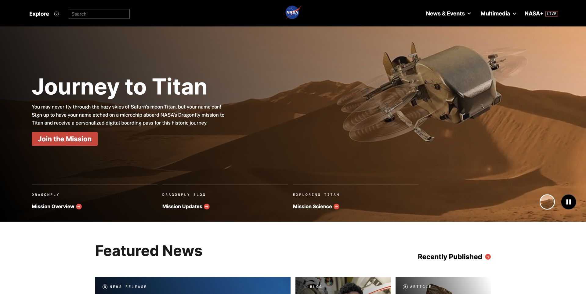
NASA’s captured homepage places a mission headline, explanatory paragraph, and red action over a wide illustration of Titan. A separate black header contains search and major destinations, while three supporting mission links establish a second level of hierarchy. The next white section introduces news without continuing the image treatment indefinitely. This is useful HTML and CSS inspiration because the different information roles remain visually distinct even within one large composition. The public response contains HTML markup, stylesheet references, and inline styling; it does not identify every authoring tool or prove accessibility compliance.
What you can learn
Start by writing the mission introduction and its supporting links as a sensible reading sequence. Then use layout and image treatment to establish the scene without making the picture carry essential text. Check overlay contrast for every replacement image and keep the news transition clear when the content stacks.
Pros
The opaque header gives navigation a stable background independent of the illustration.
Supporting links provide useful destinations beyond the dominant campaign action.
Cons & considerations
The expansive hero delays the news section on a short display.
White text depends on adequate darkening across the entire headline area.
PHPCMS dependency association; runtime not independently observed
Earlier cited evidence retained; no current scan result. References may be embedded or legacy—not a complete backend inventory.
Platform source: Observed first-party public HTML response. Observed public HTML document with linked CSS stylesheet resources. The evidence applies to this public page, not an exclusive stack or a claim of hand-written source. Platform evidence is separate from the direct website screenshot and is not a complete current infrastructure audit.
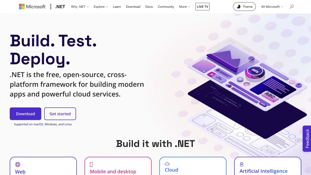
Microsoft’s .NET page combines a substantial left-aligned heading with a purple illustration on the right. Download and learning actions sit directly below the description, followed by a centered transition into application categories. The first visible cards repeat rounded borders, colored icons, and consistent heading positions. The header combines Microsoft identity with the narrower .NET identity rather than treating them as unrelated logos. Its HTML response and linked CSS support the language association; this review concerns the public marketing page, not the technology used to implement every application shown.
What you can learn
Build the introduction and category collection as separate document sections before arranging their columns. A repeated card structure should tolerate different title lengths and descriptions without forced heights that clip content. Preserve the distinction between a download destination and an explanatory starting point when the buttons wrap on smaller screens.
Pros
The category cards make a broad platform proposition more concrete.
Outlined and filled actions remain distinct without requiring separate illustrations.
Cons & considerations
Fine details inside the large illustration become less useful when scaled down.
The crowded header needs deliberate wrapping or disclosure rules at intermediate widths.
Public source checked November 3, 2026. References may be embedded or legacy—not a complete backend inventory.
Platform source: Observed first-party public HTML response. Observed public HTML document with linked CSS stylesheet resources. The evidence applies to this public page, not an exclusive stack or a claim of hand-written source. Platform evidence is separate from the direct website screenshot and is not a complete current infrastructure audit.
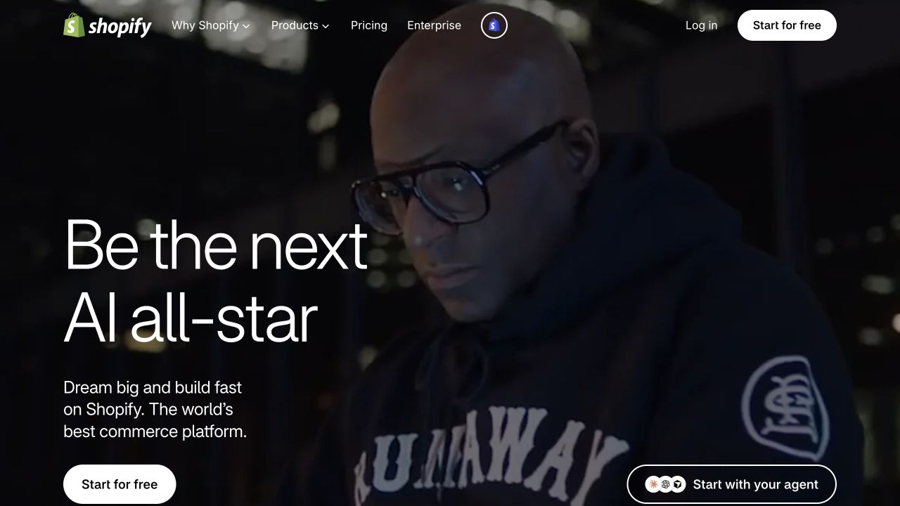
Shopify’s saved opening places very large, light-weight white text over a dark photographic scene. Supporting copy occupies a narrower measure below it, with a white rounded starting action near the lower edge. The top navigation and a separate agent-oriented action share the same scene without becoming part of the image itself. The contrast between headline scale and compact navigation carries much of the hierarchy. The reviewed HTML response includes the document and inline CSS; the example demonstrates a rendered composition rather than a recommendation to duplicate the underlying framework.
What you can learn
Treat the campaign image as replaceable content with an explicit crop and safe text area. Use a flexible type scale that responds to available width rather than shrinking an entire desktop canvas. Keep the description and starting action in the document order so they remain understandable when the image is unavailable or the layout becomes one column.
Pros
One dominant headline establishes a clear visual priority.
The white action remains distinguishable from the dark background.
Cons & considerations
The photograph carries little practical product explanation by itself.
Thin white lettering needs careful contrast checks as imagery changes.
Public source checked November 3, 2026. References may be embedded or legacy—not a complete backend inventory.
Platform source: Observed first-party public HTML response. Observed public HTML document with inline CSS style elements. The evidence applies to this public page, not an exclusive stack or a claim of hand-written source. Platform evidence is separate from the direct website screenshot and is not a complete current infrastructure audit.
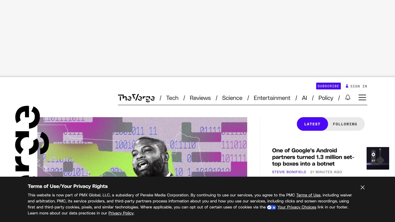
The Verge’s capture uses an unusually expressive masthead, a horizontal topic row, and a large image beside a narrower latest-news column. Heavy display lettering overlaps the visual boundaries of the lead composition, while purple accents mark subscription and selected controls. A large blank advertising reserve and a dark privacy banner also occupy the opening view. Those elements are part of the real layout, not incidental details to remove from a design brief. Public HTML and linked stylesheets establish the language association without proving how the publication’s editorial tools are built.
What you can learn
Model the lead story, latest list, advertising slot, and privacy interface as separate responsibilities. Use CSS to create the editorial rhythm while keeping story headings and links in a logical reading order. Test both a filled advertisement and an empty slot, because either state can materially change how much journalism is visible.
Pros
Different column widths distinguish the lead story from the latest stream.
A limited accent palette helps selected controls stand out.
Cons & considerations
Advertising and privacy UI substantially reduce the visible article area.
Overlapping display lettering requires careful small-screen and zoom review.
ReactAssociated with Next.js; not independently observed
Public source checked November 3, 2026. References may be embedded or legacy—not a complete backend inventory.
Platform source: Observed first-party public HTML response. Observed public HTML document with linked CSS stylesheet resources. The evidence applies to this public page, not an exclusive stack or a claim of hand-written source. Platform evidence is separate from the direct website screenshot and is not a complete current infrastructure audit.
UNICEF’s captured page separates language selection, a blue identity band, and the main topic navigation into distinct horizontal layers. A large documentary photograph then fills most of the remaining opening, with the campaign headline on a dark strip near its lower edge. The donation action is visible in the identity band while research and stories remain ordinary navigation choices. This demonstrates how HTML content roles and CSS surface changes can organize several audiences without a complicated illustration. The public page returns HTML with multiple stylesheet references; no claim of a particular CSS framework follows from its appearance.
What you can learn
Write the institutional navigation and campaign content independently, then give each a clear visual boundary. Large images need meaningful alternatives and a crop that preserves the subject across screen sizes. Place the campaign heading in the reading sequence even when its visual treatment overlaps the photograph.
Pros
Separate header bands make language, identity, and topic navigation easier to distinguish.
The photograph gives the campaign a concrete human subject.
Cons & considerations
The tall image pushes explanatory context below the first view.
Several stacked header rows consume considerable space before the campaign begins.
PHPCMS dependency association; runtime not independently observed
Earlier cited evidence retained; no current scan result. References may be embedded or legacy—not a complete backend inventory.
Platform source: Observed first-party public HTML response. Observed public HTML document with linked CSS stylesheet resources. The evidence applies to this public page, not an exclusive stack or a claim of hand-written source. Platform evidence is separate from the direct website screenshot and is not a complete current infrastructure audit.
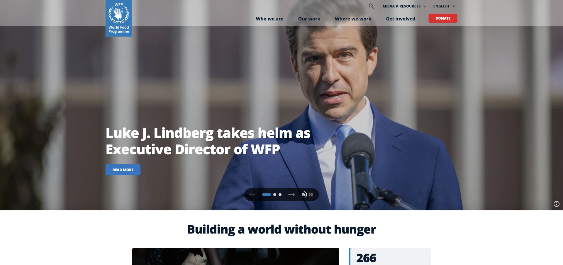
The World Food Programme capture shows a broad news photograph beneath a translucent header, a large headline, and a modest read-more action. The organization’s vertical blue mark projects below the header band and remains separate from the story. A dark carousel-control capsule sits near the bottom of the photograph, followed by a white section introducing the wider mission. The page illustrates a layered document: persistent identity, temporary story, controls, then institutional context. HTML and CSS resources are observable on the public property, but the screenshot alone cannot establish the exact layout technique used.
What you can learn
Keep each campaign’s heading, description, and destination together in the content model. Styling can place that block over photography, but it should also work as a normal section without the image. Reserve predictable space for controls and explain the wider organization after the rotating feature rather than relying on one selected slide.
Pros
The mission section establishes context beyond the current news item.
A compact control group avoids scattering carousel actions around the image.
Cons & considerations
Translucent navigation depends on the changing background beneath it.
A large feature can hide alternative stories until visitors discover its controls.
PHPCMS dependency association; runtime not independently observed
Public source checked November 3, 2026. References may be embedded or legacy—not a complete backend inventory.
Platform source: Observed first-party public HTML response. Observed public HTML document with linked CSS stylesheet resources. The evidence applies to this public page, not an exclusive stack or a claim of hand-written source. Platform evidence is separate from the direct website screenshot and is not a complete current infrastructure audit.
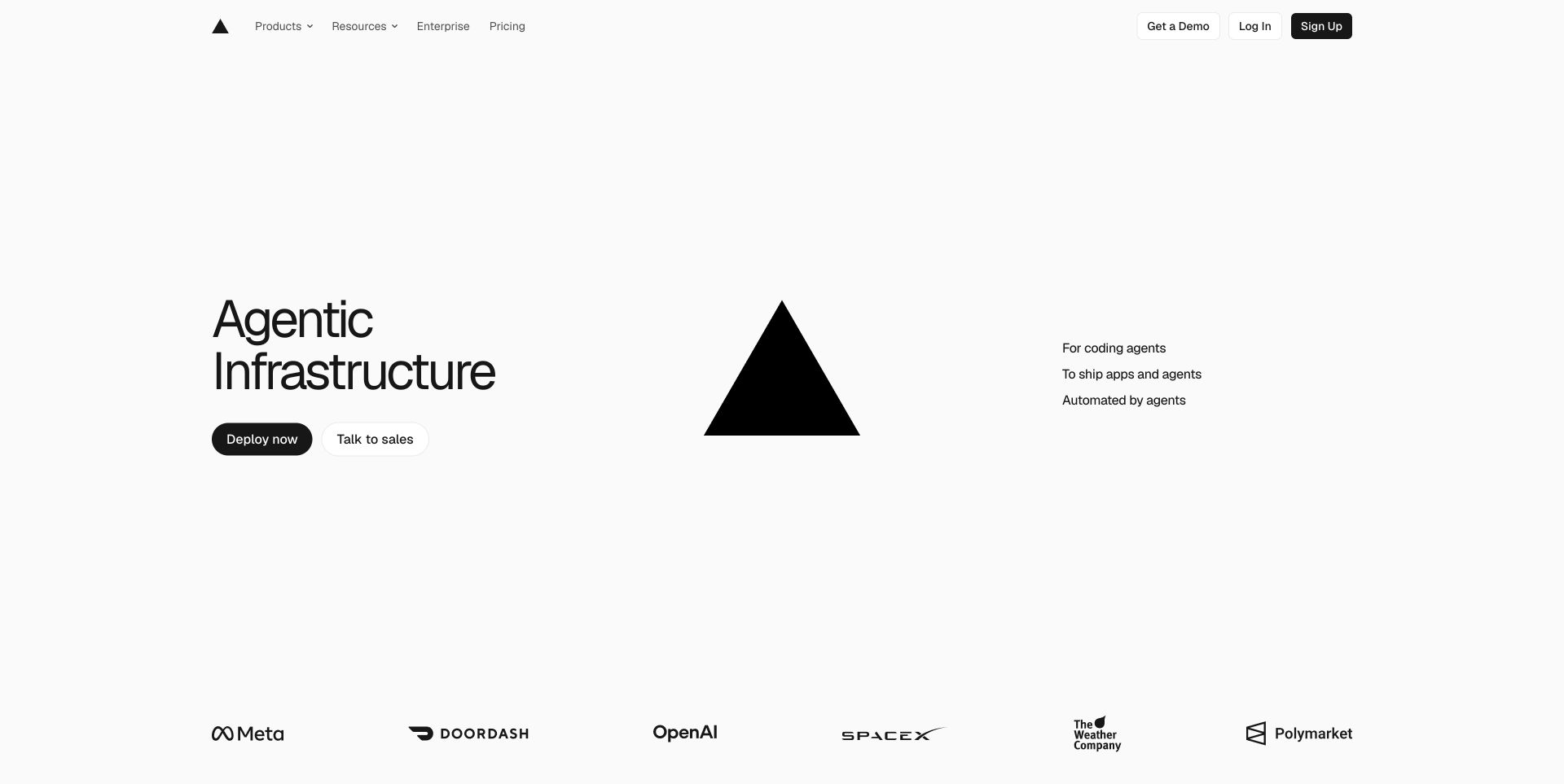
Vercel’s saved homepage has a left-hand proposition, a large central triangle, and a short supporting list on the right. The account controls occupy a thin header, while a row of customer marks begins at the bottom of the screen. Most of the canvas remains white, so scale and alignment do more work than color. The composition is a useful reference for deciding which elements deserve their own columns. Its delivered HTML and stylesheet links confirm the basic web-language layer, not whether a similarly sparse page needs the same application framework.
What you can learn
Define the relationship between proposition, illustration, and supporting list in the document before adding a multi-column layout. When space narrows, the supporting explanation should follow the main statement naturally rather than becoming detached beside a decorative shape. Set a deliberate maximum reading width and test whether the large gaps still serve the content on shorter displays.
Pros
The limited palette makes the main actions and brand shape easy to locate.
The supporting list is short enough to scan independently.
Cons & considerations
Extensive whitespace postpones detailed explanation and proof.
A geometric logo alone gives unfamiliar visitors little product context.
Public source checked November 3, 2026. References may be embedded or legacy—not a complete backend inventory.
Platform source: Observed first-party public HTML response. Observed public HTML document with linked CSS stylesheet resources. The evidence applies to this public page, not an exclusive stack or a claim of hand-written source. Platform evidence is separate from the direct website screenshot and is not a complete current infrastructure audit.
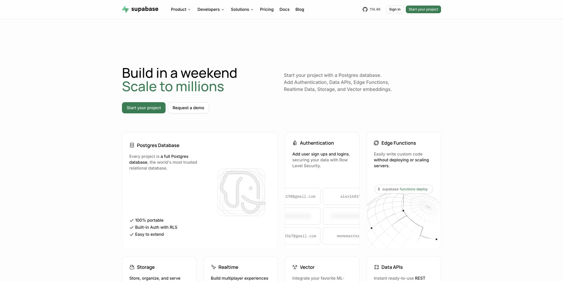
Supabase’s capture starts with a compact two-line proposition and a short explanation, then quickly introduces a grid of product cards. Database receives the widest first card, while authentication and edge functions sit alongside it. Small icons, quiet outlines, and lightly drawn illustrations keep the cards related without making every module identical. The header provides documentation and pricing before the feature collection begins. The public HTML response links CSS resources; the screenshot does not establish whether the grid uses any particular CSS framework or layout primitive.
What you can learn
Use document headings and concise descriptions to make the product collection meaningful without its illustrations. Size cards according to information priority, but allow each card to expand when content changes. A reusable spacing scale should connect the large lead card with smaller supporting cards while preserving a sensible one-column order.
Pros
The card titles turn a broad platform into recognizable capabilities.
The lead card has space for a more complete explanation.
Cons & considerations
Pale decorative details can disappear on lower-contrast displays.
A dense capability grid may overwhelm readers who need one recommended starting point.
Public source checked November 3, 2026. References may be embedded or legacy—not a complete backend inventory.
Platform source: Observed first-party public HTML response. Observed public HTML document with linked CSS stylesheet resources. The evidence applies to this public page, not an exclusive stack or a claim of hand-written source. Platform evidence is separate from the direct website screenshot and is not a complete current infrastructure audit.
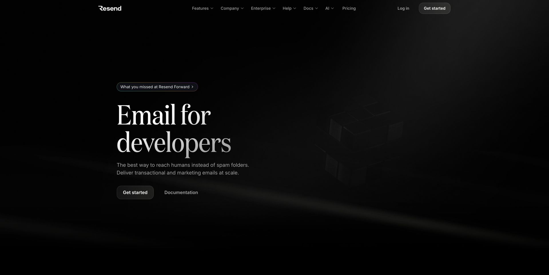
Resend’s captured opening sets a large serif product statement against an almost black canvas. A small announcement appears above it, followed by a short explanation and separate starting and documentation actions. The header is quiet and the right side contains a faint abstract object rather than a detailed interface. The page depends on type scale and tonal contrast to establish hierarchy. Its public response supplies HTML and linked CSS, but the visible effect does not reveal the exact rendering method for the background object.
What you can learn
Specify contrast for the supporting copy and secondary navigation as carefully as for the headline. A dark theme can preserve hierarchy through a small number of reliable text and surface values instead of many nearly indistinguishable grays. Keep the abstract object decorative and make the introduction complete without it.
Pros
The large type gives the product category immediate prominence.
Documentation remains an explicit alternative to starting an account.
Cons & considerations
Very dark supporting graphics add little information in the saved view.
Low-contrast secondary text needs review beyond the visually dominant headline.
Public source checked November 3, 2026. References may be embedded or legacy—not a complete backend inventory.
Platform source: Observed first-party public HTML response. Observed public HTML document with linked CSS stylesheet resources. The evidence applies to this public page, not an exclusive stack or a claim of hand-written source. Platform evidence is separate from the direct website screenshot and is not a complete current infrastructure audit.
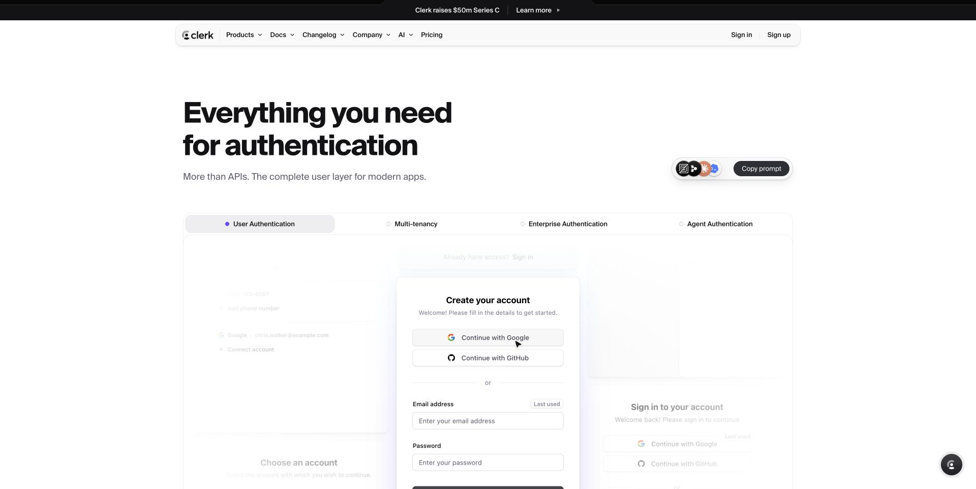
Clerk’s saved page puts a bold authentication introduction above a wide demonstration panel. A row of labeled categories sits across the panel, and a sample account form appears within the selected area. The narrow announcement and navigation bands leave most of the page for the product example. A copy-prompt control is visually separate from the demonstration’s account controls. This is useful HTML/CSS inspiration because the page must distinguish explanatory content from a sample interface that resembles a real form. The public response contains both document markup and stylesheet references.
What you can learn
Give the demonstration a clear label and boundary so visitors know whether they are viewing an example or entering a live account flow. Reuse form spacing and typography consistently, but avoid implying that a visual mockup has been tested for accessibility. The surrounding marketing page should still explain the product when the demonstration is hidden.
Pros
The product example appears soon after the main explanation.
Labeled categories organize a broad feature set within one bounded panel.
Cons & considerations
A realistic sample form can be mistaken for an actual sign-up route.
Faint background panels make secondary demonstration content difficult to read.
Public source checked November 3, 2026. References may be embedded or legacy—not a complete backend inventory.
Platform source: Observed first-party public HTML response. Observed public HTML document with linked CSS stylesheet resources. The evidence applies to this public page, not an exclusive stack or a claim of hand-written source. Platform evidence is separate from the direct website screenshot and is not a complete current infrastructure audit.
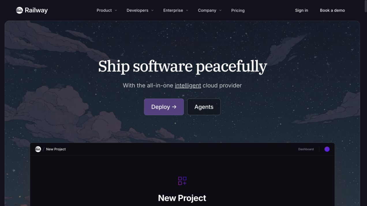
Railway’s opening places a serif headline in a rounded illustrated night scene. A purple primary action and a quieter secondary route sit beneath the short description, while a dark new-project panel begins lower in the same frame. The header remains outside that frame on a solid background. These nested surfaces help separate the permanent navigation, atmospheric branding, and product illustration. The delivered public HTML links a stylesheet, supporting the HTML/CSS association without establishing which individual styling rules produced the scene.
What you can learn
Build the outer frame, textual introduction, and product preview as independently adaptable regions. Keep the landscape decorative so a failed image does not remove the product explanation. When the page narrows, allow the preview to simplify or continue below the introduction instead of shrinking detailed interface text until it becomes illegible.
Pros
A solid header gives navigation a dependable contrast surface.
The preview connects the visual mood to an identifiable task.
Cons & considerations
The illustrated frame uses substantial vertical space before detailed capabilities.
Dark preview text needs careful contrast when displayed at smaller sizes.
Public source checked November 3, 2026. References may be embedded or legacy—not a complete backend inventory.
Platform source: Observed first-party public HTML response. Observed public HTML document with linked CSS stylesheet resources. The evidence applies to this public page, not an exclusive stack or a claim of hand-written source. Platform evidence is separate from the direct website screenshot and is not a complete current infrastructure audit.
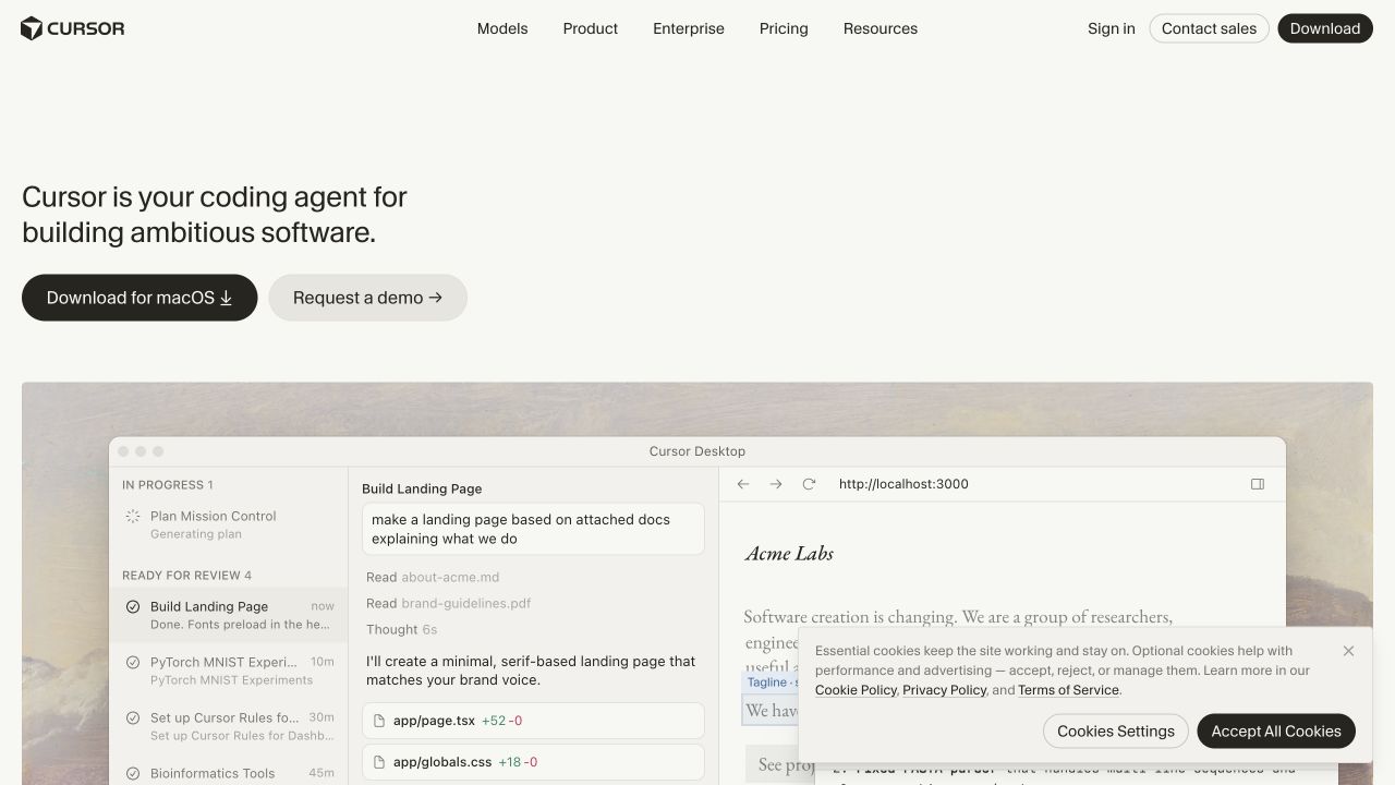
Cursor’s captured homepage uses a short left-aligned statement and two simple actions above a very large desktop-product image. The restrained off-white background and compact top navigation give the product scene room to dominate. The scene includes several panes and fine text, making it informative at large sizes but potentially difficult to read when reduced. A consent panel covers part of the lower-right image in the capture. HTML markup, CSS resources, and the saved direct image support a review of the public marketing surface rather than the installed application.
What you can learn
Separate essential product explanation from the detailed screenshot. A responsive image should preserve enough context to communicate the workflow, but text inside it cannot replace accessible page copy. Define how the image crops and how consent UI overlaps it at short viewport heights before polishing the desktop arrangement.
Pros
The introduction is concise enough to leave attention for the product scene.
Download and demonstration actions are visually distinct.
Cons & considerations
Fine interface text loses clarity when the image is scaled down.
The consent panel obscures part of the most informative visual area.
Public source checked November 3, 2026. References may be embedded or legacy—not a complete backend inventory.
Platform source: Observed first-party public HTML response. Observed public HTML document with linked CSS stylesheet resources. The evidence applies to this public page, not an exclusive stack or a claim of hand-written source. Platform evidence is separate from the direct website screenshot and is not a complete current infrastructure audit.
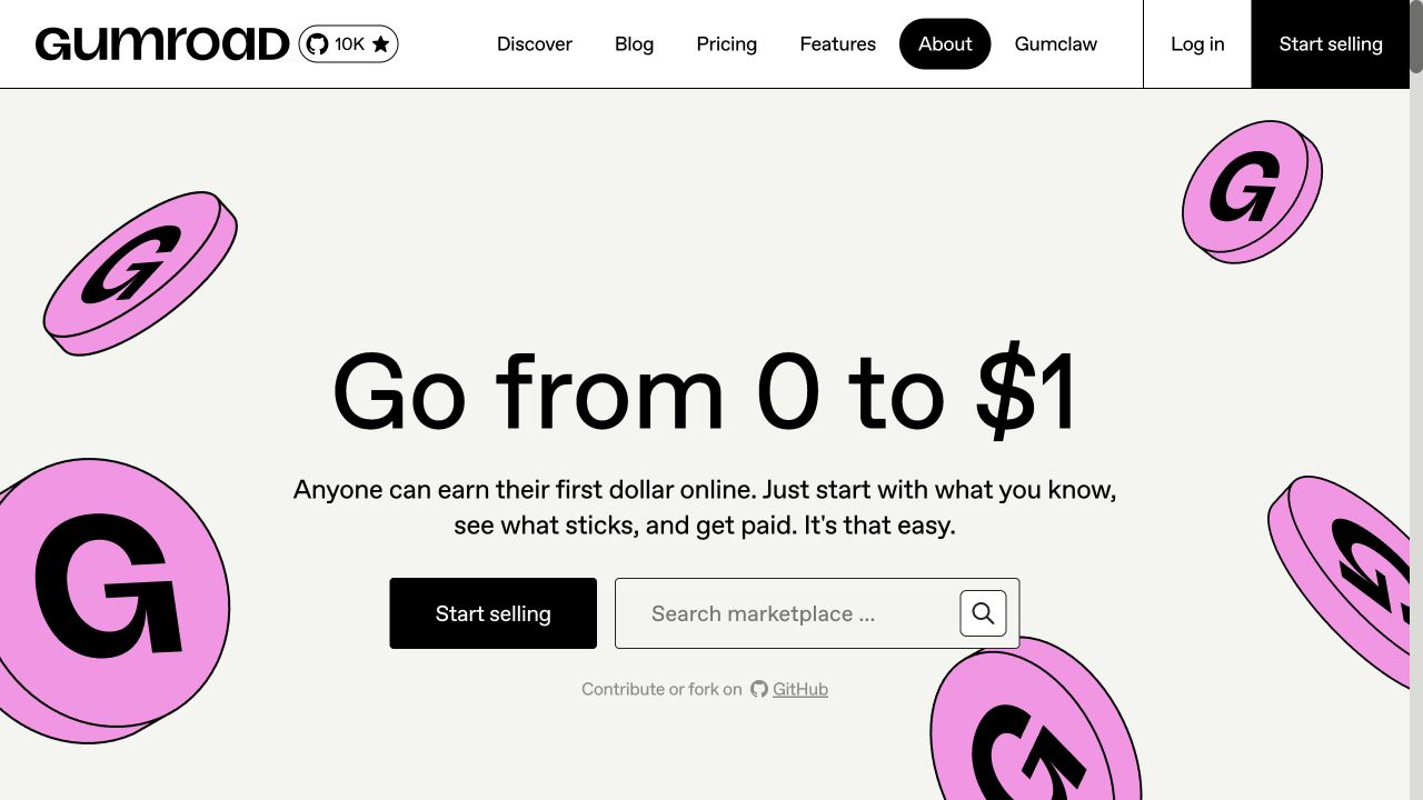
Gumroad’s capture uses a large central statement, a short explanation, and two practical routes: begin selling or search the marketplace. Pink illustrated coins surround the content while thick outlines divide the navigation and controls. The black, white, and pink palette remains consistent even though the decorative shapes vary in scale and angle. The marketplace field is visually paired with the seller action rather than hidden in the header. The public document and linked stylesheet establish the HTML/CSS layer without making a claim about checkout behavior.
What you can learn
Keep the buyer and seller decisions separate in the document and give each a clear label. Treat the coins as decoration that may crop or disappear without affecting meaning. A layout with strong borders needs consistent spacing and enough room for control labels to grow under zoom or translation.
Pros
Buying and selling routes are both available in the opening.
A small palette gives the varied illustrations a coherent identity.
Cons & considerations
Oversized decorations use space that could answer practical selling questions.
The brief headline relies on later content to explain the marketplace model.
Public source checked November 3, 2026. References may be embedded or legacy—not a complete backend inventory.
Platform source: Observed first-party public HTML response. Observed public HTML document with linked CSS stylesheet resources. The evidence applies to this public page, not an exclusive stack or a claim of hand-written source. Platform evidence is separate from the direct website screenshot and is not a complete current infrastructure audit.
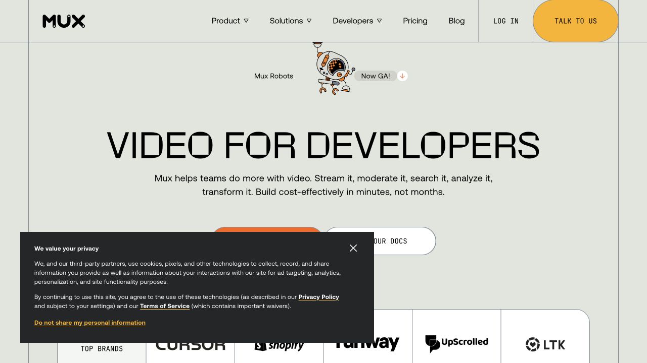
Mux’s captured page uses thin vertical and horizontal rules to connect the header, centered introduction, and customer band. A small product announcement precedes the large display headline, while documentation and sales actions sit below the description. The pale background makes the black lettering and warm accent controls prominent. A dark privacy panel covers much of the lower-left content, showing why overlay states belong in layout review. The public HTML response links several CSS files; the review does not identify which stylesheet owns each visual detail.
What you can learn
Set the structural grid before choosing a distinctive display face. Keep the headline readable at the narrowest intended size and allow supporting text to use a calmer treatment. Include privacy and announcement interfaces in the same spacing plan, since they can interrupt otherwise precise alignment and hide the primary actions.
Pros
Repeated rules create continuity between very different content regions.
The introduction includes a direct documentation route.
Cons & considerations
The unusual letterforms need more readability testing than conventional body text.
The privacy panel covers a large part of the first-screen decision area.
Public source checked November 3, 2026. References may be embedded or legacy—not a complete backend inventory.
Platform source: Observed first-party public HTML response. Observed public HTML document with linked CSS stylesheet resources. The evidence applies to this public page, not an exclusive stack or a claim of hand-written source. Platform evidence is separate from the direct website screenshot and is not a complete current infrastructure audit.
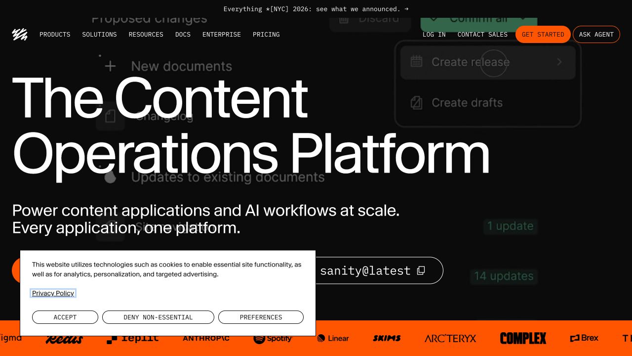
Sanity’s capture places an exceptionally large white title over a darkened product-workflow background. A shorter explanatory line and starting controls sit below it, with a bright orange customer strip along the lower edge. The navigation uses compact uppercase labels, creating a sharp scale contrast with the hero. A white consent panel occupies the lower-left area and partially covers the actions. Its public response contains HTML and CSS references; the background screenshot does not prove how the current editing product behaves.
What you can learn
Use an explicit type scale rather than letting one oversized heading determine the whole layout. The background should support the topic while remaining dispensable to understanding it. Test long title variants, consent-panel presence, and text zoom together, because an already crowded opening can lose its action area quickly.
Pros
The contrast in type sizes makes the main proposition unmistakable.
The bright lower band creates a clear boundary after the dark introduction.
Cons & considerations
The oversized headline leaves little room for detailed explanation.
Consent UI and starting controls compete in the same lower region.
Public source checked November 3, 2026. References may be embedded or legacy—not a complete backend inventory.
Platform source: Observed first-party public HTML response. Observed public HTML document with linked CSS stylesheet resources. The evidence applies to this public page, not an exclusive stack or a claim of hand-written source. Platform evidence is separate from the direct website screenshot and is not a complete current infrastructure audit.
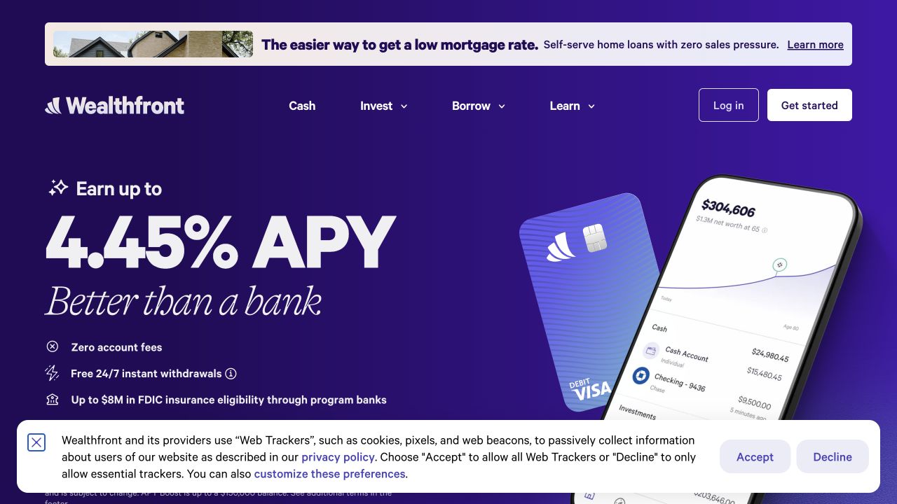
Wealthfront’s saved view uses a saturated purple background, a very large rate figure, and an angled card-and-phone illustration. A small benefit list sits below the display text, while a separate promotional strip occupies the top. The navigation remains relatively compact between those regions. The consent bar covers the lower edge and some supporting text. This is a layout reference, not financial advice or verification of the captured rate. The public HTML and CSS resources establish the web-language association only.
What you can learn
Treat the headline claim, qualification, and next action as one content group. Do not allow decorative imagery or fixed overlays to separate important explanatory text from the figure it qualifies. Use responsive type and image cropping deliberately so the product illustration does not force supporting information into unreadably small space.
Pros
A consistent palette links the physical card illustration to the page.
The benefit list supplies a second level beneath the dominant number.
Cons & considerations
The oversized figure can visually overpower its qualifications.
Promotional and consent bands reduce the usable height for essential information.
ReactAssociated with Next.js; not independently observed
Public source checked November 3, 2026. References may be embedded or legacy—not a complete backend inventory.
Platform source: Observed first-party public HTML response. Observed public HTML document with linked CSS stylesheet resources. The evidence applies to this public page, not an exclusive stack or a claim of hand-written source. Platform evidence is separate from the direct website screenshot and is not a complete current infrastructure audit.
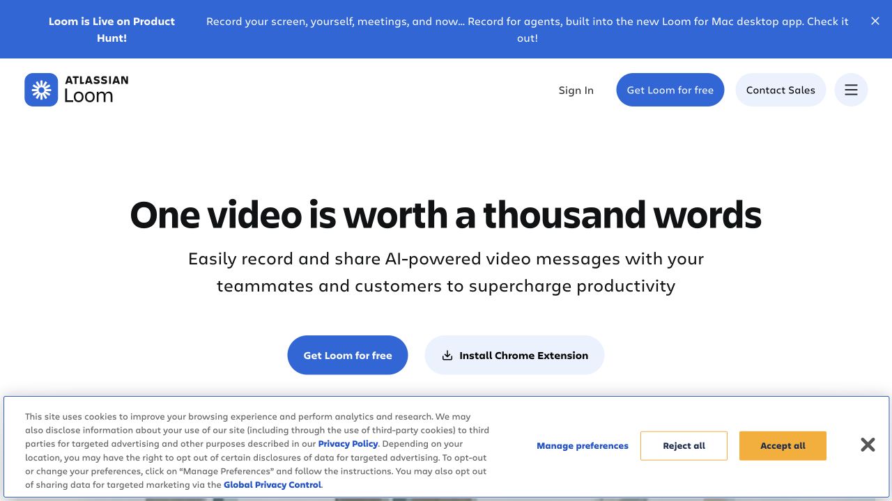
Loom’s saved opening centers a bold benefit statement above two lines of explanation and two rounded actions. Its blue announcement band is separated from the white navigation, which carries the Atlassian Loom identity and account routes. The main introduction needs little imagery to be understandable. A broad consent interface fills the bottom of the view, demonstrating how additional page regions can change a deliberately spacious layout. HTML and linked CSS are observable on the public marketing property; the screenshot is not a recording-session test.
What you can learn
Write the benefit and explanation as a short readable section before adding a visual demonstration. Use button variants to distinguish starting in the product from installing an extension, since those destinations have different expectations. Plan vertical spacing with the announcement and consent regions present rather than measuring only an ideal uncluttered screen.
Pros
The product purpose is understandable without playing a demonstration.
The extension route has an explicit installation label.
Cons & considerations
The wide consent panel consumes a substantial share of the first view.
A broad productivity claim leaves specific use cases for later content.
ReactAssociated with Next.js; not independently observed
Public source checked November 3, 2026. References may be embedded or legacy—not a complete backend inventory.
Platform source: Observed first-party public HTML response. Observed public HTML document with linked CSS stylesheet resources. The evidence applies to this public page, not an exclusive stack or a claim of hand-written source. Platform evidence is separate from the direct website screenshot and is not a complete current infrastructure audit.
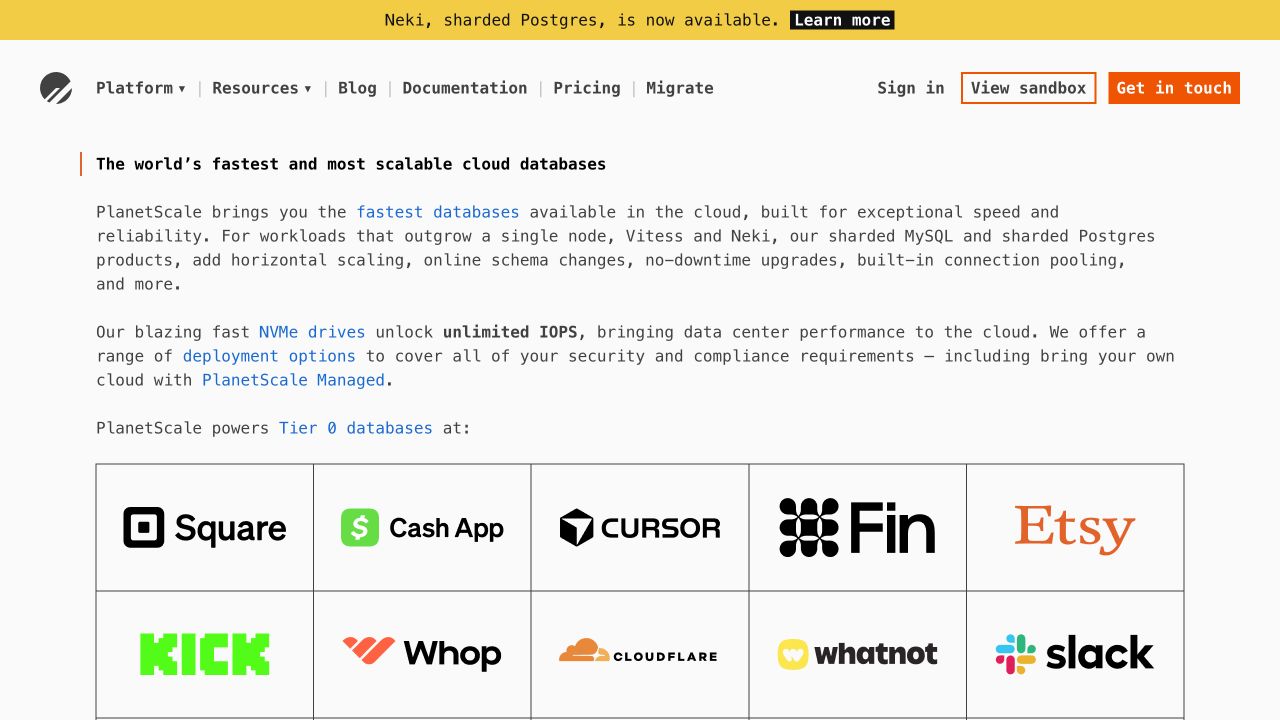
PlanetScale’s capture begins with an announcement, a compact navigation, and several substantial paragraphs. Monospaced typography and inline blue links make the technical explanation feel continuous with the product’s developer context. A ruled customer-logo grid follows, while orange accents distinguish the principal evaluation routes. The page spends its opening on language rather than a dashboard illustration. Public HTML and linked CSS support the language association, but the visual review does not independently verify the performance claims in the captured copy.
What you can learn
Give technical paragraphs a comfortable line length and clear hierarchy before decorating them. A logo grid should support the explanation rather than substitute for evidence about a specific capability. Make each inline link recognizable without relying on color alone, and ensure long paragraphs remain comfortable to read when the columns collapse.
Pros
The opening explains product categories in more depth than a short slogan.
Documentation and migration have explicit navigation labels.
Cons & considerations
Dense introductory text asks for sustained attention immediately.
The customer grid can delay practical comparison information further down.
Public source checked November 3, 2026. References may be embedded or legacy—not a complete backend inventory.
Platform source: Observed first-party public HTML response. Observed public HTML document with linked CSS stylesheet resources. The evidence applies to this public page, not an exclusive stack or a claim of hand-written source. Platform evidence is separate from the direct website screenshot and is not a complete current infrastructure audit.
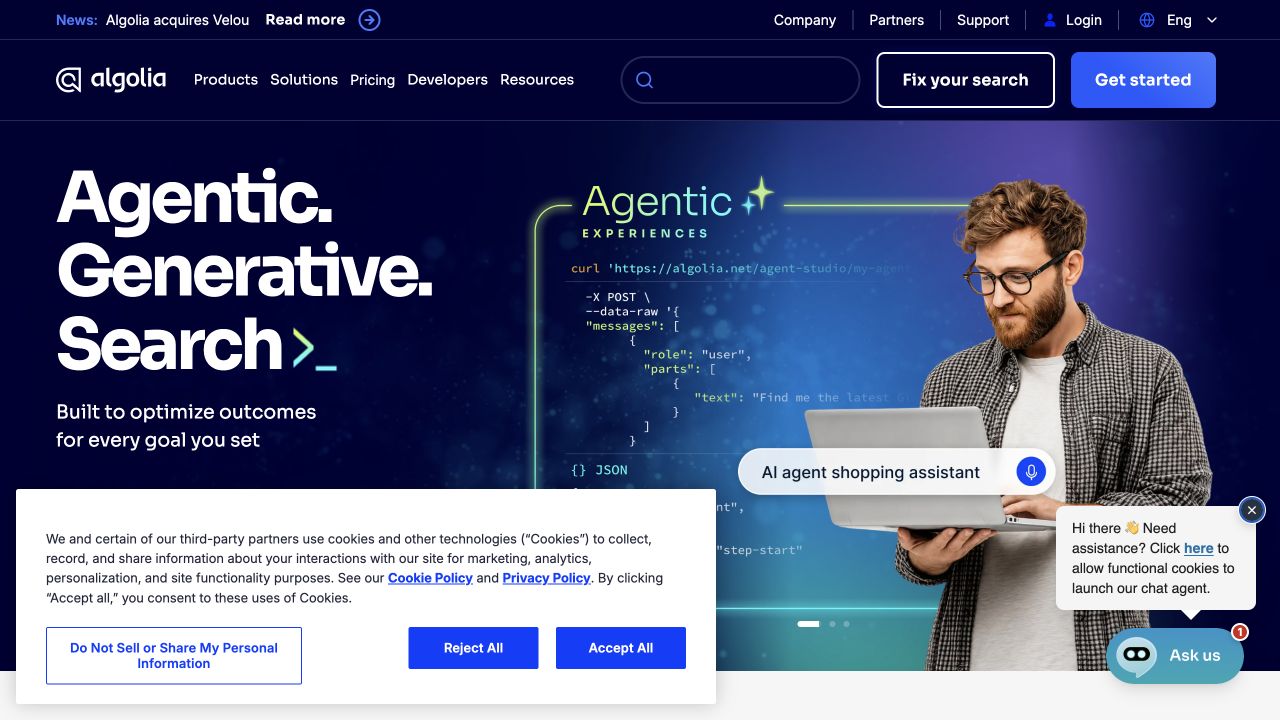
Algolia’s captured opening combines a blue background, large stacked white words, and a human figure holding a laptop. Two header rows contain utilities, product navigation, a search field, and prominent evaluation actions. A consent panel and chat prompt overlap the lower portion of the hero, while code-like graphics remain behind the photograph. The result is a useful study in the limits of visual density. Its public response supplies HTML and stylesheets; no search or chat interaction was submitted for this review.
What you can learn
Assign a clear priority to each surface before refining its styling. Main navigation, search, chat, and consent all need usable boundaries and enough space to coexist. A responsive layout should resolve their collisions deliberately instead of merely reducing the hero’s font size until everything fits.
Pros
Utility destinations are separated from the main product navigation.
The photograph gives an abstract technical proposition a concrete focal point.
Cons & considerations
Several overlays obscure the same lower hero region.
Multiple prominent evaluation controls weaken the clarity of one primary next step.
Public source checked November 3, 2026. References may be embedded or legacy—not a complete backend inventory.
Platform source: Observed first-party public HTML response. Observed public HTML document with linked CSS stylesheet resources. The evidence applies to this public page, not an exclusive stack or a claim of hand-written source. Platform evidence is separate from the direct website screenshot and is not a complete current infrastructure audit.
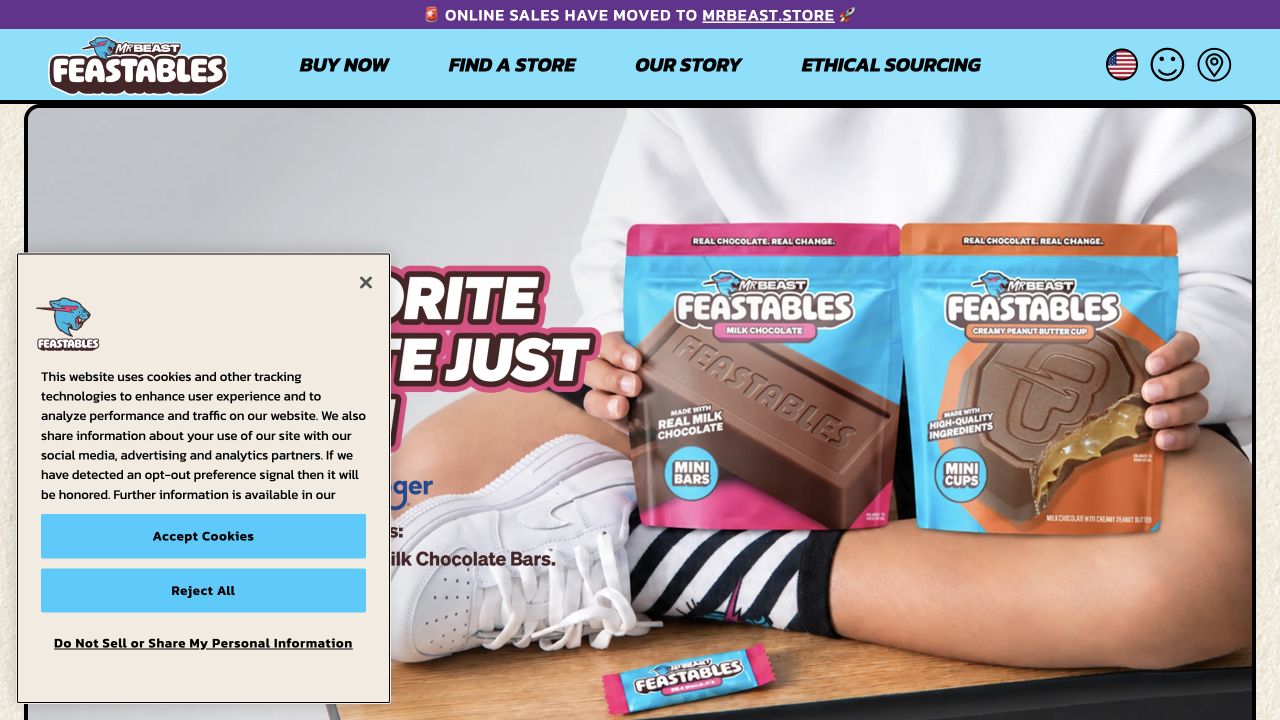
Feastables’ capture combines a cyan navigation band, bold playful lettering, and a large photograph of packaged chocolate. A purple strip announces that online sales have moved to another destination. Buying, finding stores, brand story, and sourcing remain distinct top-level routes. The privacy panel overlays part of the campaign, including some of its lettering. The actual packaging supplies much of the color and personality, while the surrounding page creates practical navigation. HTML and CSS resources are observable; the separate purchasing destination was not tested.
What you can learn
Use the packaging palette to inform the interface while keeping navigation text and campaign copy outside product photography wherever practical. Give an outbound buying transition its own clear explanation. Test the hero with different packages and longer notices so a seasonal replacement does not break the composition.
Pros
The visible products establish the category immediately.
The separate sales notice clarifies that purchasing happens elsewhere.
Cons & considerations
The privacy panel obscures substantial campaign content in the capture.
Large image-led lettering needs careful cropping and text alternatives on smaller screens.
Public source checked November 3, 2026. References may be embedded or legacy—not a complete backend inventory.
Platform source: Observed first-party public HTML response. Observed public HTML document with linked CSS stylesheet resources. The evidence applies to this public page, not an exclusive stack or a claim of hand-written source. Platform evidence is separate from the direct website screenshot and is not a complete current infrastructure audit.
Choose an authoring approach around the people maintaining the content
Use a small static site for a small stable document set
A few carefully structured pages can be maintained with straightforward templates and styles. Decide how common navigation, metadata, and repeated content stay synchronized. Static output still needs an editing process, deployment ownership, link checks, and a way to correct mistakes quickly.
Use a CMS when ongoing publishing is the real requirement
If editors regularly change projects, products, articles, or campaigns, model those records and their allowed variations. The CMS should produce useful document structure rather than an unrestricted pile of boxes. Demonstrate a real update with a long title and missing image before approving the editor experience.
Use components when meaning and behavior repeat
Shared cards, navigation, form fields, and notices can benefit from a component boundary. Keep their content responsibilities and semantics clear. Reusing a visual style alone does not guarantee that two controls have the same meaning, and a large component library is not required for a small brochure site.
From references to requirements
Plan the content specimen, layout system, and maintenance routine together
Build a specimen with representative content
Collect real titles, paragraphs, navigation labels, images, lists, tables, and form messages before choosing precise breakpoints. Include the longest plausible examples. Use a shared specimen page to see how type, line length, spacing, and image treatment relate across the whole site.
Choose layout rules rather than isolated pixel positions
Document the maximum reading width, column relationships, gaps, alignment, and stacking order. CSS provides multiple layout models, so choose the simplest one that expresses the content relationship. Treat a breakpoint as the point where the content needs another arrangement, not as proof that every device of a named type has been covered.
For each image role, record the intended aspect ratio, crop behavior, alternative text responsibility, and fallback. Separate decorative backgrounds from informative images. Keep important labels and claims in the document, and do not depend on text embedded in a screenshot to explain a product.
Review shared changes against more than the homepage
A global type or spacing adjustment can affect navigation, cards, forms, and long articles. Keep a small set of representative pages for visual review and assign someone to check content after updates. Record how fonts and third-party widgets are added so the stylesheet does not become a record of unexplained exceptions.
A useful handover demonstration
Ask the actual team to carry out its routine job: publish a realistic update, correct a mistake, preview a narrow screen, and identify who owns an integration failure. For a library or frontend framework, also ask who maintains the content source and deployment. A polished screenshot does not answer those operational questions.
Beyond the screenshot
An HTML and CSS launch checklist for real content
Confirm a meaningful page title, heading hierarchy, navigation, and main-content region.
Check the reading order before relying on visual positioning.
Test long text, missing media, sparse cards, and translated labels.
Review keyboard focus, zoom, text resizing, and narrow-screen wrapping.
Keep important qualifications beside the claims they explain.
Check text contrast over every representative image and surface.
Provide appropriate image alternatives and predictable crop behavior.
Include announcements, consent interfaces, and form errors in layout review.
Verify internal destinations, metadata, responsive assets, and public error pages.
Document who owns content updates, shared styling changes, and regressions.
Test with real content, a keyboard, a small screen, slow or failed requests, and the people who will maintain the system. These are planning checks, not an accessibility, security, performance, or search-ranking certification.
Sources & editorial method
How this HTML & CSS collection was reviewed
Each association comes from a fresh inspection of the exact public page’s HTML response, with stylesheet references or inline CSS. Direct screenshot files retain their original capture dates and measured dimensions. The collection does not infer a complete stack, hand-written source, CSS framework, conformance result, or loading speed from appearance. Reviews are specific to document and layout decisions; the separate JavaScript guide examines interaction responsibilities using independent commentary.
Every image is an unmodified capture from the actual website, with its source and capture date. Some captures are reused from our shared catalog; their dates remain the original capture dates. None comes from a vendor gallery or a generated reconstruction. Moving imagery and live content can change.
Technology attribution uses public page assets or metadata, official platform documentation, or a cited first-party project case study. Documentary and framework-relationship evidence is identified where used; it is not a complete current backend inventory. A CMS image CDN alone does not establish a full CMS deployment. A library’s presence does not prove which individual controls use it, and a platform label does not establish AI authorship.
The composition notes, lessons, pros and tradeoffs are original editorial observations. We have not measured conversion, traffic, security, performance or accessibility conformance. Website owners retain their brands and imagery; these examples are not our client portfolio. Written, Edited and Curated are independent records, not dates advanced by a build. See our editorial standards or suggest a correction.
Questions worth asking
HTML & CSS website development FAQs
Are these websites built only with HTML and CSS?
No. HTML and CSS are visible foundations, and the properties may also use JavaScript, frameworks, CMS platforms, or server applications. The evidence supports the public document and styling layer without claiming that it is the entire system.
Does a simple-looking website need a framework?
The screenshot cannot answer that. Decide from the required behavior, publishing workflow, maintenance skills, and shared components. A sparse page can have a complex operational system behind it, while a visually rich page can sometimes use a small implementation.
Should I copy the exact spacing from a reference?
Use the reference to understand relationships, then test your own content. Different headlines, languages, images, and navigation lengths can break copied measurements. A coherent set of rules is more useful than reproducing one viewport.
Does good visual design prove accessibility?
No. A screenshot can reveal possible contrast or density concerns, but keyboard behavior, meaningful structure, text alternatives, zoom, and assistive-technology use require separate evaluation. These reviews are not compliance certifications.
Why are HTML and CSS grouped together here?
HTML gives a page its document structure and meaning; CSS controls its visual presentation. This guide examines how those two layers work together to make content readable, navigable, and adaptable to different screens.
Borrow a clear relationship between content and presentation. Write the document, test its difficult states, and let the styling system make that structure easier to understand.