These examples pair the design of a public product entrance with a primary source identifying a particular Claude-powered customer feature. The screenshot shows how the product explains itself; the cited source establishes the narrower AI relationship. Neither establishes the marketing frontend's model runtime.
Claude appears in several kinds of customer software: content assistants, support answers, application builders, and configurable team agents. Those relationships differ. A selectable model, a provider case study, and an embedded workflow step should each be described in their own terms, with plan and date limits preserved.
Use this collection to study how a product makes an AI task understandable. Then write a brief around your own inputs, permitted actions, review process, and definition of completion. The surrounding frontend, content system, and analytics are separate stack questions; the feature source does not identify them.
Before the examples
What makes good Claude website development in 2026?
Name the task before naming the model
Decide what a visitor should accomplish: understand a document, draft a reply, generate a first layout, or prepare a reviewed change. Describe the required input and the usable output. A model badge is less helpful than a concrete example showing where the result goes and what still needs human judgment.
Separate a suggested action from an executed action
Claude tool use distinguishes client tools executed by the application from server tools run by Anthropic. Your interface should make the resulting state clear: proposed, running, completed, or failed. Connect each state to the actual operation rather than displaying a success message because the model produced persuasive text.
Explain whether Claude is a default, an optional model, or one part of a larger workflow. If a plan or administrator limits access, put that information near the relevant choice. Avoid suggesting that every generated website retains the same AI provider used to create its initial code.
The collection · 20 examples
20 Claude website examples worth studying
The opening five are Figma, Notion, Asana, Box, and Atlassian, followed by other documented customer products. Reviews assess public entrance design; Lovable is explicitly a public documentation example. Each feature claim has its own source and scope. No signed-in model requests were performed, and the collection is not a model benchmark.
We start with five recognizable brands or organizations: Figma Make, Notion AI, Asana AI, Box Agent, Atlassian Rovo. Each attribution applies to the named website property, not every product or website belonging to its organization. This is a curated reading sequence, not a measured ranking.
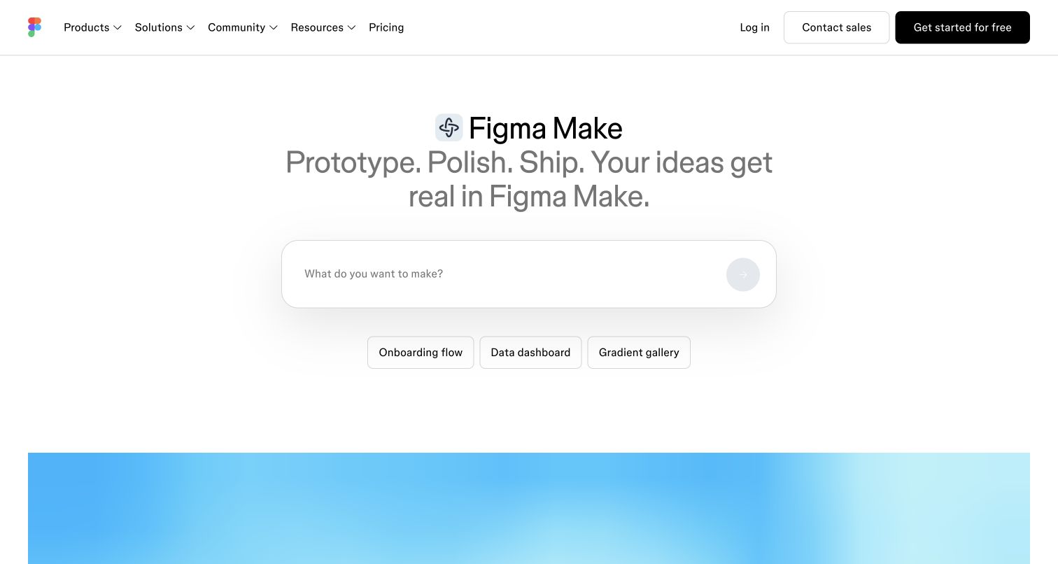
Figma Make gives its prompt box the visual weight normally reserved for a product photograph. The small Make symbol, restrained grey introduction, and three example chips establish a compact sequence: identify the tool, understand the outcome, then describe an idea. A familiar Figma navigation bar connects this focused entrance to the larger ecosystem. The blue preview beginning below the fold adds color without competing with the empty input. Figma documents selectable Claude models for Make generation; the public prompt entrance is not a runtime model test.
What you can learn
Pair an open prompt with a few concrete starting points. Keep the first action understandable before explaining the broader workflow, and show how a visitor can return to familiar product resources.
Pros
Example chips make the otherwise open-ended prompt less intimidating for new visitors.
The established navigation offers recognizable routes to pricing, resources, and account access.
Cons & considerations
The quiet grey introduction needs careful contrast checking on lower-quality displays.
The opening viewport provides limited detail about generation limits or editing responsibilities.
Public source checked November 3, 2026. References may be embedded or legacy—not a complete backend inventory.
Platform source: Primary feature source. Primary source revalidated 2026-11-04. The current Figma Make help page lists Claude models in the customer model selector. Scope is Make generation, not the Figma marketing frontend. Documentary customer-feature evidence only; no authenticated model call or marketing-frontend runtime was observed. Platform evidence is separate from the direct website screenshot and is not a complete current infrastructure audit.
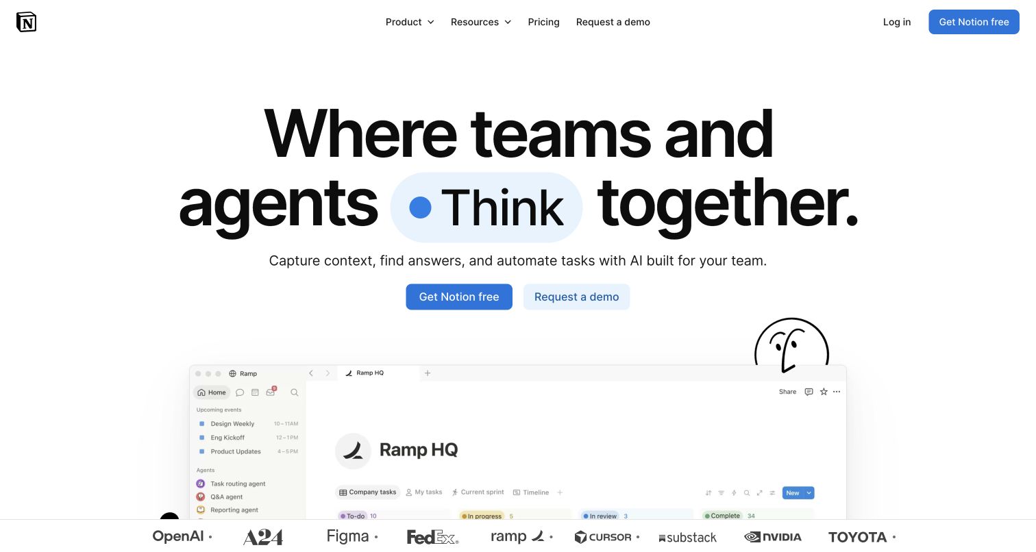
Notion uses oversized black typography and a blue highlighted word to make its human-and-agent proposition easy to notice. A hand-drawn character preserves the brand's informal tone, while the workspace preview below introduces a more concrete task environment. The blue free-start action has greater weight than the adjacent demo route. A strip of familiar customer logos adds recognition without turning the hero into a dense feature checklist. Anthropic documents Claude in Notion AI writing, search, and agent workflows; the capture illustrates the public marketing entrance.
What you can learn
Keep a broad collaboration promise close to a recognizable work artifact. A workspace preview can explain what the product organizes, while separate self-service and sales actions accommodate different buying journeys.
Pros
Large typography establishes a clear reading order across the otherwise sparse hero.
The workspace preview supplies useful context beyond the abstract agent-oriented headline.
Cons & considerations
Changing headline language can distract from reading the full product proposition.
Model access and agent permissions require deeper documentation beyond this opening view.
Public source checked November 3, 2026. References may be embedded or legacy—not a complete backend inventory.
Platform source: Primary feature source. Primary source revalidated 2026-11-04. Anthropic documents Claude powering customer-facing Notion AI writing, search and agent workflows. Notion also documents selectable Claude models in Custom Agents. Documentary customer-feature evidence only; no authenticated model call or marketing-frontend runtime was observed. Platform evidence is separate from the direct website screenshot and is not a complete current infrastructure audit.
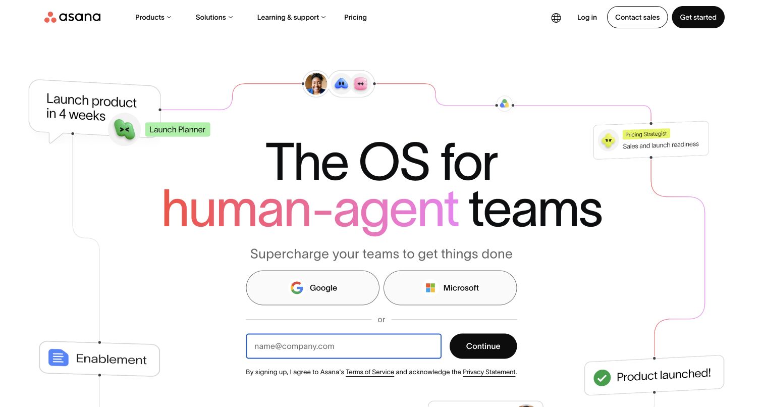
Asana surrounds its central introduction with connected task and agent cards. The diagram gives the human-and-agent message a process shape: a launch moves through named roles toward a completed outcome. Coral accents concentrate attention on the headline while the rest of the canvas stays white. Google, Microsoft, and email signup options sit directly beneath the explanation, making account creation a prominent part of the first encounter. Anthropic documents Claude in Asana AI and AI Studio customer workflows; the pictured landing page does not verify model execution.
What you can learn
Use a small workflow to explain how roles relate before listing individual capabilities. Keep the labels understandable at normal reading size, and provide a path for visitors who need evaluation material before registration.
Pros
Connected cards make the collaboration concept more tangible than a generic robot illustration.
Several clearly labeled signup routes accommodate different organizational account preferences.
Cons & considerations
Peripheral cards compete with the central reading path on the wide desktop canvas.
Registration occupies space that could otherwise explain implementation or governance requirements.
Public source checked November 3, 2026. References may be embedded or legacy—not a complete backend inventory.
Platform source: Primary feature source. Primary source revalidated 2026-11-04. Anthropic documents Claude in Asana AI and AI Studio customer workflow features, including smart workflows. This excludes Asana employee-only productivity. Documentary customer-feature evidence only; no authenticated model call or marketing-frontend runtime was observed. Platform evidence is separate from the direct website screenshot and is not a complete current infrastructure audit.
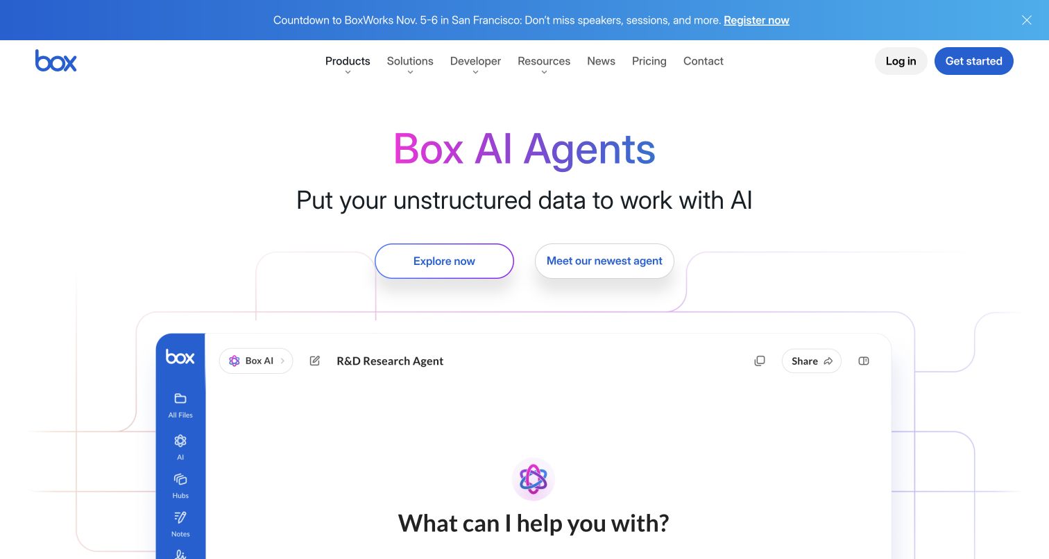
The Box Agents page names the feature immediately, then frames its purpose around unstructured data. A large research-agent mockup occupies the lower hero, retaining the recognizable Box sidebar while placing a question prompt in the main workspace. Blue and violet accents tie the title, buttons, and diagram lines together. The two calls to action offer general exploration and a newer agent announcement, with an event strip above the primary navigation. Anthropic documents Claude and Skills API document creation in Box Agent; this public product illustration is not an authenticated document session.
What you can learn
Show where a new agent fits inside the environment customers already know. Use a concrete workspace illustration, then distinguish exploratory navigation from a release announcement so visitors can choose the relevant level of detail.
Pros
The familiar sidebar makes the agent feel connected to an existing content workflow.
The feature-specific route avoids forcing visitors to decode the entire corporate portfolio.
Cons & considerations
The event strip and dual hero actions divide attention before the product explanation.
The opening mockup cannot establish permissions, document quality, or agent reliability.
Platform source: Primary feature source. Primary source revalidated 2026-11-04. Anthropic documents Box Agent document creation through its Skills API and Claude models. The reviewed public Agents page is a product entry page, not an authenticated file workspace. Documentary customer-feature evidence only; no authenticated model call or marketing-frontend runtime was observed. Platform evidence is separate from the direct website screenshot and is not a complete current infrastructure audit.
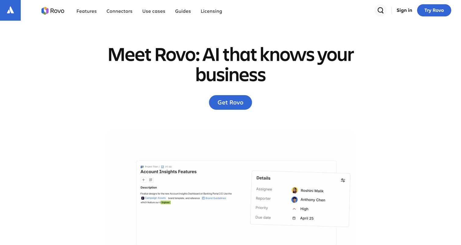
Rovo's page combines a compact product navigation with a very large centered statement about knowing a business. The single blue hero action is easy to locate against the white background. An account-insights work item begins below the generous whitespace, anchoring the message in a recognizable team task. Features, connectors, use cases, guides, and licensing are exposed at the top instead of being buried in a corporate menu. Anthropic identifies Claude as one Rovo Chat base model; other workloads can use other providers, and the screenshot does not establish routing.
What you can learn
Give a new AI product its own information architecture while retaining the parent brand. Put connectors and licensing beside feature discovery because those practical questions determine whether the promise applies to a visitor's organization.
Pros
The product navigation names useful evaluation tasks in clear, conventional language.
A single dominant hero action keeps the first decision visually straightforward.
Cons & considerations
Large whitespace delays the concrete example on shorter desktop viewports.
The broad business-knowledge claim needs the permission and configuration details found deeper in the site.
Public source checked November 3, 2026. References may be embedded or legacy—not a complete backend inventory.
Platform source: Primary feature source. Primary source revalidated 2026-11-04. Anthropic documents Claude as a base model in Rovo Chat and complex reasoning in customer agents. Other Rovo workloads use other providers; this is not exclusive use. Documentary customer-feature evidence only; no authenticated model call or marketing-frontend runtime was observed. Platform evidence is separate from the direct website screenshot and is not a complete current infrastructure audit.
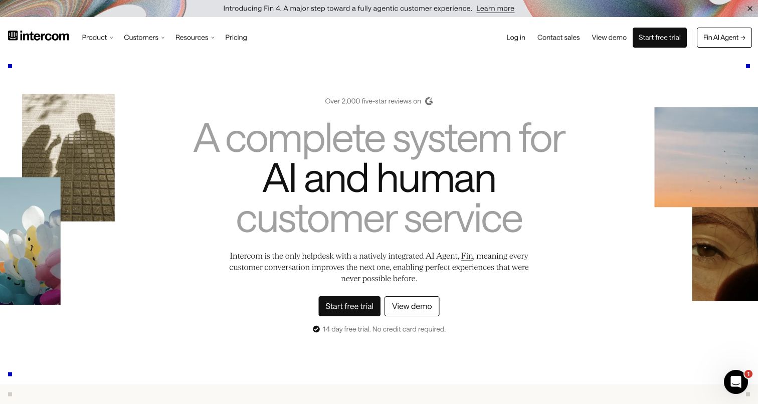
Intercom arranges a central service proposition inside a collage of people, landscape, and playful imagery. The large heading alternates dark and grey emphasis, while a narrow serif paragraph introduces Fin beneath it. A black trial button and outlined demo button provide distinct next steps. The short trial condition beneath those controls answers a practical question without expanding the hero into a pricing table or technical architecture diagram. Anthropic documents Claude in Fin support answers; the public Intercom page illustrates the product entrance rather than a tested support exchange.
What you can learn
Explain the relationship between the assistant and the human workflow before presenting automation claims. Place trial conditions beside the action, and let an evaluation route serve visitors who cannot immediately create an account.
Pros
Trial and demo options are visually distinct and easy to compare.
Human imagery supports the message that customer service includes people as well as automation.
Cons & considerations
The decorative collage occupies substantial space before visitors see the support interface.
Low-emphasis grey headline words may lose prominence on less capable screens.
Public source checked November 3, 2026. References may be embedded or legacy—not a complete backend inventory.
Platform source: Primary feature source. Primary source revalidated 2026-11-04. Anthropic documents Claude powering Fin customer-support answers. Intercom currently identifies Fin as its natively integrated AI agent and links to fin.ai. Documentary customer-feature evidence only; no authenticated model call or marketing-frontend runtime was observed. Platform evidence is separate from the direct website screenshot and is not a complete current infrastructure audit.
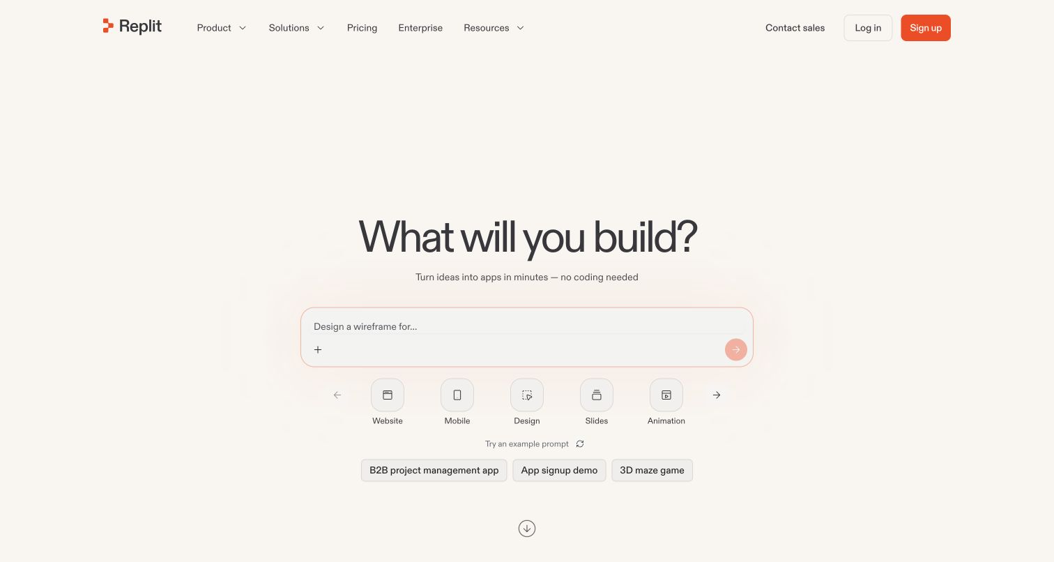
Replit centers a broad building question over a softly outlined prompt field. Artifact icons below it turn the offer into recognizable outputs such as websites, mobile apps, designs, and slides. Small example prompts provide another starting point without requiring an immediate commitment. The warm off-white background and restrained orange signup button keep the page approachable, while pricing and enterprise navigation remain available for visitors evaluating a larger deployment. Anthropic documents Claude in Replit Agent software creation; that association does not establish Claude use by every generated application.
What you can learn
Organize an AI builder around the artifact a person wants to make. Example prompts should be specific enough to suggest scope, while implementation choices can follow once the user has described a useful outcome.
Pros
Artifact categories translate a broad AI capability into concrete visitor goals.
Example prompts reduce the effort of inventing a first request from scratch.
Cons & considerations
Several output categories can obscure differences in deployment and maintenance responsibilities.
The opening view explains little about usage charges or the review of generated code.
Earlier cited evidence retained; no current scan result. References may be embedded or legacy—not a complete backend inventory.
Platform source: Primary feature source. Primary source revalidated 2026-11-04. Anthropic documents Claude in Replit Agent for customer software creation. The current public homepage offers Agent, apps and website building. Documentary customer-feature evidence only; no authenticated model call or marketing-frontend runtime was observed. Platform evidence is separate from the direct website screenshot and is not a complete current infrastructure audit.
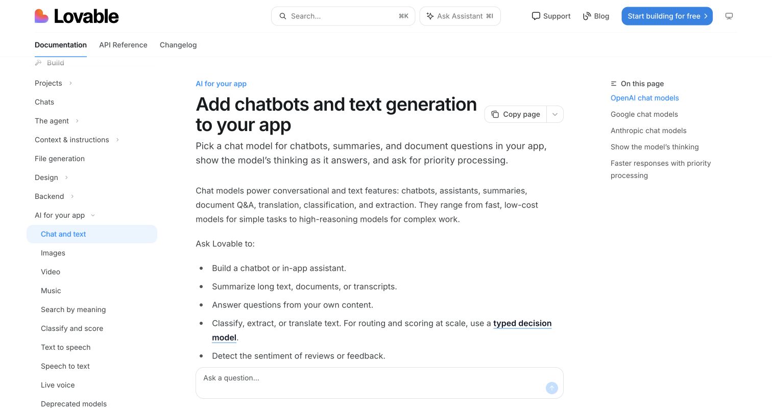
Lovable's public chat-and-text documentation uses three columns: a task hierarchy on the left, a readable article in the center, and an on-page index on the right. The heading describes the outcome directly, followed by examples such as chatbots, summaries, and document questions. Provider sections are visible in the index. Search and a build action remain available above the article without replacing the instructional content. The public documentation lists Claude chat integrations for newer Lovable apps, with project-stack limits; this article itself is not an AI runtime demonstration.
What you can learn
Treat documentation as part of product onboarding. Organize instructions around the feature being added, separate provider choices, and connect capability descriptions to the actual implementation flow rather than relying on a general AI slogan.
Pros
The visible provider index makes the long model reference easier to navigate.
Concrete task examples explain what a chat integration can contribute to an application.
Cons & considerations
Three navigation areas create a dense entrance for first-time, nontechnical readers.
This documentation view does not demonstrate the signed-in builder or a generated application.
Public source checked November 3, 2026. References may be embedded or legacy—not a complete backend inventory.
Platform source: Primary feature source. Primary source revalidated 2026-11-04. Lovable documents Anthropic Claude chat/text integrations for newer customer apps created from May 13, 2026 using TanStack Start. Older React and Vite apps use other chat models. The pictured public documentation explains this feature; its frontend is not claimed to invoke Claude. Documentary customer-feature evidence only; no authenticated model call or marketing-frontend runtime was observed. Platform evidence is separate from the direct website screenshot and is not a complete current infrastructure audit.
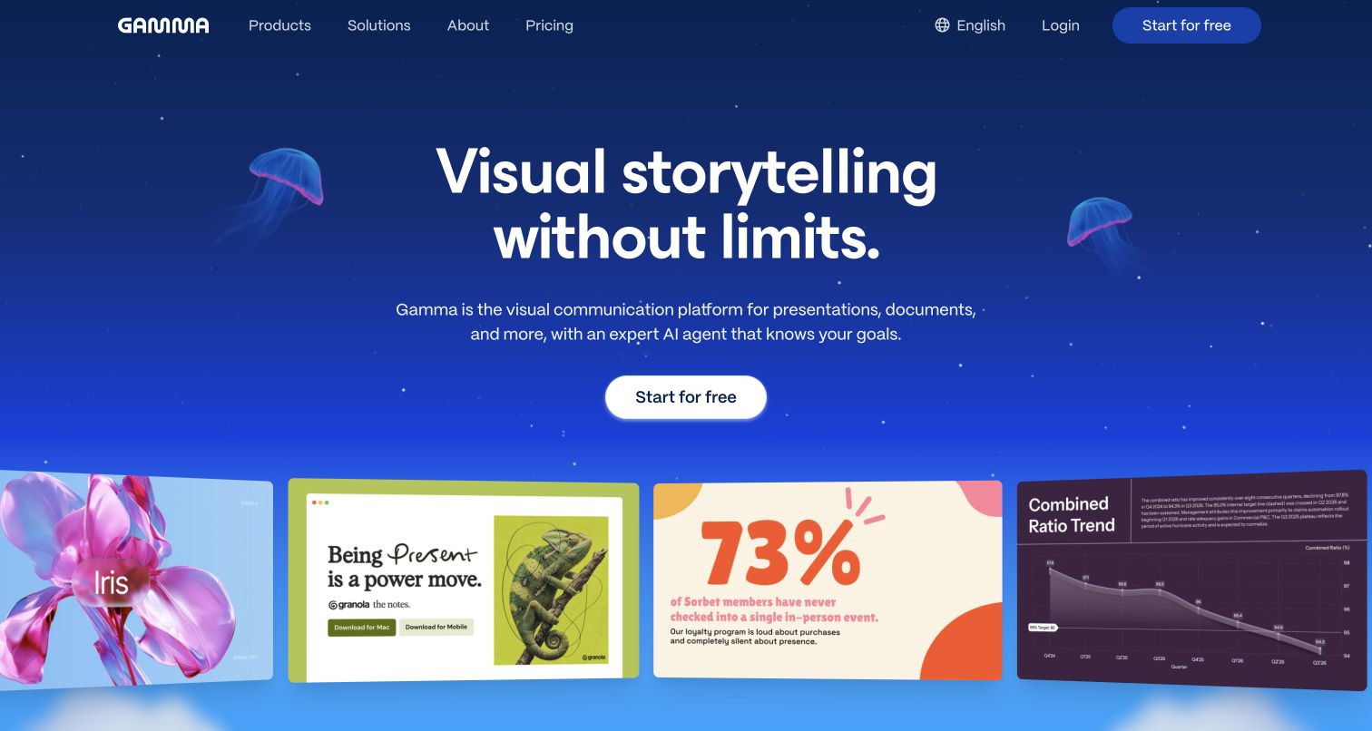
Gamma places a white storytelling headline over a saturated blue scene with small jellyfish illustrations. One bright free-start button sits above a row of varied slide examples: photography, expressive typography, a large statistic, and a chart. That gallery makes the creative range legible before the visitor reaches detailed feature explanations. Navigation stays brief, with product, solution, pricing, and account routes in the same horizontal band. Anthropic documents Claude in Gamma presentation creation and editing; exported presentations and websites are outside that documented product scope.
What you can learn
Let examples demonstrate visual variety while keeping the primary action consistent. A creative platform benefits from showing several credible output styles, but those samples should remain readable enough to communicate structure as well as decoration.
Pros
The sample row gives immediate evidence of different presentation styles and content types.
The single bright call to action remains clear against the colorful background.
Cons & considerations
Decorative background imagery competes with the examples for visual attention.
The hero does not explain export fidelity, editing limits, or model-specific access.
Earlier cited evidence retained; no current scan result. References may be embedded or legacy—not a complete backend inventory.
Platform source: Primary feature source. Primary source revalidated 2026-11-04. Anthropic documents Claude in Gamma presentation creation and editing features. Scope is the creation product, not the runtime of every exported presentation or generated website. Documentary customer-feature evidence only; no authenticated model call or marketing-frontend runtime was observed. Platform evidence is separate from the direct website screenshot and is not a complete current infrastructure audit.
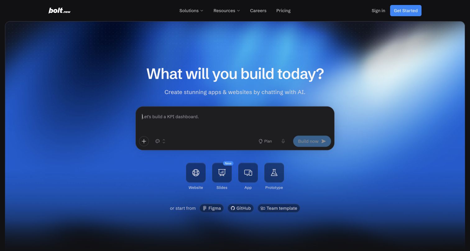
Bolt places a dark composer inside a large blue gradient panel. The building question and short description sit immediately above it, while Website, Slides, App, and Prototype categories appear below. Figma, GitHub, and team-template shortcuts make existing context part of the entrance. A compact Plan control inside the composer suggests a step between describing work and building it, without turning the hero into a full editor. Anthropic documents Claude in Bolt creation and its design-system agent; the composer screenshot does not establish which model handles a request.
What you can learn
Make starting from existing work as visible as starting from a blank prompt. Context shortcuts can explain the intended workflow, but the interface should also clarify what the planning step produces before an expensive build begins.
Pros
Context shortcuts acknowledge that product work often begins with existing assets.
The dark composer stands out clearly within the brighter surrounding hero.
Cons & considerations
Small composer controls require more interpretation than the larger artifact categories.
The landing view does not explain how generated changes are reviewed or deployed.
Public source checked November 3, 2026. References may be embedded or legacy—not a complete backend inventory.
Platform source: Primary feature source. Primary source revalidated 2026-11-04. Anthropic documents Claude in Bolt app creation and its design-system agent. The live public entry offers building apps, sites and prototypes. Documentary customer-feature evidence only; no authenticated model call or marketing-frontend runtime was observed. Platform evidence is separate from the direct website screenshot and is not a complete current infrastructure audit.
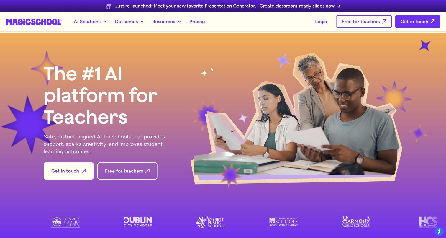
MagicSchool uses a warm-to-purple gradient, cutout classroom photography, and a large changing audience word to establish its education focus. Teacher signup and institutional contact actions appear together, matching the difference between individual exploration and district procurement. A school-logo strip extends the context below the hero. The announcement bar promotes a presentation tool, giving a specific feature a place alongside the broader platform message. Anthropic documents Claude in MagicSchool lesson-planning and student-feedback tools; these sources do not independently validate the learning claims in the hero.
What you can learn
A specialized AI product should look and speak like the audience's work. Separate individual adoption from organizational evaluation, and support a broad promise with examples that show where the tool enters an existing routine.
Pros
Classroom photography identifies the intended setting without requiring a long explanation.
Separate teacher and sales actions accommodate two visibly different evaluation journeys.
Cons & considerations
The changing headline adds motion to an already colorful, visually busy composition.
Broad safety and learning claims require evidence beyond the introductory marketing view.
Public source checked November 3, 2026. References may be embedded or legacy—not a complete backend inventory.
Platform source: Primary feature source. Primary source revalidated 2026-11-04. Anthropic documents Claude in educator/student tools including lesson planning and student feedback. The public site links to the customer web application. Documentary customer-feature evidence only; no authenticated model call or marketing-frontend runtime was observed. Platform evidence is separate from the direct website screenshot and is not a complete current infrastructure audit.
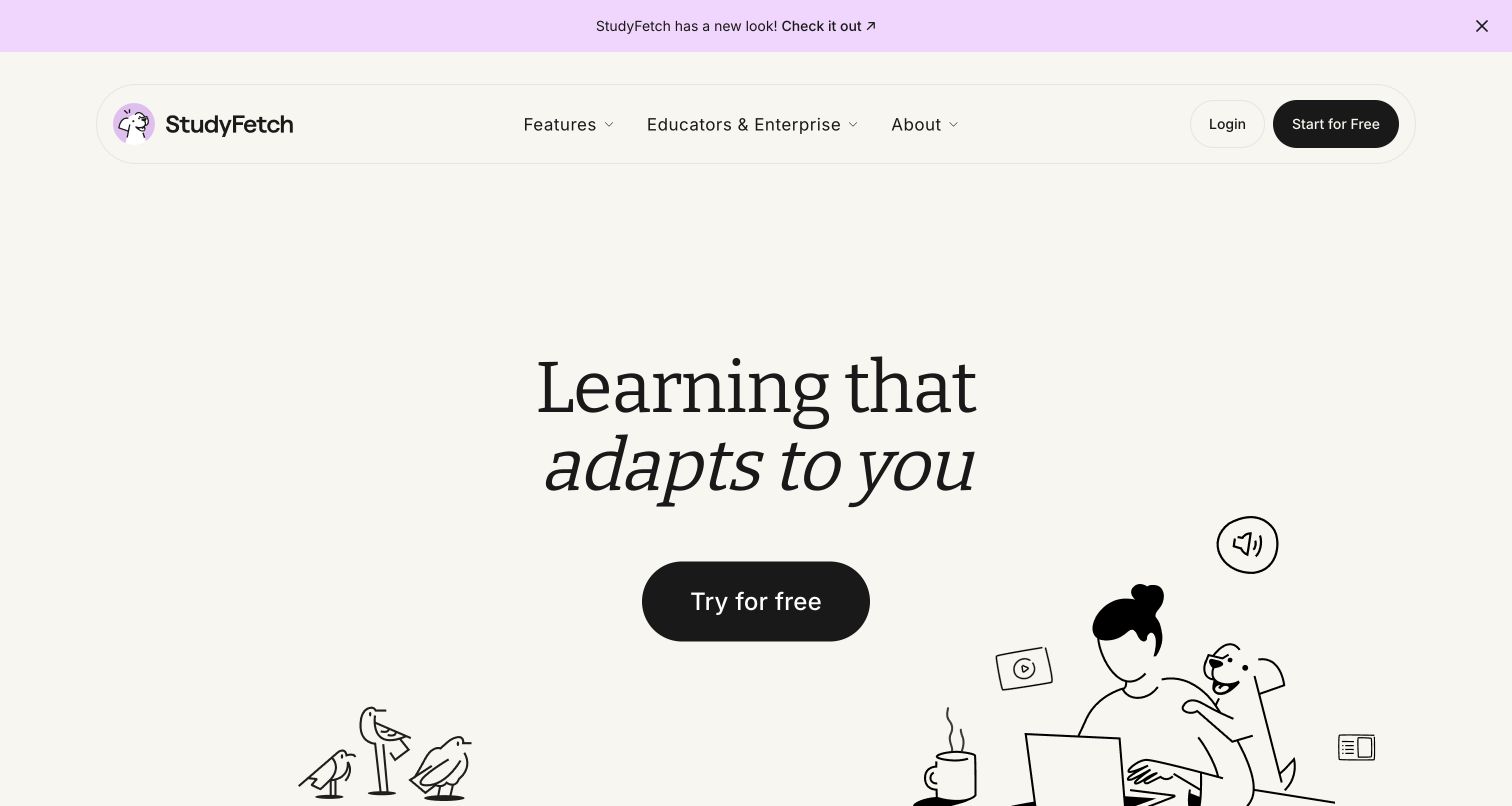
StudyFetch takes a restrained route with an off-white canvas, large serif typography, and a single black trial button. The italic second line adds personality without another color block. Hand-drawn study characters and small media icons enter from the lower edge, while the rounded navigation container keeps account access separate from the hero. The first screen emphasizes a personal learning experience rather than a dense list of AI tools. Anthropic documents Claude in the Spark.E tutor and study-material generation; this public entrance does not test tutoring quality or current model routing.
What you can learn
Use tone and spacing to establish the experience before presenting a complicated feature set. Follow an emotional learning promise with concrete examples of materials, activities, and feedback so the visitor can judge the fit.
Pros
A single high-contrast action gives the sparse opening a clear next step.
Illustration and typography create a distinctive identity without filling the canvas with dashboards.
Cons & considerations
The generous whitespace postpones practical information about supported study materials.
The first viewport alone cannot explain tutor limitations or educational effectiveness.
Platform source: Primary feature source. Primary source revalidated 2026-11-04. Anthropic documents Claude in the Spark.E tutor and customer study-material generation. The current public entry has learning and study tools. Documentary customer-feature evidence only; no authenticated model call or marketing-frontend runtime was observed. Platform evidence is separate from the direct website screenshot and is not a complete current infrastructure audit.
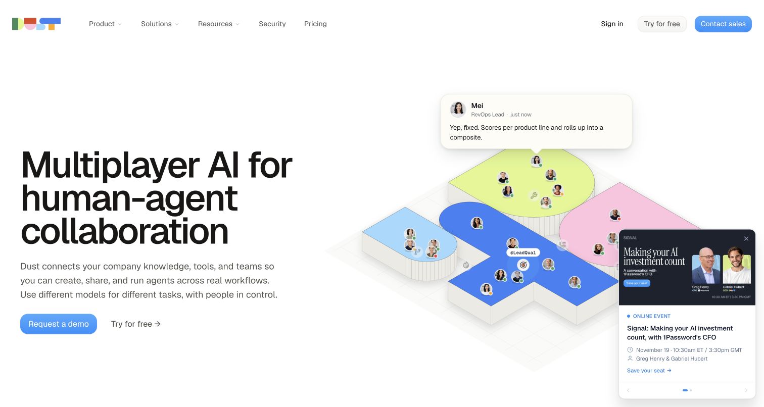
Dust places a large, left-aligned collaboration headline beside an isometric diagram of people and agents. Floating conversation cards make the illustration feel like a shared work environment rather than a solitary chatbot. A short paragraph names company knowledge, tools, and teams, followed by demo and free-start routes. The multicolor logo and pale diagram surfaces provide warmth while most of the page remains white and typographically direct. Anthropic documents Claude in Dust customer agents and deep research; the model-agnostic platform also offers other providers, rather than exclusive Claude use.
What you can learn
Show the relationships an agent participates in, not just its input box. A collaboration diagram should clarify who contributes context and who receives results, with practical security and pricing routes available alongside the product story.
Pros
The people-and-agent diagram reinforces the shared-workspace proposition at a glance.
Security and pricing are directly accessible in the primary navigation.
Cons & considerations
A floating event promotion overlaps the right-hand illustration in the observed opening.
Animated conversation snippets can become difficult to follow while reading the main introduction.
Platform source: Primary feature source. Primary source revalidated 2026-11-04. Anthropic documents a customer model dropdown and Claude-orchestrated deep research in the shared Dust agent platform. Separate employee Claude Code use is not counted. Documentary customer-feature evidence only; no authenticated model call or marketing-frontend runtime was observed. Platform evidence is separate from the direct website screenshot and is not a complete current infrastructure audit.
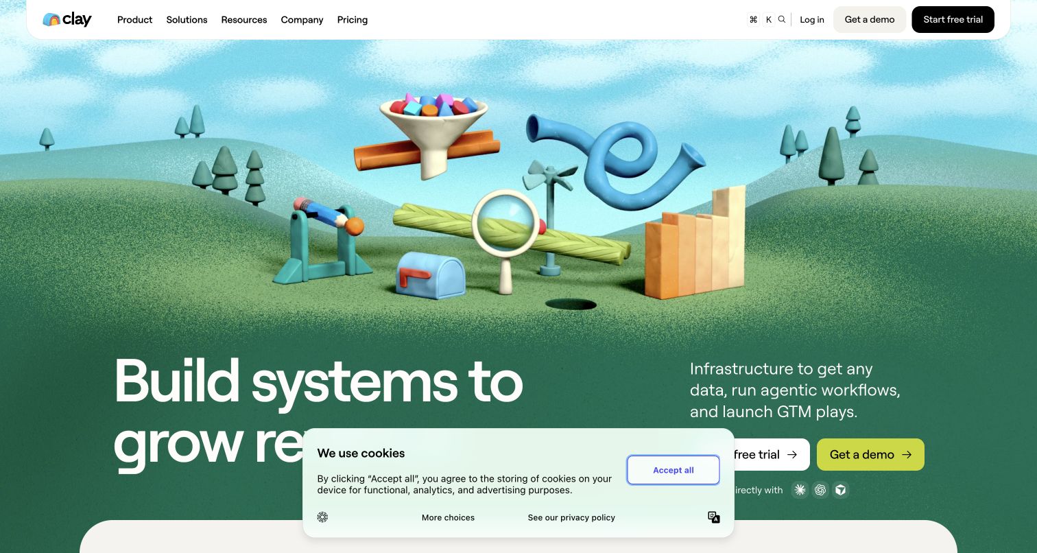
Clay's opening is dominated by a colorful three-dimensional contraption set against green hills. Tubes, a funnel, a magnifying glass, and a bar-chart form suggest transformation and growth without reproducing a spreadsheet interface. The large revenue headline sits below the illustration, opposite a short infrastructure description and trial/demo actions. A rounded white navigation bar remains readable over the scene. The observed cookie notice partially covers the lower headline area. Anthropic documents customer-selected Claude for enrichment and outreach in Clay; the illustration and marketing frontend do not demonstrate model calls.
What you can learn
A distinctive metaphor can make infrastructure memorable, but pair it with precise language about the work being done. Keep essential explanation and actions clear even when consent notices or promotional modules occupy part of the viewport.
Pros
The unusual visual metaphor differentiates the page from conventional software dashboard heroes.
Trial and demo routes address both exploratory and sales-led evaluation.
Cons & considerations
The large illustration delays the detailed workflow explanation until lower on the page.
The consent overlay obscures part of the headline in the captured first-screen experience.
Public source checked November 3, 2026. References may be embedded or legacy—not a complete backend inventory.
Platform source: Primary feature source. Primary source revalidated 2026-11-04. Anthropic documents customers selecting Claude in Clay for lead enrichment and generated outreach. Separate Clay employee uses are not counted. Documentary customer-feature evidence only; no authenticated model call or marketing-frontend runtime was observed. Platform evidence is separate from the direct website screenshot and is not a complete current infrastructure audit.
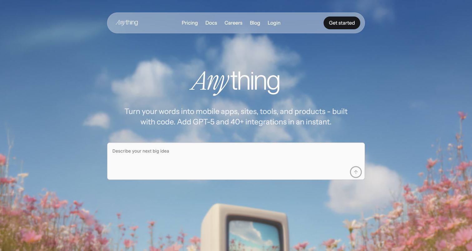
Anything puts a large white prompt field over a soft outdoor scene of sky, flowers, and an old monitor. The wordmark mixes italic and upright letterforms, echoing the informal tone of the invitation. A translucent pill-shaped navigation bar separates pricing, documentation, and login from the central creation task. The scene is distinctive, but the prompt remains the largest interactive-looking surface and the clearest place to begin. Anything documents Claude choices in its builder model switcher; that customer feature does not imply every published app uses Claude.
What you can learn
Atmosphere can make a builder approachable when the input area remains unmistakable. Add enough orientation around that open prompt for visitors to understand supported outputs, likely constraints, and where to find implementation guidance before starting.
Pros
The prominent white input separates the starting task from the busy scenic background.
Documentation and pricing are available without opening a complex navigation menu.
Cons & considerations
White introductory text over a pale sky needs careful contrast evaluation.
The opening offers few concrete examples to help visitors scope a first build.
Public source checked November 3, 2026. References may be embedded or legacy—not a complete backend inventory.
Platform source: Primary feature source. Primary source revalidated 2026-11-04. The official Agent documentation explicitly offers Claude-series models in the customer builder model switcher. Anthropic also lists Anything in Powered by Claude. Documentary customer-feature evidence only; no authenticated model call or marketing-frontend runtime was observed. Platform evidence is separate from the direct website screenshot and is not a complete current infrastructure audit.
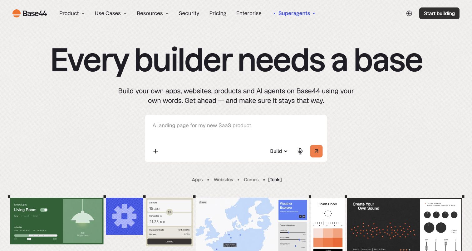
Base44 uses an exceptionally large black headline, a compact explanatory paragraph, and a white composer against a lightly textured background. An orange send control repeats the logo accent, giving the central input an obvious endpoint. Apps, Websites, Games, and Tools labels sit above a colorful output strip. Those examples provide useful variety, while the top navigation exposes security, pricing, enterprise, and a separate Superagents destination. Base44 documents selectable Claude models for customer building, subject to account and rollout limits; generated websites require their own separate evidence.
What you can learn
Use output examples to ground a broad creation promise, but keep the first prompt central. When several product categories share one entrance, explain their different operational requirements in the next step rather than implying every outcome is equivalent.
Pros
The output strip makes the range of possible artifacts visually concrete.
Security and enterprise navigation help organizational visitors find practical evaluation material.
Cons & considerations
The very large headline uses substantial vertical space before the examples appear.
The opening composer does not explain credits, model availability, or ongoing app ownership.
Public source checked November 3, 2026. References may be embedded or legacy—not a complete backend inventory.
Platform source: Primary feature source. Primary source revalidated 2026-11-04. Official AI-chat instructions offer Claude models and describe selecting a model below the homepage prompt box. Some models roll out gradually; availability is account-dependent. Documentary customer-feature evidence only; no authenticated model call or marketing-frontend runtime was observed. Platform evidence is separate from the direct website screenshot and is not a complete current infrastructure audit.
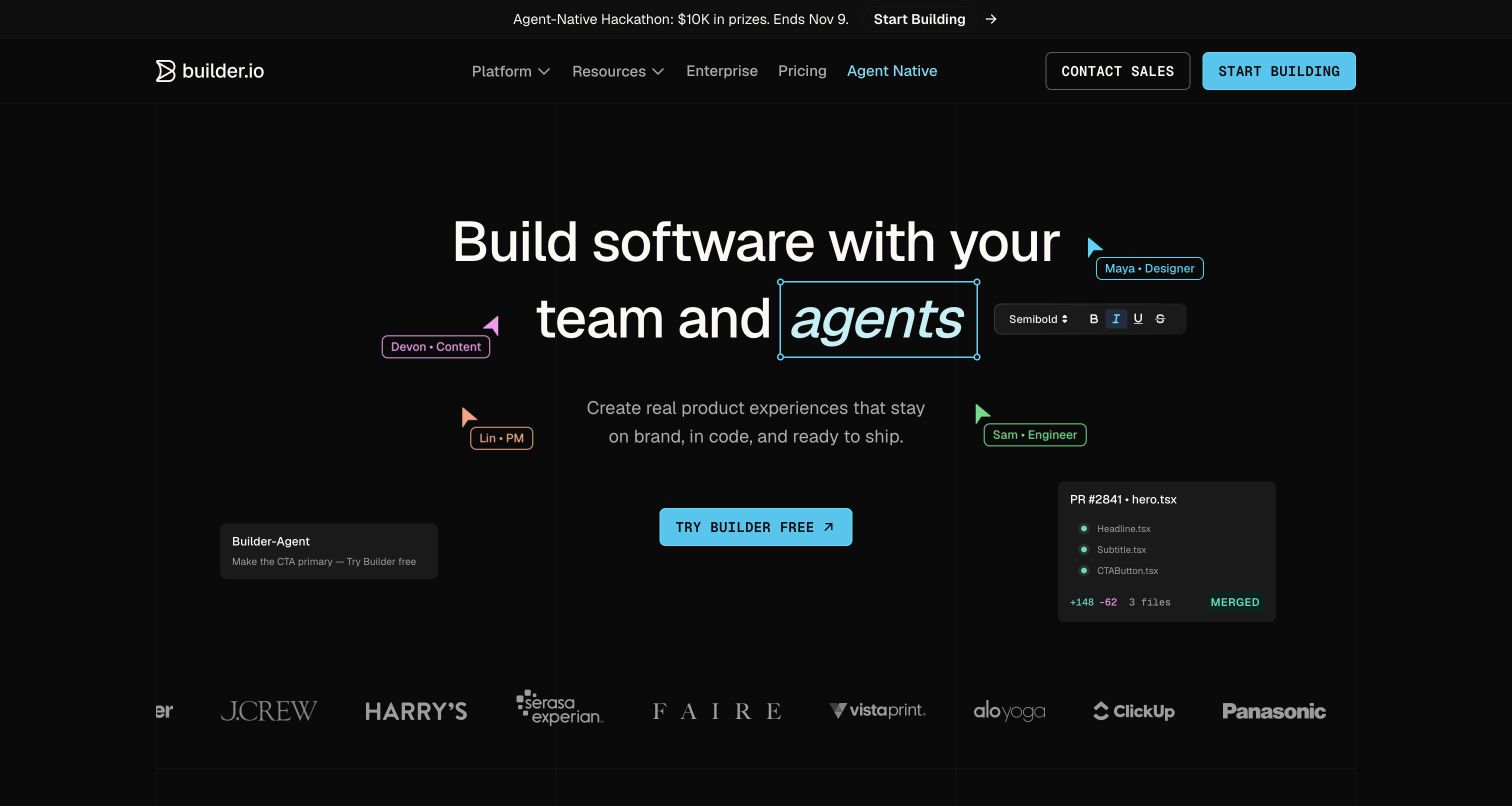
Builder turns the headline itself into a collaborative editing demonstration. Colored cursor labels, a formatting toolbar, an agent instruction card, and a pull-request preview surround the central message. Cyan actions stand out against the black grid background. The composition communicates that the product connects visual decisions with code changes, while a familiar customer-logo strip supplies recognition below. The demonstration is illustrative; no real project was edited during this review. Builder documents Claude among customer development-model choices; its illustrated workflow does not verify a model call or a real merged change.
What you can learn
Make the marketing demonstration mirror the collaboration model. Named roles and recognizable artifacts can explain a cross-functional workflow more clearly than an abstract automation diagram, provided they do not compete with the primary action.
Pros
Designer and engineer cues make the intended collaboration understandable without a long feature list.
Cyan buttons retain strong visual priority within the dark composition.
Cons & considerations
Multiple cursor labels and floating cards can distract from the main reading sequence.
The illustrative merge status does not establish how a customer's review process behaves.
Public source checked November 3, 2026. References may be embedded or legacy—not a complete backend inventory.
Platform source: Primary feature source. Primary source revalidated 2026-11-04. Builder documents Claude among models offered for customer tasks; Anthropic separately describes its generated and edited UI components. Scope is the development product. Documentary customer-feature evidence only; no authenticated model call or marketing-frontend runtime was observed. Platform evidence is separate from the direct website screenshot and is not a complete current infrastructure audit.
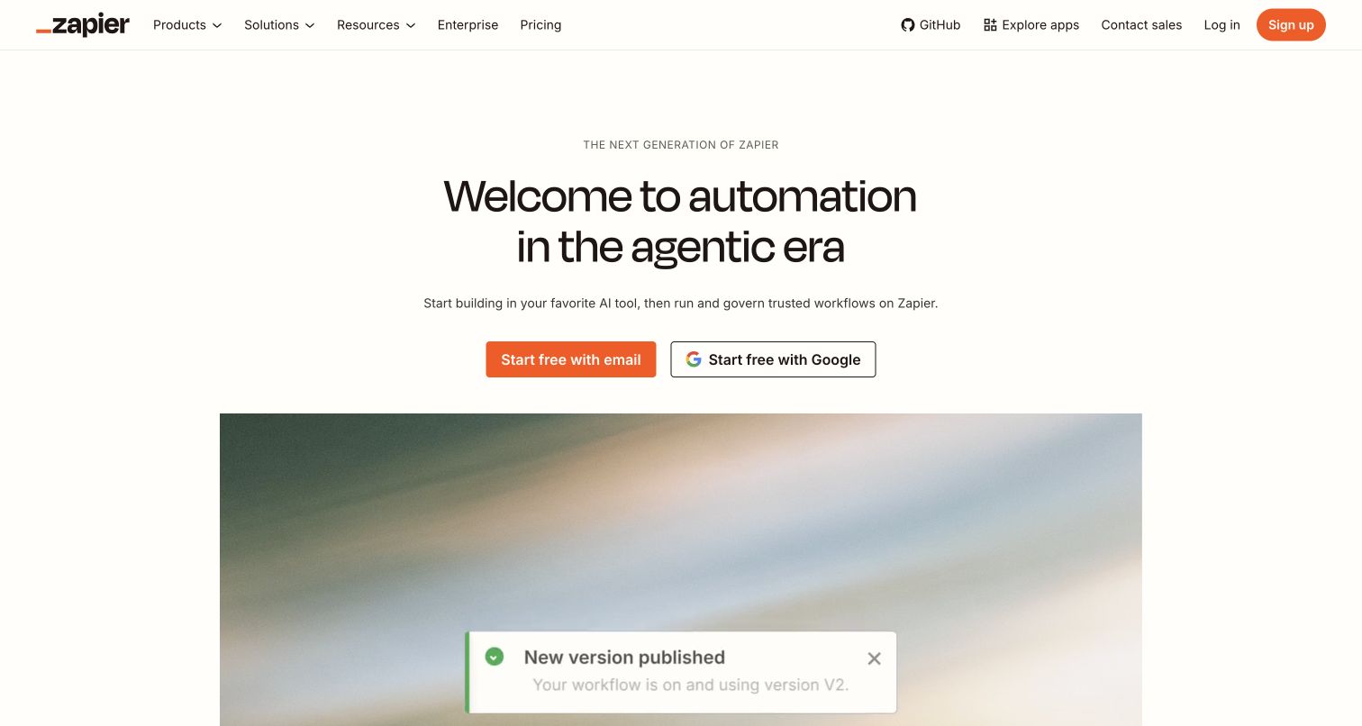
Zapier keeps its introduction simple: a small product-generation label, a centered two-line headline, and a short description of building, running, and governing workflows. Orange email signup and outlined Google signup options are easy to distinguish. A large animated walkthrough begins beneath them, connecting the abstract agentic-era language to a concrete automation interface. The upper navigation retains familiar products, solutions, apps, enterprise, and pricing routes. Zapier documents Claude in built-in AI by Zapier workflow steps; this is distinct from a Claude client calling Zapier through MCP.
What you can learn
A new platform story works best when it leads quickly to a recognizable workflow. Keep creation, operation, and governance distinct in the copy, then use the demonstration to show how those responsibilities connect in practice.
Pros
The restrained hero makes the two account-entry options easy to find.
The large workflow demonstration provides a concrete follow-up to the broad headline.
Cons & considerations
Agentic-era terminology may be unclear to visitors seeking a straightforward automation task.
An animated walkthrough needs a readable static alternative for slower or motion-sensitive browsing.
Public source checked November 3, 2026. References may be embedded or legacy—not a complete backend inventory.
Platform source: Primary feature source. Primary source revalidated 2026-11-04. Current Zapier documentation names Claude as the default for Advanced and Premium AI by Zapier steps and lists available Claude models. This is an embedded customer workflow feature, not merely Zapier MCP inside Claude. Documentary customer-feature evidence only; no authenticated model call or marketing-frontend runtime was observed. Platform evidence is separate from the direct website screenshot and is not a complete current infrastructure audit.
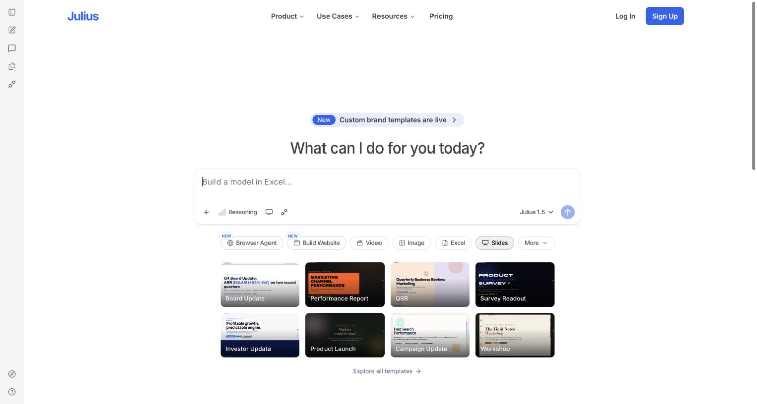
Julius resembles a workspace before the visitor signs in. A slim icon rail, central composer, model selector, and artifact tabs frame a gallery of example slide decks. Board updates, performance reports, surveys, and workshops give the broad assistant question concrete business context. Blue is reserved mainly for branding and signup, leaving the prompt and sample deliverables to carry the explanation. The observed page contains no personal files or completed user tasks. Julius announced Claude access for paid users and teams on June 9, 2026; the public default label is not proof of current routing.
What you can learn
An application-like entrance can reduce the distance between explanation and use. Pair unfamiliar controls with recognizable deliverables, and distinguish a public preview from authenticated functionality so visitors understand what they can evaluate before signing up.
Pros
Named deliverable examples give a broad assistant prompt practical business meaning.
The workspace preview exposes categories without requiring a visitor to submit information.
Cons & considerations
Small icon-only sidebar controls are less self-explanatory than the labeled artifact tabs.
The visible default model label does not explain the full model-selection policy.
Platform source: Primary feature source. Primary source revalidated 2026-11-04. Julius announced Claude Fable 5 availability for paid users and teams on June 9, 2026. This is a dated customer-product association, not a claim about the current default model, exact version, or homepage runtime. Documentary customer-feature evidence only; no authenticated model call or marketing-frontend runtime was observed. Platform evidence is separate from the direct website screenshot and is not a complete current infrastructure audit.
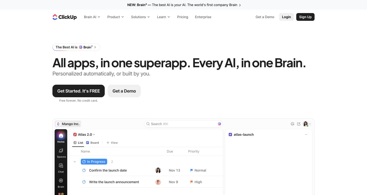
ClickUp leads with a broad superapp-and-Brain statement, followed by a short personalization line and separate free-start and demo buttons. The workspace mockup below combines a task list, sidebar, and adjacent chat area, showing how the product organizes everyday team activity. A small Brain announcement appears above the main navigation. The mostly white composition lets the colorful logo and interface details supply identity without a large decorative background. ClickUp documents Claude selection in Brain and Super Agents; the landing mockup does not show a live model response or establish account eligibility.
What you can learn
Show the everyday work surface that makes an AI claim meaningful. A familiar task list can ground a broad platform promise, but visitors also need a clear explanation of which AI capabilities require particular plans or permissions.
Pros
The task-and-chat mockup makes the unified workspace proposition easier to understand.
Free-start and demo paths are visible together with a brief signup condition.
Cons & considerations
The sweeping all-apps language needs more precise feature boundaries deeper in the journey.
The opening mockup is too dense to explain every control at normal preview size.
Platform source: Primary feature source. Primary source revalidated 2026-11-04. ClickUp explicitly documents Claude models in Brain and Super Agents and customer model switching. This is customer workspace functionality, not internal employee use. Documentary customer-feature evidence only; no authenticated model call or marketing-frontend runtime was observed. Platform evidence is separate from the direct website screenshot and is not a complete current infrastructure audit.
Choose an embedded feature, a configurable assistant, or a task agent
Embed one narrow assistance step
Begin with a bounded task such as summarizing a selected record or proposing a support reply. Preserve the original information, show the generated result beside it, and let the user revise or discard it. Define what happens when the input is missing, contradictory, or outside the feature's intended scope.
Offer model choice when the workflow warrants it
A model selector needs more than provider names. Explain the practical difference for the task and record which choice produced a result. Dust's documentation illustrates how explicit choices and maintained auto-model lists differ, including availability constraints; do not assume another product uses the same selection rules.
List the tools an agent may call, the permission checked by each, and which changes need review. Keep action receipts and a way to inspect unfinished work. A useful agent experience must reconcile partial completion before retrying a task that can modify external systems.
Collect representative tasks with permission to use their data. Include ambiguous requests, empty documents, outdated material, long inputs, and requests the product should decline. Define acceptable output before comparing prompts or models. Review factual accuracy, usefulness, editing effort, and whether the requested operation actually completed.
Design waiting and failure states
Give long tasks a meaningful progress state and preserve the user's input when something fails. Claude's API documents typed errors and request identifiers that can support diagnosis. Keep internal identifiers in support records while giving the user a clear explanation and a safe next step.
Name who maintains instructions, model configuration, tools, evaluation examples, and user-facing help. Record data destinations and retention decisions with the responsible team. Recheck the workflow when a provider or product changes model availability rather than assuming the launch configuration remains valid indefinitely.
A useful handover demonstration
Ask the actual team to carry out its routine job: publish a realistic update, correct a mistake, preview a narrow screen, and identify who owns an integration failure. For a library or frontend framework, also ask who maintains the content source and deployment. A polished screenshot does not answer those operational questions.
Beyond the screenshot
Before releasing a Claude-assisted workflow
Describe the exact task, input, expected result, and review responsibility.
Keep credentials and authorization checks in the appropriate server-side systems.
Test ordinary, ambiguous, unsupported, and permission-limited requests.
Distinguish a draft, an approved action, and a completed external operation.
Preserve input and explain partial completion when requests fail.
Measure actual latency, usage, and editing effort with representative tasks.
Check keyboard access, readable progress messages, and narrow-screen layouts.
Document model changes, evaluation ownership, rollback, and support escalation.
Test with real content, a keyboard, a small screen, slow or failed requests, and the people who will maintain the system. These are planning checks, not an accessibility, security, performance, or search-ranking certification.
Sources & editorial method
How this Claude collection was reviewed
Public pages were directly captured and visually reviewed on November 4, 2026 for the November 3 evening editorial batch. Primary sources were revalidated on November 4. Documentary evidence identifies the named Claude customer feature, including dated announcements and access limits. It does not prove a marketing page calls Claude, identify every backend component, measure model quality, or establish an authenticated runtime. Broad public-page stack observations are separate from this collection-specific evidence.
Every image is an unmodified capture from the actual website, with its source and capture date. Some captures are reused from our shared catalog; their dates remain the original capture dates. None comes from a vendor gallery or a generated reconstruction. Moving imagery and live content can change.
Technology attribution uses public page assets or metadata, official platform documentation, or a cited first-party project case study. Documentary and framework-relationship evidence is identified where used; it is not a complete current backend inventory. A CMS image CDN alone does not establish a full CMS deployment. A library’s presence does not prove which individual controls use it, and a platform label does not establish AI authorship.
The composition notes, lessons, pros and tradeoffs are original editorial observations. We have not measured conversion, traffic, security, performance or accessibility conformance. Website owners retain their brands and imagery; these examples are not our client portfolio. Written, Edited and Curated are independent records, not dates advanced by a build. See our editorial standards or suggest a correction.
Questions worth asking
Claude website development FAQs
Does a screenshot prove that a website uses Claude?
No. It establishes the observed public page design. The separate primary source identifies a specific customer feature. A model selector or provider case study is documentary evidence, and its scope should remain visible beside the example.
Does a site created with Claude keep using Claude after publication?
Not necessarily. Generating code and operating an AI feature are different activities. A published site's continuing provider relationship needs its own evidence; the builder's model choice is insufficient.
Should users choose a model themselves?
Only when the choice helps them make a meaningful decision. A narrow feature may work better with a maintained configuration, while a specialist workspace may benefit from explicit selection. In either case, record and communicate the applicable limits.
Are these products exclusively powered by Claude?
No exclusive relationship is implied. Several sources explicitly describe multiple providers or optional selection. The collection preserves the documented feature and does not extrapolate to every request, product, or corporate system.