Best Office Furniture Store Websites of 2026 (13 Real-World Examples)
Make it easier to plan a workspace, not simply admire another desk.
Office furniture store website design should help an individual choose one chair and a project team coordinate an entire floor without making either journey harder. The useful patterns combine recognisable work settings, comparable product information and clear distinctions between shopping, planning and business support.
Office furniture is a purchase with constraints. A desk must suit the available space, a storage unit must allow its doors to open and a multi-item order may depend on delivery access or installation timing. A room photograph starts the conversation, but it does not answer those questions. A strong store website connects the appealing setting to information that makes the next decision more manageable.
This collection includes specialist office retailers and official branded stores or workplace-furniture businesses with genuine desk, seating, storage or office-planning offers. A few sell a wider home range. Their inclusion is deliberate: a useful comparison can show how an office category remains discoverable when the homepage is discussing a sofa or a seasonal event. It does not make every pictured product suitable for business use.
We are evaluating public website communication rather than chair comfort, ergonomic suitability, occupational-health outcomes or furniture durability. Product claims remain the seller’s claims. Captures document actual observed frames, some retained from earlier original research with their original dates. Neither a polished interface nor a familiar brand replaces careful review of a particular product, space and purchasing arrangement.
Before the examples
What makes good office furniture store website design in 2026?
Separate a single-item purchase from an office project
A person replacing a home-office chair may need a price, adjustment information and return details. A facilities team may need quantities, matching finishes, floor-plan support and phased delivery. Name those journeys explicitly. Branch’s visible Home Office / Business switch and UPLIFT’s business planning route offer relevant patterns, without proving how either service performs after an enquiry. Share accurate product records underneath the different paths rather than maintaining contradictory consumer and trade catalogues.
Make a shortlist possible without specialist vocabulary
Organise products around what people are trying to furnish, then provide more detailed filters and specifications. Explain dimensions, adjustments and included components in plain language. A chair name or a photo of a control lever is not a complete explanation. Keep comparison fields consistent, distinguish optional upgrades from the pictured base configuration and avoid implying that one height-adjustable product will suit every person or task.
Connect the attractive room to practical buying information
Identify the main pieces in a styled workspace and show how to reach their records. Explain which accessories are included, which are separate and which are only photographic props. When a customer moves from a campaign to a product, retain useful context instead of dropping them into an unfiltered catalogue. Show important delivery, assembly and project-support information before the final transaction rather than treating it as an afterthought.
The collection · 13 examples
13 office furniture store websites worth studying
The13 examples below contrast dedicated desk sellers, workplace brands and broader furniture stores. Study how each gives office visitors an entry point, how its actual first screen frames the offer and what practical information should follow. These are editorial design observations, not tested purchasing recommendations or an ergonomic ranking.
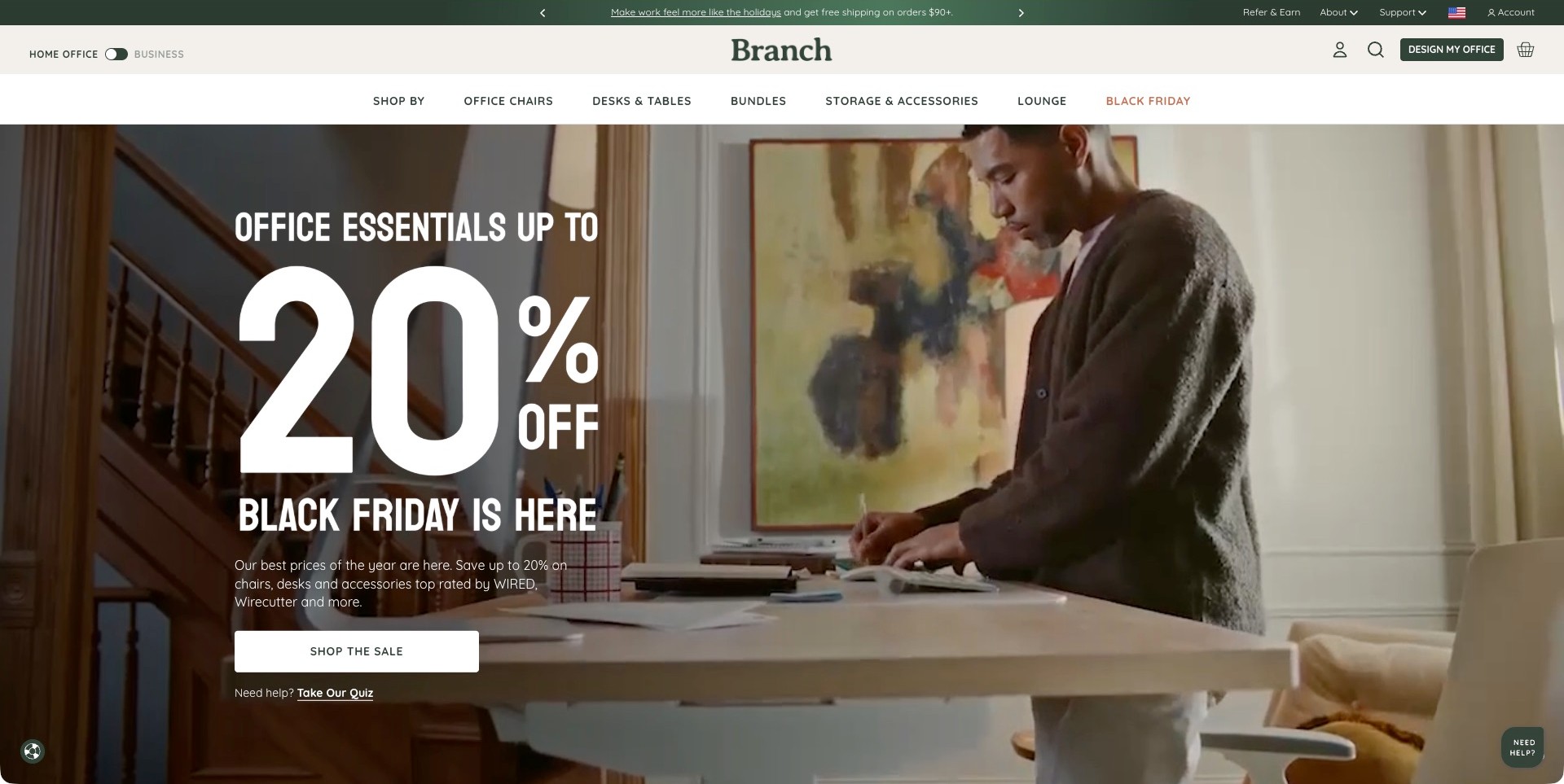
Branch’s observed campaign frame shows a person standing at a desk behind a large seasonal percentage offer. Green and cream header layers separate the HomeOffice/Business switch, product categories and a DesignMyOffice action. A quiz route sits beneath the primary shopping button. For an office-furniture store, the useful pattern is that a commercial campaign coexists with several clearly different tasks rather than requiring every buyer to follow the same sale link.
What you can learn
Keep the customer’s job visible through promotional changes. A single chair purchase, a product-selection question and an office project need different kinds of help. Name those routes explicitly and connect each to the relevant information instead of expecting a percentage discount to explain the whole offer.
Pros
The home-office and business distinction is visible before a visitor enters a product or enquiry flow.
Product categories, shopping, quiz and design-assistance actions have different labels rather than an indistinguishable set of buttons.
Cons & considerations
A large seasonal promotion can dominate the opening, so product specifications need a stable route beyond the campaign.
A photograph of standing desk use does not establish ergonomic suitability, adjustment range or what accessories are included.
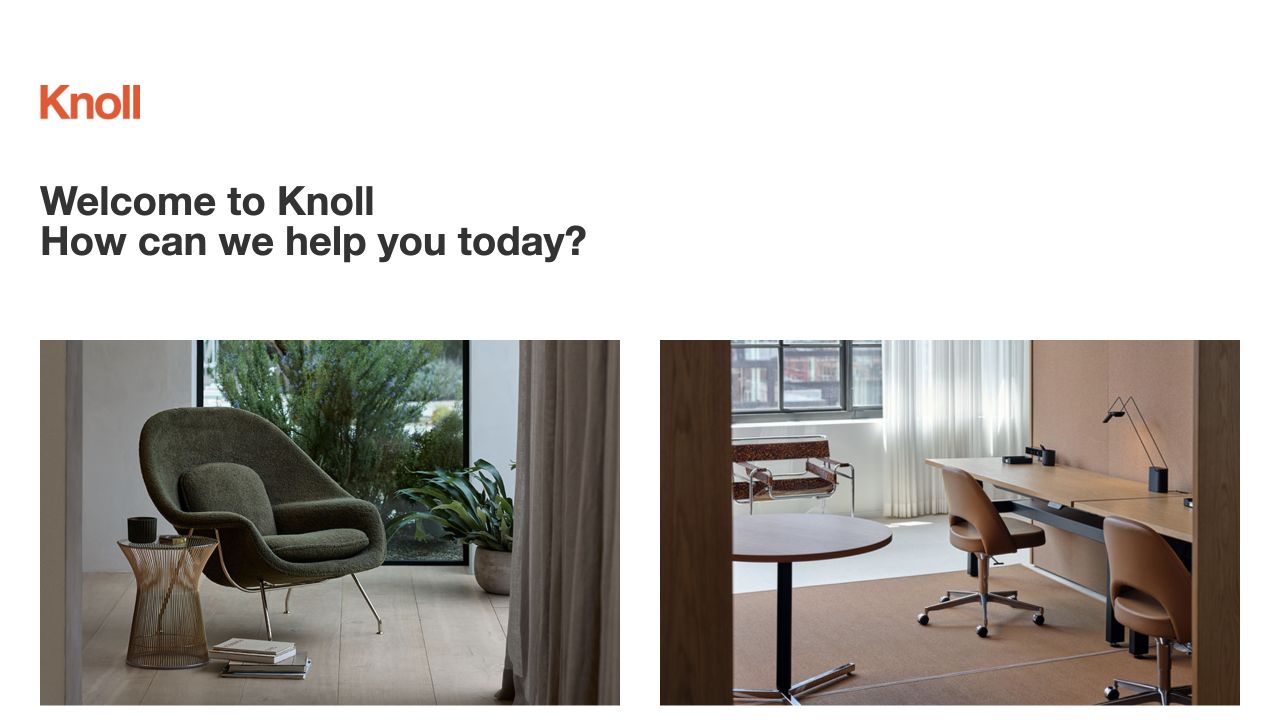
The office side of Knoll’s original paired opening shows a desk and work seating, while the neighbouring image presents a lounge chair in another room. That relationship matters for an office-furniture store: it acknowledges that work products live within a larger interior rather than presenting every chair as an isolated technical object. The orange identity and restrained white header keep the two photographs readable as separate invitations.
What you can learn
Use a workplace image to establish the intended setting, then give the buyer a direct path to the relevant chair, desk and storage categories. A room can inspire a purchase, but workstation dimensions and product adjustments should not depend on interpreting the photograph.
Pros
The desk-and-seating image gives office shoppers a relevant starting point without excluding broader interior projects.
Two distinct settings make a broad catalogue understandable before a visitor commits to a specific product category.
Cons & considerations
If home-office and contract buyers require different ordering support, separate those next steps rather than relying on one room photograph.
A styled workstation does not explain chair fit or desk clearances, so practical comparison information still needs to follow.
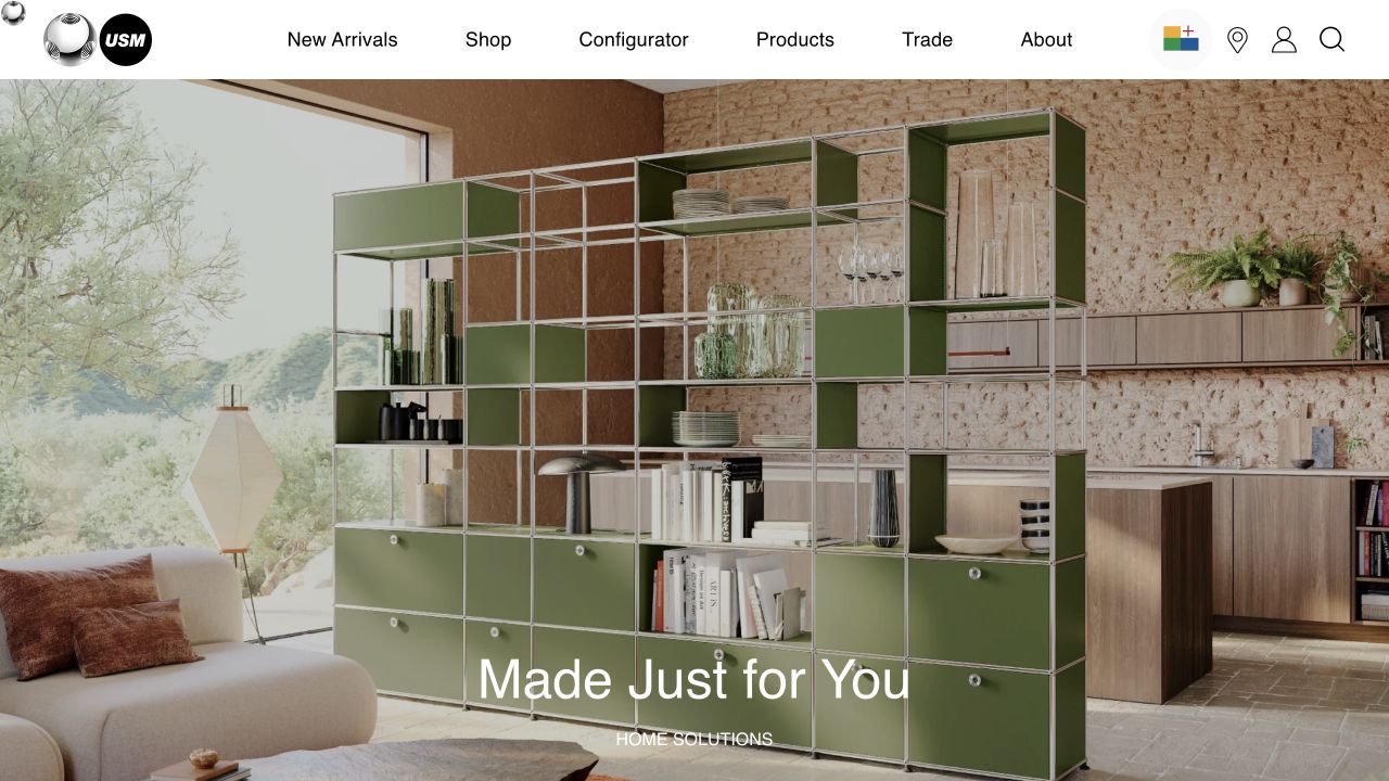
USM’s retained image centres green shelving in a home interior rather than a conventional corporate office. Its header nevertheless distinguishes products, configuration and trade information, and the current public catalogue separates home and office solutions. For an office-furniture retailer, that combination offers a useful way to show a system’s visual flexibility without filling the first screen with every possible workstation. The screenshot illustrates an arrangement, not a tested planning tool.
What you can learn
Let an attractive assembled setting draw people in, but provide task-specific office routes for storage, reception and collaborative use. Configuration choices should connect to meaningful dimensions and project support rather than asking the customer to translate a domestic photograph into a complete office layout.
Pros
A recognisable modular system gives the range coherence across different room types and customer intentions.
Configuration and trade destinations make alternative purchasing and planning tasks visible within a compact header.
Cons & considerations
A domestic room can under-explain the needs of someone planning multiple desks or shared office storage.
If customers design their own arrangement, clearly explain where compatibility, delivery and installation details are confirmed before ordering.
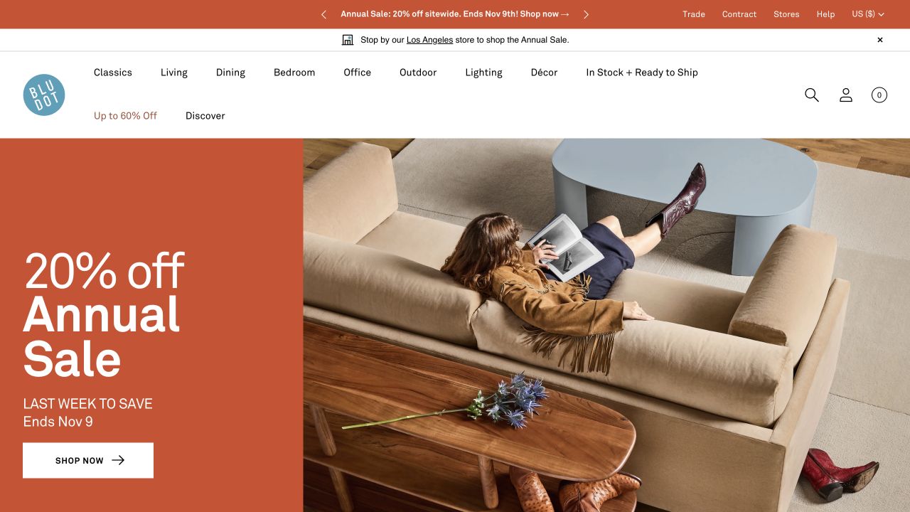
Blu Dot’s original opening is a sale campaign and overhead sofa scene, not a workstation photograph. The office category in its clear room navigation therefore does important work for someone arriving to buy a desk or task chair. The orange campaign block gives the page an unmistakable commercial hierarchy, while the furniture scene retains the brand’s wider design context. It is a useful case for keeping specialised buying journeys visible inside a broad catalogue.
What you can learn
Do not assume a general homepage campaign will explain an office range. Preserve a direct office route and organise the destination around actual tasks such as desks, seating and storage. A home-oriented aesthetic can support the offer without becoming the customer’s only navigation clue.
Pros
Explicit room categories make office products discoverable even when the featured campaign shows a different setting.
The promotion and furniture composition are integrated page content rather than a stack of competing modal offers.
Cons & considerations
An office buyer may need more specific product filters than a broad room category can provide by itself.
If promotional pricing is featured, make configuration and delivery details clear before a customer compares a workstation budget.
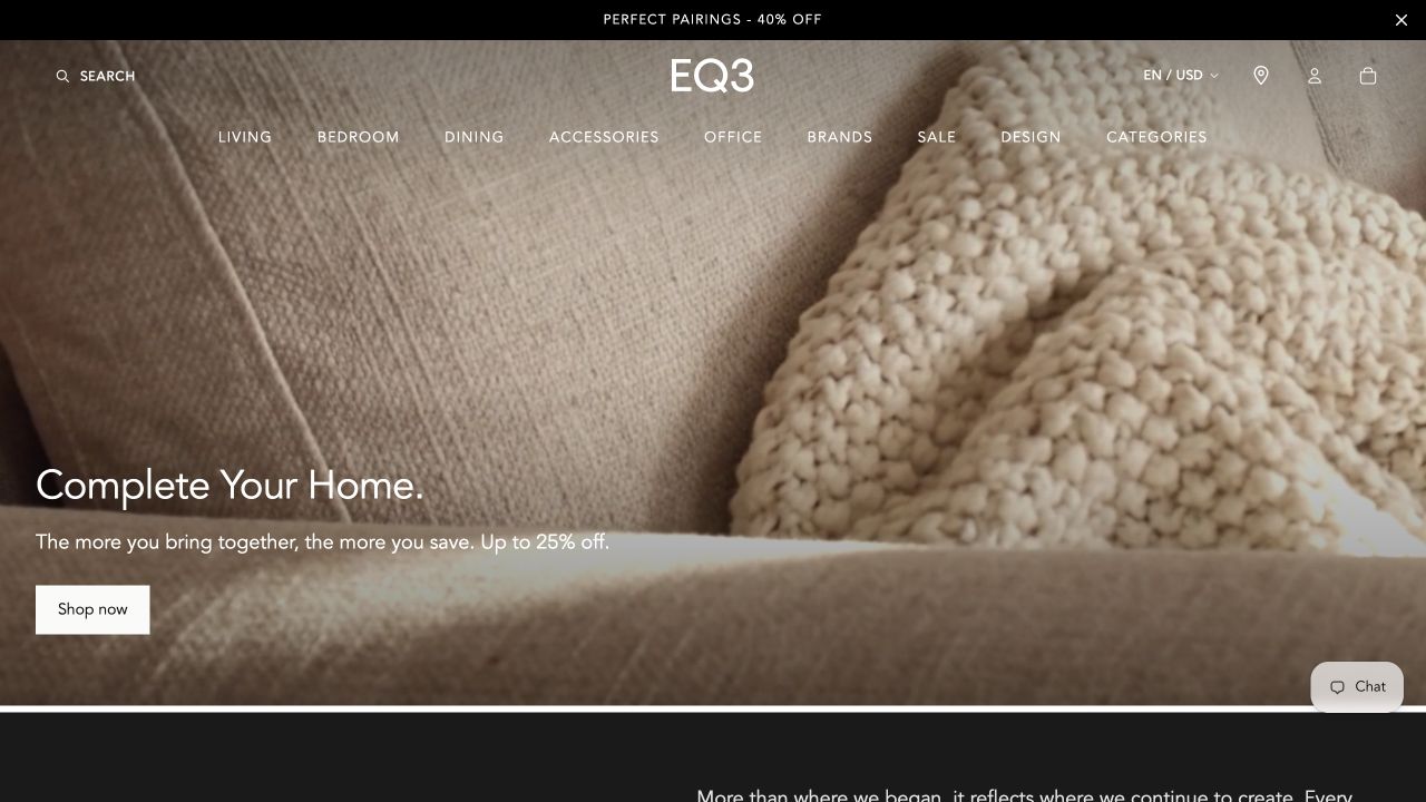
EQ3’s retained campaign uses an upholstered texture and cushion closeup rather than a desk, chair mechanism or office layout. A conventional header still names the office category, providing a direct route for visitors whose task is unrelated to the featured promotion. For office-furniture retail, the useful pattern is that a visually consistent home collection does not have to erase practical category access. The image is a campaign observation, not evidence of a particular office product.
What you can learn
Give office shoppers a stable entry point even when the homepage focuses on another room. Once inside that category, separate desk dimensions, storage needs and seating information from general lifestyle copy so a customer can build a workable shortlist before asking for design help.
Pros
The clear office label reduces reliance on recognising a product or searching through an unrelated living-room campaign.
The restrained header offers catalogue structure without forcing every category into the promotional photograph itself.
Cons & considerations
A texture-led opening cannot demonstrate the office range, so the category destination needs complete and well-labelled product views.
If several brands are sold together, distinguish their specifications and service terms instead of implying one shared office-furniture standard.
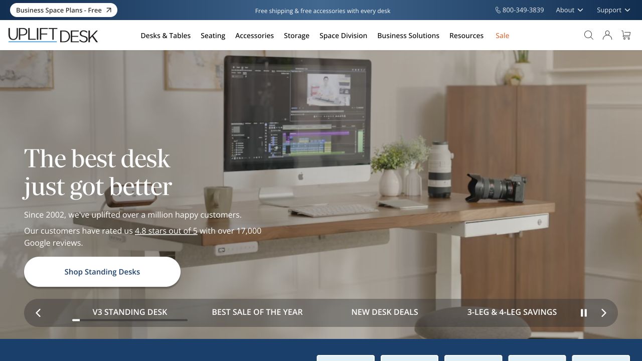
UPLIFT Desk’s retained opening shows a wooden desk with a monitor, camera and equipment. Introductory copy and a direct standing-desk shopping action sit to the left, while a business space-planning route is visible above. Unlike a purely decorative office scene, the image keeps the main product category recognisable. The visible carousel track and pause control also show that this is one campaign frame, not the entirety of the catalogue.
What you can learn
Lead with the desk in a plausible working context, then let the customer compare the details the photograph cannot answer: size, height range, accessories, power and delivery requirements. Keep a separate planning route for business projects rather than expecting a multi-desk buyer to use an ordinary single-item flow.
Pros
The desk remains clearly identifiable despite the equipment and accessories that make the scene feel inhabited.
A direct shopping action and distinct business route accommodate both a product purchase and a larger workspace enquiry.
Cons & considerations
A styled desktop can make accessories look included, so product pages should identify the actual configuration and optional equipment.
An inviting work scene is not independent proof of ergonomic suitability or a measured improvement in comfort or productivity.
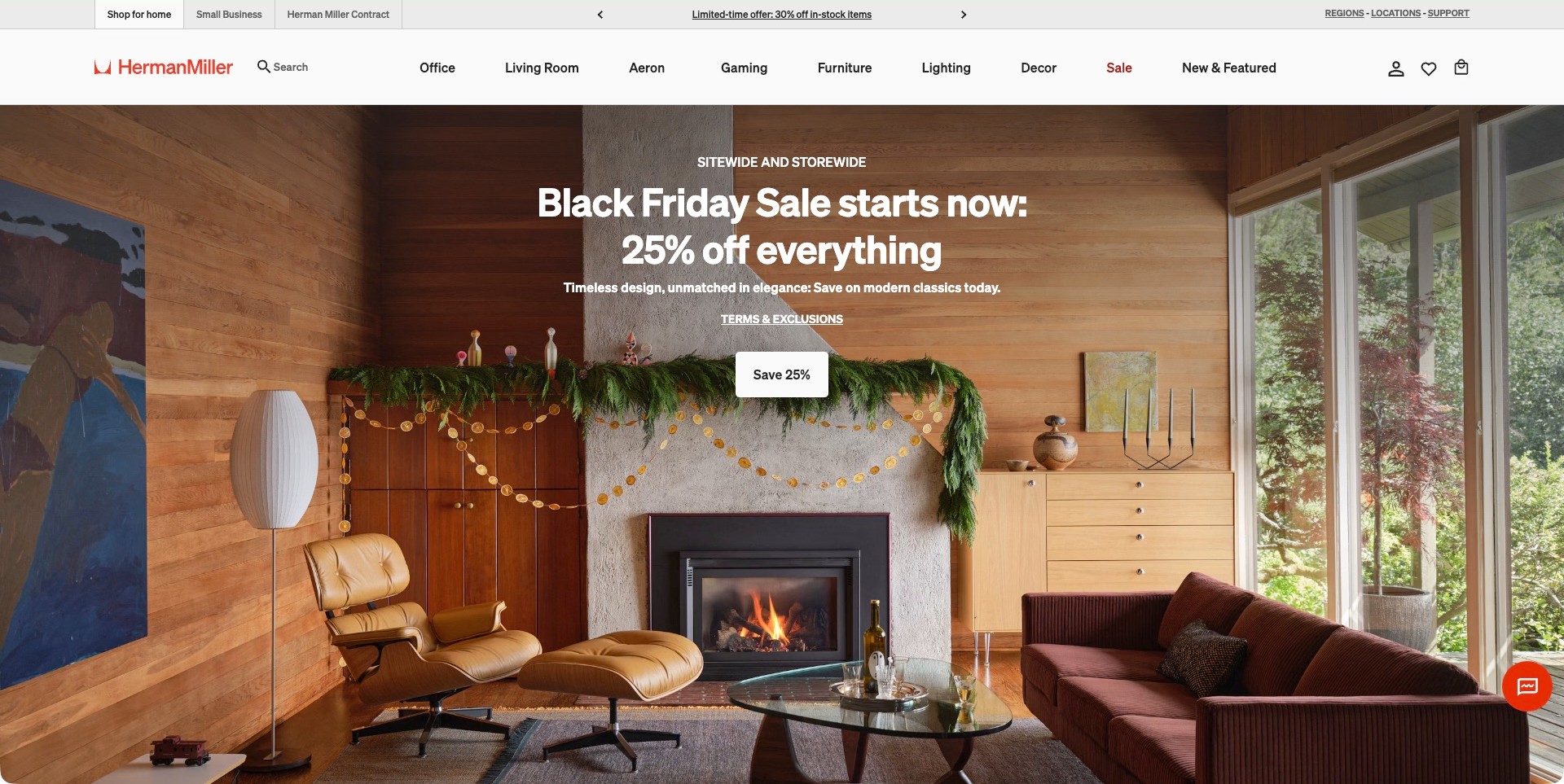
Herman Miller’s actual store opening is a living-room sale campaign, not an office photograph. Its relevance to an office-furniture store lies in the header: Office and Aeron have direct product routes, while Small Business and Herman Miller Contract appear in a distinct upper audience strip. Search remains prominent beside the brand. That structure lets a workspace buyer bypass the seasonal domestic image instead of assuming that the current campaign represents the complete range or the only available purchase process.
What you can learn
Keep the office customer’s task visible even when the homepage promotes another room. A single chair purchase and a multi-person workplace project require different information. Name both routes, then provide measurements, adjustment details, lead times and relevant assistance without making the buyer navigate through an unrelated lifestyle story.
Pros
Office, named product and business-audience routes are visible before the visitor opens a menu.
The audience strip distinguishes project context from the product categories below it.
Cons & considerations
A living-room hero may give an office buyer little immediate evidence about the workstation range.
Product suitability and business ordering conditions still require clear information beyond a general campaign discount.
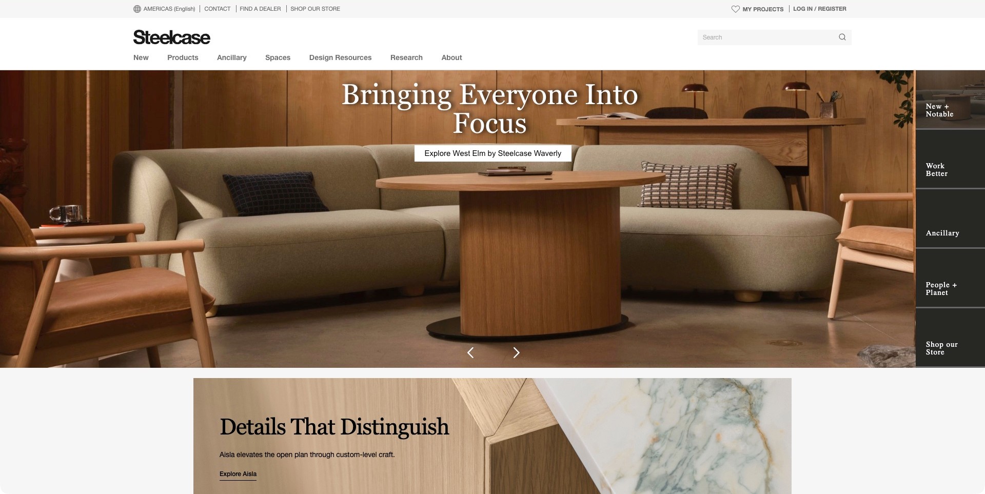
Steelcase’s captured homepage shows low upholstered seating and a wooden table in a warm café-like setting. The campaign names a West Elm by Steelcase collection rather than presenting the room as an anonymous office. A white header separates products, spaces, design resources and research, while dealer and store routes sit above. A dark section strip at the right supplies additional destinations within the site. The opening is useful for an office-furniture business because it presents collaborative furniture without hiding the practical routes to investigate and buy.
What you can learn
An office collection can be introduced through the kind of interaction it supports rather than a row of desk cut-outs. Name the range and make the next step clear. Dealer, direct-store and professional research routes should remain distinct so visitors can choose an appropriate purchasing process.
Pros
The collection name helps connect the room image to a tangible furniture range.
Store, dealer and research destinations support different stages of an office project.
Cons & considerations
A lounge-led campaign may need clearer follow-through for visitors seeking individual workstation products.
Several navigation layers require careful keyboard and small-screen treatment to avoid competing priorities.
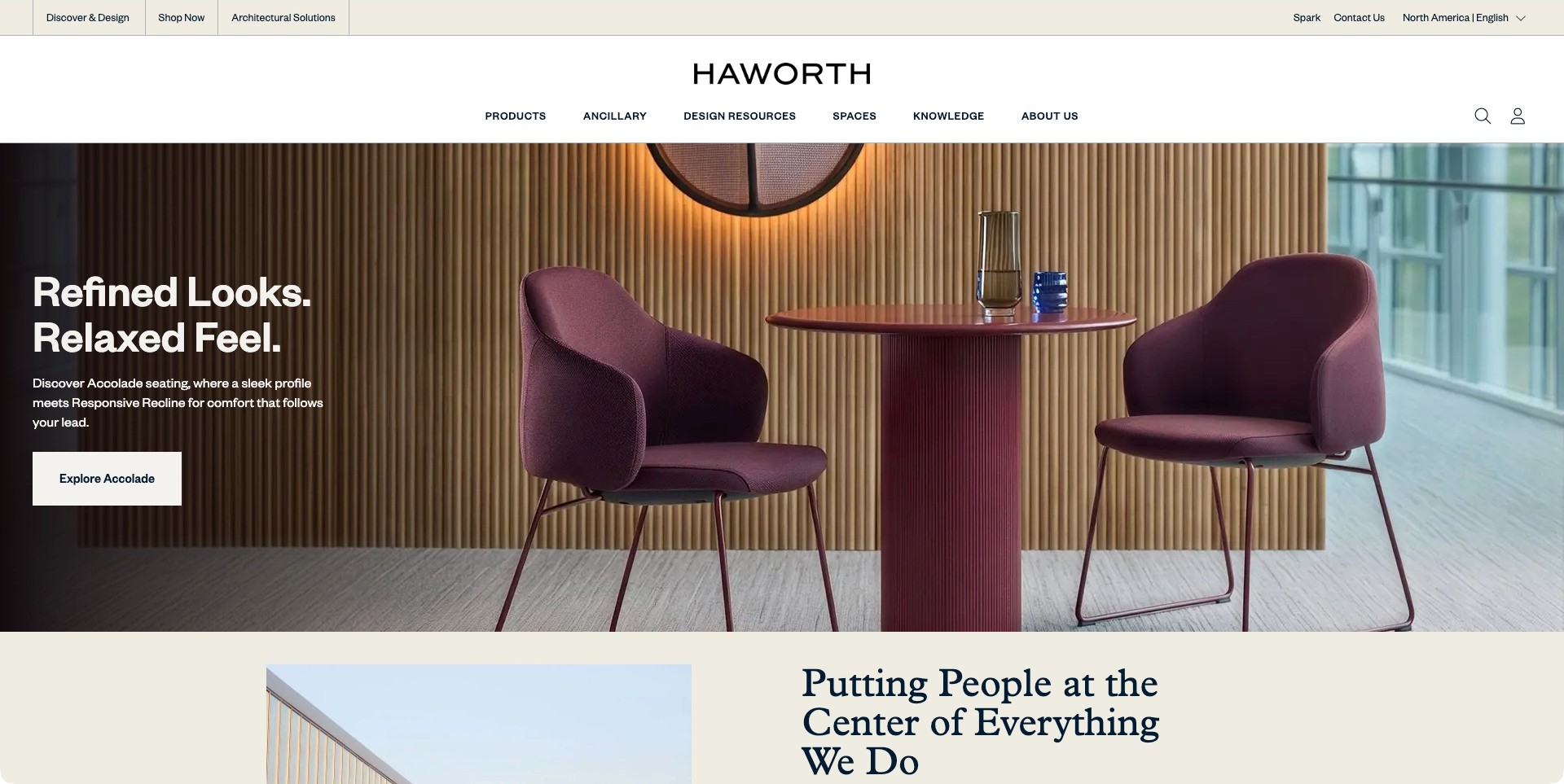
Haworth’s observed North American page features two burgundy chairs around a small table against a slatted wood wall. The campaign names the seating range and provides a specific exploration action. Above it, the header distinguishes shopping from discovery, design and architectural solutions, then exposes product, space and resource categories. This is not a desk-led storefront, but a broader workplace-furniture entrance. Its useful lesson is that an appealing setting can coexist with several clearly labelled professional and buying tasks.
What you can learn
Keep the room photograph connected to a named product, then separate purchasing from specification research. An office-furniture website may need to support both immediate shopping and a longer project. Give each audience a clear route without implying that one campaign chair explains the whole offer.
Pros
A named seating campaign connects the photograph to a specific range.
Shopping and design-resource labels distinguish different visitor tasks before a menu is opened.
Cons & considerations
A collaborative seating scene may not immediately explain the desk or storage range.
Comfort and recline claims need product-level detail rather than being inferred from the room image.
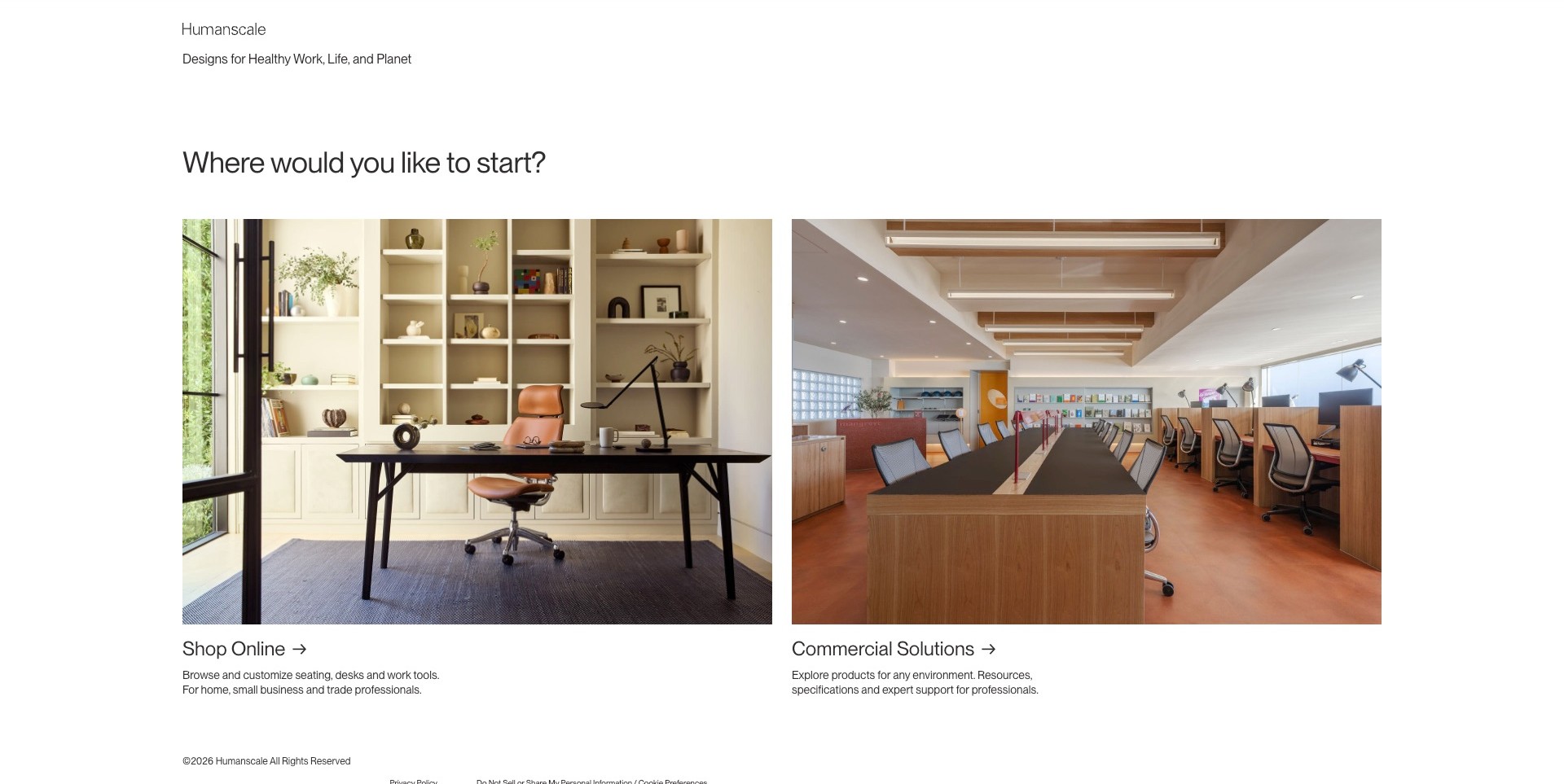
Humanscale’s actual welcome page asks where the visitor would like to start, then offers two large photographic choices. A home-office desk introduces online shopping; a shared workplace introduces commercial solutions. Short descriptions explain the difference in ordinary terms, including products, customisation and professional resources. The white page has little competing navigation, so this is a deliberate routing screen rather than a product-rich hero. It is useful for businesses whose consumer store and commercial information need separate entrances.
What you can learn
When audience routing is genuinely necessary, explain the consequences of each choice. A visitor should understand whether a destination supports buying, project research or specialist assistance without knowing the company’s internal organisation. Keep a route back between the two experiences as needs change.
Pros
The photographs distinguish individual and shared workplace contexts without relying on abstract audience icons.
Supporting descriptions make the two destinations more informative than identical generic buttons.
Cons & considerations
An extra gateway can slow visitors who already know the product they need.
The onward experiences should preserve the chosen context and provide clear product search or category navigation.
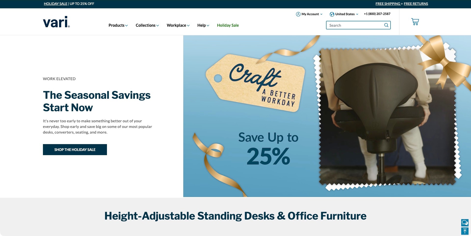
Vari’s observed homepage separates the campaign copy from a blue, gift-themed visual. The actual film frame shows a person holding a chair from behind, not a desk installation. A white text panel names the seasonal offer and supplies one shopping action, while the header retains products, collections, workplace information, help and search. The next section identifies standing desks and office furniture. The structure is useful to study because the decorative campaign and the permanent catalogue tasks occupy different visual areas.
What you can learn
Keep the practical buying tools outside the promotional image. A specialist office store can change seasonal artwork without moving search, product categories or project information. Make the product range clear in ordinary page text, then lead visitors to measurements, adjustment information and ordering details.
Pros
The split layout protects the main campaign copy from a busy photographic background.
Search and workplace information remain visible alongside ordinary product browsing.
Cons & considerations
A decorative chair frame may communicate less product detail than a direct workstation photograph.
Time-sensitive discount language should not replace stable information about the range or buying process.
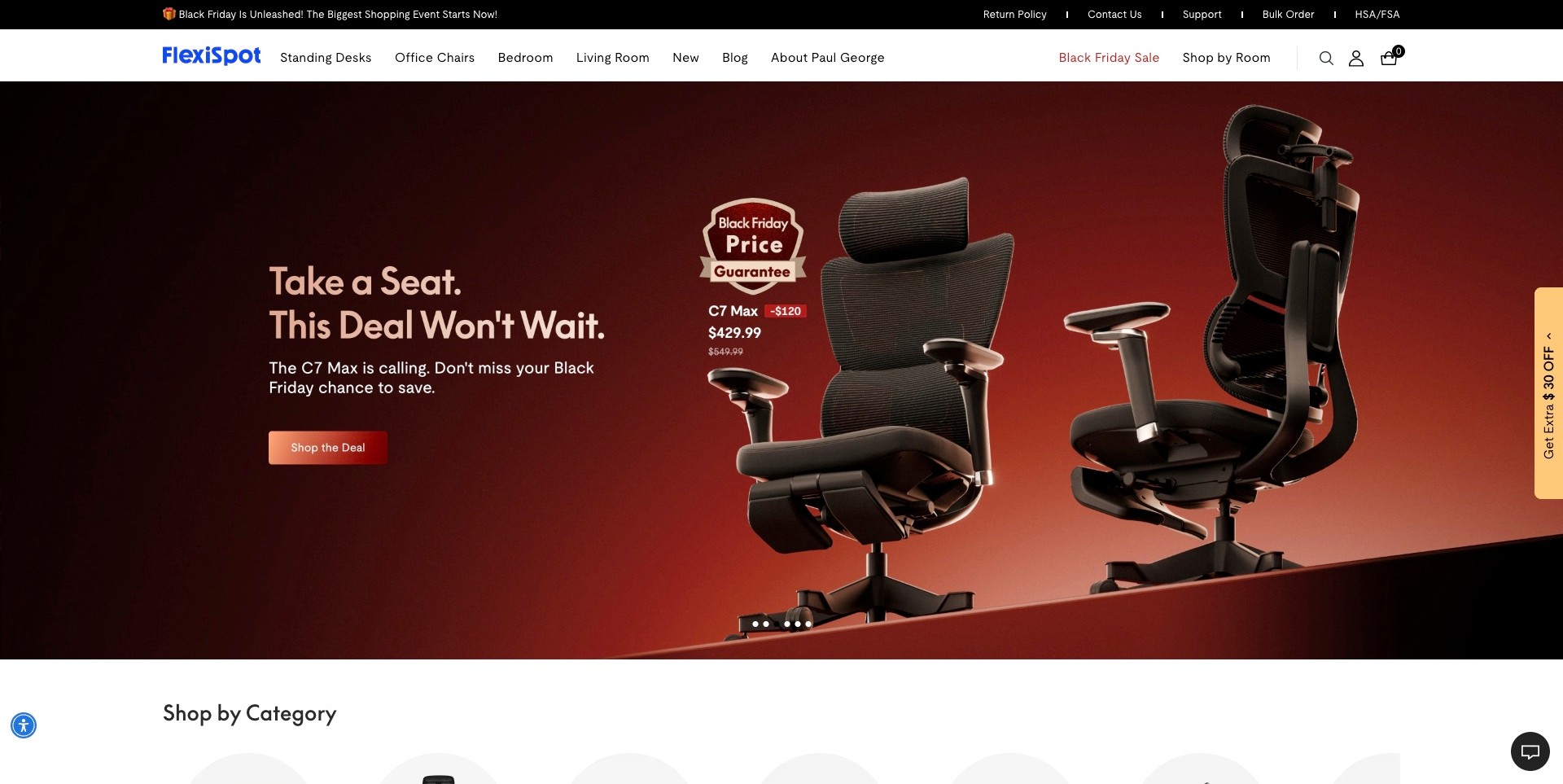
FlexiSpot’s observed opening places two black chair views against a red campaign background. The front and rear perspectives give the product a more concrete identity than a distant lifestyle scene, while the copy names the featured chair and a shopping action. Standing desks and office chairs remain explicit categories in the white header, alongside room browsing and bulk-order information. A collapsed coupon tab remains at the far edge, but no open promotion covers the product. The useful pattern is a campaign tied to a particular object and a stable catalogue structure.
What you can learn
Use complementary views to explain a product’s form, then provide the measurements and adjustment information the images cannot establish. Keep the route to the whole category visible when one promoted model dominates the homepage. Promotional badges should not become substitutes for a clear product specification.
Pros
Two perspectives expose more of the chair’s form than a single front-facing product image.
Desk, chair and room categories remain readable outside the promotional artwork.
Cons & considerations
Large price and guarantee badges can compete with practical product information.
Collapsed promotional controls still need checking so they do not cover content at smaller viewport sizes.
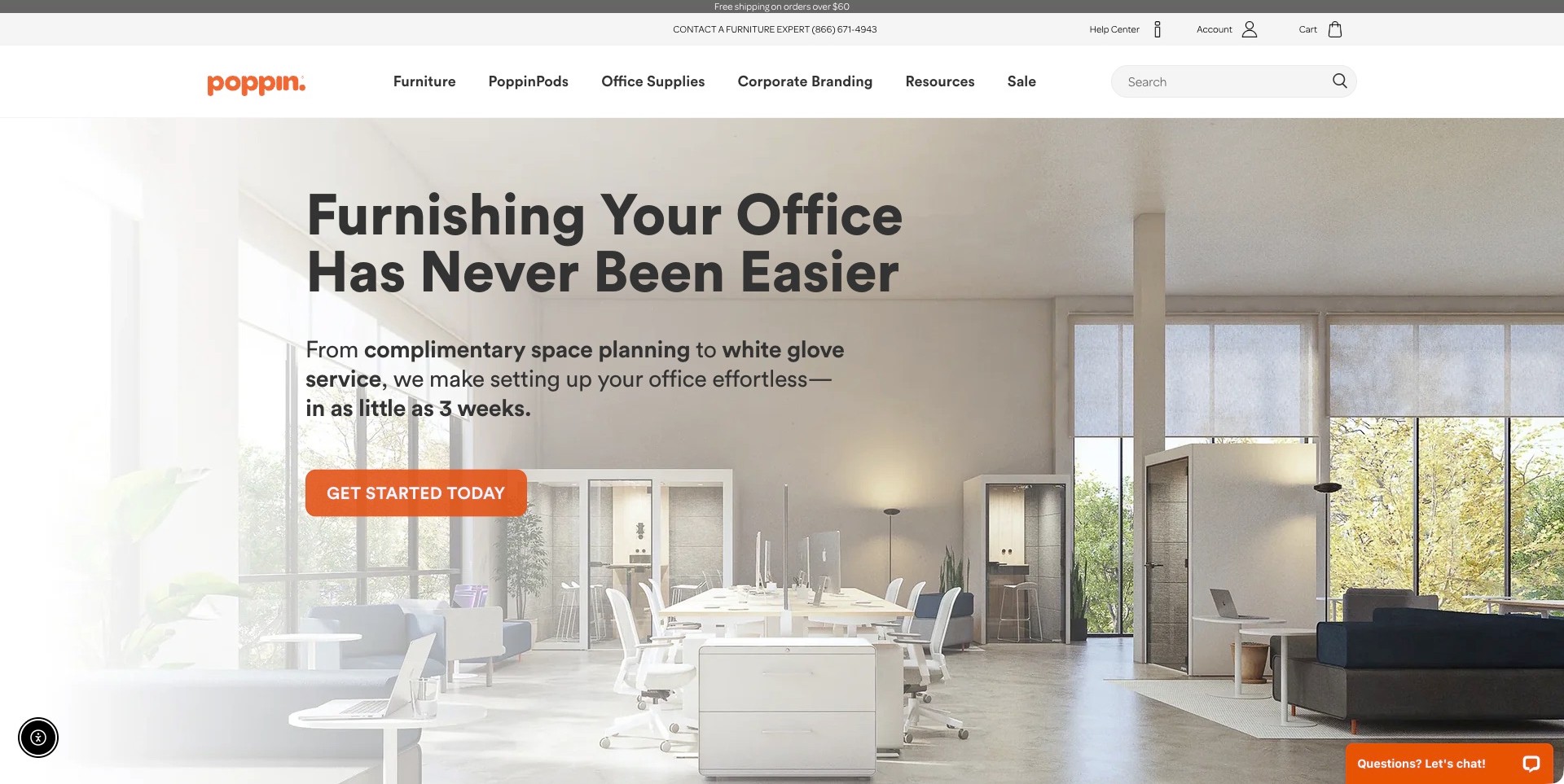
Poppin’s captured homepage shows a bright shared office with desks, storage and enclosed work pods. Large black copy introduces office furnishing, followed by a short planning-and-service explanation and an orange starting action. The header separates furniture, pods, office supplies, corporate branding and resources, while an expert contact line remains above it. The useful design pattern is a project-level introduction supported by concrete product categories, rather than a vague service message with no visible evidence of what the company sells.
What you can learn
Explain the scope of the help before asking for a project conversation. Show the types of furniture involved, distinguish project planning from ordinary product shopping and tell visitors what a starting action leads to. Any delivery or installation promise needs clear qualifications near the relevant details.
Pros
The furnished workspace makes the relationship between desks, storage and pods visible in one setting.
Product categories and project assistance are both available from the opening screen.
Cons & considerations
Large service promises need supporting scope, geography and timing information rather than remaining campaign slogans.
A complete office photograph cannot establish what is included in a particular order or planning engagement.
Kegan is a freelance web designer and developer with 15+ years of experience helping businesses turn complicated website requirements into clear, maintainable digital experiences. He works directly with clients from planning and design through development, launch, and ongoing support.
For office furniture store website design, his development approach focuses on workplace product and space-planning distinctions, useful specifications and configuration information, realistic project context, and practical purchasing or consultation routes. The scope can be a targeted improvement or a complete custom build, with responsive layouts, thoughtful content structure, and integrations chosen around the people using and maintaining the site.
Show 3 other office furniture store website designersHide other office furniture store website designers
How to plan a clearer office furniture shopping experience
Map the jobs your visitors are trying to complete
Interview the people who answer sales and support questions before deciding on navigation labels. Common tasks might include replacing a chair, finding a desk for a narrow room, adding storage to an existing system or ordering several matched workstations. Record the information needed to resolve each task. If the business offers both self-service shopping and a managed project service, decide where the handoff belongs and how customers know which path is appropriate.
Do not assume that a home-office customer is always a small order or that a business visitor already has a complete brief. Provide useful guidance at both levels. A short project enquiry can ask for the location, approximate quantity, intended timing and type of help required without demanding a finished floor plan. A one-chair buyer should still be able to obtain a clear answer when a specification is unfamiliar.
Build consistent product records before adding comparison tools
Create a common specification structure for each category. Desks may need overall width and depth, supported height settings, top options, cable-management details and assembly information. Seating may need adjustment descriptions, dimensions and separately documented product limits. Storage may need opening clearances, internal dimensions and assembly requirements. Name the fields consistently and keep units explicit. A comparison interface cannot repair source records that use different meanings for the same label.
Photograph included components separately from optional accessories where possible. If a desk image shows a monitor arm, drawer and cable tray, explain whether those items are part of the selected package. For bundles, provide an understandable contents list rather than relying only on a styled photograph. Keep the product identity stable when a colour or size changes so the customer can see which information has actually changed.
Make layout support useful before requesting a consultation
Offer practical measuring prompts near relevant products. Explain which measurements the customer should bring, such as available floor width, room access and space needed for moving a chair or opening storage. Avoid giving universal layout assurances from a simple room-size calculator. Where professional planning is offered, state what that service includes, what inputs it needs and when a person will review the proposed arrangement.
A downloadable planning checklist can be valuable without becoming an elaborate interactive tool. Ask customers to distinguish existing furniture they will retain from new pieces they are considering. Provide an accessible alternative to any visual planner and keep important dimensions available as text. The purpose is to improve the quality of a decision, not to suggest that a preview replaces site-specific planning or appropriate workplace advice.
Describe business ordering and delivery as distinct services
For a multi-item order, explain whether products can arrive together, whether installation is available and who coordinates access. A customer may need to know whether furniture is delivered to a loading bay, a particular floor or an assembled location. Keep the explanation tied to the actual delivery territory and service purchased. A general free-shipping banner does not answer those questions and should not appear to override project-specific terms.
If quoting is required, explain what a quote covers and how it differs from a visible online price. Identify likely inputs such as quantities, finishes, delivery address and timing. Do not imply that sending an enquiry reserves stock or confirms an installation date. For phased projects, provide a clear contact route rather than expecting the customer to encode a complex schedule into a standard checkout note.
Explain product adjustments without making health promises
Show how adjustable features operate with labelled images, clear descriptions and maintained instructions. A chair may have several controls that are hard to understand from a hero photograph. A desk may have a range of settings whose relevance depends on the user and task. Present what the product provides and where a person can find setup guidance, while avoiding broad claims that a purchase will prevent or solve a health problem.
Where specialist assessment or workplace advice is appropriate, keep that separate from the retail explanation. Do not turn a short shopping quiz into an apparently authoritative diagnosis. A quiz can help narrow a catalogue using the answers supplied, but should explain its limits and provide a route to a person when the situation does not fit its choices. The website’s role is understandable product information, not a substitute for professional care.
Plan support for the furniture already in use
Make assembly guides, care instructions, warranty information and replacement-part enquiries discoverable by product identity. An existing customer should not have to reopen the sales process to find a missing instruction sheet. Keep version differences clear, especially when a product has changed over time. A document for a similar-looking chair or desk is not automatically the correct one for the customer’s model.
Assign operational owners to category data, stock messaging, expired campaigns and help content. Review actual questions after launch to discover which information is missing. A page that reduces avoidable enquiries can be successful even if the contact count falls. Conversely, a high volume of vague requests may reveal that the store is not giving people enough information to choose a useful next step.
The editing job behind the design
Choose a platform that can maintain office product details
Prioritise structured specifications, variant relationships, understandable bundles and reliable support-document links. A familiar ecommerce platform may be sufficient for a straightforward catalogue. Business quoting, project pricing or installation scheduling should be chosen according to actual operating needs rather than added simply because another retailer has a sophisticated interface.
Keep shopping and enquiry systems consistent about product names, selected finishes and quantities. If a quotation begins from a product page, carry useful context into the request without exposing private information in public links. Explain when a member of the team must confirm details rather than presenting every displayed combination as an accepted order.
Public stack evidence has limits. A script or platform reference does not establish the retailer’s warehouse system, account terms or business-ordering workflow. Compare maintenance responsibilities, accessibility of product information and ownership of catalogue data before selecting technology. The best-looking frontend is not necessarily the best operational fit for the store.
Our WordPress website examples offer a separate look at publishing approaches. A visible platform label is evidence for that named page, not a guarantee that the same system will suit your requirements.
Before the public launch
Include these decisions in an office furniture website brief
Which visitor tasks are single-item purchases, and which require project support?
Can shoppers reach desks, seating and storage without recognising a model name?
Are dimensions, adjustments and included components consistently labelled?
Does each bundle list exactly what the customer is considering purchasing?
Are pictured accessories distinguished from the base product?
Is home-office shopping visibly different from a managed business project?
What information is required to prepare a useful quotation?
Do delivery explanations distinguish a parcel, pallet, room placement and installation?
Can layout information be understood without using an interactive planner?
Are assembly and care documents linked to the correct product version?
Does a quiz explain its catalogue-selection role without making health assurances?
Who maintains stock, lead-time language and expired promotional content?
Which support path serves existing owners rather than new sales enquiries?
How will the team identify unanswered product questions after launch?
These checks are a project checklist, not a performance, legal, security, or accessibility certification. Test real journeys with the people responsible for the website before making claims about the result.
Sources & editorial method
How this collection was selected and reviewed
We qualified current first-party office product or workplace-planning offers, then reviewed genuine direct screenshots and wrote office-specific observations. Some clean original images are reused with their original capture dates; no older screenshot is presented as newly captured. Branch is the explicit editorial selection for its specialist office focus, visible HomeOffice/Business distinction, category hierarchy and separate design-assistance route in the observed page. This is a design choice rather than a measured comparison of products, ergonomics, prices, customer service or business size.
Each example links to its actual source page. Screenshots are direct browser captures with their own capture dates; moving imagery, announcements and live designs can change. The notes describe observable design choices and conditional tradeoffs, not measured traffic, conversion results, service quality, or accessibility conformance.
Technology labels use public page metadata, asset evidence, or explicitly cited platform documentation. Platform documentation is not a complete current deployment audit. A component reference may be legacy or unused; it is not a complete backend inventory. Unknown stacks are omitted. These sites are editorial examples, not our client portfolio.
Written, Edited and Curated are separate editorial records, not timestamps advanced by a rebuild. Website designs and imagery belong to their owners. See our editorial standards or suggest a correction.
Questions worth asking
Office Furniture Store website design questions
Should a store combine home-office and business customers on one website?
It can, provided the journeys are clear and shared product facts remain consistent. A visible route for project support can sit alongside ordinary shopping. The important distinction is the customer’s task and required service, not an assumption about the size or sophistication of the buyer.
Is an office planning tool necessary?
Not always. Clear dimensions, complete product images and a useful measuring checklist may solve the immediate problem. An interactive planner becomes worthwhile when its rules, product data and accessible alternatives can be maintained. A visual layout alone cannot confirm every access, installation or workplace requirement.
What should appear in a chair comparison?
Use consistent, product-specific information such as dimensions, described adjustments, included components and relevant maintained instructions. Explain unfamiliar terms. Do not turn a comparison table into an unsupported claim that one chair is universally healthier or suitable for every person.
How can a project enquiry avoid becoming a long form?
Ask for the minimum useful starting brief: location, approximate quantity, timing and the kind of help required. Explain the next step and let a person resolve more detailed planning questions. Keep an existing customer’s assembly or support enquiry separate from that sales form.
Can lifestyle photography replace detailed product images?
No. A room scene explains context but often hides adjustments, cable routes, finishes or scale. Use it alongside complete and detail views, with captions connecting the scene to the actual products. Make clear which objects are not included in the selected purchase.
Borrow the clear category routes and useful project distinctions. Build an office furniture store that helps people understand the products, the space and the next step before asking them to commit to a purchase or consultation.