Best Discourse Websites of 2026 (20 Real-World Examples)
Discourse communities that make conversations easier to find
These 20 Discourse examples show how category directories, recent discussions, product navigation, and community guidance support different audiences.
Discourse is a community platform; the useful design question is how people discover a relevant conversation and understand whether to read, search, or contribute. The same software can support a technical directory or a broader discussion feed.
The opening examples include NVIDIA, Shopify, Asana, Epic, and Cloudflare. Their public pages expose Discourse evidence, but the collection does not describe their private moderation or account configuration.
Before the examples
What makes good Discourse website development in 2026?
Choose the main discovery route
Decide whether visitors arrive knowing a product, searching for an answer, or browsing activity. NVIDIA’s product map and a recent-topic feed solve different problems; do not give every route equal prominence by default.
Use terms members recognize and distinguish archived products or regions. Long nested lists need concise descriptions and an alternative search route.
Explain participation before demanding it
Make useful public content readable, with clear guidance about where to ask and what belongs in a topic. Separate official announcements from member discussion.
The collection · 20 examples
20 Discourse website examples worth studying
All pictured properties have direct Discourse generator or platform evidence. Compare their information architecture, not assumed private moderation features.
We start with five recognizable brands or organizations: NVIDIA Developer Forums, Shopify Community, Asana Community, Epic Developer Community — Unreal Engine Forum, Cloudflare Community. Each attribution applies to the named website property, not every product or website belonging to its organization. This is a curated reading sequence, not a measured ranking.
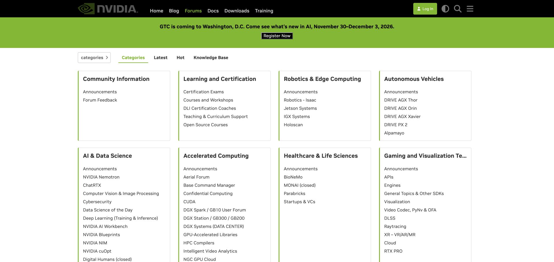
NVIDIA treats its forum entrance as a directory of technical disciplines. The black corporate header and green accents connect the community to the wider developer site, while bordered cards separate robotics, autonomous vehicles, accelerated computing and other areas. Individual products appear inside those groups, letting someone who knows their hardware move directly toward the relevant conversation. Documentation, downloads and training remain in the top navigation instead of being buried among topics. This arrangement favors destination finding over browsing recent discussion. Its cost is density: several cards contain long lists, and the longest category heading is truncated in the desktop view. The conference promotion also claims space ahead of the support directory.
What you can learn
Organize a large Discourse installation around the terms users already recognize from their products, then provide a separate recent-activity route. Maintain archived and renamed categories deliberately so old support links remain understandable.
Pros
Product groups make a sprawling ecosystem legible.
Documentation and downloads stay within easy reach.
Cons & considerations
Long category names can lose important distinctions when clipped.
Platform source: Public page platform evidence. The directly inspected page declares Discourse 2026.11.0-latest. Platform evidence is separate from the direct website screenshot and is not a complete current infrastructure audit.
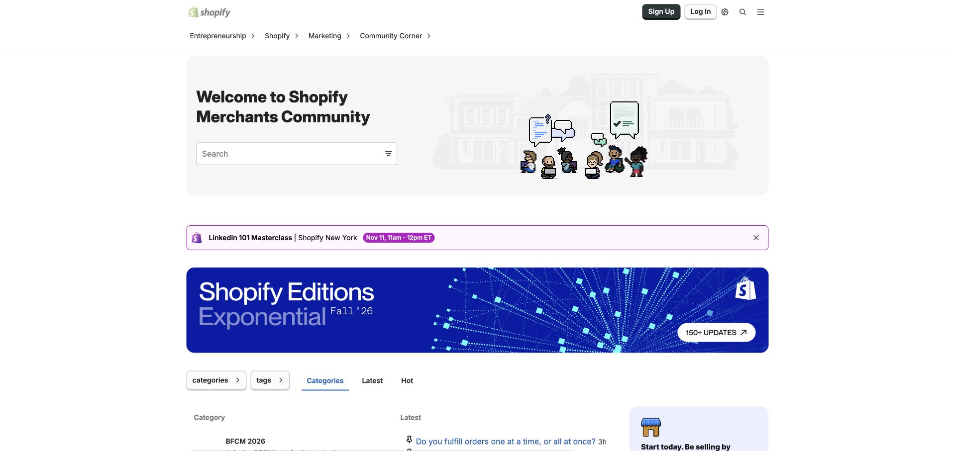
Shopify gives its merchant community a welcoming front door before presenting the forum table. A broad search field sits inside the illustrated introduction, with pixel characters making a business support destination feel approachable. Entrepreneurship, Shopify, marketing and community navigation establish distinct reasons to visit. Below the introduction, an event strip and a large Editions banner bring current programming into the community. The category area pairs a description of each subject with recent threads, so visitors can understand both purpose and activity. The tradeoff is visible in the opening screen: multiple promotional sections push discussion content toward the bottom. The leaderboard adds recognition elsewhere on the page, although popularity should not be mistaken for verified advice.
What you can learn
Use a branded Discourse welcome to orient new members, but set a clear space budget for announcements. Keep search and category access visible even when seasonal campaigns and events are active simultaneously.
Pros
Search receives a clear place within the welcome.
Category descriptions explain the merchant problems covered.
Cons & considerations
Stacked promotional blocks delay the actual discussions.
Several different community routes require careful naming to avoid overlap.
Platform source: Public page platform evidence. The directly inspected page declares Discourse 2026.11.0-latest. Platform evidence is separate from the direct website screenshot and is not a complete current infrastructure audit.
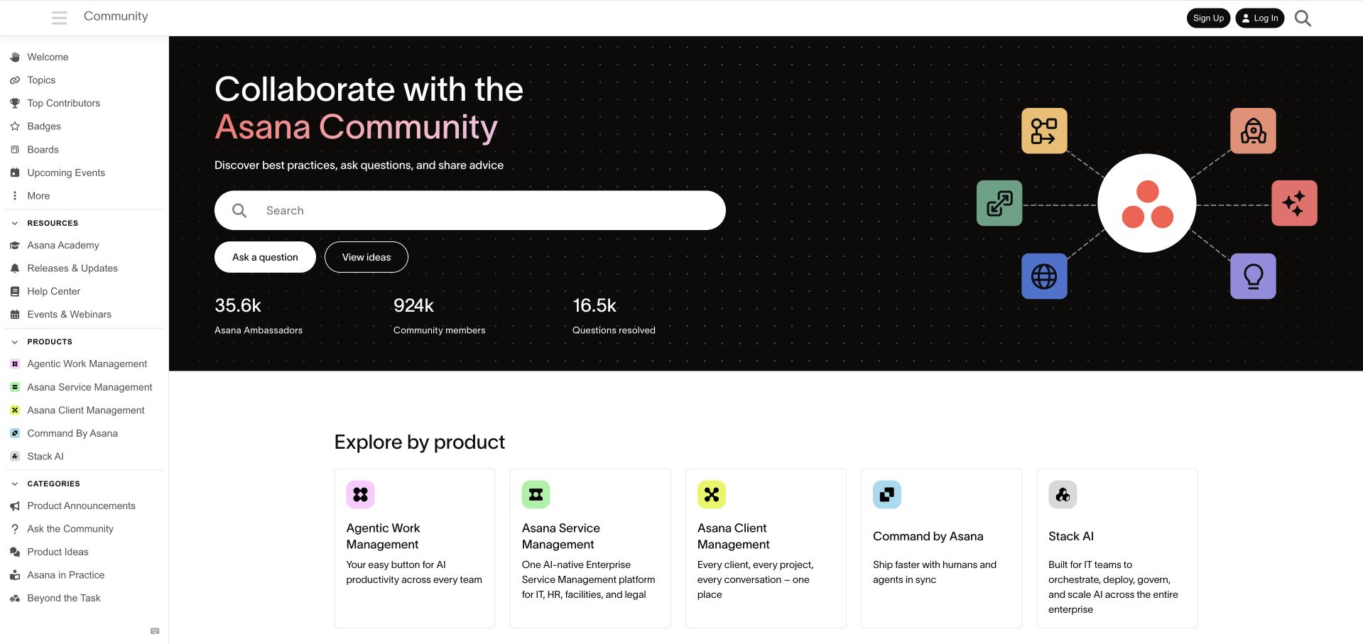
Asana turns the forum entrance into a substantial community landing page. A dark illustrated hero establishes the identity, then separates asking a question from viewing product ideas. The large search field provides a third route for people with an existing problem. Product cards below the hero describe the different offerings in plain language, while the persistent sidebar connects members with announcements, practical advice, training and the help center. This is a useful example of giving Discourse a purpose beyond a chronological list. The publicly displayed membership and resolution counts function as social proof, but the page does not make them an independent measure of support quality. The welcome section occupies considerable height before recent conversations appear.
What you can learn
Design the forum entrance around user intentions, then map those routes to a manageable category structure. Treat product, role and language navigation as complementary choices, and test whether newcomers understand their differences.
Pros
Question and idea actions distinguish two common contributions.
Product cards explain the available destinations.
Cons & considerations
The tall hero delays the discussion feed.
A long sidebar creates substantial navigation competition.
Platform source: Public page platform evidence. The directly inspected page declares Discourse 2026.11.0-latest. Platform evidence is separate from the direct website screenshot and is not a complete current infrastructure audit.
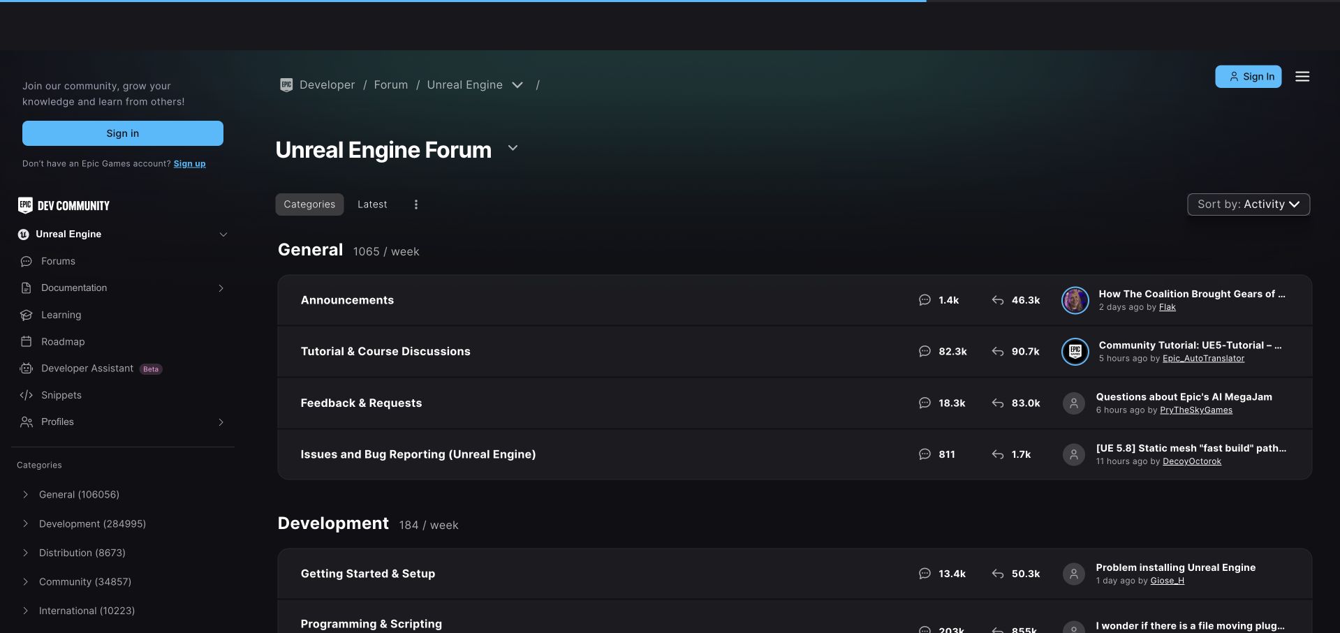
Epic's Unreal Engine forum uses a dark interface that feels connected to the surrounding developer community. The sidebar places documentation, learning, the roadmap and snippets alongside the forum rather than isolating peer discussion in a separate visual world. Category groups distinguish general announcements from development work, with topic and reply counts and a recent contribution aligned across each row. Product context remains explicit in the breadcrumb and Unreal Engine heading. That matters in an ecosystem with several tools and audiences. The table provides a useful overview for returning developers, but tightly packed statistics and clipped recent-thread titles can slow a first visit. The sign-in invitation also occupies a sizeable portion of the sidebar.
What you can learn
Preserve a clear product context when embedding Discourse into a larger developer portal. Keep learning resources close to community answers, while ensuring abbreviated thread previews still expose enough information to choose the right destination.
Pros
The surrounding learning resources are easy to discover.
Category groups separate broad announcements from development tasks.
Cons & considerations
Recent-thread titles truncate within the dense table.
Several numeric columns compete with the category labels.
Platform source: Public page platform evidence. The directly inspected page declares Discourse 2026.9.1. Platform evidence is separate from the direct website screenshot and is not a complete current infrastructure audit.
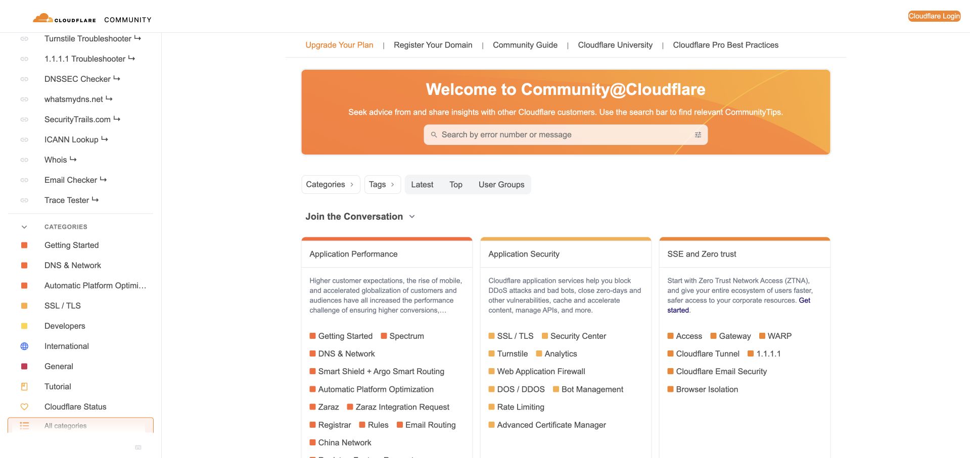
Cloudflare's community welcome asks visitors to search by an error number or message. That instruction is more useful than an unexplained search box because it reflects the way many technical support visits begin. The orange banner anchors a broad community layout, with cards grouping application performance, application security and access-related subjects. A substantial sidebar connects the discussion area with troubleshooting tools, documentation, product resources and community programs. The result is a forum that can act as a practical support hub. Its breadth also creates friction: the navigation is very long, some product labels truncate, and the grouped cards contain many links. Upgrade and domain-registration links sit above the welcome, introducing commercial tasks alongside incident resolution.
What you can learn
Give Discourse search a task-specific prompt and connect it to relevant diagnostic resources. Keep the path for someone with an urgent error distinct from the paths for product exploration and community participation.
Pros
The search prompt tells visitors what to enter.
Troubleshooting resources are available beside the forum.
Cons & considerations
The extensive sidebar is difficult to scan in one view.
Commercial links share the opening with support navigation.
Platform source: Public page platform evidence. The directly inspected page declares Discourse 2026.9.1. Platform evidence is separate from the direct website screenshot and is not a complete current infrastructure audit.
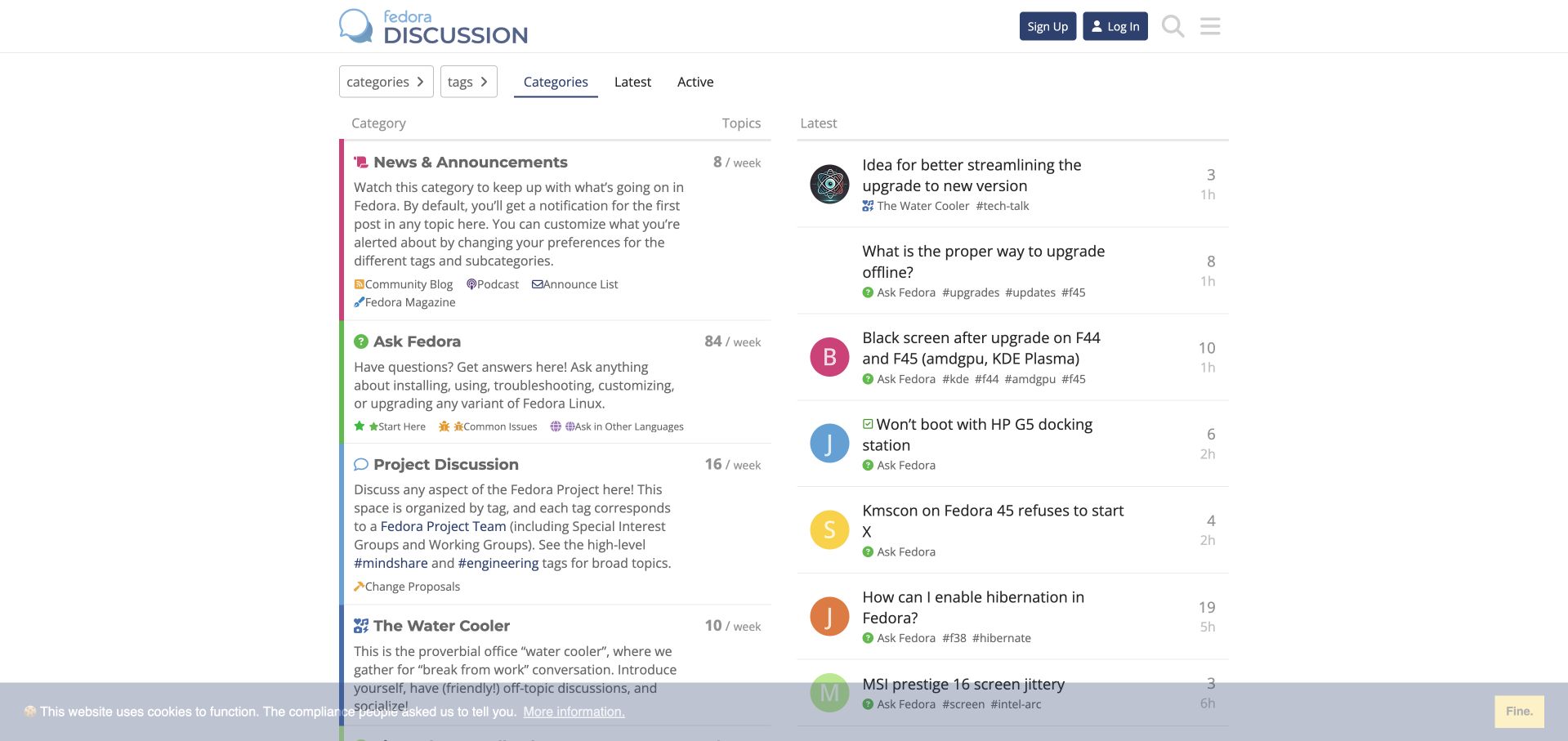
Fedora presents its community as two complementary columns: category explanations on the left and current conversations on the right. Ask Fedora is clearly described as the place for installation, usage and troubleshooting questions, while Project Discussion explains its team and tag structure. News and announcements receive their own area, and the Water Cooler gives social conversation a named home. These descriptions do useful moderation work before a visitor writes anything. Colored category borders and small icons help people follow the structure without relying on a large promotional introduction. The latest-topic column shows real activity, although technical titles and compact metadata can be demanding for newcomers. Some category explanations are long enough to compete with the actual destination links.
What you can learn
Use category descriptions to distinguish support, project decisions and social participation before implementing more elaborate navigation. In Discourse, a small number of clearly explained spaces can provide a stronger starting point than a large unexplained taxonomy.
Pros
Support and project work have explicitly different purposes.
Current topics appear beside the category map.
Cons & considerations
Lengthy descriptions reduce scanning speed.
Technical thread titles assume familiarity with Fedora terminology.
Platform source: Public page platform evidence. The directly inspected page declares Discourse 2026.9.1. Platform evidence is separate from the direct website screenshot and is not a complete current infrastructure audit.
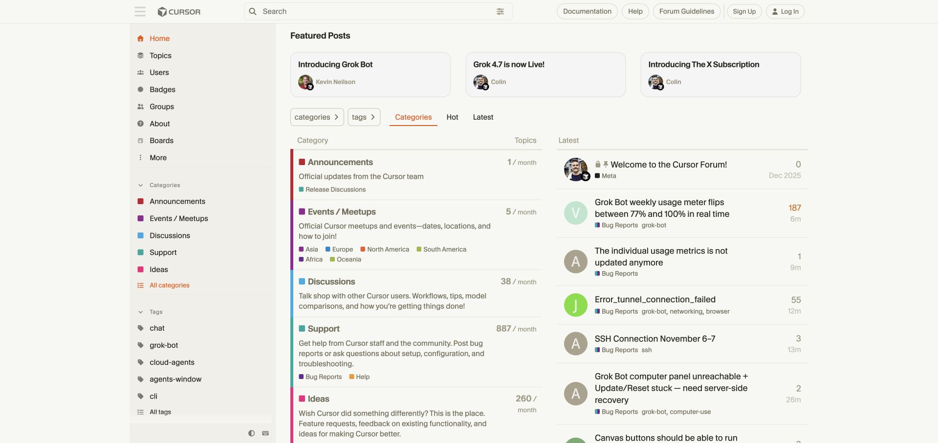
Cursor uses a restrained cream background, orange accents and a persistent search field to frame its community. Featured posts sit above a split view of categories and current topics. Announcements, events, discussions, support and ideas have concise explanations, with support broken into bug reports and help. Regional event links give an otherwise technical forum an in-person community dimension. The page also directs account and billing issues to a separate support channel, a useful boundary for matters that should not be discussed publicly. Repeated destinations in the sidebar and main table make the structure easy to rediscover, but they add visual duplication. Featured announcements occupy space even when a visitor needs immediate troubleshooting.
What you can learn
Define what belongs in public discussion and what needs a private support route before launching a Discourse community. Pair this boundary with short category descriptions and a visible search field, then keep featured announcements focused and current.
Pros
Support and feature ideas are clearly distinguished.
Private account issues receive a separate destination.
Cons & considerations
Repeated category navigation adds density.
Featured announcements push ordinary support topics lower.
Platform source: Public page platform evidence. The directly inspected page declares Discourse 2026.11.0-latest. Platform evidence is separate from the direct website screenshot and is not a complete current infrastructure audit.
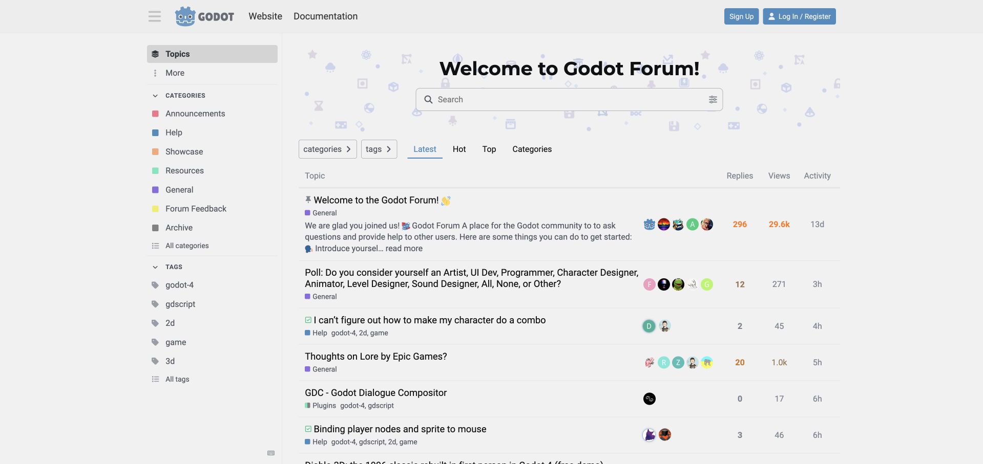
Godot puts an active topic list directly beneath a compact welcome and search area. A pinned introduction explains the purpose of the forum, while ordinary rows combine the topic title with category and tags such as version, language and dimensional workflow. This lets a mixed conversation stream remain interpretable without forcing every visitor through the category directory. The left navigation keeps help, showcases, resources and general discussion available, and the main website and documentation are linked in the header. Light decorative icons provide personality without overwhelming the table. The tradeoff is that a broad discussion poll or general conversation can appear beside an urgent technical question. Long titles and several metadata columns require careful responsive handling.
What you can learn
When recent activity is the default Discourse view, make category and version context readable in every row. Keep a concise newcomer explanation visible, but avoid letting pinned introductions consume the entire first screen.
Pros
Version and workflow tags clarify mixed technical topics.
Documentation remains directly accessible from the header.
Cons & considerations
Social and support topics compete in the same initial feed.
Platform source: Public page platform evidence. The directly inspected page declares Discourse 2026.6.0-latest. Platform evidence is separate from the direct website screenshot and is not a complete current infrastructure audit.
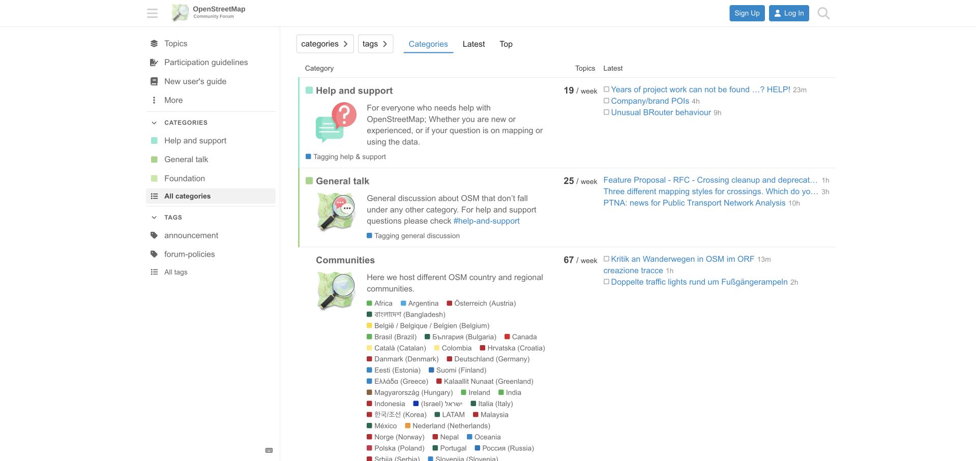
OpenStreetMap organizes its forum around help, general discussion and regional communities. Each main category has an explanatory paragraph and an illustration, while recent threads appear alongside it. The regional area names communities in local languages as well as English where useful, making the geographic structure visible rather than hiding it in a language selector. Participation guidelines and a newcomer guide have permanent sidebar positions. That combination suits a project where local context matters as much as technical skill. The large regional list is also the main design challenge: many destinations compete within one block, and colored markers alone do little to help a reader locate a particular country. Thread previews in the adjacent column are frequently abbreviated.
What you can learn
Represent regional communities explicitly when geography changes the work being discussed. In Discourse, pair those destinations with shared participation guidance, and provide a manageable way to find a region as the list grows.
Pros
Regional names acknowledge the community's multilingual structure.
Newcomer and participation guidance stay easy to find.
Cons & considerations
The long regional list needs more scanning support.
Narrow recent-topic previews hide parts of the subject.
Platform source: Public page platform evidence. The directly inspected page declares Discourse 2026.7.4. Platform evidence is separate from the direct website screenshot and is not a complete current infrastructure audit.
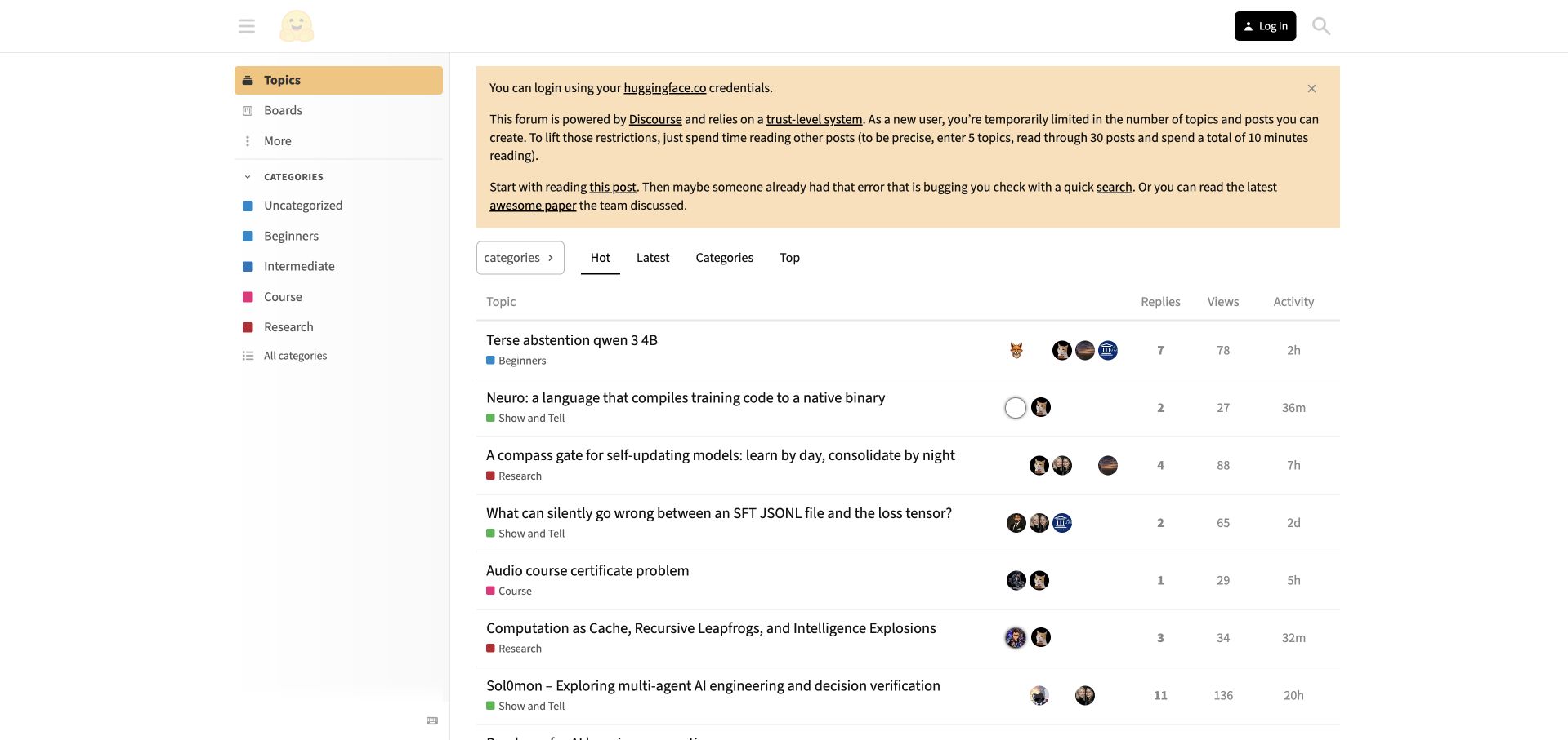
Hugging Face places a yellow onboarding notice above its discussion table. It explains that visitors can use their existing Hugging Face credentials and describes the forum's trust-level restrictions for new members. That is unusually useful operational content: a person can understand why posting capabilities may initially differ from those of established contributors. The notice also points toward introductory reading and search. Beneath it, the topic list separates beginners, research, courses and project sharing through compact category labels, while replies, views and activity remain aligned to the right. The page is visually economical, with little decoration beyond the recognizable brand mark. The onboarding paragraph is lengthy, however, and the default hot-topic stream mixes very different levels of technical experience.
What you can learn
Surface participation rules at the moment people enter a Discourse community, using plain language and a route to learn more. Keep those instructions concise enough that returning readers can still reach useful discussions quickly.
Pros
New-member restrictions are explained before posting.
Existing-account access is explicitly identified.
Cons & considerations
The large notice pushes discussions downward.
A mixed hot-topic feed offers limited skill-level orientation.
Platform source: Public page platform evidence. The directly inspected page declares Discourse 2026.11.0-latest. Platform evidence is separate from the direct website screenshot and is not a complete current infrastructure audit.
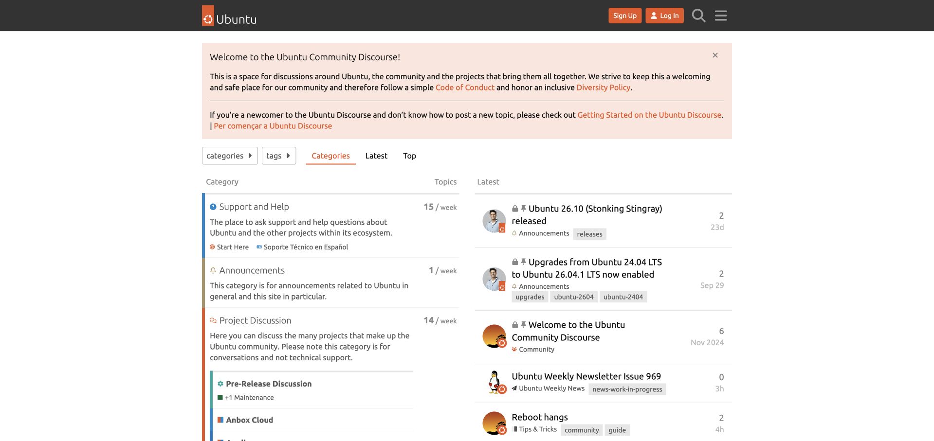
Ubuntu opens with a peach-colored welcome panel that links to its conduct expectations, diversity policy and getting-started guidance. This gives newcomers a clear introduction before they encounter a long category list. Below it, support and help are distinguished from announcements and project discussion, with the latter explicitly described as a place for conversation rather than technical support. The two-column layout pairs those destinations with recent topics, and the orange header details retain a recognizable Ubuntu identity. Project areas are numerous, so the page quickly becomes dense below its simple opening. The full-screen tracker dialog is another meaningful part of the first visit; the clean capture follows saving the existing required-only preferences, rather than concealing that interruption.
What you can learn
Use the Discourse welcome area to explain participation and the difference between support and collaboration. Keep the introduction maintainable and give returning members a direct route past it to their chosen project.
Pros
Conduct and newcomer guidance appear before participation.
Support and project discussion have explicit boundaries.
Cons & considerations
The extensive project list demands considerable scanning.
A first-visit privacy dialog interrupts access to the directory.
Platform source: Public page platform evidence. The directly inspected page declares Discourse 2026.1.7. Platform evidence is separate from the direct website screenshot and is not a complete current infrastructure audit.
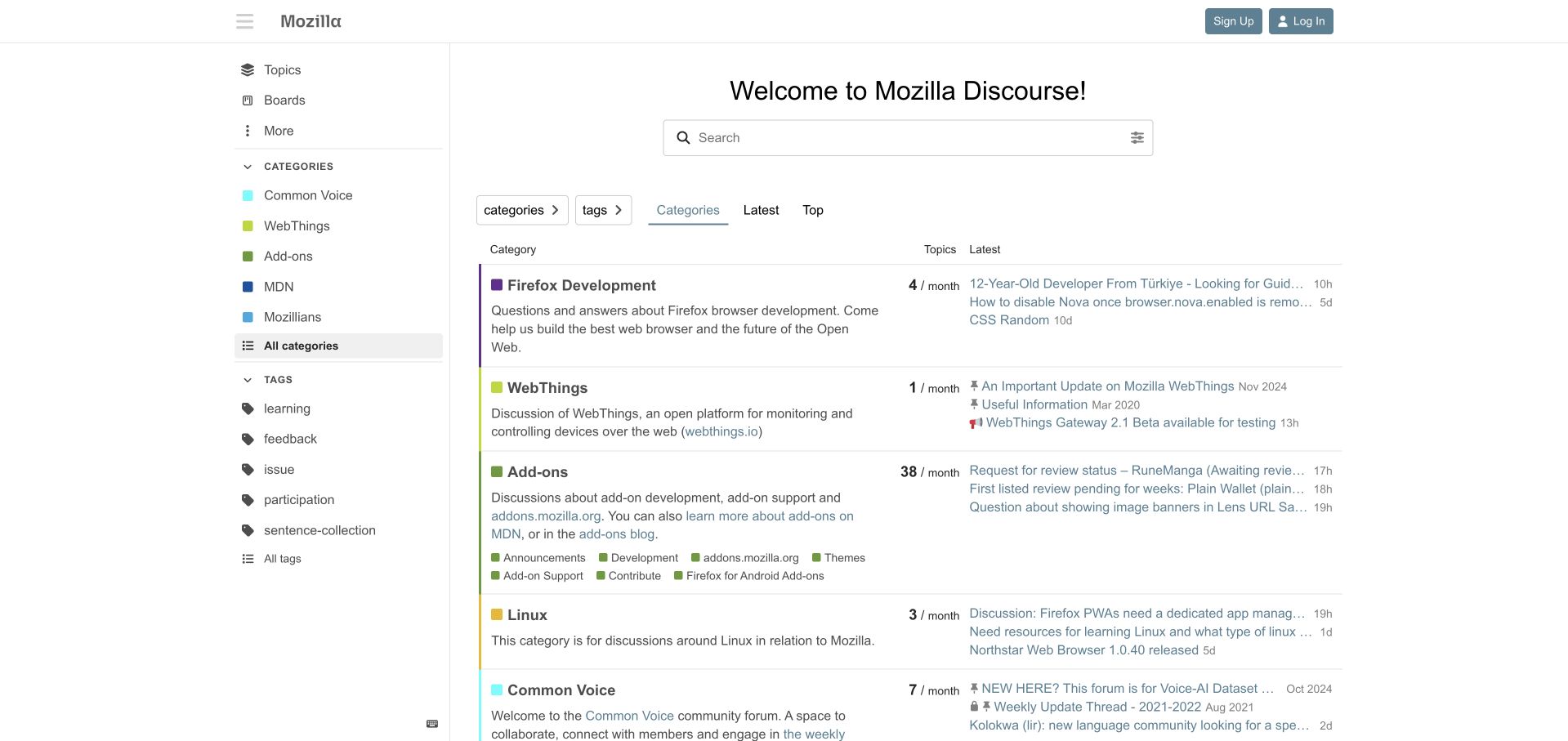
Mozilla keeps the forum interface restrained: a compact wordmark, wide search field and neutral category table do most of the work. Firefox development, WebThings, add-ons and other project communities receive descriptions that clarify their subject and audience. Subcategory links expose specific routes such as add-on development and support without requiring another page first. Recent topics sit alongside each group, providing a sense of what people are discussing. The sidebar highlights a smaller selection of categories and tags, which gives repeat visitors shortcuts but creates a second taxonomy to understand. Older pinned announcements remain prominent beside current contributions, so readers need to pay attention to dates. The overall approach is useful for presenting several related projects without giving every project a separate site.
What you can learn
Write category descriptions as audience guidance, and distinguish durable pinned information from time-sensitive announcements. A shared Discourse installation needs consistent naming and maintenance even when individual project teams manage their own conversations.
Pros
Project descriptions explain the scope of each destination.
Subcategory links shorten common support routes.
Cons & considerations
Old pinned material can appear beside fresh activity.
Sidebar selections do not exactly mirror the main directory.
Platform source: Public page platform evidence. The directly inspected page declares Discourse 2026.11.0-latest. Platform evidence is separate from the direct website screenshot and is not a complete current infrastructure audit.
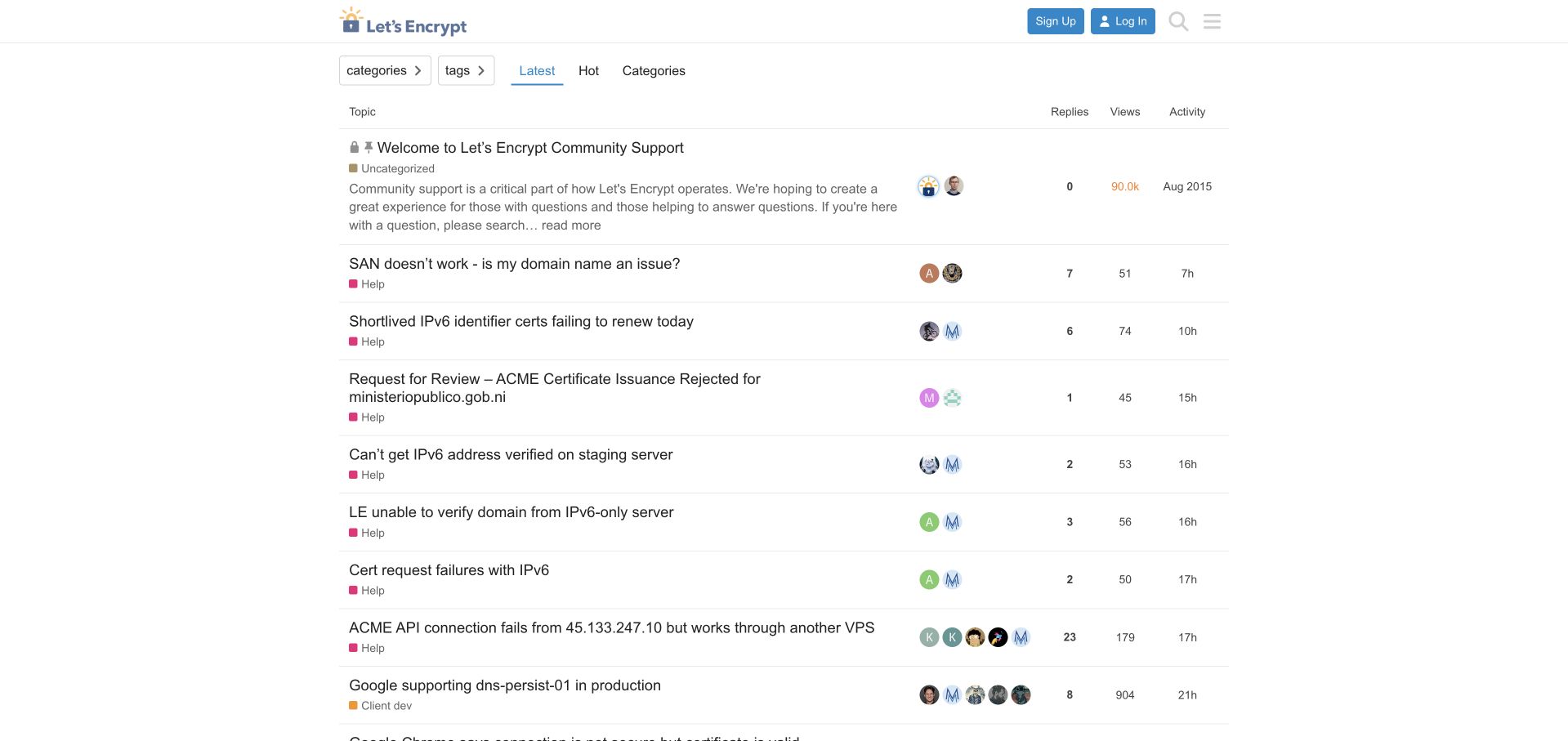
Let's Encrypt presents a compact, largely undecorated support forum. The recognizable logo and account controls sit above category and tag filters, followed immediately by the latest questions. A pinned welcome explains the role of community support and encourages searching before asking. Ordinary rows expose replies, views and recent activity, allowing readers to compare conversations without opening every topic. The design makes sense for a destination where visitors often arrive with a specific certificate problem rather than a desire to browse promotional content. It also demonstrates the limits of a minimal entrance: search is represented mainly by a header icon, and technical titles can be difficult for an inexperienced visitor to interpret. The welcome's old original date may look stale even when its guidance remains relevant.
What you can learn
A focused Discourse support forum can work with very little decoration, provided search, question preparation and escalation routes are unmistakable. Review pinned guidance periodically and distinguish its original publication date from ongoing editorial maintenance.
Pros
Current questions occupy the main screen immediately.
Reply and activity information support quick comparison.
Cons & considerations
Search could receive stronger visual emphasis.
Technical terminology offers little orientation for absolute beginners.
Platform source: Public page platform evidence. The directly inspected page declares Discourse 2026.11.0-latest. Platform evidence is separate from the direct website screenshot and is not a complete current infrastructure audit.
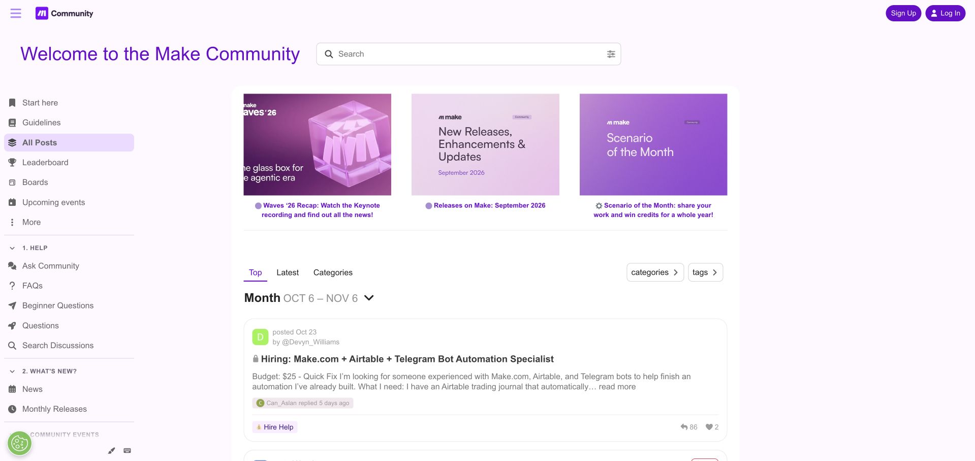
Make's purple community interface organizes the sidebar into numbered sections for help, news, events and involvement. Beginner questions, FAQs and discussion search are presented together, while contribution and recognition programs have their own area. This is a useful distinction for a community that serves both people seeking answers and members sharing expertise. Featured cards bring releases and community activities into the opening, and the main discussion area uses substantial cards with excerpts rather than a terse table. The selected top view includes an explicit monthly period, making its ranking context visible. That view can also elevate hiring posts ahead of ordinary support questions, so a first-time visitor may need to choose another route. The feature area consumes considerable vertical space.
What you can learn
Make the purpose of each navigation group explicit when customizing Discourse. If a ranked feed is the default, show its time window and give problem-solving visitors a clearly marked alternative to promotional or hiring content.
Pros
Help resources are grouped by a recognizable task.
The ranked feed displays its selected time period.
Cons & considerations
Large featured cards delay everyday discussions.
Popular hiring content can dominate a general community entrance.
Platform source: Public page platform evidence. The directly inspected page declares Discourse 2026.11.0-latest. Platform evidence is separate from the direct website screenshot and is not a complete current infrastructure audit.
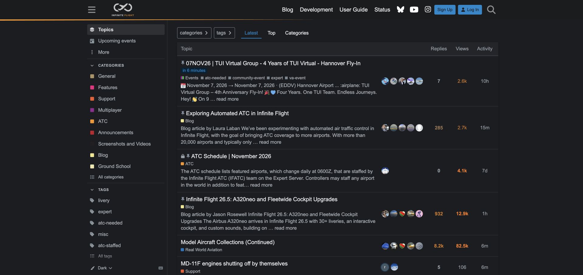
Infinite Flight uses a dark forum interface with an orange divider and compact links to the blog, user guide and service status. Its latest-topic list includes substantial previews, making event details, schedules and product announcements understandable before a reader opens a thread. Categories such as multiplayer, air traffic control and screenshots reflect the activities of the community, while tags add more precise participation context. The approach shows how Discourse can support coordination as well as troubleshooting. It is particularly effective when a topic has an imminent event or a recurring schedule. The same preview format makes the list tall, however, and several pinned items can leave little room for ordinary discussion. Specialized abbreviations assume that visitors already know the simulation's vocabulary.
What you can learn
Use excerpts and event context where people need to coordinate, but set limits on pinned material. A Discourse community should preserve a fast route to current conversation even when schedules and announcements are important.
Pros
Event and schedule previews communicate useful context early.
The user guide and status page remain easy to reach.
Platform source: Public page platform evidence. The directly inspected page declares Discourse 2026.9.1. Platform evidence is separate from the direct website screenshot and is not a complete current infrastructure audit.
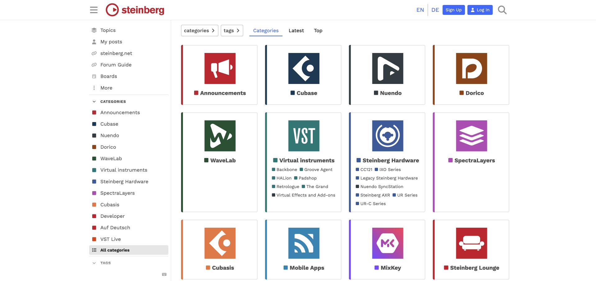
Steinberg replaces the usual category table with a grid of product cards. Cubase, Nuendo, Dorico and WaveLab have large recognizable icons, while instruments and hardware expose more detailed links inside their cards. A visitor who knows the product they own can locate a destination without reading a long explanation of the organization. The sidebar repeats key categories and keeps the forum guide nearby. English and German routes are visible in the header, acknowledging the community's main language choices. The grid is a strong orientation device, but it provides little immediate indication of current conversation or unanswered questions. Large cards also consume substantial space, and the hardware card becomes much denser than the simpler product cards. The capture follows declining optional cookies.
What you can learn
Product imagery can make a Discourse category directory easier to recognize, especially for established customers. Balance those cards with a visible latest-activity route and avoid forcing differently sized product families into identical information layouts.
Pros
Product icons support recognition without extensive reading.
Hardware and instrument subcategories are available directly.
Cons & considerations
The grid hides the latest discussion context.
Cards with many subcategories become disproportionately dense.
Platform source: Public page platform evidence. The directly inspected page declares Discourse 2026.11.0-latest. Platform evidence is separate from the direct website screenshot and is not a complete current infrastructure audit.
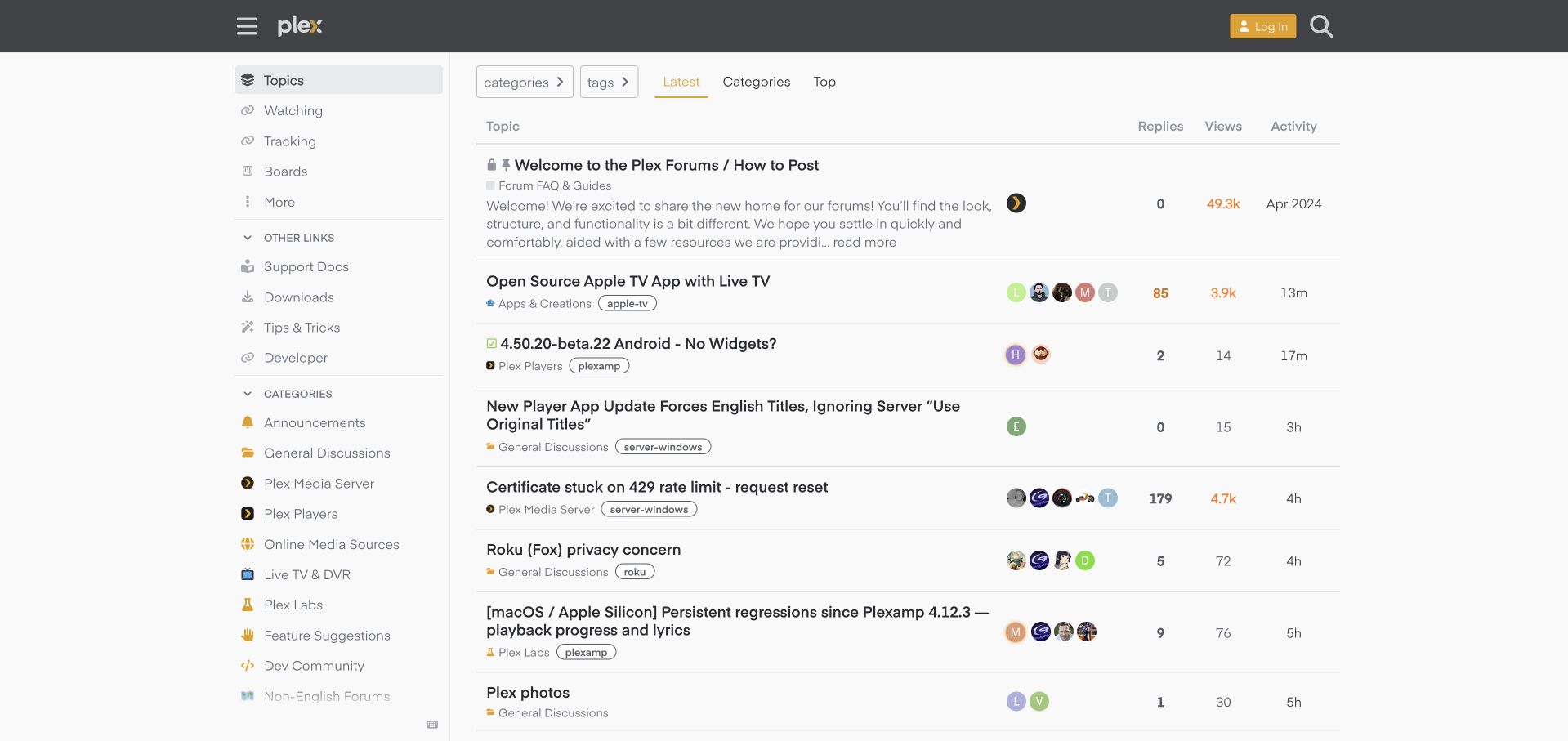
Plex combines a charcoal header with restrained gold accents and a readable latest-topic table. The sidebar distinguishes the media server, players, online sources, live television and developer community, while individual rows add tags for the relevant device, operating system or application. That detail is valuable in a support ecosystem where similar symptoms can have very different contexts. A pinned posting guide provides a starting point, and documentation, downloads and tips remain available outside the discussion taxonomy. The layout offers a practical balance between a familiar product identity and the needs of technical troubleshooting. Its limitations are mostly editorial: descriptive titles can become very long, and the mixed latest feed asks readers to separate server problems, player feedback and community creations themselves.
What you can learn
Define a small set of context tags before a Discourse support community grows. Pair them with product categories so questions carry enough information to be routed and searched without making every device a separate top-level destination.
Pros
Device and operating-system tags clarify support context.
Documentation and downloads sit beside community navigation.
Cons & considerations
Long titles make some rows disproportionately tall.
The latest feed mixes several distinct support audiences.
Platform source: Public page platform evidence. The directly inspected page declares Discourse 2026.11.0-latest. Platform evidence is separate from the direct website screenshot and is not a complete current infrastructure audit.
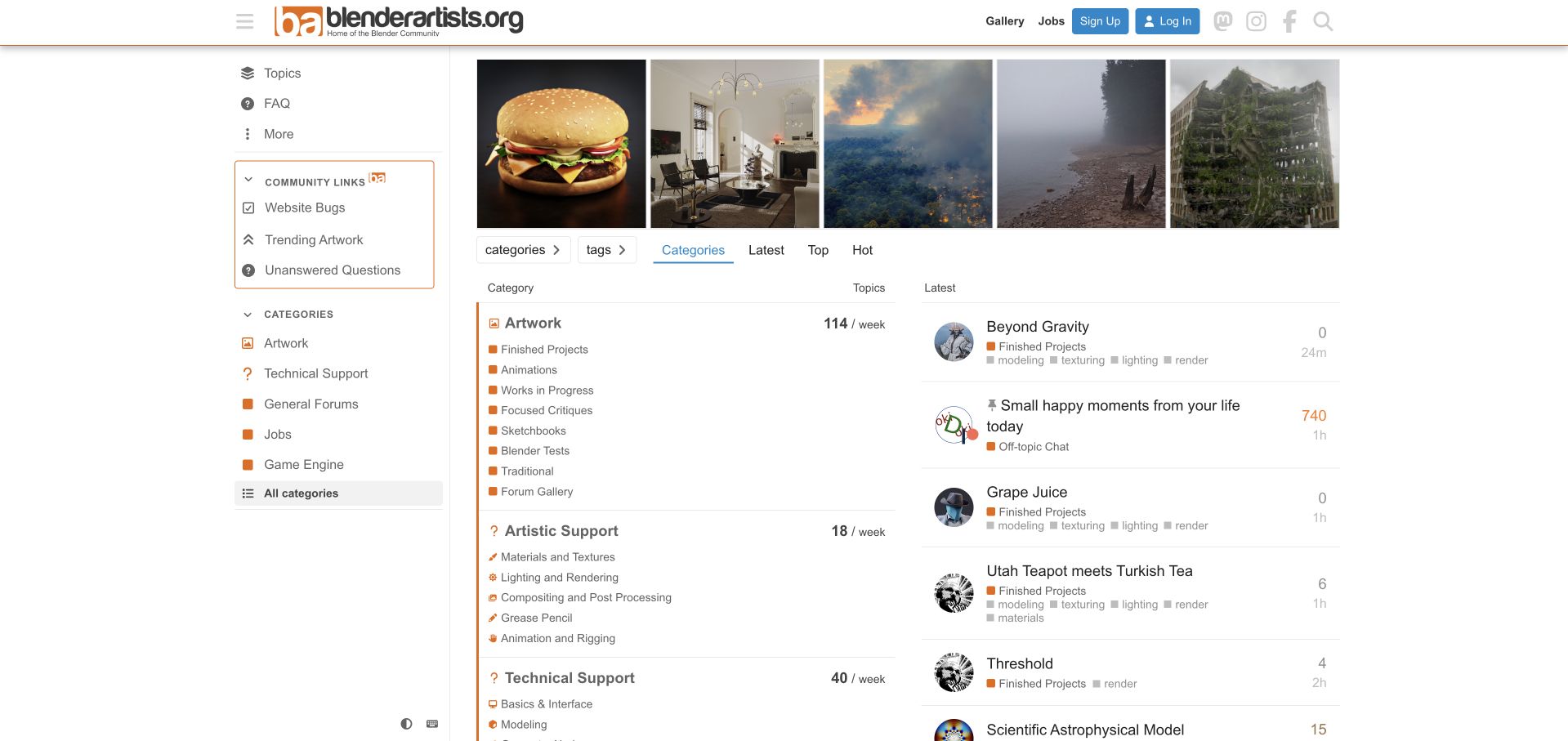
Blender Artists gives creative work a visible place in its community, with a featured artwork strip and an extensive category structure below. Finished projects, work in progress, focused critiques and sketchbooks identify different kinds of artistic participation. Artistic support is distinguished from technical support, allowing questions about materials or lighting to sit apart from interface and scripting problems. The sidebar also provides an unanswered-questions route, a useful way to direct experienced members toward contributions that need attention. This is an independent community property, and its platform evidence should not be generalized to the Blender project's other sites. The long subcategory lists create considerable density, while featured images and recent topics compete for attention. Category labels do more explanatory work than the brief page introduction.
What you can learn
Model a creative Discourse community around the kind of response a member wants: appreciation, critique, technique or troubleshooting. Add a clear route to unanswered work so the community's attention is not governed only by popularity.
Pros
Critique and technical support have distinct destinations.
Unanswered questions receive a dedicated navigation route.
Cons & considerations
Long subcategory lists make the directory dense.
Featured artwork can distract from an immediate support task.
Platform source: Public page platform evidence. The directly inspected page declares Discourse 2026.11.0-latest. Platform evidence is separate from the direct website screenshot and is not a complete current infrastructure audit.
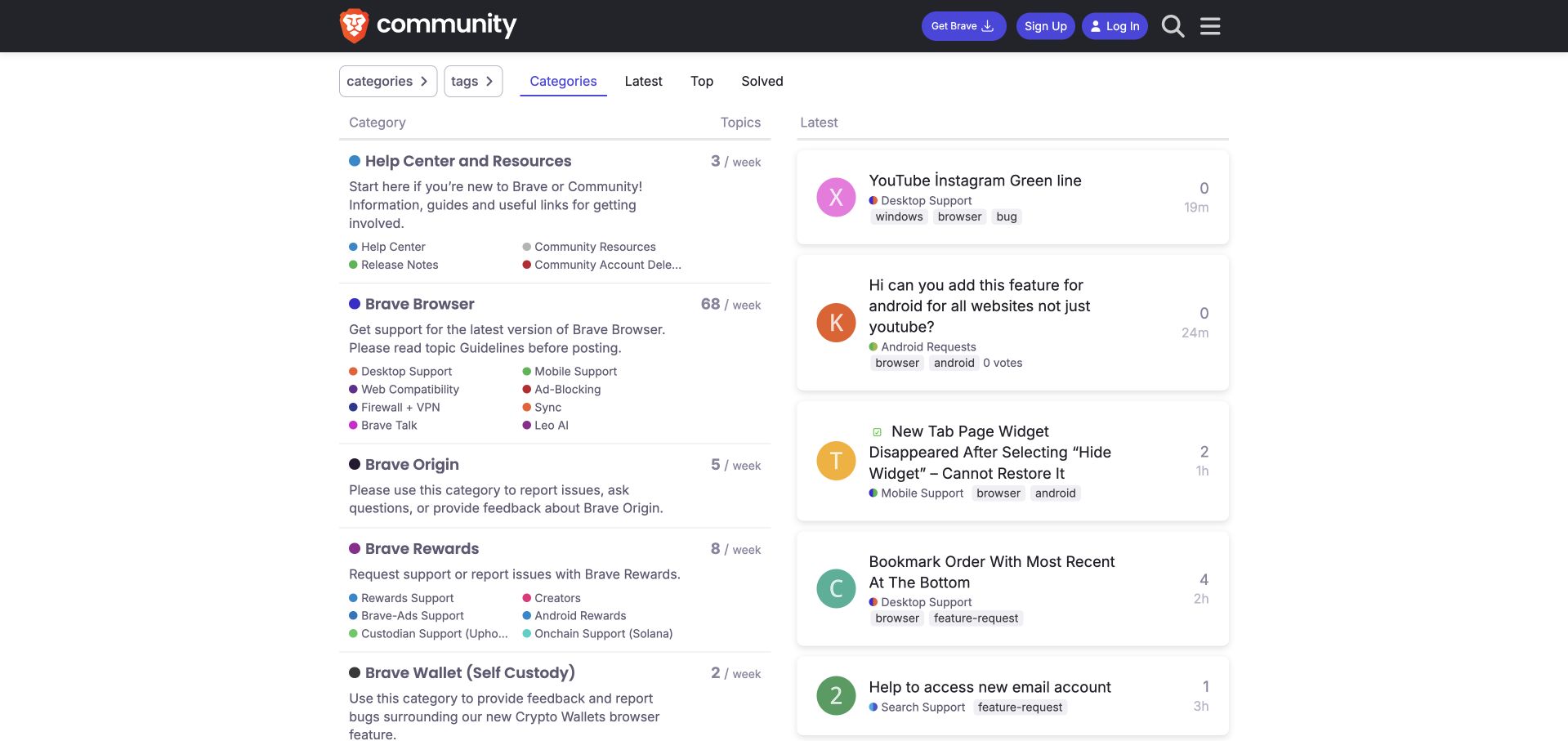
Brave's community pairs a category directory with a column of recent discussions presented as individual cards. The dark header and purple controls retain the product identity without dominating the support content. Help and resources come first, followed by browser-related areas and other products. A solved view sits alongside categories, latest and top, making resolved conversations a visible browsing option. Category descriptions explain where to ask, and smaller links distinguish desktop, mobile, compatibility and other common contexts. This gives new members a more useful starting point than a single unrestricted feed. The growing product list still makes the page lengthy, and some long subcategory labels are clipped. Recent cards show tags and activity, but their varying title lengths produce an uneven rhythm.
What you can learn
Make resolved discussions discoverable when configuring Discourse for support, and explain category scope before people post. Keep product taxonomy under review so new offerings do not gradually bury the help routes most visitors need.
Pros
Solved discussions have a prominent navigation option.
Browser support is divided into recognizable user contexts.
Cons & considerations
An expanding product list increases directory length.
Long subcategory labels can be difficult to distinguish when clipped.
Platform source: Public page platform evidence. The directly inspected page declares Discourse 2026.11.0-latest. Platform evidence is separate from the direct website screenshot and is not a complete current infrastructure audit.
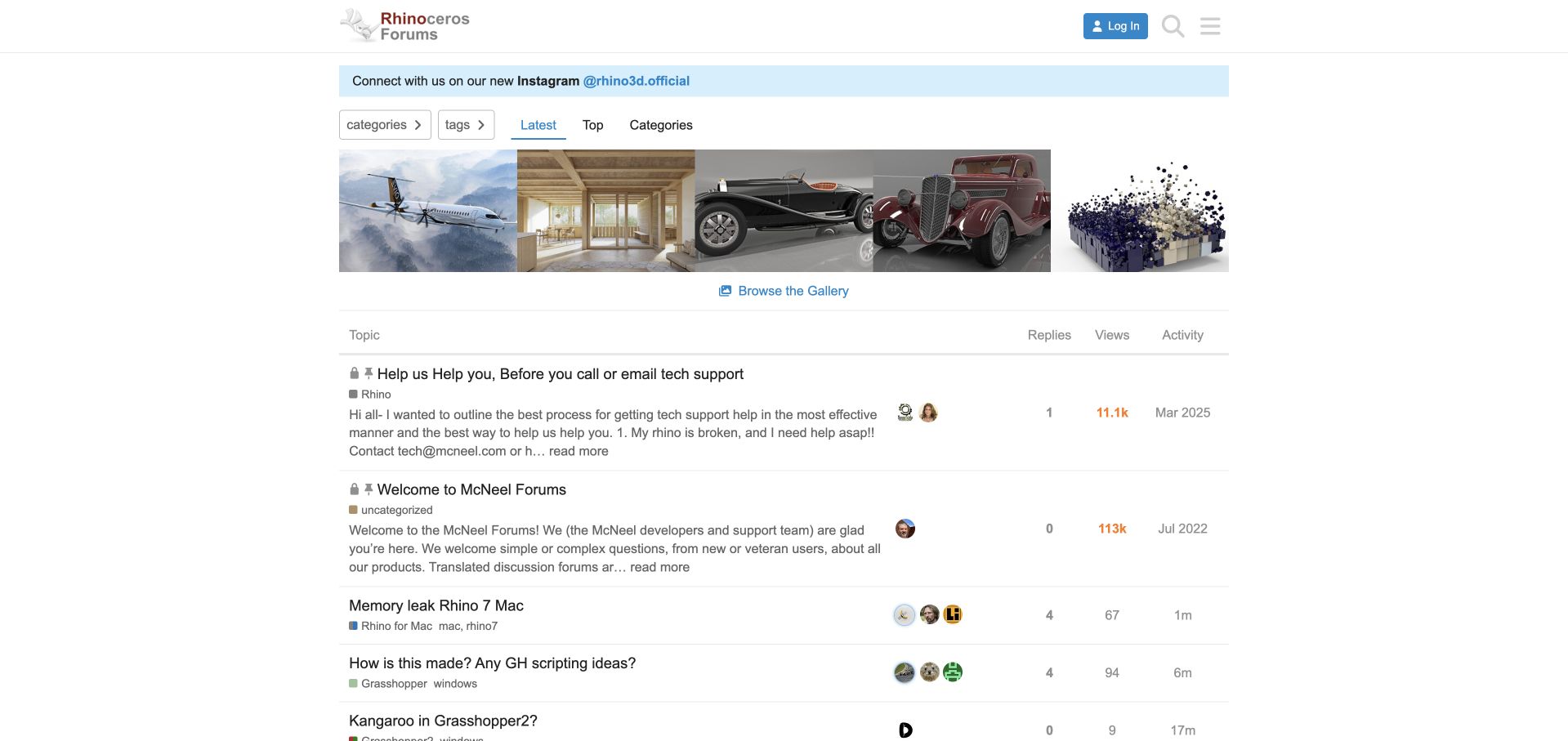
McNeel places a gallery above its Rhino discussion table, connecting technical questions to the objects and spaces people create with the software. A gallery link makes that visual area a destination. Two pinned topics then explain how to get useful support and introduce the community before current questions appear. Tags identify operating systems and product generations, while categories distinguish Rhino and Grasshopper discussions. The arrangement gives the forum a sense of creative purpose without turning the whole page into a marketing gallery. Its main challenge is the cumulative height of the social notice, gallery and pinned explanations. Returning visitors must move past several layers before reaching ordinary conversation. Compact category and tag labels also assume familiarity with the product family.
What you can learn
Use a small gallery to connect a Discourse support community with users' actual work, then keep support preparation clear and concise. Monitor the combined height of banners and pinned topics rather than evaluating each addition in isolation.
Pros
The gallery connects support with tangible creative outcomes.
Pinned guidance explains how to ask for effective help.
Cons & considerations
Several introductory layers delay current discussions.
Product and operating-system tags require some prior knowledge.
Platform source: Public page platform evidence. The directly inspected page declares Discourse 2026.11.0-latest. Platform evidence is separate from the direct website screenshot and is not a complete current infrastructure audit.
Kegan has 15+ years of experience working with small businesses, Fortune 500 companies, and everything in between. No development job is too big or too small: he brings the same hands-on attention to a focused improvement, a complete website, or a custom application.
For Discourse projects, he can help with content architecture, custom functionality, system integrations, testing, and maintainable handover. He works directly with clients on scope, design, implementation, testing, and handover, with an emphasis on clear communication and a system that remains practical to maintain after launch.
Show 3 other Discourse developersHide other Discourse developers
Choose the implementation around the operating model
Start with a restrained category system
Use a small set of meaningful destinations and expand when actual activity justifies it. Empty categories can make a new community feel larger but less useful.
Connect an established product ecosystem
Keep documentation, downloads, and service-status routes available when they answer questions the forum cannot. Preserve the boundary between community discussion and official support.
Customize with an ownership plan
Define who maintains theme changes, integrations, and category rules. Demonstrate updates with realistic long titles and an active discussion before approving a visual treatment.
From references to requirements
Plan the content and everyday maintenance
Plan migration around conversations
Preserve important topic links, authorship, attachments, and redirects according to the migration scope. Test an old answer and a renamed category, not just the new homepage.
Define editorial and moderation roles
Assign announcements, category descriptions, outdated guidance, and escalation routes. A clean layout cannot compensate for unanswered or misleading pinned content.
Test the reading journey
Check search, long threads, code, images, and mobile navigation. Review signed-out access separately from member workflows in an appropriate test environment.
A useful handover demonstration
Ask the actual team to carry out its routine job: publish a realistic update, correct a mistake, preview a narrow screen, and identify who owns an integration failure. For a library or frontend framework, also ask who maintains the content source and deployment. A polished screenshot does not answer those operational questions.
Beyond the screenshot
Discourse project checklist
Choose the primary discovery route.
Name categories plainly.
Mark archived areas.
Keep official support links clear.
Assign moderation ownership.
Preserve important URLs.
Test long topics.
Check mobile reading.
Review theme updates.
Explain contribution rules.
Test with real content, a keyboard, a small screen, slow or failed requests, and the people who will maintain the system. These are planning checks, not an accessibility, security, performance, or search-ranking certification.
Sources & editorial method
How this Discourse collection was reviewed
Twenty distinct public properties have direct website captures and original design reviews. The first five are explicitly identified recognizable organizations or established specialists. Platform evidence is scoped to each named property; documentary associations, dated observations, and narrower asset-only signals remain qualified. Captures and technology verification have independent dates. A bounded public stack audit was attempted for every source, preserving inaccessible and unknown results. No private administration or transactions were inspected.
Every image is an unmodified capture from the actual website, with its source and capture date. Some captures are reused from our shared catalog; their dates remain the original capture dates. None comes from a vendor gallery or a generated reconstruction. Moving imagery and live content can change.
Technology attribution uses public page assets or metadata, official platform documentation, or a cited first-party project case study. Documentary and framework-relationship evidence is identified where used; it is not a complete current backend inventory. A CMS image CDN alone does not establish a full CMS deployment. A library’s presence does not prove which individual controls use it, and a platform label does not establish AI authorship.
The composition notes, lessons, pros and tradeoffs are original editorial observations. We have not measured conversion, traffic, security, performance or accessibility conformance. Website owners retain their brands and imagery; these examples are not our client portfolio. Written, Edited and Curated are independent records, not dates advanced by a build. See our editorial standards or suggest a correction.
Questions worth asking
Discourse website development FAQs
Should the homepage show categories or recent topics?
Choose according to how visitors arrive. A product-support directory may need categories first; a general community may benefit from visible recent activity.
Does a public Discourse marker reveal the whole stack?
No. It identifies the community layer on that property, not every account, support, or backend system.
Should every product have a category?
Only when the audience and activity justify it. Consider how users will navigate renamed, retired, or low-volume products.
Can the examples prove community engagement?
No. Visible counts and recent posts are snapshots, not a complete engagement or support-effectiveness analysis.