Best XenForo Websites of 2026 (20 Real-World Examples)
XenForo communities that connect discovery with specialist discussion
These 20 examples compare trending feeds, forum indexes, topic metadata, resource links, and the tradeoffs of advertising or large navigation systems.
XenForo’s official product presentation distinguishes discussion and related community capabilities, with hosted and self-managed routes. The appropriate implementation depends on the operating team as much as the visual design.
MacRumors, Tom’s Hardware, AVForums, XDA, and Tom’s Guide lead the collection. The pictured properties expose XF markers, platform credits, or related resources.
Before the examples
What makes good XenForo website development in 2026?
Choose a meaningful landing view
Trending discussions help frequent readers browse, while a category index helps visitors with a known subject. Provide a clear route between them.
Dates, reply counts, labels, and prefixes should help readers choose a thread. Explain specialized prefixes and avoid allowing badges to dominate the title.
Protect the reading area
Advertising, affiliate promotions, and sticky notices need space limits. Preserve a stable route to the discussion content at desktop and mobile sizes.
The collection · 20 examples
20 XenForo website examples worth studying
Current public XF evidence supports the examples; mixed publishing layers and access limitations remain qualified in the individual reviews.
We start with five recognizable brands or organizations: MacRumors Forums, Tom's Hardware Forums, AVForums, XDA Forums, Tom's Guide Forum. Each attribution applies to the named website property, not every product or website belonging to its organization. This is a curated reading sequence, not a measured ranking.
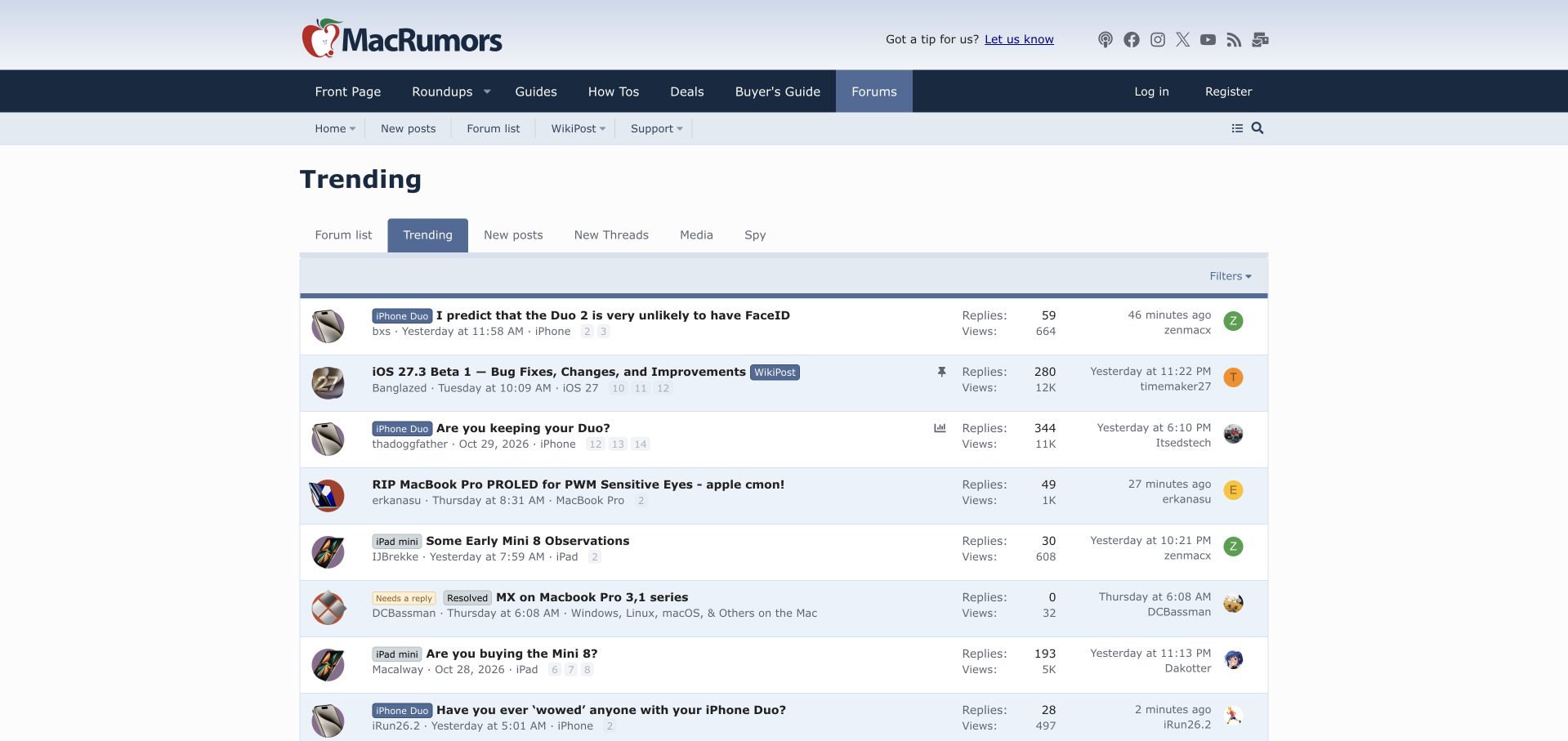
MacRumors opens its forum on a trending discussion feed beneath the publication's familiar masthead. Product labels sit beside bold thread titles, while reply counts, views and recent activity remain aligned to the right. A highlighted sticky row and small poll or WikiPost indicators distinguish different kinds of participation without breaking the table's rhythm. Visitors can switch to the forum list, new posts, new threads or media through a compact tab row. The result feels like an active extension of the publication rather than a detached support destination. Its weakness is the number of overlapping navigation choices: new posts and the forum list appear in more than one place. Long thread titles and pale pagination links also make some rows harder to read quickly.
What you can learn
A publication community can lead with conversation while preserving a category directory one step away. Use clear topic labels and meaningful status markers to make an activity feed understandable to readers arriving from editorial content.
Pros
Product labels give individual discussions useful context.
Distinct indicators identify polls, pinned material and collaborative WikiPosts.
Platform source: Public page platform evidence. The page exposes a data-xf="2.3" platform marker with XF structure or /js/xf/ resources. Platform evidence is separate from the direct website screenshot and is not a complete current infrastructure audit.
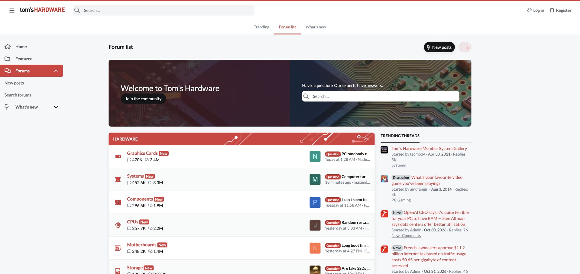
Tom's Hardware uses a circuit-board welcome panel to connect its community with the publication's subject. A prominent search field shares the hero with a join action, while a persistent left rail keeps forums and new activity close at hand. Below, red section headers introduce familiar hardware categories such as graphics cards, systems, processors and storage. Small component icons reinforce those labels, and question prefixes distinguish support requests in the latest-post previews. The right column surfaces trending discussions alongside the directory. This gives both a specific problem and casual browsing an obvious starting point. The latest-post column is narrow, however, and repeatedly truncates precisely the question that might help a visitor decide where to go. Search and activity links also recur across several navigation surfaces.
What you can learn
A technical community entrance should support a known problem and open-ended exploration. Combine prominent search with recognizable component categories, then allocate enough space to preview the actual questions within them.
Pros
Component names and icons make the support taxonomy recognizable.
The hero presents search and joining as clear, separate actions.
Cons & considerations
Narrow recent-post previews truncate useful problem context.
Repeated search and activity controls make the navigation busier.
Visible tech stack
Earlier / documented evidence
XenForo
Platform source: Public page platform evidence. The page exposes a data-xf="2.3" platform marker with XF structure or /js/xf/ resources. Platform evidence is separate from the direct website screenshot and is not a complete current infrastructure audit.
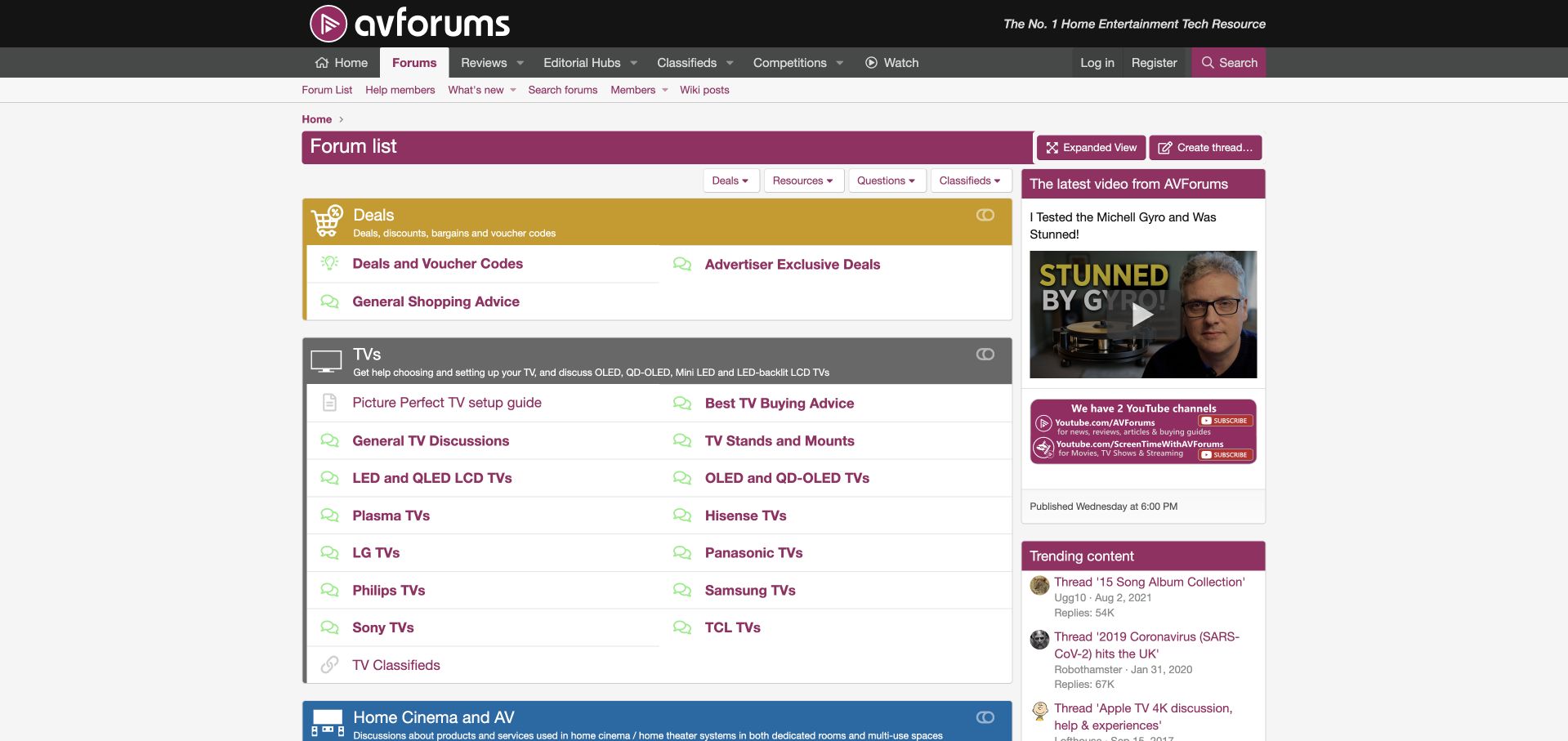
AVForums replaces much of the usual topic-count table with grouped links arranged in two columns. A gold deals section leads into televisions, where buying advice, setup guidance, display technologies and individual manufacturers all appear within one clearly bounded panel. Purple links and a dark masthead keep the community connected to the wider publication. Separate controls expose resources, questions and classifieds, while video and trending content occupy a narrower sidebar. This structure gives visitors several useful entrances without forcing them to interpret activity statistics first. The television panel is extensive, though, and mixes brands, technologies, tasks and resale destinations in one group. Deals also receive the first position, which may delay someone arriving for an urgent setup problem.
What you can learn
A forum index can behave like a practical directory rather than a statistical table. Group related destinations around an understandable subject, but distinguish tasks, brands and transaction areas when their purposes begin to compete.
Pros
Two-column link groups make many destinations visible without dense metrics.
Buying and setup guidance sit close to product-specific discussion.
Cons & considerations
Several different classification systems coexist within the television panel.
Commercial deals precede the main technical-help destinations.
Visible tech stack
Earlier / documented evidence
XenForo
Platform source: Public page platform evidence. The page exposes a data-xf="2.3" platform marker with XF structure or /js/xf/ resources. Platform evidence is separate from the direct website screenshot and is not a complete current infrastructure audit.
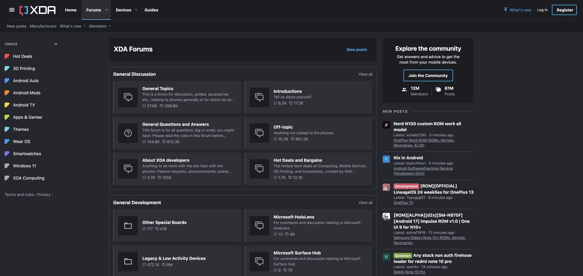
XDA presents a dark interface with a left rail of colored topic labels and a central grid of discussion cards. General Topics, Introductions, Questions and Answers, and Off-topic each receive a distinct block, while the right column introduces the community and lists recent posts. Device and manufacturer routes remain visible in the upper navigation. The card descriptions make an important distinction between general discussion and questions, and the separate legacy-device area acknowledges the age of a large technical archive. The grid is easier to survey than one uninterrupted table, but its excerpts cut off useful explanatory text. Muted gray descriptions and several parallel navigation systems also make the first visit more demanding than the clean card outlines initially suggest.
What you can learn
Cards can make a large discussion taxonomy approachable when each one explains a concrete purpose. Preserve the key boundary in the visible excerpt, especially when users must choose between discussion, questions and device-specific help.
Pros
Topic cards divide participation types into recognizable destinations.
Device routes and a legacy area accommodate a broad technical archive.
Cons & considerations
Truncated descriptions hide some category guidance.
Muted text and parallel navigation rails increase the reading burden.
Visible tech stack
Earlier / documented evidence
XenForo
Platform source: Public page platform evidence. The page exposes XenForo platform markup with XF structure or /js/xf/ resources. Platform evidence is separate from the direct website screenshot and is not a complete current infrastructure audit.
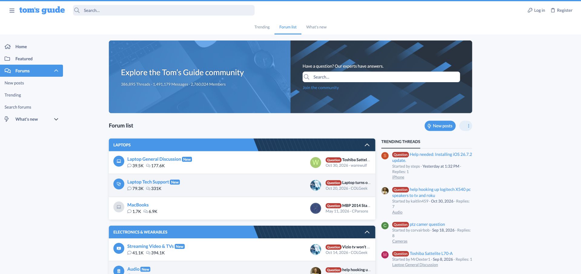
Tom's Guide uses a blue illustrated welcome panel with a search field and an invitation to join. The directory separates laptops from electronics and wearables, with rows for general laptop discussion, technical support, MacBooks, televisions, audio and cameras. Round device icons make those destinations recognizable, while question labels in recent-post previews explain the kind of conversation happening inside. A left navigation rail and trending-thread sidebar frame the main directory. Compared with a single chronological feed, this gives readers a route based on their device. The hero's large cumulative membership figures do not reveal how active every category is today, however. Several visible latest-post dates are older, and truncated previews make that uneven activity harder to interpret without opening a category.
What you can learn
Consumer support works well when visitors can begin with the device they recognize. Pair that familiar taxonomy with transparent activity cues, rather than allowing large lifetime totals to stand in for current participation.
Pros
Device families provide an accessible route into technical discussion.
Search and question markers reinforce the help-oriented purpose.
Cons & considerations
Lifetime totals say little about current activity in individual categories.
Truncated previews limit the usefulness of recent-post context.
Visible tech stack
Earlier / documented evidence
XenForo
Platform source: Public page platform evidence. The page exposes XenForo platform markup with XF structure or /js/xf/ resources. Platform evidence is separate from the direct website screenshot and is not a complete current infrastructure audit.
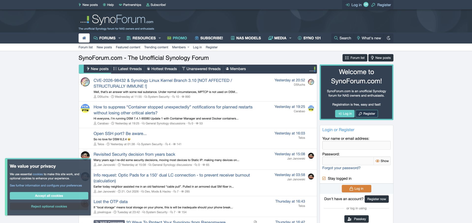
SynoForum explicitly identifies itself as an unofficial Synology community in both the header and welcome panel. Its entrance emphasizes discussions rather than a category table: tabs distinguish new posts, latest threads, popular threads and unanswered questions. Short excerpts, category names and timestamps provide context before a reader opens a conversation. Navigation to NAS models, resources and introductory material supports visitors who need a more structured reference path. The teal accents and dark blue header establish a coherent identity separate from the manufacturer. The right side repeats joining and login prompts, however, using substantial space for similar actions. A privacy panel remained visible in the captured guest view after its preference endpoint could not be completed, covering the lower-left discussion area.
What you can learn
Make volunteer participation easy to find by giving unanswered questions a first-class entrance. An independent product community should also state its relationship to the manufacturer clearly, especially when its topic closely matches a commercial brand.
Pros
Unanswered discussions have a dedicated, visible activity tab.
The unofficial relationship to Synology is clearly disclosed.
Cons & considerations
Repeated login and registration panels compete with discussion space.
The observed privacy panel overlaps part of the guest feed.
Visible tech stack
Earlier / documented evidence
XenForo
Platform source: Public page platform evidence. The page exposes a data-xf="2.3" platform marker with XF structure or /js/xf/ resources. Platform evidence is separate from the direct website screenshot and is not a complete current infrastructure audit.
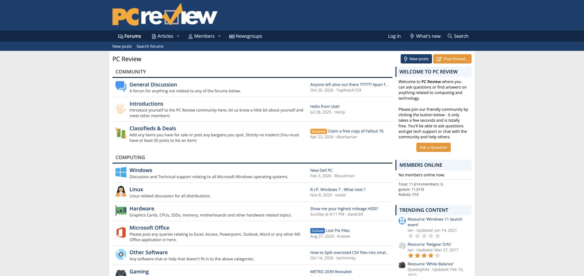
PC Review uses a blue masthead and a simple white directory with colorful subject icons. Community discussion, introductions and classifieds appear before computing areas for Windows, Linux, hardware and office applications. Each row gives the category a plain-language description, while the latest discussion occupies a smaller area to the right. The absence of dominant count columns leaves more room to explain where a question belongs. A welcome panel provides an explicit question-asking action, and articles and newsgroups remain accessible in navigation. Readable structure cannot substitute for activity: several visible sections show old latest-post dates, and some sidebar resources are older still. It is best studied as an organized archive with uneven participation rather than as uniformly busy support.
What you can learn
Category descriptions can be more useful than large totals when visitors are deciding where to ask. Keep those descriptions concise, and expose activity dates honestly so readers can distinguish active discussion from reference material.
Pros
Plain descriptions explain the scope of each computing category.
Reduced emphasis on totals leaves the main labels easy to scan.
Cons & considerations
Several visible categories have relatively old latest-post dates.
Older sidebar resources can weaken the impression of freshness.
Visible tech stack
Earlier / documented evidence
XenForo
Platform source: Public page platform evidence. The page exposes a data-xf="2.3" platform marker with XF structure or /js/xf/ resources. Platform evidence is separate from the direct website screenshot and is not a complete current infrastructure audit.
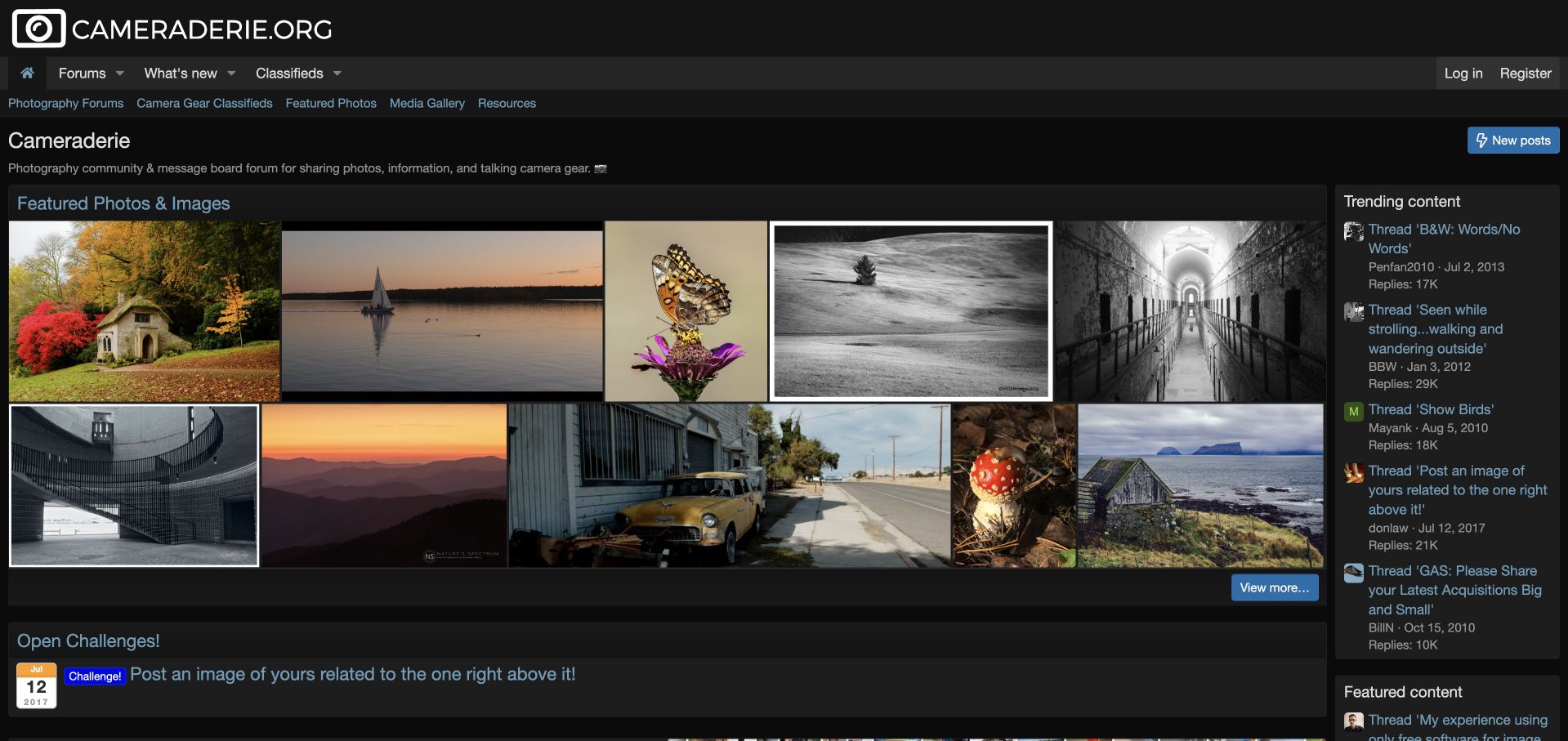
Cameraderie opens with a mosaic of featured photographs against a dark background. Landscapes, architecture and close-up subjects demonstrate the range of work before visitors encounter a conventional forum directory. A short introduction explains that the community shares photographs and discusses camera gear, while navigation separates photography forums, classifieds, featured images, a media gallery and resources. Below the mosaic, an open challenge provides a concrete participation prompt. A trending-content column keeps established conversations visible beside the imagery. The community platform becomes a visual front page. The dense arrangement leaves little room for image context at first glance, though, and long-running discussions in the sidebar carry old start dates that can be mistaken for inactivity.
What you can learn
When members create visual work, show that work before asking newcomers to decode the forum taxonomy. Follow the showcase with a specific invitation to participate, and distinguish the age of a thread from its continuing activity.
Pros
The photo mosaic communicates the community's purpose immediately.
An open challenge offers a concrete route from browsing to participation.
Cons & considerations
Dense image placement provides limited context in the initial view.
Old thread-start dates can confuse perceptions of current activity.
Visible tech stack
Earlier / documented evidence
XenForo
Platform source: Public page platform evidence. The page exposes a data-xf="2.3" platform marker with XF structure or /js/xf/ resources. Platform evidence is separate from the direct website screenshot and is not a complete current infrastructure audit.
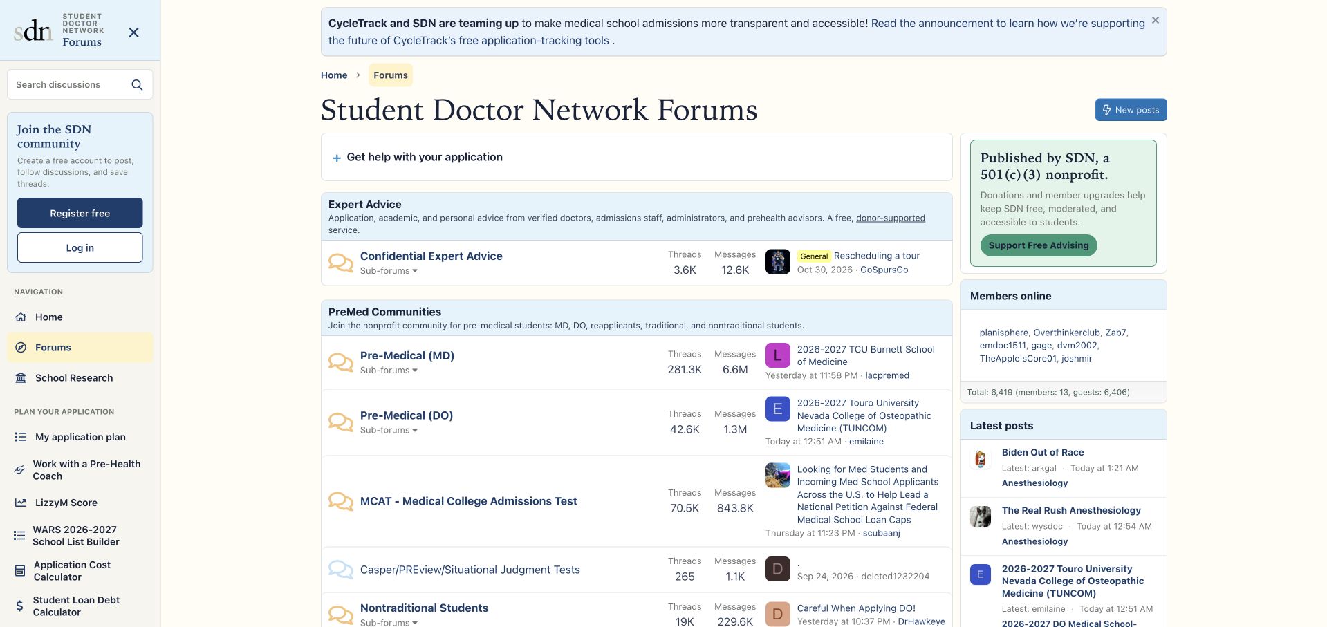
Student Doctor Network places its forum inside a broader navigation structure for planning applications, researching schools, tracking interviews and exploring professions. A cream background, serif title and restrained blue panels give the interface a more editorial character than a default discussion board. The main index separates expert-advice access from premedical communities, with further distinctions for degree paths, examinations and nontraditional applicants. A nonprofit support panel explains the site's funding context without hiding the discussions. This creates useful continuity between community conversation and practical tools. The left rail is very long, however, and includes enough specialized destinations to overwhelm a visitor with one immediate question. Dense counts and recent-post previews also compete with the category explanations. This review does not assess individual advice.
What you can learn
A community serving a long educational journey can organize navigation around stages as well as subjects. Keep the immediate discussion entrance clear while making related planning tools available without requiring exhaustive exploration.
Pros
Application stages connect forum use with related planning resources.
Different applicant groups and professional paths receive explicit destinations.
Cons & considerations
The extensive left rail creates many competing choices.
Dense metadata reduces space for category explanations.
Visible tech stack
Earlier / documented evidence
XenForo
Platform source: Public page platform evidence. The page exposes a data-xf="2.3" platform marker with XF structure or /js/xf/ resources. Platform evidence is separate from the direct website screenshot and is not a complete current infrastructure audit.
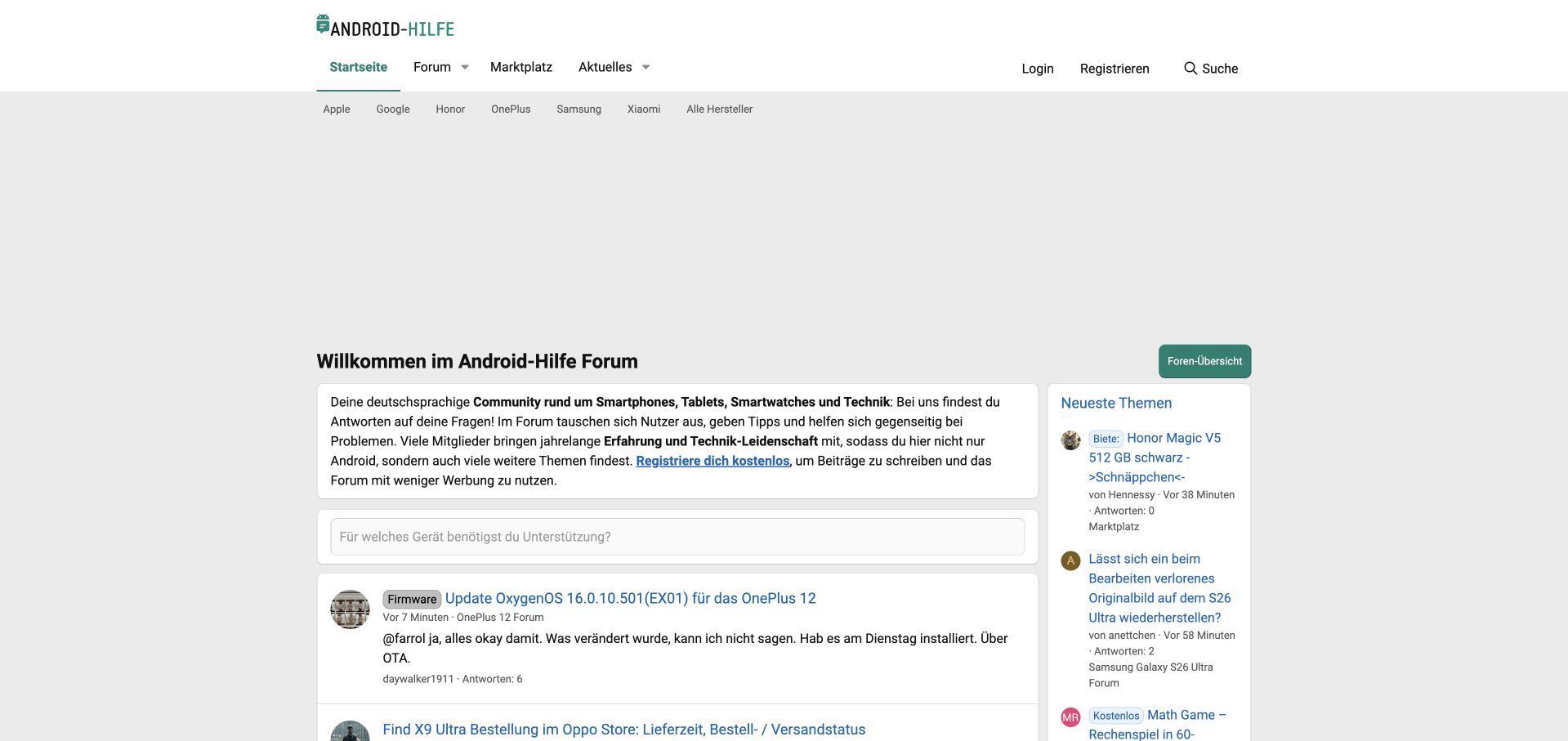
Android-Hilfe introduces its German-language community with a concise welcome panel and a device-oriented search prompt. Manufacturer shortcuts sit directly below the main navigation, making familiar brand names an alternative to browsing the full forum structure. The central feed combines a topic title, category, short excerpt and recent activity, while a narrower column lists additional new discussions. Green accents and generous white surfaces keep the identity restrained. The device prompt is particularly useful because it asks for something visitors likely know. A large empty area separates navigation from that practical content in the observed desktop layout, however. The welcome paragraph and two simultaneous activity feeds also compete for attention before a user has identified the appropriate device area.
What you can learn
For device support, begin with the information visitors can confidently supply: the product they own. Manufacturer routes and a clear device prompt can make a large archive approachable, provided they appear early enough in the page.
Pros
The search prompt is framed around the visitor's device.
Manufacturer shortcuts offer a familiar alternative to the full directory.
Cons & considerations
A large empty area delays the practical support entrance.
Parallel activity feeds compete with the initial device-selection task.
Visible tech stack
Earlier / documented evidence
XenForo
Platform source: Public page platform evidence. The page exposes a data-xf="2.3" platform marker with XF structure or /js/xf/ resources. Platform evidence is separate from the direct website screenshot and is not a complete current infrastructure audit.
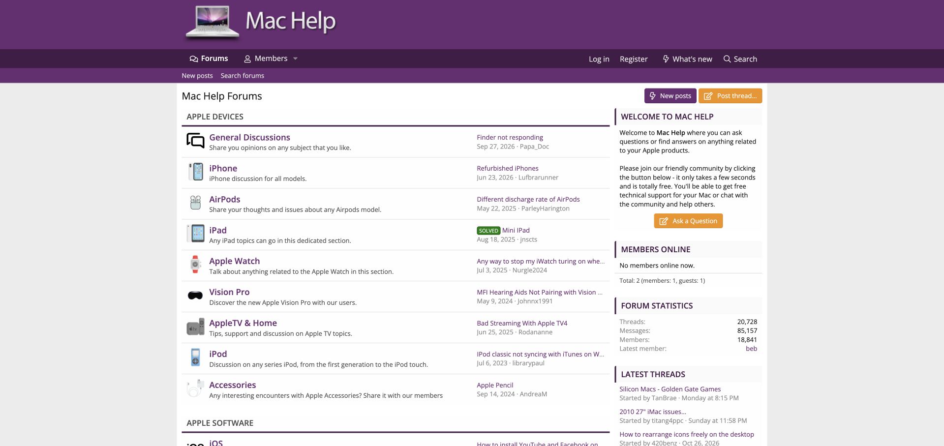
Mac Help uses a purple masthead above a white directory. Apple devices appear as individual rows with recognizable illustrations, short explanations and the latest discussion alongside. Software sections follow below the device list, while an orange question-asking button stands out in the welcome sidebar. The structure gives owners of both newer and older products a clear destination without requiring technical terminology. A solved label on an example discussion adds useful status information. The directory's simplicity also makes uneven activity visible: several device sections show dates from earlier years. The large header and sidebar statistics occupy space that could instead explain where newcomers are most likely to find current discussion. This is an independent community, not an Apple-operated support property.
What you can learn
A modest support community benefits from familiar labels and short descriptions. Preserve older product areas as useful archives, but distinguish them from current participation so a clear taxonomy does not imply equally active help everywhere.
Pros
Product names and illustrations make the directory easy to understand.
Solved markers give useful context to individual discussions.
Cons & considerations
Several visible device areas show old latest-post dates.
The large masthead and statistics consume space without guiding newcomers.
Visible tech stack
Earlier / documented evidence
XenForo
Platform source: Public page platform evidence. The page exposes XenForo platform markup with XF structure or /js/xf/ resources. Platform evidence is separate from the direct website screenshot and is not a complete current infrastructure audit.
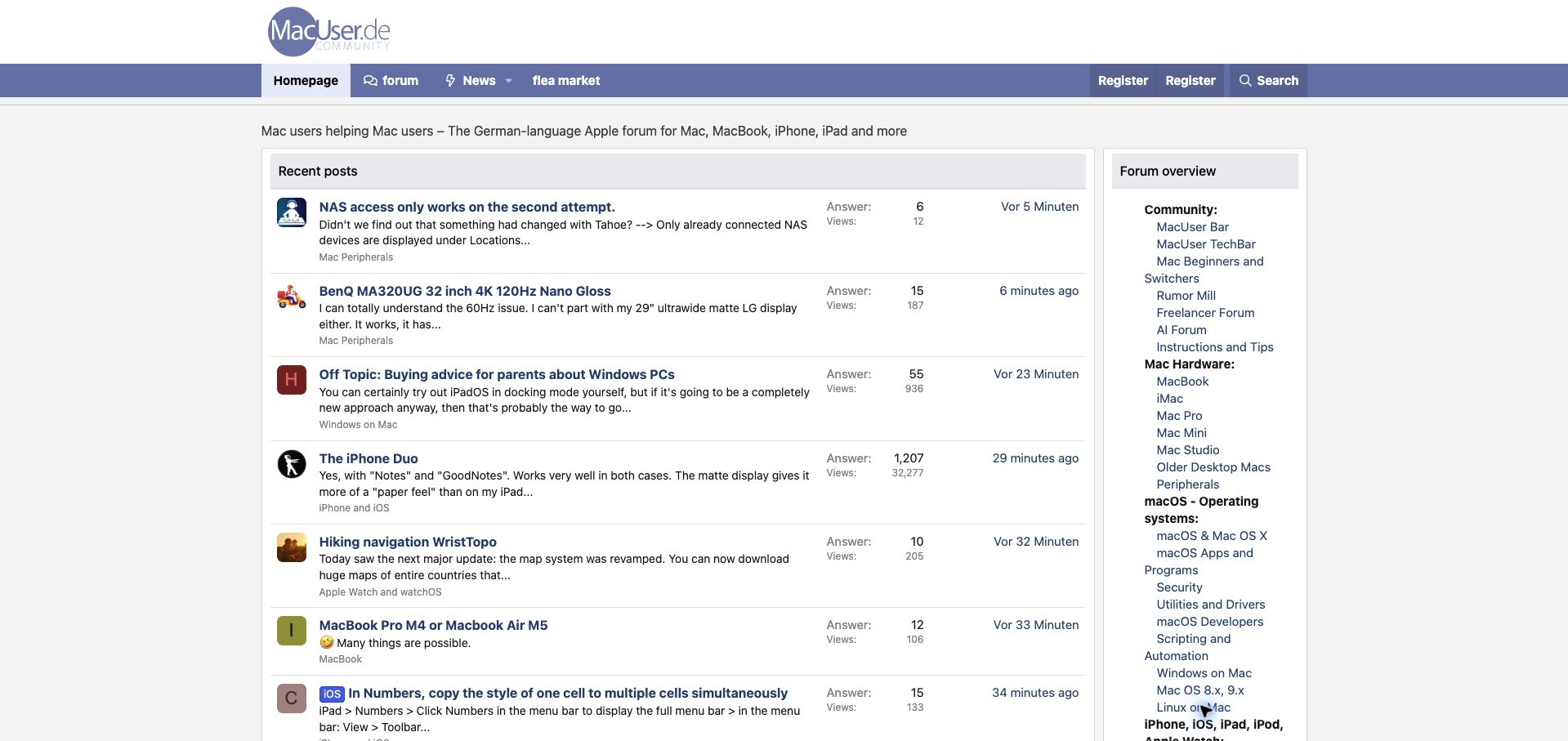
MacUser's German-language community puts recent discussions in the main column and a compact forum overview beside them. Each thread includes an excerpt and its category, so a visitor can distinguish hardware troubleshooting from broader conversation without opening every item. The sidebar groups community spaces, hardware, operating systems and creative software into an extensive subject map. Muted purple branding and a white reading surface keep the page visually calm despite the quantity of information. This combination serves returning readers who want new activity and newcomers who need a destination. The long, narrow subject map forces labels to wrap. Excerpts also vary considerably in usefulness because short conversational replies can provide little context for the original problem.
What you can learn
An activity feed and a subject directory serve different visiting intentions. Present both, but keep the directory compact enough to scan and ensure excerpts help explain the discussion rather than simply showing its latest fragment.
Pros
Category labels provide context within the recent-discussion feed.
A persistent subject map supports visitors with a specific destination.
Cons & considerations
The narrow, lengthy sidebar makes some category labels awkward to read.
Brief conversational excerpts do not always explain the underlying topic.
Platform source: Public page platform evidence. The page exposes a data-xf="2.3" platform marker with XF structure or /js/xf/ resources. Platform evidence is separate from the direct website screenshot and is not a complete current infrastructure audit.
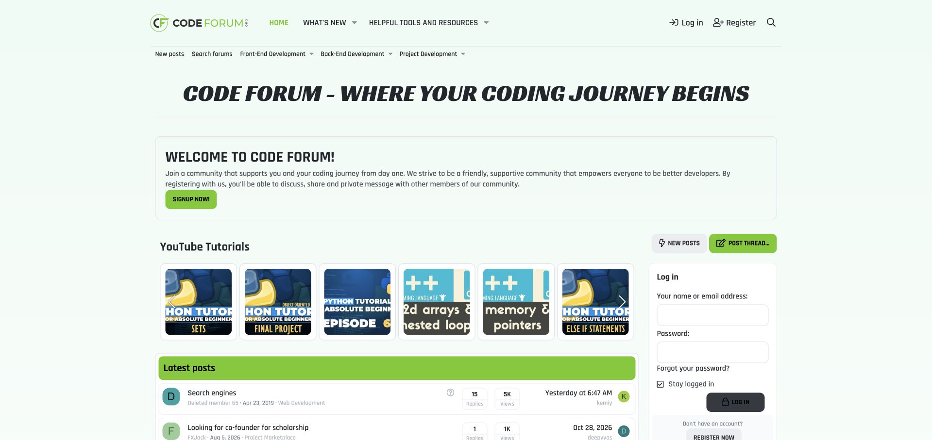
Code Forum uses pale green surfaces, lime accents and bold italic display type to establish a friendly coding identity. A welcome panel explains the community's participation benefits, followed by tutorial thumbnails and a latest-post list. Navigation distinguishes front-end, back-end and project development, giving newcomers a broad map before they encounter individual programming languages. The tutorial row makes the educational purpose tangible rather than relying entirely on a signup message. Its small cropped thumbnails are harder to interpret, though, and several appear visually repetitive. A large introduction and login panel also compete with the actual discussions. The page is strongest where it shows useful activity; the broad promise of support becomes less persuasive when the first view spends too much space asking visitors to register.
What you can learn
A beginner-oriented community should demonstrate what participation looks like before emphasizing membership. Pair a welcoming explanation with legible learning material and clear development categories, while keeping the current discussions within easy reach.
Pros
Development categories offer an understandable high-level subject map.
Tutorial previews demonstrate an educational purpose beyond registration.
Cons & considerations
Small cropped tutorial images are difficult to distinguish.
Welcome and login panels compete with the discussion entrance.
Visible tech stack
Earlier / documented evidence
XenForo
Platform source: Public page platform evidence. The page exposes a data-xf="2.3" platform marker with XF structure or /js/xf/ resources. Platform evidence is separate from the direct website screenshot and is not a complete current infrastructure audit.
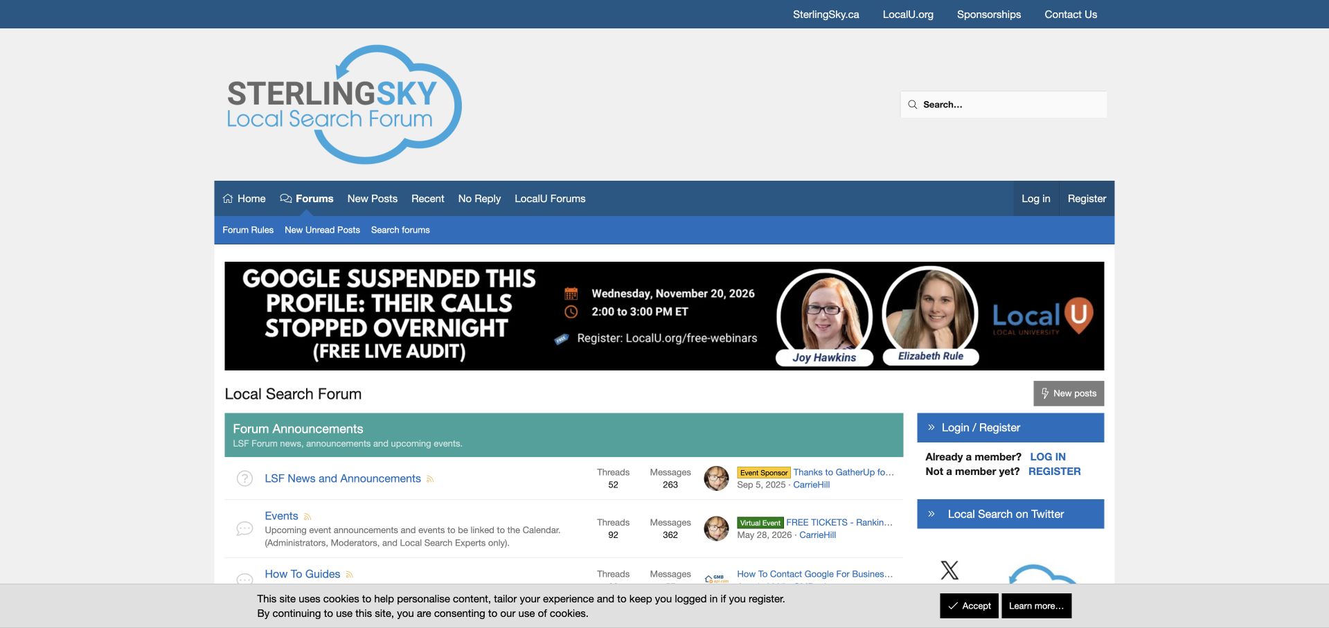
Local Search Forum connects Sterling Sky branding, a prominent search field and an educational-event banner with a conventional discussion directory. The navigation includes a direct No Reply destination alongside recent and unread posts, making unanswered questions easy for regular contributors to find. Announcements, events and how-to guidance occupy distinct rows with clear descriptions. The relationship to related educational resources is visible in the upper utility navigation rather than left implicit. This gives the forum a coherent professional context. The oversized logo area and event banner consume much of the first screen, however, and administrative material precedes the substantive specialist categories. A narrow sidebar adds login and social destinations, increasing the number of competing routes before readers reach the discussions they came to browse.
What you can learn
Professional communities can connect live help with durable educational resources. Keep unanswered questions easy to reach, but balance promotional and administrative content so that the practical discussion entrance remains prominent.
Pros
No Reply provides a direct route for contributors seeking unanswered questions.
Events and how-to material have clearly described destinations.
Cons & considerations
Large branding and event promotion delay the main discussion areas.
Administrative rows and sidebar links create competing priorities.
Platform source: Public page platform evidence. The page exposes a data-xf="2.3" platform marker with XF structure or /js/xf/ resources. Platform evidence is separate from the direct website screenshot and is not a complete current infrastructure audit.
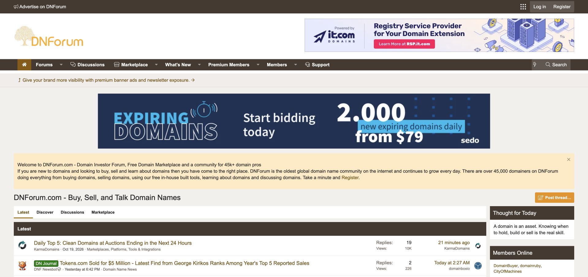
DNForum uses gold and brown branding with a broad introductory panel and a tabbed activity area. Latest, Discover, Discussions and Marketplace offer different ways to enter the community, acknowledging that reading an industry conversation and browsing listings are different tasks. Topic prefixes and category names provide context within the feed, while the main navigation repeats the distinction between discussion and marketplace destinations. The layout makes its commercial character clear. Large advertising banners dominate the upper page, however, and the long welcome paragraph delays the actual community content. The wide feed also gives some titles an excessive reading measure. This example is useful for its separation of visitor intentions, without treating member listings, valuations or promotional claims as independently verified information.
What you can learn
When a community includes a marketplace, give that activity its own clear entrance. Readers should be able to identify whether they are entering discussion, discovery or listings before commercial content begins to dominate the page.
Pros
Discussion and marketplace intentions receive separate navigation routes.
Topic prefixes help identify the nature of individual feed items.
Cons & considerations
Large advertisements and introductory copy push discussion downward.
The broad feed creates long lines and dispersed metadata.
Platform source: Public page platform evidence. The page exposes a data-xf="2.3" platform marker with XF structure or /js/xf/ resources. Platform evidence is separate from the direct website screenshot and is not a complete current infrastructure audit.
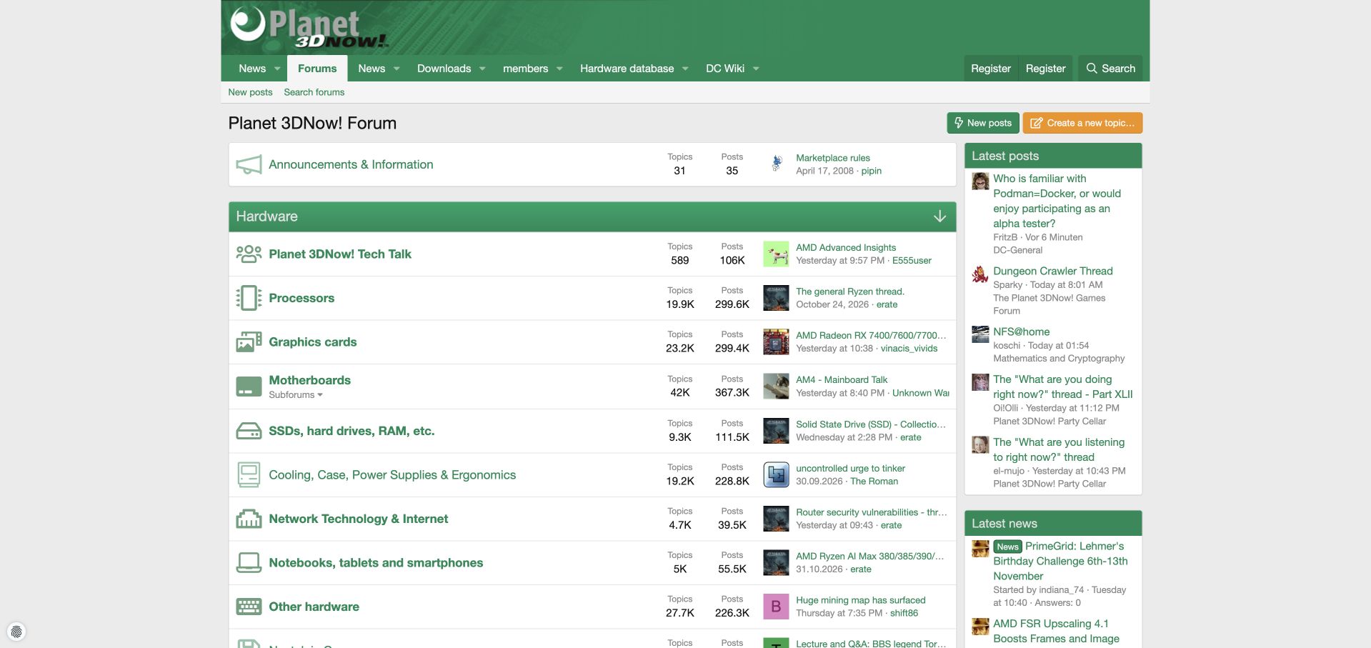
Planet 3DNow! uses green section headers and matching component icons to organize its hardware forum. Processors, graphics cards, motherboards, storage, cooling and networking each have a distinct row, while technical conversation has a broader destination at the top. Links to a hardware database, downloads and a computing wiki connect the forum with reference resources. Recent posts and news remain visible in the right column. The consistent icons make the taxonomy easy to scan, and the central table gives the main categories generous space. Latest-thread titles are much more compressed, often hiding the specific issue behind an ellipsis. The index also combines enduring reference conversations with recent activity, so prominent older threads need to be read as archives rather than assumed to be newly published guidance.
What you can learn
Use familiar components to organize a hardware community, then connect those categories with deeper reference tools. Allocate enough room for thread previews to explain the current conversation, not just repeat an abbreviated technical name.
Pros
Consistent component icons reinforce the category structure.
Reference tools complement the discussion directory.
Platform source: Public page platform evidence. The page exposes a data-xf="2.3" platform marker with XF structure or /js/xf/ resources. Platform evidence is separate from the direct website screenshot and is not a complete current infrastructure audit.
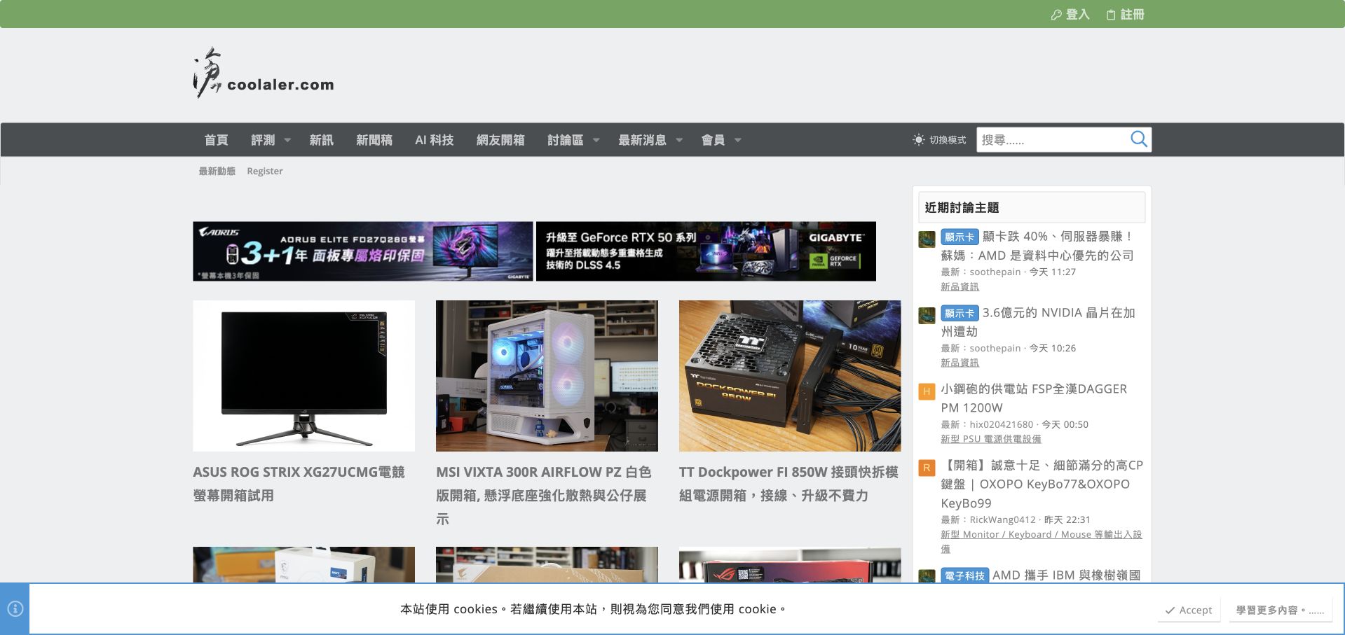
Coolaler's homepage presents a three-column grid of hardware review photography beside recent community discussions. Product images give the editorial material a clear visual identity, while colored prefixes help distinguish the topics in the sidebar. Reviews, news and community destinations share one navigation system. The public page exposes both a WordPress generator and XenForo assets within a ThemeHouse XPress wrapper, making this a useful example of integration rather than a claim that one platform independently produces everything shown. The relationship between articles and conversation is visible without forcing visitors into separate branded environments. Advertising strips interrupt the transition into the review grid, however, and several long headlines wrap unevenly. The sidebar also compresses technical discussion titles into a relatively narrow reading column.
What you can learn
A publication can connect editorial material with community activity through a shared interface. Keep each content type recognizable and describe the underlying integration accurately instead of attributing a mixed platform page to a single system.
Pros
Review imagery and recent discussions are visible together.
Shared navigation connects editorial and community destinations.
Cons & considerations
Advertising strips interrupt the editorial entrance.
Long headlines and narrow discussion previews create uneven reading density.
Platform source: Public page platform evidence. The page exposes a data-xf="2.3" platform marker with XF structure or /js/xf/ resources. The pictured publishing layer also declares WordPress; the association includes the integrated XenForo ecosystem rather than a claim that this is a pure forum index. Platform evidence is separate from the direct website screenshot and is not a complete current infrastructure audit.
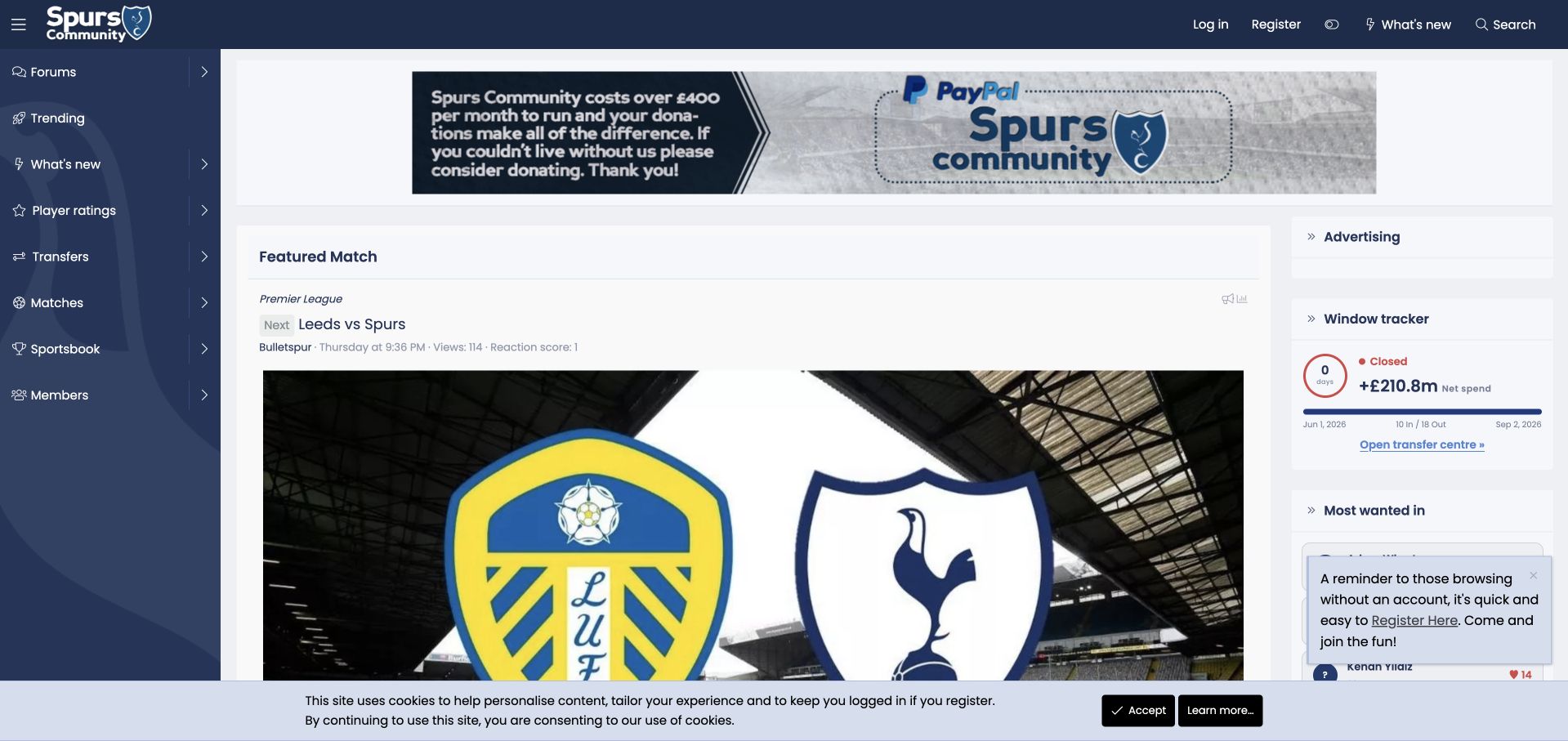
Spurs Community opens with a featured match rather than a plain forum index. A team image anchors the main column, while a dark left rail exposes discussions, player ratings, transfers and matches. A transfer-window panel and other community modules occupy the right side. News items below the feature include source references, making the homepage feel closer to an editorial front page than a conventional category table. The interface gives returning supporters an immediately relevant entrance. A donation banner takes a position above the feature, however, and a registration reminder overlaps the sidebar for guests. The large image also postpones the text discussion feed. This is an independent supporter property, not the football club's official website.
What you can learn
A community centered on recurring events can use those events to organize its entrance. Keep the forum routes visible beside the feature, and balance fundraising and membership prompts against the content that makes visitors return.
Pros
A featured match gives the homepage a clear recurring editorial focus.
Persistent navigation separates matches, transfers and general discussion.
Cons & considerations
Fundraising and registration prompts compete with the featured content.
The large match image delays access to the text discussion feed.
Visible tech stack
Earlier / documented evidence
XenForo
Platform source: Public page platform evidence. The page exposes XenForo platform markup with XF structure or /js/xf/ resources. Platform evidence is separate from the direct website screenshot and is not a complete current infrastructure audit.
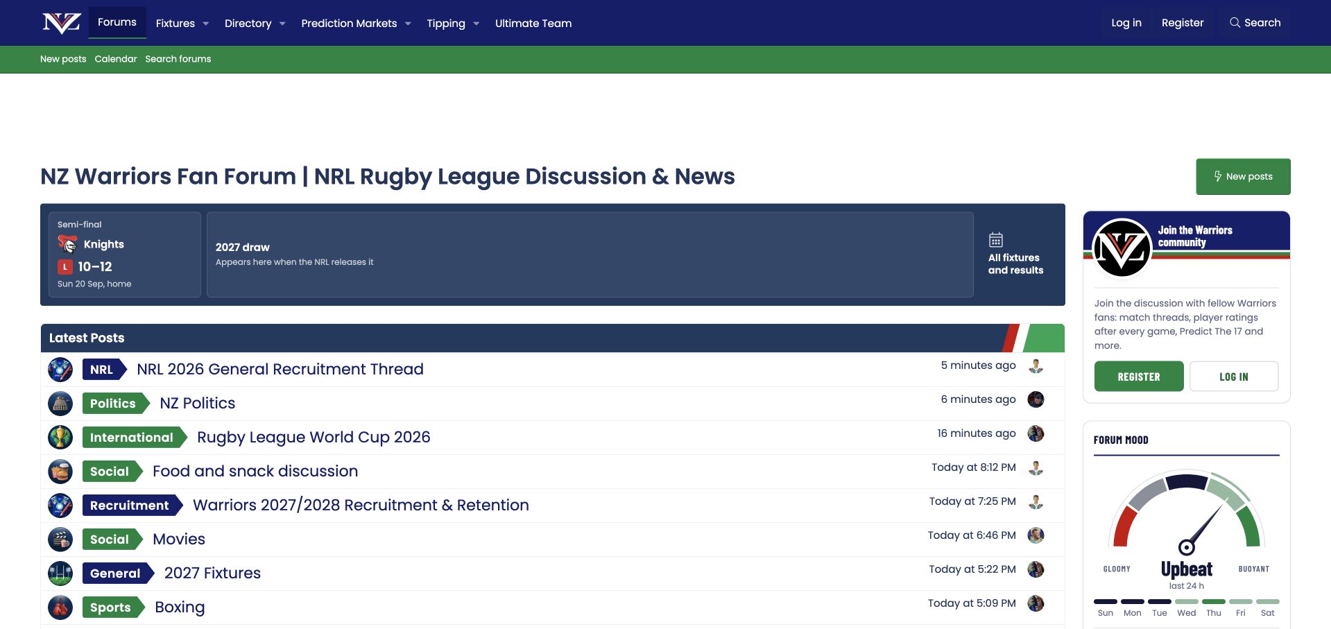
NZ Warriors places a compact fixture strip above a clearly labeled latest-post list. The strip preserves a previous result while explicitly stating that the next season's draw will appear when it is released. That is a useful treatment of missing information: the empty state explains what readers can expect instead of presenting an unexplained blank. Colored topic prefixes distinguish recruitment, general discussion and social conversations in the feed. A membership card and a community-mood graphic add personality to the sidebar. The interface is readable, although a large empty area above the title delays the practical content. An initial dismissible advertising notice also interrupted the guest visit. The example concerns the fan forum's information design; its other participation features were not exercised.
What you can learn
Seasonal communities need clear states for information that is not yet available. Explain what is missing and when it will appear, while keeping active conversations easy to browse during gaps in the event calendar.
Pros
The fixture area explains unavailable future information explicitly.
Colored topic prefixes make the activity feed easy to distinguish.
Cons & considerations
A large empty upper area delays the main content.
An advertising notice interrupts the initial guest experience.
Visible tech stack
Earlier / documented evidence
XenForo
Platform source: Public page platform evidence. The page exposes a data-xf="2.3" platform marker with XF structure or /js/xf/ resources. Platform evidence is separate from the direct website screenshot and is not a complete current infrastructure audit.
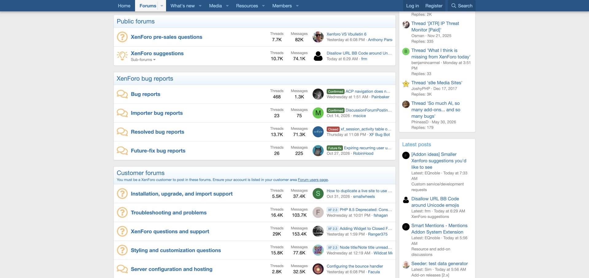
XenForo's own community separates official announcements, public discussion, bug reports and customer support into clearly titled sections. The bug-report area distinguishes unresolved reports, resolved reports and items planned for a future fix. Status prefixes in recent-thread previews reinforce those distinctions. The customer section explicitly states that posting requires a customer account association, explaining the boundary before someone attempts to participate. Installation, troubleshooting, styling and server configuration then receive separate destinations. This makes the directory useful as both a support map and a demonstration of the software's organization. The page remains long and metadata-heavy, however, and recent-post titles are often truncated. Newcomers must also understand the difference between a product problem, an add-on issue and a server question to select the best destination.
What you can learn
Support boundaries should be visible before users start writing. Label eligibility requirements and issue states at the directory level, then use concise descriptions to help visitors distinguish product, extension and hosting problems.
Pros
Customer-only participation requirements are explicitly disclosed.
Bug-report states have distinct destinations and visible prefixes.
Cons & considerations
The long directory and dense metadata require sustained scanning.
Closely related technical categories still demand informed self-classification.
Visible tech stack
Earlier / documented evidence
XenForo
Platform source: Public page platform evidence. The page exposes a data-xf="2.3" platform marker with XF structure or /js/xf/ resources. Platform evidence is separate from the direct website screenshot and is not a complete current infrastructure audit.
Kegan has 15+ years of experience working with small businesses, Fortune 500 companies, and everything in between. No development job is too big or too small: he brings the same hands-on attention to a focused improvement, a complete website, or a custom application.
For XenForo projects, he can help with content architecture, custom functionality, system integrations, testing, and maintainable handover. He works directly with clients on scope, design, implementation, testing, and handover, with an emphasis on clear communication and a system that remains practical to maintain after launch.
Show 3 other XenForo developersHide other XenForo developers
Choose the implementation around the operating model
Use a clear forum index
A conventional category structure suits many specialist communities when descriptions and hierarchy remain concise.
Build a publication-and-forum relationship
If editorial articles and community discussion coexist, explain which area the visitor is in. The Coolaler example is explicitly qualified as an integrated publishing environment.
Choose hosting and maintenance together
Compare the actual responsibilities of the proposed setup, including backups, updates, extensions, and support. Do not infer those responsibilities from another community’s appearance.
From references to requirements
Plan the content and everyday maintenance
Map content relationships
Identify forums, resources, articles, and external support destinations. Avoid duplicate categories that divide useful activity without a clear audience distinction.
Plan the migration detail
Preserve important thread URLs, images, and member attribution according to the approved scope. Test common old links and archived discussions.
Review real reading states
Check long topics, quoted replies, empty searches, closed threads, and ad-loaded layouts. Ensure privacy controls do not permanently obscure navigation.
A useful handover demonstration
Ask the actual team to carry out its routine job: publish a realistic update, correct a mistake, preview a narrow screen, and identify who owns an integration failure. For a library or frontend framework, also ask who maintains the content source and deployment. A polished screenshot does not answer those operational questions.
Beyond the screenshot
XenForo project checklist
Choose the landing view.
Clarify category hierarchy.
Explain topic prefixes.
Limit competing overlays.
Separate articles from forums.
Preserve important thread links.
Test long replies.
Review ad-loaded mobile layouts.
Assign extension owners.
Document maintenance duties.
Test with real content, a keyboard, a small screen, slow or failed requests, and the people who will maintain the system. These are planning checks, not an accessibility, security, performance, or search-ranking certification.
Sources & editorial method
How this XenForo collection was reviewed
Twenty distinct public properties have direct website captures and original design reviews. The first five are explicitly identified recognizable organizations or established specialists. Platform evidence is scoped to each named property; documentary associations, dated observations, and narrower asset-only signals remain qualified. Captures and technology verification have independent dates. A bounded public stack audit was attempted for every source, preserving inaccessible and unknown results. No private administration or transactions were inspected.
Every image is an unmodified capture from the actual website, with its source and capture date. Some captures are reused from our shared catalog; their dates remain the original capture dates. None comes from a vendor gallery or a generated reconstruction. Moving imagery and live content can change.
Technology attribution uses public page assets or metadata, official platform documentation, or a cited first-party project case study. Documentary and framework-relationship evidence is identified where used; it is not a complete current backend inventory. A CMS image CDN alone does not establish a full CMS deployment. A library’s presence does not prove which individual controls use it, and a platform label does not establish AI authorship.
The composition notes, lessons, pros and tradeoffs are original editorial observations. We have not measured conversion, traffic, security, performance or accessibility conformance. Website owners retain their brands and imagery; these examples are not our client portfolio. Written, Edited and Curated are independent records, not dates advanced by a build. See our editorial standards or suggest a correction.
Questions worth asking
XenForo website development FAQs
Should a community open on trending topics?
Only when browsing recent discussion is a primary task. Keep a category route for visitors with a specific question.
Does an XF marker reveal the hosting plan?
No. It identifies the public platform layer, not the commercial or operational arrangement.
Can editorial content and a forum share a site?
Yes, when navigation and labels explain the relationship instead of making the two areas appear interchangeable.
Do visible activity counts prove success?
No. They are public snapshots and do not establish member satisfaction, support outcomes, or business performance.