Definitive guide · Invision Community website development
Best Invision Community Websites of 2026 (20 Real-World Examples)
Invision Community websites that organize forums and member resources
These 20 examples compare forum directories, announcements, resources, activity feeds, and the relationship between a community and its parent brand.
Invision’s public product presentation includes forums and additional community content types. A project should decide which of those areas serves a real member task before exposing every possible destination.
Squarespace, Evernote, Malwarebytes, Warframe, and Linus Tech Tips lead the collection. Public footer credits or platform resources support the named-property associations.
Before the examples
What makes good Invision Community website development in 2026?
Give each content type a purpose
A forum, gallery, event, and resource library should have distinct roles. Avoid making members search several overlapping areas for the same answer.
Use clear labels and controlled visual emphasis for official notices. A crowded set of pinned banners can hide the ordinary conversations visitors came to read.
Connect the community to the product
Retain useful support, documentation, and account routes without letting a corporate header overwhelm the forum directory.
The collection · 20 examples
20 Invision Community website examples worth studying
Credits and IPS resources identify the community layer. The reviews do not infer private membership, commerce, or moderation configuration from a public screenshot.
We start with five recognizable brands or organizations: Squarespace Forum, Evernote User Forum, Malwarebytes Forums, Warframe Forums, Linus Tech Tips Forums. Each attribution applies to the named website property, not every product or website belonging to its organization. This is a curated reading sequence, not a measured ranking.
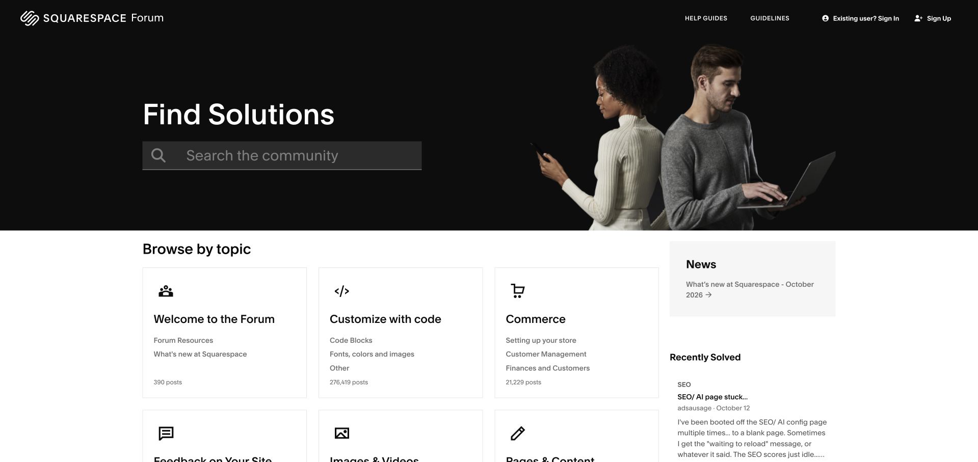
Squarespace introduces its forum with a black welcome panel, a prominent search box and a small collage of people. The presentation feels connected to the product brand without hiding the practical support structure. Below it, a three-column set of categories separates getting started, customization and commerce, while a narrower news and solved-topic column offers alternative entry points. Category descriptions explain what belongs where, which helps a merchant distinguish a product question from a code question. The header also provides help guides and community guidelines. There is a useful balance between a welcoming introduction and a working directory, although the hero takes considerable vertical space before the forum choices begin.
What you can learn
Give a branded community one obvious search route, then describe categories using the problems visitors bring. Keep product documentation nearby so a peer discussion is not the only apparent route to an answer.
Pros
Search has strong visual priority within the welcome.
Category descriptions establish useful boundaries between support tasks.
Cons & considerations
The large introduction delays the category grid.
Small gray descriptions need more reading effort than the bold headings.
Visible tech stack
Earlier / documented evidence
Invision Community
Platform source: Public page platform evidence. The public footer explicitly credits Invision Community. Platform evidence is separate from the direct website screenshot and is not a complete current infrastructure audit.
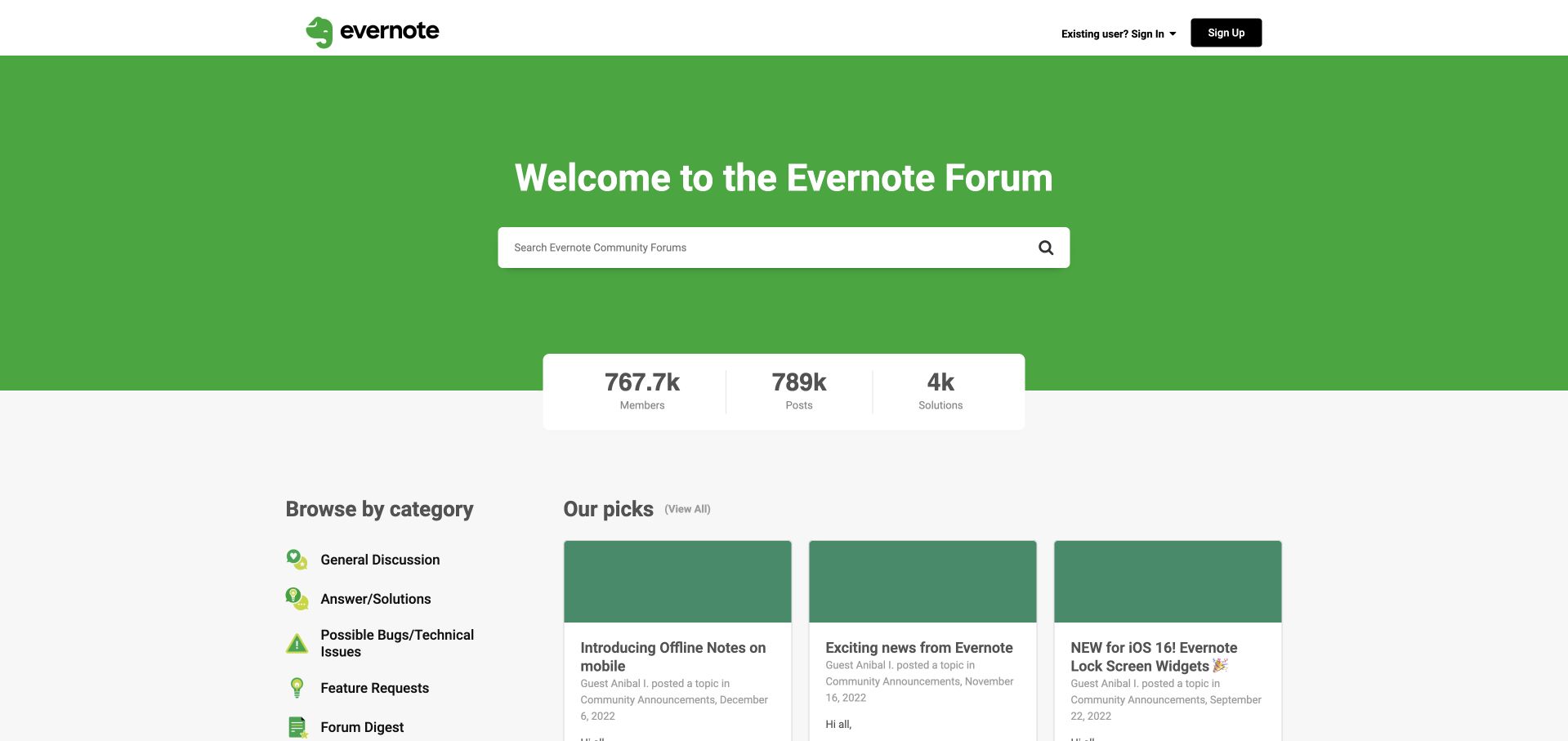
Evernote gives its user forum a very simple first impression: the elephant logo, a broad green welcome area and a centered search field. A floating statistics strip bridges the hero and the content, while the lower layout pairs a category list with editorial picks. General discussion, solutions, possible bugs and feature requests are named as distinct destinations rather than mixed into a single stream. The visual simplicity helps visitors recognize the product and choose a support intent. The editorial picks are a weaker part of the observed page: their visible dates are from 2022, despite their prominent placement. Those dates should be read as archive context, not as evidence of current product announcements.
What you can learn
Separate durable navigation from time-sensitive recommendations. If a forum homepage includes editorial picks, assign someone to refresh them or label them as evergreen resources so old dates do not undermine the welcome.
Pros
The search field is immediately easy to locate.
Task categories distinguish bugs, ideas and solved questions.
Cons & considerations
Old featured announcements occupy valuable homepage space.
The tall hero and statistics strip postpone actual discussion content.
Visible tech stack
Earlier / documented evidence
Invision Community
Platform source: Public page platform evidence. The public footer explicitly credits Invision Community. Platform evidence is separate from the direct website screenshot and is not a complete current infrastructure audit.
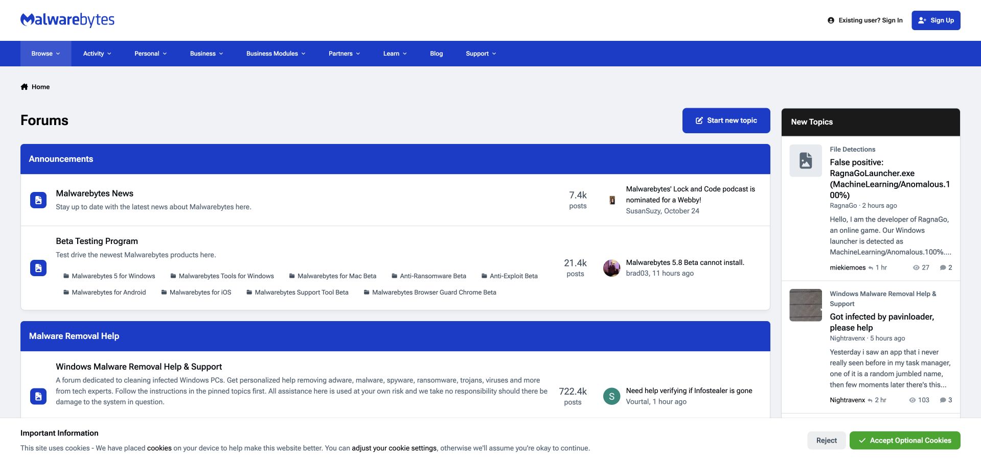
Malwarebytes retains its corporate navigation above a more conventional forum index. Blue category bars divide the main column, with a compact new-topics panel on the right. Announcements and testing areas precede the malware-removal sections, whose descriptions direct visitors to pinned preparation guidance. That distinction is the most useful design detail: the interface makes clear that some requests belong in a defined support process rather than an ordinary conversation. Titles, descriptions and recent activity remain visible together, allowing returning users to scan familiar destinations. The opening view is nevertheless crowded by several layers of navigation and introductory categories. This review concerns the public community interface, not the accuracy of individual security advice posted by members.
What you can learn
When a community includes sensitive troubleshooting, make the preparation and escalation route visible at category level. Distinguish official procedures from peer discussion through structure and labels rather than assuming newcomers already understand the difference.
Pros
Category descriptions point toward the appropriate preparation steps.
The separate recent-topic column supports quick return visits.
Cons & considerations
Multiple navigation layers compete above the main content.
General announcements appear before the more urgent support destinations.
Visible tech stack
Earlier / documented evidence
Invision Community
Platform source: Public page platform evidence. The public footer explicitly credits Invision Community. Platform evidence is separate from the direct website screenshot and is not a complete current infrastructure audit.
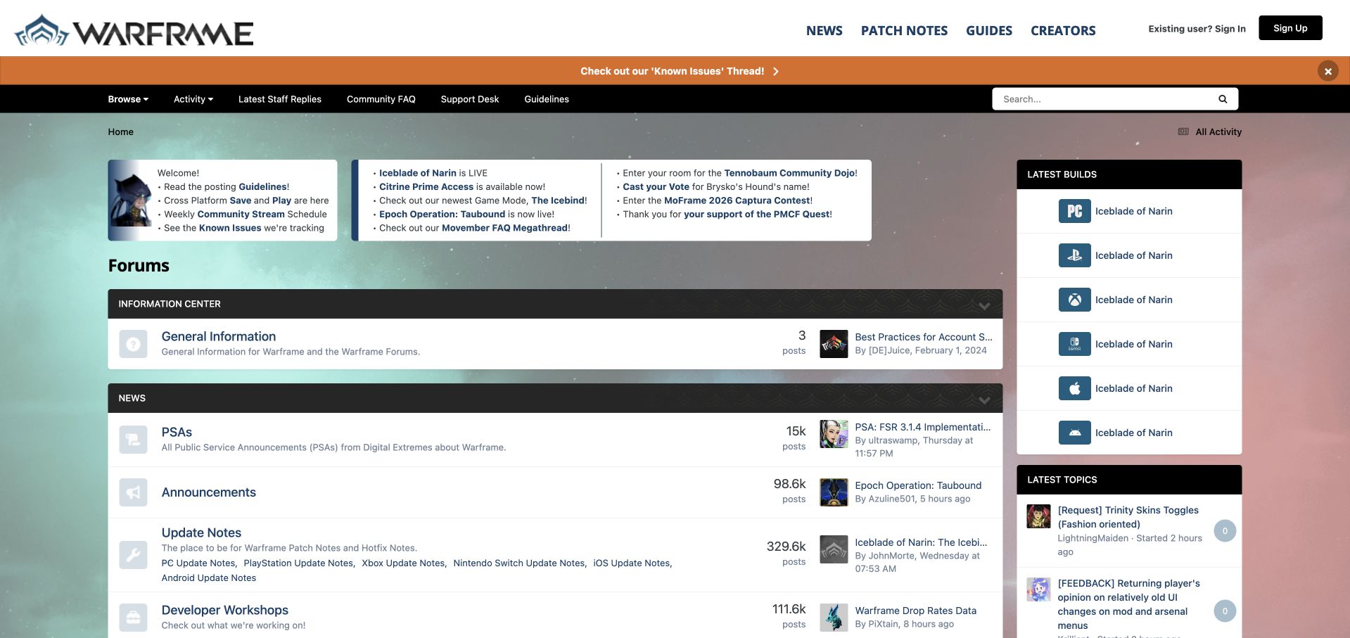
Warframe surrounds its discussion index with a substantial game-specific information layer. The branded header connects news, patch notes and guides, while a prominent notice highlights known issues. A dark secondary bar offers staff replies, the community FAQ and the support desk. Below, update links sit alongside a latest-builds panel divided by device platform. This is useful context for a game whose players may be discussing different versions of the same experience. The forum is therefore both a conversation space and a release-information gateway. Its main weakness is competition for attention: several promotional links and notices precede the category list, and a newcomer must distinguish staff information from general community activity.
What you can learn
Keep platform and version context close to a game community's support routes. Give authoritative release information a recognizable place, then limit simultaneous notices so urgent problems remain distinguishable from ordinary promotions.
Pros
Device-specific build links help establish the right context.
Staff replies and the support desk have explicit navigation routes.
Cons & considerations
Numerous notices make the opening area visually dense.
Promotions and support updates compete before the forum categories.
Visible tech stack
Earlier / documented evidence
Invision Community
Platform source: Public page platform evidence. The public footer explicitly credits Invision Community. Platform evidence is separate from the direct website screenshot and is not a complete current infrastructure audit.
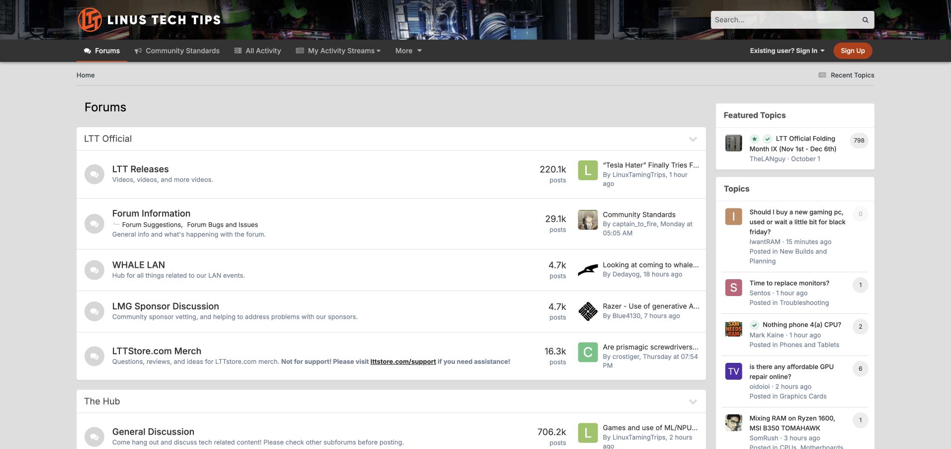
The Linus Tech Tips forum uses a computer-hardware banner and orange branding to make a traditional forum layout feel part of the media business. Community standards and activity sit near the main navigation, while the first groups cover releases, information, events, sponsors and merchandise. A featured community event occupies the right column beside recent topics. The merchandise description makes a particularly useful boundary explicit: the discussion area is not the route for order support. That small instruction prevents a community category from promising a service it cannot deliver. The layout gives returning members many useful shortcuts, but it also exposes a large amount of metadata, with counts, timestamps and short thread previews sharing narrow columns.
What you can learn
A publisher's community can connect programs beyond discussion, provided each destination explains its purpose. State where customer-service requests belong, and keep commerce or event links from obscuring the main participation routes.
Pros
The visual identity clearly connects the forum with the media brand.
Merchandise discussion is distinguished from order-support handling.
Cons & considerations
Several metadata columns make the index feel crowded.
Brand programs occupy substantial space before broader technical discussion.
Visible tech stack
Earlier / documented evidence
Invision Community
Platform source: Public page platform evidence. The public footer explicitly credits Invision Community. Platform evidence is separate from the direct website screenshot and is not a complete current infrastructure audit.
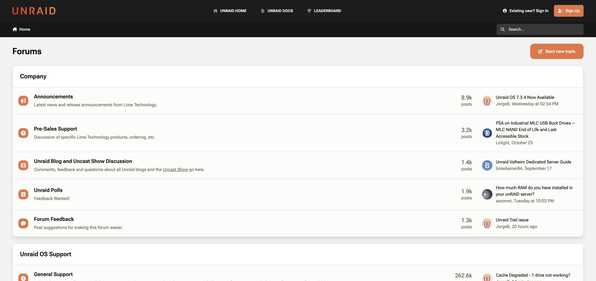
Unraid uses a restrained black header and orange wordmark above a wide, mostly single-column forum directory. Links to the main product site and documentation stay visible, while company news, presales questions, blog and podcast material, polls and feedback occupy the first group. Operating-system support follows as its own area. The support descriptions ask visitors to supply relevant version context, an effective way to improve the quality of a question before someone starts writing it. The spacious rows are easier to distinguish than a tightly packed feed, but the desktop width leaves long horizontal distances between category names and recent activity. A visitor arriving with a broken installation must also pass the company-oriented section first.
What you can learn
Organize technical communities around the visitor's stage: evaluation, everyday use and troubleshooting. Put version requirements directly beside the support destination, and decide whether company announcements deserve to precede urgent help on the default page.
Pros
Presales and operating-system support have distinct destinations.
Version guidance appears before a support request is started.
Cons & considerations
Wide rows separate related information across the screen.
Company material pushes operational help farther down the index.
Visible tech stack
Earlier / documented evidence
Invision Community
Platform source: Public page platform evidence. The public footer explicitly credits Invision Community. Platform evidence is separate from the direct website screenshot and is not a complete current infrastructure audit.
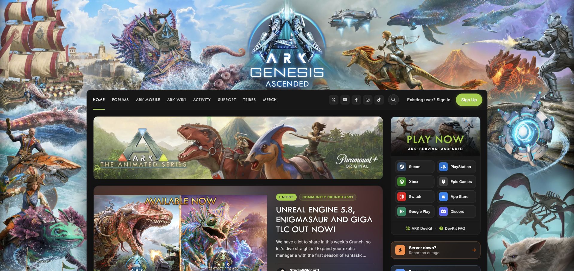
ARK's public community homepage demonstrates a broader use of Invision Community than a plain forum index. A large illustrated game background surrounds dark content panels, while the main column leads with an illustrated Community Crunch story. The navigation connects forums, mobile information, the wiki, activity, support and tribes. A right-hand block presents store and platform destinations alongside status information. This creates a recognizable game portal where editorial material can lead into participation. It also makes the page visually busy: the atmospheric background, promotional banner, story artwork and numerous platform buttons all compete in the opening view. The design is most useful as an example of a community-led publication, rather than a minimal help center.
What you can learn
Use a community CMS to connect news and participation around a shared subject. Give recurring editorial series a consistent place, but simplify surrounding promotion so the current story and practical support links remain easy to find.
Pros
Editorial stories and community destinations share a coherent branded setting.
Platform and status links remain available beside the main article.
Cons & considerations
Several strong illustrations compete for attention at once.
A dense collection of promotional buttons complicates the first view.
Platform source: Public page platform evidence. The public footer explicitly credits Invision Community. Platform evidence is separate from the direct website screenshot and is not a complete current infrastructure audit.
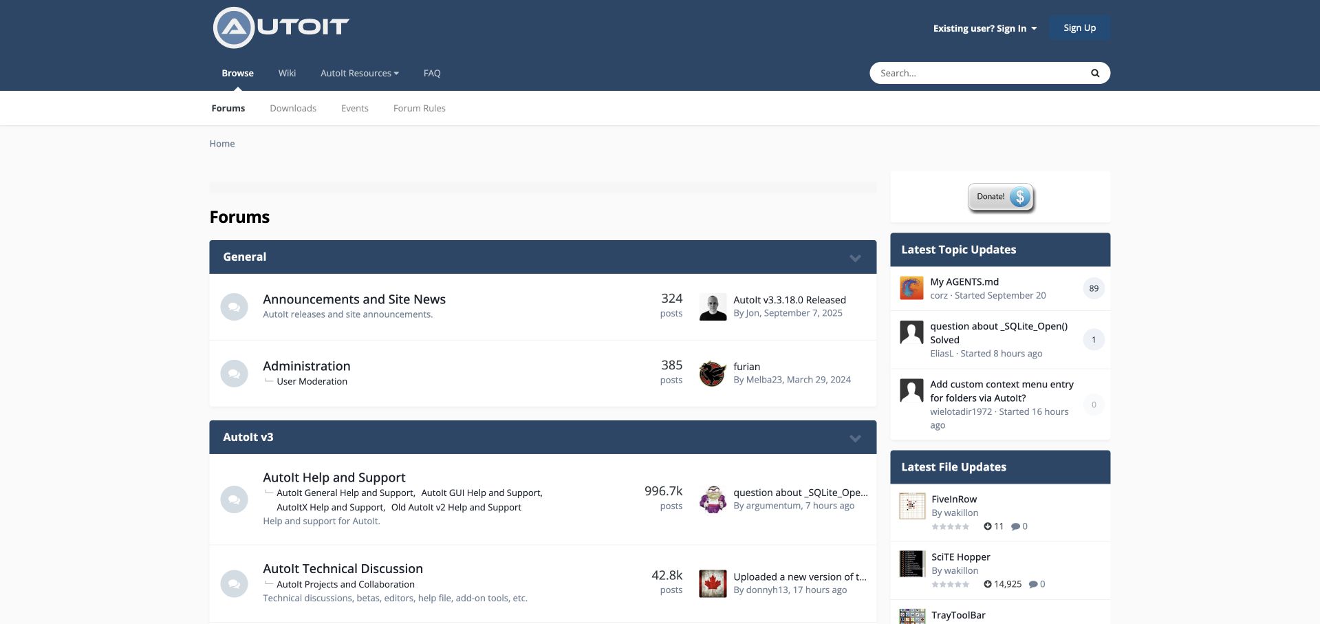
AutoIt's forum combines a compact blue header with links to the wiki, resources and frequently asked questions. The index begins with general news and administration, then moves into the main language-support categories. General help, interface work, older versions and examples receive their own labels, making it possible to distinguish a question from a reusable contribution. Recent topics and file activity appear in a narrower sidebar. This arrangement connects discussion with the surrounding learning ecosystem without requiring a large marketing introduction. The price is the familiar density of a mature technical forum: small descriptions, counts and preview text ask for careful scanning, while administrative categories precede the destinations most likely to matter to a new programmer.
What you can learn
Expose examples, documentation and discussion as complementary parts of a programming community. Use category labels to distinguish asking, learning and sharing, and review whether the default ordering reflects newcomers' needs as well as moderators' routines.
Pros
Reference resources remain close to the discussion entry point.
Separate example and help areas clarify how to contribute.
Cons & considerations
Administrative categories delay access to practical language support.
Small metadata and multiple columns increase scanning effort.
Platform source: Public page platform evidence. The public footer explicitly credits Invision Community. Platform evidence is separate from the direct website screenshot and is not a complete current infrastructure audit.
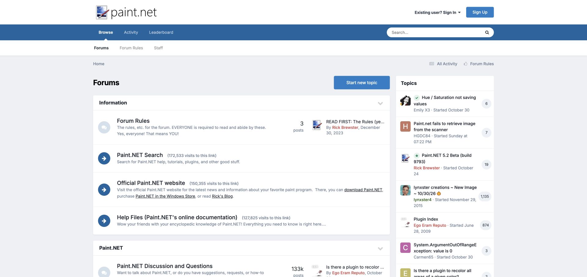
The Paint.NET forum uses a straightforward blue and gray theme with an unusually explicit information section. Rules, a dedicated search route, the official product site and help documentation appear as entries before the discussion areas. Their descriptions explain the destination rather than relying only on a short navigation label. Below, the forum distinguishes general product discussion from troubleshooting and other community activities, while recent topics occupy a right-hand column. The approach gives newcomers a useful orientation and reduces the chance that documentation will be overlooked. Its drawback is that resource links receive the same large row treatment as active forums, pushing the conversations lower. Visit counts on those links add visual weight without contributing much to a visitor's immediate task.
What you can learn
Treat essential reference links as part of community onboarding, but give them a compact presentation. Preserve clear distinctions between documentation, discussion and troubleshooting instead of asking every visitor to infer those boundaries.
Pros
Official help and product links are clearly described.
Discussion and troubleshooting purposes are explained in the index.
Cons & considerations
Large information rows postpone the actual forum categories.
Link-visit statistics add detail without helping destination choice.
Visible tech stack
Earlier / documented evidence
Invision Community
Platform source: Public page platform evidence. The public footer explicitly credits Invision Community. Platform evidence is separate from the direct website screenshot and is not a complete current infrastructure audit.
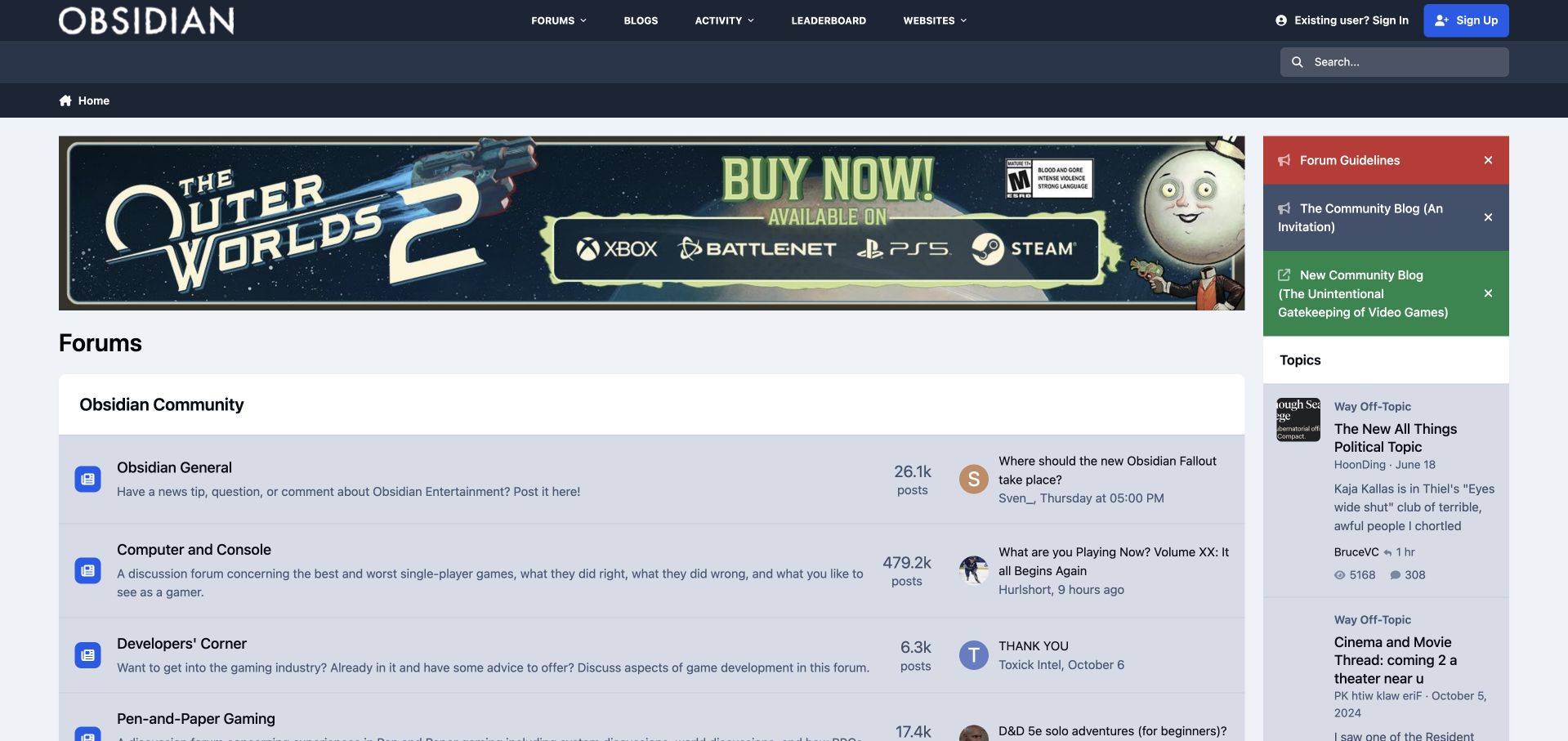
Obsidian Entertainment places a dark studio header and a large game promotion above its community index. The forum categories extend beyond one release, with company discussion, individual games, developer-oriented material and tabletop interests all represented. A sidebar introduces guidelines and the community blog, then exposes recent topics and member writing. The result feels like a continuing studio community rather than a temporary campaign page. Its broader purpose is valuable, but the opening composition has competing priorities: a large current-game banner dominates the top, while the sidebar can surface unrelated conversations beside the main product categories. This is the game studio's public community property; it should not be confused with the unrelated Obsidian note-taking application.
What you can learn
Keep a stable studio-level structure beneath changing game promotions. Give individual releases clear homes, and curate homepage sidebars carefully so incidental activity does not overwhelm the purpose a new visitor came to pursue.
Pros
The category structure supports several games and broader studio interests.
Guidelines and community writing have visible entry points.
Cons & considerations
A large promotional banner delays the forum directory.
Unrelated recent activity can distract from product-specific destinations.
Platform source: Public page platform evidence. The public page exposes Invision IPS controllers and matching Invision JavaScript or stylesheet resources. Platform evidence is separate from the direct website screenshot and is not a complete current infrastructure audit.
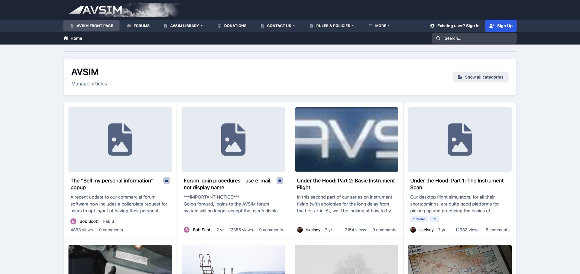
AVSIM's public homepage presents an article grid rather than opening directly on forum categories. A dark aviation-themed header keeps forums, the separate library, rules and contact routes visible above four-column cards. Each card carries a title, excerpt, author and age, with views and comments below. The observed first row mixes operational notices with older instructional articles, so the publication layer serves both housekeeping and long-lived knowledge. Explicit login guidance helps explain the difference between community and library access. The visual treatment is less consistent: several cards use generic image placeholders, and years-old articles share the same prominence as newer notices. That makes the grid useful for archive discovery but less clear as a statement of what is current.
What you can learn
When a community homepage combines notices and evergreen articles, label their roles and dates clearly. Provide separate routes for current activity and reference browsing, especially when a related library has different account behavior.
Pros
Article cards expose authorship and age before a click.
Forum and library destinations remain distinct in the main navigation.
Cons & considerations
Generic image placeholders weaken consistency across the grid.
Operational notices and older tutorials compete at the same hierarchy level.
Visible tech stack
Earlier / documented evidence
Invision Community
Platform source: Public page platform evidence. The public page exposes Invision IPS controllers and matching Invision JavaScript or stylesheet resources. Platform evidence is separate from the direct website screenshot and is not a complete current infrastructure audit.
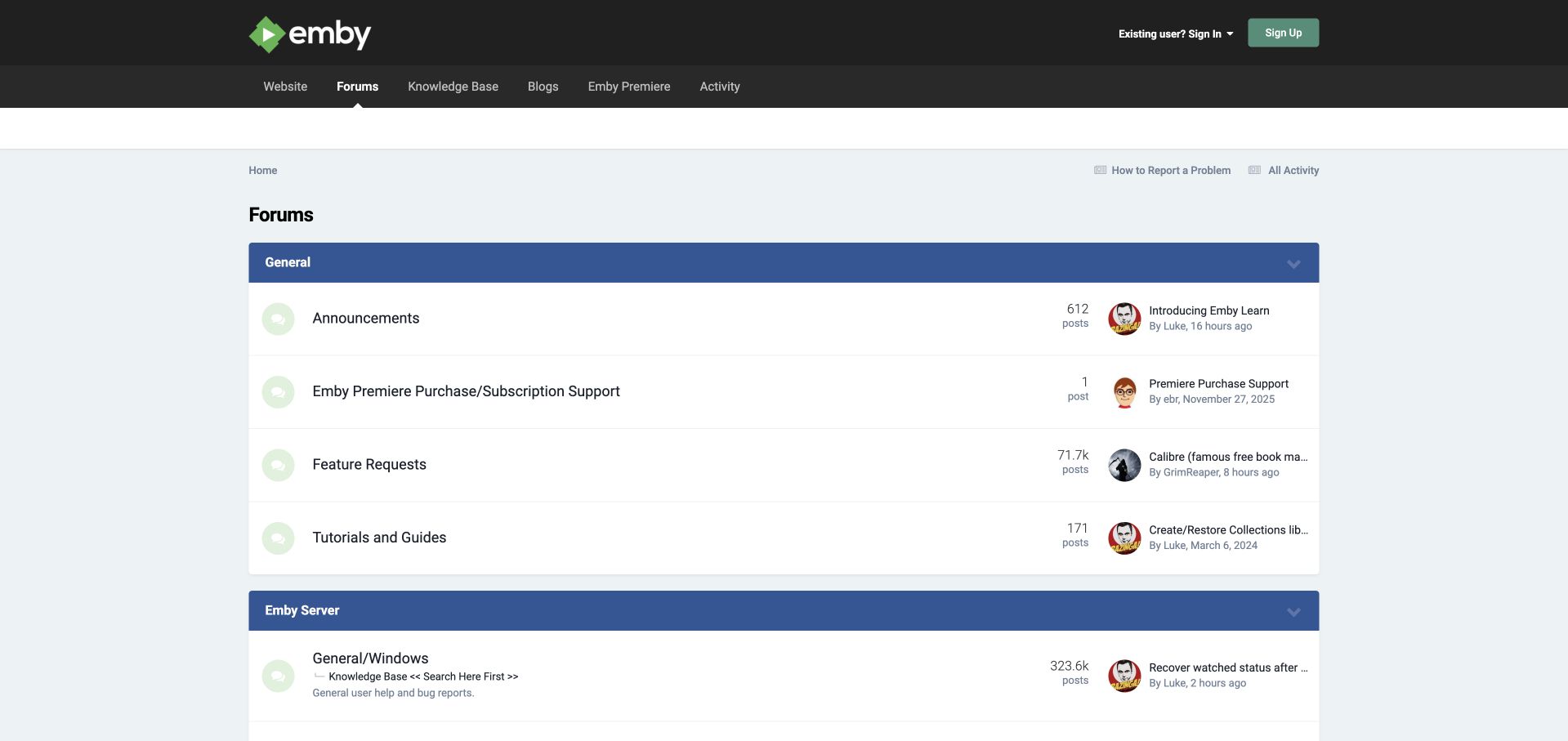
Emby's charcoal header and green identity sit above a wide forum directory, with the knowledge base, blogs and Premiere offering available in the navigation. A report-a-problem link establishes a practical starting point before the categories. General announcements, purchase questions, feature requests and tutorials are separated from server support, which then branches into operating systems and hardware environments. This is a useful taxonomy for software that can run in several different places. It helps keep billing issues from being mixed into installation troubleshooting. The desktop layout is spacious, though the wide rows create large gaps between a category and its latest thread. Long recent-topic titles also lose detail in their allotted space, limiting how much the activity preview can explain.
What you can learn
Use the product's actual support dimensions to shape the community hierarchy. Separate commercial account questions from technical environments, and place question-preparation guidance near the entry point rather than hiding it inside an individual board.
Pros
Billing and platform support are separated into understandable groups.
Problem-reporting guidance is available before browsing the forum.
Cons & considerations
Very wide rows make related information harder to scan together.
Truncated recent-thread titles provide incomplete context.
Platform source: Public page platform evidence. The public page exposes Invision IPS controllers and matching Invision JavaScript or stylesheet resources. Platform evidence is separate from the direct website screenshot and is not a complete current infrastructure audit.
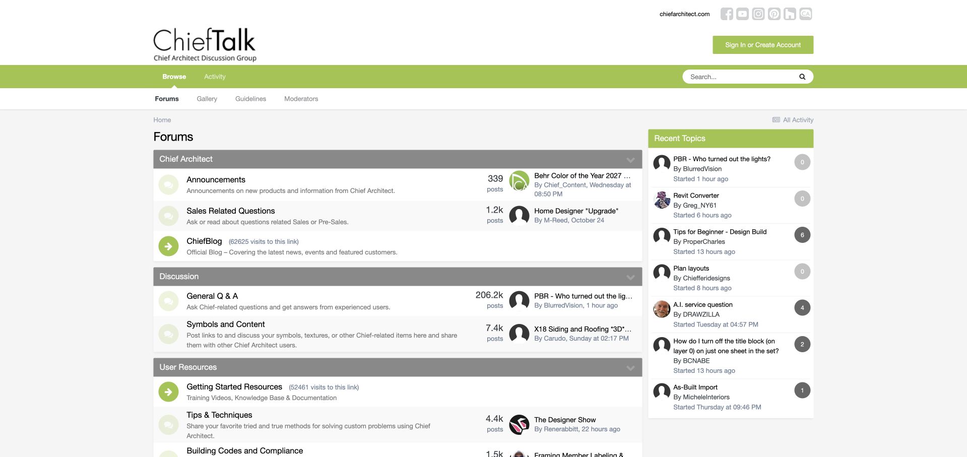
ChiefTalk uses a restrained white and green identity above a conventional forum and sidebar layout. The main index begins with company information, then separates discussion from symbol and content sharing and other user resources. Documentation, videos and practical tips have visible routes alongside the peer community. That structure recognizes that a design-software user may arrive looking for an asset or learning material rather than a conversational answer. The right-hand recent-topics list gives returning visitors a quick view of activity without replacing the category map. The overall presentation is functional, but the smaller gray metadata and narrow recent-topic column are harder to scan than the main headings. The first company-oriented group also uses space before the practical work areas.
What you can learn
Map a professional community to the materials people exchange, not only the questions they ask. Give reusable assets, documentation and discussion distinct labels so newcomers can select the right workflow before posting or searching.
Pros
Content sharing has a clear place beside question-based support.
Learning resources remain connected to the community index.
Cons & considerations
Small gray metadata reduces the prominence of useful context.
The narrow activity sidebar clips longer topic descriptions.
Platform source: Public page platform evidence. The public page exposes Invision IPS controllers and matching Invision JavaScript or stylesheet resources. Platform evidence is separate from the direct website screenshot and is not a complete current infrastructure audit.
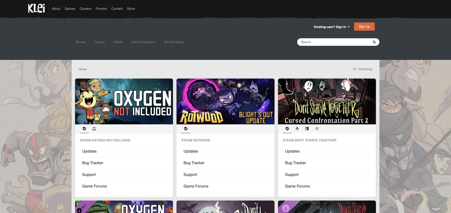
Klei transforms the forum entrance into a grid of illustrated game panels. A rough-edged dark header and character artwork establish the studio's visual identity, while prominent game titles divide the main content into recognizable destinations. Within each panel, platform choices sit above consistent routes for updates, bug tracking, support and game discussion. This is more useful than a single long list of all boards because the first choice is a game the visitor knows. The repeated structure then makes the next choice predictable. The cost is a long page once many games are included, and some platform choices depend heavily on icons. The composition is strongest where the game artwork and practical task labels reinforce one another.
What you can learn
For a multi-product community, repeat a small task vocabulary inside clearly branded product groups. Pair platform icons with accessible names and visible labels where possible so recognition does not depend on familiarity with every store symbol.
Pros
Game artwork makes the first destination choice easy to recognize.
Repeated update, bug and support routes create a predictable pattern.
Cons & considerations
A growing game catalog makes the repeated grid long.
Icon-heavy platform choices need strong text alternatives.
Visible tech stack
Earlier / documented evidence
Invision Community
Platform source: Public page platform evidence. The public footer explicitly credits Invision Community. Platform evidence is separate from the direct website screenshot and is not a complete current infrastructure audit.
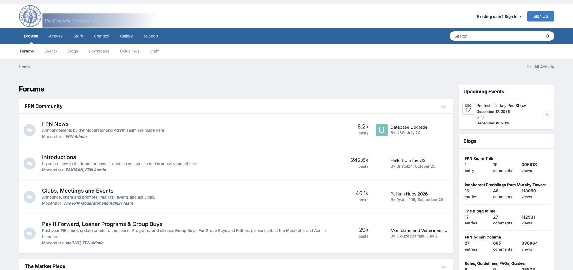
The Fountain Pen Network presents a pale blue and gray forum index with community news and introductions near the top. Club events, giveaways, lending programs and moderator information appear as named destinations, while the sidebar highlights an upcoming pen event and community publishing activity. These details make the site feel like an organization with shared routines, not simply a database of product questions. They also give visitors several ways to participate beyond writing a post. The opening hierarchy is less decisive than it could be: administrative labels and moderator references repeat, and the pale header treatment gives the identity relatively little contrast. A broad desktop layout leaves considerable whitespace between the category descriptions and their supporting metadata.
What you can learn
Show the participation models that make a specialist community distinctive, such as clubs, events or shared resources. Group administration separately and keep the primary subject categories easy to reach beneath those organizational details.
Pros
Offline events are connected to the online community entrance.
Named programs reveal ways to participate beyond ordinary discussion.
Cons & considerations
Repeated administrative information adds weight to the index.
The pale header identity has limited visual emphasis.
Platform source: Public page platform evidence. The public footer explicitly credits Invision Community. Platform evidence is separate from the direct website screenshot and is not a complete current infrastructure audit.
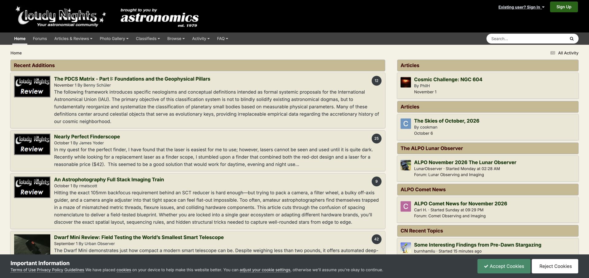
Cloudy Nights opens with an editorial feed rather than a pure discussion table. A dark branded header and visible sponsor frame an olive and beige content area, where recent additions have titles, bylines, dates and comment counts. The sidebar groups article destinations, observing publications and recent topics, connecting longer reading with the community's ongoing conversations. This layout supports visitors who want to learn about a subject before joining a discussion. Authorship and dates are especially useful in a collection that mixes durable reference material with time-sensitive observations. The page is less efficient for quick browsing because long excerpts occupy the main column and several similarly styled sidebar boxes compete for attention. Individual member articles remain distinct from independently verified technical guidance.
What you can learn
Give editorial material and peer discussion complementary roles on a community homepage. Surface authorship and dates consistently, then shorten excerpts and differentiate sidebar groups so the visitor can choose between reading and participating.
Pros
Bylines and dates provide context before opening an article.
Editorial and forum destinations remain connected in one interface.
Cons & considerations
Long excerpts reduce the number of articles visible at once.
Several similar sidebar groups create competition for attention.
Visible tech stack
Earlier / documented evidence
Invision Community
Platform source: Public page platform evidence. The public footer explicitly credits Invision Community. Platform evidence is separate from the direct website screenshot and is not a complete current infrastructure audit.
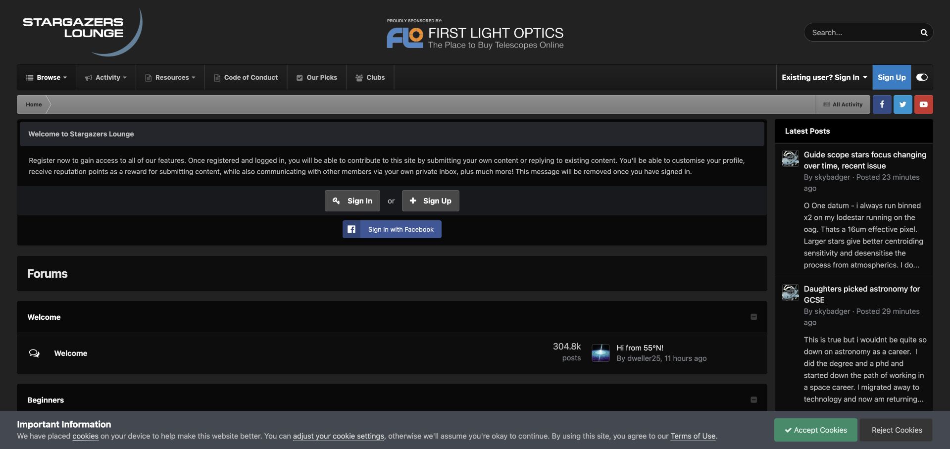
Stargazers Lounge uses a dark interface with a large astronomy identity and sponsor presence above the navigation. Resources, conduct, selected material and clubs have explicit routes, followed by a substantial welcome message for guests. The index then introduces welcome and beginner areas, including distinct observing, imaging and equipment discussions. This makes the intended audience clear: newcomers have a place alongside experienced members. The guest explanation is useful, but its size, combined with the header, delays the categories that demonstrate the community's value. Small metadata against the dark gray surfaces also requires more effort to read. The design is a useful study in welcoming language and experience-based organization, with an opportunity to shorten the path from introduction to actual discussion.
What you can learn
Name beginner destinations explicitly and describe what guests can do before registration. Keep that explanation brief enough that useful discussions remain visible, and test contrast for secondary text as carefully as the main headings.
Pros
Beginner categories acknowledge different learning needs.
Conduct and resource links are easy to identify in navigation.
Cons & considerations
The header and guest welcome consume much of the opening view.
Small secondary text has limited contrast on dark surfaces.
Visible tech stack
Earlier / documented evidence
Invision Community
Platform source: Public page platform evidence. The public footer explicitly credits Invision Community. Platform evidence is separate from the direct website screenshot and is not a complete current infrastructure audit.
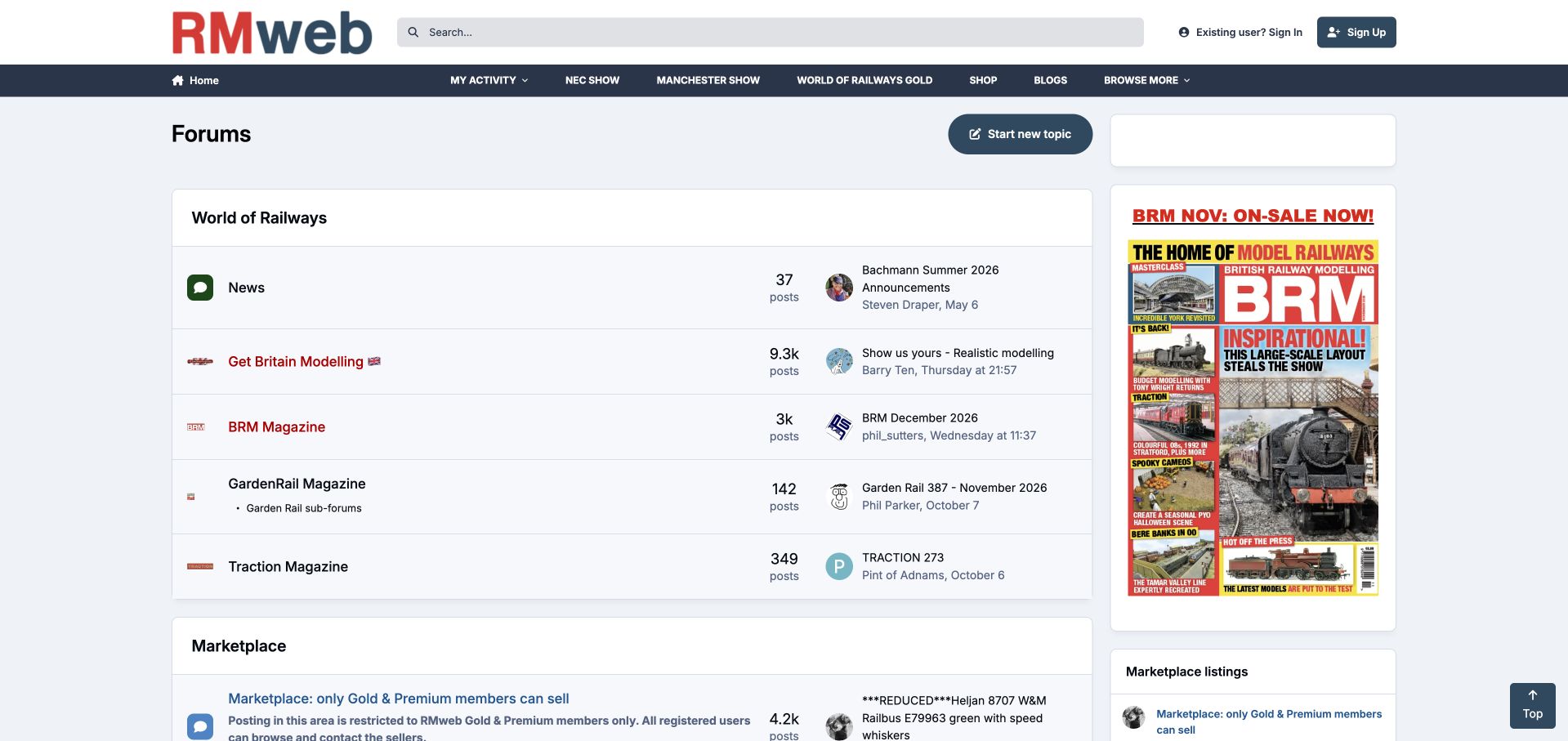
RMweb presents a red and navy identity, a broad search field and navigation that includes exhibitions, membership, shopping and blogs. The forum directory connects magazine and railway-interest groups, while the right column features a publication cover. This creates a shared entrance for the publisher's editorial, event and community activities. The marketplace description is useful because it explains the difference between browsing and selling permissions before someone enters that area. The tradeoff is the number of commercial and editorial destinations competing with ordinary discussion. A new visitor must distinguish the overall community from individual magazine groups and member services, and some subject categories sit farther down a long index. The interface rewards returning members more readily than first-time readers.
What you can learn
Make membership-dependent actions explicit at the point where people choose a destination. When a publisher combines events, magazines and discussion, group those offers clearly so a newcomer can find the community without understanding the whole business first.
Pros
Exhibitions and publications are connected to the community navigation.
Marketplace descriptions clarify different participation permissions.
Cons & considerations
Many commercial routes compete with the core discussion task.
A long index requires newcomers to interpret several overlapping groups.
Visible tech stack
Earlier / documented evidence
Invision Community
Platform source: Public page platform evidence. The public footer explicitly credits Invision Community. Platform evidence is separate from the direct website screenshot and is not a complete current infrastructure audit.
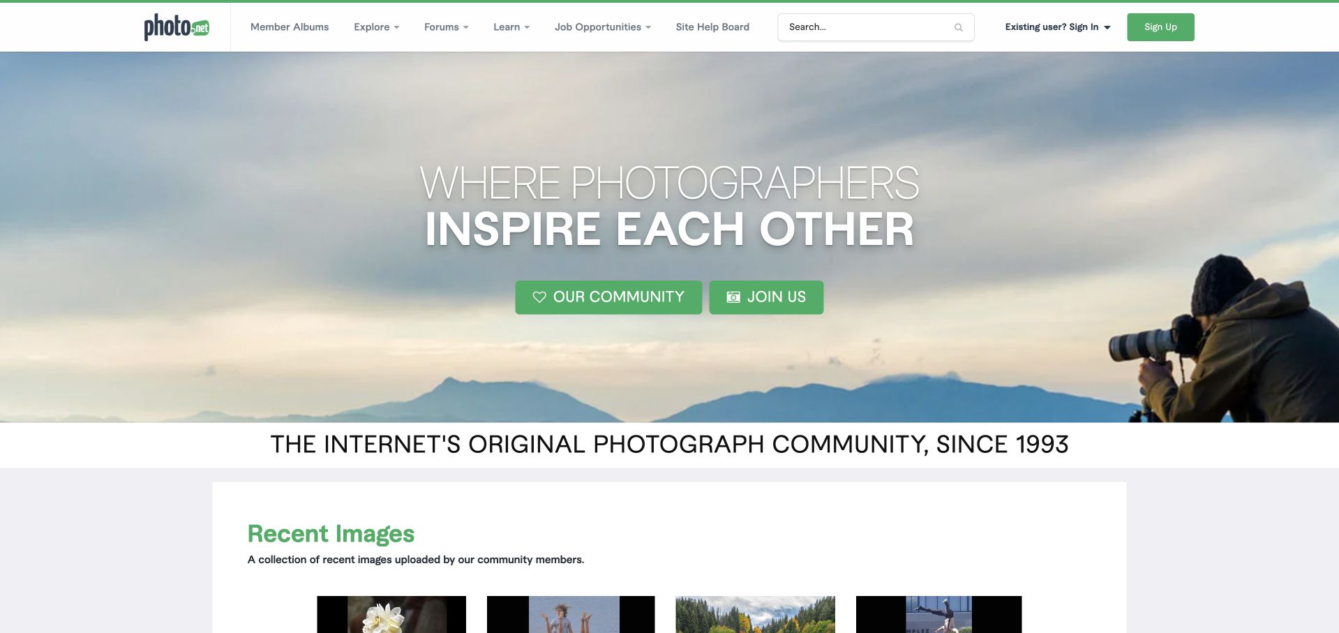
Photo.net opens with a large photograph of a photographer at work, overlaid by a community statement and two green calls to action. The header offers member albums, exploration, forums, learning and job opportunities, with search kept in the same horizontal band. Below the hero, a short heritage statement introduces a recent-images gallery, making member work the next substantive content. The page establishes a clear creative identity and offers several participation modes beyond a forum thread. Its most obvious compromise is scale: the hero occupies much of the initial viewport before actual member photographs appear. The broad navigation also asks visitors to distinguish between browsing images, learning and discussing without much explanatory text at that first level.
What you can learn
Let a creative community demonstrate its value through members' work early in the visit. A strong introductory image can establish identity, but it should not delay the gallery or critique routes that make participation tangible.
Pros
The photographic hero immediately communicates the shared interest.
Albums, discussion and learning have distinct top-level routes.
Cons & considerations
The large hero pushes member work toward the fold.
Several broad navigation labels need further exploration to understand.
Visible tech stack
Earlier / documented evidence
Invision Community
Platform source: Public page platform evidence. The public footer explicitly credits Invision Community. Platform evidence is separate from the direct website screenshot and is not a complete current infrastructure audit.
AI Skills Hub demonstrates Invision Community beyond the familiar forum format. The public homepage uses a rounded navigation bar, a dark teal background and a prominent program banner, followed by a large statement explaining the learning directory. Navigation separates a personal pathway, the catalogue, use cases, research and events. Further down, the page offers learning routes and describes a skills-mapping tool that requires an account. The platform vendor's case study identifies the Innovate UK and PwC project, while the observed page supplies current implementation evidence. The distinction between public resources and account-based personalization is useful, although the opening promotional banner occupies substantial space and the similarly named Hub and Boost offerings require careful explanation.
What you can learn
Start an education community with the learner's choices: browse, follow a pathway or attend an event. Explain account-dependent features before sign-in, and keep program branding from obscuring the differences between those learning routes.
Pros
Navigation distinguishes resources, pathways and events.
Account requirements are stated for the personalized mapping feature.
Cons & considerations
The large program banner delays the practical learning choices.
Closely related program names can make the hierarchy harder to understand.
Visible tech stack
Earlier / documented evidence
Invision Community
Platform source: Public page platform evidence. The public footer explicitly credits Invision Community. Platform evidence is separate from the direct website screenshot and is not a complete current infrastructure audit.
Kegan has 15+ years of experience working with small businesses, Fortune 500 companies, and everything in between. No development job is too big or too small: he brings the same hands-on attention to a focused improvement, a complete website, or a custom application.
For Invision Community projects, he can help with content architecture, custom functionality, system integrations, testing, and maintainable handover. He works directly with clients on scope, design, implementation, testing, and handover, with an emphasis on clear communication and a system that remains practical to maintain after launch.
Show 3 other Invision Community developersHide other Invision Community developers
Choose the implementation around the operating model
Use a focused forum structure
Start with the categories and member journeys that already exist. Add other content areas only with ownership and enough material to make them useful.
Build a resource-centered community
When downloads, tutorials, or galleries matter, explain their relationship to discussions and give them consistent discovery rules.
Extend an existing brand carefully
Carry typography and color into the community while preserving readable topic rows, status labels, and navigation. Plan how customizations will be maintained through upgrades.
From references to requirements
Plan the content and everyday maintenance
Audit old content before migration
Map categories, important threads, attachments, and public links. Define what is archived, redirected, or retained rather than treating the new theme as the entire project.
Write the operational guidance
Assign rules, staff announcements, escalation paths, and member help to named owners. Keep locked or retired areas explicitly labeled.
Test realistic community pages
Check long titles, dense forum indexes, embedded media, empty search results, and signed-out access. Use test accounts for private flows when separately authorized.
A useful handover demonstration
Ask the actual team to carry out its routine job: publish a realistic update, correct a mistake, preview a narrow screen, and identify who owns an integration failure. For a library or frontend framework, also ask who maintains the content source and deployment. A polished screenshot does not answer those operational questions.
Beyond the screenshot
Invision Community project checklist
Define each content area.
Clarify official announcements.
Maintain category descriptions.
Label archived forums.
Keep support routes visible.
Map old links.
Test media and attachments.
Check narrow topic rows.
Assign upgrade ownership.
Review contribution guidance.
Test with real content, a keyboard, a small screen, slow or failed requests, and the people who will maintain the system. These are planning checks, not an accessibility, security, performance, or search-ranking certification.
Sources & editorial method
How this Invision Community collection was reviewed
Twenty distinct public properties have direct website captures and original design reviews. The first five are explicitly identified recognizable organizations or established specialists. Platform evidence is scoped to each named property; documentary associations, dated observations, and narrower asset-only signals remain qualified. Captures and technology verification have independent dates. A bounded public stack audit was attempted for every source, preserving inaccessible and unknown results. No private administration or transactions were inspected.
Every image is an unmodified capture from the actual website, with its source and capture date. Some captures are reused from our shared catalog; their dates remain the original capture dates. None comes from a vendor gallery or a generated reconstruction. Moving imagery and live content can change.
Technology attribution uses public page assets or metadata, official platform documentation, or a cited first-party project case study. Documentary and framework-relationship evidence is identified where used; it is not a complete current backend inventory. A CMS image CDN alone does not establish a full CMS deployment. A library’s presence does not prove which individual controls use it, and a platform label does not establish AI authorship.
The composition notes, lessons, pros and tradeoffs are original editorial observations. We have not measured conversion, traffic, security, performance or accessibility conformance. Website owners retain their brands and imagery; these examples are not our client portfolio. Written, Edited and Curated are independent records, not dates advanced by a build. See our editorial standards or suggest a correction.
Questions worth asking
Invision Community website development FAQs
Does every Invision project need galleries and events?
No. Choose content areas that have a clear audience and an owner rather than displaying unused features.
What does a footer credit establish?
It supports the platform association of the pictured public property. It does not reveal the full configuration or every paid capability.
How should announcements be prioritized?
Reserve strong emphasis for current operational information and keep routine notices from overwhelming the forum index.
Can a community share the parent site’s design?
Yes, but topic readability and discovery still need their own layout rules and responsive checks.