Definitive guide · Concrete CMS website development
Best Concrete CMS Websites of 2026 (20 Real-World Examples)
Twenty public website examples documented in official Concrete CMS case studies, with direct screenshots, original reviews and property-specific evidence.
A useful content-managed website helps both its visitors and the people responsible for keeping it accurate. These examples show service directories, product introductions, civic tasks and campaign pages with documented Concrete CMS relationships. The reviews examine the public designs captured on November 10, 2026; an earlier case study is not treated as proof of every current implementation detail.
Start with the information people need, the tasks they bring and the team that will maintain the content. A museum visit, a public-service query and a complex equipment purchase call for different structures. Plan the hierarchy, recurring page types and editorial responsibilities around those differences. A CMS should help maintain a coherent experience as information changes, rather than merely supply a place to paste finished layouts.
The collection opens with U.S. Army MWR, the California Secretary of State, ITV Media, GlobalSign and Milwaukee Mitchell International Airport. Each official case identifies a public website project. Internal training, intranet and private coordination projects were excluded instead of substituting corporate homepages for them. Every screenshot below records the actual public page, while the CMS evidence remains limited to the named project and its documented scope.
Before the examples
What makes good Concrete CMS website development in 2026?
Design for the visitor’s recurring tasks
List the questions people bring before arranging the navigation. Separate frequent practical tasks from institutional background and temporary campaigns. A directory, a search field and a prominent announcement have different jobs; they should not compete at equal volume. Use labels that make sense outside the organization. Test the structure with realistic examples of information people need to find, including a direct arrival on a deeper page. The airport, public-service and municipal examples show different ways to keep task routes near a strong visual introduction.
Give editors a controlled set of useful building blocks
Define recurring content patterns before granting unlimited layout choices. Concrete’s documentation describes modular blocks, page types and reusable stacks, which can support a deliberate publishing system. Decide which parts of a page need flexibility and which should stay consistent. Provide examples of acceptable headings, images, calls to action and content lengths. A well-designed editing model should make the normal update understandable while reducing the chance that an ordinary change disrupts the public page’s hierarchy.
A page needs an owner, a reason to exist and a plan for keeping it useful. Decide who may propose changes, who reviews sensitive material and who can publish. Concrete supports separate user groups and publishing permissions; configure those around real responsibilities rather than job titles alone. Establish a routine for expired campaigns, moved information and broken external destinations. Good content governance is a practical maintenance arrangement, not evidence that any particular site meets a regulatory or accessibility standard.
These twenty original reviews pair direct November 10, 2026 public-page captures with official Concrete CMS case studies. Each source received one bounded broad stack audit attempt. Sixteen completed checks, one partial scan and three unavailable scans are preserved separately from the documentary CMS associations.
We start with five recognizable brands or organizations: U.S. Army MWR, California Secretary of State, ITV Media, GlobalSign, Milwaukee Mitchell International Airport. Each attribution applies to the named website property, not every product or website belonging to its organization. This is a curated reading sequence, not a measured ranking.
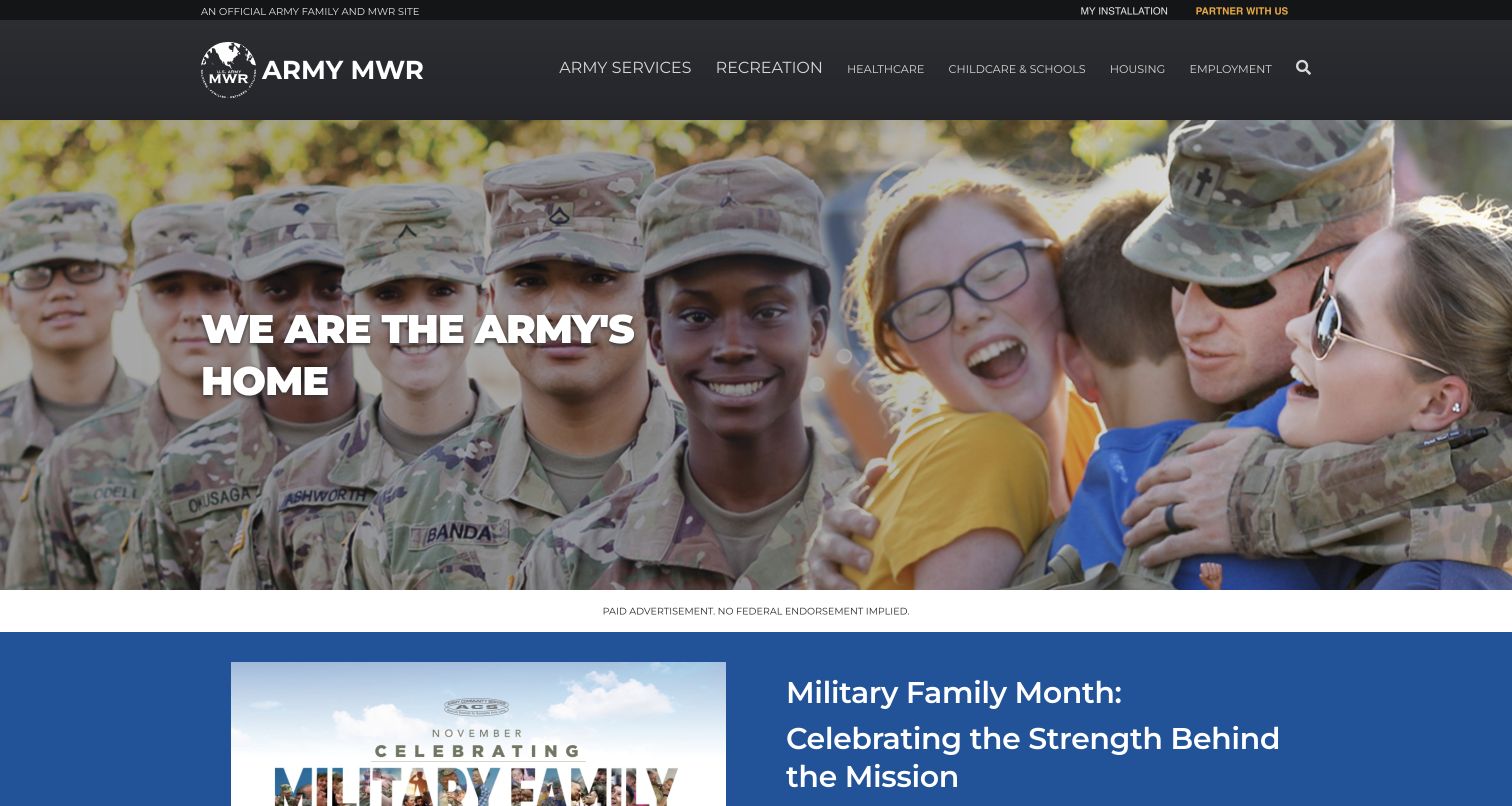
Army MWR places its recognizable identity above navigation organized around everyday needs: recreation, health, childcare, housing and employment. A large photograph of service members and families gives those categories a human setting. The opening message sits in a distinct light panel, with a separate campaign strip below rather than several competing calls over the same image. Concrete’s official case documents the public MWR website network. That relationship does not establish the implementation of every Army website or any private personnel system.
What you can learn
For a distributed service organization, begin with the vocabulary of the people using the service. Let a common navigation structure create continuity, while photography and campaign areas provide room for local relevance and changing priorities.
Pros
The service categories explain useful destinations before visitors need to understand the organization’s structure.
The separate message panel keeps introductory copy distinguishable from a detailed photographic background.
Cons & considerations
A broad topic menu still needs clear local context once a visitor chooses a service.
Campaign content should remain secondary when people arrive needing a specific practical answer.
Platform source: Official Concrete CMS case: U.S. Army MWR. Public Army MWR garrison and services website network, specifically armymwr.com; not every Army system. Documented public-website project association from the official CMS case study, reviewed November 10, 2026. The case may describe an earlier implementation. It does not establish the current CMS version, every present component or any private system. The new screenshot is design evidence, not a runtime audit. Platform evidence is separate from the direct website screenshot and is not a complete current infrastructure audit.
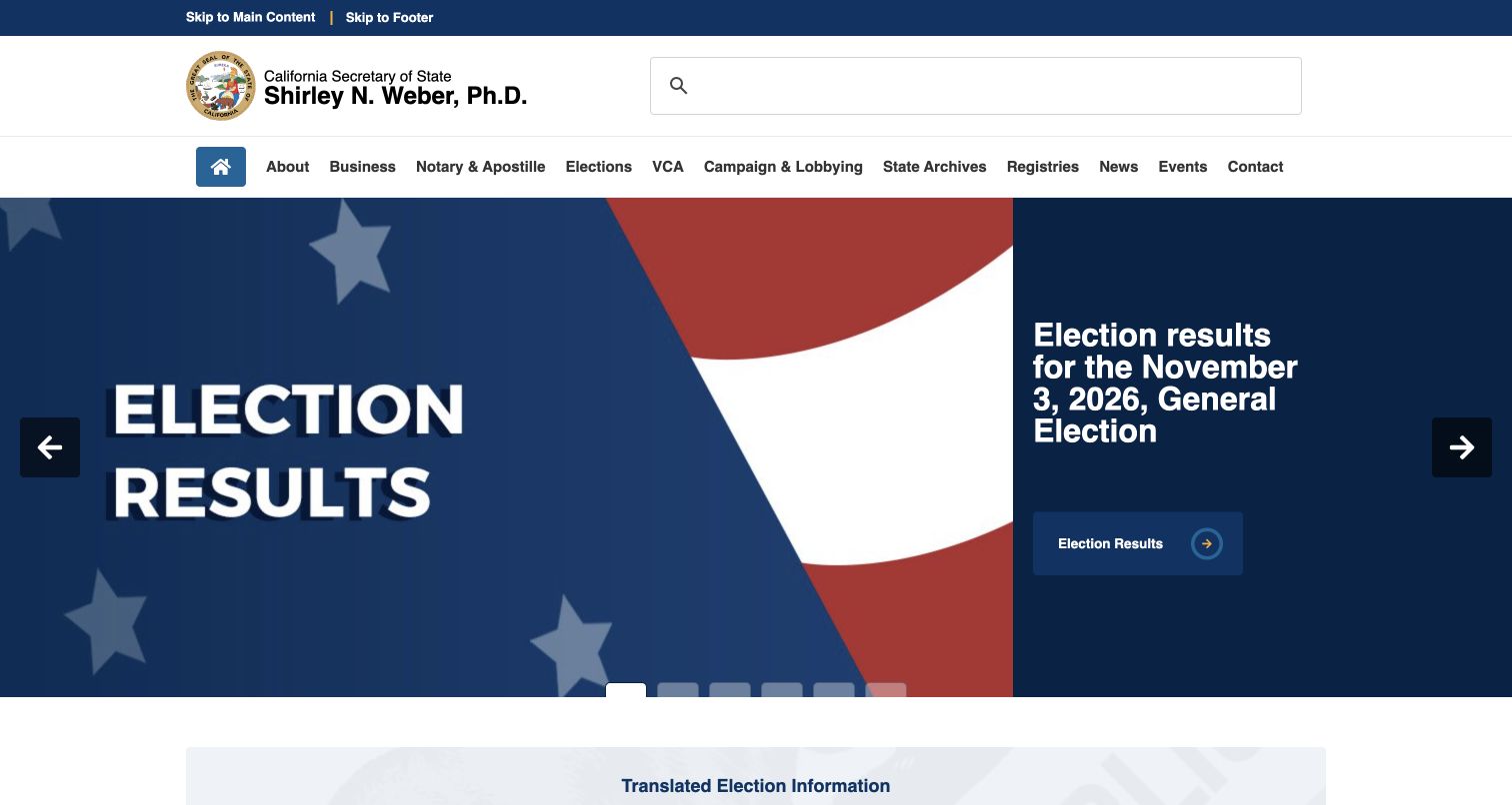
The California Secretary of State homepage combines an official seal and office identification with a conspicuous search field and an extensive topic navigation. Its captured opening feature gives election results a dedicated panel beside a large flag image, making a timely destination easy to distinguish from the wider departmental offering. The layout communicates both institutional ownership and a current priority. The vendor’s case identifies the public sos.ca.gov website and a Concrete CMS upgrade, without establishing the systems behind separate state services.
What you can learn
Treat a government homepage as both a directory and a place for timely information. Preserve stable service categories while giving an urgent task a clearly bounded location that can change without rebuilding the entire navigation.
Pros
Official identity remains visible above the feature, helping visitors orient themselves before following a link.
Search and topic navigation provide alternatives to the promoted destination in the main feature.
Cons & considerations
A long horizontal menu can become demanding when several departments use similar terminology.
Time-sensitive features need clear ownership so older priorities do not occupy the most prominent space.
Platform source: Official Concrete CMS case: California Secretary of State. The public sos.ca.gov departmental website and its documented Concrete CMS upgrade; not separate state applications. Documented public-website project association from the official CMS case study, reviewed November 10, 2026. The case may describe an earlier implementation. It does not establish the current CMS version, every present component or any private system. The new screenshot is design evidence, not a runtime audit. Platform evidence is separate from the direct website screenshot and is not a complete current infrastructure audit.
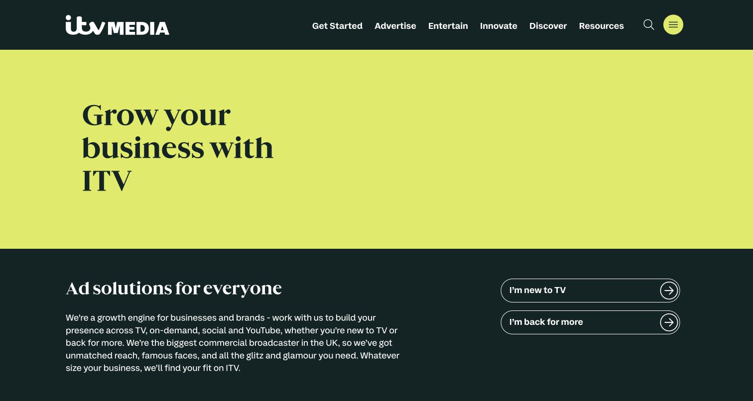
ITV Media’s captured homepage uses a lime opening field, dark green navigation and oversized editorial typography to explain its advertising proposition. Below the introductory statement, distinct routes address businesses new to television advertising and those returning for more. That audience separation is particularly useful for a recognizable broadcaster whose name can suggest a viewing service. Concrete’s case concerns the public ITV Media advertising website. It does not attribute ITVX, ITV Hub or ITV’s wider technical estate to this CMS.
What you can learn
When a familiar brand serves several audiences, state the specific purpose of the current property early. Follow that explanation with routes based on visitors’ experience or intent, rather than expecting the parent brand alone to provide enough context.
Pros
The limited color palette gives the introduction a strong identity without adding many competing visual elements.
Audience-specific routes make the next step more concrete than a single generic contact invitation.
Cons & considerations
Very large opening typography can postpone detailed evidence for visitors already comparing advertising options.
Brand familiarity can still create confusion unless page titles and search descriptions maintain the same commercial scope.
Visible tech stack
Earlier / documented evidence
Concrete CMS
Platform source: Official Concrete CMS case: ITV Media. The public ITV Media commercial advertising website; not ITVX, ITV Hub or the broadcaster’s complete technical estate. Documented public-website project association from the official CMS case study, reviewed November 10, 2026. The case may describe an earlier implementation. It does not establish the current CMS version, every present component or any private system. The new screenshot is design evidence, not a runtime audit. Platform evidence is separate from the direct website screenshot and is not a complete current infrastructure audit.
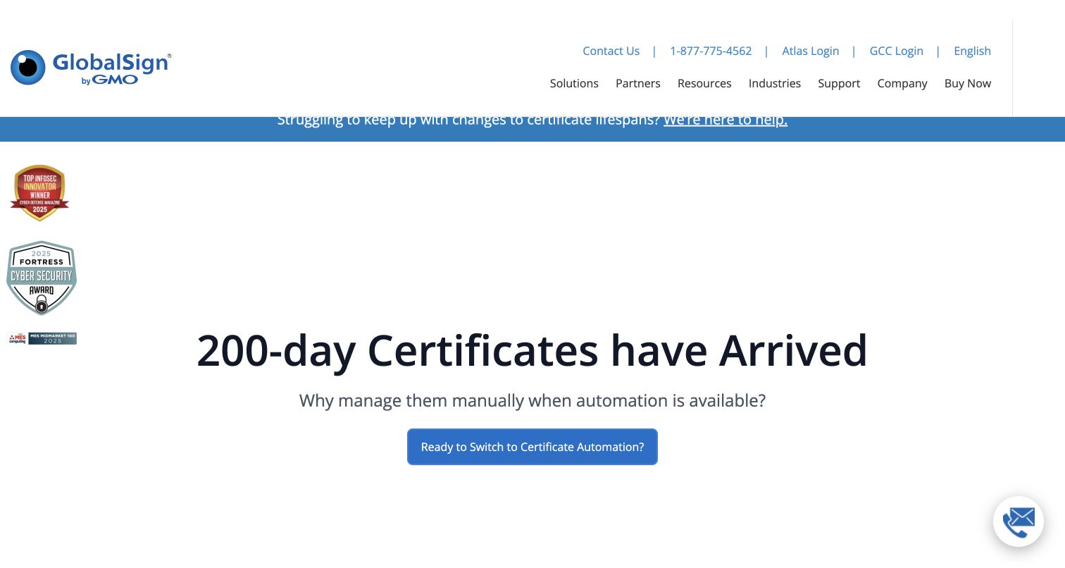
GlobalSign’s public homepage places a large certificate-automation proposition in a spacious white field below a conventional enterprise navigation. A blue announcement strip separates a current message from the main introduction, while a primary button offers an evident next step. Small supporting badges sit beneath the central message rather than competing with it. The Concrete CMS case describes the multilingual public website. Neither the screenshot nor that case establishes the implementation of certificate issuance, customer accounts or other private services.
What you can learn
Give a complex technical offer a short, coherent starting point. Separate the immediate proposition, a timely announcement and supporting credentials into recognizable layers, then let deeper navigation carry the detail needed by experienced evaluators.
Pros
Generous space around the main statement makes the central proposition easy to locate.
Utility links and product navigation remain visually distinct from the main introductory action.
Cons & considerations
A broad technical claim still needs concrete supporting detail on the destinations that follow.
A floating chat control and secondary badges can accumulate around otherwise carefully restrained content.
Platform source: Official Concrete CMS case: GlobalSign. The multilingual public GlobalSign marketing website; not certificate issuance or other private services. Documented public-website project association from the official CMS case study, reviewed November 10, 2026. The case may describe an earlier implementation. It does not establish the current CMS version, every present component or any private system. The new screenshot is design evidence, not a runtime audit. Platform evidence is separate from the direct website screenshot and is not a complete current infrastructure audit.
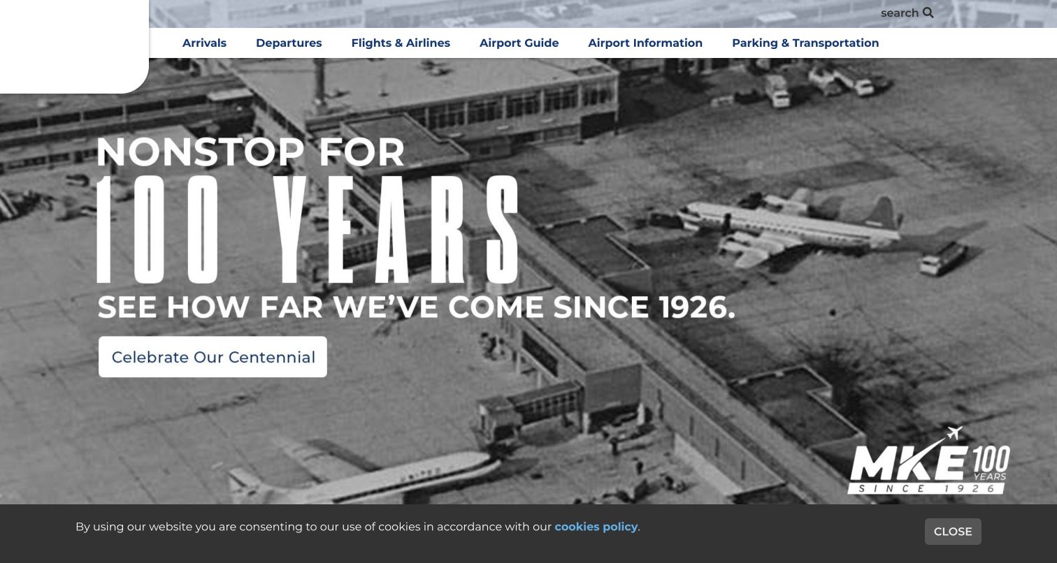
Milwaukee Mitchell International Airport places arrivals, departures, airport information and parking in the opening navigation. The captured hero is devoted to an anniversary campaign, using a large historic photograph and condensed white typography. This creates a clear distinction between routine travel tasks in the header and the airport’s broader story in the feature. Concrete’s case documents the public information website and its earlier CMS migration. It does not establish airline systems, flight-data backends or a current software version.
What you can learn
A public destination can celebrate its history without making every visitor follow the campaign. Keep frequent practical tasks available in stable positions, and treat large promotional features as an additional route rather than the sole entrance to essential information.
Pros
Travel-oriented navigation labels match the practical questions many visitors bring to an airport website.
The historic image gives the anniversary feature a coherent visual subject and recognizable editorial purpose.
Cons & considerations
A large campaign can push detailed operational information below the first captured screen.
Historical imagery and white overlay text need careful contrast across different crops and image conditions.
Platform source: Official Concrete CMS case: Milwaukee Mitchell International Airport. The public airport information website; not airline systems or flight-data backends. Documented public-website project association from the official CMS case study, reviewed November 10, 2026. The case may describe an earlier implementation. It does not establish the current CMS version, every present component or any private system. The new screenshot is design evidence, not a runtime audit. Platform evidence is separate from the direct website screenshot and is not a complete current infrastructure audit.
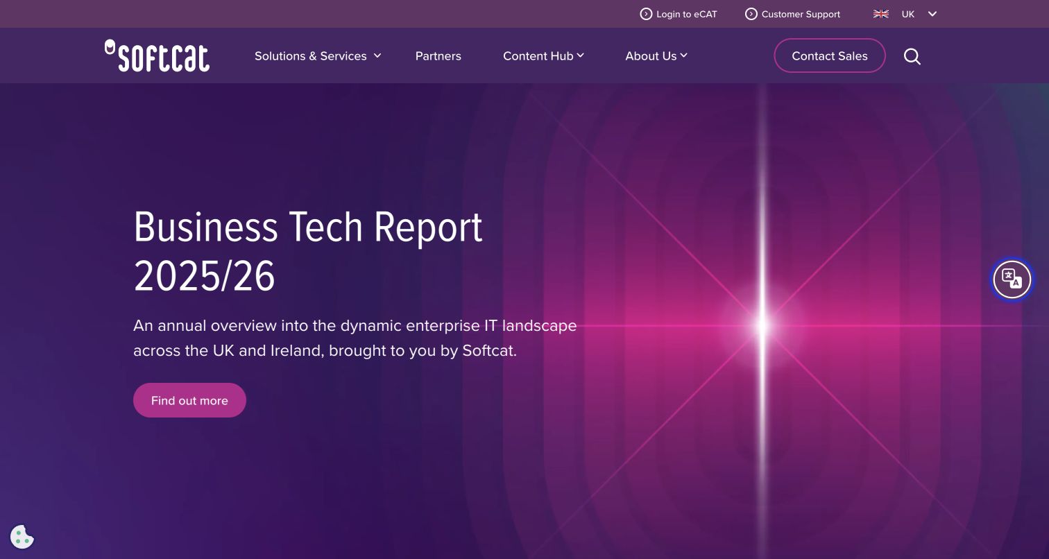
Softcat’s captured opening promotes its Business Tech Report with a purple gradient, a large white heading and a magenta action. An abstract graphic occupies the right side, leaving the left column to explain the report. The white header separates the brand, service navigation and utility destinations from the campaign’s visual treatment. Concrete’s official case identifies the public marketing website as a documented project. The current screenshot is not evidence of customer procurement tools, support accounts or the present CMS implementation.
What you can learn
Give a recurring report or campaign its own visual emphasis while retaining a stable site framework. The visitor should be able to understand the promoted content and also leave that campaign to explore the organization’s broader services without losing orientation.
Pros
The split composition reserves a clear reading area instead of placing all text over detailed imagery.
The bright primary action stands apart from both the purple feature and the neutral navigation.
Cons & considerations
An abstract graphic supplies atmosphere but conveys less immediate detail than a useful report preview.
A large campaign needs a concise explanation of its audience so a new visitor can judge relevance.
Visible tech stack
Earlier / documented evidence
Concrete CMS
Platform source: Official Concrete CMS case: Softcat. The public Softcat marketing website documented in the vendor case study; not account or procurement systems. Documented public-website project association from the official CMS case study, reviewed November 10, 2026. The case may describe an earlier implementation. It does not establish the current CMS version, every present component or any private system. The new screenshot is design evidence, not a runtime audit. Platform evidence is separate from the direct website screenshot and is not a complete current infrastructure audit.
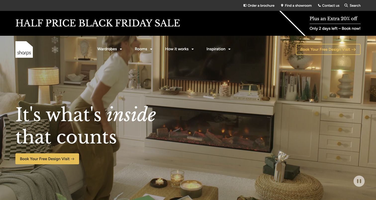
Sharps introduces fitted furniture through a large interior scene, with a white serif headline and a contrasting yellow design-visit action. The navigation sits over the image while a dark promotional strip and smaller utility links occupy the space above. The captured frame shows how a room can communicate the product’s setting before individual specifications appear. Concrete’s case documents the public Sharps marketing website; it does not verify private scheduling systems, manufacturing operations or the runtime behind today’s page.
What you can learn
For a product that changes a physical space, show the context of use before overwhelming the visitor with options. Pair the scene with one understandable next step, then provide specifications and service details as a deliberate continuation of that introduction.
Pros
The room gives visitors a concrete setting for understanding what the product changes.
A warm yellow action remains distinct from the pale typography and darker parts of the image.
Cons & considerations
Navigation over changing imagery requires consistent contrast across every frame and screen size.
Several promotional and utility rows can consume space before the actual furniture explanation begins.
Visible tech stack
Earlier / documented evidence
Concrete CMS
Platform source: Official Concrete CMS case: Sharps. The public Sharps fitted-furniture marketing website; not its private booking or business systems. Documented public-website project association from the official CMS case study, reviewed November 10, 2026. The case may describe an earlier implementation. It does not establish the current CMS version, every present component or any private system. The new screenshot is design evidence, not a runtime audit. Platform evidence is separate from the direct website screenshot and is not a complete current infrastructure audit.
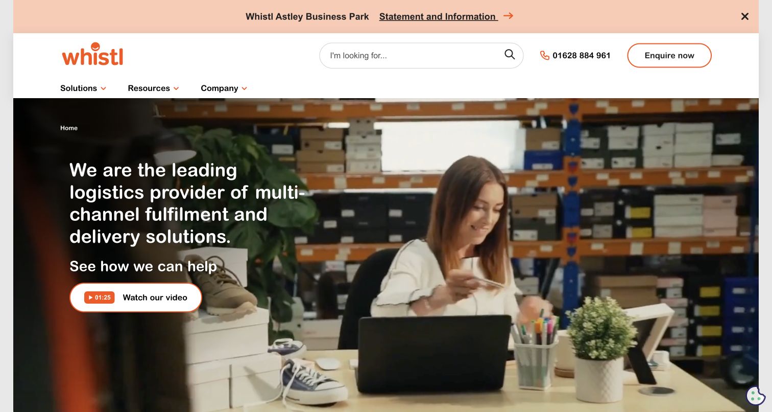
Whistl’s homepage places an orange wordmark, search, contact information and service categories in a broad white header. Beneath it, a warehouse scene gives the service a concrete operational setting, with a darkened left area carrying the introductory text and a video invitation. A separate notice strip accommodates timely information without folding it into the hero. The vendor’s Concrete CMS case concerns the public logistics website, not parcel-tracking systems or the machinery and private workflows depicted in the imagery.
What you can learn
Show the environment in which a service operates, then keep the visitor’s task separate from the scene. A clear header can organize service discovery while a bounded introduction explains the organization’s role without requiring an immediate conversation or video view.
Pros
Search and service navigation remain visible above the image, offering routes for visitors with specific needs.
The darker text area makes the introductory copy easier to distinguish from the busy warehouse background.
Cons & considerations
A video invitation should have a useful written counterpart for people who cannot or prefer not to watch.
Utility information and service categories need careful spacing when the header becomes narrower.
Platform source: Official Concrete CMS case: Whistl. The public Whistl logistics marketing website; not parcel tracking or operational backends. Documented public-website project association from the official CMS case study, reviewed November 10, 2026. The case may describe an earlier implementation. It does not establish the current CMS version, every present component or any private system. The new screenshot is design evidence, not a runtime audit. Platform evidence is separate from the direct website screenshot and is not a complete current infrastructure audit.
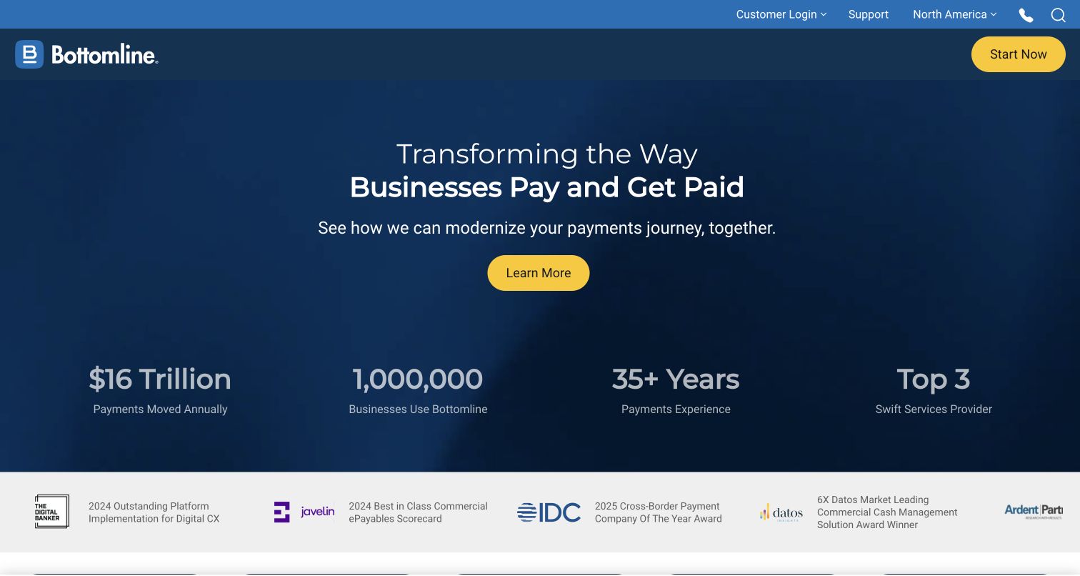
Bottomline’s captured public homepage uses a dark blue field for a centered proposition and a bright yellow primary action. The same accent appears in the header’s start route, while utility navigation sits above the main product categories. A compact row of numerical claims and a strip of award marks provide supporting material below the introduction. Those claims are presentation observations, not independently verified results. Concrete’s case covers the public corporate website and hosting project, not Bottomline’s payment products or transaction infrastructure.
What you can learn
Use consistent visual roles for primary actions, utility links and supporting material. Let the main statement introduce the offer, but make its evidence and qualifications easy to inspect rather than expecting large numbers or recognizable badges to explain themselves.
Pros
A restrained blue and yellow palette makes the primary action easy to distinguish.
Supporting signals occupy a separate band, preserving a clear boundary around the main proposition.
Cons & considerations
Numerical claims need accessible definitions and context before they can support a meaningful comparison.
A broad enterprise statement may require additional task or product routes for visitors with precise requirements.
Platform source: Official Concrete CMS case: Bottomline. The public Bottomline corporate website and its documented Concrete hosting project; not the company’s payment products. Documented public-website project association from the official CMS case study, reviewed November 10, 2026. The case may describe an earlier implementation. It does not establish the current CMS version, every present component or any private system. The new screenshot is design evidence, not a runtime audit. Platform evidence is separate from the direct website screenshot and is not a complete current infrastructure audit.
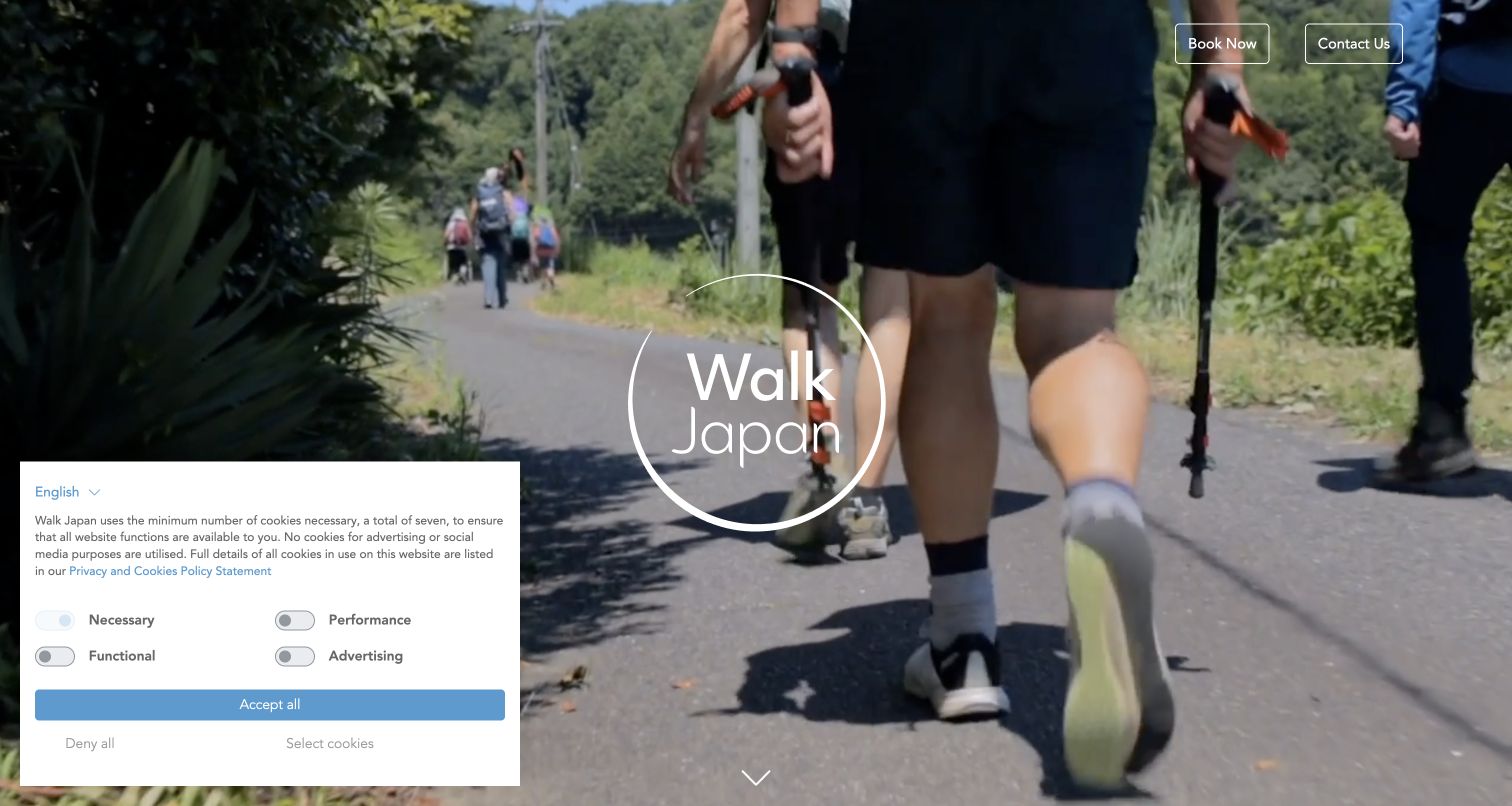
Walk Japan’s captured homepage opens with a walking scene and a large circular wordmark centered over the landscape. Booking and contact links sit at the upper edge, while a downward cue suggests that more information follows. The sparse composition puts the experience ahead of an extensive menu, although a privacy panel occupies one corner of the captured screen. Concrete’s case documents the public travel website and its earlier development history. A newer image does not establish the implementation of a separate booking portal.
What you can learn
An immersive introduction works best when the visitor can still identify the organization and find a practical route forward. Keep the opening simple, but make it obvious where useful trip details begin and how someone can move past the atmosphere.
Pros
The walking scene communicates the nature of the experience without relying on a long opening paragraph.
A small set of visible actions keeps the introduction from becoming a wall of competing choices.
Cons & considerations
Limited opening detail can delay comparison for visitors who already know the kind of trip they need.
A privacy panel must be considered part of the real composition rather than an exceptional edge case.
Visible tech stack
Earlier / documented evidence
Concrete CMS
Platform source: Official Concrete CMS case: Walk Japan. The public Walk Japan travel website, originally built in 2015 and subsequently maintained; not a separate booking portal. Documented public-website project association from the official CMS case study, reviewed November 10, 2026. The case may describe an earlier implementation. It does not establish the current CMS version, every present component or any private system. The new screenshot is design evidence, not a runtime audit. Platform evidence is separate from the direct website screenshot and is not a complete current infrastructure audit.
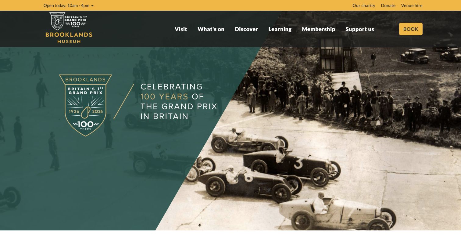
Brooklands Museum combines a yellow utility strip, dark green navigation and a prominent booking route with a large anniversary feature. The captured campaign pairs bold graphic lettering with historic motorsport imagery, giving the page a specific editorial subject. Opening-hour information remains separate from the feature, helping distinguish a practical visit question from the museum’s storytelling. Concrete’s official case identifies the public museum website. It does not establish the technology of every ticketing destination or prove that the current page retains the documented implementation.
What you can learn
A museum homepage has to inspire a visit and answer ordinary planning questions. Give each function a clear place: practical utilities in a stable header, a strong editorial feature below, and a booking route that remains understandable throughout the introduction.
Pros
Opening information and booking are visible before visitors need to explore the campaign.
The combination of graphic treatment and historical photography gives the feature a coherent subject.
Cons & considerations
A large anniversary promotion can postpone details about the wider collection or current visitor experience.
Historic photographs need carefully chosen crops so essential subject matter survives smaller display areas.
Platform source: Official Concrete CMS case: Brooklands Museum. The public Brooklands Museum visitor website documented by the CMS vendor; not every linked ticketing service. Documented public-website project association from the official CMS case study, reviewed November 10, 2026. The case may describe an earlier implementation. It does not establish the current CMS version, every present component or any private system. The new screenshot is design evidence, not a runtime audit. Platform evidence is separate from the direct website screenshot and is not a complete current infrastructure audit.
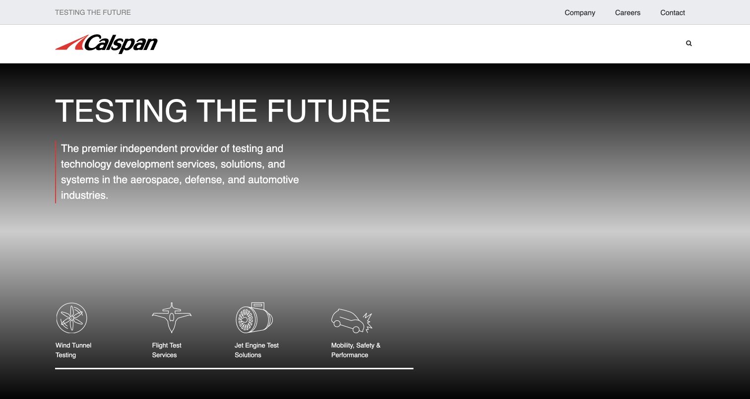
Calspan’s captured opening uses a strong wordmark, an uppercase proposition and a short explanation of its testing services. Four illustrated categories introduce wind-tunnel testing, flight testing, jet-engine work and mobility-related services. A limited utility bar keeps company, career and contact destinations separate from the main technical message. The captured background is subdued, leaving text and category icons as the clearest elements. The Concrete CMS case concerns this public marketing website, not testing equipment, engineering applications or private customer systems.
What you can learn
Introduce a specialist business with a short explanation and a small set of meaningful service categories. The visitor should be able to decide which branch deserves attention before encountering the full technical vocabulary, capabilities and qualifications of each practice.
Pros
The category row translates a broad engineering proposition into several concrete starting points.
Separate utility navigation prevents corporate destinations from competing directly with the service explanation.
Cons & considerations
A broad headline needs the following descriptive paragraph to make the organization’s role clear.
Illustrated categories should retain descriptive text so visitors do not have to interpret technical icons alone.
Platform source: Official Concrete CMS case: Calspan. The public aerospace and automotive testing marketing website; not test equipment or internal engineering systems. Documented public-website project association from the official CMS case study, reviewed November 10, 2026. The case may describe an earlier implementation. It does not establish the current CMS version, every present component or any private system. The new screenshot is design evidence, not a runtime audit. Platform evidence is separate from the direct website screenshot and is not a complete current infrastructure audit.
Viking Masek’s homepage places a large packaging-machine assembly beneath a bold, centered automation proposition. The product image extends across the opening screen, helping convey the scale and modular nature of the equipment. A red service strip separates support and sales contact routes, while the main header offers both machine discovery and a quote destination. Concrete’s official case documents a public-site migration from HubSpot. That relationship does not establish the software inside the machinery or the company’s private sales systems.
What you can learn
Show enough of a complex product to make its physical purpose understandable, then separate exploration from inquiry. A visitor still comparing equipment should have a useful route that does not require the same commitment as a person already requesting a quotation.
Pros
The machinery image provides concrete product context beneath an otherwise broad automation statement.
Distinct discovery and quote actions accommodate visitors at different stages of their evaluation.
Cons & considerations
A wide product composition can lose useful mechanical detail when reduced to a narrow screen.
Prominent service and sales contacts should retain clear labels so existing customers choose the right route.
Platform source: Official Concrete CMS case: Viking Masek. The public packaging-equipment website documented as a migration from HubSpot to Concrete CMS; not the machinery’s software. Documented public-website project association from the official CMS case study, reviewed November 10, 2026. The case may describe an earlier implementation. It does not establish the current CMS version, every present component or any private system. The new screenshot is design evidence, not a runtime audit. Platform evidence is separate from the direct website screenshot and is not a complete current infrastructure audit.
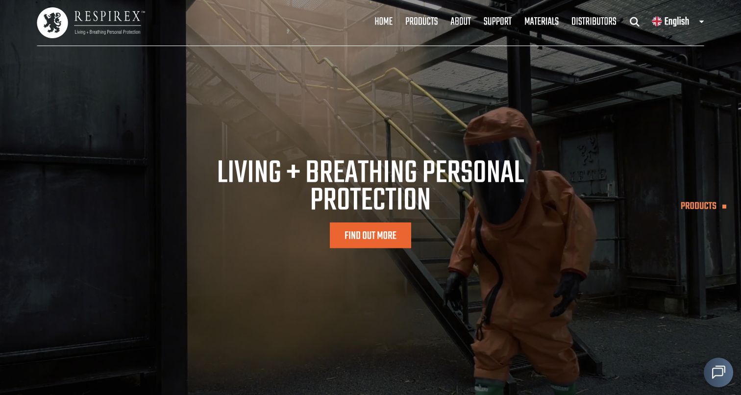
Respirex opens with a full-width industrial scene showing protective equipment in use. White condensed typography and an orange action sit over a darkened portion of the image, while the header separates products, support, materials and distributors. The observed navigation also distinguishes product types from applications, offering more than one way into a specialist catalog. Concrete’s case identifies the multilingual public website. The design review does not verify protective performance, certifications or the implementation of private compliance and ordering systems.
What you can learn
A specialist product catalog benefits from both a recognizable use context and a deliberate classification system. Let imagery introduce the setting, then give visitors paths based on the task they need to perform or the type of product they already understand.
Pros
The industrial setting makes the product category tangible before detailed specifications appear.
Application and product-type routes support different levels of familiarity with a technical catalog.
Cons & considerations
A dramatic image cannot replace precise suitability information and product-specific documentation.
Condensed white text over moving imagery needs careful contrast and a useful reduced-motion alternative.
Platform source: Official Concrete CMS case: Respirex International. The public multilingual protective-equipment catalog and marketing website; not product certification systems. Documented public-website project association from the official CMS case study, reviewed November 10, 2026. The case may describe an earlier implementation. It does not establish the current CMS version, every present component or any private system. The new screenshot is design evidence, not a runtime audit. Platform evidence is separate from the direct website screenshot and is not a complete current infrastructure audit.
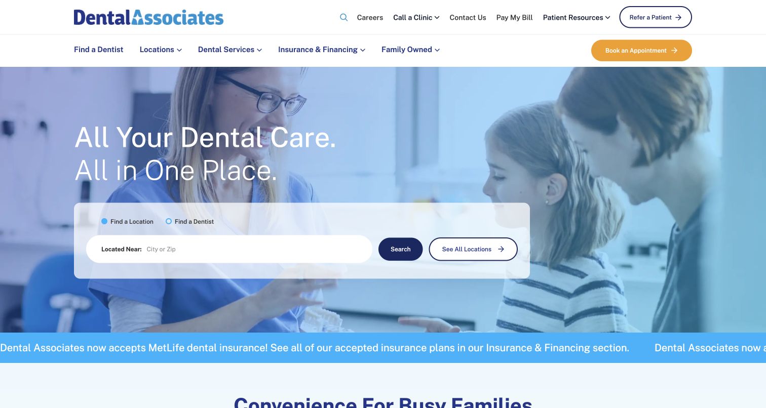
Dental Associates places a location-or-dentist selector directly beneath its opening promise, over a blue-tinted photograph of a family receiving care. A city or postal-code field, search action and all-locations alternative make the initial task concrete. Two header levels separate patient utilities from services, locations and insurance information. The Concrete CMS case concerns the public Wisconsin dental-group website. Neither this screenshot nor that documentary association verifies clinical outcomes, patient-record systems or external billing and booking implementations.
What you can learn
When a service depends on location or provider choice, make that decision part of the first useful screen. Provide a clear alternative to search, and keep existing-patient tasks distinct from the information a prospective patient needs to evaluate the service.
Pros
A bounded search panel makes the first practical action easy to identify within the large photograph.
The all-locations route supports visitors who prefer browsing or do not have a search term ready.
Cons & considerations
A moving announcement beneath the hero can compete with the location task if its motion is persistent.
Patient utilities and acquisition actions need clear labels so people do not enter the wrong workflow.
Platform source: Official Concrete CMS case: Dental Associates. The public Wisconsin dental group website; not clinical records, patient portals or external payment systems. Documented public-website project association from the official CMS case study, reviewed November 10, 2026. The case may describe an earlier implementation. It does not establish the current CMS version, every present component or any private system. The new screenshot is design evidence, not a runtime audit. Platform evidence is separate from the direct website screenshot and is not a complete current infrastructure audit.
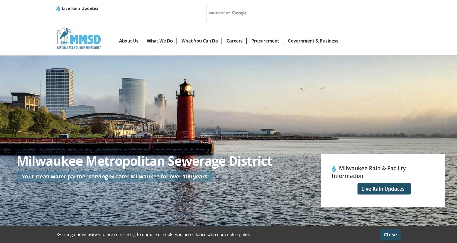
Milwaukee Metropolitan Sewerage District uses a waterfront photograph to establish a local setting, with its full name and a short service statement over the image. A separate white card highlights rain and facility information, while the header offers search and categories for residents, businesses and government audiences. This gives a practical information route its own visual boundary. Concrete’s case documents the public mmsd.com website within a broader migration project; related properties and private operational systems are not counted or inferred here.
What you can learn
For a public infrastructure organization, connect the service to the place people recognize while giving urgent information a distinct route. Keep that task visible without forcing all institutional, educational and business content into the same opening panel.
Pros
The local image provides context that a generic infrastructure photograph would not communicate as directly.
The white information card separates an operational destination from the broader institutional introduction.
Cons & considerations
Text over detailed water and skyline imagery needs consistent contrast across different crops.
Audience categories should lead to task-oriented pages rather than requiring visitors to understand internal departments.
Platform source: Official Concrete CMS case: Milwaukee Metropolitan Sewerage District. The public mmsd.com information website in the documented CMS migration; related brands are not counted as additional examples. Documented public-website project association from the official CMS case study, reviewed November 10, 2026. The case may describe an earlier implementation. It does not establish the current CMS version, every present component or any private system. The new screenshot is design evidence, not a runtime audit. Platform evidence is separate from the direct website screenshot and is not a complete current infrastructure audit.
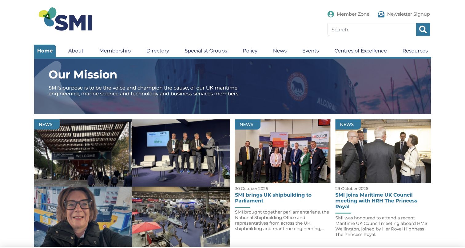
The Society of Maritime Industries presents a compact mission panel above a prominent news grid. The first story receives more space, while adjacent cards combine photographs, dates, headings and short explanations. Navigation separates membership, directory, specialist groups, policy, events and resources, with member access kept in a utility position. Concrete’s official case identifies the public association website, although its case heading uses a different expansion of the organization’s name. The captured site supplies the current public name and identity.
What you can learn
An association should explain whom it serves and then show the work it is doing. A brief purpose statement followed by dated activity can connect an abstract mission with concrete examples, while stable navigation supports members who arrive with a specific task.
Pros
Dated news cards give the organization’s activity a visible structure beyond a general mission statement.
The separate member-access route distinguishes returning-user needs from the public introduction.
Cons & considerations
A wide navigation needs careful prioritization when many sections compete for limited space.
A dominant news feature can obscure evergreen membership information unless that route remains easy to locate.
Platform source: Official Concrete CMS case: Society of Maritime Industries. The public maritimeindustries.org association website migrated to Concrete CMS; private membership systems are not inferred. Documented public-website project association from the official CMS case study, reviewed November 10, 2026. The case may describe an earlier implementation. It does not establish the current CMS version, every present component or any private system. The new screenshot is design evidence, not a runtime audit. Platform evidence is separate from the direct website screenshot and is not a complete current infrastructure audit.
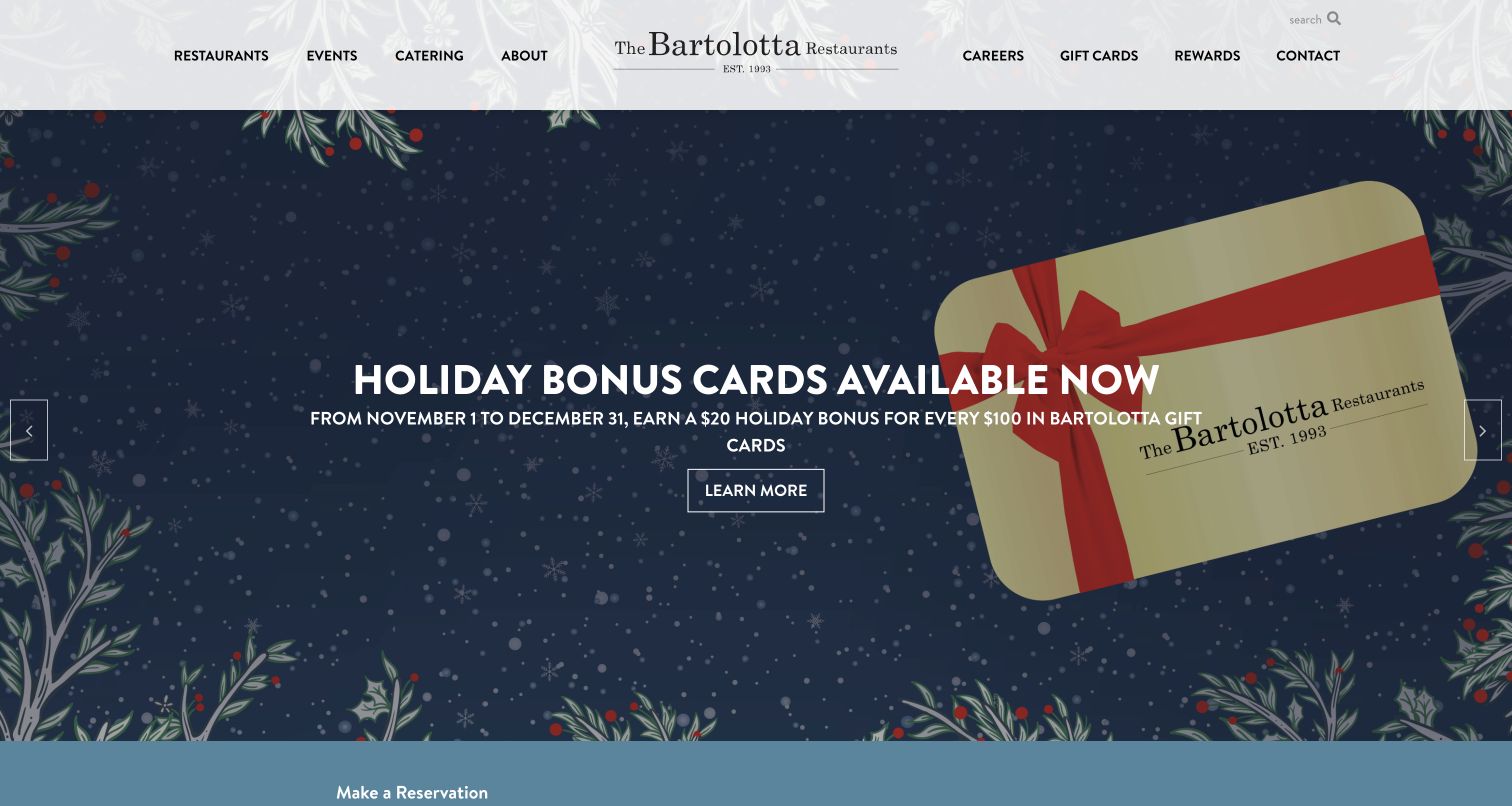
The Bartolotta Restaurants centers its wordmark between navigation groups for dining, events, catering and other practical destinations. The captured carousel frame promotes a seasonal gift-card offer through a large illustrated card, short headline and outlined action. A reservation area begins below the feature, giving the broad group presentation a practical continuation. Concrete’s case documents the public restaurant-group website and its site network. This example counts only the group homepage and does not attribute an embedded reservation service to Concrete.
What you can learn
Give a multi-location hospitality group a consistent public identity while preserving direct routes to the individual experiences. Seasonal campaigns can occupy a shared feature area, but restaurant discovery and reservations should remain understandable regardless of which promotion is currently displayed.
Pros
The centered identity and balanced navigation communicate a coherent group rather than an unrelated list of venues.
The campaign uses one clear visual subject and a restrained action instead of several competing promotions.
Cons & considerations
A seasonal offer should not displace the basic restaurant directory for visitors planning a meal.
Carousel content needs an accessible way to pause or navigate without making essential information transient.
Platform source: Official Concrete CMS case: The Bartolotta Restaurants. The public restaurant-group website and its documented Concrete site network; this guide counts only the group homepage. Documented public-website project association from the official CMS case study, reviewed November 10, 2026. The case may describe an earlier implementation. It does not establish the current CMS version, every present component or any private system. The new screenshot is design evidence, not a runtime audit. Platform evidence is separate from the direct website screenshot and is not a complete current infrastructure audit.
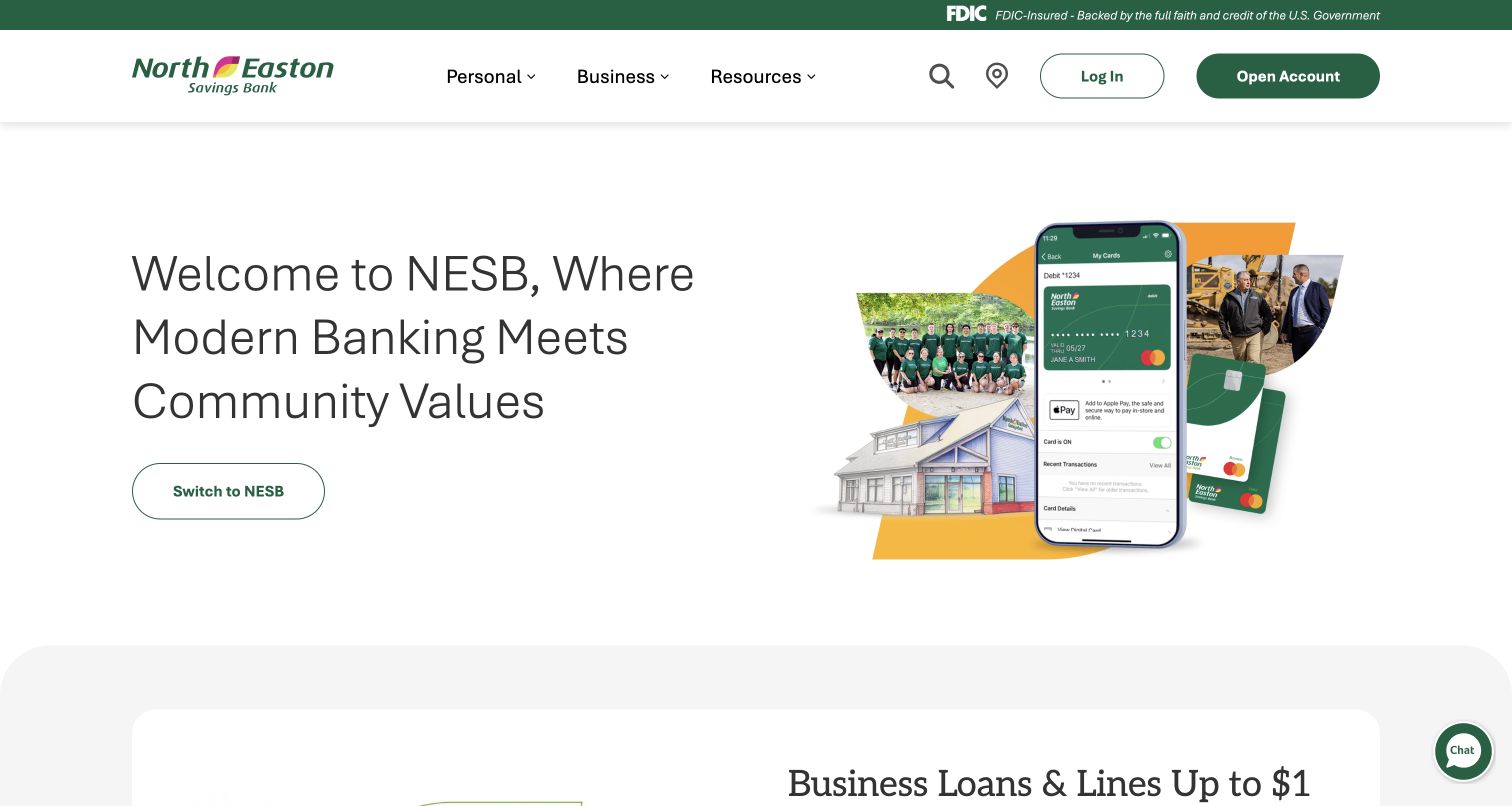
North Easton Savings Bank’s captured homepage combines a spacious introductory statement with a collage of local people, a building and a mobile-card illustration. Personal, business and resource navigation remain prominent in the header, while login and account-opening destinations receive distinct treatments. A thin institutional notice sits above them. Concrete’s case concerns the public marketing website associated with a merger project. It does not identify the technology behind online banking, account applications, card systems or any financial transaction service.
What you can learn
A financial-service homepage should make its public information role and account-access routes easy to distinguish. Use imagery to introduce the organization’s positioning, then keep product details, existing-customer tasks and higher-commitment applications clearly labeled and deliberately separated.
Pros
A limited set of main categories reduces the number of choices in the introductory navigation.
The collage connects a community message with a tangible interface illustration rather than relying on text alone.
Cons & considerations
A broad community statement needs deeper product pages to answer concrete eligibility and service questions.
Account access and application routes require especially clear labeling because they lead beyond ordinary informational browsing.
Platform source: Official Concrete CMS case: North Easton Savings Bank. The public bank marketing website documented during its merger project; not online banking, account applications or transaction systems. Documented public-website project association from the official CMS case study, reviewed November 10, 2026. The case may describe an earlier implementation. It does not establish the current CMS version, every present component or any private system. The new screenshot is design evidence, not a runtime audit. Platform evidence is separate from the direct website screenshot and is not a complete current infrastructure audit.
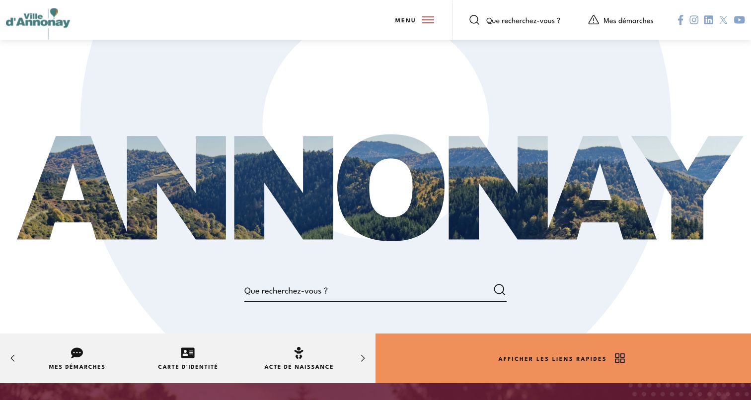
Annonay’s municipal homepage makes the city name the dominant visual element, with landscape imagery visible inside the large letters. A broad search field sits directly below, and a lower strip presents practical shortcuts such as identity documents and birth records. The compact header keeps menu access, search and civic procedures visible without filling the opening with departmental labels. Concrete’s case documents this public municipal website within a site-factory project; separate administrative transaction services are outside that association.
What you can learn
A civic homepage can express a strong sense of place while still prioritizing ordinary tasks. Pair a recognizable identity with a conspicuous search route and a short set of practical shortcuts, then use the wider navigation for less frequent information needs.
Pros
The oversized city identity gives the opening a distinctive local character without a long introductory paragraph.
Search and task shortcuts provide immediate alternatives to exploring the full municipal menu.
Cons & considerations
The large word treatment uses substantial vertical space before detailed civic information appears.
Shortcut labels and icons should remain understandable without assuming residents already know administrative terminology.
Platform source: Official Concrete CMS case: City of Annonay. The public municipal website in a documented Concrete CMS site-factory project; not separate civic transaction services. Documented public-website project association from the official CMS case study, reviewed November 10, 2026. The case may describe an earlier implementation. It does not establish the current CMS version, every present component or any private system. The new screenshot is design evidence, not a runtime audit. Platform evidence is separate from the direct website screenshot and is not a complete current infrastructure audit.
Kegan has 15+ years of experience working with small businesses, Fortune 500 companies, and everything in between. No development job is too big or too small: he brings the same hands-on attention to a focused improvement, a complete website, or a custom application.
For Concrete CMS projects, he can help with responsive interfaces, reusable components, custom functionality, API connections, and performance-minded implementation. He works directly with clients on scope, design, implementation, testing, and handover, with an emphasis on clear communication and a system that remains practical to maintain after launch.
Show 3 other Concrete CMS developersHide other Concrete CMS developers
Choose a Concrete CMS approach around the publishing team
Build a focused public marketing website
For a single organization, begin with a limited set of page types and a clear primary task. Separate service information, supporting evidence, news and inquiry routes instead of forcing every page into the same promotional pattern. Define the content needed for a useful page before expanding the design system. Keep public marketing content distinct from account applications and specialist services that may have different owners. The CMS choice should support the team’s editing needs without becoming a claim about every connected system.
Coordinate several related public properties
A network needs shared conventions and clearly identified exceptions. Concrete documents multisite capabilities, but the appropriate setup depends on content ownership, languages, release responsibilities and operational requirements. Decide which elements should be shared and which require local control. Record the consequences of changing a shared component. A consistent header can help people move through a network, while local service information still needs an accountable editor and a useful structure. Do not assume that a shared visual identity proves a shared implementation.
Before redesigning an established site, inventory its useful pages, incoming links, documents and recurring tasks. Identify obsolete material separately from content that still serves an audience. Plan how destinations move, how editors will update them and how the public will recognize the new structure. Preserve valuable routes or provide intentional redirects. A case study can show that another organization completed a CMS project, but its reported outcomes cannot substitute for a baseline and acceptance criteria for your own work.
From references to requirements
Plan content, boundaries and maintenance together
Model representative pages before scaling the library
Use real examples of service descriptions, locations, news stories and supporting documents to test the proposed structure. Include long headings, missing images and content that needs a clear expiry date. Determine which fields should be required and which can be omitted without leaving confusing gaps. Plan the relationships between pages so a visitor can move from an overview to a specific task. Give editors concise guidance that explains the purpose of each field instead of relying on visual imitation.
List search, forms, reservations, identity, payments and other integrations separately from the public content pages. Record what information each service needs and who is responsible for its configuration and support. Explain transitions clearly when a visitor leaves one service for another. A public-site CMS case does not establish the backend of a linked account or transaction system. Apply the same discipline to your own architecture so a shared brand does not obscure different operational and privacy responsibilities.
Make maintenance a normal part of publication
Assign responsibility for content review, dependency updates, backups and release verification. Keep the public routes, images and essential tasks in the acceptance checklist. Retain dated records that distinguish the visible design from implementation observations. Decide what should happen when an external service is unavailable rather than treating every dependency as permanently reliable. A maintainable site is one whose editors and operators can explain how ordinary updates are made, checked and recovered when something goes wrong.
A useful handover demonstration
Ask the actual team to carry out its routine job: publish a realistic update, correct a mistake, preview a narrow screen, and identify who owns an integration failure. For a library or frontend framework, also ask who maintains the content source and deployment. A polished screenshot does not answer those operational questions.
Beyond the screenshot
A practical Concrete CMS project checklist
Name the primary audiences and the recurring tasks each brings.
Separate stable service navigation from temporary campaigns and announcements.
Define recurring page types with realistic content and required fields.
Give editors useful layout choices with clear limits and examples.
Assign content ownership, review responsibilities and publishing permissions.
Inventory existing URLs and plan intentional redirects for moved material.
Document account, payment, reservation and other external service boundaries.
Check image crops, text contrast and behavior with long or missing content.
Plan language and local-content ownership before expanding a site network.
Record maintenance, recovery and live-verification responsibilities.
Test with real content, a keyboard, a small screen, slow or failed requests, and the people who will maintain the system. These are planning checks, not an accessibility, security, performance, or search-ranking certification.
Sources & editorial method
How this Concrete CMS collection was reviewed
Twenty distinct public website properties were researched for the original November 9 evening batch, with editorial work and direct captures on November 10, 2026. Each image was captured from its actual public page through the supported browser and visually inspected as source research. Loading and privacy-choice intermediate frames remain private; only the selected genuine frames are intended for publication. Every example has an official Concrete CMS case identifying the public project, with the exact property scope retained. The case studies were reviewed on November 10, without inventing implementation dates or claiming their descriptions establish today’s complete runtime. Internal-only projects were excluded. Twenty new exact source identities received one bounded broad audit attempt each: sixteen checked, one partial and three unavailable. Those results and their limits remain in the evidence records. No forms, accounts, purchases, votes or messages were submitted. These are design studies, not endorsements of services, security claims or regulatory certifications.
Every image is an unmodified capture from the actual website, with its source and capture date. Some captures are reused from our shared catalog; their dates remain the original capture dates. None comes from a vendor gallery or a generated reconstruction. Moving imagery and live content can change.
Technology attribution uses public page assets or metadata, official platform documentation, or a cited first-party project case study. Documentary and framework-relationship evidence is identified where used; it is not a complete current backend inventory. A CMS image CDN alone does not establish a full CMS deployment. A library’s presence does not prove which individual controls use it, and a platform label does not establish AI authorship.
The composition notes, lessons, pros and tradeoffs are original editorial observations. We have not measured conversion, traffic, security, performance or accessibility conformance. Website owners retain their brands and imagery; these examples are not our client portfolio. Written, Edited and Curated are independent records, not dates advanced by a build. See our editorial standards or suggest a correction.
Questions worth asking
Concrete CMS website development FAQs
Do the screenshots prove that every current page runs Concrete CMS?
No. The screenshots document the public designs actually captured. Official case studies establish documented Concrete CMS projects for those properties, often describing earlier work. Current public-source observations are separate and do not reveal a complete backend or guarantee a particular CMS version.
Why are internal systems excluded from this collection?
A case about training, an intranet or a private coordination system does not establish the implementation of an organization’s public homepage. This collection selects public website projects whose official case records identify the relevant public property.
Does a CMS case establish the technology behind booking or banking links?
No. Linked reservation tools, patient portals, online banking and other account or transaction services can have separate implementations. The evidence here stays scoped to the named public website and does not extend through every outbound link.
What should a team plan before choosing an editing system?
Identify the recurring content, primary visitor tasks, editing responsibilities and external service boundaries. Try representative pages and difficult content cases before expanding the design. The system should support those publishing requirements and the team’s ability to maintain them.
What does an unavailable broad audit mean?
It means the scanner could not make a new conclusion within its access and request limits. This collection retains a decoded-size limit, an HTTP 404 response and an access-check result as unavailable outcomes. None was bypassed or treated as proof that a technology was absent.
Are the vendor’s reported performance or compliance outcomes verified here?
No. The case studies are used to establish accurately scoped project relationships. The reviews examine visible design choices and do not reproduce marketing outcomes as independent measurements or certify accessibility, security, uptime or service quality.
Borrow the clear task routes, deliberate content hierarchy and useful publishing patterns in these examples. Keep the implementation evidence scoped to the public property, and choose a CMS configuration that your own team can maintain with confidence.