Best Pet Store Websites of 2026 (18 Real-World Examples)
Pet-store websites that connect a useful product catalog with local shops, services and everyday repeat purchases.
Explore 18 real pet-store websites, from neighborhood boutiques and regional shops to specialist and national online retailers. Study how they explain product ranges, local availability and the next useful step.
A pet-store website often has to answer several different questions at once. A returning customer may want the same bag of food, a new visitor may need to find a nearby shop, and someone else may be looking for grooming or a particular accessory. Friendly animal photography helps establish the tone, but the navigation needs to preserve these different tasks.
This collection compares public retail websites rather than the quality of their products or advice. It includes stores with physical locations, specialist assortments and broader online catalogs. The reviews focus on visible design, information structure and shopping orientation; they do not endorse nutritional claims, treatments or the suitability of any product for an individual animal.
Before the examples
What makes good pet store website design in 2026?
Make the product range easy to understand
Use familiar species, product and brand labels. Give search a clear role when the assortment is large, and let a small specialist range remain focused rather than imitating the navigation of a national warehouse.
Connect shopping with the right location
Keep the selected store, collection method and delivery area understandable. A national campaign does not establish local stock. Make store hours and services easy to find without requiring an account or a product search.
Separate recurring purchases from new decisions
Returning shoppers need a direct route to familiar items. Explain repeat ordering and subscriptions clearly, while preserving an ordinary one-time shopping route and distinguishing appointments from product transactions.
The collection · 18 examples
18 pet store websites worth studying
Compare 18 distinct pet-store properties for their approaches to search, local context, service discovery and brand presentation. Tomlinson’s Feed is the researched Editors Choice for connecting its selected-store context with clear shopping, service and community routes.
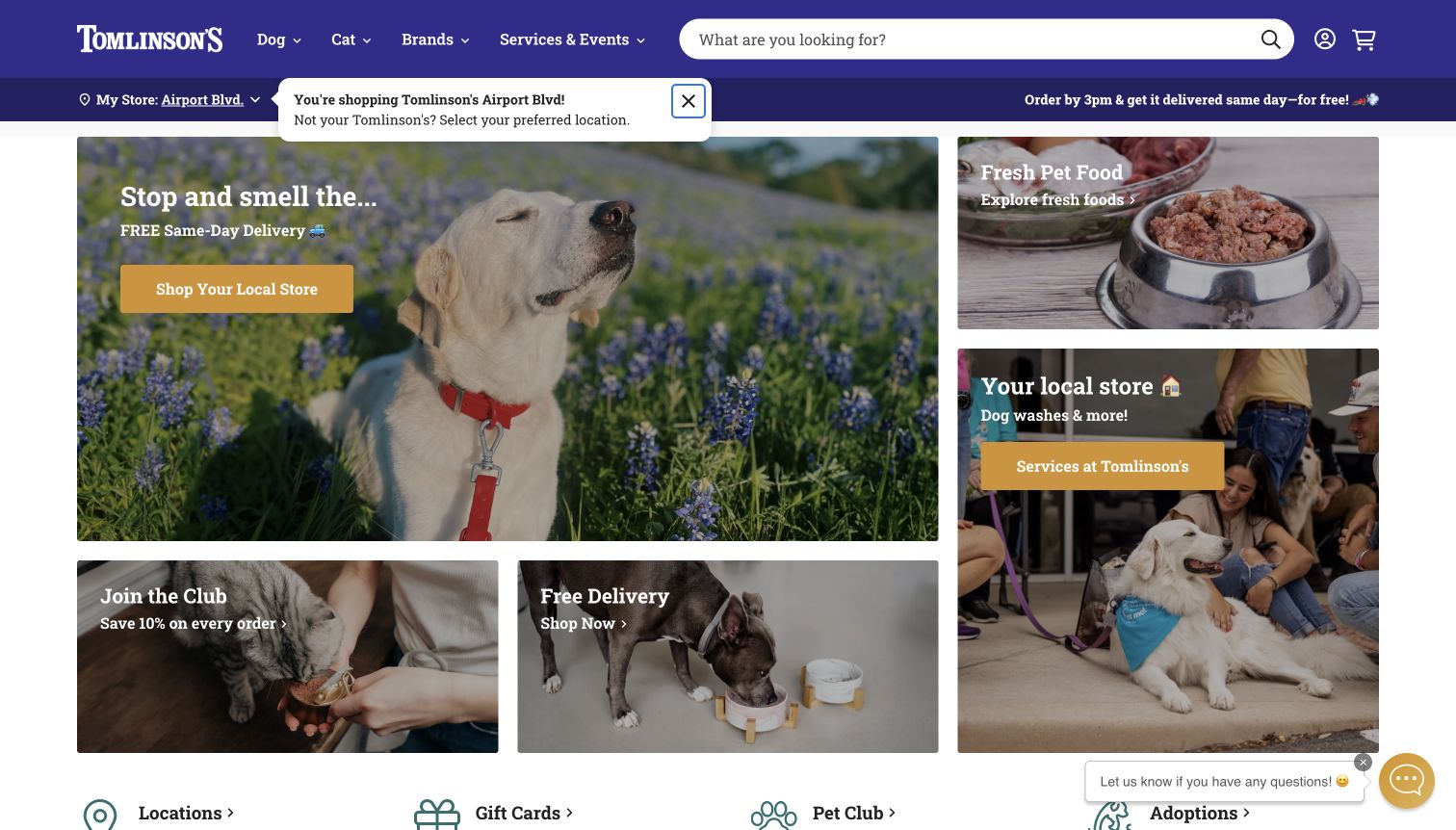
Tomlinson's places the selected store immediately beneath a prominent search field, making local context part of the shopping interface. The opening grid gives different jobs their own panels: shopping the local store, exploring fresh food, finding services, joining the club and arranging delivery. Warm animal photography and mustard buttons sit within a clear purple header, so the page feels friendly without relying on a single oversized promotional message. Below the grid, compact shortcuts point to locations, gift cards, membership and adoptions before product categories begin. This creates a useful bridge between a neighborhood business and an online catalog. The observed store reminder also makes an automatically selected location visible, although visitors still need to confirm that it matches their actual shopping area.
What you can learn
Give the selected location a persistent, understandable place in the interface. Then separate shopping, services and community activity into concrete actions, so the local identity remains useful when a customer moves from browsing products to planning a visit.
Pros
Distinct panels explain the main customer tasks.
Search and the selected store are easy to locate.
Cons & considerations
Several panels compete for first-screen attention.
A default store still needs explicit customer verification.
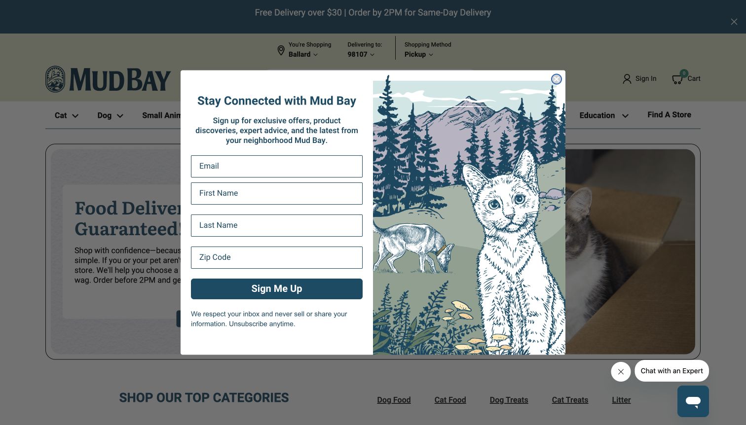
Mud Bay puts store, delivery area and shopping method above the main navigation, giving fulfillment a visible role before products appear. The underlying hero pairs a cat photograph with a food-delivery message and separate links to supporting information. Dog, cat and small-animal routes then lead toward a broader catalog, while education and store finding remain distinct. The captured first visit includes a large newsletter invitation, illustrated with a mountain landscape and animals. That artwork reinforces the regional identity, but the overlay also blocks much of the shopping introduction. The design is therefore useful both for its practical location context and for the tension between an attractive signup presentation and the visitor's immediate browsing task.
What you can learn
Expose the store and fulfillment mode early, especially when local stock changes what can be ordered. Keep promotional invitations secondary to that orientation, and avoid making a first-time visitor complete a marketing decision before understanding the catalog.
Pros
Store and fulfillment details have dedicated header positions.
Species and education routes use recognizable labels.
Cons & considerations
The newsletter overlay obscures the opening offer.
Several location controls add complexity to the header.
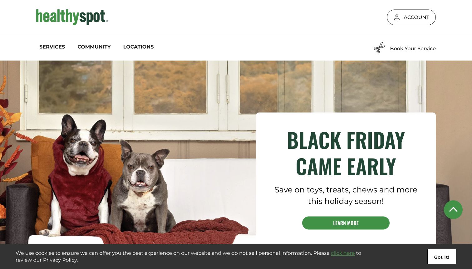
Healthy Spot uses a sparse green-and-white header with just three main destinations: Services, Community and Locations. A separate booking action signals that appointments are a significant part of the business. The observed opening campaign places large seasonal copy beside a pet photograph, while later sections distinguish grooming, daycare and other services. This is a useful alternative to a catalog-heavy homepage: visitors can understand the local service offer without navigating a long product menu. The promotional hero still dominates the first screen, and a cookie notice occupies its lower edge. A shopper arriving specifically to compare products would need more guidance than someone seeking a location or appointment, which makes the prioritization important to study.
What you can learn
Let the main navigation reflect the tasks the business can actually support. A store that emphasizes appointments can give booking a clear place, while still explaining where product browsing or in-store shopping fits into the overall experience.
Pros
The short navigation keeps local services easy to identify.
Booking is separated from the general location route.
Cons & considerations
The seasonal campaign takes most of the opening screen.
Product-focused visitors receive less immediate catalog guidance.
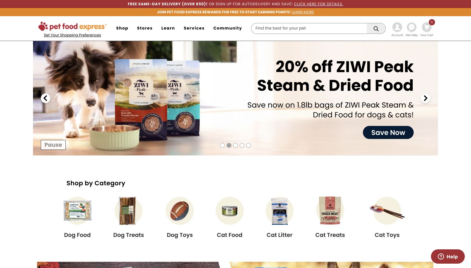
Pet Food Express combines a compact header with a large promotional carousel and a visible category row. Search sits beside the main destinations, while Shop, Stores, Learn, Services and Community describe different reasons to visit. Beneath the campaign, small product images label familiar categories such as dog food, cat litter and treats. That combination gives a visitor an immediate route away from the promotion and into a narrower shopping task. The opening also contains delivery and rewards announcements, adding practical information but increasing the number of simultaneous messages. Carousel controls include a visible pause option in the capture. The page is strongest as a reference for balancing a changing retail campaign with stable navigation that remains recognizable throughout the year.
What you can learn
Keep durable category shortcuts close to campaign content. A visitor who does not want the advertised product should still have a clear route into the catalog, and local stores or services should remain separate from promotional shopping categories.
Pros
Illustrated category shortcuts provide a stable next step.
Store, learning and service routes are explicitly separated.
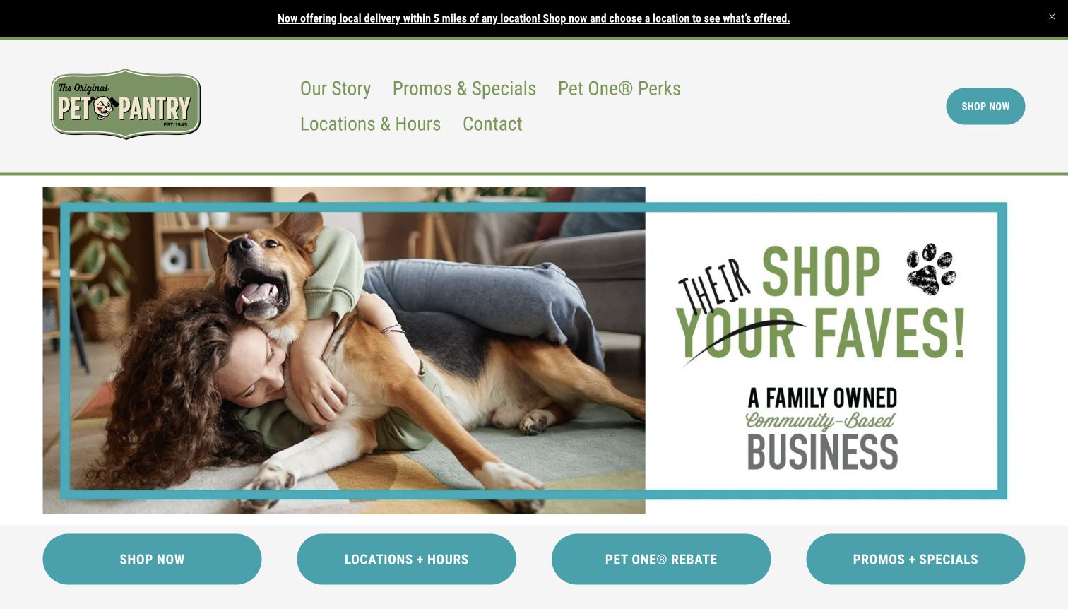
Pet Pantry's main home page pairs a family-and-dog photograph with a broad statement of its community identity. Four turquoise buttons immediately below lead to shopping, locations and hours, rewards and promotions. The header repeats those practical destinations with a clear story link, giving the site a simple structure without a dense product menu. The reviewed page follows an entry promotion on the root address, so the capture records the main home page rather than that initial screen. Product-category explanations and local activity continue farther down. The useful pattern is the separation of a welcoming local introduction from a small set of specific tasks. The extra entry step and separate shopping destination are also important parts of the visitor journey.
What you can learn
Make location details and store hours as easy to find as the shop. If the catalog lives separately, label that transition clearly and avoid adding an unnecessary promotional step between a returning customer and their intended destination.
Pros
Four task buttons make the next step concrete.
Local identity is supported by a clear locations route.
Cons & considerations
The root entry promotion adds another decision.
Shopping and store information use different destinations.
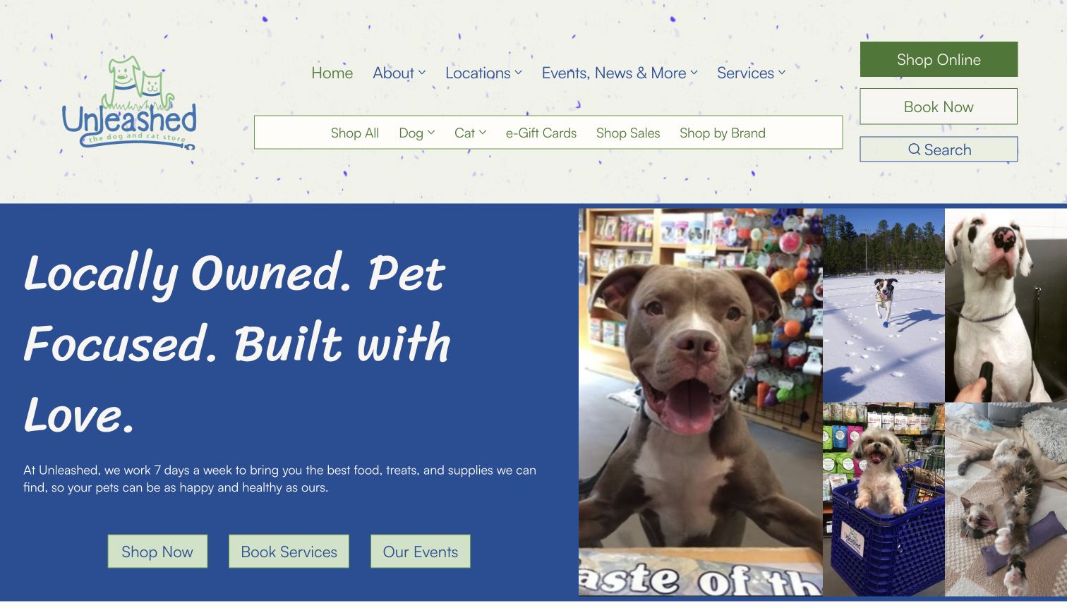
Unleashed combines a playful illustrated logo with a collage of pets and a large statement of local ownership. Three hero buttons distinguish shopping, booking services and viewing events. The header gives general business information one row and product browsing another, making the breadth of the offer visible. Lower sections introduce dog and cat shopping alongside promotions. This provides a useful example of a neighborhood store carrying its personality into a broader digital presence. The two navigation rows and additional buttons make the opening busy, however, and the shopping links lead to a separate storefront. The design's strongest lesson is the explicit separation of customer intentions, rather than the amount of navigation used to express them.
What you can learn
Use authentic local imagery and plain action labels to explain what visitors can do. Keep shopping, appointments and events distinct, then reduce duplicated navigation so those useful choices remain easy to scan on a smaller screen.
Pros
The hero separates shopping, services and events.
Pet imagery gives the local identity a personal character.
Cons & considerations
Multiple navigation rows increase visual density.
The separate storefront creates a change in browsing context.
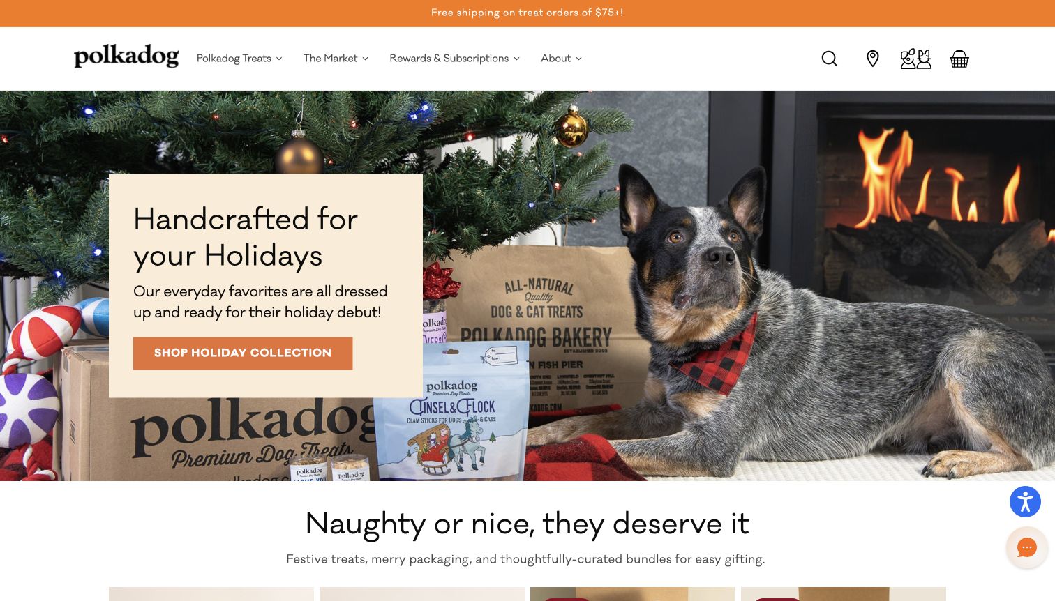
Polkadog uses a restrained white header and a vivid seasonal photograph to introduce its treat collection. The hero brings product packaging into the same scene as a dog, connecting the campaign with the actual items being sold. A single orange action leads to the holiday collection, followed by product cards with names, prices and review indicators. Navigation distinguishes the brand's treats, a wider market, rewards and background information, while a location icon gives physical shops a place in the header. This is a useful specialist-store pattern because it does not pretend to carry every possible pet category. The opening campaign and lifestyle image take priority, so visitors looking for a particular everyday item depend on search or the menu.
What you can learn
Let a focused assortment shape the navigation and photography. Show recognizable products within the brand story, then make sure repeat shoppers can bypass the seasonal campaign through search and consistently labeled everyday collections.
Pros
Packaging connects the hero to real product choices.
The assortment is organized around a clear specialist identity.
Cons & considerations
The seasonal image delays detailed product comparison.
An icon-only store route requires more interpretation than a label.
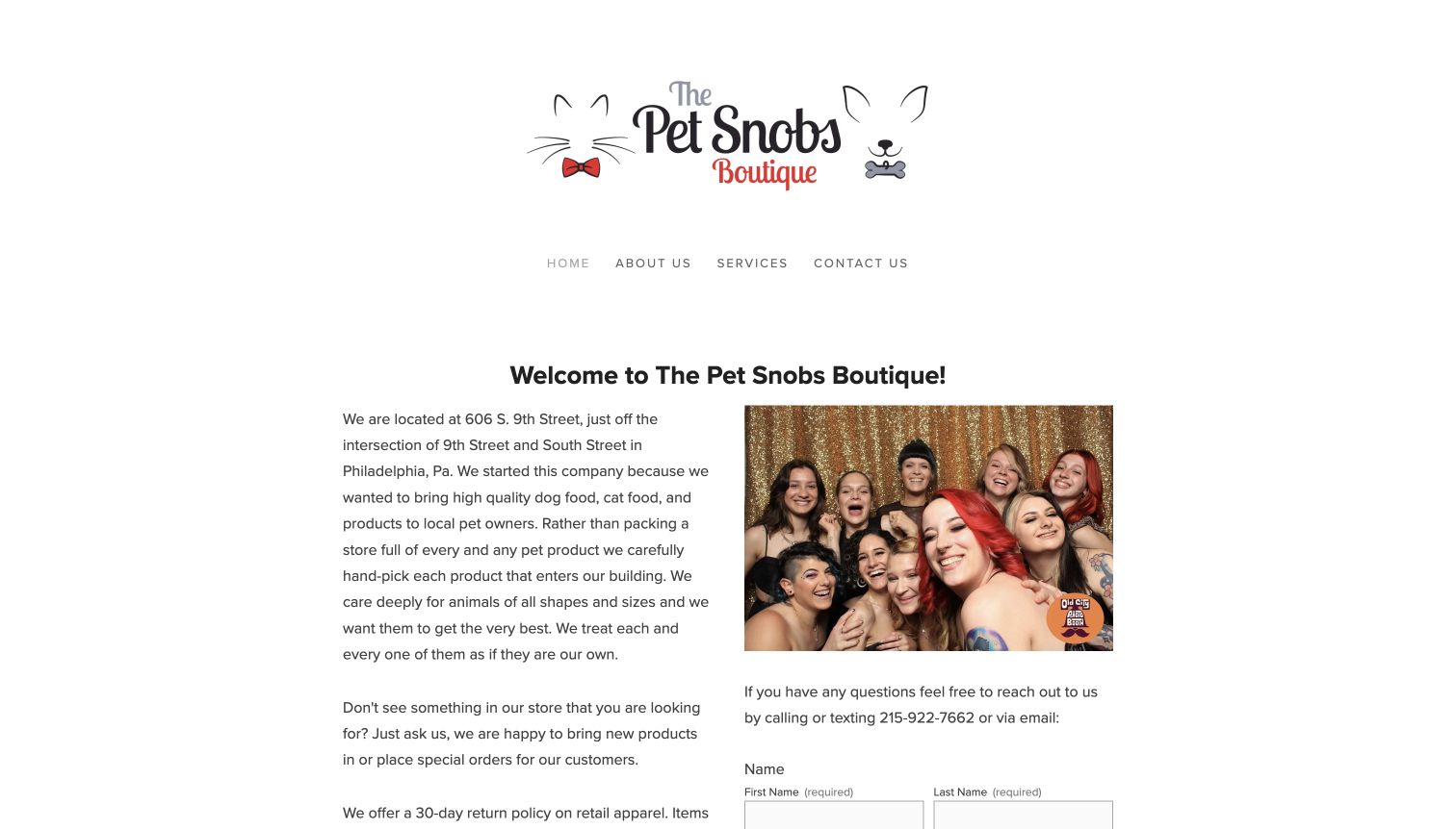
The Pet Snobs Boutique takes a simple, text-led approach. A large logo sits above a short navigation, then the opening introduction states the Philadelphia address and describes the store's curated product approach. A team photograph and contact information give the business a human presence without an elaborate promotional carousel. The page also explains special orders, retail returns and grooming arrangements, which helps visitors understand the practical limits of the offer. This is useful for a shop whose website supports local visits and conversations rather than a large online checkout. The tall identity area and long paragraphs make the opening less efficient for quick scanning, and store information shares space with more detailed grooming policies farther down.
What you can learn
State the location, product scope and contact route directly when the website's main job is to support a local visit. Break policies into clearly labeled sections so practical details remain findable without overwhelming the introductory story.
Pros
The address and local purpose are stated plainly.
A team photograph adds specific human context.
Cons & considerations
The large header uses substantial vertical space.
Long paragraphs slow comparison of practical details.
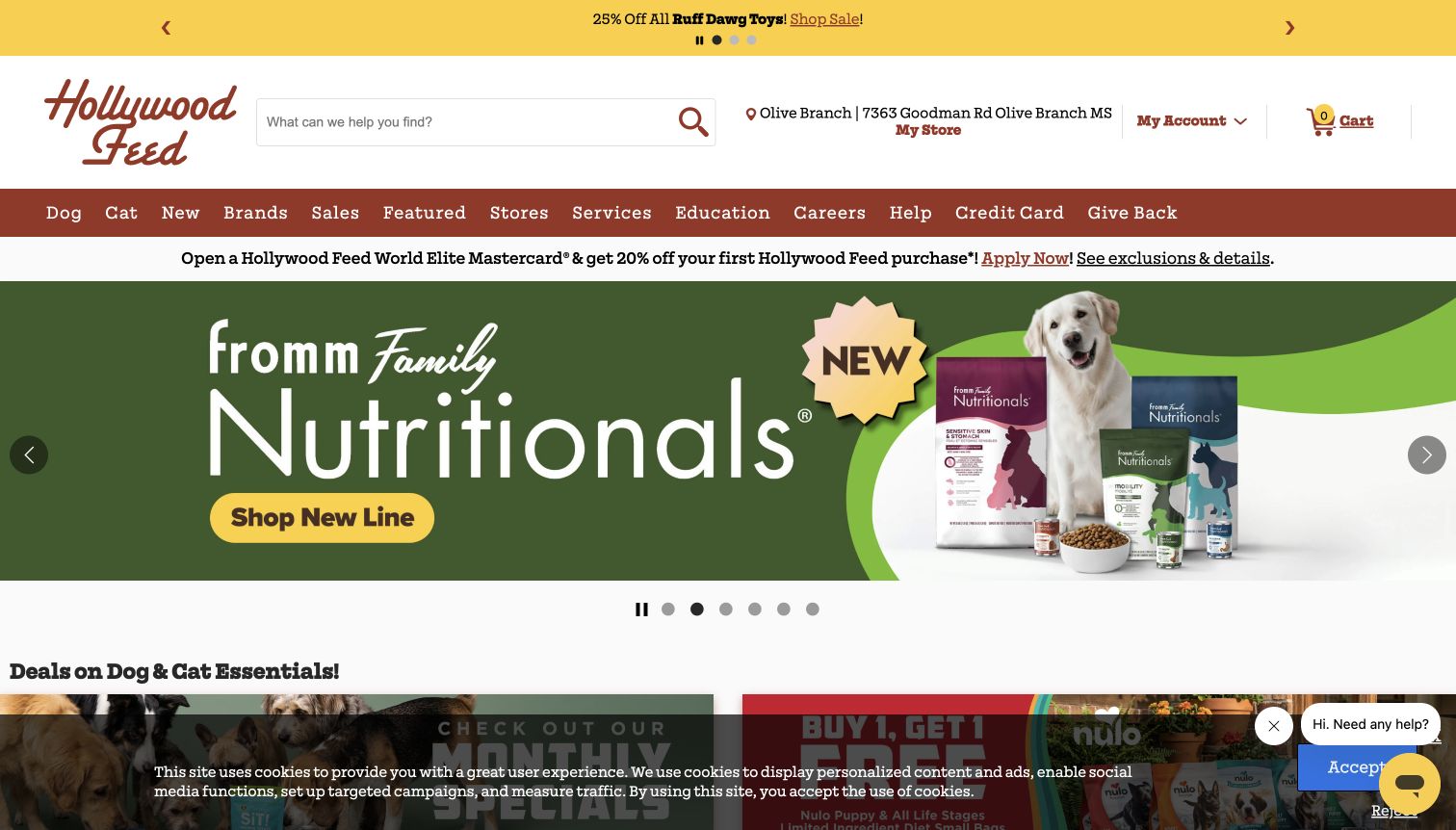
Hollywood Feed places search and the selected store beside its distinctive script logo. A wide navigation covers product types, brands, promotions, stores, services and education, while the central carousel introduces a current product campaign. The captured view also includes a credit-card promotion, a cookie banner and a chat control. Together these show the challenge of fitting many business priorities into one retail entrance. The store label is useful because it makes local context visible, and familiar product routes help repeat shoppers orient themselves. However, the number of offers and navigation items competes with that clarity. The page is a valuable reference for catalog breadth and an equally useful reminder to give supporting promotions a deliberate hierarchy.
What you can learn
Keep local availability and search prominent when the catalog is large. Review every additional banner against the customer's immediate task, and give financial, promotional and support messages separate priorities instead of presenting them all with similar emphasis.
Pros
Search and the selected store are prominent.
The navigation exposes a wide range of shopping routes.
Cons & considerations
Several simultaneous promotions fragment attention.
The long menu and cookie banner crowd the opening view.
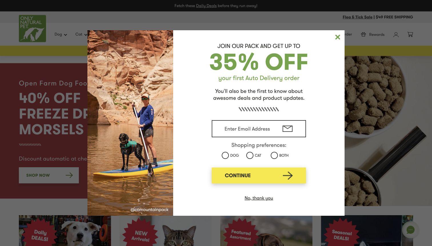
Only Natural Pet places dog, cat, brand and deal routes beside search, with separate shortcuts for reordering, rewards and account access. Those repeat-shopping tools acknowledge that many customers return for familiar products rather than browse from the beginning each time. The underlying homepage combines a large product promotion with further assortment shortcuts. In the captured first visit, an email offer occupies the center of the screen and asks for shopping preferences before the visitor has explored the catalog. Its lifestyle photograph and bright discount message become the dominant experience. The site is useful for examining repeat-purchase navigation, while the overlay illustrates how acquisition campaigns can temporarily hide the very shortcuts intended to make shopping easier.
What you can learn
Support returning customers with clear reorder and subscription routes, but keep those tools accessible before any marketing invitation. Describe product categories precisely and keep nutritional or health claims separate from the design decisions being used as inspiration.
Pros
Reorder and rewards have dedicated header links.
Dog, cat and brand routes are easy to recognize.
Cons & considerations
The email overlay obscures the initial shopping choices.
Several promotional layers compete with the specialist catalog.
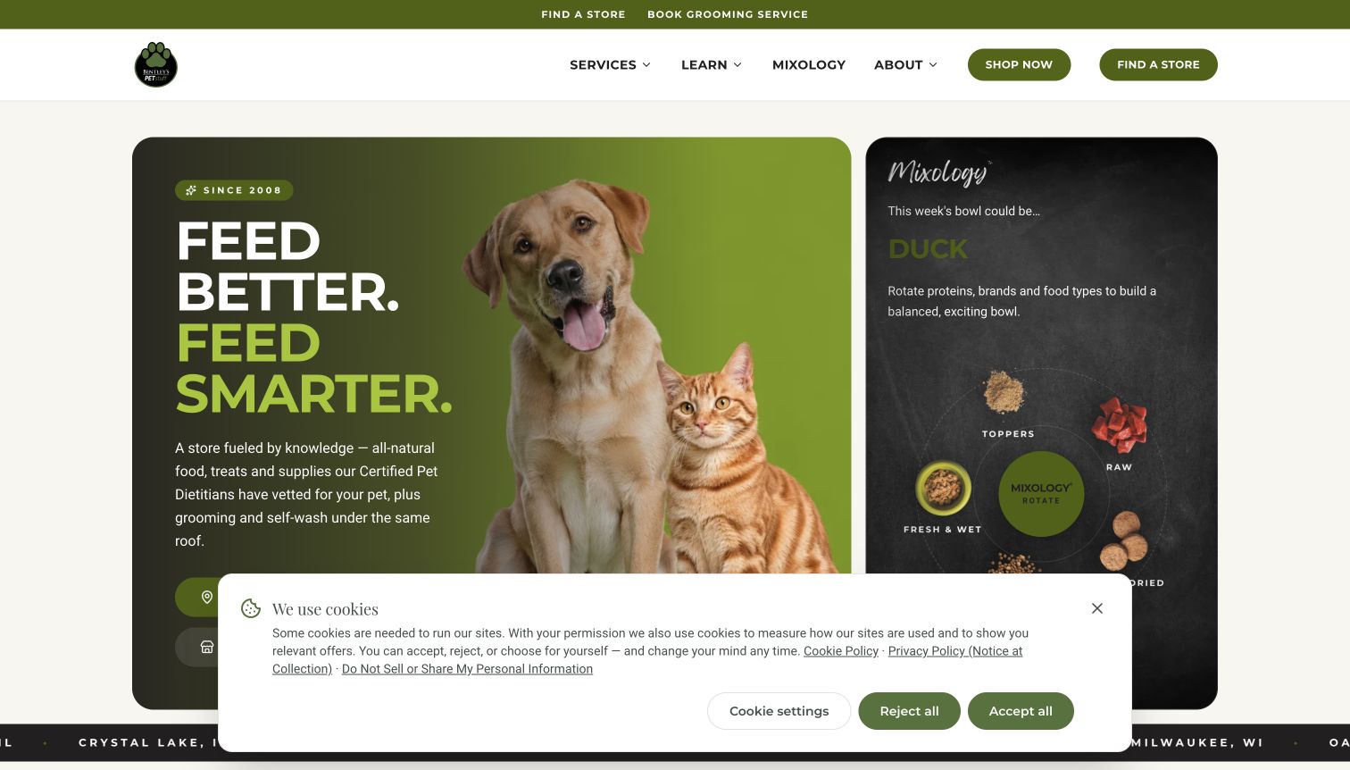
Bentley's current brand page uses rounded panels, an olive palette and large animal imagery to establish a coherent identity. Store finding is repeated in the top utility row, main navigation and hero, while grooming receives its own route. The opening introduces the retail offer alongside a separate panel explaining the brand's food-mixing concept. A list of locations farther down reinforces that this is a store network rather than a single online warehouse. This is useful as a way to preserve a distinct brand within a broader company website. The page also shows the tradeoffs: educational marketing occupies a large part of the opening, the cookie panel covers lower content, and shopping moves to a different destination.
What you can learn
Give a retail brand a clear identity while making the local-store route unmistakable. Separate educational content from service booking and product transactions, and label any move to a different shopping destination so visitors retain their sense of place.
Pros
Store finding is consistently emphasized across the page.
Grooming has a separate and recognizable route.
Cons & considerations
The cookie panel obscures part of the hero.
Educational messaging competes with immediate shopping tasks.
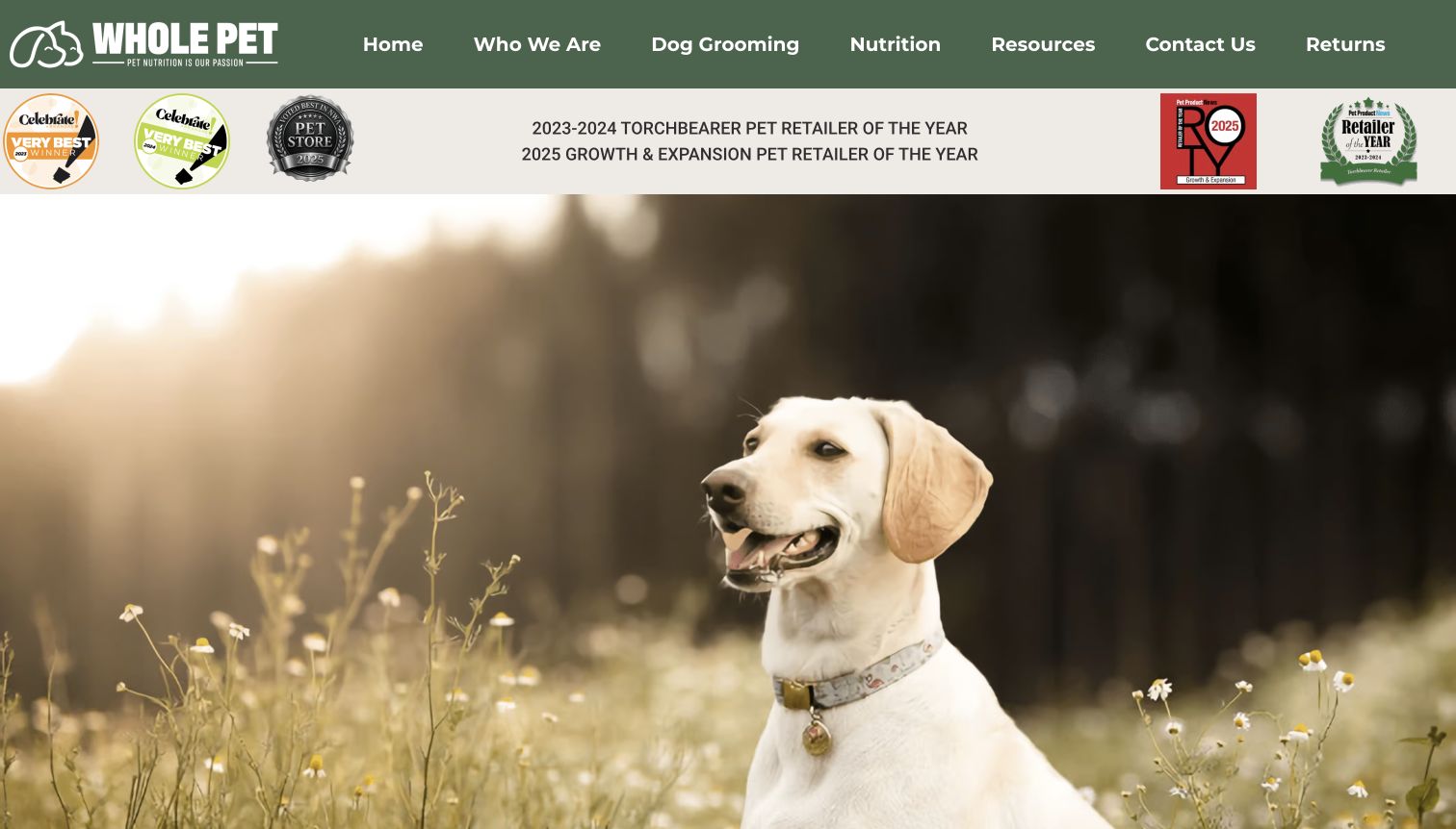
Whole Pet uses a green header with a set of routes covering its story, grooming, nutrition, resources and contact information. A broad dog photograph supplies the main visual introduction, while a band of recognition badges sits above it. The later page explains the business and gives individual locations their own named links before introducing supplies and services. This structure is useful for a retailer whose website supports in-person shopping and appointments rather than beginning with a product grid. The opening photograph contains little actionable information by itself, and the recognition band takes space before the main explanation. The design is worth studying for its clear regional location structure, while treating the displayed awards and product claims as the store's own statements.
What you can learn
Use individual location pages to connect a regional brand with practical visits. Keep the introductory photograph proportionate to the information it conveys, and let service labels and local details do more work than a collection of promotional badges.
Pros
Location names provide clear routes into local information.
The primary menu separates grooming from general background.
Cons & considerations
The large photograph postpones the detailed introduction.
Recognition badges compete with more useful practical information.
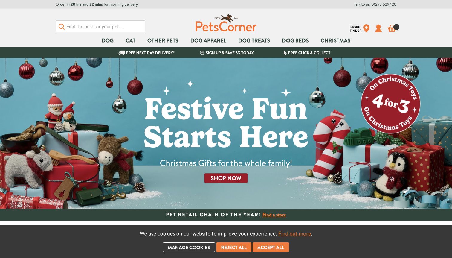
Pets Corner places search, a store finder and account tools around a compact logo, then uses a straightforward row of product categories. Delivery, membership and click-and-collect information sit immediately above the seasonal hero, making fulfillment part of the introduction rather than a detail hidden in the footer. The captured campaign uses a bright arrangement of pet toys and gifts with one principal shopping action. This gives the page an approachable retail mood while preserving familiar catalog routes. The opening also includes an order countdown and a cookie notice, adding urgency and another decision to an already promotional screen. The useful pattern is the proximity of shopping and fulfillment information, rather than the specific seasonal offer or promotional claims.
What you can learn
Keep delivery and collection routes close to the catalog entrance. When adding seasonal campaigns, preserve stable species and product labels so a customer buying a routine item does not have to decode a temporary theme first.
Pros
Store finding and fulfillment information are easy to locate.
Stable category links remain above the seasonal campaign.
Cons & considerations
The countdown adds pressure to an already busy header.
The cookie notice occupies a substantial lower-screen area.
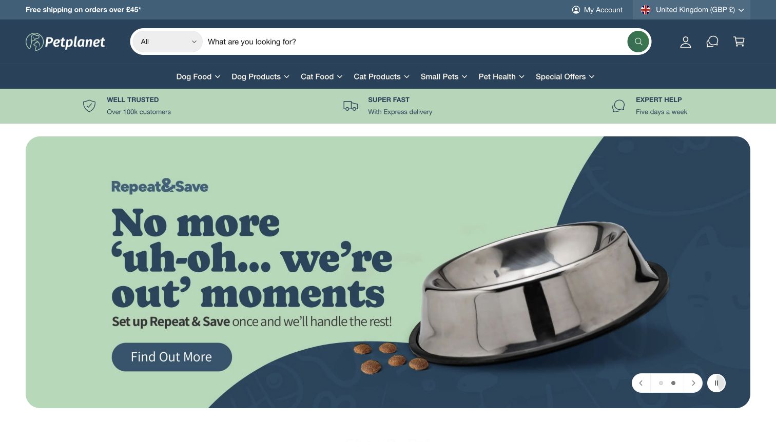
Petplanet gives search a large central position and pairs it with a product-type selector. The main navigation distinguishes food, general products, smaller pets and special offers, while a short benefit strip sits above the hero. In the captured view, the campaign explains recurring ordering through an empty bowl image and a concise message about avoiding shortages. The blue-and-green palette and broad rounded panel keep the presentation coherent. This is useful for a catalog where customers often know the product category they need. The long product-type menu can be cumbersome compared with a smaller set of initial choices, and the recurring-order promotion still takes most of the first screen before individual products are available for comparison.
What you can learn
Build search around the way customers describe routine purchases. Explain repeat ordering as a specific service with a clear next step, while keeping subscription details and ordinary one-time shopping visibly distinct as visitors move deeper into the catalog.
Pros
Search occupies a clear central position.
The repeat-order campaign explains a recognizable customer need.
Cons & considerations
The product-type selector contains many detailed choices.
A large hero delays direct comparison of individual products.
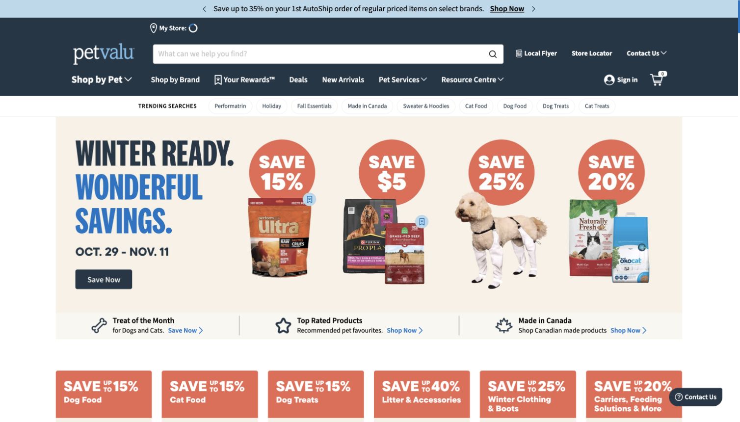
Pet Valu combines a prominent search field with routes by pet, brand, rewards, services and advice. A separate utility area includes the local flyer and store locator, preserving the distinction between browsing products and finding a nearby shop. The captured homepage uses a wide seasonal promotion followed by smaller links for treats, highly rated items and Canadian products. Trending-search chips offer another route into familiar categories without requiring a full search query. This is useful for a large assortment where visitors arrive with different levels of product knowledge. The density is also the main tradeoff: announcements, navigation rows, chips and promotional tiles all ask for attention before the visitor reaches a conventional product listing.
What you can learn
Offer several purposeful discovery routes when the assortment supports them, but give each a clear role. Brand browsing, species categories and local-store information should complement search rather than create a second, equally complicated navigation system around it.
Pros
Search is supported by brand and species routes.
Local flyers and store finding remain separately labeled.
Cons & considerations
Many navigation and promotional layers crowd the opening.
Trending chips add another competing set of choices.
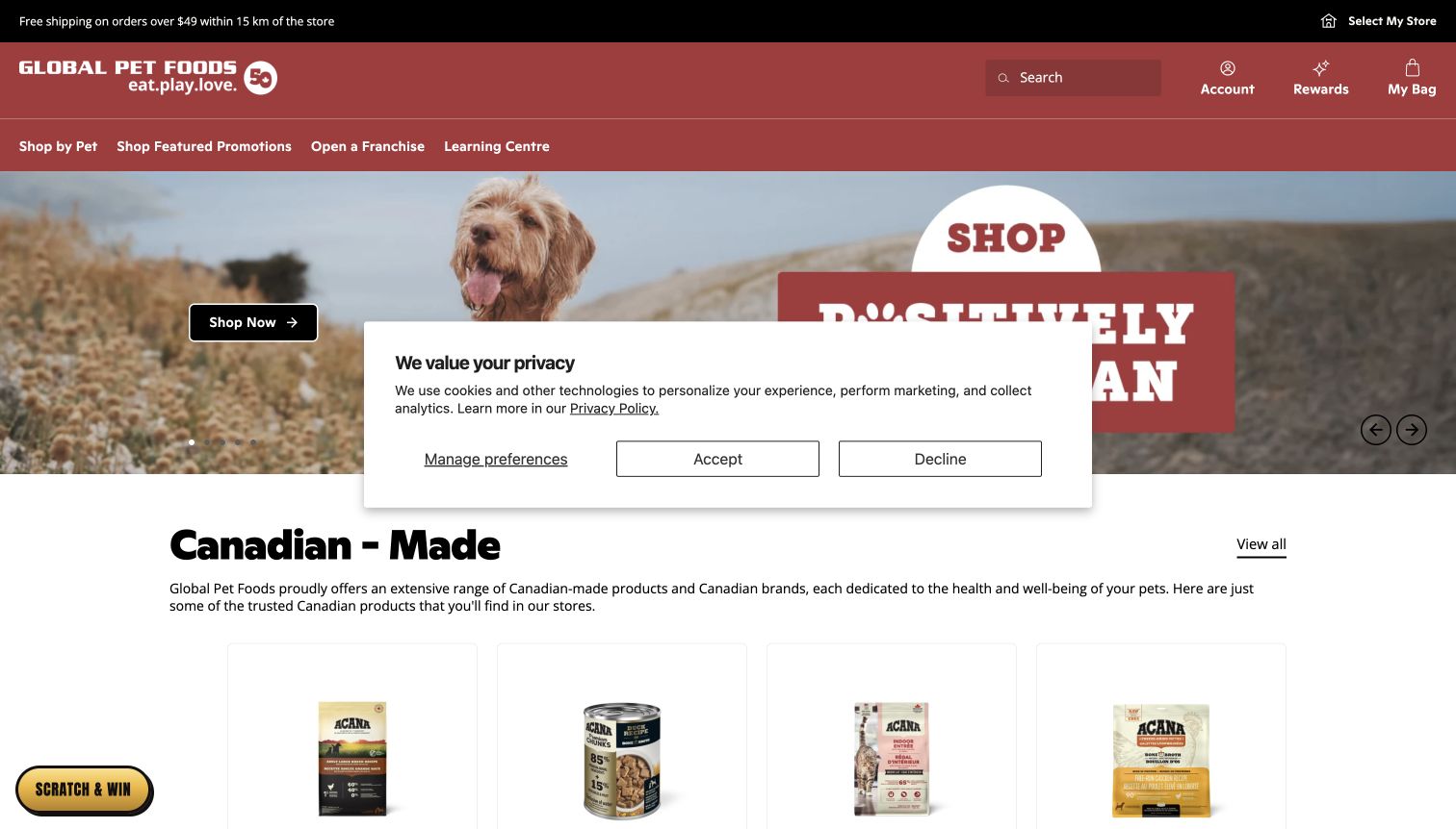
Global Pet Foods places store selection in a thin utility row and uses a strong red header to organize search, account, rewards and shopping. The opening campaign leads into a Canadian-made product section, creating a recognizable merchandising theme beyond a single discount. Product cards follow beneath the explanation, connecting that theme with actual catalog entries. This is a useful way to combine a broad network identity with a local fulfillment choice. In the captured visit, the privacy notice remains visible across the middle of the page after a decline action, so the screenshot records that obstructed state rather than a cleaned-up reconstruction. The national campaign is clear, but the selected store and delivery conditions still need attention before ordering.
What you can learn
Connect editorial merchandising themes with concrete product lists, and keep local-store selection visible throughout the journey. Privacy controls should resolve predictably so a visitor can return to browsing without losing the relationship between the campaign and its products.
Pros
The product theme continues into a visible catalog section.
Store selection has a dedicated utility position.
Cons & considerations
The observed privacy notice obscures central content.
National messaging still needs local availability context.
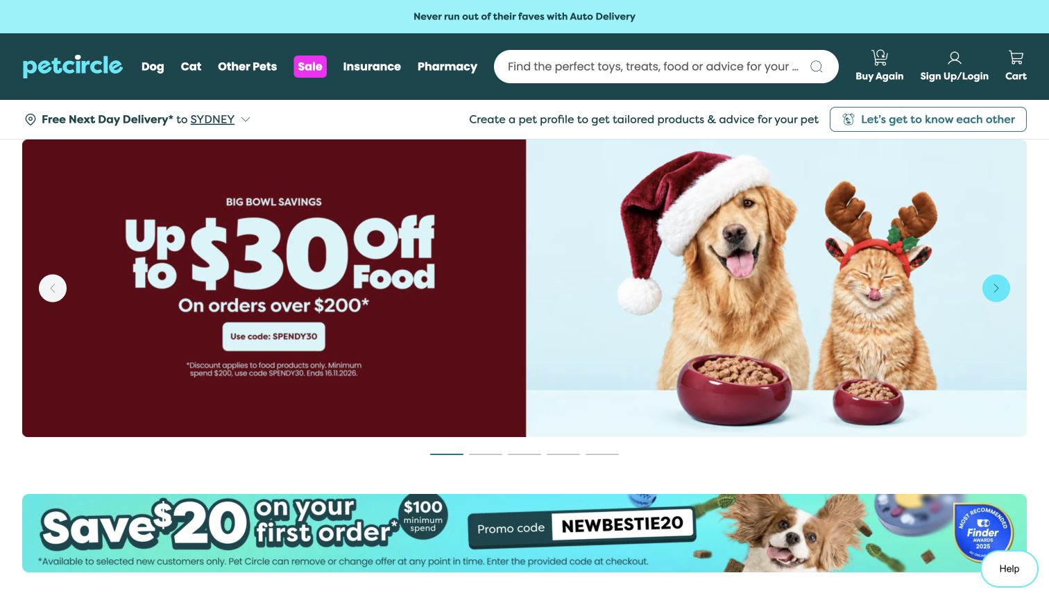
Pet Circle organizes the header around species, search and returning-customer tools. Buy Again is distinct from sign-in and the cart, while the next row displays the delivery area and a separate invitation to create a pet profile. The observed hero presents a food offer beside a dog-and-cat photograph, followed by more promotions and species-led shopping cards. This is useful for studying how a large online retailer can distinguish repeat purchases from discovery. The site also routes insurance and pharmacy activity separately, which adds breadth without treating those services as ordinary product categories. The tradeoff is a crowded opening sequence: delivery, personalization, promotions and account actions all appear before a visitor reaches the main assortment.
What you can learn
Make repeat purchasing easy to find without forcing every visitor into personalization. Keep delivery context explicit, and clearly separate specialist services from ordinary catalog browsing so customers understand when they are leaving one type of task for another.
Pros
Buy Again has a distinct place in the header.
Species routes and search support different shopping habits.
Cons & considerations
Several promotional and profile prompts compete for attention.
Specialist service links add complexity to the main navigation.
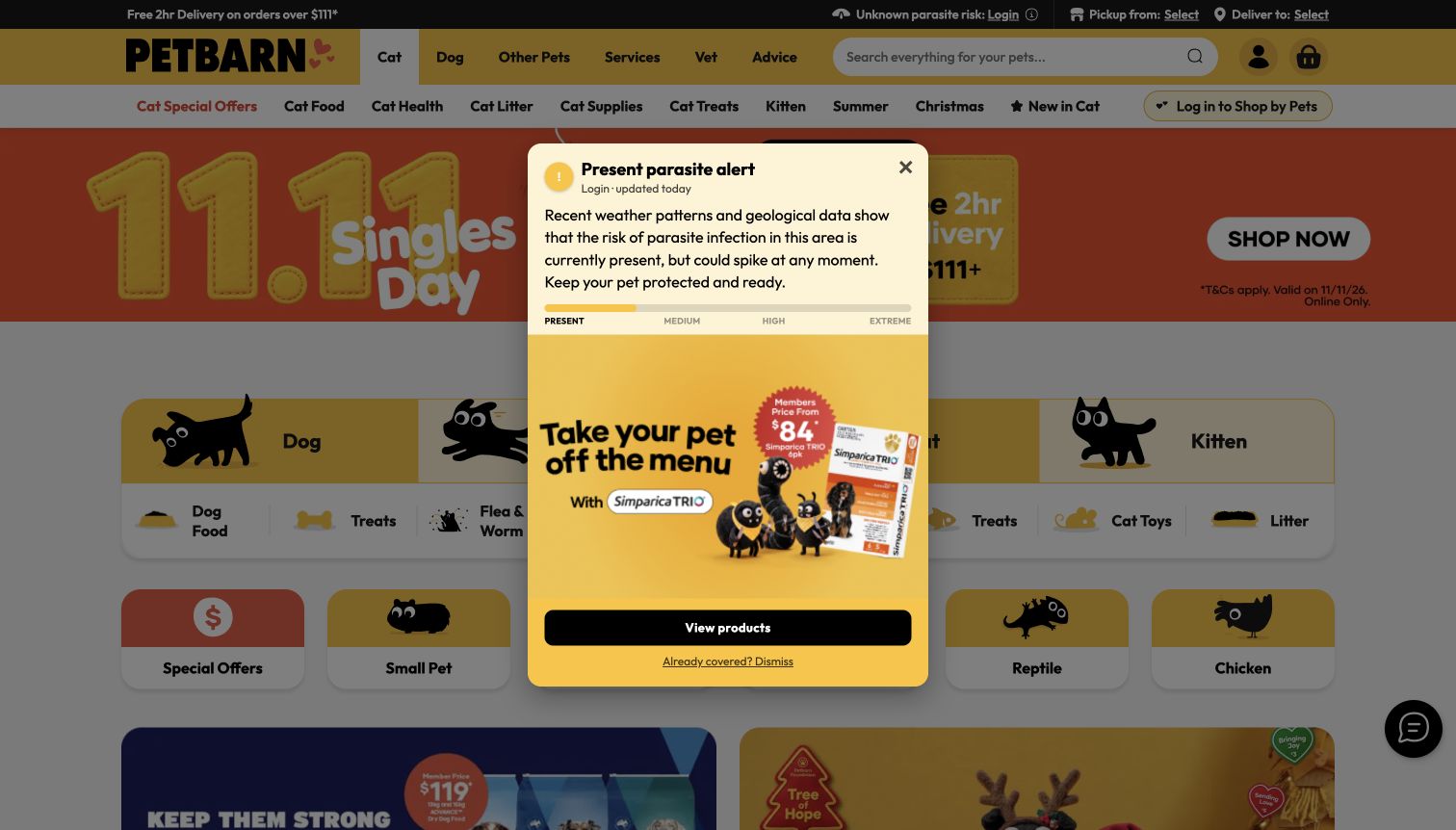
Petbarn places pickup and delivery controls in the utility bar, then groups the main offer into cat, dog, other pets, services, veterinary information and advice. The underlying homepage uses illustrated category tiles and a seasonal campaign to connect that broad navigation with specific shopping routes. This makes the site useful for comparing a multi-species catalog with the dog-and-cat focus of smaller stores. In the captured first visit, a product promotion styled as a parasite alert appears over the page, while the header reports an unknown risk and a login route. That overlay is part of the observed design, not an independently verified health assessment. It also demonstrates how an additional promotional layer can obscure otherwise clear category choices.
What you can learn
Keep species, local fulfillment and professional services clearly separated. When the interface includes health-related promotions, label their scope carefully and avoid allowing an overlay to become the main obstacle between the visitor and ordinary product information.
Pros
Pickup and delivery have distinct controls.
Illustrated categories make the broad assortment easier to scan.
Cons & considerations
The promotional overlay blocks the opening category layout.
Multiple service and shopping layers create a dense header.
Kegan is a freelance web designer and developer with 15+ years of experience helping businesses turn complicated website requirements into clear, maintainable digital experiences. He works directly with clients from planning and design through development, launch, and ongoing support.
For pet store website design, his development approach focuses on pet store websites that organize products by animal and need, explain store services and offer clear shopping, delivery and visiting information. The scope can be a targeted improvement or a complete custom build, with responsive layouts, thoughtful content structure, and integrations chosen around the people using and maintaining the site.
Show 3 other pet store website designersHide other pet store website designers
Organize the assortment before designing the campaign
Begin with the actual range. Record species, product type, brand and the attributes that customers genuinely use to compare items. A specialist treat shop may need only a few well-explained collections, while a broad catalog needs consistent categories and search. Avoid adding a complex menu simply because a larger retailer has one.
Decide which distinctions belong in navigation and which belong in product filters. Keep familiar everyday routes visible when seasonal campaigns change. A customer looking for cat litter should not have to understand the current holiday theme before reaching it. Use product names, images and variant labels that remain recognizable throughout the shopping sequence.
Product information should come from maintained business records. Keep pack size, price, variants and availability coherent between listings and detail pages. Marketing language should not replace the factual information needed to compare options. Identify who reviews descriptions and who resolves discrepancies when the same product appears in several collections.
Make fulfillment and services specific to the place
If stock and services vary by location, make the store part of the interface. Explain whether the displayed location is selected, suggested or still unknown. Give visitors an obvious way to change it, and avoid presenting a default location as a confirmed match for their address. The product catalog and service pages should use the same location names.
Distinguish delivery, collection and an ordinary store visit. Each has different information needs: service area, timing, order readiness, opening hours and contact details. State the business’s actual conditions near the relevant action. Do not imply that a national promotional banner guarantees stock or delivery at every branch.
Grooming, self-service washing and other appointments need their own descriptions and booking routes. Explain which location provides a service and where its current arrangements are maintained. A product checkout should not be used as a vague substitute for appointment information, and browsing the service offer should not require unnecessary personal details.
Protect routine shopping from promotional clutter
Campaigns can introduce a new range, but they should leave a clear route to the permanent catalog. Review the combined effect of announcement bars, carousels, chat, membership offers and email invitations. Each may seem small in isolation; together they can hide the reason a customer came to the website.
Give repeat shopping a clear role without assuming that every visitor wants a subscription. Explain the difference between one-time orders, reminders, memberships and automatic deliveries. Use the current provider’s approved terms and controls, and keep account-related information out of public product descriptions. Do not make a discount message the only explanation of a recurring commitment.
After launch, maintain store hours, expired promotions, category labels and service links as ordinary content tasks. Review first visits and returning visits separately. The site should remain understandable when an optional campaign, chat widget or large image is unavailable, and dismissing a notice should return the visitor to a usable shopping page.
The editing job behind the design
Choose tools around the catalog and local operations
A catalog platform should support the product structure the business can maintain. Define the source of prices, variants and stock before choosing presentation features. Keep private customer and order records separate from the public editorial content.
For several locations, establish how local stock, store details and appointment availability are updated. A shared visual identity is useful only when the location shown beside a product or service is accurate and understandable.
The visible technology stacks describe evidence from the specific reviewed public pages. A shopping link does not prove the technology used across an entire company. Unavailable scans remain qualified rather than being filled with guesses.
Our WordPress website examples offer a separate look at publishing approaches. A visible platform label is evidence for that named page, not a guarantee that the same system will suit your requirements.
Before the public launch
Pet-store website brief checklist
Describe the real product range and species served.
Keep familiar product categories stable across campaigns.
Use consistent names for brands, products and variants.
Make search prominent when the catalog warrants it.
Distinguish a selected store from a suggested location.
Explain collection and delivery conditions near the relevant action.
Keep branch hours and contact details easy to find.
Tie services to the locations that actually provide them.
Separate appointment booking from product checkout.
Explain recurring orders independently of promotional discounts.
Preserve a clear one-time shopping route.
Keep nutritional and health statements tied to approved source information.
Ensure notices and overlays have usable dismissal behavior.
Assign ownership for expired offers and changing availability.
These checks are a project checklist, not a performance, legal, security, or accessibility certification. Test real journeys with the people responsible for the website before making claims about the result.
Sources & editorial method
How this collection was selected and reviewed
These 18 distinct public pet-store properties were reviewed on November 11, 2026. Screenshots are direct views of the pages discussed. Pet Pantry uses its main home page after the entry promotion, and Bentley’s uses its current brand landing page within EarthWise Pet. The other images show homepages. Promotional and privacy overlays are retained where they appeared, including the product promotion on Petbarn; their claims are not independently endorsed. Tomlinson’s own About page supports its regional business context. Reviews assess website presentation and information choices, with technology evidence qualified to each exact source page.
Each example links to its actual source page. Screenshots are direct browser captures with their own capture dates; moving imagery, announcements and live designs can change. The notes describe observable design choices and conditional tradeoffs, not measured traffic, conversion results, service quality, or accessibility conformance.
Technology labels use public page metadata, asset evidence, or explicitly cited platform documentation. Platform documentation is not a complete current deployment audit. A component reference may be legacy or unused; it is not a complete backend inventory. Unknown stacks are omitted. These sites are editorial examples, not our client portfolio.
Written, Edited and Curated are separate editorial records, not timestamps advanced by a rebuild. Website designs and imagery belong to their owners. See our editorial standards or suggest a correction.
Questions worth asking
Pet Store website design questions
What should appear before a customer starts shopping?
Make the product range understandable and show any location or fulfillment choice that affects availability. Keep search, familiar categories and store information accessible before optional promotional invitations.
Does every pet store need a large online catalog?
No. A neighborhood shop may benefit more from clear product scope, location details and service information. A broad online assortment needs structured products, consistent categories and a maintained source of stock information.
How should several store locations be presented?
Give each location accurate hours, contact details and service information. Make the selected store clear in the shopping journey, and distinguish a suggested default from a location the customer has deliberately chosen.
Where should grooming and other appointments fit?
Give services their own descriptions and location-specific booking routes. Keep appointments distinct from ordinary product checkout, with practical details available before the visitor is asked for personal information.
How should repeat ordering be explained?
Distinguish one-time purchases, reminders, memberships and automatic deliveries. Explain the actual terms and account controls near the relevant choice rather than relying only on a discount headline.
Does Editors Choice endorse the store’s products or advice?
No. It is an editorial website-design selection based on public presentation and communication. It does not verify product suitability, nutritional claims, treatment advice, business quality or accessibility conformance.
Make the next practical step as clear as the brand is friendly. Connect the assortment, the selected location and the fulfillment choice, then keep routine shopping easy to reach as campaigns change.