Best Bean-to-Bar Chocolate Maker Websites of 2026 (13 Real-World Examples)
Thirteen real chocolate-maker websites showing how to connect cacao origins, production, products and visits without making shoppers decode the craft vocabulary.
A bean-to-bar website should make the chocolate approachable while giving curious visitors enough detail to understand the maker’s process.
A visitor may arrive looking for a gift, a particular origin, a factory visit or simply a good place to start. These are different journeys. A useful maker website explains what the business produces, shows the actual bars and packaging, and connects the story to practical product information rather than treating craft language as a substitute for it.
The examples here include origin-focused makers, producers with cafés and tours, and brands that combine bars with confections or bakery products. Study the decisions about category labels, imagery, process explanation and visitor routes. The collection evaluates website presentation; it does not certify sourcing claims, compare chocolate quality or endorse a particular product.
Before the examples
What makes good bean-to-bar chocolate maker website design in 2026?
Explain what bean-to-bar means for this maker
Name the steps the business actually performs and distinguish making chocolate from using finished chocolate in another product. A short introduction can link to a fuller process record with real photographs. Keep claims about origin, trade relationships and certifications specific, attributed and maintained rather than relying on an unexplained badge.
Turn origin and flavor into useful product information
Give each bar a stable record with its cacao origin, percentage, weight, ingredients and relevant dietary information. Explain tasting notes as descriptive guidance, not a promise that everyone will experience the same flavor. Show the wrapper and the chocolate itself where possible, and separate these details from seasonal campaign copy.
Separate shopping from visiting and learning
A gift order, wholesale inquiry, factory tour and farm visit require different information. Use plain labels and make availability, location and booking conditions appropriate to each route. Visitors should be able to buy a familiar bar without reading a long production story, while the story remains easy to find for those who want it.
Compare the process-first introductions with the seasonal retail campaigns. Notice how the stronger structures keep origin information and visits reachable even when a temporary product occupies the largest image.
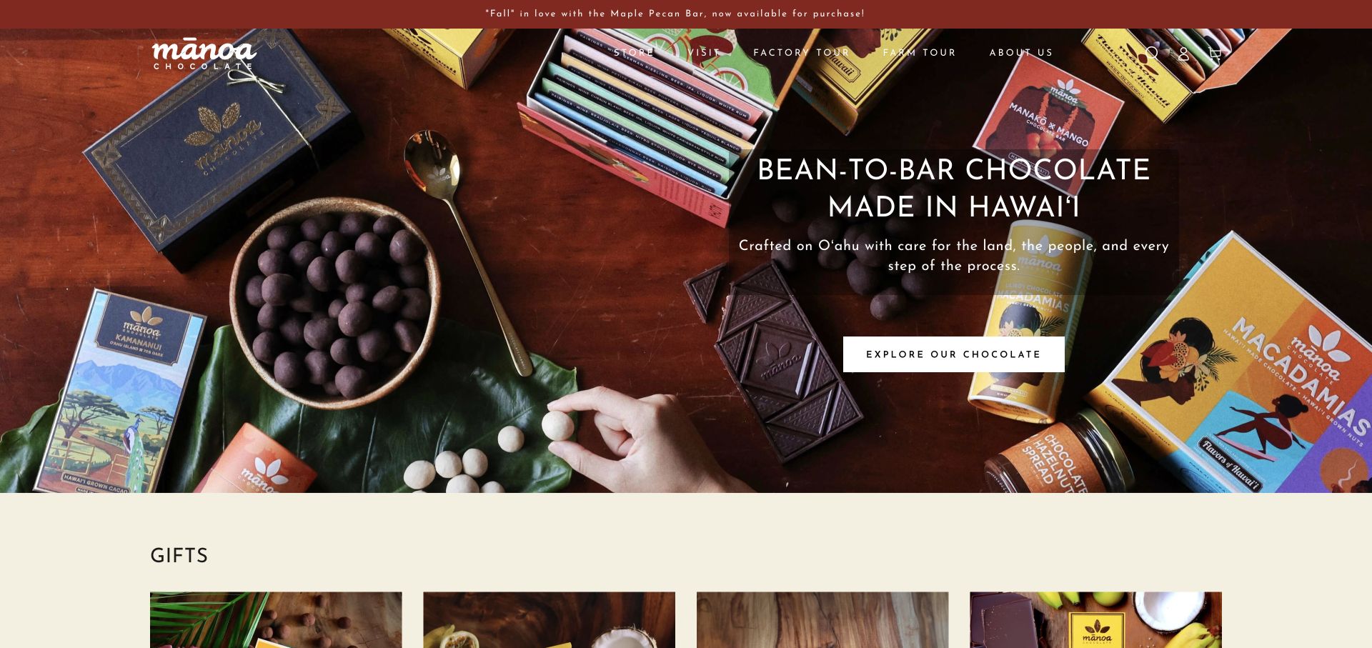
Mānoa’s homepage says what it makes and where before asking the visitor to explore the range. A warm overhead photograph shows wrapped bars, loose chocolate and gift products around a clearly separated text panel. The opening line names bean-to-bar chocolate and Hawaiʻi, while the header distinguishes a factory tour from a farm tour instead of burying both under a generic experience label. Gift products begin below the hero, creating a direct transition from the maker proposition into shopping. This combination of clear scope, real products and practical experience routes makes it our editorial choice. The selection evaluates the website’s presentation, not product quality, sustainability claims or tour availability.
What you can learn
Name the production approach and place clearly, then separate experiences that require different visitor expectations. A farm visit and a factory visit should not become interchangeable calls to action.
Pros
The opening proposition clearly combines product, process and location.
Factory and farm tours are distinct, readable navigation choices.
Cons & considerations
The wide product photograph needs deliberate cropping on smaller screens.
Specific origins, allergens and delivery conditions still belong on individual product records.
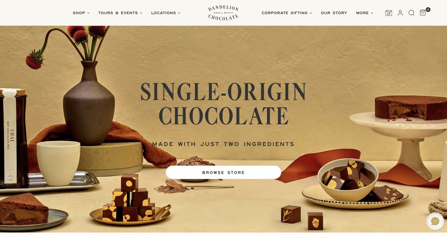
The retained Dandelion homepage places a single-origin statement among a deliberately varied serving scene: drinking chocolate, confections and a sliced cake. For a bean-to-bar maker, this is an interesting way to move beyond a wall of wrapped bars while keeping the ingredient proposition prominent. The centered store button supplies one retail starting point, and the header gives tours, locations and corporate gifting their own routes. The visual warmth comes from the tabletop and product styling rather than a long introductory story. Its limitation is scope: a two-ingredient brand statement cannot replace the separate recipes and allergen information for every confection in the photograph.
What you can learn
Connect the origin story to the things a visitor can actually buy or experience, but keep ingredient claims tied to the correct product rather than extending a bar recipe across the whole range.
Pros
The photographed range makes several forms of chocolate easy to recognize.
Tours and corporate gifts remain visible beside the main shopping route.
Cons & considerations
The opening view does not compare bar origins or prices.
A broad ingredient statement needs product-specific clarification for filled and baked goods.
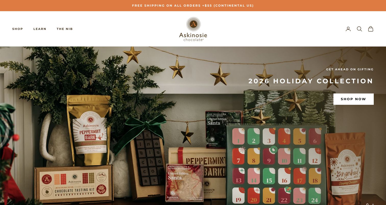
Askinosie’s retained holiday view lets packaging do much of the explanatory work. An advent calendar, tasting kit and drinking-chocolate bags communicate different gift formats without placing a competing button on every item. A short holiday heading and one shop action occupy the quieter side of the photograph. The small Shop, Learn and The Nib navigation gives the commercial campaign a route back to the maker’s process and writing. This separation is useful for a specialist producer: an occasional gift buyer can begin quickly, while a cacao enthusiast can investigate further. The first screen is nevertheless a seasonal campaign, not a comparison of origins, processing methods or ingredients.
What you can learn
Let a timely gift campaign simplify the first decision, while preserving a plainly named learning section for the production and sourcing information that distinguishes a maker from a reseller.
Pros
Gift formats are legible in a coherent product photograph.
The compact Learn route keeps deeper maker information discoverable.
Cons & considerations
The seasonal hero must be maintained when its campaign ends.
Origin and dietary comparisons require a deeper product visit.
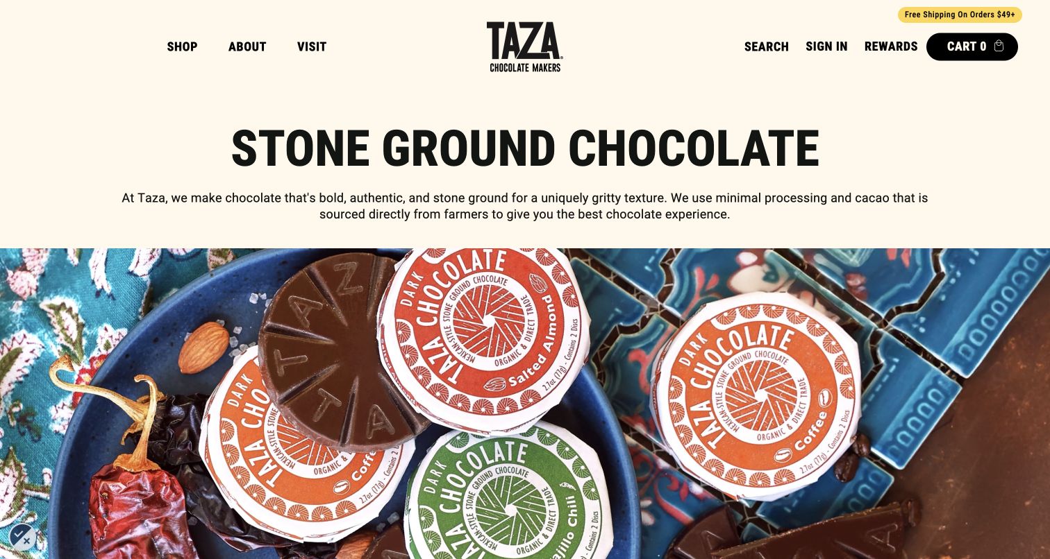
Taza’s retained homepage states its stone-ground approach before showing a close view of its round chocolate discs and wrappers. The short explanation connects processing to texture, giving the photograph a useful purpose beyond decoration. The cream background and black typography provide a calm frame for the colorful labels, while Shop, About and Visit stay easy to identify. This is a strong design pattern for a bean-to-bar producer with a process that may be unfamiliar to a first-time buyer. The homepage’s own sourcing and quality statements still need supporting detail, and a visitor choosing a specific cacao percentage or flavor must move into the catalogue.
What you can learn
Explain the sensory consequence of a production method in plain language, then show the corresponding product form so a process claim becomes something the shopper can understand.
Pros
The process proposition is readable before the product photograph.
Three simple navigation categories separate purchase, background and visits.
Cons & considerations
The introduction does not compare individual flavors or prices.
Trade and quality claims need accessible supporting information beyond the headline.
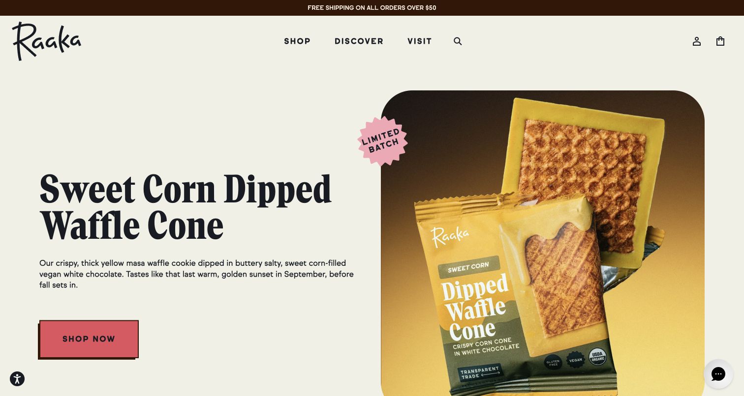
Raaka’s retained campaign pairs a large sweet-corn waffle-cone heading with the open product and its yellow wrapper. The two-column composition leaves room for a short explanation of the unusual combination rather than relying on a poetic product name alone. A limited-batch marker establishes the campaign’s place in the range, and Shop, Discover and Visit give three clear directions beyond it. For a bean-to-bar website, the lesson is how to introduce an experimental confection without hiding the basic buying route. The pictured campaign is a specific retained observation, not a claim of current stock, and the opening view does not explain the maker’s unroasted process.
What you can learn
When a flavor combination needs explanation, photograph the unwrapped item beside its packaging and give it a concise description before expanding into the underlying cacao story.
Pros
The open product and wrapper make an unusual confection concrete.
A clear primary action sits apart from the editorial and visit routes.
Cons & considerations
Limited-release campaigns need accurate availability and replacement planning.
A newcomer must continue beyond this view to learn the production method.
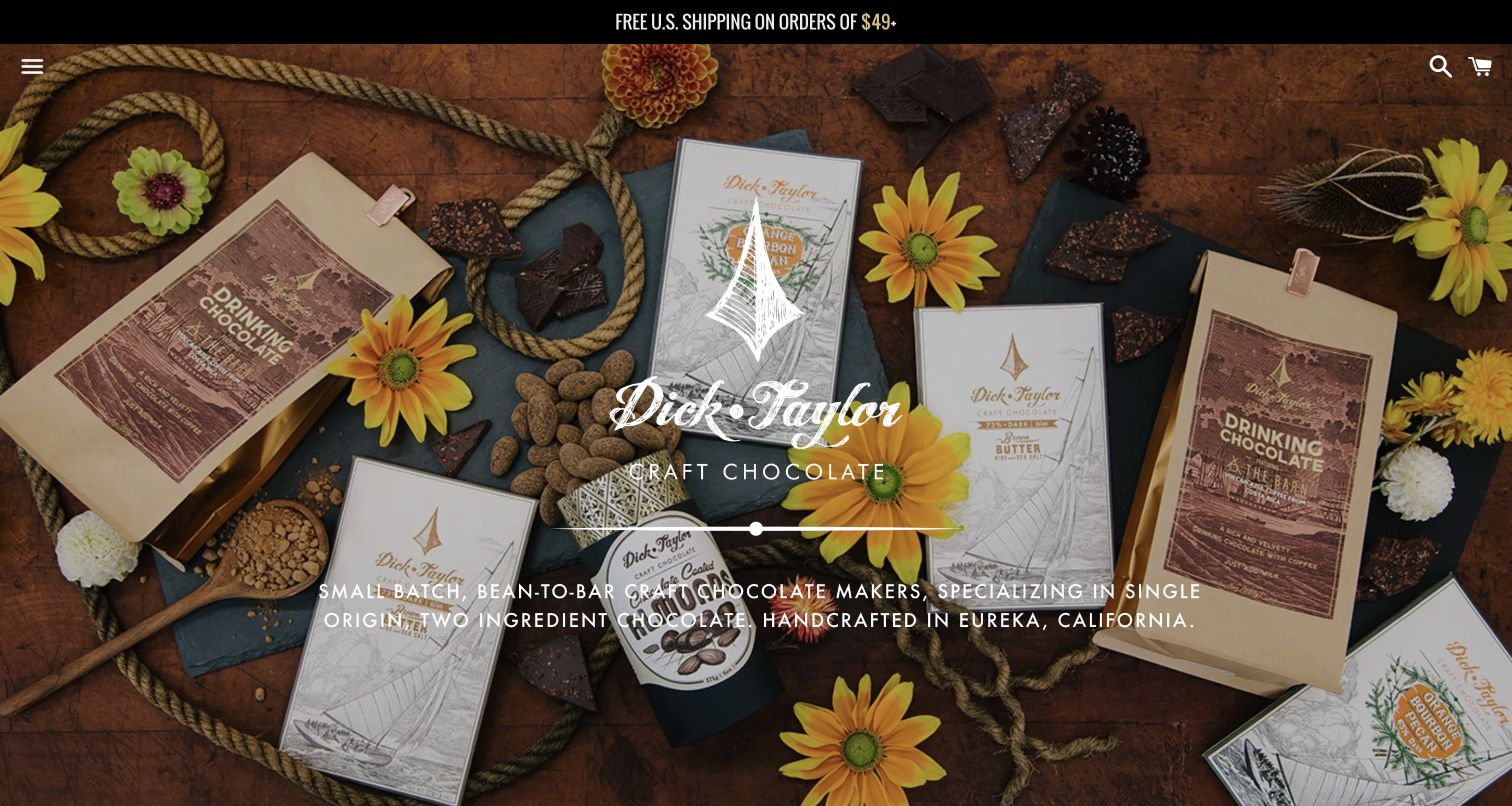
Dick Taylor’s retained opening composition brings bars, drinking chocolate, loose cacao and botanical details together on a dark tabletop. The centered mark and concise bean-to-bar introduction establish both the maker and the product category within the same view. Illustrated wrappers remain recognizable, so the imagery communicates craft through the actual objects rather than an unrelated lifestyle scene. The restrained header leaves the photograph room to work, but it also puts the broader navigation behind a menu icon. This is useful as a brand introduction for a focused maker; shoppers who already know an origin or product still need a quick catalogue route after the opening statement.
What you can learn
Use the actual packaging and ingredients to establish a maker’s identity, then pair that atmosphere with a clear route into named products so the first impression does not become a navigation obstacle.
Pros
The maker’s location and bean-to-bar scope are stated in the opening view.
Real wrappers and cacao details reinforce the product identity.
Cons & considerations
The collapsed main menu adds a step for specific product journeys.
Small white copy across a detailed photograph needs careful contrast at other screen sizes.
Platform source: Dated exact public source-page audit. Linked stylesheet matches Fancybox. Dated public resource or code association on this exact source page; not proof that any particular visible component initializes or behaves as assumed. Platform evidence is separate from the direct website screenshot and is not a complete current infrastructure audit.
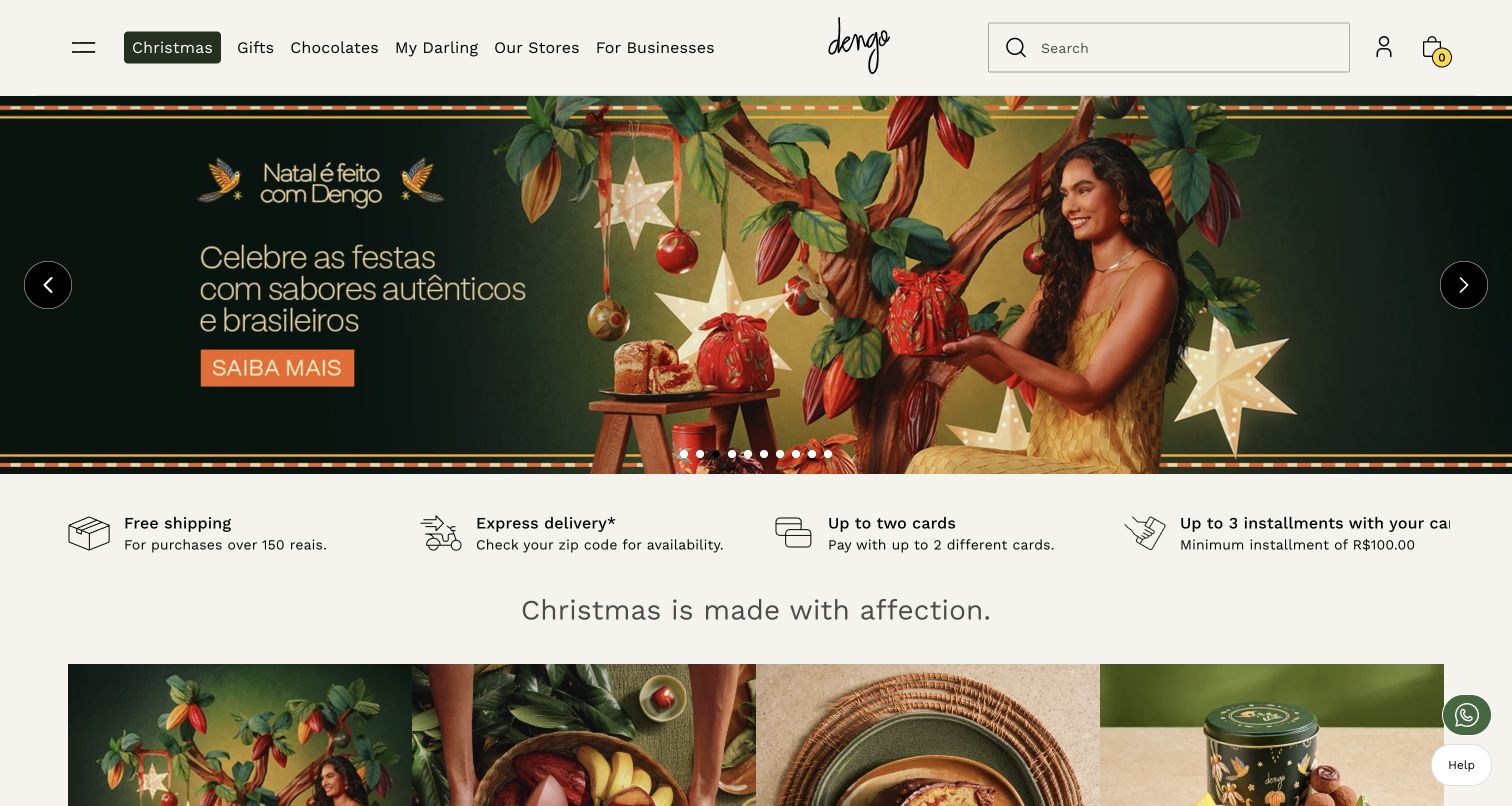
Dengo’s retained Brazilian storefront uses a richly illustrated holiday scene to introduce the seasonal collection, then places shipping, delivery availability and payment information in a separate service strip. That division is valuable for a chocolate maker with a wide retail operation: the campaign can carry personality without making practical purchase conditions compete inside the image. The header separates chocolate, gifts, stores and business customers, and the next product modules begin immediately below the introductory area. The screenshot records the observed mixed-language storefront state. It should not be treated as proof that every language journey is equally complete or that the displayed delivery terms apply outside the selected market.
What you can learn
Keep the emotional campaign and the operational shopping facts in distinct, adjacent areas. Regional delivery and business-order routes should be easy to find without turning the hero into a list of conditions.
Pros
A separate service strip makes practical purchase information scannable.
Stores and business customers have their own header routes.
Cons & considerations
A multi-slide campaign can distribute important messages across unseen frames.
Localized navigation and delivery information need consistent market-specific maintenance.
Platform source: Official VTEX exact-property project case. Brazilian public chocolate store, not separate dengo.com corporate property. Vendor documents VTEX Commerce Platform and pandemic-era live-shopping project; historical scope. Platform evidence is separate from the direct website screenshot and is not a complete current infrastructure audit.
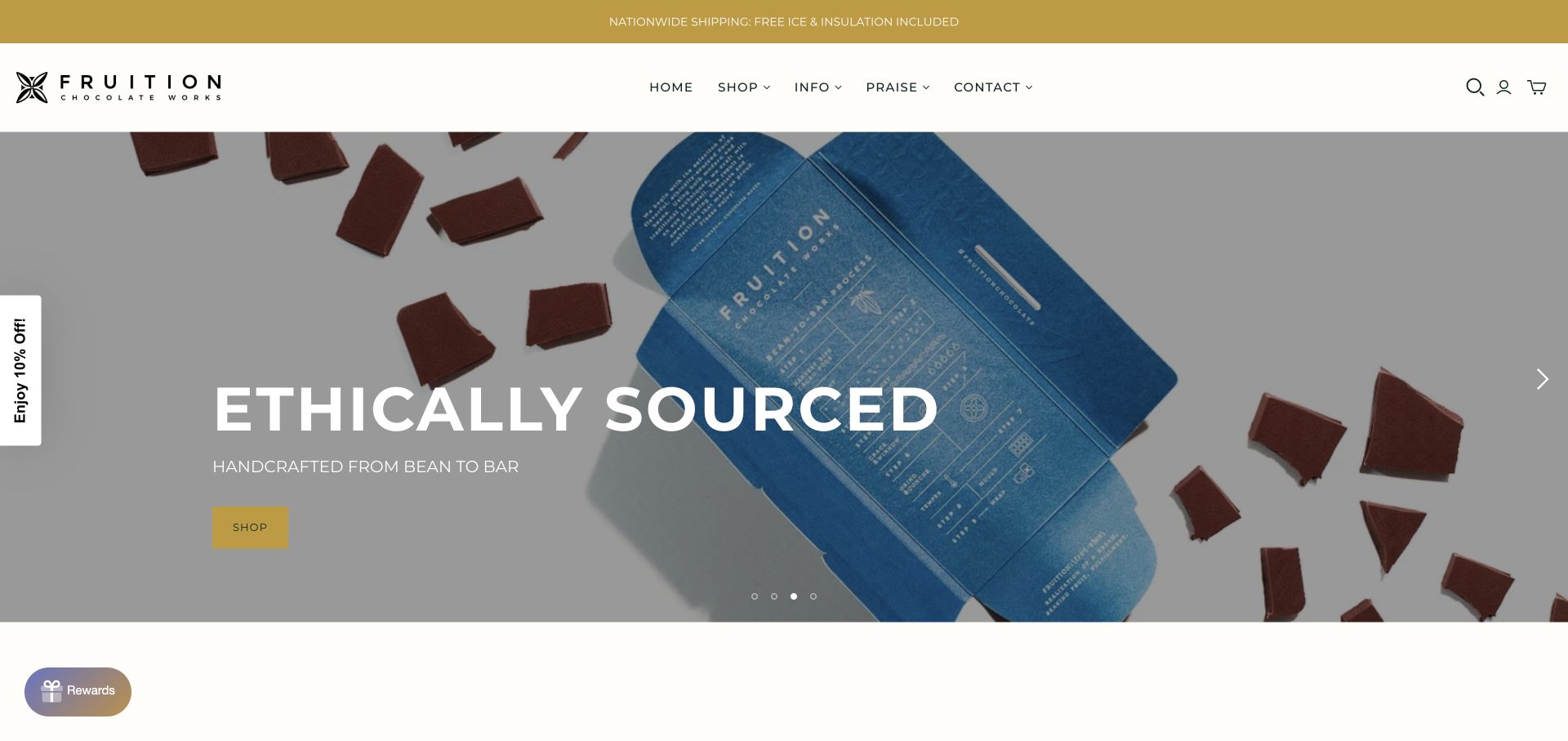
Fruition’s current homepage places a close photograph of an opened bar and its blue wrapper behind a concise sourcing statement and shop action. The image allows the packaging’s process diagram to participate in the maker story, while the plain header keeps the main routes familiar. Further down the observed page, product categories, cacao origins and the café sit in separate sections. This gives a visitor several levels of detail without requiring the entire production explanation before shopping. The review concerns this organization and presentation; the site’s ethical and award language is attributed to the maker, not independently certified by this collection. A promotional dialog was dismissed before the direct capture.
What you can learn
Connect process information to the finished object, then let visitors choose between shopping, origin research and a physical visit rather than forcing all three into one lengthy introduction.
Pros
The opened wrapper creates a tangible bridge between product and process.
Cacao-origin sections provide a deeper route beyond the retail campaign.
Cons & considerations
Large campaign text does not replace product-level origin and ingredient details.
Promotional overlays should not interrupt visitors before they understand the maker.
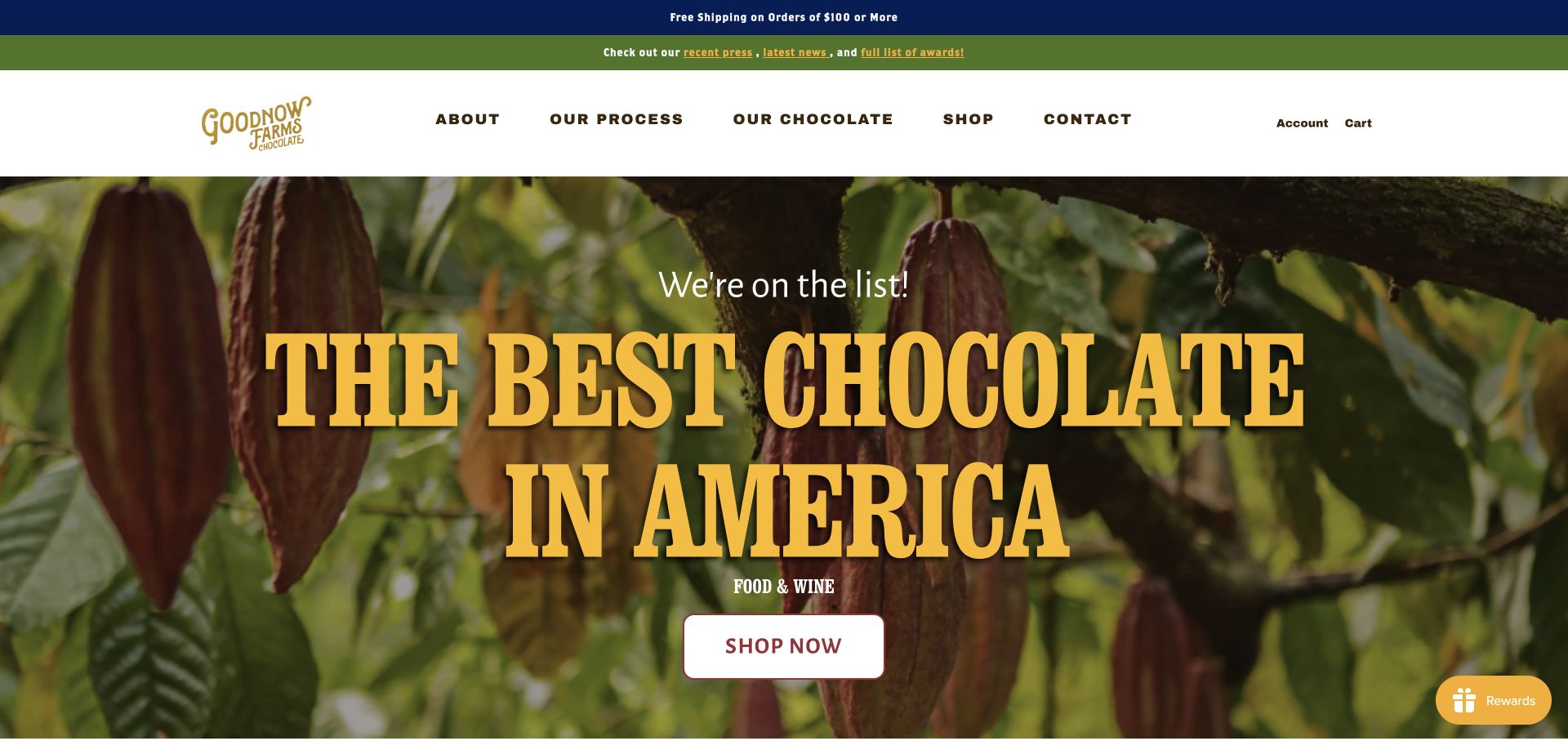
Goodnow Farms uses a close view of cacao pods behind a large press-recognition headline. The photography keeps the ingredient visible even while the opening message emphasizes external recognition. Above it, Our Process and Our Chocolate are prominent text links beside Shop, making the deeper craft story unusually easy to locate from a promotional first screen. The observed page continues into named releases and collections. For a bean-to-bar producer, this shows how a campaign can sit within an information architecture that still serves a curious buyer. The recognition belongs to the cited publication and the maker’s presentation; this review does not adopt it as an independent product ranking.
What you can learn
Give process and cacao information the same navigational clarity as the shop. A recognition-led campaign works better when visitors can immediately inspect the details that support the maker’s identity.
Pros
Process and chocolate information have explicit header labels.
Cacao imagery keeps the ingredient connected to the brand campaign.
Cons & considerations
The oversized recognition message delays direct product comparison.
Awards and quotations need dates and source links to remain meaningful over time.
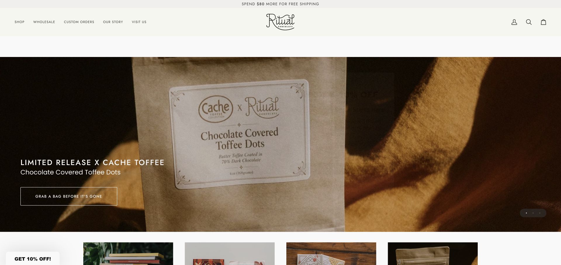
Ritual’s new direct capture shows a collaboration with Cache Toffee through a large, closely framed product bag. The short description identifies the chocolate-covered toffee format and the action points to that release, while wholesale, custom orders, the maker story and visits remain in the header. This is a useful example of giving a limited product a clear moment without redesigning the whole shopping structure. The observed page also separates bars, bundles and best sellers below the campaign. The collaboration image should not be mistaken for the complete bean-to-bar process, and a limited-release message needs prompt maintenance when stock or the campaign changes.
What you can learn
Give a collaboration its own concise proposition and product image, but retain the catalogue and maker-story routes so one temporary release does not define the entire website.
Pros
The photographed pack and product description explain the collaboration quickly.
Wholesale and custom-order routes remain visible for different buyer needs.
Cons & considerations
The initial campaign does not explain the maker’s broader cacao sourcing.
Scarcity language and product links require timely stock and campaign updates.
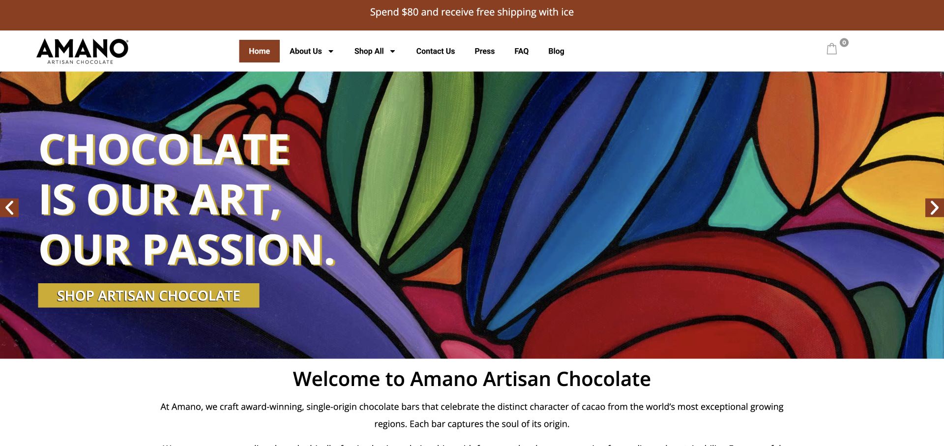
Amano’s captured opening slide uses colorful artwork behind a short statement about chocolate as a craft. The conventional header and prominent shop action keep that expressive introduction attached to familiar navigation. Immediately below, the page begins a plain-language explanation of single-origin bars, providing a more concrete next layer after the artistic first impression. This is an alternative to the recurring tabletop and cacao-pod imagery in the collection. It works best when the following product pages explain the origins and actual bars with equal care. The opening art alone cannot demonstrate chocolate texture, package size, ingredients or the production steps described elsewhere on the site.
What you can learn
An expressive visual identity can introduce a maker, but follow it promptly with concrete product and origin information so the artwork supports rather than substitutes for the offering.
Pros
A distinctive artwork treatment differentiates the opening view.
The shop action and conventional navigation remain easy to recognize.
Cons & considerations
The captured artwork does not show a bar or wrapper for immediate product comparison.
A rotating hero needs readable text and useful behavior without depending on motion.
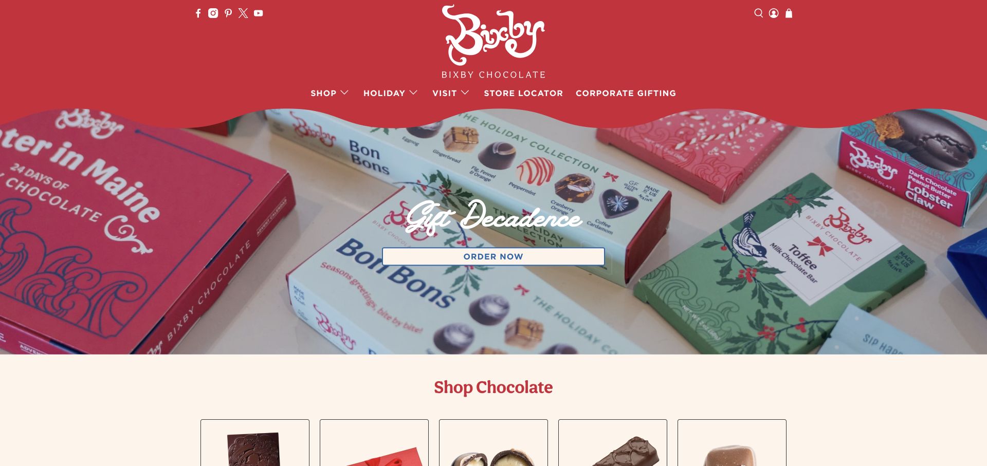
Bixby’s current opening view brings seasonal packaging together beneath a bold red header with a curved lower edge. The central gift message is brief and the order action is easy to find, while the next section begins a visual shopping taxonomy. The observed page distinguishes chocolate products, the factory boutique and a tasting experience, preventing the physical visit from becoming an afterthought. For bean-to-bar makers with a mixed range, this is a useful example of presenting the broader business without implying that every confection is the same kind of bar. Product-level process, ingredients and origin information must remain specific to the item being sold.
What you can learn
Use a coherent gift presentation to introduce a mixed range, then label product families and factory experiences separately so visitors can choose the kind of purchase or visit they want.
Pros
The seasonal product group supports a clear gifting proposition.
Factory shopping and tastings have separate pathways in the observed page.
Cons & considerations
The broad hero does not distinguish bean-to-bar bars from other confections.
Holiday-led content needs a reliable maintenance plan outside the campaign period.
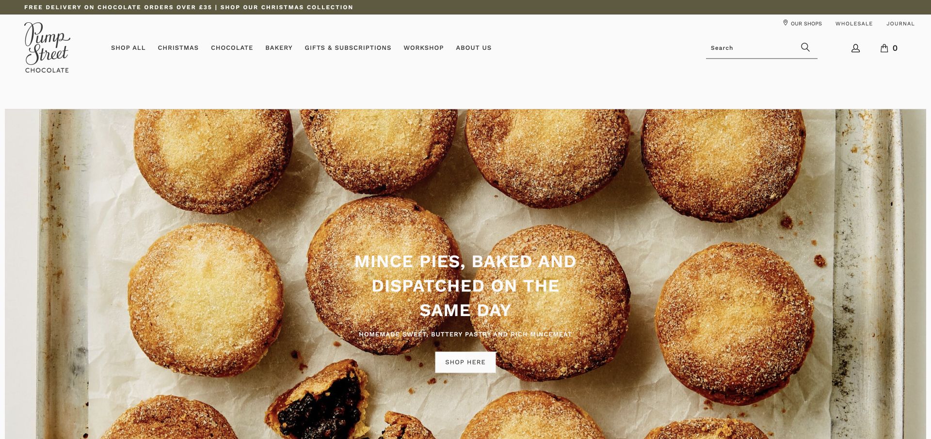
Pump Street’s current homepage makes its bakery and chocolate identities visible in the main navigation rather than merging them into an ambiguous shop label. The captured rotating campaign happens to feature mince pies, a useful reminder that a maker’s homepage may serve more than one product category. A separate Chocolate route, gifts and subscriptions, workshops and the maker background remain accessible above the image. This is worth studying for a bean-to-bar producer expanding into related food or experiences. The connection needs careful labeling: visitors should know whether a page concerns a chocolate bar, a bakery delivery or an in-person workshop before encountering its purchase conditions.
What you can learn
When related businesses share a brand, preserve clear category labels and separate practical information. A coherent visual identity should not obscure differences in product ingredients, delivery or visit requirements.
Pros
Bakery and chocolate are explicitly separated in the main navigation.
Workshops and subscriptions have visible routes alongside ordinary shopping.
Cons & considerations
A bakery-led hero can initially obscure the bean-to-bar range for a new visitor.
Large seasonal photography leaves product comparisons to the next step.
Kegan is a freelance web designer and developer with 15+ years of experience helping businesses turn complicated website requirements into clear, maintainable digital experiences. He works directly with clients from planning and design through development, launch, and ongoing support.
For bean-to-bar chocolate maker website design, his development approach focuses on origin and product records, production storytelling, gift navigation, shipping details and distinct factory or farm visit routes. The scope can be a targeted improvement or a complete custom build, with responsive layouts, thoughtful content structure, and integrations chosen around the people using and maintaining the site.
Show 3 other bean-to-bar chocolate maker website designersHide other bean-to-bar chocolate maker website designers
Plan the site around the maker’s real products and experiences
Define the product records before arranging the homepage
List the actual product families: single-origin bars, blends, inclusions, filled confections, drinking chocolate and gifts. Decide which distinctions help a shopper compare items. Do not apply a simple bar ingredient statement to a photograph containing products with different recipes.
Create fields for origin, percentage, weight, ingredients, allergens, storage guidance and availability. Use the maker’s verified information and the appropriate review process for regulated product details. A consistent record is easier to maintain than embedding changing facts inside campaign images.
Choose a small set of opening journeys. A first-time buyer may need a tasting set, while a returning customer may search for an exact origin. Give both a useful route and keep wholesale or corporate orders distinct when those services genuinely exist.
Connect production storytelling to evidence
Map the story from cacao sourcing through the maker’s own production steps. Use photographs and explanations that show what actually happens, with clear attribution for farms, cooperatives and collaborators. Avoid implying ownership or control over stages carried out by partners.
Give origin and process pages durable links from the products they explain. A shopper reading about one bar should not have to restart from a general brand essay to find its relevant source. Keep historical harvest or partnership information dated rather than presenting every story as a new observation.
Distinguish a brand’s own claims from independent documentation. Awards, certifications and press quotations should identify their source and scope. Their presence can help a visitor investigate, but they should not become an unsupported blanket guarantee about every product.
Design for seasonal changes and practical fulfillment
Separate reusable catalogue content from seasonal hero messages. Give temporary releases an explicit maintenance owner and a useful destination when they sell out. A holiday photograph can introduce the range, but should not leave the entire site looking abandoned when the season changes.
Make delivery regions, warm-weather handling and order deadlines easy to locate before checkout. These details vary by maker and product; use the actual policy rather than borrowing another company’s threshold or timing. Explain local pickup separately from shipping.
Test finding a named bar, comparing two origins, locating ingredients and understanding a tour booking. Review keyboard access, image descriptions and mobile text placement during implementation. The goal is a clear path through real content, not simply a large photograph that looks attractive at one size.
The editing job behind the design
Choose tools that keep the catalogue and maker story aligned
A managed commerce platform can handle a modest range when product fields, image sizes and stock responsibilities are well defined. A larger origin archive benefits from structured content that connects makers, cacao sources and products without duplicating the same facts across unrelated pages.
Add subscriptions, wholesale accounts or booking tools only when the business can maintain their specific terms and customer service. Keep functional purchase and visit information available without requiring a newsletter signup. Avoid collecting personal information that the task does not need.
The technology observations in these examples come from bounded public-source audits. They may identify visible commerce, library, font or delivery references, but do not reveal a maker’s complete backend or private production systems. Partial or unavailable evidence remains qualified rather than being filled with guesses.
Our WordPress website examples offer a separate look at publishing approaches. A visible platform label is evidence for that named page, not a guarantee that the same system will suit your requirements.
Before the public launch
A bean-to-bar website launch checklist
The opening page identifies the maker, product range and relevant location clearly.
Bean-to-bar and related process language matches the work the business actually performs.
Each product has accurate origin, percentage, weight, ingredient and allergen information.
The wrapper and the chocolate are shown clearly without relying on one ambiguous lifestyle image.
Bars, confections, bakery products and drinks are categorized without blurring their differences.
Origin and process records are linked from the products they explain.
Sourcing, certification, award and press claims have appropriate sources and scope.
Factory visits, farm visits and tastings have distinct descriptions and practical details.
Shipping regions, handling conditions, pickup and order deadlines are maintained.
Seasonal campaigns have a replacement plan and accurate stock destinations.
Product comparison and navigation remain usable with a keyboard and on narrow screens.
The team can update products, policies and visits without editing decorative image text.
These checks are a project checklist, not a performance, legal, security, or accessibility certification. Test real journeys with the people responsible for the website before making claims about the result.
Sources & editorial method
How this collection was selected and reviewed
We reviewed thirteen genuine chocolate-maker website captures for this collection on November 11, 2026 Pacific. Six retain their original November 4 or November 10 captures; seven new homepage captures were made on November 12 UTC, still November 11 Pacific. Individual labels preserve those actual dates. The comparison covers product presentation, production and origin explanation, navigation and visit routes. Mānoa Chocolate is the researched Editors Choice for its clear bean-to-bar and location proposition, real product composition and distinct factory and farm-tour links. This is an editorial design selection, not a product-quality, sourcing or service endorsement. Each source has a broad public technology-audit attempt; partial results retain their limits.
Each example links to its actual source page. Screenshots are direct browser captures with their own capture dates; moving imagery, announcements and live designs can change. The notes describe observable design choices and conditional tradeoffs, not measured traffic, conversion results, service quality, or accessibility conformance.
Technology labels use public page metadata, asset evidence, or explicitly cited platform documentation. Platform documentation is not a complete current deployment audit. A component reference may be legacy or unused; it is not a complete backend inventory. Unknown stacks are omitted. These sites are editorial examples, not our client portfolio.
Written, Edited and Curated are separate editorial records, not timestamps advanced by a rebuild. Website designs and imagery belong to their owners. See our editorial standards or suggest a correction.
Should a chocolate maker lead with the process or the products?
Make the product category clear immediately, then choose the opening emphasis around the main visitor. A distinctive process can explain why the chocolate is different, while a seasonal gift campaign can serve an urgent purchase. Keep both shopping and deeper maker information easy to reach.
How should a site explain cacao origins?
Use a clear origin record with the maker’s supported information, relevant dates and appropriate attribution. Link it to the bars made with that cacao. Distinguish a farm, region or cooperative precisely rather than implying a more specific source than the evidence supports.
Can a bean-to-bar site include other confections or bakery products?
Yes. Label the product families and maintain their own ingredients and practical information. A maker’s bar recipe or production claim should not automatically describe every filled chocolate, pastry or drink pictured in the same campaign.
What belongs on a chocolate product page?
Start with the actual product name, images, weight, cacao percentage where relevant, ingredients, allergens, availability and price. Add origin, tasting guidance and storage or delivery information that is accurate for that item. Follow the applicable product-information requirements for the markets served.
How should factory tours and farm visits be presented?
Treat them as different experiences with clear locations, duration, booking conditions and accessibility information. Explain what visitors will actually see. Do not use one generic visit label to imply that every experience includes the same production stages.
Make the craft understandable, the products comparable and the next step clear—whether the visitor wants one bar, a gift or a closer look at how the chocolate is made.