A good agency website does more than demonstrate taste. It helps a prospective client understand what the practice actually does and what evidence supports that offer.
A full-screen reel, a concise service statement, and a deeply documented case study solve different problems. The reel introduces character. The statement explains the discipline. The case lets someone evaluate relevant experience. A strong agency site connects those pieces rather than asking one impressive opening to perform all three jobs.
This collection includes website specialists alongside digital-product, brand, and multidisciplinary studios with relevant digital work. They are not interchangeable businesses. Compare the presentation pattern with your actual engagement model, project evidence, audience, and editorial capacity. The reviews assess visible choices and scoped public technology evidence, not independently measured agency results or the quality of a proposed engagement.
Before the examples
What makes good web design agency website design in 2026?
Explain the discipline without requiring a showreel
Name the kind of work, the typical audience, and the team’s contribution in plain language. A prospective client should not need to recognize a famous logo or interpret an immersive visual scene to identify the service. Retain a useful written introduction even when a film or unusual interaction is central to the identity.
Make the case study precise about responsibility
Record the problem, scope, role, collaborators, deliverables, constraints, and dates. Distinguish the studio’s contribution from work supplied by the client or another partner. If a result is included, preserve its source, measurement period, and qualifications. A screenshot, award mark, or familiar brand is not a substitute for that explanation.
Help a suitable client understand the next step
Explain the engagement types and the purpose of a first conversation. Provide a direct contact route without forcing someone through an elaborate interactive sequence. Ask only for useful project information, describe what happens after submission, and ensure staff can respond through a maintained process rather than an unmonitored general form.
The collection · 23 examples
23 web design agency websites worth studying
Compare reel-led studios with editorial introductions, explicit service navigation with deliberately sparse portfolios, and website specialists with wider product and brand practices. Borrow the pattern that helps explain your work—not the fame of the featured client.
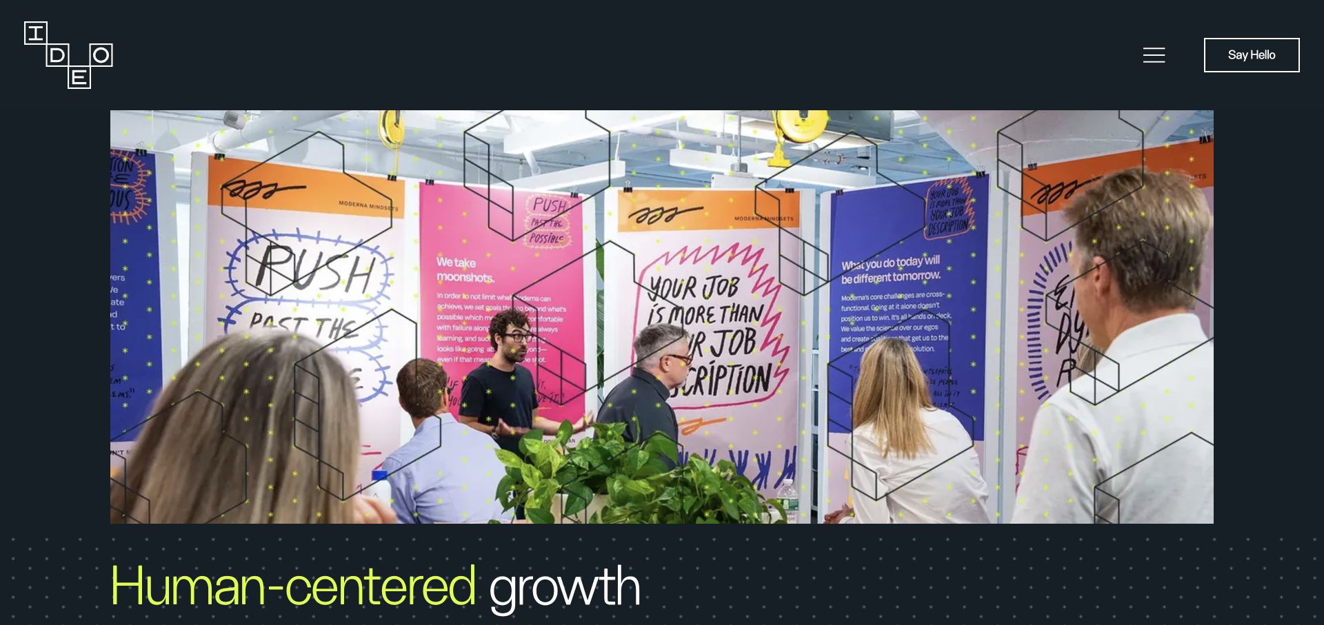
IDEO introduces the practice through a workshop photograph: people, notes, and colorful material occupy the central frame. Its dark header keeps the agency identity and contact route separate from that busy scene. Lime typography begins the written proposition beneath the image. For an agency reference, the useful choice is to show a recognizable working activity rather than another collage of finished screens. The image does not establish the process used on a particular engagement or independently verify the results of that work.
What you can learn
Give process photographs a real editorial purpose. Explain the activity, secure appropriate permissions, and connect it to a specific service or case study. Keep a compact description of the engagement nearby so an unfamiliar visitor does not have to interpret workshop scenery as the entire service offer.
Pros
The workshop gives the practice a human, observable setting.
A stable dark header contains the essential agency navigation.
Cons & considerations
The opening scene delays a precise account of the services available.
Fine pattern and text around photographs need careful checks when imagery changes.
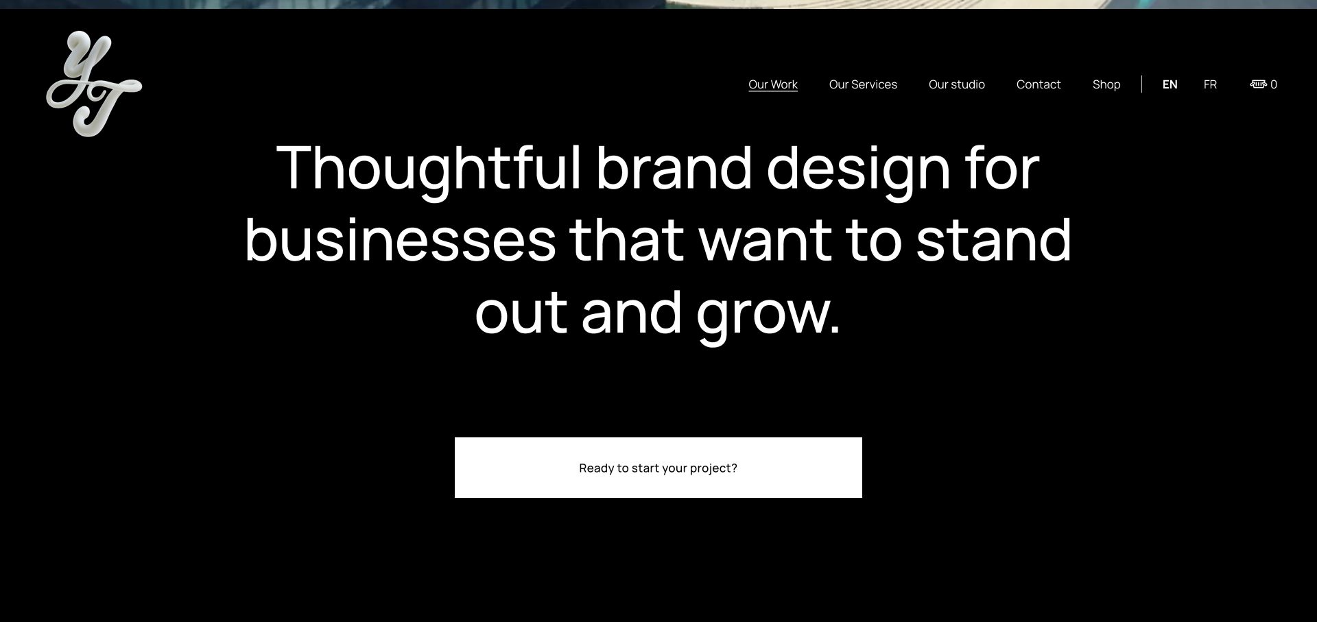
The saved Yarza Twins section uses a black field, a small expressive monogram, and a large centered statement about its brand-design work. A broad white enquiry button gives that statement a simple continuation. Compared with a dense agency services grid, the composition makes positioning itself the main content. This capture is a section below the opening media, not a claim that the full website begins with text alone. It is especially useful for studying how a studio can make the written introduction hold its own after a visual showreel.
What you can learn
Write a studio introduction that remains understandable when the film is skipped. Define the audience, discipline, and next step without stuffing the statement with every service. Connect the enquiry action to practical information about the engagement rather than depending entirely on the confidence of the typography.
Pros
The centered proposition receives an unmistakable visual hierarchy.
The enquiry button clearly finishes the introductory thought.
Cons & considerations
Broad positioning still needs concrete project evidence elsewhere.
Large display text leaves limited room for detailed buying questions in this section.
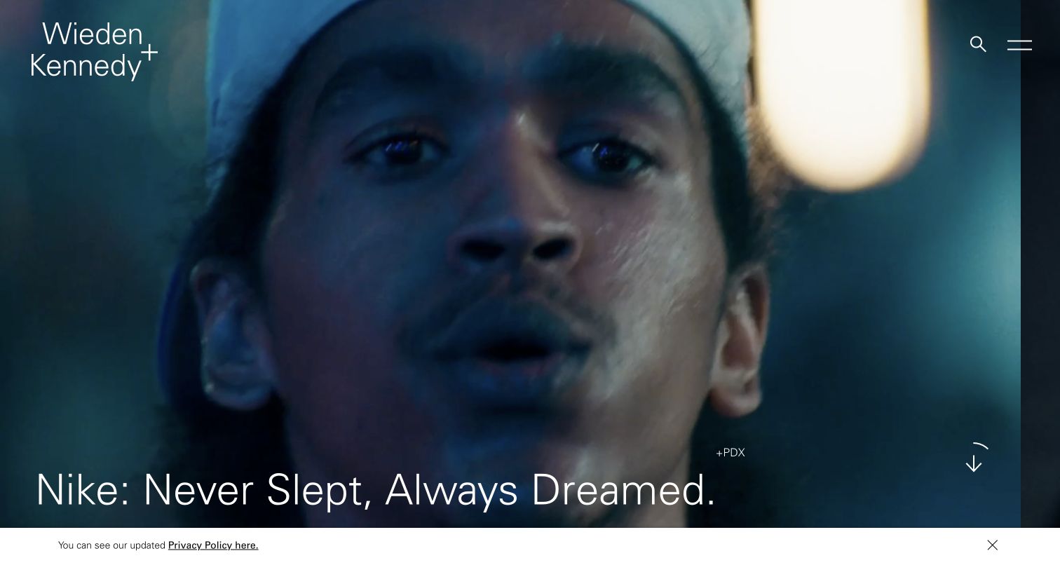
Wieden+Kennedy gives almost the whole saved view to a close-up campaign image. Its agency name stays in the corner, while a small office label and the project title provide context along the lower edge. Search and menu controls are restrained rather than competing with the featured work. The reference demonstrates project-first presentation, not proof of the campaign’s effectiveness or the technology used by the featured client. An unfamiliar visitor sees the character of the work immediately, but still has to continue to discover the agency’s engagement model.
What you can learn
Treat the featured project as a maintained content record, with a clear title, agency role, credits, and a useful destination. Keep an ordinary work archive and service route available alongside the cinematic introduction. The same frame should survive a less dramatic photograph and an unusually long client name.
Pros
The single campaign image establishes a strong visual priority.
The office label adds project context without a separate explanatory panel.
Cons & considerations
Small controls can make practical service discovery less immediate.
White titles over variable campaign imagery require deliberate crop and contrast checks.
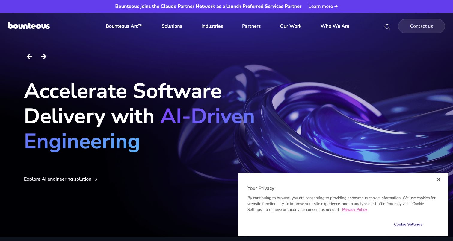
Bounteous uses a deep purple hero with a large technical-service statement and a glossy abstract form on the right. Above it, the navigation distinguishes solutions, industries, partners, and work, while a separate announcement adds a current corporate message. This is a different agency pattern from a minimal portfolio: visitors can begin by their problem, sector, or a supporting relationship. The abstract illustration supplies a recognizable visual language, but cannot by itself demonstrate what the team delivered or substantiate the capability claim.
What you can learn
Give each broad capability an explicit route to a relevant project and a plain account of the agency’s role. Keep announcements time-bound and decide what receives priority when several campaigns are active. Organize the navigation around actual evaluation questions rather than reproducing an internal department chart.
Pros
Distinct work and industry routes support more than one research path.
The purple palette gives several promotional layers a consistent identity.
Cons & considerations
The abstract visual provides little concrete information about the work.
Announcement, hero, and privacy surfaces make the opening comparatively dense.
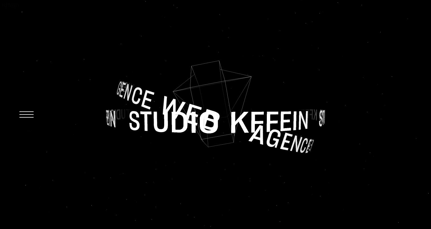
KFFEIN’s saved French-language opening places white lettering in a dimensional, rotating composition against black. The agency name and related words become the visual object, with a small menu control positioned at the side. It is a distinctive alternative to the familiar agency reel containing a dozen client screens. The opening communicates an appetite for expressive presentation, although the actual services, project context, and engagement details are not explained within this frame. A still capture also cannot establish the behavior or comfort of the full motion sequence.
What you can learn
Make the identity treatment one layer of the introduction rather than its only source of meaning. Supply a direct textual explanation, a dependable work route, and a useful still or reduced-motion presentation. Structure projects and credits separately so the editorial portfolio can evolve without redesigning the animated identity.
Pros
The studio name is integral to the creative treatment.
A restrained black-and-white field keeps the composition focused.
Cons & considerations
Visitors seeking a particular service need information beyond the opening.
The motion-led idea requires its own keyboard, fallback, and reduced-motion testing.
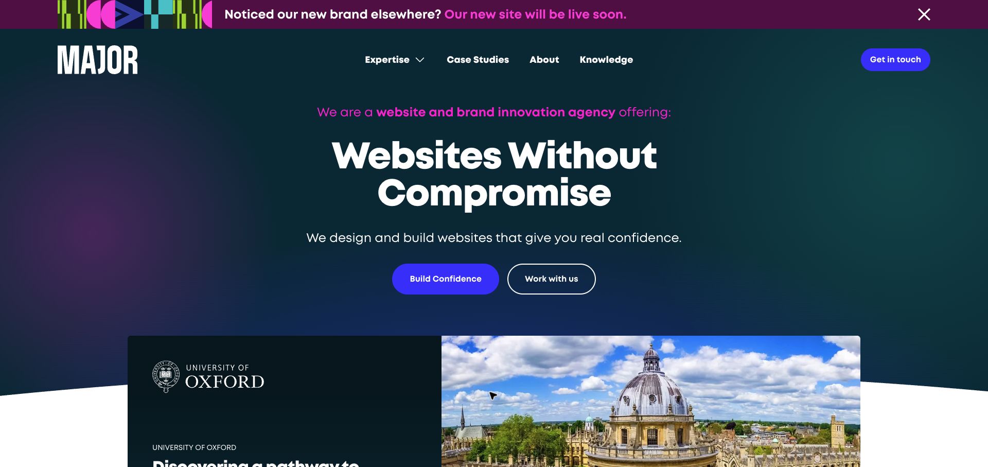
MAJOR Digital places its main website proposition on a dark gradient, with two actions beneath it. A University of Oxford project card begins within the same saved view, pairing a recognizable name with an architectural image. This gives the introductory statement a concrete continuation rather than leaving the visitor with a slogan alone. A bright strip at the top announces a forthcoming brand and site change, which is useful context for the captured presentation but also another message competing for attention.
What you can learn
Bring one relevant project into the opening sequence, then explain its scope, constraints, and the studio’s actual responsibilities. Keep an alternative route for visitors who want to understand the service before enquiring. Temporary rebrand messages need an owner and removal date so they do not become permanent background noise.
Pros
A named project begins to support the service introduction immediately.
Two distinct actions accommodate exploration and a more direct enquiry.
Cons & considerations
The bright rebrand strip draws attention away from the main proposition.
A broad website promise needs a specific case study to become distinctive.
Studio Science makes its current AI-implementation theme the main editorial content. Large white type sits on black, supported by a lime sentence, and a sharply separated partnership graphic begins the next section. The composition reads like a point of view before it reads like a gallery. Its visible relationship can provide a destination for further research, but is not independent evidence of client outcomes, implementation quality, or any capability beyond what the agency specifically documents. The saved homepage is a useful example of a practice-led introduction.
What you can learn
Separate the current theme, supporting explanation, relationship, and case-study evidence into maintained content. Keep the rest of the agency’s capabilities discoverable when a specialist topic takes over the homepage. Explain what a relationship actually covers instead of allowing a familiar partner logo to carry an unspecified promise.
Pros
The typographic hierarchy makes the current topic immediately apparent.
The section boundary separates the proposition from supporting material.
Cons & considerations
The specialist theme may not answer every prospective client’s first question.
Large text postpones detailed examples of the actual work and process.
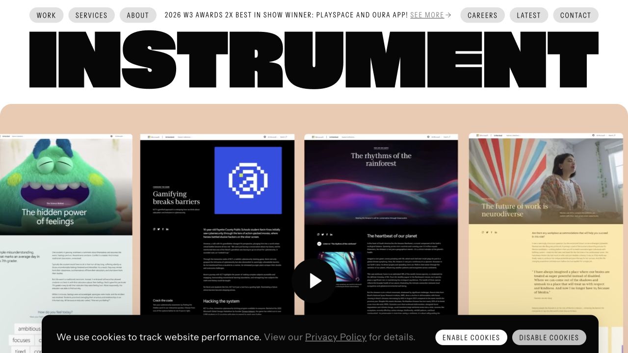
Instrument places an oversized black wordmark across a white header, followed by a large reel frame. The saved sequence shows several website compositions, while compact capsule navigation offers work, services, company information, and contact. The agency identity therefore remains visually separate from the client material, even when that material changes substantially. The opening is unmistakably portfolio-led, but a reel image alone does not explain the team’s exact scope or the conditions of the projects shown.
What you can learn
Give the showreel a permanent frame and connect its projects to ordinary case-study pages. Identify the agency’s role, collaborators, deliverables, and relevant constraints there. Preserve a straightforward services route for someone who arrives with a defined problem and does not want to watch the entire sequence before learning whether it fits.
Pros
The large wordmark keeps the agency recognizable above client artwork.
Capsule navigation remains readable outside the reel’s changing imagery.
Cons & considerations
A changing reel can obscure which project a visitor wants to revisit.
The opening still needs written scope and project evidence beyond the featured screen.
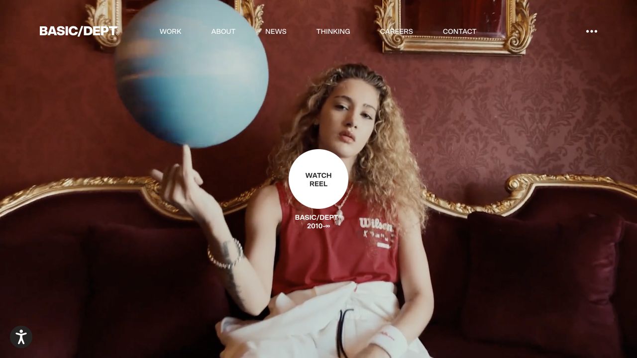
BASIC/DEPT® opens with a full-bleed reel treatment. The captured frame shows a person, a globe, and an elaborate interior, while a central circular play action and light navigation sit over the media. Rather than displaying a grid of equal projects, the website asks the viewer to enter one visual sequence. It makes a strong presentation reference for an agency with rich commissioned material, but a film frame does not establish the agency’s exact contribution, the scope of an engagement, or the behavior of a client’s application.
What you can learn
Offer a stable work index and individual case destinations alongside a cinematic reel. Give each project explicit credits and explain what was designed or built. Check overlay legibility for every approved media frame, and provide an informative still rather than making video playback a prerequisite for understanding the practice.
Pros
The featured sequence receives an immersive, uninterrupted visual setting.
The central reel action is visually separate from the surrounding navigation.
Cons & considerations
Media takes priority over a concise description of available services.
Light controls depend on the brightness and movement of changing background frames.
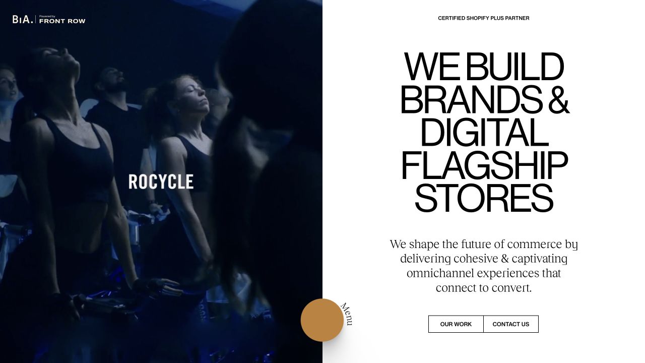
Build in Amsterdam splits the opening between a dark fitness-brand sequence and a large typographic statement about brand and digital flagship stores. Black framing, generous spacing, and a small number of navigation choices make the proposition feel deliberate rather than crowded. The media supports a recognizable brand setting without being asked to explain the entire service. A partner reference provides further context, but a platform badge does not establish the CMS or runtime used by the agency’s own site.
What you can learn
Lead with a specialization that can be supported by detailed work. Explain how brand, commerce, design, and implementation responsibilities relate in an actual engagement, then let the case studies show their boundaries. Keep platform partnerships distinct from technology observations and from a promise that every client needs that platform.
Pros
The written introduction identifies a specific kind of digital practice.
The split layout keeps expressive imagery and explanatory text distinct.
Cons & considerations
One featured brand scene represents only part of a broader service relationship.
Oversized typography needs careful reflow when the proposition becomes longer or localized.
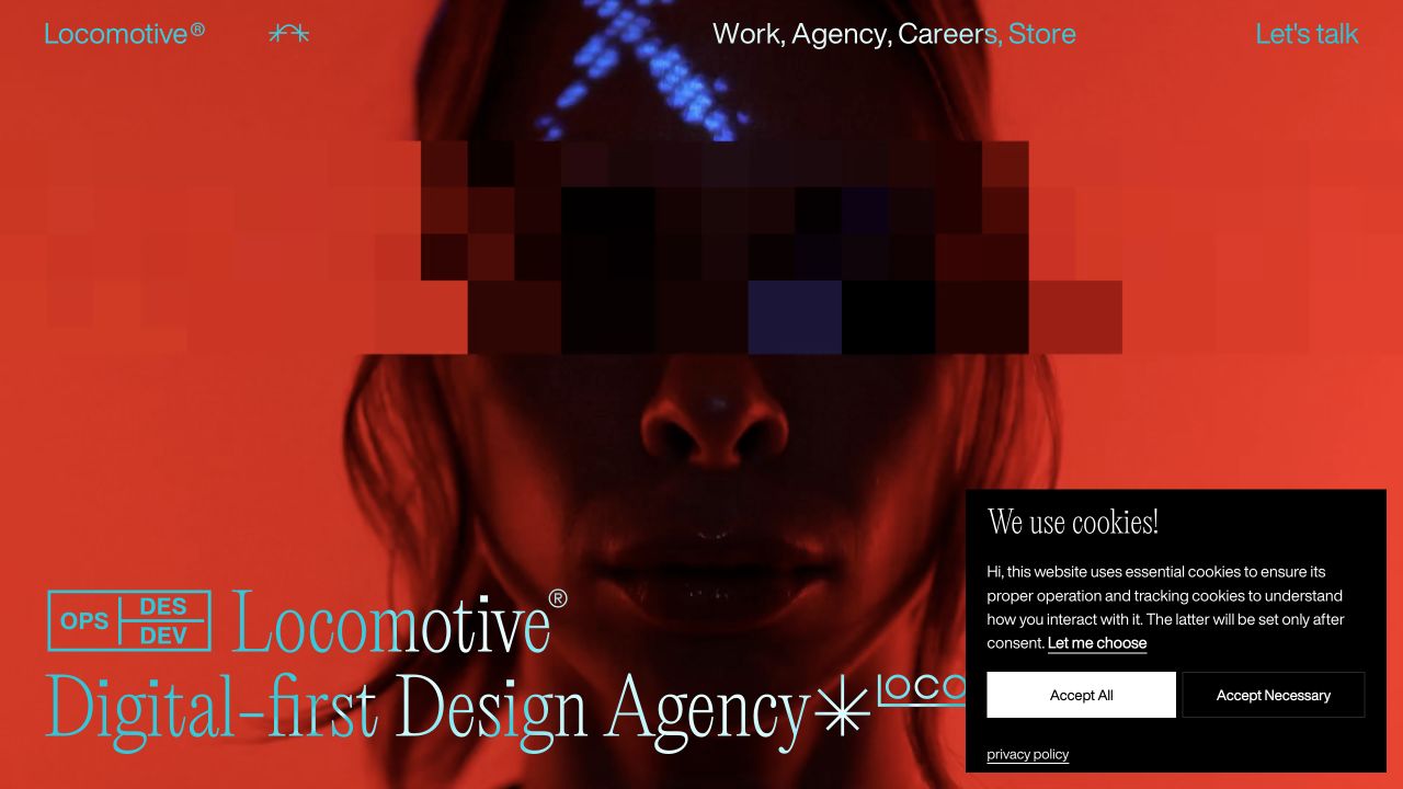
Locomotive’s opening layers unusually scaled typography over a saturated red moving-image scene. Words referring to design and code participate in the composition, while work, agency, careers, store, and a conversation route occupy the upper frame. The site makes creative implementation itself part of the presentation, not merely a small service bullet. Its visual energy is the reference here; the screenshot does not test animation responsiveness, accessibility, or the quality of the engineering behind any client project.
What you can learn
Translate the design-and-development claim into specific project responsibilities. Explain what was designed, what was implemented, and which collaborators or systems were involved. Retain a normal project index and concise contact path when the first screen is highly expressive, and design a meaningful still presentation for visitors who avoid motion.
Pros
The visible language connects creative and technical disciplines.
Practical agency and work routes remain present around the composition.
Cons & considerations
Large moving elements compete with quick reading of the proposition.
The privacy panel in the captured session occupies part of the lower-right composition.
Active Theory introduces its creative digital practice through a dark interactive-looking scene of particles and a metallic central form. Small work and contact labels sit at the upper edge, with a quiet scrolling cue below. It is an intentionally sparse opening: the medium demonstrates the kind of visual experimentation being offered, while ordinary explanatory copy is secondary. A captured frame records that presentation only. It cannot verify input behavior, rendering performance across devices, or accessibility of the full experience.
What you can learn
Use immersive media to introduce the discipline, then provide a conventional way to understand and browse it. Describe the studio’s role in each experience and offer stable project URLs, readable captions, and useful fallbacks. An unfamiliar buyer should not need to discover a hidden interaction before finding services or a contact route.
Pros
The central visual gives the experience a singular point of attention.
Work and contact remain separate destinations rather than one ambiguous action.
Cons & considerations
The opening contains little plain-language explanation for an unfamiliar visitor.
A graphics-led introduction needs testing on devices and input methods beyond this capture.
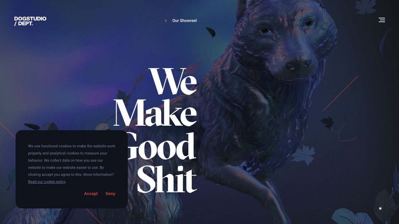
Dogstudio makes a large blue-purple three-dimensional dog the visual anchor of its opening. Oversized white lettering and a compact agency mark establish a strong identity around the character, while showreel and menu controls provide the main visible routes. The result is recognizably a creative studio rather than a generic business-services page. The character communicates tone and craft, but does not by itself explain a project scope, a development process, or the practical arrangements of hiring the team.
What you can learn
Give a signature character a purpose beyond decoration. Connect the visual introduction to a useful portfolio and a concise explanation of services, and preserve ordinary destinations when the animation or reel is unavailable. Model project credits and written summaries separately so they remain maintainable without altering the creative scene.
Pros
The recurring dog gives the studio a distinctive visual identity.
The contrast between character, dark field, and large type creates a clear composition.
Cons & considerations
The first screen requires further exploration for detailed buying information.
The captured privacy panel covers part of the lower-left visual area.
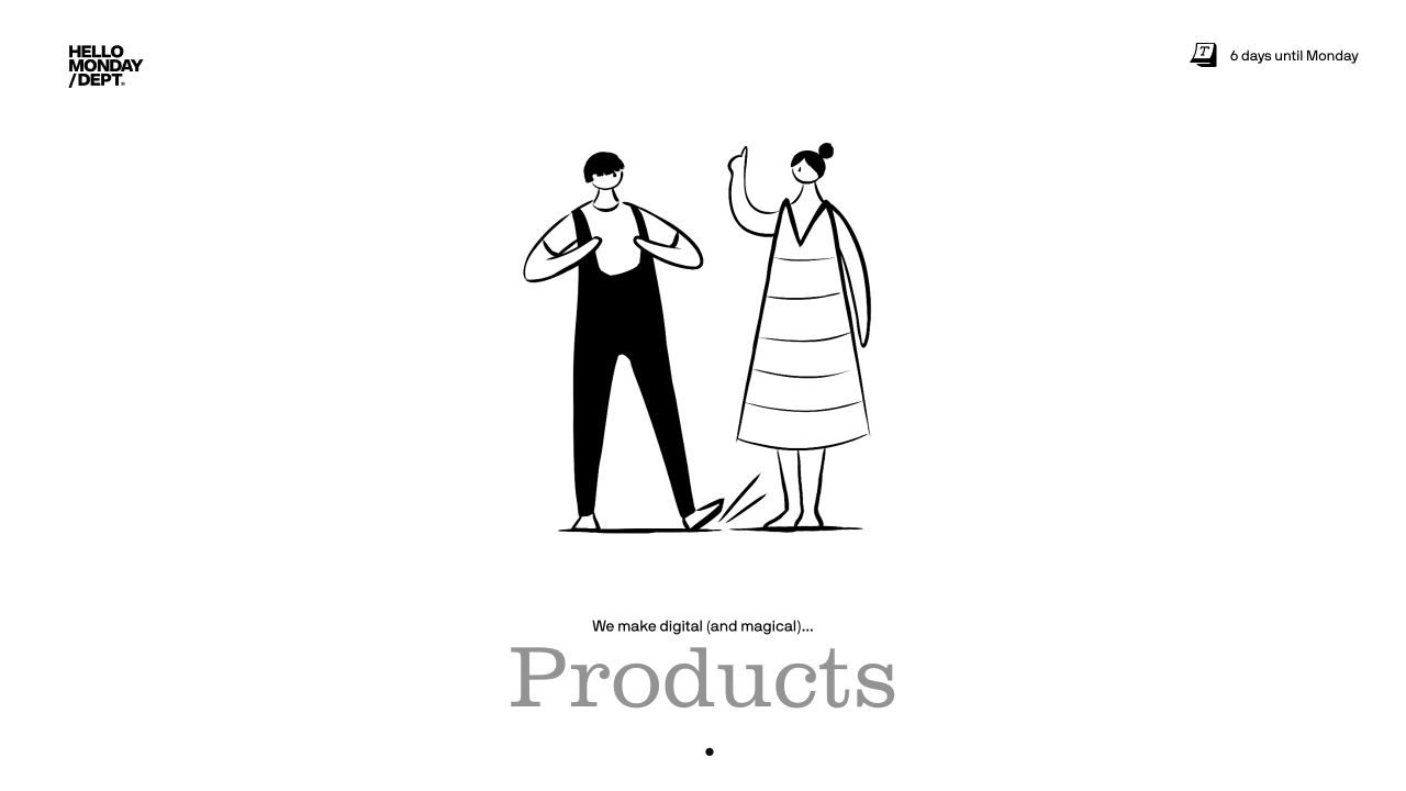
Hello Monday uses a mostly white canvas with a black-and-white animated scene of illustrated people. Its compact brand and a small countdown to Monday add character without turning the header into a long service catalog. The opening favors an approachable studio mood, while the public work content supplies project and discipline context beyond it. This is useful for studying how an agency can introduce personality without relying on a montage of client logos. The illustration itself is not evidence of an engagement’s outcome.
What you can learn
Let the distinctive illustration establish tone, then make the work easy to investigate through named projects and clear descriptions. Explain the contribution of brand, design, and technology on each case. Keep time-dependent details such as a countdown understandable and ensure they are not necessary for using the rest of the site.
Pros
The restrained illustrated palette gives the opening a cohesive character.
Small editorial details make the studio introduction feel intentionally authored.
Cons & considerations
The playful scene provides less immediate information about services than a direct case study.
Illustration and motion need a useful explanatory continuation rather than carrying the entire proposition.
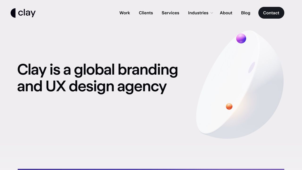
Clay opens on a light gray field with a large, left-aligned statement identifying its branding and UX design practice. A conventional navigation row separates work, clients, services, industries, company information, and editorial content, with a dark contact action at the end. The introductory hierarchy is calm and explicit compared with immersive reel-led agency sites. It makes the discipline clear before asking visitors to interpret project artwork. The plain statement still needs supporting case details; its clarity is not proof of the agency’s results.
What you can learn
Name the discipline and intended engagement clearly, then let visitors choose the kind of evidence they need. Connect industry pages and service pages to genuinely relevant work rather than multiplying near-identical sales copy. Keep the case-study roles, constraints, and credits precise enough to substantiate the broad opening description.
Pros
The main text identifies the practice without requiring a video introduction.
Familiar navigation gives services, work, and contact distinct destinations.
Cons & considerations
A broad design-agency statement still needs specific evidence to become memorable.
Numerous top-level routes need careful prioritization on narrow screens.
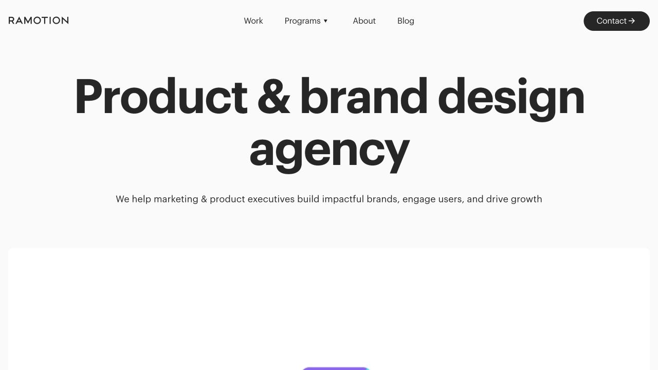
Ramotion places a large centered product-and-brand design statement on white, followed by a short explanatory line. Work, programs, company information, editorial content, and a dark contact action form a compact navigation. A colorful project panel begins below, giving the written positioning a visual continuation without competing with it immediately. The structure is useful when a studio offers related disciplines that need to be understood together. The opening does not establish how a particular program is scoped or whether every engagement includes both disciplines.
What you can learn
Explain the relationship between product and brand work in concrete terms. Give service packages or programs a clear audience, deliverables, and boundary, and use case studies to show when the disciplines overlap. Retain an exploratory work route for visitors who are not yet ready to contact the studio.
Pros
The opening identifies two related disciplines in a concise statement.
The beginning of project imagery provides a natural continuation below the introduction.
Cons & considerations
The general proposition needs detailed cases to distinguish the practice.
Program language requires explanation before a visitor can compare engagement options.
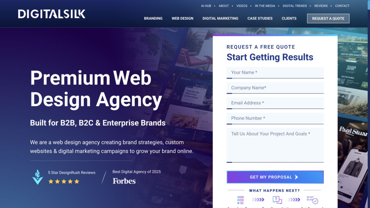
Digital Silk uses blue-purple digital imagery behind a service-led opening, with a prominent quotation form occupying the right side. Several navigation layers separate services and audiences, while recognizable review-platform marks add another layer of presentation. The layout puts the enquiry mechanism directly beside the proposition instead of waiting until after the portfolio. That makes the intended next step obvious, but also asks a relatively new visitor to consider sharing project information early. No form was completed in this review.
What you can learn
Give an early enquiry form a clear scope and explain what happens after submission. Provide enough project and service evidence for someone who is still evaluating the agency, and do not make the form the only route to useful information. Review the actual data requested and the staff handoff separately from its visual prominence.
Pros
The main enquiry destination is immediately apparent.
Service-oriented navigation supports visitors arriving with a defined need.
Cons & considerations
The large form competes with the introductory explanation and visual work.
Multiple navigation and credibility layers make the first screen comparatively busy.
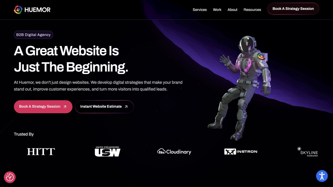
HUEMOR pairs a dark purple space scene and astronaut imagery with an explicit B2B agency introduction. The header separates services, work, company information, and resources, with a strategy-conversation action highlighted at the side. Its characterful visual theme is therefore anchored by a recognizable audience instead of left as an unexplained creative effect. The homepage makes a service proposition, not independently verified evidence of client growth, website performance, or the quality of the strategy offered.
What you can learn
Name the audience and then make the relevance visible through selected cases and practical service descriptions. Use the space motif consistently without letting it obscure page labels or project detail. Explain the purpose of a strategy conversation and the information needed beforehand rather than making a themed button stand in for the engagement process.
Pros
The audience label gives the expressive visual theme a practical context.
Work and resources offer exploratory paths beside the conversation action.
Cons & considerations
Dark atmospheric artwork can make small supporting text harder to distinguish.
The broad proposition still needs specific case responsibilities and supporting evidence.
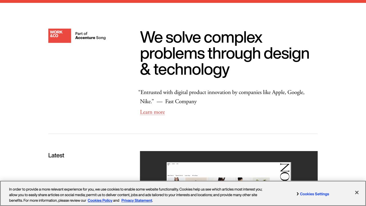
Work & Co uses a restrained white opening with a small red mark and a direct product-design-and-technology proposition. An attributed publication quotation supports the introduction, and the next editorial area begins below. The association with Accenture Song appears separately from the main statement. Unlike a full-screen reel, this layout gives readers a clear written starting point before they browse work. The quotation and corporate association are presented claims and context, not an independent assessment of current delivery quality or client results.
What you can learn
Make a product agency’s scope understandable in ordinary language, then give the work enough detail to support it. Keep corporate relationships, press quotations, and the agency’s own claims visually distinguishable. Explain product responsibilities across design, engineering, release, and ongoing work only where a case actually documents those roles.
Pros
The concise written proposition is not dependent on moving media.
The restrained identity keeps supporting editorial material easy to distinguish.
Cons & considerations
A press quotation cannot replace an explanatory case study.
Sparse navigation may require an additional step to locate a particular service or office.
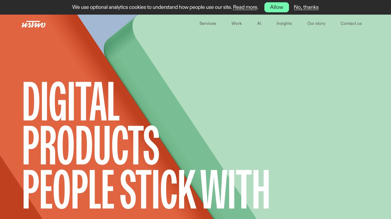
ustwo combines large condensed white typography with bright orange shapes and a mint-colored field. The message introduces digital products, while a simple top navigation leaves the visual statement room to breathe. The opening is energetic without depending on a collage of tiny application screens. It is a useful reference for expressing a product practice through typography and color, provided the later work makes the responsibilities concrete. The statement about products and their users remains the studio’s proposition rather than a finding from this review.
What you can learn
Pair an expressive introduction with specific explanations of product decisions and delivered work. Show the problem, the team’s contribution, and the limits of the engagement in maintained case records. Test the large type with alternative wording and small screens so the visual concept does not depend on one short headline.
Pros
The bold color and type create a recognizable studio identity.
The product discipline remains readable within the expressive composition.
Cons & considerations
Large display lettering delays room for detailed project evidence.
The thin privacy strip and header add extra layers around an already active visual field.
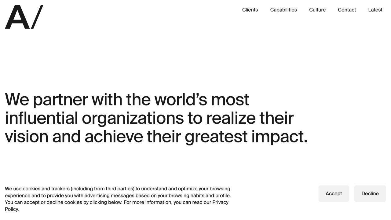
AREA 17 uses a large black agency mark and substantial white space before its written introduction. The navigation names clients, capabilities, culture, contact, and current editorial material. There is no large case-study photograph competing with the opening sentence in the captured view. The structure asks readers to understand the practice before immersing themselves in work, making it a useful counterpoint to reel-led portfolios. Its spaciousness is a composition choice, not evidence that a visitor will understand the offer or complete an enquiry more readily.
What you can learn
Use the introductory space to make a precise statement rather than a generic slogan. Give capabilities and clients distinct, informative destinations, and connect them through project records with clear roles. Test how much useful information remains visible when the opening is read on a short laptop or a narrow phone.
Pros
The restrained layout keeps the written introduction visually prominent.
Capabilities and contact are explicit labels rather than hidden inside a reel.
Cons & considerations
Generous empty space postpones examples for visitors evaluating visual work first.
A concise introduction still needs concrete project and engagement details nearby.
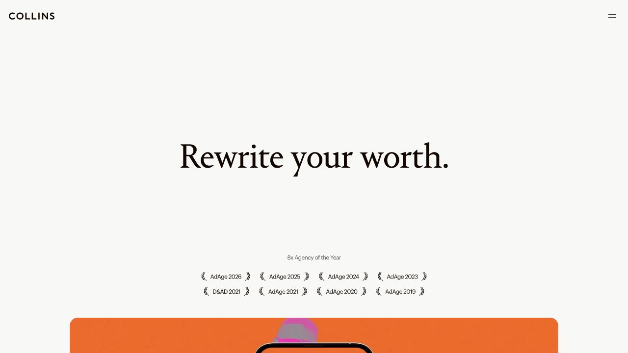
COLLINS centers a short serif proposition on an off-white page, with a compact wordmark and minimal menu treatment above it. Rows of award-related marks and years appear beneath, before larger media begins. The composition treats the studio’s point of view as an editorial statement rather than a directory of services. This is a brand-led practice with digital work, so it is a related reference rather than a model for every website-only agency. The displayed awards are the studio’s cited credentials, not rankings independently assessed by this guide.
What you can learn
State the practice’s point of view clearly, then connect it to named work and an accurate description of the engagement. Explain how brand strategy and digital delivery relate instead of letting a credentials row imply every capability. Keep any award or recognition references dated and linked to an appropriate supporting source.
Pros
The short serif introduction receives a calm, deliberate visual frame.
The transition to media gives the editorial statement a next chapter.
Cons & considerations
The first screen does not give a detailed account of web-specific deliverables.
Credentials can overshadow practical case evidence if they are not contextualized.
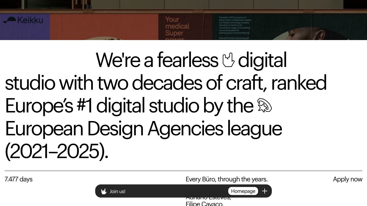
Bürocratik follows its expressive reel with a large black-on-white studio introduction. This saved section gives its experience and cited awards substantial typographic space, while a compact navigation capsule remains near the bottom. A team-history section begins beneath a fine dividing line. Public work descriptions identify branding and website projects, supporting its inclusion as a digital-studio reference. The stated awards and experience remain studio claims; the screenshot does not independently verify a ranking or a project outcome. This is the written introduction below the reel, not its first media frame.
What you can learn
Keep a stable route through expressive media and connect each visual example to a proper case page. Explain the website contribution separately from the wider brand system. Provide a readable studio introduction and a non-reel work index so visitors can evaluate the practice without waiting for a particular sequence to reappear.
Pros
The floating capsule preserves a consistent agency-navigation frame.
The written introduction provides an alternative to interpreting the preceding reel.
Cons & considerations
Large experience and award statements leave limited room for detailed services in this section.
A bottom-positioned control needs deliberate checks across scrolling, device heights, and media changes.
Build a useful agency evidence library before the homepage reel
Create one properly documented project first
Choose a project for which the studio can explain its actual role and has permission to publish the material. Prepare a short overview, a deeper account, credits, approved imagery, and any substantiated results. Test the structure with a less photogenic project as well; the case template should not rely on a famous brand or an extraordinary opening image.
Map services to evidence and practical engagement information
List the questions prospective clients actually ask: what the team handles, what it does not, who is involved, what must be supplied, and how work continues after launch. Link each service to relevant cases and a maintained explanation. Avoid creating many thin industry pages that merely replace an audience name in the same promise.
Design the media and ordinary navigation together
Define project titles, captions, poster images, credits, and normal destinations before building the reel. Preview quiet images, long client names, portrait crops, and unavailable video. Test keyboard navigation, reduced-motion presentation, and small screens directly. A striking introduction should still lead to a readable work index, services, and contact information.
The editing job behind the design
Choose an editorial system around project evidence, not visual spectacle
The important content structures are usually projects, services, people, credits, related articles, and supporting claims. Give editors controlled ways to connect them and preview changes. A small studio may benefit from a maintained publishing platform; a more custom presentation needs clear ownership of motion, media delivery, deployment, and corrections. The reference agency’s stack is not a recommendation for a different team.
Separate the public marketing implementation from the technology shown inside client work. A mobile interface in a reel is not evidence that the agency’s website runs on that interface’s framework. Likewise, a partner badge, client logo, or vendor relationship does not prove the agency’s own CMS. The visible technology lists use source-specific evidence and retain those boundaries.
Our WordPress website examples offer a separate look at publishing approaches. A visible platform label is evidence for that named page, not a guarantee that the same system will suit your requirements.
Before the public launch
Web design agency website launch checklist
Ask an unfamiliar reader to identify the discipline, intended client, and next step.
Check every case for accurate scope, credits, dates, permissions, and collaborator roles.
Substantiate result statements and keep their period, source, and limitations visible.
Provide readable project summaries and normal destinations outside the showreel.
Test media fallback, reduced motion, keyboard focus, small-screen crops, and long titles.
Connect services and audience pages to genuinely relevant project evidence.
Exercise enquiry validation, confirmation, staff notification, and an alternative contact route.
Assign owners for project updates, team changes, expired announcements, and broken links.
These checks are a project checklist, not a performance, legal, security, or accessibility certification. Test real journeys with the people responsible for the website before making claims about the result.
Sources & editorial method
How this collection was selected and reviewed
We reviewed official studio properties, combining dated library captures with direct new browser screenshots. A creative-community candidate was excluded because it was not an agency. The selection includes website, digital-product, and brand-led practices with relevant digital work; their differing scopes are called out rather than treated as identical offers. We did not submit enquiries, test hiring outcomes, or independently validate agency awards and business-result claims.
Each example links to its actual source page. Screenshots are direct browser captures with their own capture dates; moving imagery, announcements and live designs can change. The notes describe observable design choices and conditional tradeoffs, not measured traffic, conversion results, service quality, or accessibility conformance.
Technology labels use public page metadata, asset evidence, or explicitly cited platform documentation. Platform documentation is not a complete current deployment audit. A component reference may be legacy or unused; it is not a complete backend inventory. Unknown stacks are omitted. These sites are editorial examples, not our client portfolio.
Written, Edited and Curated are separate editorial records, not timestamps advanced by a rebuild. Website designs and imagery belong to their owners. See our editorial standards or suggest a correction.
Questions worth asking
Web Design Agency website design questions
Does every agency need an elaborate animated homepage?
No. Motion can demonstrate a relevant creative discipline, but it adds media, fallback, and maintenance responsibilities. A clear written introduction and well-documented work can be a better fit for a practice whose clients need to understand complex services quickly. Judge the choice against the audience and actual content, not a gallery trend.
What should an agency case study contain?
A useful starting point is the client context, problem, scope, studio role, collaborators, constraints, deliverables, dates, and selected evidence. Include outcomes only when they can be substantiated and properly qualified. Make the account understandable without requiring the reader to watch a long film or infer the contribution from a logo.
Should a small studio publish pricing?
It can explain engagement types, minimum project fit, or representative ranges if those details accurately reflect the business. Do not invent a package solely to make the page feel complete. Whether prices are published or discussed later, explain what a first conversation is for and what information helps determine a suitable scope.
Can we show work completed with another agency?
Only with appropriate permission and an accurate account of the role. Credit collaborators, distinguish individual contributions from the wider team’s work, and avoid implying sole responsibility. Check contractual and publication requirements with the relevant parties before including confidential material or client results.
Borrow a clearer way to frame the practice. Then make the case evidence, service explanation, and first conversation as carefully considered as the visual introduction.