Storyblok website design starts with the relationship between the editor and the finished page. Build a small, dependable set of content components before filling a homepage with visual variations.
These twenty public examples range from international consumer brands to careers portals, professional learning sites and specialist publications. Each is connected to an official Storyblok case study that names the reviewed property. A customer relationship does not establish that every application, checkout or related domain uses the same CMS.
The useful comparison is how the websites organize content and decisions: a campaign beside shopping routes, a job search after an employer introduction, or a news publication within a streaming brand. The screenshots were captured on November 3, 2026. They record public rendered pages, while the case studies provide separate documentary evidence of the CMS association.
Before the examples
What makes good Storyblok website development in 2026?
Name components around editorial jobs
A campaign hero, course introduction and article spotlight have different content needs. Give editors meaningful fields and a few intentional layout choices. Avoid a collection of anonymous spacing controls that transfers design decisions into every routine update. Storyblok’s documentation separates content modeling, blocks, fields and references as concepts worth planning together.
Visual flexibility should serve a clear next step: reading, comparing a product, finding a vacancy or understanding a service. Large campaign images can create recognition, but they should not erase the route to practical information. Review every component with both an ideal campaign and a less polished everyday update.
Describe the CMS boundary accurately
A content system can supply public page copy and media while other services handle products, applications, payments or learning accounts. Record that boundary in the project brief. It prevents a design showcase from becoming an unsupported promise about functionality, data ownership or integration effort.
The collection · 20 examples
20 Storyblok website examples worth studying
Study the editorial choices in each capture and use the linked customer evidence for the named property. The first five demonstrate recognizable brands across consumer goods, education, fashion and anime publishing.
We start with five recognizable brands or organizations: Oatly, Education First, Paul Smith, Marc O'Polo, Crunchyroll News. Each attribution applies to the named website property, not every product or website belonging to its organization. This is a curated reading sequence, not a measured ranking.
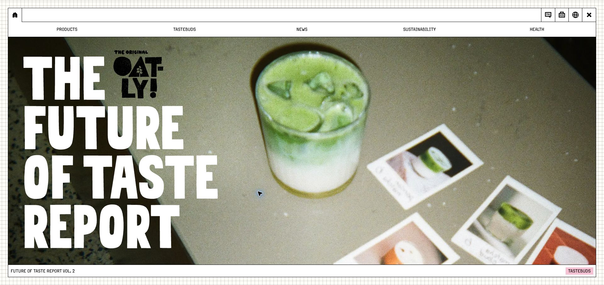
Oatly makes a campaign feel like the front cover of an independent magazine. A bordered canvas, graph-paper background and oversized condensed lettering give the opening a deliberate printed quality. The current taste report sits beside a drink photograph, while the navigation offers products, recipes, news, sustainability and health as distinct reading routes. This arrangement gives a familiar packaged product a much larger editorial universe. Storyblok’s Oatly case describes the content system behind its international websites; it does not establish which tool processes every local purchase. The capture shows the global entry point.
What you can learn
Give campaign records enough structure to carry an image, readable title, category and destination together. A distinctive art direction can then survive new launches without forcing editors to construct each page from scratch. Keep practical product information reachable beside the more experimental storytelling.
Pros
The bordered composition connects navigation and campaign art into one memorable visual system.
Clear topical navigation supports visitors arriving with different questions about the same product.
Cons & considerations
The dominant report artwork postpones direct product comparison until another page or scroll.
Icon-only utilities need clear accessible names because their drawings alone are less explanatory.
ReactAssociated with Next.js; not independently observed
Public source checked November 3, 2026. References may be embedded or legacy—not a complete backend inventory.
Platform source: Official Storyblok customer case. Official Storyblok customer case identifies this public property and links to it. The evidence concerns its documented content-management implementation; it does not identify every current commerce, account, learning, recruitment or streaming system. Current visual design was reviewed separately. Platform evidence is separate from the direct website screenshot and is not a complete current infrastructure audit.
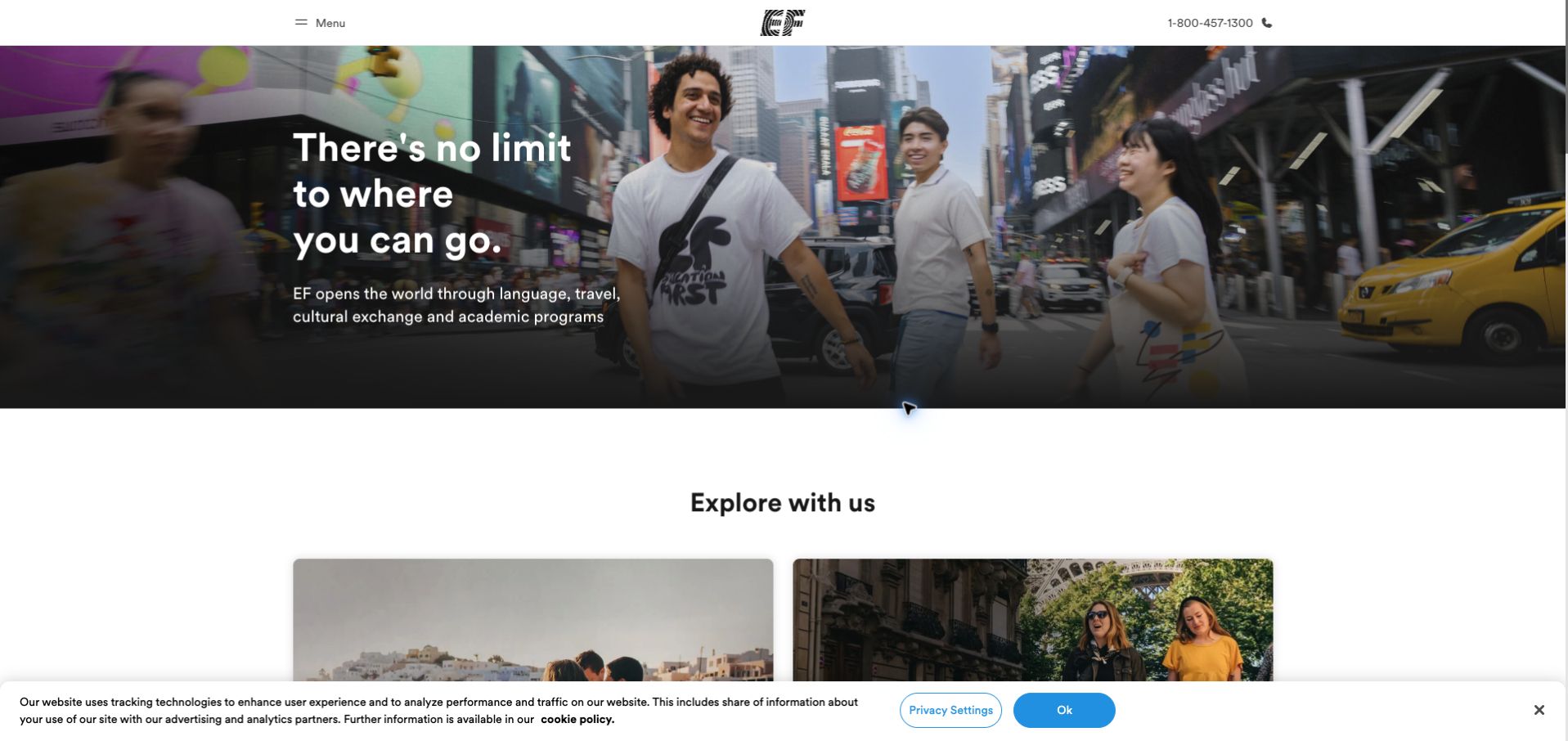
Education First opens with students in a recognizable city setting and a short promise about possibility. The image fills a wide band rather than the entire page, leaving the beginning of an exploration section visible below it. A compact header supplies the brand, menu and telephone contact. That restraint makes the first impression welcoming, although visitors must continue to find the precise course suited to them. The official Storyblok case concerns EF’s multilingual web publishing operation. The linked global address redirected to the United States site during this review, so the capture represents that regional experience.
What you can learn
Separate the universal brand story from the fields that vary by market: available programs, contact details, language and destinations. Preview the regional page as a complete journey, including its next section, rather than approving only an attractive translated headline.
Pros
Human photography gives an abstract education offering an immediate social and geographic context.
The visible exploration section encourages continuation beyond the aspirational opening message.
Cons & considerations
The broad promise does not identify program eligibility or duration within the opening view.
A bottom privacy notice competes with the first row of exploration cards in this capture.
ReactAssociated with Gatsby; not independently observed
Public source checked November 3, 2026. References may be embedded or legacy—not a complete backend inventory.
Platform source: Official Storyblok customer case. Official Storyblok customer case identifies this public property and links to it. The evidence concerns its documented content-management implementation; it does not identify every current commerce, account, learning, recruitment or streaming system. Current visual design was reviewed separately. Platform evidence is separate from the direct website screenshot and is not a complete current infrastructure audit.
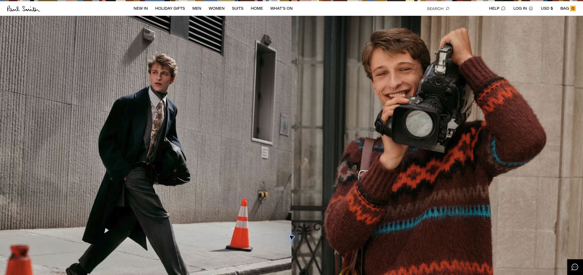
Paul Smith gives the campaign photography almost all of the first screen. Two adjacent images establish texture, styling and personality while a narrow white navigation strip carries the shopping routes. The signature logo and colored trim are enough to identify the brand without covering the photographs with explanation. This suits visitors who already know the designer. Storyblok’s case explicitly discusses the rebuilt Paul Smith website and its wider commerce stack. Its inline company link leads here; an inconsistent generic live-project button in that case was not used as evidence for another property.
What you can learn
Treat a paired campaign image as an editorial component with controlled crops and useful link destinations. Keep category navigation persistent so a mood-led opening still supports customers who arrive ready to shop. Review the campaign at narrower widths before signing off on its framing.
Pros
The compact navigation preserves a large uninterrupted canvas for the collection photography.
Separate shopping categories remain available without inserting competing buttons over the campaign.
Cons & considerations
The opening contains little product explanation for visitors unfamiliar with the designer.
A nearly image-only hero needs strong alternative text and carefully maintained category destinations.
Vue.jsAssociated with Nuxt; not independently observed
Public source checked November 3, 2026. References may be embedded or legacy—not a complete backend inventory.
Platform source: Official Storyblok customer case. Official Storyblok Paul Smith case describes the rebuilt retail website and links to paulsmith.com in its introductory text. Its inconsistent generic View Live button points elsewhere and was not used. Platform evidence is separate from the direct website screenshot and is not a complete current infrastructure audit.
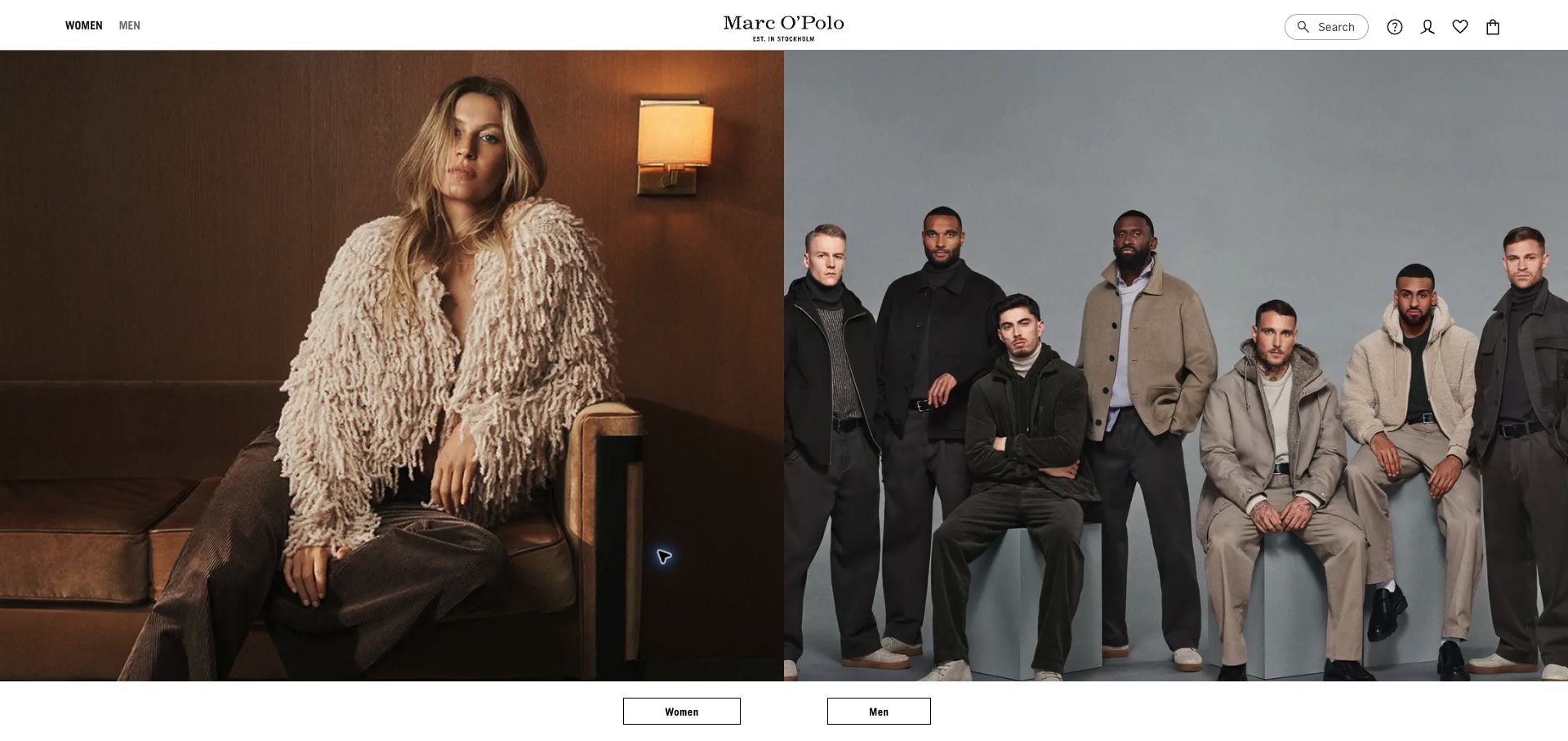
Marc O’Polo splits its opening evenly between a seated model and a group portrait. The photographs occupy matched panels, and two plainly labeled category buttons sit beneath them. A centered wordmark and restrained utility icons keep the visual emphasis on fabric, styling and people. The result is a simple choice between collections, repeated in the header. Storyblok documents the brand’s storefront content migration and international rollout. The reviewed URL is the United States market reached from its official live link, rather than a claim that every country has identical inventory or checkout behavior.
What you can learn
Build paired audience entrances as one coordinated component so images, labels and destinations stay synchronized. Regional editors should be able to replace campaign assets while preserving the decision structure. Keep regional routing explicit when content or product availability differs between markets.
Pros
Equal image panels make the two main collection routes easy to understand together.
Minimal header chrome gives the clothing photography enough scale to communicate material and mood.
Cons & considerations
The large campaign band leaves detailed merchandise information below the opening viewport.
Small utility icons rely on familiar conventions and accessible labels to remain understandable.
Vue.jsAssociated with Nuxt; not independently observed
Public source checked November 3, 2026. References may be embedded or legacy—not a complete backend inventory.
Platform source: Official Storyblok customer case. Official Storyblok customer case identifies this public property and links to it. The evidence concerns its documented content-management implementation; it does not identify every current commerce, account, learning, recruitment or streaming system. Current visual design was reviewed separately. Platform evidence is separate from the direct website screenshot and is not a complete current infrastructure audit.
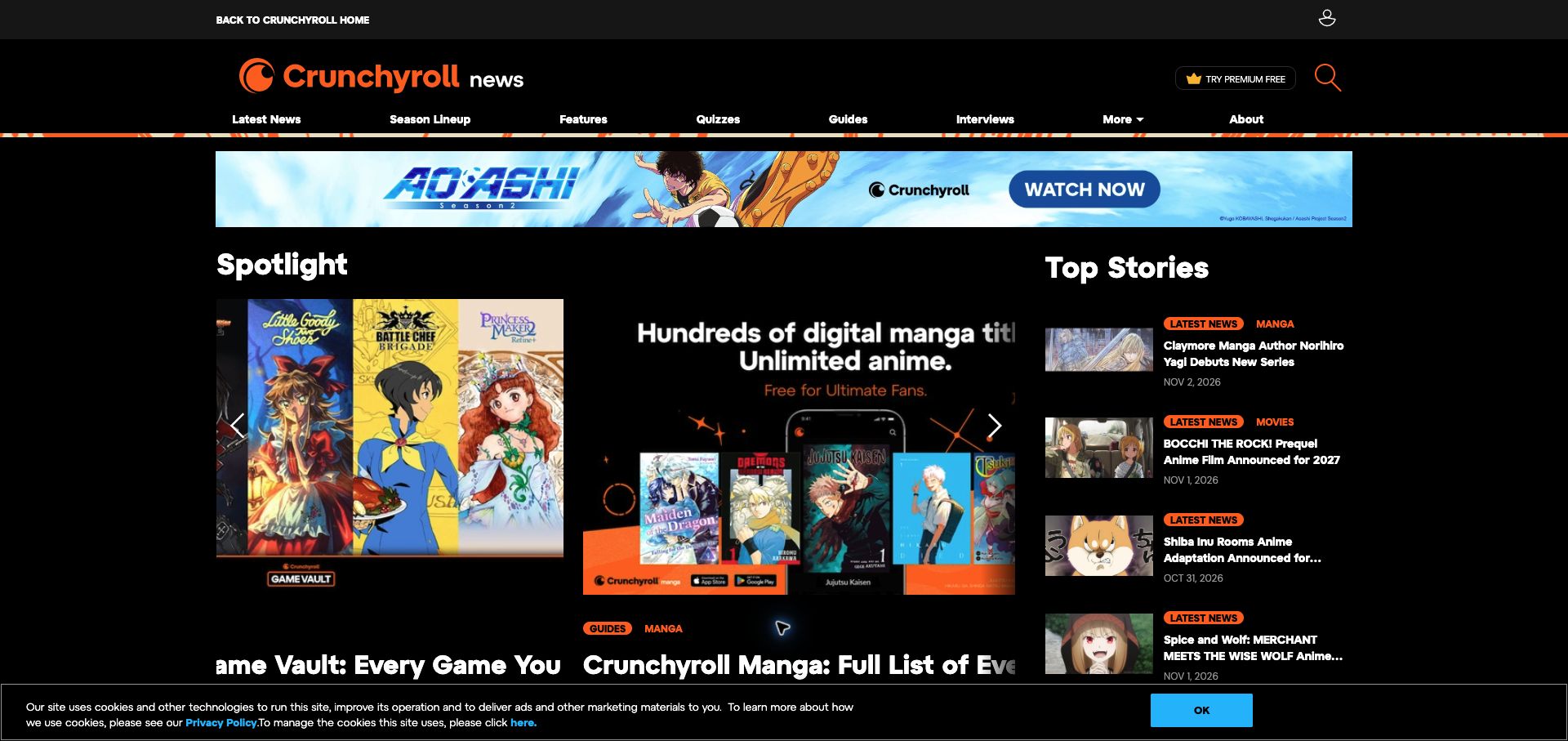
Crunchyroll News has its own editorial identity inside the larger streaming brand. Orange accents, a black canvas and a prominent news masthead connect it visually to the parent service, while the navigation switches to formats such as features, guides, quizzes and interviews. A large spotlight area sits alongside a tighter top-stories list, creating different reading speeds on the same screen. Promotions sit above the stories. The official Storyblok case identifies the News migration specifically. This example therefore concerns the news property at /news, not the video player, account system or the complete streaming application.
What you can learn
Model editorial formats and content series separately from the commercial product catalogue. A shared header can maintain brand recognition while dedicated navigation helps readers understand the publication. Give promotional placements their own bounded region so campaigns do not obscure article hierarchy.
Pros
The news masthead and format navigation clearly establish the purpose of this sub-property.
A compact top-stories column offers a useful alternative to the much larger spotlight treatment.
Cons & considerations
The campaign banner and rotating spotlight compete for attention before the latest article list.
Some long headlines truncate in compact cards, making the full destination necessary for context.
Visible tech stack
Earlier / documented evidence
Storyblok
Earlier cited evidence retained; no current scan result. References may be embedded or legacy—not a complete backend inventory.
Platform source: Official Storyblok customer case. Official Storyblok case explicitly identifies the Crunchyroll News migration and links to /news. This evidence applies to the news publication, not the streaming platform. Platform evidence is separate from the direct website screenshot and is not a complete current infrastructure audit.
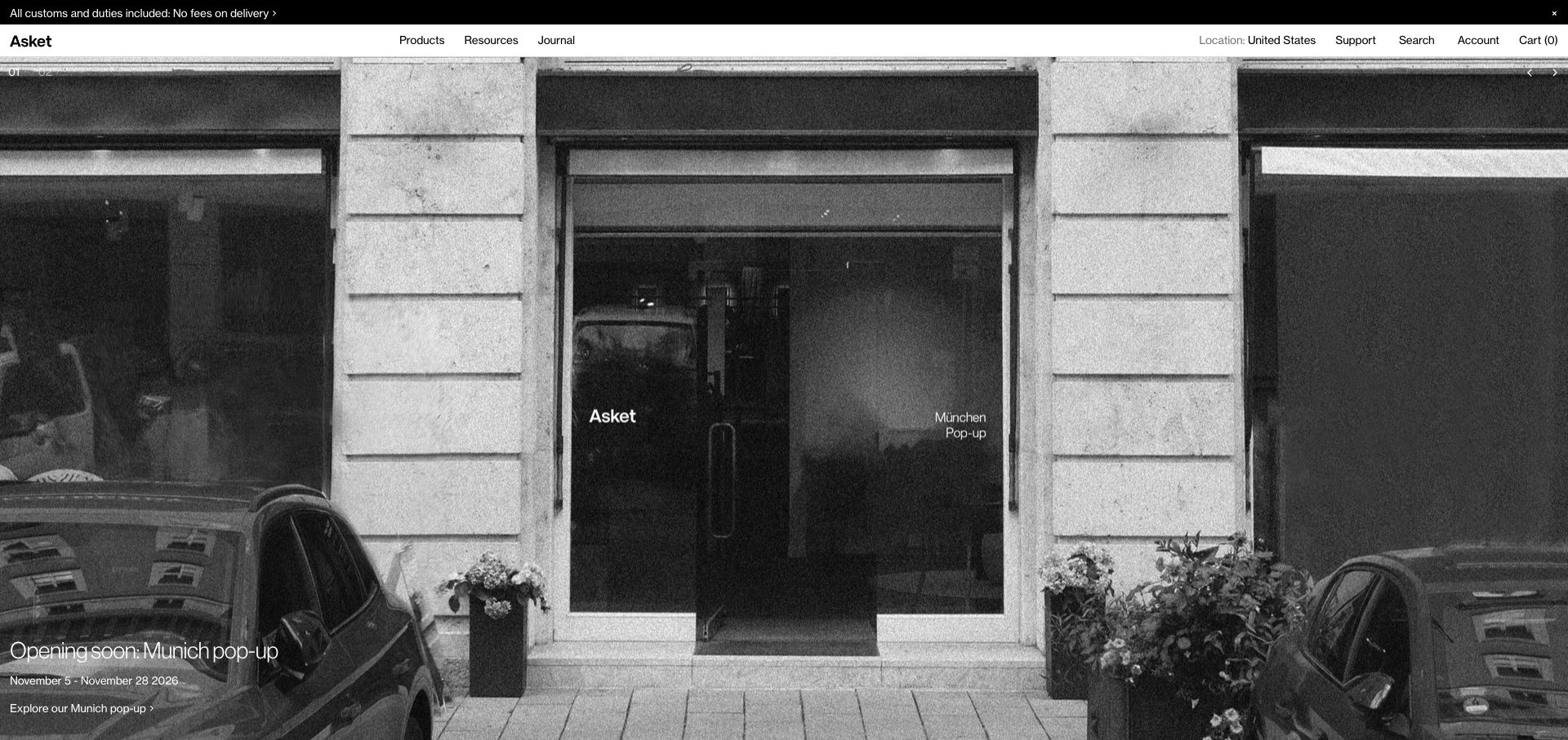
Asket uses a monochrome storefront photograph to announce a physical pop-up. The sparse type, understated wordmark and low-contrast photographic texture produce a calm opening with very little sales pressure. The date and exploration link sit at the lower left, while products, resources and journal retain equal presence in the white header. A customs notice addresses delivery concerns. Storyblok’s customer entry links directly to the Asket site, supporting its published association with the CMS. That listing is documentary evidence, rather than a technical audit of the current shopping and fulfillment infrastructure.
What you can learn
Let temporary campaigns coexist with permanent informational routes. Store event dates and destinations as editable content, and provide an expiry review so a beautiful announcement does not outlive its usefulness. Quiet visual design still needs a clear next action and enough contrast over photography.
Pros
The restrained palette makes the physical-store campaign feel consistent with a considered clothing brand.
Resources and journal links give product research a visible place alongside transactional browsing.
Cons & considerations
The single campaign occupies almost the whole opening screen before any garment is visible.
Small white copy over the photograph deserves careful contrast testing across every campaign crop.
Public source checked November 3, 2026. References may be embedded or legacy—not a complete backend inventory.
Platform source: Official Storyblok customer case. Official Storyblok customer case identifies this public property and links to it. The evidence concerns its documented content-management implementation; it does not identify every current commerce, account, learning, recruitment or streaming system. Current visual design was reviewed separately. Platform evidence is separate from the direct website screenshot and is not a complete current infrastructure audit.
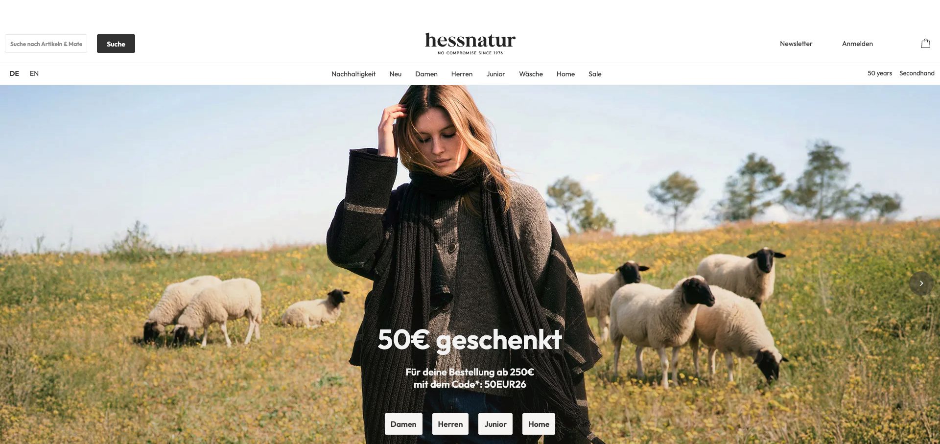
Hessnatur places a fashion model among sheep in a broad landscape image, visually connecting the clothing to a material story. A promotional message and four category buttons sit near the bottom of the hero. Above it, a spacious masthead includes search, account access and a second navigation row that places sustainability alongside the main shopping categories. The combination connects shopping and brand values. Storyblok’s case describes content and product storytelling integrated into an existing shop. It supports the editorial association without suggesting that Storyblok itself supplies payment processing, stock management or the promotional pricing rules.
What you can learn
Keep the campaign offer, qualification text and destination buttons together in the content model so edits do not create contradictory messages. Pair a strong lifestyle image with stable category routes, and make the supporting sustainability information easy to reach beyond the photograph.
Pros
The setting gives the material-oriented brand story a concrete visual expression.
Category buttons provide direct routes even when the hero emphasizes a broad seasonal promotion.
Cons & considerations
Promotional copy competes with detailed image texture and needs careful placement at smaller widths.
The tall masthead and large hero delay the start of product-level comparison.
ReactAssociated with Next.js; not independently observed
Public source checked November 3, 2026. References may be embedded or legacy—not a complete backend inventory.
Platform source: Official Storyblok customer case. Official Storyblok customer case identifies this public property and links to it. The evidence concerns its documented content-management implementation; it does not identify every current commerce, account, learning, recruitment or streaming system. Current visual design was reviewed separately. Platform evidence is separate from the direct website screenshot and is not a complete current infrastructure audit.
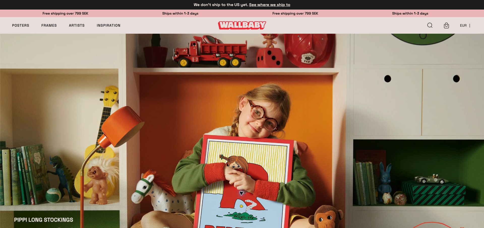
Wallbaby introduces a poster through a colorful domestic scene rather than a plain product grid. The child holding the artwork communicates scale, while the red logo complements the photograph. The navigation separates posters, frames, artists and inspiration, giving shoppers both practical and editorial routes. Storyblok’s case describes the poster-store project and directly links its Swedish property. The captured browser rendered some Swedish content in English; the review concerns the visible layout and does not treat that translation as a native language implementation.
What you can learn
Use room imagery to explain the role of a visual product, then offer clear routes to dimensions, framing and the individual artist. Make campaign text independent of the photograph where possible so it can translate cleanly and remain readable when the image crop changes.
Pros
The room scene communicates product scale and a specific use context without a long explanation.
Artist and inspiration routes give shoppers more discovery options than a product catalogue alone.
Cons & considerations
Several shipping strips consume space before the artwork and may distract from the main category choice.
The opening delays price and size information that practical buyers will need before selecting a print.
Public source checked November 3, 2026. References may be embedded or legacy—not a complete backend inventory.
Platform source: Official Storyblok customer case. Official Storyblok customer case identifies this public property and links to it. The evidence concerns its documented content-management implementation; it does not identify every current commerce, account, learning, recruitment or streaming system. Current visual design was reviewed separately. Platform evidence is separate from the direct website screenshot and is not a complete current infrastructure audit.
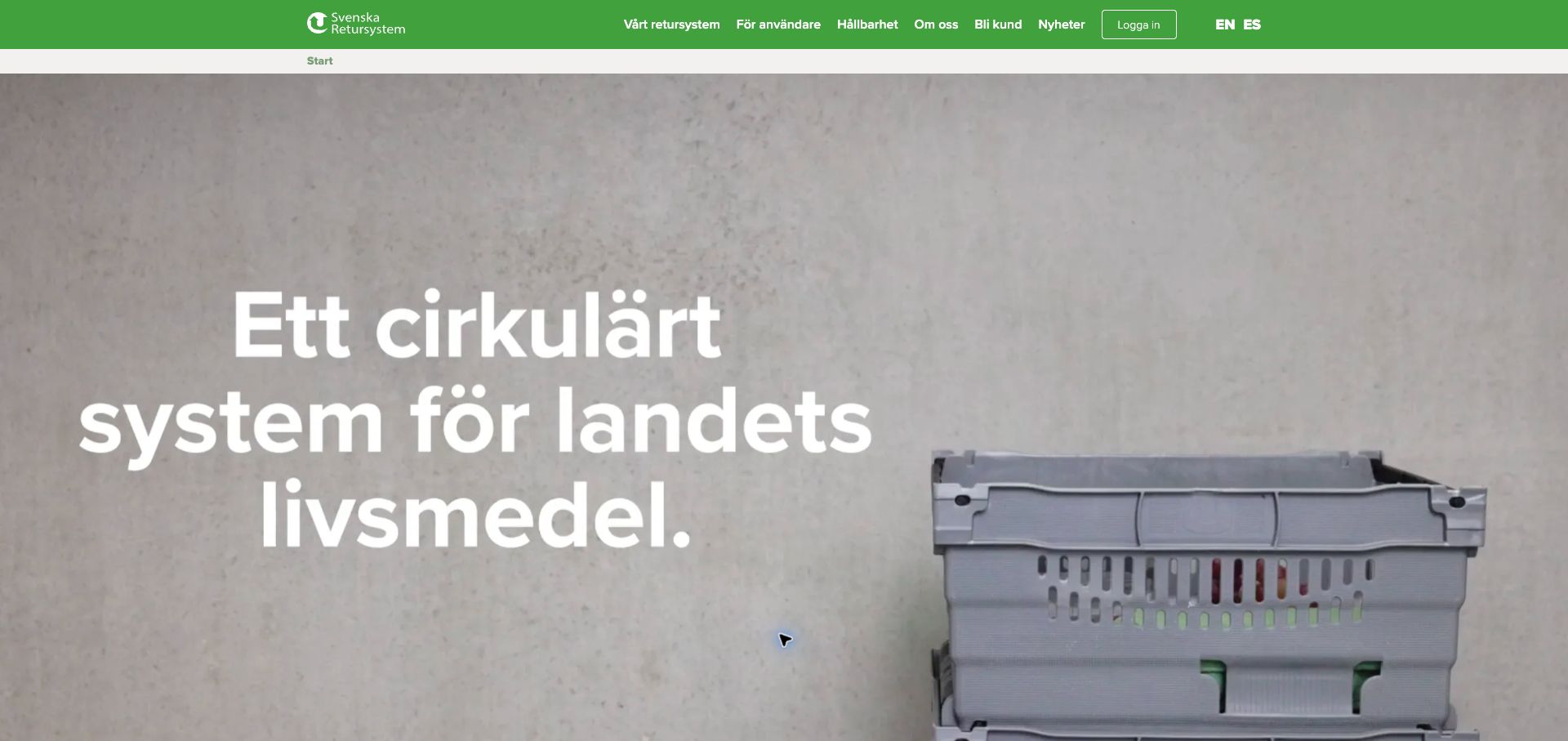
Svenska Retursystem gives its circular logistics service a concrete face: a reusable crate occupies a substantial part of the hero. The oversized statement introduces the system’s purpose while the green header makes the company identity unmistakable. Navigation separates the return system, existing users, sustainability and becoming a customer, allowing different audiences to locate the right starting point. The Storyblok case describes this website’s regional content trees and tailored information for multiple customer segments. That is a useful editorial context for the screenshot, but it does not prove the backend of any authenticated logistics or ordering application reached later.
What you can learn
Anchor an unfamiliar business service in an object the audience recognizes. Then model customer segments and regional information deliberately, instead of relying on a general homepage to answer every operational question. The public explanation and the logged-in workflow can remain distinct parts of the journey.
Pros
The crate photograph immediately makes the return-system proposition more concrete.
Existing-user and new-customer routes are separately visible in the primary navigation.
Cons & considerations
The very large statement offers little operational detail within the first screen.
White type over a pale moving or photographic background requires careful contrast checks.
Public source checked November 3, 2026. References may be embedded or legacy—not a complete backend inventory.
Platform source: Official Storyblok customer case. Official Storyblok customer case identifies this public property and links to it. The evidence concerns its documented content-management implementation; it does not identify every current commerce, account, learning, recruitment or streaming system. Current visual design was reviewed separately. Platform evidence is separate from the direct website screenshot and is not a complete current infrastructure audit.
La Rosée fills the opening with two close views of a cosmetic being used. The split composition moves between the bottle and the application moment, giving the product a sensory context. A translucent header keeps the photography dominant while offering products, a diagnostic route and partner pharmacies. A short product promise is placed low in the hero, with the next explanatory section beginning below it. Storyblok’s case explicitly scopes the CMS to content for the brand’s Shopify Hydrogen store. This supports an editorial role, without verifying transactions or product claims.
What you can learn
Structure product education so imagery, explanatory copy and relevant next steps remain linked. A diagnostic navigation item can help discovery, but its content and outcomes need separate review. Keep commercial content management and the systems that handle orders clearly distinguished in planning.
Pros
The paired images explain how the featured product is used without a separate demonstration page.
The start of a text section below the hero gives the visual campaign an explanatory continuation.
Cons & considerations
Transparent navigation can become harder to read when campaign photography changes beneath it.
Product claims in prominent banners need ongoing editorial ownership and supporting documentation.
Public source checked November 3, 2026. References may be embedded or legacy—not a complete backend inventory.
Platform source: Official Storyblok customer case. Official Storyblok customer case identifies this public property and links to it. The evidence concerns its documented content-management implementation; it does not identify every current commerce, account, learning, recruitment or streaming system. Current visual design was reviewed separately. Platform evidence is separate from the direct website screenshot and is not a complete current infrastructure audit.
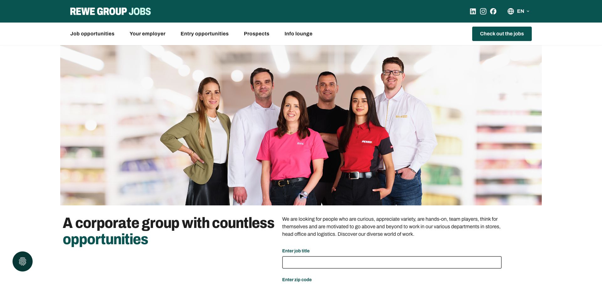
REWE Group Jobs combines a group portrait with a search task. The people in different branded uniforms make the scale of the employer visible before the text explains its opportunities. Beneath the image, the introduction is paired with job-title and location fields, creating a direct path from interest to a vacancy search. Separate masthead and navigation rows organize the routes. The official Storyblok case concerns rewe-group.jobs and connected recruitment content. This is evidence for the public careers portal, not a claim that Storyblok operates every applicant record or hiring decision system behind it.
What you can learn
Give employer storytelling and vacancy discovery adjacent space. Model the public content so different divisions can contribute within one recognizable structure, while keeping job data and application processing governed by their own systems. Test the empty search state as carefully as the campaign hero.
Pros
The group portrait visibly connects several operating brands within a single employer story.
Search fields appear immediately after the introduction, making the intended next action practical.
Cons & considerations
The large portrait pushes part of the search form below this desktop viewport.
Two navigation rows require disciplined labels to avoid overlapping routes for new candidates.
Vue.jsAssociated with Nuxt; not independently observed
Public source checked November 3, 2026. References may be embedded or legacy—not a complete backend inventory.
Platform source: Official Storyblok customer case. Official Storyblok REWE HR Platform case explicitly names rewe-group.jobs and its content-management implementation. This does not establish the applicant-tracking backend. Platform evidence is separate from the direct website screenshot and is not a complete current infrastructure audit.
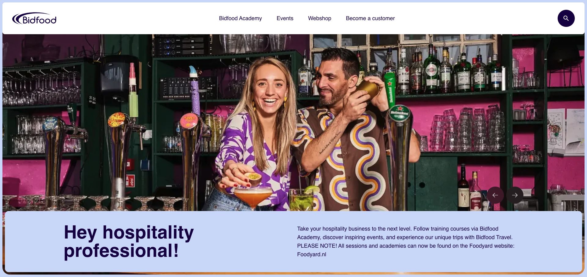
Bidfood’s support property feels like a hospitality publication. A colorful bar photograph sits beneath a rounded navigation bar, while a lavender introduction panel calls out the intended professional audience. The navigation links training, events, the webshop and becoming a customer, so education has a visible relationship to the commercial offering. The current introduction also explains that sessions and academies have moved to Foodyard. Storyblok’s official case names this support subdomain specifically. The screenshot is therefore a review of its public information and routing role, rather than evidence about the separate webshop or the destination’s learning-management technology.
What you can learn
Maintain transition notices when content moves between services, and give the new destination an explicit link with a clear purpose. A useful supplier website can combine inspiration with operational routes, provided editors keep those routes current and avoid leaving competing versions of the same information.
Pros
Hospitality photography makes the audience and practical context immediately apparent.
The introduction openly explains the change in location for training content.
Cons & considerations
The migration notice adds another destination for visitors to understand before beginning a course.
The large photograph takes substantial space before the supporting information becomes visible.
Vue.jsAssociated with Nuxt; not independently observed
Public source checked November 3, 2026. References may be embedded or legacy—not a complete backend inventory.
Platform source: Official Storyblok customer case. Official Storyblok case explicitly identifies support.bidfood.nl as the content property. The separate webshop and Foodyard learning destination are outside this evidence. Platform evidence is separate from the direct website screenshot and is not a complete current infrastructure audit.
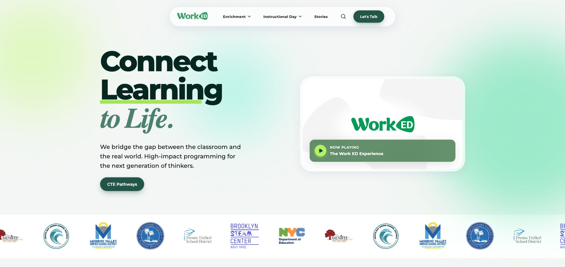
WorkED uses a pale green gradient and large mixed-style typography to introduce learning connected with everyday life. The main message, short explanation and pathway button form one column, while a contained video invitation balances the other. A rounded navigation bar lends a friendly appearance. Institutional logos begin beneath the hero, adding context for the intended organizational audience. Storyblok’s case documents an earlier marketing-site implementation for WorkED and links this property. Its project history is useful evidence, but does not establish the internal technology of every current program-delivery or enrollment tool.
What you can learn
Give a video a defined role within the introduction and keep an equivalent written explanation nearby. Model program categories and customer stories separately so the homepage can evolve without losing its structure. Review inherited case-study evidence when the public design changes substantially.
Pros
The written proposition remains understandable without pressing the video control.
A contained media card keeps the hero organized instead of covering the whole screen with motion.
Cons & considerations
Broad language about impact needs program detail and evidence further down the journey.
A moving or repeated logo strip can distract from the main call to explore pathways.
Public source checked November 3, 2026. References may be embedded or legacy—not a complete backend inventory.
Platform source: Official Storyblok customer case. Official Storyblok customer case identifies this public property and links to it. The evidence concerns its documented content-management implementation; it does not identify every current commerce, account, learning, recruitment or streaming system. Current visual design was reviewed separately. Platform evidence is separate from the direct website screenshot and is not a complete current infrastructure audit.
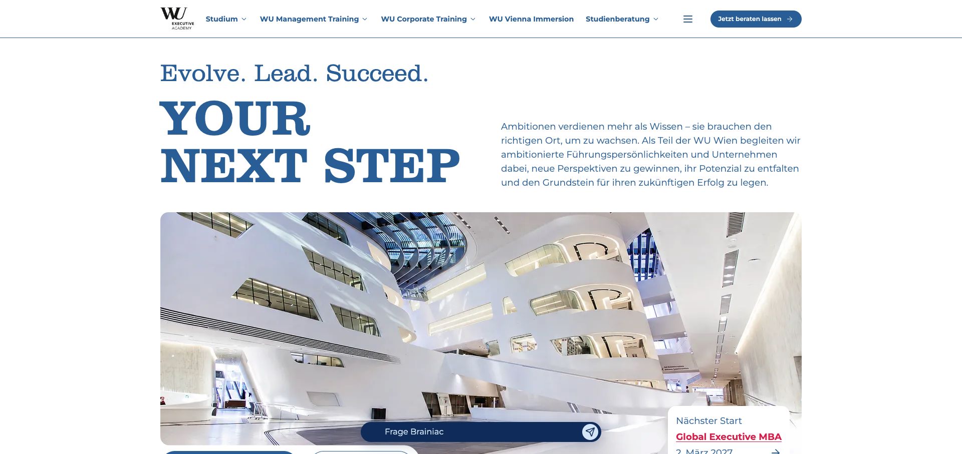
WU Executive Academy pairs a large serif statement with an explanatory text block, then introduces a broad photograph of its architectural setting. The restrained palette preserves the institutional identity. Program families occupy the navigation, with a consultation action separated at the right. A chat input and a program-start card enter near the bottom of the captured view. Storyblok’s case identifies the academy’s public website, content API and integrations with course data. The visual review is limited to the public introduction and does not evaluate the booking or advisory process itself.
What you can learn
Use content structure to connect a broad educational promise with individual programs, dates and advice routes. Time-sensitive course information should have an identified owner and update source. Floating assistance should support the main journey without concealing the program information the visitor came to inspect.
Pros
The institutional identity and architectural image give the offer a recognizable physical context.
Separate program families and consultation access support different stages of research.
Cons & considerations
The opening statement remains broad until visitors reach specific program details.
Floating chat and program cards can crowd the lower part of the first screen.
Vue.jsAssociated with Nuxt; not independently observed
Public source checked November 3, 2026. References may be embedded or legacy—not a complete backend inventory.
Platform source: Official Storyblok customer case. Official Storyblok customer case identifies this public property and links to it. The evidence concerns its documented content-management implementation; it does not identify every current commerce, account, learning, recruitment or streaming system. Current visual design was reviewed separately. Platform evidence is separate from the direct website screenshot and is not a complete current infrastructure audit.
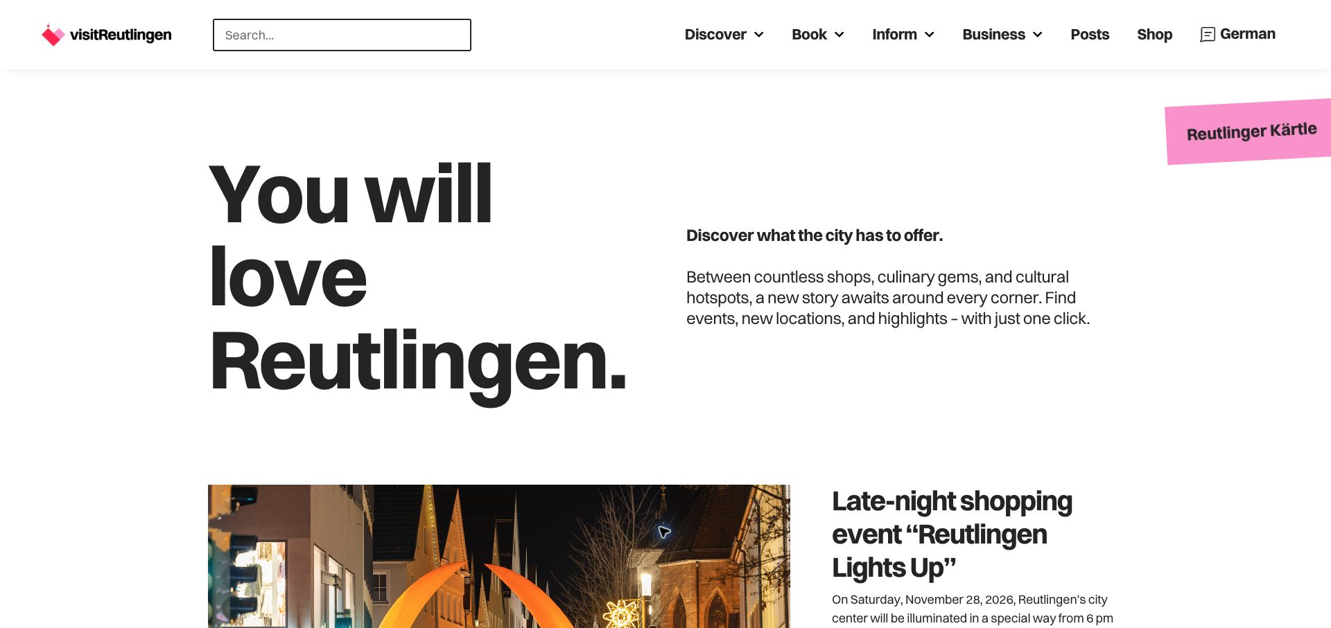
Visit Reutlingen opens with a large typographic invitation and a short explanation of the city’s shops, food and culture. Search and task-oriented navigation occupy the header, while the first event story begins directly below the introduction. A tilted pink promotion adds a distinct accent. Storyblok’s case links the city-marketing platform and describes its integrated editorial structure. The original live link redirected to the current root domain. Some captured text was browser-translated, so the assessment focuses on hierarchy and routes rather than claiming an English-localization implementation.
What you can learn
Organize a destination site around what visitors need to do: discover, book and find practical information. Keep dated events in structured records with explicit expiry handling. A fresh event near the introduction can demonstrate current activity more effectively than a generic scenic hero alone.
Pros
Search and practical navigation make the destination useful beyond its promotional opening.
The visible event story immediately connects the broad city promise with a specific activity.
Cons & considerations
Large introductory typography uses space that could otherwise show more current events.
A separate promotional sticker can compete with the primary navigation and first editorial feature.
Public source checked November 3, 2026. References may be embedded or legacy—not a complete backend inventory.
Platform source: Official Storyblok customer case. Official Storyblok customer case identifies this public property and links to it. The evidence concerns its documented content-management implementation; it does not identify every current commerce, account, learning, recruitment or streaming system. Current visual design was reviewed separately. Platform evidence is separate from the direct website screenshot and is not a complete current infrastructure audit.
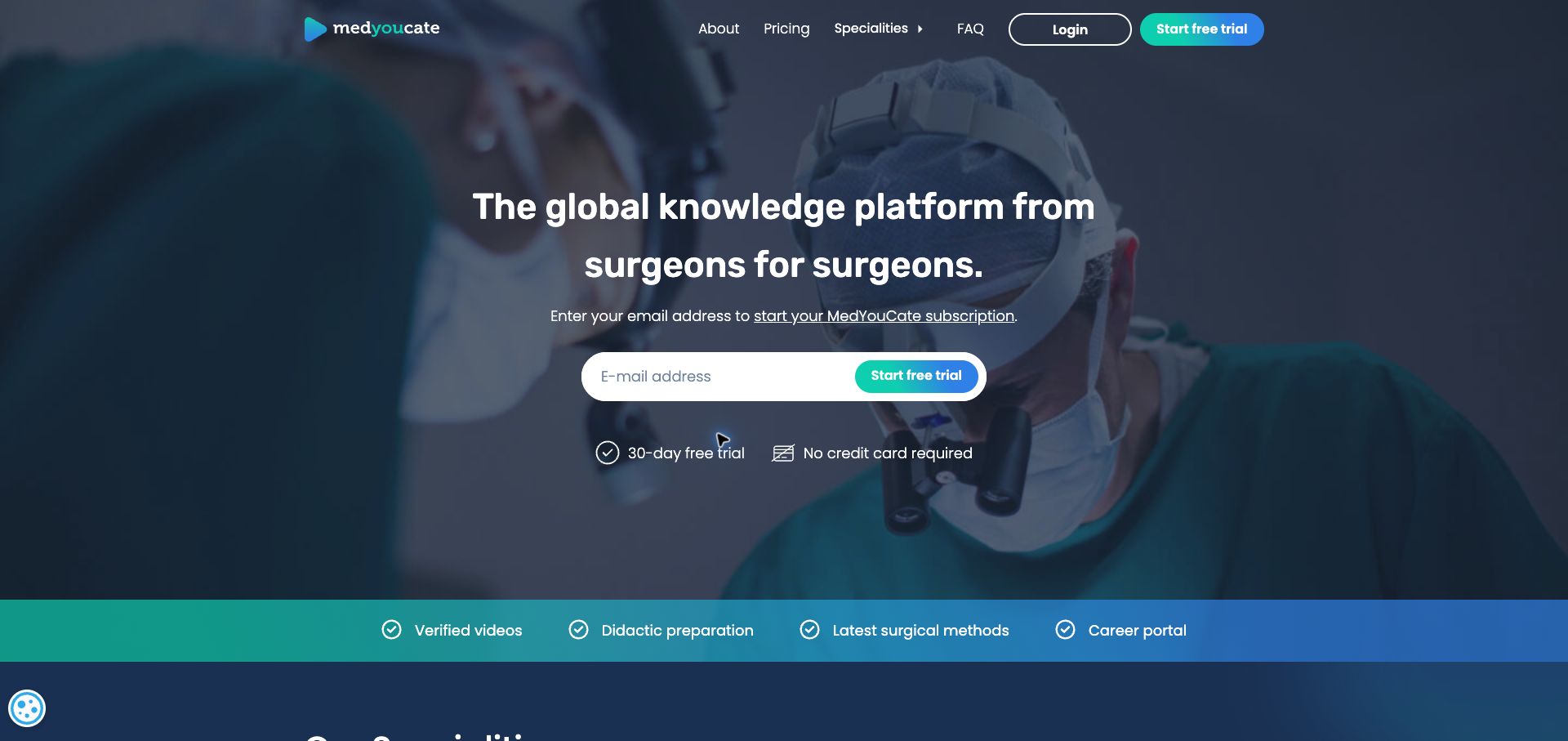
MedYouCate identifies its professional audience immediately through the surgical setting and a concise statement about knowledge shared between surgeons. A centered email field and trial button make the primary conversion visible, while login remains distinct in the header. A colored strip lists the principal benefits. Storyblok’s case links this public learning property and documents its content-management association. The screenshot reviews the marketing entrance only. It does not assess the clinical quality of the videos, the safety of medical techniques, or the technology used inside a subscribed learning account.
What you can learn
Keep professional credibility claims distinct from interface decoration and give them clear supporting material elsewhere in the journey. A focused audience statement can reduce explanation, but the trial pathway should also communicate what is included and how access works before asking for personal details.
Pros
The audience and subject are visible through both the headline and the background image.
Login and trial access are differentiated, helping returning and prospective users find separate routes.
Cons & considerations
An email-first action asks for commitment before visitors inspect much sample content.
The full-screen professional image needs careful cropping so it remains readable behind the central form.
ReactAssociated with Next.js; not independently observed
Public source checked November 3, 2026. References may be embedded or legacy—not a complete backend inventory.
Platform source: Official Storyblok customer case. Official Storyblok customer case identifies this public property and links to it. The evidence concerns its documented content-management implementation; it does not identify every current commerce, account, learning, recruitment or streaming system. Current visual design was reviewed separately. Platform evidence is separate from the direct website screenshot and is not a complete current infrastructure audit.
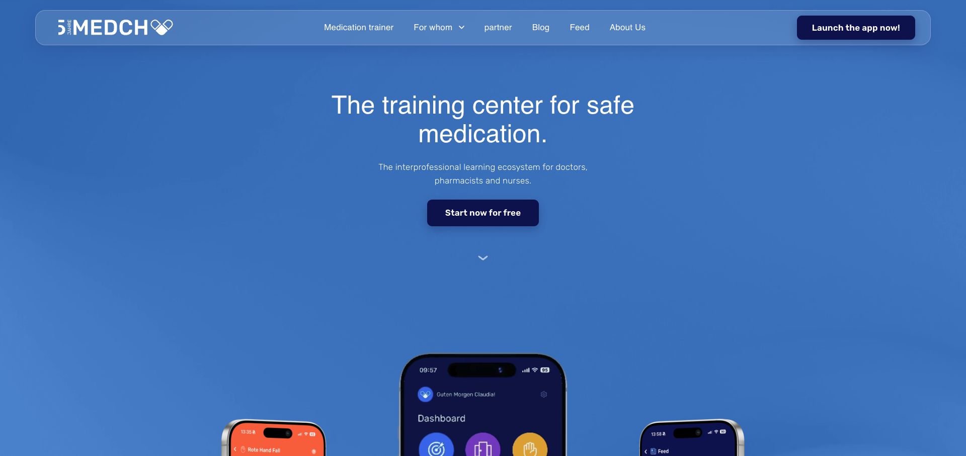
MEDCH uses a blue canvas and a centered statement to explain its medication-learning purpose. The short supporting line identifies the professional groups it serves, and the main button offers a clear starting point. Phone mockups introduce the product interface below. A translucent rounded navigation bar separates topic information from the action to launch the application. Storyblok’s customer case lists the learning platform and connects it with this site. The public screenshot supports a design review of that entrance; it does not verify clinical content, learner outcomes or the infrastructure behind the authenticated training application.
What you can learn
Lead with the specific learning problem before presenting interface imagery. Keep public explanatory content, professional eligibility and account access understandable as separate concerns. When using device mockups, ensure the essential product description is also readable text and not dependent on tiny embedded interface labels.
Pros
The limited palette and centered hierarchy make the principal offer easy to locate.
The application-launch route is visually distinct from the informational navigation.
Cons & considerations
Large empty areas delay a detailed view of the product until the visitor scrolls.
The small interface previews need supporting descriptions to explain actual learning activities.
Public source checked November 3, 2026. References may be embedded or legacy—not a complete backend inventory.
Platform source: Official Storyblok customer case. Official Storyblok customer case identifies this public property and links to it. The evidence concerns its documented content-management implementation; it does not identify every current commerce, account, learning, recruitment or streaming system. Current visual design was reviewed separately. Platform evidence is separate from the direct website screenshot and is not a complete current infrastructure audit.
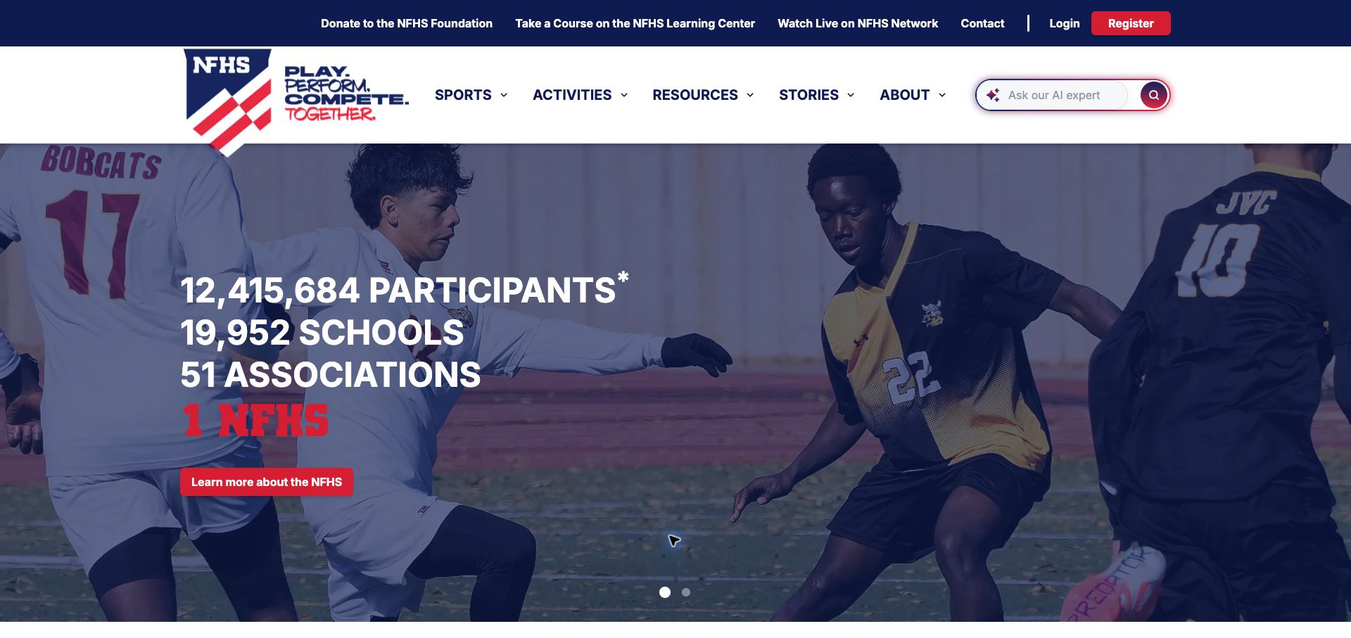
NFHS presents participation figures over a sports photograph, using a dark overlay to maintain readable white and red type. Its main navigation divides sports, activities, resources and stories, while a separate upper strip links to learning, live viewing, donations and account access. This combines organizational scale with practical services. Storyblok’s case explicitly names the migration of NFHS Org and NFHS Learn. This example captures only the public NFHS organization homepage. It does not assume that the linked viewing network, donation flow or learning features share this architecture.
What you can learn
Separate the organization’s public information structure from its service portals, then label those exits clearly. Large participation figures can establish context, but give them a source and maintenance schedule. Keep the primary navigation useful even when the current campaign or statistics change.
Pros
The sports image and participation figures immediately explain the association’s scale and domain.
The separate utility strip provides direct routes to related services without filling the main menu.
Cons & considerations
The number of service choices creates a dense header that requires careful responsive design.
Headline statistics need a visible explanation of their time period and scope elsewhere on the page.
ReactAssociated with Next.js; not independently observed
Public source checked November 3, 2026. References may be embedded or legacy—not a complete backend inventory.
Platform source: Official Storyblok customer case. Official Storyblok customer case identifies this public property and links to it. The evidence concerns its documented content-management implementation; it does not identify every current commerce, account, learning, recruitment or streaming system. Current visual design was reviewed separately. Platform evidence is separate from the direct website screenshot and is not a complete current infrastructure audit.
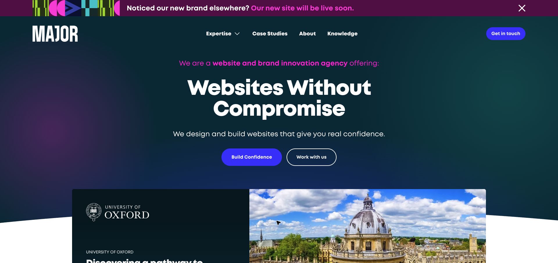
MAJOR Digital presents a direct website proposition over a dark gradient, with two actions beneath it. The next section begins with a University of Oxford project card, pairing its name with architecture. A bright announcement strip explains that a new brand and site are coming, explaining the current appearance. Storyblok’s official case describes the agency’s own composable website and editorial access. The reviewed property is therefore the agency site itself, rather than evidence that any client pictured in its portfolio uses Storyblok or the same implementation approach.
What you can learn
Move quickly from a service promise to a concrete project, and make the case-study destination explicit. If a rebrand is in progress, use a temporary announcement with a removal date. Portfolio evidence should explain the work without implying unverified facts about the client’s current technology.
Pros
The visible project begins to substantiate the agency promise within the opening screen.
Two clearly styled actions accommodate visitors ready to enquire and those wanting more explanation.
Cons & considerations
The rebrand announcement competes strongly with the main proposition through its color and placement.
A broad promise about confidence needs detailed project evidence to distinguish the agency from competitors.
ReactAssociated with Next.js; not independently observed
Public source checked November 3, 2026. References may be embedded or legacy—not a complete backend inventory.
Platform source: Official Storyblok customer case. Official Storyblok customer case identifies this public property and links to it. The evidence concerns its documented content-management implementation; it does not identify every current commerce, account, learning, recruitment or streaming system. Current visual design was reviewed separately. Platform evidence is separate from the direct website screenshot and is not a complete current infrastructure audit.
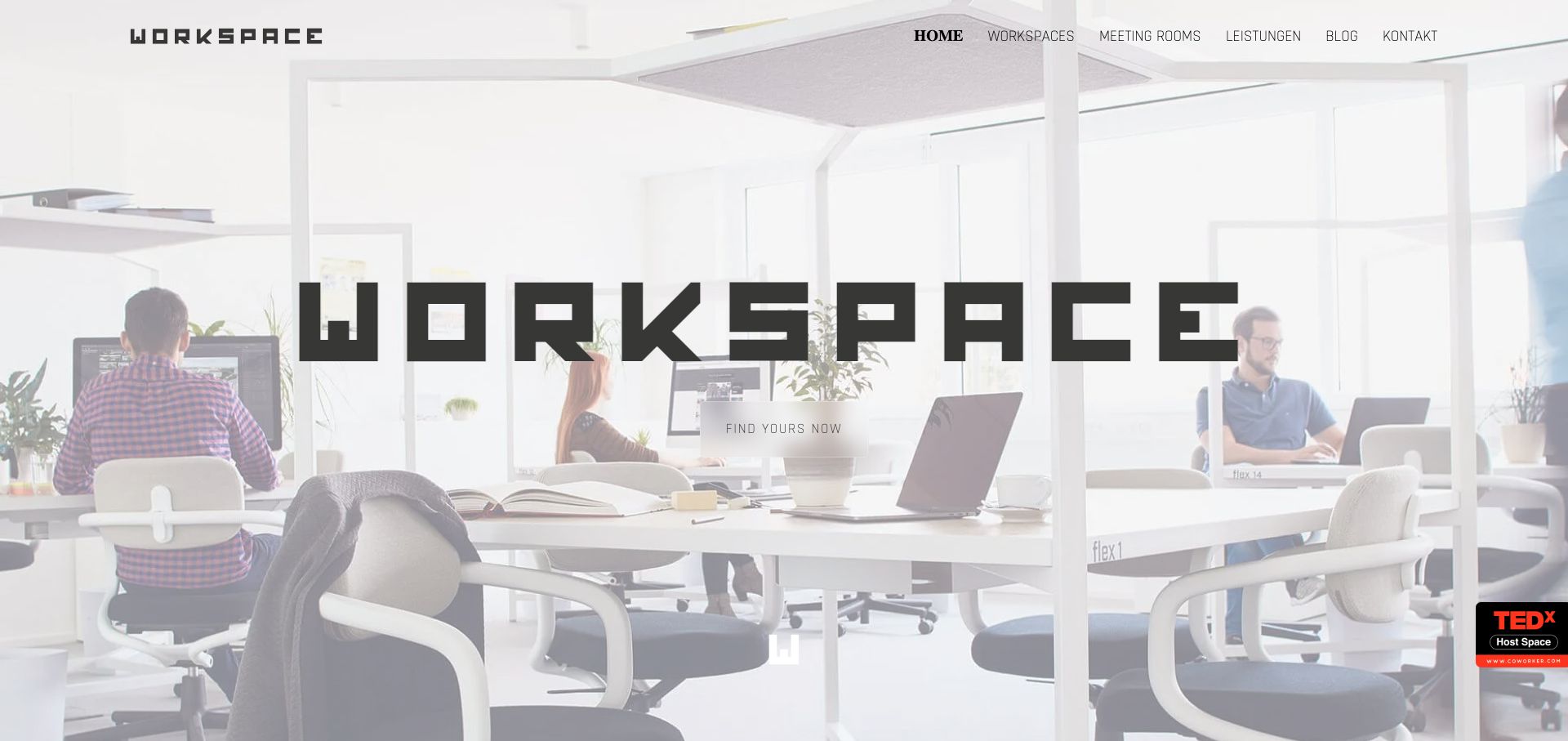
WORKSPACE Wels uses a bright office photograph as the backdrop for an oversized geometric wordmark. The minimal header offers workspace options, meeting rooms, services, a blog and contact, while a small central action invites visitors to find their place. The image shows a tangible environment of desks, daylight and people. Storyblok’s case describes this representative website and its content about office solutions and community. That supports the public marketing property’s CMS association, without identifying the software used for room reservations, tenancy administration or any later commercial agreement.
What you can learn
Show the physical environment early, then connect it to practical information about capacity, location and available facilities. Keep photography and descriptive fields together so the image cannot promise an option the copy no longer offers. A strong place identity benefits from a more explicit action label.
Pros
The office photograph immediately conveys the kind of working environment being offered.
The short navigation exposes the main facility categories without overwhelming the image.
Cons & considerations
The very pale photograph and small central button produce weak emphasis around the next action.
The first screen does not explain location, availability or the differences between workspace options.
ReactAssociated with Next.js; not independently observed
Public source checked November 3, 2026. References may be embedded or legacy—not a complete backend inventory.
Platform source: Official Storyblok customer case. Official Storyblok customer case identifies this public property and links to it. The evidence concerns its documented content-management implementation; it does not identify every current commerce, account, learning, recruitment or streaming system. Current visual design was reviewed separately. Platform evidence is separate from the direct website screenshot and is not a complete current infrastructure audit.
Choose the smallest architecture that supports the content operation
Use a consistent frontend with a deliberate block library
Start with the main page families and their real content. Implement shared navigation, typography, media rules and accessible interactions before adding exceptional layouts. A small component library makes review easier and gives editors a predictable set of tools for regular publishing.
Add editorial content to an existing commerce system
When a store needs richer campaigns or advice, plan how product references and editorial records meet. The La Rosée case documents Storyblok content alongside Shopify Hydrogen. Use such cases to identify integration questions, not as evidence that a CMS replaces stock, checkout or order management.
Separate a specialist publication or service portal
A news section or careers portal may need different navigation and governance from the parent website. Give that property a clear identity, canonical routes and integration ownership. Crunchyroll’s source names News specifically, illustrating why a scoped implementation is more informative than a company logo alone.
Plan editing, regional content and release behavior before launch
Model regional differences beyond translation
Markets can have different offers, contacts, program eligibility and campaign timing. Decide which records are shared and which are local. Test an incomplete translation and a market-specific replacement rather than assuming every locale is a copy of the default homepage. The regional structure must match actual publishing responsibility.
Rehearse preview and publication with editors
Ask the people who will maintain the site to create a campaign, replace an image, correct a long title and withdraw an expired notice. Verify their preview against the rendered public page. Document which action publishes content, which action deploys frontend code and how an error is rolled back.
Make integrations and freshness observable
Name the source of jobs, course dates, product facts and news records. Define what happens when one source is unavailable or stale. Keep meaningful public error and empty states in the design, and assign ownership for redirects, broken external routes and archived campaigns.
A useful handover demonstration
Ask the actual team to carry out its routine job: publish a realistic update, correct a mistake, preview a narrow screen, and identify who owns an integration failure. For a library or frontend framework, also ask who maintains the content source and deployment. A polished screenshot does not answer those operational questions.
Beyond the screenshot
Storyblok website planning and launch checklist
Inventory the page families and the editorial job of each reusable component.
Identify shared content, regional overrides and translation ownership.
Keep product, vacancy and course records connected to their authoritative source.
Test long titles, missing media, empty lists and expired campaigns.
Check preview accuracy with the people who will publish routine updates.
Distinguish content publication from frontend releases and integration changes.
Validate keyboard interaction, focus, contrast and responsive image crops.
Map old URLs and maintain redirects for moved publications or service portals.
Explain the boundary between public content and authenticated applications.
Assign owners for content freshness, integration failures and rollback decisions.
Test with real content, a keyboard, a small screen, slow or failed requests, and the people who will maintain the system. These are planning checks, not an accessibility, security, performance, or search-ranking certification.
Sources & editorial method
How this Storyblok collection was reviewed
We read official Storyblok customer cases and followed their property links, then captured and visually reviewed twenty public websites. CMS evidence is documentary and scoped to each named implementation; it is not a fresh forensic inventory of every backend. Closed stores, unrelated redirects and unusable captures were excluded. Some regional pages were rendered with browser translation, noted in the affected reviews. Performance figures, customer testimonials and medical or commercial claims were not independently verified.
Every image is an unmodified capture from the actual website, with its source and capture date. Some captures are reused from our shared catalog; their dates remain the original capture dates. None comes from a vendor gallery or a generated reconstruction. Moving imagery and live content can change.
Technology attribution uses public page assets or metadata, official platform documentation, or a cited first-party project case study. Documentary and framework-relationship evidence is identified where used; it is not a complete current backend inventory. A CMS image CDN alone does not establish a full CMS deployment. A library’s presence does not prove which individual controls use it, and a platform label does not establish AI authorship.
The composition notes, lessons, pros and tradeoffs are original editorial observations. We have not measured conversion, traffic, security, performance or accessibility conformance. Website owners retain their brands and imagery; these examples are not our client portfolio. Written, Edited and Curated are independent records, not dates advanced by a build. See our editorial standards or suggest a correction.
Questions worth asking
Storyblok website development FAQs
Does visual editing remove the need for frontend development?
The design still needs implemented components, routing and integration behavior. Evaluate the editor and the frontend together: content flexibility is useful only when the available choices produce reliable pages.
Can a Storyblok example prove which checkout a company uses?
Only when separate evidence identifies that system and scope. This guide attributes the CMS relationship for the named public property. It does not infer transaction infrastructure from a screenshot.
How many components should a project start with?
There is no useful universal count. Begin with the recurring content jobs in your real page inventory, combine genuinely shared patterns and add an exception only when it solves a documented need.
Should every country share the same homepage?
Only if the content operation and visitor needs support it. Plan translation, local offers, legal copy, contact details and campaign dates explicitly, then decide which records can be shared.
Are these screenshots performance or accessibility audits?
No. They document visible composition at the capture time. Run measured performance checks, keyboard reviews, assistive-technology testing and integration QA against your own implementation.
Borrow the content pattern that fits your audience, then prove it with real editing tasks and imperfect content. A successful Storyblok website remains coherent when the next campaign, translation or correction arrives.