Best TYPO3 Websites of 2026 (20 Real-World Examples)
TYPO3 websites that organize large institutional content
These 20 examples examine multilingual navigation, service directories, institutional publishing, and the relationship between editorial structure and visual design.
TYPO3 presents itself as an open-source enterprise CMS. The practical design task is to make a large body of content understandable to visitors and maintainable by the people publishing it.
Eukanuba Europe, APCOA, Heidelberg University Hospital, the French Senate, and Leipzig lead the collection. Evidence is scoped to the reviewed European or institutional property, not other regional sites with the same brand.
Before the examples
What makes good TYPO3 website development in 2026?
Design the content hierarchy first
List the audience’s main questions and the content types that answer them. A complex organization does not require equally complex navigation on every page.
Distinguish translation, country selection, and separate services. Preserve the visitor’s context when changing language and identify content that is not available in every locale.
Connect editorial structure to reusable layouts
Use consistent service, person, location, and article patterns. Let editors publish realistic content without needing to improvise a new layout each time.
The collection · 20 examples
20 TYPO3 website examples worth studying
Current generators or assets and attributed TYPO3 implementation sources support the named properties. Mixed commerce and frontend arrangements are qualified.
We start with five recognizable brands or organizations: Eukanuba Europe, APCOA Germany, Heidelberg University Hospital, French Senate — English introduction, City of Leipzig. Each attribution applies to the named website property, not every product or website belonging to its organization. This is a curated reading sequence, not a measured ranking.
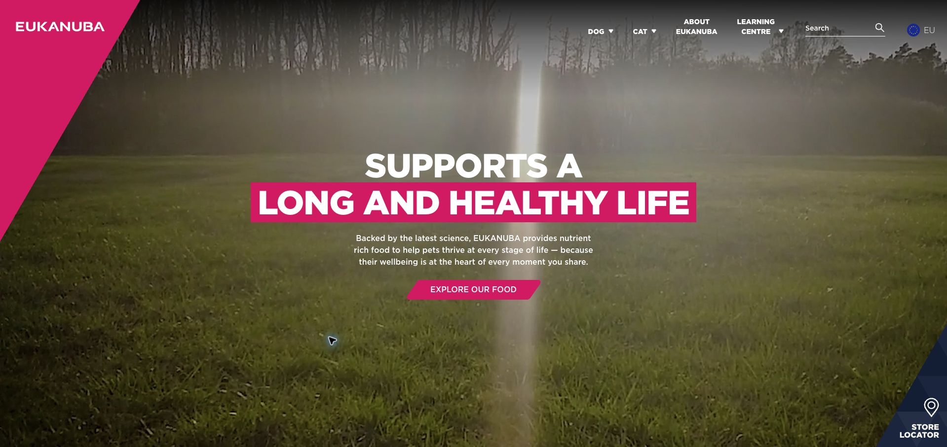
Eukanuba’s European homepage uses a moving outdoor scene, large white type, and a diagonal magenta frame to make a functional product feel connected to everyday life. The first action leads to food, while dog and cat navigation keeps the two main audiences distinct. Further down, Life Care, Grain Free, Breed Care, and Special Care turn a large range into understandable shopping intentions. The persistent store-locator corner also acknowledges that discovery and purchase may happen in different places. This example is specifically the European property: its current TYPO3 generator supports the regional implementation documented by the vendor, while the US site showed a different platform.
What you can learn
Give campaign imagery one clear job, then organize the next step around the distinctions customers actually use. Keep regional platform evidence attached to the exact site, particularly when a global brand has different owners or systems across markets.
Pros
Food categories explain purpose before asking visitors to compare individual products.
The store locator remains visually separate from the central discovery action.
Cons & considerations
Background motion competes with small navigation text in some frames.
The large hero delays detailed product comparisons until visitors scroll.
Platform source: TYPO3 implementation case study. The live page declares TYPO3 CMS. Platform evidence is separate from the direct website screenshot and is not a complete current infrastructure audit.
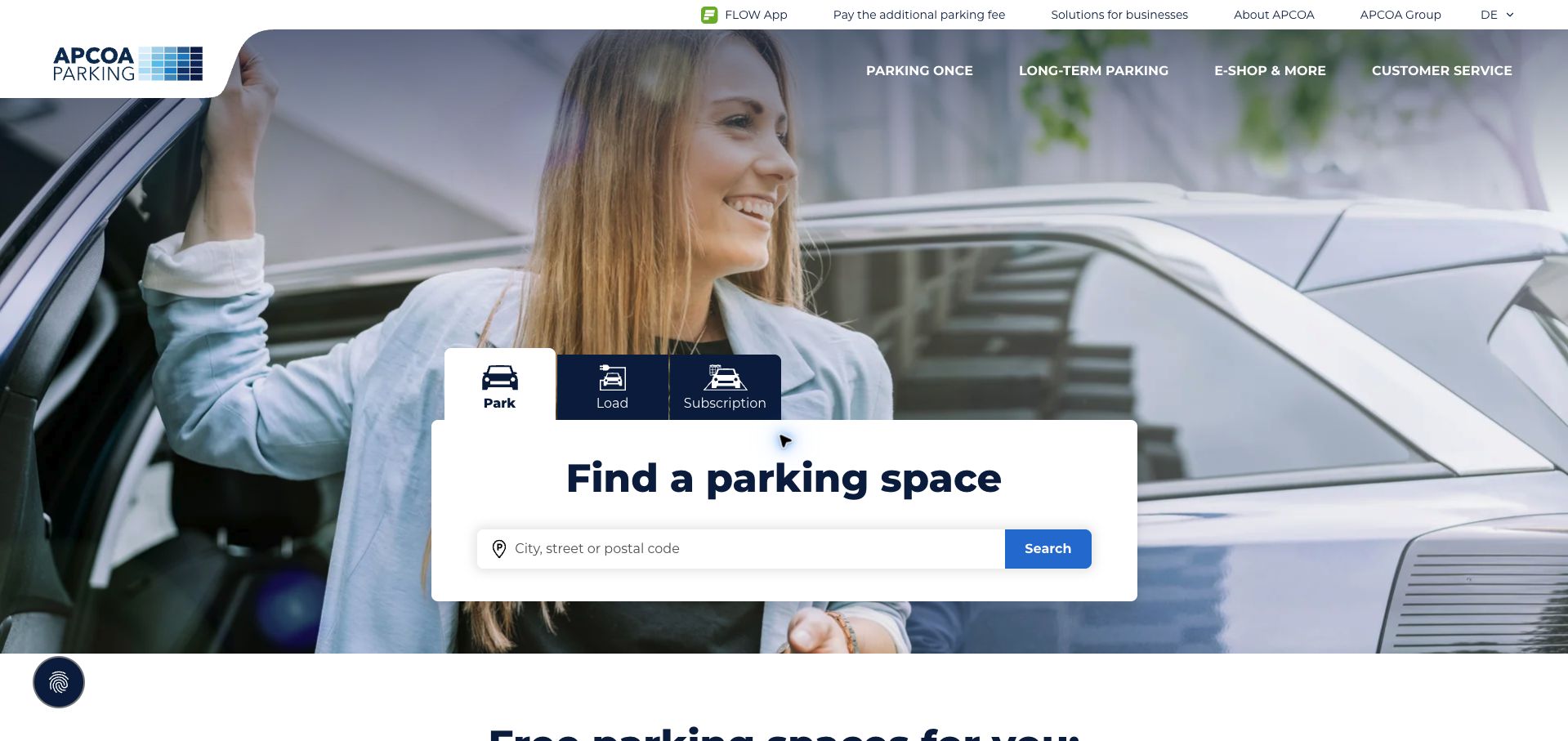
APCOA’s German homepage places a white parking finder over a full-width arrival photograph. Three tabs distinguish parking, charging, and subscriptions before the visitor enters a city, street, or postal code. That small sequence turns an extensive service portfolio into an immediate task. Corporate information and business solutions sit in a thinner upper navigation, leaving the main area for drivers. Airport and cruise parking, city destinations, and subscription offers extend the same structure below. The live page declares TYPO3, matching the vendor’s documented country-site platform. The captured German page was partly translated by the browser; translated labels should not be read as authored English copy.
What you can learn
Start a location-based service with a specific destination field and a small number of intent choices. Separate corporate and customer navigation so routine users do not have to understand the organization before finding a practical service.
Pros
The high-contrast search panel stays readable against the photograph.
Distinct intent tabs make several related services available in one compact area.
Cons & considerations
Large background photography occupies space that could show nearby options.
Booking destinations leave the marketing site, so journey consistency needs separate testing.
Platform source: TYPO3 implementation case study. The live page declares TYPO3 CMS. Platform evidence is separate from the direct website screenshot and is not a complete current infrastructure audit.
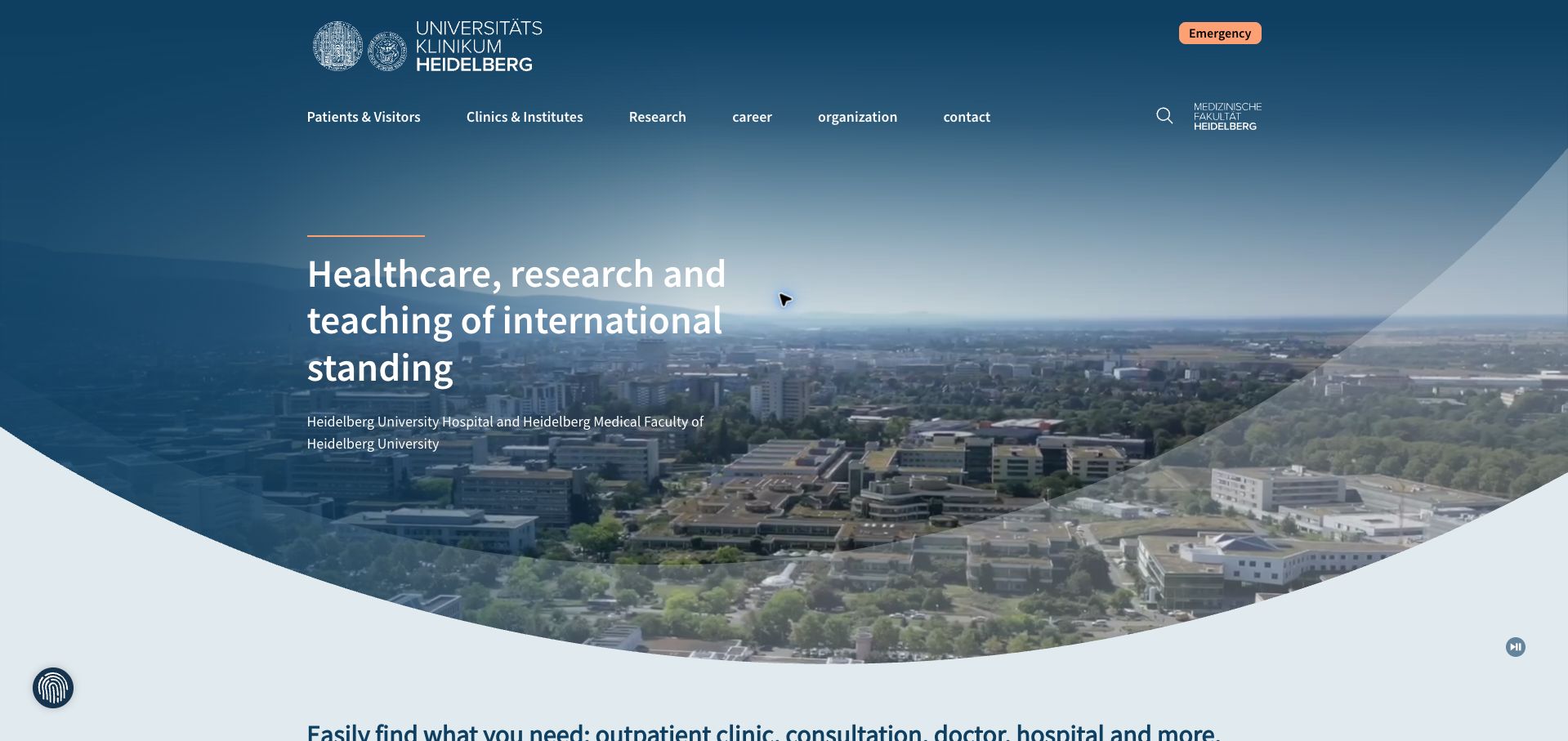
Heidelberg University Hospital introduces its campus with a broad aerial video and a restrained blue overlay. The navigation separates patients and visitors, clinics and institutes, research, careers, and organizational information. A contrasting emergency link sits above that main row, making an urgent route visually different from general exploration. Below the introductory hero, a dedicated search invites visitors to find a clinic, physician, or consultation, followed by dated institutional news. The page’s TYPO3 generator and the current vendor case study support the platform attribution. The capture includes browser-translated German text, and this review evaluates the public information layout without assessing medical care or appointment systems.
What you can learn
Use audience navigation to reduce the burden of a large institutional structure, and reserve a distinct treatment for urgent information. A patient finder should be close enough to the introduction that an unfamiliar visitor can move quickly from orientation to a specific task.
Pros
Emergency navigation has a clearly different color and position.
The search prompt names recognizable patient tasks instead of internal departments alone.
Cons & considerations
The tall video hero pushes the practical finder below the first viewport.
Research and institutional messaging compete with patients’ immediate needs.
Platform source: TYPO3 implementation case study. The live page declares TYPO3 CMS. Platform evidence is separate from the direct website screenshot and is not a complete current infrastructure audit.
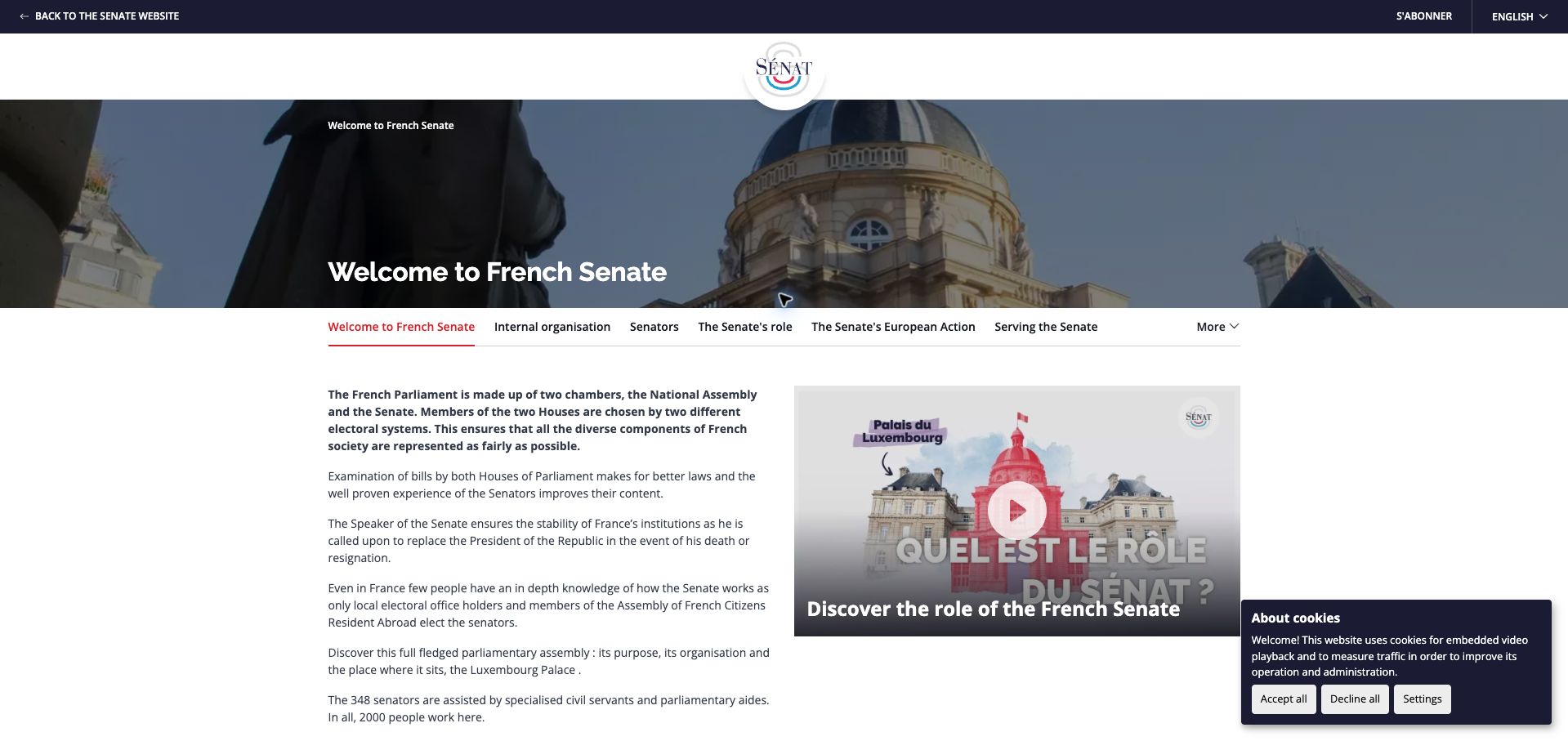
The French Senate’s English introduction uses a compact institutional crest, a panoramic building image, and a horizontal topic bar to orient visitors. The first paragraphs explain the relationship between the Senate and National Assembly before moving into more detailed institutional responsibilities. A video thumbnail offers another route into the same subject, while the navigation separates senators, internal organization, European action, and supporting services. This is an explanatory language section rather than a capture of the French news homepage. Its current TYPO3 generator aligns with the vendor’s account of the Senate’s platform, but it does not establish that every connected parliamentary business application runs on the CMS.
What you can learn
Create a deliberate entry page for readers who lack the context assumed by the main domestic site. Explain the institution in plain language, then provide stable topic navigation so translation leads into a coherent information structure rather than an isolated landing page.
Pros
Topic navigation stays close to the introductory explanation.
Text and video provide complementary ways to understand the institution.
Cons & considerations
The selected language section still exposes a French subscription label.
The dense opening paragraphs could benefit from more descriptive subheadings.
Visible tech stack
Earlier / documented evidence
TYPO3
Platform source: TYPO3 implementation case study. The live page declares TYPO3 CMS. Platform evidence is separate from the direct website screenshot and is not a complete current infrastructure audit.
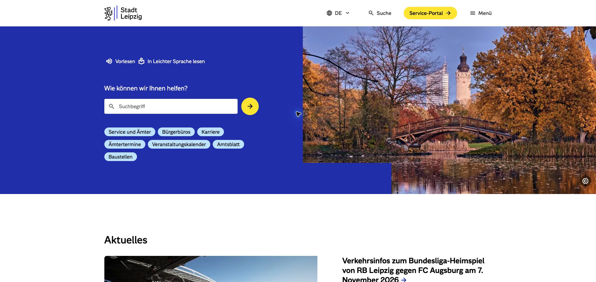
Leipzig’s homepage puts a service search on a strong blue field beside an autumn city photograph. Short links beneath the field cover offices, appointments, events, public notices, construction, and careers. The result is a useful balance: the city retains a recognizable visual identity without making residents pass through a ceremonial welcome before finding services. Read-aloud and easy-language routes appear above the search, and a yellow service-portal button is separated from the general menu. Current TYPO3 asset paths, including its generated stylesheet directory, corroborate the published implementation case. Dated local news follows the task area rather than replacing it at the top of the page.
What you can learn
Treat a municipal homepage as a set of frequently repeated tasks. Pair open search with a few editorially chosen shortcuts, and expose alternate reading routes near the content they support. Local imagery can communicate place without becoming the main interaction.
Pros
Common resident needs are presented as compact, recognizable shortcuts.
The service portal has a distinct color and clear directional cue.
Cons & considerations
The general menu conceals deeper navigation until opened.
Short category labels still require visitors to choose among overlapping service routes.
Platform source: TYPO3 implementation case study. The live page references TYPO3-generated assets: https://www.leipzig.de/typo3temp/assets/compressed/merged-ab8f03e0f60a7b7bd172ef1ca91da12a-62beb44558a54bb7f6d72b1ca1325787.js.gz?1791189443, https://www.leipzig.de/typo3temp/assets/compressed/merged-ee55cd5e37fc7c35fdf2cc04e1642403-6691f7e6278ad90822292bb2f5cd6d2e.js.gz?1791189443. Platform evidence is separate from the direct website screenshot and is not a complete current infrastructure audit.
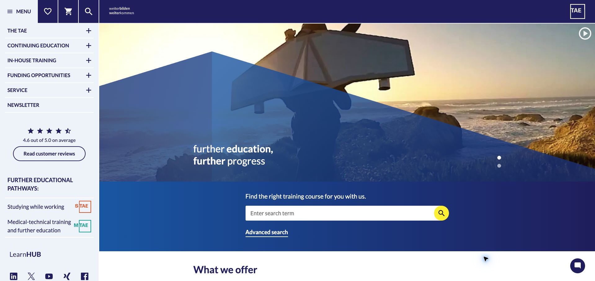
TAE combines a fixed-looking left navigation column with a large photographic introduction and a prominent course search. The side column distinguishes continuing education, company training, funding, and service information, while separate links identify degree study and medical-technical education. A visible rating links to the organization’s own review page; this is a presentation observation, not independent verification of satisfaction. Below the hero, four tabs separate the principal learning formats, followed by subject areas such as automotive, construction, IT, and management. The live TYPO3 generator corroborates the vendor’s detailed booking-platform case. Browser translation affected the German labels in the saved capture.
What you can learn
When a catalog serves individuals, employers, and students, separate learning formats before presenting the full subject taxonomy. Keep search and advanced search visible, while allowing persistent navigation to support visitors who know the type of training but not the exact course name.
Pros
The course finder sits in a dedicated contrasting band.
Learning formats and technical subjects provide two useful entry paths.
Cons & considerations
The wide sidebar reduces space available to the main content.
Several branded education destinations can make the organizational structure harder to grasp.
Platform source: TYPO3 implementation case study. The live page declares TYPO3 CMS. Platform evidence is separate from the direct website screenshot and is not a complete current infrastructure audit.
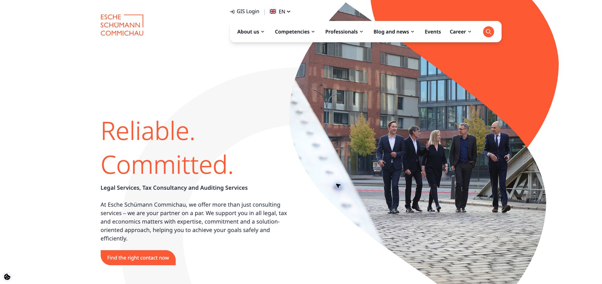
Esche’s English homepage pairs a short orange headline with a large photograph of its professionals outside the office. The introduction immediately names legal, tax, and auditing services, then offers a direct route to finding a contact. This is more useful than leaving the visitor with a generic statement about expertise. The navigation includes professionals alongside competencies, and the page exposes filters for role, practice focus, and language within that broader discovery structure. Later sections introduce services, people, international coverage, and careers. The live page declares TYPO3, consistent with the documented relaunch. The review concerns information design and does not independently validate professional credentials or service outcomes.
What you can learn
Translate an abstract promise of expertise into a concrete way to find an appropriate person. Let practice area and language support that search, while keeping organizational storytelling secondary to the visitor’s question about who can help with a particular issue.
Pros
The opening contact action connects directly to expert discovery.
Photography gives the multidisciplinary firm a recognizable human presence.
Cons & considerations
The broad introductory promise remains less specific than the service categories.
A very large professional carousel can be cumbersome compared with focused filtering.
Platform source: TYPO3 implementation case study. The live page declares TYPO3 CMS. Platform evidence is separate from the direct website screenshot and is not a complete current infrastructure audit.
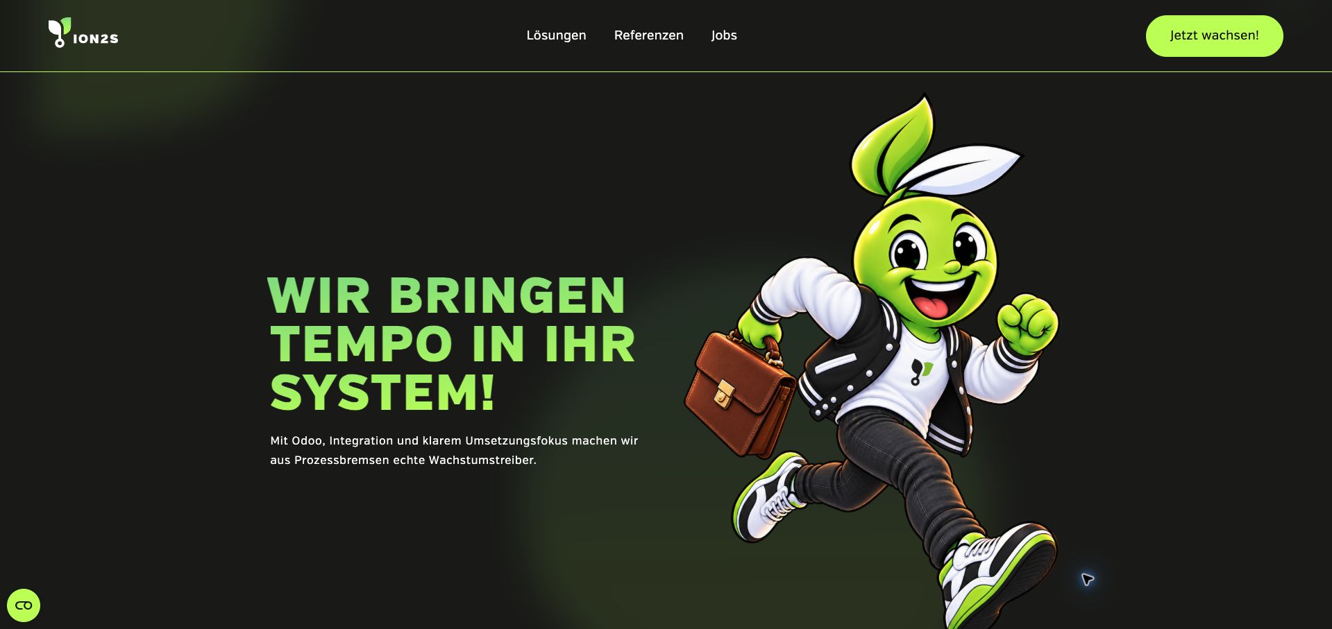
ion2s uses a near-black background, vivid lime typography, and a large running mascot to make its positioning recognizable. The header is economical, with routes for solutions, references, and jobs beside a prominent contact action. The first message focuses on improving business systems, while subsequent sections explain content management, integration, and related delivery capabilities. Phone and email contact options follow the introduction rather than requiring visitors to open a form. Generator tags name TYPO3 with T3Headless, and the vendor case documents the separation between TYPO3 content management and a Nuxt frontend. The mascot’s visual style alone is not evidence of how its artwork was produced.
What you can learn
A technical services site can use a strong character and color system without adding a complicated navigation model. Keep the core service explanation and contact routes easy to locate, and distinguish the editorial platform from the frontend when documenting a headless implementation.
Pros
The limited navigation makes the main business routes easy to scan.
Consistent lime accents give headings and actions a clear visual relationship.
Cons & considerations
The oversized illustration delays more concrete project evidence.
The opening promise requires supporting service detail to become sufficiently specific.
Platform source: TYPO3 implementation case study. The live page declares TYPO3 CMS x T3Headless, TYPO3 CMS x T3Headless. Platform evidence is separate from the direct website screenshot and is not a complete current infrastructure audit.
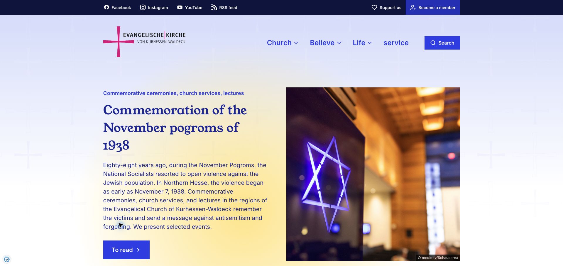
EKKW’s homepage leads with a substantial current story, pairing a serif headline and explanatory paragraph with a large credited photograph. At capture, the feature concerned remembrance events around the November 1938 pogroms, giving the page a specific editorial purpose rather than an evergreen welcome. Four broad navigation groups cover church, belief, life, and service, while membership and support routes occupy a separate utility strip. Search and shortcuts to congregations, pastoral care, weddings, and baptism follow the lead feature. The page currently declares TYPO3, matching the vendor’s documented communications platform. The German interface was partly translated in the browser during capture.
What you can learn
Give a community institution room for timely editorial communication while preserving clear routes to recurring services. A strong lead story should not become the only path through the site; search and practical shortcuts need an equally deliberate place in the overall structure.
Pros
A credited editorial image and detailed introduction establish clear context.
Membership and support actions are separated from general topic navigation.
Cons & considerations
The long lead feature pushes routine service shortcuts below the opening view.
Broad navigation labels may require extra exploration for unfamiliar visitors.
Platform source: TYPO3 implementation case study. The live page declares TYPO3 CMS. Platform evidence is separate from the direct website screenshot and is not a complete current infrastructure audit.
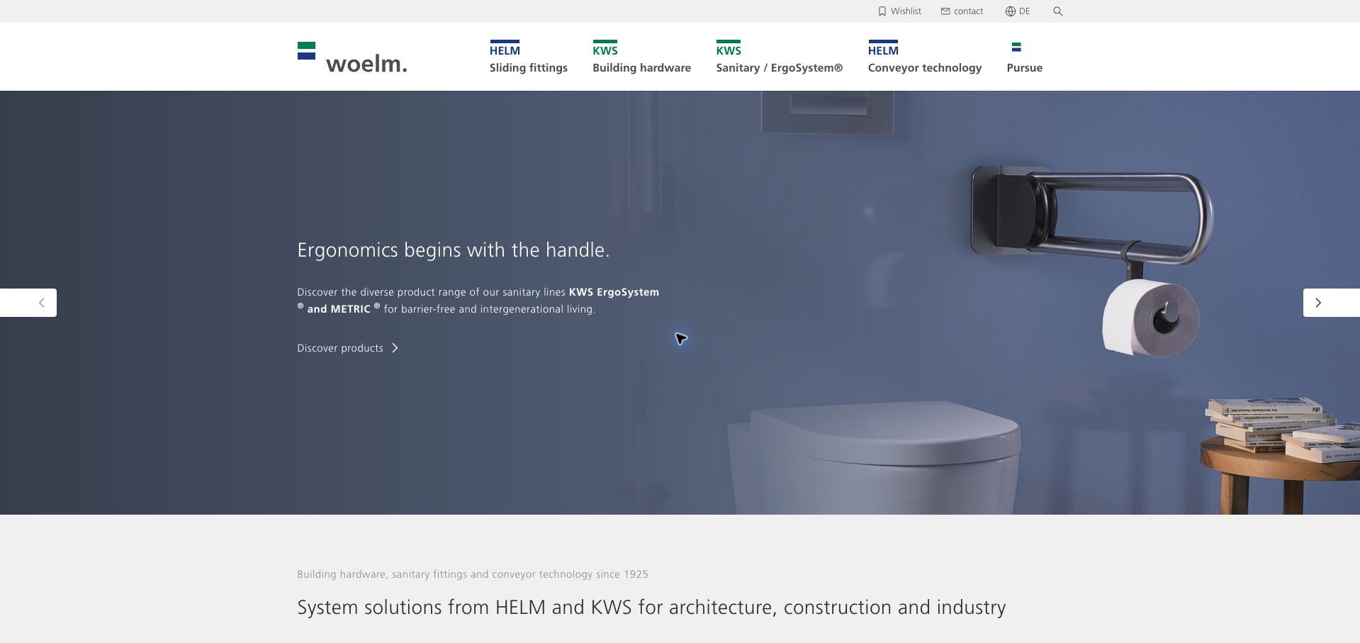
Woelm’s homepage organizes its main navigation around sliding fittings, building hardware, sanitary systems, and conveyor technology, with HELM and KWS brand marks repeated above the relevant categories. That structure connects product purpose with brand recognition rather than asking visitors to decode a corporate portfolio first. The captured hero presents sanitary hardware in a realistic interior and links directly to products. Other slides address sliding doors and conveying systems. A utility area provides search, contact, language selection, and a wishlist, supporting the research-and-shortlist behavior common to specification work. Current TYPO3 metadata corroborates the published product-platform case; configuration and quotation functions were not submitted or transactionally tested.
What you can learn
For technical products, pair brand names with plain application categories. Use contextual imagery to explain where a component belongs, then preserve a path toward product details and a shortlist so professional research does not depend on remembering item names across visits.
Pros
Application categories make the two product brands easier to understand.
A visible wishlist supports comparison across a broad specification catalog.
Cons & considerations
Rotating hero content makes some product families less immediately visible.
The generous campaign area postpones technical details and direct item comparison.
Platform source: TYPO3 implementation case study. The live page declares TYPO3 CMS. Platform evidence is separate from the direct website screenshot and is not a complete current infrastructure audit.
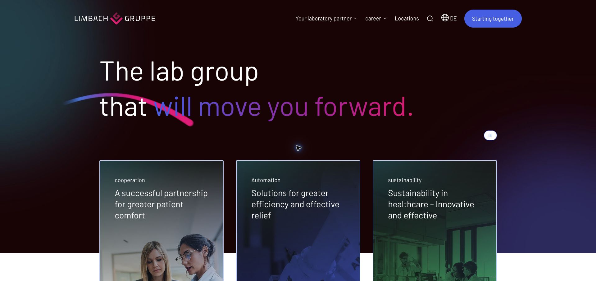
Limbach Group’s homepage uses a dark, animated background with a headline and colored emphasis. Three photographic cards introduce cooperation, automation, and sustainability, giving the corporate message several tangible directions. Below, the content separates medical-care networks, healthcare startups, and hospitals, while the header keeps locations and careers available alongside the main laboratory-partner route. This structure suits an organization whose visitors need different relationships with the same network. Current TYPO3 metadata supports the CMS attribution documented in the platform case study. The review concerns the public corporate site, not laboratory systems, patient records, or the quality of diagnostic services. Some German copy was browser-translated.
What you can learn
Use shared visual identity to introduce a network, then make audience-specific routes explicit. A corporate umbrella page should explain the relationships it supports and provide a direct location route, rather than expecting every visitor to understand the group’s internal structure.
Pros
Audience sections turn broad partnership language into more specific paths.
Location and career links remain available in the header.
Cons & considerations
The abstract opening headline requires later content to explain the offer.
Thin lettering and color gradients deserve careful contrast checks across motion frames.
Platform source: TYPO3 implementation case study. The live page declares TYPO3 CMS. Platform evidence is separate from the direct website screenshot and is not a complete current infrastructure audit.
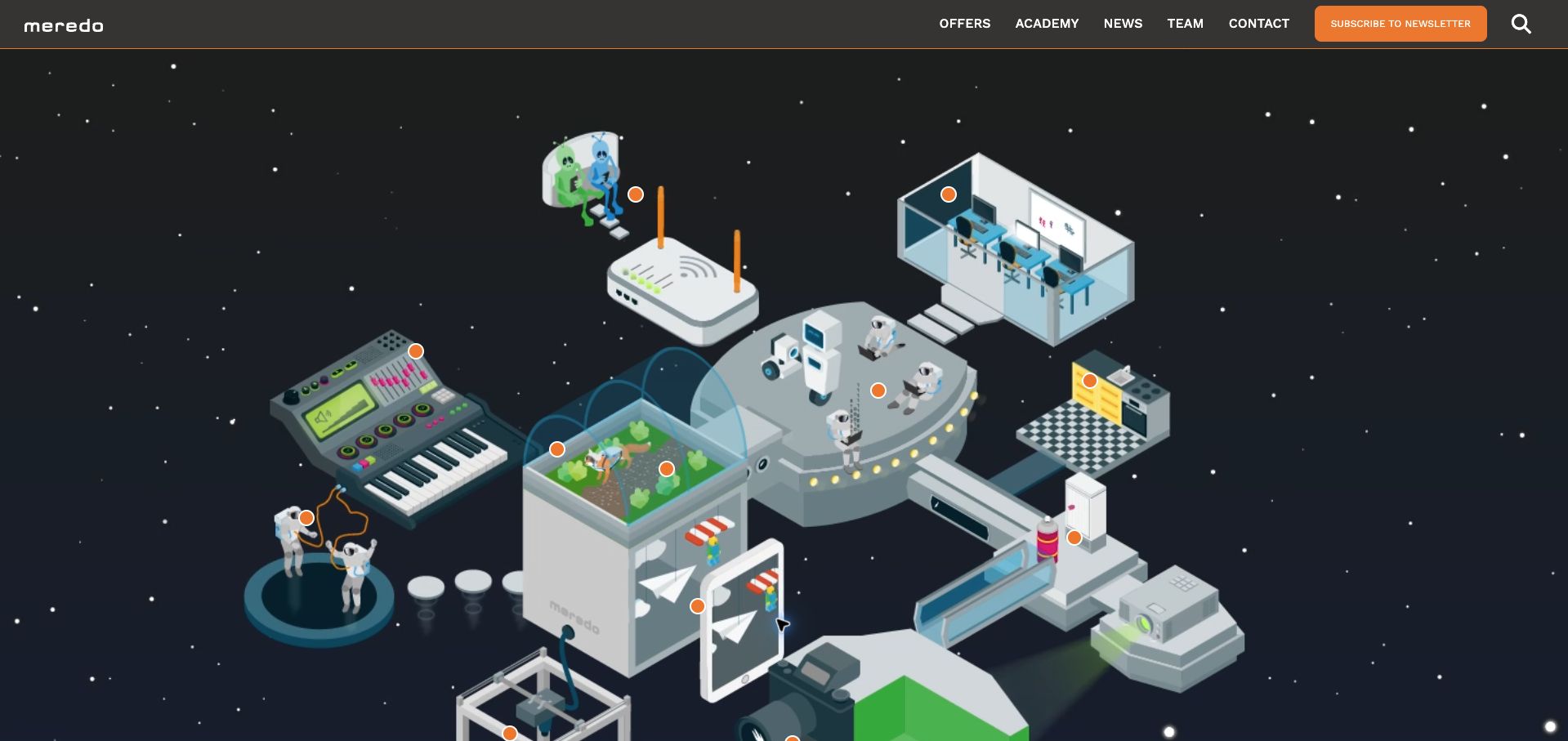
meredo opens with an illustrated universe of music, gaming, robotics, cameras, and digital activities. Orange markers connect the image to the idea of exploration, while a header keeps offers, academy, news, team, and contact available. The practical structure emerges below: programs for children and families, offers for schools and organizations, online tutorials, registration, and a downloadable annual program. The live page declares TYPO3, corroborating the vendor’s implementation case. This is a distinctive educational presentation, although the illustrated opening does not itself explain all the available activities. The capture includes browser translation of portions of the German interface; no registration or child-related information was entered.
What you can learn
Let an illustration establish the atmosphere of a learning program, but provide equivalent labeled routes for visitors who need a practical answer. Separate families and institutional buyers early, and make dates, registration, and a complete program easy to find after the visual introduction.
Pros
The illustration communicates a broad range of creative digital activities.
Audience-specific offer categories support both families and schools.
Cons & considerations
The image-heavy opening postpones a concise explanation of the organization.
Unlabeled visual markers are less self-explanatory than the conventional offer links.
Platform source: TYPO3 implementation case study. The live page declares TYPO3 CMS. Platform evidence is separate from the direct website screenshot and is not a complete current infrastructure audit.
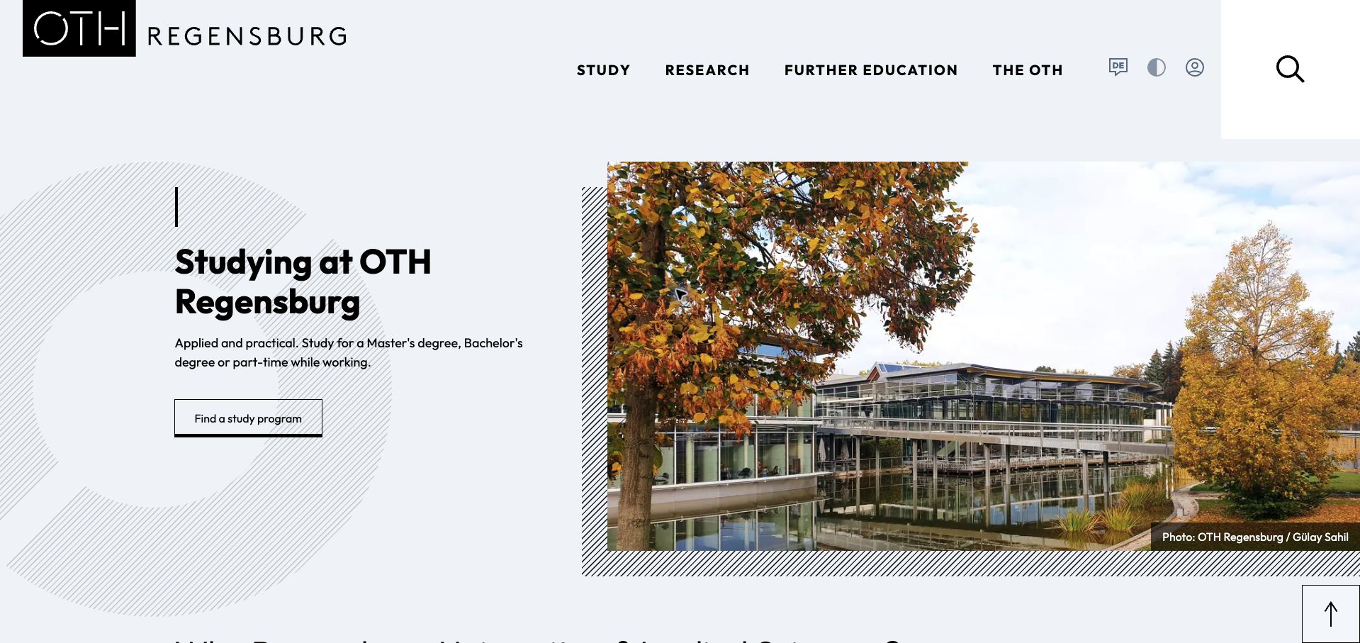
OTH Regensburg gives prospective students a clear first step: a short introduction and a bordered program-finder button beside a large campus photograph. The restrained black-and-white palette and diagonal line pattern create identity without overwhelming the task. The main navigation separates study, research, continuing education, and the institution itself. Further down, reasons to choose the university sit alongside news, research, careers, and dated institutional figures. The live TYPO3 generator corroborates the vendor case describing the university’s recruitment-oriented rebuild. Rankings and enrollment figures are presented by the university and are not independently evaluated here. The German page was partly translated by the browser during the capture.
What you can learn
Give prospective students one obvious route into the academic offering before presenting the institution’s full story. Use the rest of the homepage to answer supporting questions about place, research, and community, while keeping audience navigation distinct from promotional claims.
Pros
A single program-finding action makes the opening easy to understand.
Campus photography provides concrete context without replacing the main message.
Cons & considerations
The large header and photograph reduce space for practical admissions detail.
Several institutional sections follow before a visitor sees more specific course information.
Platform source: TYPO3 implementation case study. The live page declares TYPO3 CMS. Platform evidence is separate from the direct website screenshot and is not a complete current infrastructure audit.
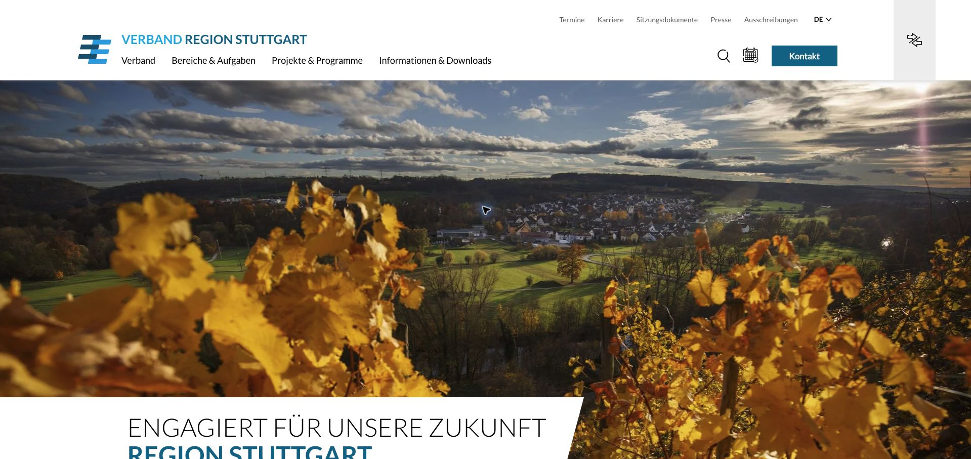
Verband Region Stuttgart uses an expansive regional landscape to establish a sense of place, then introduces its future-oriented public role. The white header carries four substantial navigation groups covering the association, responsibilities, projects, and information downloads. A thinner utility row surfaces meeting documents, press, procurement, careers, and dates, while search, calendar, and contact have their own controls. This separates routine professional needs from the broader story of regional development. Current TYPO3 metadata corroborates the platform case study. The page is a regional governance and project-information site, not the City of Stuttgart’s general resident-service portal, a distinction that matters when studying its navigation and intended audiences.
What you can learn
For a regional public body, distinguish organizational responsibilities from individual projects and downloadable evidence. Keep meeting records and procurement routes easy to reach even when the homepage uses strong destination photography to communicate regional identity and a shared public purpose.
Pros
Document and press links are available without opening a broad navigation category.
The visual language connects the organization to a recognizable landscape.
Cons & considerations
The large scenic introduction delays explanatory text below the first viewport.
Institutional category names may require interpretation by first-time residents.
Platform source: TYPO3 implementation case study. The live page declares TYPO3 CMS. Platform evidence is separate from the direct website screenshot and is not a complete current infrastructure audit.
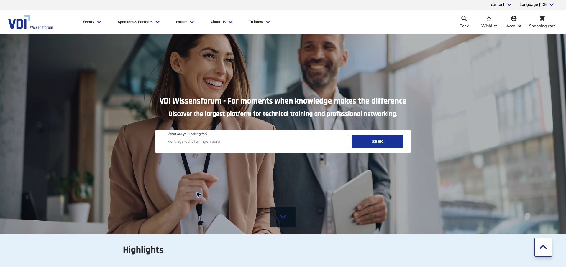
VDI Wissensforum places a course-search field over a professional workplace photograph, with a blue submit control. The header includes events and partner information alongside search, wishlist, account, and cart tools. That combination acknowledges both first-time discovery and repeat attendance. Below, dated highlights introduce conferences, webinars, and qualifications, followed by other training. The live page declares TYPO3, while the case describes a hybrid architecture combining TYPO3 content with Magento commerce. That evidence should not be simplified into a claim that the CMS alone handles every purchase. Browser translation affected parts of the German page; the visible search example was supplied by the site, not entered during research.
What you can learn
Make search the central action when visitors arrive with a topic in mind, and keep saved-item and account tools nearby for returning customers. Document content and commerce responsibilities separately when a single public interface combines multiple platforms behind the scenes.
Pros
The large search field clearly identifies the main discovery task.
Dated event highlights help distinguish upcoming opportunities from evergreen subjects.
Cons & considerations
Broad promotional copy is less informative than the actual course taxonomy.
The full-width photograph consumes space that could surface formats or filters.
Platform source: TYPO3 implementation case study. The live page declares TYPO3 CMS. Platform evidence is separate from the direct website screenshot and is not a complete current infrastructure audit.
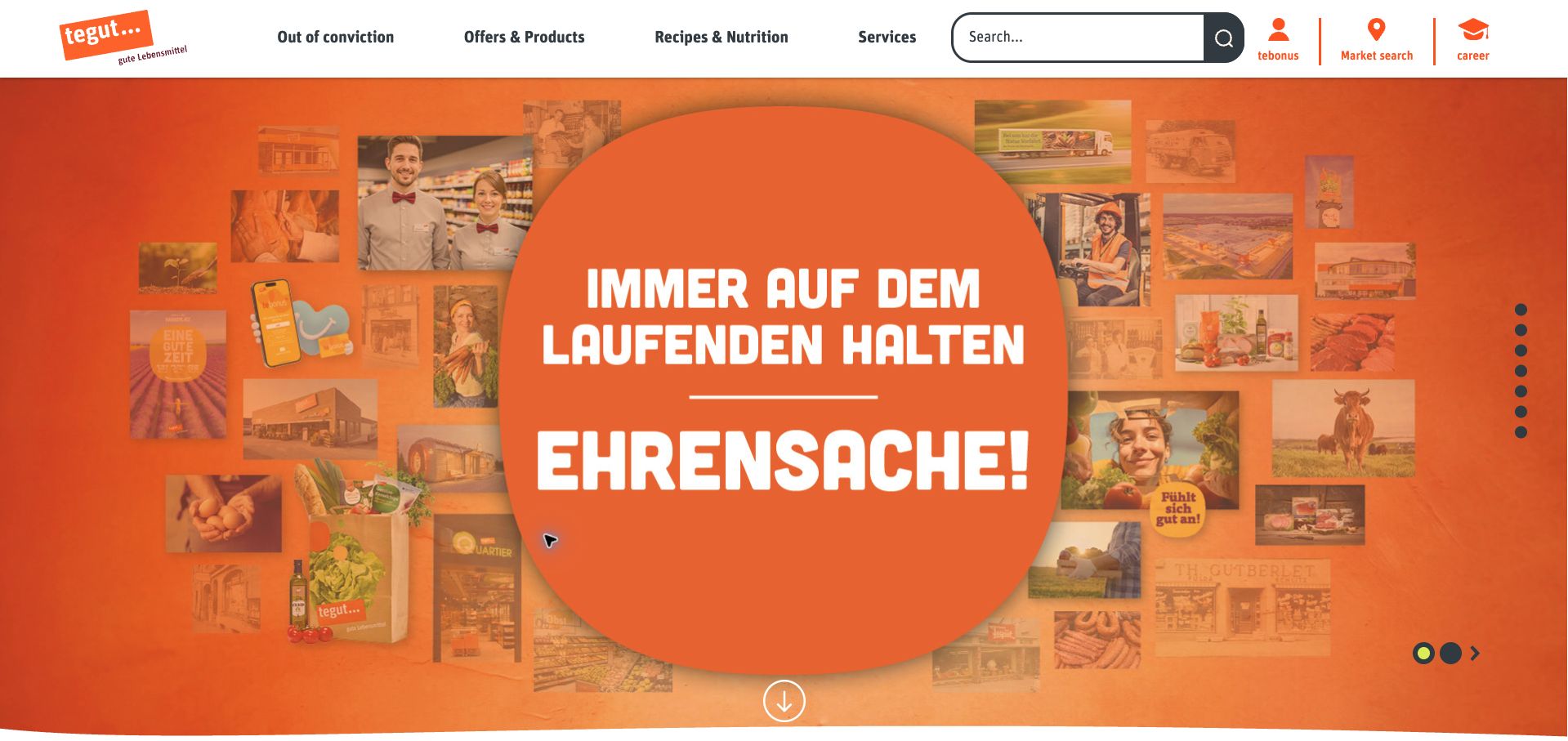
tegut’s homepage uses a vivid orange campaign panel and a collage of people, food, and local scenes to establish its retail personality. The header remains practical: product offers, recipes, services, search, loyalty access, and a store finder are all present. Below the campaign, the page explains its food positioning and directs visitors toward weekly offers associated with a chosen store. Current TYPO3-generated stylesheet and asset paths corroborate the documented implementation, even though the page does not expose a generator meta tag. The review concerns this public grocery website rather than any separate checkout service. Some navigation was translated by the browser while campaign artwork remained in German.
What you can learn
A retailer can use a strong brand campaign without hiding practical shopping tasks. Keep store discovery and offer navigation consistently available, and connect local selection to relevant promotions so a regional message can lead toward a useful nearby action.
Pros
The header makes search and store discovery prominent throughout the introduction.
Recipes and product offers provide complementary reasons to return.
Cons & considerations
The oversized campaign delays weekly offers below the first viewport.
Image-based campaign lettering does not adapt like ordinary text during translation.
Platform source: TYPO3 implementation case study. The live page references TYPO3-generated assets: https://static.tegut.com/typo3temp/assets/compressed/jquery.cookie-4b4d605064d92198d854b96fe59f586b.js.gz?1793871585, https://static.tegut.com/typo3temp/assets/compressed/Base-bd090619222a3daa1202721981281051.js.gz?1793871585. Platform evidence is separate from the direct website screenshot and is not a complete current infrastructure audit.
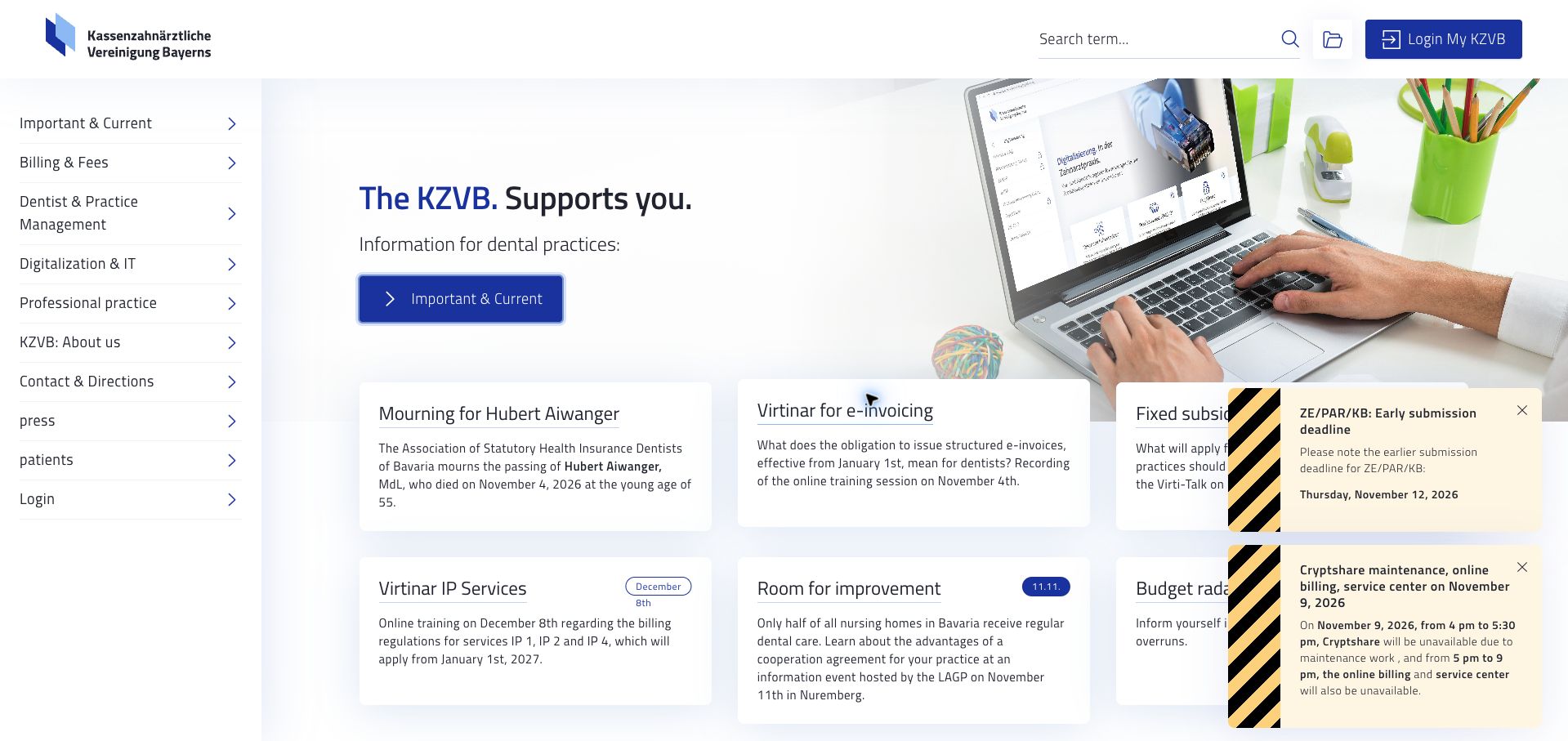
KZVB’s public homepage resembles a professional service dashboard more than a conventional brand campaign. A persistent left navigation groups billing, practice management, digitalization, professional matters, and patient information. The main area combines a concise introduction with a grid of current updates, while search and member login remain visible above. At capture, separate notices highlighted a submission deadline and scheduled service maintenance. Their warning stripes make urgency clear, although the notices overlap some content cards. Current TYPO3 metadata supports the vendor’s platform case. Only public information was reviewed; the member area, billing systems, and professional advice were not accessed or evaluated. The saved view includes browser-translated German text.
What you can learn
For a repeat-use professional portal, prioritize recognizable task groups and explicit dated notices. Give operational alerts a clear hierarchy, but manage their size and placement so urgent information does not prevent users from reading the routine content they came to find.
Pros
Task-based navigation supports recurring professional information needs.
Deadline and maintenance notices are visually distinct from ordinary news.
Cons & considerations
Multiple floating notices cover part of the update grid.
The dense sidebar requires familiarity with the organization’s terminology.
Platform source: TYPO3 implementation case study. The live page declares TYPO3 CMS. Platform evidence is separate from the direct website screenshot and is not a complete current infrastructure audit.
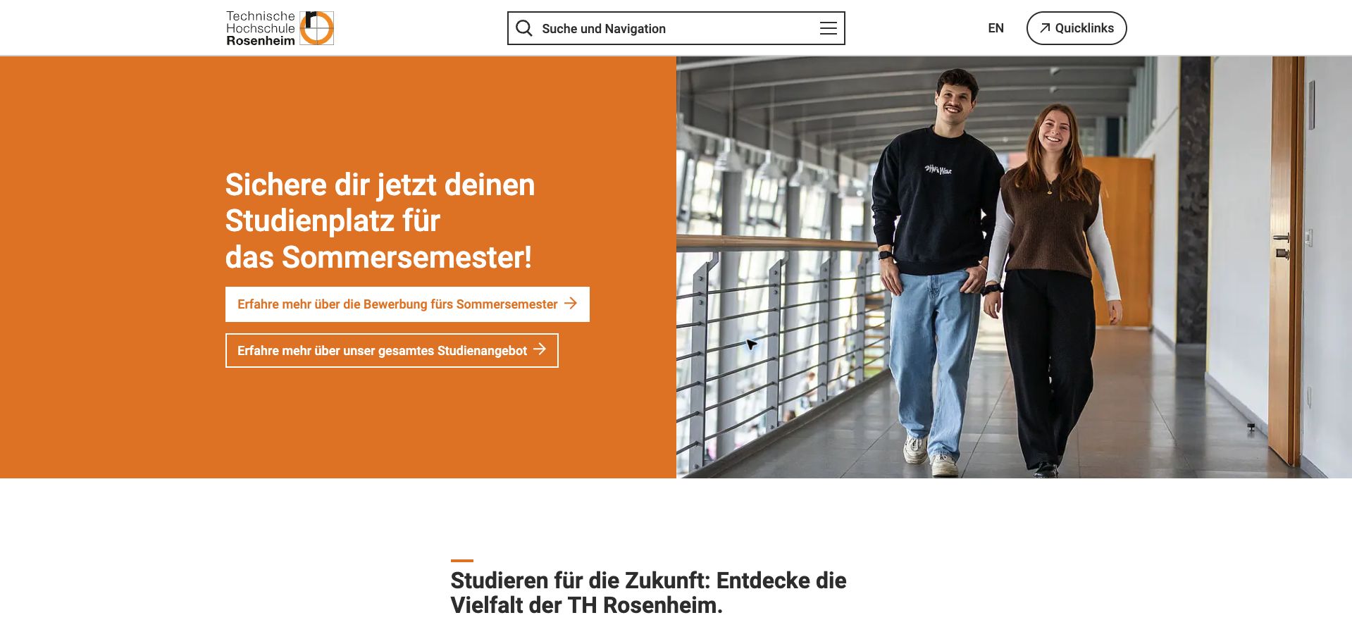
TH Rosenheim’s homepage places an orange admissions panel beside a photograph of two students on campus. Two stacked actions distinguish information about the upcoming summer-semester application from the full course offering. That gives visitors a choice between an immediate deadline-related task and broader exploration. The header combines search and navigation in one prominent control, with English and quick links kept separate. Below the introduction, audience routes cover prospective students, current students, researchers, employers, alumni, schools, and other groups. The live TYPO3 generator corroborates the university platform case, but the vendor’s stated navigation goals are not treated here as independently measured usability results.
What you can learn
Pair seasonal admissions content with an evergreen alternative so visitors outside the current campaign still have a useful next step. Once the primary student task is established, route secondary audiences explicitly rather than expecting them to infer their destination from the university’s internal departments.
Pros
Two differently styled actions separate applying from general course exploration.
Audience links acknowledge the many groups served by the university.
Cons & considerations
Combining search and navigation can obscure the distinction between those interactions.
A long audience list needs careful hierarchy to avoid overwhelming new visitors.
Platform source: TYPO3 implementation case study. The live page declares TYPO3 CMS. Platform evidence is separate from the direct website screenshot and is not a complete current infrastructure audit.
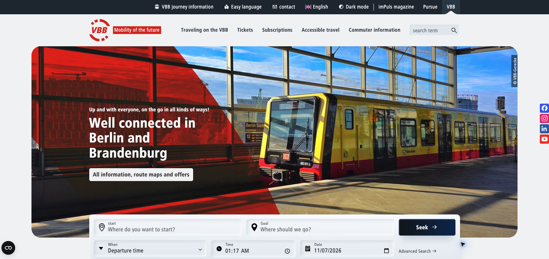
VBB introduces the Berlin-Brandenburg network with a train photograph and a red geometric panel, then overlaps the lower part of the hero with a journey planner. Start, destination, departure or arrival preference, time, and date form a familiar planning sequence. The main navigation separates tickets, subscriptions, accessible travel, and commuter information, while a utility row includes easy language and an English route. Below, construction notices and disruptions serve an operational role. The current TYPO3 generator corroborates the vendor’s documented public platform. No itinerary was submitted, and the review does not establish the underlying routing system or the accuracy of live travel information. Browser translation affected the captured German labels.
What you can learn
Keep journey planning close to the opening message and pair it with service-status information. Transit visitors need both an intended route and context about interruptions; clear ticket and accessibility routes should support those tasks without competing with the planner itself.
Pros
The planner groups the journey fields into a recognizable sequence.
Accessible travel and easy-language routes are visibly available.
Cons & considerations
The tall hero leaves some planner controls near the viewport edge.
Dense utility and primary navigation create considerable competition above the main task.
Platform source: TYPO3 implementation case study. The live page declares TYPO3 CMS. Platform evidence is separate from the direct website screenshot and is not a complete current infrastructure audit.
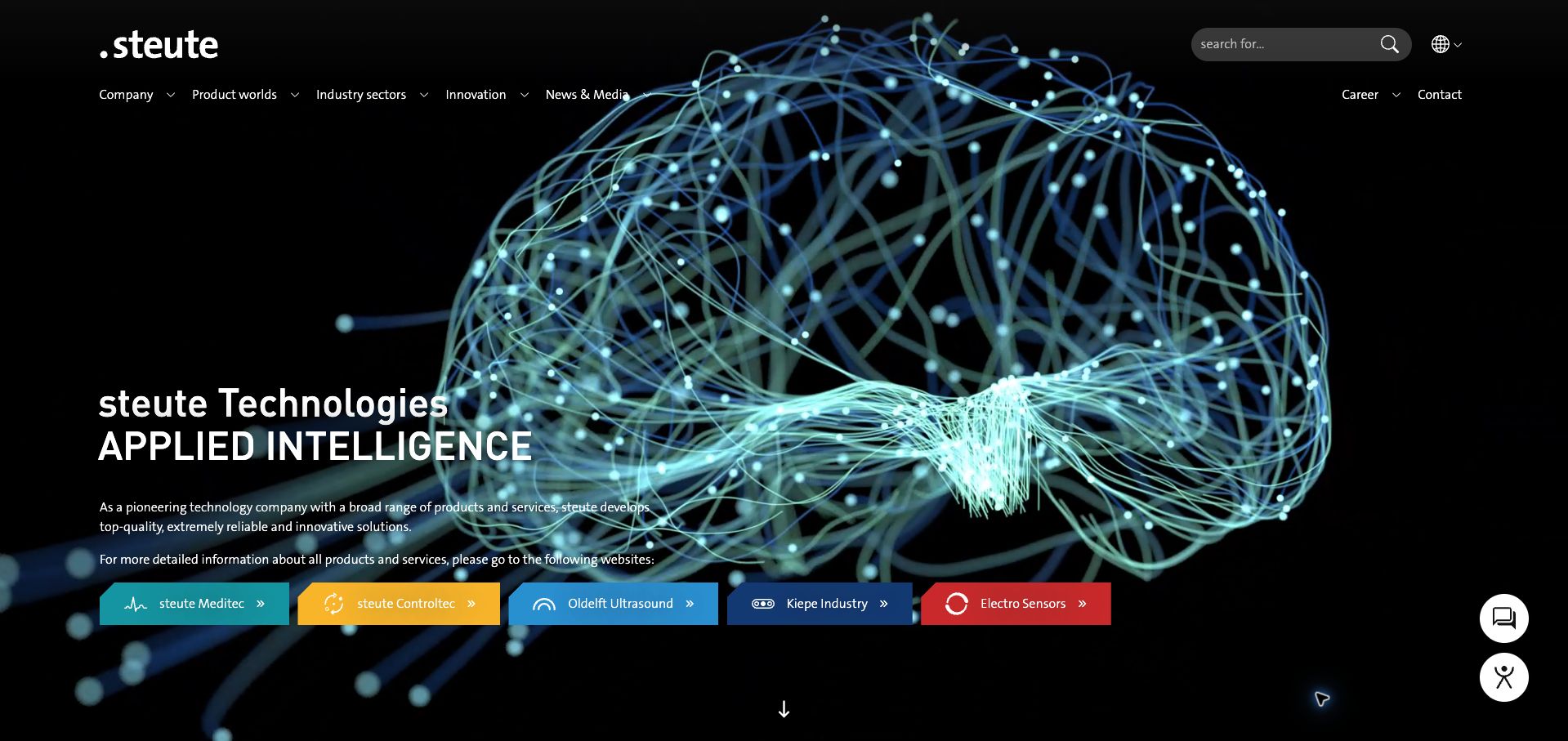
steute’s English corporate homepage uses an animated network illustration against black to support its applied-intelligence positioning. The practical element is the row of five colored destination buttons: Meditec, Controltec, Oldelft Ultrasound, Kiepe Industry, and Electro Sensors. These sit beneath an explanation that detailed products and services live on the respective websites. The main navigation distinguishes product worlds, industry sectors, innovation, and corporate information, while search remains visible at the top. Current TYPO3 metadata corroborates the vendor’s implementation. The evidence applies to this gateway page; it does not establish the platform of every linked business or specialist catalog.
What you can learn
When a corporate site routes visitors to several specialist businesses, state that relationship and make each destination recognizable. Product-world navigation and industry navigation can coexist, but the page should explain which route gives buyers detailed specifications rather than leaving them to discover the site boundaries by trial and error.
Pros
Color-coded destinations make the specialist business routes easy to distinguish.
The page explicitly explains where detailed product information is available.
Cons & considerations
Abstract animation communicates technology more readily than concrete product applications.
Visitors must leave the corporate page to continue into detailed product research.
Platform source: TYPO3 implementation case study. The live page declares TYPO3 CMS. Platform evidence is separate from the direct website screenshot and is not a complete current infrastructure audit.
Kegan has 15+ years of experience working with small businesses, Fortune 500 companies, and everything in between. No development job is too big or too small: he brings the same hands-on attention to a focused improvement, a complete website, or a custom application.
For TYPO3 projects, he can help with content architecture, custom functionality, system integrations, testing, and maintainable handover. He works directly with clients on scope, design, implementation, testing, and handover, with an emphasis on clear communication and a system that remains practical to maintain after launch.
Show 3 other TYPO3 developersHide other TYPO3 developers
Choose the implementation around the operating model
Use a conventional CMS presentation
A connected publishing and rendering setup can suit a team that values consistent page editing. Demonstrate the actual workflow with representative content.
Separate the frontend for a defined reason
The ion2s example has a qualified headless association. A separate frontend needs explicit preview, deployment, caching, and ownership plans; it is not a visual style to copy.
Integrate specialist services at clear boundaries
Commerce, maps, search, or account systems may be separate. Describe the visitor handoff and avoid implying that a CMS marker identifies the entire application.
From references to requirements
Plan the content and everyday maintenance
Map permissions and publishing responsibility
Define who writes, reviews, translates, and retires each content type. Match editing controls to those responsibilities.
Prepare the content migration
Inventory old URLs, multilingual equivalents, attachments, and important service pages. Test redirects and search with real old content.
Rehearse ongoing updates
Ask editors to change a service, publish an event, update a translation, and archive a notice. Check long headings and missing images at narrow widths.
A useful handover demonstration
Ask the actual team to carry out its routine job: publish a realistic update, correct a mistake, preview a narrow screen, and identify who owns an integration failure. For a library or frontend framework, also ask who maintains the content source and deployment. A polished screenshot does not answer those operational questions.
Beyond the screenshot
TYPO3 project checklist
Map audiences and content types.
Clarify language versus region.
Define reusable page patterns.
Assign editorial roles.
Plan translation ownership.
Inventory old URLs.
Test preview workflows.
Label external services.
Check long headings.
Document update responsibility.
Test with real content, a keyboard, a small screen, slow or failed requests, and the people who will maintain the system. These are planning checks, not an accessibility, security, performance, or search-ranking certification.
Sources & editorial method
How this TYPO3 collection was reviewed
Twenty distinct public properties have direct website captures and original design reviews. The first five are explicitly identified recognizable organizations or established specialists. Platform evidence is scoped to each named property; documentary associations, dated observations, and narrower asset-only signals remain qualified. Captures and technology verification have independent dates. A bounded public stack audit was attempted for every source, preserving inaccessible and unknown results. No private administration or transactions were inspected.
Every image is an unmodified capture from the actual website, with its source and capture date. Some captures are reused from our shared catalog; their dates remain the original capture dates. None comes from a vendor gallery or a generated reconstruction. Moving imagery and live content can change.
Technology attribution uses public page assets or metadata, official platform documentation, or a cited first-party project case study. Documentary and framework-relationship evidence is identified where used; it is not a complete current backend inventory. A CMS image CDN alone does not establish a full CMS deployment. A library’s presence does not prove which individual controls use it, and a platform label does not establish AI authorship.
The composition notes, lessons, pros and tradeoffs are original editorial observations. We have not measured conversion, traffic, security, performance or accessibility conformance. Website owners retain their brands and imagery; these examples are not our client portfolio. Written, Edited and Curated are independent records, not dates advanced by a build. See our editorial standards or suggest a correction.
Questions worth asking
TYPO3 website development FAQs
Does a TYPO3 marker identify every system on a site?
No. It supports the CMS association for the named public property; stores, accounts, and integrations may be separate.
Is headless TYPO3 necessary for a modern design?
No. Choose it for a concrete requirement and an operating team that can maintain the additional frontend responsibilities.
What should a multilingual brief include?
Language ownership, missing-translation behavior, equivalent URLs, and how users retain context when switching.
Can a large institutional menu be simplified?
Usually by organizing around visitor tasks and content relationships rather than reproducing the entire internal organization chart.