Best Planetarium Websites of 2026 (12 Real-World Examples)
Planetarium websites that connect the wonder of the night sky with clear shows, visit information and educational opportunities.
Explore 12 real planetarium website properties, from regional astronomy centres to university domes and major museum experiences. Compare how they explain programmes, distinguish admission choices and help visitors plan a trip.
A planetarium website has two jobs: convey an experience that is difficult to reproduce on a flat screen, and explain the ordinary details needed to attend it. Families need suitable shows and admission information. Teachers need learning context and a workable group-booking route. Astronomy enthusiasts may want live presentations, observing opportunities or specialist events. Those journeys overlap, but they are not identical.
This collection includes dedicated planetarium sites and clearly identified planetarium sections within larger institutions. The reviews examine public website communication, information structure and visual presentation. They do not assess projection quality, scientific accuracy of every show, staff expertise or the visitor experience in person. A strong museum brand is useful context, but the planetarium page still needs to explain its own programme and practical requirements.
Before the examples
What makes good planetarium website design in 2026?
Connect each show to the visit decision
Give each programme a useful description, format, approximate duration and intended audience when those details are known. Explain whether a live presentation, recorded full-dome film or music event is being offered. Link the programme directly to current availability without making a promotional image carry all the information.
Separate admission from the dome experience
Clarify whether the planetarium has its own ticket, is included in general admission or requires a timed reservation. Larger institutions should make that distinction before visitors enter a booking flow. Keep current policies, accessibility information and location details close to the relevant planning links.
Give schools a complete starting point
Teachers need more than a generic contact button. Explain relevant age groups, learning themes, group arrangements and the steps for requesting a visit. Keep educational enquiries separate from ordinary ticket purchases, and describe any practical limitations without promising a confirmed booking.
The collection · 12 examples
12 planetarium websites worth studying
Compare these 12 distinct public planetarium properties as examples of website design and visitor communication. The Editors Choice recognises an explicitly reviewed design approach; it is not a scientific accreditation or an endorsement of an attraction’s services.
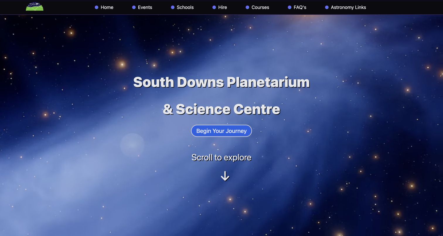
South Downs gives its specialist subject the entire opening frame. A blue star field sits behind the full planetarium name, with a central journey button and a clear invitation to continue down the page. The compact black navigation keeps events, schools, hire and courses available above that atmosphere. The public source then separates public shows, school visits and private hire, explaining the practical questions attached to each. That combination is useful for a regional attraction serving visitors with different reasons to attend. The page does not need a large institutional menu to communicate its range. The opening emphasises mood before visit logistics, and the broad journey label provides less direction than a specific show or ticket action.
What you can learn
Use an immersive opening to establish the subject, then give distinct audiences plain routes into the information they need. Keep urgent practical decisions reachable without requiring everyone to follow the same scenic introduction.
Pros
The full venue name is readable against the astronomy imagery.
Schools, events and hire have separate navigation labels.
Cons & considerations
The first screen does not show the current programme.
The general journey button leaves the next destination open to interpretation.
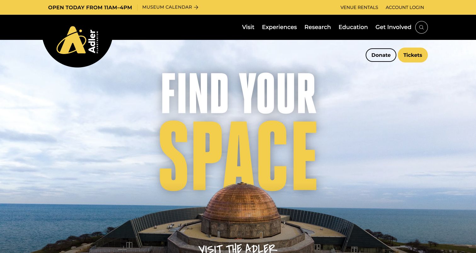
Adler connects its astronomy identity to a real destination by placing the waterfront building beneath an oversized invitation to find space. Black and yellow branding carries through the logo, opening-hours band and ticket button, making functional information feel part of the same design. Visit, experiences, research and education remain separate top-level routes. The composition is memorable because the building gives the abstract theme a physical location. It also demonstrates how a large institution can keep a purchase action visible without replacing every link with a button. The broad opening is less useful for comparing individual dome programmes, however, and its very large slogan occupies space that could otherwise introduce what a first-time visitor can do.
What you can learn
Pair a distinctive venue image with a small set of clear planning actions. Let the homepage establish identity while programme pages answer the more detailed questions about formats, availability and admission.
Pros
The ticket action stands out beside the main visual.
A separate hours strip puts a practical detail above the promotional opening.
Cons & considerations
Specific dome shows are not explained in the first view.
Large promotional typography reduces room for introductory detail.
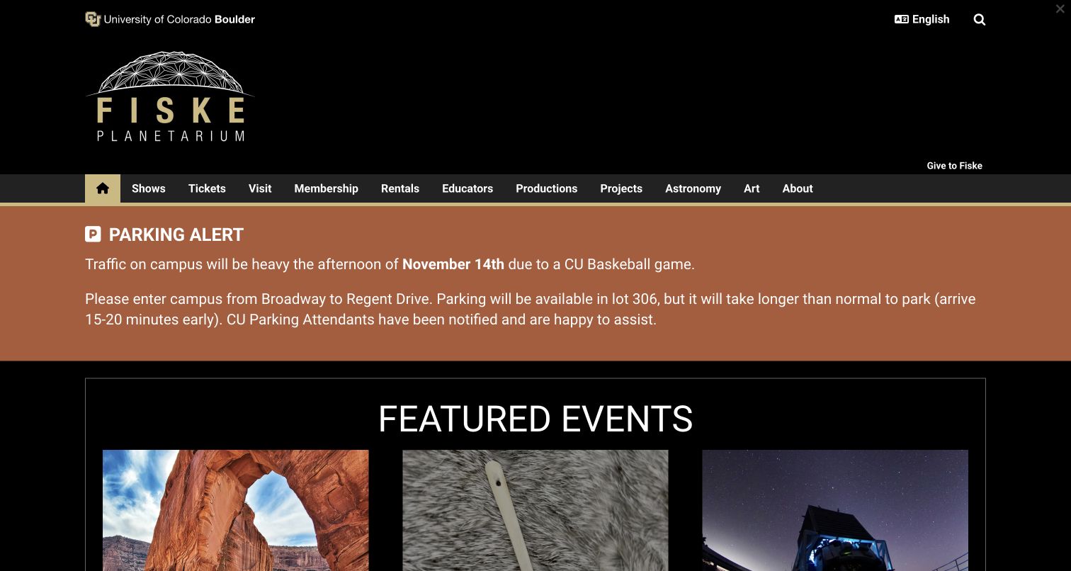
Fiske uses the university’s black-and-gold presentation while maintaining its own dome-shaped identity. A wide navigation row names shows, tickets, visits, educators and other specialist sections. In the captured view, a large parking alert precedes the featured-event cards and explains how a campus event affects arrival. That is a valuable design decision: information that could determine whether someone reaches a performance takes priority over a clean promotional composition. The event cards below introduce different activities through images rather than a single generic astronomy banner. The cost is a fairly tall institutional header and a dense range of navigation choices. With the alert present, much of the first screen is functional framing before a visitor reaches programme details.
What you can learn
Give temporary operational notices enough prominence to help people act on them, and remove or revise them when their purpose ends. An attractive event grid cannot compensate for missing arrival information.
Pros
Shows and tickets are named directly in the main navigation.
The parking notice explains a concrete consequence for visitors.
Cons & considerations
The large header delays the programme content.
Numerous navigation items require visitors to distinguish overlapping interests.
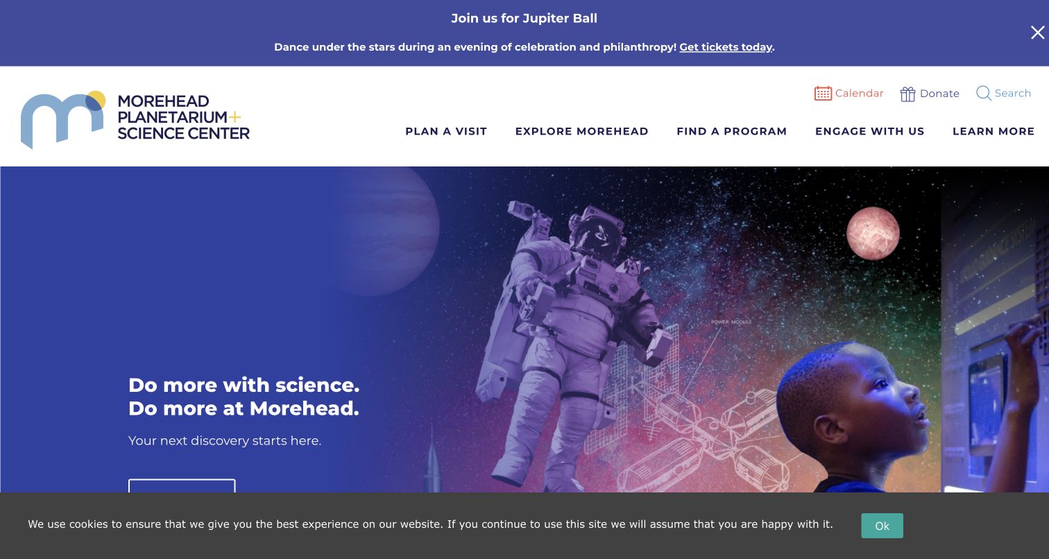
Morehead combines an astronaut, planets and a young visitor into a layered science scene. A solid blue area protects the introductory message from the busier imagery, while the white masthead separates navigation from the hero. Labels such as planning a visit and finding a programme give the large science-centre offer a useful task-based structure. Calendar, search and donation links sit in a smaller utility row. The captured page also shows the demands competing for attention: an event announcement occupies the top and a cookie notice covers the lower edge. Those are genuine parts of the observed source view, not removed for the screenshot. The layout remains identifiable, but a visitor sees several layers before reaching the detailed programme information.
What you can learn
Reserve a calm area for introductory text when using a rich science montage. Evaluate the combined height of announcements, navigation and notices so that each useful component does not collectively hide the next step.
Pros
Audience-oriented labels make a broad programme easier to approach.
The blue text panel creates separation from complex imagery.
Cons & considerations
Several horizontal layers compete in the opening view.
The visible cookie notice obscures part of the hero action.
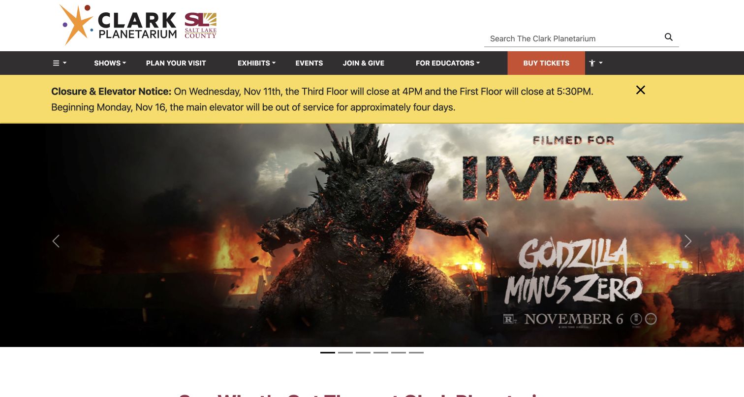
Clark pairs its planetarium logo with Salt Lake County branding, clarifying that institutional relationship. A dark navigation band groups shows, visit planning, exhibits and educator information, with an orange ticket action at the edge. The captured homepage gives a closure and elevator notice a prominent yellow strip before the promotional carousel. That placement treats access and scheduling information as part of the visitor experience rather than a footnote. The featured slide promotes an IMAX film, demonstrating that this property includes more than its dome programme. That breadth also creates a communication challenge: a visitor interested specifically in astronomy must use the show navigation to separate the available experiences. The large carousel artwork does not explain those distinctions by itself.
What you can learn
When several attractions share a website, keep their identities and admission choices explicit. Pair promotional imagery with straightforward categories, and give changes affecting access enough prominence to be discovered before a booking.
Pros
The ticket button is distinct from ordinary navigation.
The closure and elevator notice is visible before promotional content.
Cons & considerations
The opening film promotion does not explain the dome offer.
A carousel makes the introductory message depend on the visible slide.
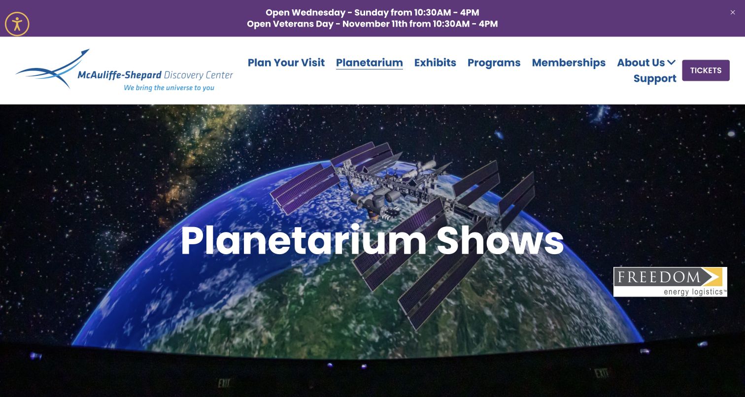
The McAuliffe-Shepard page makes the planetarium a first-class section within the discovery centre. Its selected navigation label, large show heading and dome image reinforce the same destination. The captured image includes the seating edge beneath a projected Earth and space station, helping visitors understand that this is an immersive theatre rather than an ordinary screen. Opening information appears above the masthead, while a purple ticket action remains separate from the main links. The source page goes on to describe the Freedom Energy Planetarium and its programme. The first view establishes the experience strongly, although it leaves individual show choices below the fold and gives a sponsor mark considerable space alongside the heading. Those are presentation trade-offs rather than evidence about the actual performances.
What you can learn
Use a dedicated section to explain an attraction inside a larger venue. Show enough of the physical setting to make the experience understandable, and connect that introduction to specific programme and admission information.
Pros
The planetarium is clearly identified in both heading and navigation.
The dome image communicates the setting of the experience.
Cons & considerations
Individual show choices require further exploration.
The sponsor identity competes with the introductory content.
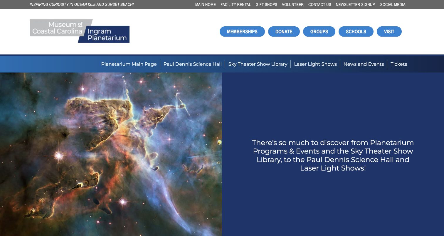
Ingram’s landing page solves a useful structural problem: two attractions share a parent identity, but visitors need to know which one they are exploring. The paired museum and planetarium logo remains in the masthead, while a second blue navigation band names the planetarium’s show library, science hall, laser shows and tickets. A split opening places detailed nebula imagery on one side and a short programme overview on a solid blue panel. This keeps the text readable without darkening the image. The source page then provides a planetarium-specific event calendar. The layered header is substantial, and its several rows of links ask visitors to distinguish general support actions from local programme navigation. The dedicated section gives planetarium visitors more context than an undifferentiated museum homepage.
What you can learn
Give a shared organisation a consistent identity while providing each attraction with its own task-oriented navigation. A clear local menu can preserve context better than repeating the entire parent site’s choices.
Pros
The planetarium has a dedicated programme navigation band.
The split introduction keeps explanatory text separate from imagery.
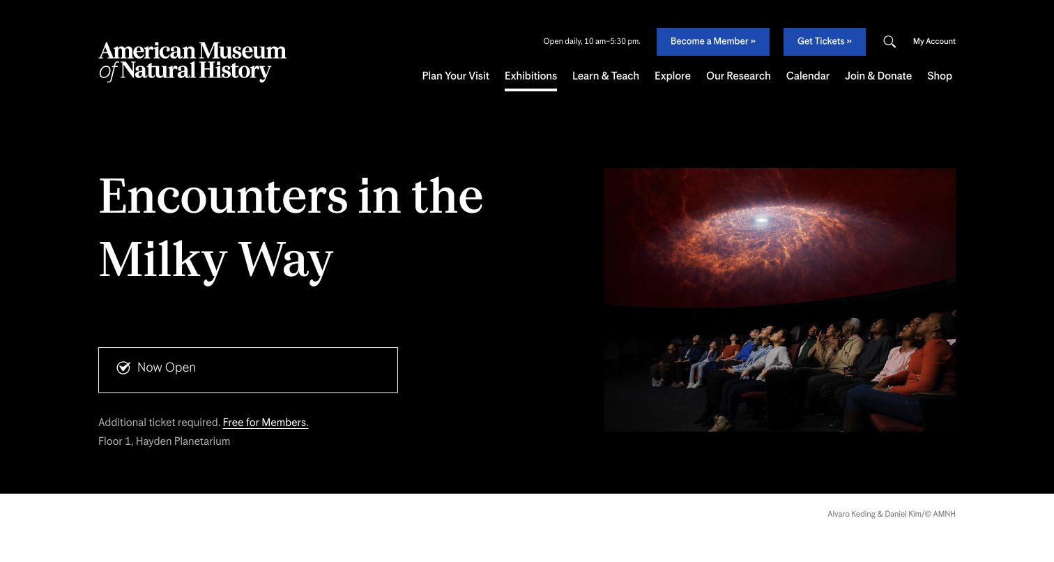
The Hayden Planetarium example is the American Museum of Natural History’s specific space-show page. It pairs a large programme title with a photograph of visitors beneath the dome, using a restrained black background and generous spacing. An opening-status panel and a short admission note sit directly under the title, followed by the location within the museum. That organisation gives the visitor useful context before a long description: this is a named experience in a particular place, with its own ticket relationship. Museum-wide tickets and membership remain available in the header. The specific programme focus is also its limit as an example: it does not represent the entire institution’s astronomy research or every planetarium activity. Suitability and detailed planning require reading further.
What you can learn
Place admission relationships and location beside the programme introduction. Clear practical context makes a dramatic show image more useful, especially when an experience belongs to a larger museum visit.
Pros
Admission context appears alongside the show introduction.
A dome photograph explains the physical viewing experience.
Cons & considerations
The page represents one programme rather than the full planetarium offer.
Detailed audience guidance is not visible in the opening capture.
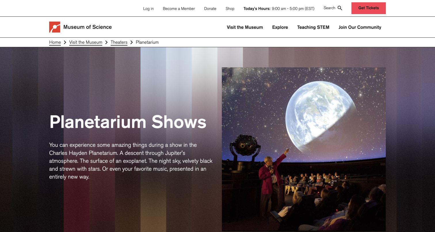
Boston’s Charles Hayden Planetarium page uses a photograph of a presenter and seated audience to explain the experience. The image shows the relationship between a live guide, the visitors and the projected sky, while a plain heading and short paragraph introduce the range of astronomy and music programming. Breadcrumbs keep the page’s position within the Museum of Science visible. The restrained white header carries today’s hours and a red ticket button without overwhelming the subject. This is a useful alternative to presenting space imagery alone: the visitor can imagine attending the event, not merely looking at an illustration of a planet. The introductory paragraph remains broad, however, and the opening does not help someone choose a particular performance or distinguish the ticket arrangements for different programme types.
What you can learn
Show people participating in the experience when that explains more than spectacle alone. Use the landing page to establish the setting, then make programme comparisons and ticket conditions easy to reach.
Pros
The presenter-and-audience photograph makes the activity tangible.
Breadcrumbs preserve context within the larger museum site.
Cons & considerations
Specific performance options are below the opening view.
The broad introduction leaves programme differences for subsequent pages.
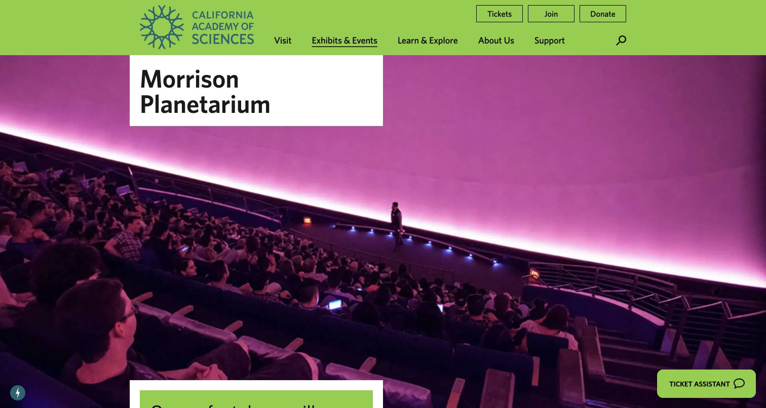
Morrison’s page gives a large photograph of the dome interior most of the opening screen. Visitors, seating and a presenter establish the scale, while the pink projection makes the room feel distinct from an ordinary lecture space. A white title block keeps the planetarium name readable against the image. The California Academy of Sciences’ green header supplies a strong institutional frame, with tickets, membership and donation actions grouped separately from the main navigation. The result is direct. It also leaves practical explanation outside the first view: someone deciding whether to attend still needs to find the programme, admission and suitability details below. A floating ticket assistant appears at the lower corner, introducing another action alongside the existing ticket route.
What you can learn
Use an accurate interior photograph to explain scale and atmosphere, then keep the title on a dependable surface. Make sure the next content answers planning questions rather than repeating the visual impression.
Pros
The interior image shows the dome and audience together.
The white title block avoids placing essential text over a busy photograph.
Cons & considerations
The opening provides little programme or admission detail.
The floating assistant adds another competing route into ticket information.
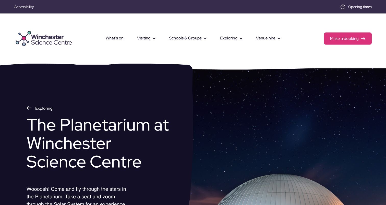
Winchester’s planetarium page separates a large introductory heading from the starry image beside it. The dark text panel has a gently curved edge, giving the layout personality without placing paragraphs over the busy sky. Above it, a spacious white navigation area groups visiting, schools, exploration and venue hire, with a pink booking action at the far side. Accessibility and opening times occupy a smaller utility strip. The page clearly belongs to the science centre while naming the planetarium as its own experience. Its generous scale is attractive, although the tall header and long title mean that the explanatory paragraph continues below the captured view. A visitor wanting a particular show must move beyond this broad introduction to the programme information.
What you can learn
Give an attraction a clear introduction within the parent institution’s design system. Keep atmospheric imagery separate from explanatory text, and ensure that generous spacing still leaves the practical next step easy to locate.
Pros
The solid text area provides a dependable reading surface.
Booking, opening times and accessibility have identifiable routes.
Cons & considerations
The tall opening delays detailed programme information.
The large heading leaves little explanation visible before scrolling.
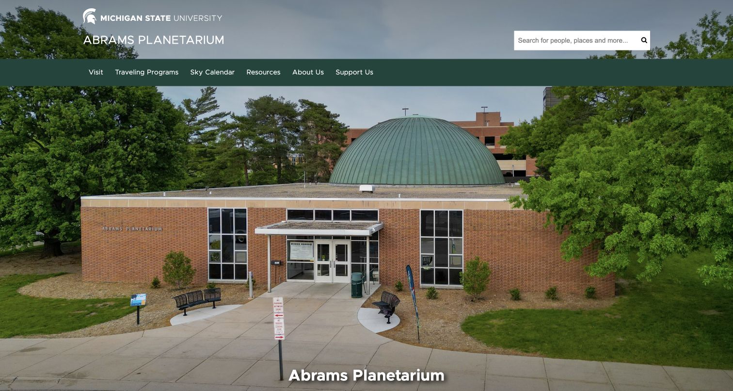
Abrams opens with a large photograph of its building, showing the entrance and green dome in their campus setting. Michigan State University branding and the planetarium name sit above a dark-green navigation band, so the institutional relationship is clear. Visit, travelling programmes, the sky calendar and resources are named separately. This is a practical choice for an educational venue: the website presents both a place to attend and a continuing astronomy resource. The official visit section confirms distinct routes for public shows, school groups and other audiences. The opening photograph provides strong physical orientation, but it contains little explanation of the experience inside. The general university-style search wording also has a broader scope than someone seeking only a planetarium programme might expect.
What you can learn
A recognisable exterior can help first-time visitors understand where they are going. Pair that physical orientation with clear programme routes, and give ongoing educational resources their own place in the navigation.
Pros
The entrance and dome are visible in the opening photograph.
The university and planetarium identities are clearly connected.
Cons & considerations
The initial view does not explain individual shows.
Broad search wording is less specific than the surrounding programme navigation.
Kegan is a freelance web designer and developer with 15+ years of experience helping businesses turn complicated website requirements into clear, maintainable digital experiences. He works directly with clients from planning and design through development, launch, and ongoing support.
For planetarium website design, his development approach focuses on show information, admission guidance and distinct public, school and group-visit journeys. The scope can be a targeted improvement or a complete custom build, with responsive layouts, thoughtful content structure, and integrations chosen around the people using and maintaining the site.
Show 3 other planetarium website designersHide other planetarium website designers
Build a programme structure visitors can understand
Start with the experiences the institution actually offers. A live sky presentation, a recorded astronomy film, a laser concert and an outdoor observing session need different descriptions even when they share a calendar. Create a consistent record for each programme: title, short explanation, format, duration, audience guidance, venue and a link to current availability. Add sensory or access information where it helps someone decide whether the experience is suitable.
Separate enduring show information from individual performances. The description may remain useful for months, while dates, start times and remaining availability can change frequently. A central calendar should use those records instead of requiring staff to rewrite the same explanation across many event pages. Keep cancelled or sold-out sessions clearly marked, and make the relationship between a show and its booking destination understandable before someone leaves the site.
Use imagery to communicate scale and atmosphere, but give visitors ordinary words as well. A photograph of the dome, a programme still and a short trailer each answer different questions. Caption them accurately, avoid implying that a promotional rendering is a photograph of the venue, and provide useful alternatives to information delivered only through motion or audio. Assign an editor to check programme details when seasons change, rather than relying on an undated homepage announcement.
Explain the visit before asking someone to book
Map the questions a first-time visitor is likely to ask in order. Where is the planetarium? Which entrance should they use? Does a dome ticket include the surrounding museum, or is another admission required? How early should they arrive, and what happens if they miss the start? Put current answers near the relevant programme and ticket links rather than scattering them through unrelated institutional pages.
Treat access information as part of planning. Explain the arrangements the venue can actually provide, including routes into the building, seating considerations and any show-specific sensory information. Link to a more detailed access page when needed, and give visitors a reliable way to ask about circumstances that the website cannot cover. Avoid using a broad accessibility label as a substitute for concrete information or an assurance that every programme suits every visitor.
If booking happens on another service, make that transition clear. Retain a visible way back to show descriptions, visit details and the institution’s contact information. Do not imply that submitting an enquiry reserves seats. Check the complete journey whenever ticket products change, including combinations of museum admission, dome performances, memberships and concessions. Keep operational details in an owned source of truth so a seasonal banner, programme page and external ticket description do not contradict one another.
Support education and returning audiences after launch
A planetarium can serve several recurring communities beyond the occasional visitor. Teachers may need curriculum context and group logistics, families may follow school-holiday programmes, and astronomy enthusiasts may look for live sky updates or specialist talks. Give each audience a clear starting route without turning the homepage into a long list of equally prominent buttons. Use labels that describe the task, such as school visits or current shows, rather than internal department names.
For educational visits, explain the information staff need to respond usefully: approximate group size, age range, preferred dates and learning interests. Publish realistic response expectations only if the team can maintain them. Keep requests private and distinguish an enquiry from an accepted booking. Resources for teachers can support preparation and follow-up, but should be labelled with their purpose and reviewed when programme content changes.
Plan for ongoing ownership as carefully as launch design. Assign responsibility for event listings, access details, temporary closures, learning resources and external booking links. Remove expired promotions or redirect them to an appropriate current page without breaking useful references. Review the site under ordinary conditions such as a long programme title, an unavailable trailer or a narrow screen. The goal is a dependable public programme that remains understandable between major redesigns and seasonal campaigns.
The editing job behind the design
Choose tools that keep shows and visit information in sync
Use structured records for programmes and performances, with clear ownership for dates, audience guidance and ticket destinations. A manageable content model is more useful than a different visual template for every show.
Keep essential programme and visit information available without an animation or embedded trailer. Give media descriptive alternatives, avoid unexpected audio and preserve ordinary links to current booking information.
Treat ticketing, education requests and audience records as separate operational systems with appropriate privacy boundaries. Public stack evidence identifies only what the bounded source audit could observe; it does not establish an institution’s complete booking or research infrastructure.
Our WordPress website examples offer a separate look at publishing approaches. A visible platform label is evidence for that named page, not a guarantee that the same system will suit your requirements.
Before the public launch
Planetarium website brief checklist
Name the planetarium and explain its relationship to any parent museum or university.
Distinguish live presentations, recorded films, music events and observing sessions.
Give programme pages useful duration, audience and format information.
Keep performance dates and availability separate from enduring show descriptions.
Explain how planetarium tickets relate to general admission or memberships.
Publish current arrival, entry, location and transport information.
Provide specific access and sensory details where they affect a visit.
Offer a clear school-visit route with educational and practical context.
Label external ticketing transitions and preserve a route back to information.
Keep essential details readable without trailers or background motion.
Protect enquiry information and avoid implying a submitted request is confirmed.
Assign owners for seasonal updates, closures, calendar entries and broken links.
These checks are a project checklist, not a performance, legal, security, or accessibility certification. Test real journeys with the people responsible for the website before making claims about the result.
Sources & editorial method
How this collection was selected and reviewed
This collection follows the saved random target of 12 distinct public planetarium properties. Dedicated institutional sites and specifically identified planetarium sections are both eligible; separate pages belonging to the same planetarium are not counted as additional examples. Reviews focus on public design and communication. Direct screenshot provenance and bounded broad technology-audit records accompany each source. Technology evidence describes visible public signals rather than a complete backend. No booking, payment, account action or real form submission was made.
Each example links to its actual source page. Screenshots are direct browser captures with their own capture dates; moving imagery, announcements and live designs can change. The notes describe observable design choices and conditional tradeoffs, not measured traffic, conversion results, service quality, or accessibility conformance.
Technology labels use public page metadata, asset evidence, or explicitly cited platform documentation. Platform documentation is not a complete current deployment audit. A component reference may be legacy or unused; it is not a complete backend inventory. Unknown stacks are omitted. These sites are editorial examples, not our client portfolio.
Written, Edited and Curated are separate editorial records, not timestamps advanced by a rebuild. Website designs and imagery belong to their owners. See our editorial standards or suggest a correction.
Questions worth asking
Planetarium website design questions
Does a planetarium need a separate website?
A dedicated site can help a standalone organisation, while a clearly named section may suit a planetarium within a museum or university. In either case, visitors should understand the specific experience, current programmes and booking arrangements without having to interpret the institution’s organisational structure.
What should appear on a planetarium show page?
Include a plain-language description, format, useful duration and audience guidance, plus current dates or a clear availability link. Explain relevant sensory considerations and whether admission or a separate reservation is needed. Keep changing operational details reviewed.
How should school visits differ from public ticket booking?
School pages should explain learning themes, suitable age ranges and group arrangements, then provide a clear enquiry or booking process. A teacher may need to discuss dates, access and group requirements before a reservation can be confirmed.
Should a planetarium homepage use an immersive video?
Video can introduce the atmosphere, but it should not hide programme information or become necessary for navigation. Use a meaningful poster image, readable text, appropriate controls and alternatives for people who cannot or prefer not to play it.
Are these planetariums ranked by scientific or visitor quality?
No. The collection and Editors Choice address website design and public communication. Source-page reviews and screenshots do not establish the quality of projection equipment, every scientific statement, staff expertise or an in-person visit.