A clothing website has to do two jobs well: establish a recognizable point of view and help someone choose a garment that fits their needs.
An established label can open with an abstract campaign because many visitors already know its products. A new specialist brand may need to show the garment, its use, and a useful price or category context much sooner. Borrow the reasoning behind a reference rather than copying the amount of explanation a famous brand can afford to omit.
The collection spans sportswear, everyday basics, luxury houses, specialist outerwear, and broader fashion retail. It includes footwear where that forms part of the brand’s clothing and styling offer. Reviews concern visible presentation and scoped public technology evidence, not the quality, fit, sourcing, or performance of the garments themselves.
Before the examples
What makes good clothing brand website design in 2026?
Keep the campaign and the clothing identifiable
A beautiful scene should lead to a clearly named collection or product, not an unrelated catalog. Show which individual pieces are pictured and whether they are sold separately. Preserve ordinary garment categories for returning customers, even when the current campaign introduces a collaboration, a gift occasion, or an unusual accessory.
Make fit and material information comparable
Agree on size naming, garment measurements, model context where appropriate, fabric composition, care, and variation naming before designing the product template. Distinguish body measurements from the measurements of the garment. An editorial photograph can introduce a silhouette, but it cannot replace the information needed to compare similar items.
Separate visual mood from substantiated claims
Outdoor scenery does not establish weather protection, and a rural material story does not establish a certification. Give every technical or sourcing statement an actual scope and supporting source. Make the appropriate product reviewer responsible for these explanations rather than leaving them as unmaintained campaign copy.
The collection · 29 examples
29 clothing brand websites worth studying
Compare how the stores move between atmosphere and shopping detail. Pay particular attention to stable category access, garment identification within styled scenes, and the amount of explanation expected from an unfamiliar visitor.
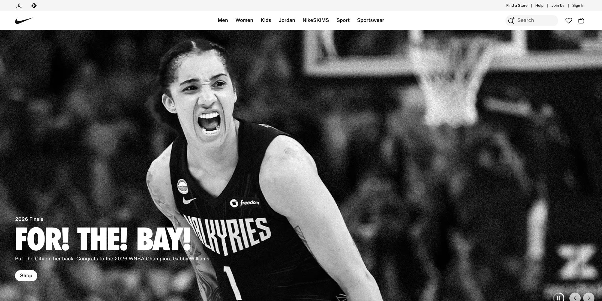
Nike makes a black-and-white sporting photograph the emotional lead, with a short campaign message and a small shopping action. Above it, a clean navigation strip retains the familiar product and audience categories. This is a useful clothing reference because the campaign communicates an attitude while the header continues to serve practical browsing. The image does not explain the exact garments, available sizes, or relationship between the featured athlete and the products a shopper will find next.
What you can learn
Keep the campaign’s emotional job separate from the catalog’s explanatory job. Link the scene to a clearly identified range, maintain stable category labels, and give product pages consistent fit and material information. A returning customer should not need to interpret a new campaign before finding the same basic garment category.
Pros
The restrained monochrome image gives the campaign a singular visual emphasis.
Permanent shopping routes remain visible outside the photographic story.
Cons & considerations
Strong sporting imagery can overshadow the practical product offer.
A short shopping label needs a destination that clearly connects the campaign to available garments.
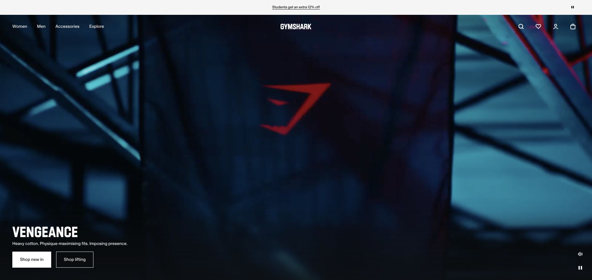
Gymshark’s captured opening uses a dark, cinematic frame and a forceful collection identity. The navigation remains at the top, while a release-oriented action and a separate shopping action sit with the campaign. The distinction matters for apparel customers: some want to understand the new collection, while others arrive ready to shop a familiar product type. The atmospheric image does not establish fit, fabric behavior, training suitability, or the actual availability of the featured pieces.
What you can learn
Give launches and ordinary shopping different, accurately labeled destinations. Build the campaign from actual product records rather than creating an isolated visual microsite. Plan how it is retired, how unavailable sizes are represented, and how a customer returns to the broader clothing range.
Pros
Two distinct actions acknowledge interest in both the launch story and products.
The dark visual direction gives the collection a recognizable identity.
Cons & considerations
Cinematic media requires clear loading and reduced-motion alternatives.
A forceful collection message still needs practical garment and size information nearby.
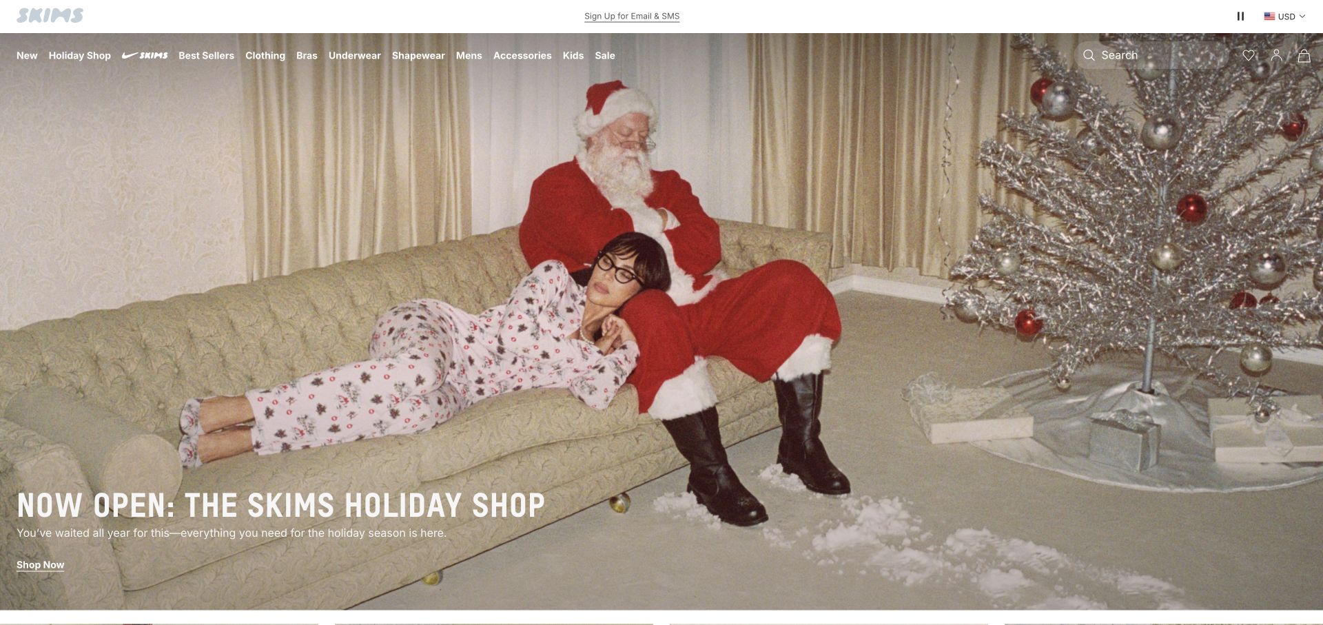
SKIMS uses a staged holiday living-room scene to introduce a seasonal shop. The light header and compact shopping navigation leave the photograph to carry much of the mood, while the campaign wording tells the visitor that this is a curated destination rather than the entire catalog. This is useful when a clothing brand combines coordinated items across several recipients or occasions. The scene alone cannot explain whether the garments come separately, how they fit, or what sizes remain available.
What you can learn
Treat the seasonal shop as a maintained collection with clear inclusion rules. Keep product names and individual destinations identifiable inside the broader story. Explain bundle contents, matching items, sizing, and returns on the actual product pages rather than expecting the campaign scene to answer every question.
Pros
The coordinated scene gives the seasonal collection a distinct atmosphere.
A named holiday destination explains the role of the current campaign.
Cons & considerations
Styled groups can make individually sold items look like a single package.
Time-sensitive imagery needs prompt replacement when the occasion or stock changes.
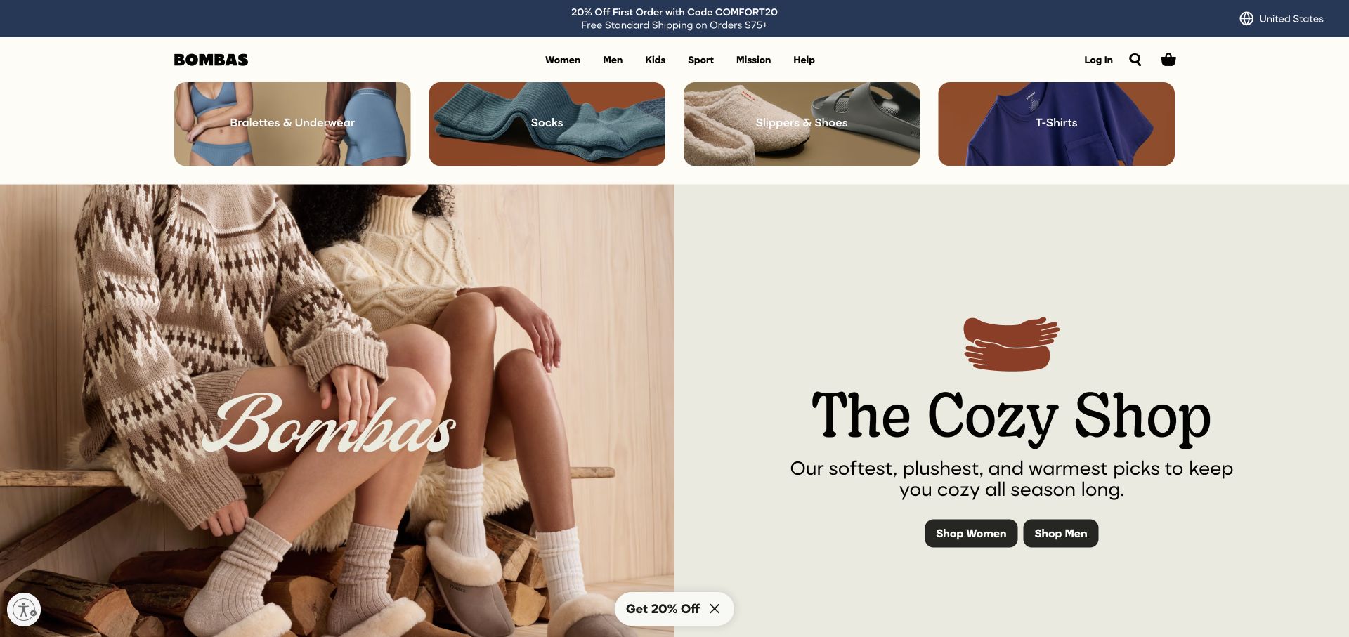
Bombas combines category shortcuts with a split opening that pairs a styled clothing photograph and a plain seasonal shopping panel. That structure gives socks and other relatively small essentials more context than a row of isolated pack shots. The visible category imagery also helps explain that the range is broader than the featured cozy-season message. The practical questions beneath that scene remain important: garment type, size, quantity, material, and whether a displayed combination is sold as a set.
What you can learn
Give basics a consistent comparison language. Separate pack quantity from garment size and collection styling from functional attributes. Keep familiar restocking routes short for returning buyers while allowing the seasonal panel to introduce a different occasion or gift assortment.
Pros
Category shortcuts establish the wider essentials range quickly.
The split composition gives the seasonal message its own readable surface.
Cons & considerations
Styled layers can leave the exact product or pack contents ambiguous.
A gifting or seasonal theme should not bury the straightforward repeat-purchase path.
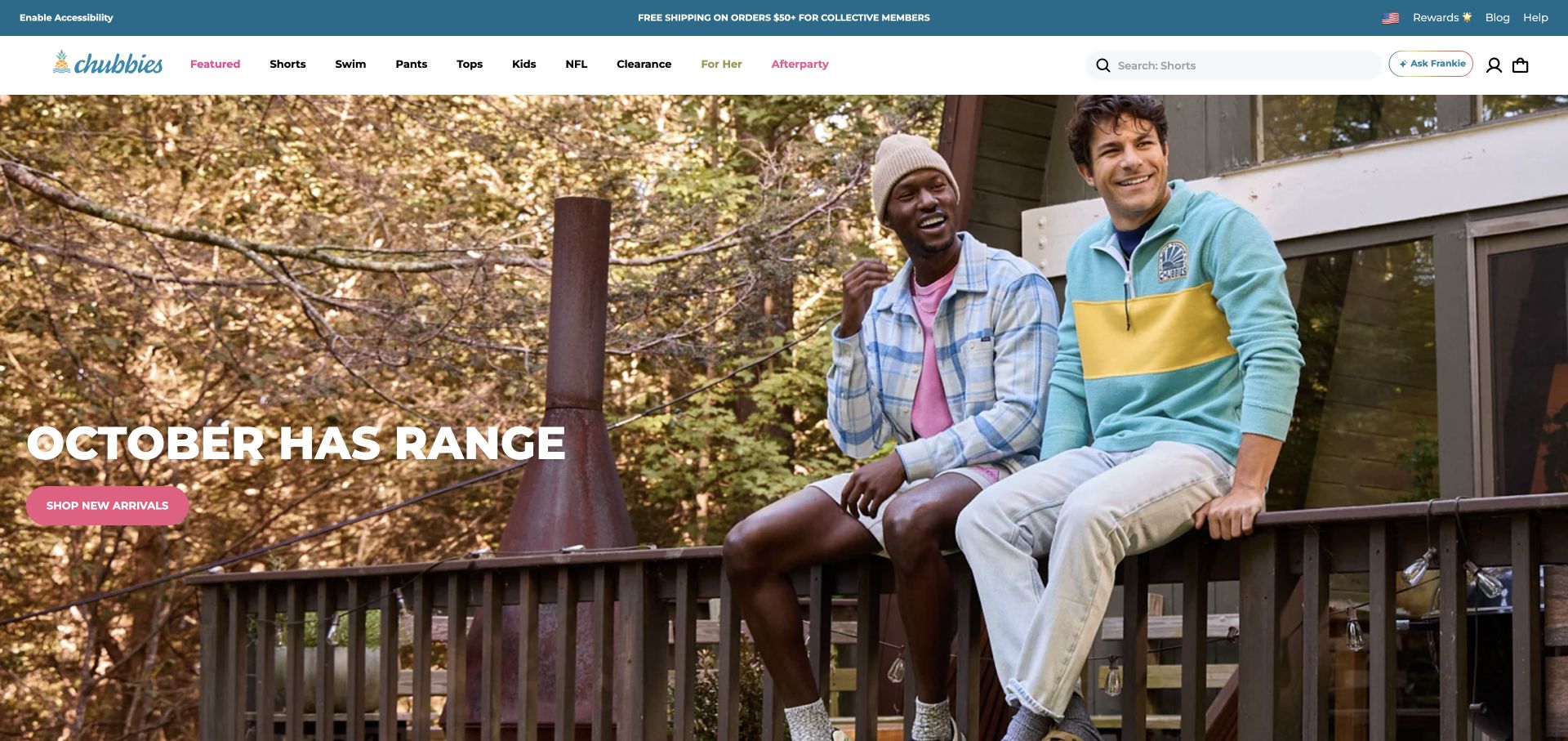
Chubbies puts two people in an outdoor social setting beneath a compact shopping header. The casual clothing and relaxed composition communicate an intended occasion before a visitor studies individual garments. That makes the brand’s tone tangible, while the small campaign action gives a route into the range. The design challenge is preserving that approachable tone without allowing seasonal copy or lifestyle imagery to obscure fit, inseam, fabric, and other basic comparison information.
What you can learn
Write the garment’s functional description independently of the campaign voice. Use the personality to invite browsing, then make lengths, fits, materials, and care easy to compare consistently. A playful seasonal headline should be editable without changing the meaning or organization of the product catalog.
Pros
The social setting makes the clothing’s everyday context easy to recognize.
The informal photography supports a clear brand tone.
Cons & considerations
Seasonal slogans can date faster than the underlying garment range.
Lifestyle imagery alone cannot show the differences between several similar fits or lengths.
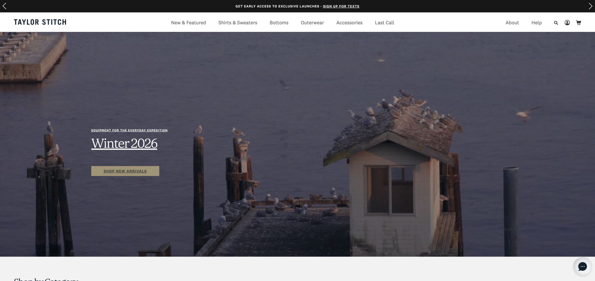
Taylor Stitch places a seasonal collection message over a spacious landscape and architectural scene. Its light header remains restrained, giving the campaign room rather than surrounding it with many competing offers. This is a useful reference for an apparel business that wants a collection to feel like a coherent editorial release. The restrained opening also creates an explanatory obligation: the page must soon identify the actual garments and show how the story connects to their construction, use, and availability.
What you can learn
Use the landscape to establish a collection’s mood, then connect it to product-level evidence. Show fabrics, details, fit, and care in a repeatable format. Make the campaign destination specific enough that someone intrigued by the image can find the clothes without another layer of abstract brand storytelling.
Pros
The spacious photograph gives the collection a considered editorial tone.
A restrained header avoids competing with the lead image.
Cons & considerations
Atmosphere can delay identification of the actual clothing being offered.
Subtle overlaid text needs contrast checks across responsive crops and changing imagery.
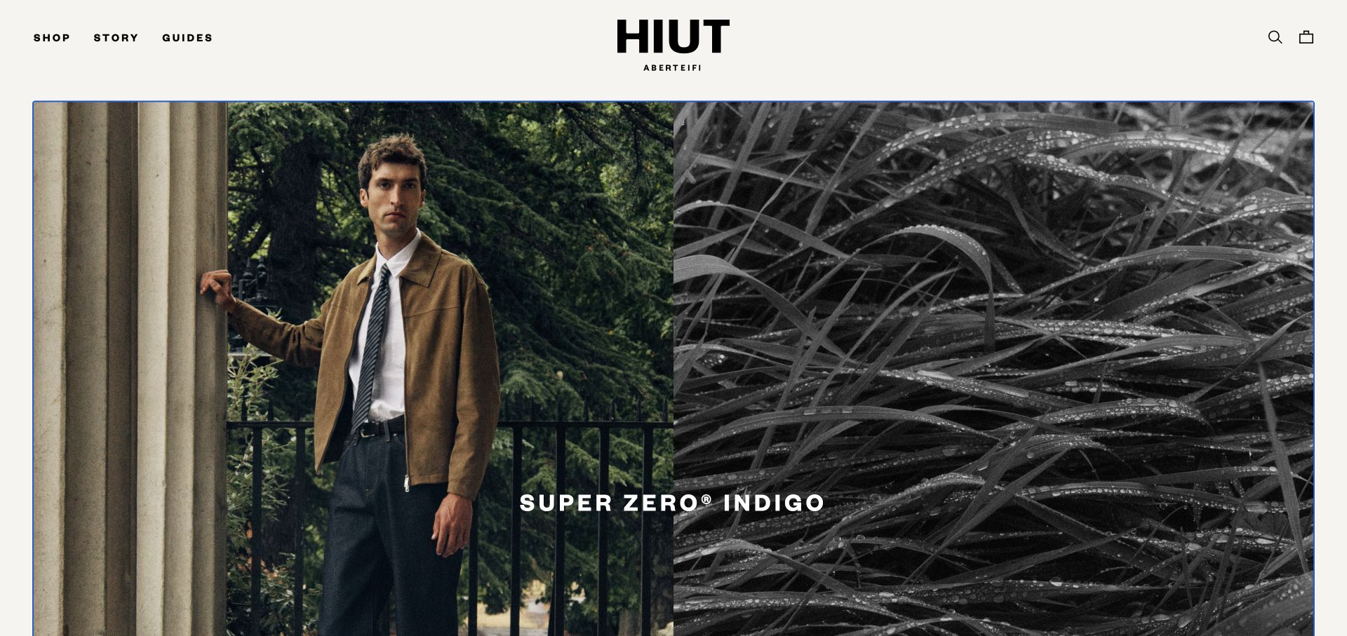
Hiut Denim’s split photograph pairs a person wearing the clothing with an abstracted material or process-oriented image. A bold centered wordmark and minimal navigation keep the brand’s denim focus unusually clear. The result is a useful specialist reference: it does not need a sprawling menu to suggest breadth it does not have. The next information should deepen the product decision through cut, measurement, construction, and care rather than simply adding more atmospheric photographs.
What you can learn
Let a narrow catalog produce a clearer information hierarchy. Give each fit an understandable comparison and support it with consistent measurements and real worn views. Distinguish a campaign’s fabric story from the practical details a shopper needs to select and maintain a specific pair.
Pros
A person and a material-oriented image provide complementary views of the product.
The focused identity avoids an unnecessarily broad retail menu.
Cons & considerations
Specialist terminology needs explanation for shoppers unfamiliar with denim construction.
A strong fabric story cannot replace clear measurements and fit comparison.
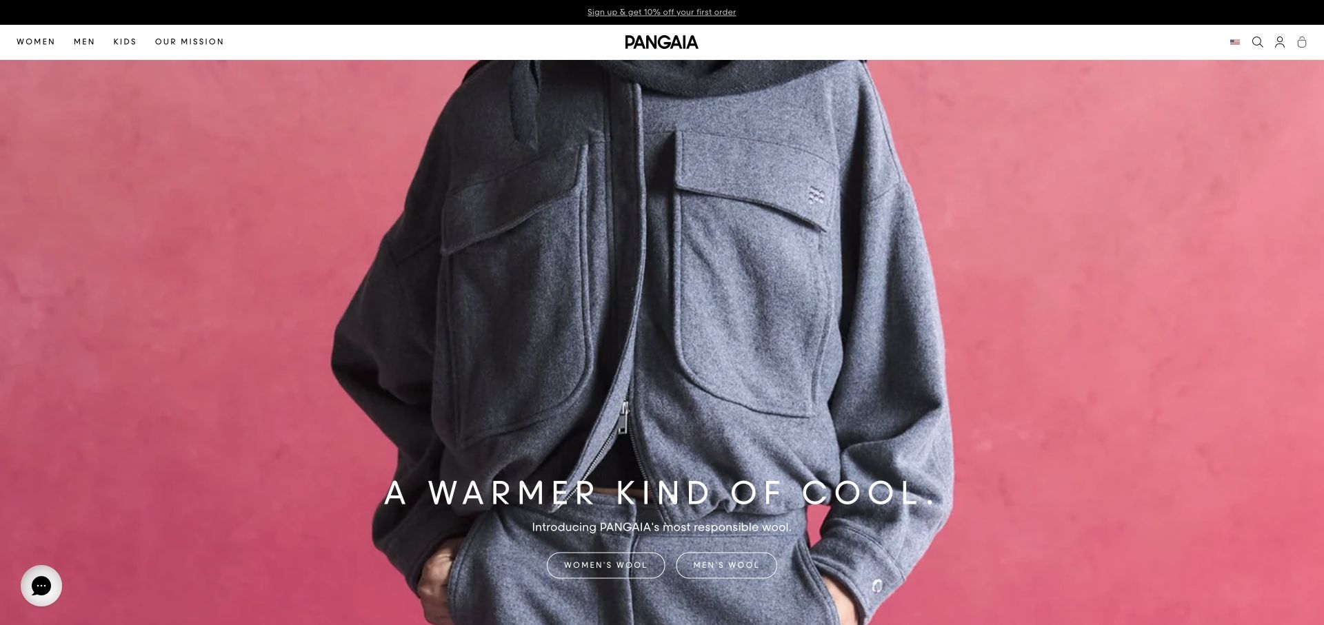
PANGAIA uses a close view of a zip-front garment against a strong pink field. The composition concentrates on texture and volume rather than an elaborate lifestyle scene, while a narrow light header separates navigation from the image. This is useful for clothing whose material story is central to the brand. That story must still distinguish a visual impression of softness from specific information about composition, care, certification, or any environmental assertion.
What you can learn
Connect material-led imagery to maintained, product-specific explanations. State what a fabric claim refers to, which garment it applies to, and where supporting information can be found. Keep fit, measurements, and care equally accessible so a material proposition does not become the only basis for choosing the product.
Pros
The close crop draws attention to the garment’s visible material qualities.
A simple color field keeps the product from being lost in a busy scene.
Cons & considerations
A texture photograph cannot substantiate technical or environmental material claims.
A single close-up needs complementary views to explain fit, length, and proportion.
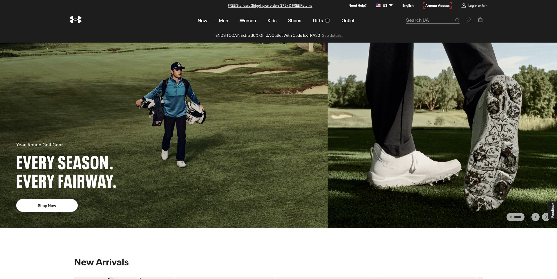
Under Armour’s captured opening combines a golfer in an outdoor setting with a close view of footwear, placing an activity-specific message beside both. The dark header and the beginning of a new-arrivals section provide a more conventional retail frame. This is worth studying when the shopper’s starting question is about an activity rather than a garment category. It does not independently establish that any featured item improves sporting performance or fits every participant’s conditions.
What you can learn
Create activity collections from clear product relationships, then preserve the ability to compare individual pieces. Separate tested product specifications from campaign language. A visitor should be able to identify the pictured shoe or garment and understand its available sizes without having to start the entire activity story again.
Pros
The activity context makes the collection’s intended setting legible.
Multiple views connect a wider scene to a more specific product.
Cons & considerations
Sporting imagery can imply benefits that need separate supporting evidence.
Activity-led navigation should not remove familiar garment and footwear categories.
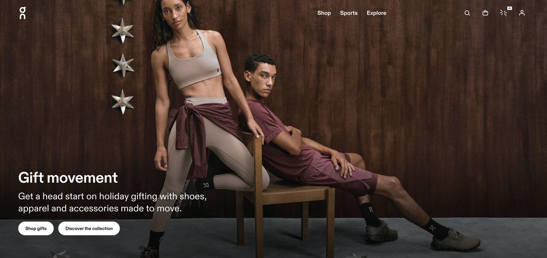
On introduces gifting through a coordinated group wearing clothing and shoes in a warm interior. The scene expands the brand story beyond a single running product, while a compact top navigation preserves shopping categories and practical utilities. It demonstrates how a familiar footwear identity can be broadened into an apparel proposition without replacing the visual language completely. The coordinated styling still needs product identification so shoppers can tell which pieces belong to the current collection.
What you can learn
Use a styled group to explain compatibility of look, not to imply that every item is sold together. Connect each scene to named garments and footwear. Keep size guidance and product-use descriptions distinct across categories instead of assuming that a customer’s familiarity with one range carries over to another.
Pros
The coordinated group shows apparel and footwear as a connected range.
A warm setting gives the gift message a specific visual context.
Cons & considerations
Styled combinations need clear individual product destinations.
Different clothing and footwear sizing systems require separate explanations.
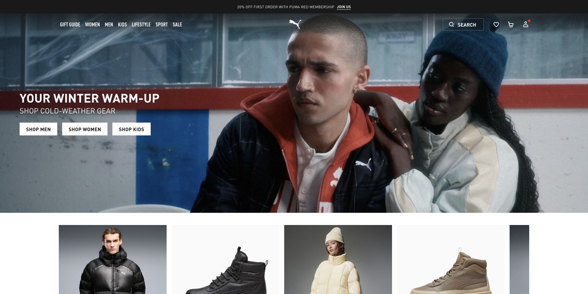
PUMA’s opening pairs a broad seasonal photograph with a short shopping message, then exposes product imagery directly underneath. That change of scale is useful: the lead establishes the campaign while the following cards begin the more specific shopping task. The conventional light navigation and promotional bar frame both areas. A clothing brief can borrow this sequence without assuming that a recognizable campaign tells customers enough about the differences among the products shown.
What you can learn
Plan the handoff from campaign imagery to product cards deliberately. Give the first shoppable row clear names and meaningful categories, and make sure the featured collection still works when a promoted item is unavailable. Keep product comparison based on consistent attributes rather than only campaign membership.
Pros
The next product section is visible beneath the larger seasonal scene.
The header retains a familiar shopping structure around the campaign.
Cons & considerations
Several promotional bands can compete with the main collection message.
Campaign-led cards still need useful garment and fit information after the click.
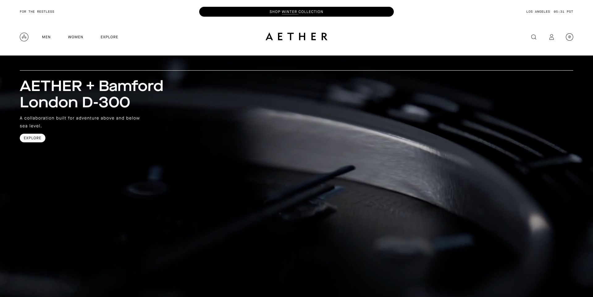
AETHER’s capture leads with a close view of a collaboration object rather than a person wearing its usual clothing range. The restrained wordmark and light navigation frame the image, and the campaign text identifies the partnership. This is a useful example precisely because it differs from a standard apparel hero: a collaboration can create a distinct editorial event, but it can also momentarily make the underlying clothing business harder for an unfamiliar visitor to recognize.
What you can learn
Keep collaboration pages connected to a clear permanent apparel catalog. Explain what is being sold, which partner owns which part of the story, and how the release relates to the broader brand. Make the ordinary men’s, women’s, or garment-category route easy to find even when the campaign promotes another object.
Pros
A close crop gives the collaboration a sharply focused visual identity.
The partnership is identified rather than left as an unexplained product image.
Cons & considerations
An accessory-led opening can obscure the brand’s core apparel range.
A special release needs accurate availability, partnership credits, and post-campaign destinations.
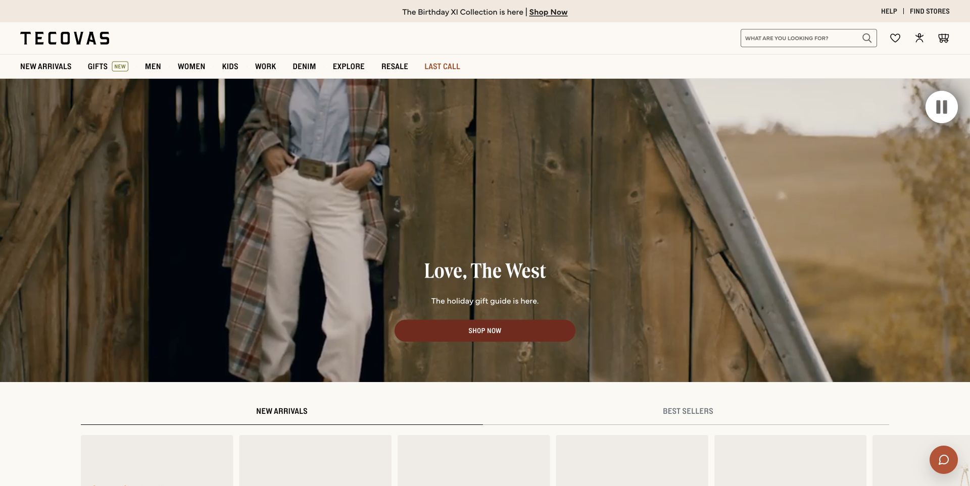
Tecovas places a person in a full styled look within a familiar western setting, with its wordmark and shopping navigation kept on a light strip above. The image introduces an overall way of dressing rather than isolating only the boot associated with the brand. This is useful for a business extending from a signature product into coordinated apparel. The practical shopping path must still let someone distinguish the individual pieces, their sizes, and what is available separately.
What you can learn
Use a complete look as an editorial grouping, then make every purchasable element identifiable. Give clothing fit and footwear fit their own guidance. Keep the signature product easy to find for an existing customer who is not shopping the wider seasonal collection.
Pros
A full-body view gives the styled clothing useful visual proportion.
The setting and product presentation maintain a coherent lifestyle identity.
Cons & considerations
A coordinated look can leave individual product names and availability unclear.
Expanding categories need distinct fit guidance rather than one generic sizing message.
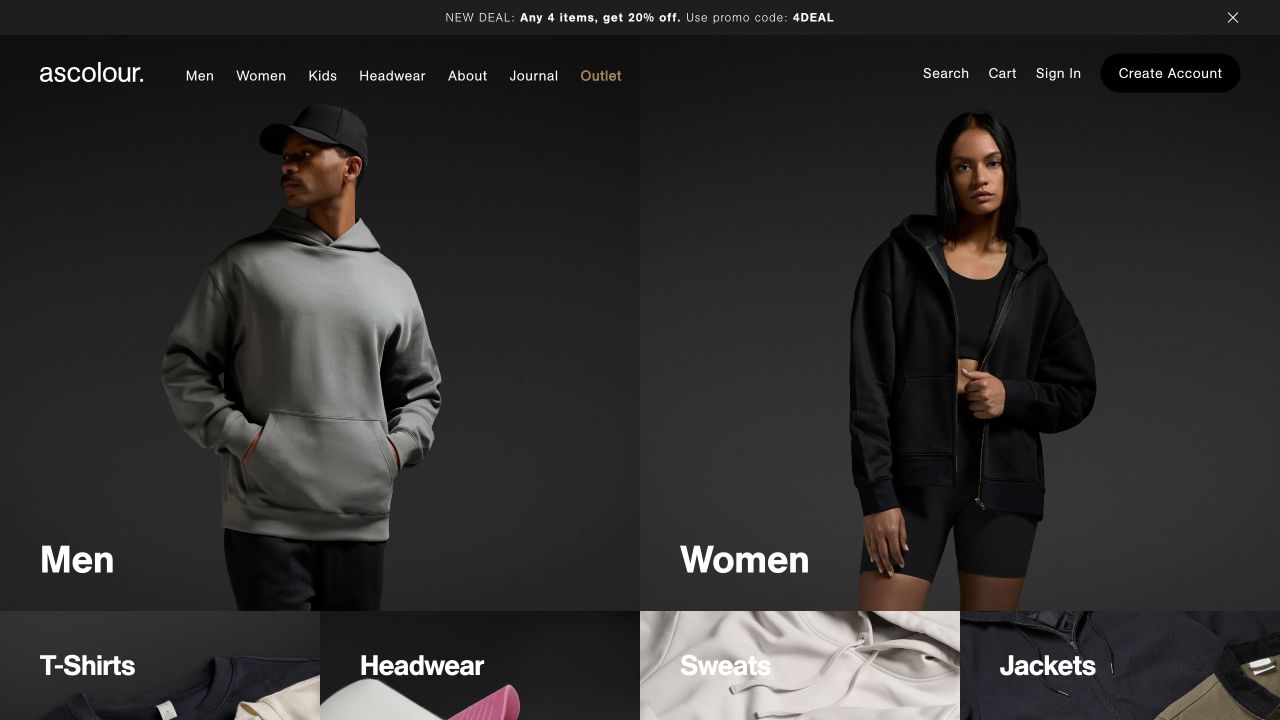
AS Colour divides its opening into large men’s and women’s photographs, then places smaller garment categories beneath them. The dark background and plain styling emphasize the clothing shapes rather than a seasonal narrative. This is a useful contrast to campaign-heavy fashion sites because the immediate problem is range discovery. A customer choosing garments for personal use or a larger order still needs consistent information about cut, fabric, colors, sizing, and any quantity-related arrangements.
What you can learn
Build clear attributes into every base garment record and keep repeated names consistent. Separate a retail shopper’s product evaluation from account or larger-order requirements. Product photography should show the actual silhouette clearly, with supporting views and measurements rather than relying on a single attractive model pose.
Pros
Large audience entrances make the initial catalog division obvious.
Visible garment categories begin practical discovery immediately below the hero.
Cons & considerations
Audience-based divisions should not make the same product hard to find in another context.
A visually simple range can conceal important weight, fit, and fabric differences.
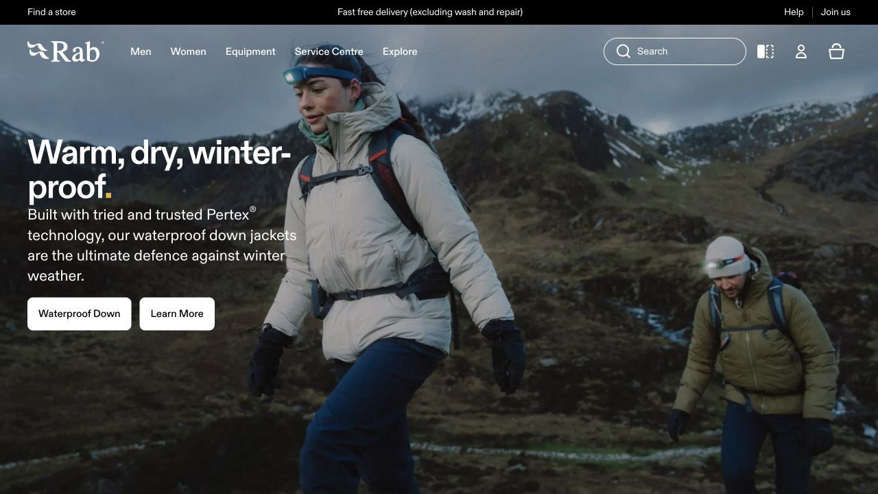
Rab’s photographed hikers and mountain landscape give the outerwear proposition a concrete setting. The main collection action and a separate learning route acknowledge that some shoppers are ready to browse while others want product context. A stable, light navigation band sits above the scene. The image communicates intended use, but weather resistance, warmth, weight, and care need product-specific explanations rather than being inferred from the presence of a mountain in the background.
What you can learn
Connect activity imagery to clear garment categories and comparable specifications. Explain how a shopper should interpret the brand’s own technical labels and what assumptions accompany them. Keep the shopping and learning destinations related so education can lead to an informed product decision without restarting navigation.
Pros
The outdoor setting makes the intended clothing context recognizable.
Separate shopping and learning routes support different stages of research.
Cons & considerations
Dramatic conditions can imply product protection that requires specific evidence.
Technical ranges need plain-language comparison alongside specialist terminology.
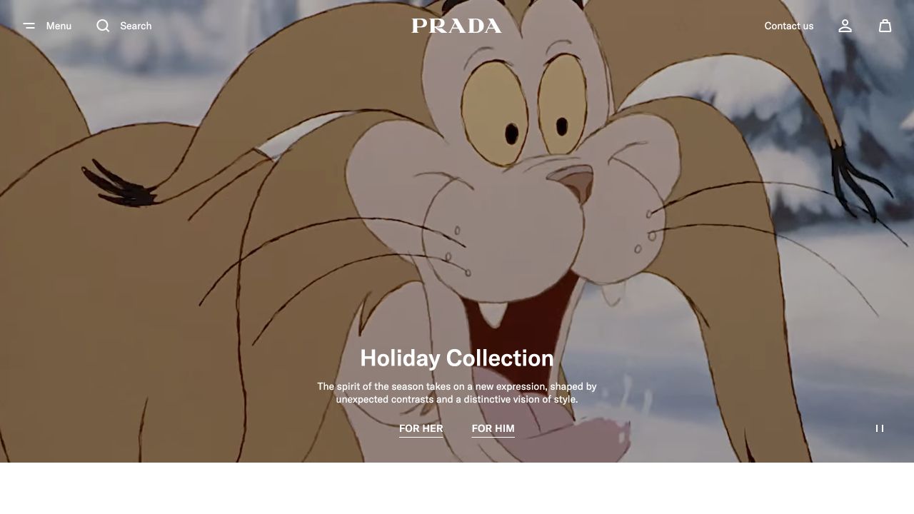
Prada’s captured opening gives an illustrated character and a holiday collection message most of the frame. The quiet wordmark and minimal shopping controls allow the campaign to behave more like an editorial cover than a conventional product grid. This is useful for studying a fashion brand that can rely on an established identity. A less familiar label would need to explain the garment offer more directly before expecting an illustration alone to carry the introduction.
What you can learn
Define the job of a campaign cover separately from the product index. Make its collection destination clear, preserve ordinary category access, and provide credits and permissions for collaboration material. Do not copy a famous brand’s level of abstraction without considering what your own visitor already knows.
Pros
A focused illustration gives the seasonal campaign a distinct identity.
The restrained frame avoids clutter around the editorial image.
Cons & considerations
An unfamiliar visitor may not learn much about the actual clothing from the opening.
A collaboration-led campaign depends on clear rights, credits, and a maintained collection destination.
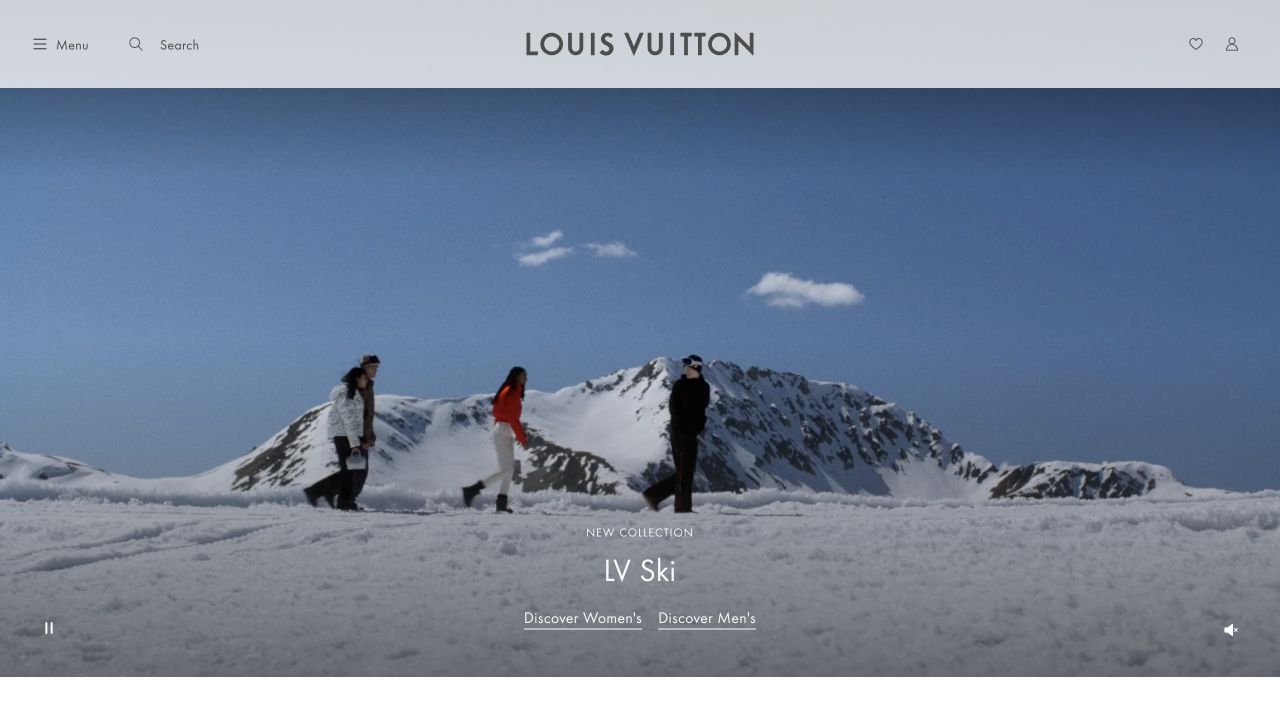
Louis Vuitton’s captured page uses a snowy landscape and a small ski-collection label beneath a very restrained header. The scene is deliberately more atmospheric than informational. That makes it a useful reference for understanding how an established luxury identity can place relatively little explanatory copy in the opening. The tradeoff is that the garments are not immediately inspectable, so the collection and product pages need to take over the practical work quickly.
What you can learn
Choose atmosphere only when the surrounding information architecture can support it. Make the collection link precise, provide useful product views after it, and ensure a returning shopper can bypass the editorial scene. A landscape can establish mood without being asked to explain size, construction, or the difference between related garments.
Pros
The spacious environment gives the seasonal story a clear visual mood.
The quiet header reinforces a recognizable luxury identity.
Cons & considerations
Small text over a large image requires careful responsive and contrast treatment.
The opening offers little product detail for visitors making a practical comparison.
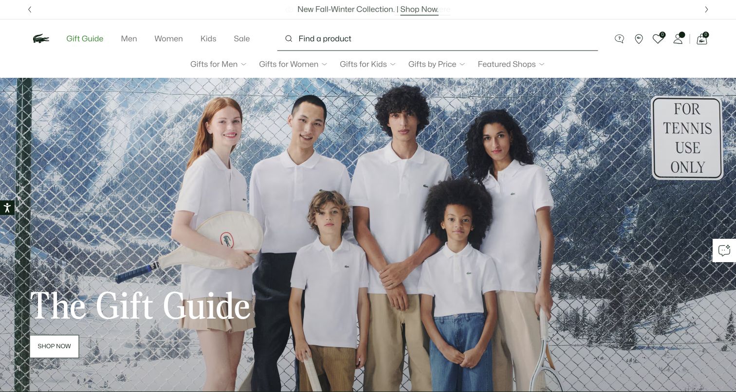
Lacoste’s gift-oriented opening uses a group portrait in a tennis-court setting, with several looks visible together. A light navigation frame separates the broader shopping structure from the scene. The photograph connects the brand’s sporting context with a seasonal retail moment without turning the entire first screen into a list of discounts. The next page still needs to identify which garments and accessories are featured and make fit and product differences easy to compare.
What you can learn
Build a gift or seasonal collection around useful selection rules rather than only a mood. Show recipients or occasions where appropriate, but keep the clothing categories and actual product attributes consistent. A styled group should help discovery, not require a shopper to reverse-engineer every outfit.
Pros
The tennis setting gives the group photograph recognizable brand context.
A clearly framed seasonal destination connects the story to shopping.
Cons & considerations
Several outfits can make individual garment identification difficult.
Gift-oriented navigation should not interrupt ordinary category and size-based shopping.
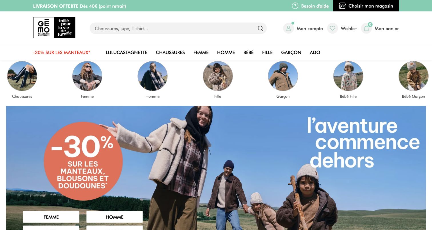
Gémo combines a large promotional clothing scene with a dense but familiar shopping header and round category shortcuts. The composition acknowledges that a family-oriented apparel catalog needs several quick entry points, not only one idealized campaign viewer. The promotion is immediately visible, while the navigation carries much of the responsibility for directing different shoppers. This is useful when breadth is genuine, but it also exposes the cost of stacking offers, utilities, audience labels, and categories into the same opening area.
What you can learn
Prioritize the most useful audience and product entrances, then test them with ordinary tasks. Make promotion rules specific and keep categories stable after the offer ends. Use a consistent garment record so a broad store’s different departments do not develop incompatible size and material descriptions.
Pros
Visible shortcuts offer several immediate routes into the apparel catalog.
The campaign is framed inside an understandable retail structure.
Cons & considerations
A dense header and multiple promotional elements can compete for attention.
Broad audience coverage needs a careful mobile hierarchy rather than a smaller copy of the desktop menu.
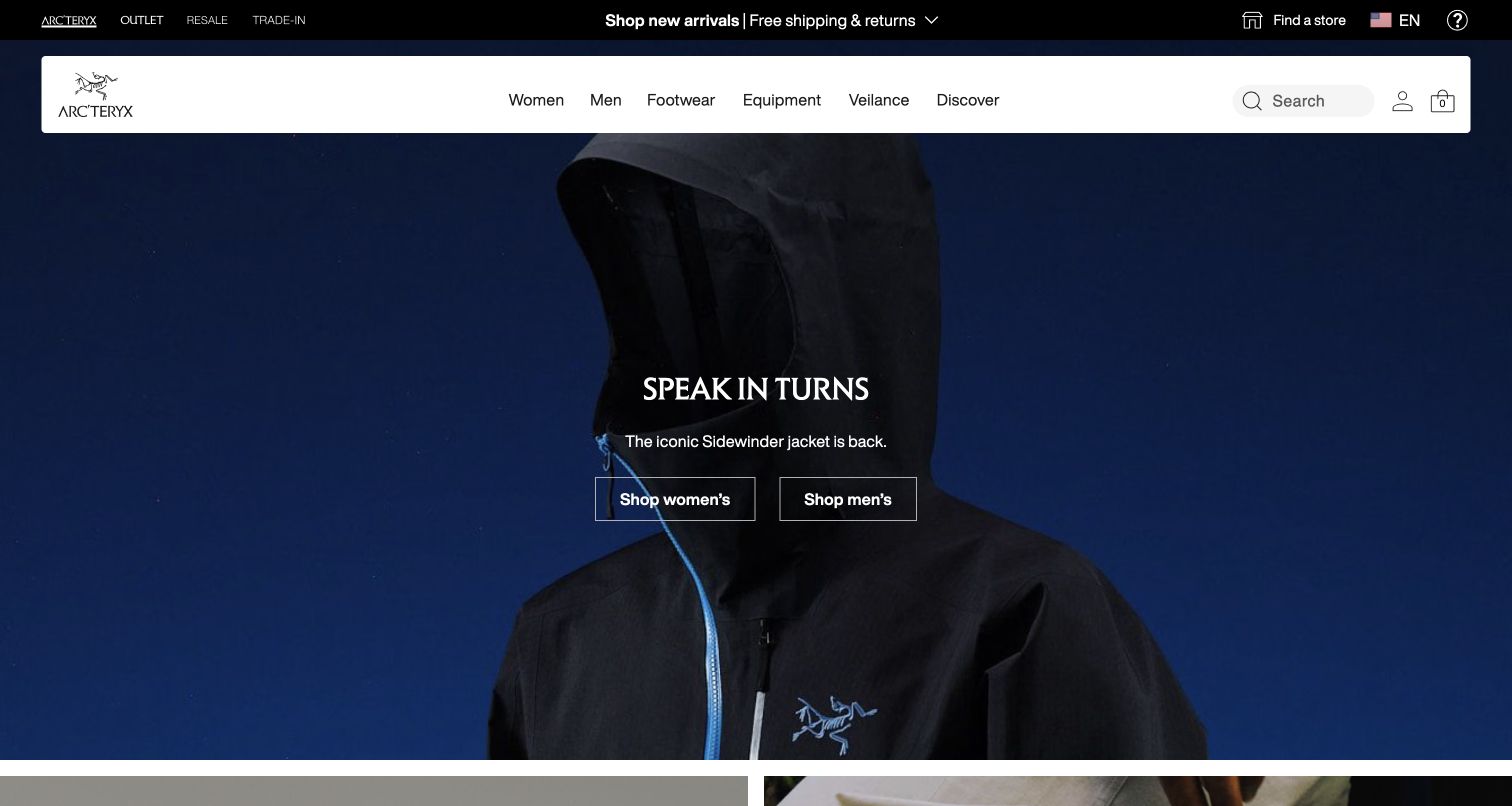
Arc’teryx centers a close view of a dark technical garment beneath a light, conventional shopping header. The restrained campaign text leaves the garment’s shape and details to do much of the visual work. This is useful when a brand wants the product itself, rather than an expansive landscape, to establish the opening. A close crop nevertheless cannot explain the full fit, layering relationship, weather specifications, or differences among similarly named products.
What you can learn
Use the close-up to introduce a particular construction detail, then provide complementary whole-garment and worn views. Explain product families and intended conditions in comparable language. Give unfamiliar shoppers a route to interpret technical labels rather than assuming that a familiar logo makes every specification self-explanatory.
Pros
The product close-up keeps attention on the garment rather than background spectacle.
Stable navigation provides a practical route outside the current campaign.
Cons & considerations
Dark, tightly cropped garments can be difficult to compare without additional views.
Technical protection and performance statements need product-specific documentation.
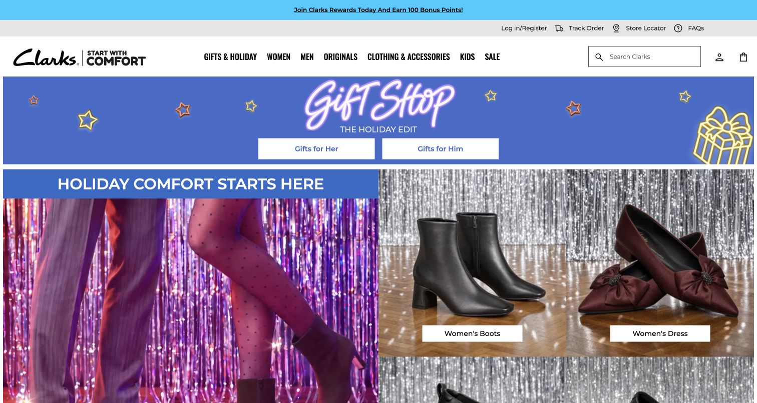
Clarks places boots and a bright gift-shop campaign inside a light, conventional store header. The seasonal colors distinguish the promotion from the persistent shopping categories, giving the page a clear temporary theme. This is a useful fashion reference for brands whose signature products are bought repeatedly but also make seasonal gifts. The visual presentation does not itself resolve size conversion, width, material, care, or the return arrangements that can matter especially for gifted footwear.
What you can learn
Keep the permanent fit and product information consistent while seasonal merchandising changes around it. Explain gift-specific practicalities at the appropriate decision point, and link a campaign image to clearly named products rather than an undifferentiated catalog. A returning buyer should retain a short route to a familiar model.
Pros
The seasonal visual layer is distinguishable from the stable store navigation.
Recognizable footwear images make the campaign’s product category clear.
Cons & considerations
Promotional decoration can compete with the details of similar-looking products.
Gift buying still needs clear fit, delivery, and returns information.
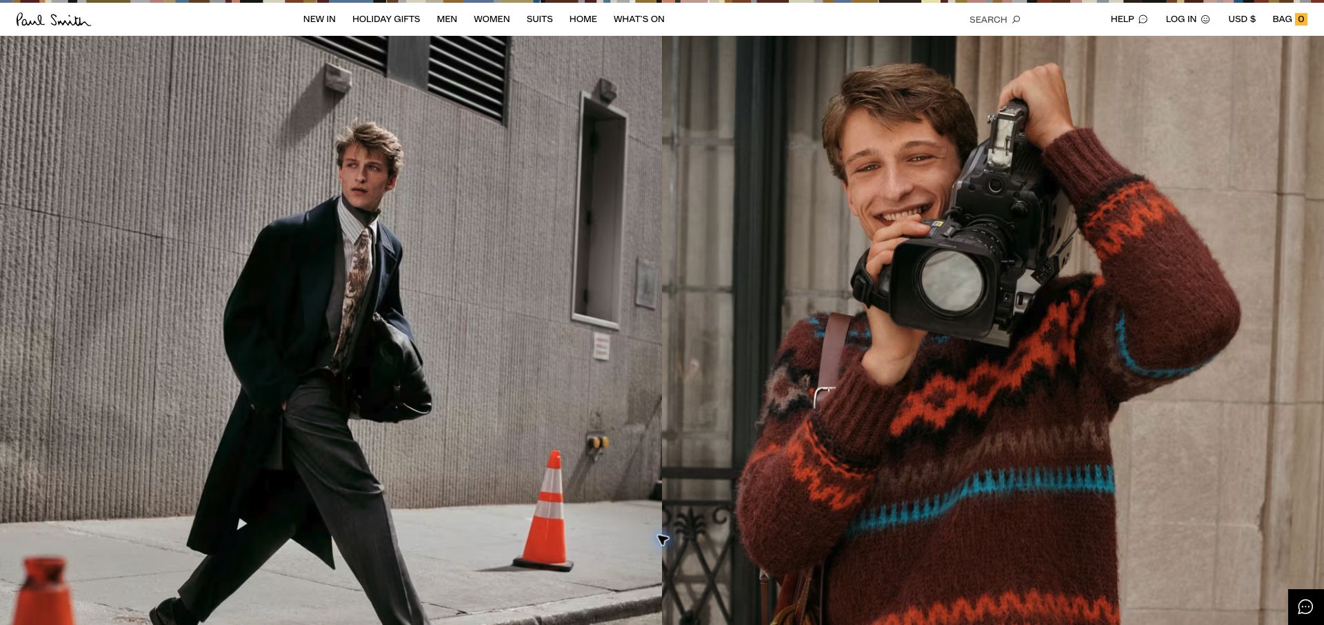
Paul Smith’s captured opening divides the frame between a sharply dressed figure in an architectural setting and an informal, colorful portrait. The contrast introduces both the clothing and a recognizable sense of personality. A thin navigation line keeps the scene uncluttered. This is useful for a brand that wants editorial character without making every collection image look identical. The next retail layer must still clarify which products belong to each story and how a customer should browse the actual range.
What you can learn
Let contrasting images reveal an intentional brand relationship, then connect them to specific collections or editorial pages. Keep the shopping routes predictable and the product taxonomy independent of a particular photograph. Personality should enrich the catalog rather than force a visitor to interpret the brand before finding a garment.
Pros
Contrasting portraits communicate more than one aspect of the brand identity.
The sparse frame gives the photographs room to establish their relationship.
Cons & considerations
A portrait-led opening needs a clear connection to the purchasable collection.
Fine navigation text requires careful legibility and touch-target treatment.
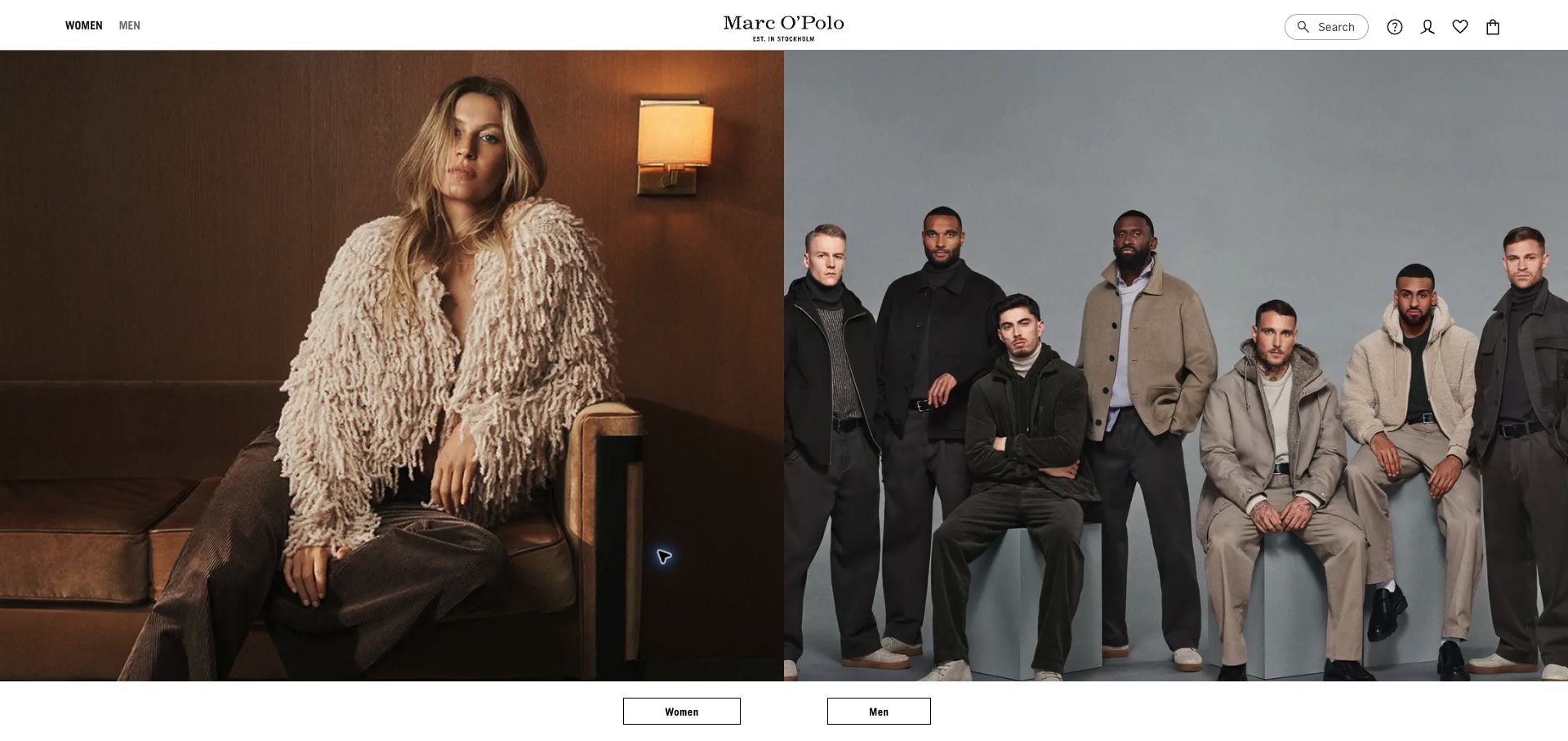
Marc O’Polo splits its opening between a close, textured clothing portrait and a group of people wearing coordinated casual looks. The central wordmark and quiet header tie the two halves together. The arrangement is useful when the catalog has several entry points but the brand wants one consistent visual language. It gives a sense of range without filling the frame with many small cards, although each half needs a clearly understandable destination.
What you can learn
Use a split campaign only when the audience or collection distinction is meaningful. Label the destinations plainly, give products consistent attributes across both ranges, and test how the halves become a single vertical sequence on a phone. Do not let a photograph’s position be the only indication of where a shopping action leads.
Pros
The paired images show variety while maintaining one visual identity.
A centered brand mark provides a stable point between the two scenes.
Cons & considerations
Two equally weighted images can leave the first shopping choice ambiguous.
Responsive stacking needs clear labels so the relationship survives outside the desktop composition.
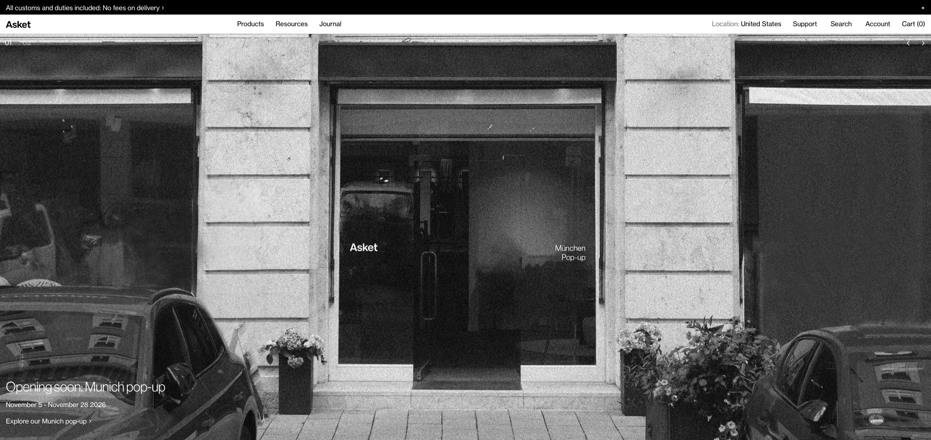
Asket’s captured opening uses a monochrome storefront scene beneath a very restrained shopping header. The image places the clothing business in a physical setting rather than presenting a dramatic seasonal outfit or large discount. This is useful for studying a brand whose visual message is continuity and considered selection. The quiet framing needs support from product detail: a visitor still has to understand the garments, the range of fits, and what makes one option different from another.
What you can learn
Use the stable visual identity to support a well-maintained product system. Keep core garments, measurements, material explanations, and care information consistent across updates. If the story emphasizes longevity, explain the actual product and service details behind it without allowing an aesthetic impression to substitute for evidence.
Pros
The physical storefront gives the quiet brand identity a tangible setting.
Minimal promotional clutter leaves room for a consistent catalog structure.
Cons & considerations
An atmospheric storefront does not immediately explain the garment offer.
Claims about longevity or responsible production require specific supporting information.
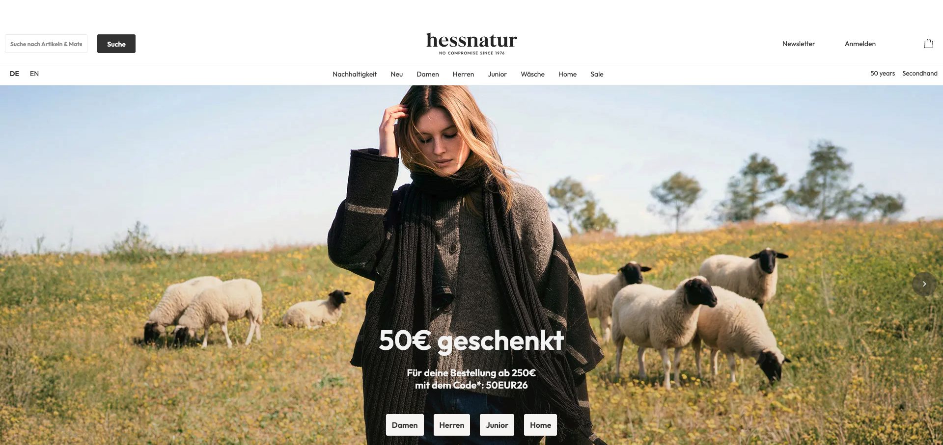
hessnatur shows a person wearing outerwear in a field with sheep, pairing the clothing with a visible material-related context. A promotional message and simple shopping actions sit over the image, while the header keeps audience and product navigation separate. This is useful for understanding how sourcing imagery can be woven into apparel merchandising. The presence of sheep or a rural landscape is not itself proof of a particular garment’s composition, certification, or production arrangements.
What you can learn
Connect any material narrative to the exact product and its documented attributes. Explain the scope of certifications or sourcing statements rather than applying a general pastoral image to every item. Keep fit, care, price, and availability information accessible alongside the broader story.
Pros
The setting links the clothing visually with a material-oriented brand narrative.
A separate header retains practical shopping routes around the campaign.
Cons & considerations
Sourcing imagery can suggest claims that need product-specific substantiation.
Promotional text should not obscure the material and care details needed for comparison.
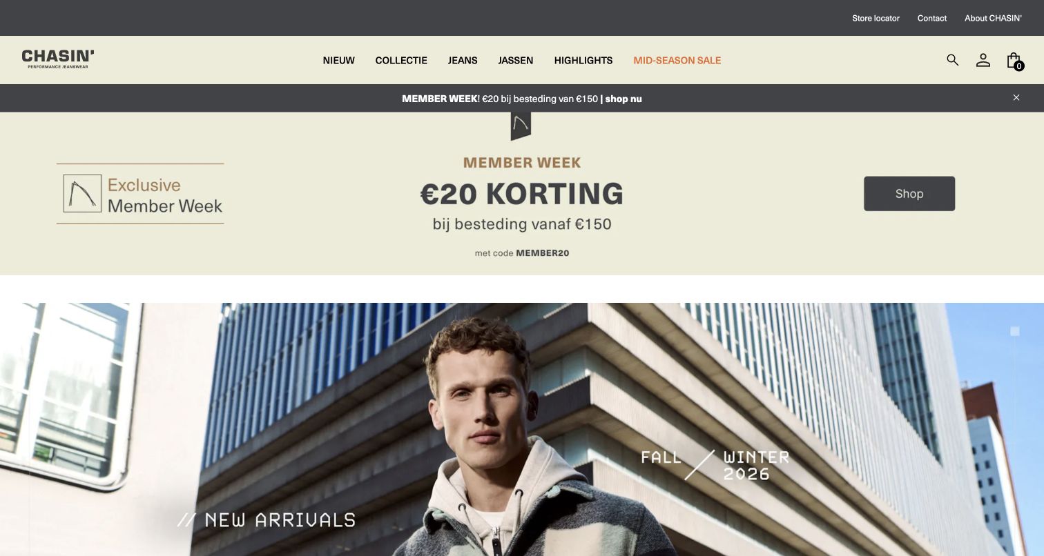
CHASIN’ places a large promotion above an urban clothing portrait and a new-arrivals message. Its dark navigation line separates the store structure from the lighter offer area, while the photograph gives the garments a recognizable everyday setting. The composition is useful for comparing two competing retail priorities: drawing attention to a current incentive and making the actual clothing collection visible. A shopper should not have to infer whether the pictured products qualify for the offer.
What you can learn
Give promotions an explicit scope, expiry, and product destination. Keep the new-arrivals collection useful without the discount, and ensure that an editor can remove the offer without disturbing the clothing navigation. Use the product page to explain fit and fabric consistently rather than repeating campaign language as a substitute for a description.
Pros
The urban portrait grounds the collection in a recognizable clothing context.
The offer is visually separated from the permanent navigation.
Cons & considerations
A large incentive band can dominate the garment story.
Eligibility and timing need clear terms rather than being implied by proximity to a photograph.
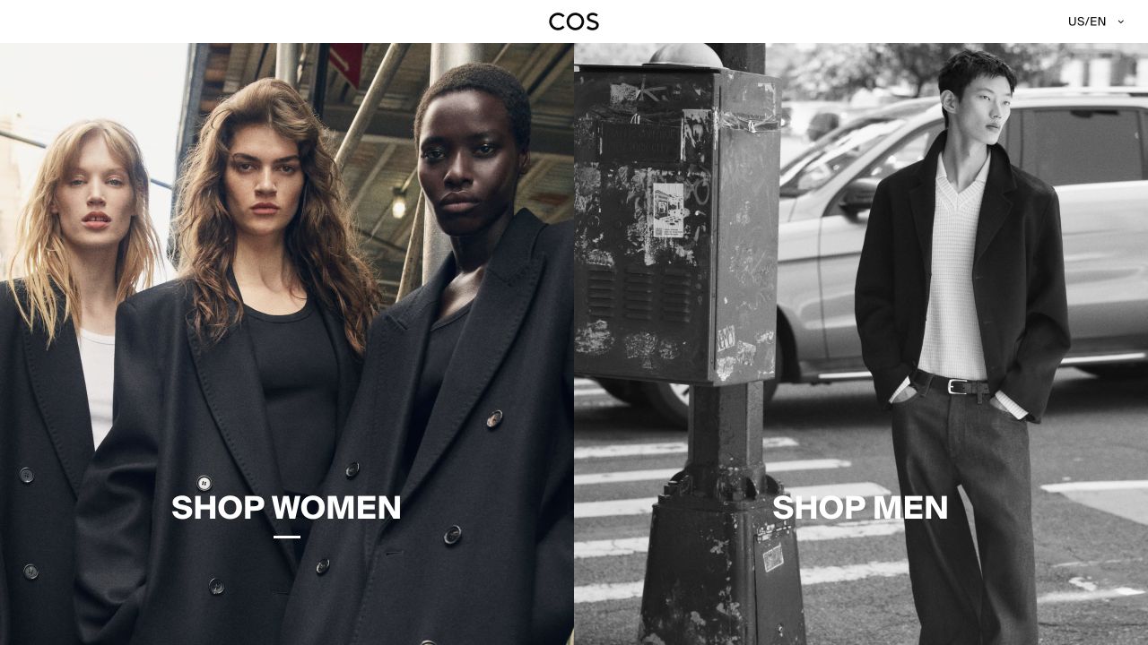
COS gives almost the entire opening to two street-photography panels, with a centered wordmark and a small regional selector above. One panel leads to womenswear and the other to menswear. The photographs show enough of the coats and tailoring to make these recognizably clothing destinations rather than abstract brand scenes. This is useful for a label that wants a very short first choice, although the simplicity moves search, garment-level browsing, and the broader explanation into the next layer.
What you can learn
Use a two-way entrance only when the distinction is genuinely useful for the catalog. Label each destination plainly and make the relationship survive when the photographs stack vertically. Provide a way to reach specific product categories without requiring a customer to interpret an image as the only navigation cue.
Pros
Large, separately labeled photographs make the opening choice visually clear.
The restrained identity leaves the garments and styling room to establish the tone.
Cons & considerations
A minimal entrance adds another step for someone seeking a specific item.
Audience divisions need inclusive, understandable alternatives where products or shopping intentions overlap.
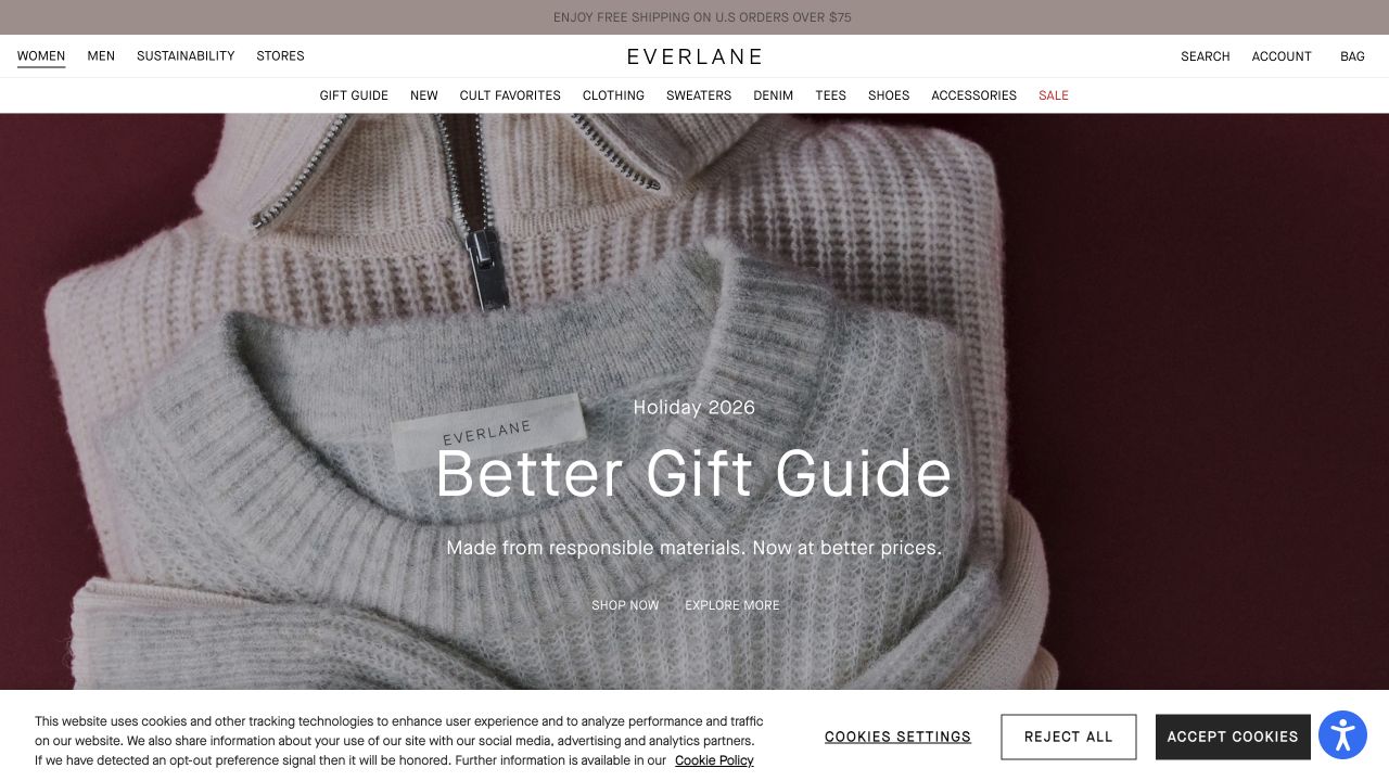
Everlane’s captured homepage places a close view of knitwear behind a holiday gift-guide message, with separate shopping and exploration actions. A detailed but light navigation band lists recognizable clothing categories before the campaign begins. That arrangement lets an existing shopper find denim or sweaters while a browsing visitor can follow the seasonal story. The image’s softness and the accompanying material language remain a visual and marketing presentation, not independent evidence of garment composition or sourcing.
What you can learn
Keep permanent garment categories stable while the campaign changes. Connect the knitwear photograph to clearly named products, show composition and care on their own records, and explain what any sourcing statement actually covers. A gift destination should add useful curation rather than duplicate the entire catalog under a seasonal title.
Pros
The close crop makes texture the distinctive feature of the opening.
Recognizable garment categories remain visible above the seasonal message.
Cons & considerations
Overlaid white text needs contrast checks across image crops.
Broad material or responsibility statements need specific supporting product information.
UNIQLO’s US opening combines a collage of worn garments and fabric details with a very prominent, dated promotional panel. A visible search field and audience tabs stay at the top, and a category-search section begins beneath the image. This is useful for a broad clothing catalog because it supports both the current event and ordinary item discovery. The campaign is also explicitly temporary, so its dates and destinations have to remain accurate as the underlying products and stock change.
What you can learn
Treat an offer’s dates, eligible range, and replacement state as structured content. Keep search and familiar clothing categories available outside the campaign. For a catalog spanning adults and children, make size systems and audience context clear rather than assuming that a visually consistent interface makes every measurement comparable.
Pros
Search and audience tabs provide alternatives to following the large promotional panel.
Visible dates make the temporary nature of the campaign explicit.
Cons & considerations
A dominant promotional panel can obscure the garments it is meant to feature.
Several audience and size systems require careful product-level guidance and mobile navigation.
Build an editorial wardrobe and a reliable product system
Prepare awkward products before the ideal campaign
Use a garment with many sizes, one with several lengths, a limited collaboration, an unavailable variation, and a product sold in a pack. Decide how they differ in the catalog and how a customer can compare them. Include both whole-garment and detail images, with consistent color and honest styling context.
Design campaign replacement as a normal editing task
Give a collection its dates, owner, products, imagery, and approved wording. Test how the page behaves when an item sells out, the offer expires, or a portrait crop replaces a landscape image. Keep old campaign links useful through a maintained collection or a deliberate redirect rather than an abandoned promotional page.
Rehearse practical shopping questions
Ask staff to walk through sizing, care, delivery, gifting, and returns using a realistic item. Check who updates the answers and which system owns availability. Test product selection and notifications in the appropriate test workflow without creating real customer records or assuming a successful homepage interaction proves the checkout is ready.
The editing job behind the design
Choose tools that respect the catalog and the merchandising team
Use a commerce model that can represent the actual size, color, length, fit, and stock relationships without misleading duplicates. A supported theme can be appropriate when its product and collection controls fit the business. A separate frontend needs a clear reason, an editing preview, and people responsible for releases, search, caching, and integrations.
Treat product information, campaign content, imagery, search, reviews, email, and inventory as connected responsibilities. Avoid adding an app simply because a reference appears to use it. The public stack lists show supported observations and qualifications; they do not reveal every fulfillment, customer, or accounting system behind a fashion brand.
Our WordPress website examples offer a separate look at publishing approaches. A visible platform label is evidence for that named page, not a guarantee that the same system will suit your requirements.
Before the public launch
Clothing brand website launch checklist
Verify that every campaign image leads to the correct named collection or products.
Check size naming, garment measurements, materials, care, and pack contents across the range.
Use consistent color names and explain meaningful fit or length differences.
Review technical, sourcing, certification, and environmental statements with responsible staff.
Test unavailable sizes, changing stock, gifting, delivery, and returns information.
Read category navigation, image crops, overlaid text, and product controls on a phone.
Record permissions for models, collaborators, photographs, and customer content.
Assign ownership of campaign expiry, catalog corrections, broken links, and product updates.
These checks are a project checklist, not a performance, legal, security, or accessibility certification. Test real journeys with the people responsible for the website before making claims about the result.
Sources & editorial method
How this collection was selected and reviewed
We selected distinct official apparel and fashion-retail properties, combining directly captured library images with new official COS, Everlane, and UNIQLO screenshots. Earlier capture dates remain unchanged. We assessed visible clothing presentation and navigation; no account, purchase, fit test, or independent assessment of material or sourcing claims was performed.
Each example links to its actual source page. Screenshots are direct browser captures with their own capture dates; moving imagery, announcements and live designs can change. The notes describe observable design choices and conditional tradeoffs, not measured traffic, conversion results, service quality, or accessibility conformance.
Technology labels use public page metadata, asset evidence, or explicitly cited platform documentation. Platform documentation is not a complete current deployment audit. A component reference may be legacy or unused; it is not a complete backend inventory. Unknown stacks are omitted. These sites are editorial examples, not our client portfolio.
Written, Edited and Curated are separate editorial records, not timestamps advanced by a rebuild. Website designs and imagery belong to their owners. See our editorial standards or suggest a correction.
Questions worth asking
Clothing Brand website design questions
Should the homepage lead with a model or a product grid?
Use the format that explains the range to the intended visitor. A styled person can show silhouette and context; a grid can support direct comparison. A broad catalog often needs clear categories around either approach. Keep the actual product identification and selection information easy to find.
How much sizing information is enough?
Enough to explain the business’s real size and fit distinctions without ambiguity. Use consistent size naming, relevant measurements, and an explanation of whether a measurement describes a body or a garment. Have the product team verify the data rather than generating a generic chart that may not match the range.
Can a sustainability photograph carry the material story?
It can establish an editorial theme, but it cannot substantiate a claim. Explain which product, material, process, or certification a statement covers and keep supporting information current. Do not let a broad landscape or sourcing image imply evidence for every item in the store.
Does a clothing brand need separate collection pages for every campaign?
Only when each page adds useful curation or explanation. Give it meaningful product relationships, a review date, and a maintenance plan. Avoid multiplying near-identical pages merely to repeat seasonal phrases or slight product-category variations.
Borrow a clearer way to connect the brand’s point of view with the actual garment. Make the fit, material, and shopping information dependable after the campaign changes.