Algolia is a search and discovery layer. These websites show how search fits within retail, travel, events, education, and fundraising experiences; their visual designs and complete technology stacks belong to much larger systems.
A search field may look simple, but its usefulness depends on information the visitor never sees: structured records, meaningful attributes, update processes, result types, and sensible ranking decisions. The examples here place that field in very different contexts. Some make it the dominant opening action; others preserve it as a quiet shortcut beside an expressive campaign.
Every selection pairs a public website capture with an official Algolia customer account. The evidence supports a documented search or discovery implementation, with regional and product boundaries stated where relevant. It is not a current backend audit. In particular, a case about text search does not automatically identify the provider of a newer AI assistant, visual search tool, checkout, or content management system.
Before the examples
What makes good Algolia website development in 2026?
Start with records that reflect the visitor’s task
Prepare searchable records around meaningful entities: a product, event, course, fundraiser, resort, or article section. Decide which fields identify it, which describe it, and which help people compare or refine results. Algolia’s data preparation guidance explains the relationship between records, attributes, and index structure; the design work is choosing a structure that represents your actual content.
A course, a degree programme, and a topic article can all match the same words while answering different needs. Label them clearly and send each to an appropriate destination. Likewise, discovery should not imply that a prescription, ticket, booking, or delivery option has been verified merely because a relevant result appears.
Treat search placement as a deliberate design decision
A large visible field is useful when people arrive with an item in mind. A quieter search route may suit an editorial or campaign-led entrance, provided it remains easy to find. Compare search prominence with category navigation, guidance, and service actions instead of assuming every visitor should begin by typing.
The collection · 20 examples
20 Algolia website examples worth studying
Compare the size and position of search, the alternative browse routes, and the context available before a visitor leaves the homepage. The reviews discuss what is visible in the captures; they do not report independent relevance benchmarks, conversion improvements, accessibility conformance, or transaction tests.
We start with five recognizable brands or organizations: Walgreens, Under Armour, Lacoste, JD Sports, Club Med. Each attribution applies to the named website property, not every product or website belonging to its organization. This is a curated reading sequence, not a measured ranking.
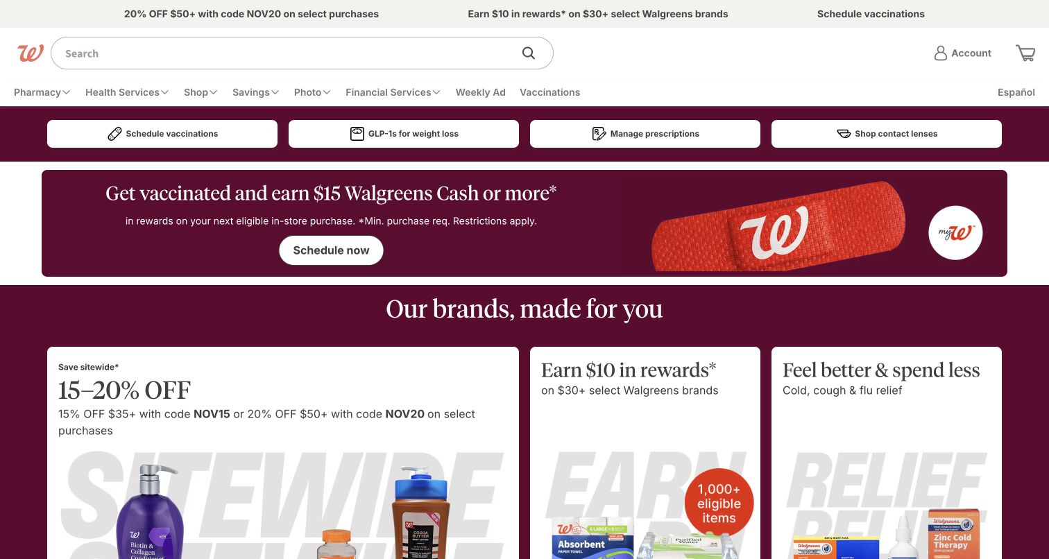
Walgreens gives its broad search field a prominent place beside the red brand mark, then separates pharmacy, health, shopping, and savings routes below. Four practical task buttons precede a large vaccination campaign. The opening acknowledges that a visitor might arrive with a product in mind or with an entirely different service task. Algolia’s customer account documents search and discovery across the website and mobile experience. It does not establish the technology behind appointments, prescriptions, or the entire commerce system, and those processes were not tested for this review.
What you can learn
Keep exact-item search visible without forcing every visitor into it. Define separate searchable content types and clear result labels for products, advice, and services; a product result and an appointment route should not appear interchangeable merely because both match the same phrase.
Pros
The wide search input remains easy to locate above a busy promotional area.
Practical task buttons provide alternatives for visitors who already know the service they need.
Cons & considerations
Several service and retail intentions compete within one dense header and opening viewport.
Campaign prominence can push everyday product discovery farther down the page on shorter screens.
Visible tech stack
Referenced on the public page
Google Fonts
Earlier / documented evidence
Algolia
Public source checked November 3, 2026. References may be embedded or legacy—not a complete backend inventory.
Platform source: Official Algolia customer implementation case. Official Algolia case documents website and mobile search and discovery for Walgreens. This public US retail entrance is shown; pharmacy, appointment and prescription systems are outside the evidence. This is an attributed case-study association reviewed on 2026-11-03, not a current homepage-backend or full-stack audit. Platform evidence is separate from the direct website screenshot and is not a complete current infrastructure audit.
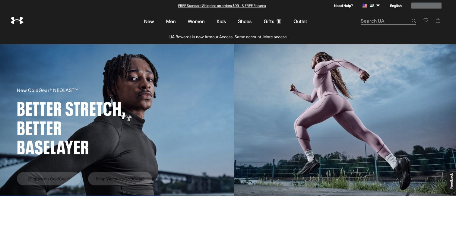
Under Armour’s US opening gives most of the viewport to athletes and a seasonal clothing campaign. A dark navigation bar carries product categories, while a restrained search control sits toward the right. The photograph establishes the use context before the visitor reaches a product grid, and separate shopping actions divide the campaign into audience routes. Algolia’s case specifically discusses the company’s North American ecommerce search implementation. This is a documented regional search association, rather than evidence that Algolia produces the photography, frontend layout, or every Under Armour storefront.
What you can learn
Treat search as a stable shortcut through changing campaign content. Product names, activity terms, garment types, and regional vocabulary should remain searchable even when a campaign introduces a new slogan that is unfamiliar to a returning shopper.
Pros
A consistent dark header keeps catalogue routes distinct from the large campaign image.
Audience-specific actions make the seasonal presentation actionable without adding a full product grid.
Cons & considerations
The compact search treatment has less visual weight than the dominant campaign photograph.
Text and controls over varied photography need fresh contrast checks for each replacement campaign.
ReactAssociated with Next.js; not independently observed
Public source checked November 3, 2026. References may be embedded or legacy—not a complete backend inventory.
Platform source: Official Algolia customer implementation case. Official Algolia case specifically describes North American ecommerce search for Under Armour. The captured en-us property matches that regional scope. This is an attributed case-study association reviewed on 2026-11-03, not a current homepage-backend or full-stack audit. Platform evidence is separate from the direct website screenshot and is not a complete current infrastructure audit.
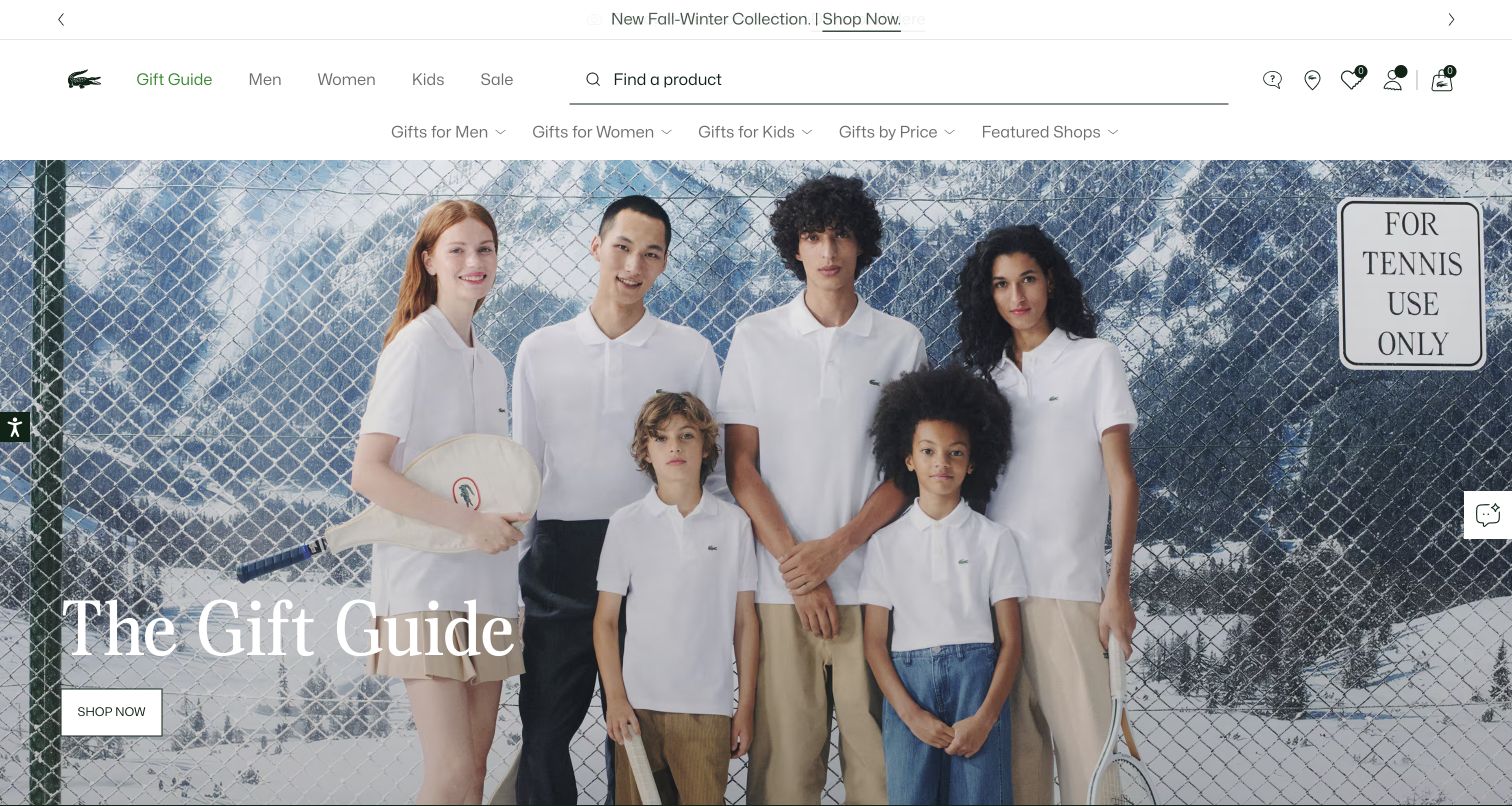
Lacoste places a wide product-search field below its white brand header and above a gift-oriented navigation row. A large tennis-themed lifestyle photograph supplies the editorial identity beneath these practical controls. The arrangement gives both a known-item shopper and an undecided gift buyer a clear starting point. The official Algolia story documents search and merchandising across Lacoste’s international online shops. The US capture illustrates one regional storefront; the source supports the documented rollout, without proving that every current regional feature or visual component uses the same backend.
What you can learn
Let the search field name its purpose plainly and keep gift navigation as a complementary route. Plan synonyms and product attributes around how people describe clothing, accessories, recipients, and occasions, while keeping stock and market differences out of misleading cross-region results.
Pros
The long search field has a clear place between identity and campaign material.
Gift navigation supplies a useful browse path for visitors without an exact product name.
Cons & considerations
Multiple horizontal navigation layers consume substantial space before the main shopping content begins.
Lifestyle photography creates atmosphere but provides limited immediate information about individual product availability or pricing.
Visible tech stack
Earlier / documented evidence
Algolia
Earlier cited evidence retained; no current scan result. References may be embedded or legacy—not a complete backend inventory.
Platform source: Official Algolia customer implementation case. Official Algolia case documents search and merchandising across Lacoste’s international online stores. The US regional storefront is pictured as one public example of the documented commerce programme. This is an attributed case-study association reviewed on 2026-11-03, not a current homepage-backend or full-stack audit. Platform evidence is separate from the direct website screenshot and is not a complete current infrastructure audit.
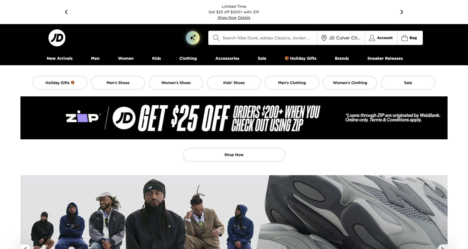
JD Sports puts a large search field in its black header alongside account, bag, and store controls. A category row and rounded shopping shortcuts sit above the main campaign imagery. This layered entrance makes search one of several ways into a broad footwear and apparel catalogue, with promotions close enough to redirect an undecided visitor. Algolia’s official case concerns the JD Sports and Finish Line US digital commerce operation and its search and merchandising work. The pictured JD US storefront is the relevant public property, not evidence for every international JD domain.
What you can learn
Decide which shortcuts express durable categories and which belong to short-lived promotions. Search results should retain a coherent product vocabulary across brands, and category pages should not need to duplicate every query a shopper might type.
Pros
The high-contrast header makes the search field easy to distinguish from surrounding commerce utilities.
Separate category shortcuts support browsing without asking the visitor to form a precise query.
Cons & considerations
Several promotional layers can make the first product context feel crowded on smaller viewports.
The breadth of brands and categories requires careful naming to avoid overlapping or ambiguous destinations.
Visible tech stack
Earlier / documented evidence
Algolia
Earlier cited evidence retained; no current scan result. References may be embedded or legacy—not a complete backend inventory.
Platform source: Official Algolia customer implementation case. Official Algolia case documents search and merchandising for JD Sports and Finish Line in the US. Only the JD Sports US storefront is represented here, not the wider international domain estate. This is an attributed case-study association reviewed on 2026-11-03, not a current homepage-backend or full-stack audit. Platform evidence is separate from the direct website screenshot and is not a complete current infrastructure audit.
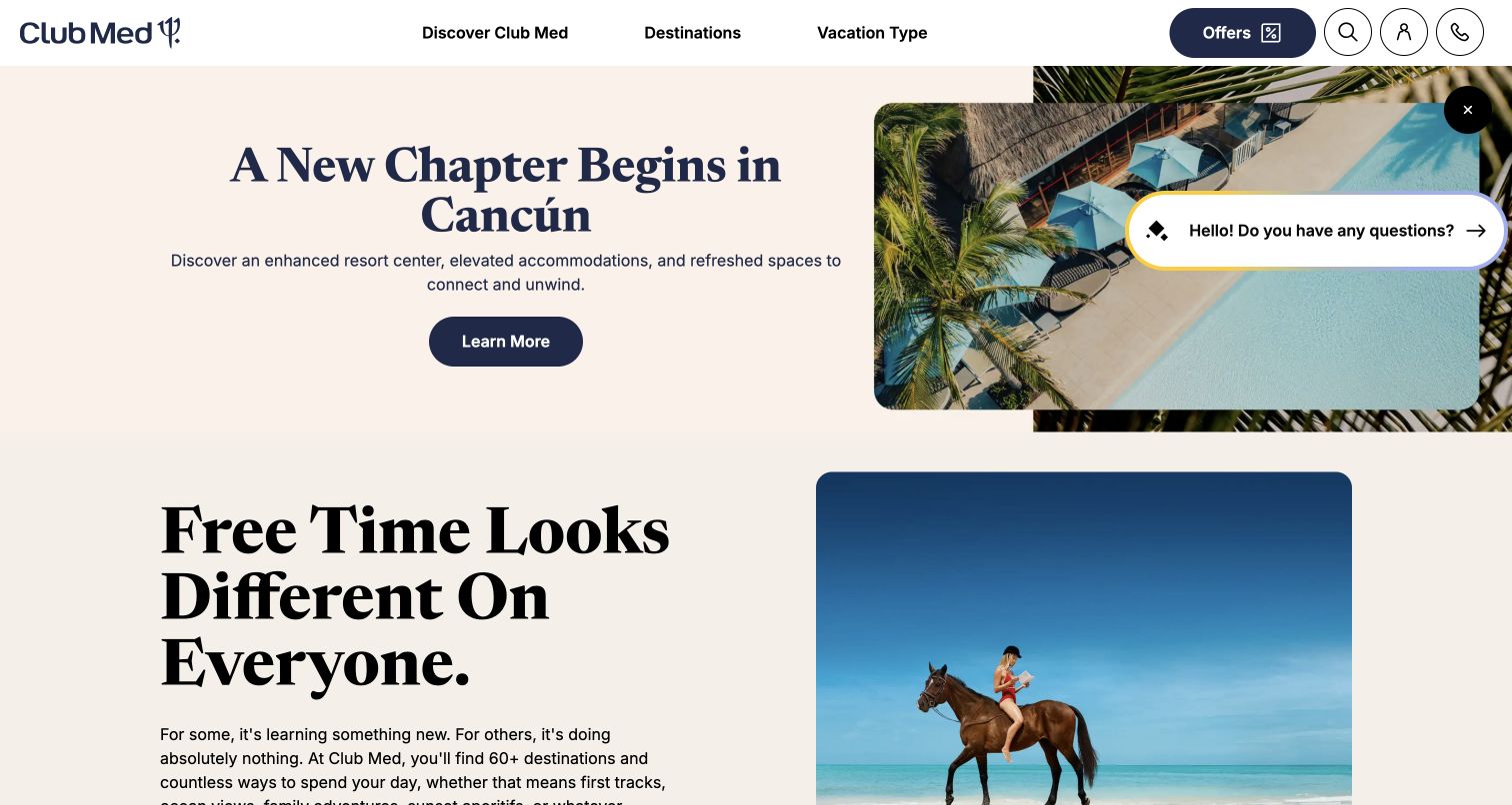
Club Med combines a restrained navigation bar with a large resort campaign and destination photography. The header exposes destinations, holiday types, offers, search, and contact routes, acknowledging that travel planning rarely starts with a single product identifier. Algolia’s case describes a global website programme with federated discovery across resorts, cruises, tours, and inspiration content. The US public view is one market in that documented programme. The screenshot does not test resort availability, pricing, booking completion, or future conversational features mentioned in the source account.
What you can learn
Separate inspirational content from bookable inventory while giving both intelligible result types. A traveler should understand whether a result explains a destination or leads to an available offer, and which dates, party details, or market assumptions affect the next step.
Pros
Destination imagery establishes a clear travel context while the header preserves practical planning routes.
Search and human contact remain available alongside offers for visitors with different levels of certainty.
Cons & considerations
A single resort campaign may be less useful to visitors who already have another destination.
The floating assistance widget competes with nearby content and needs careful placement across screen sizes.
Public source checked November 3, 2026. References may be embedded or legacy—not a complete backend inventory.
Platform source: Official Algolia customer implementation case. Official Algolia case documents the global website revamp and federated search across resorts, cruises, tours and inspiration in local markets. The US public site is a market view; bookings and future conversational features are not verified. This is an attributed case-study association reviewed on 2026-11-03, not a current homepage-backend or full-stack audit. Platform evidence is separate from the direct website screenshot and is not a complete current infrastructure audit.
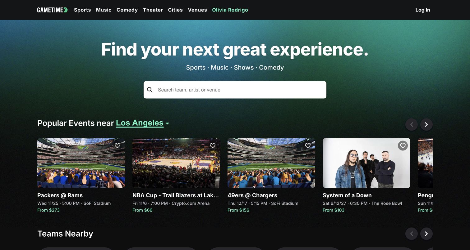
Gametime places an oversized search field at the center of its dark opening, explicitly inviting searches for a team, artist, or venue. Category links above cover sports, music, comedy, theater, cities, and venues, while event cards begin below with imagery and contextual details. The page gives the visitor several ways to express the same underlying intent: finding an event worth attending. Algolia’s official customer account documents the event-discovery search relationship. The capture remains a public browsing view, with no ticket selection, purchase, or verification of inventory freshness.
What you can learn
Build the index around entities people actually remember. Team names, performer aliases, venue names, city terms, and event dates should have clear relationships, and result cards need enough context to distinguish recurring events without forcing a detail-page visit.
Pros
The central input explains the kinds of queries the marketplace is prepared to accept.
Visible event cards connect a broad search invitation with concrete examples of the available catalogue.
Cons & considerations
A default city can mislead visitors unless the current location context stays clear and changeable.
Price and availability details require reliable updates beyond what a single homepage capture can establish.
Visible tech stack
Referenced on the public page
Google Fonts
ExpressReported response header
Earlier / documented evidence
Algolia
Public source checked November 3, 2026. References may be embedded or legacy—not a complete backend inventory.
Platform source: Official Algolia customer implementation case. Official Algolia customer story documents event discovery and search for the Gametime ticket marketplace. The public website is shown without testing purchases, seat availability or payment systems. This is an attributed case-study association reviewed on 2026-11-03, not a current homepage-backend or full-stack audit. Platform evidence is separate from the direct website screenshot and is not a complete current infrastructure audit.
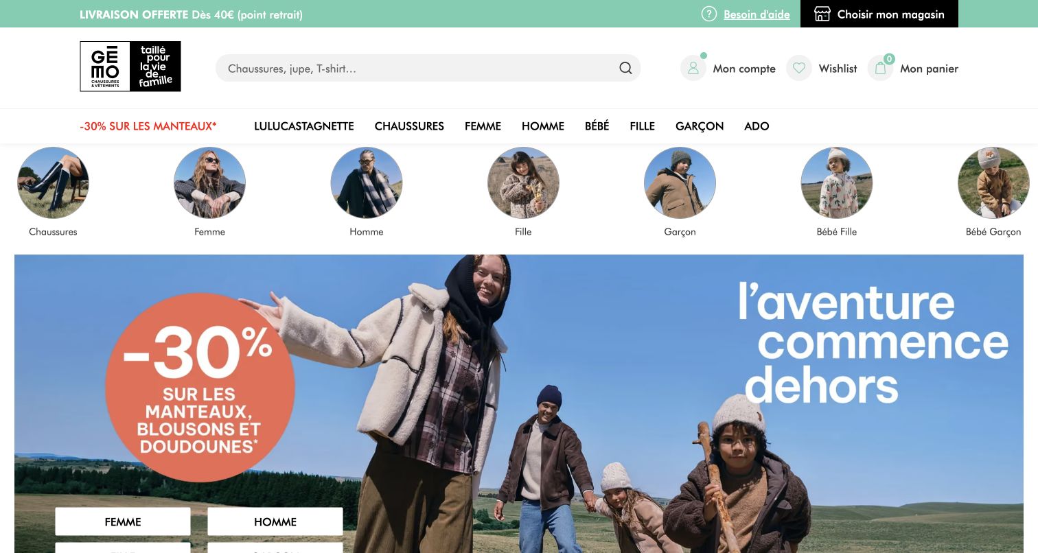
Gémo’s French homepage combines a mint utility strip, a broad grey search field, and audience-oriented category navigation. Circular category pictures create another browsing layer before a large fashion promotion. The composition makes the catalogue approachable through recognizable groups while keeping direct search available near the brand. Algolia’s customer case documents the retailer’s search and product-discovery work. The visible page supplies design context for that association; it does not independently establish current relevance rules, search results, or the technology behind the campaign artwork and checkout.
What you can learn
Use category images to orient people, but keep labels and index attributes precise. When one catalogue serves several audiences, record age group, garment type, size, and availability consistently so a general query can be refined without requiring shoppers to understand internal merchandising categories.
Pros
The wide search input remains visible above both category pictures and the promotional hero.
Circular category imagery offers recognizable entry points for shoppers who prefer browsing to typing.
Cons & considerations
Several category layers repeat the navigation burden before individual products become visible in the viewport.
Large discount graphics can dominate more useful product context when campaign priorities change frequently.
Public source checked November 3, 2026. References may be embedded or legacy—not a complete backend inventory.
Platform source: Official Algolia customer implementation case. Official Algolia customer story documents Gémo’s ecommerce search and discovery. The French retail property supplies the public interface context; current relevance settings and checkout are not audited. This is an attributed case-study association reviewed on 2026-11-03, not a current homepage-backend or full-stack audit. Platform evidence is separate from the direct website screenshot and is not a complete current infrastructure audit.
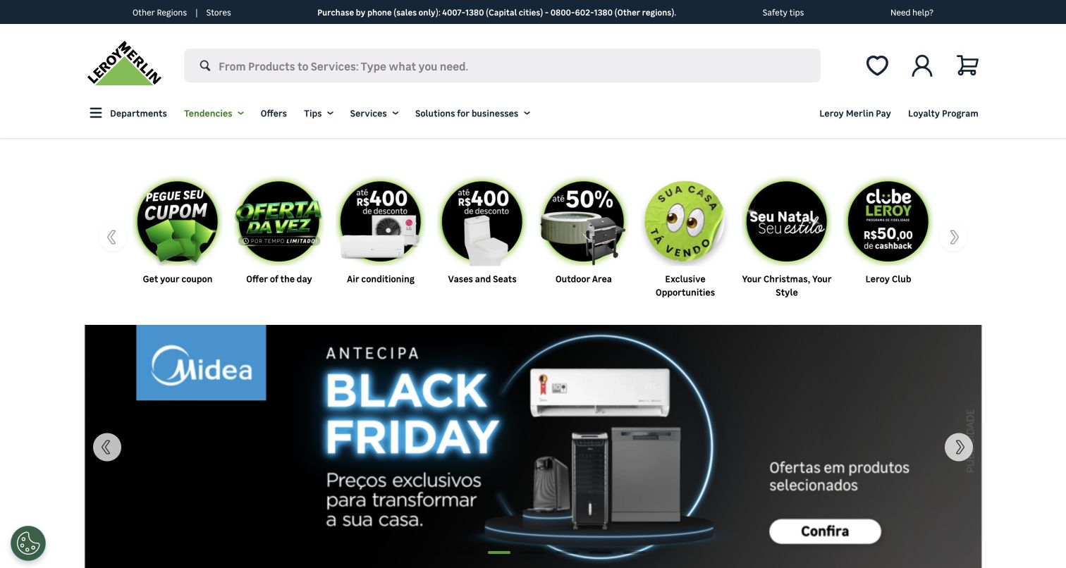
Leroy Merlin Brazil places a broad search field beside its logo, followed by department navigation and circular promotional shortcuts. The opening then moves into a large retail campaign. This browser-translated capture shows a catalogue entrance designed for both direct product lookup and browsing across many home-improvement needs. Algolia’s official case explicitly concerns the Brazilian operation and its search, filtering, and discovery implementation. The review does not treat the translated labels as the site’s original English copy or infer the current operation of every catalogue feature from the homepage alone.
What you can learn
Plan for both trade terminology and ordinary project language. Technical dimensions, materials, compatibility, and category relationships need structured fields so users can narrow a broad search without relying on a campaign category that may disappear after the promotion ends.
Pros
The large search field has a stable position before the promotion-heavy part of the page.
Department navigation offers a parallel route when visitors do not know an exact product term.
Cons & considerations
Several offer shortcuts and campaign panels make the opening visually busy for task-focused visitors.
The captured browser translation is not suitable evidence for evaluating the retailer’s original interface wording.
Visible tech stack
Earlier / documented evidence
Algolia
Earlier cited evidence retained; no current scan result. References may be embedded or legacy—not a complete backend inventory.
Platform source: Official Algolia customer implementation case. Official Algolia case explicitly concerns Leroy Merlin’s Brazilian ecommerce search and filtering implementation. The Brazilian storefront matches that regional scope. This is an attributed case-study association reviewed on 2026-11-03, not a current homepage-backend or full-stack audit. Platform evidence is separate from the direct website screenshot and is not a complete current infrastructure audit.
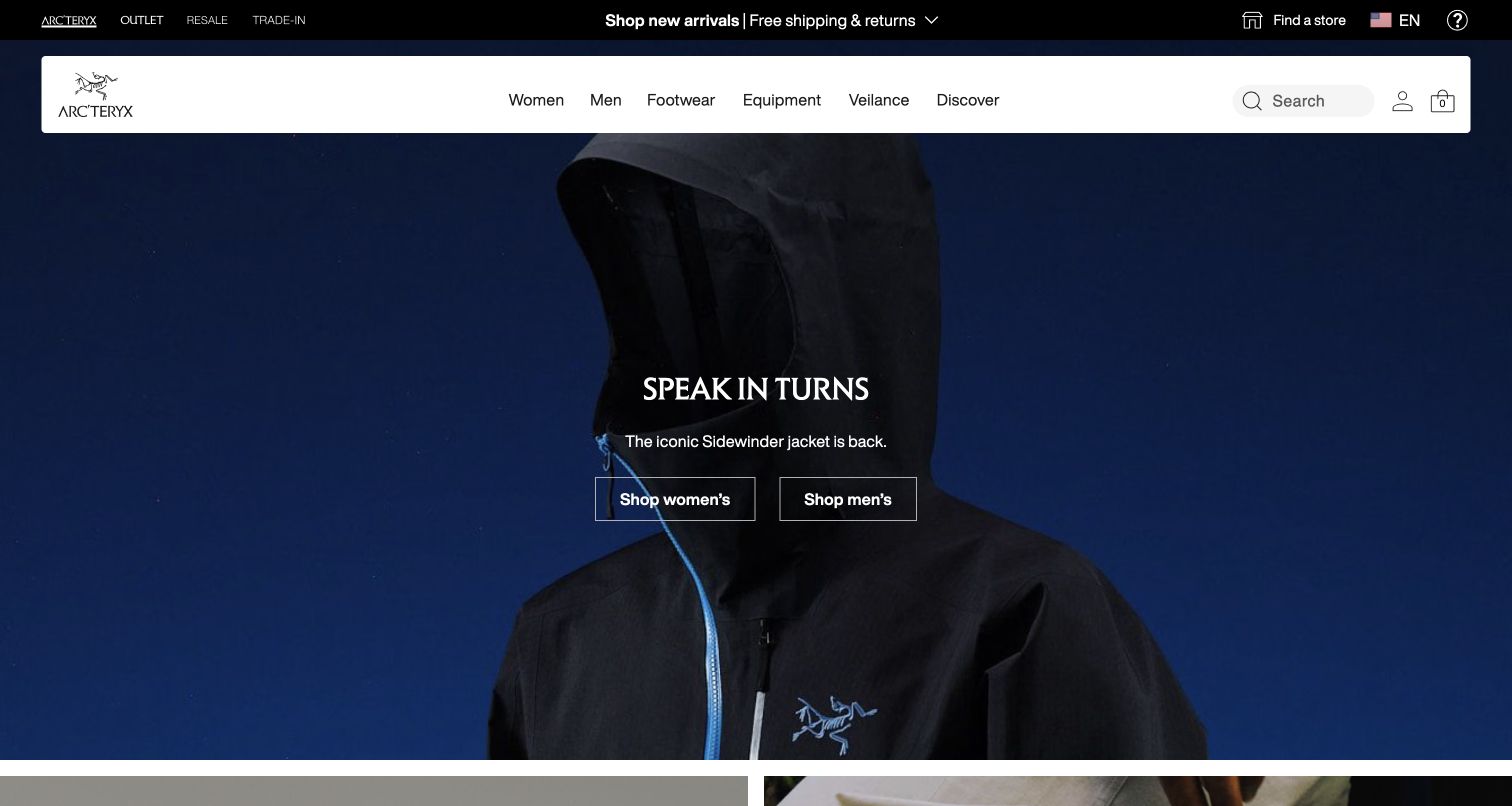
Arc’teryx presents a dark, close-up jacket photograph beneath a floating white navigation bar. The compact search control has a plain label and sits beside account and bag utilities. Large campaign copy and two audience routes occupy the center, leaving the header as the stable route into the wider catalogue. Algolia’s case describes product discovery and merchandising for Arc’teryx within the Amer Sports context. That account supports a search association; it does not prove that every product recommendation, regional feature, or technical clothing claim is supplied or validated by Algolia.
What you can learn
Keep technical product names searchable alongside plain-language activities and garment descriptions. The campaign can introduce a collection, but the catalogue should also serve visitors who remember a model name, a use case, or only an approximate spelling.
Pros
The bright navigation bar separates practical catalogue controls from the dark, expressive product image.
A labeled search control is more explicit than an isolated icon within the utility cluster.
Cons & considerations
The large atmospheric hero offers little immediate comparison information for a visitor choosing between models.
Similar specialist product names need clear result context so search does not simply reproduce catalogue complexity.
ReactAssociated with Next.js; not independently observed
Public source checked November 3, 2026. References may be embedded or legacy—not a complete backend inventory.
Platform source: Official Algolia customer implementation case. Official Algolia case documents Arc’teryx search and product discovery within the Amer Sports context. The US regional storefront is shown; other group brands and every current regional feature are outside the evidence. This is an attributed case-study association reviewed on 2026-11-03, not a current homepage-backend or full-stack audit. Platform evidence is separate from the direct website screenshot and is not a complete current infrastructure audit.
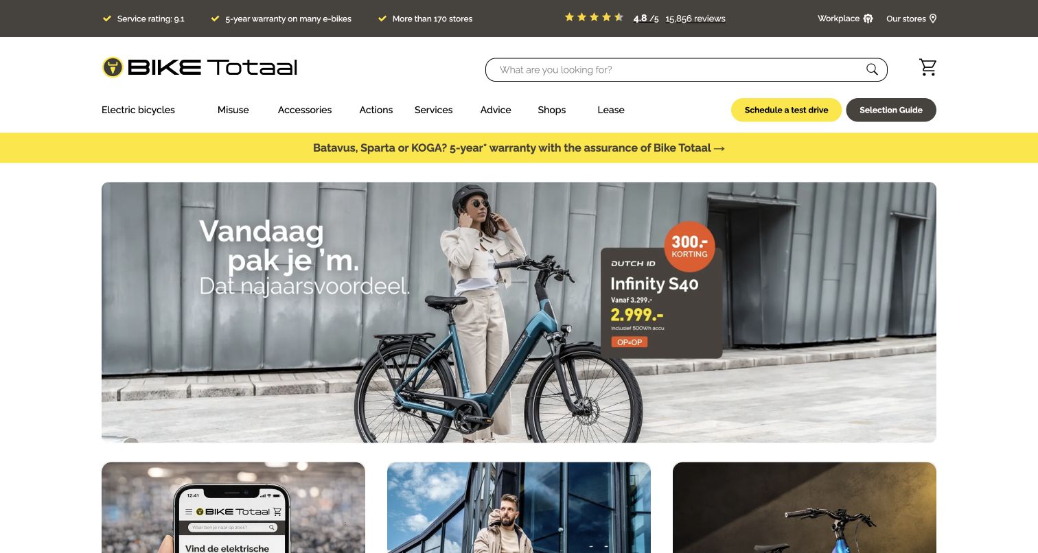
Bike Totaal pairs a wide outlined search field with navigation for bicycles, services, advice, and store-related journeys. Distinct actions for a test ride and selection help sit above a large campaign image. The opening recognizes that choosing a bicycle can involve both catalogue research and an in-person decision. Algolia’s official case concerns the Dutch retailer’s search and discovery experience. This browser-translated desktop view is used for layout analysis, not as an endorsement of automatic wording or proof that local shop stock and booking systems share the search provider.
What you can learn
Connect searchable products with appropriate local next steps. Model bicycle type, intended use, dimensions, and store availability separately, then explain when a visitor is moving from product discovery into advice or a test-ride enquiry.
Pros
The prominent search field serves visitors who arrive with a specific bicycle or component in mind.
Distinct guidance and test-ride actions acknowledge the considered nature of the buying decision.
Cons & considerations
Campaign imagery provides less immediate technical context than a concise comparison or product-selection interface.
Automatically translated labels in this capture should not be reused as polished navigation copy.
Public source checked November 3, 2026. References may be embedded or legacy—not a complete backend inventory.
Platform source: Official Algolia customer implementation case. Official Algolia customer case documents the Dutch Bike Totaal retailer’s search and product-discovery experience. The public Dutch storefront is represented, without testing local-store stock or test-ride booking systems. This is an attributed case-study association reviewed on 2026-11-03, not a current homepage-backend or full-stack audit. Platform evidence is separate from the direct website screenshot and is not a complete current infrastructure audit.
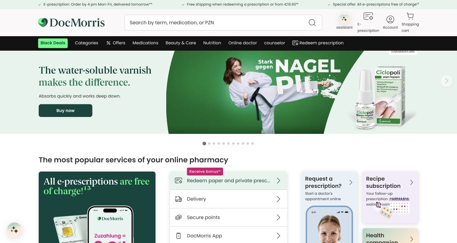
DocMorris places a large search field high in the header, alongside separate prescription, account, and cart actions. A dark category strip leads into promotional product content and service cards. The search prompt accommodates both everyday product wording and a product identifier, reflecting different kinds of catalogue knowledge. Algolia’s official case documents deploying Search API and discovery features on the DocMorris site. This browser-translated public view does not establish the operation of prescription handling, private health services, or clinical recommendations, and no medical or account journey was entered.
What you can learn
Make the boundary between product lookup and sensitive service tasks explicit. Search records need unambiguous names and identifiers, while prescription or advice journeys should retain their own requirements and explanations rather than being presented as ordinary promotional results.
Pros
The wide search field is distinct from the neighboring prescription and account-specific controls.
A clear category strip provides an alternative to searching by an exact product name or code.
Cons & considerations
Promotional content shares attention with service tasks that may require more careful user interpretation.
The translated capture cannot establish the clarity of the original wording or the quality of medical information.
ReactAssociated with Next.js; not independently observed
Public source checked November 3, 2026. References may be embedded or legacy—not a complete backend inventory.
Platform source: Official Algolia customer implementation case. Official Algolia case states that Search API, Dynamic Re-Ranking, A/B Testing and Rules were deployed on the DocMorris website before expansion to related channels. The public German pharmacy storefront is shown; private health and prescription functions are not established. This is an attributed case-study association reviewed on 2026-11-03, not a current homepage-backend or full-stack audit. Platform evidence is separate from the direct website screenshot and is not a complete current infrastructure audit.
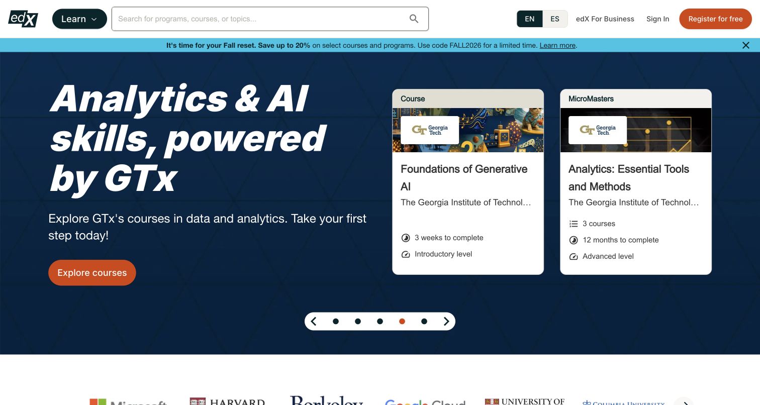
edX combines a large course-and-topic search input with a Learn menu and clearly separated business, sign-in, and registration routes. A dark blue campaign presents AI learning alongside credential cards, with partner identity visible lower in the opening. The page offers a broad discovery tool before asking the visitor to commit to one learning theme. Algolia’s official case specifically names edx.org and its discovery work. The homepage capture does not test course enrolment, search ranking, credential eligibility, or the current delivery technology behind every linked learning experience.
What you can learn
Index topic, institution, level, format, and credential type as distinct attributes. A learner searching a broad subject needs to understand why a short course, professional programme, and degree appear together, with result labels that help them compare the commitment involved.
Pros
The search prompt communicates a broader scope than one institution or a single course title.
Credential cards give the promotional theme concrete destinations without hiding the general catalogue entrance.
Cons & considerations
The featured learning theme may not match the intent of visitors exploring unrelated subjects.
Several credential types require clear comparison information beyond the limited context of the opening campaign.
Public source checked November 3, 2026. References may be embedded or legacy—not a complete backend inventory.
Platform source: Official Algolia customer implementation case. Official Algolia case specifically identifies edx.org and its search and discovery work. The public course-marketplace entrance is shown without asserting the technology behind linked learning platforms or enrolment systems. This is an attributed case-study association reviewed on 2026-11-03, not a current homepage-backend or full-stack audit. Platform evidence is separate from the direct website screenshot and is not a complete current infrastructure audit.
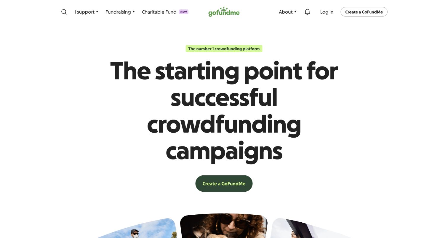
GoFundMe’s French public entrance uses a centered brand mark, a small search route, and a very large fundraising proposition with a green creation action. Photographic campaign material begins below. The main visual emphasis serves people who want to start a fundraiser, while the header preserves discovery for people looking to support one. Algolia’s official account documents fundraiser search and discovery, including campaigns and browsing experiences. This browser-translated view provides interface context; it does not verify fundraising legitimacy, payment handling, identity checks, or the current implementation of every visible campaign feature.
What you can learn
Give donor search enough context to distinguish similar names and causes without overloading results. Location, campaign subject, organizer information, and meaningful status need clear presentation, while starting a new fundraiser should remain a separate and understandable journey.
Pros
The primary creation action is unmistakable within a spacious and restrained opening composition.
Search remains available in the header for visitors arriving to find an existing fundraiser.
Cons & considerations
The strong creation emphasis gives donor discovery less visual prominence in the initial viewport.
Campaign imagery alone cannot establish trustworthiness, requiring fuller context and appropriate checks elsewhere in the journey.
ReactAssociated with Next.js; not independently observed
Public source checked November 3, 2026. References may be embedded or legacy—not a complete backend inventory.
Platform source: Official Algolia customer implementation case. Official Algolia case documents fundraiser search, discovery pages and campaign browsing for GoFundMe; it links the French public property captured here. Payments, identity verification and fundraiser legitimacy are outside this evidence. This is an attributed case-study association reviewed on 2026-11-03, not a current homepage-backend or full-stack audit. Platform evidence is separate from the direct website screenshot and is not a complete current infrastructure audit.
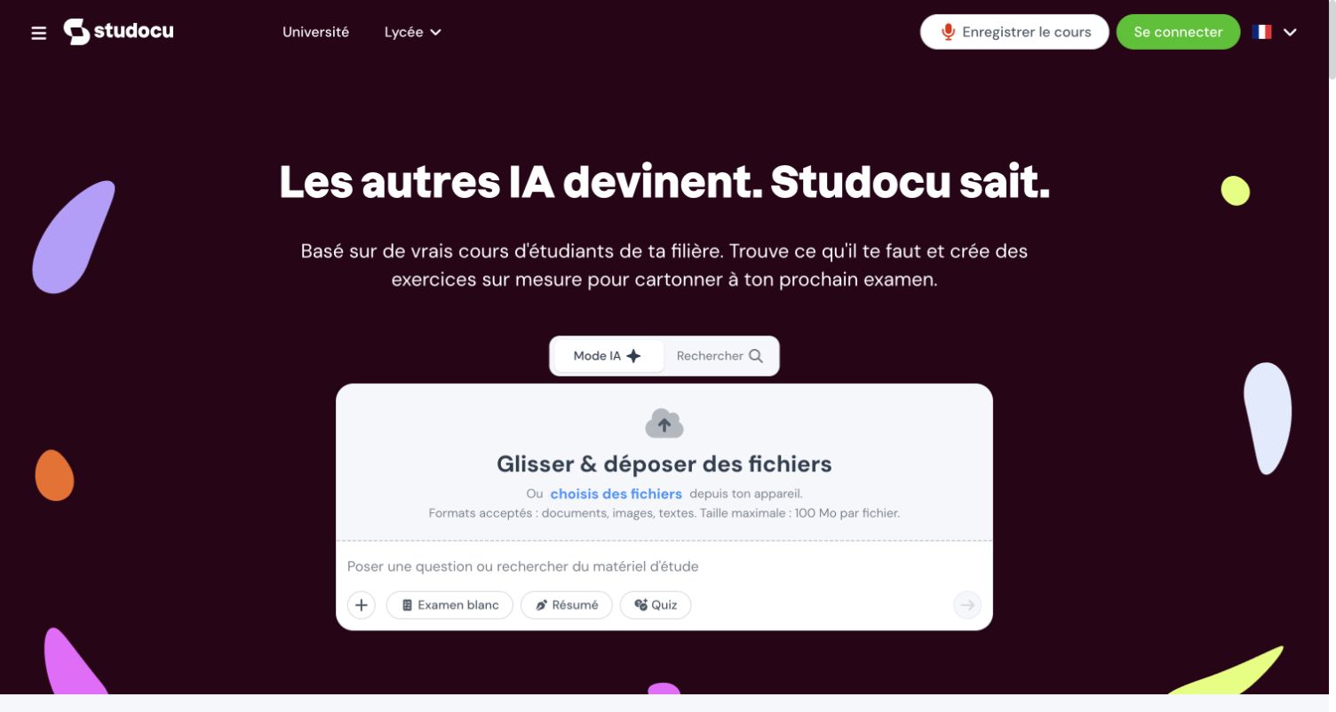
Studocu’s French opening uses a maroon background, a learning proposition, and a central panel with AI and search modes. The presentation foregrounds study tools alongside the document library. The distinction matters: Algolia’s official customer story documents the migration of document search, with further content categories on a roadmap. It does not establish that the current AI assistant, upload interface, or generated study outputs use Algolia. The capture records the public entry point without uploading a document or accessing restricted material.
What you can learn
When adding a new interface beside established search, explain the difference in user expectations. Finding an existing source and asking a tool to generate an answer require different labels, provenance, and empty-state guidance, even if they share the same visual panel.
Pros
The mode switch makes the presence of more than one discovery interaction visible at the entrance.
The central panel gives the primary learning task more focus than a crowded document grid.
Cons & considerations
A strong AI proposition can obscure the established route for finding specific existing course materials.
The documented search relationship should not be extended to generated answers or upload processing without separate evidence.
Visible tech stack
Earlier / documented evidence
Algolia
Earlier cited evidence retained; no current scan result. References may be embedded or legacy—not a complete backend inventory.
Platform source: Official Algolia customer implementation case. Official Algolia case documents completed migration of document search, while other content categories were on a roadmap. The linked French public entrance is shown; its current AI assistant and upload processing are not established by the case. This is an attributed case-study association reviewed on 2026-11-03, not a current homepage-backend or full-stack audit. Platform evidence is separate from the direct website screenshot and is not a complete current infrastructure audit.
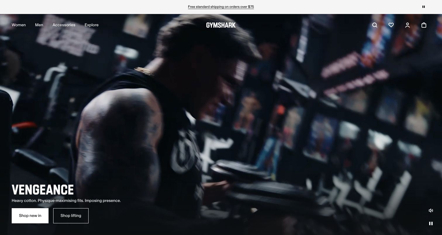
Gymshark gives its opening to a full-width gym video, with white navigation over the imagery and a compact search icon at the right. A concise collection headline and two shopping actions sit near the lower left, while visible media controls acknowledge the moving background. Algolia’s case documents site search, product listing pages, collection discovery, and merchandising within Gymshark’s headless commerce programme. The current capture is a single frame of a changing campaign, not a measurement of page speed or proof that Algolia supplies the video, frontend, or checkout.
What you can learn
Let campaigns carry the brand mood while keeping search and category routes predictable. Product availability and variant information should inform discovery independently of the hero, so a visitor can reach relevant products even when a new collection dominates the opening.
Pros
The uncluttered header preserves basic catalogue routes over an immersive campaign rather than adding a competing panel.
Two concise shopping actions turn the collection message into clear alternatives for the next step.
Cons & considerations
An icon-only search entry is less explicit than a visible input for unfamiliar visitors.
Moving imagery requires separate testing for distraction, contrast, loading behavior, and effective pause controls.
ShopifyDocumented platform association; current media delivery observed
Algolia
Associated dependencies
ReactAssociated with Next.js; not independently observed
Public source checked November 3, 2026. References may be embedded or legacy—not a complete backend inventory.
Platform source: Official Algolia customer implementation case. Official Algolia case documents site search, product listing and collection pages, and merchandising within Gymshark’s headless commerce programme. The public storefront supplies visual context; frontend and checkout responsibilities remain separate. This is an attributed case-study association reviewed on 2026-11-03, not a current homepage-backend or full-stack audit. Platform evidence is separate from the direct website screenshot and is not a complete current infrastructure audit.
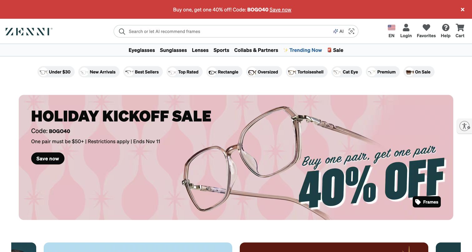
Zenni places a long search field above category navigation and a row of compact attribute-like shopping shortcuts. A large eyewear promotion supplies the seasonal emphasis underneath. The interface acknowledges that shoppers may describe frames by shape, price, popularity, or material rather than knowing a model name. Algolia’s official case documents search and browse on Zenni’s website and explicitly excludes visual search from that account. The present header includes additional AI and image-related cues, whose implementation is not established by this source or by the screenshot.
What you can learn
Build a vocabulary around the attributes shoppers use, then preserve distinctions between typed search, visual lookup, and other assistance. Clear labels and consistent frame metadata matter more than implying that one search integration automatically supplies every discovery interaction in the header.
Pros
The broad search field remains prominent before the offer-led hero and multiple shopping categories.
Compact frame and price shortcuts offer starting points to shoppers who lack a precise query.
Cons & considerations
Several discovery controls inside one input area may need explanation for first-time visitors.
The dominant promotion provides less immediate guidance about fit and product differences than a comparison view.
Public source checked November 3, 2026. References may be embedded or legacy—not a complete backend inventory.
Platform source: Official Algolia customer implementation case. Official Algolia case documents text search and browse for Zenni’s website and mobile commerce, explicitly excluding visual search. New AI or image-related controls visible in the current storefront are not attributed without separate evidence. This is an attributed case-study association reviewed on 2026-11-03, not a current homepage-backend or full-stack audit. Platform evidence is separate from the direct website screenshot and is not a complete current infrastructure audit.
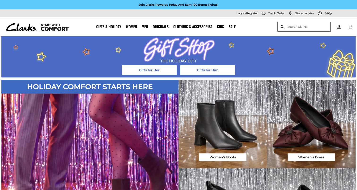
Clarks presents a labeled search field at the right of a white header, with audience categories and a prominent gift section to the left. A blue seasonal banner divides gifts into two routes, followed by footwear photography and category actions. The design combines a recognizable brand promise with several practical ways into the catalogue. Algolia’s official case documents Search and Recommend within an international commerce rebuild. This US storefront view is design context for that documented programme, not a live audit of regional ranking, recommendations, or the complete commerce architecture.
What you can learn
Keep seasonal gifting separate from durable product attributes. A search journey needs clear distinctions between adult and child products, sizes, styles, and regional availability, while gift pages can curate those same records without duplicating their underlying facts.
Pros
The text-labeled search input is easy to identify among the compact account and bag utilities.
Separate gift routes make the seasonal proposition concrete before the visitor reaches detailed product listings.
Cons & considerations
Several utility and promotional strips reduce the space available for the opening product presentation.
Large seasonal artwork can make a routine product search feel secondary for returning shoppers.
Visible tech stack
Earlier / documented evidence
Algolia
Earlier cited evidence retained; no current scan result. References may be embedded or legacy—not a complete backend inventory.
Platform source: Official Algolia customer implementation case. Official Algolia case documents Search and Recommend in Clarks’ international commerce rebuild. The US regional storefront is shown as design context for the documented programme, without claiming a live audit of regional feature deployment. This is an attributed case-study association reviewed on 2026-11-03, not a current homepage-backend or full-stack audit. Platform evidence is separate from the direct website screenshot and is not a complete current infrastructure audit.
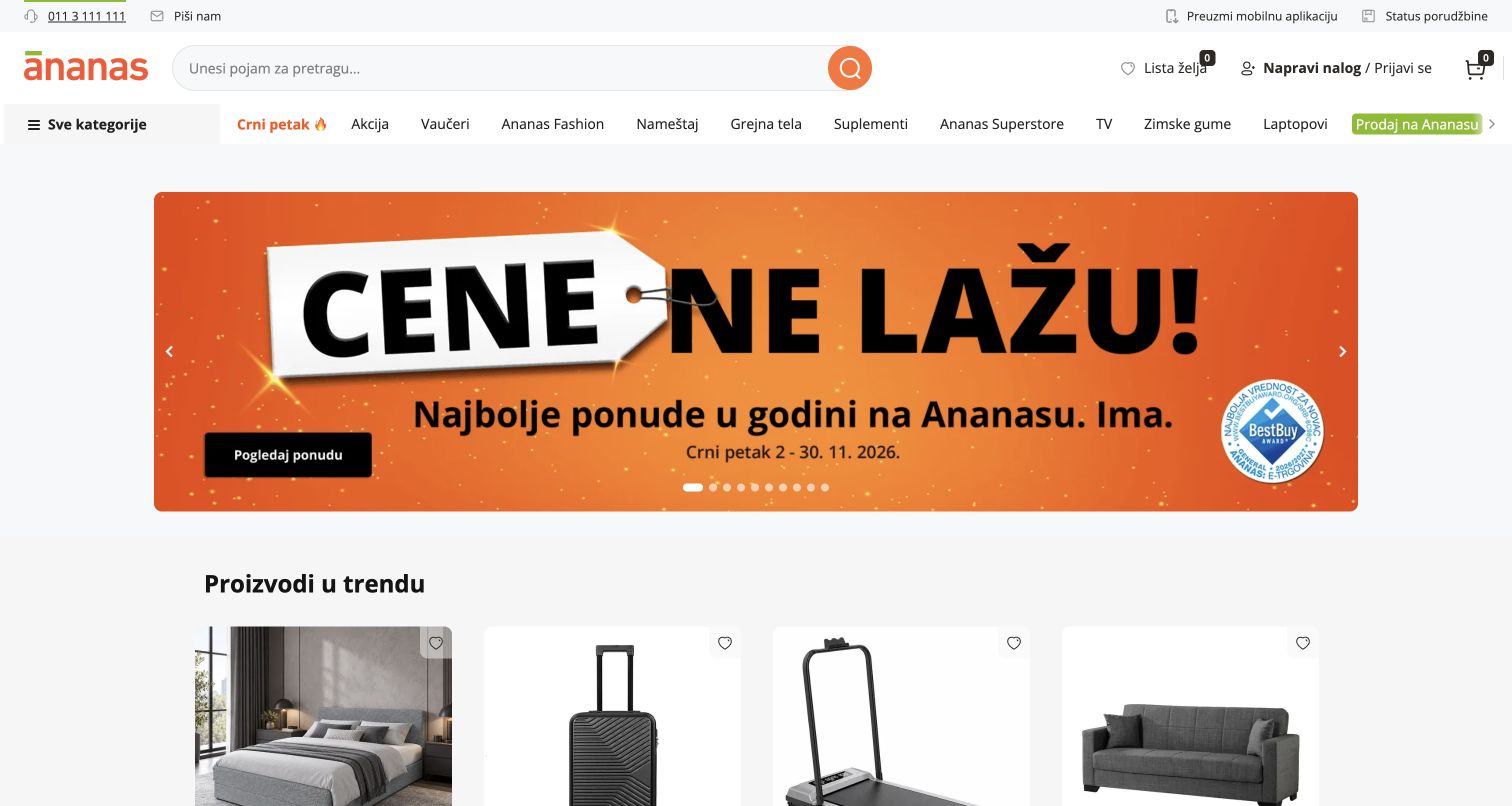
Ananas places a long search field near its orange identity, followed by a category and promotion row. A large orange campaign occupies the center, with a varied product-card grid starting below. The breadth of products makes direct lookup especially consequential: visitors may arrive for something far outside the current promotion. Algolia’s official case explicitly discusses Ananas.rs and the company’s regional marketplaces, including inconsistent merchant-supplied data. The Serbian storefront is a matching public property, but the screenshot does not validate every seller record, delivery claim, or current ranking rule.
What you can learn
Normalize the catalogue before expecting search to solve every discovery problem. Merchant titles, categories, attributes, and identifiers need consistent treatment, with a process for sparse records and duplicate products. Preserve local language distinctions instead of treating regional storefronts as interchangeable copies.
Pros
The large input gives known-item search a clear place above an expansive marketplace offer.
Product cards below the campaign reveal catalogue variety beyond the single featured promotion.
Cons & considerations
A crowded category row can make unrelated product interests compete for limited header space.
Merchant data quality and duplicate listings require ongoing work that the homepage presentation cannot demonstrate.
ReactAssociated with Next.js; not independently observed
Public source checked November 3, 2026. References may be embedded or legacy—not a complete backend inventory.
Platform source: Official Algolia customer implementation case. Official Algolia case explicitly discusses Ananas.rs and search across its regional marketplaces. The captured Serbian property matches the named market; logistics, fintech and future agent features are outside the search association. This is an attributed case-study association reviewed on 2026-11-03, not a current homepage-backend or full-stack audit. Platform evidence is separate from the direct website screenshot and is not a complete current infrastructure audit.
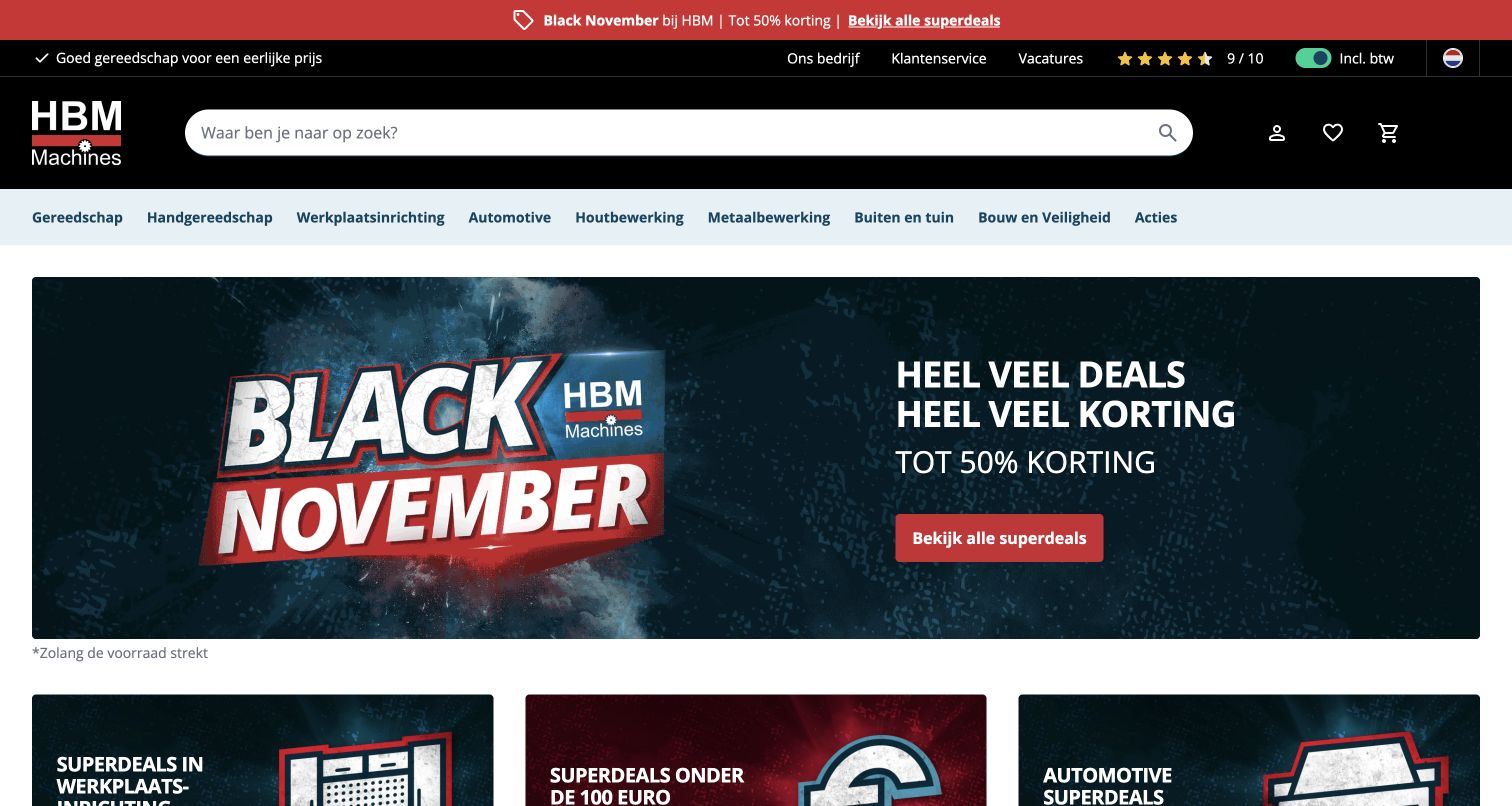
HBM Machines uses a black header with a very wide white search field and a separate pale category strip. A large promotional banner follows, with workshop and tool offers beginning below. The visual priority is unusually clear: a visitor with a particular tool in mind can search before engaging with the promotion. Algolia’s official case documents Search, facets, collections, and recommendations in HBM’s multinational commerce rebuild. The Dutch storefront reflects that documented web programme; future features discussed in the case are not treated as already deployed or visible here.
What you can learn
Treat technical attributes as decision aids rather than decorative product copy. Dimensions, power requirements, use cases, and compatibility need consistent fields, while category labels should connect specialized trade language with the simpler terms a less experienced buyer might use.
Pros
The large white search field has strong visual separation from the black header and campaign.
A dedicated category strip creates a stable browsing route below the search and utility controls.
Cons & considerations
Promotional graphics provide little immediate help when visitors need to compare technical specifications or compatibility.
A broad assortment requires disciplined metadata to prevent search results from grouping superficially similar tools together.
Visible tech stack
Earlier / documented evidence
Algolia
Earlier cited evidence retained; no current scan result. References may be embedded or legacy—not a complete backend inventory.
Platform source: Official Algolia customer implementation case. Official Algolia case documents Search, Facets and Filters, Collections and Recommend across HBM’s unified multinational commerce website. The Dutch storefront is shown; planned Dynamic Re-Ranking testing is not treated as completed. This is an attributed case-study association reviewed on 2026-11-03, not a current homepage-backend or full-stack audit. Platform evidence is separate from the direct website screenshot and is not a complete current infrastructure audit.
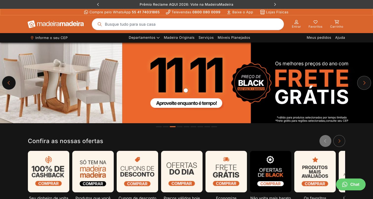
MadeiraMadeira places a long search field in its orange header, with location context and departments beneath. A large furniture campaign leads into offer tiles and product-oriented content. The opening recognizes that finding an item and understanding delivery conditions are related but different tasks. Algolia’s official case documents site search, category discovery, autocomplete, and other catalogue uses on the Brazilian website and app. The public screenshot does not confirm delivery eligibility, stock, payments, or whether features described as future tests in that source were subsequently launched.
What you can learn
Keep catalogue relevance and fulfillment context connected without making visitors guess which information is settled. Product type, dimensions, room, and material can guide discovery, while delivery prices and availability should clearly reflect the location information actually provided by the visitor.
Pros
The wide search field remains visually distinct from both the campaign and supporting commerce utilities.
The persistent location route acknowledges that shipping conditions can affect a furniture-shopping decision.
Cons & considerations
The initial location prompt adds an interruption before visitors have decided what they want to browse.
Several offer tiles prioritize promotion over comparison details such as dimensions, materials, and assembly requirements.
ReactAssociated with Next.js; not independently observed
Public source checked November 3, 2026. References may be embedded or legacy—not a complete backend inventory.
Platform source: Official Algolia customer implementation case. Official Algolia case documents search bars, category pages, navigation and autocomplete on MadeiraMadeira’s Brazilian website and app. Recommend is described as planned testing, so that feature is not asserted as deployed. This is an attributed case-study association reviewed on 2026-11-03, not a current homepage-backend or full-stack audit. Platform evidence is separate from the direct website screenshot and is not a complete current infrastructure audit.
Choose the discovery journey before selecting interface components
Known-item search with useful refinement
For a large catalogue, begin with real queries: exact names, codes, misspellings, broad categories, and ordinary descriptions. Decide which attributes help narrow each result set. Algolia requires attributes intended for faceting or filtering to be configured accordingly; meaningful labels and consistent values still depend on the catalogue and interface you provide.
A category page can share discovery infrastructure with typed search, but its editorial purpose may differ. Identify who can promote a product, change a collection, or introduce a campaign rule. Keep relevance, availability, and commercial priorities explicit so a promotional decision does not quietly conceal useful results.
Federated discovery across different content
When a site contains products, guidance, services, or several kinds of inventory, decide whether one search experience should span them. Provide recognizable groups and result labels, with clear next steps. Test broad queries that cross categories and empty states where one content type has no match, rather than designing only the ideal result.
From references to requirements
Prepare the information and operating process behind search
Audit data and synchronization
List the systems that own product names, dates, prices, availability, destinations, and permissions. Define how updates and removals reach the search index, how failures are noticed, and what users see while data is stale. Test unavailable records and changed URLs as carefully as newly added content.
Build a representative query set
Collect realistic queries with the people who handle support, merchandising, content, and customer research. Include synonyms, ambiguous names, long queries, regional vocabulary, and no-result cases. Review the actual results against a stated task so a visually polished interface does not hide poor catalogue coverage.
Measure the journey with validated events
Define meaningful search actions before interpreting a dashboard. Algolia’s event model distinguishes views, clicks, and conversions, and its validation guidance helps check that events reach the intended index and records. Test identifiers and duplicate events, apply the appropriate privacy choices, and distinguish a click from completion of the visitor’s real task.
Ask the actual team to carry out its routine job: publish a realistic update, correct a mistake, preview a narrow screen, and identify who owns an integration failure. For a library or frontend framework, also ask who maintains the content source and deployment. A polished screenshot does not answer those operational questions.
Beyond the screenshot
Before a search experience is ready to launch
Define searchable entities, stable identifiers, result types, and meaningful destinations.
Choose searchable attributes and refinement fields from real visitor tasks.
Normalize sparse catalogue records, synonyms, regional vocabulary, and inconsistent units.
Check update, deletion, unavailable-item, and stale-index behavior.
Keep search, category browsing, service tasks, and campaign routes understandable together.
Test keyboard navigation, focus, result announcements, touch targets, and mobile refinement.
Review exact, broad, ambiguous, misspelled, and no-result queries with realistic content.
Give merchandising rules an owner, review process, expiry policy, and rollback route.
Validate event identifiers and consent behavior before using analytics to judge changes.
Document which system owns search, content, inventory, pricing, checkout, and support.
Test with real content, a keyboard, a small screen, slow or failed requests, and the people who will maintain the system. These are planning checks, not an accessibility, security, performance, or search-ranking certification.
Sources & editorial method
How this Algolia collection was reviewed
Each example uses a direct desktop capture of the named public property and a linked official Algolia customer case. The case establishes a documented search or discovery association, not a current full-stack audit. Some captures retain the browser’s existing translation behavior and are labeled accordingly. Overlays were dismissed through ordinary controls where possible. Blank, verification-gated, planned-only, or ambiguously matched properties were excluded; no account, payment, upload, or private service flow was tested.
Every image is an unmodified capture from the actual website, with its source and capture date. Some captures are reused from our shared catalog; their dates remain the original capture dates. None comes from a vendor gallery or a generated reconstruction. Moving imagery and live content can change.
Technology attribution uses public page assets or metadata, official platform documentation, or a cited first-party project case study. Documentary and framework-relationship evidence is identified where used; it is not a complete current backend inventory. A CMS image CDN alone does not establish a full CMS deployment. A library’s presence does not prove which individual controls use it, and a platform label does not establish AI authorship.
The composition notes, lessons, pros and tradeoffs are original editorial observations. We have not measured conversion, traffic, security, performance or accessibility conformance. Website owners retain their brands and imagery; these examples are not our client portfolio. Written, Edited and Curated are independent records, not dates advanced by a build. See our editorial standards or suggest a correction.
Questions worth asking
Algolia website development FAQs
Does an Algolia website have a particular visual style?
No. Algolia supplies search and discovery capabilities that can fit within different frontends and content systems. The variation in this collection comes from each organization’s interface, branding, catalogue, and editorial choices.
Does the customer case prove the current homepage backend?
It proves the documented association and scope described by that source. It does not establish every later implementation change, regional feature, application, or private service. The evidence notes keep those limits explicit.
Should search replace category navigation?
Usually the two serve different needs. Someone who knows an item’s name may prefer search, while someone exploring an unfamiliar range may need categories, guidance, or editorial collections. Test both paths with realistic visitor tasks.
Will a search integration repair an inconsistent catalogue?
It can offer tools that help discovery, but the organization still needs an intentional data model and maintenance process. Sparse names, conflicting categories, missing attributes, and stale availability can remain confusing regardless of how prominent the search field is.
Can text search evidence identify the provider of a visible AI or image-search tool?
No. Those functions may use separate services. For example, the Zenni case explicitly excludes visual search from its described Algolia usage, and the Studocu case concerns document search rather than its current AI assistant.
How should a team judge whether a change helped?
State the intended visitor outcome, validate the event data, and compare representative queries and journeys. Search usage or clicks alone may not explain whether people found a suitable item, understood it, and completed the task they came to do.