BigCommerce examples range from familiar retail stores to technical parts catalogs, service bookings, and nonprofit sponsorships. Their useful common ground is a buying model—not a single visual style or a requirement to go headless.
The collection associates the named public properties with BigCommerce through official cases and other primary evidence. Some use a theme-based storefront; others use a separately built frontend and a content platform. BigCommerce operating the commerce engine does not mean it also supplies every visible page, image, or application.
A sensible brief begins with the customer’s selection problem. Does someone choose a shoe size, configure a desk, identify a compatible component, book a local service, or allocate a sponsorship? Specify those decisions and the underlying product data before choosing an approach based on a large brand’s homepage.
Before the examples
What makes good BigCommerce website development in 2026?
Give the catalog a useful organizing logic
Define category names, product attributes, comparison criteria, and the information a shopper needs before selecting an option. Technical buyers may need dimensions or compatibility where consumer retail needs size and color. The interface should reflect those differences without forcing every product into an identical marketing story.
Separate content ownership from transaction ownership
Identify where campaigns, product facts, prices, availability, customer accounts, and order status originate. A headless case may use a separate CMS for editorial content and BigCommerce for commerce. Record that boundary so editors know which system changes what and developers know which data can be cached.
Design around buying context, not just product cards
A returning wholesale buyer and a first-time consumer do not necessarily need the same opening route. Make the primary shopping paths recognizable, then provide appropriate account or trade routes. Do not expose private account prices or promise inventory behavior based on what a public homepage appears to show.
The collection · 20 examples
20 BigCommerce website examples worth studying
Use these properties to compare product discovery, brand storytelling, service information, and public buying routes. Several backend implementations are intentionally not obvious in a screenshot; the accompanying sources explain the documented association.
We start with five recognizable brands or organizations: Mizuno USA, UPLIFT Desk, Yeti Cycles, AS Colour, Blooms The Chemist. Each attribution applies to the named website property, not every product or website belonging to its organization. This is a curated reading sequence, not a measured ranking.
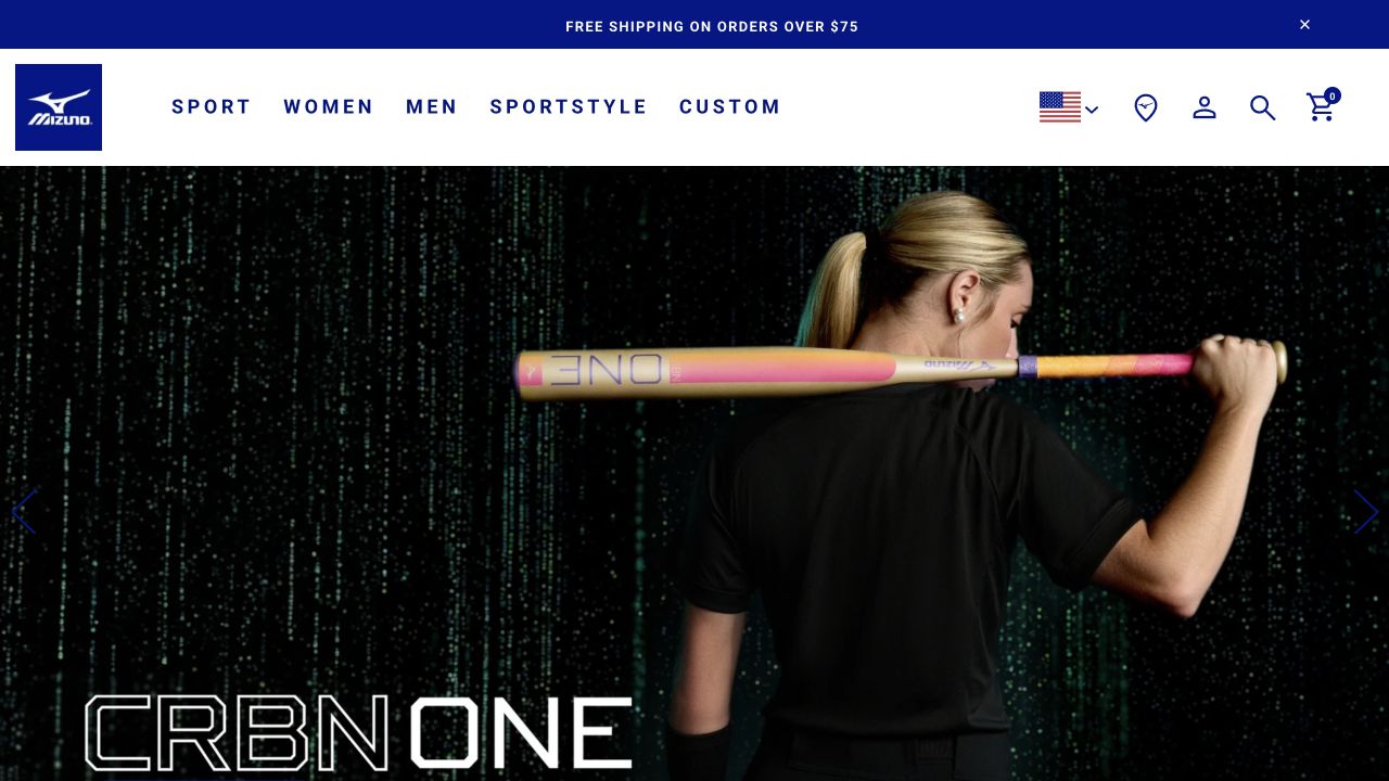
Mizuno USA keeps its opening navigation compact: Sport, Women, Men, Sportstyle, and Custom sit between the brand mark and familiar shopping controls. The captured campaign is a large photograph of an athlete holding a bat against a dark patterned background. A product name anchors the lower edge rather than introducing several unrelated offers. The blue shipping strip remains separate from the campaign, so practical store information is not dependent on the artwork. The opening establishes a sporting context before individual product details appear.
What you can learn
A broad sporting catalog can use a highly focused campaign if its permanent routes remain understandable. Make sport-based discovery available alongside audience-based shopping, then test whether the labels help your own customers. The documented BigCommerce association is the US storefront; the source separately identifies its content platform rather than treating commerce as the complete stack.
Pros
The short main navigation avoids turning every product family into a competing headline.
Search, account, location, and cart controls remain outside the campaign imagery.
Cons & considerations
The oversized campaign pushes much of the product explanation below the opening frame.
Dark promotional photography needs readable text treatment for every image and crop.
Visible tech stack
Earlier / documented evidence
BigCommerce
Earlier cited evidence retained; no current scan result. References may be embedded or legacy—not a complete backend inventory.
Platform source: Primary platform or implementation reference. The official case directly links the US storefront and documents BigCommerce commerce with Contentstack content delivery. The association applies to the named public property; it is not a complete technology inventory or an edition/version audit. Platform evidence is separate from the direct website screenshot and is not a complete current infrastructure audit.
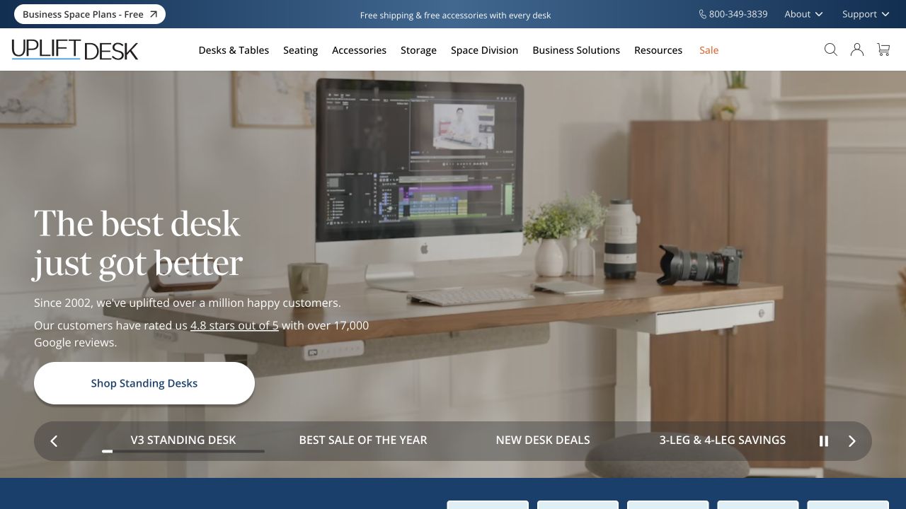
UPLIFT Desk shows a standing desk in a working room rather than isolating the product on a blank surface. A large serif headline, short supporting text, and one white shopping button occupy the left side. The header separates desks, seating, accessories, storage, and business solutions. Beneath the hero, a rounded carousel strip exposes named campaign choices instead of only anonymous dots. Support and a telephone number sit in the upper utility area, reinforcing that furniture shopping may involve questions before purchase.
What you can learn
A room photograph can introduce scale and use while product categories remain literal. Make important campaign options identifiable, but keep the core shopping route clear when the carousel changes. The official implementation account documents BigCommerce with Catalyst; it does not make every visible customization or business-service workflow a standard platform feature.
Pros
The desk is shown with recognizable equipment that helps establish its intended setting.
Named carousel choices explain alternate messages more clearly than dots alone.
Cons & considerations
Several campaign options and utility links create a substantial opening decision set.
The room photograph cannot replace dimensions, configuration details, or compatibility information.
ReactAssociated with Next.js; not independently observed
Public source checked November 3, 2026. References may be embedded or legacy—not a complete backend inventory.
Platform source: Primary platform or implementation reference. The vendor's 2025 case documents the storefront's move from Stencil to Catalyst while retaining BigCommerce. The association applies to the named public property; it is not a complete technology inventory or an edition/version audit. Platform evidence is separate from the direct website screenshot and is not a complete current infrastructure audit.
Yeti Cycles uses a full-width championship photograph as the opening campaign, with its compact turquoise logo and white navigation above. Bikes, Apparel, Gear, Roots, and Demo distinguish equipment, community content, and trial-related tasks. Search, location, account, and cart controls remain visible on the darkened photograph. The large championship lettering sits low in the frame, giving the athlete and event context much of the space. This is a community-led entrance to a store, not a product comparison screen.
What you can learn
Community material can make a technical brand feel specific, provided shoppers can still reach the catalog without interpreting the story. Preserve straightforward routes into equipment and demonstrations. The platform case and current public signals concern Yeti Cycles, the bicycle company, not another business with a similar name or its separate operational systems.
Pros
Equipment, apparel, and community material have distinct short navigation labels.
The contrasting logo remains identifiable over a busy event photograph.
Cons & considerations
The event-led first screen postpones practical differences between bicycle models.
Overlay navigation and low-positioned type need careful contrast and responsive image cropping.
Vue.jsAssociated with Nuxt; not independently observed
Public source checked November 3, 2026. References may be embedded or legacy—not a complete backend inventory.
Platform source: Primary platform or implementation reference. The official case documents this bicycle brand's headless BigCommerce storefront and ZaneRay implementation. The association applies to the named public property; it is not a complete technology inventory or an edition/version audit. Platform evidence is separate from the direct website screenshot and is not a complete current infrastructure audit.
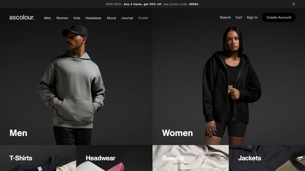
AS Colour’s opening splits the main photograph between men’s and women’s apparel, with large category names anchored near each image. The black navigation is visually continuous with the subdued photography. Men, Women, Kids, Headwear, About, Journal, and Outlet stay visible above, alongside search, cart, and account routes. A thin promotion strip states an offer without filling the hero with additional marketing copy. The next row begins further product categories, making the page feel like an organized catalog rather than a single temporary campaign.
What you can learn
Product-led photography can double as navigation when category labels remain explicit. Keep trade access understandable without allowing wholesale requirements to overwhelm the public retail surface. BigCommerce’s case specifically documents AS Colour’s regional retail and wholesale implementation; it does not reveal the contents or permissions of any private customer account.
Pros
Large category labels provide immediate entry points into a broad apparel range.
Account creation and sign-in remain visible without displacing the primary merchandise categories.
Cons & considerations
The dark image palette depends on deliberate lighting to preserve product distinctions.
Audience-based categories alone do not yet explain fit, fabric, or quantity choices.
Visible tech stack
Earlier / documented evidence
BigCommerce
Earlier cited evidence retained; no current scan result. References may be embedded or legacy—not a complete backend inventory.
Platform source: Primary platform or implementation reference. The official case directly links ascolour.com and documents BigCommerce across its regional wholesale and DTC stores. The association applies to the named public property; it is not a complete technology inventory or an edition/version audit. Platform evidence is separate from the direct website screenshot and is not a complete current infrastructure audit.
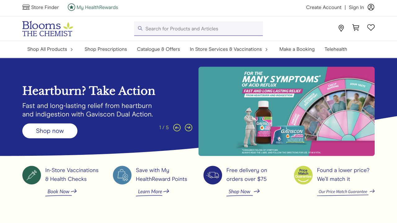
Blooms The Chemist places a wide search field between its logo and familiar store, cart, and wishlist controls. The navigation distinguishes products, prescriptions, offers, in-store services, bookings, and telehealth. A blue promotional hero pairs text and a product image, followed by a row of practical service benefits. These benefits include vaccination bookings, rewards, delivery, and a price-match route. The page therefore exposes everyday pharmacy tasks before asking visitors to browse a long product catalog or read corporate background.
What you can learn
When retail and services coexist, give the different tasks their own destinations and clear language. Keep medical suitability and eligibility information with the relevant service rather than assuming a promotional image explains it. The official BigCommerce case documents this Australian pharmacy network’s store implementation, not a clinical assessment or compliance audit.
Pros
Products and articles can be searched from a prominent, clearly positioned field.
Service booking and retail shopping are distinguishable within the stable navigation.
Cons & considerations
The number of product and service routes makes navigation prioritization especially important.
A rotating offer can dominate the opening before a visitor reaches practical service details.
Visible tech stack
Earlier / documented evidence
BigCommerce
Earlier cited evidence retained; no current scan result. References may be embedded or legacy—not a complete backend inventory.
Platform source: Primary platform or implementation reference. The official case directly links this Australian pharmacy property and documents its BigCommerce implementation. The association applies to the named public property; it is not a complete technology inventory or an edition/version audit. Platform evidence is separate from the direct website screenshot and is not a complete current infrastructure audit.
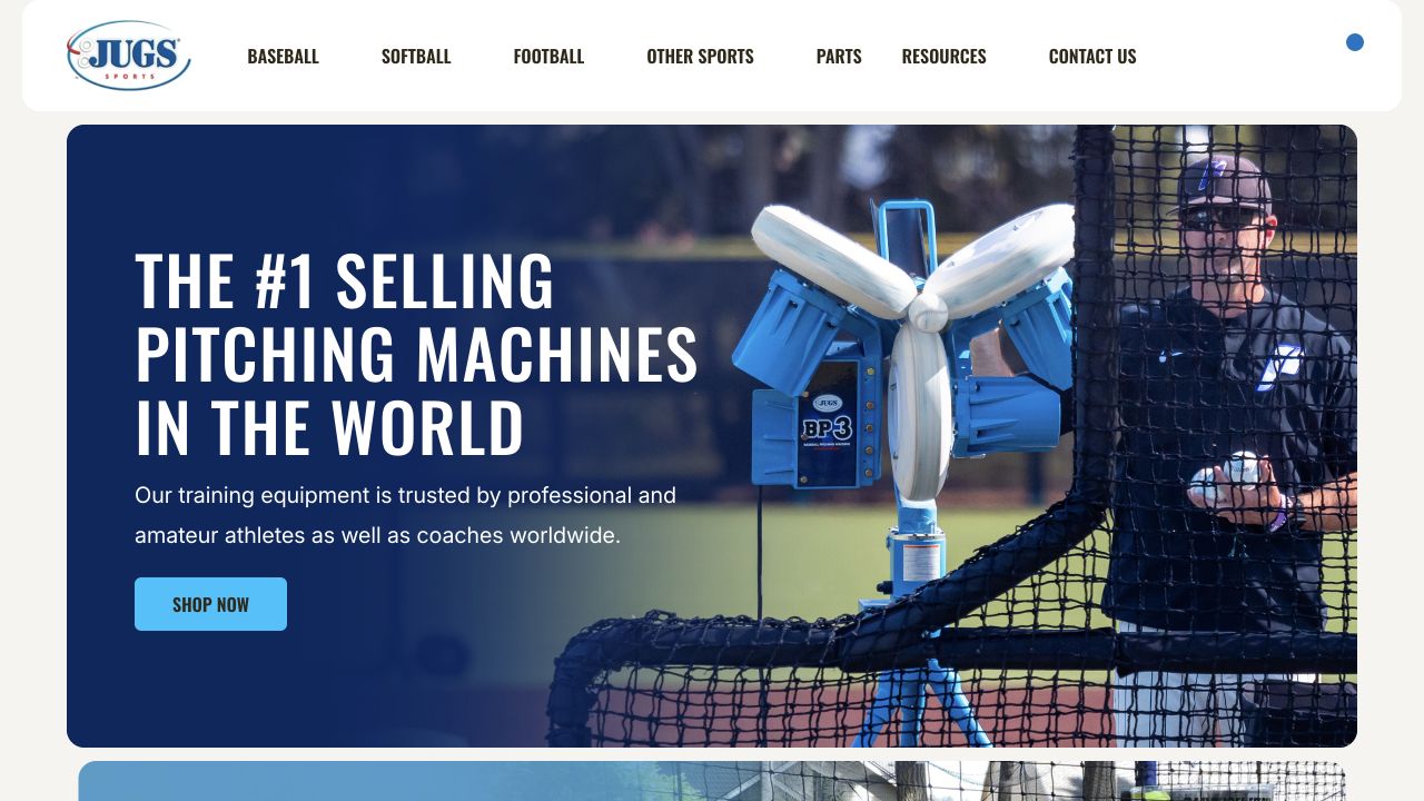
JUGS Sports introduces pitching machines through a photograph of equipment inside a batting cage with a player behind the net. A large left-aligned headline and supporting sentence establish the category, followed by a blue shopping button. The white rounded header separates baseball, softball, football, other sports, parts, and resources. The page uses a sports-specific vocabulary rather than decorative collection names. The equipment is visible at a useful scale, although the opening remains promotional rather than a detailed technical specification.
What you can learn
A real-use photograph can answer what a specialist product does before the visitor learns individual model names. Keep sport and parts routes available for returning buyers who already know the task. A vendor’s promotional claim about market position is not independently established by the screenshot, so the lesson here concerns communication and navigation rather than sales leadership.
Pros
The equipment and player share a frame that explains the product’s use.
Parts and resources are permanent navigation choices alongside the sports categories.
Cons & considerations
The single featured category receives most of the opening space before other equipment appears.
Technical differences, safety details, and model suitability still require deeper product content.
Visible tech stack
Earlier / documented evidence
BigCommerce
Earlier cited evidence retained; no current scan result. References may be embedded or legacy—not a complete backend inventory.
Platform source: Primary platform or implementation reference. The official case directly links this sporting-equipment storefront and names BigCommerce as its platform. The association applies to the named public property; it is not a complete technology inventory or an edition/version audit. Platform evidence is separate from the direct website screenshot and is not a complete current infrastructure audit.
Oase’s reviewed US landing page presents four clear environmental categories: Pond & Water Garden, Aquarium, Fountain Technology, and Water Technology. A large garden-and-water photograph sits below the simple white header, with one broad proposition centered over it. The view includes a small indication that video playback depends on cookie consent, while the still image remains meaningful. There is no crowded opening grid of components or technical part numbers. The page first helps visitors establish which setting their project belongs to.
What you can learn
For a technical catalog, a use-environment choice can be more approachable than the organization’s internal product taxonomy. Keep an informative static state when optional media is unavailable. The official implementation case distinguishes BigCommerce commerce from Storyblok content delivery; neither the photograph nor the case supports calling every part of the experience a native commerce template.
Pros
Four readable environment labels divide a broad range into recognizable starting points.
The garden photograph remains useful even without playing the optional background video.
Cons & considerations
The broad opening proposition gives little immediate guidance about individual product selection.
Technical buyers may need a direct product-search route beyond the initial environment choices.
Visible tech stack
Earlier / documented evidence
BigCommerce
Earlier cited evidence retained; no current scan result. References may be embedded or legacy—not a complete backend inventory.
Platform source: Primary platform or implementation reference. The case directly links oase.com and documents a composable BigCommerce foundation with Storyblok across regional properties. Scope: Capture the public locale reached from this URL; do not call Storyblok content itself BigCommerce. The association applies to the named public property; it is not a complete technology inventory or an edition/version audit. Platform evidence is separate from the direct website screenshot and is not a complete current infrastructure audit.
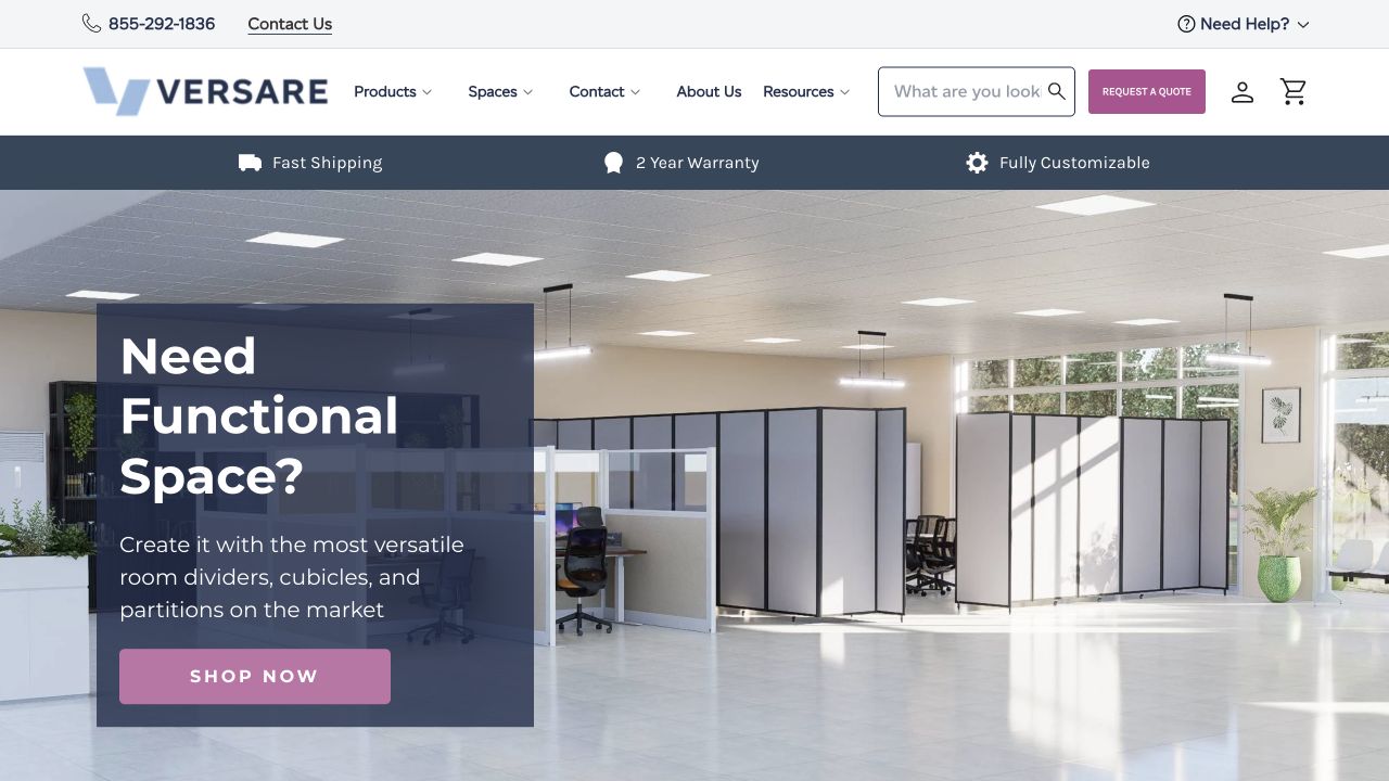
Versare shows a large interior fitted with partitions and work areas, placing a dark translucent text panel over the left side. The headline frames the customer’s space problem, while the supporting copy names room dividers, cubicles, and partitions. The header keeps products, spaces, resources, search, and a quote request visible. A separate benefits bar names shipping, warranty, and customization. This creates a bridge between browsing familiar product categories and asking for assistance with a more complicated project.
What you can learn
An installation photograph can introduce the desired outcome, but the page should also name the products that achieve it. Provide both shopping and quote routes when those are genuinely different workflows. The public BigCommerce association does not show how a custom quotation is priced, reviewed, or passed into the business’s internal sales process.
Pros
The room installation gives product scale and arrangement more context than isolated objects.
Shopping and requesting a quote are visibly different next steps.
Cons & considerations
The large overlay panel covers some of the installation detail it is describing.
Several benefit and support strips compete with the main content near the top of the page.
Visible tech stack
Earlier / documented evidence
BigCommerce
Earlier cited evidence retained; no current scan result. References may be embedded or legacy—not a complete backend inventory.
Platform source: Primary platform or implementation reference. BigCommerce publishes this manufacturer's storefront implementation case. The association applies to the named public property; it is not a complete technology inventory or an edition/version audit. Platform evidence is separate from the direct website screenshot and is not a complete current infrastructure audit.
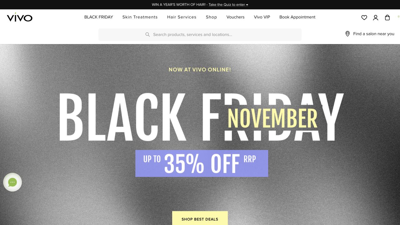
Vivo’s homepage puts Hair Services, Skin Treatments, Shop, Vouchers, membership, and booking in one white navigation bar. A wide search field explicitly includes products, services, and locations, with a salon finder beside it. The captured hero is a typographic sale campaign, using a gray background, oversized lettering, and a bright shopping action. That campaign does not remove the appointment route or the local-service controls. The composition makes the hybrid retail-and-service model visible before a visitor reaches individual products.
What you can learn
A service network can share a public destination with ecommerce without forcing every visitor into the same funnel. Write search and navigation labels around the tasks customers actually have. The implementation case documents BigCommerce, while the current page also contains other technology-related text; a single detected word is not a reliable complete-stack inventory.
Pros
Search explicitly includes services and locations rather than suggesting it only searches products.
Booking remains a stable header task during a retail promotion.
Cons & considerations
The sale artwork does little to introduce the business to a first-time visitor.
The many service, membership, gift, and product choices require clear mobile prioritization.
Visible tech stack
Earlier / documented evidence
BigCommerce
Earlier cited evidence retained; no current scan result. References may be embedded or legacy—not a complete backend inventory.
Platform source: Primary platform or implementation reference. The official case directly links vivo.co.nz and documents its migration to BigCommerce. The association applies to the named public property; it is not a complete technology inventory or an edition/version audit. Platform evidence is separate from the direct website screenshot and is not a complete current infrastructure audit.
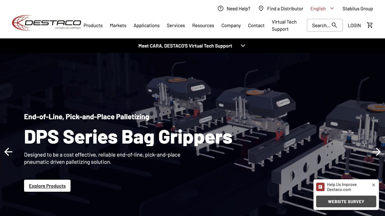
DESTACO’s opening separates products, markets, applications, services, resources, and company information in a white header. Search, login, cart, distributor lookup, and support are visible alongside those routes. A black strip introduces virtual technical support before the product campaign below. The captured campaign shows industrial equipment and names a particular bag-gripping product family rather than only describing corporate expertise. The page offers several ways to proceed because engineers may arrive with an application, a part, or a support question.
What you can learn
Do not force every technical buyer through a single shopping category tree. Provide application, product, distributor, and support routes when each solves a different task. The documented BigCommerce foundation is the public catalog implementation, not proof that every specification, CAD service, or support tool is supplied by the same platform.
Pros
Application-based and product-based routes address different starting points for technical selection.
Distributor lookup and support remain available before the visitor commits to a product family.
Cons & considerations
The many adjacent header labels create a high information density at desktop width.
A broad product campaign still needs precise specifications and compatibility information on deeper pages.
Public source checked November 3, 2026. References may be embedded or legacy—not a complete backend inventory.
Platform source: Primary platform or implementation reference. The official case directly links destaco.com and describes the BigCommerce product-catalog foundation. The association applies to the named public property; it is not a complete technology inventory or an edition/version audit. Platform evidence is separate from the direct website screenshot and is not a complete current infrastructure audit.
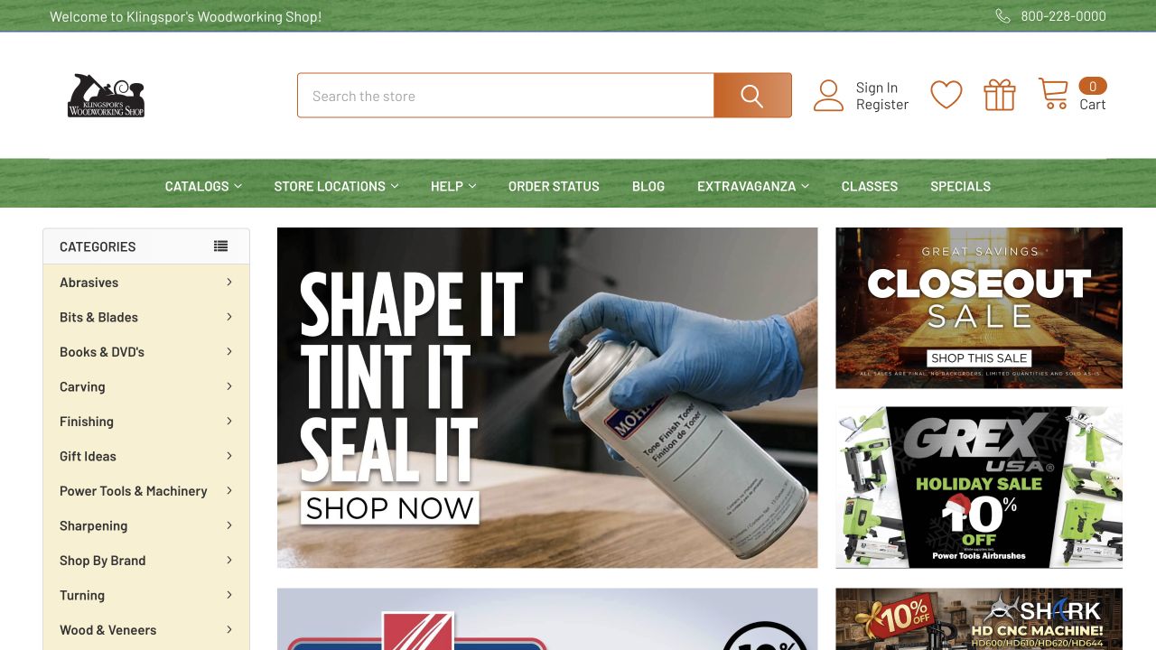
Klingspor’s Woodworking Shop uses a traditional catalog layout with a left-hand category rail, a large central promotion, and smaller offers to the right. Abrasives, bits and blades, carving, finishing, machinery, sharpening, and other specialist categories are visible without opening a menu. A prominent search field sits above, while catalog, location, help, order-status, blog, and class links occupy a separate green bar. The composition is busy, but the different regions have clearly different jobs rather than forming one undifferentiated campaign grid.
What you can learn
A large specialist inventory does not need to hide its taxonomy for the sake of visual minimalism. Give categories, search, promotions, and support their own hierarchy, then test the actual labels with customers. This public view supports a discovery-pattern review, not a conclusion about inventory accuracy or how efficiently an order is fulfilled.
Pros
The exposed category rail offers useful context for shoppers who do not know a product name.
Search and order support remain distinct from the promotional tiles.
Cons & considerations
Several competing image promotions can make the central buying priority less obvious.
The dense desktop arrangement needs a different narrow-screen hierarchy rather than proportional shrinking.
Visible tech stack
Earlier / documented evidence
BigCommerce
Earlier cited evidence retained; no current scan result. References may be embedded or legacy—not a complete backend inventory.
Platform source: Primary platform or implementation reference. BigCommerce documents this woodworking-supply storefront as a platform implementation. The association applies to the named public property; it is not a complete technology inventory or an edition/version audit. Platform evidence is separate from the direct website screenshot and is not a complete current infrastructure audit.
Laser Clinics Australia places Book Now and Buy Now beside one another in the permanent header, then repeats those routes within the opening promotion. Treatment categories and solution-based discovery sit alongside clinic lookup and medical-team information. The captured campaign uses a full-width beach photograph with large white promotional type. The page therefore treats scheduling and purchasing as related but distinct actions, rather than expecting a generic call to action to explain both. Practical treatment information remains a separate destination from the promotional offer.
What you can learn
When payment and appointment selection are not the same step, label the distinction explicitly. Keep eligibility, treatment details, conditions, and clinical information accessible beyond the campaign. The BigCommerce source establishes a commerce implementation; this visual review does not evaluate the medical claims, treatment suitability, or regulatory compliance of the service.
Pros
Booking and buying are labeled separately in both header and campaign actions.
Clinic and medical-team routes are visible outside the temporary offer.
Cons & considerations
The promotional photograph and offer occupy most of the initial reading space.
Small conditions and text over photography need careful contrast and mobile treatment.
Visible tech stack
Earlier / documented evidence
BigCommerce
Earlier cited evidence retained; no current scan result. References may be embedded or legacy—not a complete backend inventory.
Platform source: Primary platform or implementation reference. The official case directly links the Australian property and describes a composable BigCommerce service-shopping journey. The association applies to the named public property; it is not a complete technology inventory or an edition/version audit. Platform evidence is separate from the direct website screenshot and is not a complete current infrastructure audit.
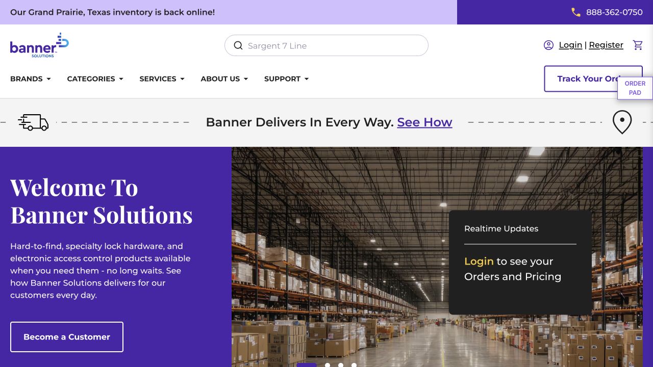
Banner Solutions centers product search in a spacious white header, with login, registration, cart, and order tracking nearby. Brand and category navigation are separate from services and support. The purple campaign area introduces the distributor’s product specialization beside a warehouse photograph. A dark card on that image explicitly points existing customers toward orders and pricing behind login. This establishes that anonymous product discovery and a customer’s account information are different experiences. An operational notice occupies its own narrow strip above the header.
What you can learn
For B2B commerce, acknowledge returning customers’ everyday tasks as clearly as the new-customer proposition. Keep account-dependent information labeled rather than pretending the public page exposes every price or order status. The official case documents BigCommerce B2B Edition with Catalyst; the screenshot does not verify the capabilities or permissions of a private buyer account.
Pros
Search and account access receive strong placement for task-oriented returning buyers.
The public page distinguishes becoming a customer from viewing existing account information.
Cons & considerations
Several floating controls can crowd the edge of the main navigation.
The warehouse image provides business context but little detail about individual products.
ReactAssociated with Next.js; not independently observed
Public source checked November 3, 2026. References may be embedded or legacy—not a complete backend inventory.
Platform source: Primary platform or implementation reference. The official case directly links this distributor and documents BigCommerce B2B Edition with a Catalyst frontend. The association applies to the named public property; it is not a complete technology inventory or an edition/version audit. Platform evidence is separate from the direct website screenshot and is not a complete current infrastructure audit.
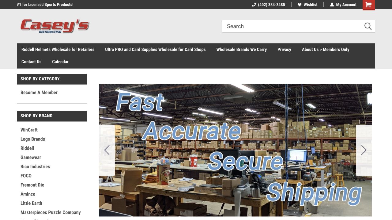
Casey’s Distributing uses a broad search field above a dark horizontal navigation bar and a left-hand brand list. The captured promotion shows a working warehouse with an emphasis on shipping, while membership and account routes remain visible. The page is less like a consumer campaign than a supplier directory with retail functionality. Its brand rail lists manufacturers directly, offering a useful route for buyers who arrive knowing a supplier rather than a particular item. Telephone contact sits in the upper utility strip.
What you can learn
A wholesale homepage can prioritize familiar brands, membership, and repeat tasks over elaborate brand storytelling. Make the distinction between browsing public material and accessing member information explicit. The current page exposes BigCommerce signals as well as an older documented implementation, but neither source reveals current contract prices or what an authenticated account can do.
Pros
A visible supplier list supports buyers who organize purchasing around known brands.
Search, telephone contact, wishlist, and account routes are available without opening a hidden menu.
Cons & considerations
Dense small navigation text requires careful keyboard and narrow-screen presentation.
The operational campaign says little about product differences until buyers select a brand or category.
Visible tech stack
Earlier / documented evidence
BigCommerce
Earlier cited evidence retained; no current scan result. References may be embedded or legacy—not a complete backend inventory.
Platform source: Primary platform or implementation reference. The vendor case directly links this exact wholesale sports-merchandise website. Scope: Older case; verify public storefront and current runtime before publication. The association applies to the named public property; it is not a complete technology inventory or an edition/version audit. Platform evidence is separate from the direct website screenshot and is not a complete current infrastructure audit.
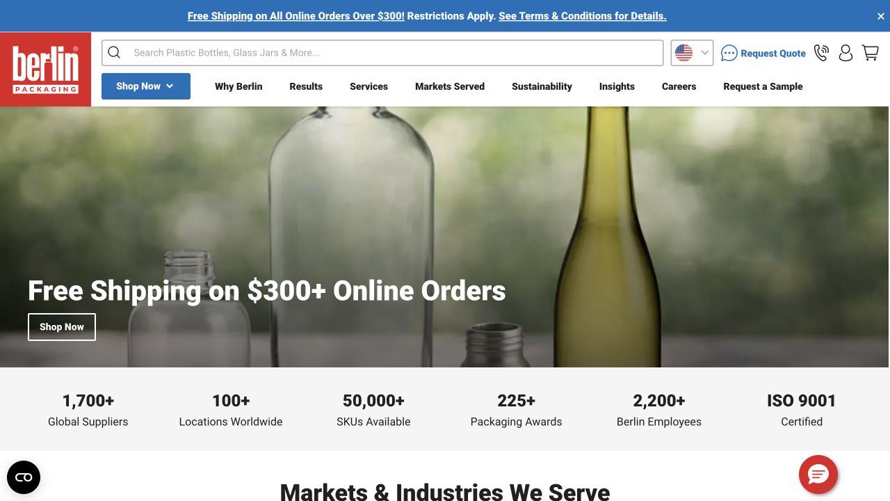
Berlin Packaging’s header gives a wide product search field more space than any individual navigation item. Shop Now is separate from services, markets served, sustainability, and company information. Request Quote and Request a Sample provide recognizable procurement tasks in addition to the cart. The opening uses large container photography rather than a grid of tiny product thumbnails. This reflects the difference between someone buying a known bottle and someone researching a packaging project that may need samples or assistance.
What you can learn
Do not make assisted purchasing compete invisibly with a conventional cart. Give quote, sample, and stock-shopping routes explicit labels and explain what each one requires. The named public property is documented on BigCommerce and exposes current platform signals; that association should not be extended automatically to every subsidiary or international packaging business.
Pros
The large search input supports direct product discovery in an extensive catalog.
Quote and sample actions describe concrete next steps instead of a generic Contact button.
Cons & considerations
Numerous procurement and company routes create a dense header to manage responsively.
Large introductory imagery does not by itself explain container dimensions or material suitability.
Visible tech stack
Earlier / documented evidence
BigCommerce
Earlier cited evidence retained; no current scan result. References may be embedded or legacy—not a complete backend inventory.
Platform source: Primary platform or implementation reference. The vendor case identifies berlinpackaging.com and its BigCommerce ecommerce/API implementation. Scope: Older case; verify current property rather than extrapolating to other Berlin Packaging subsidiaries. The association applies to the named public property; it is not a complete technology inventory or an edition/version audit. Platform evidence is separate from the direct website screenshot and is not a complete current infrastructure audit.
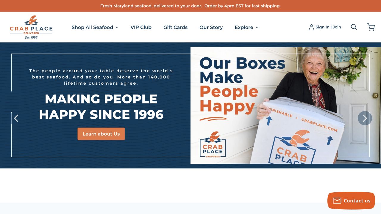
The Crab Place places a practical shipping announcement above a clear seafood-shopping menu. The captured campaign pairs a company-introduction panel with a photograph of a smiling recipient holding a delivery box. The blue-and-orange identity connects the packaging and page controls, while VIP rewards and gift cards remain visible in the header. The hero promotes the delivery experience rather than presenting seafood as an anonymous commodity. A contact control sits at the lower corner without replacing the permanent shopping routes.
What you can learn
When fulfillment is central to the product, show the package and context while keeping delivery information easy to find. A happy-recipient photograph is a brand presentation, not independent evidence of customer satisfaction. The official BigCommerce case describes customized commerce work; the screenshot alone does not establish delivery guarantees or checkout scheduling behavior.
Pros
Shipping information is positioned separately from the changing campaign artwork.
The package photograph makes the online-to-doorstep aspect of the business tangible.
Cons & considerations
The introductory carousel frame postpones the seafood range and its prices.
A promotional shipping message still needs detailed, location-specific conditions on the relevant pages.
Visible tech stack
Earlier / documented evidence
BigCommerce
Earlier cited evidence retained; no current scan result. References may be embedded or legacy—not a complete backend inventory.
Platform source: Primary platform or implementation reference. The vendor's recent case documents BigCommerce APIs and checkout for this seafood-delivery merchant. Scope: Confirm the exact merchant URL through the case's outbound link or live website before capture. The association applies to the named public property; it is not a complete technology inventory or an edition/version audit. Platform evidence is separate from the direct website screenshot and is not a complete current infrastructure audit.
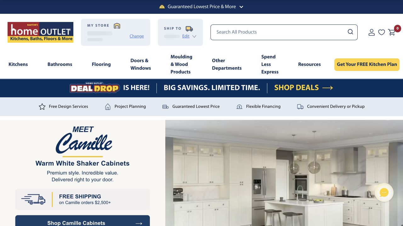
Home Outlet’s opening shows a furnished kitchen beside a named cabinet range and a shipping message. The header gives substantial room to product search and explicitly separates store choice from shipping location. Product departments sit below, followed by a benefits strip covering design services, project planning, pricing, financing, and delivery or pickup. The composition acknowledges that a cabinet purchase can involve a room project and local logistics, not just adding an isolated item to a cart. The brand’s yellow accents mark shopping and planning actions.
What you can learn
For bulky or project-based products, make location, delivery, and planning visible before customers invest in browsing. An inspirational room should lead into concrete range information. This capture does not set a location or verify actual local stock; the official BigCommerce case and public signals establish the storefront association, not availability for any particular customer.
Pros
Store and shipping contexts are visibly different controls rather than one ambiguous location label.
Planning and design services are presented alongside product shopping.
Cons & considerations
Several stacked navigation and benefit rows reduce the visible area for the cabinet campaign.
A room photograph cannot replace cabinet dimensions, compatibility, or installation details.
Visible tech stack
Earlier / documented evidence
BigCommerce
Earlier cited evidence retained; no current scan result. References may be embedded or legacy—not a complete backend inventory.
Platform source: Primary platform or implementation reference. Official vendor case documents BigCommerce with Mira Commerce; direct URL still requires checking. The association applies to the named public property; it is not a complete technology inventory or an edition/version audit. Platform evidence is separate from the direct website screenshot and is not a complete current infrastructure audit.
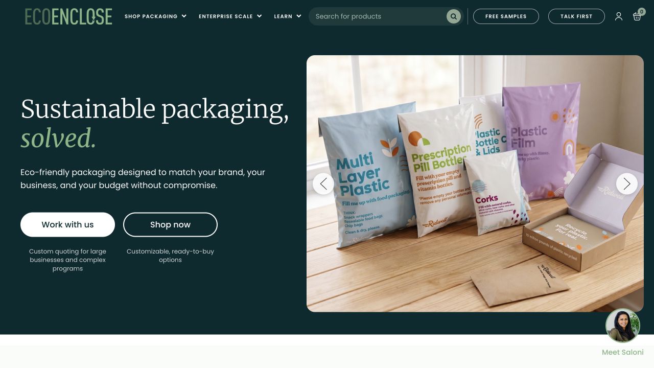
EcoEnclose uses a dark-green opening with a large serif proposition on the left and packaging photography on the right. Two prominent buttons distinguish working with the company from shopping immediately. Short captions beneath those controls explain the difference: larger or more complex programs versus customizable ready-to-buy options. The header keeps packaging, enterprise scale, learning material, search, samples, and contact visible. The product photograph shows several packaging forms rather than relying only on a sustainability illustration or a corporate slogan.
What you can learn
When two actions look equally important, explain the operating difference beneath them. That gives visitors a reason to choose a route instead of merely comparing button colors. The BigCommerce association is property-specific; the screenshot does not independently verify environmental claims, supply-chain characteristics, or every custom-program capability described elsewhere on the site.
Pros
Brief captions make the two main commercial routes meaningfully different.
Packaging forms are shown at a readable scale within one bounded photographic panel.
Cons & considerations
The broad sustainability proposition needs detailed supporting material beyond the opening view.
Several assistance routes can overlap unless their forms and response expectations are clearly explained.
Visible tech stack
Earlier / documented evidence
BigCommerce
Earlier cited evidence retained; no current scan result. References may be embedded or legacy—not a complete backend inventory.
Platform source: Primary platform or implementation reference. Official vendor case documents this packaging merchant's BigCommerce implementation. The association applies to the named public property; it is not a complete technology inventory or an edition/version audit. Platform evidence is separate from the direct website screenshot and is not a complete current infrastructure audit.
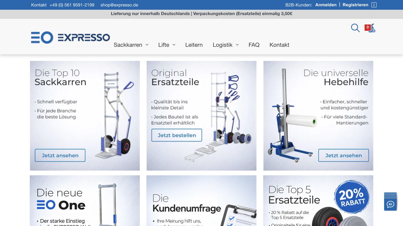
EXPRESSO’s actual German shop uses a blue contact strip and a broad white header above a grid of photographic category panels. The opening panels distinguish hand trucks, original spare parts, and lifting equipment. Each pairs a product photograph with concise German text and a direct viewing or ordering action. Trade login and registration are separated from the main category navigation. This storefront is distinct from the company’s corporate root website, an important boundary when identifying its commerce implementation.
What you can learn
A technical store can prioritize clear category destinations over a cinematic homepage. Give spare parts a visible route because an existing owner may need a component rather than a new machine. Current BigCommerce signals were observed on shop.expresso.de; the corporate website has different public signals and should not inherit the shop’s technology label.
Pros
The opening grid separates equipment discovery from buying replacement parts.
Contact and trade-account routes are visible without entering the catalog.
Cons & considerations
Text incorporated into category artwork requires legible alternative content and mobile crops.
Several similarly styled panels can make the primary starting point less obvious to newcomers.
Visible tech stack
Earlier / documented evidence
BigCommerce
Earlier cited evidence retained; no current scan result. References may be embedded or legacy—not a complete backend inventory.
Platform source: Primary platform or implementation reference. The official implementation case documents the manufacturer’s BigCommerce shop. Current public BigCommerce signals were observed on shop.expresso.de, distinct from the corporate expresso.de website. The association applies to the named public property; it is not a complete technology inventory or an edition/version audit. Platform evidence is separate from the direct website screenshot and is not a complete current infrastructure audit.
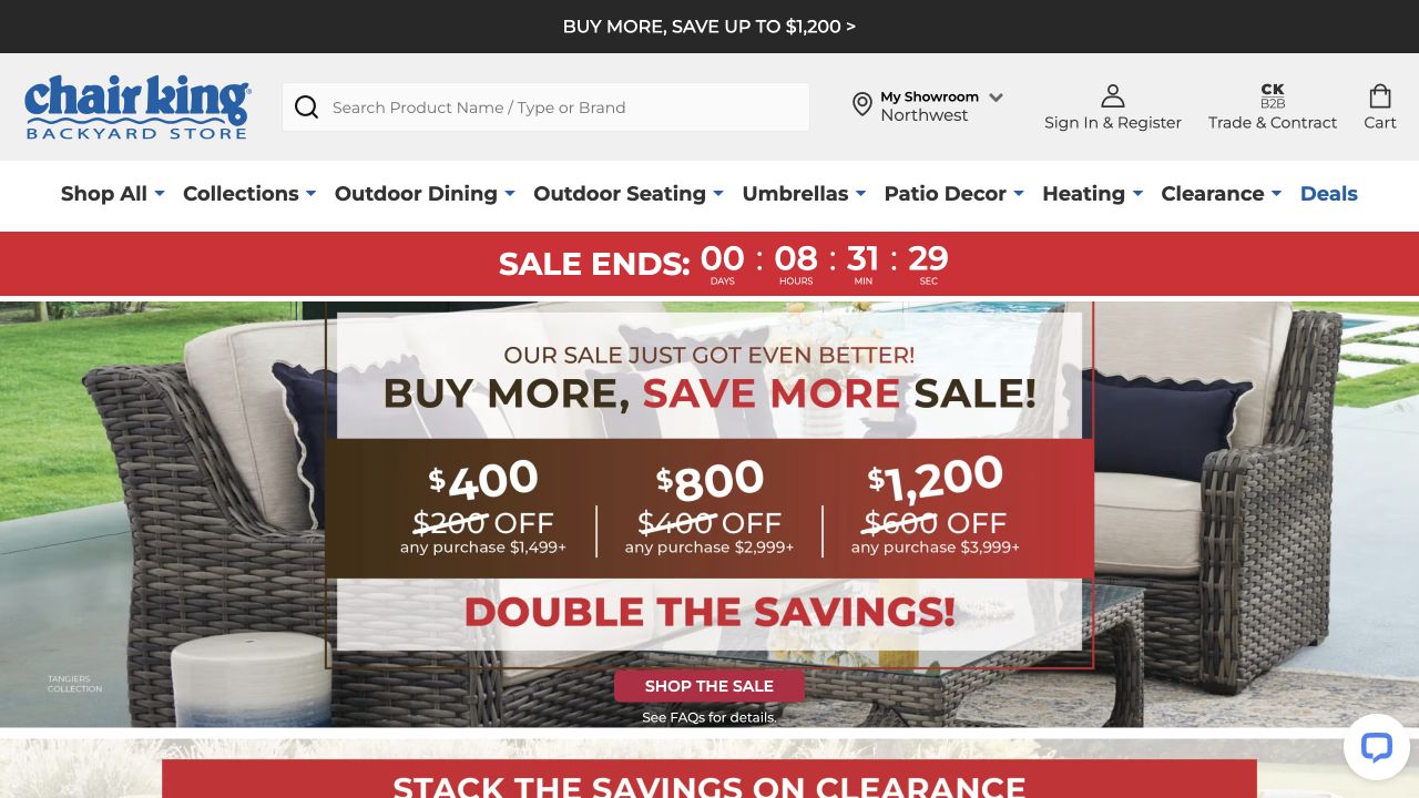
Chair King’s opening combines a broad product-search field with showroom, account, trade, and cart routes. Beneath its category navigation, the captured campaign promotes a tiered sale over a patio-furniture photograph. Red promotional surfaces and a countdown make the offer visually dominant, while outdoor dining, seating, umbrellas, décor, and heating remain explicit choices. The showroom route signals that this is not a purely online catalog. The campaign occupies most of the opening view, so the stable navigation does important orientation work.
What you can learn
A promotion-heavy store still needs practical routes for browsing, local assistance, and trade customers. Keep the conditions of tiered offers understandable beyond the artwork, and do not let a countdown replace a clear product proposition. BigCommerce evidence concerns this named storefront, not the separate trade property or every sister brand operated by the business.
Pros
Product search and showroom access are prominent for practical furniture-shopping tasks.
Trade customers receive a distinct route rather than sharing an unexplained generic login.
Cons & considerations
The stacked offer strips and countdown compete strongly with product information.
Large-item delivery and local availability need further explanation beyond the promotional opening.
Visible tech stack
Earlier / documented evidence
BigCommerce
Earlier cited evidence retained; no current scan result. References may be embedded or legacy—not a complete backend inventory.
Platform source: Primary platform or implementation reference. The official case directly links chairking.com and documents the BigCommerce implementation; current public storefront signals also identify BigCommerce. The association applies to the named public property; it is not a complete technology inventory or an edition/version audit. Platform evidence is separate from the direct website screenshot and is not a complete current infrastructure audit.
Choose between a theme and a separately operated frontend
Use a theme-first implementation when it fits the model
Test the standard category, product, cart, and account journeys before commissioning a custom application. List real limitations in terms of customer tasks or merchant workflow. Familiar requirements often benefit more from clear content and careful product data than from replacing the whole storefront.
Consider Catalyst for a defined composable requirement
Catalyst is BigCommerce’s customizable headless framework built with Next.js, React, and its GraphQL Storefront API. It provides a starting commerce funnel rather than removing implementation responsibility. Evaluate deployment, upgrades, content preview, search, analytics, and checkout transitions as part of the architecture decision.
Scope custom integration work around operational needs
A distributor’s ERP pricing or a service business’s booking system can matter more than visual novelty. Prototype the risky connection first, including slow responses and unavailable data. Decide how the storefront responds when a dependent system fails rather than treating integration as a final launch task.
From references to requirements
Turn the operating model into testable requirements
Define channels, markets, and catalog differences
Write down which brands, currencies, customer groups, languages, and product ranges need distinct treatment. Separate a genuine regional requirement from a copied campaign preference. Give every difference a data owner and an acceptance test so the implementation does not become a collection of undocumented exceptions.
Trace one complete order across systems
Follow a representative purchase from selection through payment, order creation, stock allocation, fulfillment, cancellation, and support. Include both customer-facing messages and staff actions. Reconcile what the store says with what the receiving systems actually know, particularly when availability or contract pricing changes.
Specify the handover for both editors and engineers
Ask an editor to publish a campaign and a developer to roll back a release. A separately deployed frontend needs its own operational runbook. Capture credentials ownership, environments, monitoring, API access, extension inventory, and escalation paths rather than leaving these details in the build team’s private accounts.
A useful handover demonstration
Ask the actual team to carry out its routine job: publish a realistic update, correct a mistake, preview a narrow screen, and identify who owns an integration failure. For a library or frontend framework, also ask who maintains the content source and deployment. A polished screenshot does not answer those operational questions.
Beyond the screenshot
Before a BigCommerce implementation is ready
Document the storefront approach and every separately operated system.
Test category, search, filtering, comparison, and unavailable-product paths.
Verify product options, prices, customer groups, and regional differences.
Exercise real integration failures and stale-data behavior.
Review mobile, keyboard, dialog, validation, and checkout transitions.
Reconcile order, refund, stock, payment, and fulfillment records.
Plan redirects, canonical URLs, page metadata, and tracking continuity.
Rehearse merchant updates, deployment rollback, and support escalation.
Test with real content, a keyboard, a small screen, slow or failed requests, and the people who will maintain the system. These are planning checks, not an accessibility, security, performance, or search-ranking certification.
Sources & editorial method
How this BigCommerce collection was reviewed
The collection uses direct public-property captures and attributed BigCommerce customer cases or property-specific evidence. A headless backend association is not a claim that BigCommerce generates the frontend. The examples are editorial references, not measured rankings or confirmation of private-account functionality.
Every image is an unmodified capture from the actual website, with its source and capture date. Some captures are reused from our shared catalog; their dates remain the original capture dates. None comes from a vendor gallery or a generated reconstruction. Moving imagery and live content can change.
Technology attribution uses public page assets or metadata, official platform documentation, or a cited first-party project case study. Documentary and framework-relationship evidence is identified where used; it is not a complete current backend inventory. A CMS image CDN alone does not establish a full CMS deployment. A library’s presence does not prove which individual controls use it, and a platform label does not establish AI authorship.
The composition notes, lessons, pros and tradeoffs are original editorial observations. We have not measured conversion, traffic, security, performance or accessibility conformance. Website owners retain their brands and imagery; these examples are not our client portfolio. Written, Edited and Curated are independent records, not dates advanced by a build. See our editorial standards or suggest a correction.
Questions worth asking
BigCommerce website development FAQs
Does every BigCommerce website look like a conventional store?
No. A platform can support different catalogs and presentation layers. The visible design may come from a theme, a custom frontend, and an additional CMS; the source notes identify the supported association for the named property.
Is Catalyst automatically better than a theme?
No. Compare the requirements and maintenance model. A separate application may provide valuable control but also adds software and operational responsibilities that a conventional store might not need.
Can a retail and wholesale experience share a system?
They can be designed around a shared platform, but the right implementation depends on pricing rules, customer access, catalog visibility, payment terms, and integrations. Demonstrate those specific scenarios instead of assuming a platform label guarantees them.
Why can an old official customer logo be misleading?
Stores migrate. A vendor logo or old case may describe a real historical association without proving the current storefront still uses that platform. That is why exact-property evidence and current review dates matter.