Outdoor clothing websites have to translate a brand’s world into a practical choice. A mountain photograph can establish atmosphere, but it cannot answer which garment, fit, or specification a customer is actually comparing.
This collection focuses on clothing brands rather than treating every outdoor retailer, rental business, or travel operator as the same website category. Compare how a brand moves between activity-led storytelling, product families, technical descriptions, and ordinary shopping routes.
The reviews concern the captured interface. They do not independently verify durability, environmental statements, test ratings, or a garment’s suitability for an activity. Public product claims should have their own substantiation and review rather than borrowing authority from dramatic imagery.
Before the examples
What makes good outdoor clothing brand website design in 2026?
Connect the activity story to a concrete product choice
An activity-led campaign should lead to identifiable garments or a clearly defined category. Explain the relationship between the story, season, and collection without assuming a visitor knows internal range names. Keep a direct product-type route for someone who already knows what they need.
Make comparison more useful than a row of badges
Use consistent product fields and explain the context of approved specifications. Distinguish material, intended use, fit, features, and the company’s supported performance statements. Avoid relying on unexplained symbols or implying that a category label establishes suitability for every condition.
Treat fit and availability as part of the design
Place usable measurements and fit explanations close to variant selection. Make the selected color, size, stock state, and price clear, and distinguish a model’s styling from the items included in the purchase. Keep delivery and returns information accessible during comparison.
The collection · 13 examples
13 outdoor clothing brand websites worth studying
Study the transition from landscape-led brand identity to practical garment selection. The most useful reference may be a category label, a fit explanation, or a restrained product presentation rather than the scale of the campaign photograph.
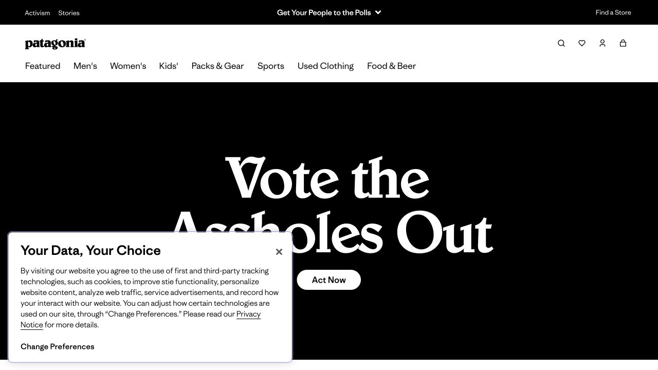
Patagonia places a stark, text-led campaign beneath a conventional white shopping header. Activism and Stories occupy their own utility strip, while clothing audiences, sports and used garments remain distinct navigation choices. The contrast makes the brand position unmistakable without requiring the shopping taxonomy to become a slogan. Lower on the observed page, the used-clothing introduction has its own audience routes. These are visible publishing choices, not evidence about the company’s environmental results or the quality of individual garments.
What you can learn
Decide how a values campaign relates to everyday catalog tasks. A returning customer should still recognize where to find a replacement layer when the lead message changes. Give resale, repair or campaigning their own maintained explanations rather than presenting a single badge as proof of a broader claim.
Pros
Editorial and shopping destinations have clearly different roles in the header.
Used clothing is treated as a practical route rather than only a sustainability statement.
Cons & considerations
A forceful campaign can overshadow product context for unfamiliar visitors.
Environmental and social claims need supporting detail beyond a dramatic opening.
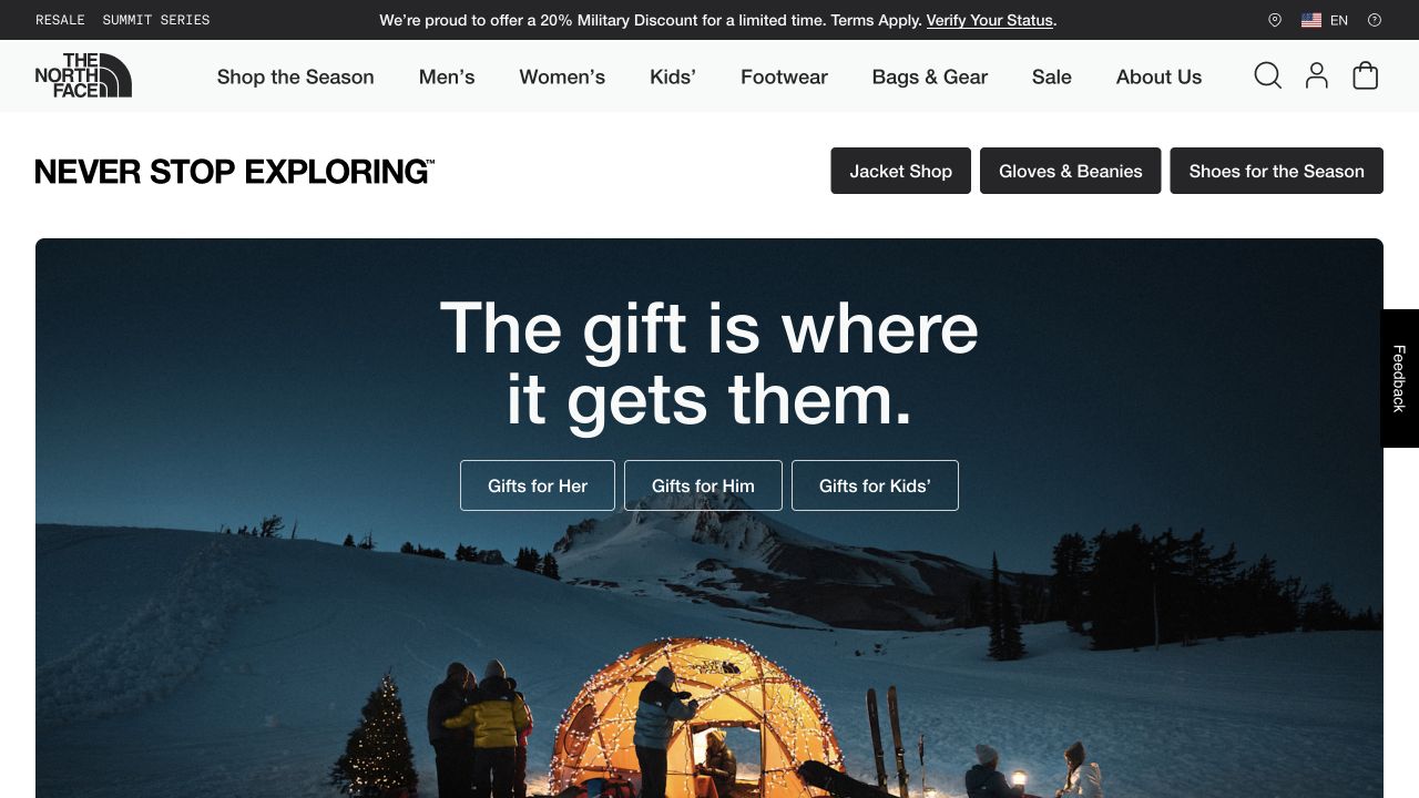
The North Face combines a restrained white header with a large night-time camping photograph and a short seasonal gifting introduction. Audience-specific gift actions sit directly under the headline, while jacket, accessories and footwear shortcuts appear above the feature. The following content shifts into athlete-inspired collections and mountain clothing. This layering shows how a promotional opening can coexist with enduring merchandise categories instead of replacing the entire navigation whenever the season changes.
What you can learn
Define permanent shopping categories separately from temporary campaign modules. A visitor who came for a waterproof jacket should not need to interpret a holiday story first. In a prototype, replace the feature with another season and confirm that the catalog, product naming and service information still make sense.
Pros
Category shortcuts provide an alternative to the main campaign story.
Separate audience buttons make the gifting feature more actionable than an unlinked image.
Cons & considerations
Several stacked promotions can consume a substantial first screen.
Night photography requires deliberate text contrast at different responsive crops.
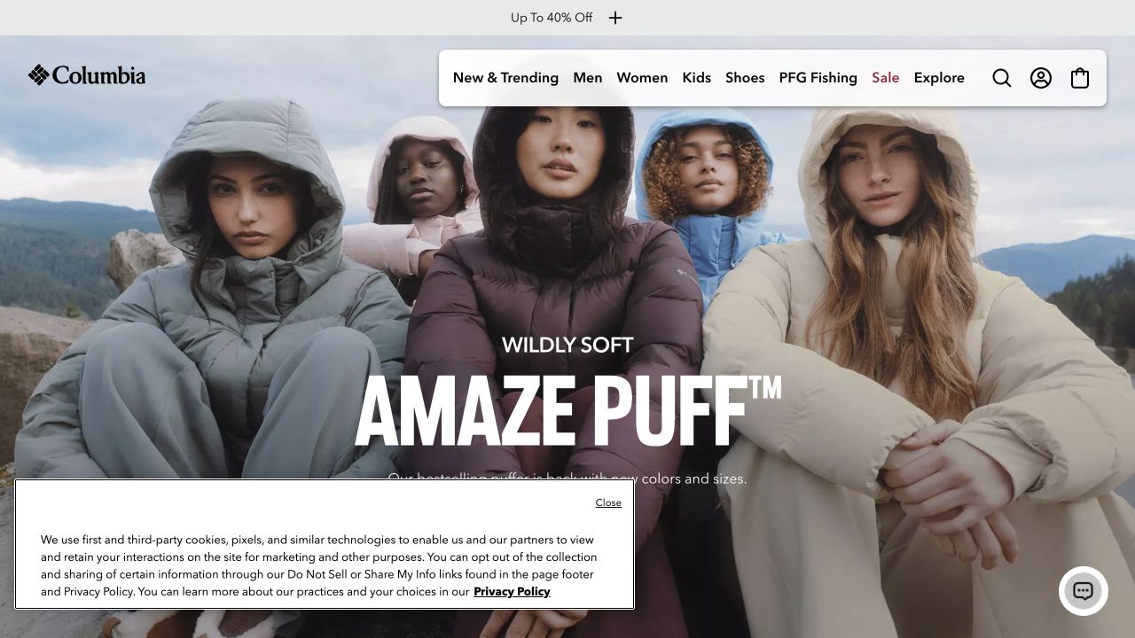
Columbia’s captured opening features several people wearing the same puffer family, with an oversized product-family name over the image. The header uses familiar Men, Women, Kids and Shoes categories alongside fishing and sale routes. A separate promotion follows the main product introduction rather than being the only organizing principle. The page later offers outdoor stories and category features, allowing the brand to move between everyday clothing and activity-specific equipment without abandoning a recognizable retail structure.
What you can learn
A product-family campaign is more useful when customers can connect it to their own shopping category. Photograph representative fits and contexts, then supply fabric, sizing and use information in the destination pages. Treat the attractive group image as an introduction, not as evidence that one garment suits every activity or climate.
Pros
The same featured product is shown on several people rather than as one isolated packshot.
Plain audience categories remain available above the expressive campaign typography.
Cons & considerations
Large overlaid lettering can obscure relevant garment detail.
Promotional savings should not substitute for explaining differences between product families.
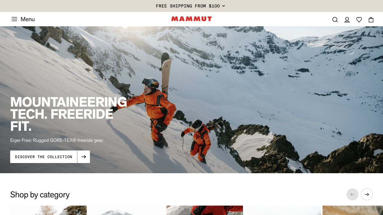
Mammut leads with a snowy mountain setting, a compact collection description and a distinct discovery action. Immediately below, a row of named categories includes waterproof jackets, midlayers, pants and climbing equipment. The wider page separates collaboration stories, materials information and a technologies destination. This is a useful contrast to a purely atmospheric homepage: the photograph establishes context, but the following category vocabulary begins to explain what someone can actually find.
What you can learn
Follow a dramatic outdoor introduction with clear garment and equipment types. Let a visitor decide whether to browse a named category, investigate material construction or read the story behind a collaboration. For your own project, verify the destinations and comparison information rather than assuming an impressive landscape makes specialist buying decisions easier.
Pros
Named equipment categories follow the campaign before a long brand narrative.
Product, collaboration and technology content have visibly separate editorial roles.
Cons & considerations
A compact menu can conceal the breadth of a technical catalog until opened.
White lettering over snow and moving landscapes needs careful fallback treatment.
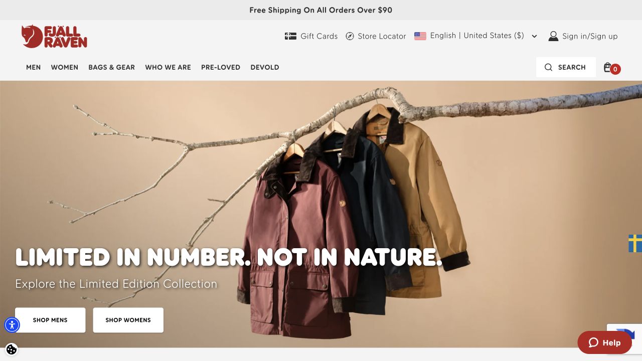
Fjällräven’s observed page pairs a light retail header with a limited-collection campaign. Men, Women and Bags & Gear are joined by Who We Are and Pre-Loved, giving company information and secondhand products recognizable destinations. Further down, the page introduces material guidance and instructions for waxing its fabric. The useful design idea is not the specific campaign styling; it is the relationship between buying, understanding construction and looking after a product after purchase.
What you can learn
Plan care information alongside the catalog rather than adding it as an afterthought. Connect relevant material or maintenance guidance to the garments it concerns, and distinguish brand history from product instructions. An educational section only earns its place when the team can keep the advice, links and applicable product ranges current.
Pros
Pre-Loved and company information are visible beside shopping categories.
Material and care topics extend the site beyond the next transaction.
Cons & considerations
A large seasonal feature can delay entry to specific product comparisons.
Specialist material names need plain-language explanation for newcomers.
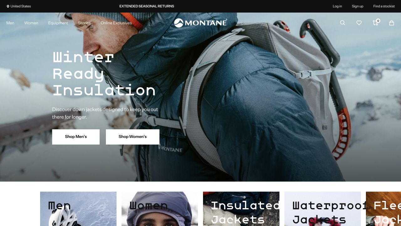
Montane’s opening photograph shows a layered outdoor outfit and backpack in cold conditions, paired with a short insulation message and separate shopping actions. The observed navigation exposes a detailed distinction between waterproof, insulated, windproof and softshell clothing, as well as legwear and accessories. That vocabulary is valuable for experienced buyers, but it also reveals the education burden that comes with a specialist assortment. A newcomer may know the intended trip without knowing the manufacturer’s preferred garment category.
What you can learn
Support both entry points: what the customer intends to do and what type of item they already recognize. Explain category boundaries on landing pages and provide a route back to related layers. Include a less experienced user in testing so a technically precise navigation does not become an expertise test.
Pros
Clothing is photographed as part of a realistic layered system.
The catalog vocabulary distinguishes construction types rather than grouping every jacket together.
Cons & considerations
A long specialist menu can be difficult to scan on a phone.
A campaign image alone cannot explain the differences between insulation and protective shell layers.
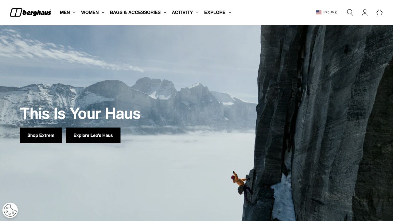
Berghaus places a large outdoor image beneath a compact retail header and introduces separate Icons, Trail and Everyday Outdoors areas. The observed menu distinguishes jacket constructions, tops, walking trousers, footwear and packs. This combination gives the brand room for an emotional introduction while acknowledging that its customers are not all preparing for the same kind of outing. The reference concerns how ranges are presented, not an assessment of the equipment’s suitability or field performance.
What you can learn
Make range labels answer a real customer question. If everyday use and more technical outings share the same storefront, explain what changes between the ranges instead of relying on photography alone. Test whether shoppers can move from the campaign into a sensible category without already knowing a product name.
Pros
Trail and everyday destinations make different intended uses explicit.
Garment construction terms appear within a conventional retail hierarchy.
Cons & considerations
Broad lifestyle labels can be ambiguous without useful category introductions.
Expansive navigation needs prioritization when only a small part fits on screen.
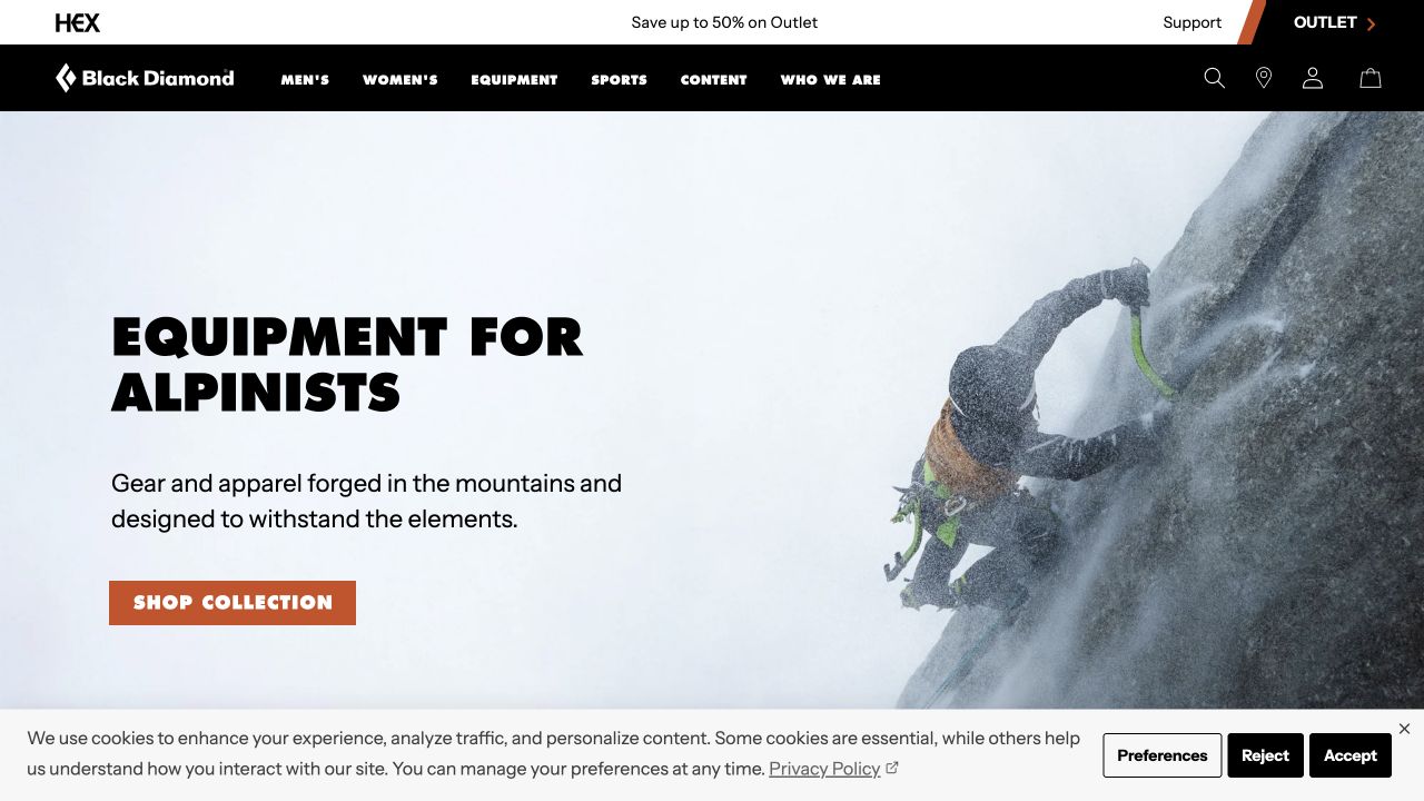
Black Diamond uses a clear alpinist theme to introduce a mixed clothing and equipment range. A climbing photograph sits beside a plain headline and short explanation, followed by distinct sections for shells, ice equipment, gloves and insulation. Men’s and Women’s routes remain in the header, while Sports and Content offer alternative ways into the catalog. The composition is useful because the page does not treat apparel as disconnected fashion when the surrounding products serve a specific activity.
What you can learn
When clothing accompanies specialist equipment, organize the story around the activity without concealing individual product types. Keep care, compatibility, sizing and safety information attached to the relevant detail pages. A coherent visual campaign should introduce the system, while leaving practical selection and limitations to accurately maintained product content.
Pros
The opening names the activity and describes the combined apparel-and-equipment scope.
Separate shell and insulation sections help distinguish different clothing jobs.
Cons & considerations
An expert-oriented identity can be less welcoming to a first-time participant.
Technical equipment claims need more support than a campaign photograph supplies.
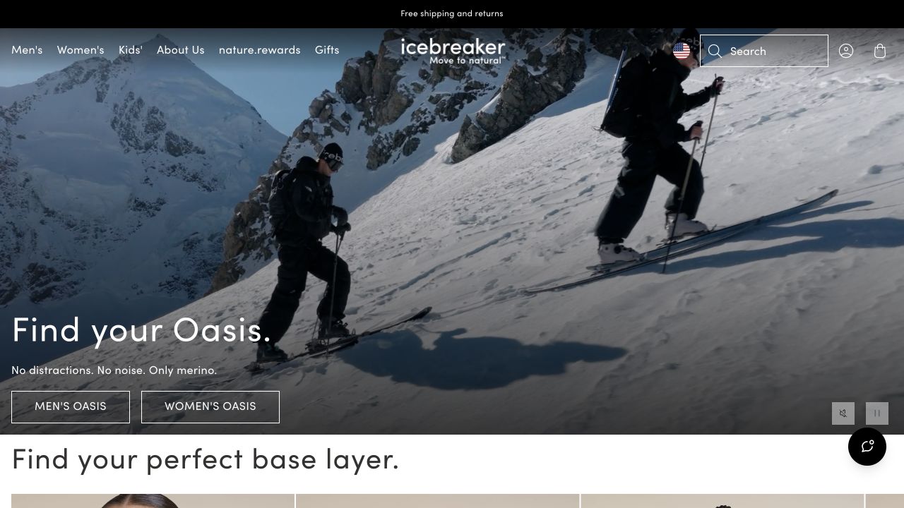
Icebreaker’s observed homepage introduces a snowy activity scene before moving into a comparison of its base-layer families. Different weights are named separately and accompanied by short descriptions rather than being presented as identical versions of the same photograph. Men’s, Women’s and Kids’ remain familiar navigation choices, with company information available alongside them. The material-led positioning supplies a clear theme, while the following explanation begins the practical work of helping visitors interpret the assortment.
What you can learn
If a material is central to the brand, show how its variations change the shopping decision. Use a repeatable comparison structure for weight, fit and intended context, with qualifications reviewed by the product team. Do not expect an attractive fabric story or a mountain film to answer a customer’s actual layering questions.
Pros
Base-layer families receive short explanations rather than unexplained numerical labels alone.
Audience navigation remains conventional despite a strongly material-led story.
Cons & considerations
Moving hero imagery needs a readable still and reduced-motion alternative.
Technical material benefits require precise product-specific evidence and care instructions.
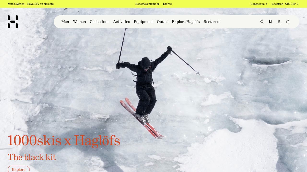
Haglöfs opens with an expansive skiing photograph and a collaboration label, while the light navigation names clothing audiences, collections, activities and equipment. Below the feature, the observed page lists lifestyle, hiking, trail running, mountaineering and skiing as separate discovery routes. The interface therefore offers more than one way to understand a seasonal range: someone can follow the collaboration or approach the catalog through an activity they already recognize.
What you can learn
Keep collaboration storytelling separate from the permanent category system. A temporary partnership should be removable without stranding product links or hiding the main assortment. In a content model, give the campaign an end date, a clear owner and a fallback destination for products that remain available after the feature retires.
Pros
Activity labels provide a practical alternative to the collaboration narrative.
A light header creates a stable navigation surface above changing imagery.
Cons & considerations
Very large imagery can postpone useful product detail on short screens.
A collaboration name may mean little to a visitor unfamiliar with either partner.
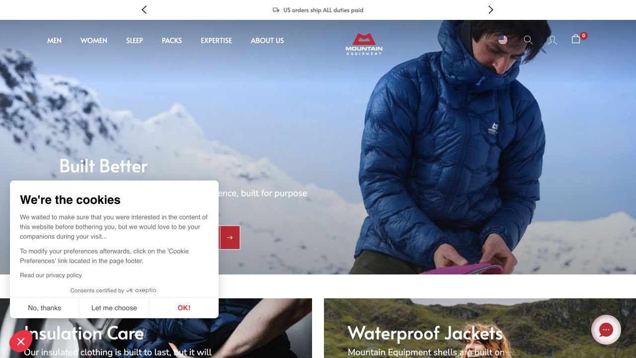
Mountain Equipment’s US homepage combines a cold-weather product photograph with a short construction-led introduction and separate shopping actions. Immediately after the feature, insulation care and waterproof jackets have their own image-led entrances. The navigation also distinguishes clothing from sleeping equipment, packs and expertise. The aftercare route is the notable element: the page treats continued use as something a visitor may need help with, not merely as a claim in a campaign headline.
What you can learn
Build the care route at the same time as the product templates. Show which materials or garments an instruction applies to and how someone gets further help if the general explanation is insufficient. Keep regional shop information unambiguous so product availability and service guidance do not silently refer to a different market.
Pros
Aftercare is introduced near the main campaign rather than hidden only in a footer.
The shop distinguishes apparel, sleeping equipment and packs as different needs.
Cons & considerations
Regional notices can obstruct the first impression if they are not easy to dismiss.
A durability message needs specific care and service information behind it.
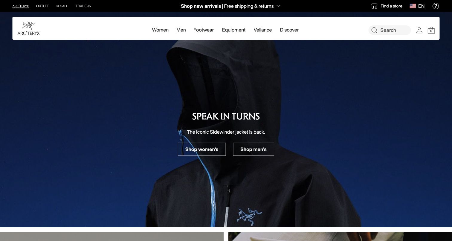
The captured Arc’teryx opening emphasizes the hood and zip of a dark jacket against a deep blue background. A floating white navigation bar separates practical catalog controls from the image, including a labeled search field and familiar audience categories. The campaign then offers separate shopping routes without filling the frame with additional promotions. This is a useful product-focused counterpoint to the landscape-heavy references elsewhere in the collection: construction detail, rather than scenery, supplies the atmosphere.
What you can learn
Decide whether a campaign needs to explain the setting or show a distinctive product feature. If the latter, choose a crop that remains intelligible on narrow screens and connect the image to clear model, fit and use information. Preserve a plain search route for customers returning with a specific product name.
Pros
The bright header remains distinct from the dark campaign image.
A close-up gives a technical garment feature visual prominence.
Cons & considerations
An unfamiliar visitor receives little immediate guidance about model differences.
A dramatic crop can become ambiguous when the image is reduced or reframed.
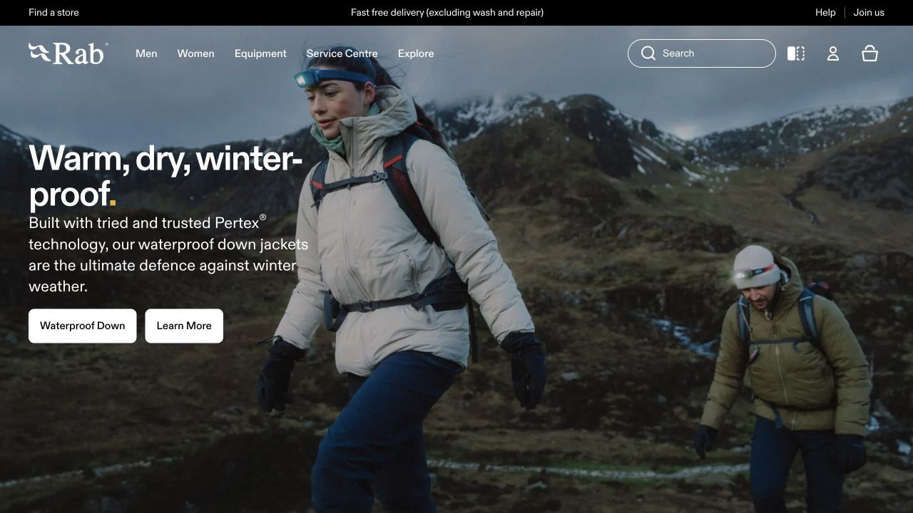
Rab’s captured homepage shows clothing being worn in a rugged mountain setting, with the featured jacket visible alongside a backpack and other layers. The introductory copy names a protection category, and two separate buttons let the visitor browse that category or learn more. Service Centre and Explore remain visible in the header beside conventional shopping categories. The reference demonstrates a relationship between context and explanation rather than proving any advertised waterproofing or warmth claim.
What you can learn
Offer a learning route when the product proposition needs more explanation than a short campaign can support. Keep it connected to the same garment family so visitors do not have to restart their research in a generic blog. Product pages still need accurate fit, construction, maintenance and limitation information reviewed by the responsible team.
Pros
The campaign places the garment within a recognizable layering and use context.
Shopping and further explanation have separate, understandable actions.
Cons & considerations
White overlaid copy needs careful treatment across photographs and crops.
Environmental context does not establish actual garment performance or suitability.
Build a catalog brief around real comparison questions
Choose representative garments and awkward cases
Prepare a technical item, an everyday item, several fits, a wide size range, and an unavailable variant. Collect the business’s approved descriptions and comparison fields before designing the cards. Test whether the same template remains understandable when one garment has much more supporting information than another.
Connect editorial content without duplicating product facts
Decide where a story introduces an activity and where the product record becomes authoritative. Keep care, repair, material, and specification updates maintained by named owners. A campaign should not become an inconsistent second copy of instructions that continue after the campaign ends.
Rehearse mobile discovery and service handoffs
Try category entry, sorting, comparison, variant changes, size information, and the appropriate test ordering flow on a phone. Include an unavailable item and a visitor returning through an old campaign link. Give repair, warranty, and service inquiries a route that is distinguishable from a new-product promotion.
The editing job behind the design
Choose a system that keeps product and editorial information connected
A commerce system should support the actual variant structure, consistent comparison fields, and the team’s merchandising process. A CMS should support genuine activity stories without requiring editors to duplicate product specifications. Clarify ownership when those are different systems.
Inventory search, reviews, localization, size tools, stock, and service integrations separately. Each needs an operational owner and a useful failure state. The visible stack can identify delivered components, but it does not disclose manufacturing systems, stock accuracy, or the quality of a recommendation tool.
Our WordPress website examples offer a separate look at publishing approaches. A visible platform label is evidence for that named page, not a guarantee that the same system will suit your requirements.
Before the public launch
Outdoor clothing website launch checklist
Connect campaigns to identifiable products and durable category destinations.
Verify product comparison fields, specification context, and approved performance statements.
Check fit explanations, measurement units, sizes, colors, stock states, and prices.
Make delivery, returns, care, repair, and service routes easy to identify.
Test a phone, keyboard navigation, long product names, and missing imagery.
Rehearse sold-out products, expired campaigns, and direct entry from an old link.
Keep product instructions and specifications consistent across editorial pages.
Assign owners for seasonal content, integrations, and supported product claims.
These checks are a project checklist, not a performance, legal, security, or accessibility certification. Test real journeys with the people responsible for the website before making claims about the result.
Sources & editorial method
How this collection was selected and reviewed
The selection compares official outdoor-clothing brand properties, using actual dated browser captures and fresh category-specific commentary. It is not a field test of equipment or a verification of performance, sustainability, safety, or manufacturing claims. We did not complete purchases or test private customer-service systems.
Each example links to its actual source page. Screenshots are direct browser captures with their own capture dates; moving imagery, announcements and live designs can change. The notes describe observable design choices and conditional tradeoffs, not measured traffic, conversion results, service quality, or accessibility conformance.
Technology labels use public page metadata, asset evidence, or explicitly cited platform documentation. Platform documentation is not a complete current deployment audit. A component reference may be legacy or unused; it is not a complete backend inventory. Unknown stacks are omitted. These sites are editorial examples, not our client portfolio.
Written, Edited and Curated are separate editorial records, not timestamps advanced by a rebuild. Website designs and imagery belong to their owners. See our editorial standards or suggest a correction.
Questions worth asking
Outdoor Clothing Brand website design questions
Should navigation start with activities or product types?
The choice depends on actual customer tasks and catalog breadth. A brand can provide both, as long as the relationship is understandable and neither route creates a different version of the same product facts.
Are technical badges enough to explain a garment?
Not by themselves. Use clear labels and approved supporting context, and explain meaningful comparison fields. A reader should not have to guess which conditions or product features a symbol refers to.
Do we need a cinematic outdoor film?
No. A strong still image and useful product information can provide an effective opening. If a film is used, preserve essential context and navigation without requiring it to load or play.
Does this guide recommend clothing for particular conditions?
No. It reviews website presentation. Product suitability, supported ratings, and activity-specific advice require appropriate evidence beyond a screenshot or technology label.