Prismic separates a team’s content editing from the code that presents it. The useful design question is which repeatable sections give editors enough flexibility to tell a clear story while preserving readable layouts and reliable visitor tasks.
These examples span fundraising, hospitality, retail, technical software, and professional services. Their visual styles vary, but each raises practical questions about ownership: who maintains an offer, which system controls a price, how a destination changes, and what an editor can safely rearrange. Start with those decisions before copying a hero or card layout.
Each example pairs a real public-page capture with a named vendor case study or official website reference. The evidence applies to the specified property and scope. A national brand site does not identify every global market, and a marketing website does not identify a private application. Vendor associations and visible public signals are qualified; screenshots alone cannot reveal the full CMS, commerce, hosting, or account architecture.
Before the examples
What makes good Prismic website development in 2026?
Design sections around editorial decisions
Prismic calls reusable page sections slices. Give each one a purpose that an editor can explain: introduce a campaign, compare plans, select case studies, or connect an appeal to its destination. Define the permitted content and meaningful variants. A large library of nearly identical sections makes choices harder; a smaller library that covers actual publishing tasks is easier to maintain.
Campaign composition should not create extra copies of prices, dates, conditions, specifications, or service information. Decide where each fact lives and reference it consistently. Retail examples often combine editorial content and a commerce platform; public service tools may combine CMS explanations and operational applications. Document those boundaries so a content editor knows which change can be made in Prismic and which requires another owner.
Make preview part of the editorial workflow
A preview is useful when it represents the content and context that will be published. Check a real long headline, a missing image, a translated section, and an expired promotion. Give reviewers a clear destination and approval responsibility. Prismic provides preview features, but the project still needs an implementation and process that editors can use confidently.
Look for the publishing decision behind each visual choice: a campaign with an expiry, a plan comparison with common fields, a case-study selection, a service tool with supporting content, or a regional property with local responsibilities. Each screenshot shows one observed public view.
We start with five recognizable brands or organizations: McDonald’s Spain, UNICEF Aotearoa New Zealand, Evri, Cheval Blanc, SportsShoes.com. Each attribution applies to the named website property, not every product or website belonging to its organization. This is a curated reading sequence, not a measured ranking.
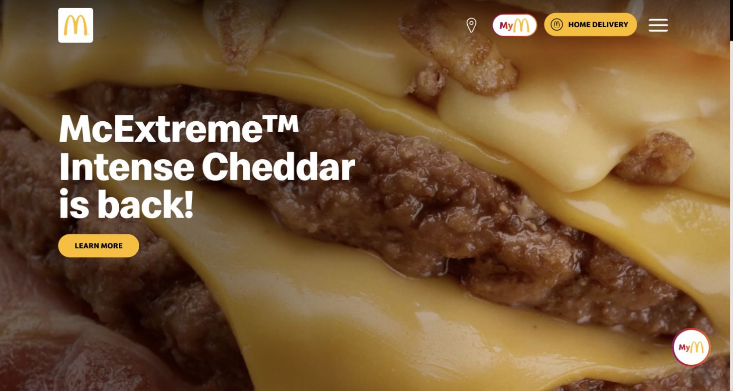
McDonald’s Spain opens with a close-up campaign video, large white product copy, and a yellow action. The golden arches, restaurant locator, loyalty identity, delivery link, and menu remain visible above the campaign. Prismic’s official gallery names this Spanish property specifically. The reference establishes that regional association; it does not identify the technology used by every McDonald’s market, the loyalty application, or the separate ordering destinations linked from this page.
What you can learn
For a Prismic project, make the campaign a bounded slice with separate title, media, destination, and expiry fields. Preserve restaurant discovery and practical product information when seasonal creative changes. Preview the headline against several video frames and provide a static image fallback. The captured browser renders the campaign in English, while the property and its original page metadata are Spanish; localization needs its own review.
Pros
The familiar identity and yellow action remain distinct against detailed food imagery.
Persistent utility links support visitors whose task is unrelated to the campaign.
Cons & considerations
Video movement requires contrast, reduced-motion, and fallback checks beyond this still capture.
Regional promotions need explicit ownership and expiry handling across linked campaign destinations.
Visible tech stack
Earlier / documented evidence
Prismic
Earlier cited evidence retained; no current scan result. References may be embedded or legacy—not a complete backend inventory.
Platform source: Prismic’s official public website gallery. Prismic’s official website gallery names McDonald’s Spain and links mcdonalds.es; the claim applies to this regional public website, not every McDonald’s market, app, or ordering property. Vendor documentation establishes an association, not an audit of a private backend or installed version. Platform evidence is separate from the direct website screenshot and is not a complete current infrastructure audit.
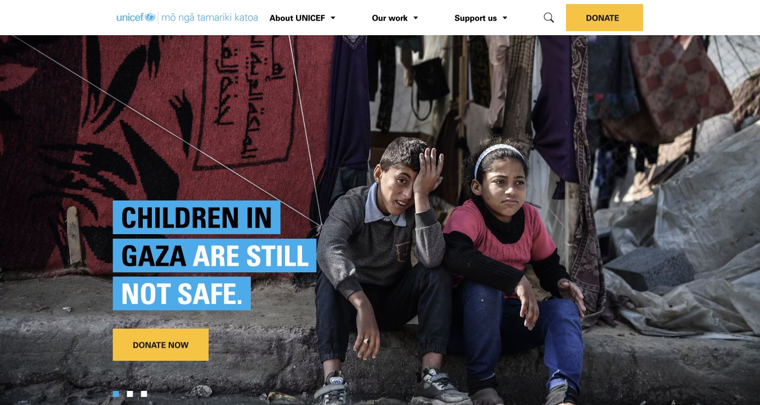
UNICEF Aotearoa New Zealand combines a documentary photograph with large blue-backed appeal text and a contrasting yellow donation action. The header separates organizational information, work, and support routes. A small sequence indicator shows that the opening is part of a carousel. Prismic’s named case study describes reusable sections for this national fundraising property. It does not establish that other UNICEF sites or the payment processing service use the same CMS.
What you can learn
Build an appeal slice around an approved message, image rights, destination, and publication window. Keep the cause record separate from the homepage placement so an urgent campaign can be corrected consistently. Test a long headline over several crops, including narrow screens where faces and text compete. Assign editorial approval to factual statements and review donation handoffs separately from the presentation layer before releasing the appeal.
Pros
Solid text backgrounds maintain a clear reading area over a complex photograph.
The same donation color connects the header utility and the main appeal action.
Cons & considerations
A rotating appeal needs understandable controls and a dependable first visible message.
Emotional campaign imagery requires careful attribution, consent, and context during editorial review.
Public source checked November 3, 2026. References may be embedded or legacy—not a complete backend inventory.
Platform source: Prismic’s named customer case study. Prismic’s named UNICEF Aotearoa New Zealand case study describes reusable sections for this national fundraising website. Other UNICEF properties and payment services are outside the evidence scope. Vendor documentation establishes an association, not an audit of a private backend or installed version. Platform evidence is separate from the direct website screenshot and is not a complete current infrastructure audit.
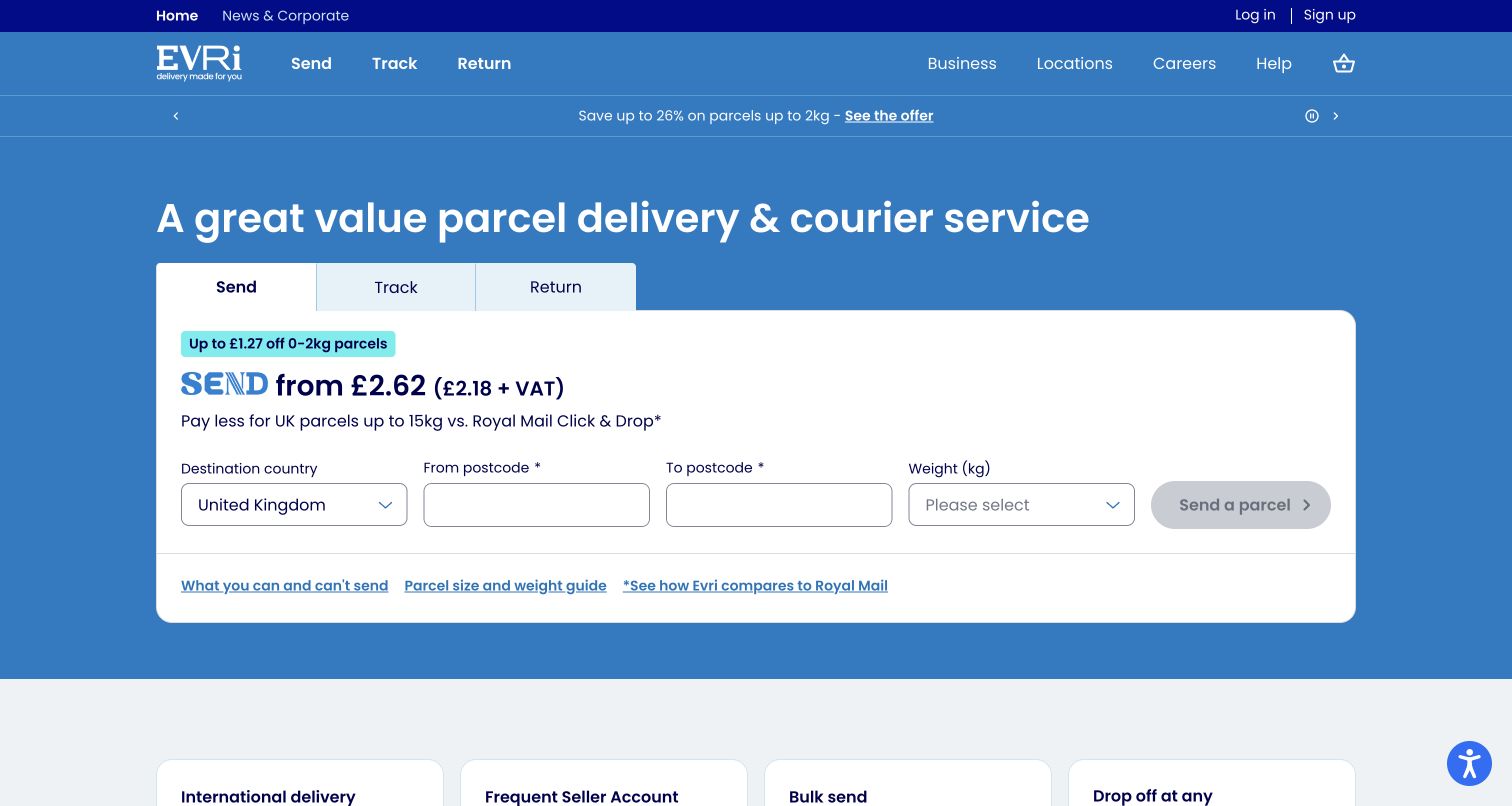
Evri places Send, Track, and Return tabs inside a large white panel on a blue background. The selected send view exposes destination, postcode, and weight fields with help links directly beneath. Navigation repeats the same task vocabulary, reducing the gap between the header and the working area. Prismic’s case study describes sharing components across the website and product flows; this capture reviews their public arrangement without submitting parcel information or testing a transaction.
What you can learn
Treat operational fields and editorial claims as different responsibilities even when they share one slice-shaped layout. The CMS can hold explanatory content and service links, while validation, prices, and transaction state need authoritative systems. Preview empty, loading, error, and unavailable-service states with the product team. Keep restrictions and weight guidance near the action rather than hiding them in a general help archive.
Pros
Task labels are repeated consistently in the header and central service panel.
Supporting restrictions and size guidance are available beside the initial fields.
Cons & considerations
A single large form needs deliberate stacking and error placement on smaller screens.
Promotional comparisons and prices need owners and review dates independent of layout changes.
Vue.jsAssociated with Nuxt; not independently observed
Public source checked November 3, 2026. References may be embedded or legacy—not a complete backend inventory.
Platform source: Prismic’s named customer case study. Prismic’s named Evri case study describes reusable website sections and shared components with service flows. No parcel transaction, account system, or current price was independently tested. Vendor documentation establishes an association, not an audit of a private backend or installed version. Platform evidence is separate from the direct website screenshot and is not a complete current infrastructure audit.
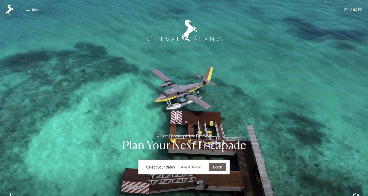
Cheval Blanc gives the opening view almost entirely to turquoise water and an arrival scene, with a centered white wordmark and a restrained serif invitation. Menu and language controls sit at opposite corners, while a small date-and-booking panel anchors the lower center. The vendor’s case study specifically describes Prismic managing this hospitality website with defined templates, sections, and editorial responsibilities. It does not establish the implementation of the separate reservation engine.
What you can learn
Define an immersive hero as a complete editorial unit: destination, accessible description, approved video, poster image, and booking route. Keep restaurant menus and frequently changing practical details in controlled records instead of embedding them into campaign media. Preview every frame behind the white identity and controls. A destination-led page should still answer the visitor who arrives ready to book rather than browse a film.
Pros
The booking panel supplies a concrete next step within an otherwise atmospheric opening.
Minimal typography allows the destination image to communicate the central brand impression.
Cons & considerations
White controls over moving imagery require testing across the full video sequence.
Hidden navigation adds an interaction before visitors can compare destinations or practical services.
Visible tech stack
Earlier / documented evidence
Prismic
Earlier cited evidence retained; no current scan result. References may be embedded or legacy—not a complete backend inventory.
Platform source: Prismic’s named customer case study. Prismic’s named Cheval Blanc case study explicitly identifies its website CMS, templates, slices, and editorial roles. The separate reservation engine is outside the verified scope. Vendor documentation establishes an association, not an audit of a private backend or installed version. Platform evidence is separate from the direct website screenshot and is not a complete current infrastructure audit.
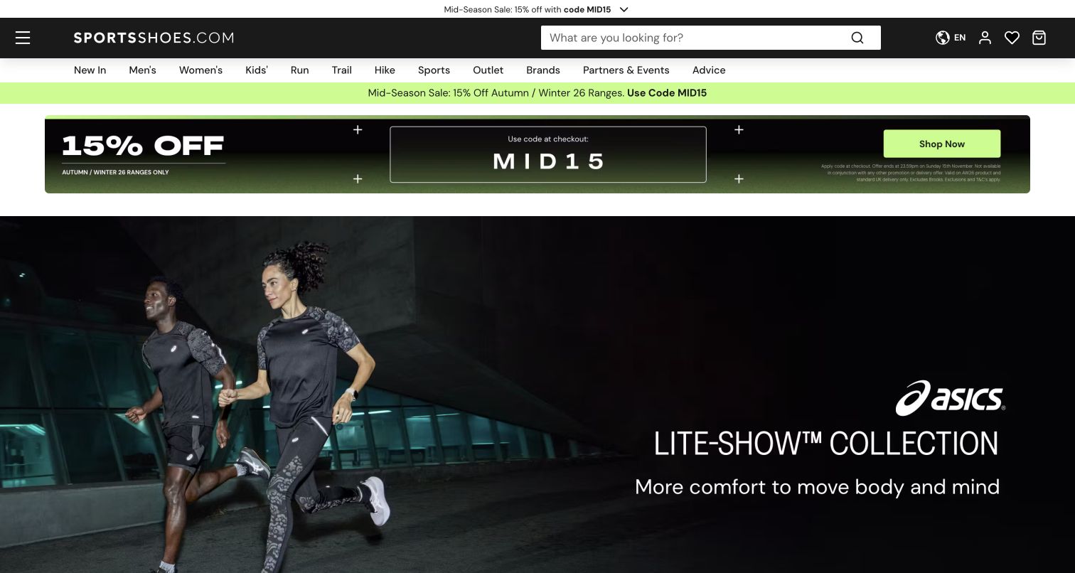
SportsShoes.com uses a black search-led header, a visible category row, and a bright promotional strip before a wide ASICS campaign image. The offer has its own code and action, while the campaign below emphasizes the product collection. Prismic’s case study describes the retailer’s content workflow across web and app. The screenshot demonstrates the public merchandising hierarchy; it does not verify the offer, stock, checkout, or measured commercial results reported by the vendor.
What you can learn
Give promotional strips, collection campaigns, and product information separate models and owners. A reusable Prismic slice can present a campaign while the commerce system remains authoritative for availability and price. Define how two simultaneous promotions share the opening without overwhelming navigation. Preview the page after the code expires and ensure the campaign destination still provides a useful result when individual products are sold out.
Pros
A large search field supports shoppers who already know the product they want.
Category labels provide a stable route beneath the changing promotional content.
Cons & considerations
Several stacked announcement layers delay the campaign and consume valuable mobile space.
Offer terms and image-based promotional text need readable alternatives and careful expiry checks.
ReactAssociated with Next.js; not independently observed
Public source checked November 3, 2026. References may be embedded or legacy—not a complete backend inventory.
Platform source: Prismic’s named customer case study. Prismic’s named SportsShoes.com case study documents website and app content delivery. This example captures the public storefront and does not audit checkout, inventory, or vendor-reported outcomes. Vendor documentation establishes an association, not an audit of a private backend or installed version. Platform evidence is separate from the direct website screenshot and is not a complete current infrastructure audit.
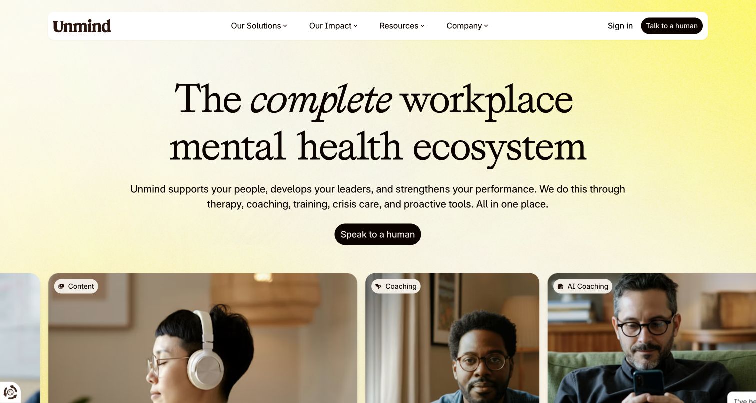
Unmind opens with a warm pale background, large serif proposition, and a short explanation of its workplace offering. A single contact action leads into a row of photographic cards labeled by service, including content and coaching. The floating navigation retains solutions, impact, resources, and company information. Prismic’s case study names this marketing website and its reusable sections; the association does not describe the private clinical services or employee-facing product behind the sign-in route.
What you can learn
Model each service separately, then let a homepage section reference selected records with clear labels and consistent images. Keep the broad proposition concise enough to survive translation. A contact action should describe what happens next, while existing customers need a recognizable sign-in route. For health-related material, assign qualified review to claims and explanations rather than assuming that a polished campaign establishes effectiveness.
Pros
Service labels turn the photographic row into useful orientation rather than decoration.
A short navigation and single main action give the broad proposition room to breathe.
Cons & considerations
Animated entry effects need a reliable static state when scripts or motion preferences differ.
A broad service promise needs supporting detail before a buyer can assess fit.
Visible tech stack
Earlier / documented evidence
Prismic
Earlier cited evidence retained; no current scan result. References may be embedded or legacy—not a complete backend inventory.
Platform source: Prismic’s named customer case study. Prismic’s named Unmind case study describes the public marketing website and reusable sections. The private mental-health product, clinical services, and customer data systems are outside this association. Vendor documentation establishes an association, not an audit of a private backend or installed version. Platform evidence is separate from the direct website screenshot and is not a complete current infrastructure audit.
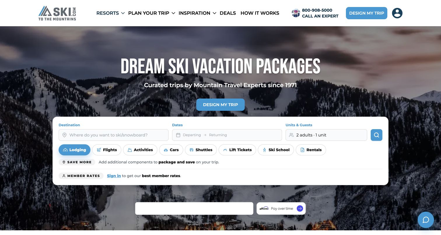
Ski.com combines a mountain panorama with a bold vacation headline, an expert-contact utility, and a large booking panel. Destination, dates, and party size appear before a row of trip components such as lodging, flights, and lift tickets. A separate design-my-trip action offers another route. The named Prismic case study documents a website rebuild and content architecture; the capture does not establish availability, the booking engine’s full behavior, or any live travel offer.
What you can learn
Keep destination stories and planning advice in reusable content sections while treating search inputs and inventory as operational integrations. Define which path serves someone who knows their resort and which serves someone needing advice. Preview long destination names and selected date ranges at narrow widths. Preserve a clear explanation when a visitor leaves editorial content for an external provider or an assisted-planning form.
Pros
The page offers both an expert-assisted route and visible self-service search fields.
Trip-component labels explain the breadth of the service before the visitor begins searching.
Cons & considerations
Many controls within the hero create a demanding mobile layout and focus order.
The photograph requires careful overlays so the headline remains legible across different crops.
Visible tech stack
Earlier / documented evidence
Prismic
Earlier cited evidence retained; no current scan result. References may be embedded or legacy—not a complete backend inventory.
Platform source: Prismic’s named customer case study. Prismic’s named Ski.com case study documents a website rebuild with Prismic content and a separate booking integration. Only the public website presentation was captured. Vendor documentation establishes an association, not an audit of a private backend or installed version. Platform evidence is separate from the direct website screenshot and is not a complete current infrastructure audit.
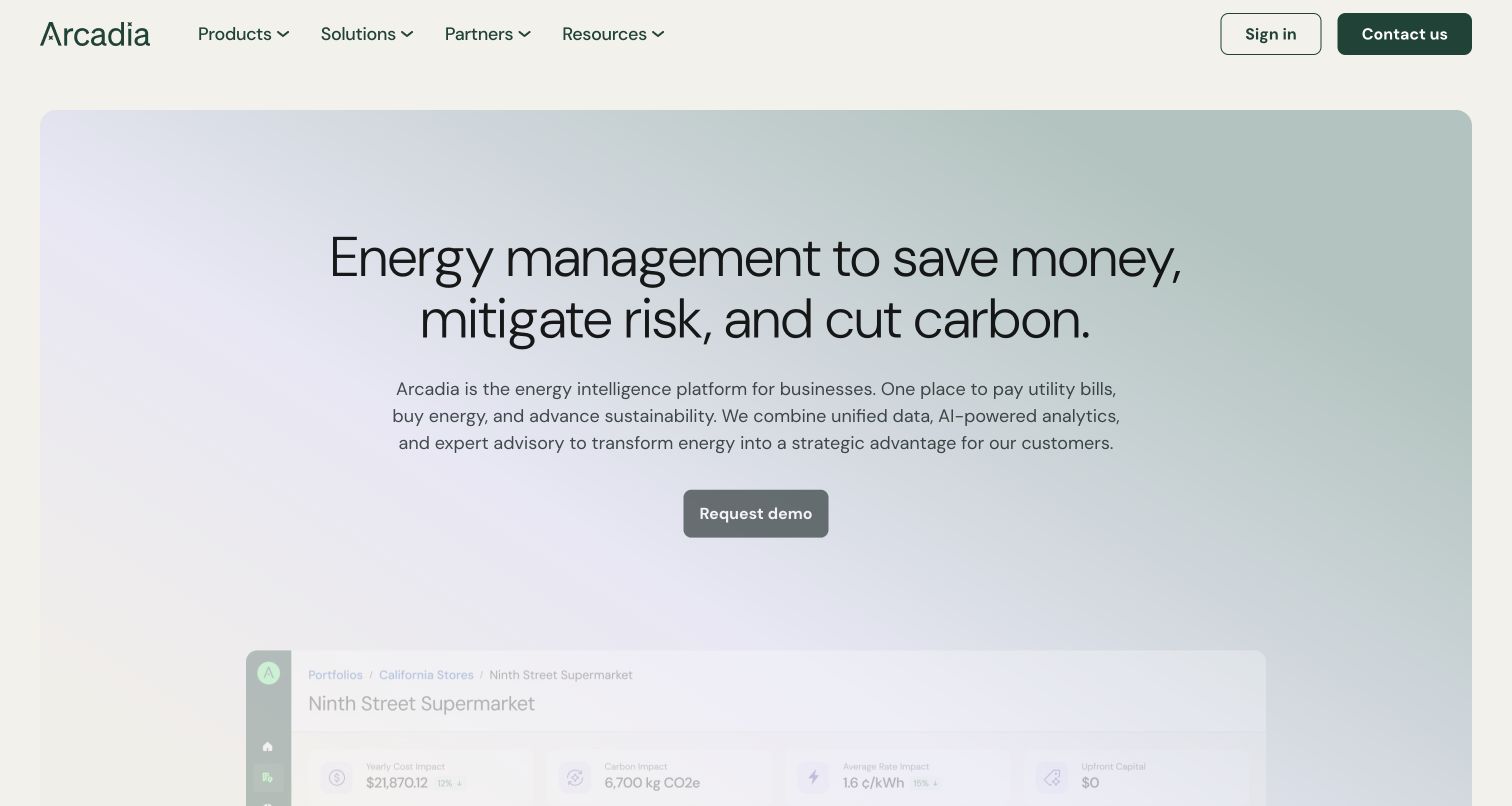
Arcadia uses a muted gradient panel, a large outcome-oriented headline, a short platform description, and one dark demonstration action. A product interface begins below the text, while the header groups products, solutions, partners, and resources. The vendor’s case study discusses audience-specific content and brand consistency on this property. The current opening is reviewed as observed; historical case-study messaging and performance claims are not presented as the exact state of today’s design.
What you can learn
Use structured audience and product records to keep a shared homepage from becoming a list of unrelated calls to action. Let a campaign slice select one clear proposition and one appropriate destination. A product preview should carry a maintained caption explaining its illustrative role. Review terminology when the company’s offering changes so older landing pages do not compete with the current navigation or describe superseded services.
Pros
One central action keeps the broad platform explanation from becoming a crowded menu.
The product preview starts to make an otherwise abstract proposition more tangible.
Cons & considerations
The pale gradient needs contrast checks for smaller supporting text and interface details.
Outcome claims require supporting evidence; the screenshot itself does not demonstrate customer savings.
ReactAssociated with Next.js; not independently observed
Public source checked November 3, 2026. References may be embedded or legacy—not a complete backend inventory.
Platform source: Prismic’s named customer case study. Prismic’s named Arcadia case study documents website storytelling and audience-specific sections. The current design is captured separately; historical messaging and vendor outcomes are not assumed unchanged. Vendor documentation establishes an association, not an audit of a private backend or installed version. Platform evidence is separate from the direct website screenshot and is not a complete current infrastructure audit.
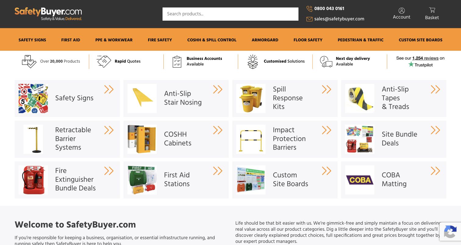
SafetyBuyer leads with a prominent search field, direct contact details, and an orange category bar. Beneath a row of service benefits, a compact grid pairs product pictures with plain names such as safety signs, spill response kits, and first-aid stations. The named case study describes Prismic content integrated with a Magento commerce backend. That division matters: the screenshot shows the public catalog entrance, not an audit of product compliance, fulfillment, or transaction processing.
What you can learn
Design category tiles as reusable content references, not manually duplicated product descriptions. Let the commerce catalog own product identifiers, price, and stock, while Prismic holds appropriate explanatory content and campaign placement. Keep quote requests and account purchasing understandable for business buyers. Test categories with unusually long names and ensure their images remain useful without obscuring the labels or replacing accessible text.
Pros
Search and plain category labels support visitors who already know the required item.
Service information appears close to the catalog instead of requiring a separate sales page.
Cons & considerations
A dense grid needs deliberate grouping and ordering when reduced to a narrow column.
Safety-related product claims and specifications require source ownership beyond the marketing CMS.
Public source checked November 3, 2026. References may be embedded or legacy—not a complete backend inventory.
Platform source: Prismic’s named customer case study. Prismic’s named SafetyBuyer case study explicitly describes Prismic content combined with a Magento commerce backend and separate frontend. Product compliance and transactions were not audited. Vendor documentation establishes an association, not an audit of a private backend or installed version. Platform evidence is separate from the direct website screenshot and is not a complete current infrastructure audit.
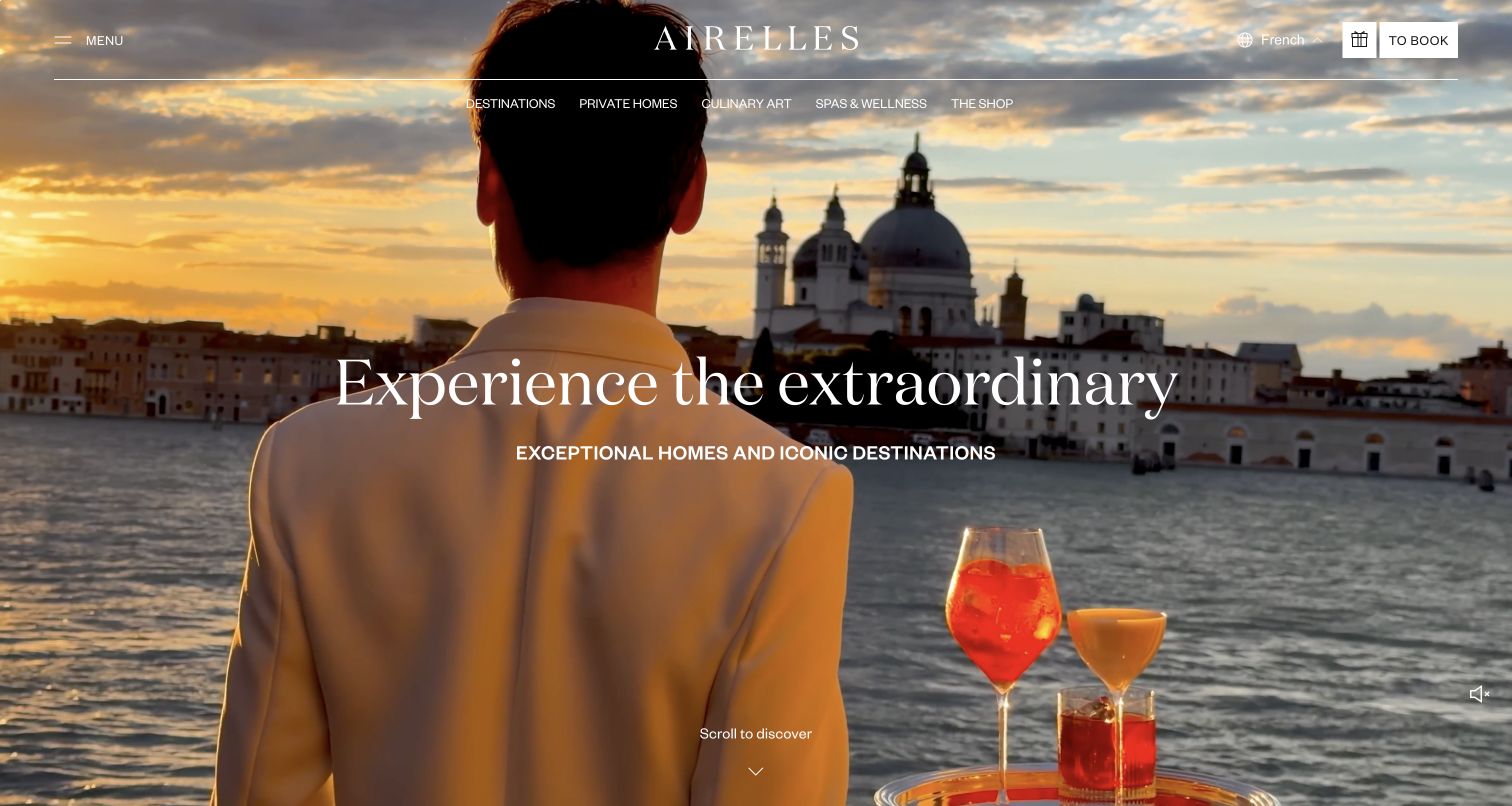
Airelles places its wordmark and fine navigation lines over a full-screen hospitality film. The captured scene combines a waterfront setting with a short central invitation, while destinations, private homes, dining, wellness, and the shop remain visible above it. Booking has a distinct light control. The official case study explains a renewed Prismic architecture for this collection website, including a separation between institutional storytelling and shop journeys; it does not inventory every connected booking service.
What you can learn
Build a shared destination model before making each property’s landing page. Reuse location, practical information, and approved experience records while allowing a carefully bounded hero to express local character. Give promotional overlays an owner and expiry so they do not permanently interrupt the opening. Test the header against different video frames and retain a useful static alternative for slower connections and reduced-motion preferences.
Pros
Visible experience categories help visitors move beyond the atmospheric opening without opening a menu.
The booking control remains visually separate from the editorial destination links.
Cons & considerations
Large moving media needs a dependable poster image and a clear playback policy.
Promotional overlays and consent notices can obscure the primary experience when shown together.
Public source checked November 3, 2026. References may be embedded or legacy—not a complete backend inventory.
Platform source: Prismic’s named customer case study. Prismic’s named Airelles case study describes the collection website and distinct institutional and shop journeys. Booking, private-home operations, and other connected services are not independently identified. Vendor documentation establishes an association, not an audit of a private backend or installed version. Platform evidence is separate from the direct website screenshot and is not a complete current infrastructure audit.
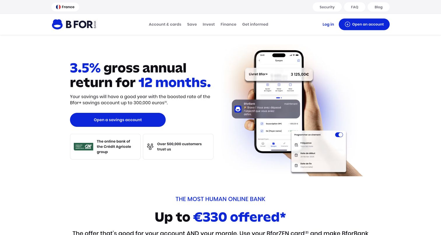
BforBank’s public homepage presents a large blue-and-black savings offer beside a phone illustration and supporting interface panels. A prominent action sits above trust statements, while navigation distinguishes accounts, saving, investing, and finance. Prismic’s case study identifies the marketing website as the campaign destination before account opening. This review concerns that public presentation only; the displayed rates, eligibility, account systems, and financial suitability were not independently assessed or tested.
What you can learn
Keep the offer’s rate, qualification, dates, and required explanatory text together in an approved content record. A Prismic slice should present that record without allowing editors to omit its conditions. Review the actual destination and language before publication, especially when a campaign feeds a separate application. Phone imagery should be clearly illustrative and updated when the product interface changes, rather than treated as proof of a live customer account.
Pros
Typographic emphasis makes the principal offer and its duration easy to distinguish.
Navigation separates major product areas while preserving a distinct existing-customer sign-in route.
Cons & considerations
Prominent financial claims require current review and nearby conditions beyond visual approval.
Floating interface fragments can become unreadable when the image is compressed for smaller screens.
ReactAssociated with Next.js; not independently observed
Public source checked November 3, 2026. References may be embedded or legacy—not a complete backend inventory.
Platform source: Prismic’s named customer case study. Prismic’s named BforBank case study identifies the public marketing website as the campaign destination before account opening. Banking accounts, rates, and private applications are outside this technical association. Vendor documentation establishes an association, not an audit of a private backend or installed version. Platform evidence is separate from the direct website screenshot and is not a complete current infrastructure audit.
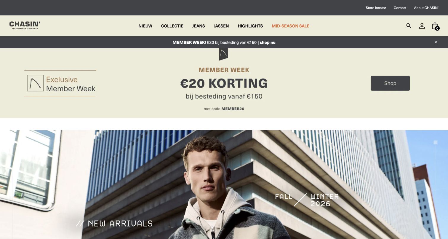
CHASIN’ combines a cream navigation band with dark utility bars, a member-week promotion, and a large seasonal fashion photograph. The promotion states a spend threshold and code, while the collection imagery establishes the new-season context below. Product categories remain explicit across the header. Prismic’s named case describes a headless commerce content workflow for the brand; the capture reviews this Dutch storefront and does not establish the implementation of every regional shop or account service.
What you can learn
Separate the short promotion from the seasonal collection record so one can expire without dismantling the other. Let a campaign slice reference the correct commerce destination and show required conditions together with the offer. Test the combined heights of utility, navigation, announcement, and hero sections on mobile. Keep size guidance, returns, and store information findable when a visitor moves from inspiration to a purchase decision.
Pros
The promotion communicates its threshold and code together within one visual region.
Named product categories maintain a stable path through changing seasonal imagery.
Cons & considerations
Repeated promotional layers can push the collection story well below the opening viewport.
Mixed language and regional offers need deliberate editorial checks for the selected storefront.
ReactAssociated with Next.js; not independently observed
Public source checked November 3, 2026. References may be embedded or legacy—not a complete backend inventory.
Platform source: Prismic’s named customer case study. Prismic’s named CHASIN’ case study describes editorial content in a headless commerce setup. The official hub links this Dutch storefront; no claim is made for every regional or private system. Vendor documentation establishes an association, not an audit of a private backend or installed version. Platform evidence is separate from the direct website screenshot and is not a complete current infrastructure audit.
Walden Robotics fills a rounded opening panel with an industrial robot at work, a white proposition, and a compact navigation panel. Company and news sit beside separate recruitment and commercial actions. The orange action echoes the robot’s details, connecting product and action. Prismic’s official gallery names this public website, and its current HTML contains Prismic-related resources. Those resource references support the observation but are not treated as independent proof of the CMS architecture.
What you can learn
Use a product-story slice with a maintained video, static poster, explanation, and destination. Keep recruiting and commercial inquiries distinct so each audience understands its next step. Technical specifications and capability claims need approved records behind the campaign. Preview every video frame for text contrast and provide a clear playback alternative. A compelling demonstration should lead to practical information about the product rather than carry all of that explanation inside moving imagery.
Pros
Two differently colored actions distinguish joining the company from exploring commercial engagement.
The product is immediately visible in a working environment.
Cons & considerations
White copy over moving machinery requires frame-by-frame contrast and motion checks.
A broad capability proposition needs supporting specifications and evidence beyond the opening film.
ReactAssociated with Next.js; not independently observed
Public source checked November 3, 2026. References may be embedded or legacy—not a complete backend inventory.
Platform source: Prismic’s official public website gallery. Prismic’s official website gallery names Walden Robotics and links this public marketing property. Current public HTML includes Prismic resources; these media and frontend references are supplemental observations, not independent proof of the complete CMS architecture. Vendor documentation establishes an association, not an audit of a private backend or installed version. Platform evidence is separate from the direct website screenshot and is not a complete current infrastructure audit.
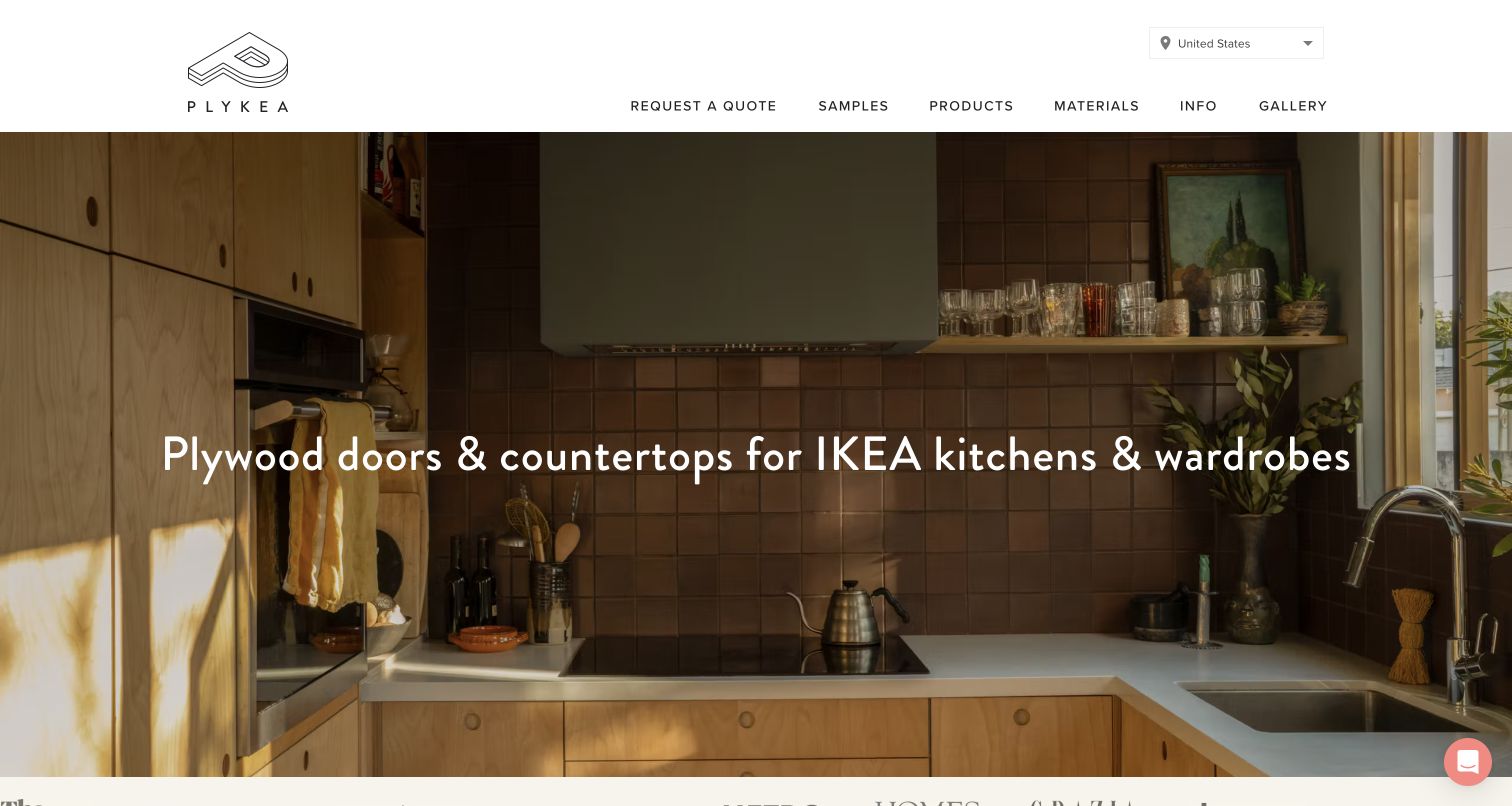
Plykea places a warm kitchen photograph beneath a spacious white header and a plain explanation of what it makes. The opening names plywood doors and countertops for compatible kitchens and wardrobes. Samples, products, materials, information, and gallery appear beside a quotation route. Prismic’s official gallery links this property; the browser redirected to its US version. That reference concerns Plykea’s site and does not establish any CMS relationship for the separate IKEA brand mentioned in the copy.
What you can learn
Keep product compatibility, material options, and market-specific fulfillment information in maintained records. A Prismic hero slice can select a completed installation while referring to those records for the practical explanation. Distinguish a sample request from a full quotation so the visitor understands the commitment of each step. Preview regional terminology and retain descriptive captions for photography that demonstrates materials and construction choices.
Pros
The main sentence explains the product category without requiring familiarity with the brand.
Samples and materials have visible routes alongside the higher-commitment quotation action.
Cons & considerations
A wide installation photograph needs considered crops to preserve useful material details.
Regional compatibility and delivery information must stay aligned with the selected market.
Vue.jsAssociated with Nuxt; not independently observed
Public source checked November 3, 2026. References may be embedded or legacy—not a complete backend inventory.
Platform source: Prismic’s official public website gallery. Prismic’s official website gallery links Plykea. The live root redirected to its US property. This names Plykea’s public site and does not identify the technology used by the separate IKEA brand mentioned in product copy. Vendor documentation establishes an association, not an audit of a private backend or installed version. Platform evidence is separate from the direct website screenshot and is not a complete current infrastructure audit.
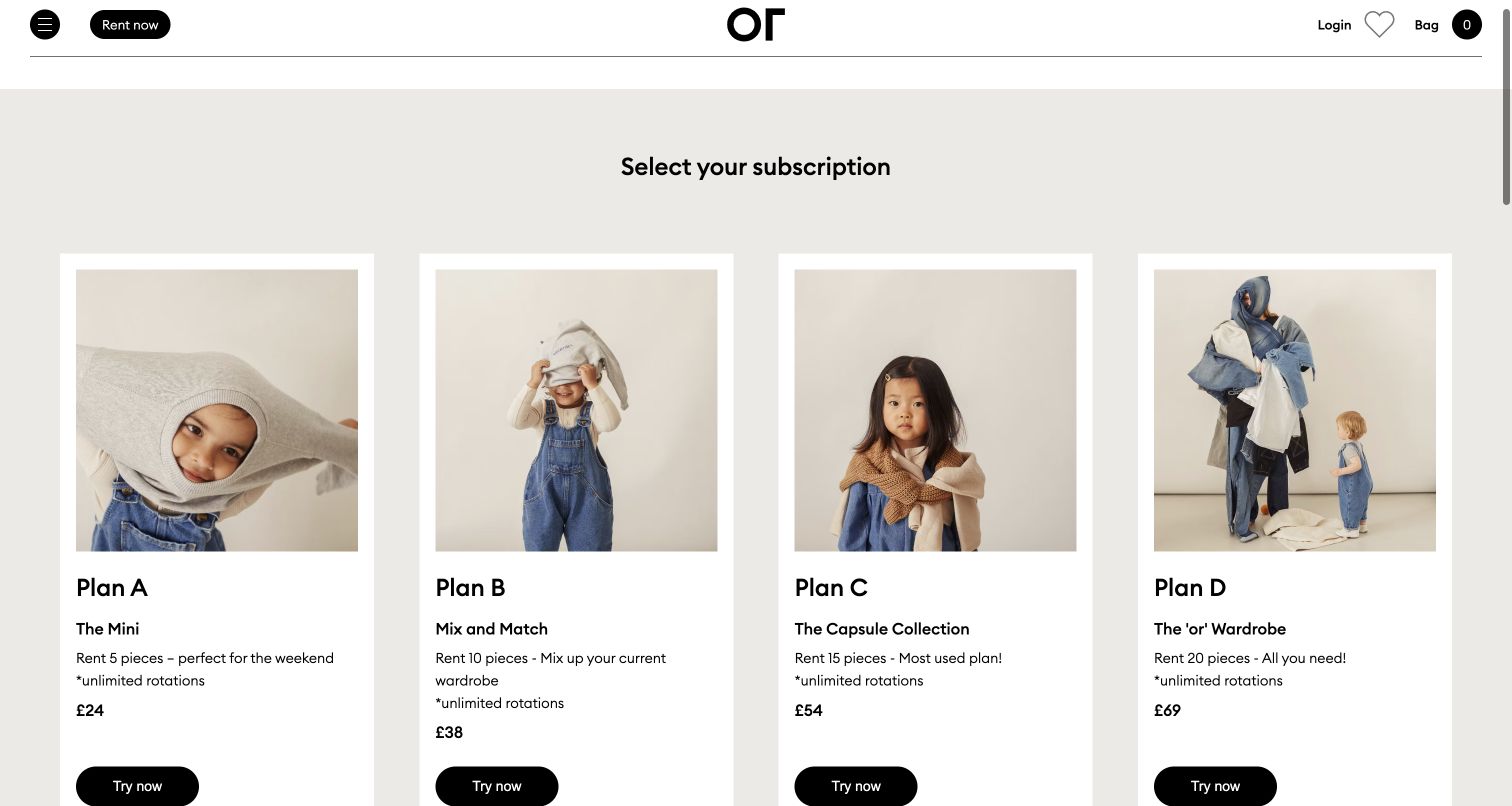
OR Collective’s collection page presents four plans in white cards against a gray background. Each card combines a photograph, plan name, short descriptor, quantity, price, and repeated action. The header preserves rental, login, favorites, and bag routes. Prismic’s gallery links this specific public collection page. Its inclusion concerns the content presentation; it does not verify subscription terms, stock, recurring payments, or the private account workflow.
What you can learn
Use a structured plan record for the comparison fields and keep billing or availability data in the system that owns it. A reusable card should render the same field order so differences are easy to scan. Explain the time period and any rotation limits near the price rather than relying on a later checkout. Preview a plan with longer conditions and ensure the action labels remain understandable when read independently.
Pros
Equivalent card structures make quantities and prices relatively easy to compare across plans.
Photography gives the service a recognizable product context before the visitor selects an option.
Cons & considerations
The opening needs an explicit billing period and clear access to full rental conditions.
Four desktop columns require careful stacking so comparison remains practical on smaller screens.
ReactAssociated with Next.js; not independently observed
Public source checked November 3, 2026. References may be embedded or legacy—not a complete backend inventory.
Platform source: Prismic’s official public website gallery. Prismic’s official website gallery links OR Collective’s public collection page. The association does not identify the private account, recurring billing, or rental fulfillment systems. Vendor documentation establishes an association, not an audit of a private backend or installed version. Platform evidence is separate from the direct website screenshot and is not a complete current infrastructure audit.
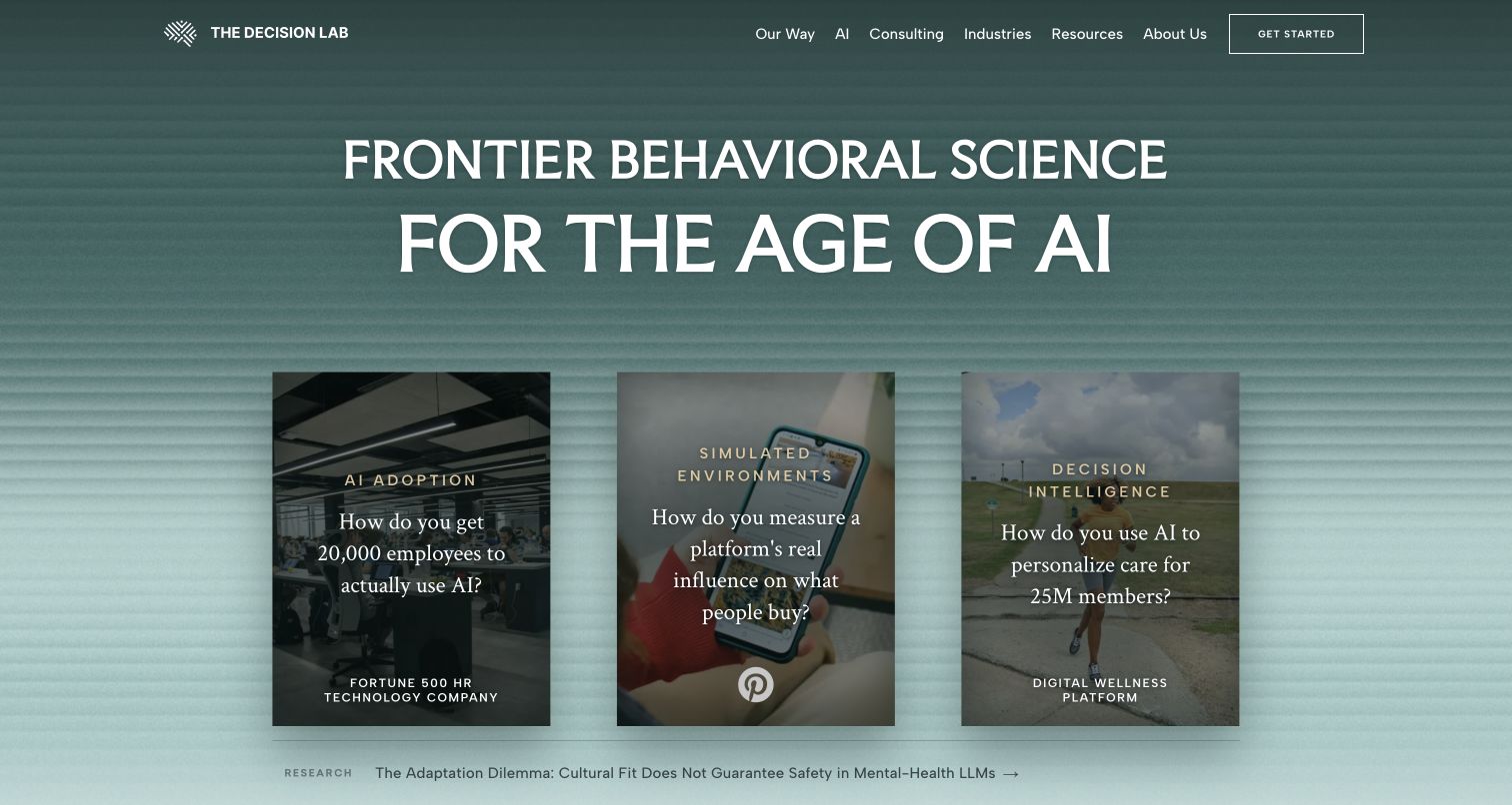
The Decision Lab uses a textured green background, a large white proposition, and three photographic case-study cards. Each card leads with a question, connecting the consultancy’s broad behavioral-science position to a particular organizational problem. A research link appears beneath the cards. Prismic’s official gallery identifies this public property as a reference. The capture supports a review of the editorial hierarchy, not independent confirmation of client outcomes or scientific claims within the linked work.
What you can learn
Model a case study with a problem, client attribution, evidence, services, and related research. A homepage slice can then select examples without rewriting their claims. Keep a question-led teaser specific enough to be useful while preserving context on the destination page. Define image overlays and text limits so a longer case title remains readable. Give research content its own review process and publication metadata.
Pros
Problem-led cards make a broad advisory proposition easier to connect to practical work.
A separate research link offers a quieter route for visitors who want supporting thinking.
Cons & considerations
Text over varied photographs needs contrast checks for every selected card and crop.
Client and research claims require source attribution beyond the visual teaser shown here.
ReactAssociated with Next.js; not independently observed
Public source checked November 3, 2026. References may be embedded or legacy—not a complete backend inventory.
Platform source: Prismic’s official public website gallery. Prismic’s official website gallery names The Decision Lab and links this public property. Its current website presentation was directly captured; client outcomes and research claims were not independently established. Vendor documentation establishes an association, not an audit of a private backend or installed version. Platform evidence is separate from the direct website screenshot and is not a complete current infrastructure audit.
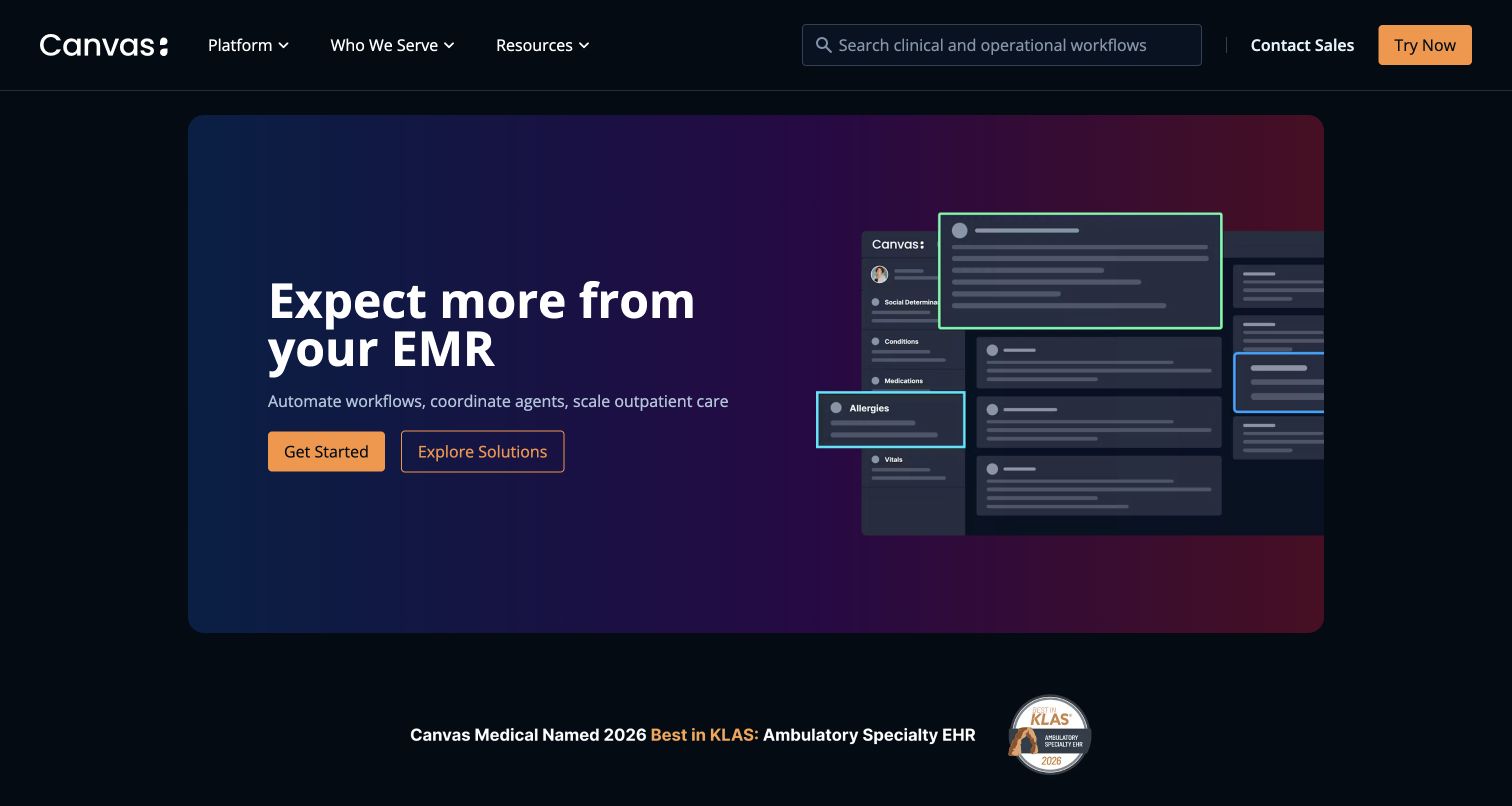
Canvas Medical uses a dark page, a purple-blue feature panel, and orange actions to frame a software proposition. An abstracted interface illustration sits beside the copy, while the header exposes platform, audience, and resource routes plus search. A recognition strip follows below. Prismic’s gallery documents the public marketing property. This is not evidence that a clinical application, patient record, or private workflow is stored in or served by Prismic.
What you can learn
Keep public product explanations, audience pages, and approved illustrations in the content model; treat sensitive operational data as outside that publishing scope. A product slice should use clearly illustrative interface content and meaningful alternative text. Define separate paths for learning about a solution and starting a sales conversation. Review healthcare-related statements with appropriate owners and keep recognition claims linked to their original supporting sources.
Pros
Two distinct actions support both immediate engagement and further product exploration.
The interface illustration gives the software proposition a visible reference without showing real records.
Cons & considerations
Dense interface details may become unreadable when the feature image scales down.
Healthcare and recognition claims need evidence review beyond an attractive marketing layout.
Public source checked November 3, 2026. References may be embedded or legacy—not a complete backend inventory.
Platform source: Prismic’s official public website gallery. Prismic’s official website gallery names Canvas Medical and links its public marketing property. The association does not describe private clinical software, patient records, or operational workflows. Vendor documentation establishes an association, not an audit of a private backend or installed version. Platform evidence is separate from the direct website screenshot and is not a complete current infrastructure audit.
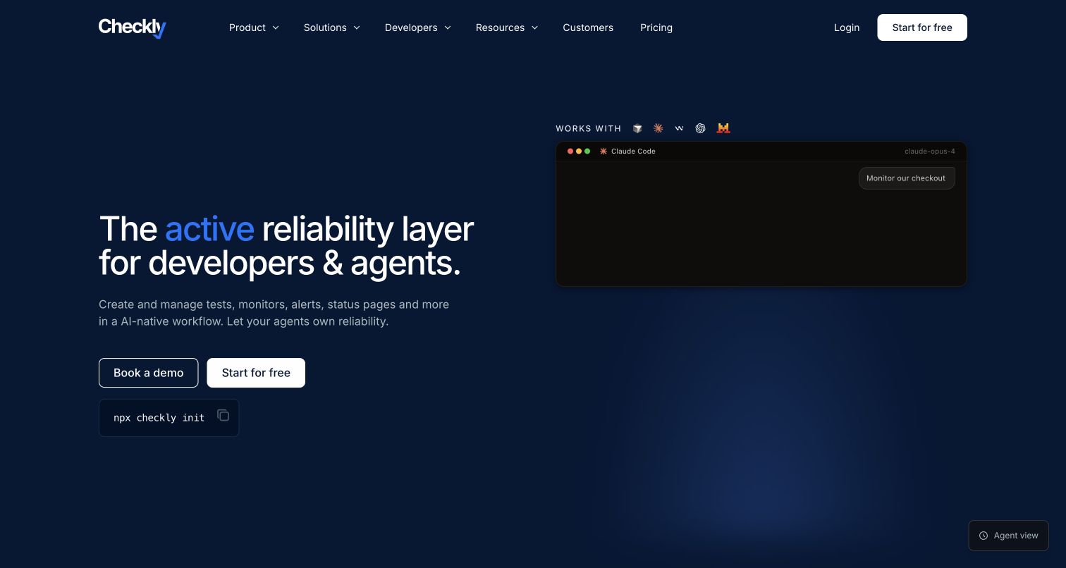
Checkly presents a dark blue opening with a concise reliability proposition, a simulated development workflow, and two routes: a demonstration and a free start. A small command example provides another technical cue below the actions. Navigation includes developers, resources, customers, and pricing. Prismic’s official gallery lists this marketing property, but the current public page does not independently expose its CMS responsibility. The example is therefore treated as a documented association with that boundary stated.
What you can learn
Model technical product statements and documentation references as reviewed content, then give campaign sections controlled choices of illustration and action. Keep code examples accurate, selectable, and clearly separate from instructions the visitor must execute. Explain the relationship between marketing pages and product signup. A demonstration animation needs a static counterpart that still communicates the task when motion is disabled or the media cannot load.
Pros
Separate demonstration and self-service actions acknowledge different stages of product evaluation.
Developer navigation and a command example make the intended audience immediately recognizable.
Cons & considerations
Animated workflow illustrations need useful static states and accessible text descriptions.
A vendor gallery reference does not establish the current implementation of the product or website.
ReactAssociated with Next.js; not independently observed
Public source checked November 3, 2026. References may be embedded or legacy—not a complete backend inventory.
Platform source: Prismic’s official public website gallery. Prismic’s official website gallery names Checkly and links this public marketing property. Current public HTML did not independently expose its CMS role; the documented association is qualified and does not cover the private product. Vendor documentation establishes an association, not an audit of a private backend or installed version. Platform evidence is separate from the direct website screenshot and is not a complete current infrastructure audit.
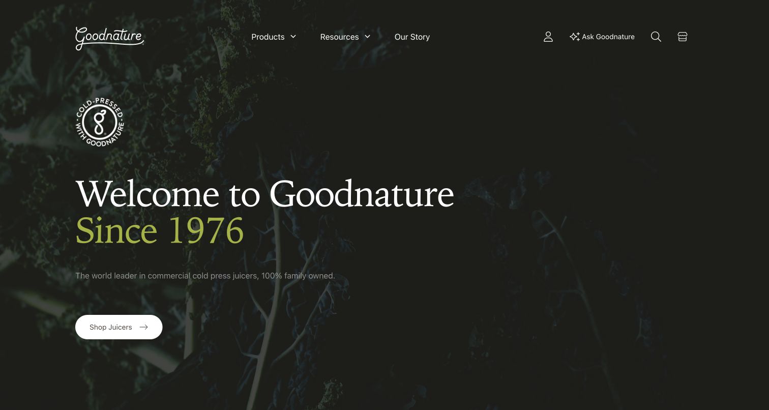
Goodnature opens with a dark leafy background, an oversized serif welcome, and a contrasting founding-year statement. A white product action sits below a concise explanation of the business. The header keeps products, resources, and the company story distinct, with search and account utilities at the right. Prismic’s official gallery names the property. Public pages also contain commerce-related assets, so the association should not be read as a complete inventory of the storefront or account systems.
What you can learn
Keep company history and educational resources separate from product catalog records, then connect them through deliberate page sections. A heritage-led hero should still explain what the organization sells, particularly for visitors arriving without brand knowledge. Give resource content consistent authorship and update dates. Define the CMS-to-commerce handoff so product links, availability, and account access remain correct when the editorial presentation changes.
Pros
A direct product action provides a useful route beneath the broader brand introduction.
Products, resources, and story labels recognize different visitor intentions in a compact header.
Cons & considerations
Low-emphasis supporting text on a dark photograph needs careful contrast checking.
A heritage statement cannot substitute for product specifications and practical buying information.
Public source checked November 3, 2026. References may be embedded or legacy—not a complete backend inventory.
Platform source: Prismic’s official public website gallery. Prismic’s official website gallery names Goodnature and links this public property. Commerce-related assets are also present; CDN references alone are not treated as CMS proof and no complete storefront inventory is asserted. Vendor documentation establishes an association, not an audit of a private backend or installed version. Platform evidence is separate from the direct website screenshot and is not a complete current infrastructure audit.
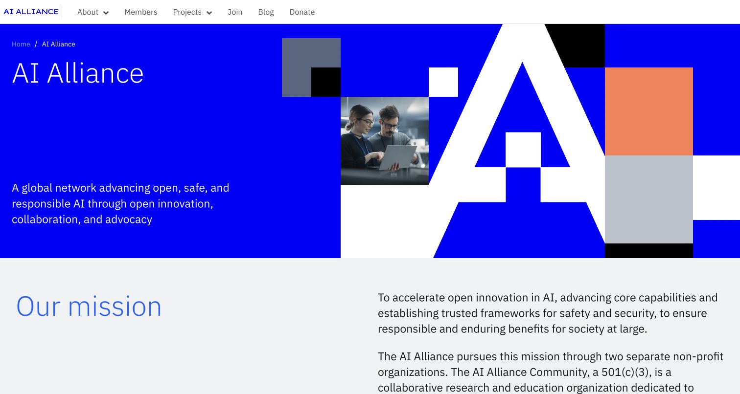
The AI Alliance places a blue mission panel beside a geometric white letterform and collaboration photograph. The simple header separates about, members, projects, joining, blog, and donation routes. A mission explanation starts immediately below the feature. Prismic’s gallery labels the reference as IBM AI Alliance, while the live property identifies the alliance itself. This review preserves that scope and makes no claim about IBM’s corporate websites or participating members’ systems.
What you can learn
Create distinct records for members, projects, and editorial updates instead of treating a coalition site as one long campaign. A homepage section can refer to the current mission while participation pages explain practical next steps. Make organizational boundaries clear in copy and metadata. Review membership status and project links regularly, and ensure decorative geometry does not replace useful descriptions or dominate the small-screen reading order.
Pros
Plain navigation labels make organizational information and participation routes easy to distinguish.
The mission text begins above the fold and continues into a clear explanatory section.
Cons & considerations
The large graphic needs a deliberate mobile order so the mission remains easy to reach.
A coalition reference cannot establish technology use across its member organizations or founders.
Public source checked November 3, 2026. References may be embedded or legacy—not a complete backend inventory.
Platform source: Prismic’s official public website gallery. Prismic’s official gallery labels this reference IBM AI Alliance and links thealliance.ai. The live property identifies the AI Alliance. Evidence is limited to this coalition website, not IBM corporate sites or any member’s infrastructure. Vendor documentation establishes an association, not an audit of a private backend or installed version. Platform evidence is separate from the direct website screenshot and is not a complete current infrastructure audit.
Combine stable records for products, services, people, and case studies with a small set of curated landing-page sections. Give editors control over relevant selections and ordering, while maintaining typography, spacing, and accessible interaction in code. The homepage should reference the organization’s current information instead of becoming a separate collection of stale claims.
Commerce with an editorial layer
Write down which system owns catalog identifiers, price, availability, cart, account, and checkout. Prismic can hold appropriate stories and campaign content while commerce systems manage transactions. Preview unavailable products and expired promotions. A visually unified page still needs clear data ownership and a maintained integration between the editorial and operational parts.
Regional or multi-property publishing
Share reusable presentation where it helps, then identify local ownership of language, dates, destination links, legal text, and operational details. A familiar global logo does not make the information interchangeable. Test the selected market and its fallback behavior, including any redirect that occurs when a visitor arrives at the root URL.
Plan a Prismic website around repeatable publishing work
Inventory content before naming slices
Collect representative pages and updates from the people who maintain the site. Identify which content repeats, which needs a permanent URL, and which exists only for a short campaign. Use those examples to define content types, relationships, section limits, and image requirements. Include difficult records rather than approving a design with only short headlines and ideal photographs.
Separate editorial permissions and operational responsibility
Identify who drafts, reviews, publishes, corrects, and retires content. Keep sensitive product and customer workflows outside the public marketing scope unless there is a specific, approved integration. Assign factual review for health, financial, safety, and technical statements. A section’s visual flexibility should never make a required qualification or attribution optional.
Rehearse the complete release
Have an editor create and preview a page, obtain review, publish it, correct a mistake, and remove or replace it. Inspect the public URL, navigation, listings, metadata, and cached content. Confirm that a successful CMS publication produces the intended frontend update. Document how the team recognizes and resolves a stale or failed publication instead of relying on an unexplained deployment step.
Maintain the library after launch
Track which sections and variants are used and retire obsolete ones deliberately. Review code examples, campaigns, destination links, image rights, and translations on an appropriate schedule. Give the frontend, integration, and editorial workflow named owners. A new visual treatment should be tested with existing content before it replaces a widely used section.
A useful handover demonstration
Ask the actual team to carry out its routine job: publish a realistic update, correct a mistake, preview a narrow screen, and identify who owns an integration failure. For a library or frontend framework, also ask who maintains the content source and deployment. A polished screenshot does not answer those operational questions.
Beyond the screenshot
Prismic content and release checklist
Give every content type and slice an understandable editorial purpose.
Define authoritative sources for prices, dates, conditions, and specifications.
Test long copy, missing assets, unusual records, and translated sections.
Keep regional properties and private applications clearly scoped.
Review image rights, attribution, factual claims, and expiry dates.
Preview actual page context and verify publication reaches the public frontend.
Check narrow layouts, keyboard navigation, contrast, and reduced motion.
Provide useful fallbacks for video, animation, and external integrations.
Verify canonical URLs, redirects, metadata, navigation, and sitemap coverage.
Assign ongoing ownership of content, frontend code, and connected services.
Test with real content, a keyboard, a small screen, slow or failed requests, and the people who will maintain the system. These are planning checks, not an accessibility, security, performance, or search-ranking certification.
Sources & editorial method
How this Prismic collection was reviewed
This collection uses twenty distinct public properties identified in Prismic’s official case studies or gallery and captured directly in the browser on November 3, 2026 UTC. Regional and product boundaries are preserved, including McDonald’s Spain, UNICEF Aotearoa New Zealand, and Canvas Medical’s public marketing website. Some captured browser views render translated text; the recorded source URL remains authoritative for the selected property. Public markup was checked where available, but media-CDN references alone are not treated as proof of a CMS. A vendor reference is a documented association, not a private-backend audit or an independent performance measurement.
Every image is an unmodified capture from the actual website, with its source and capture date. Some captures are reused from our shared catalog; their dates remain the original capture dates. None comes from a vendor gallery or a generated reconstruction. Moving imagery and live content can change.
Technology attribution uses public page assets or metadata, official platform documentation, or a cited first-party project case study. Documentary and framework-relationship evidence is identified where used; it is not a complete current backend inventory. A CMS image CDN alone does not establish a full CMS deployment. A library’s presence does not prove which individual controls use it, and a platform label does not establish AI authorship.
The composition notes, lessons, pros and tradeoffs are original editorial observations. We have not measured conversion, traffic, security, performance or accessibility conformance. Website owners retain their brands and imagery; these examples are not our client portfolio. Written, Edited and Curated are independent records, not dates advanced by a build. See our editorial standards or suggest a correction.
Questions worth asking
Prismic website development FAQs
What should a Prismic slice represent?
A repeatable editorial purpose with tested content fields and presentation rules. Examples include an appeal, a plan comparison, a product story, or a case-study selection. Name it so editors understand when to use it.
Does Prismic determine the appearance of these websites?
The examples use their own presentation and frontend implementation. Prismic supplies content management capabilities; the design, code, integrations, accessibility, and operational ownership still need project decisions.
Can the same website use Prismic and a commerce platform?
Yes, documented examples combine editorial content with separate commerce systems. Define which platform owns each field and workflow. A vendor case study does not establish that every current component remains unchanged.
Does a recognizable brand reference apply to all its websites?
No. The evidence belongs to the exact regional, organizational, or marketing property named. It does not identify other markets, subsidiaries, private products, payment systems, or member organizations.
How do we keep a flexible section library manageable?
Build it from real publishing tasks, provide clear names and examples, test realistic content, and review usage after launch. Retire obsolete variants deliberately and keep critical facts in shared authoritative records.