Best Candle Brand Websites of 2026 (15 Real-World Examples)
Fifteen real candle-brand websites showing how to explain scent, present vessels, guide gift buyers and connect retail with workshops or custom work.
A candle website has to communicate something a screen cannot deliver: the fragrance itself. Clear language and useful product structure matter as much as atmosphere.
A visitor may recognize a jar, want a gift for someone else, remember one scent or be considering a workshop. These are different starting points. A useful candle website gives each visitor a way into the range without demanding a newsletter signup or familiarity with the brand’s collection names.
The examples span specialist candle studios, home-fragrance brands, experience-led shops and businesses with custom or wholesale services. Compare the relationship between imagery, scent descriptions, product formats and practical information. This collection evaluates website design and content organization; it does not rank candle performance, certify ingredients or verify every marketing claim.
Before the examples
What makes good candle brand website design in 2026?
Make fragrance descriptions useful
Give each scent a short, consistent description and a broader family where that helps comparison. Explain evocative names with recognizable notes, without promising that every person will perceive them identically. A quiz or discovery set can support choice, but the basic product information should remain available without an account.
Show the vessel and the product inside it
Use photographs that reveal size, shape, label and how the container opens. Pair styled scenes with inspectable product views. A candle, diffuser, room spray and empty accessory can share a visual identity while still requiring distinct descriptions and care information.
Give gifts, workshops and custom work separate routes
A gift buyer needs budget, presentation and delivery details. A workshop visitor needs location, booking conditions and what the experience includes. A custom client needs an explanation of the process and requirements. Keep these journeys clear rather than hiding every request under one generic shop label.
The collection · 15 examples
15 candle brand websites worth studying
Compare the brands that explain fragrance through familiar scenes with those that lead with a vessel, a mission or a making experience. Notice whether a new visitor can move from that first impression to a specific product or service.
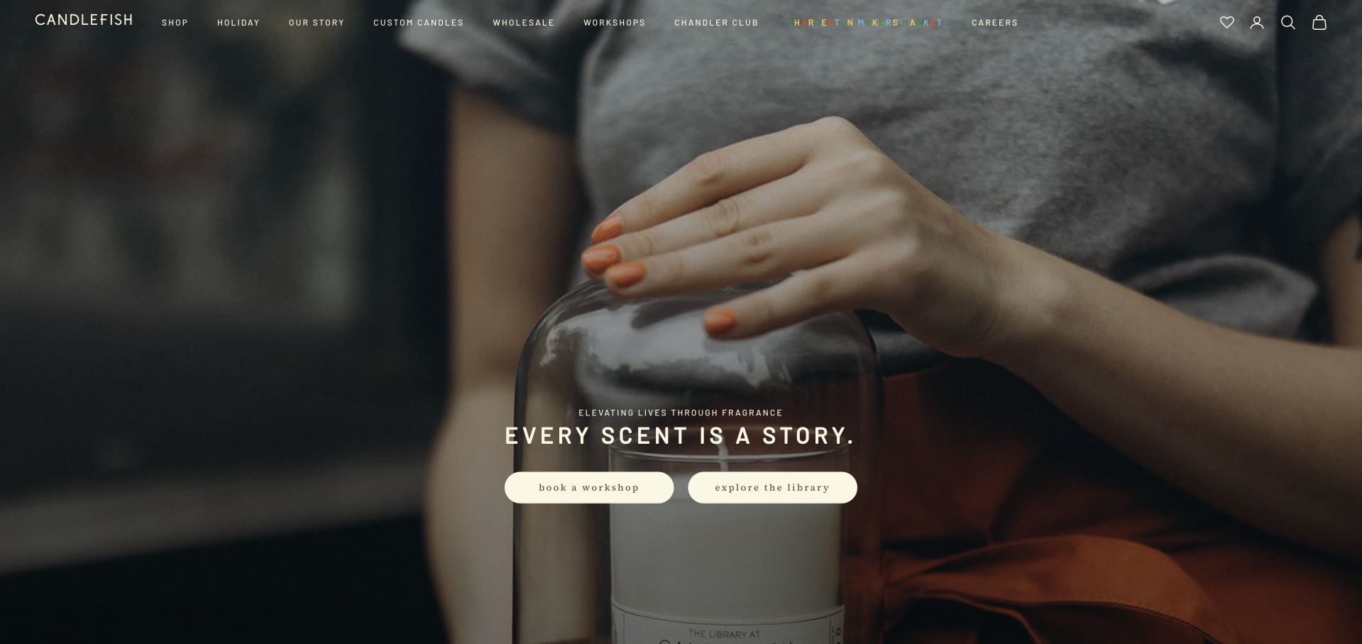
Candlefish’s opening view shows the act of pouring a candle and offers two equally prominent actions: book a workshop or explore the fragrance library. This makes its dual role clear before the visitor reaches the locations and numbered candle range below. The observed page explains separate Charleston and Boston locations and distinguishes public and private workshops. It is a strong example of connecting an experience business with a product catalogue without hiding either path. The numbered fragrance system still needs descriptive support for remote shoppers, and workshop pages must supply practical booking information rather than relying on the attractive making scene alone.
What you can learn
Give workshops and shopping distinct first-screen actions when both are central to the business. A numbered scent library needs descriptive guidance so online visitors are not dependent on an in-store smell test.
Pros
The making scene supports the workshop proposition directly.
Two clear actions separate experience booking from product browsing.
Cons & considerations
Numbered fragrances require useful scent descriptions and comparison tools.
Video and workshop imagery do not replace booking terms or practical visit details.
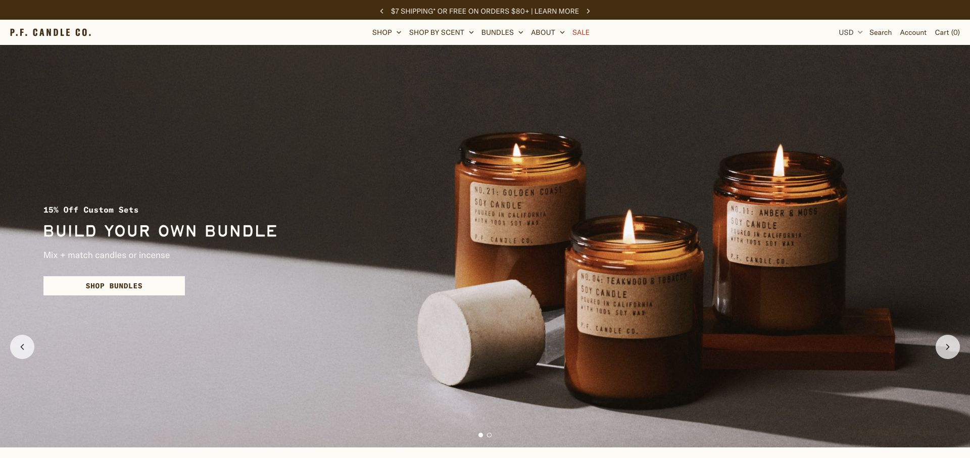
P.F. Candle Co. places three lit amber jars against a quiet, dark background, making the familiar vessel and paper label the focus of its bundle campaign. The action is specific: build a set of candles or incense, rather than follow an unexplained lifestyle slogan. The observed page then adds scent notes, size and stated burn time to product cards and offers browsing by scent family. These layers matter when the product cannot be smelled online. A customer can start with the packaging, narrow a fragrance family and inspect a concrete item. The homepage still depends on a changing promotion, so its discount and bundle conditions need ongoing maintenance.
What you can learn
Pair the atmosphere of a candle photograph with comparable scent and size information. Bundles become useful when shoppers understand what they are combining, rather than simply seeing a discount.
Pros
Distinctive jars remain recognizable in the campaign photograph.
Scent families and product-card details support comparison.
Cons & considerations
The opening bundle promotion requires current terms and stock.
The hero itself does not compare fragrance notes or vessel sizes.
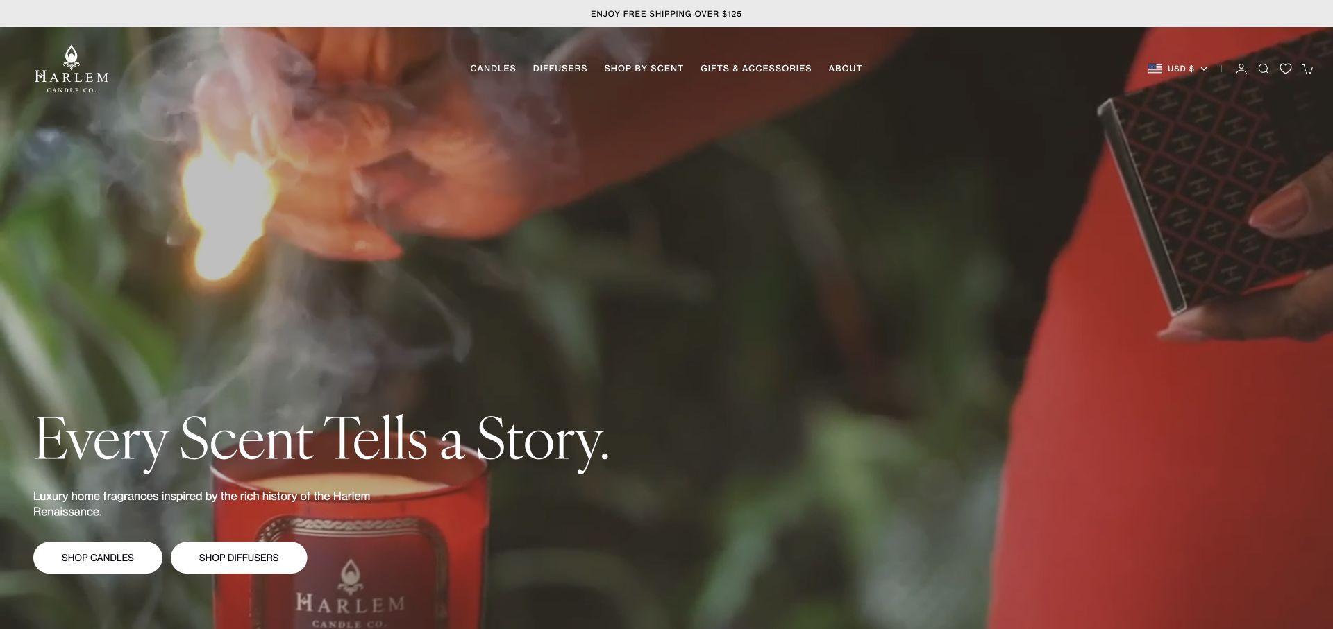
Harlem Candle Co. uses a close moving scene of a candle being lit to introduce its connection to the Harlem Renaissance. A concise statement explains the reference while separate buttons identify candles and diffusers. This avoids asking a visitor to decode the brand story before finding a product. The observed best-seller cards name fragrance families beside individual scents, which gives the expressive naming system a practical comparison layer. The site is useful for studying how a place-based identity can carry through imagery, names and navigation. The opening video is atmospheric, however, and does not replace product specifications or the need for a useful still-image fallback.
What you can learn
Give a place-based brand story one clear sentence, then connect it to plainly labeled product paths and scent descriptions. Cultural references should enrich the range rather than become the only way to navigate it.
Pros
Candles and diffusers have separate first-screen actions.
Fragrance-family labels help explain expressive product names.
Cons & considerations
Video performance and readable text need careful implementation.
Vessel dimensions and burn guidance require a deeper product visit.
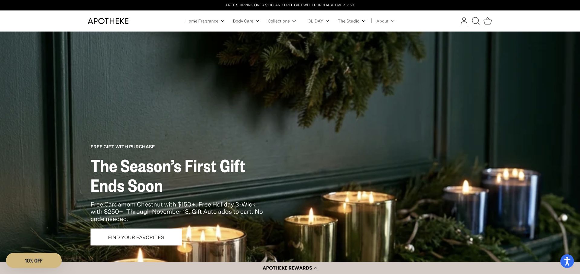
APOTHEKE’s captured seasonal campaign uses metallic vessels against dark green paneling, leaving a defined area for the offer and action. The header separates home fragrance, body care, collections and the studio, while the observed navigation breaks candles into formats and scents into families such as woody, citrusy and gourmand. This is a useful hierarchy for a brand whose range extends well beyond a single candle size. The page shows how a quiet visual identity can sit above a substantial catalogue. Its temporary gift threshold and deadline are prominent, so the campaign also illustrates the maintenance burden of leading with a short-lived offer.
What you can learn
Keep the campaign simple while organizing the catalogue by both product format and scent family. A visitor should not need to know the collection name to find an appropriate candle.
Pros
The hero gives product vessels and offer copy distinct space.
Product formats and fragrance families provide complementary routes.
Cons & considerations
Time-limited offer copy needs prompt replacement when it ends.
A deep menu requires careful keyboard and mobile behavior.
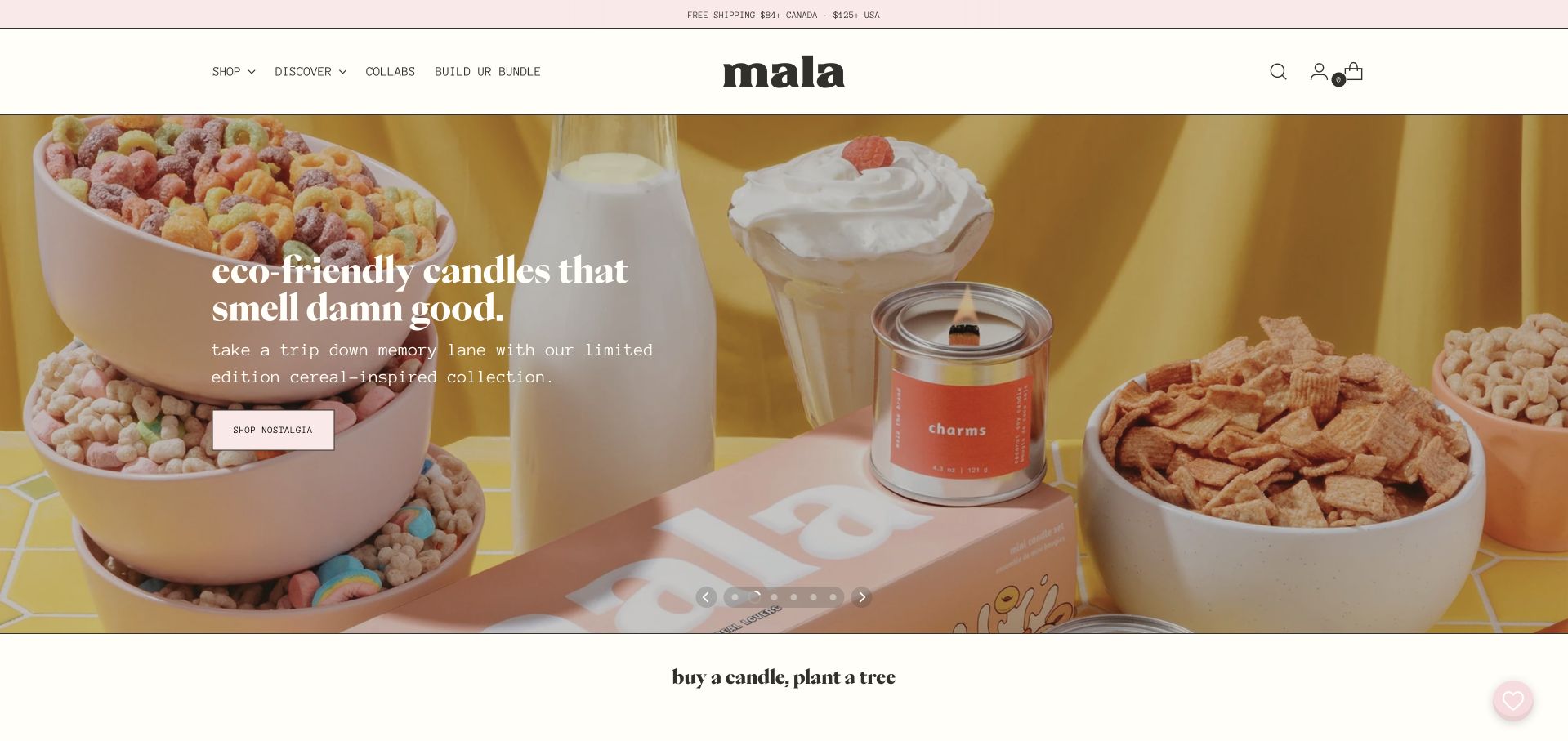
Mala’s captured cereal-inspired campaign surrounds one candle with recognizable breakfast objects and bright color. The setting makes an abstract scent concept more concrete without relying on a technical fragrance vocabulary. A short shopping action leads to that collection, while the observed page also offers a discovery kit and bundle route for visitors who cannot choose one scent. The informal typography and language are consistent with the playful packaging. This approach benefits from clear boundaries: a styled photograph communicates an idea, not proof of an exact smell, and broad environmental claims need their own support rather than being accepted from a headline.
What you can learn
Use familiar scenes to introduce an unusual fragrance idea, then offer a low-commitment way to explore the range. Keep sustainability and ingredient claims separately supported and specific.
Pros
Recognizable props explain the campaign’s nostalgic theme.
Discovery and bundle routes address uncertainty about scent choice.
Cons & considerations
A carousel can hide useful introductions on later slides.
Broad environmental language needs evidence beyond the hero image.
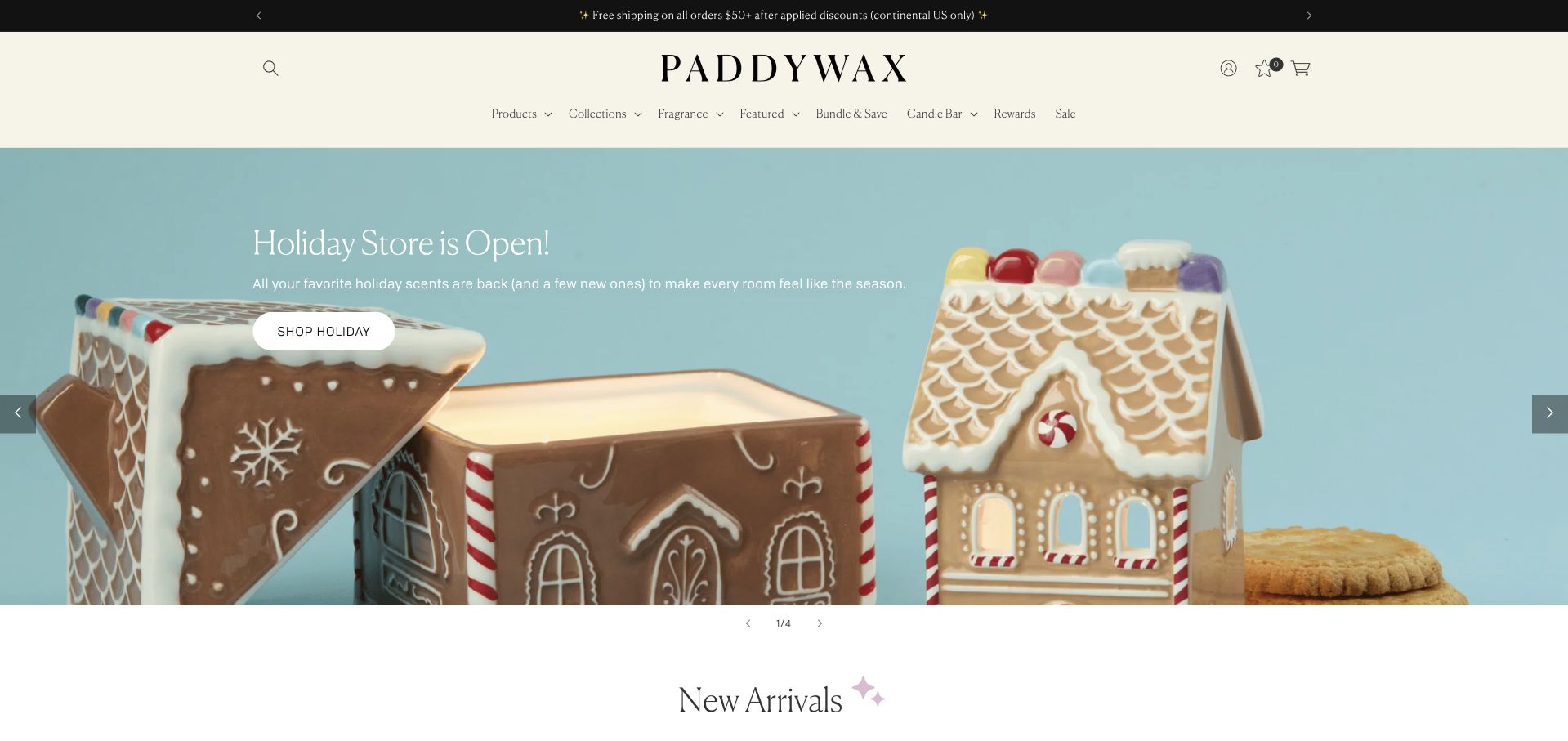
Paddywax presents a house-shaped candle with its lid removed, so the opening image communicates both the decorative vessel and the wax inside. A pale blue background and short holiday message leave the object easy to inspect. The observed product cards continue that emphasis with named vessel designs, size, price and a fragrance-family label. Navigation separates products, collections and fragrance, which gives shoppers several ways into a visually varied range. This is worth studying when the container is part of the purchase decision. Decorative appeal still needs practical support: dimensions, safe use and what can happen to the vessel after use belong on the product page.
What you can learn
Photograph an unusual vessel open and in context so shoppers understand both its appearance and function. Keep fragrance and practical specifications close enough that decoration does not obscure the product itself.
Pros
The open container clearly shows how the decorative object works.
Product cards combine vessel names with size and scent context.
Cons & considerations
Seasonal styling needs a maintained replacement outside the campaign.
The hero does not provide dimensions or detailed care information.
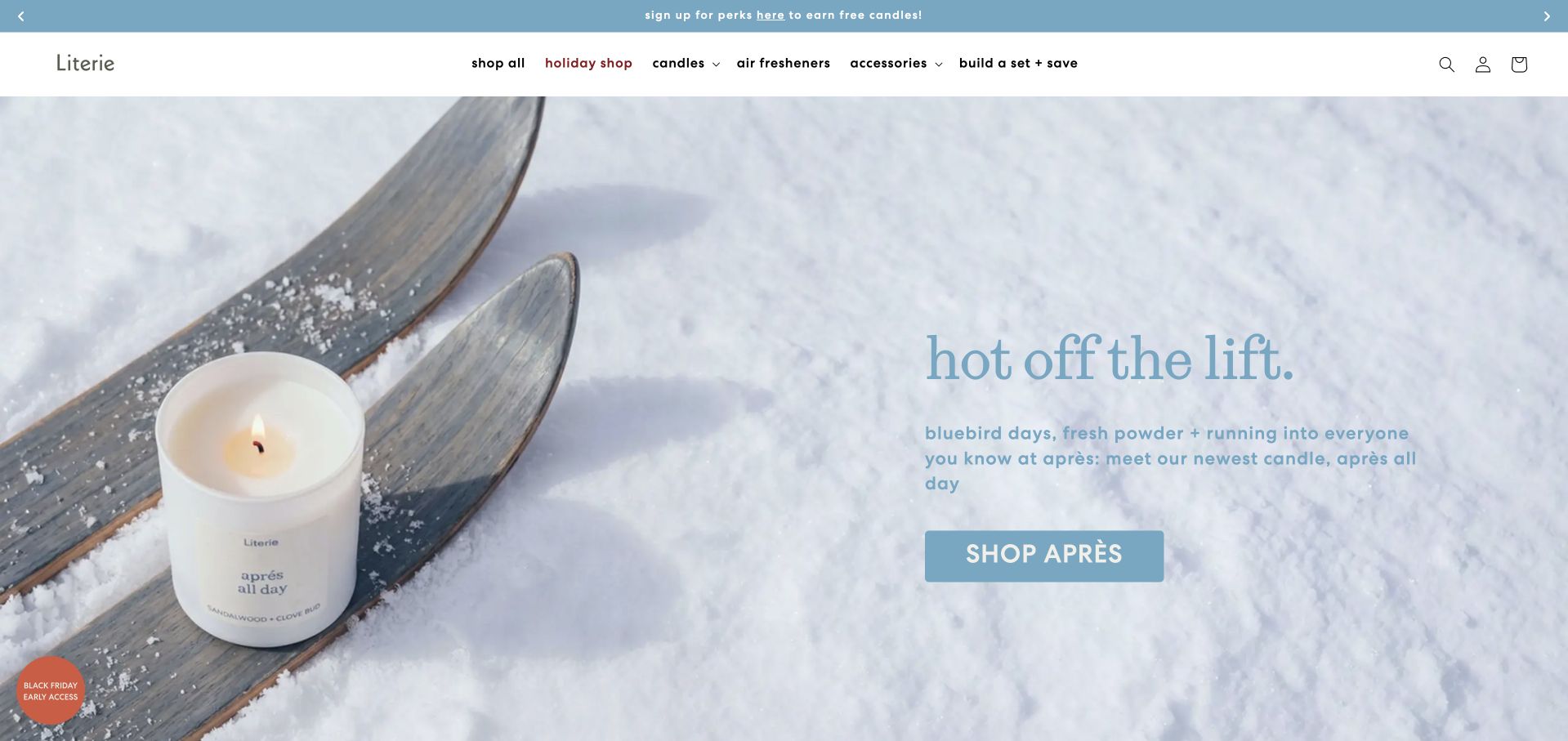
Literie’s captured après-ski campaign places a candle on old skis against snow, with a short description of the occasion on the opposite side. The scene is unusually specific, giving the product name an immediate context. Main navigation keeps candles, air fresheners, accessories and custom sets separate, and the observed page offers additional occasion-led collections. The result is useful for studying how gift shopping can start with a recipient’s interest instead of a fragrance ingredient. The pale text and background also create a practical implementation question: the atmosphere should survive without making the explanatory copy difficult to read on smaller or lower-contrast screens.
What you can learn
An occasion can be a useful entry point for a gift, but connect the story to actual scent notes, product details and a clear purchase route. Check that atmospheric color choices preserve legibility.
Pros
A concrete setting makes the product concept immediately understandable.
Accessory and set routes remain separate from individual candles.
Cons & considerations
Light text over a pale scene warrants careful contrast review.
Occasion-led names still need precise fragrance descriptions deeper in the journey.
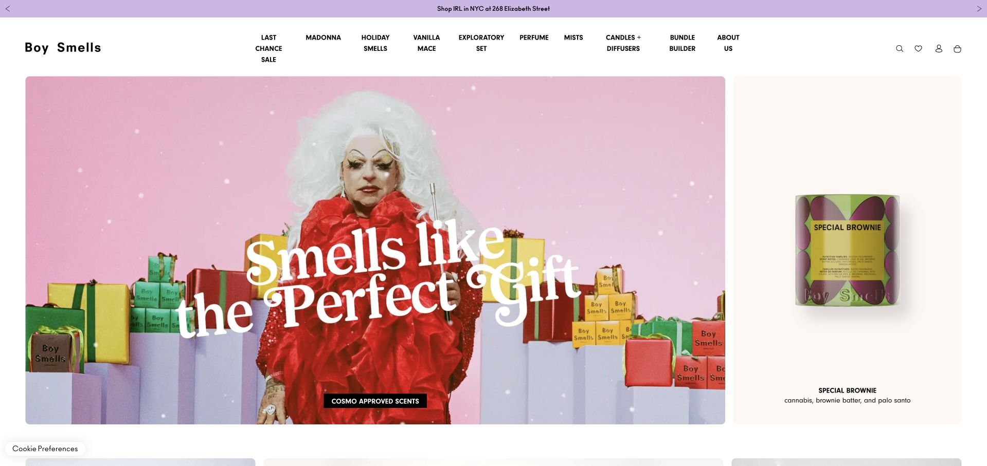
Boy Smells divides the opening area into a large, colorful gift campaign and a narrower product panel. The separate panel shows a single candle with its name and notes, giving a visitor something concrete to inspect beside the theatrical image. The header contains multiple campaigns as well as product categories, reflecting a range that includes perfume and mists alongside candles. The useful lesson is the separation of brand expression from product clarity: one does not have to carry every message. The trade-off is navigation density. Many campaign labels can compete with the basic category a first-time candle shopper needs.
What you can learn
Place an inspectable product and concise scent notes beside expressive campaign photography. Audit the header regularly so temporary launches do not crowd out the main product categories.
Pros
A dedicated product panel provides detail beside the campaign.
The visual language is consistent across packaging and photography.
Cons & considerations
Numerous campaign links create a dense opening navigation.
Moving campaign media needs an accessible and lightweight fallback.
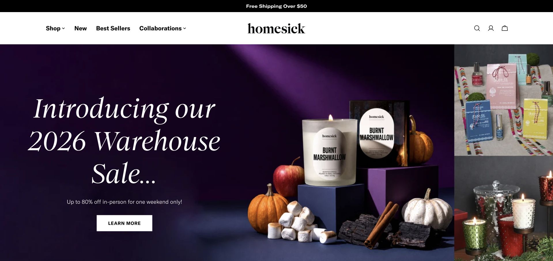
Homesick’s captured homepage leads with a warehouse-sale campaign, using a large editorial headline beside clearly labeled candles. Its four main navigation groups keep the interface comparatively restrained despite several active collaborations and seasonal collections in the observed page. The hero explains that the event is in person and sends visitors to a separate details page, a useful distinction from ordinary online shopping. The example shows how a brand can promote a temporary event without adding a new permanent navigation system. It also demonstrates the risk: someone arriving to buy a candle online may first encounter a campaign that does not match that intention.
What you can learn
Keep temporary events separate from everyday shopping and state their practical scope immediately. A minimal permanent header can remain useful while the largest campaign area changes.
Pros
The header retains a small number of clear shopping routes.
The captured campaign distinguishes an in-person event from online purchasing.
Cons & considerations
A local event can dominate the first view for distant shoppers.
Event dates and destinations require timely maintenance.
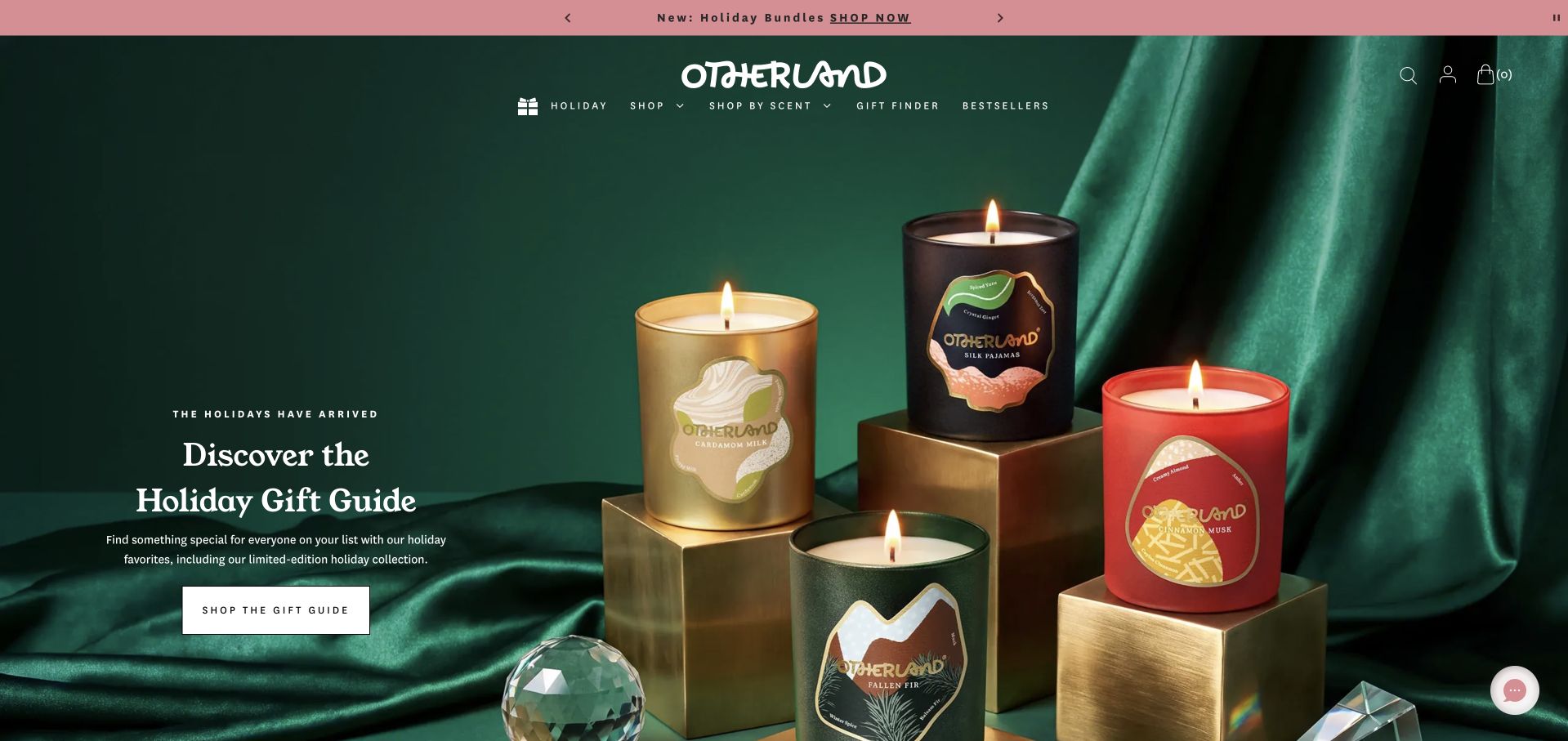
Otherland arranges four richly colored candles on metallic blocks against green fabric, with a compact gift-guide introduction in a quieter area of the image. The observed page follows that campaign with budget and recipient routes, including gifts for a host and a homebody. It then gives individual products short scent-note combinations and prices. This sequence is useful because a gift buyer may know the person or budget before knowing a fragrance family. The design remains dependent on seasonal merchandising, and a brand should keep the evergreen scent catalogue equally reachable after the campaign ends. The photograph cannot substitute for size or ingredient details.
What you can learn
Offer recipient and budget routes alongside scent browsing when gifts are a major use case. Keep the same underlying product records so seasonal collections do not create contradictory details.
Pros
Recipient and budget categories offer practical gift-shopping entry points.
Product cards pair distinctive names with short scent descriptions.
Cons & considerations
Seasonal navigation needs regular review as stock and occasions change.
The opening image leaves vessel size and specifications to product pages.
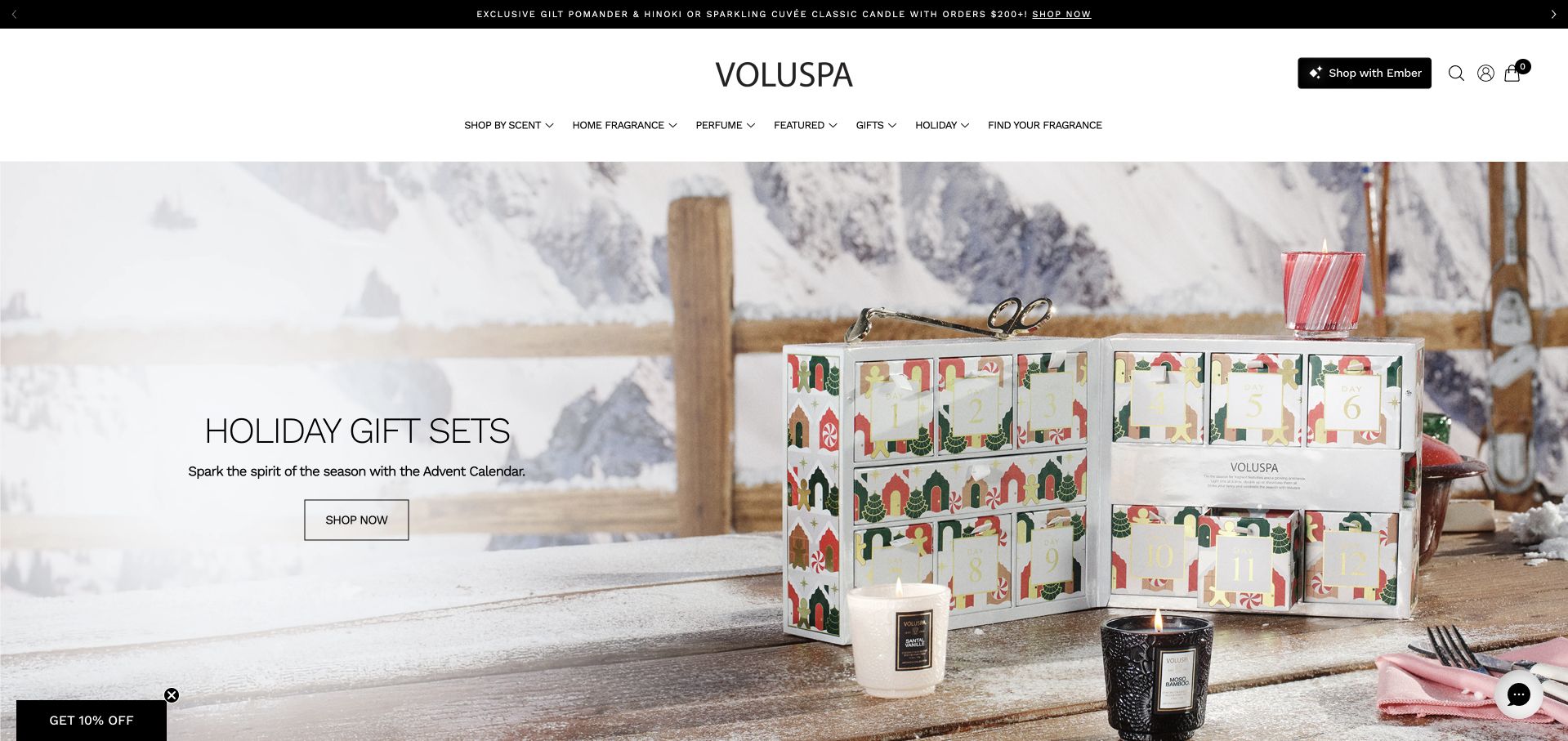
Voluspa’s opening campaign photographs an advent gift set with individual candles in front of it. This explains the physical format better than showing a closed box alone. The page gives the gift a short seasonal message and one shopping action, then introduces a product carousel with specific formats and prices. Navigation distinguishes fragrance browsing, product type, gifts and a fragrance-finder route. These different entry points serve shoppers who know a scent as well as those choosing a present. The observed site also presented several dismissible overlays, an instructive reminder that a clear catalogue can still be interrupted before a visitor reaches it.
What you can learn
Show what a gift set contains and offer both scent-based and format-based navigation. Coordinate consent, region and marketing prompts so they do not compete with the product introduction.
Pros
The open gift set makes its contents and presentation understandable.
Gift, fragrance and product-format routes address different shopping needs.
Cons & considerations
Multiple initial overlays can interrupt an otherwise clear introduction.
Large gift photography does not replace per-item size and fragrance details.
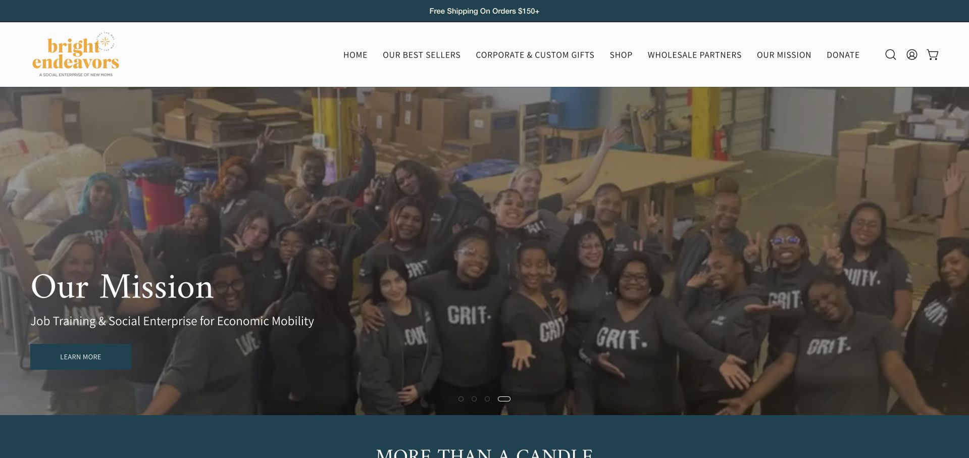
Bright Endeavors keeps its commercial routes and organizational mission visible in the same header. The captured rotating slide shows a group in a working environment and links to an explanation of the social-enterprise program; other observed slides and the next sections return to candles and fragrance collections. Best sellers include clear starting prices, while corporate gifts and wholesale have their own routes. This is useful for a candle brand whose purpose is a meaningful part of its identity. The website’s stated impact remains its own claim, not an outcome verified by this design review. Product and program information should each remain easy to investigate.
What you can learn
Connect a mission to actual product and organizational information rather than asking the mission to do all the selling. Keep wholesale, corporate gifts and ordinary shopping as distinct journeys.
Pros
The mission has a visible route alongside practical shopping categories.
Different purchasing audiences receive separate navigation paths.
Cons & considerations
A mission-led carousel frame may not immediately show the candle range.
Impact statements require maintained evidence and clear organizational context.
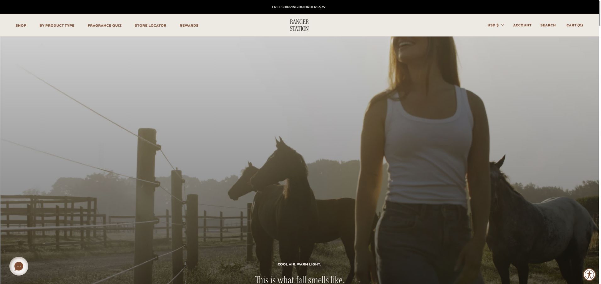
Ranger Station opens with outdoor moving imagery and a brief seasonal line. The observed page later explains a more concrete differentiator: candles poured into cocktail glasses, with a separate route to that range. Its best-seller area mixes candles with personal fragrance and car products, while product-type navigation helps distinguish those uses. The opening film establishes an atmosphere, but the practical vessel story carries more information for a candle shopper. This contrast is worth studying. A brand can build a strong mood without assuming that mood alone tells a visitor what is for sale, how large it is or how the product should be used.
What you can learn
Follow a broad lifestyle introduction with a specific product feature visitors can understand and compare. Separate home, personal and vehicle fragrance so shared branding does not blur their purposes.
Pros
The observed page explains a distinctive reusable vessel concept.
Product-type navigation separates a mixed fragrance range.
Cons & considerations
The opening film does not immediately show a candle or its specifications.
A large video needs careful loading and reduced-motion behavior.
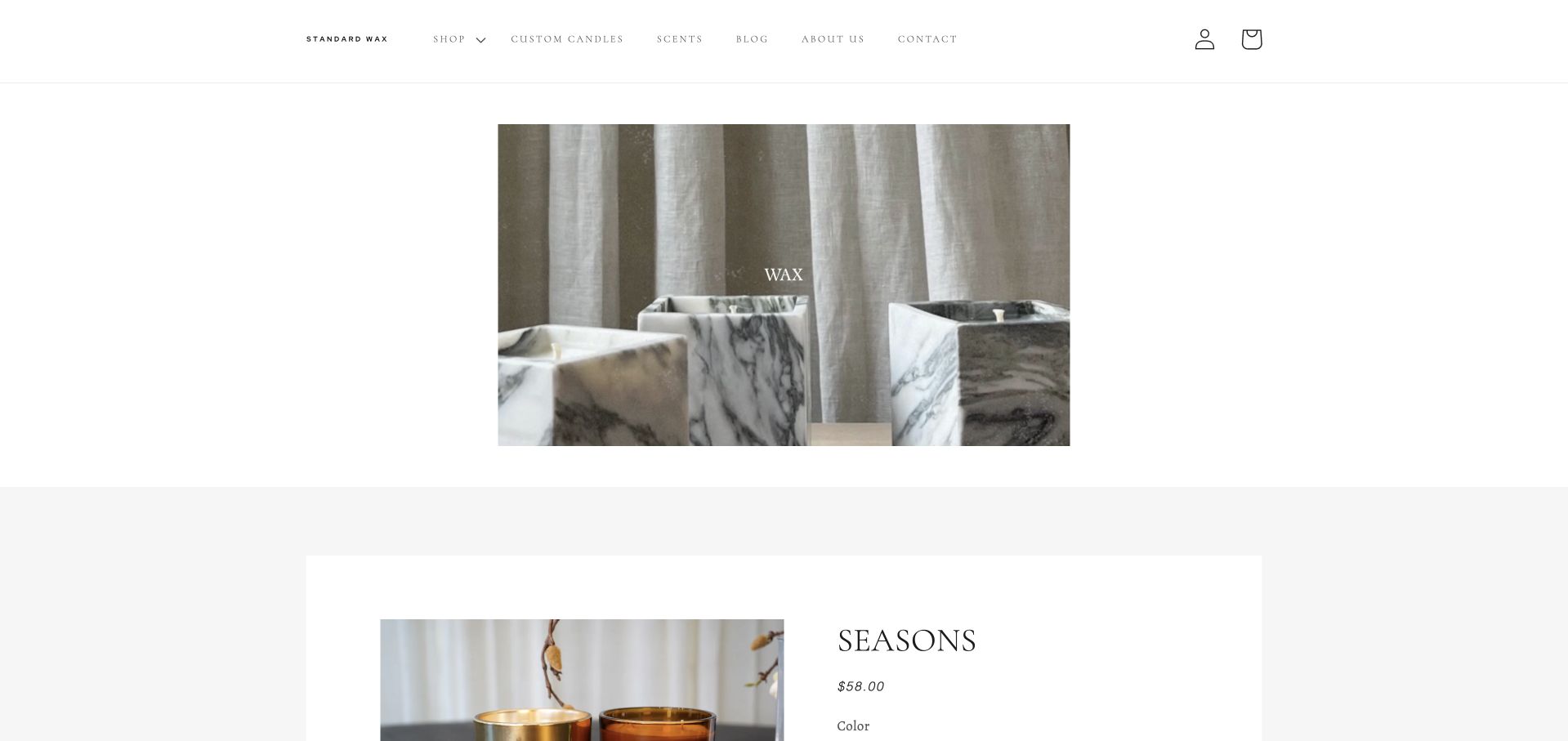
Standard Wax uses extensive white space around a restrained vessel image, followed by a featured product with visible price and color choices. The observed page then introduces the owner and explains custom candles, white-label collections and corporate gifts. That combination makes the business model more legible than a general handmade slogan would. The dedicated Custom Candles and Scents links keep project inquiries distinct from ordinary retail browsing. The quiet presentation has a trade-off: the opening view communicates little about scent, and small navigation type can demand more effort. The lower contact information is helpful, but the first screen could explain the offer sooner.
What you can learn
If a candle business serves both shoppers and custom clients, name those routes directly and explain who handles the work. Minimal presentation should still communicate the product and next step promptly.
Pros
Custom production has a dedicated navigation route and explanation.
Featured-product price and color choices are presented together.
Cons & considerations
The opening image offers little scent or product context on its own.
Small navigation text and generous spacing warrant mobile legibility checks.
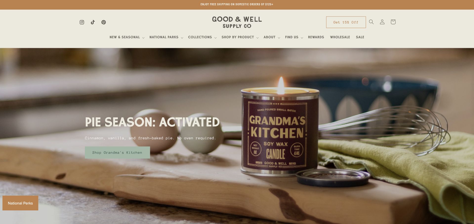
Good & Well’s captured campaign pairs a plainly labeled candle with baking objects and a short scent description. The photograph explains the kitchen-inspired idea while leaving the product label readable. The observed navigation then offers a different organizing system: national parks, states and other named collections, alongside shopping by product. This combination helps a visitor enter through an emotional association or a practical category. Its giving-back statement links to a fuller explanation, which is a better pattern than leaving a broad claim unsupported in the hero. The design review does not verify the claimed contribution or the candle’s performance.
What you can learn
Use an evocative scene to introduce one scent, then give themed collections and product types separate browsing paths. Link broader purpose claims to specific, maintained explanations.
Pros
The label and supporting props make the featured scent concept concrete.
Place-based collections provide a consistent catalogue theme.
Cons & considerations
Many overlapping collections need clear labels and search support.
Giving-back claims require evidence beyond the campaign presentation.
Kegan is a freelance web designer and developer with 15+ years of experience helping businesses turn complicated website requirements into clear, maintainable digital experiences. He works directly with clients from planning and design through development, launch, and ongoing support.
For candle brand website design, his development approach focuses on fragrance discovery, product details, gifting, workshop routes and clear retail information. The scope can be a targeted improvement or a complete custom build, with responsive layouts, thoughtful content structure, and integrations chosen around the people using and maintaining the site.
Show 3 other candle brand website designersHide other candle brand website designers
Plan a candle website around real shopping decisions
Create a consistent fragrance and product model
List the product formats the business actually sells and decide which fields customers need to compare them. Maintain scent notes, fragrance family, vessel size, wax quantity, stated burn guidance, price and availability in structured product records. Do not bury changing details inside campaign artwork.
Separate a scent from the formats that carry it when the catalogue requires that distinction. One fragrance might appear in a jar candle, diffuser and spray, but their ingredients and instructions are not interchangeable. Make the selected format clear before asking a shopper to choose an option.
Decide how to explain unfamiliar names. Short notes, a plain-language description and a relevant photograph can work together. If offering a quiz, explain what it does and keep direct browsing available; a visitor should not have to supply personal information to understand the range.
Build a hierarchy for gifts and experiences
Identify the main non-product journeys. Gifts can be organized by budget, recipient or occasion, but avoid creating overlapping categories that lead to indistinguishable lists. Use the same underlying product records so a gift guide and an ordinary catalogue page show consistent details.
Treat workshops as experiences with their own information: location, schedule, what participants make, what is included and applicable booking conditions. Show genuine making scenes, and distinguish public sessions from private groups. Do not imply that a visitor can attend a workshop merely because the brand has a physical store.
For custom candles and wholesale, explain the real service before presenting an inquiry form. Describe the available choices, process and any supported minimums or lead times. Collect only the information needed to assess the request, and keep this workflow separate from ordinary retail checkout.
Keep atmosphere maintainable and usable
Give seasonal campaigns an owner and replacement date. Check that stock, offer terms and destination pages remain accurate when a promotion ends. The permanent navigation should still help someone buy a familiar product while the largest photograph changes for a holiday or collaboration.
Plan image crops and text placement for narrow screens. A vessel label or small product detail that is visible on a desktop can disappear in a mobile crop. Moving backgrounds need a useful still frame and considerate behavior for visitors who prefer less motion or have limited bandwidth.
Coordinate privacy, region, newsletter and rewards interfaces so visitors are not greeted by several competing overlays. Test finding a named scent, comparing formats, locating care information and understanding a workshop or gift order. A polished photograph should support these tasks rather than conceal them.
The editing job behind the design
Choose a platform around catalogue maintenance
A managed commerce platform can support a candle range when product fields, variants and stock responsibilities are clear. The harder work is often consistent content: scent descriptions, vessel images, care guidance and campaign destinations need an owner and a reliable update process.
Add subscriptions, bundles, quizzes, booking tools and custom-order forms only when they serve a real business process. Each additional interface should work with keyboard access and narrow screens, and should explain its terms without requiring unnecessary personal data. Keep functional shopping available when optional marketing storage is declined.
The stack records in this collection come from bounded public-source audit attempts. They can show visible commerce, library, analytics, font and delivery references, but they do not reveal a company’s full backend or private operations. Partial and unavailable observations retain their qualifications rather than being completed with guesses.
Our WordPress website examples offer a separate look at publishing approaches. A visible platform label is evidence for that named page, not a guarantee that the same system will suit your requirements.
Before the public launch
A candle-brand website launch checklist
The opening view identifies the product category and a useful next step.
Every scent has consistent notes and an understandable description.
Product format, vessel size, wax quantity and price are clearly distinguished.
Styled scenes are supported by inspectable product photographs.
Care and safety information is easy to locate and matches the actual product.
Gift routes explain presentation, delivery and relevant deadlines.
Workshops have distinct locations, inclusions and booking information.
Custom and wholesale services explain the process before requesting details.
Seasonal offers have accurate terms and a replacement plan.
Navigation supports both known-product search and first-time discovery.
Consent and marketing prompts do not obstruct ordinary browsing.
Images, menus and purchase choices remain usable on narrow screens and with a keyboard.
These checks are a project checklist, not a performance, legal, security, or accessibility certification. Test real journeys with the people responsible for the website before making claims about the result.
Sources & editorial method
How this collection was selected and reviewed
We reviewed fifteen genuine candle-brand homepages for this collection on November 11, 2026 Pacific. Their direct browser screenshots were captured on November 12 UTC, still November 11 Pacific; individual capture records preserve the exact date and dimensions. Open newsletters, consent notices and other optional overlays were dismissed through normal site controls before the accepted captures. Candlefish is the researched Editors Choice for connecting a real making scene to clear workshop and fragrance-library journeys, supported by location and format information below. The choice concerns website design, not candle performance, safety, environmental claims or service quality. Every source received a bounded broad technology-audit attempt, with any access or sampling limitations retained.
Each example links to its actual source page. Screenshots are direct browser captures with their own capture dates; moving imagery, announcements and live designs can change. The notes describe observable design choices and conditional tradeoffs, not measured traffic, conversion results, service quality, or accessibility conformance.
Technology labels use public page metadata, asset evidence, or explicitly cited platform documentation. Platform documentation is not a complete current deployment audit. A component reference may be legacy or unused; it is not a complete backend inventory. Unknown stacks are omitted. These sites are editorial examples, not our client portfolio.
Written, Edited and Curated are separate editorial records, not timestamps advanced by a rebuild. Website designs and imagery belong to their owners. See our editorial standards or suggest a correction.
Questions worth asking
Candle Brand website design questions
How can a website explain a scent that visitors cannot smell?
Use a consistent combination of fragrance notes, a broader family and a short plain-language description. Familiar scenes can introduce the idea, but should not be the only explanation. Discovery sets or a useful quiz may help uncertain buyers without replacing direct catalogue browsing.
Should candle websites lead with lifestyle photography or product images?
Both can be useful. A styled scene introduces mood and context; a clear product view explains the vessel, label and format. Keep the main action and essential product information visible so the atmosphere does not make the offering ambiguous.
How should gift collections be organized?
Choose a small set of useful routes such as budget, occasion or recipient. Keep the same product details across those collections and the main catalogue. Explain gift packaging, delivery timing and any personalization conditions before checkout.
Can a candle shop and workshop business share one site?
Yes, when their journeys are clearly separated. Give shopping and booking distinct actions, then provide practical information for each location and workshop type. A making photograph should connect to an explanation of what a participant can actually book.
What should a custom-candle inquiry page explain?
Describe the real choices, production process and supported requirements before asking for contact information. Distinguish private-label work, event gifts and wholesale if they are different services. Publish only confirmed minimums, pricing rules and lead times, and maintain them when the service changes.