Best Shopware Websites of 2026 (20 Real-World Examples)
Twenty real public storefronts with documented Shopware projects, original reviews and practical lessons for catalog, content and commerce planning.
A useful store helps people understand the assortment, choose an appropriate product and see what happens next. These examples show how Shopware-associated projects balance expressive campaigns with the practical structure of retail, specialist catalogs and service-linked commerce.
Start with the buying decision rather than the homepage treatment. A museum gift buyer, a workshop ordering parts and someone choosing paint for a kitchen need different routes into a catalog. The strongest structure lets visitors begin with what they already know, then supplies the information needed to make a more precise choice.
The collection opens with AIDA’s merchandise shop, STABILO Germany, Schwalbe, the separate Rijksmuseum Shop and ADAC Shop. Their recognizable identities are sourced independently from their platform relationships. Official vendor and implementing-agency evidence is tied to each named property; a retailer’s public association does not establish every current system behind the business.
Before the examples
What makes good Shopware website development in 2026?
Keep shopping tasks stable while campaigns change
Promotions can establish mood and urgency, but visitors still need reliable search, categories and service routes. Give campaigns a defined area that can change without moving the permanent navigation. Use realistic long headings, varied product imagery and ordinary editorial updates when deciding whether the structure will remain readable over time.
Separate reusable layouts from product meaning
Shopware’s Shopping Experiences documentation describes centrally managed layouts built from sections, blocks and elements. Use that structure to create reusable page patterns, while keeping product attributes and customer choices in a deliberate catalog model. A flexible page builder cannot compensate for unclear sizing, compatibility or application data.
Regional availability, trade-account terms, local fitting and installation requirements can change the meaning of an offer. Make those conditions visible at the point where they affect a decision. A public page should distinguish a product, a service and a request for advice, rather than presenting them as interchangeable routes to the same checkout.
The collection · 20 examples
20 Shopware website examples worth studying
These twenty reviews examine genuine captures of distinct public properties. Vendor and implementer sources provide documentary Shopware associations, including an explicitly historical Amisell project. Broad public-source audits remain separate and retain unavailable or excluded results. The editorial sequence is not a ranking of revenue, product quality or service performance.
We start with five recognizable brands or organizations: AIDA Online Shop, STABILO Germany, Schwalbe, Rijksmuseum Shop, ADAC Shop. Each attribution applies to the named website property, not every product or website belonging to its organization. This is a curated reading sequence, not a measured ranking.
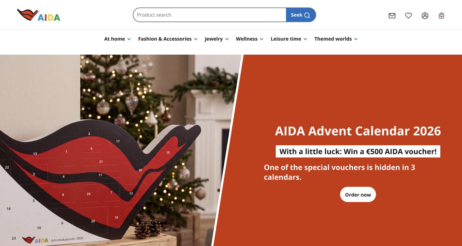
AIDA’s merchandise shop carries the cruise brand into a straightforward retail layout. Its colorful wordmark sits beside a long product search, with familiar account, saved-item and basket icons grouped at the right. A second row separates home, fashion, jewelry, wellness and leisure products before the seasonal campaign begins. The captured advent-calendar promotion uses a large product photograph against a burnt-orange text panel, making the object recognizable before visitors read the offer. This is a review of the public gift shop documented in the Shopware case, not the cruise-booking website. The promotional prize language is observed content, not an independently checked offer.
What you can learn
Give seasonal campaigns a strong visual identity while keeping the permanent catalog routes visible. In a Shopware build, merchandise taxonomy and promotional content should remain separately editable so a campaign change does not reorganize the whole store.
Pros
Large search remains available above the campaign.
Product photography connects the seasonal message to a tangible item.
Cons & considerations
Campaign content occupies almost the entire first screen.
Promotion terms require separate examination before any transaction.
Visible tech stack
Earlier / documented evidence
Shopware
Platform source: Primary Shopware project or exact-property showcase source. Official case identifies this merchandise and gift shop, not the main cruise-booking website. Documented project association; not current backend proof. Platform evidence is separate from the direct website screenshot and is not a complete current infrastructure audit.
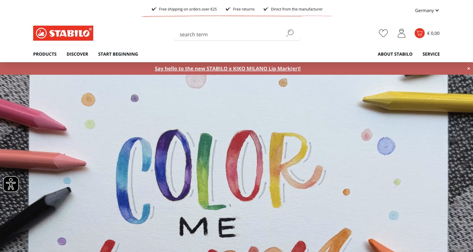
STABILO’s German store uses its red logo as a compact anchor above an expansive creative image. In the capture, colored pencils surround lettering painted on textured paper, letting the product’s purpose carry the visual introduction. Search occupies the center of the header; saved items, account and basket remain distinct to the right. A slimmer navigation row separates products, discovery and brand information, while a promotional strip introduces a collaboration. The official case documents this German direct-to-consumer project, rather than proving all international STABILO websites use the same stack. Existing browser translation changes some labels without changing the photographed artwork.
What you can learn
Build commerce and inspiration around a shared content model, but give each a clear entry point. A Shopware campaign can show how a product feels in use while predictable search and category links serve shoppers who already know what they need.
Pros
Artwork communicates color and texture immediately.
Search and account functions retain a consistent header position.
Cons & considerations
The large opening image pushes product details below the fold.
Translated labels and image lettering can present different languages.
Visible tech stack
Earlier / documented evidence
Shopware
Platform source: Primary Shopware project or exact-property showcase source. Official case documents the German direct-to-consumer store’s migration from Shopware 5 and TYPO3 to Shopware 6; broader international plans are not treated as completed. Documented project association; not current backend proof. Platform evidence is separate from the direct website screenshot and is not a complete current infrastructure audit.
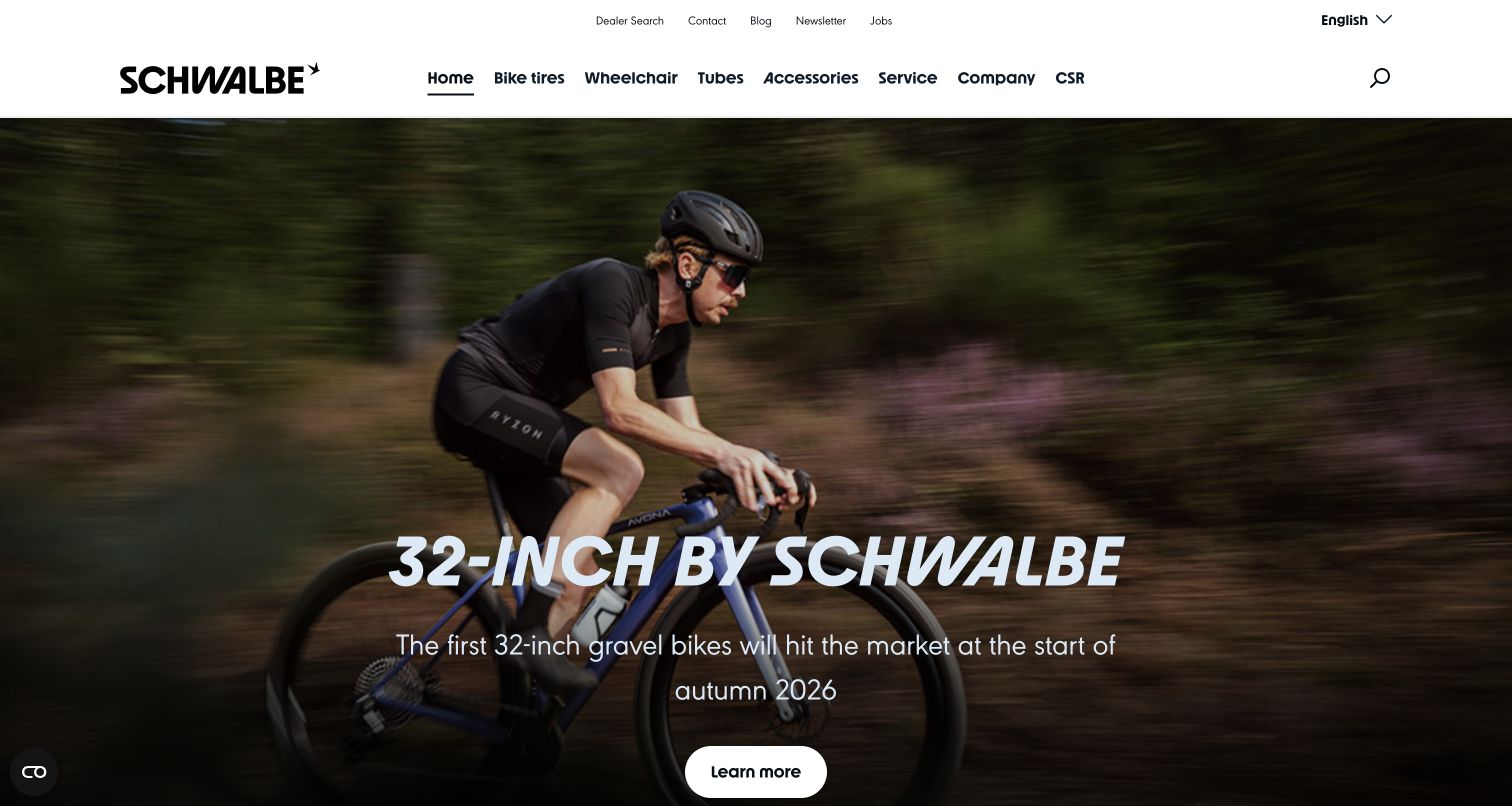
Schwalbe’s opening view places an action photograph beneath a simple black-and-white navigation bar. A cyclist crossing the frame supplies context for the tire announcement, while a large italic headline and rounded button create an unmistakable campaign hierarchy. Above it, bicycle tires, wheelchair products, tubes, accessories and service are presented as separate routes. Dealer search and contact information sit in a quieter utility row. The vendor showcase links this store. The screenshot records one moment in a rotating campaign, not evidence of the product’s performance or availability. Optional cookies were denied before the clear source capture was taken.
What you can learn
Use sport photography to establish the riding situation, then offer clear product-family and service routes. A Shopware implementation still needs structured sizing and compatibility information beyond the campaign; the image alone cannot resolve a technical purchase.
Pros
Navigation distinguishes rider and wheelchair product needs.
The photograph gives a technical announcement an immediate context.
Cons & considerations
A changing campaign is less predictable than a stable buying guide.
Product specifications are not available within the opening panel.
Visible tech stack
Earlier / documented evidence
Shopware
Platform source: Primary Shopware project or exact-property showcase source. Vendor showcase links this store. Documented project association; not current backend proof. Platform evidence is separate from the direct website screenshot and is not a complete current infrastructure audit.
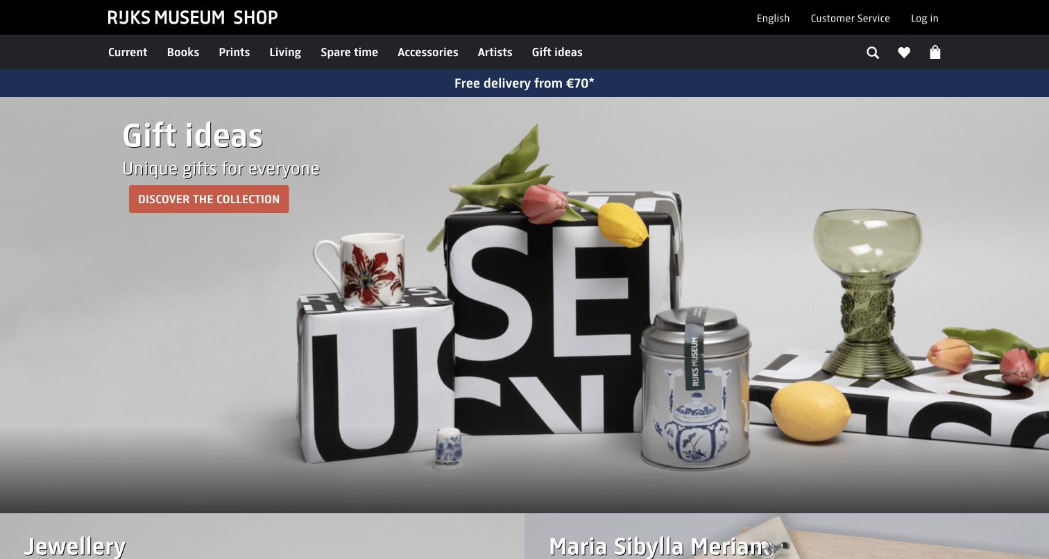
The Rijksmuseum Shop presents a distinct retail experience under a restrained black header. Books, prints, living, accessories and artists form a readable category row, while the hero groups branded gift boxes, decorative objects and flowers against a pale background. A coral call to action stands out without competing with the products. The design borrows the institution’s name and visual confidence, but the implementation evidence concerns this separate shop; it does not establish the technology behind the museum’s collection or ticketing site. The captured page also uses a delivery threshold as a narrow reassurance strip above the campaign.
What you can learn
Keep institutional content and merchandise responsibilities explicit. For a Shopware store attached to a museum, artist and collection relationships can guide discovery, while delivery, returns and checkout belong to a coherent retail journey with their own governance.
Pros
Product groupings make gifts feel connected to the institution.
Retail categories remain visible above the editorial-style image.
Cons & considerations
The large campaign limits immediate comparison between individual products.
Museum information requires a separate destination from the shop.
Visible tech stack
Earlier / documented evidence
Shopware
Platform source: Primary Shopware project or exact-property showcase source. Implementing agency’s primary case identifies the separate public museum shop and links this exact property; no claim for the museum’s main collection website. Documented project association; not current backend proof. Platform evidence is separate from the direct website screenshot and is not a complete current infrastructure audit.
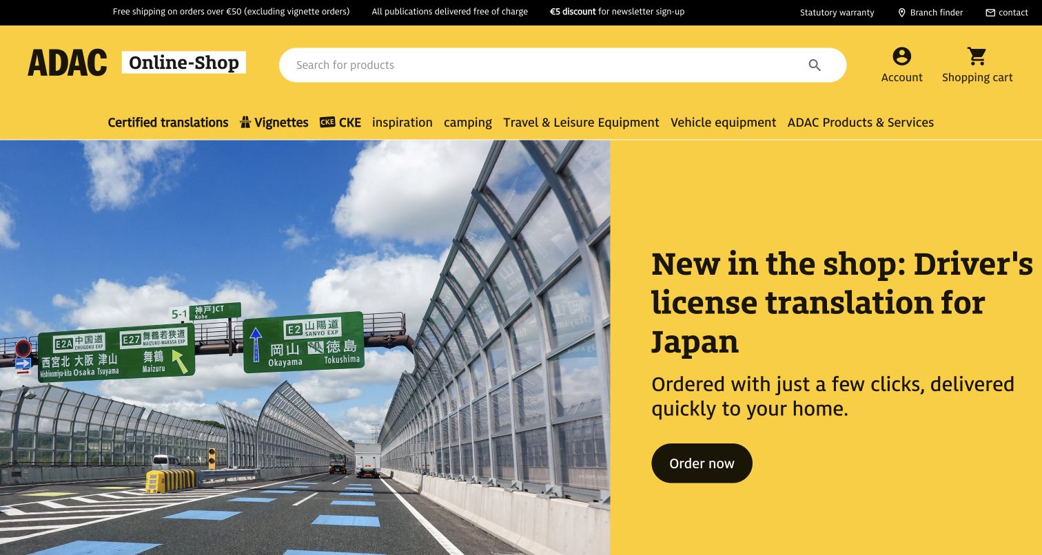
ADAC’s online shop uses the organization’s yellow as a broad structural color rather than a small accent. The logo, long search field and account controls occupy a bright header, with travel equipment, vehicle products and services organized beneath. In the capture, a photograph of Japanese road signs supports a driver-license translation promotion on a yellow panel. That pairing explains the use case before the visitor explores the service. The Shopware case concerns the ADAC Nordrhein-operated shop, not every ADAC website. The page mixes physical merchandise with service categories, making the nature of each offer an important design consideration.
What you can learn
When goods and services share a Shopware catalog, make fulfillment differences visible before checkout. Strong category names can preserve the parent brand’s familiarity while helping visitors distinguish a shipped product from a document or service request.
The campaign photograph explains a specific travel problem.
Cons & considerations
A wide category row requires careful small-screen treatment.
Service requirements need more detail than the opening promotion supplies.
Visible tech stack
Earlier / documented evidence
Shopware
Platform source: Primary Shopware project or exact-property showcase source. Official case links this public ADAC Nordrhein-operated shop and its physical-goods and digital-services migration, not the whole ADAC group’s websites. Documented project association; not current backend proof. Platform evidence is separate from the direct website screenshot and is not a complete current infrastructure audit.
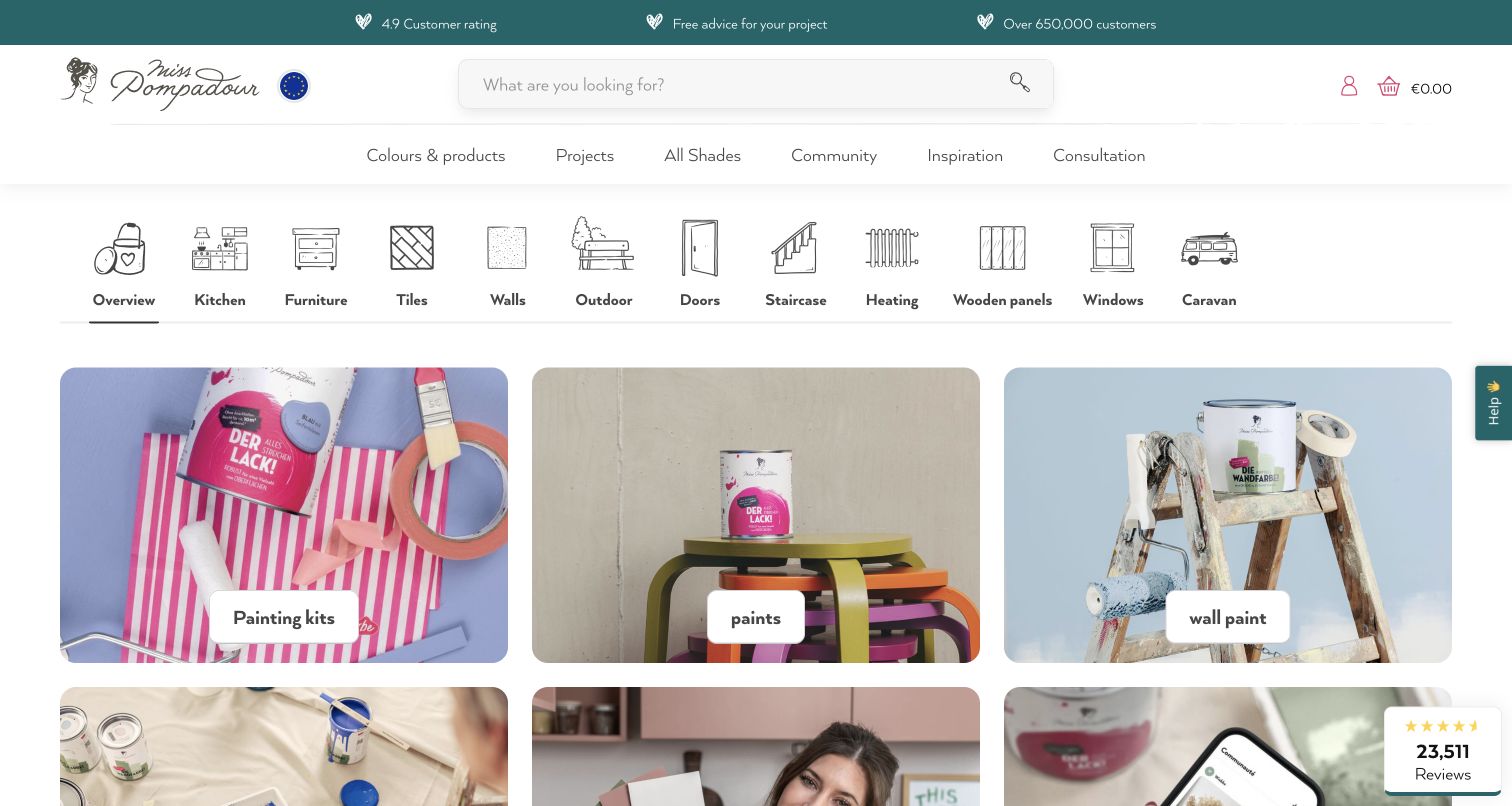
MissPompadour helps visitors begin with the surface they want to change. A row of illustrated icons names kitchens, furniture, tiles, walls, doors and other project types before the first product cards. Below, colorful photographs show paint tins, tools and finished furniture, linking the product to an achievable activity. The white header leaves space for search, while the muted teal reassurance strip introduces advice and customer feedback. The vendor showcase links this store. Ratings and customer counts are the merchant’s displayed claims, not measurements independently validated for this review. The source capture follows a necessary-cookies-only selection.
What you can learn
Model project or substrate information alongside standard product categories in Shopware. Customers choosing paint may know the material and desired finish before they know a product name; those routes should lead to compatible products and preparation advice.
Pros
Illustrated surface choices reduce reliance on technical product names.
Photographs connect tools, colors and finished results.
Cons & considerations
The many project choices can compete for first-time attention.
Displayed ratings do not replace detailed suitability information.
Platform source: Primary Shopware project or exact-property showcase source. Vendor showcase links this store. Documented project association; not current backend proof. Platform evidence is separate from the direct website screenshot and is not a complete current infrastructure audit.
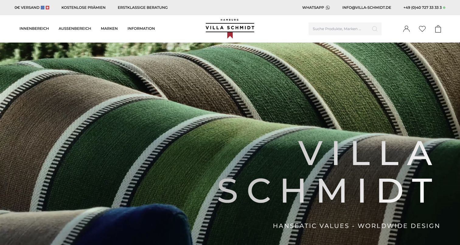
Villa Schmidt gives the opening screen to texture and atmosphere. The captured campaign shows folded upholstery fabric behind oversized, widely spaced branding, while a narrow white navigation bar separates indoor, outdoor and brand browsing. Search, saved items and the basket are deliberately quiet, allowing the material image to dominate. This is useful inspiration for a furniture store where finish and setting matter before technical comparison. The vendor showcase links this store. The source review kept the German storefront and dismissed a regional suggestion, so the capture does not imply the same product range or service conditions in every market.
What you can learn
Treat editorial imagery as an entrance to structured choices rather than a substitute for them. Shopware product models should expose dimensions, materials, variants and delivery constraints consistently once shoppers move from the atmospheric opening into the catalog.
Pros
Material photography communicates texture at a useful scale.
The header preserves a compact route into products and brands.
Cons & considerations
The opening image does not explain product prices or configurations.
Large visual branding delays more practical buying information.
Platform source: Primary Shopware project or exact-property showcase source. Vendor showcase links this store. Documented project association; not current backend proof. Platform evidence is separate from the direct website screenshot and is not a complete current infrastructure audit.
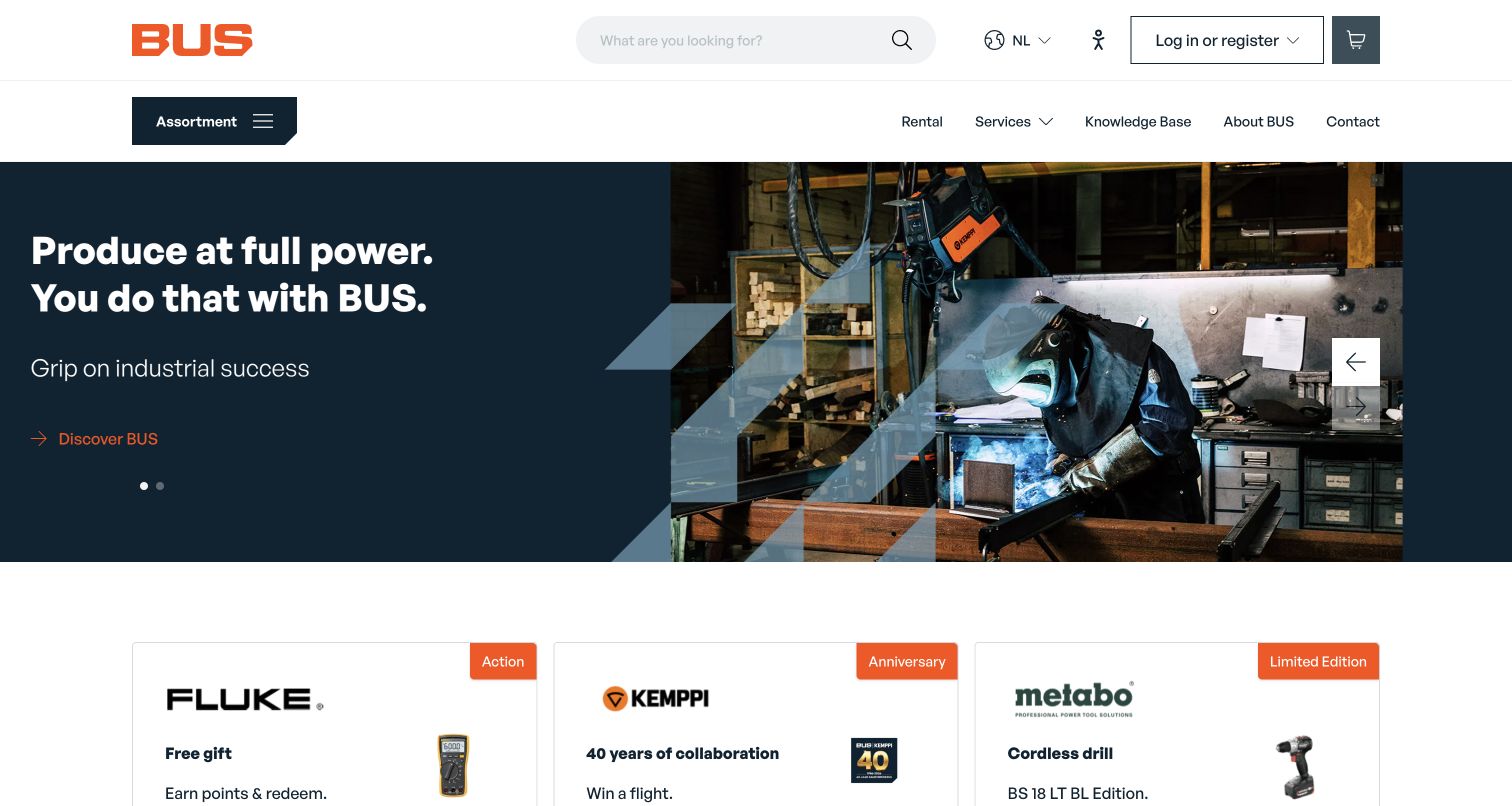
BUS Industrial Tools combines a conventional search-led store header with a more distinctive industrial campaign. Its orange logo and small accents contrast with a dark navy hero showing welding work in progress. The product assortment receives a clear menu trigger, while rental, services and knowledge resources sit alongside it. Below the hero, manufacturer and promotion cards begin a more concrete catalog journey. The vendor showcase links this store. The public page can be studied without logging in; the review does not assume the pricing, permissions or purchasing workflow that an authenticated business account would receive.
What you can learn
A B2B Shopware storefront should separate public product discovery from account-specific commerce. Keep service and expertise routes visible, but document customer pricing, approvals and repeat-order requirements as distinct implementation work rather than assuming consumer checkout covers them.
Pros
Industrial photography makes the customer context tangible.
Search and assortment navigation remain prominent above service content.
Cons & considerations
Promotional cards create several competing next steps.
Public browsing cannot verify business-account purchasing behavior.
Platform source: Primary Shopware project or exact-property showcase source. Vendor showcase links this store. Documented project association; not current backend proof. Platform evidence is separate from the direct website screenshot and is not a complete current infrastructure audit.
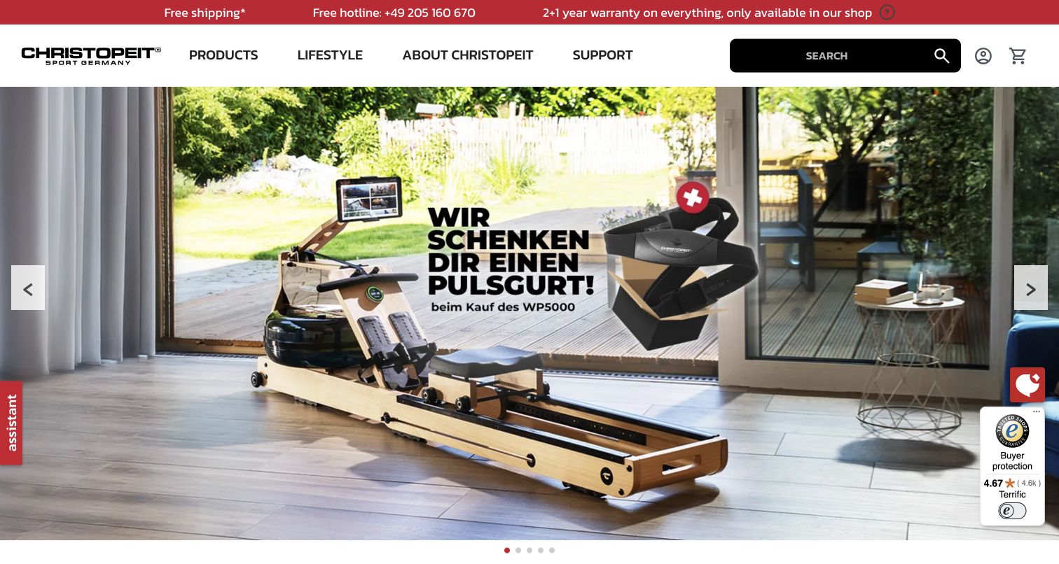
Christopeit Sport opens with a rowing machine placed in a bright living space, giving visitors a sense of scale and intended environment. The black product search stands out against a white header, while products, lifestyle, brand information and support occupy separate navigation routes. A red utility strip summarizes shipping, telephone support and warranty messaging. The vendor showcase links this store. The captured promotion contains lettering embedded in the image, while some surrounding interface text is translated by the browser. Several floating service and review controls remain visible, and their claims are not treated as independent proof of product quality.
What you can learn
Show equipment in context while keeping specifications and support easy to reach. A Shopware product page should make dimensions, assembly needs and service conditions explicit; a lifestyle photograph can orient the buyer but cannot answer those practical questions.
Platform source: Primary Shopware project or exact-property showcase source. Vendor showcase links this store. Documented project association; not current backend proof. Platform evidence is separate from the direct website screenshot and is not a complete current infrastructure audit.
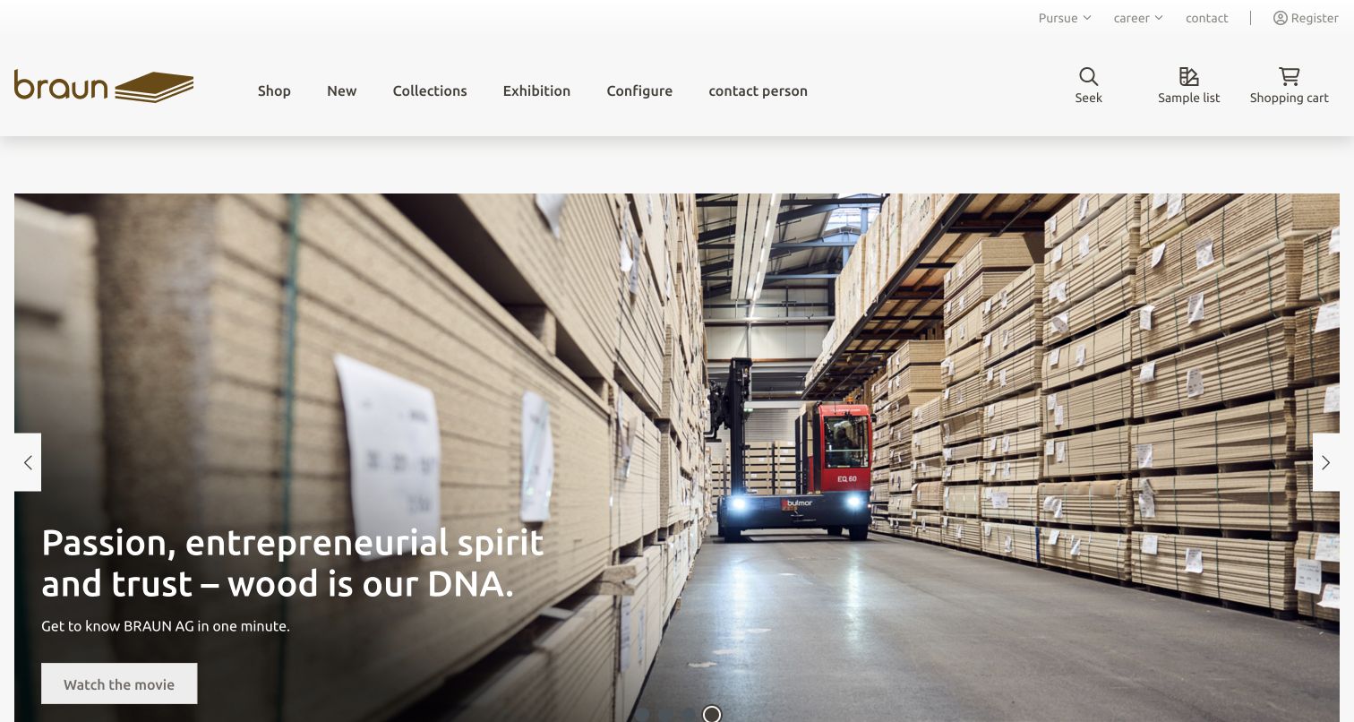
BRAUN AG’s Swiss materials site uses a warehouse photograph to communicate the scale and character of its offering. Stacks of boards and a forklift create a credible working context, while a concise headline connects that scene to the company’s focus on wood. The header gives shop, collections, exhibition, configuration and contact routes similar prominence. A sample-list control is visibly distinct from the basket, suggesting an important intermediate step in a materials purchase without requiring an account interaction. The vendor showcase links this Swiss supplier. It is unrelated to the similarly named appliance brand, and the review does not merge those identities.
What you can learn
For a materials business, sample selection and technical consultation deserve deliberate places in the Shopware journey. Keep those tasks separate from ordering, and structure finish, size and application data so inspirational content can lead to a precise product decision.
Pros
Operational photography gives the brand a concrete setting.
Samples and shopping have distinct visible controls.
Cons & considerations
The campaign leaves detailed product specifications further down the journey.
Specialist terminology may require supporting explanations for new buyers.
Platform source: Primary Shopware project or exact-property showcase source. Vendor showcase links this Swiss materials supplier, unrelated to the appliance brand. Documented project association; not current backend proof. Platform evidence is separate from the direct website screenshot and is not a complete current infrastructure audit.
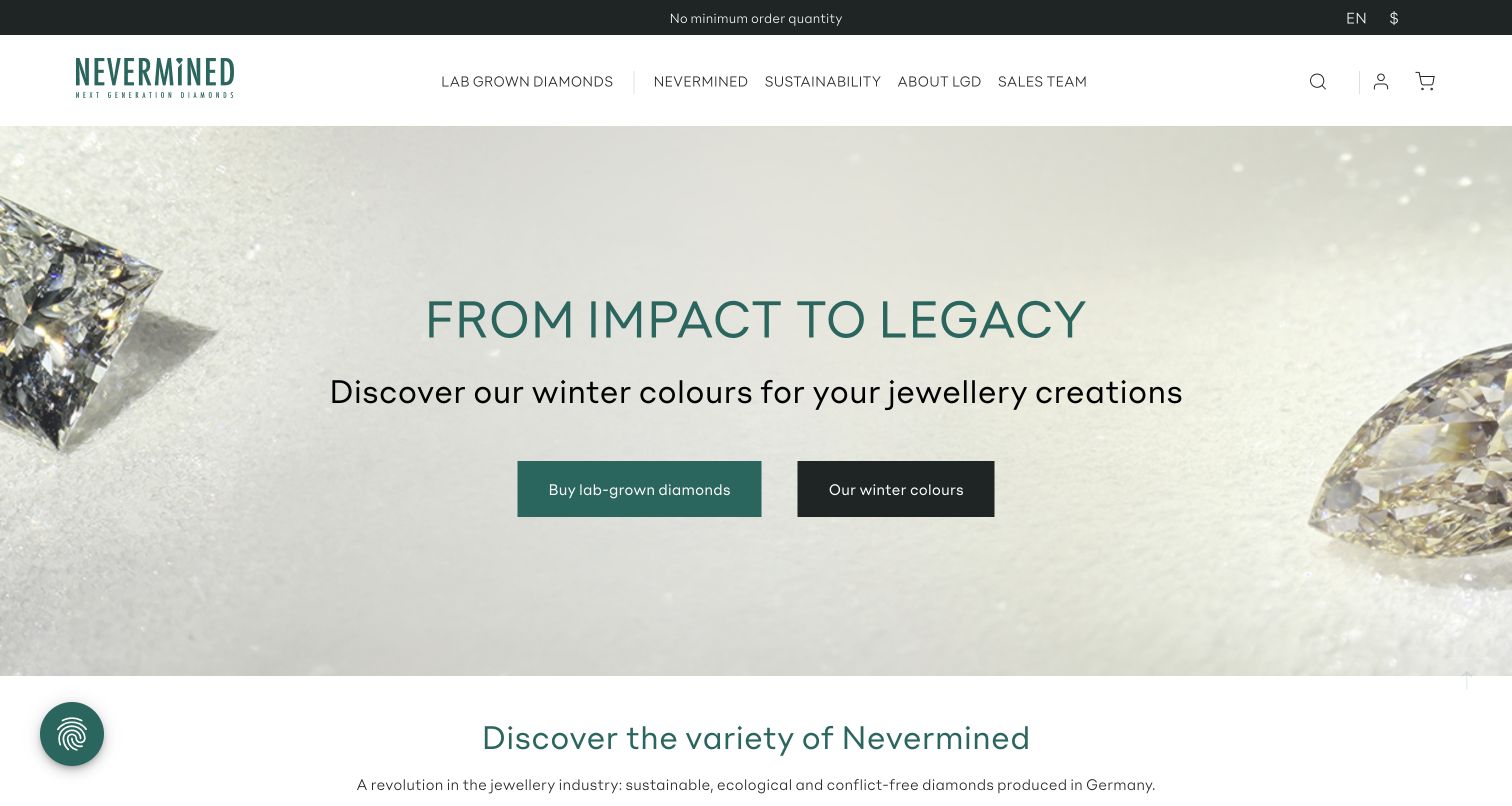
Nevermined’s captured storefront uses pale backgrounds, oversized diamond details and deep green typography to frame a specialist product range. Two contrasting buttons distinguish direct shopping from exploration of a seasonal color collection. The header remains sparse, grouping diamonds, brand information, sustainability content and a sales team route. The vendor showcase links this store. The page selected its US English locale automatically, which is recorded in the capture URL rather than treated as evidence for every regional storefront. Environmental and production statements belong to the merchant and require separate substantiation; the design review evaluates how information is presented, not those claims.
What you can learn
Specialist materials benefit from clear routes for browsing and consultation. In Shopware, keep technical attributes and evidence documents close to product selection, and give brand storytelling a supporting role so buyers can assess suitability without relying on promotional language.
Pros
A limited palette lets the product imagery remain prominent.
Separate calls to action distinguish catalog and collection discovery.
Cons & considerations
The first screen provides little technical comparison information.
Production claims need evidence beyond an attractive presentation.
Platform source: Primary Shopware project or exact-property showcase source. Vendor showcase links this store. Documented project association; not current backend proof. Platform evidence is separate from the direct website screenshot and is not a complete current infrastructure audit.
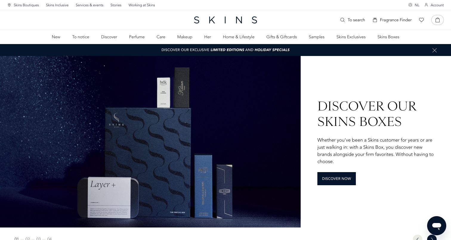
Skins Cosmetics pairs a spacious, letter-spaced wordmark with dense but orderly product navigation. The captured hero places dark gift-box photography on the left and a white explanatory panel on the right, giving the bundle both an object and a rationale. A fragrance-finder route sits near search, offering another way into a catalog where visitors may not know the product name. The vendor showcase links this store. An unsolicited blank side panel appeared during the first visit and was dismissed with its own close control; that initial proof remains private. The final capture reflects the unobstructed public page, with no sampling or shopping action performed.
What you can learn
Curated bundles need enough explanation to feel intentional. A Shopware build can connect editorial collections to structured products while preserving search, brand navigation and guided discovery for visitors who arrive with very different levels of product knowledge.
Pros
Split imagery and copy explain the featured bundle clearly.
Search and fragrance discovery provide complementary catalog routes.
Cons & considerations
A large number of departments increases navigation complexity.
The observed unsolicited side panel interrupted the initial visit.
Platform source: Primary Shopware project or exact-property showcase source. Vendor showcase links this store. Documented project association; not current backend proof. Platform evidence is separate from the direct website screenshot and is not a complete current infrastructure audit.
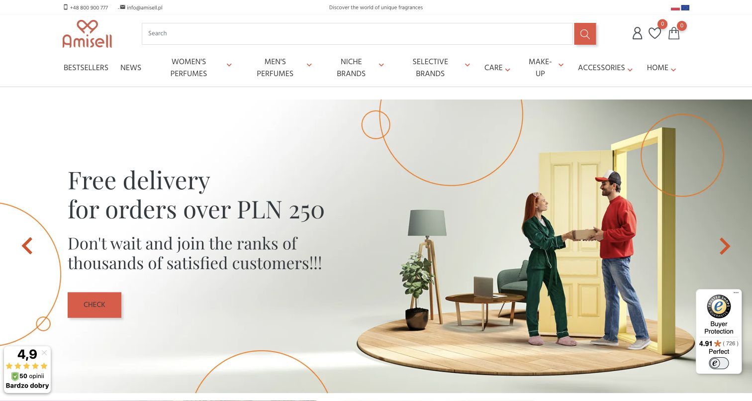
Amisell’s public store uses a warm coral accent across the logo, search button and promotional call to action. A large delivery-themed campaign combines a staged doorway scene with oversized serif text, while the header separates fragrance audiences, niche brands, care and accessories. The implementing agency documents an earlier Shopware 6 project for this exact property. Current public module routes look different and are retained for the broad audit; the earlier case is not presented as proof of the current backend. This example is therefore useful both for its catalog presentation and for showing why a platform guide must distinguish documented history from a fresh technical observation.
What you can learn
Keep migration evidence attached to its original project scope. A Shopware planning review can still learn from the present storefront’s hierarchy, but a new screenshot must never silently turn an earlier implementation case into a current-stack claim.
Pros
Coral accents make search and campaign actions easy to locate.
Product departments offer several recognizable routes into the catalog.
Cons & considerations
A delivery promotion dominates over product comparison in the opening.
The historical platform association needs explicit current-scope qualification.
Platform source: Primary Shopware project or exact-property showcase source. Implementer documents an earlier Shopware 6 store for this exact property. Current capture contains PrestaShop-style module routes; the documented association is historical, not a claim of its current backend. Documented project association; not current backend proof. Platform evidence is separate from the direct website screenshot and is not a complete current infrastructure audit.
J. König’s opening photograph shows stoneworking equipment against the material it cuts, creating an immediate connection between tools and application. The blue wordmark, fine divider and large search field give the header a functional character. Products, themed collections, news and company information are separated into a compact row. The vendor showcase links this store. In the capture, a history-led panel begins below the working photograph, while product details remain further into the journey. The cookie choice took time to settle; the final clear capture was taken only after the public dialog closed, without repeating the save action.
What you can learn
Use application photography to explain specialist tools, then provide a structured route to compatibility and specification details. Shopware categories should reflect both the tool type and the material or job, helping experienced buyers and newcomers reach the same precise information.
Pros
The working image gives the equipment a clear practical context.
Search is visually prominent without crowding the navigation.
Cons & considerations
The opening screen does not yet expose technical specifications.
The observed consent update temporarily delayed an unobstructed view.
Platform source: Primary Shopware project or exact-property showcase source. Vendor showcase links this store. Documented project association; not current backend proof. Platform evidence is separate from the direct website screenshot and is not a complete current infrastructure audit.
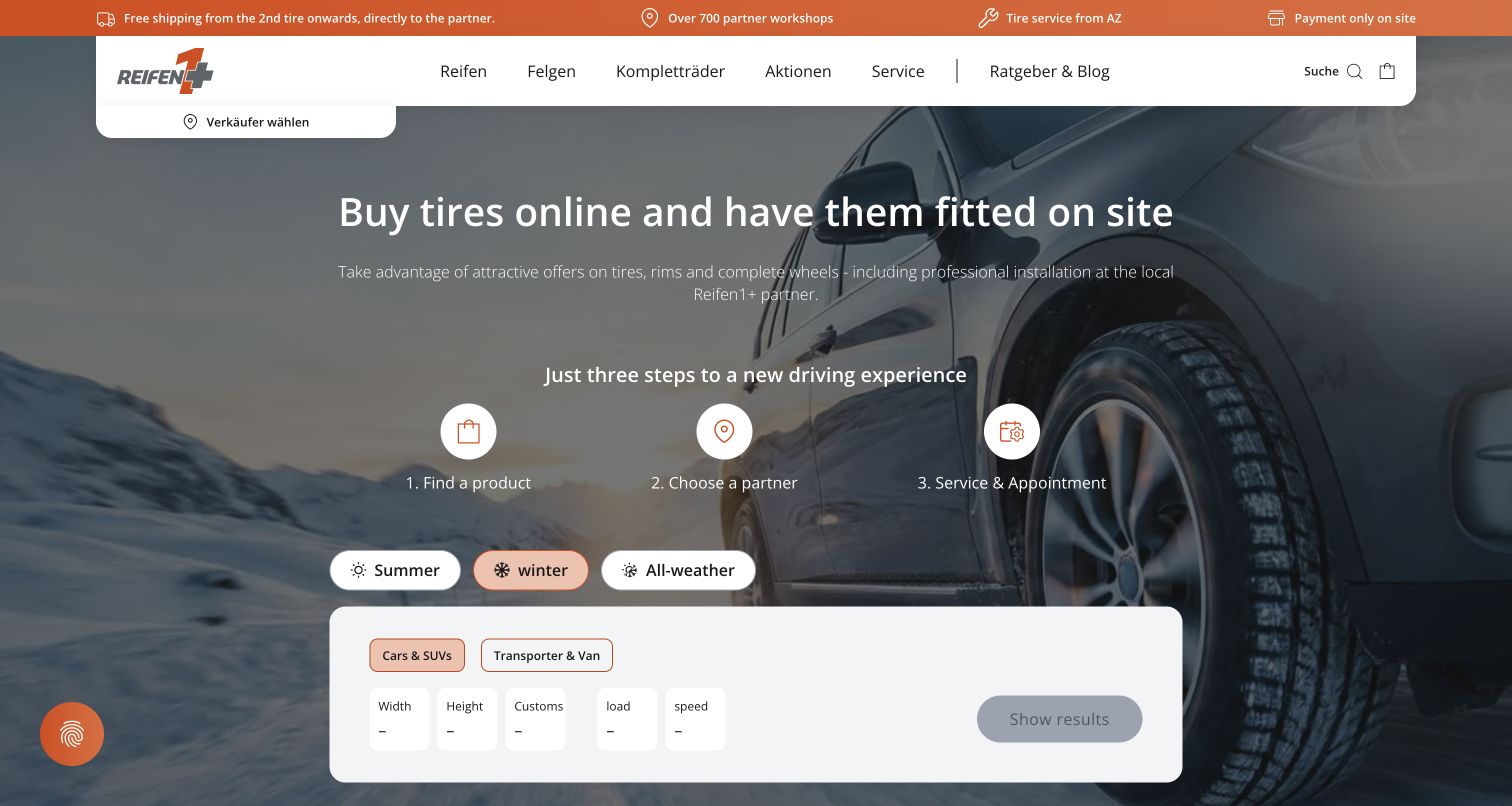
reifen1+ makes the relationship between online products and local service unusually explicit. A tire photograph sits behind a three-step explanation: find a product, choose a partner, then arrange service. Seasonal tire options and a structured dimension selector appear directly below, bringing the practical task into the opening screen. The vendor-hosted implementation reference describes Shopware commerce and workshop services, while Interpneu’s own page identifies the current public domain. The former German domain redirects there. No tire search or booking was submitted, so the review evaluates the visible journey rather than claiming that stock, pricing or appointments were tested.
What you can learn
When fulfillment depends on a local partner, explain that relationship before collecting product choices. A Shopware implementation should model partner availability, delivery and appointment boundaries clearly, with automated tests for handoffs that a static design review cannot establish.
Pros
The three-step explanation makes the fulfillment model understandable.
Dimension inputs bring a technical product task into the hero.
Cons & considerations
Several specifications must be understood before a useful search.
Displayed flow does not verify local stock or booking availability.
Visible tech stack
Earlier / documented evidence
Shopware
Platform source: Primary Shopware project or exact-property showcase source. Vendor-hosted implementing-partner reference documents Reifen1+ commerce and workshop services on Shopware. Interpneu’s own page identifies reifen1plus.com as the public shop; the old .de URL redirects there. Documented project association; not current backend proof. Platform evidence is separate from the direct website screenshot and is not a complete current infrastructure audit.
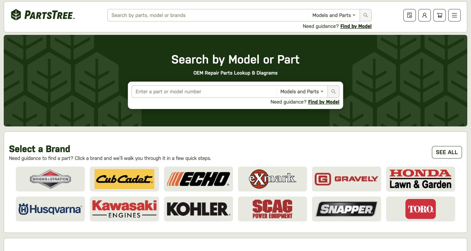
PartsTree places model and part lookup at the center of its homepage. A compact header repeats the search task, while a larger green panel gives the same function more room and explains the role of diagrams. Below, a grid of manufacturer names offers a visual route for visitors who know the machine brand but not the part number. The official Shopware case documents this public replacement-parts storefront and its complex catalog. The design prioritizes identification over lifestyle storytelling, an appropriate choice for a compatibility-driven task. The capture records the entry page only; no order, account or parts-search request was made.
What you can learn
Build the product model around the identifiers customers actually possess. For a Shopware parts catalog, brand, model, diagram and replacement relationships need consistent indexing and error handling; a prominent search field is useful only when those underlying connections are reliable.
Pros
Search purpose is explicit in both header and hero.
Manufacturer tiles provide a second route when identifiers are incomplete.
Cons & considerations
Visitors without a model number may need additional guidance.
Compatibility accuracy cannot be inferred from the entry-page design.
Platform source: Primary Shopware project or exact-property showcase source. Official case describes this public replacement-parts storefront and diagram-based catalog using Shopware 6. Documented project association; not current backend proof. Platform evidence is separate from the direct website screenshot and is not a complete current infrastructure audit.
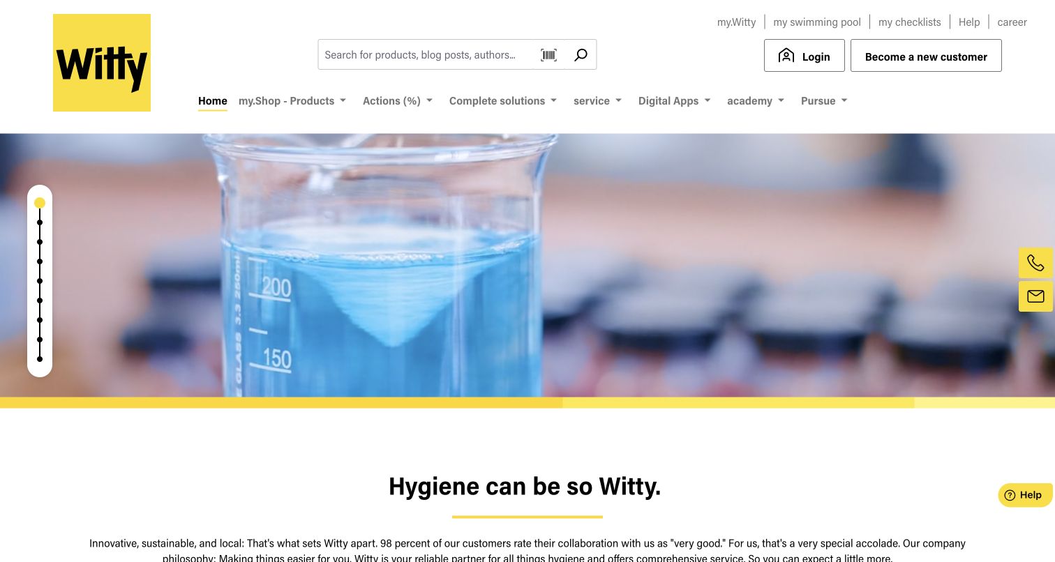
Witty combines a strong yellow identity with a broad business-oriented header. Search covers products and editorial material, while the navigation distinguishes the shop, complete solutions, services, digital applications and an academy. The captured hero shows laboratory glassware, followed by a simple brand statement and introductory copy. Login and new-customer controls are visible but separate, supporting a public first impression without suggesting that account-specific features were inspected. The vendor showcase links this store. The image and organization communicate a technical service context, but customer-satisfaction and environmental statements on the page remain the company’s claims rather than independent findings from this review.
What you can learn
A Shopware storefront serving professional buyers can connect products with training and operational support. Define those content types deliberately, and keep authenticated procurement functions separate from public guidance so the information architecture remains understandable before registration.
Pros
Service and training routes sit naturally beside product discovery.
Yellow accents make the brand coherent across a complex header.
Cons & considerations
The broad navigation creates several competing visitor priorities.
The opening laboratory image gives limited product-level detail.
Visible tech stack
Earlier / documented evidence
Shopware
Platform source: Primary Shopware project or exact-property showcase source. Vendor showcase links this store. Documented project association; not current backend proof. Platform evidence is separate from the direct website screenshot and is not a complete current infrastructure audit.
BIOMARIS divides its opening content between a specific product offer and a broader introduction to the brand’s marine theme. A large search field spans the center of the header, while a blue navigation strip separates products, brand information, locations and customer service. The campaign shows packaging and price information beside a portrait, with a second panel leading to explanatory content. The official case documents the skincare store’s move from Magento to Shopware 6. Health and product-effect statements visible in the promotion are not independently assessed here. The review focuses on how the page separates immediate shopping from further explanation.
What you can learn
Give product promotions and supporting education different visual jobs. In Shopware, connect campaign content to structured product information and evidence-reviewed claims, while keeping ingredients, suitability and service details accessible beyond the first promotional screen.
Pros
The split opening supports both shopping and brand exploration.
A wide search field remains available above the campaign.
Cons & considerations
Several promotional and review elements compete within one screen.
Product-effect claims need substantiation beyond the displayed campaign.
Platform source: Primary Shopware project or exact-property showcase source. Official case documents the public skincare store’s Magento 1 to Shopware 6 migration. Documented project association; not current backend proof. Platform evidence is separate from the direct website screenshot and is not a complete current infrastructure audit.
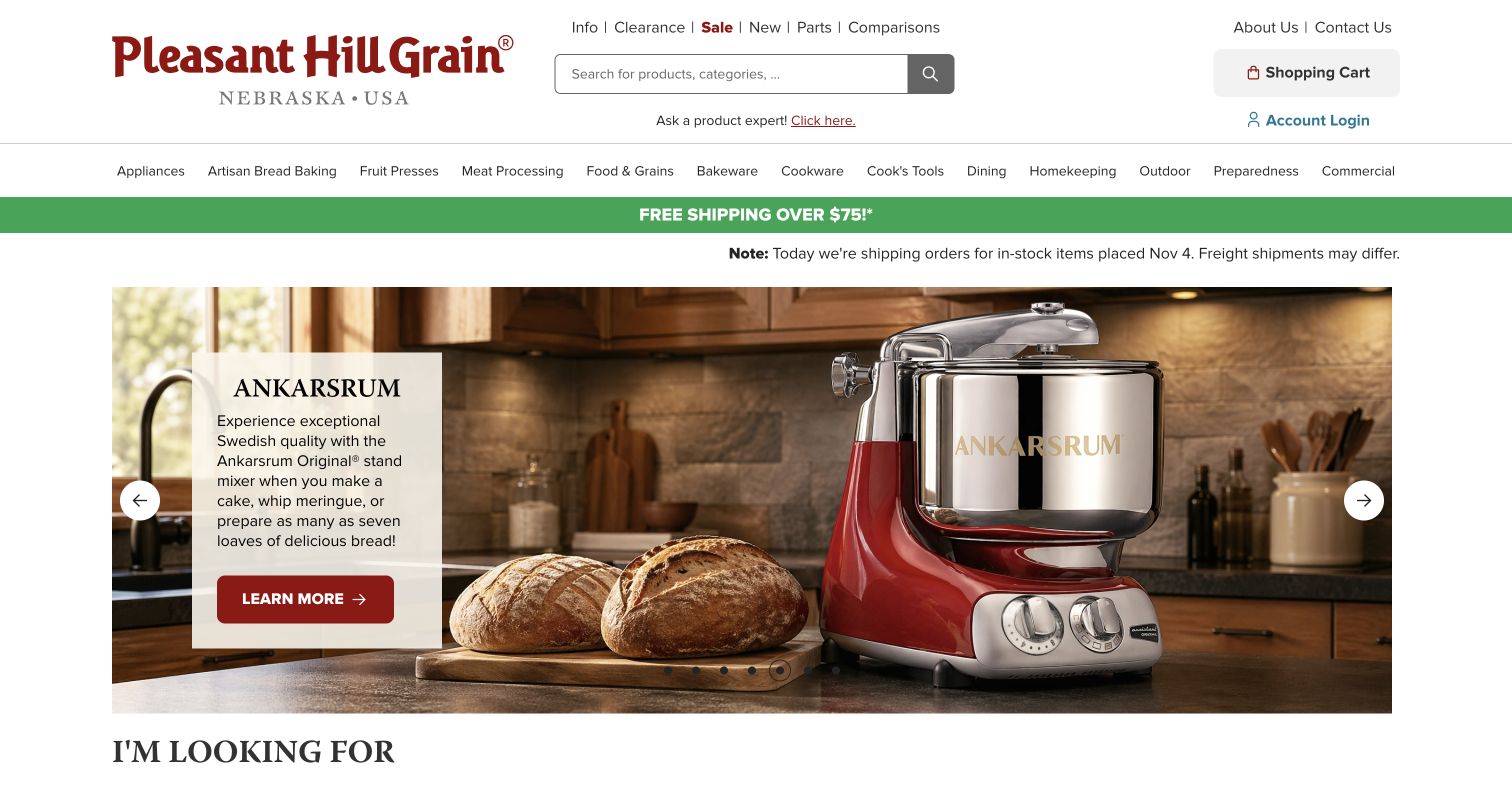
Pleasant Hill Grain uses a traditional retail structure with a strong specialist identity. Its burgundy wordmark and detailed category row sit above a campaign showing a mixer in a working kitchen. A pale text panel names the featured product and provides a clear route to learn more. Shipping and current dispatch information appear before the image, giving practical expectations a place near the top of the page. The official Shopware case links this exact storefront. The design balances product expertise and commercial detail, although the many departments and utility links demand careful hierarchy. No product comparison, purchase or account operation was performed.
What you can learn
For considered equipment purchases, operational information belongs near discovery rather than only at checkout. A Shopware content model should keep dispatch notices, product expertise and category navigation maintainable without burying the primary product-selection task.
Pros
Dispatch information is visible before shoppers enter a product page.
Contextual product photography supports the specialist retail identity.
Cons & considerations
The large category range makes the header information-dense.
A campaign image cannot establish machine specifications or suitability.
Platform source: Primary Shopware project or exact-property showcase source. Official case links this specialty kitchen-equipment storefront and describes its Shopware 6 migration. Documented project association; not current backend proof. Platform evidence is separate from the direct website screenshot and is not a complete current infrastructure audit.
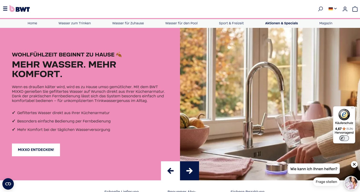
BWT’s German shop uses the brand’s pink to turn a technical water-product offer into a domestic scenario. The captured panel pairs explanatory text and short benefits with a photograph of a tap filling a glass. A compact logo bar sits above application-based navigation for drinking water, home, pool and leisure products. The official case identifies the Best Water Home shop and links this precise route; it does not establish the backend of every corporate BWT page. A floating help invitation remains in the capture without being opened. Product-effect and installation statements require their own review beyond this visual assessment.
What you can learn
Keep a regional commerce route clearly scoped within a larger corporate website. Shopware product structures should support application, compatibility and installation needs, while localized content and service rules make the limits of the particular store explicit.
Pros
Application-based navigation translates technical products into familiar needs.
The split campaign links explanatory text to a household setting.
Cons & considerations
Floating help and review elements reduce space for the campaign.
Installation and compatibility details require deeper product information.
Platform source: Primary Shopware project or exact-property showcase source. Official case links the German Best Water Home shop; no claim about every BWT corporate page. Documented project association; not current backend proof. Platform evidence is separate from the direct website screenshot and is not a complete current infrastructure audit.
Kegan has 15+ years of experience working with small businesses, Fortune 500 companies, and everything in between. No development job is too big or too small: he brings the same hands-on attention to a focused improvement, a complete website, or a custom application.
For Shopware projects, he can help with responsive interfaces, reusable components, custom functionality, API connections, and performance-minded implementation. He works directly with clients on scope, design, implementation, testing, and handover, with an emphasis on clear communication and a system that remains practical to maintain after launch.
Show 3 other Shopware developersHide other Shopware developers
Choose a store structure around the information buyers possess
Lead with application for unfamiliar products
A visitor may know the surface to paint, the room to furnish or the problem to solve without knowing a product name. Application-led navigation can translate that knowledge into a useful starting point. Connect these routes to the same structured product records used by ordinary categories, so inspiration and search do not become inconsistent catalogs.
Lead with identifiers for specialist replacements
Part numbers, model names, materials and dimensions can be more useful than a lifestyle campaign. Keep exact lookup prominent and offer a second route when a visitor has incomplete information. Explain what the results do and do not establish; compatibility-sensitive purchases require accurate relationships and clear exceptions, not merely a convincing search interface.
Make retail feel related to the parent institution
A cruise company, museum or membership organization can run a distinct public shop without copying the structure of its main website. Carry over recognizable identity while giving merchandise, delivery and customer service their own coherent organization. Keep the shop’s technical evidence and responsibilities separate from collection archives, ticketing or other institutional services.
From references to requirements
Plan operational behavior alongside the visible store
Make business rules understandable and testable
Shopware’s Rule Builder combines conditions and supports assignments such as shipping, payment availability and promotions. Give rules descriptive names, record their intended interactions and test boundary cases. The customer-facing interface should explain why an option is available or unavailable instead of exposing an unexplained change in the final step.
Treat automated actions as part of the service design
Flow Builder connects events, rules and actions, including communications and order-status changes. Before enabling an automation, define its trigger, owner and expected outcome, then test it without real customer or payment writes. Helpful storefront messages depend on the surrounding operational behavior being coherent, especially when a purchase involves several teams or a local service partner.
Keep content ownership and release checks explicit
Assign responsibility for catalog accuracy, campaign copy, imagery, claims and regional conditions. Keep source evidence and capture dates distinct from editorial updates. A practical release sequence is creation, automated checks, build and deployment, then live verification; source research remains necessary even when a separate pre-deployment screen review is not required.
A useful handover demonstration
Ask the actual team to carry out its routine job: publish a realistic update, correct a mistake, preview a narrow screen, and identify who owns an integration failure. For a library or frontend framework, also ask who maintains the content source and deployment. A polished screenshot does not answer those operational questions.
Beyond the screenshot
A practical Shopware storefront checklist
Name the exact public shop, market, audiences and priority buying tasks.
Preserve search and category routes when seasonal campaigns change.
Model product attributes, variants, applications and compatibility before expanding page layouts.
Provide useful routes for shoppers with incomplete product information.
Keep regional availability, delivery and service conditions visible where decisions depend on them.
Distinguish product purchases, local appointments, samples and requests for advice.
Define reusable content layouts with clear editorial ownership.
Document rule conditions, priorities and meaningful boundary cases.
Test automated triggers and communications without real customer transactions.
Keep documentary platform evidence, current observations and capture dates separate.
Run automated preservation and link checks, deploy the checked build, then verify the live pages.
Test with real content, a keyboard, a small screen, slow or failed requests, and the people who will maintain the system. These are planning checks, not an accessibility, security, performance, or search-ranking certification.
Sources & editorial method
How this Shopware collection was reviewed
Twenty distinct public properties were selected from primary vendor or implementing-agency evidence. The opening five organizations have separate identity sources. All twenty final screenshots are direct browser captures from November 10, 2026 UTC and Pacific, with original bytes, URLs, dimensions and attribution retained; the batch remains the original November 9 evening slot. Browser automatic translation already present in the environment was left unchanged, and several captures therefore mix translated interface text with original artwork. Each image was inspected for an original collection-specific review. Earlier cookie or unsolicited-panel views remain private supporting proof. Four initial candidates were excluded because of a TLS failure, a distinct-property redirect, a regional gateway or a closing notice. Every selected page received a bounded broad audit attempt; no access or robots restriction was bypassed. No purchase, booking, account, review, form or newsletter submission was made. Product claims, ratings, health statements and promotional offers were not independently verified or endorsed.
Every image is an unmodified capture from the actual website, with its source and capture date. Some captures are reused from our shared catalog; their dates remain the original capture dates. None comes from a vendor gallery or a generated reconstruction. Moving imagery and live content can change.
Technology attribution uses public page assets or metadata, official platform documentation, or a cited first-party project case study. Documentary and framework-relationship evidence is identified where used; it is not a complete current backend inventory. A CMS image CDN alone does not establish a full CMS deployment. A library’s presence does not prove which individual controls use it, and a platform label does not establish AI authorship.
The composition notes, lessons, pros and tradeoffs are original editorial observations. We have not measured conversion, traffic, security, performance or accessibility conformance. Website owners retain their brands and imagery; these examples are not our client portfolio. Written, Edited and Curated are independent records, not dates advanced by a build. See our editorial standards or suggest a correction.
Questions worth asking
Shopware website development FAQs
Does a Shopware showcase prove the current backend?
It establishes the vendor’s documented association with the named property. A public screenshot cannot prove a hidden backend, and a limited source audit may reveal only supporting technologies. This guide keeps documentary projects, historical associations and current observations separate.
Why include Amisell as a historical example?
The implementing agency explicitly documents a Shopware 6 project for Amisell. The current capture and public module paths are recorded separately, without claiming Shopware is still the live backend. The design observations apply to the pictured public storefront, while the platform association remains historical.
What are Shopware Shopping Experiences?
They are centrally managed content layouts organized into sections, blocks and elements. The documentation covers several page types, including landing and category pages. A project still needs a clear product model and editorial structure so reusable layouts help visitors make informed choices.
What should a team plan before using Rule Builder?
Define the condition being evaluated, how it combines with other conditions and where the resulting rule applies. Give the rule a useful name and test boundary cases. Shipping, payment and promotional changes should also be understandable to the shopper affected by them.
How should Flow Builder fit into a storefront project?
Treat its event-driven actions as part of the operational service. Decide which event triggers a flow, which conditions matter, who owns it and how the outcome is checked. Test communications and order-related behavior without creating real customer transactions during quality assurance.
Why are some technology audits unavailable?
The scanner respects robots rules, access denials, rate limits and bounded response sizes. An unavailable result is retained rather than bypassed or interpreted as an empty stack. Genuine screenshots and primary project evidence remain separately documented.
Are the stores ranked by sales or service quality?
No. The order is editorial and begins with five recognizable organizations whose identities are sourced separately. Reviews discuss visible information structure and design decisions, without measuring revenue, certifying accessibility, endorsing products or awarding a badge.
Borrow the structure that helps people understand the assortment and choose confidently. Strong imagery, clear product relationships and dependable operational behavior should reinforce one another; the platform name alone does not guarantee that result.