Best Khoros Websites of 2026 (20 Real-World Examples)
Khoros communities that organize enterprise product knowledge
These 20 examples examine product support navigation, knowledge articles, discussions, events, and the way large organizations orient community visitors.
Khoros currently distinguishes Aurora from its Classic community lineage. The examples retain their observed platform-specific evidence rather than treating every Lithium resource as proof of a migration.
Microsoft, HP, Autodesk, Cisco, and Electronic Arts lead the collection. The association applies to the named community property, not every product or website operated by those organizations.
Before the examples
What makes good Khoros website development in 2026?
Make product selection understandable
Large ecosystems need a clear product or audience route before a generic community feed. Use familiar labels and explain renamed products.
An approved article, staff announcement, and member reply carry different context. Make their source and status understandable without relying on tiny badges.
Keep enterprise navigation focused
Corporate menus, support portals, and account links should help visitors reach the correct destination rather than duplicate every part of the parent site.
The collection · 20 examples
20 Khoros website examples worth studying
Aurora and Classic-style properties are described from current public resource and markup evidence, with no claim about hidden enterprise systems.
We start with five recognizable brands or organizations: Microsoft Tech Community, HP Support Community, Autodesk Forums, Cisco Community, EA Forums. Each attribution applies to the named website property, not every product or website belonging to its organization. This is a curated reading sequence, not a measured ranking.
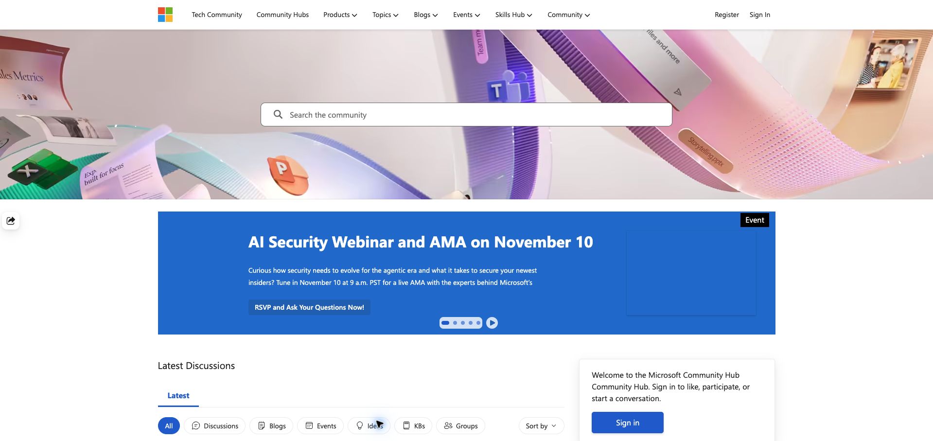
Microsoft Tech Community places a broad search field across a colorful product illustration, then uses an editorial carousel to promote events and announcements. Below it, the latest discussions area offers separate chips for discussions, blogs, events, ideas, knowledge articles and groups. This is a useful way to expose different kinds of community material without requiring visitors to understand the full site hierarchy first. The familiar Microsoft identity and compact product navigation connect the community to the wider ecosystem. However, the large illustration and promotional panel occupy most of the first screen. Small carousel dots also reveal little about the other featured items until someone explores them. This review concerns the community hub, whose current page carries Khoros Aurora assets.
What you can learn
Give a mixed community feed explicit content-type controls. Visitors should be able to distinguish a question, an official announcement and a scheduled event before opening each item, while retaining a shared search across the collection.
Pros
Content-type chips make a mixed feed easier to understand.
Consistent Microsoft branding provides immediate orientation.
Cons & considerations
Promotional content delays the first discussion rows.
Carousel dots offer little preview of hidden features.
Platform source: Public page platform evidence. The public page loads Khoros Aurora resources from Lithium infrastructure. This identifies the community property, not the organization’s other products or private systems. Platform evidence is separate from the direct website screenshot and is not a complete current infrastructure audit.
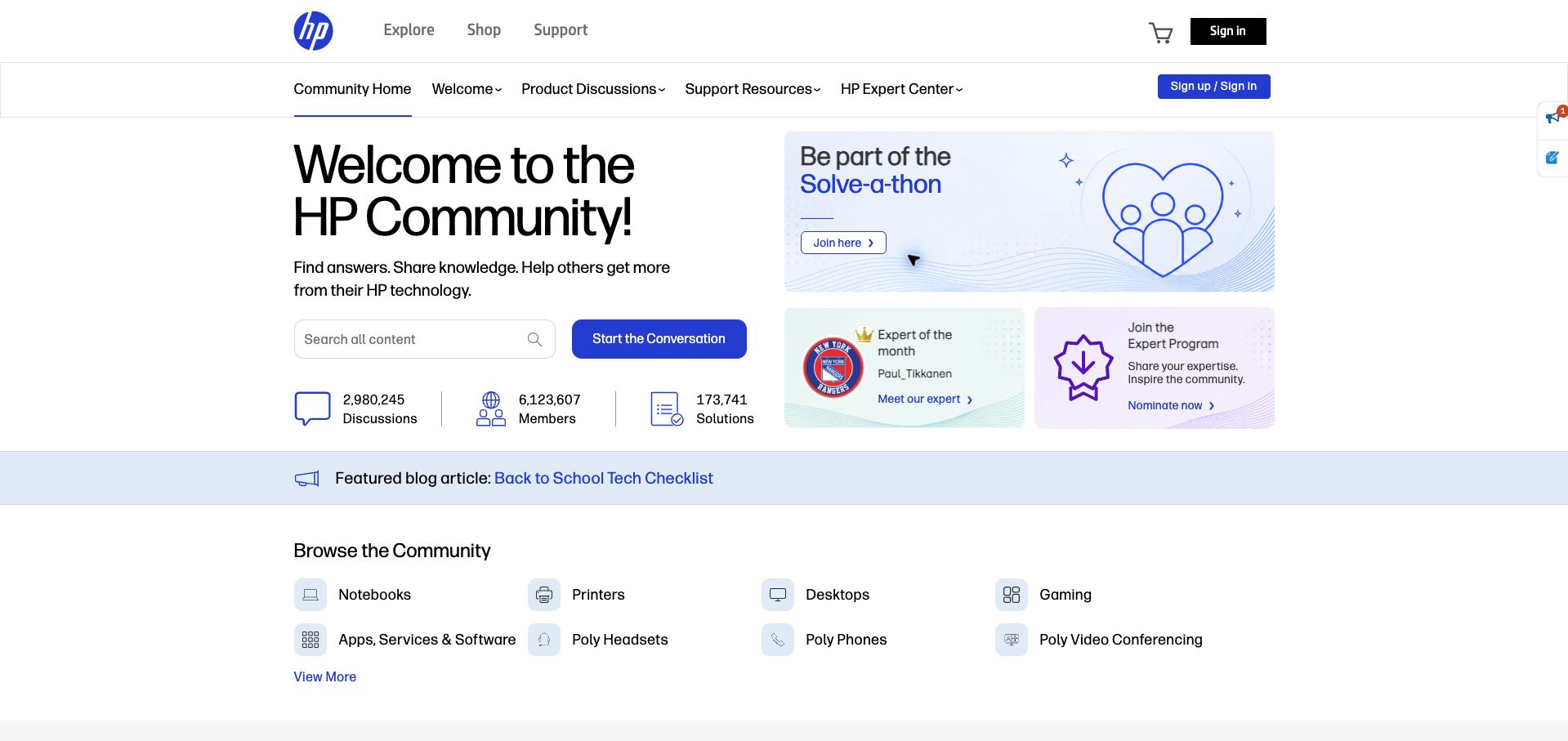
HP's community gives search and Start a Conversation a clear home on the left of its opening panel. Contributor programs and featured community promotions occupy a separate blue and violet area on the right. Below, product icons route visitors toward notebooks, printers, desktops, gaming and Poly equipment, followed by discussions and accepted solutions. That progression supports both a customer with a specific device problem and someone returning to participate. The page also shows community totals, but these communicate scale rather than whether an individual question will receive a timely answer. Multiple header rows and promotional cards compete for attention before the product directory becomes visible. The strongest design move is the separation between practical support navigation and community recognition.
What you can learn
Treat help seekers and regular contributors as related audiences with different immediate needs. Give search and product selection a stable position, then place recognition programs nearby without letting them interrupt the route to an answer.
Pros
Product icons provide concrete support destinations.
Contributor promotions have a distinct visual area.
Cons & considerations
Several navigation rows add visual complexity.
Large community totals do not explain response expectations.
Visible tech stack
Earlier / documented evidence
Khoros
Platform source: Public page platform evidence. The public community exposes Lithium/Khoros resource paths and lia platform classes. This identifies the community property, not the organization’s other products or private systems. Platform evidence is separate from the direct website screenshot and is not a complete current infrastructure audit.
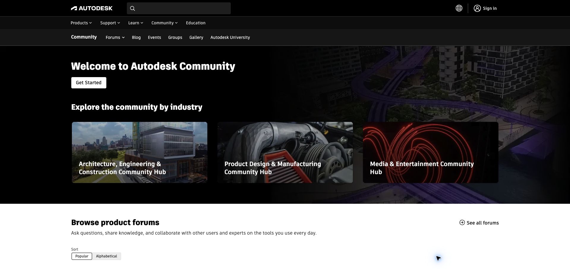
Autodesk introduces its forums with three industry cards: architecture, engineering and construction; product design and manufacturing; and media and entertainment. A more detailed product directory follows, grouping familiar applications such as AutoCAD, Revit, Fusion and Maya beneath those headings. The arrangement supports visitors who identify with a discipline as well as those who already know the exact software involved. Dark corporate navigation reinforces the connection to Autodesk, while the white directory area gives the many product links room to breathe. The cost is much navigation and hero space before the detailed choices. Small controls for popular and alphabetical ordering are also less prominent than the industry imagery. Current forum assets establish the Khoros association for this property.
What you can learn
When a product portfolio is large, provide two compatible entry paths: the visitor's field of work and the product name. Keep the detailed directory easy to reach so experienced users do not have to repeat a broad discovery journey.
Pros
Industry cards support visitors who lack an exact product name.
Grouped product links offer a more precise second route.
Cons & considerations
Several header tiers precede the actual directory.
Sorting controls receive little visual emphasis.
Visible tech stack
Earlier / documented evidence
Khoros
Platform source: Public page platform evidence. The public community exposes Lithium/Khoros resource paths and lia platform classes. This identifies the community property, not the organization’s other products or private systems. Platform evidence is separate from the direct website screenshot and is not a complete current infrastructure audit.
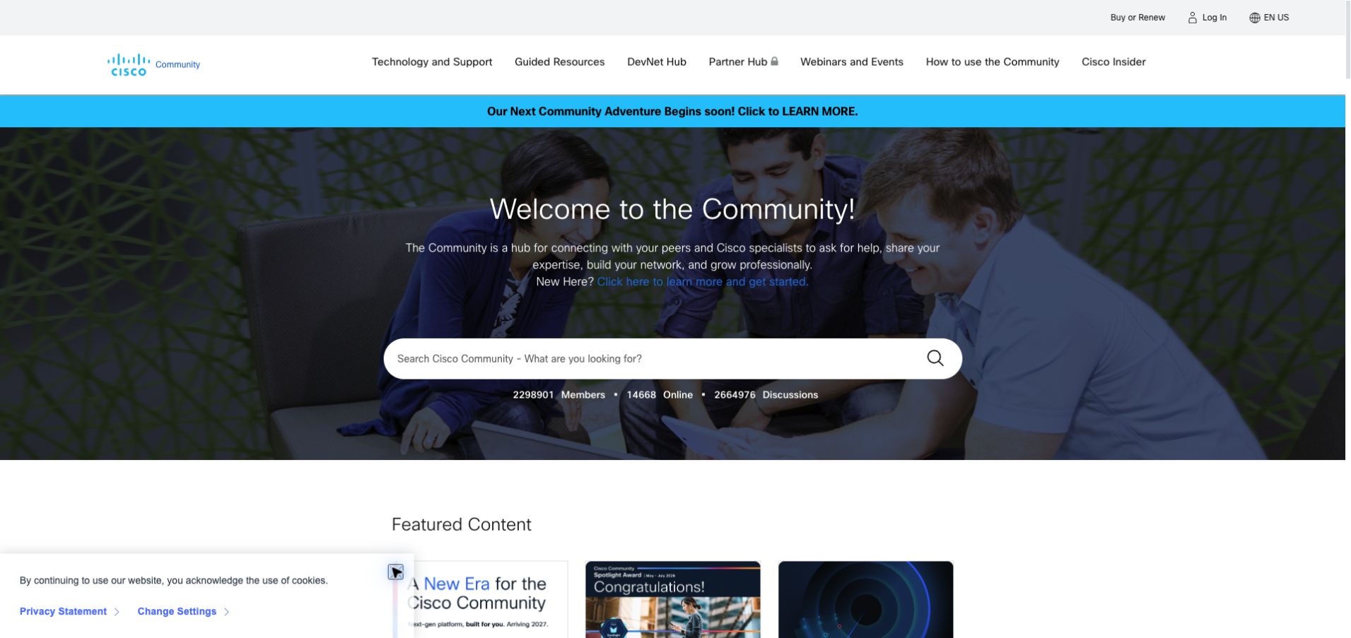
Cisco's community uses a wide photographic welcome panel with a large central search field. Its navigation distinguishes technical support, guided resources, the developer hub, partner material and events, while a newcomer link explains how to begin. Featured content and contributor recognition then broaden the page beyond troubleshooting. The design presents participation as an ongoing professional activity rather than a single support transaction. A visible announcement says a new community experience is coming, so the current design should be understood as a dated observation. The large hero and multiple navigation choices make the opening slower to scan than a compact product directory. Member and discussion totals add context but cannot establish the quality of an individual answer. Current Lithium scripts confirm the platform inspected here.
What you can learn
A professional community can support learning and recognition alongside practical help, provided the search remains obvious. Separate audience-specific destinations with clear labels and keep future-platform announcements distinct from the current support experience.
Pros
A prominent search field anchors the broad offering.
Newcomer guidance gives first-time visitors a starting point.
Cons & considerations
The large welcome panel postpones topical content.
Many equally weighted destinations require careful scanning.
Visible tech stack
Earlier / documented evidence
Khoros
Platform source: Public page platform evidence. The public community exposes Lithium/Khoros resource paths and lia platform classes. This identifies the community property, not the organization’s other products or private systems. Platform evidence is separate from the direct website screenshot and is not a complete current infrastructure audit.
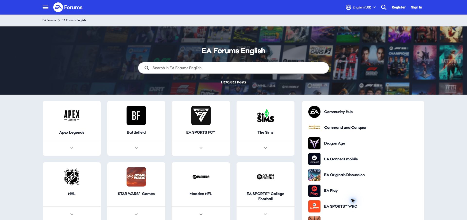
EA's English forum landing page makes game selection the main task. Large white cards display the identities of Apex Legends, Battlefield, EA SPORTS FC and The Sims, while a neighboring list accommodates additional franchises and general community areas. A search field spans the dark game-art hero, and language selection remains visible in the blue header. The mixture of large cards and a compact secondary list gives prominent games more space without hiding the rest of the catalog. It also introduces two interaction patterns: some destinations appear as expandable cards, others as ordinary links. New community content sits below this substantial directory, so visitors seeking the latest conversation must scroll. The inspected page uses the distinctive Khoros Aurora component structure.
What you can learn
Use recognizable product artwork to shorten the path into a large entertainment community, but make the destination behavior consistent. A visitor should know whether a card opens a forum or first reveals another set of choices.
Pros
Game logos make familiar destinations quick to recognize.
Language and search controls remain easy to locate.
Cons & considerations
Cards and side links use different interaction patterns.
The large directory pushes recent discussions below the opening view.
Visible tech stack
Earlier / documented evidence
Khoros
Platform source: Public page platform evidence. The public community exposes Lithium/Khoros resource paths and lia platform classes. This identifies the community property, not the organization’s other products or private systems. Platform evidence is separate from the direct website screenshot and is not a complete current infrastructure audit.
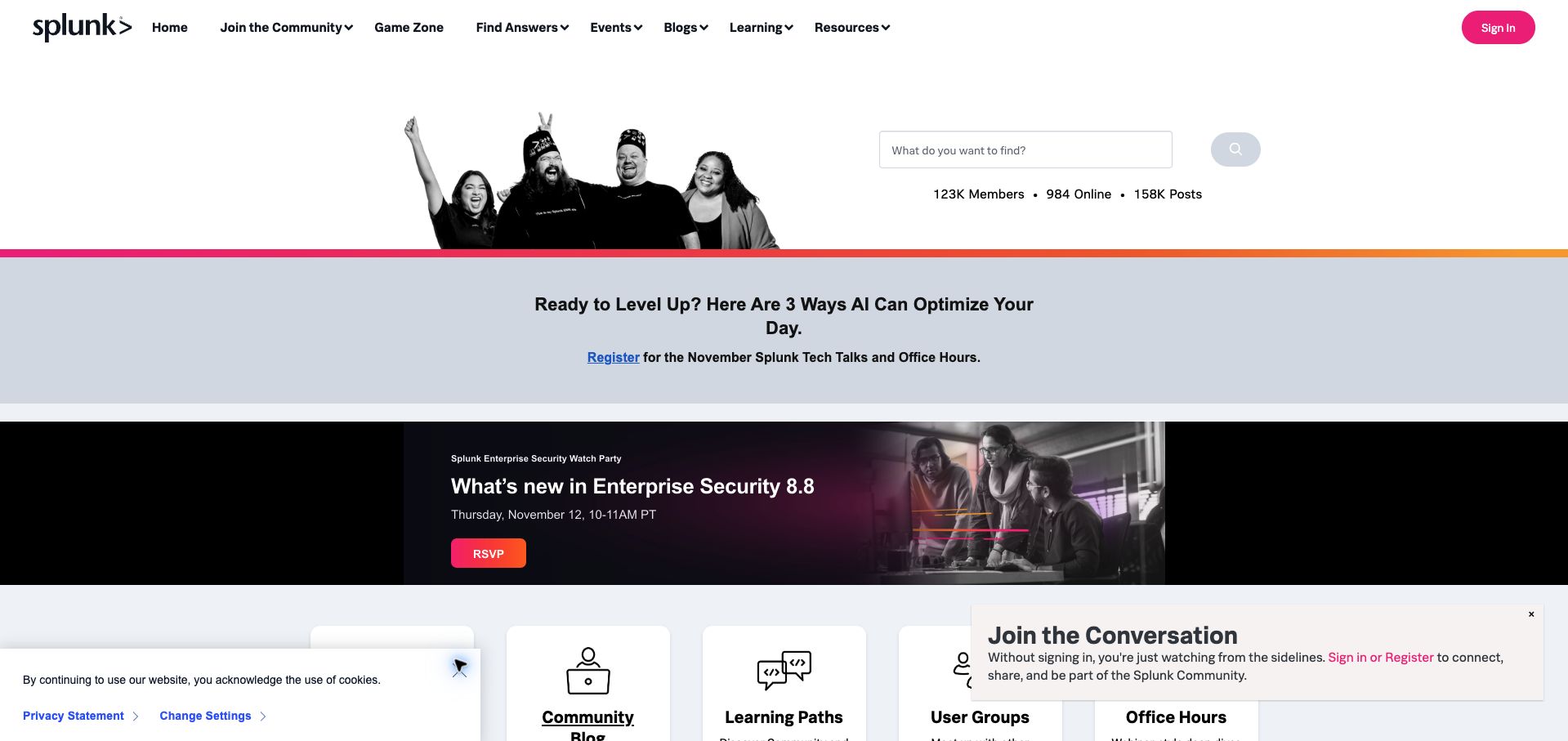
Splunk pairs a photograph of community members with a search field and simple membership statistics. Beneath that opening, event promotions lead into a row of resources covering getting started, the community blog, learning paths, user groups and office hours. The activity area offers useful distinctions between solved, unsolved and unanswered material, giving regular contributors a way to find work that still needs attention. Pink and orange accents connect the forum to Splunk's wider brand without changing the basic support vocabulary. The opening is less efficient when several notices appear together: the page included a cookie notice and sign-in invitation. Two large event promotions also consume space before the resource cards and activity feed. The platform evidence applies to this community property.
What you can learn
Connect questions to a broader learning system using clearly named resources. Separate unresolved work from the general feed so experienced members can contribute, and limit simultaneous prompts that compete with the first useful action.
Pros
Solved and unanswered views support different visitor tasks.
Learning paths and office hours extend help beyond forum replies.
Cons & considerations
Multiple prompts compete near the bottom of the viewport.
Event promotions delay the main activity feed.
Visible tech stack
Earlier / documented evidence
Khoros
Platform source: Public page platform evidence. The public community exposes Lithium/Khoros resource paths and lia platform classes. This identifies the community property, not the organization’s other products or private systems. Platform evidence is separate from the direct website screenshot and is not a complete current infrastructure audit.
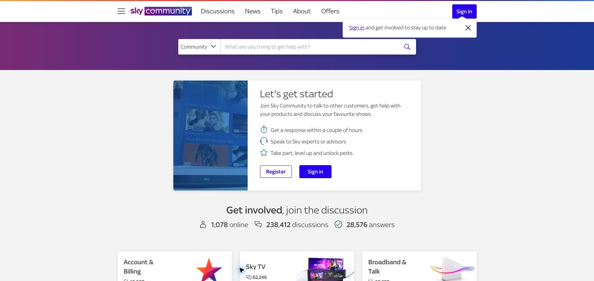
Sky introduces its community with a compact explanation of what joining offers, using simple icons for responses, expert help and participation perks. A search bar sits in a branded gradient strip above this invitation, while product and account categories appear below the community statistics. The approach makes the social support model explicit before asking visitors to choose between television, broadband, mobile or billing topics. It is especially useful when customers might confuse a community with private account support. The tradeoff is that the registration invitation occupies most of the first screen even for someone who only wants to read. A separate sign-in reminder repeats that emphasis. The page's response-time wording is Sky's stated expectation, not a performance result established by this review.
What you can learn
Explain what a support community can do in plain language, then give readers a direct route to relevant topics. Keep participation benefits brief enough that browsing existing answers remains an equally clear option.
Pros
The opening explains the purpose of community participation.
Service categories use familiar customer-facing labels.
Cons & considerations
Registration messaging dominates the initial viewport.
A second sign-in reminder repeats the same request.
Visible tech stack
Earlier / documented evidence
Khoros
Platform source: Public page platform evidence. The public community exposes Lithium/Khoros resource paths and lia platform classes. This identifies the community property, not the organization’s other products or private systems. Platform evidence is separate from the direct website screenshot and is not a complete current infrastructure audit.
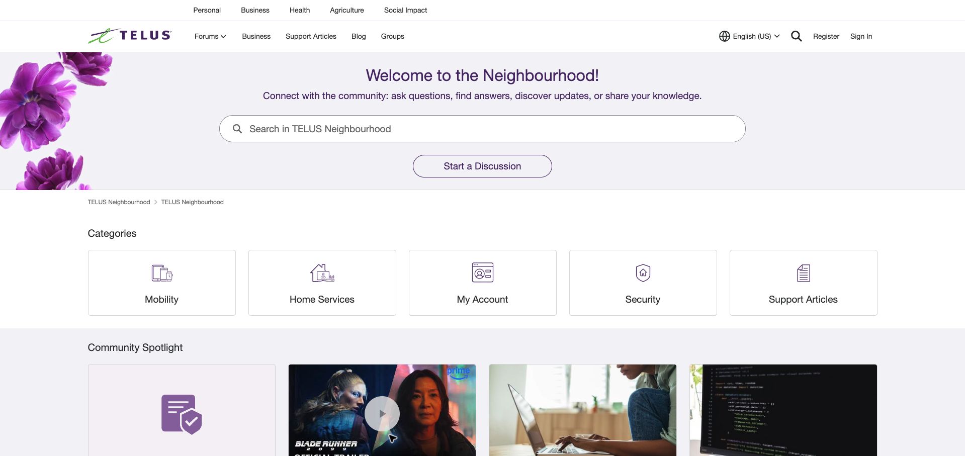
TELUS Neighbourhood uses pale purple, floral imagery and a generous search field to create a calm entry into customer discussions. Five category cards cover mobility, home services, accounts, security and support articles. Their simple line icons and short labels keep the first decision manageable. Community spotlight cards follow with practical topics such as device troubleshooting and recognizing scams, adding an editorial layer without replacing the product routes. A Start a Discussion button sits beneath search, making participation visible but separate from browsing. The broad category names still require another decision before a visitor reaches a specific issue. Corporate navigation above the community header also adds a second layer of destinations. Aurora customization assets directly identify the inspected community implementation.
What you can learn
A support homepage can feel approachable without becoming vague. Use a short set of concrete service categories beneath search, and reserve a separate editorial area for timely guidance that benefits many visitors at once.
Pros
Five clear category cards keep the first choice manageable.
The restrained visual style reduces competition with search.
Cons & considerations
Broad categories require another step to reach a specific issue.
Corporate and community navigation share the same opening space.
Visible tech stack
Earlier / documented evidence
Khoros
Platform source: Public page platform evidence. The public page loads Khoros Aurora resources from Lithium infrastructure. This identifies the community property, not the organization’s other products or private systems. Platform evidence is separate from the direct website screenshot and is not a complete current infrastructure audit.
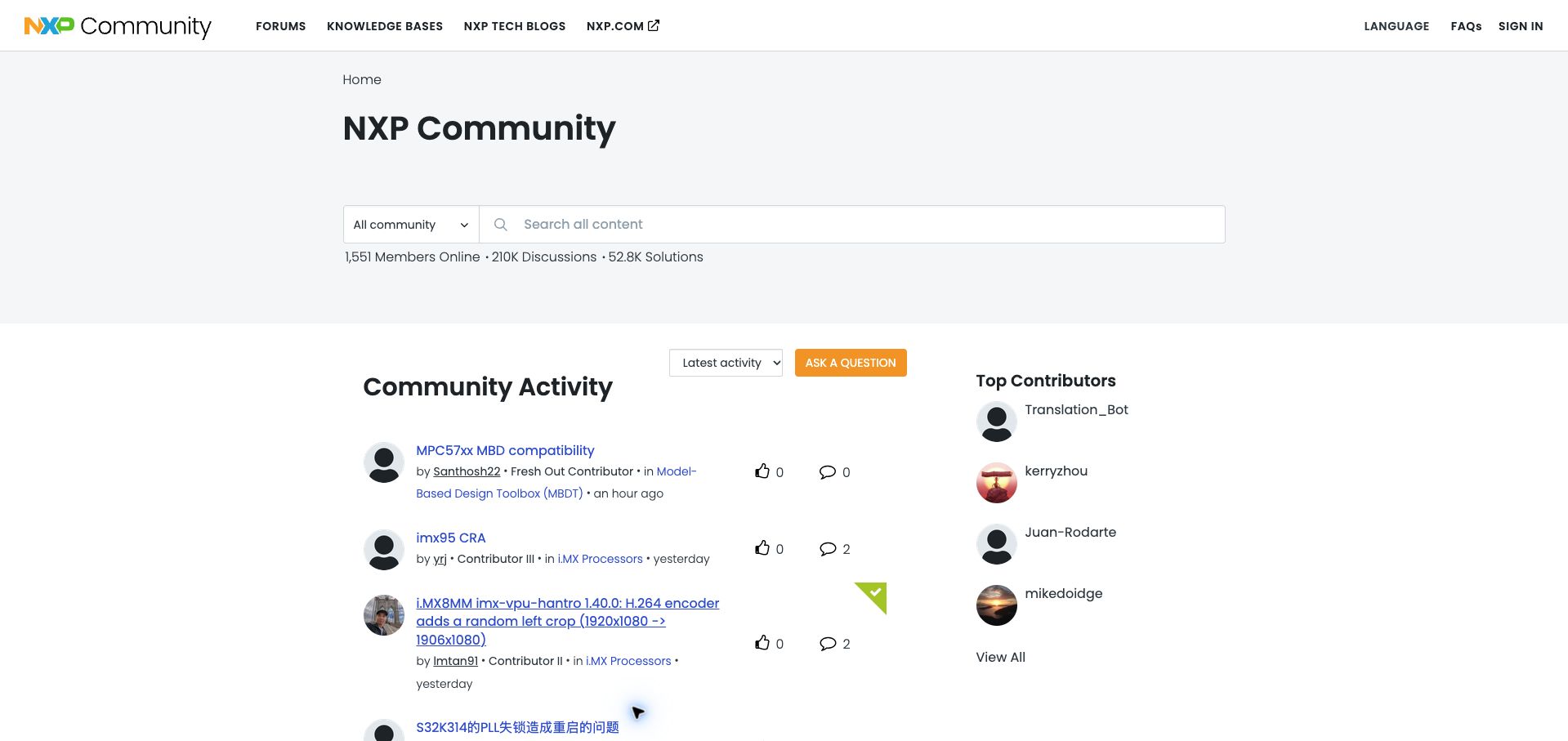
NXP keeps its community opening unusually direct: a large title, scoped search and three compact statistics lead into the activity list. Discussion titles carry specific hardware and software terminology, with author, forum and recency information beneath them. A green corner marker identifies a solved item in the inspected list, while reply and appreciation counts stay aligned beside each row. The right column recognizes contributors without taking over the main reading area. This arrangement suits engineers looking for a precise issue rather than a general introduction. Its limitation is that abbreviations and product codes dominate the feed, leaving newcomers dependent on search or the forum menu. Long titles can also wrap heavily, making row heights inconsistent. The page currently exposes Lithium community assets.
What you can learn
For a specialist audience, preserve the exact technical language people search for and add clear solution status. Balance that precision with a visible category route for visitors who cannot yet identify the right product family.
Pros
Solution markers distinguish useful outcomes in the activity list.
Forum and author context stay attached to each topic.
Cons & considerations
Product abbreviations can be difficult for newcomers.
Long technical titles create uneven row heights.
Visible tech stack
Earlier / documented evidence
Khoros
Platform source: Public page platform evidence. The public community exposes Lithium/Khoros resource paths and lia platform classes. This identifies the community property, not the organization’s other products or private systems. Platform evidence is separate from the direct website screenshot and is not a complete current infrastructure audit.
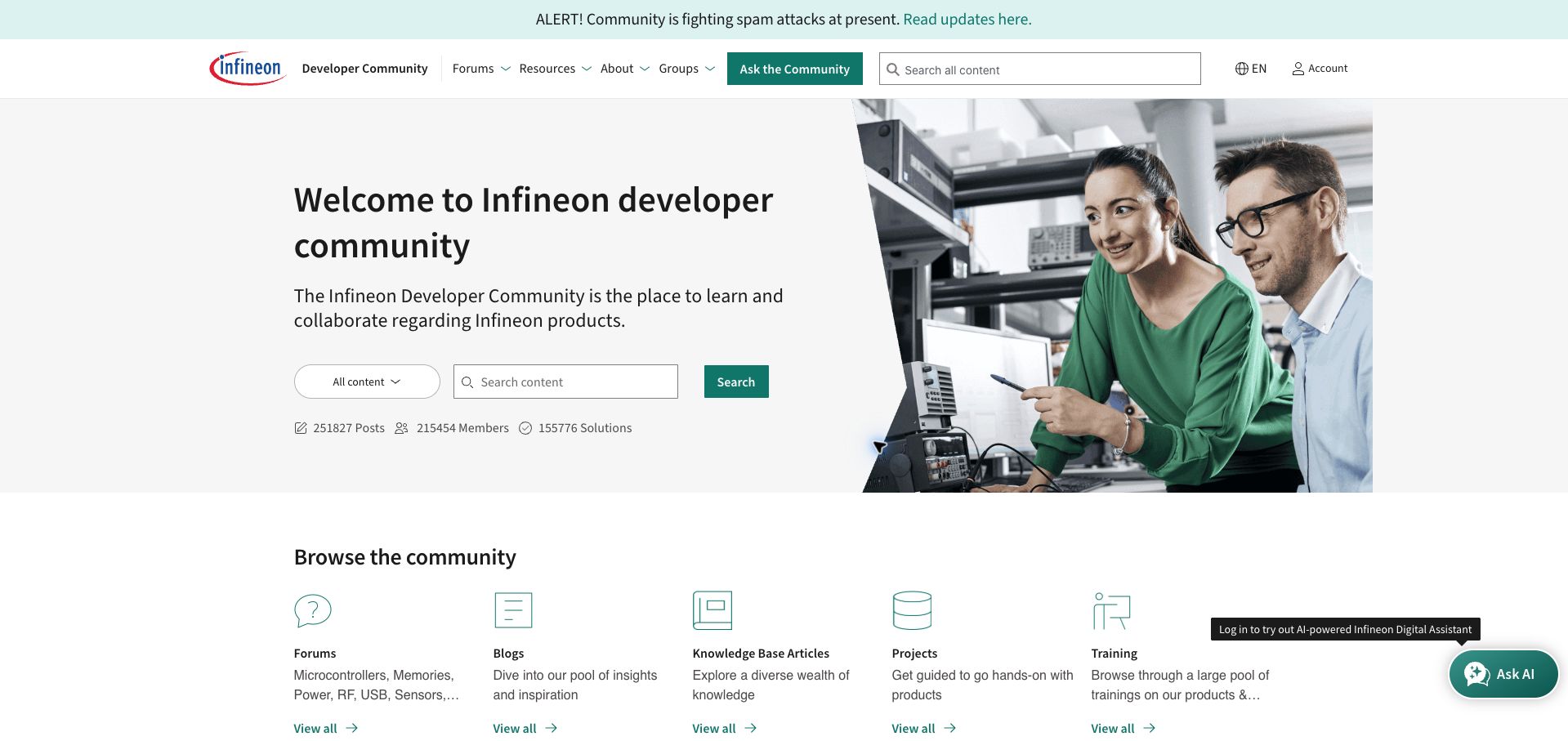
Infineon presents a split hero with a short community explanation, scoped search and a laboratory photograph. The next row separates forums, blogs, knowledge base articles, projects and training through restrained line icons and explanatory text. This is a useful distinction for visitors who need different levels of help: a conversation, a reference answer or a practical learning activity. Further down, content-type tabs and status controls support more detailed browsing. The page also carries an alert about current spam attacks, a reminder that the review captures an operating community at a particular moment. Two search fields and an AI-assistant prompt create several competing ways to begin. The large hero means the actual content list remains below the opening view.
What you can learn
Give knowledge formats their own clear destinations instead of mixing every resource into one undifferentiated feed. Explain what each format is for, while keeping the primary search action stronger than optional assistance tools.
Pros
Resource types have concise descriptions and distinct destinations.
The hero connects technical collaboration to a recognizable setting.
Cons & considerations
Several search and assistance controls compete for attention.
The large introduction postpones the detailed content list.
Visible tech stack
Earlier / documented evidence
Khoros
Platform source: Public page platform evidence. The public community exposes Lithium/Khoros resource paths and lia platform classes. This identifies the community property, not the organization’s other products or private systems. Platform evidence is separate from the direct website screenshot and is not a complete current infrastructure audit.
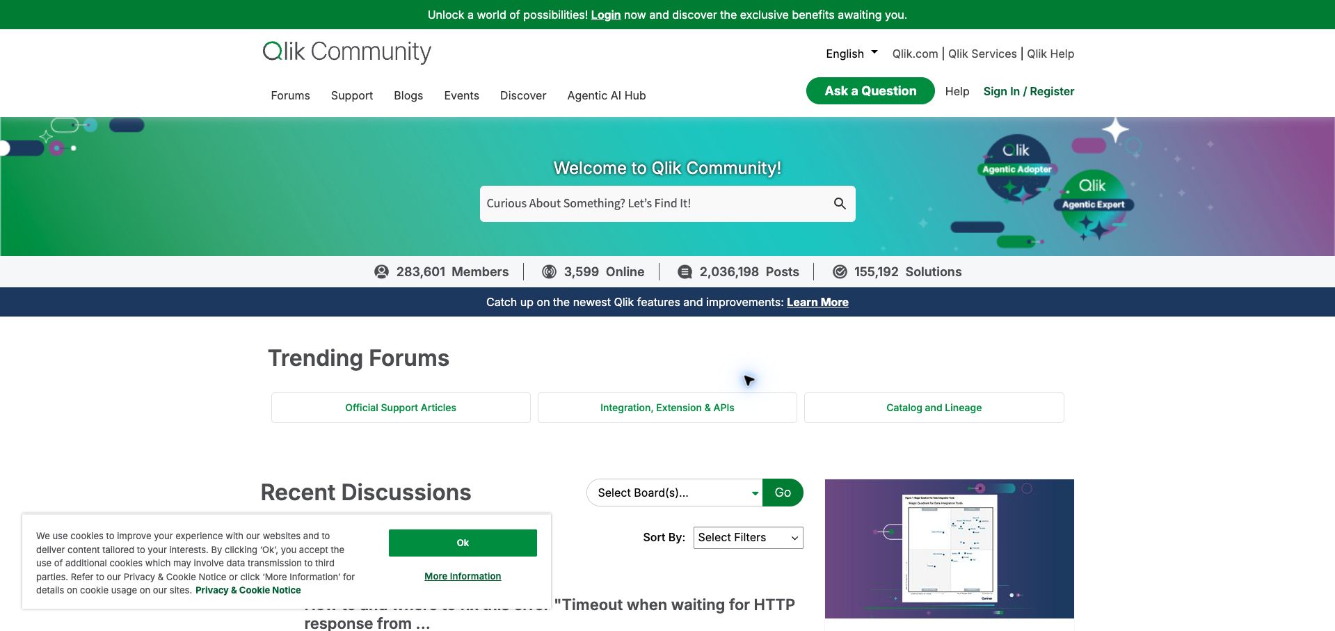
Qlik's community places a friendly search prompt inside a colorful hero, followed by a compact strip of membership and solution statistics. Three trending destinations then provide shortcuts into official support articles, integrations and APIs, and catalog topics. The discussion area offers board selection, status tabs and ordering controls, giving experienced visitors several ways to narrow a large collection. The distinction between official support material and peer discussion is particularly useful for a technical product community. The page is less restrained in its opening: a login invitation, feature announcement and cookie notice all compete with the main content. Multiple filters also require visitors to understand whether they are changing the board, discussion status or sort order. The current community page loads Lithium assets.
What you can learn
Combine a few editorially chosen shortcuts with deeper filtering for experienced members. Label each control by the dimension it changes, and distinguish official reference material from peer conversations before users invest time in a thread.
Pros
Trending destinations offer useful shortcuts into a broad archive.
Board and status controls support focused browsing.
Cons & considerations
Several notices compete with the main navigation.
Multiple filtering dimensions increase the learning burden.
Platform source: Public page platform evidence. The public community exposes Lithium/Khoros resource paths and lia platform classes. This identifies the community property, not the organization’s other products or private systems. Platform evidence is separate from the direct website screenshot and is not a complete current infrastructure audit.
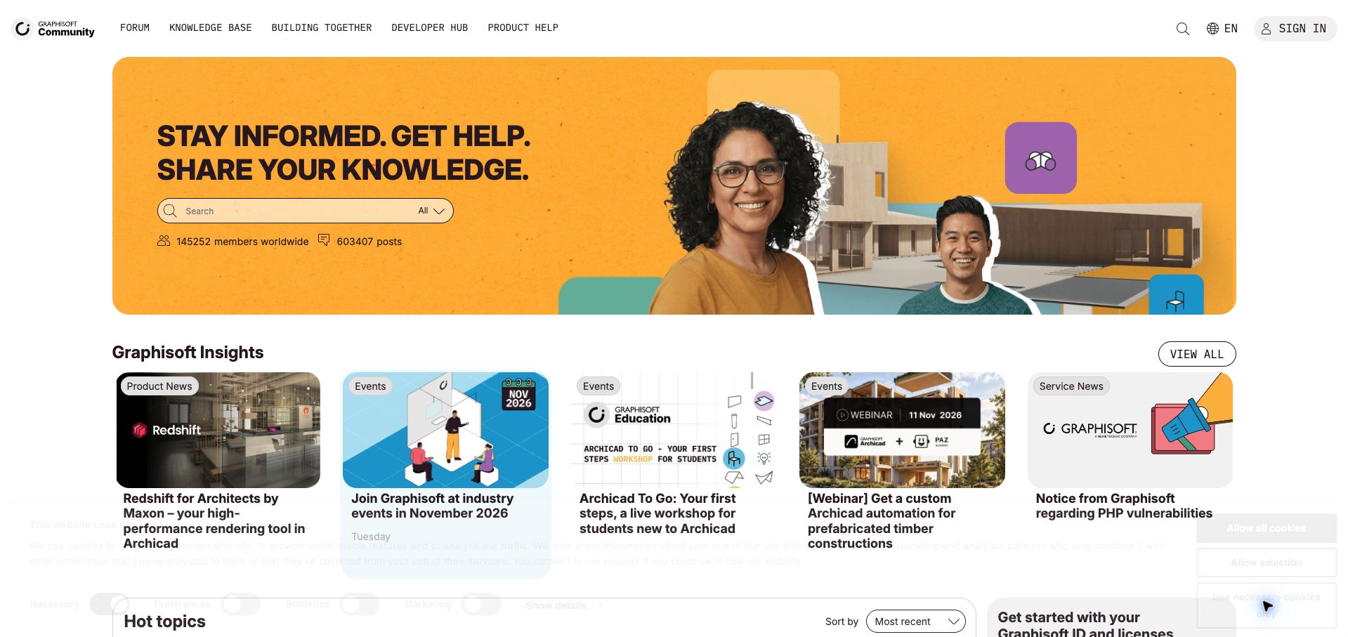
Graphisoft's English community uses an orange hero combining people, architectural imagery and a concise invitation to get help and share knowledge. Search is embedded directly beneath that message. Below, a five-column Insights row labels items as product news, events or service news, allowing a rendering announcement, workshop and security notice to coexist without appearing identical. The rounded imagery and bold typography give this technical destination a distinctive editorial character. A hot-topics area follows, but the opening strongly favors curated news over live discussion. Five dense cards across the desktop viewport also leave limited room for longer headlines. Current Lithium scripts establish the platform association for this English community section, rather than for Graphisoft's entire web presence.
What you can learn
A technical community can retain a strong creative identity while remaining practical. Use content labels to distinguish announcements, events and support information, and make the transition from curated news to open discussion easy to spot.
Pros
Content labels clarify the purpose of each editorial card.
Architectural imagery connects the community to its audience.
Cons & considerations
Curated news takes precedence over the live topic list.
Five columns make long headlines visually dense.
Visible tech stack
Earlier / documented evidence
Khoros
Platform source: Public page platform evidence. The public community exposes Lithium/Khoros resource paths and lia platform classes. This identifies the community property, not the organization’s other products or private systems. Platform evidence is separate from the direct website screenshot and is not a complete current infrastructure audit.
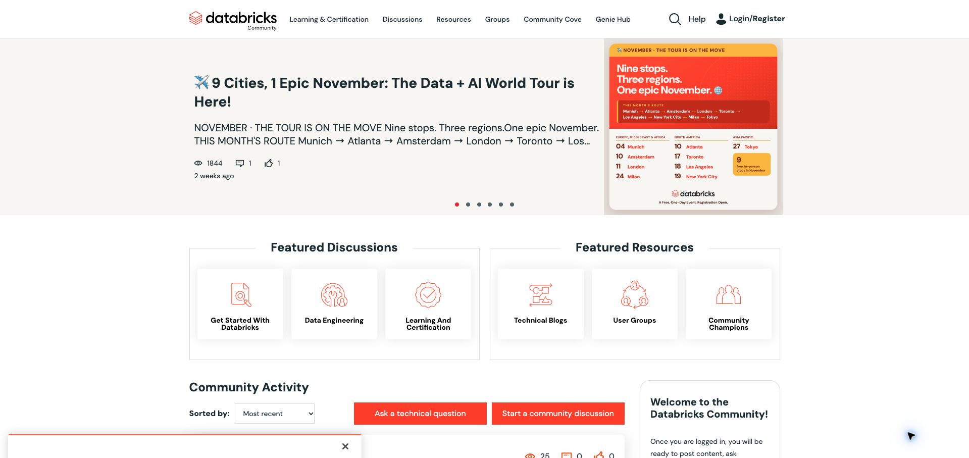
Databricks divides its main shortcuts into two clearly titled groups: Featured Discussions and Featured Resources. Getting started, data engineering and certification sit opposite technical blogs, user groups and community champions. That simple split helps visitors choose between joining a conversation and finding material or people to learn from. A large event feature appears above these routes, while the activity area below provides separate buttons for a technical question and a community discussion. The latter distinction is more useful than a single generic posting action because it signals the kind of contribution expected. The opening still devotes considerable space to a rotating promotion, and the small carousel indicators provide little context. Certification and learning labels also appear in several navigation areas, creating some duplication.
What you can learn
Separate conversational destinations from reusable resources, then label posting actions by intent. A technical question and a general community discussion may need different expectations even when they share the same underlying platform.
Pros
Two shortcut groups clarify different ways to use the community.
Posting actions distinguish technical help from general discussion.
Cons & considerations
A large promotional carousel precedes practical navigation.
Repeated learning labels add overlap between destinations.
Visible tech stack
Earlier / documented evidence
Khoros
Platform source: Public page platform evidence. The public community exposes Lithium/Khoros resource paths and lia platform classes. This identifies the community property, not the organization’s other products or private systems. Platform evidence is separate from the direct website screenshot and is not a complete current infrastructure audit.
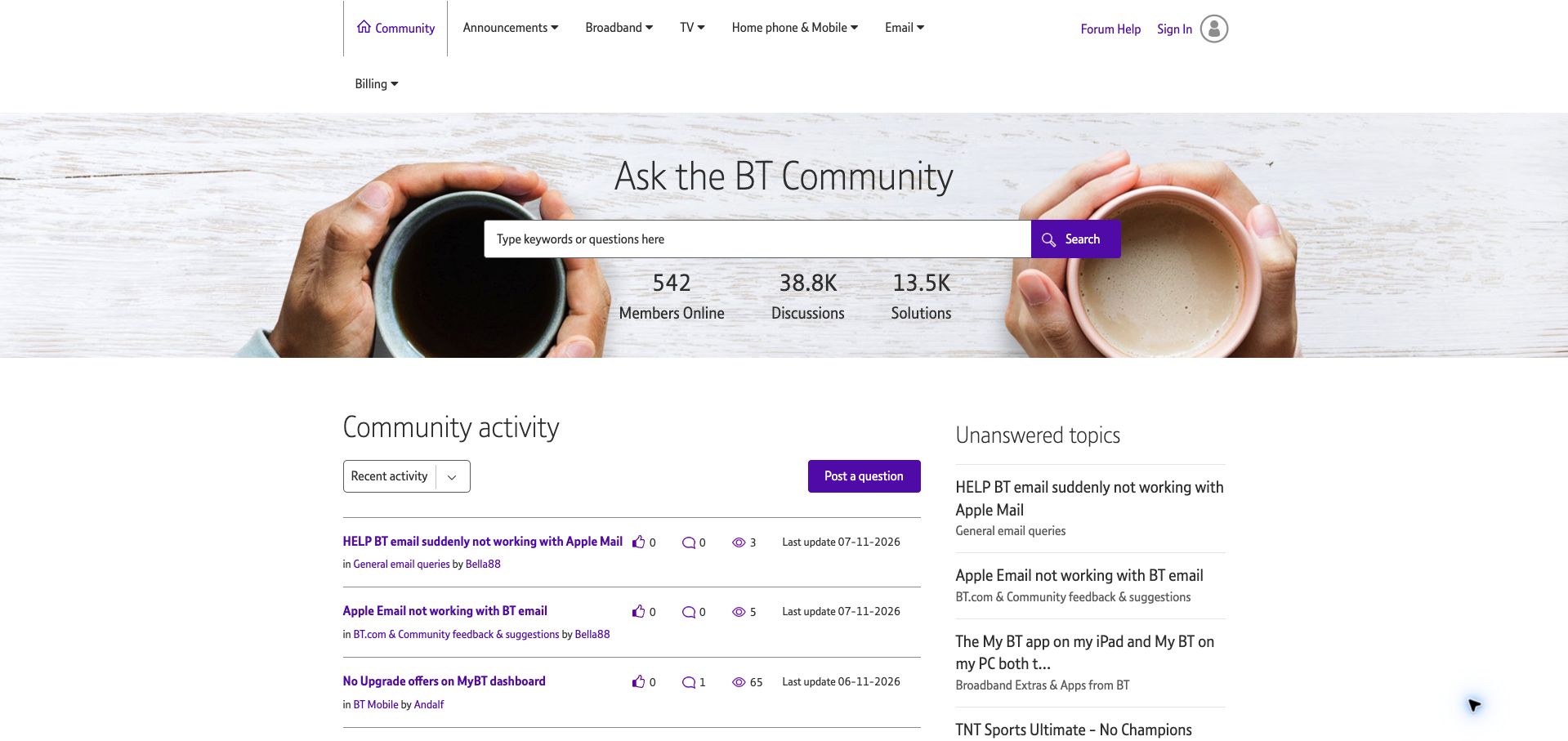
BT's community opens with a warm photograph of two cups of coffee, a direct invitation to ask the community and a broad search field. Beneath it, a relatively plain activity table displays topic titles, categories, authors, engagement counts and update dates. A separate unanswered-topics column gives returning helpers a visible queue of questions that still need attention. Purple accents connect navigation and actions without overwhelming the largely white reading area. The practical strength is this balance between finding an existing answer and identifying an opportunity to contribute. The desktop header is less tidy: Billing wraps onto another line in the inspected view. Some topic titles are also truncated, and the small icon counts require familiarity to interpret quickly.
What you can learn
Show unresolved work alongside general activity when a community depends on volunteer participation. Keep the distinction visible without requiring a filter change, and make sure utility navigation remains orderly at the actual desktop width.
Pros
An unanswered column gives contributors a clear place to help.
Update dates provide useful context for each discussion.
Cons & considerations
One navigation item wraps onto a separate header line.
Truncated titles and small metric icons reduce scanning clarity.
Visible tech stack
Earlier / documented evidence
Khoros
Platform source: Public page platform evidence. The public community exposes Lithium/Khoros resource paths and lia platform classes. This identifies the community property, not the organization’s other products or private systems. Platform evidence is separate from the direct website screenshot and is not a complete current infrastructure audit.
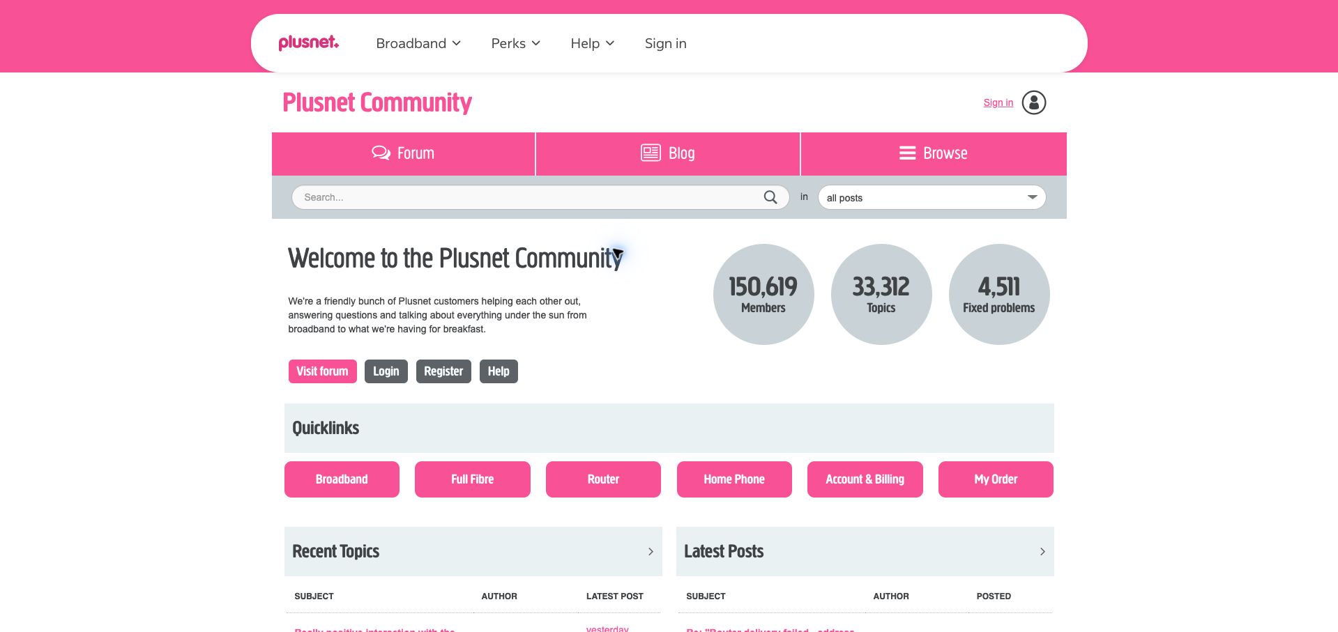
Plusnet gives its community a strong pink identity while keeping the main choices familiar. A search strip sits below the forum and blog navigation, followed by a short welcome and three large statistics. The most practical section is a row of quick links for broadband, full fibre, routers, home phones, billing and orders. These labels reflect the customer's immediate concern rather than an internal organizational chart. Below them, parallel tables distinguish recent topics from latest posts, supporting both new conversations and ongoing replies. The layout is approachable, though the corporate header, community title, navigation strip and search occupy considerable vertical space. The difference between the two activity tables may also be unclear to someone visiting a forum for the first time.
What you can learn
Use customer language for the first layer of support navigation. If separate feeds represent new topics and new replies, explain that difference so the distinction helps occasional visitors as well as experienced community members.
Pros
Quick links map directly to common customer concerns.
Distinctive brand color makes the community recognizable.
Cons & considerations
Several stacked header elements delay useful content.
The two activity-table labels need interpretation by newcomers.
Visible tech stack
Earlier / documented evidence
Khoros
Platform source: Public page platform evidence. The public community exposes Lithium/Khoros resource paths and lia platform classes. This identifies the community property, not the organization’s other products or private systems. Platform evidence is separate from the direct website screenshot and is not a complete current infrastructure audit.
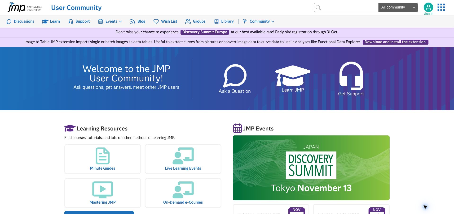
JMP's community hero presents three large illustrated actions: ask a question, learn JMP and get support. The distinctions are immediately understandable and avoid forcing every visitor into the discussion list. Below, a learning-resources grid offers minute guides, live events, mastering sessions and on-demand courses, while an adjacent event panel promotes the wider user community. The page's blue and purple palette and consistent icons tie these functions together. Its main weakness is competing navigation: a long menu and two announcement strips appear before the hero. One announcement still advertises an October 31 early-bird deadline in the November capture, showing why promotional copy needs active maintenance. The current site exposes Lithium scripts; that evidence concerns the user community, not the statistical software itself.
What you can learn
Give specialist software users different routes for an immediate problem, ongoing learning and formal support. Make those choices visually comparable, and maintain dated promotions so old deadlines do not weaken an otherwise useful resource hub.
Pros
Three explicit actions separate distinct visitor needs.
Learning formats are named clearly in a compact grid.
Cons & considerations
Two announcement strips compete above the hero.
A past early-bird deadline remained visible in the capture.
Visible tech stack
Earlier / documented evidence
Khoros
Platform source: Public page platform evidence. The public community exposes Lithium/Khoros resource paths and lia platform classes. This identifies the community property, not the organization’s other products or private systems. Platform evidence is separate from the direct website screenshot and is not a complete current infrastructure audit.
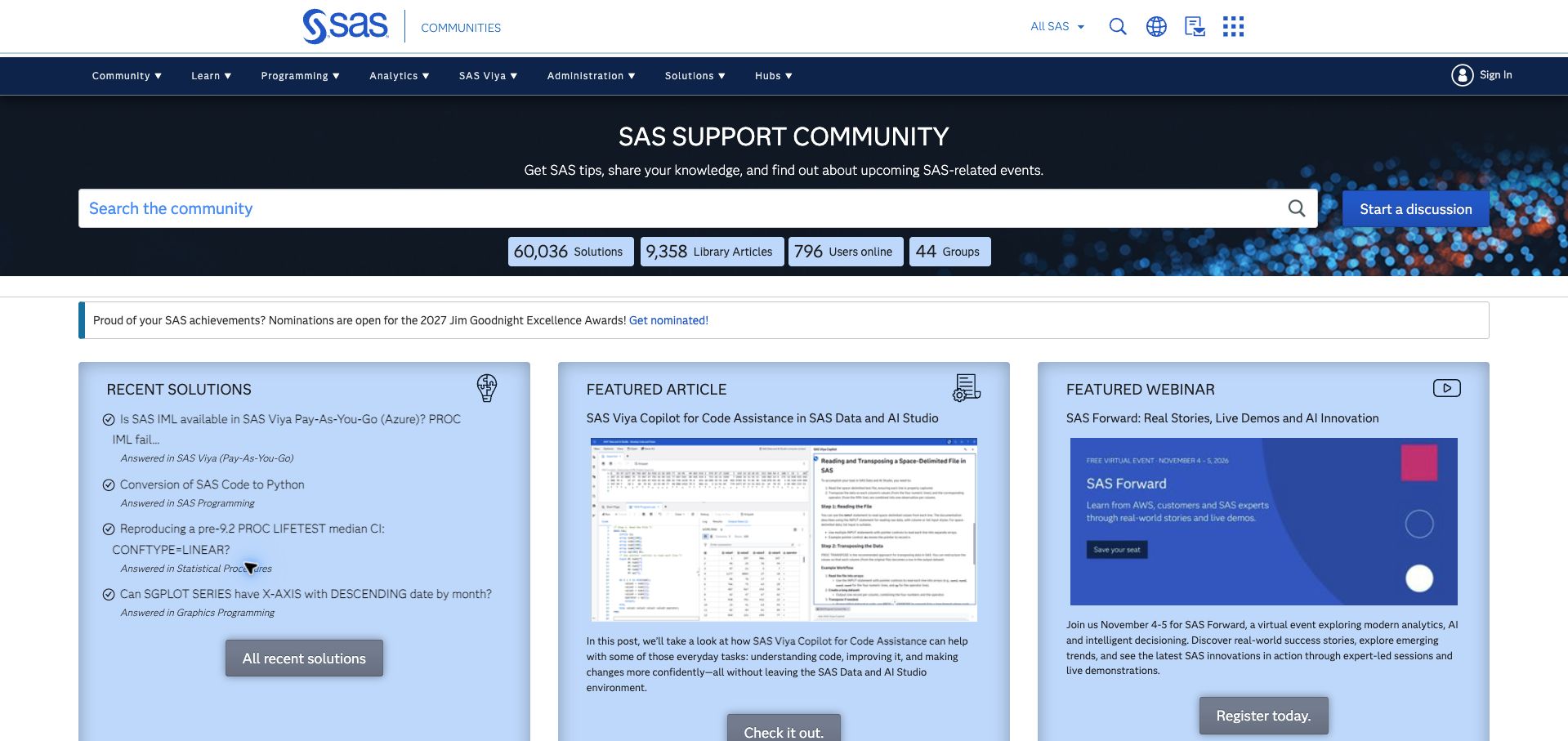
SAS Support Communities gives search the width of its dark introductory panel, with Start a Discussion beside it. A short statistics row distinguishes solutions, library articles, online users and groups. The next section uses three large panels for recent solutions, a featured article and a featured webinar. That arrangement makes resolved questions a first-class resource rather than burying them in a chronological feed. It also shows the range of material available to visitors who are learning a product rather than fixing one immediate problem. The broad navigation contains many specialist categories, which can overwhelm a newcomer. The featured webinar panel in the capture still points to a recently passed event, so its registration wording needs careful interpretation rather than an assumption that the event remains upcoming.
What you can learn
Expose solved questions as a reusable learning resource and place them beside longer educational content. Keep event state explicit—upcoming, live or replay—so a prominent feature remains useful after its scheduled date passes.
Pros
Recent solutions receive a prominent dedicated panel.
Search and discussion creation are clearly separated.
Cons & considerations
The large specialist navigation can overwhelm new visitors.
Event promotion does not clearly communicate its post-event state.
Visible tech stack
Earlier / documented evidence
Khoros
Platform source: Public page platform evidence. The public community exposes Lithium/Khoros resource paths and lia platform classes. This identifies the community property, not the organization’s other products or private systems. Platform evidence is separate from the direct website screenshot and is not a complete current infrastructure audit.
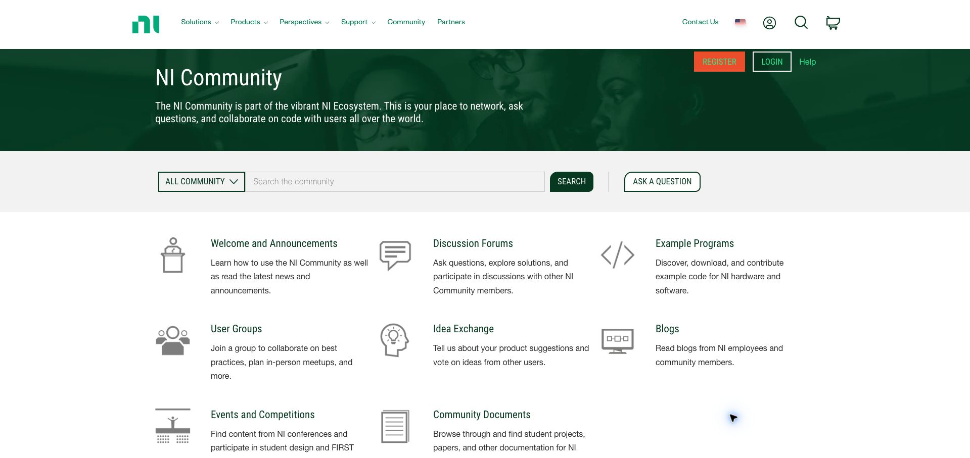
NI's community uses a dark green welcome panel and a separate search strip, then presents an explanatory directory. Discussion forums, example programs, user groups, the idea exchange, blogs and community documents each receive an icon, title and short description. The descriptions do useful work: they distinguish asking for help from downloading example code, meeting peers or suggesting product changes. This gives a new visitor a clear picture of the community's scope before showing individual threads. The restrained grid is easy to scan on desktop, though the large corporate header and welcome panel use space that could expose more destinations immediately. The monochrome icons are also less distinctive than the text labels, so readers still need to read carefully rather than navigate by shape alone.
What you can learn
When a community supports several fundamentally different activities, describe those activities at the directory level. Short explanations can prevent visitors from treating a code library, idea board and support forum as interchangeable destinations.
Pros
Brief descriptions explain what each resource is for.
The grid distinguishes participation from reusable technical material.
Cons & considerations
The large header delays the full directory.
Similar gray icons depend on their accompanying labels.
Platform source: Public page platform evidence. The public community exposes Lithium/Khoros resource paths and lia platform classes. This identifies the community property, not the organization’s other products or private systems. Platform evidence is separate from the direct website screenshot and is not a complete current infrastructure audit.
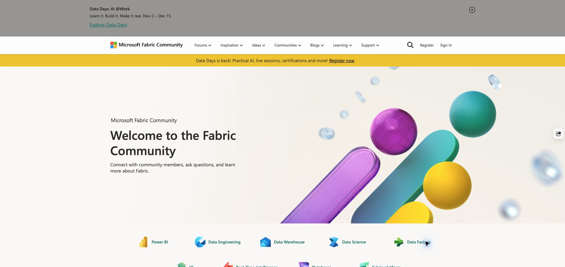
Microsoft Fabric Community uses an illustrated welcome panel followed by product icons and names. Power BI, data engineering, data warehouse, data science and data factory appear as concrete destinations, with further platform areas continuing below. This connects an umbrella product identity to the specific tools and disciplines visitors recognize. The broader navigation adds forums, inspiration, ideas, blogs, learning and support, while later cards point toward careers and user groups. The opening is visually polished but spacious: two separate Data Days promotions and the large hero leave little room for active discussions. Search is represented by a header icon rather than a prominent field in this view. Aurora customization assets verify the community implementation separately from Microsoft's main marketing sites.
What you can learn
An umbrella platform needs recognizable component routes so visitors can translate the brand into their actual task. Keep those product links close to the opening and avoid letting repeated campaign messages displace search or current community activity.
Pros
Product icons translate the platform into concrete destinations.
Learning and community participation have explicit navigation labels.
Cons & considerations
Two campaign messages repeat the same promotional priority.
Search is less prominent than the large welcome artwork.
Visible tech stack
Earlier / documented evidence
Khoros
Platform source: Public page platform evidence. The public page loads Khoros Aurora resources from Lithium infrastructure. This identifies the community property, not the organization’s other products or private systems. Platform evidence is separate from the direct website screenshot and is not a complete current infrastructure audit.
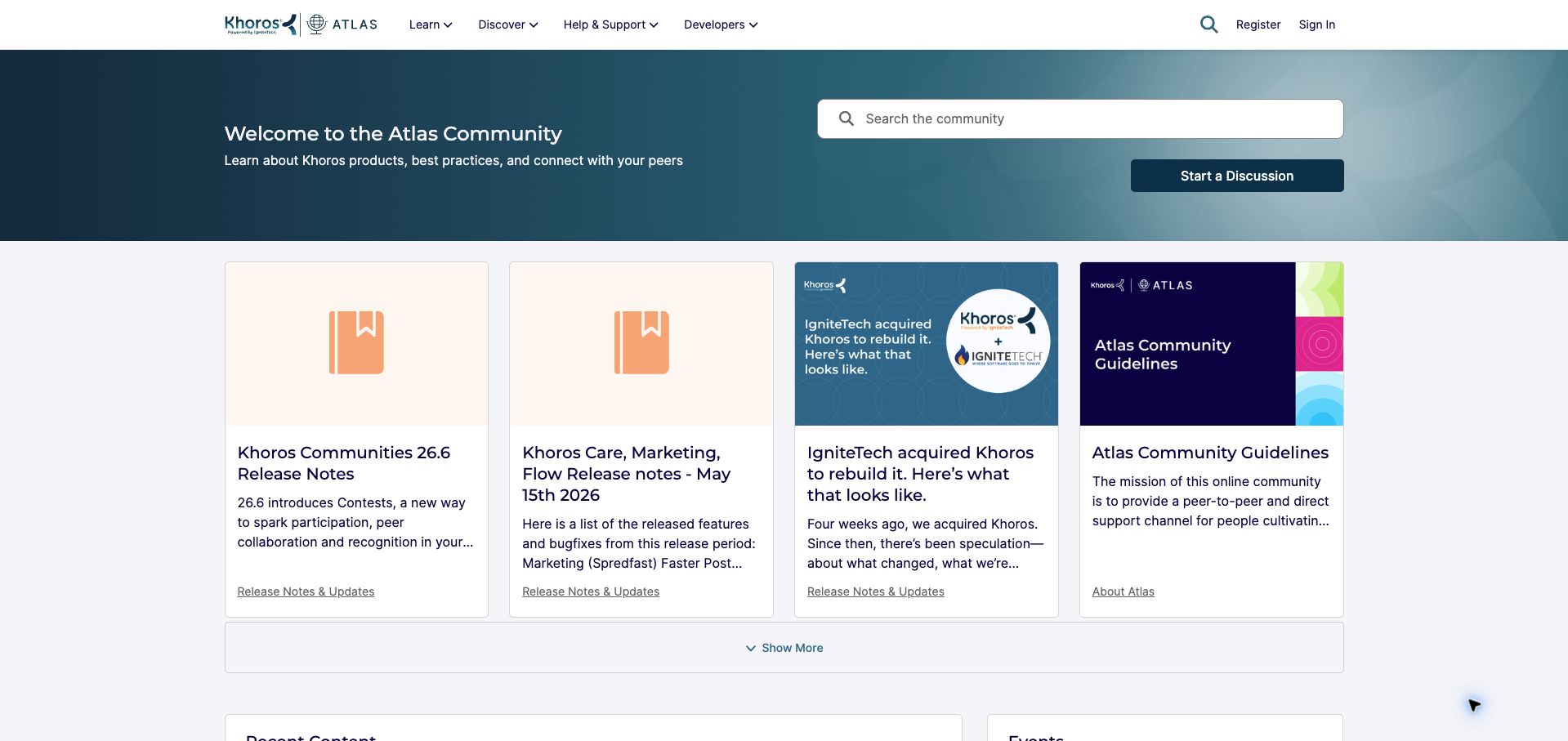
Khoros Atlas places a welcome beside search and a separate Start a Discussion button. Four cards follow, combining release notes, a company update and community guidelines. Each card retains a category link beneath its description, making the source area clear even when the featured subjects differ. The opening is more compact than many customer implementations and provides a useful view of the vendor's own Aurora community. Its main weakness is editorial freshness: a current release note sits beside an older update whose relative wording assumes a different moment. Two release-note cards also share generic bookmark imagery, making their titles do most of the differentiation. The public page shows the browsing experience; administrative tools and signed-in participation were not evaluated.
What you can learn
A platform's own community should make learning, support and participation equally easy to discover. Give featured cards clear categories and maintain their summaries, especially relative phrases that become misleading when an item stays featured for months.
Pros
Search and discussion creation are distinct, prominent actions.
Category links explain where featured material belongs.
Cons & considerations
Older relative wording weakens the freshness of featured content.
Repeated placeholder imagery makes release cards harder to distinguish.
Visible tech stack
Earlier / documented evidence
Khoros
Platform source: Public page platform evidence. The public community exposes Lithium/Khoros resource paths and lia platform classes. This identifies the community property, not the organization’s other products or private systems. Platform evidence is separate from the direct website screenshot and is not a complete current infrastructure audit.
Kegan has 15+ years of experience working with small businesses, Fortune 500 companies, and everything in between. No development job is too big or too small: he brings the same hands-on attention to a focused improvement, a complete website, or a custom application.
For Khoros projects, he can help with content architecture, custom functionality, system integrations, testing, and maintainable handover. He works directly with clients on scope, design, implementation, testing, and handover, with an emphasis on clear communication and a system that remains practical to maintain after launch.
Show 3 other Khoros developersHide other Khoros developers
Choose the implementation around the operating model
Improve an existing community structure
Start with category descriptions, search routes, outdated notices, and public entry points. A full platform migration is not required for every information problem.
Plan a platform transition explicitly
Inventory content, URLs, roles, integrations, and customizations before changing platform generation. Verify what the proposed environment supports rather than inferring it from a vendor demo.
Connect community and support carefully
Explain when public discussion is appropriate and when a case belongs in a private support channel. Preserve context without inviting account details into public posts.
From references to requirements
Plan the content and everyday maintenance
Map the knowledge lifecycle
Assign ownership for accepted solutions, old product information, announcements, and duplicate content. Define how a reader knows whether guidance is current.
Test audience and language routes
Check regional labels, product families, signed-out access, and mobile navigation. A large global header should not hide the community’s own search.
Document the operating responsibilities
Name the people responsible for moderation, content governance, integrations, updates, and escalations. Design the interface around that actual workflow.
A useful handover demonstration
Ask the actual team to carry out its routine job: publish a realistic update, correct a mistake, preview a narrow screen, and identify who owns an integration failure. For a library or frontend framework, also ask who maintains the content source and deployment. A polished screenshot does not answer those operational questions.
Beyond the screenshot
Khoros project checklist
Identify the platform generation.
Map product families.
Separate articles and discussions.
Label staff guidance.
Maintain dated notices.
Preserve important URLs.
Clarify private support routes.
Test regional navigation.
Review mobile search.
Assign content owners.
Test with real content, a keyboard, a small screen, slow or failed requests, and the people who will maintain the system. These are planning checks, not an accessibility, security, performance, or search-ranking certification.
Sources & editorial method
How this Khoros collection was reviewed
Twenty distinct public properties have direct website captures and original design reviews. The first five are explicitly identified recognizable organizations or established specialists. Platform evidence is scoped to each named property; documentary associations, dated observations, and narrower asset-only signals remain qualified. Captures and technology verification have independent dates. A bounded public stack audit was attempted for every source, preserving inaccessible and unknown results. No private administration or transactions were inspected.
Every image is an unmodified capture from the actual website, with its source and capture date. Some captures are reused from our shared catalog; their dates remain the original capture dates. None comes from a vendor gallery or a generated reconstruction. Moving imagery and live content can change.
Technology attribution uses public page assets or metadata, official platform documentation, or a cited first-party project case study. Documentary and framework-relationship evidence is identified where used; it is not a complete current backend inventory. A CMS image CDN alone does not establish a full CMS deployment. A library’s presence does not prove which individual controls use it, and a platform label does not establish AI authorship.
The composition notes, lessons, pros and tradeoffs are original editorial observations. We have not measured conversion, traffic, security, performance or accessibility conformance. Website owners retain their brands and imagery; these examples are not our client portfolio. Written, Edited and Curated are independent records, not dates advanced by a build. See our editorial standards or suggest a correction.
Questions worth asking
Khoros website development FAQs
Does Lithium evidence mean the site is outdated?
No. Lithium-named infrastructure can remain part of the platform’s public resources. Describe the observed evidence without guessing migration status.
Should knowledge articles and forums be separate?
They need distinct labels and useful links between them, whether they share a search interface or separate destinations.
Can a community replace private support?
Only for appropriate public questions. Explain the boundary and provide a clear route for account-specific issues.
Do these examples verify an organization’s AI features?
No. Public resource evidence and screenshots do not establish private AI configuration or the behavior of every product capability.