Stripe supplies payment and billing infrastructure. The website still needs to explain what someone is buying, when money changes hands and how the customer can manage the relationship afterward.
These 20 examples are public websites of businesses with a documented Stripe relationship. Their screenshots show marketing, discovery or acquisition design. The linked primary sources establish a separately described payment, subscription or platform-payout role; they do not prove that Stripe built the visible frontend or that every product uses the same payment arrangement.
The useful design question is how the public page prepares a visitor for the next commitment. A retail purchase, a software subscription, a creator pledge and a service appointment have different expectations. Begin with those expectations and the actual business rules, then choose the integration that supports them.
Before the examples
What makes good Stripe website development in 2026?
Describe the commitment before the payment interface
Write down what the customer receives, the charge timing, currency, billing interval where relevant and the route to support. Keep this language consistent from the public offer to the later confirmation. A polished card form cannot repair an unclear plan name or an unexpected recurring commitment.
Choose an integration around the required journey
Stripe Checkout supports a prebuilt payment experience, including hosted and embedded options. Evaluate the appropriate mode against your product, required payment methods and implementation responsibilities. A familiar integration can reduce custom interface work, but your team still owns the offer, surrounding content and correct fulfillment behavior.
Keep the customer relationship distinct from the frontend stack
Document whether Stripe supports the business’s own subscriptions, payments collected for other sellers, or another specific role. A vendor case study can establish that association without identifying the current CMS, framework or every private application. Preserve the scope and date of the source instead of turning it into a universal architecture claim.
The collection · 20 examples
20 Stripe website examples worth studying
Compare the public journey leading toward a commercial decision. Each example pairs an original visual review with a scoped Stripe source; none is presented as a tested live checkout or a complete technology inventory.
We start with five recognizable brands or organizations: Amazon, Shopify, Figma, Notion, OpenAI. Each attribution applies to the named website property, not every product or website belonging to its organization. This is a curated reading sequence, not a measured ranking.
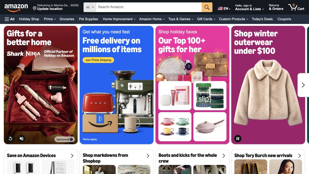
Amazon gives the search field most of the useful header space, then fills the opening screen with seasonal departments and product groups. The dark navigation distinguishes persistent shopping tools from the colorful promotional cards underneath. A shopper can search a known item or enter a broader category without first understanding a brand campaign. Stripe’s customer story documents selected global payment work, including local payment methods. It does not establish that every Amazon transaction or national storefront uses Stripe.
What you can learn
Borrow the separation between product finding and promotional discovery. A payment brief should then name the countries, methods and checkout ownership for the relevant purchase route. The storefront screenshot can inform that journey, but cannot verify authorization behavior, saved payment details or the systems used after a customer signs in.
Pros
The dominant search box supplies a direct route for visitors with a specific purchase in mind.
Repeated card structures make several retail departments visible within one screen.
Cons & considerations
Numerous competing offers make the first viewport visually demanding for someone seeking one clear recommendation.
Delivery and account controls add context that a smaller catalog may not need at this density.
Visible tech stack
Earlier / documented evidence
Stripe
Earlier cited evidence retained; no current scan result. References may be embedded or legacy—not a complete backend inventory.
Platform source: Stripe official customer evidence. Stripe’s Amazon case documents selected global payments work, including local payment methods and Connect. This is not evidence that every Amazon country, product or transaction uses Stripe. Platform evidence is separate from the direct website screenshot and is not a complete current infrastructure audit.
Shopify uses a full-width portrait and a short entrepreneurial headline to frame the product around its users. The white trial button stands apart from the dark photographic background, while pricing and enterprise routes remain in the compact header. An additional agent-related entry point signals a second way to begin. Stripe documents its relationship with Shopify Payments and other merchant financial products; this is infrastructure for the platform’s commerce offering, not proof that the pictured marketing page is generated by Stripe.
What you can learn
Treat the public website, merchant onboarding and buyers’ checkout experiences as separate design problems. A confident marketing invitation still needs a clear explanation of account eligibility, pricing and operational responsibilities further along the journey. This example is useful for that division of audiences, without assuming every merchant should copy Shopify’s particular visual style.
Pros
The portrait makes the entrepreneurial audience tangible before product details become extensive.
Trial, pricing and enterprise routes offer distinct starting points for different buying situations.
Cons & considerations
The large campaign image leaves little room for concrete workflow explanation above the fold.
Two different starting modes require careful explanation so visitors understand the next step.
Public source checked November 3, 2026. References may be embedded or legacy—not a complete backend inventory.
Platform source: Stripe official customer evidence. Stripe’s Shopify case identifies Shopify Payments and further merchant financial products. This is the platform’s payment relationship, not the implementation of its public marketing frontend or every merchant store. Platform evidence is separate from the direct website screenshot and is not a complete current infrastructure audit.
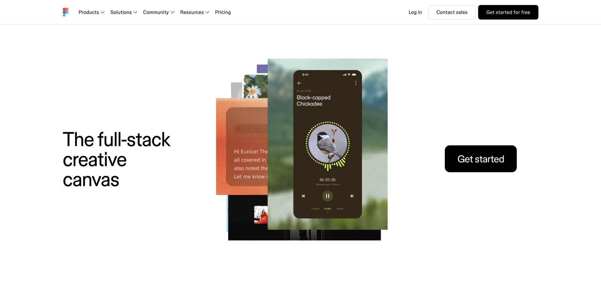
Figma places a stack of designed artifacts between a concise product description and a black getting-started button. The generous white space lets the work supply color and detail without crowding the navigation. Pricing, community and contact routes stay accessible above the main composition. Stripe’s official Figma story describes payment and subscription infrastructure and a revised billing model. The useful association is the commercial system behind paid access, while the visible creative presentation remains Figma’s own website design.
What you can learn
Show what a customer can make, then explain how a team buys the capability. For a collaborative product, the commercial brief should distinguish seats, product entitlements and billing ownership instead of leaving those concepts inside the payment form. A striking product demonstration can introduce the value, but the plan comparison must resolve the practical buying questions.
Pros
Overlapping creative samples communicate the product’s range with very little explanatory copy.
The isolated dark action is easy to distinguish from the otherwise restrained page.
Cons & considerations
The abstract creative collage does not explain collaboration or administrative tasks by itself.
A first-time buyer must continue beyond the hero to understand package and seat differences.
Public source checked November 3, 2026. References may be embedded or legacy—not a complete backend inventory.
Platform source: Stripe official customer evidence. Stripe’s Figma case describes Payments and Billing for product subscriptions and a revised billing model. The marketing capture is separate from the documented paid-access infrastructure. Platform evidence is separate from the direct website screenshot and is not a complete current infrastructure audit.
Notion’s opening view combines a large team-and-agent headline, two compact actions and a recognizable workspace preview. Customer marks form a quiet supporting row rather than displacing the product demonstration. Blue accents guide attention through an otherwise white and black composition. Notion’s own payment-method help page explicitly identifies Stripe as its payment processor, while separately describing mobile-store subscription management. That distinction matters: this public website is a reference for introducing the product, not a screenshot of every possible purchase channel.
What you can learn
Keep the explanation of a workspace consistent as visitors move from marketing into plan selection and administration. A team buyer needs to know who owns the subscription and where a payment method can be changed. Preserve channel-specific instructions when web purchases and mobile subscriptions have different management paths, rather than offering one misleading universal billing instruction.
Pros
The workspace image turns the broad collaboration promise into a recognizable product setting.
Paired self-service and demo actions acknowledge different levels of buying complexity.
Cons & considerations
Small details inside the embedded interface are hard to evaluate at the captured scale.
The broad AI language leaves plan boundaries and administration questions for later pages.
Public source checked November 3, 2026. References may be embedded or legacy—not a complete backend inventory.
Platform source: Notion official payment help. Notion’s own payment-method help page says it uses Stripe to process payments and distinguishes mobile-store subscriptions. Evidence is scoped to that documented payment relationship. Platform evidence is separate from the direct website screenshot and is not a complete current infrastructure audit.
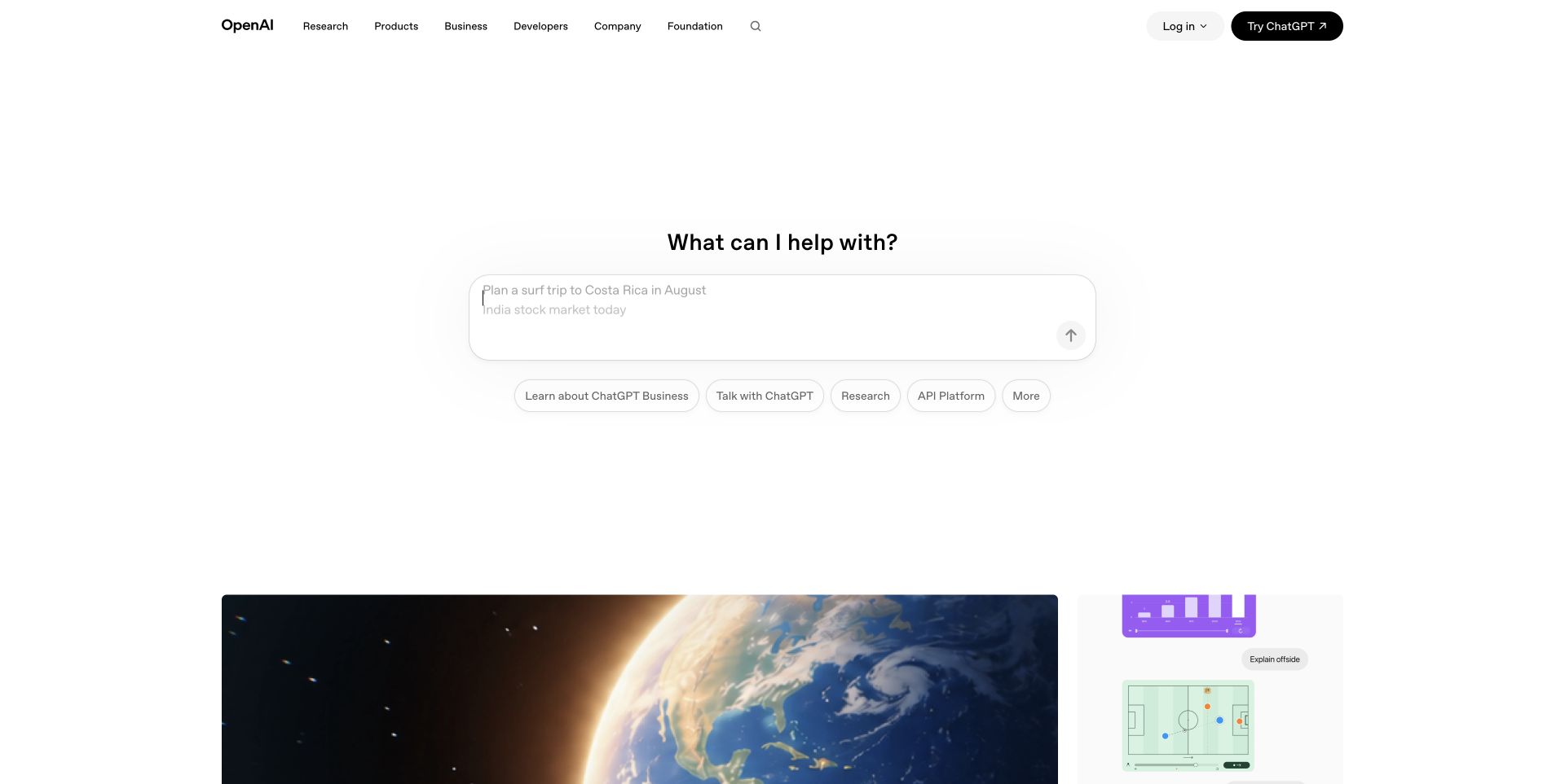
OpenAI gives the middle of the page to a question prompt rather than a dense product grid. A small navigation bar and extensive white space make that interaction the opening focus; editorial imagery begins lower in the viewport. The page therefore works as both an introduction and a route into exploration. Stripe’s published OpenAI announcement documents payments for ChatGPT and DALL·E, including Checkout and Billing. That source establishes a named commercial relationship, not the implementation of every current OpenAI product or this homepage.
What you can learn
An exploratory entry point should lead to clear product and account context before paid commitments appear. Describe the distinction between trying a tool, selecting a subscription and paying for metered services. The lesson is to coordinate discovery and purchasing language, while keeping historically documented payment scope separate from claims about a present private account flow.
Pros
The central prompt gives curious visitors an immediate and understandable way to engage.
The restrained header leaves room for both product discovery and editorial material.
Cons & considerations
A sparse opening view offers limited guidance to visitors comparing specific commercial plans.
The relationship between the prompt and individual product destinations requires further exploration.
Earlier cited evidence retained; no current scan result. References may be embedded or legacy—not a complete backend inventory.
Platform source: Stripe official customer evidence. Stripe’s March 2023 OpenAI announcement documents Stripe Checkout and Billing for ChatGPT and DALL·E. This is a dated documented relationship, not a complete current inventory of OpenAI products or homepage technology. Platform evidence is separate from the direct website screenshot and is not a complete current infrastructure audit.
Anthropic leads with a substantial statement about its work and public-benefit purpose, followed by a large report feature framed by small visual artifacts. The subdued background and editorial typography create a reading-oriented introduction. Product access remains available in the header rather than dominating the main composition. Stripe’s customer story describes Anthropic’s payment and billing infrastructure. The capture itself shows the company’s public communication, so the technology evidence should not be mistaken for a view of Claude subscription or API purchasing screens.
What you can learn
A company can establish purpose before asking for a purchase, provided product routes remain easy to find. In an AI service brief, separate the public narrative from the commercial explanation of subscriptions, usage and account ownership. Use the appropriate product pages to answer those questions rather than asking a corporate report feature to serve every visitor need.
Pros
The large introductory statement makes the organization’s positioning explicit without an animated demonstration.
The report feature gives the institutional message a concrete publication to explore.
Cons & considerations
Visitors arriving to compare paid products need to leave the main editorial feature.
The amount of introductory text asks for more reading than a simple product-first hero.
Public source checked November 3, 2026. References may be embedded or legacy—not a complete backend inventory.
Platform source: Stripe official customer evidence. Stripe’s Anthropic case documents payment and billing infrastructure and supporting financial tools. The corporate homepage is shown for public design context, not as an inspected Claude checkout. Platform evidence is separate from the direct website screenshot and is not a complete current infrastructure audit.
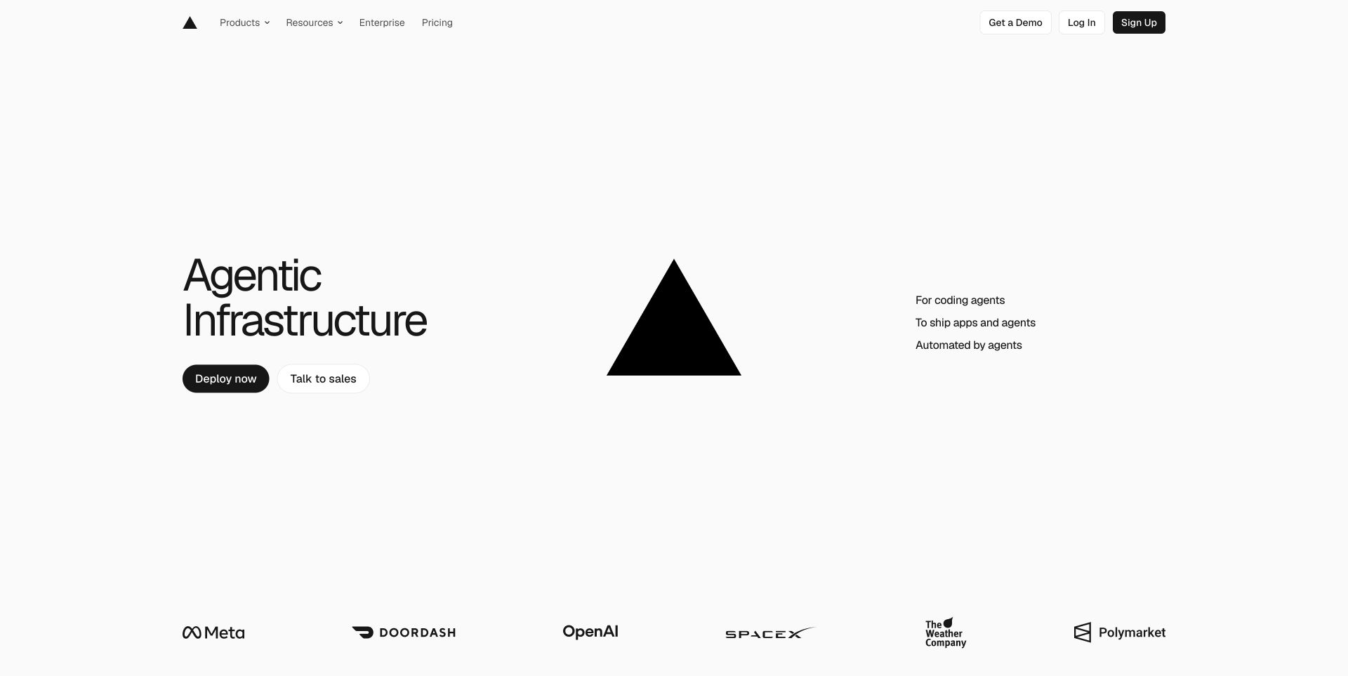
Vercel’s captured homepage uses a central triangular mark, a compact infrastructure headline and unusually generous white space. A deployment action and sales contact sit near the message, while customer marks provide supporting context at the bottom of the view. The composition emphasizes a small number of decisions rather than a long feature inventory. Stripe’s current customer story documents Vercel’s billing, checkout and international payments work. It is evidence for that commercial layer, separate from Vercel’s own hosting and website-delivery capabilities.
What you can learn
For a developer platform, keep the first deployment invitation distinct from the explanation of ongoing charges. Plan how a visitor learns about paid usage, workspace responsibility and billing controls before the product grows beyond an initial experiment. A minimal homepage can be effective orientation, but the linked pricing and documentation must carry the operational detail that the hero deliberately omits.
Pros
The limited palette and central mark establish a strong, recognizable visual identity.
Deployment and sales routes accommodate both hands-on developers and larger purchasing teams.
Cons & considerations
The sparse opening view gives little concrete information about limits or paid usage.
The infrastructure terminology assumes some familiarity with the product category.
Public source checked November 3, 2026. References may be embedded or legacy—not a complete backend inventory.
Platform source: Stripe official customer evidence. Stripe’s Vercel case describes billing, checkout, international payment and risk-management work. This payment relationship is distinct from Vercel’s hosting and delivery platform. Platform evidence is separate from the direct website screenshot and is not a complete current infrastructure audit.
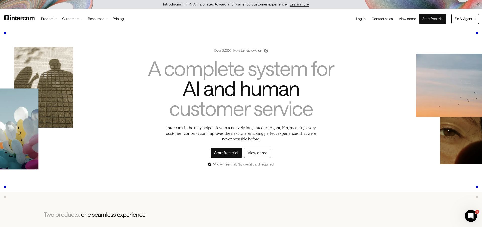
Intercom’s capture centers a customer-service statement between decorative image fragments. A trial action and demonstration route appear together beneath the explanatory text, while the next section begins with the idea of two products in one experience. The layout keeps a unified story despite a broad offering. Stripe’s customer page now carries Fin branding but describes Intercom’s move to consolidated Stripe Billing and usage-based billing for Fin. The source supports that named billing scope; the preserved capture is the dated Intercom marketing property.
What you can learn
When products share a commercial relationship, explain what is bundled and what varies with use. A unified visual story should not hide the unit a customer will be billed for. Give self-service visitors and sales-assisted buyers consistent language for seats, usage and administration, even when they enter through different calls to action.
Pros
The centered hierarchy makes the combined service proposition easy to locate in the composition.
Trial and demo choices acknowledge both immediate exploration and a more guided evaluation.
Cons & considerations
Decorative imagery occupies space that could otherwise explain the relationship between the two products.
The broad headline cannot resolve the differences between subscription and usage charges on its own.
ReactAssociated with Next.js; not independently observed
Public source checked November 3, 2026. References may be embedded or legacy—not a complete backend inventory.
Platform source: Stripe official customer evidence. Stripe’s customer page, currently branded FinAI, explicitly describes Intercom adopting Stripe Billing and usage-based billing for Fin alongside Stripe Payments. The preserved Intercom marketing capture is dated independently. Platform evidence is separate from the direct website screenshot and is not a complete current infrastructure audit.
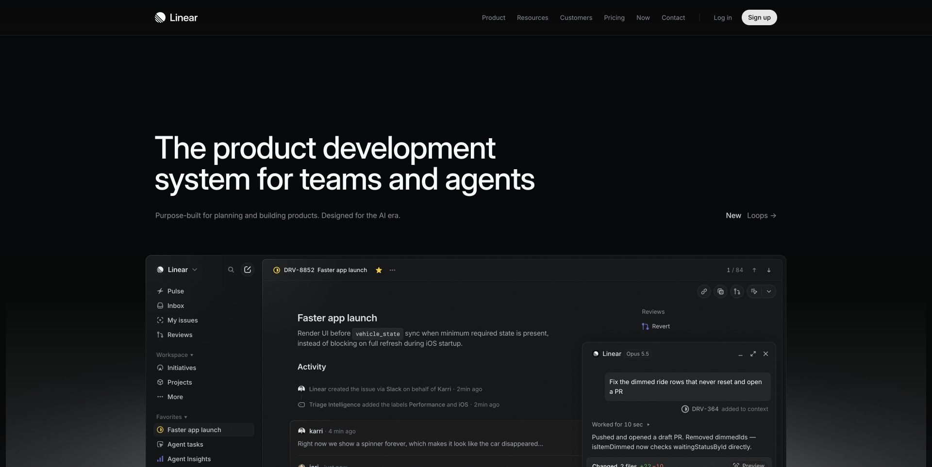
Linear’s dark opening screen places a concise product-development headline above a large interface preview. Navigation and sign-up controls stay small, allowing the working environment to become the main supporting evidence. Subtle gray boundaries distinguish the application panels without introducing a bright promotional collage. Stripe’s Linear case study describes subscriptions, payment processing and related billing work. The visual review concerns the public product introduction; it does not imply that the application interface shown in the hero is itself a Stripe component.
What you can learn
Make the relationship between the free product experience and the paid team plan understandable before the upgrade moment. A product-led page can show real working concepts, while pricing and account screens explain which capabilities change with a purchase. Preserve the same workspace and team terminology across those surfaces so the customer can connect the commercial decision to daily use.
Pros
The substantial interface preview supplies concrete context for the short product proposition.
The restrained palette keeps attention on the software rather than unrelated promotional imagery.
Cons & considerations
Fine interface labels are difficult to read within the scaled hero demonstration.
A dark composition with subtle boundaries needs careful contrast checks beyond this visual review.
Public source checked November 3, 2026. References may be embedded or legacy—not a complete backend inventory.
Platform source: Stripe official customer evidence. Stripe’s Linear case documents payment processing, subscription billing and related tax/data services. The public product page is not a payment-flow capture. Platform evidence is separate from the direct website screenshot and is not a complete current infrastructure audit.
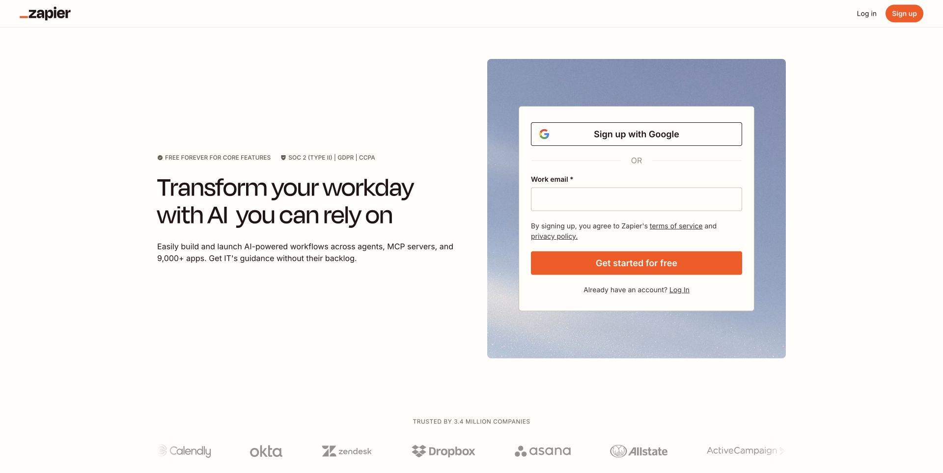
Zapier’s captured acquisition route places a short automation proposition on the left and a sign-up panel on the right. The warm white background, orange action and customer-logo row create a compact introduction with little navigation overhead. This is a specific public landing route, not a claim about every Zapier page. Stripe’s customer story documents payment processing and fraud-related services for Zapier. The screenshot shows the earlier acquisition step, with no evidence that submitting this form would immediately trigger a charge.
What you can learn
Treat account creation and paid conversion as different commitments. A prominent sign-up panel should explain its immediate outcome, while later screens clearly introduce plan limits, billing frequency and payment details. Preserve the source route when studying this example because a focused acquisition landing page serves a narrower purpose than a complete product or help website.
Pros
The side-by-side layout connects a concise benefit statement directly to a next action.
The visible logo row adds context without pushing the form below the first viewport.
Cons & considerations
The form-led composition gives less space to detailed product explanation or comparison.
Visitors who are not ready to create an account have fewer visible exploration choices.
ReactAssociated with Next.js; not independently observed
Public source checked November 3, 2026. References may be embedded or legacy—not a complete backend inventory.
Platform source: Stripe official customer evidence. Stripe’s Zapier case documents payment processing and Radar. The pictured public acquisition route is distinct from a paid-plan checkout. Platform evidence is separate from the direct website screenshot and is not a complete current infrastructure audit.
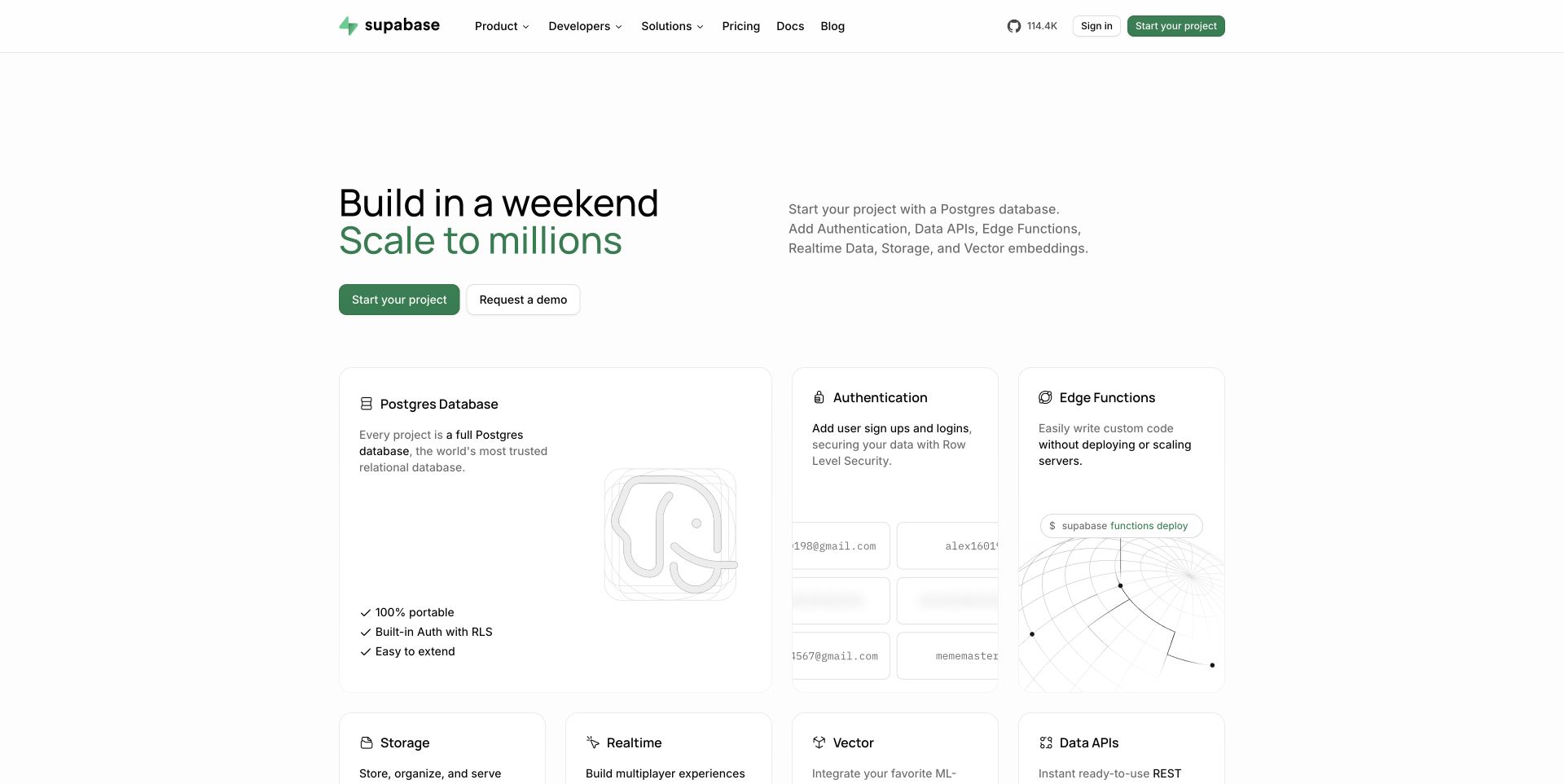
Supabase pairs a short build-and-scale headline with green actions, then introduces database, authentication and other capabilities through a card grid. The page moves quickly from positioning to named components, giving developers a way to map the product to their own architecture. Stripe’s customer story describes payments and associated optimization tools used by Supabase. That evidence concerns how Supabase collects payment for its offering; it should not be confused with claiming that every application built using Supabase also integrates Stripe.
What you can learn
A modular product presentation needs an equally clear explanation of commercial units. State which capabilities belong to the plan, which depend on usage and where administrators can inspect charges. Reuse the understandable component names from the public site in billing explanations, while keeping your customer’s own payment integrations separate from the platform’s subscription relationship.
Pros
Named capability cards give the broad platform promise a concrete structure immediately.
A limited green accent ties the main actions and brand identity together.
Cons & considerations
Several technical concepts appear quickly and may be demanding for less experienced visitors.
Small diagram and card details need deeper pages before they can support an implementation decision.
Public source checked November 3, 2026. References may be embedded or legacy—not a complete backend inventory.
Platform source: Stripe official customer evidence. Stripe’s Supabase case documents Payments, Elements, Link and associated authorization/dispute tools for Supabase’s business. It does not establish the stack of applications built by Supabase customers. Platform evidence is separate from the direct website screenshot and is not a complete current infrastructure audit.
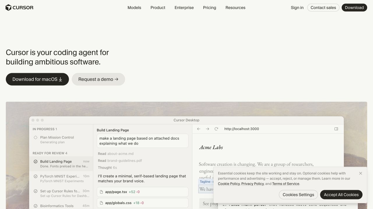
Cursor’s light homepage introduces the coding agent with a compact statement and a prominent desktop-download action. An adjacent demo route accommodates team evaluation, and a large editor preview supplies context below. The navigation separates features, enterprise information and pricing without overwhelming the opening message. Stripe documents Cursor’s payment and billing infrastructure, including subscription-related tools. The captured public page remains a download and evaluation surface; downloading software is not presented here as evidence of a completed subscription or an inspected payment flow.
What you can learn
Keep installation, account creation and paid entitlement understandable as separate steps. A desktop product should explain where a customer manages the subscription and how that account relates to the installed application. Use the product demonstration to establish usefulness, then give individuals and team administrators explicit commercial information at the point where they need to make a decision.
Pros
The operating-system-specific download action makes the immediate next step concrete.
The editor preview shows the product in a recognizable working environment.
Cons & considerations
The large preview contains small details that are difficult to assess at this scale.
Visitors comparing subscription options must follow pricing rather than learning them in the hero.
Public source checked November 3, 2026. References may be embedded or legacy—not a complete backend inventory.
Platform source: Stripe official customer evidence. Stripe’s Cursor case documents payment and billing infrastructure including Checkout and Billing. The public download page is separate from the paid entitlement journey. Platform evidence is separate from the direct website screenshot and is not a complete current infrastructure audit.
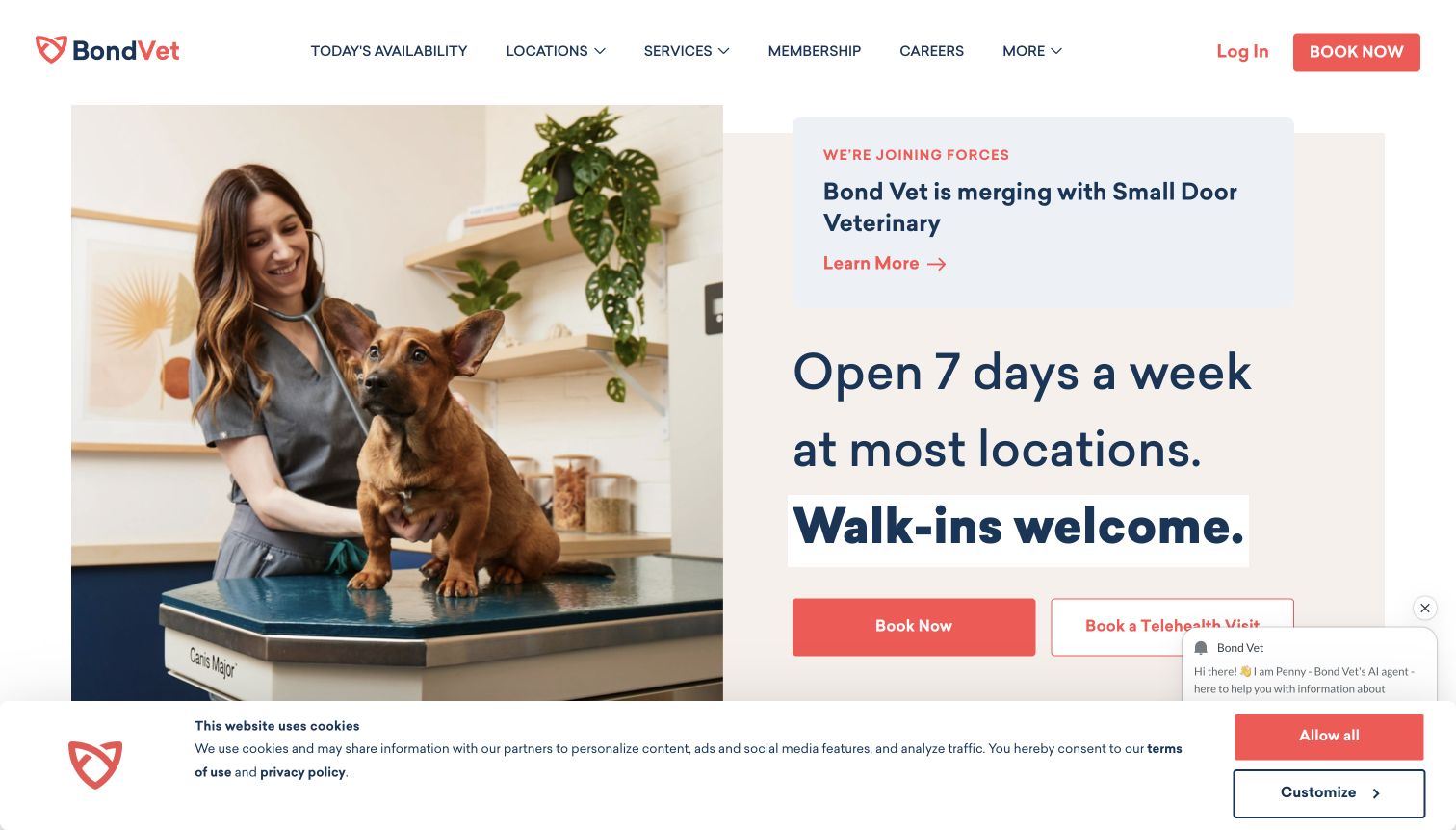
Bond Vet’s captured homepage places a care-team photograph beside availability messaging and appointment actions. Location and service navigation sit above, making the page useful to someone deciding where and when to seek a visit. A merger notice and visible privacy overlay add competing information to the opening view. Stripe’s official story documents both online and in-person payment processing for Bond Vet. This is a payment-infrastructure association and a website-design review, not an assessment of veterinary care or a verified booking transaction.
What you can learn
A service website should explain the appointment journey before the financial handoff. Identify when a visitor is requesting availability, confirming a booking or paying, and keep those states distinct in the interface. For a multi-location business, payment and receipt responsibilities also need to remain consistent between online scheduling and the physical visit.
Pros
Availability language and booking controls respond directly to an immediate service need.
The photograph and location navigation establish a tangible, place-based service context.
Cons & considerations
The merger message competes with the primary appointment task in the captured view.
Privacy and assistance overlays occupy space near actions and should be checked at narrow widths.
ReactAssociated with Gatsby; not independently observed
Public source checked November 3, 2026. References may be embedded or legacy—not a complete backend inventory.
Platform source: Stripe official customer evidence. Stripe’s Bond Vet case documents online and in-person payment processing using Payments and Terminal. The appointment-oriented homepage is not an inspected transaction or evaluation of care. Platform evidence is separate from the direct website screenshot and is not a complete current infrastructure audit.
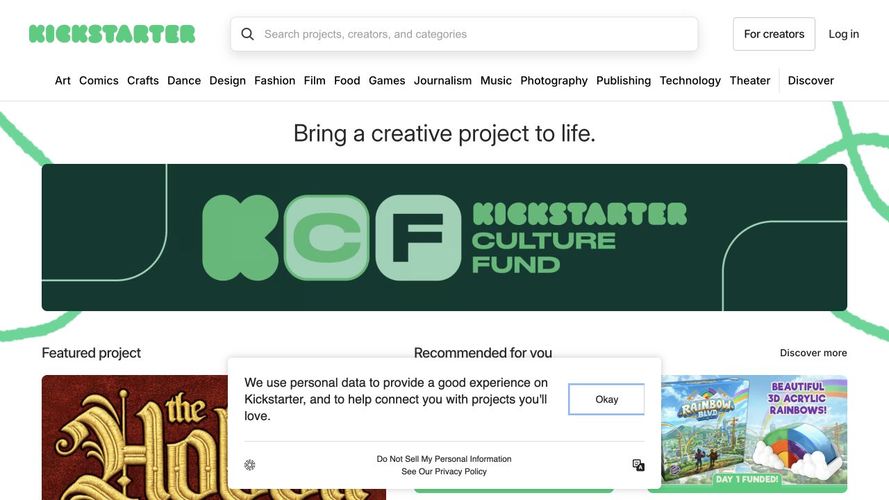
Kickstarter places a broad search field and category navigation above a creative-project mission statement. A large culture-fund feature occupies the center, followed by a featured project and smaller recommendation cards. The composition connects platform identity with distinct things a visitor can explore. Stripe’s Kickstarter story documents Payments and Connect for collecting successful pledges and paying creators. The screenshot is the discovery surface; the payment evidence does not turn a pledge into an ordinary retail purchase or establish the terms of any individual campaign.
What you can learn
Design discovery, commitment and creator settlement as related but separate stages. Before a contributor commits, the interface needs campaign-specific timing and responsibility information that cannot fit in the homepage hero. A platform brief should describe those states explicitly, while the public catalog helps visitors understand the range of projects and locate the ones relevant to them.
Pros
Search and a broad category row support both focused lookup and exploratory browsing.
Large and small project features create a useful hierarchy within a varied catalog.
Cons & considerations
The prominent platform campaign uses space that might otherwise show more individual projects.
The dense category row requires a deliberate responsive treatment for smaller screens.
Visible tech stack
Earlier / documented evidence
Stripe
Earlier cited evidence retained; no current scan result. References may be embedded or legacy—not a complete backend inventory.
Platform source: Stripe official customer evidence. Stripe’s Kickstarter case documents Payments and Connect for collecting successful pledges and paying creators. This is a crowdfunding payment relationship, not a claim about individual campaign terms. Platform evidence is separate from the direct website screenshot and is not a complete current infrastructure audit.
Typeform’s dark purple hero uses large, expressive typography to introduce forms and AI automation. A concise supporting paragraph and bright trial action sit within the same visual field, with pricing available in the header and an announcement strip above. The captured composition emphasizes the product’s personality before displaying a form-building workspace. Stripe’s Typeform story documents two distinct roles: Billing for Typeform subscriptions and Connect for payments collected through customers’ forms. Those relationships should remain separate in any description of the platform.
What you can learn
Clarify whether a visitor is paying for the software or enabling payments from their own audience. The marketing site can introduce both possibilities, but onboarding and help content need different terminology, responsibilities and setup guidance for each. A recognizable brand treatment is useful only when the practical commercial choice remains understandable as the user moves deeper.
Pros
The strong color and typographic treatment give a familiar software category a distinct identity.
The main trial action and header pricing route provide clear evaluation entry points.
Cons & considerations
The headline-led hero offers little immediate detail about the actual form-editing workflow.
The announcement strip introduces another message before the central product proposition.
Public source checked November 3, 2026. References may be embedded or legacy—not a complete backend inventory.
Platform source: Stripe official customer evidence. Stripe’s Typeform case documents Billing for Typeform subscriptions and Connect enabling customers to collect payments within their forms. These are two distinct commercial roles. Platform evidence is separate from the direct website screenshot and is not a complete current infrastructure audit.
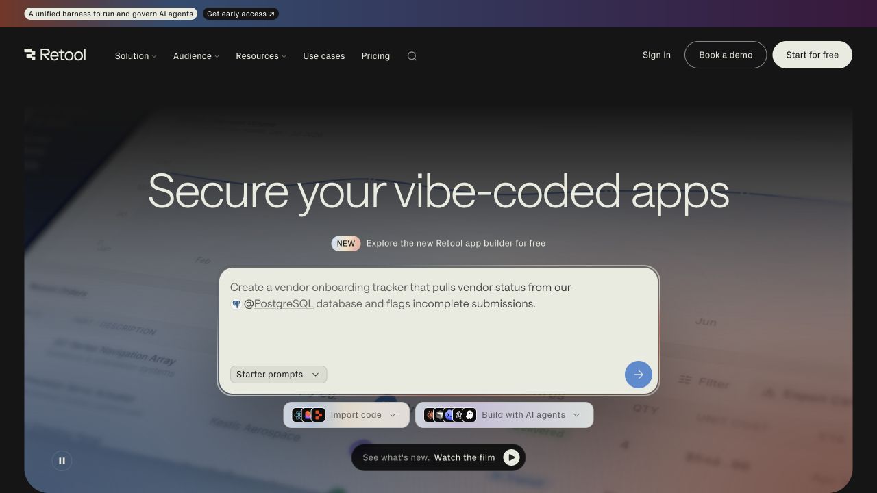
Retool’s homepage places a large sample prompt over an animated visual background beneath a security-oriented headline. Import and agent-building choices sit nearby, while the header separates a free start from booking a demonstration. The design makes creating something feel like the immediate next step. Stripe’s Retool customer story describes billing, invoices and payment options for the service. That commercial association is separate from the sample application in the hero, which should not be described as an actual customer’s system or transaction.
What you can learn
An interactive-looking demonstration needs clear boundaries around what happens when a visitor proceeds. Explain when experimentation becomes an account, a shared organizational workspace or a paid arrangement. Retool also illustrates why enterprise and self-service purchasing may need different routes without using inconsistent product names or leaving invoice ownership to be discovered after setup.
Pros
The example prompt gives a concrete starting idea instead of an abstract feature claim.
Free-start and demonstration routes acknowledge different evaluation and procurement needs.
Cons & considerations
The animated background and multiple creation controls introduce several competing visual elements.
Security-oriented wording requires supporting detail beyond what the opening screen can demonstrate.
Public source checked November 3, 2026. References may be embedded or legacy—not a complete backend inventory.
Platform source: Stripe official customer evidence. Stripe’s Retool case documents billing, invoices and payment options for Retool customers. The sample application prompt on the homepage is not a payment screen. Platform evidence is separate from the direct website screenshot and is not a complete current infrastructure audit.
Substack’s signed-out page presents a content feed in the center, a navigation rail on the left and a sign-up card on the right. A creator-oriented banner sits above the feed, so the page invites both reading and publishing. Orange actions unify varied material. Stripe’s Substack story documents subscription billing, payments and Connect for its publishing platform. The public feed is evidence of discovery and acquisition design; it does not reveal the terms or payment state of any individual publication.
What you can learn
A publishing platform needs to distinguish following a creator, taking a paid subscription and starting a publication. Give each action its own explanation and make renewal management easy to locate when money is involved. The feed can communicate the breadth of available work, while individual publication pages should carry the specific promise a reader is being asked to support.
Pros
The visible feed demonstrates the type of work available before an account is created.
The persistent rail establishes a recognizable framework for reading and participation.
Cons & considerations
Creator acquisition and reader discovery compete for attention in the same opening view.
A variable public feed cannot provide a consistent explanation of subscription terms by itself.
Visible tech stack
Earlier / documented evidence
Stripe
Earlier cited evidence retained; no current scan result. References may be embedded or legacy—not a complete backend inventory.
Platform source: Stripe official customer evidence. Stripe’s Substack case documents online payments, recurring subscription billing and Connect for the publishing platform. Individual publication terms are outside the observed public feed. Platform evidence is separate from the direct website screenshot and is not a complete current infrastructure audit.
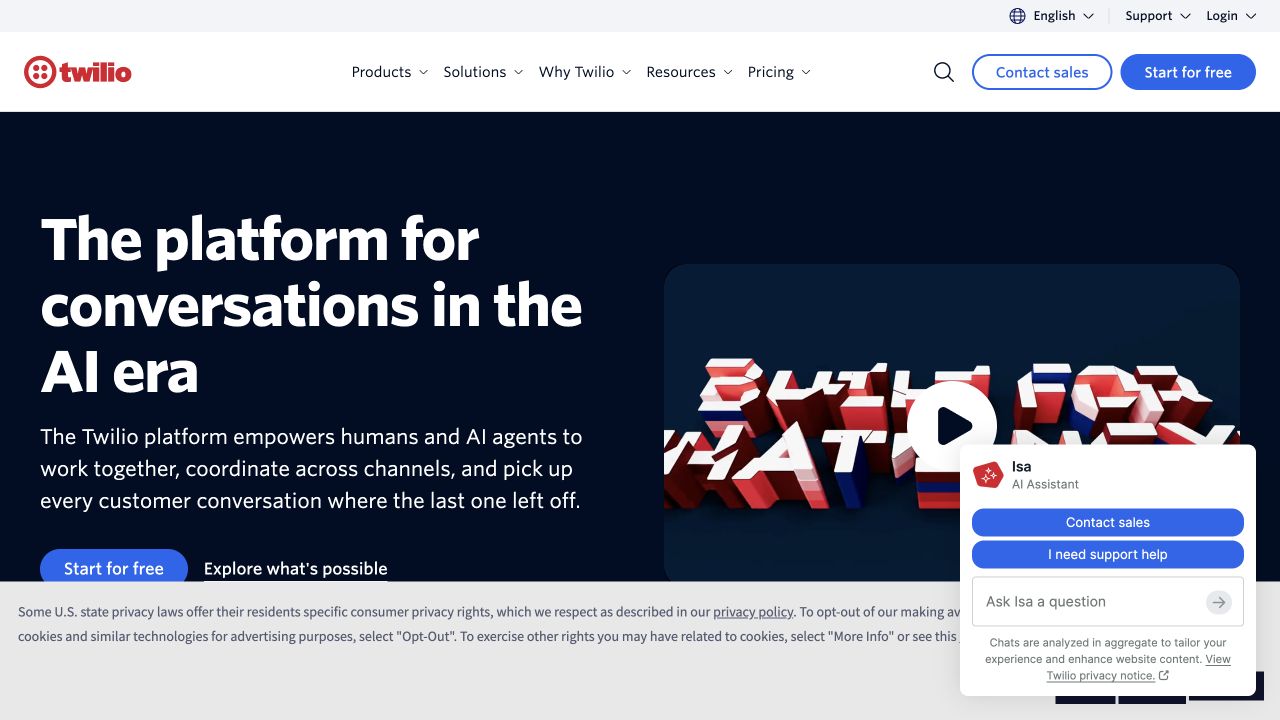
Twilio’s opening screen pairs a large white platform headline on dark blue with a visual demonstration area. A prominent start action and a secondary exploration route sit beneath the copy, while the header exposes products, solutions, resources and pricing. The captured state also includes a privacy notice and assistant panel that occupy the lower-right region. Stripe’s Twilio customer story documents payment processing. It supplies commercial evidence for the guide, while the screenshot shows the separate task of explaining a broad communications platform.
What you can learn
A developer-service website should make experimentation and commercial evaluation equally intelligible. Visitors need to connect the capabilities they explore with the eventual billing model and account owner. Check the first-visit experience with privacy and assistance interfaces present: those elements are part of the actual page and can obscure supporting material even when the underlying hero is carefully composed.
Pros
The large headline and restrained color contrast establish a clear primary reading area.
Product, pricing and developer-oriented routes support several distinct evaluation tasks.
Cons & considerations
The assistant and privacy panels cover a substantial portion of the captured lower viewport.
The broad platform statement needs deeper examples to explain a particular implementation.
Public source checked November 3, 2026. References may be embedded or legacy—not a complete backend inventory.
Platform source: Stripe official customer evidence. Stripe’s Twilio case documents Stripe as a payment processor with related reporting. The communications-platform homepage is a separate public marketing surface. Platform evidence is separate from the direct website screenshot and is not a complete current infrastructure audit.
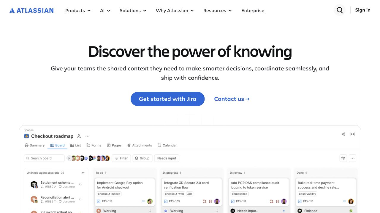
Atlassian’s white homepage leads with a centered knowledge-and-teamwork proposition, then offers a Jira starting point and a contact route. A large work-board preview fills the lower part of the screen, giving the broad message a specific product context. The main navigation preserves access to products, solutions and enterprise material. Stripe’s Atlassian story documents consolidated payment and billing infrastructure. The example therefore connects product discovery with a sourced commercial relationship, without suggesting that Stripe renders the board preview or manages the work inside it.
What you can learn
When several products share an organization, explain the purchasing unit and administrative role as clearly as the product benefit. A homepage can begin with one familiar application, but the commercial journey should clarify which products and users are included. Keep self-service entry points and sales conversations aligned around the same account and subscription concepts.
Pros
The centered actions give both hands-on and sales-assisted visitors an obvious starting route.
The board preview supplies a recognizable example beneath an otherwise broad teamwork message.
Cons & considerations
The large introductory statement does not identify the full product and plan structure.
Fine board labels are illustrative at this scale and need a dedicated product demonstration.
Visible tech stack
Referenced on the public page
Amazon CloudFrontDelivery / hosting signal
Earlier / documented evidence
Stripe
Public source checked November 3, 2026. References may be embedded or legacy—not a complete backend inventory.
Platform source: Stripe official customer evidence. Stripe’s Atlassian case documents consolidated payment and billing infrastructure using Payments and Billing. This does not describe the technology rendering the public homepage or Jira work boards. Platform evidence is separate from the direct website screenshot and is not a complete current infrastructure audit.
Bookshop.org places its local-bookstore mission above a conventional retail header with search, category browsing and cart access. A bookstore-selection route makes the platform relationship visible before checkout. The large promotional banner and book-list cards then give visitors familiar ways to discover a title. Stripe’s Bookshop.org story documents Payments for consumer purchases and Connect for payouts to bookstores. The design review concerns that public storefront; the captured fundraising figure is a dated page element, not a newly verified financial total.
What you can learn
Make the marketplace’s purpose understandable without hiding ordinary shopping tasks. Explain how the selected bookstore relates to a purchase and preserve that context through the later payment journey. The homepage can establish the mission, but order confirmation and support content still need clear responsibility for the specific transaction, delivery and any subsequent customer question.
Pros
Search, categories and bookstore selection connect practical shopping with the platform’s mission.
The large campaign and smaller lists provide different levels of catalog discovery.
Cons & considerations
The promotional banner occupies much of the first screen before individual books are visible.
A changing impact total requires careful dating if repeated in editorial or marketing material.
Visible tech stack
Earlier / documented evidence
Stripe
Earlier cited evidence retained; no current scan result. References may be embedded or legacy—not a complete backend inventory.
Platform source: Stripe official customer evidence. Stripe’s Bookshop.org case documents Payments for consumer card purchases and Connect for bookstore payouts. The visible public storefront is separate from the underlying transaction and settlement flows. Platform evidence is separate from the direct website screenshot and is not a complete current infrastructure audit.
Map product selection, price, availability, payment, confirmation and fulfillment. Specify which system owns the order and what a customer sees when the payment requires another step or does not complete. Review the handoff from the public page with representative products rather than only an ideal single-item purchase.
A subscription or usage-based service
Explain the unit being purchased and the way charges change over time. Stripe Billing supports recurring and usage-based models, but the website must still make the relevant plan boundaries, billing administration and customer-management routes understandable. Use consistent names for plans, workspaces and account owners across marketing and product interfaces.
A platform serving independent sellers or creators
Map the platform, buyer and seller responsibilities separately. Stripe Connect supports payments and money movement for platforms and marketplaces. Define the intended account and payout arrangement with the appropriate business and implementation specialists; a marketplace homepage should not be treated as a specification for another company’s commercial model.
Plan the states around a payment, not only the successful button click
Write a journey and ownership map
Identify the public offer, account step, payment interface, confirmation, receipt, fulfillment and support destination. Name the system and team responsible for each stage. Include returning customers and administrators who need to change a payment method, inspect an invoice or understand an existing subscription.
Review real edge cases in an approved test environment
Include declined or interrupted payments, required additional authentication, repeated clicks, delayed completion and a customer returning after leaving the flow. Verify the actual integration’s documented events and state transitions. Keep test data and operations separate from live purchases; a visual homepage review cannot establish that these behaviors work.
Preserve the offer through responsive layouts
Check that price context, important conditions, action labels and recovery messages remain readable at narrow widths and enlarged text. Review keyboard focus and the handoff into any hosted interface. Keep the business identity and purpose clear without assuming the payment provider should dictate the whole visual system.
A useful handover demonstration
Ask the actual team to carry out its routine job: publish a realistic update, correct a mistake, preview a narrow screen, and identify who owns an integration failure. For a library or frontend framework, also ask who maintains the content source and deployment. A polished screenshot does not answer those operational questions.
Beyond the screenshot
A website and payment journey review checklist
Identify the seller or service provider and the exact customer commitment.
Keep product, plan and account terminology consistent across every step.
Explain charge timing and recurring or usage-based behavior where applicable.
Choose the integration mode using current documentation and actual requirements.
Map payment states to order, entitlement and fulfillment responsibilities.
Exercise failures and recovery paths with approved test data.
Check responsive layouts, keyboard navigation and visible error messages.
Provide clear receipt, billing-management and support destinations.
Record the documented payment scope separately from the public frontend stack.
Test with real content, a keyboard, a small screen, slow or failed requests, and the people who will maintain the system. These are planning checks, not an accessibility, security, performance, or search-ranking certification.
Sources & editorial method
How this Stripe collection was reviewed
We reviewed 20 distinct public website properties and primary customer or help sources checked on November 3, 2026. Eight screenshots were captured directly for this guide; twelve verified direct captures were reused with their original dates and dimensions. Reviews discuss the pictured public pages. Stripe sources describe the named payment or billing relationship, sometimes historically or for a specific product; they are not proof of every current route or system. No private account, purchase, pledge, booking or payment form was submitted. Visible privacy and assistance overlays are retained where present and considered in the reviews.
Every image is an unmodified capture from the actual website, with its source and capture date. Some captures are reused from our shared catalog; their dates remain the original capture dates. None comes from a vendor gallery or a generated reconstruction. Moving imagery and live content can change.
Technology attribution uses public page assets or metadata, official platform documentation, or a cited first-party project case study. Documentary and framework-relationship evidence is identified where used; it is not a complete current backend inventory. A CMS image CDN alone does not establish a full CMS deployment. A library’s presence does not prove which individual controls use it, and a platform label does not establish AI authorship.
The composition notes, lessons, pros and tradeoffs are original editorial observations. We have not measured conversion, traffic, security, performance or accessibility conformance. Website owners retain their brands and imagery; these examples are not our client portfolio. Written, Edited and Curated are independent records, not dates advanced by a build. See our editorial standards or suggest a correction.
Questions worth asking
Stripe website development FAQs
Are these websites built with Stripe?
The examples have a documented Stripe payment, billing or platform relationship. Stripe is not being presented as their website builder. The public layout and frontend technology are separate questions.
Why show a homepage instead of a payment form?
The guide studies how public content prepares a visitor for a commercial decision. Payment evidence comes from the linked primary source. We did not enter private accounts or submit transactions to obtain screenshots.
Does a customer story prove every product uses Stripe today?
No. Read the specific scope and date. A story can describe selected countries, products, channels or an earlier implementation. The evidence notes preserve those limits.
Should every project use the same Checkout or Billing setup?
No. A direct sale, subscription and marketplace have different requirements and responsibilities. Select the integration from the actual commercial model and current documentation.
Were the example websites tested for conversion or payment success?
No. These are visual and content reviews with sourced technology associations. They do not measure conversion, authorization rates, accessibility conformance or the reliability of private payment systems.