Umbraco appears behind corporate publications, public institutions, membership organizations, catalogues, and expressive event sites. These examples show different ways to organize content; they do not imply that one CMS produces a particular visual style.
The collection pairs current public website captures with official Umbraco implementation accounts that identify the named properties. Some projects use Umbraco Cloud, some integrate separate operational systems, and one explicitly documents a headless frontend. Those distinctions remain visible in the evidence notes rather than being flattened into a single stack claim.
Start an Umbraco brief with the real publishing work. Who updates a notice, changes an exhibition date, maintains a product description, or publishes a member resource? A convincing homepage is only one output of that system. The content model, permissions, preview process, and integration ownership determine whether the team can keep the experience coherent after launch.
Before the examples
What makes good Umbraco website development in 2026?
Model recurring information before arranging pages
Document Types define the content that can be created, its fields, and allowed structure in Umbraco. Use that control to represent durable concepts such as events, courses, people, products, and service notices. A page layout should assemble those records without requiring editors to copy the same important facts into several places.
A flexible editing interface still needs clear choices. Define a small set of components with meaningful labels, image guidance, sensible text lengths, and appropriate combinations. Ask an editor to publish a realistic awkward example, such as a long event title or a notice without an image, before deciding the system is easy to use.
Keep public content distinct from operational services
Several examples connect the CMS with banking, membership, ticketing, commerce, or product systems. Identify the source of truth for each piece of information and the destination of each action. A public content platform should explain a service clearly without obscuring the boundary where another system takes responsibility.
The collection · 20 examples
20 Umbraco website examples worth studying
Compare stable task routes, campaign areas, search prominence, and the relationship between editorial material and structured records. The captures show public desktop views. They are design references, not independent measurements of performance, conversion, accessibility conformance, or private-system reliability.
We start with five recognizable brands or organizations: Carlsberg Group, British Army, Royal Institute of British Architects, Lazard, Royal College of Physicians. Each attribution applies to the named website property, not every product or website belonging to its organization. This is a curated reading sequence, not a measured ranking.
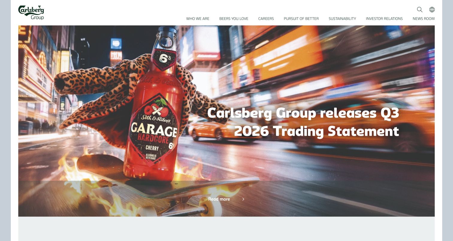
Carlsberg Group combines a restrained corporate header with a colorful beverage photograph and a timely reporting headline. The image gives the business a tangible product identity while the navigation keeps corporate subjects separate from a consumer shopping journey. This is useful inspiration for an organization that must communicate with investors, prospective employees, journalists, and commercial partners from one entrance. Umbraco’s official case associates the group website with its Pegasus framework on Umbraco Cloud; the screenshot does not establish which version or services currently operate behind every Carlsberg brand.
What you can learn
Model corporate news, financial updates, and brand stories as distinct content types with shared presentation rules. Let editors change the leading story without rebuilding the page, and preserve a direct route to stable investor information when campaign imagery rotates.
Pros
A quiet header leaves room for the product photograph to establish immediate identity.
The reporting headline gives the corporate opening a concrete reason to visit today.
Cons & considerations
A broad corporate menu still requires visitors to understand the organization’s information categories.
Prominent campaign imagery can compete with urgent reporting links unless editorial priorities stay disciplined.
Public source checked November 3, 2026. References may be embedded or legacy—not a complete backend inventory.
Platform source: Official Umbraco implementation case. Official Umbraco case links the corporate Carlsberg Group website and documents the Pegasus framework on Umbraco Cloud. This is an attributed implementation association reviewed on 2026-11-03, not a current version or complete-stack audit. Platform evidence is separate from the direct website screenshot and is not a complete current infrastructure audit.
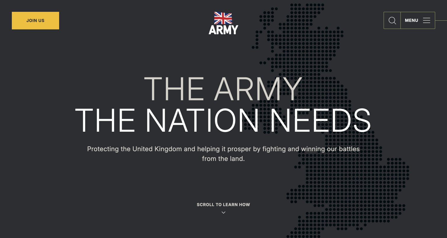
The British Army opening uses a dark field, a dotted national map, and a large statement of purpose to establish identity quickly. A gold recruitment action sits apart from the central crest, search, and menu controls. That arrangement recognizes two different intentions: learning about the institution and considering a career. The official Umbraco case documents Cantarus’s work on this public Army website, rather than a private personnel system or an unrelated recruitment application. The visual lesson concerns how a large institutional content estate introduces itself before exposing its deeper navigation.
What you can learn
Keep the institution’s narrative and its most important task route visible together. In Umbraco, define a controlled hero component with separate fields for the message, supporting media, and primary action, then test longer headlines and imagery with less contrast.
Pros
The recruitment action has a distinctive color and a stable position in the header.
A limited opening palette makes the crest and large purpose statement easy to distinguish.
Cons & considerations
A collapsed menu conceals the breadth of public information until the visitor opens it.
The dramatic hero needs careful contrast and motion checks across alternative campaign assets.
Visible tech stack
Earlier / documented evidence
Umbraco
Earlier cited evidence retained; no current scan result. References may be embedded or legacy—not a complete backend inventory.
Platform source: Official Umbraco implementation case. Official Umbraco case identifies army.mod.uk and documents Cantarus’s Umbraco public website implementation. This is an attributed implementation association reviewed on 2026-11-03, not a current version or complete-stack audit. Platform evidence is separate from the direct website screenshot and is not a complete current infrastructure audit.
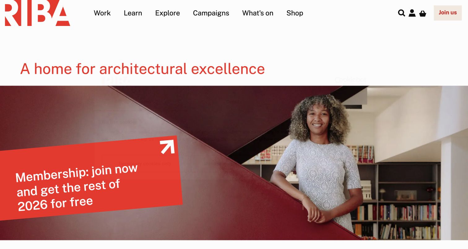
RIBA’s red identity anchors a white header with plain routes for work, learning, exploration, campaigns, events, and shopping. Below it, a large architectural proposition leads into a photograph and an angled membership panel. The page balances the organization’s cultural role with a practical invitation to join, instead of presenting membership as a disconnected advertisement. The vendor case links this specific public RIBA property to an Umbraco Cloud implementation. Its usefulness lies in organizing a broad professional offer; the screenshot cannot verify member-only services or the integration behind the joining process.
What you can learn
Give membership content an explicit place in the same content model as publications, events, and professional resources. Reusable panels should have meaningful destinations and enough editorial constraints to remain understandable when a photograph or campaign headline changes.
Pros
The navigation uses recognizable activities rather than internal departmental names or system terminology.
The membership panel connects a human photograph with a concrete next step.
Cons & considerations
The angled panel and large headline require careful handling when translated or substantially expanded.
Several audience interests share the entrance, making ongoing navigation governance especially important.
Public source checked November 3, 2026. References may be embedded or legacy—not a complete backend inventory.
Platform source: Official Umbraco implementation case. Official Umbraco case links riba.org and documents the public professional-body website on Umbraco Cloud. This is an attributed implementation association reviewed on 2026-11-03, not a current version or complete-stack audit. Platform evidence is separate from the direct website screenshot and is not a complete current infrastructure audit.
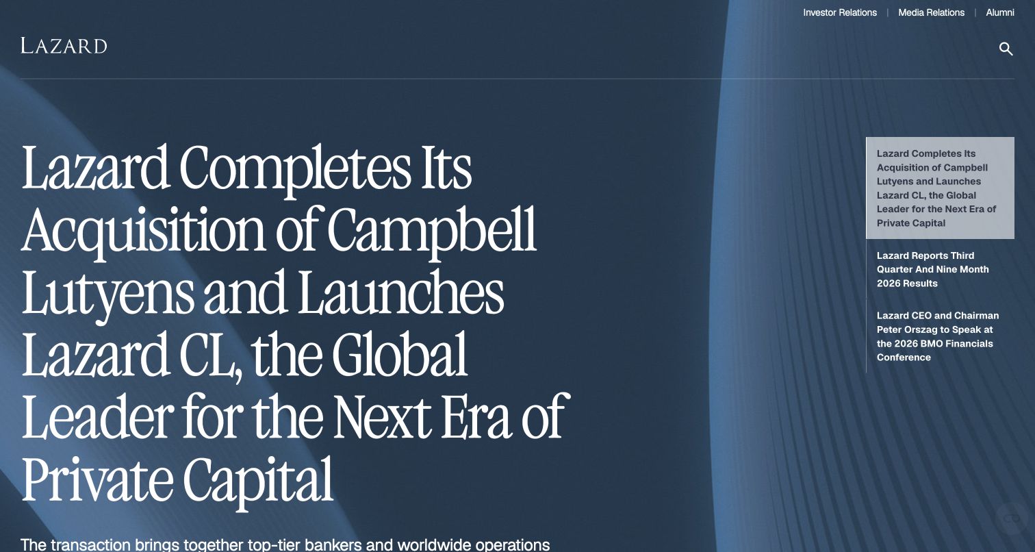
Lazard’s opening places a large white serif news headline over a textured blue background, with related stories arranged to the right. The small logo and restrained utility navigation give the news room to establish the firm’s expertise. It is an editorial approach to a professional-services homepage: evidence of current work appears before a lengthy explanation of capabilities. Umbraco’s case describes a multilingual implementation with transaction-data integration for the named corporate website. That account supports the CMS association but does not establish the current software version or every system within the wider financial business.
What you can learn
Treat transactions and perspectives as structured records with dates, categories, and reusable summaries. The homepage can then select a clear lead story while dedicated indexes serve visitors who need to compare several engagements or find a particular area of expertise.
Pros
A strong typographic hierarchy makes one editorial subject dominant without a crowded promotional grid.
The adjacent story list gives returning visitors alternatives within the same visual context.
Cons & considerations
A news-first opening assumes some familiarity with the firm and its service categories.
Long transaction names can dominate the composition and need deliberate editorial length limits.
Public source checked November 3, 2026. References may be embedded or legacy—not a complete backend inventory.
Platform source: Official Umbraco implementation case. Official Umbraco case links lazard.com and describes a multilingual CMS implementation with external transaction data. This is an attributed implementation association reviewed on 2026-11-03, not a current version or complete-stack audit. Platform evidence is separate from the direct website screenshot and is not a complete current infrastructure audit.
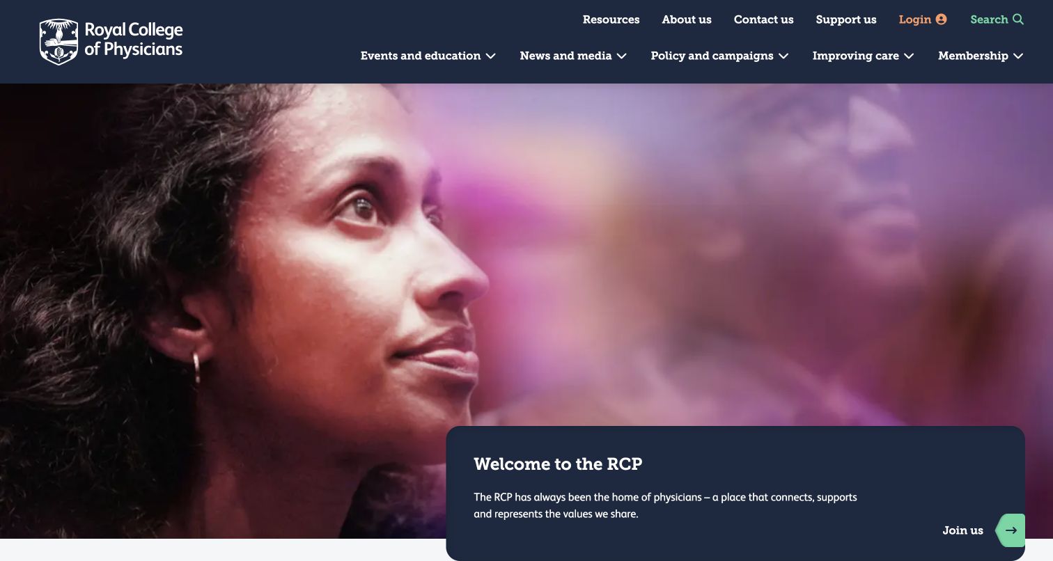
The Royal College of Physicians combines a formal dark-blue navigation system with a large, warm photograph of a person. A matching blue panel introduces the organization and provides a joining route. The visual contrast makes the membership body feel connected to the people it serves while retaining clear institutional identity. The official implementation account identifies an Umbraco rebuild for rcp.ac.uk, with a version named in the project history. That historical detail should not be mistaken for a current version audit, nor does this public view establish the behavior of private membership tools.
What you can learn
Build a consistent relationship between introductory photography, membership explanation, and action. A CMS template should accommodate several subjects without letting text cover faces or essential image detail; provide focal-point guidance and test the same module at narrow widths.
Pros
The photograph provides human context without replacing the organization’s recognizable navigation and identity.
The welcome panel groups the introductory message and joining action into one readable unit.
Cons & considerations
The large hero gives limited initial space to the organization’s deeper educational resources.
Text over photography needs fresh contrast checks whenever editors replace the leading image.
Visible tech stack
Referenced on the public page
ASP.NETReported response header
Microsoft IISReported response header
Earlier / documented evidence
Umbraco
Public source checked November 3, 2026. References may be embedded or legacy—not a complete backend inventory.
Platform source: Official Umbraco implementation case. Official Umbraco case links rcp.ac.uk and documents its public website rebuild on Umbraco CMS. This is an attributed implementation association reviewed on 2026-11-03, not a current version or complete-stack audit. Platform evidence is separate from the direct website screenshot and is not a complete current infrastructure audit.
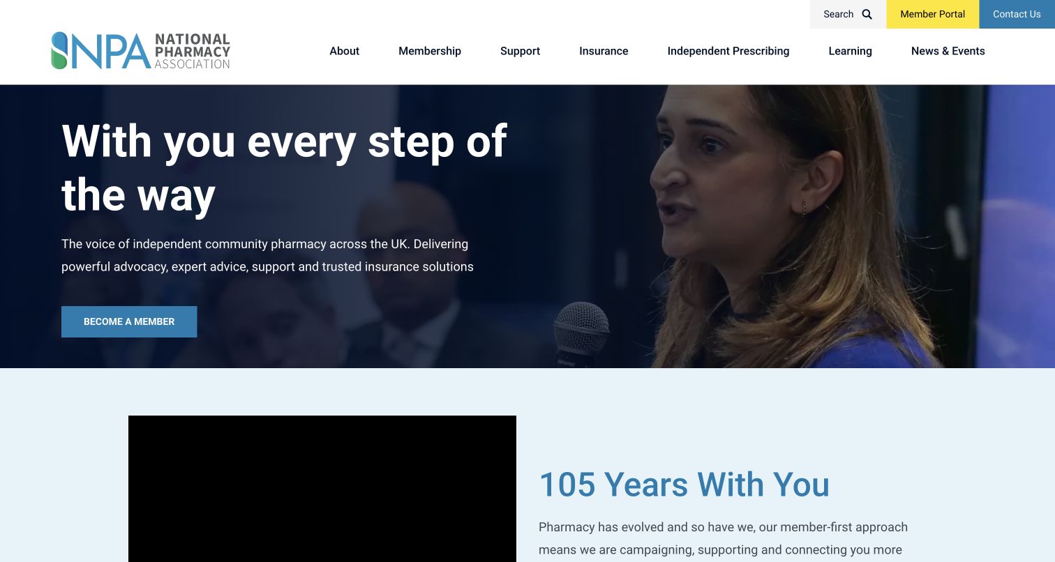
The National Pharmacy Association opens with a navy-and-white composition, a pharmacist photograph, and a concise promise of support. Membership and member access are visibly different actions: the yellow portal link sits in the header while the hero invites a visitor to become a member. This separation is useful for associations whose website must both attract new members and serve existing ones. Umbraco’s case describes the NPA public-site rebuild and connected member journeys. It does not make the public screenshot evidence of what happens after authentication or of every pharmacy service the association provides.
What you can learn
Create separate, stable routes for joining and returning-member tasks. Editorial pages can explain benefits, but the header should not force an existing member to move through acquisition copy before reaching the tools they came to use.
Pros
The member portal has a distinct visual treatment that separates it from general navigation.
The hero photograph connects the support promise with a recognizable professional setting.
Cons & considerations
A broad support statement needs specific benefits and resources close below the opening view.
Promotional membership content can overwhelm routine member tasks if every campaign receives equal prominence.
Visible tech stack
Earlier / documented evidence
Umbraco
Earlier cited evidence retained; no current scan result. References may be embedded or legacy—not a complete backend inventory.
Platform source: Official Umbraco implementation case. Official Umbraco case identifies npa.co.uk and documents Crumpled Dog’s CMS rebuild and connected membership journeys. This is an attributed implementation association reviewed on 2026-11-03, not a current version or complete-stack audit. Platform evidence is separate from the direct website screenshot and is not a complete current infrastructure audit.
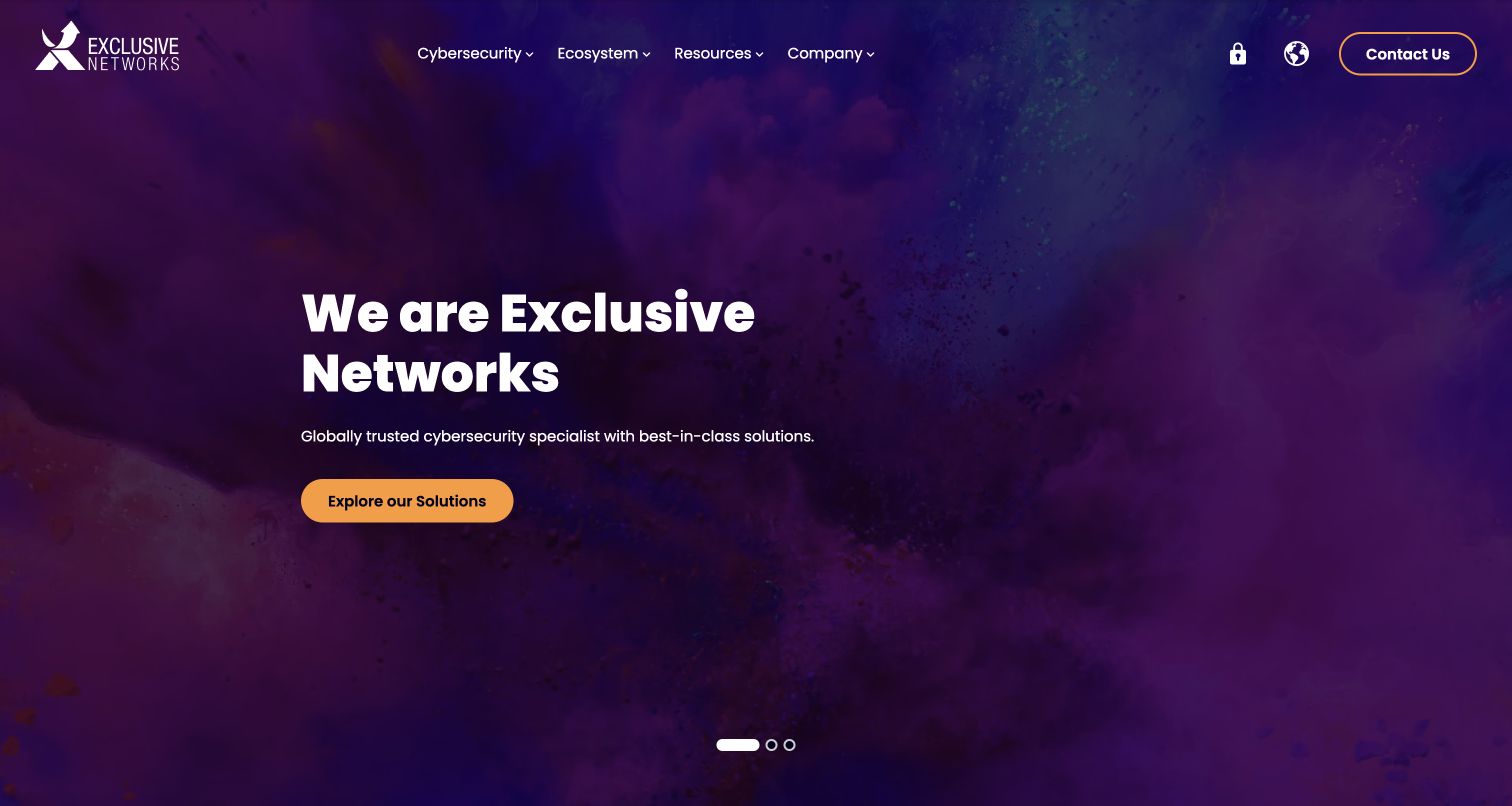
Exclusive Networks uses a purple atmospheric background, a white brand statement, and a single orange route into its solutions. The header organizes the offer around cybersecurity, an ecosystem, resources, and company information, while global and contact controls remain separate. That structure is more useful than trying to place every technical product in the hero. Umbraco’s official account describes a CMS consolidation across the distributor’s web estate. The captured global property illustrates the public result, but the case does not prove that every acquired company or regional application shares the same implementation.
What you can learn
Separate the solution taxonomy from vendor records and editorial resources. Connect them through references so an editor can maintain a vendor once and surface related guidance in relevant places, while keeping the opening message concise enough for a visitor unfamiliar with the portfolio.
Pros
One bright action stands out against the dark background without a competing button cluster.
The top-level categories distinguish technical offerings from partner relationships and supporting information.
Cons & considerations
The atmospheric imagery conveys mood more readily than it explains a specific cybersecurity service.
Rotating hero messages can make the initial proposition vary between visits and screenshots.
Public source checked November 3, 2026. References may be embedded or legacy—not a complete backend inventory.
Platform source: Official Umbraco implementation case. Official Umbraco case links exclusive-networks.com and describes replacing a fragmented regional CMS estate with Umbraco. This is an attributed implementation association reviewed on 2026-11-03, not a current version or complete-stack audit. Platform evidence is separate from the direct website screenshot and is not a complete current infrastructure audit.
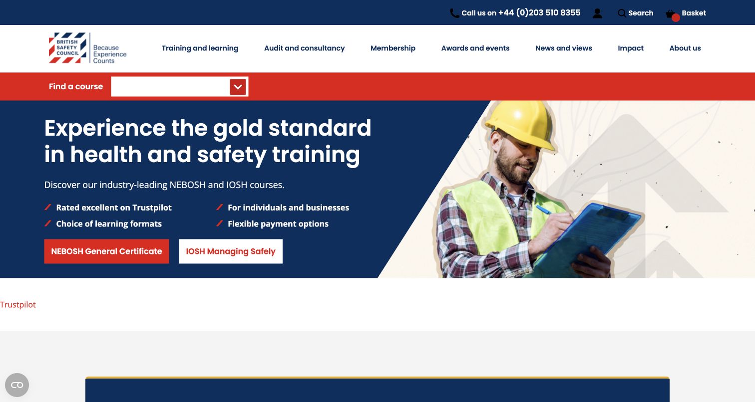
British Safety Council makes course finding a prominent red strip directly below its navigation. The hero reinforces the training proposition with two named course routes, short supporting points, and an occupational photograph. A visitor can recognize a practical learning offer before reading the wider institutional story. The official Umbraco case documents a CMS and Commerce rebuild for this public property. That source is a platform association; it does not demonstrate that every booking, payment, or learning-management function is supplied by Umbraco, or that the visible design meets any measured accessibility or conversion target.
What you can learn
Keep course titles, formats, dates, and audience suitability as structured information. A strong landing page should hand people into a consistent course-finding journey, with enough detail to distinguish qualifications rather than requiring them to interpret similar promotional labels.
Pros
Course discovery receives a persistent, visually distinct position above the promotional hero.
The two named qualification routes provide more direction than an undifferentiated learn-more action.
Cons & considerations
Several navigation categories compete for attention before a first-time learner understands the course range.
The promotional area needs clear content ownership when course availability or qualification details change.
Public source checked November 3, 2026. References may be embedded or legacy—not a complete backend inventory.
Platform source: Official Umbraco implementation case. Official Umbraco case identifies britsafe.org and documents an Umbraco CMS and Commerce implementation for its public training and membership website. This is an attributed implementation association reviewed on 2026-11-03, not a current version or complete-stack audit. Platform evidence is separate from the direct website screenshot and is not a complete current infrastructure audit.
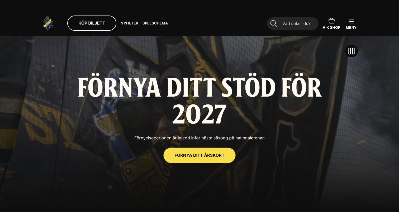
AIK Fotboll pairs black-and-yellow identity with a full-width supporter image and a large season-renewal message. Ticket buying is visible in the header, alongside news, fixtures, shopping, and search. The opening feels like a club environment while still exposing the tasks that supporters repeatedly need. The Umbraco customer story specifically describes a headless implementation for aikfotboll.se. That distinction matters: Umbraco is documented as the content system, while the public frontend and connected ticketing or merchandise journeys can have separate responsibilities. The screenshot shows the campaign’s presentation, not a test of ticket availability.
What you can learn
Model fixtures, teams, news, and campaigns separately so frequently changing information can be reused. Keep ticket routes easy to locate outside the seasonal hero, and give campaign media clear fallback behavior when motion is paused or the network is slow.
Pros
Ticket access remains visible even when the leading campaign changes to a different season.
The club palette and supporter imagery establish a coherent identity without excessive explanatory copy.
Cons & considerations
The very large campaign headline leaves limited room for immediate fixture or travel information.
Background motion and changing imagery require testing beyond a single clean desktop frame.
Public source checked November 3, 2026. References may be embedded or legacy—not a complete backend inventory.
Platform source: Official Umbraco implementation case. Official Umbraco case links aikfotboll.se and explicitly describes a headless Umbraco implementation; the frontend and ticketing are separate architectural responsibilities. This is an attributed implementation association reviewed on 2026-11-03, not a current version or complete-stack audit. Platform evidence is separate from the direct website screenshot and is not a complete current infrastructure audit.
KGM Motors UK gives the opening viewport to a vehicle promotion, using oversized campaign graphics and a dark header. A vertical set of utility icons provides routes associated with brochures, test drives, calls, locations, offers, and vehicles. The composition recognizes that choosing a car often involves several supporting tasks rather than an immediate online purchase. Umbraco’s official case links this UK property to a Cloud implementation connecting national, dealer, vehicle-stock, and CRM concerns. Those documented integrations should not be read as proof that every current utility or dealer destination is generated by the same application.
What you can learn
Keep promotional artwork distinct from structured model facts and dealer information. Editors should be able to change an offer without duplicating vehicle specifications, and every utility icon should have a meaningful accessible label and a clear destination on smaller screens.
Pros
The vehicle photograph and campaign message make the current promotional focus immediately obvious.
Persistent utility routes acknowledge the research tasks that surround a considered vehicle purchase.
Cons & considerations
A busy promotional image can reduce readability when the same artwork is scaled down.
Icon-heavy side controls demand accessible labels and may be less obvious to unfamiliar visitors.
Public source checked November 3, 2026. References may be embedded or legacy—not a complete backend inventory.
Platform source: Official Umbraco implementation case. Official Umbraco case links kgm-motors.co.uk and describes its UK platform on Umbraco Cloud, with dealer, vehicle-stock and CRM connections. This is an attributed implementation association reviewed on 2026-11-03, not a current version or complete-stack audit. Platform evidence is separate from the direct website screenshot and is not a complete current infrastructure audit.
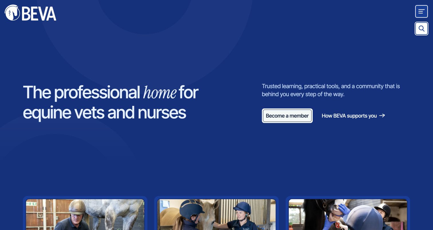
BEVA’s opening uses a deep-blue field, a large statement about its professional community, and two clear routes: become a member or learn how the association helps. Three photographic cards begin below the fold, suggesting distinct audience pathways rather than a single undifferentiated resource archive. The official case documents replacing the public website with Umbraco within a wider connected membership ecosystem. The CMS association applies to the public property shown; it does not make the screenshot a test of CRM data, private community access, or the app described in the project.
What you can learn
Use career stage and professional role as deliberate content relationships. A resource may suit more than one audience, so reference shared records instead of copying pages into separate sections. Preserve a straightforward general search for visitors who do not fit a single category.
Pros
The two opening actions distinguish a membership decision from learning about practical support.
The restrained blue composition gives the introductory language room without relying on a stock hero.
Cons & considerations
The compact menu hides detailed resource categories until another interaction is made.
Audience pathways need careful maintenance when a useful resource belongs to several professional groups.
Public source checked November 3, 2026. References may be embedded or legacy—not a complete backend inventory.
Platform source: Official Umbraco implementation case. Official Umbraco case links beva.org.uk and documents replacing the public DNN website with Umbraco inside a wider connected membership system. This is an attributed implementation association reviewed on 2026-11-03, not a current version or complete-stack audit. Platform evidence is separate from the direct website screenshot and is not a complete current infrastructure audit.
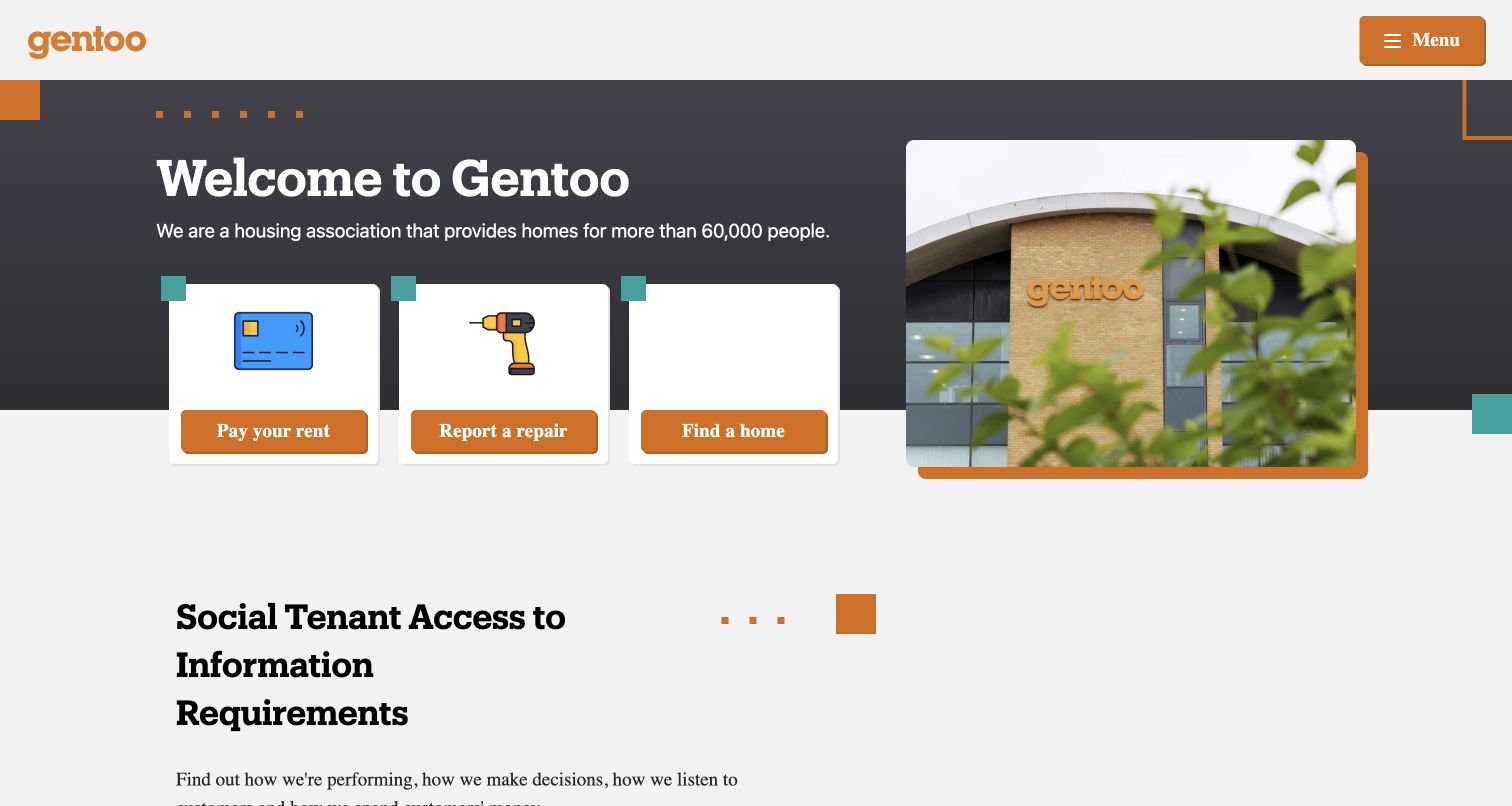
Gentoo puts three practical actions directly under its welcome message: paying rent, reporting a repair, and finding a home. Each appears as a large illustrated card with a consistent orange action area. A building photograph establishes place, while a transparency section begins beneath the hero. This is a useful model for a service organization whose recurring visitors need to finish a task quickly. The official Umbraco case documents the Group website and a separate Homes property on Umbraco Cloud; this review concerns the Group entrance and does not treat the two audiences as interchangeable.
What you can learn
Choose the opening tasks from actual resident needs and give them stable locations. Store labels and destinations centrally, then keep service notices separate from corporate news so urgent operational information can be published without displacing the essential routes.
Pros
Three concrete tasks are understandable without opening the menu or reading institutional background.
Illustrations and repeated card structure make the actions visually distinct from the building photograph.
Cons & considerations
A short opening task list requires a clear secondary route for less common resident needs.
Hidden navigation makes the wording and ordering of those primary actions particularly consequential.
Public source checked November 3, 2026. References may be embedded or legacy—not a complete backend inventory.
Platform source: Official Umbraco implementation case. Official Umbraco case explicitly names gentoogroup.com and describes moving the Group and separate Homes websites onto Umbraco Cloud. Only the Group property is pictured here. This is an attributed implementation association reviewed on 2026-11-03, not a current version or complete-stack audit. Platform evidence is separate from the direct website screenshot and is not a complete current infrastructure audit.
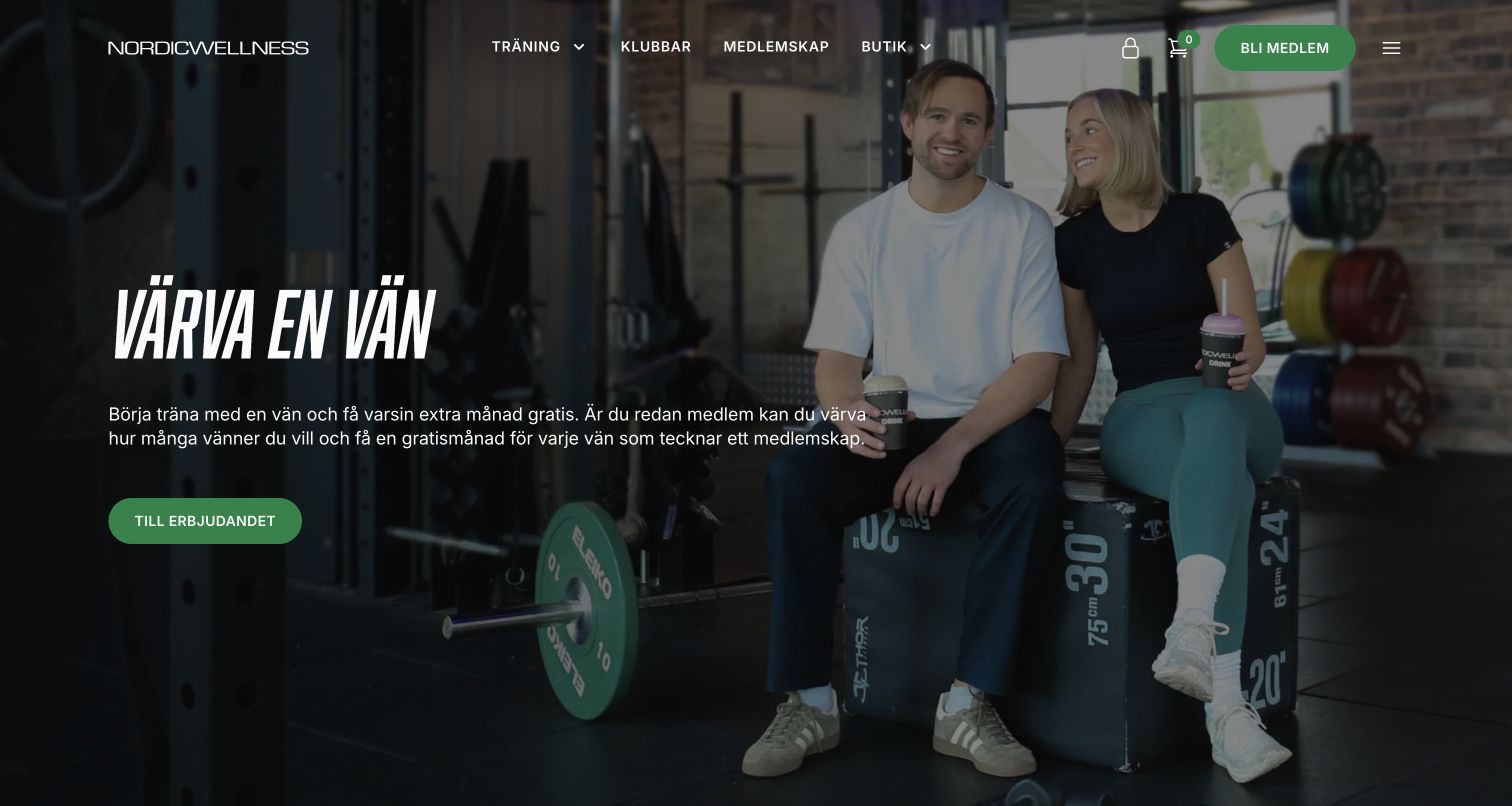
Nordic Wellness places a referral promotion over a gym photograph, while a slim header separates training, clubs, memberships, and shopping. The green membership action is easy to identify against the darker image. The opening combines an immediate campaign with stable categories that remain useful after that campaign ends. Umbraco’s official case describes a modular CMS foundation connected to membership, booking, commerce, and member services. The public website is the captured property; the screenshot does not establish the operation of private bookings, membership eligibility, payment processing, or all third-party systems involved.
What you can learn
Treat club pages, classes, and membership options as structured content, and keep campaign offers separate from their underlying terms. Local editors need consistent fields for location and facilities, while central teams should control the shared navigation and recurring promotion rules.
Pros
The header offers a direct club route alongside broader training and membership information.
A limited color system keeps the principal membership action recognizable over lifestyle photography.
Cons & considerations
The referral message assumes visitors understand the membership offer and may need supporting context.
A full-image hero depends on suitable image crops and contrast across different screen proportions.
Public source checked November 3, 2026. References may be embedded or legacy—not a complete backend inventory.
Platform source: Official Umbraco implementation case. Official Umbraco case links nordicwellness.se and describes a modular Umbraco CMS foundation connected to membership, bookings and commerce. This is an attributed implementation association reviewed on 2026-11-03, not a current version or complete-stack audit. Platform evidence is separate from the direct website screenshot and is not a complete current infrastructure audit.
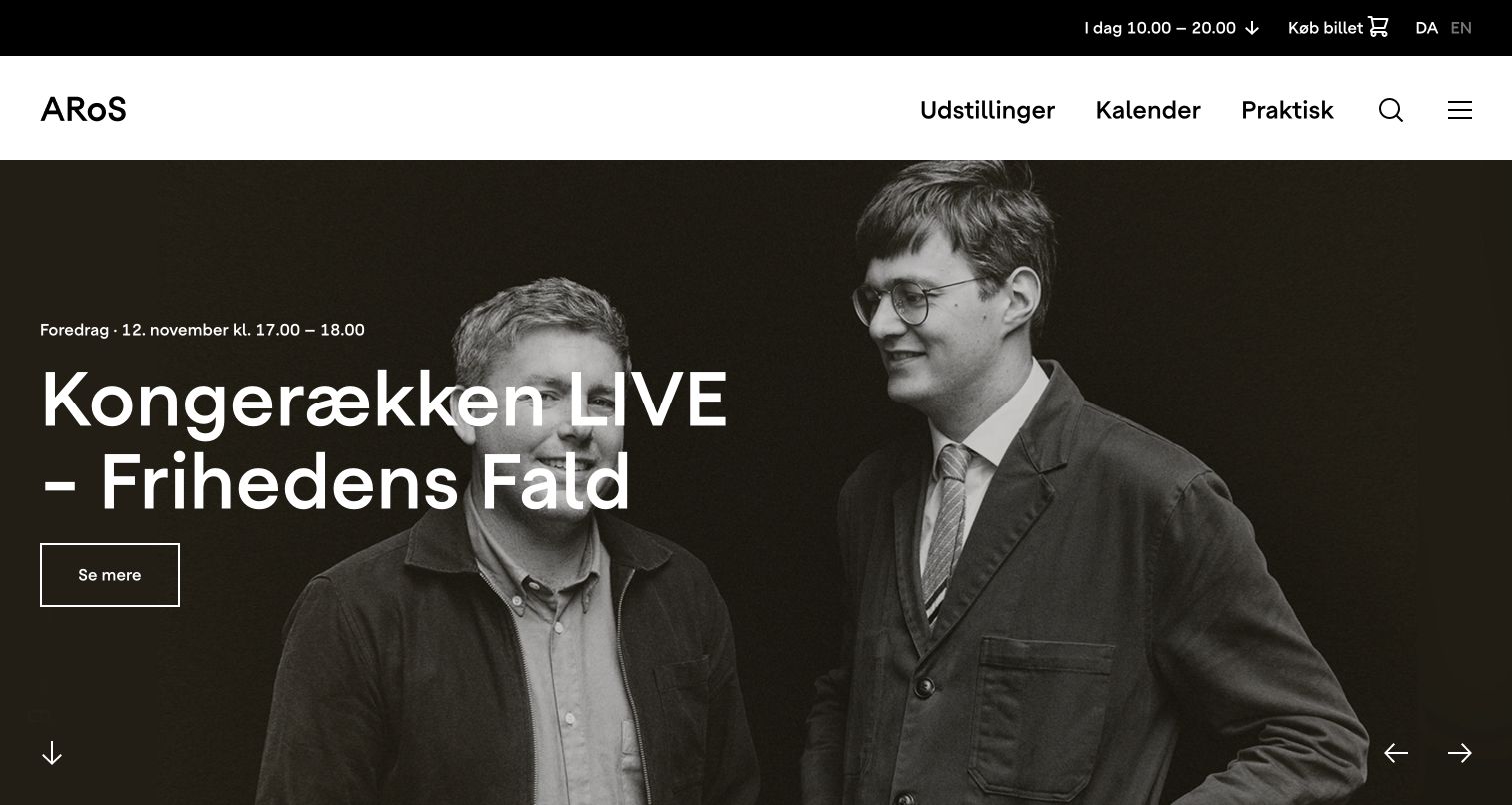
ARoS places opening hours, tickets, and language selection in a dark utility strip above a restrained white navigation bar. A large photographic event feature supplies the expressive layer, with its date and a simple route to more detail. The practical visit information remains legible even when the exhibition imagery changes completely. The official Umbraco case identifies a museum website rebuild with editorial components and visit-planning features. This capture shows the public entrance, not the ticketing transaction or a verification that opening hours and availability are synchronized correctly in every circumstance.
What you can learn
Keep practical visit facts outside the campaign image and model exhibitions and events as dated content. A shared content record should drive relevant listings and detail pages, with explicit rules for future, current, sold-out, and past material.
Pros
Opening hours and ticket access retain a stable position above the changing editorial feature.
The spacious navigation separates exhibitions, calendar information, and practical planning into recognizable groups.
Cons & considerations
Large event imagery gives only one item prominence despite the museum’s wider exhibition programme.
A rotating hero requires clear controls and predictable focus behavior for keyboard visitors.
Public source checked November 3, 2026. References may be embedded or legacy—not a complete backend inventory.
Platform source: Official Umbraco implementation case. Official Umbraco case links aros.dk and documents a public museum website built on Umbraco CMS with exhibition and visit-planning content. This is an attributed implementation association reviewed on 2026-11-03, not a current version or complete-stack audit. Platform evidence is separate from the direct website screenshot and is not a complete current infrastructure audit.
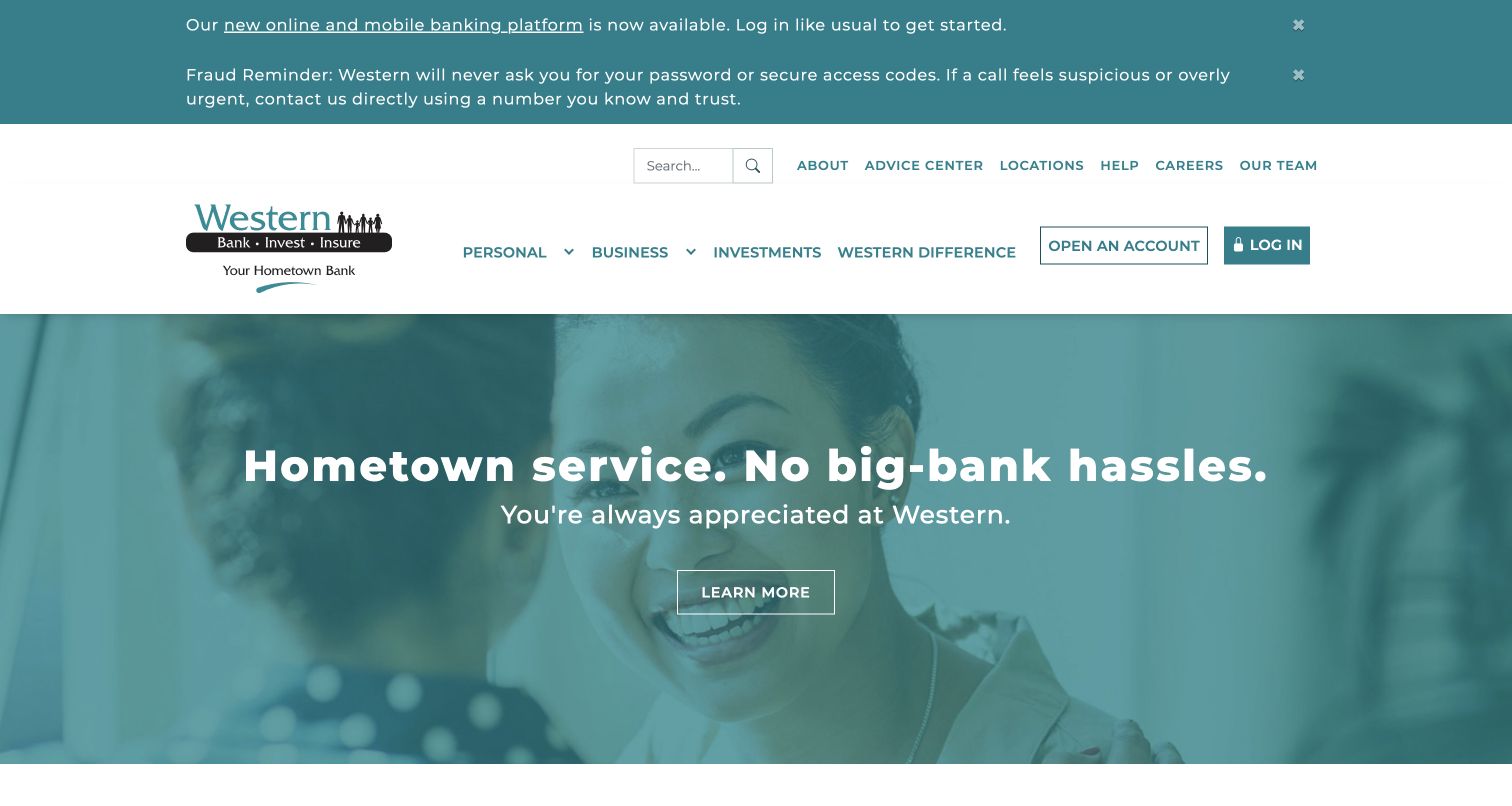
Western State Bank uses a teal palette, a service-oriented headline, and a human photograph to introduce its public website. Product navigation, account opening, and login appear in the header, while prominent notices communicate current banking changes and fraud reminders. The notices are visually separate from the brand story, making operational information hard to confuse with a promotion. Umbraco’s official case documents the public bank website on Umbraco Cloud. It does not establish the platform behind authenticated banking, and this review does not evaluate financial products or the security of account services.
What you can learn
Give service notices a controlled publication and expiry process independent of promotional content. Keep public product explanations distinct from secure account actions, and make destinations explicit so visitors understand when they are moving into a separate banking service.
Pros
Operational notices occupy a clear area above the main navigation and public marketing message.
Account access is visually differentiated from the broader personal and business product categories.
Cons & considerations
Multiple simultaneous notices push the primary website content farther down the opening viewport.
A large relationship-focused hero provides less immediate detail for visitors comparing specific account features.
Public source checked November 3, 2026. References may be embedded or legacy—not a complete backend inventory.
Platform source: Official Umbraco implementation case. Official Umbraco case links westernbanks.com and describes Blend Interactive’s public website implementation on Umbraco Cloud. Authenticated banking is outside this association. This is an attributed implementation association reviewed on 2026-11-03, not a current version or complete-stack audit. Platform evidence is separate from the direct website screenshot and is not a complete current infrastructure audit.
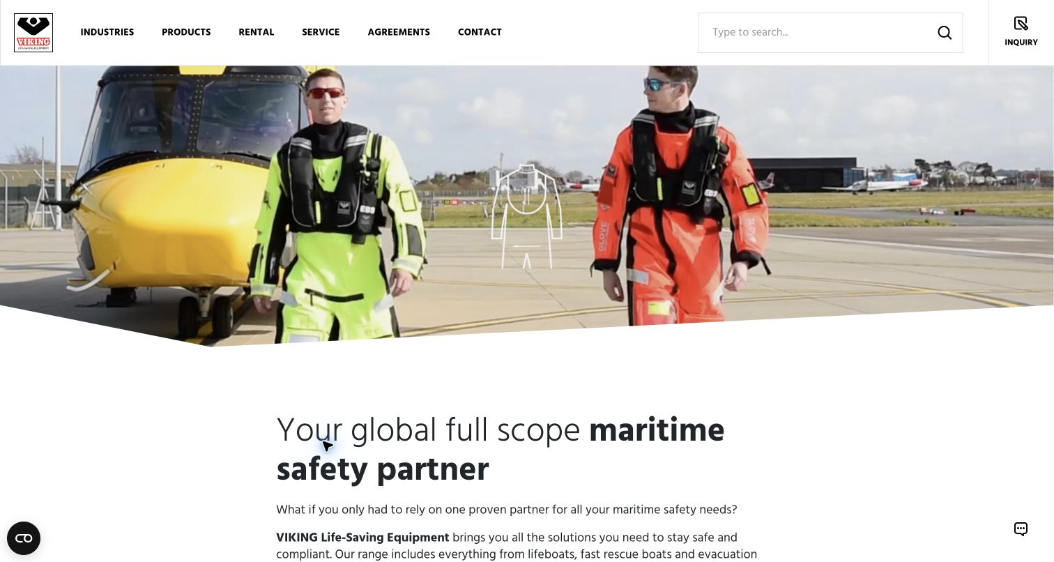
VIKING Life-Saving Equipment begins with compact routes for industries, products, rental, service, agreements, and contact. A broad search field and an enquiry control make the catalogue-oriented purpose apparent before the introductory maritime-safety message. The hero uses real-world equipment imagery, followed by more explanatory text. Umbraco’s official case documents the CMS alongside SAP Commerce Cloud product data and ServiceNow connections. This is a useful example of editorial and operational systems sharing a public experience, not evidence that Umbraco itself supplies stock management, product synchronization, or every service interaction.
What you can learn
Define which system owns each product fact and which owns editorial context. Use CMS pages to explain applications and industries while referencing maintained product records; provide a clear enquiry handoff for decisions that require specialist advice rather than presenting every item as a simple purchase.
Pros
The navigation distinguishes products from ongoing service and agreement relationships.
Search and enquiry have visible dedicated controls appropriate to a substantial technical catalogue.
Cons & considerations
The opening video occupies considerable space before detailed product-selection information appears.
A multi-system catalogue needs explicit stale-data and unavailable-service handling beyond its visual presentation.
Public source checked November 3, 2026. References may be embedded or legacy—not a complete backend inventory.
Platform source: Official Umbraco implementation case. Official Umbraco case links viking-life.com and documents Umbraco CMS alongside SAP Commerce Cloud product data and ServiceNow integration. This is an attributed implementation association reviewed on 2026-11-03, not a current version or complete-stack audit. Platform evidence is separate from the direct website screenshot and is not a complete current infrastructure audit.
Design Matters fills its opening with a speaker photograph, oversized condensed typography, event location, and dates. A broad contrasting ticket bar anchors the bottom of the hero, while a compact vertical control area holds navigation and theme choices. The result is strongly expressive but still names the basic event facts visitors need. The official Umbraco case describes moving the conference’s reusable site foundation to Umbraco. The current campaign is a public example of that association; the screenshot does not verify the external ticket workflow or prove that every archived edition uses the same architecture.
What you can learn
Separate the event’s reusable information structure from its annual art direction. Dates, venue, speakers, and programme records should survive a palette or typography change. Test the expressive system with long speaker names, multilingual content, and a fully keyboard-driven visit.
Pros
Event place and dates are central to the composition instead of buried beneath visual effects.
The wide ticket action creates a clear next step within an unusually expressive layout.
Cons & considerations
Oversized text over moving photography can become difficult to read in some frames.
Compact icon controls require discoverable labels and careful focus treatment to remain understandable.
Public source checked November 3, 2026. References may be embedded or legacy—not a complete backend inventory.
Platform source: Official Umbraco implementation case. Official Umbraco case links designmatters.io and describes replacing WordPress with a reusable Umbraco conference-site foundation. This is an attributed implementation association reviewed on 2026-11-03, not a current version or complete-stack audit. Platform evidence is separate from the direct website screenshot and is not a complete current infrastructure audit.
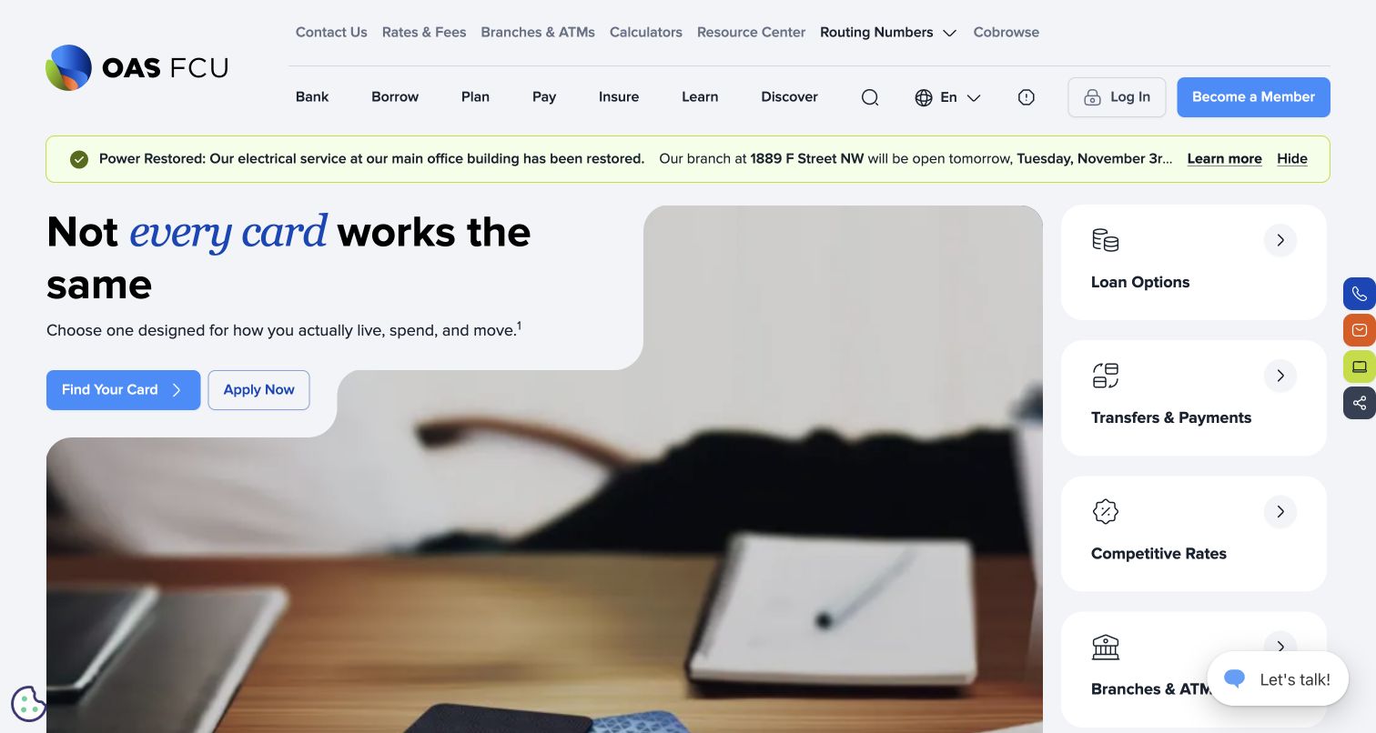
OAS Federal Credit Union combines a public product menu with four large task cards for loans, payments, rates, and branch information. A sculpted image area supports the leading campaign, while account access and membership remain visible in the header. The task rail gives returning visitors useful alternatives to the changing promotion. Umbraco’s official case describes a bilingual rebuild with structured rates and disclosures. The public capture supports commentary on organization and presentation; it does not verify advertised financial terms, private account behavior, personalization, or the accuracy of the content-management workflow.
What you can learn
Centralize recurring rates and disclosures as managed records rather than copying them into campaigns. Keep editorial explanation separate from transactional account access, and assign review and expiry responsibilities to notices that affect branches or member services.
Pros
The side task cards expose practical destinations without requiring engagement with the leading campaign.
Membership and login are clearly differentiated actions within the public header.
Cons & considerations
Several simultaneous controls, notices, and floating utilities compete within the first viewport.
Complex image cutouts can make campaign copy and imagery harder to adapt at smaller widths.
Visible tech stack
Earlier / documented evidence
Umbraco
Earlier cited evidence retained; no current scan result. References may be embedded or legacy—not a complete backend inventory.
Platform source: Official Umbraco implementation case. Official Umbraco case links oasfcu.org and describes a bilingual public website rebuilt on Umbraco CMS with structured rates and disclosures. Private banking is not established by the case. This is an attributed implementation association reviewed on 2026-11-03, not a current version or complete-stack audit. Platform evidence is separate from the direct website screenshot and is not a complete current infrastructure audit.
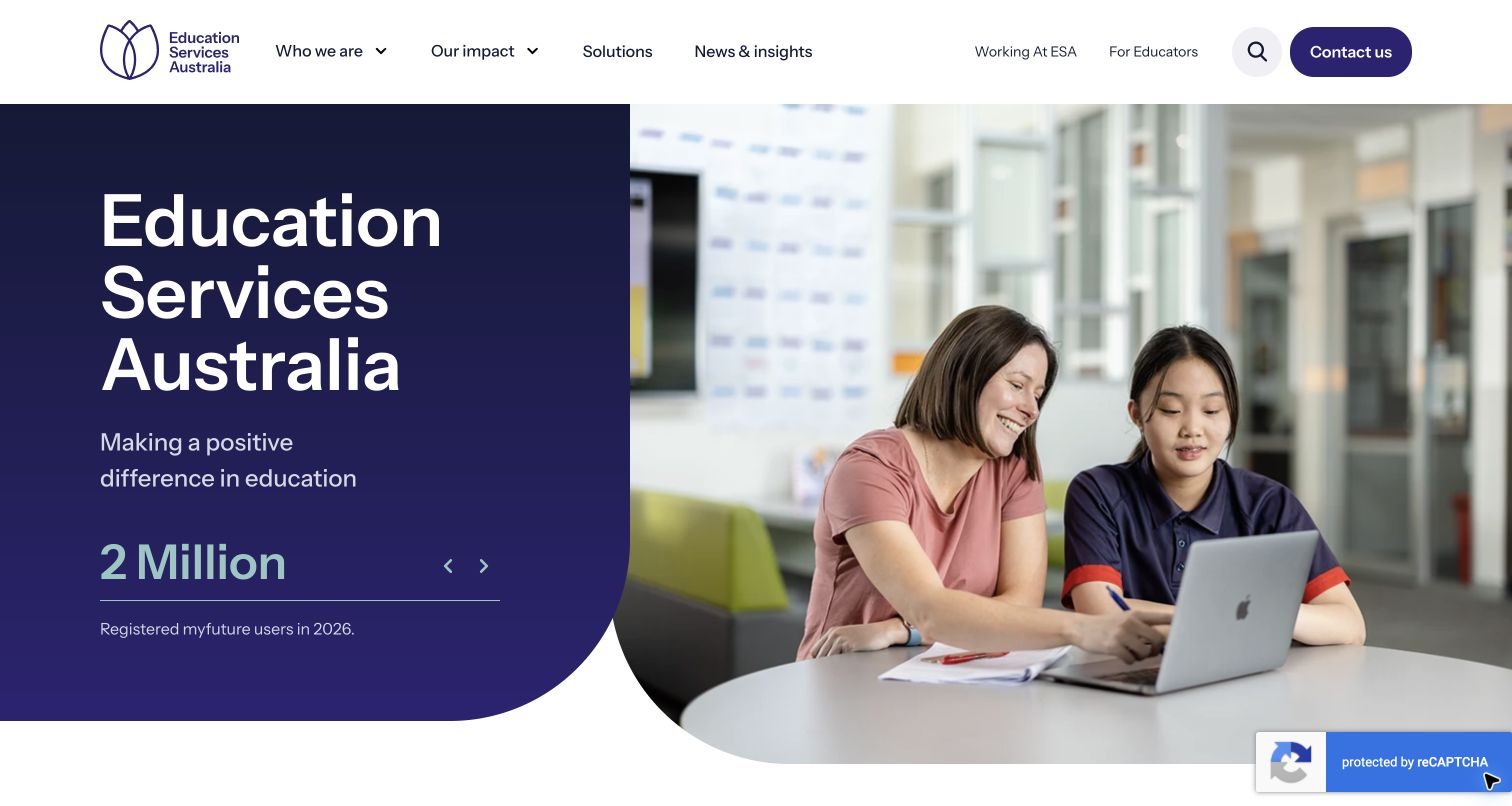
Education Services Australia pairs a dark-blue introduction with a photograph of teaching and learning, while the header distinguishes organizational information, impact, solutions, news, and educator resources. A rotating statistic within the introductory panel connects the mission to the scale of a particular service. The official Umbraco case specifically concerns ESA’s corporate website, with a documented Azure-hosted rebuild. That does not imply that every named education product uses Umbraco or that the public statistic independently proves a result. The design is useful for connecting an institutional mission with a discoverable service portfolio.
What you can learn
Keep the corporate story separate from individual product records and their destinations. Give each educational solution an audience, purpose, owner, and review date, so editors can maintain a coherent portfolio without implying that all tools share one software platform.
Pros
The educator route is visible alongside organizational navigation, recognizing a practical visitor audience.
The split composition connects an institutional message with a relevant human setting.
Cons & considerations
Rotating statistics need clear definitions and editorial dates to remain meaningful over time.
A broad solutions category can conceal differences between resource libraries, software, and advisory services.
Public source checked November 3, 2026. References may be embedded or legacy—not a complete backend inventory.
Platform source: Official Umbraco implementation case. Official Umbraco case links esa.edu.au and documents a corporate website rebuild on Umbraco hosted on Azure. This is not an association for every ESA educational product. This is an attributed implementation association reviewed on 2026-11-03, not a current version or complete-stack audit. Platform evidence is separate from the direct website screenshot and is not a complete current infrastructure audit.
The Royal College of Radiologists gives search a wide position near membership and login controls, then presents navigation for specialties, exams, learning, careers, services, and news. A purple-and-turquoise event promotion fills the leading content area. This recognizes the importance of retrieval for an organization with a deep professional archive, even while a current campaign takes visual priority. The official implementation account documents moving the public RCR website to Umbraco. The capture does not test private member access, exam transactions, or the accuracy and suitability of any clinical material linked from the site.
What you can learn
Model specialties and content purposes as separate relationships so relevant material can appear in several useful contexts. Search should complement the navigation, with carefully maintained titles and summaries that help visitors distinguish an event, policy, exam guide, or professional resource.
Pros
The large search field gives returning visitors a direct alternative to extensive navigation.
Membership and private login remain distinct from specialist content and career resources.
Cons & considerations
The event-led hero occupies substantial space that some visitors may prefer for frequent tasks.
Many top-level categories require disciplined labels and consistent treatment of overlapping professional content.
Public source checked November 3, 2026. References may be embedded or legacy—not a complete backend inventory.
Platform source: Official Umbraco implementation case. Official Umbraco case links rcr.ac.uk and documents moving the public college website to Umbraco. Private member and exam functions are outside the captured evidence. This is an attributed implementation association reviewed on 2026-11-03, not a current version or complete-stack audit. Platform evidence is separate from the direct website screenshot and is not a complete current infrastructure audit.
Choose an implementation around publishing and delivery needs
Use an integrated website for a coherent publishing team
When the primary output is one website, begin with a consistent set of templates and components that reflect its content. Prototype navigation, search, listings, detail pages, and campaign updates together. The practical question is whether the team can publish accurately without escalating every routine change.
Choose headless delivery for a specific channel requirement
Umbraco’s Content Delivery API returns content as JSON for separate presentation layers. That can support a frontend or additional channel, but it adds responsibilities for routing, preview, caching, releases, and error handling. Document who owns those responsibilities and how an editor verifies a change before it becomes public.
Shared components and content can help related brands or regional sites remain consistent, but every shared item needs a clear owner. Decide which differences are intentional, which information is centrally maintained, and which local teams can override. Avoid making a single change unexpectedly affect unrelated audiences.
From references to requirements
Make content operations concrete before launch
Inventory content, audiences, and destinations
Identify the information visitors repeatedly need, then map it to content types and task routes. Record external destinations, old URLs, duplicated material, and content that needs retirement. Include examples from several departments so the model is not optimized only for the homepage team.
Test the boundaries between systems
For product data, member access, forms, search, payments, and booking links, record the owning system and expected failure behavior. Test missing records, stale values, rejected submissions, and unavailable destinations. A successful visual preview does not prove that an integration handles those conditions.
Rehearse publishing and maintenance
Ask the actual team to create an event, change a notice, replace a hero image, and correct a mistaken publication. Then rehearse deployment rollback and content recovery with the technical owner. Record the supported version, extension inventory, hosting responsibility, and update process in a handover the team can find.
A useful handover demonstration
Ask the actual team to carry out its routine job: publish a realistic update, correct a mistake, preview a narrow screen, and identify who owns an integration failure. For a library or frontend framework, also ask who maintains the content source and deployment. A polished screenshot does not answer those operational questions.
Beyond the screenshot
Before an Umbraco website is ready
Define content types, relationships, allowed locations, and ownership.
Test long titles, missing media, expired events, and empty listings.
Make primary visitor tasks available outside rotating campaigns.
Review mobile layouts, keyboard routes, focus, contrast, and motion controls.
Check preview and publication behavior for each language and channel.
Document CMS, frontend, hosting, and external-service responsibilities.
Exercise integration failures and stale-data behavior with realistic content.
Map redirects, metadata, search indexing, and archived content.
Rehearse routine editing, recovery, software updates, and deployment rollback.
Test with real content, a keyboard, a small screen, slow or failed requests, and the people who will maintain the system. These are planning checks, not an accessibility, security, performance, or search-ranking certification.
Sources & editorial method
How this Umbraco collection was reviewed
Every example uses a direct capture of the named public website and a linked official Umbraco implementation account. A case study supports an attributed property association, not an assertion about its current version, every related domain, or all connected private services. Cookie overlays were dismissed where available; incomplete or error-dominated captures were excluded. The reviews discuss visible decisions and separate them from project claims.
Every image is an unmodified capture from the actual website, with its source and capture date. Some captures are reused from our shared catalog; their dates remain the original capture dates. None comes from a vendor gallery or a generated reconstruction. Moving imagery and live content can change.
Technology attribution uses public page assets or metadata, official platform documentation, or a cited first-party project case study. Documentary and framework-relationship evidence is identified where used; it is not a complete current backend inventory. A CMS image CDN alone does not establish a full CMS deployment. A library’s presence does not prove which individual controls use it, and a platform label does not establish AI authorship.
The composition notes, lessons, pros and tradeoffs are original editorial observations. We have not measured conversion, traffic, security, performance or accessibility conformance. Website owners retain their brands and imagery; these examples are not our client portfolio. Written, Edited and Curated are independent records, not dates advanced by a build. See our editorial standards or suggest a correction.
Questions worth asking
Umbraco website development FAQs
Does Umbraco determine how the website looks?
No. A CMS supplies a content system and implementation capabilities; the site’s design depends on the templates, components, frontend, and editorial choices created for it. The variety in this collection is a reason to start from requirements rather than a presumed platform style.
Is Umbraco Cloud the same as a headless website?
No. Cloud hosting and headless delivery describe different decisions. A project can choose how it hosts and operates the CMS separately from how content is presented. Confirm the actual architecture instead of inferring it from a customer logo.
Can nontechnical editors maintain an Umbraco site?
That depends on the implementation they receive. Clear fields, useful components, permissions, preview, and training all matter. Have an editor perform ordinary changes with real content before accepting broad claims about ease of use.
Do these cases prove the current version or complete stack?
No. The linked implementation accounts establish documented associations with the named properties. They do not reveal every subsequent change, software version, private member application, ticket platform, or operational service.
Should every content item be freely rearrangeable?
Usually it is better to decide which information is structured and which layout choices are valuable. Important shared facts need consistent fields, while campaign pages may benefit from more composition options. Test those choices with the people responsible for accuracy.
Borrow a clear content or navigation pattern, then prove that your team can publish and maintain it with the information and systems your organization actually uses.