A magazine website needs more than a striking cover. It must help a reader understand the publication, find something worth reading, and return to an archive whose value outlasts the current lead story.
The examples include different editorial identities and relationships between print, digital reading, and membership. Compare the hierarchy of stories, section names, issue navigation, and subscription entrances. The collection is not a ranking of reporting quality, audience size, or commercial success.
A homepage is one editorial view of the publication. Plan article pages, topic archives, search, author records, and issue pages alongside it. A new reader arriving through a direct article link should not need to visit the front page to understand what publication they are reading.
Before the examples
What makes good magazine website design in 2026?
Make the editorial hierarchy legible
Distinguish the lead story, section features, current issue, and shorter updates through a repeatable set of treatments. Use labels that help a reader understand the type of material before opening it. Avoid making every card appear equally urgent or depending entirely on image scale to communicate importance.
Give the archive useful structure
Define sections, topics, issues, authors, and series according to the publication’s actual material. Connect those records without requiring editors to retype the same relationships. A large archive needs meaningful paths beyond the latest homepage selection; a small publication should not imitate categories it cannot maintain.
Explain the reading and subscription boundary
Make free, paid, registered, and print material understandable before an unexpected interruption. Clearly describe subscription and membership destinations, and distinguish editorial material from commercial placements. Keep practical account and subscription-help routes separate from persuasive campaign copy.
The collection · 22 examples
22 magazine websites worth studying
Compare cover-led, story-led, section-led, and membership-led approaches. Look closely at what the opening reveals about the publication’s identity and what a returning reader would need next.
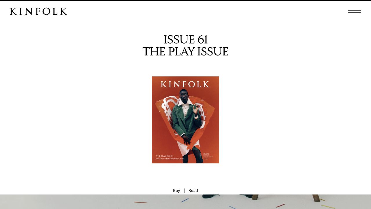
Kinfolk’s opening gives its current numbered issue, cover and theme considerable white space. A compact masthead and menu avoid competing with the issue presentation, while separate buying and reading routes acknowledge different intentions. Latest stories subsequently use categories such as interiors, fashion and culture. This is an issue-first design rather than a breaking-news front page: the publication’s editorial package receives more immediate attention than a long chronological feed of individual articles.
What you can learn
Decide whether the issue or the individual story is the primary discovery unit. If both matter, connect every applicable article to an issue record with its own cover, publication information and contents. Keep buying a physical copy distinct from reading a digital story, and provide a durable archive rather than treating the featured issue as a disposable campaign.
Pros
The cover and issue number make the current edition unmistakable.
Separate reading and buying actions acknowledge different visitor tasks.
Cons & considerations
A quiet issue-led opening exposes relatively few stories immediately.
Readers following a subject need useful category routes beyond the featured edition.
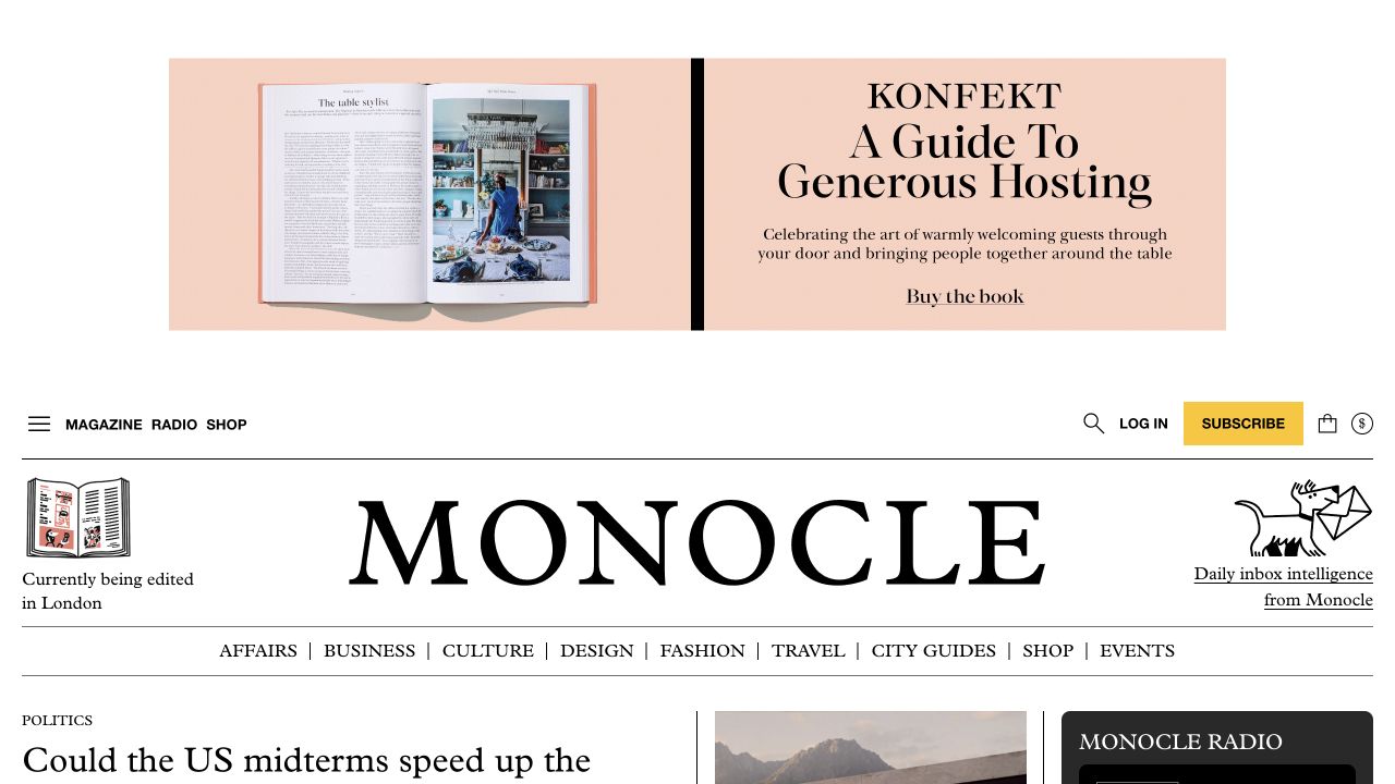
Monocle uses an upper utility layer for magazine, radio, shopping and subscriptions, followed by a wide subject navigation. The observed homepage mixes article summaries and reading-time labels with a live-radio area, columnist introductions and city guides. It is useful for seeing a multi-format publisher’s organizing problem in practice: a visitor may want to read, listen, buy an issue or browse a location, and these activities should not all be labeled simply as content.
What you can learn
Model format and subject independently so a design story, a radio conversation and a city guide can be related without becoming indistinguishable. Explain live listening versus archived audio, and keep the player’s state clear. Give subscription and shop offers defined spaces so they do not repeatedly interrupt the same reading task.
Pros
Magazine, radio and shopping have distinct utility destinations.
Subject labels and reading-time cues add context to the article grid.
Cons & considerations
The many formats create a demanding navigation and mobile-priority problem.
Live radio and archived programs need different availability and playback explanations.
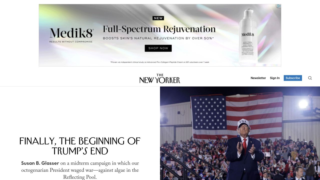
The New Yorker pairs its familiar masthead with a detailed section row and a hierarchy of lead stories, shorter selections and named editorial areas. Bylines and descriptive text distinguish articles rather than leaving all meaning to the images. Magazine, fiction, cartoons, puzzles, audio and events have separate destinations. The useful reference is the coexistence of daily web publishing and a long-established issue identity, with several kinds of reading organized under one recognizable brand.
What you can learn
Define the editorial purpose of each homepage slot before building interchangeable cards. Distinguish a news update, criticism and fiction through labels and content fields, not just visual tone. Explain subscription requirements before the reader follows a gated destination, and ensure the archive can relate an online article to its issue without confusing publication and update dates.
Pros
Named editorial sections make the breadth of the publication navigable.
Bylines and summaries provide context beyond a striking headline.
Cons & considerations
The dense section system requires a carefully prioritized mobile menu.
Issue dates, web publication dates and updates need consistent presentation.
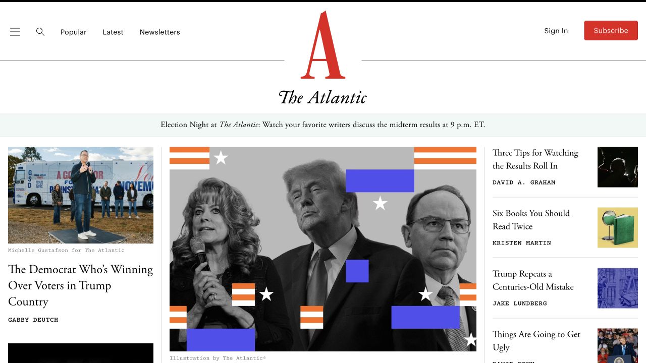
The Atlantic centers its red identity above a lead-story arrangement with supporting articles and a narrower secondary column. Popular, latest and newsletter destinations offer alternative ways into the material without asking readers to understand the entire section taxonomy first. Image credits and authorship remain part of the presentation, while sponsor material is labeled separately. This provides a useful hierarchy reference, though a screenshot cannot establish how readers actually divide their attention among those competing story paths.
What you can learn
Write rules for the lead, supporting and compact story treatments so editors can choose intentionally instead of merely filling available space. Keep sponsorship labels attached to the relevant item in every layout. Give newsletters a defined subject and frequency, and preserve a direct route into the article archive for readers who miss the day’s opening selection.
Pros
Several story sizes establish a recognizable editorial priority.
Popular, latest and newsletter routes support different discovery habits.
Cons & considerations
A dense secondary column may compete with the principal story on medium screens.
Sponsored and editorial items need consistently distinct labels across reused cards.
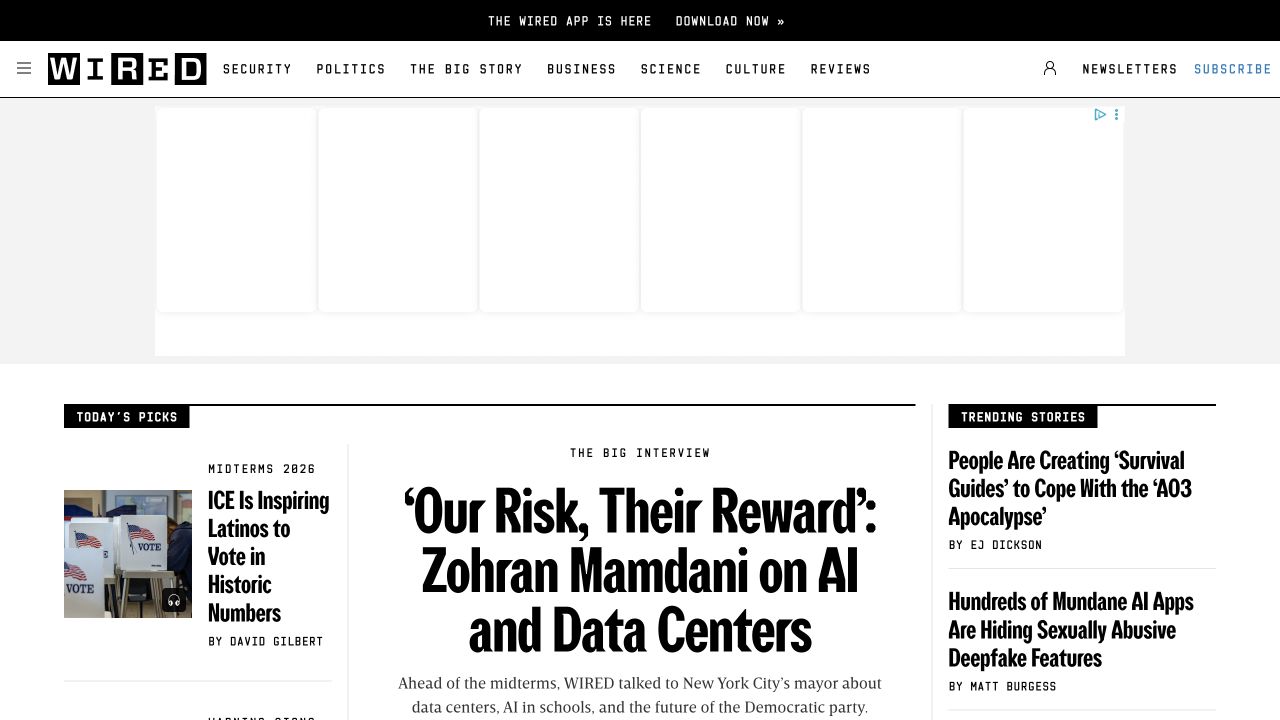
WIRED’s compact black-and-white masthead sits above a structured homepage with selected stories, a trending column, reviews and subscriber features. Large condensed headlines and smaller supporting descriptions create clear differences between article treatments. The captured view also reserves substantial space for advertising, which is part of the observed layout rather than proof of a loading failure. The reference is useful for the classification challenge of a publication whose product coverage and public-interest reporting share the same domain.
What you can learn
Keep review type, editorial category and commercial disclosure as separate fields. Plan ad slots alongside the content grid instead of adding them after layouts are approved, and test what happens when a slot is empty. Make subscriber labeling intelligible before a click, while preserving author, date and description information for every public article listing.
Pros
Reviews and other editorial subjects have explicit navigation labels.
Different story treatments communicate more than one level of editorial priority.
Cons & considerations
Advertising space changes how much editorial content fits in the opening view.
Reviews and commercial relationships need clear disclosure rules beyond visual styling.
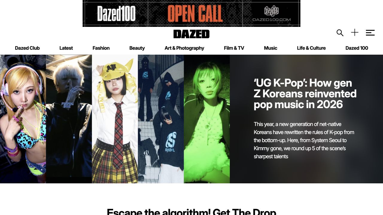
Dazed opens with a large visual feature, pairing prominent cultural imagery with a substantial headline and explanatory copy. Fashion, beauty, art, music, film and other recurring subjects form a separate navigation layer, while the current print magazine and newsletter appear further in the page. The approach favors an authored editorial opening over a uniform grid of equally sized links. That works as a design reference only when the imagery has adequate rights, credits and adaptable crops.
What you can learn
Define a repeatable feature component that supports long headlines, contributor credits and a meaningful image description. Preserve category and archive navigation for readers who do not recognize the featured subject. When linking a web feature to a print issue, explain the relationship rather than suggesting that every article belongs to the latest edition.
Pros
The feature combines photography with enough copy to explain the story.
Recurring subjects provide a stable structure around changing cultural material.
Cons & considerations
Oversized feature art makes a few editorial choices dominate the opening.
Long headlines and complex image crops require deliberate small-screen treatments.
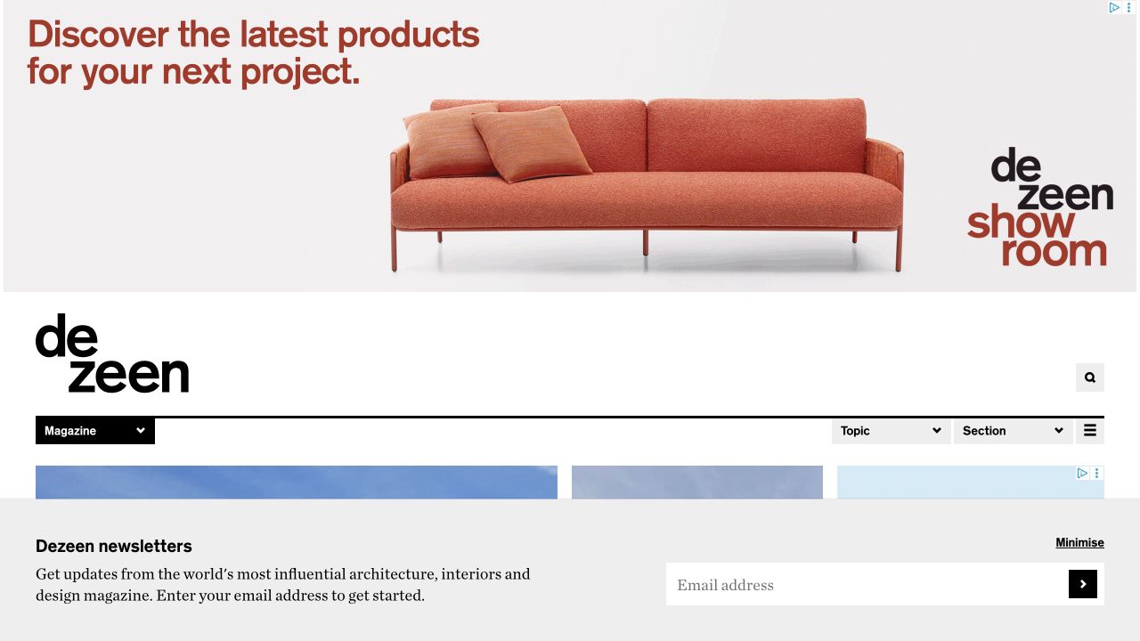
Dezeen’s observed page separates its magazine from awards, a product showroom, events and other professional destinations. Within the editorial area, subject and section controls support article discovery, while interviews and opinions receive their own groupings. Advertising and a newsletter prompt occupy conspicuous space around the content. The useful design problem is the boundary between a specialist publication and the wider services built around its audience; related destinations should not become indistinguishable article categories.
What you can learn
Give every commercial or professional destination a plain description of its purpose. Keep article subject, article format and paid showcase status distinct in the content model. Plan newsletter and advertising placements with editorial layouts, and make the latest-story route easy to reach even when the publisher’s awards or events are receiving seasonal emphasis.
Pros
Magazine and professional-service destinations are explicitly separated.
Interviews and opinions supply format-based paths beyond subject browsing.
Cons & considerations
Prominent promotions can reduce the editorial material visible initially.
Showroom, awards and article content need clear commercial and editorial boundaries.
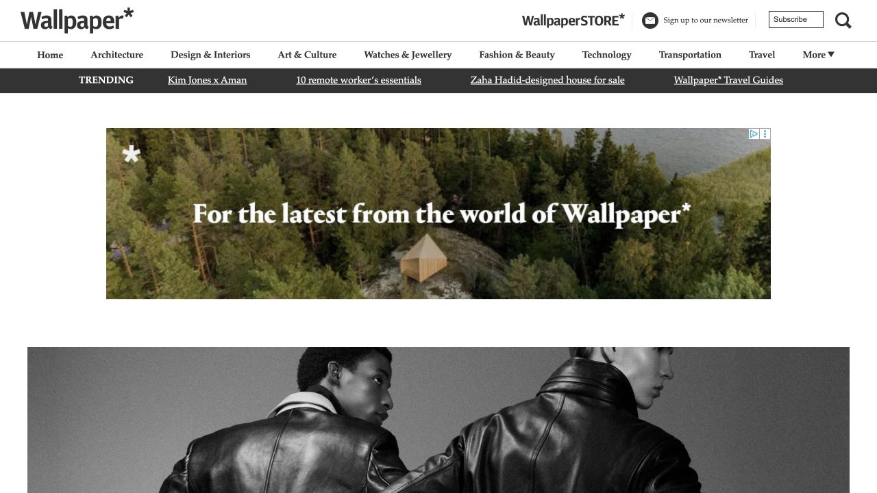
Wallpaper uses a recognizable masthead and a long subject row above large, photography-led feature material. Architecture and interiors coexist with fashion, art, travel and technology, while a separate trending strip adds another way into current coverage. The captured page also gives a newsletter invitation a visible position. Its value as a reference is the consistent presentation of disparate visual subjects, rather than an assumption that every category has the same reading intent or editorial cadence.
What you can learn
Choose a small set of article treatments that work for a building, a fashion photograph and a product feature without losing their credits. Keep trending navigation distinct from enduring sections and explain newsletter scope before asking for an address. Give each subject a maintained landing page so older stories are not discoverable only through the current homepage selection.
Pros
A common masthead and grid connect several visually different subjects.
Subject and trending routes serve different forms of article discovery.
Cons & considerations
A long category row becomes difficult to prioritize on narrow screens.
Newsletter and promotional strips can compete with the first editorial feature.
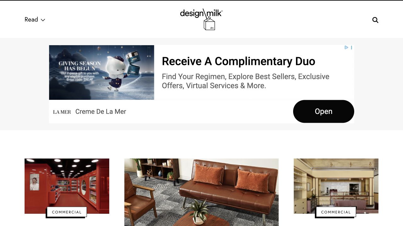
Design Milk uses a compact wordmark and restrained navigation above an image-led article arrangement. Categories on the cards help explain why a particular interior, object or creative project belongs in the selection. The observed page includes conspicuous advertising and commercial labels, making the distinction between editorial material and other placements important to the reading experience. This is a useful example for publishers whose homepage must work as a practical browsing surface rather than a cover-like introduction.
What you can learn
Create a predictable card pattern with a subject label, headline, original description and attribution. Maintain separate fields for sponsorship or commercial status instead of embedding disclosure in an image. Decide how many promotional placements can appear between editorial groups, and check that a reader can still identify the latest independent story without interpreting unfamiliar visual cues.
Pros
Category labels give image-heavy cards useful textual context.
The compact identity leaves room for several editorial choices.
Cons & considerations
Large advertisements can visually outrank the surrounding articles.
Commercial labels must survive every card size and reuse context.
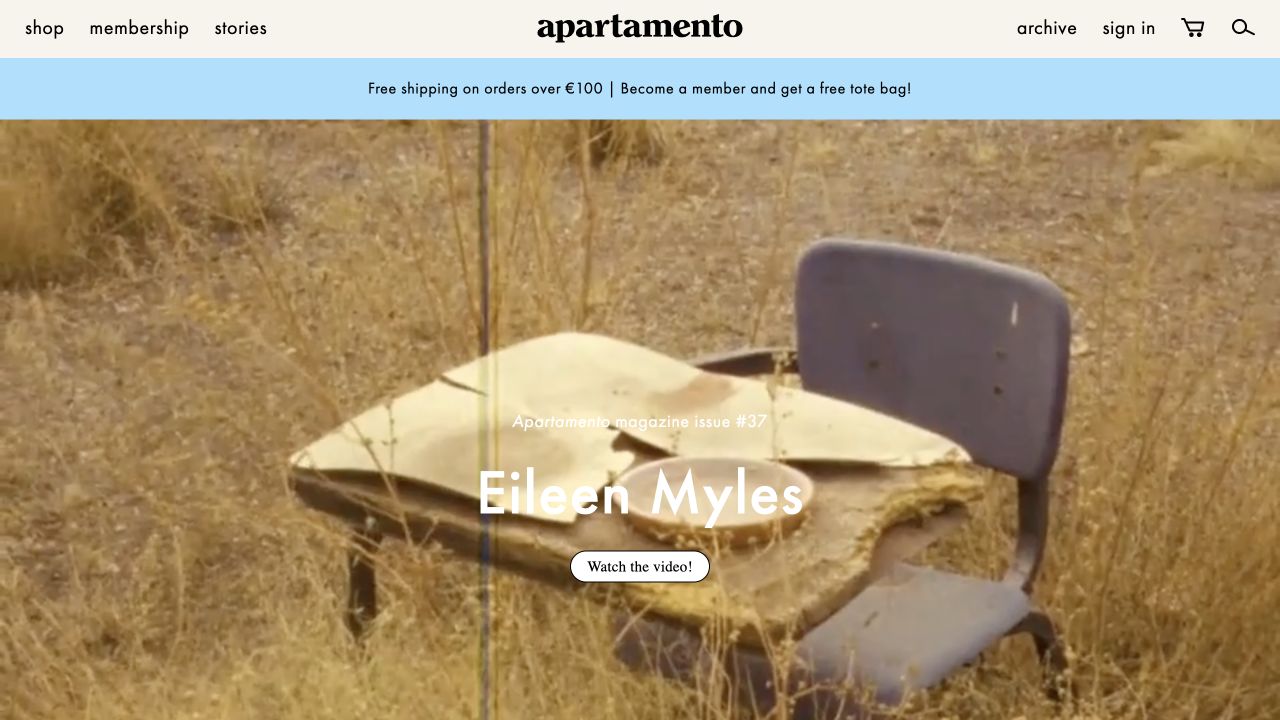
Apartamento combines a large photographic or video-led feature with shopping, membership, stories and archive routes. The observed opening gives a creative subject substantial room, while later material introduces products and recent editorial work. The design deliberately connects a publication with the physical books and objects around it. Its usefulness lies in the shared visual identity, but the visitor still needs to know whether an image leads to a story, a video, a magazine issue or an item for sale.
What you can learn
Give editorial features and product cards distinct labels even when they share photography and typography. Build issue and contributor relationships so related interviews and publications remain discoverable. Explain membership benefits separately from purchasing a single object, and provide a non-video summary when moving imagery carries most of the introduction.
Pros
A consistent visual world links the magazine with related publishing products.
Stories and archive destinations remain separate from ordinary shopping.
Cons & considerations
Editorial and commercial imagery can be difficult to distinguish at a glance.
Video-led features need a clear alternative for visitors who do not play them.
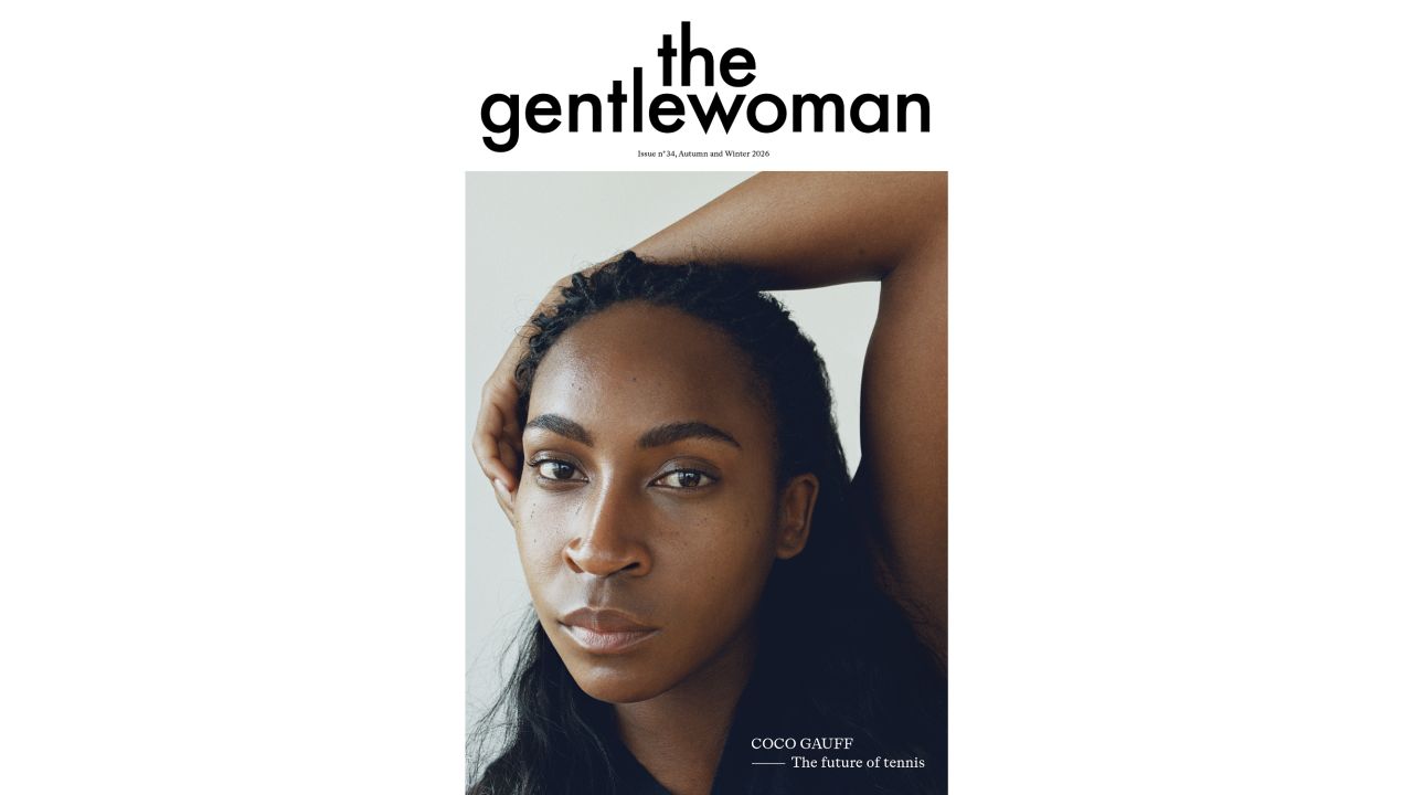
The Gentlewoman gives a prominent portrait generous white space beneath its masthead. A compact set of routes connects the current magazine with a club, a library, shopping and collaborations. The opening makes the featured person and edition feel like the editorial center of the publication, not merely another item in a rapidly updating grid. This is a useful reference for a slower publishing rhythm in which a durable profile library matters as much as the latest issue.
What you can learn
Model a person, their profile and the issue as related but separate records. Keep names and descriptive text outside the portrait image, and make the interview library searchable without requiring familiarity with past covers. Clarify which collaboration pages are editorial, promotional or commercial so that the restrained visual style does not conceal a meaningful difference in purpose.
Pros
A focused portrait gives the current editorial subject a clear visual priority.
The library route supports discovery beyond the latest edition.
Cons & considerations
The initial view offers little explanation for readers unfamiliar with the subject.
Portrait cropping and text placement require considered mobile alternatives.
The Rake’s settled homepage uses a large portrait and dark background to introduce its current cover subject, supported by a headline, descriptive paragraph and reading link. Editorial, magazine, shop and brand destinations are separately labeled in the header. Subsequent issue listings show edition numbers and prices. This is a useful reference for connecting an interview or fashion feature with a physical magazine, while maintaining a visible distinction between reading that story and buying an issue or other product.
What you can learn
Keep issue number, publication information and available formats in a maintained issue record. Reuse the cover story’s title and contributor information without making a shop page the only route to the editorial feature. Explain country-specific pricing and delivery when physical purchases are involved, and label sponsored brand material separately from independent editorial coverage.
Pros
The cover subject is introduced with a real description rather than an unexplained portrait.
Issue listings provide numbered editions and shopping information.
Cons & considerations
Editorial, brand and retail destinations require careful disclosure boundaries.
Large portrait features can delay access to the broader article archive.
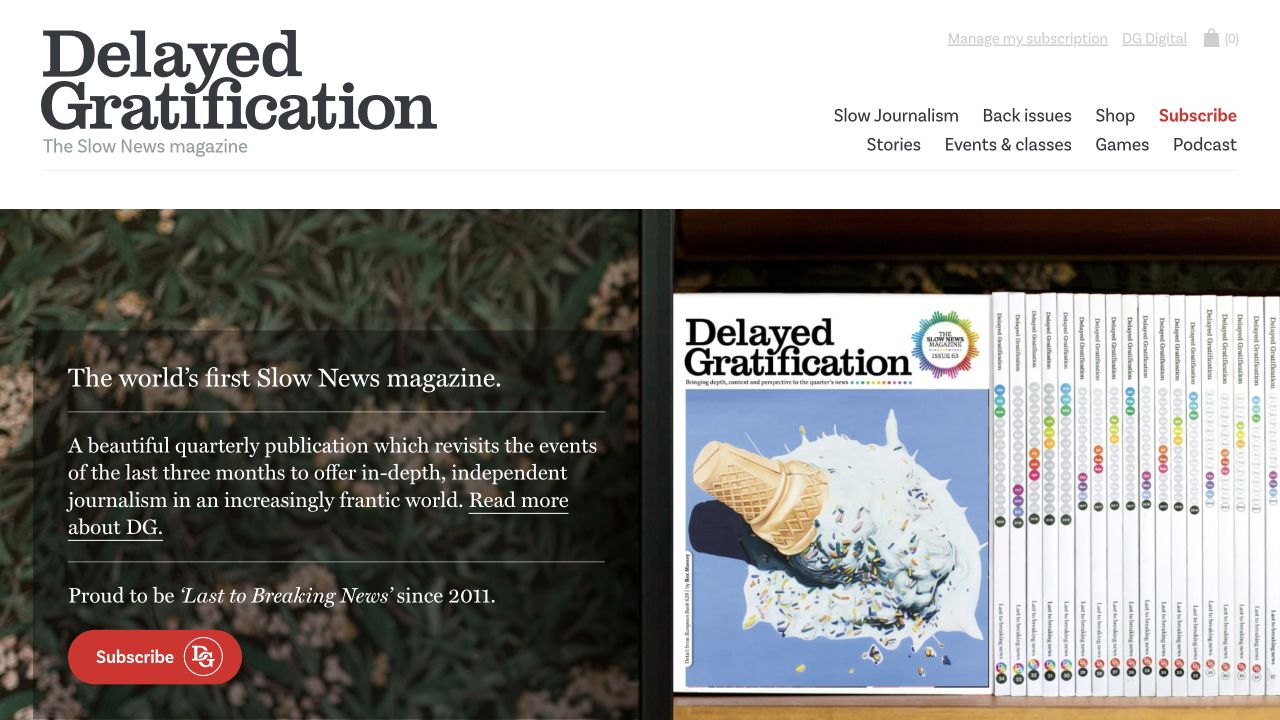
Delayed Gratification introduces its slow-journalism proposition beside a physical issue and separates subscriptions, back issues, stories, events, games and audio. Issue records distinguish the period covered from the date of publication. That is the most useful structural detail: a reader can understand why the material is intentionally retrospective instead of interpreting an older subject date as an abandoned website. The opening also gives the magazine’s graphic and illustrated character an immediate physical context.
What you can learn
When coverage period and publication date differ, store and display both deliberately. Give back issues durable contents pages and make subscription fulfillment terms separate from editorial descriptions. Treat workshops and events as their own time-sensitive records, with timezone and booking information, rather than letting a past class remain as an undated promotional card.
Pros
The editorial cadence is explained in plain language near the issue.
Coverage periods and publication dates are visibly different pieces of information.
Cons & considerations
Several non-magazine activities can dilute the central subscription task.
Back issues and dated classes need an explicit availability and archival policy.
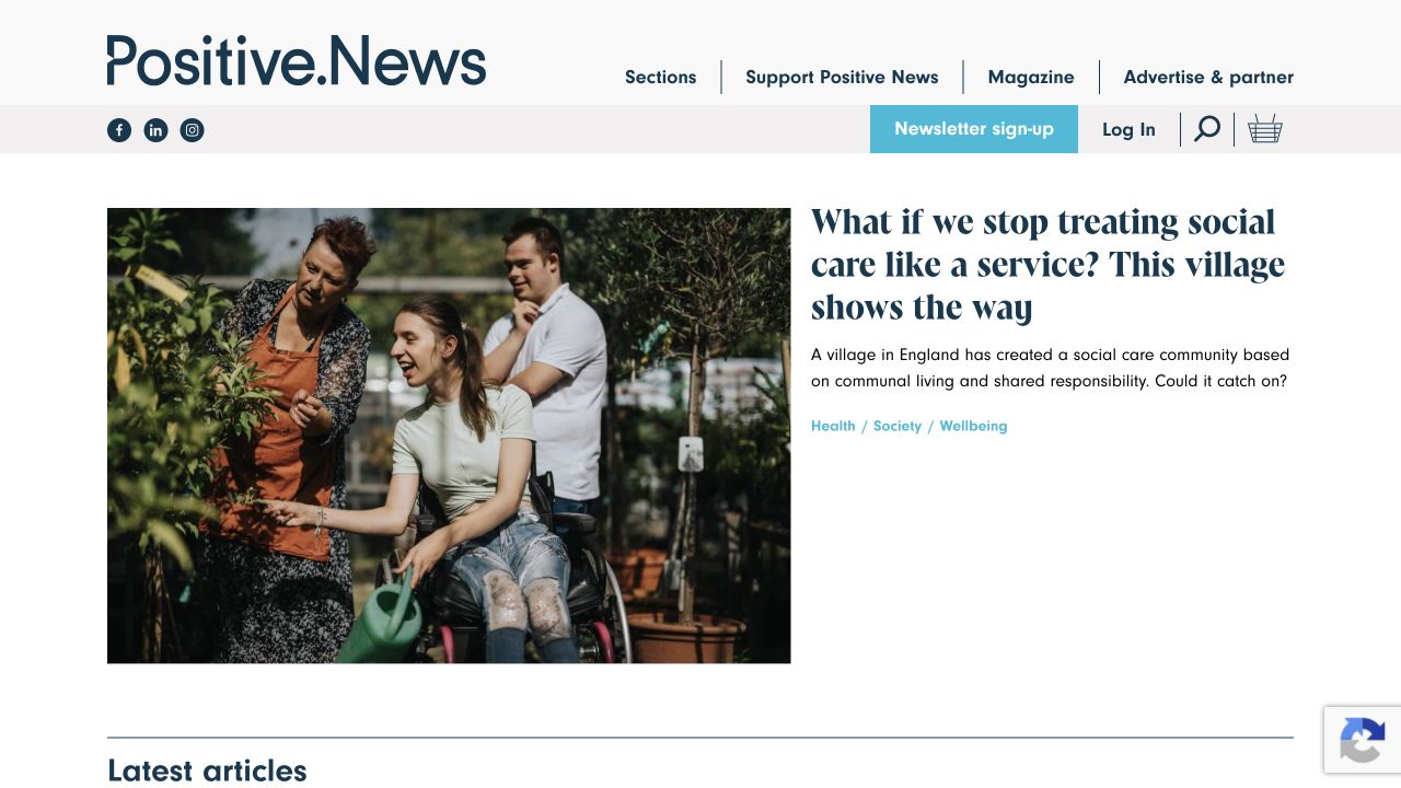
Positive News pairs a substantial lead image with a headline, description and subject tags, followed by a latest-article sequence. Magazine, support, advertising and newsletter routes are distinguished in the header. The page communicates a constructive-news identity through its selections, but the interface still relies on familiar editorial metadata rather than a mission statement alone. Its relevance here is the design of that distinction; the website review does not independently verify the reporting or endorse individual article claims.
What you can learn
Translate an editorial mission into selection and labeling rules that writers can actually apply. Keep opinion, partner material and reported features distinguishable, and give support requests a separate purpose from newsletter signup. Preserve authorship and dates on article records so the publication’s tone does not substitute for ordinary source and accountability information.
Pros
Lead-story descriptions and tags explain the selection beyond the image.
Support and advertising routes have their own recognizable destinations.
Cons & considerations
A broad mission can become vague without consistent editorial labeling.
Repeated subject tags need governance to avoid fragmented near-duplicate archives.
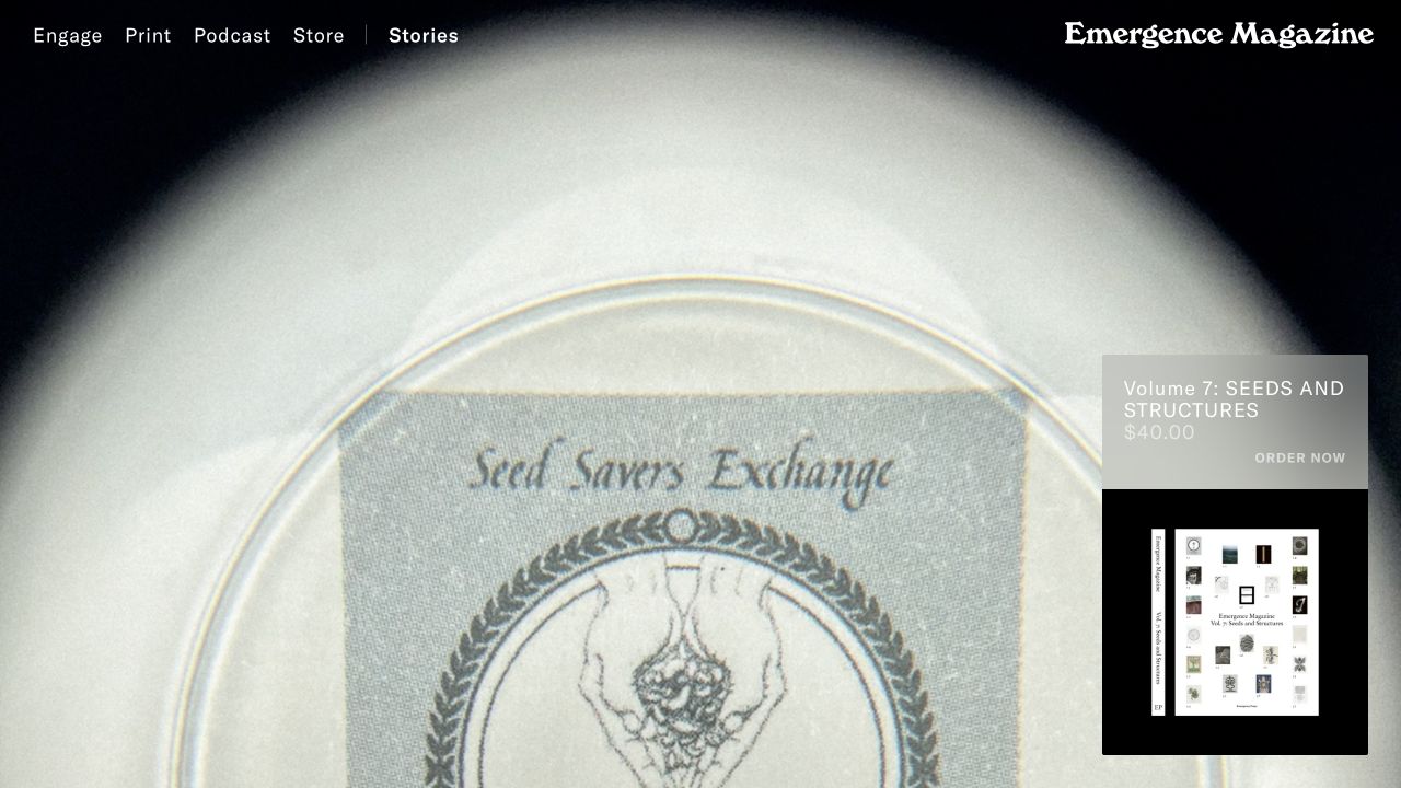
Emergence Magazine’s fully rendered opening uses atmospheric moving imagery beneath a minimal navigation layer, with a print-volume offer placed to one side. Further down, a named essay, an editorial statement and selected reading, listening and viewing routes clarify the publication’s scope. It is a useful reference for a deliberately immersive publisher, but the introductory motion alone does not communicate the same information as the subsequent text and story lists. The saved image is a settled motion frame, not a static illustration of every story.
What you can learn
Make the non-motion structure understandable before adding an immersive introduction. Treat essays, conversations, films and events as different content types with clear credits and appropriate alternatives. Separate print ordering from digital reading, and check that the principal story remains discoverable when video cannot play or a visitor chooses reduced motion.
Pros
Reading, listening and viewing are organized as distinct editorial paths.
The editorial statement connects the varied formats to a common scope.
Cons & considerations
Atmospheric motion can delay an unfamiliar visitor’s understanding of the publication.
Introductory text and navigation need testing across changing image backgrounds.
Quanta Magazine combines a large illustrated opening with clear routes into physics, mathematics, biology, computer science, topics and an archive. Latest articles, videos and special features receive separate groupings, with bylines and image credits contributing context. The design is useful for a specialist publication because it does not require every reader to enter through the same discipline. Illustration can introduce an abstract subject, while the article description and labels carry information that an image cannot reliably convey on its own.
What you can learn
Design a content model that separates scientific field, story format and named series. Keep illustration credits and explanatory descriptions attached to the story wherever it appears. Provide context for specialist terminology without reducing the headline to a vague teaser, and maintain archive routes for readers who arrive through an older topic rather than the latest feature.
Pros
Discipline navigation provides a stable structure for highly varied subjects.
Videos and special features are distinguished from ordinary article listings.
Cons & considerations
Abstract illustrations need textual context to explain their relationship to a story.
Overlapping scientific topics require consistent tagging and archive ownership.
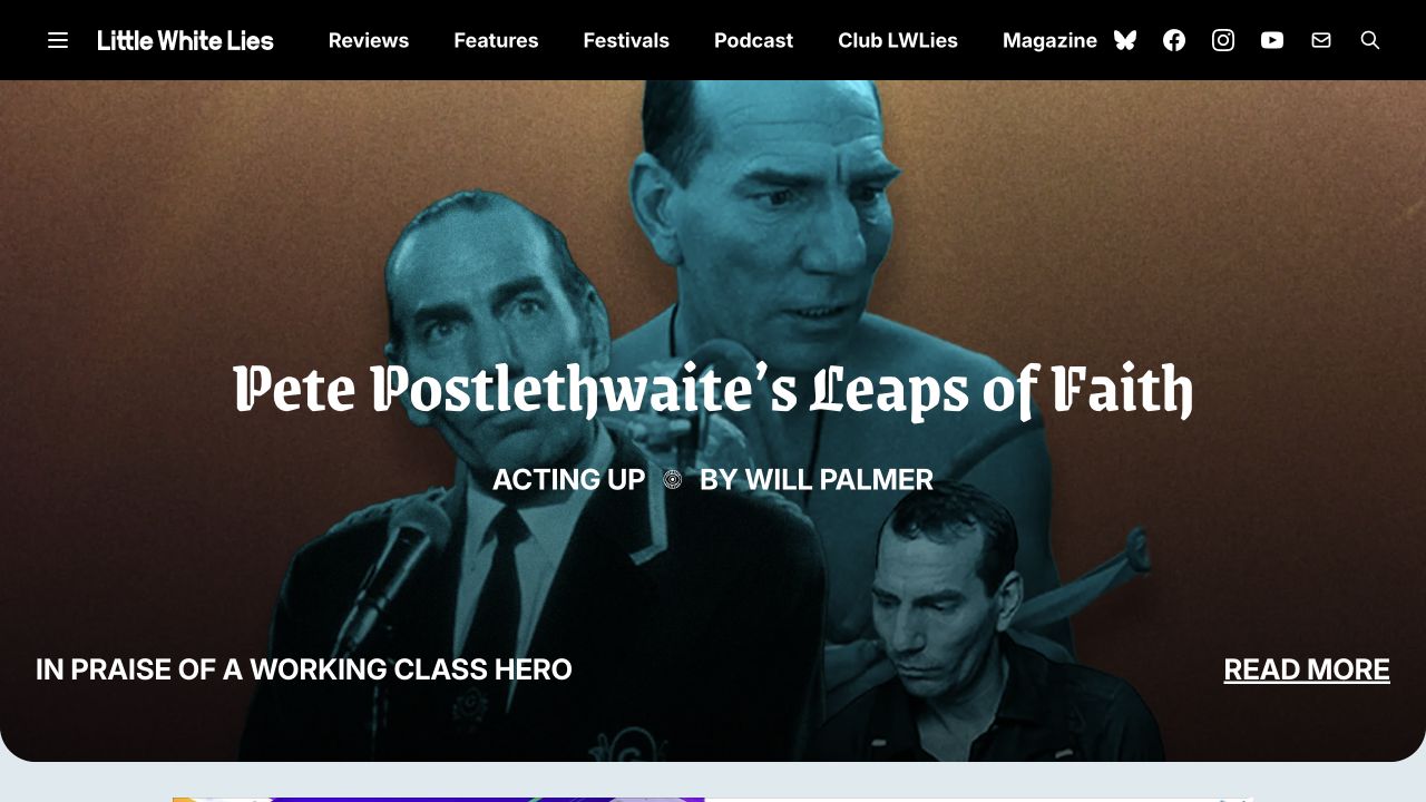
Little White Lies uses a cinematic collage and a prominent headline to introduce a named feature series. Reviews, features, festivals, audio, membership and the magazine are distinct header destinations. Subsequent review cards expose several labeled scores rather than one unexplained rating, while contributor bylines identify individual voices. The reference is especially useful for the relationship between a publication’s expressive art direction and the structured metadata that makes its criticism and recurring editorial formats understandable.
What you can learn
Document any scoring system and link its explanation from the places where scores appear. Keep a review’s publication context distinct from a later retrospective or interview about the same film. Model print issues and membership benefits separately, and preserve illustration credits when a feature image is reused in newsletters or archive cards.
Pros
Reviews and other editorial formats have clear, separate destinations.
Labeled component scores convey more context than an isolated numerical rating.
Cons & considerations
A distinctive scoring system still needs an accessible explanation.
Feature franchises and film titles can create overlapping archives without editorial governance.
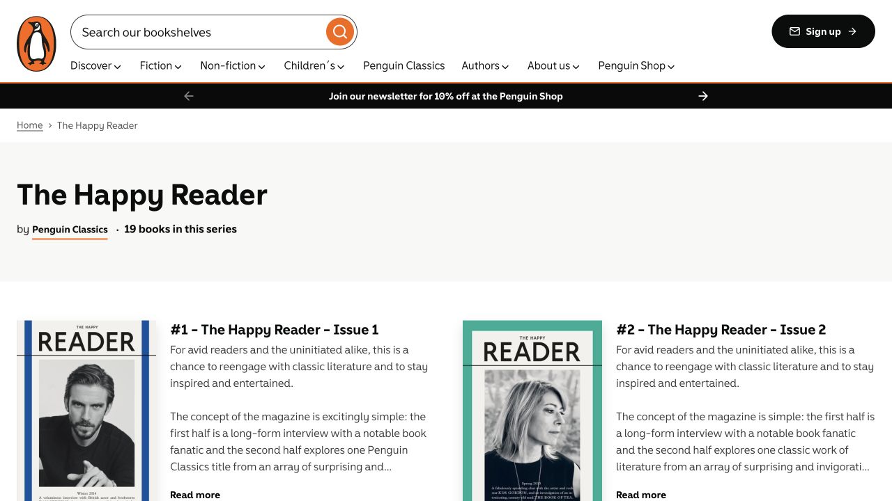
The Happy Reader’s former standalone address leads to Penguin’s official issue-series archive. The captured page therefore shows a publisher catalog, with a series introduction followed by numbered issues, rather than a current magazine homepage. That difference is intentional and important to the example. The archive preserves an explanation of the literary magazine’s interview-and-book format and gives individual editions stable places within the broader publisher’s discovery system.
What you can learn
When consolidating or retiring a magazine website, map old issue addresses to relevant permanent records instead of sending every link to a generic home page. State clearly what is archived and avoid implying that the oldest listed issue is newly published. Preserve issue numbers, contributor information and contents where available, while explaining current purchase availability separately from historical publication facts.
Pros
The archive identifies the publication as a numbered issue series.
An introductory description preserves context beyond individual product listings.
Cons & considerations
A general publisher shell offers less magazine-specific identity and navigation.
A back-issue archive cannot establish a current editorial schedule or subscription offer.
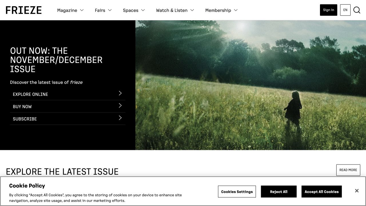
Frieze presents its latest issue with separate online exploration, purchase and subscription actions. Magazine, fairs, spaces, audio or video and membership remain distinct header routes. The subsequent article selection identifies formats such as essays, roundtables and opinion, with contributor names and dates. This is a useful reference for an organization whose publishing activity shares a brand with events and other programs, while still requiring clear boundaries around what an ordinary magazine reader is being asked to do.
What you can learn
Separate the issue, article, event and membership models before designing a shared homepage. Explain whether an action opens editorial material, sells a physical edition or starts a recurring subscription. Keep multi-author credits legible, and ensure that a fair’s time-sensitive promotion does not remove durable discovery routes into the magazine’s criticism and archive.
Pros
Explore, purchase and subscribe are presented as different issue-related actions.
Article-format labels and contributor information provide useful editorial context.
Cons & considerations
Fairs and other organizational programs may compete with magazine discovery.
Recurring subscriptions and single-issue purchases need clearly differentiated conditions.
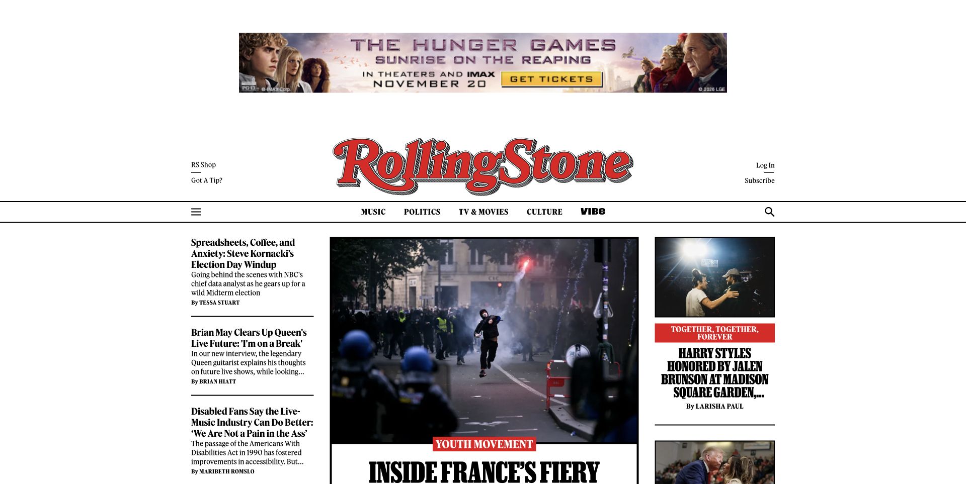
Rolling Stone’s captured homepage combines its red masthead with a large lead image, a prominent headline, shorter side-column stories and a subscription feature. Music, politics, television, film and other subjects share a compact navigation row. The page is useful for comparing how an established magazine adapts a recognizable identity to a continuously updated web front page. Several story sizes create editorial emphasis, but the screenshot does not demonstrate which treatment earns more attention or clicks.
What you can learn
Define how editors select a lead story versus a compact secondary item, and preserve the headline, author and section metadata across both. Plan advertising and subscription placements as part of the editorial layout. Keep the print issue and web publication dates distinct, with clear access labels before a reader follows a subscriber-only destination.
Pros
A familiar masthead anchors several different kinds of culture coverage.
Lead and supporting story treatments communicate an editorial hierarchy.
Cons & considerations
Dense side columns require careful reordering on smaller screens.
Advertising and subscriber promotions compete for the same limited opening space.
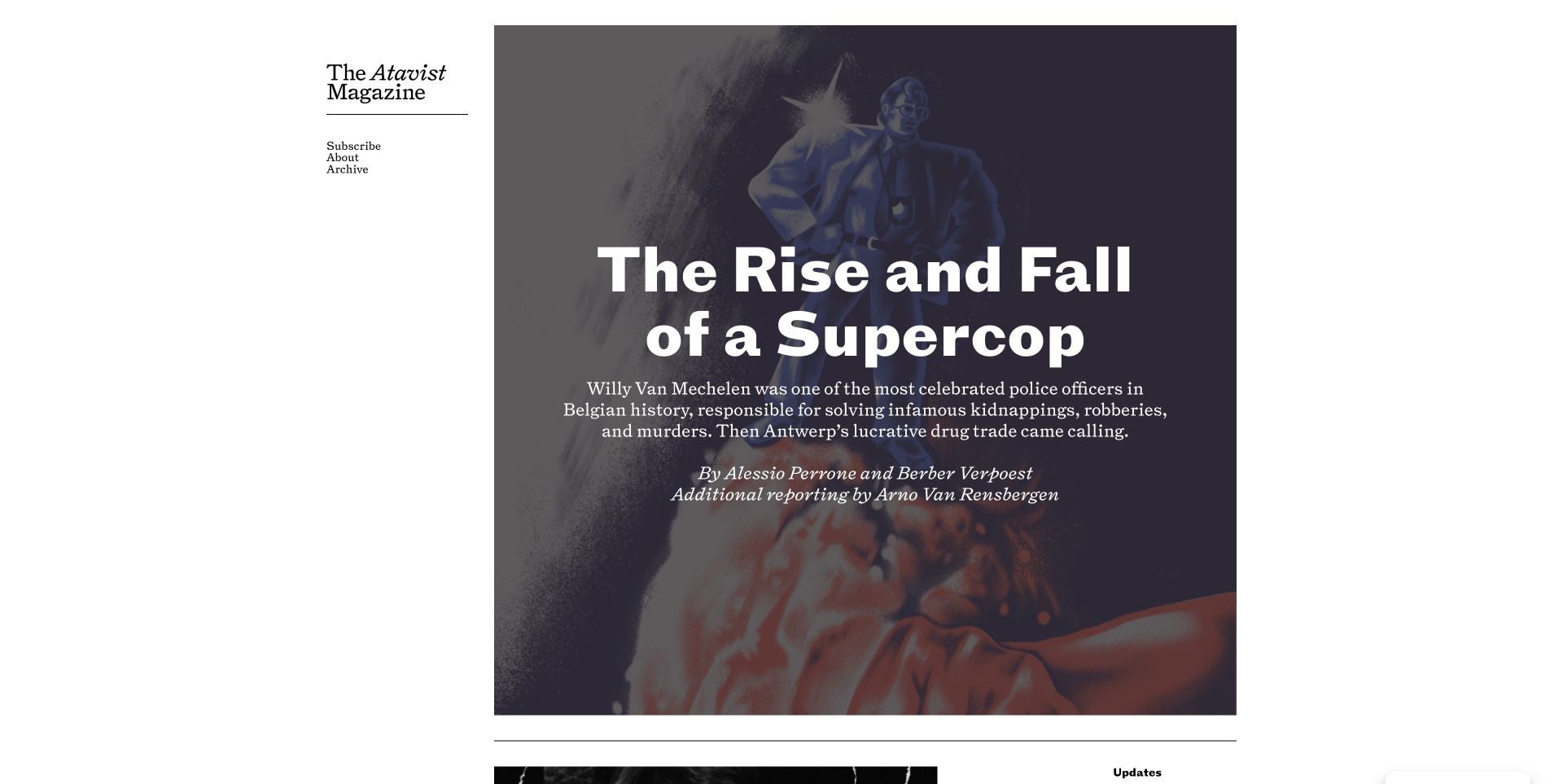
The Atavist Magazine’s captured homepage gives a single reported feature most of the opening area. A large illustration supports the title, description and explicit contributor credit, while a small side navigation exposes subscription, company information and the archive. This is deliberately different from a high-frequency news grid. The design communicates a publication built around substantial individual stories, and the archive becomes especially important when the current feature is not the subject a visitor came to read.
What you can learn
Give each longform story a durable record with its own description, author and additional reporting credits. Keep the archive accessible without requiring the visitor to scroll through a sequence of former covers. Explain subscription access before the reading journey changes, and plan how audio, corrections and later updates attach to the same story rather than creating disconnected copies.
Pros
The focused feature allows a descriptive introduction and detailed attribution.
The archive remains available outside the main story presentation.
Cons & considerations
A single lead story offers limited subject variety in the first view.
Minimal navigation depends on a genuinely useful archive and clear access information.
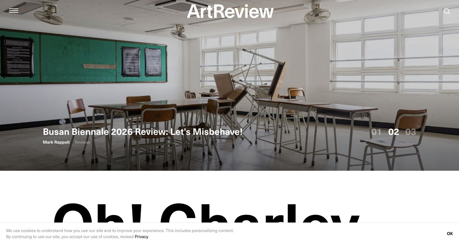
ArtReview’s captured homepage uses a wide artwork or exhibition photograph with an overlaid feature title, followed by a conspicuous subscription section. Its broader navigation distinguishes magazine material, recurring lists, audio or video, live events, partnerships and shopping. The useful reference is the classification of a specialist art publication’s activities. An exhibition review, an institutional partnership and a magazine purchase may share visual material, but they should not become the same kind of content simply because they appear under one masthead.
What you can learn
Give criticism a consistent author, date, subject and image-credit model, and keep partnership status explicit wherever that material is reused. Offer a direct magazine archive route beyond the current visual feature. When exhibition dates or venues appear, distinguish those facts from the publication date of the review, particularly for readers arriving after a show has closed.
Pros
The visual feature supplies a strong setting for exhibition-focused coverage.
Magazine, events and partnership activities have distinct navigation labels.
Cons & considerations
Overlaid titles need careful placement across very different artwork crops.
Subscription promotion can interrupt discovery if it appears before sufficient editorial context.
Model an issue and an article as different records
List the fields each needs: a title, summary, contributors, dates, imagery, relationships, and any relevant availability information. Test a long headline, a text-only article, and a piece associated with more than one topic. Keep corrections and authorship information maintainable rather than embedded in decorative page sections.
Define editorial controls with the publishing team
Decide who can commission, edit, approve, schedule, promote, and correct material. Rehearse changing a lead story without changing its original publication date. Document how an issue is archived and how a correction or expired promotion becomes visible across related pages.
Test reading and account journeys separately
Review article typography, captions, navigation, search results, and long pages on a phone. Use the appropriate test workflow for subscription and account handoffs. Plan useful messages for unavailable material, failed embeds, and a reader who follows an older newsletter or social link.
The editing job behind the design
Choose publishing tools around editorial relationships
Compare content systems by the publication’s editing, review, scheduling, taxonomy, and archive needs. A strongly connected set of article, author, topic, and issue records is more useful than a homepage that editors cannot update reliably. Keep the source of publication and correction dates explicit.
Treat subscription, email, search, advertising, and analytics services as distinct integrations. Assign owners, describe their data boundaries, and test how the site behaves when an embed or external destination fails. A font, CMS, or membership signal in a public page is not an audit of the magazine’s entire publishing operation.
Our WordPress website examples offer a separate look at publishing approaches. A visible platform label is evidence for that named page, not a guarantee that the same system will suit your requirements.
Before the public launch
Magazine website launch checklist
Test long headlines, bylines, captions, image credits, and article updates.
Check relationships among stories, sections, topics, authors, series, and issues.
Keep publication dates separate from genuine correction and update dates.
Explain free, paid, account, print, and subscription-help destinations clearly.
Verify search, empty results, older issue links, and direct article entry.
Review reading, keyboard access, zoom, and slow or unavailable embeds.
Label commercial placements and keep their review separate from editorial selection.
Rehearse scheduling, corrections, archive changes, and subscription handoff failures.
These checks are a project checklist, not a performance, legal, security, or accessibility certification. Test real journeys with the people responsible for the website before making claims about the result.
Sources & editorial method
How this collection was selected and reviewed
We selected official magazine publication properties to compare editorial identity, story hierarchy, archives, and reader entrances. Direct captures are labeled with their actual dates; reused captures retain those dates. We did not evaluate reporting accuracy, enter subscriber accounts, bypass paywalls, or measure audience or subscription results.
Each example links to its actual source page. Screenshots are direct browser captures with their own capture dates; moving imagery, announcements and live designs can change. The notes describe observable design choices and conditional tradeoffs, not measured traffic, conversion results, service quality, or accessibility conformance.
Technology labels use public page metadata, asset evidence, or explicitly cited platform documentation. Platform documentation is not a complete current deployment audit. A component reference may be legacy or unused; it is not a complete backend inventory. Unknown stacks are omitted. These sites are editorial examples, not our client portfolio.
Written, Edited and Curated are separate editorial records, not timestamps advanced by a rebuild. Website designs and imagery belong to their owners. See our editorial standards or suggest a correction.
Questions worth asking
Magazine website design questions
Should the homepage copy the current print cover?
Only when that serves the publication’s actual digital reading task. An issue-led opening can work, but digital stories, topic discovery, and a returning reader’s needs may require a different hierarchy.
How many editorial categories do we need?
Use categories the publication can define consistently and maintain with enough useful material. More labels do not automatically create a better archive. Test real lookup tasks and make the relationship between topics, sections, and issues understandable.
Do all stories need large photographs?
No. Design deliberate treatments for text-led material and missing or differently proportioned images. Editorial importance should remain understandable when a story cannot use an impressive landscape photograph.
Can a screenshot prove that a paywall works well?
No. A capture records one public view. Subscription, account, accessibility, and reading-state behavior need their own appropriate testing; this guide did not access paid material.