A portfolio should do more than display good photographs. It should help the right viewer understand the work, find relevant projects, and know how to get in touch.
A commissioner may want a quick overview, a couple may be comparing a wedding approach, and a collector may need context for a print. An editor looking for an archive has another task again. A useful site recognizes these differences without burying the photography beneath a large sales interface.
These examples span portraits, documentary work, weddings, fashion, wildlife, and fine art. Compare image scale, sequencing, project context, navigation, and contact access. The screenshots document the websites for design review; they do not grant permission to reuse the photographers' images or identity assets.
Before the examples
What makes good photographer website design in 2026?
Give the portfolio a deliberate structure
Choose whether visitors should begin with a concise overview, named projects, subject categories, or a paced sequence. Use a small set of meaningful labels. A gallery should help someone understand the body of work, not simply contain every photograph the studio has ever published.
Respect the images and provide context
Preserve useful image proportions, avoid accidental crops, and give important projects concise captions. Distinguish a publication date, image date, exhibition date, and website update. Let the photography establish the tone while the supporting text answers questions the images cannot.
Keep practical routes visible
Make contact, biography, and relevant service or commission information easy to find. Separate prints, workshops, presets, and other products from the client portfolio when they serve different audiences. A minimal design should still make the next conversation understandable.
The collection · 26 examples
26 photographer websites worth studying
The 26 examples compare single-image entrances, full-screen sequences, dense archives, mixed-format grids, and story-led portfolios. Study which structure serves the viewer's task instead of assuming that the most dramatic homepage is the most useful one.
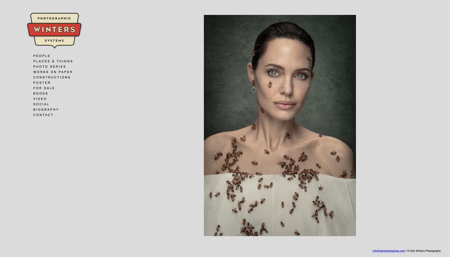
Dan Winters places a single large portrait beside a compact sidebar rather than filling the homepage with competing thumbnails. A distinctive badge-like identity anchors the navigation, which groups people, places, series, works on paper, books, and contact into a visible index. The gray background gives the photograph room to carry the visual character of the page. This is a useful reference for an established photographer whose archive spans different forms of work. The sidebar makes the breadth discoverable without writing a long introduction, though the small, widely spaced labels need careful attention to readability and touch access.
What you can learn
Let a strong photograph establish the tone, then give the archive a clear category system that remains visible. Use labels a commissioner can understand without knowing the work already. Keep contact and biography in the same predictable navigation rather than treating them as afterthoughts.
Pros
One dominant image provides a focused first impression.
The persistent index exposes the breadth of the archive.
Cons & considerations
Small navigation labels can be difficult to read quickly.
The opening image has little explanatory project context.
Visible tech stack
Referenced on the public page
Google Analytics
Amazon CloudFrontDelivery / hosting signal
Public source checked November 3, 2026. References may be embedded or legacy—not a complete backend inventory.
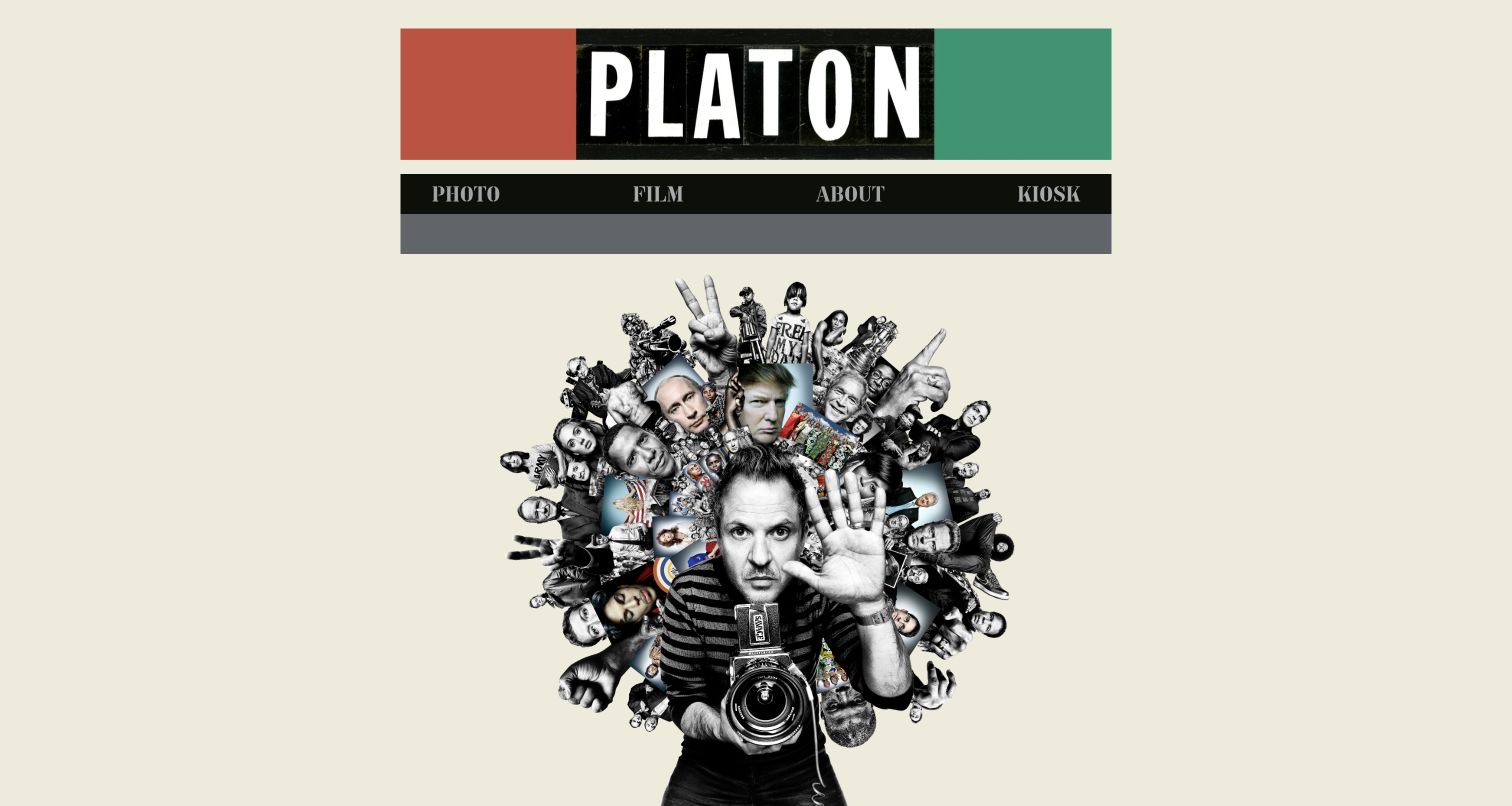
Platon's homepage uses a bold nameplate, a short four-part navigation, and a collage of portraits surrounding the photographer. The composition communicates personality and range before presenting a conventional gallery. Photo, Film, About, and Kiosk provide a compact structure, while studio information is available further down the page. The design is memorable because the identity and imagery feel intentionally related rather than assembled from a generic portfolio template. Its challenge is discoverability: a new visitor receives a strong impression but relatively little explanation of the projects, services, or practical route for a commission in the opening screen.
What you can learn
A distinctive identity can be useful when it grows out of the work itself. Pair expressive art direction with plain navigation and an easy contact route. Do not rely on an existing reputation to explain every project category or make the first inquiry feel possible.
Pros
The collage establishes a recognizable visual identity.
Four main navigation choices keep the structure compact.
Cons & considerations
The opening screen gives little context for individual projects.
Commissioning information requires further exploration.
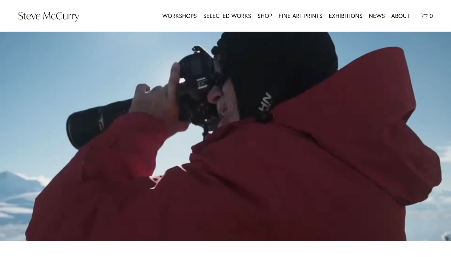
Steve McCurry's site places a large moving-image introduction beneath a clean white header. The navigation explicitly names workshops, selected works, prints, exhibitions, news, and the shop, so a visitor can see the different ways to engage with the work. The opening film creates a sense of the photographer's practice, while the surrounding structure behaves more like an active studio and publication hub than a static portfolio. The tradeoff is the scale of the media: it dominates the first screen and does not immediately show the project index. Several commerce-related routes also need careful labeling to remain distinct.
What you can learn
If the business includes prints, events, and education, expose those activities clearly without merging them into a single shop link. Preserve a direct route to the photography itself. Provide a useful still image and readable navigation when a large introductory video cannot play.
Pros
Different studio activities are named directly in the header.
The restrained frame lets the opening media establish tone.
Cons & considerations
Large video delays the view of actual project navigation.
Shop and fine-art-print routes need clear differentiation.
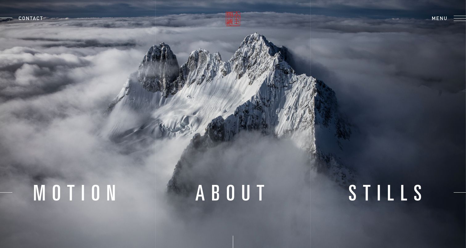
Jimmy Chin's homepage places Motion, About, and Stills across a full-screen mountain image, with Contact and Menu in the upper corners. The photograph conveys the subject matter immediately, and the three large labels turn it into a navigational surface without adding descriptive paragraphs. The small red mark provides identity while leaving the landscape dominant. This is a strong reference for reducing a multidisciplinary portfolio to a few meaningful choices. It also shows the limitations of a cinematic entrance: the labels must remain legible on the chosen image, and visitors seeking a particular project have to move beyond the opening screen.
What you can learn
Use a small number of discipline-based routes when they reflect the actual work. Keep contact visible outside the main menu so the dramatic first impression does not block a practical inquiry. Test the composition with different image crops and a still fallback on small screens.
Pros
Three large routes make the creative disciplines easy to distinguish.
Contact remains visible without opening the menu.
Cons & considerations
Text contrast depends on the background image and crop.
Specific project context appears only after entering a section.
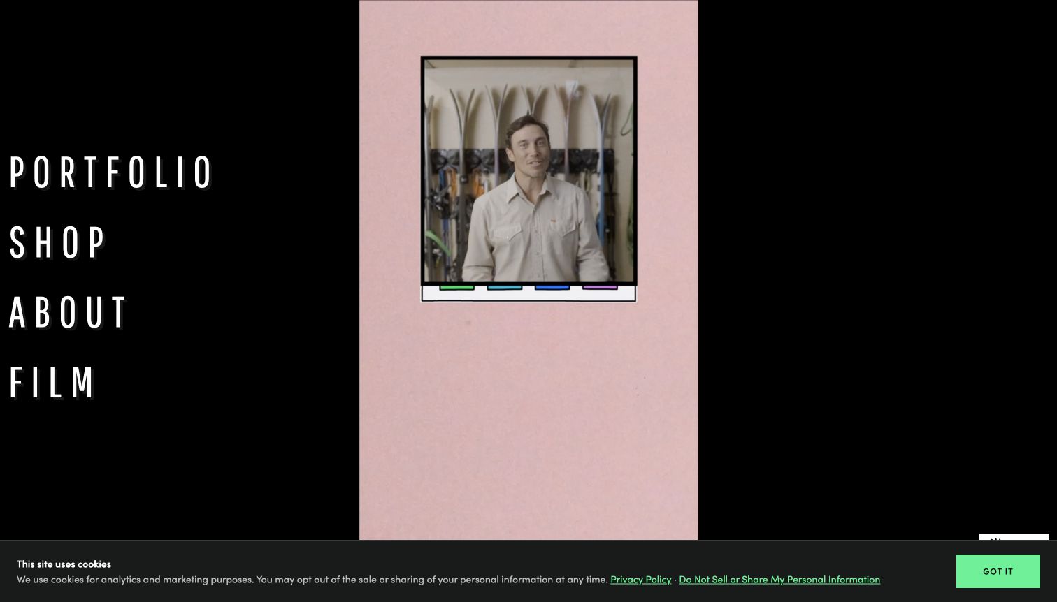
Chris Burkard's homepage uses a black frame, large condensed navigation labels, and an immersive media background. Portfolio, Shop, About, and Film appear as the main choices, giving the visitor a simple map of a wider creative business. The strong contrast and generous type make the navigation more prominent than a conventional tiny menu over a photograph. In the captured moment, the moving background shows a portrait-oriented scene, demonstrating how media composition can change the balance of the whole page. The design offers atmosphere, but it provides little immediate project detail or explanation of the available services.
What you can learn
Large navigation can serve as the homepage's structure when the categories are distinct and few. Make the media optional to understanding those routes. Plan for changing aspect ratios and video frames so the design does not become confusing or visually empty during playback or loading.
Pros
Large category labels are easy to identify against the dark frame.
Portfolio, film, and commerce are separated into distinct routes.
Cons & considerations
The moving background changes the visual balance over time.
The opening view offers little context about individual projects.
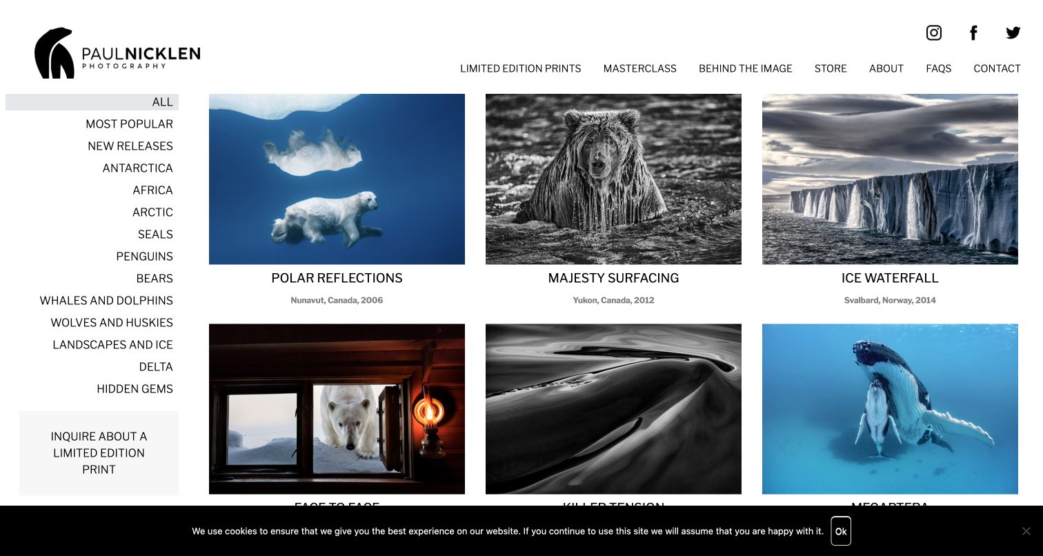
Paul Nicklen's limited-edition collection pairs a persistent subject index with a three-column image grid. Each visible work has a title and geographic or date context, helping the page function as a catalog rather than an unlabeled mood board. The left-hand categories include regions and animal subjects, while a separate inquiry action explains the next step for a potential print buyer. The studio header still provides access to stories, education, and contact. This is a useful reference for organizing a large print offering, although the lengthy category list and compact captions require careful adaptation for smaller screens.
What you can learn
Give print buyers more than a sequence of attractive images. Use consistent titles, context, collection labels, and a clear inquiry or purchase route. Keep subject filtering understandable, and distinguish the date of the photograph from the date a website capture or product listing was updated.
Pros
Titles and location context make the images easier to evaluate.
Subject categories and a print-inquiry route support a concrete buying task.
Cons & considerations
The long sidebar demands careful mobile treatment.
Small captions are secondary to the images and can be easy to overlook.
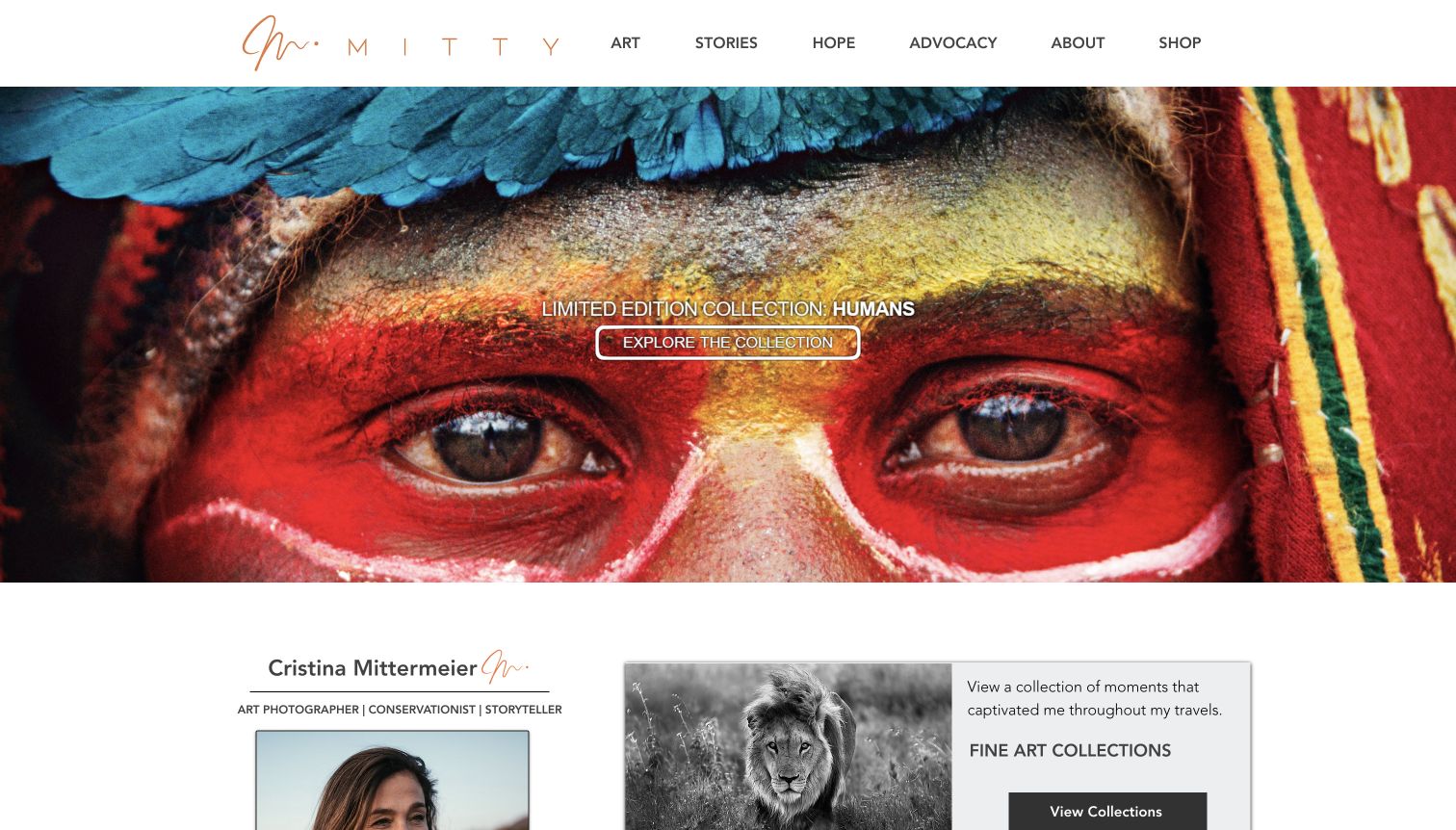
Cristina Mittermeier's site puts a close-cropped photograph behind a named collection invitation, with a restrained white header above it. Art, Stories, Advocacy, About, and Shop are visible as separate sections, so the portfolio can support both viewing and learning about the photographer's wider work. Below the hero, an introduction and collection cards begin to explain that relationship. The design is useful for a practice with several connected purposes because it gives each one a recognizable place. The hero crop is visually forceful, but small white text over a detailed image needs care, and abstract section names can still require explanation.
What you can learn
Connect a mission to specific bodies of work instead of using it only as a slogan. Give art, editorial stories, and commercial products distinct routes. Use a named collection to invite deeper viewing, then provide enough context for a new visitor to understand why the images belong together.
Pros
A named collection creates a concrete destination from the hero.
Art, storytelling, and advocacy have separate navigation roles.
Cons & considerations
Small text overlays a detailed photographic surface.
Broad section names may need supporting explanations for newcomers.
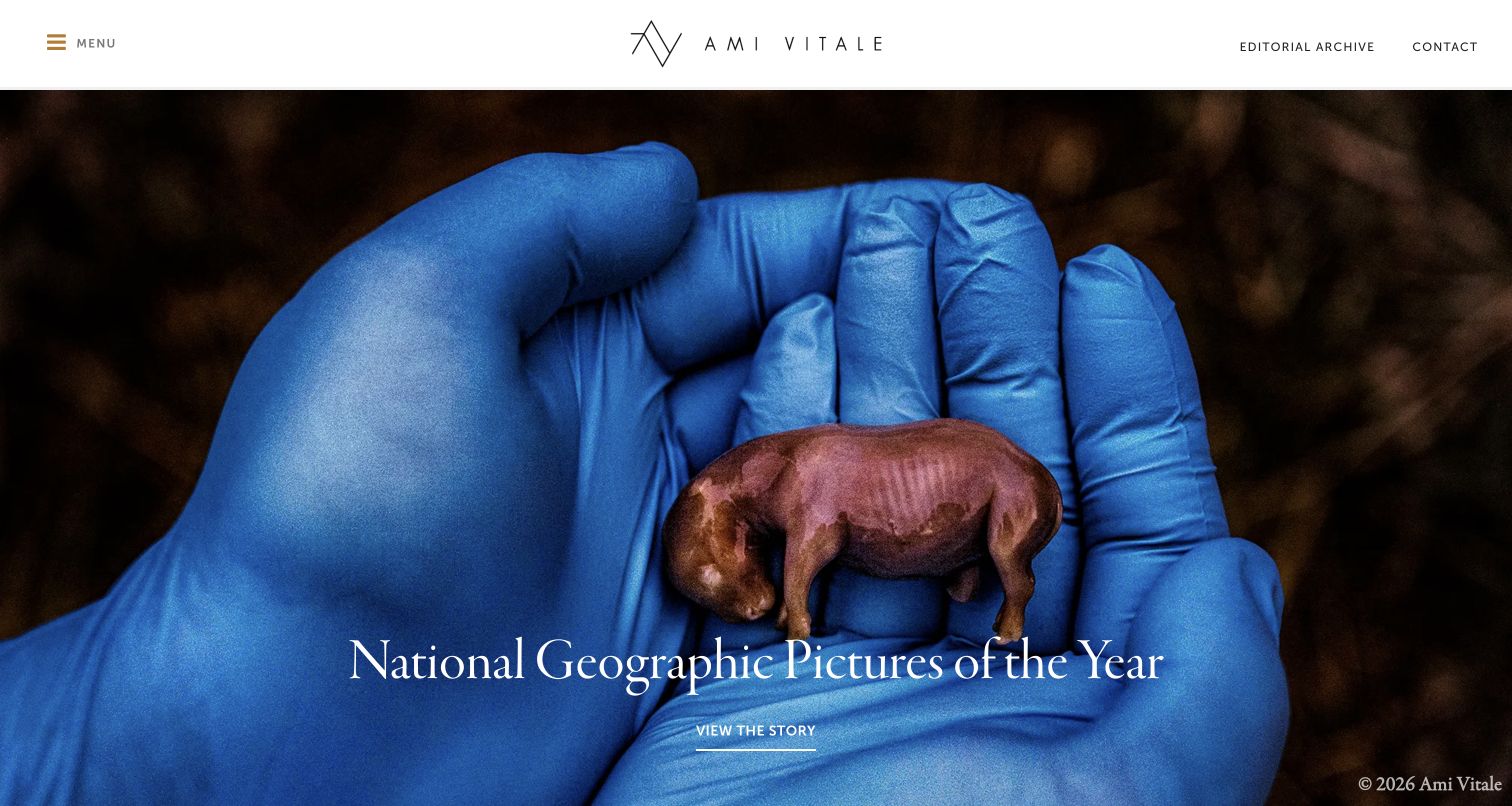
Ami Vitale's homepage treats the opening photograph as a story invitation, with a clear title and a View the Story action. The white header preserves contact and editorial-archive routes outside the collapsed menu, keeping practical professional tasks visible. The large image gives the work emotional weight, while the story title makes it more specific than a generic portfolio slideshow. This is a useful model for photographers whose projects are best understood through narrative. The full-screen treatment still means visitors see one featured story at a time, and smaller navigation labels need enough contrast and space to remain usable.
What you can learn
Use a featured image to lead into a complete story with context and sequencing. Keep archive and contact tasks available for editors who already know what they need. A rotating feature should supplement a stable project index rather than becoming the only way to discover the work.
Pros
Story titles give the opening imagery a clear context.
Archive and contact remain visible outside the menu.
Cons & considerations
One featured story dominates the first impression.
Small utility labels can be less prominent than the large media.
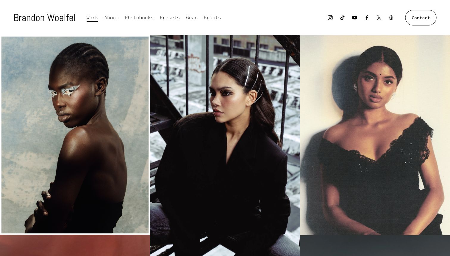
Brandon Woelfel opens directly into a large image grid beneath a simple name and navigation bar. The first row shows varied portraits at a scale large enough to communicate lighting and color choices without an introductory slogan. Work, About, photobooks, presets, gear, and prints share the header, with Contact given a separate outlined treatment. The design lets the photography do the first explanatory work while exposing related products. The many social icons and merchandise routes can draw attention away from a commissioner's task, and the grid itself offers little context about the individual assignments shown.
What you can learn
Use an immediate grid when the work has enough coherence to establish a point of view on its own. Keep contact visually distinct and provide context somewhere for projects that need it. Separate educational products and social links from the core path a prospective client would take.
Pros
Large portraits make the visual style immediately apparent.
Contact has a distinct position in the header.
Cons & considerations
Several product and social routes compete with portfolio browsing.
Uncaptioned images provide limited assignment context.
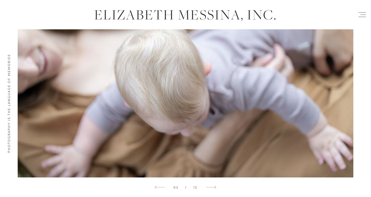
Elizabeth Messina uses a large serif nameplate above a generous image carousel, with a short vertical statement at the edge and a minimal menu control. The captured family photograph fills most of the available area, giving the image a calm, editorial presentation. A visible counter and arrows indicate that the opening is a sequence rather than a single static hero. The design is useful for a photographer whose work benefits from space and consistent tone. Its restraint also creates a discovery cost: categories, contact, and the broader practice are not visible until the visitor opens the menu or continues down the page.
What you can learn
Let quiet art direction support the photographs, but make the sequence controls clear and keep important routes easy to find. Use an image counter honestly and provide a stable gallery index. A minimal opening should still help a new visitor understand what kind of work is available.
Pros
Generous image space creates a calm viewing experience.
The counter and arrows make the sequence visible.
Cons & considerations
Contact and portfolio categories are hidden behind the menu.
The first screen gives little practical context beyond the imagery.
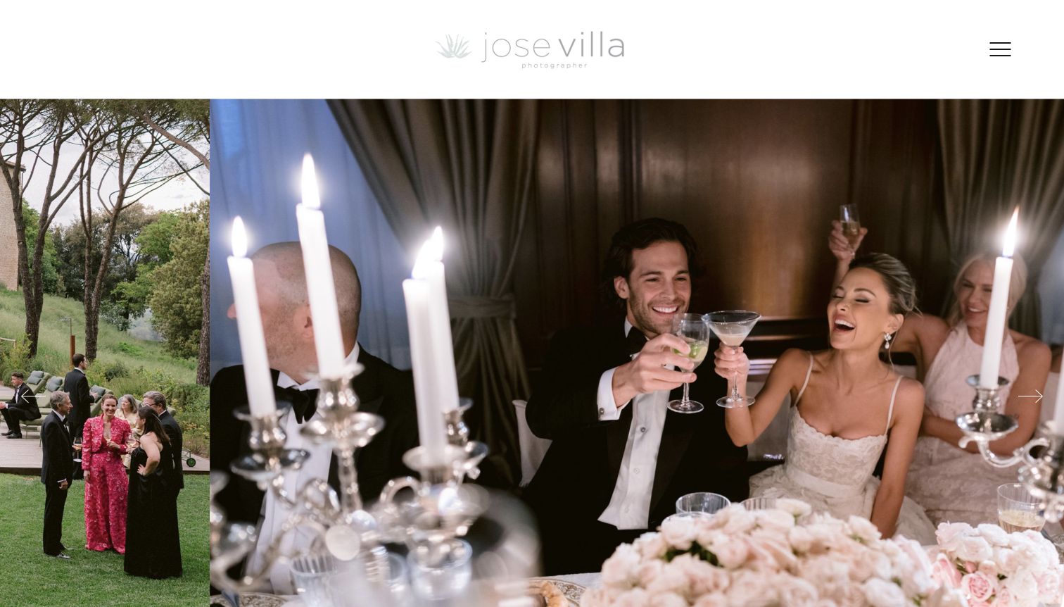
Jose Villa's homepage places a broad wedding-image sequence beneath a restrained white header. The light wordmark and compact menu leave the photographs to carry the visual identity, while arrows at the edges signal horizontal movement. The captured reception scene gives the page a sense of occasion without adding promotional copy over the image. Contact information and an inquiry form appear elsewhere in the page structure. This is a useful reference for an image-led wedding portfolio, but its understated interface can make the practical path harder to discover, particularly when the logo and controls have low contrast.
What you can learn
A wedding portfolio can lead with photographs when the selection clearly communicates the work. Preserve a plain contact route and an accessible way to browse the sequence. Make the studio identity and controls legible rather than relying on delicacy as the only expression of a premium aesthetic.
Pros
The wide imagery gives events and atmosphere room to register.
A minimal frame avoids covering the photographs with sales copy.
Cons & considerations
The pale wordmark has limited contrast on the white header.
The inquiry path is less visible than the slideshow itself.
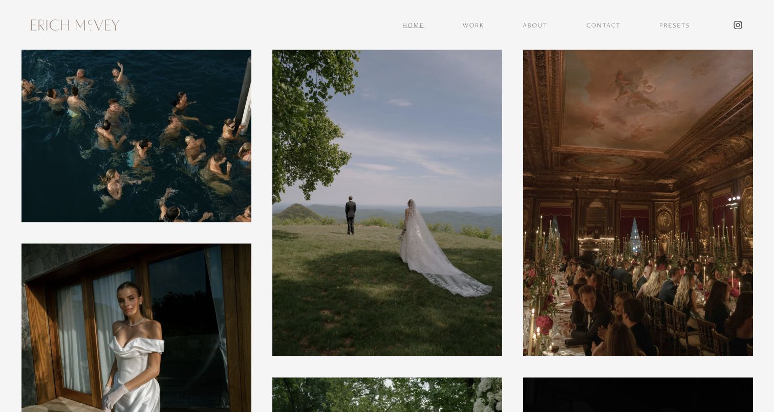
Erich McVey's homepage presents a three-column grid with different image proportions, separated by generous white gutters. Portraits, landscapes, and event scenes can sit together without being forced into identical crops. A restrained header offers Work, About, Contact, and Presets, so the portfolio and practical routes remain recognizable. The grid is useful for showing the range of a wedding story rather than only a succession of couple portraits. The thin, pale typography is a tradeoff: it complements the visual quiet but gives navigation less prominence, and the opening images provide little written context about the events.
What you can learn
Choose a grid that respects the original image proportions and sequence different kinds of moments intentionally. Keep enough spacing for each photograph to be read. Use navigation contrast and project captions to support the experience without turning every image into a promotional card.
Pros
Mixed proportions preserve variety without forcing uniform crops.
Generous gutters help individual images remain distinct.
Cons & considerations
Pale, thin navigation can be difficult to scan.
The opening grid offers little project or location context.
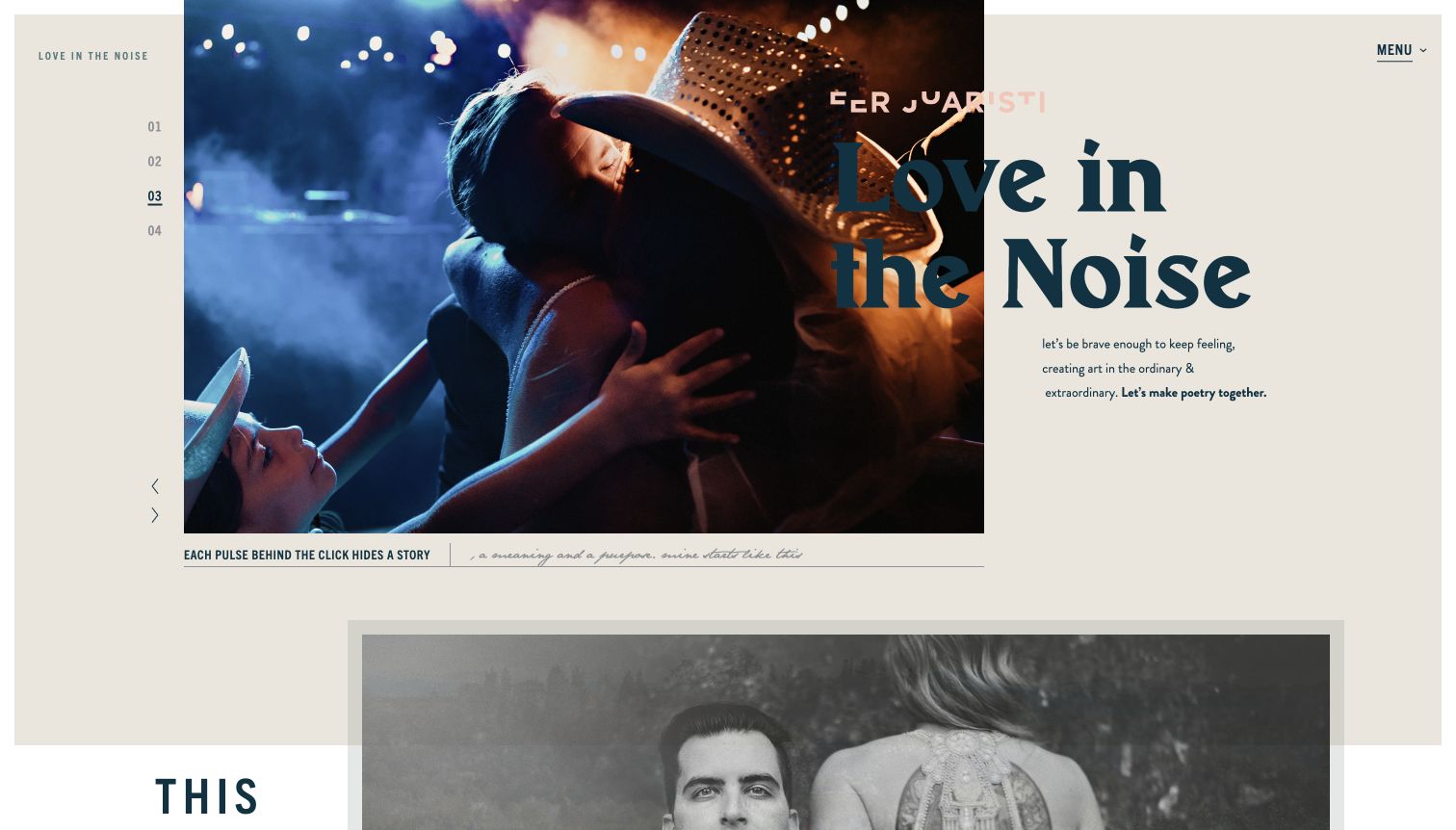
Fer Juaristi combines an off-center photograph, a numbered sequence, oversized typography, and a warm paper-like background. The headline overlaps the image boundary, giving the homepage the feel of an editorial spread rather than a conventional service landing page. Small captions and a visible menu create secondary layers around the main image. The design communicates a distinct point of view, which can help a photographer attract clients who respond to that style. It also demands careful composition: text crossing from photograph to background can lose contrast, and poetic copy does less to explain the practical service or inquiry process.
What you can learn
Use expressive layout to reflect the work, then support it with clear portfolio and contact routes. Treat overlapping text as a responsive design problem, not only a desktop composition. Give practical expectations their own plain-language page so the visual voice does not have to carry every message.
Pros
The asymmetric composition establishes a distinctive artistic identity.
Numbered controls make the image sequence visible.
Cons & considerations
Overlapping typography can lose contrast across photographs.
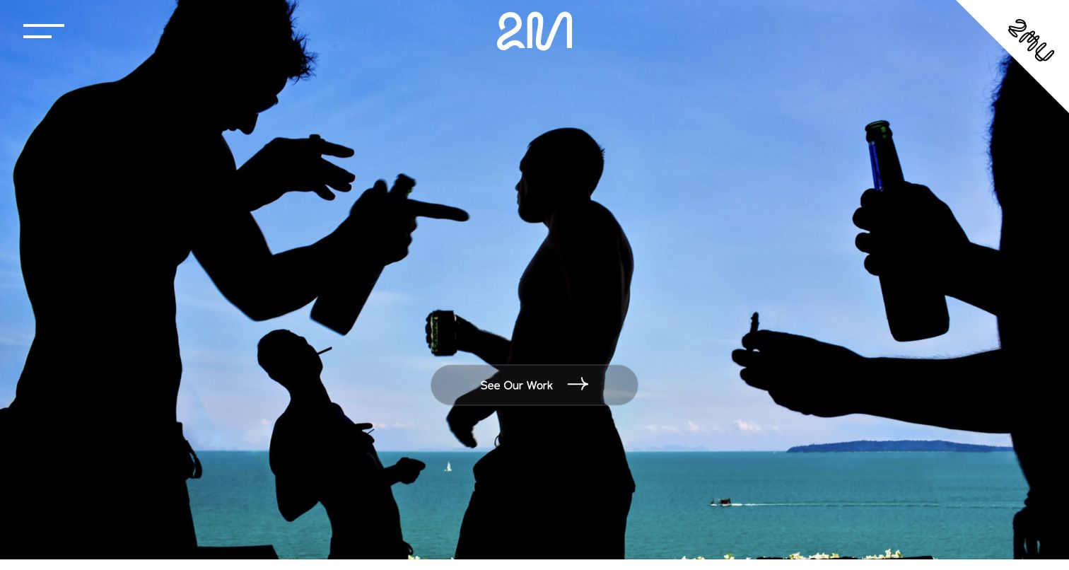
Two Mann Studios opens with a full-bleed photograph and a single See Our Work action. The compact mark and menu leave the image dominant, and the selected scene feels observational rather than a conventional posed wedding portrait. Below the opening, the studio introduces its people and broader story, giving the visual impression a human context. The design is a useful example of letting a distinctive moment communicate an approach before explaining it. The first screen still relies heavily on that one image, and a new visitor must explore further to find location, availability, or the practical inquiry route.
What you can learn
Select an opening image that demonstrates how the studio sees an event, then lead directly to a coherent body of work. Follow the visual statement with real information about the photographers and process. Keep an obvious inquiry route available for visitors who already know they want to talk.
Pros
One clear work action prevents competing calls to action.
The chosen image communicates a candid visual approach.
Cons & considerations
The first impression depends heavily on a single photograph.
Practical inquiry information is not visible in the opening view.
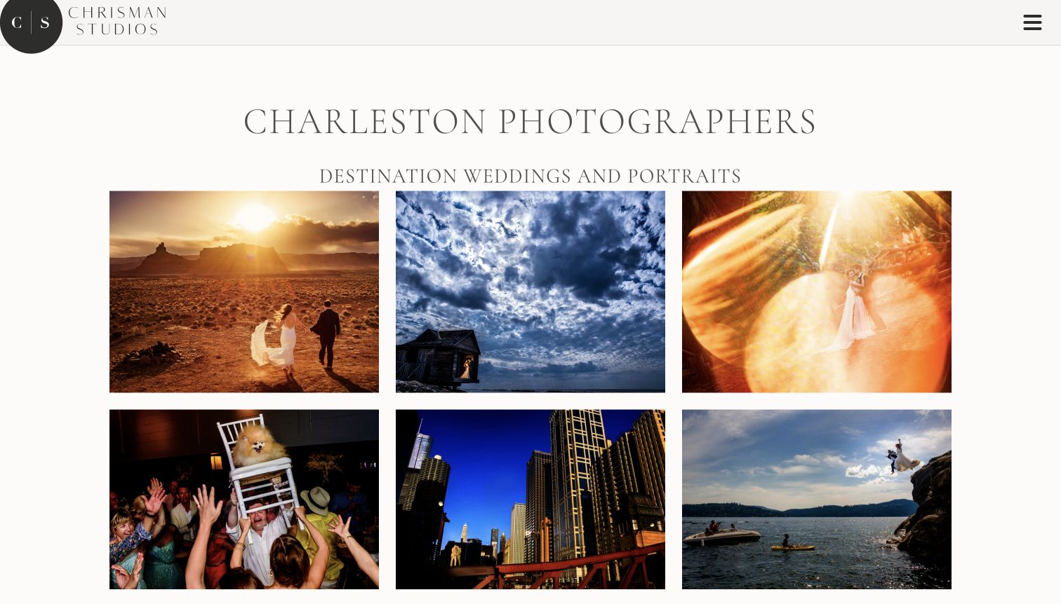
Chrisman Studios states its Charleston location and wedding-and-portrait focus before presenting a six-image grid. The images show varied lighting, settings, and moments, so the visitor sees range without waiting through a slideshow. A restrained studio mark and menu frame the page, while the lower introduction explains the people behind the business and offers an inquiry route. This is a useful blend of plain service positioning and expressive photography. The large introductory typography uses a fair amount of vertical space, and the collapsed navigation keeps individual services hidden until the visitor explores further.
What you can learn
State location and service focus plainly, then use a varied selection to demonstrate the work. A grid can communicate range faster than a long rotating hero. Give each important service an understandable route and make the inquiry action easy to find after the first visual impression.
Pros
Location and service type are explicit above the portfolio.
The grid shows several visual approaches at once.
Cons & considerations
Large introductory typography delays the image content slightly.
Individual service routes sit behind a collapsed menu.
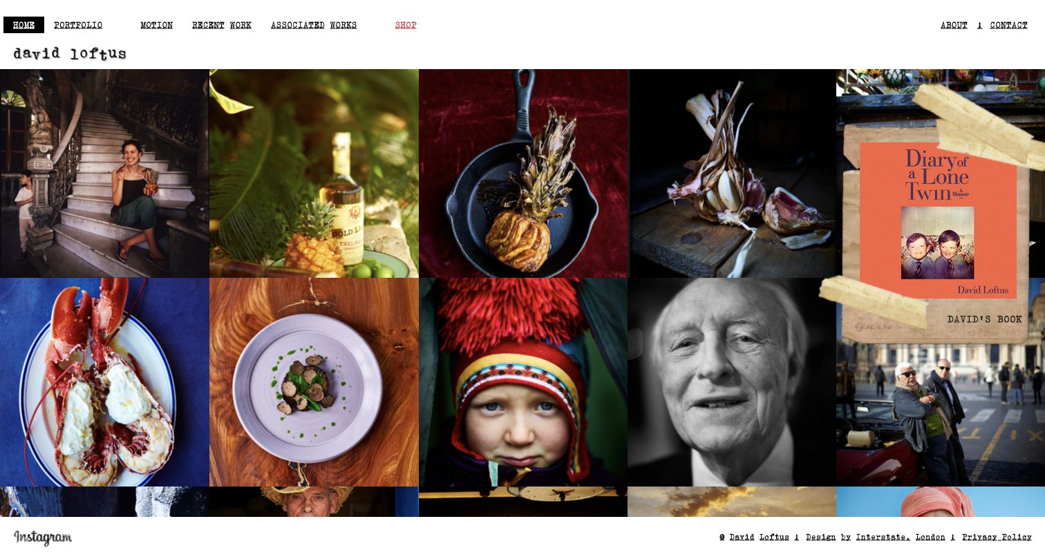
David Loftus uses a dense grid of food, portraits, products, and places beneath a compact typewriter-style header. Portfolio, recent work, motion, and associated works provide different ways into the archive, while About and Contact remain visible at the right. A book promotion sits over the image field, connecting the portfolio with the photographer's publishing activity. The design offers a strong overview of a broad practice without a long introduction. Its density is also the main tradeoff: small navigation and closely packed photographs require more attention, and the promotional card covers part of the work.
What you can learn
A contact-sheet approach works when the archive is broad and the categories are well organized. Provide both subject-based and project-based routes if clients use both. Keep promotions from obscuring too much of the portfolio, and give important navigation enough size to remain usable on mobile.
Pros
The grid quickly demonstrates a broad range of subject matter.
Recent and associated work provide additional archive entry points.
Cons & considerations
Small navigation can be hard to scan in the dense composition.
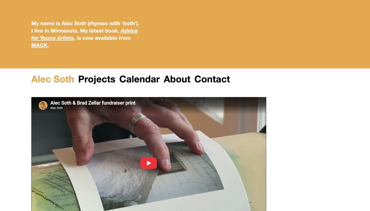
Alec Soth's site opens with a short first-person introduction on a warm-colored panel, followed by unusually large, plain navigation. Projects, Calendar, About, and Contact are easy to identify. The first content item is an embedded studio-related film, with additional updates and exhibition information in the page. This feels closer to an active artist's notebook than a polished sales funnel, which is useful for a practice built around books and ongoing bodies of work. The tradeoff is that a new visitor does not immediately see a representative photography grid, and the news-oriented opening requires regular editorial attention.
What you can learn
A personal voice can make an artist site approachable when it is paired with direct navigation. Keep the project archive one clear step away and give dated updates a maintenance plan. Do not let an embedded film become the only useful content in the first screen.
Pros
Large, plain navigation is easy to understand.
The personal introduction gives the site a recognizable voice.
Cons & considerations
The opening news item delays a direct view of the photography.
A studio-update format needs consistent maintenance.
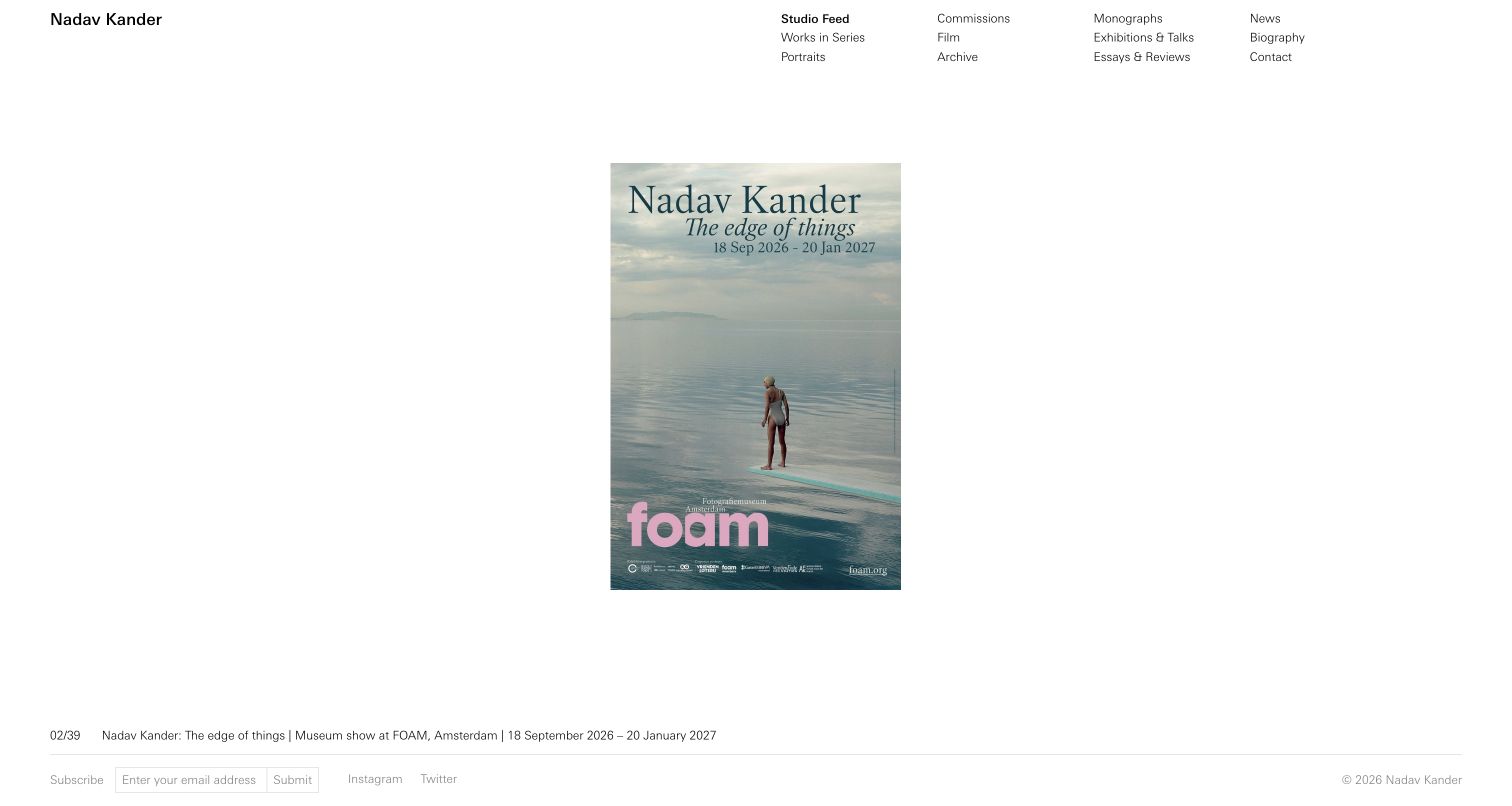
Nadav Kander's homepage places a compact, multi-column navigation above a spacious studio-feed presentation. Works in Series, Portraits, Commissions, Film, Archive, and publication-related sections make the breadth of the practice visible without a large menu overlay. The captured item is an exhibition announcement centered in abundant white space, with a caption and sequence counter below. This is a useful reference for treating a photographer's website as an ongoing studio record. The small scale of the featured item and navigation can feel reserved, and an announcement-led first impression does not immediately demonstrate the full photographic range.
What you can learn
Use an archive taxonomy that distinguishes bodies of work from commissions, publications, and studio news. Give feed items captions so their role is clear. Balance visual restraint with readable controls and an easy path to a representative portfolio for first-time visitors.
Pros
The visible taxonomy exposes several meaningful archive routes.
Captions and counters explain the studio-feed format.
Cons & considerations
Small navigation and featured media can feel distant on a large screen.
A news item may precede a representative view of the photography.
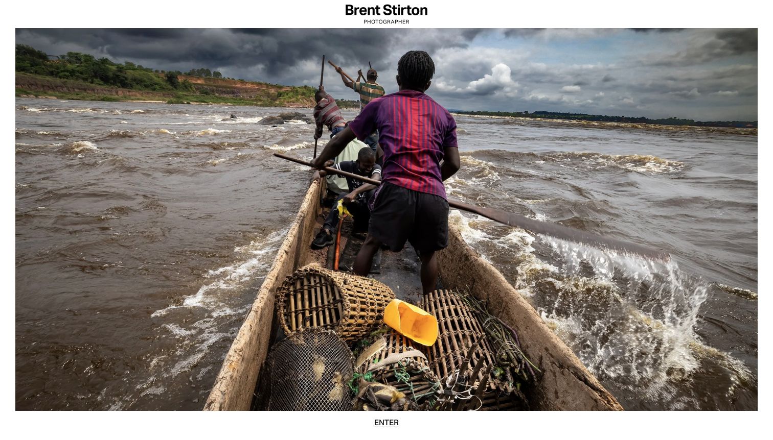
Brent Stirton's homepage uses an unusually simple entrance: a name, a small photographer label, one large image, and an Enter link beneath it. The photograph receives almost all of the available space, allowing its composition and subject to establish the tone. There are no competing product or social actions in the captured view. This is a useful reference for understanding the strength of a deliberately narrow first impression. It is also a caution about adding an entrance layer: a visitor has to take another step before reaching project context, navigation, or contact information.
What you can learn
A single-image entrance can create focus, but weigh that effect against the extra navigation step. Make the entry action obvious and preserve access for keyboard users. Consider whether a visible project or contact link would help professional visitors without weakening the photographic presentation.
Pros
One photograph receives enough space to make a strong impression.
The interface avoids competing promotional elements.
Cons & considerations
The entrance adds a step before useful portfolio navigation.
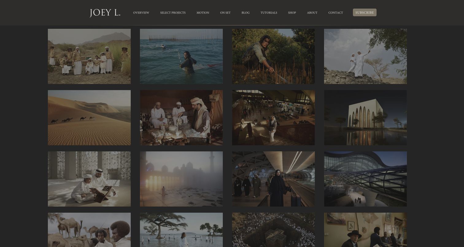
Joey L.'s overview page presents a dense four-column image grid beneath a dark studio header. Navigation distinguishes the quick overview from selected projects, motion, and on-set material, giving clients several levels of depth. Blog, tutorials, and shop routes show the wider business without replacing the core portfolio structure. The grid offers a fast scan of subjects and locations, while the dark frame keeps the emphasis on photographs. The captured thumbnails are visually muted, and the small navigation labels require effort to read; those choices reduce the immediacy of an otherwise useful overview.
What you can learn
Offer a concise overview for quick evaluation and a separate project route for deeper context. Production or on-set material can help explain how the work is made, but it should remain distinct from final images. Keep thumbnail contrast and navigation readability strong enough for rapid professional browsing.
Pros
Overview and selected-project routes serve different research depths.
Motion and on-set sections clarify the range of the practice.
Cons & considerations
Muted thumbnails reduce visual impact in the captured view.
Small navigation competes with a dense image grid.
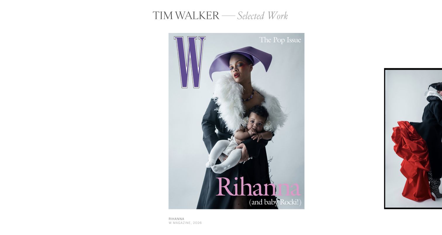
Tim Walker's selected-work view uses large individual images against white space, with the next image partly visible at the edge. A restrained serif title identifies the photographer and section, while small captions below the work provide publication context. The composition behaves like a paced editorial sequence rather than a uniform thumbnail wall. It is useful for photographers whose images benefit from being considered one at a time. The same restraint creates a navigation challenge: the visible controls and practical contact route are less obvious than the photography, so a first-time visitor must learn how to move through the presentation.
What you can learn
Use image pacing deliberately and provide concise captions when publication or project context matters. Make the direction of travel and the route back to an index clear. A portfolio can feel editorial while still giving visitors obvious contact and category navigation.
Pros
Large images preserve visual detail and editorial pacing.
Captions provide useful publication context.
Cons & considerations
The route through the sequence is less explicit than a conventional grid.
Contact and broader navigation are not prominent in the opening view.
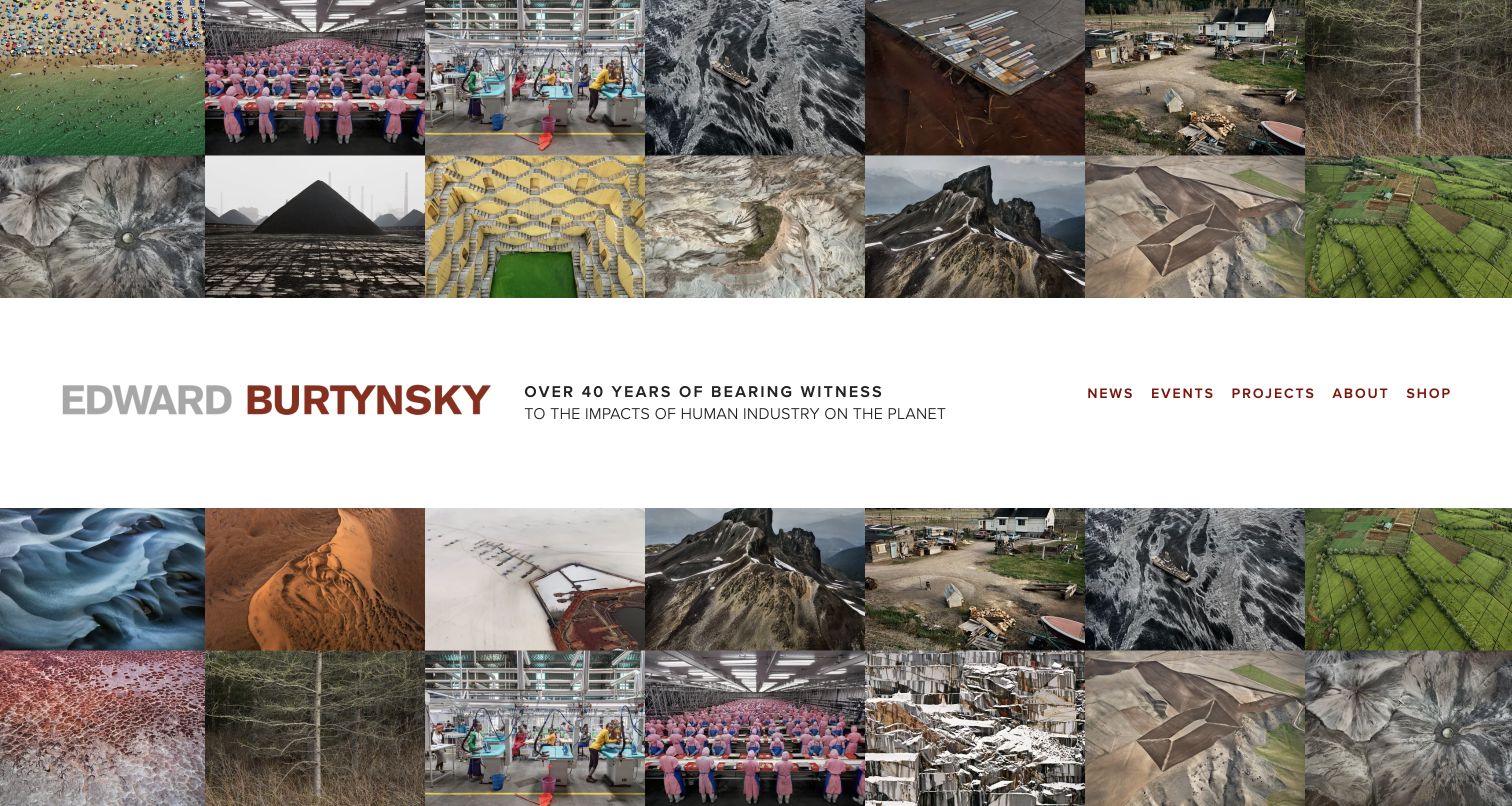
Edward Burtynsky's homepage surrounds a central identity and navigation band with a mosaic of photographs. The repeating aerial and industrial subjects communicate a consistent body of work before the visitor enters a project. News, Events, Projects, About, and Shop sit together in the white band, keeping the site map readable against the dense imagery. The design is distinctive because the archive itself becomes the page's visual environment. A promotional overlay appeared on the first visit, however, interrupting that presentation. The many small images also communicate breadth more effectively than the detail of any single photograph.
What you can learn
A mosaic can establish a theme across a large archive, but give visitors a clear route to full project views. Keep identity and navigation on a stable readable surface. Promotions should be easy to dismiss and should not become the only opening experience a new visitor sees.
Pros
The mosaic quickly communicates a coherent photographic subject area.
A central white band keeps the navigation legible.
Cons & considerations
Small images prioritize breadth over individual photographic detail.
An opening promotion can interrupt the intended portfolio experience.
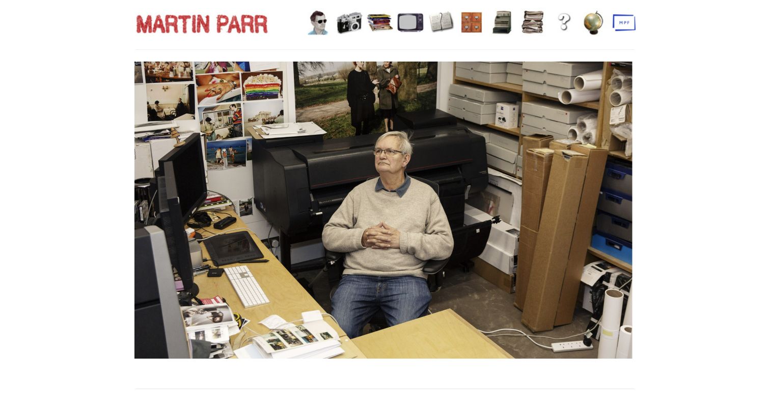
Martin Parr's site uses a red nameplate and a row of illustrated objects as navigation above a large studio photograph. The image shows the working environment rather than beginning with a conventional gallery, giving the page an informal and personal character. The underlying navigation provides routes to recent work, books, archive, biography, and contact. This is a useful reference for expressing personality through the interface without a long written introduction. The object-based menu is also the main usability tradeoff: visitors may need to interpret the icons before knowing which destination each one represents.
What you can learn
Personality can come from a small number of well-chosen interface details. Pair illustrative navigation with readable labels and predictable keyboard behavior. Make the archive and contact route understandable to someone unfamiliar with the artist rather than assuming the visual joke will explain the destination.
Pros
The studio photograph makes the site feel personal and specific.
Distinctive navigation objects reinforce the informal visual identity.
Cons & considerations
Object-based controls may require interpretation before use.
The first screen shows the studio rather than a representative project selection.
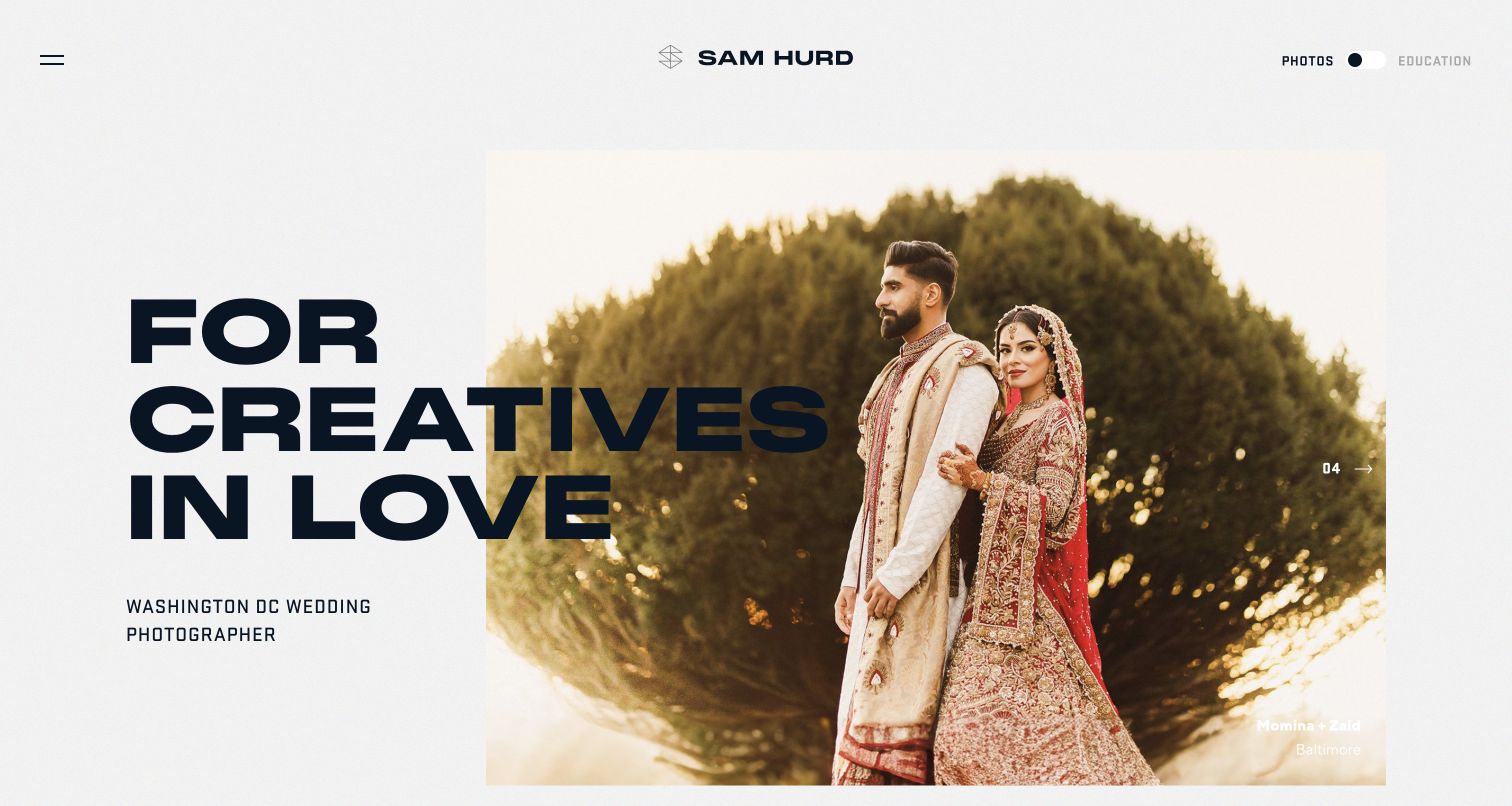
Sam Hurd combines oversized typography with a large wedding photograph, making the Washington, DC service focus explicit in the opening view. A Photos and Education switch in the header separates two audiences that could otherwise become tangled in one navigation. The selected image has a caption and sequence marker, while a compact menu keeps the main composition uncluttered. This is a useful reference for a photographer who sells both client work and learning material. The large headline overlaps the image area, so its scale and contrast need careful handling across photographs and screen sizes.
What you can learn
Separate client services from education when the two audiences have different goals. Keep location and service type explicit even in an expressive design. Use image captions and sequence controls consistently, and test oversized typography against the actual photographs rather than only a neutral placeholder.
Pros
Photography and education have a clear audience distinction.
Location and wedding-service focus are stated directly.
Cons & considerations
Large overlapping typography can compete with the photograph.
The compact menu hides some practical routes from the opening screen.
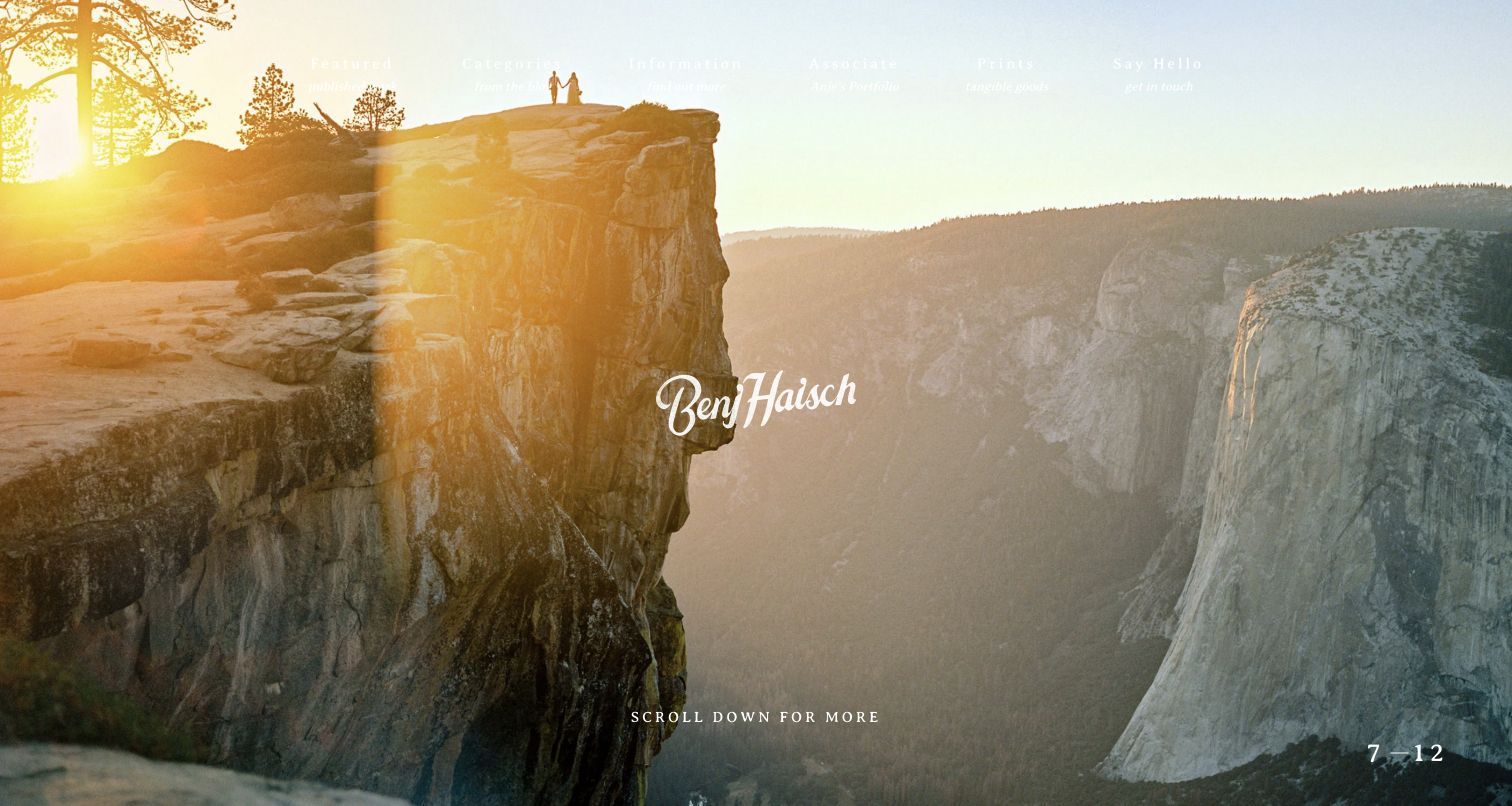
Benj Haisch's homepage uses a full-screen landscape wedding photograph with a centered signature mark. The navigation pairs categories such as Featured, Information, Prints, and Say Hello with small descriptive subtitles, giving more context than single-word labels alone. A slide counter and a scroll prompt indicate that the page continues beyond the opening image. The photograph makes the connection between people and landscape immediately visible. The tradeoff is contrast: light navigation sits over a bright sky in the captured frame, and the sparse first screen leaves practical service details for the sections below.
What you can learn
Choose a hero that demonstrates the relationship between subject and setting, then make navigation legible on every slide. Descriptive subtitles can clarify creative labels, but they need enough size and contrast to help. Follow the atmospheric opening with location, approach, and inquiry information.
Pros
The landscape image clearly establishes the photographic setting.
Navigation subtitles add context to broad section labels.
Cons & considerations
Light text loses contrast against the bright sky.
Practical service information is deferred beyond the hero.
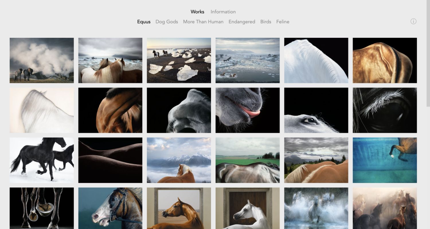
Tim Flach's Equus gallery places a compact series navigation above a six-column image grid. The selected series is visually distinguished from neighboring projects, and the photographs move between environmental scenes and close details of the same subject. The light-gray background and limited interface keep attention on the sequence without introducing unrelated commercial messages. This is a useful reference for organizing a practice around named bodies of work. The dense grid gives a quick overview, but individual images are relatively small, and titles such as Equus or Dog Gods may need explanatory context for a visitor encountering the work for the first time.
What you can learn
Give each body of work its own stable page and make the selected series obvious. Use a grid to show range within a project, then provide larger viewing and concise context. Avoid making poetic series titles the only explanation of what a prospective client or viewer is about to see.
Pros
The selected series is clear within a compact project navigation.
The grid shows variation within one coherent subject.
Cons & considerations
Six columns reduce the size of individual images.
Series names benefit from supporting context for new visitors.
Decide whether the main audience is commissioning, booking, collecting, licensing, or learning. Provide a representative overview for quick evaluation and deeper projects for context. If the practice serves several audiences, label their routes explicitly rather than mixing every product into one gallery.
Prepare a repeatable project record
For each project, keep the selected images, sequence, title, brief context, publication permissions, and any required credits together. Record which images can be shown publicly. This makes future editing easier and reduces the risk of an attractive page using the wrong crop or outdated project information.
Design the inquiry after the viewing experience
Give visitors a plain contact route and explain the information that helps the studio respond. A wedding inquiry, print question, and commercial brief may need different fields. Keep client galleries and private delivery separate from the public portfolio, and avoid unnecessary friction before the first conversation.
The editing job behind the design
Choose a portfolio system around editing and image delivery
The system should support responsive images, meaningful alternative text, flexible project ordering, and predictable navigation. Decide whether the studio needs only a portfolio or also a print catalog, client galleries, publishing, and education products. Each additional workflow creates maintenance and support responsibilities.
Test the experience with slow image loading, blocked video, a small screen, and keyboard navigation. Keep a useful still fallback and avoid making a giant media file the only explanation of the work. Platform labels are left empty in this collection where qualified technology evidence was not established.
Our WordPress website examples offer a separate look at publishing approaches. A visible platform label is evidence for that named page, not a guarantee that the same system will suit your requirements.
Before the public launch
Photographer website launch checklist
Edit the opening selection for relevance and sequence, not just image quantity.
Verify image permissions, credits, project titles, and publication context.
Check crops, mixed image proportions, responsive loading, and useful still fallbacks.
Make portfolio categories, contact, biography, and commerce routes understandable.
Test keyboard controls, carousel labels, image descriptions, and text contrast.
Review inquiry delivery and assign owners for news, exhibitions, products, and broken links.
These checks are a project checklist, not a performance, legal, security, or accessibility certification. Test real journeys with the people responsible for the website before making claims about the result.
Sources & editorial method
How this collection was selected and reviewed
We reviewed the reserved 26 distinct official photographer websites and captured public desktop views directly in a browser on November 3, 2026 UTC. Most captures show the homepage; Paul Nicklen's print catalog, Tim Flach's Equus gallery, and other explicitly labeled portfolio views provide more useful static references than transitional video frames. The reviews are original observations about presentation and navigation. Photographs and brand assets remain attributable to their original creators and websites; no inquiry forms, purchases, or private galleries were used.
Each example links to its actual source page. Screenshots are direct browser captures with their own capture dates; moving imagery, announcements and live designs can change. The notes describe observable design choices and conditional tradeoffs, not measured traffic, conversion results, service quality, or accessibility conformance.
Technology labels use public page metadata, asset evidence, or explicitly cited platform documentation. Platform documentation is not a complete current deployment audit. A component reference may be legacy or unused; it is not a complete backend inventory. Unknown stacks are omitted. These sites are editorial examples, not our client portfolio.
Written, Edited and Curated are separate editorial records, not timestamps advanced by a rebuild. Website designs and imagery belong to their owners. See our editorial standards or suggest a correction.
Questions worth asking
Photographer website design questions
Should a photographer use a grid or a slideshow?
A grid helps visitors scan range quickly, while a sequence can give individual photographs more attention. Choose based on the work and viewer's task. Either needs clear controls, useful image sizes, and a route to deeper project context.
How many photographs belong on the homepage?
Use enough to communicate the work without overwhelming the visitor. A concise, edited selection is usually easier to understand than an unstructured archive. The full body of work can live in clearly labeled projects or categories.
Should prints and education share the portfolio site?
They can when the navigation makes the different tasks clear. Keep prospective clients from having to sort through courses or products to find relevant work, and give collectors or students a direct route to what they need.
Does a minimal portfolio need written context?
Yes, where images alone cannot answer the viewer's question. A short project description, clear category name, location or service statement, and contact route can add useful context without competing with the photographs.
Borrow the structure that helps people understand your work. Use your own photographs, edit the sequence carefully, and make the route from viewing to conversation clear.