A book publisher’s website serves several audiences around the same catalog. A useful design connects the appeal of an individual title with reliable edition information and clear routes for different professional and reader needs.
The collection includes broad publishing houses and focused lists. Compare how they introduce books, connect authors and imprints, organize subject browsing, and distinguish buying from professional inquiries. The design of a publisher’s homepage does not establish the quality or commercial performance of its books.
Start with the relationships in the catalog, not a row of attractive jackets. A work may have several editions or formats, while a contributor may be associated with several titles. The website needs to make those distinctions understandable without forcing every audience into the same shopping or contact flow.
Before the examples
What makes good book publisher website design in 2026?
Make edition and format information explicit
Give the catalog a consistent way to describe title, contributor, format, publication date, identifiers, and availability. Explain which record a reader is viewing, particularly when a cover or title is shared across formats. Keep external purchasing destinations attached to the appropriate edition rather than an ambiguous promotional image.
Separate audience routes without duplicating the catalog
Readers, retailers, librarians, media, prospective authors, and rights contacts can require different supporting information. Provide recognizable entrances for the audiences the publisher actually serves. A clear route to approved submission guidance is more useful than a general contact form that appears to invite every kind of material.
Connect discovery to the depth of the list
Use imprints, subjects, series, contributor pages, and curated selections where they represent genuine relationships. Keep a direct title or author lookup available. A heavily promoted frontlist should not make the continuing backlist invisible to someone arriving with a specific book in mind.
The collection · 25 examples
25 book publisher websites worth studying
Compare broad catalog discovery, distinctive imprint identities, illustrated-book presentation, and professional information routes. Pay attention to how a reader moves from a cover to an identifiable book record.
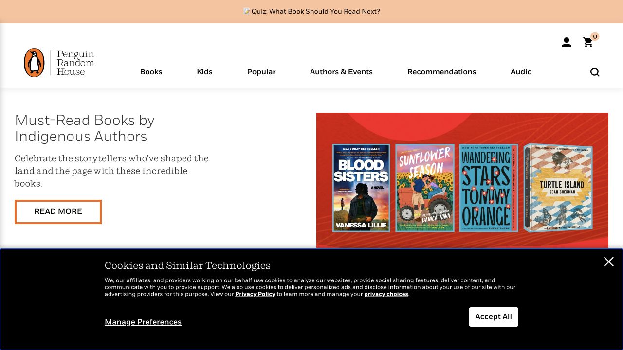
Penguin Random House gives Books, Kids, Authors and recommendations recognizable places in a light navigation system. The observed opening combines an editorial reading theme with several book covers rather than treating the publisher logo as the entire message. A reader quiz and subsequent category shelves offer different starting points for visitors who have a title in mind and those who do not. The reference is useful for organizing an extensive trade catalog without making every imprint compete in the first screen.
What you can learn
Define discovery routes by reader intent before arranging promotional slots. A known-title search, a gift search and a request for a recommendation should not require the same sequence. Keep author, format and publication information consistent when a book appears in different collections, and offer a straightforward route back to its complete record.
Pros
Book covers and editorial themes support different kinds of browsing.
The header distinguishes children’s books from broader discovery routes.
Cons & considerations
Several recommendation mechanisms can overlap without clear labels.
A large catalog needs consistent metadata to prevent conflicting book descriptions.
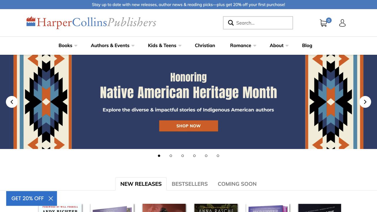
HarperCollins places Books, Authors and Events, younger-reader collections and specialist categories across a broad header. New-release, bestseller and forthcoming shelves repeat a cover, title and author pattern, while a separate editorial channel offers reading-related material. The captured page feels like a publisher’s catalog rather than a single-author campaign. Its useful distinction is that discovery articles and commercial book records coexist, with neither needing to contain all of the other’s information.
What you can learn
Build one dependable book record and reuse its data in shelves, articles and author pages. Give forthcoming titles a different action and date label from available books. Treat the editorial channel as a planned publishing workflow, with named owners and contextual links, so that older recommendations still lead to maintained title information.
Pros
Repeated cover and author treatments make the assortment comparable.
Events and reading content have destinations beyond the shopping shelf.
Cons & considerations
Numerous specialist header categories can become crowded on smaller screens.
Editorial stories need deliberate links back to the relevant editions and formats.
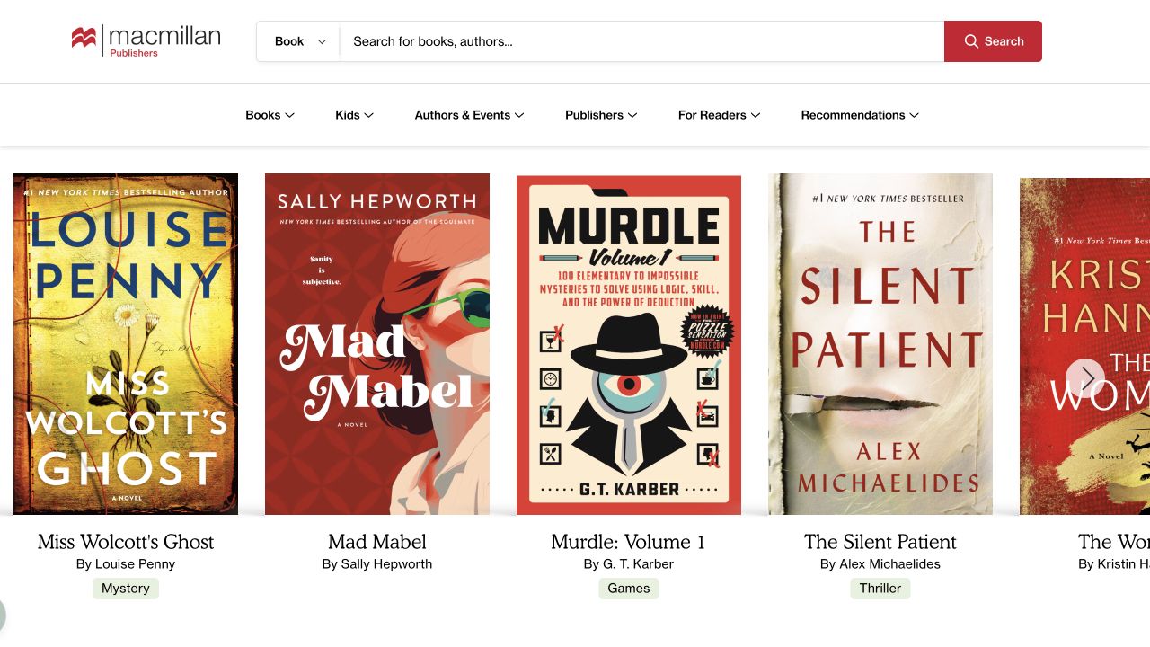
Macmillan makes a book-and-author search conspicuous above a cover-led catalog. Books, younger readers, authors and events, publishers and recommendations appear as distinct navigation choices. Genre labels supply another route into the assortment, while the page retains the visual identity of individual covers. This combination is worth examining when a publisher’s own structure is more complicated than the reader’s task: someone looking for a novel should not first need to understand the imprint organization.
What you can learn
Test search with partial titles, author names and common misspellings before adding more homepage shelves. Decide how an edition, a series and a work relate in the catalog, and explain those relationships in results. Keep genre browsing useful for visitors who cannot name a particular book and preserve an obvious author-event route.
Pros
A prominent search supports visitors with a specific book or author in mind.
Genres provide a reader-facing alternative to publisher and imprint navigation.
Cons & considerations
Multiple discovery routes require consistent naming to avoid duplicate-looking destinations.
A cover strip alone cannot communicate format, availability or edition differences.
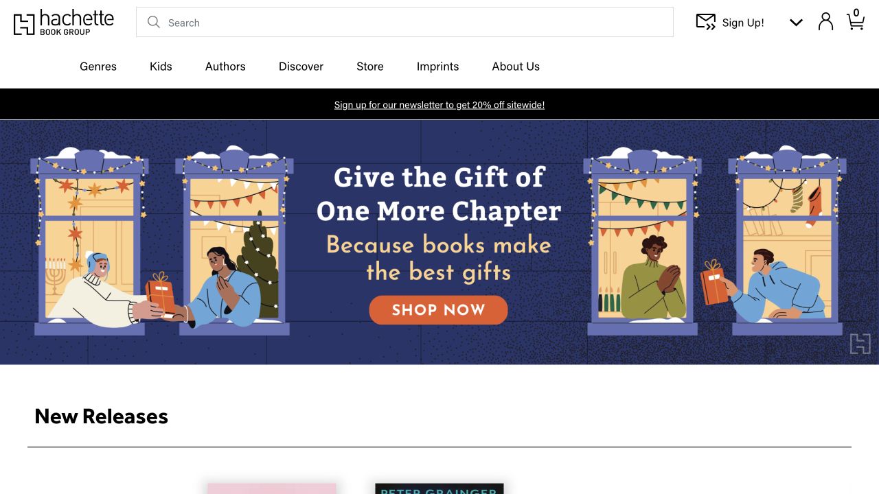
Hachette Book Group’s dark header separates genres, children’s books, authors, discovery content and imprints. A seasonal illustrated-book campaign supplies the opening visual, followed by recognizable forthcoming and new-release shelves. The contrast between a changing gift feature and stable catalog navigation is the important pattern here. Visitors can respond to the current promotion without losing access to the broader publishing list or needing to identify the featured imprint first.
What you can learn
Specify which homepage modules are temporary campaigns and which are permanent discovery infrastructure. Give a campaign an end date and replacement owner, but keep the underlying title records stable. When a book appears in a gift collection, retain its author, format and publication status rather than relying entirely on decorative artwork.
Pros
The campaign and the permanent genre navigation have different visual roles.
Forthcoming and newly available books receive separate catalog treatments.
Cons & considerations
A gift-led opening can obscure the breadth of the remaining publishing list.
Imprint and genre routes need explanations when their collections overlap.
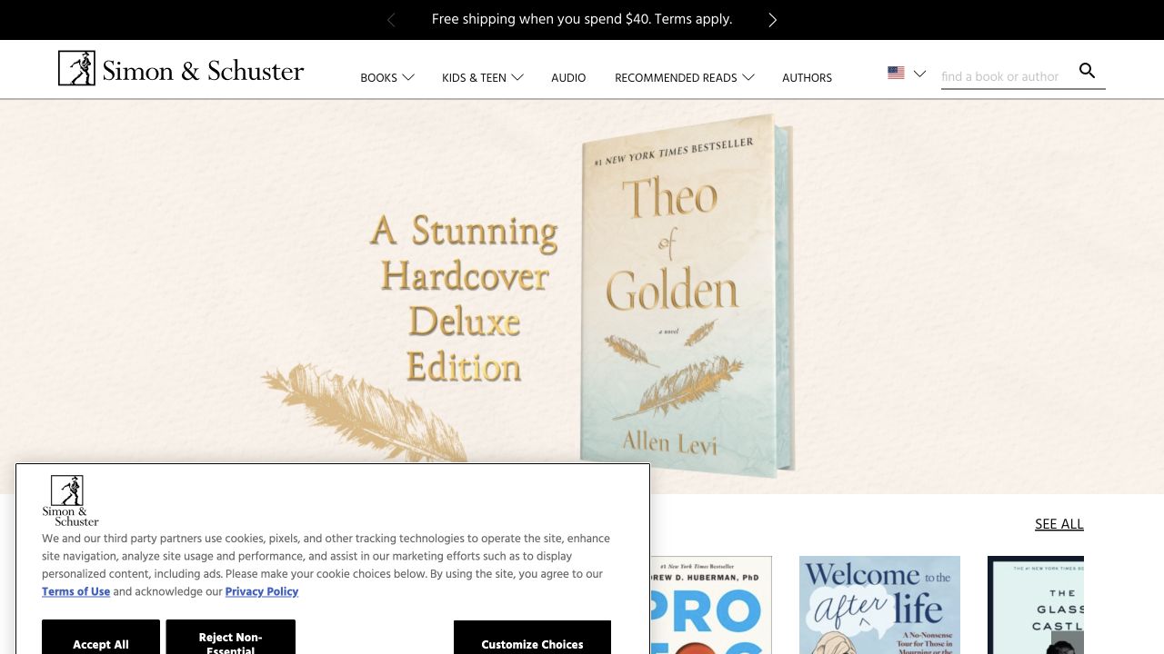
Simon and Schuster uses a relatively restrained featured-book area above shelves for current and popular titles. Books, younger readers, audio, recommended reading and authors remain available in the header. Cover artwork carries much of the color while the surrounding interface stays light. The design makes a useful distinction between featuring one title with some attention and giving readers several other ways to continue when that title is not relevant to them.
What you can learn
Choose a limited amount of supporting information for a featured title, then let its detail page carry the full description. Keep audio and other formats connected to the same work without making their purchase options ambiguous. Check whether readers can move from a shelf to author information and back without restarting their search.
Pros
The neutral interface lets different book-cover identities coexist.
Audio and recommended-reading routes are visible alongside conventional browsing.
Cons & considerations
A subdued feature needs clear descriptive context to explain its selection.
Several popular-title shelves can feel repetitive without meaningful editorial distinctions.
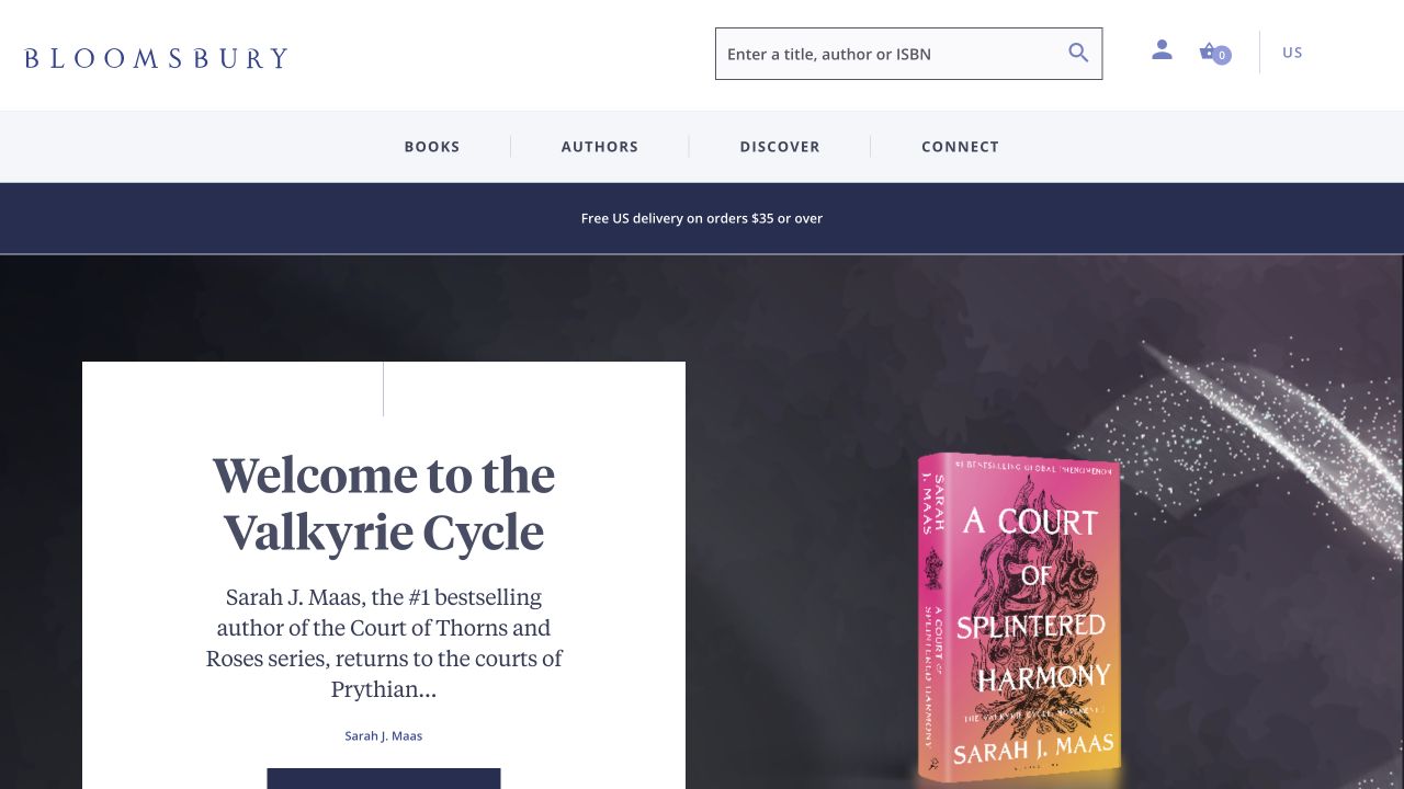
Bloomsbury pairs its featured book cover with the title, author and supporting editorial language rather than using an unexplained image banner. Books, authors and discovery routes sit alongside search and regional shopping utilities. The observed page also distinguishes preordering from ordinary shopping. It is a useful reference for connecting a launch campaign to the practical catalog information a reader needs, especially when the same publisher handles several audiences and subjects.
What you can learn
Make the campaign component pull its title, author, format and release status from the catalog record. Give editorial praise a clear source and avoid letting a quoted endorsement replace the book description. Review regional availability and currency alongside the visual design so that a compelling feature does not lead to an irrelevant purchase route.
Pros
The featured cover is supported by textual context and an identifiable author.
Preorder language distinguishes an upcoming release from an available title.
Cons & considerations
Prominent endorsement text can compete with the book’s own description.
Regional catalogs require maintenance beyond changing a currency selector.
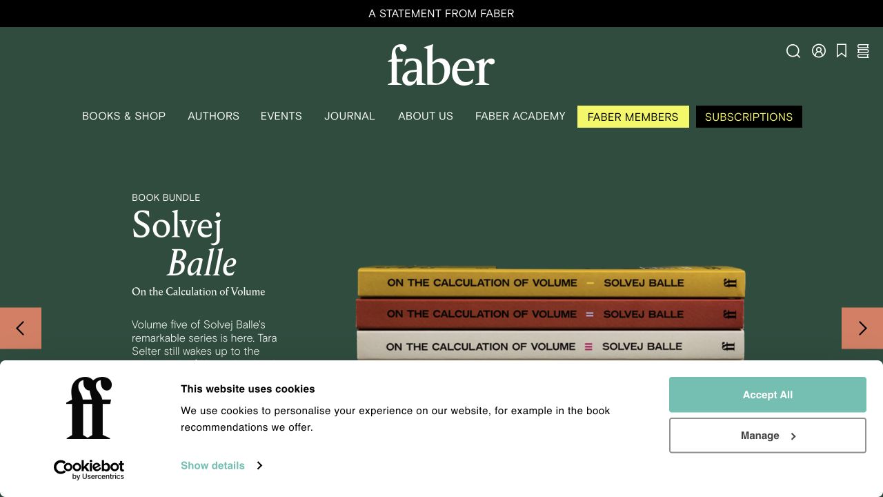
Faber’s dark green identity frames a large author-and-book feature, with navigation extending beyond shopping into events, a journal, an academy, membership and subscriptions. The opening treats the publisher as a continuing literary organization rather than only a checkout destination. That breadth is valuable to study, but it also creates a classification problem: a reader seeking one book and someone exploring a writing course need different descriptions and next steps.
What you can learn
Write a short purpose statement for each non-book destination before adding it to the main menu. Keep course or membership eligibility, pricing and schedules separate from ordinary book metadata. Reuse author biographies where appropriate, but do not make an author’s event listing substitute for the maintained information on their available titles.
Pros
The strong publisher identity remains consistent across several types of offering.
Author and community content have enduring navigation destinations.
Cons & considerations
A wide range of literary activities can compete with basic book discovery.
Memberships, courses and subscriptions need distinct terms and purchase journeys.
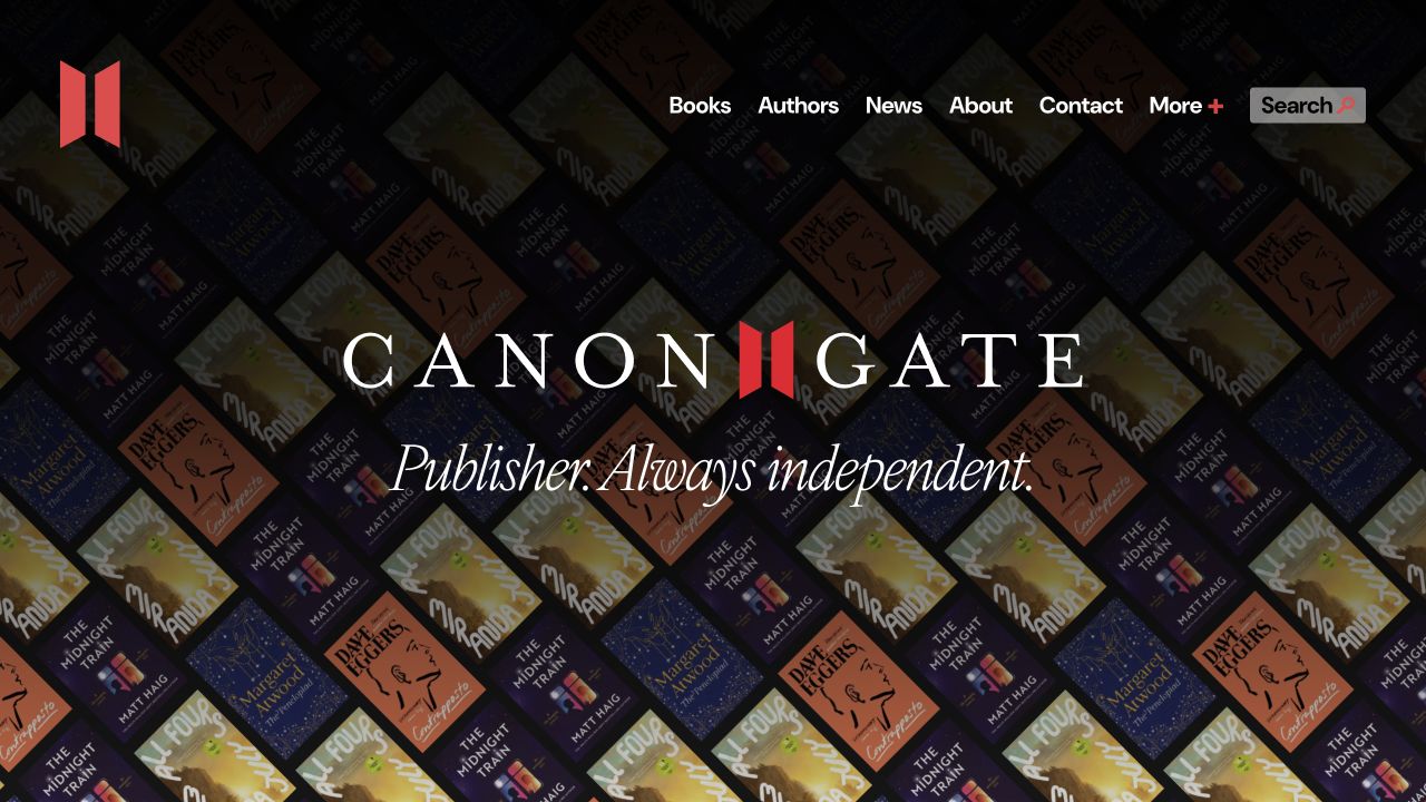
Canongate opens with a pronounced book-spine image and a straightforward independent-publisher identity. A compact header separates books, authors, news, company information and contact. New releases sit alongside dated publishing news rather than disappearing behind an abstract brand film. The combination gives visitors both a catalog and a sense that the organization has a continuing editorial point of view. The important lesson is the relationship between that identity and practical title discovery, not the particular decorative treatment.
What you can learn
Explain the publishing focus in plain language and connect it to representative books. Keep announcements dated, distinguish outside coverage from original news, and make author information reusable across campaigns. A smaller publishing team should choose a manageable news cadence rather than allowing an ambitious homepage feed to become visibly abandoned.
Pros
The compact menu avoids exposing internal organizational complexity.
Dated news adds context beyond a static list of products.
Cons & considerations
An identity-led opening still needs immediate access to searchable title information.
News and external coverage require ongoing link and date maintenance.
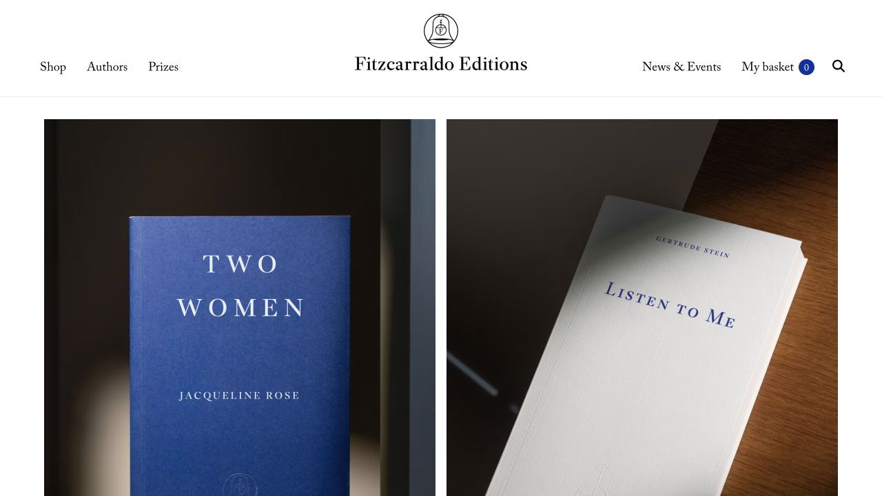
Fitzcarraldo Editions makes its blue and white cover system central to the opening. A spare masthead and compact shop, author, prize and news routes leave room for the books themselves. The observed feature includes publication or preorder information and prices, so the visual consistency is accompanied by practical distinctions. It is a useful reference for a small, coherent list, where the publisher’s production identity can be recognizable across many titles without requiring unrelated campaign graphics.
What you can learn
Consistent covers make metadata even more important: readers still need title, author, translator where relevant and publication status outside the image. Model prizes and events as relationships to books and people, not separate unmaintained promotional pages. Check the catalog at small sizes, where subtle cover differences may no longer distinguish individual editions.
Pros
A disciplined cover system gives the catalog a distinctive collective character.
Price and publication status add useful context to visually similar editions.
Cons & considerations
Uniform covers can make quick title comparison harder at thumbnail sizes.
Minimal navigation relies on clear catalog sorting and searchable textual metadata.
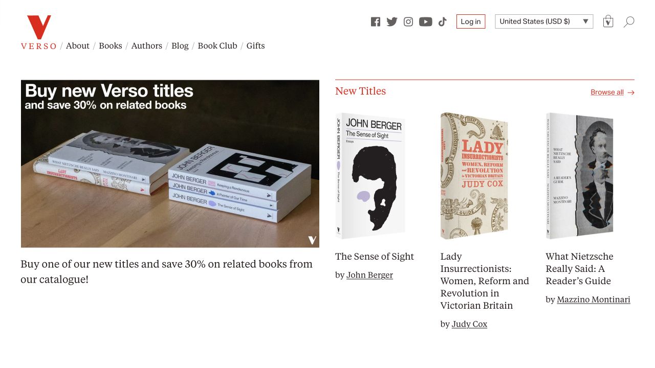
Verso combines a prominent editorial feature with a shelf of new books, under navigation for books, authors, a blog, a book club, gifts and company information. The red and white identity connects the article and catalog areas without presenting them as identical content. Its relevance here is the editorial structure: subject-led publishing can explain why a book belongs in a conversation while still providing a distinct record for the publication itself.
What you can learn
Keep opinion or commentary clearly labeled as editorial content, with its own author and date. Link from that discussion to the appropriate book edition instead of inserting an unexplained purchase button into every paragraph. Plan how book-club membership, ordinary orders and gift purchases differ before giving all three the same visual treatment.
Pros
Editorial features provide a subject-based entry into the publishing catalog.
Books and author information remain available outside the current feature.
Cons & considerations
A strong current-affairs feature may overshadow quieter backlist subjects.
Book-club and individual-book purchases require clearly differentiated terms.
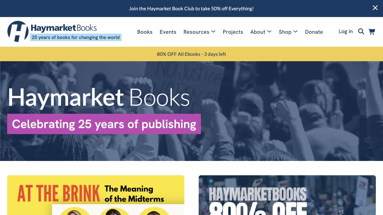
Haymarket Books uses a strong blue identity, anniversary messaging and prominent book covers. Events, resources, projects, ordinary shopping and donations appear as different ways to participate. Recommended titles and writers connect the organization’s publishing activity to its wider public program. The useful website pattern is how a publisher can expose these related activities without pretending that reading an article, buying a book and supporting an organization are the same visitor task.
What you can learn
Give each participation route a clear purpose, destination and owner. Keep event information time-specific and retain enduring book records after an event ends. If donations or memberships sit alongside commercial orders, explain the distinction near the relevant action rather than expecting the visitor to infer it from the organization’s mission statement.
Pros
Events and resources broaden discovery beyond a conventional product grid.
Distinct shopping and support routes acknowledge different visitor intentions.
Cons & considerations
A wide program can create too many equally weighted homepage priorities.
Anniversary or campaign material needs a planned retirement and archival strategy.
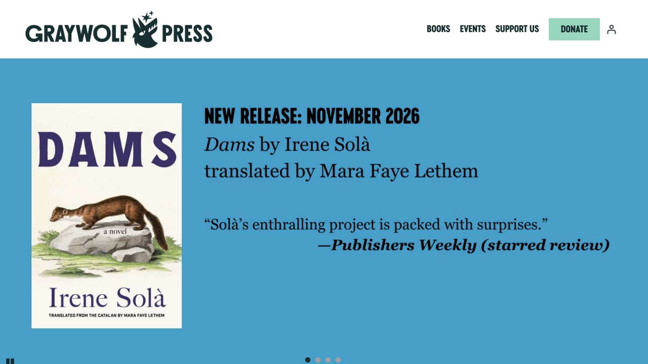
Graywolf Press uses a light header and a strong blue featured-book composition, with the cover, author and translator receiving meaningful space. Books and events sit alongside support information and a donation route. The opening is book-led while still explaining that the press has an institutional mission beyond selling the featured publication. This is useful for smaller literary organizations that need to acknowledge creative contributors without turning the first screen into a lengthy organizational history.
What you can learn
Make translator and other contributor credits proper catalog fields rather than optional text in a campaign image. Separate the reader’s purchase route from the supporter’s donation journey, and preserve an understandable route between them. Plan author-event records so that the corresponding title page remains useful when the tour or launch has finished.
Pros
Creative attribution includes more than the headline author.
The support route is present without replacing the book-centered opening.
Cons & considerations
A single large feature necessarily limits immediate exposure for the wider list.
Purchase and donation actions need different explanations and confirmation messages.
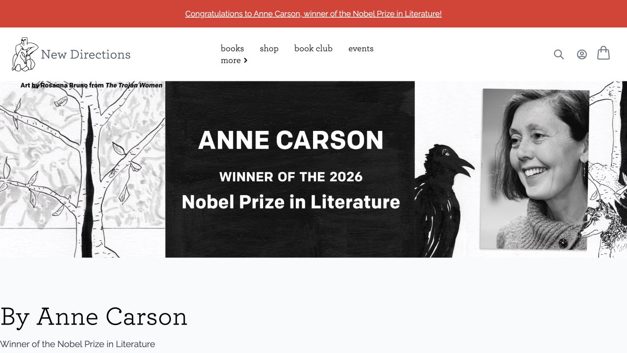
New Directions combines graphic artwork and author imagery with a compact set of book, shop, club and event routes. Subsequent shelves show covers and buying information, while named series offer another way to browse. The opening demonstrates how a distinctive literary identity can coexist with ordinary catalog tasks. Its visual energy does not remove the need to distinguish a new title, a reissue and a book that belongs to a particular continuing series.
What you can learn
Use series and edition relationships as structured data rather than relying on cover resemblance. Keep the publisher’s expressive artwork separate from essential title and availability text, and provide enough description for readers unfamiliar with an author. Review recurring book-club offers independently from individual title pages because their commitments and schedules may differ.
Pros
Publisher artwork adds character beyond repeating book-cover thumbnails.
Named series provide a meaningful alternative to generic genre navigation.
Cons & considerations
Highly expressive artwork can compete with basic title information.
Backlist reissues need explicit edition and publication-date distinctions.
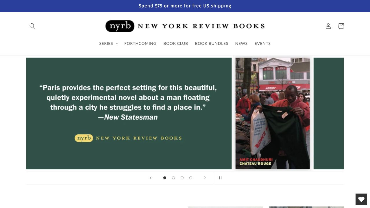
New York Review Books presents series, forthcoming titles, a book club, bundles, news and events as primary discovery paths. The observed page gives considerable space to cover artwork, title and author information rather than one oversized campaign image. Its value is the visible editorial organization of the catalog: readers can browse a collection with a particular character without needing every title to fit into a single commercial genre label.
What you can learn
Explain each series in a short, reusable introduction and connect books to more than one appropriate browsing route. Distinguish a bundle from the individual editions it contains, including availability and format. Keep forthcoming labels synchronized with publication information, and provide a route to authors and translators beyond the visual cover grid.
Pros
Series navigation reflects the editorial structure of the publishing list.
Forthcoming books and bundles are distinguishable from ordinary catalog titles.
Cons & considerations
Readers unfamiliar with the series names need concise contextual descriptions.
Bundles and club offers create availability and edition details to maintain.
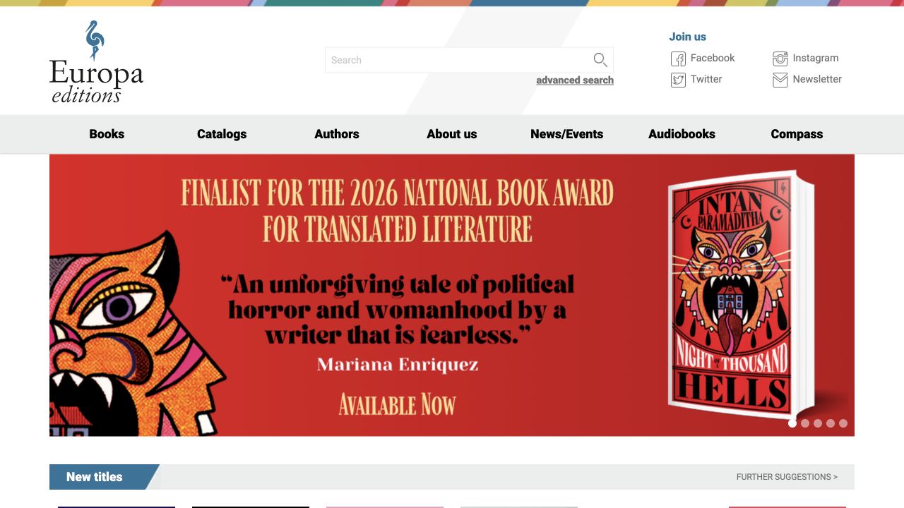
Europa Editions combines a relatively compact blue and white header with new titles, anniversary material and author-oriented discovery. Books, authors, news, audio and company information remain distinct, while country or regional groupings provide another way into the list. The useful pattern is that the international character of a publishing program can become navigable information, rather than being expressed only as a broad claim in an About paragraph.
What you can learn
Use geographic and language groupings carefully: make their editorial meaning explicit and avoid reducing an author to a single category. Give translators and original-language details consistent fields where relevant. Keep audio formats and regional availability connected to the correct edition, and give temporary anniversary campaigns an enduring destination if readers may return later.
Pros
Author discovery offers a useful alternative to shopping by genre alone.
News and audio routes are visible without replacing ordinary book browsing.
Cons & considerations
Geographic groupings need clear editorial definitions and respectful labeling.
Multiple markets and formats require edition-specific purchase information.
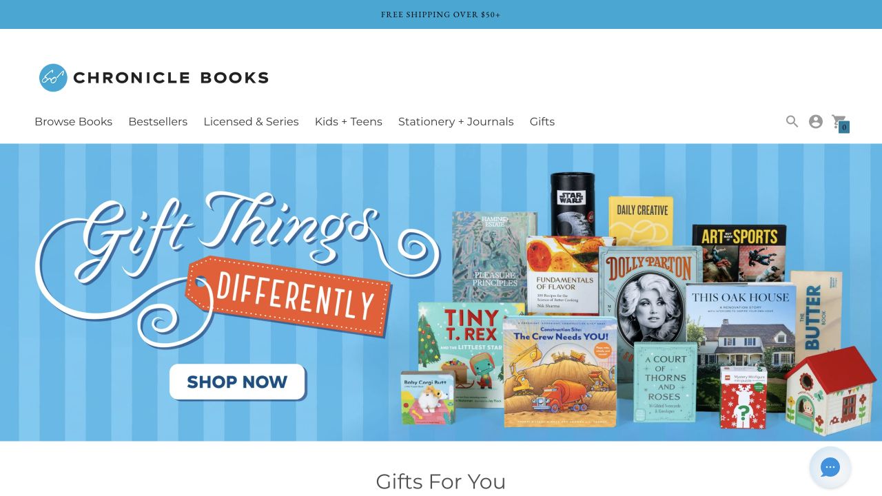
Chronicle Books uses a blue and white identity around colorful books and gift objects. Its browsing system includes children’s titles, familiar licensed properties, stationery and gifts as well as conventional book discovery. The featured composition makes the physical assortment visible, which is useful when the catalog extends beyond reading material. At the same time, that breadth means visitors need to understand whether a photographed item is a book, an activity product or a collection of separate objects.
What you can learn
Define product types before designing category cards. A stationery set, a picture book and a boxed collection need different metadata, dimensions and availability language. Use seasonal gift groupings as a second layer over a stable catalog, and make sure the photographed combination does not imply that separate items are all included in one purchase.
Pros
The photography communicates a broad assortment of physical formats.
Gift and age-oriented routes support browsing without a known title.
Cons & considerations
Styled product groupings can make included contents ambiguous.
A mixed book-and-object catalog needs more than one product-detail template.
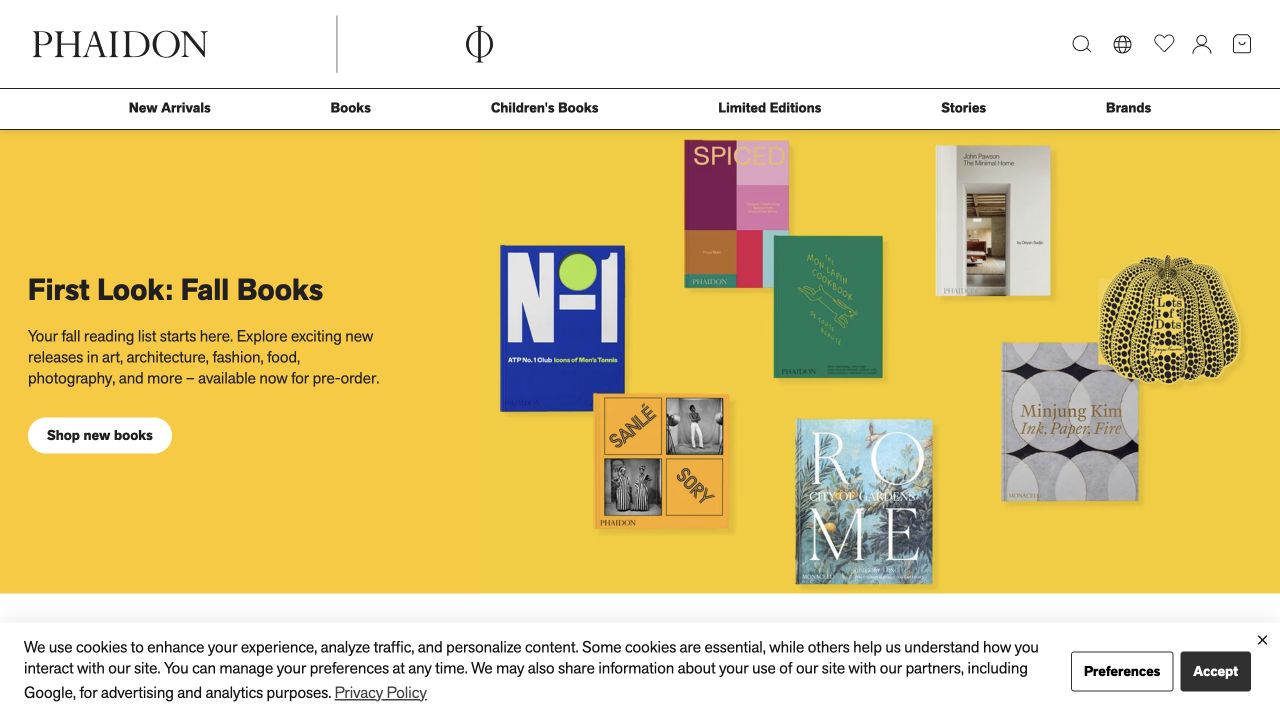
Phaidon presents its seasonal books as a considered arrangement of covers and designed objects against a bold yellow field. Subject navigation and special-edition routes support the visual opening. The page treats books as physical artifacts as well as texts, which is particularly relevant to art, architecture and design publishing. The useful comparison is between giving a striking publication enough room and retaining the practical details a reader needs before choosing a large or unusually produced edition.
What you can learn
Plan photography for covers, interiors and physical scale rather than relying on a single hero image. Record dimensions, binding, pagination and edition information in consistent fields. Keep collectors’ editions distinct from ordinary versions of the same work, with clear descriptions of what changes, so visual presentation does not create uncertainty about the item being offered.
Pros
The composition reflects the physical and visual character of the publishing list.
Subject and special-edition routes give the campaign useful catalog context.
Cons & considerations
Large styled imagery reveals little about dimensions or interior content by itself.
Collectors’ editions require careful differentiation from standard versions.
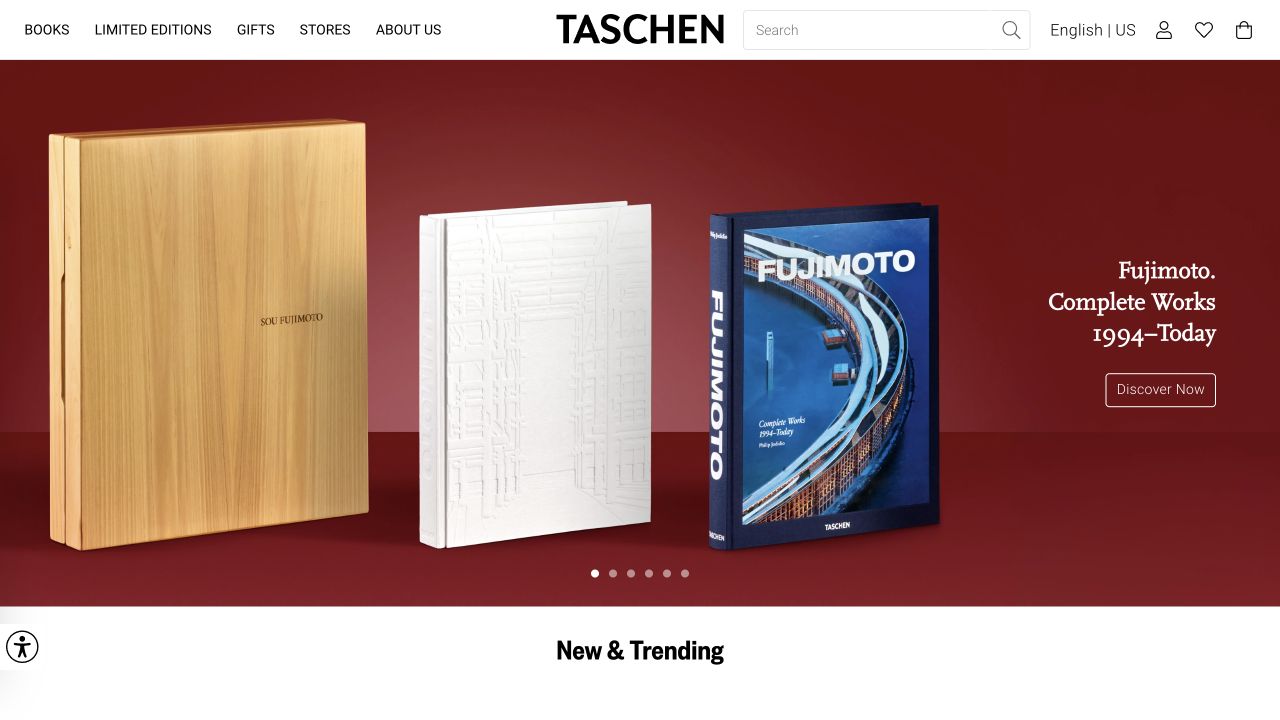
TASCHEN gives the featured book and its open spreads a prominent visual role, using strong color and physical scale rather than only flat cover thumbnails. Navigation separates ordinary books, limited editions, gifts and stores. The reference is useful for understanding how product photography can show a publication’s material character. It also exposes an important catalog requirement: editions that share a title may still differ significantly in size, presentation, contents or availability.
What you can learn
Create an edition comparison before designing the campaign. Explain dimensions, binding, included accessories and any stated limitation with precise catalog fields. Supply alternative views that show readable interiors without making essential information image-only. Keep store visits and online orders as separate routes, particularly where regional stock or delivery conditions differ.
Pros
Open-book photography shows more of the product than a cover alone.
Limited editions and store information have recognizable navigation routes.
Cons & considerations
Dramatic product scale can obscure practical size and handling details.
Edition differences become confusing without a structured comparison.
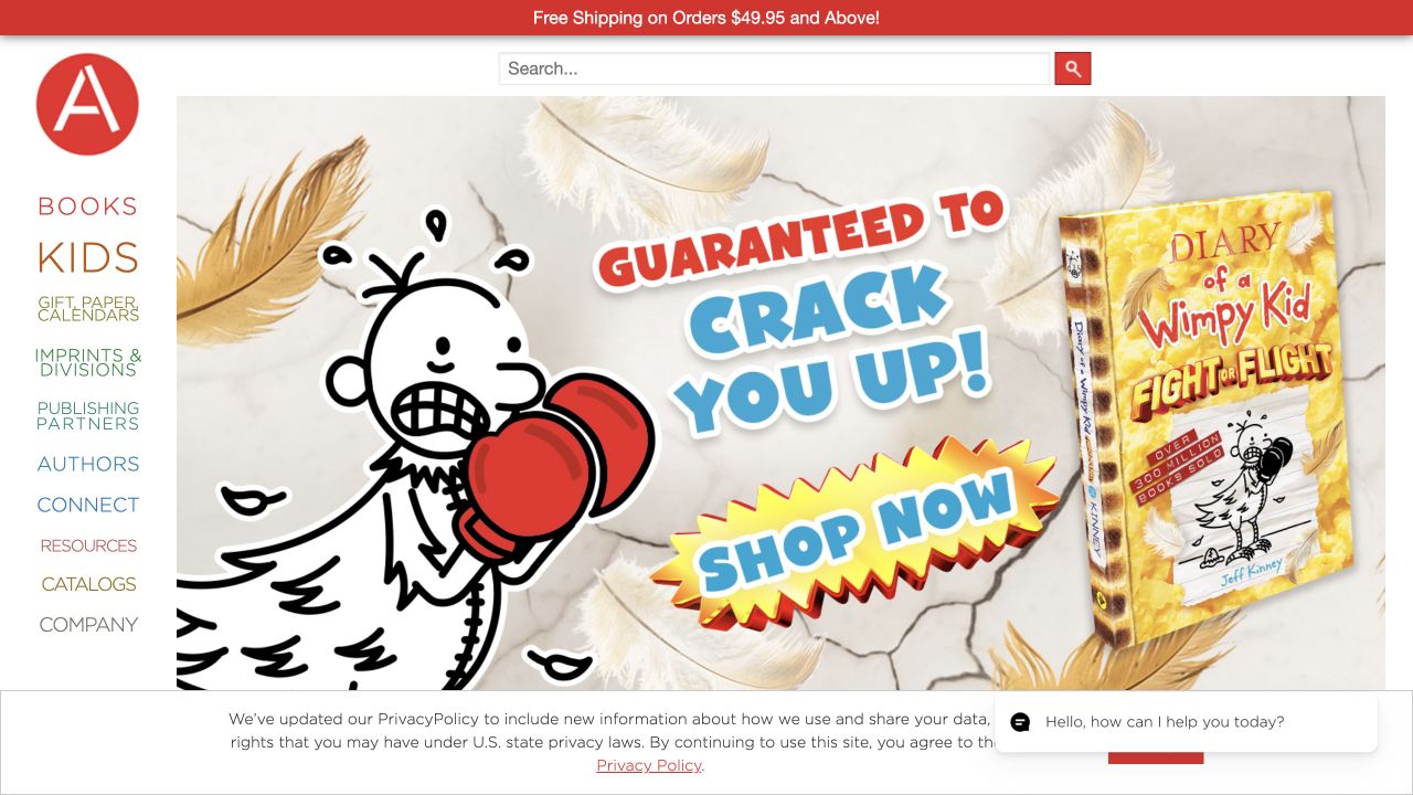
Abrams combines a recognizable illustrated-book feature with a broad header covering books, younger readers, gifts, imprints, creators and publishing resources. Subsequent cover shelves support readers who are not interested in the opening campaign. The breadth makes it a useful reference for publishing businesses that serve parents, adult readers, trade partners and creative contributors at once. The design problem is not merely choosing attractive covers; it is keeping those audience needs from collapsing into one crowded shop.
What you can learn
Map audience-specific tasks before exposing every internal imprint in the menu. Keep author and illustrator credits separate, and connect series records to their individual volumes. Give trade catalogs and publishing-partner information their own descriptions so that consumer browsing is not interrupted by unexplained professional resources or files.
Pros
Creator and professional-resource routes extend beyond retail merchandising.
Younger-reader and gift categories reflect meaningful catalog differences.
Cons & considerations
A very broad header can become difficult to scan on smaller screens.
Series and imprint names need context for visitors unfamiliar with the list.
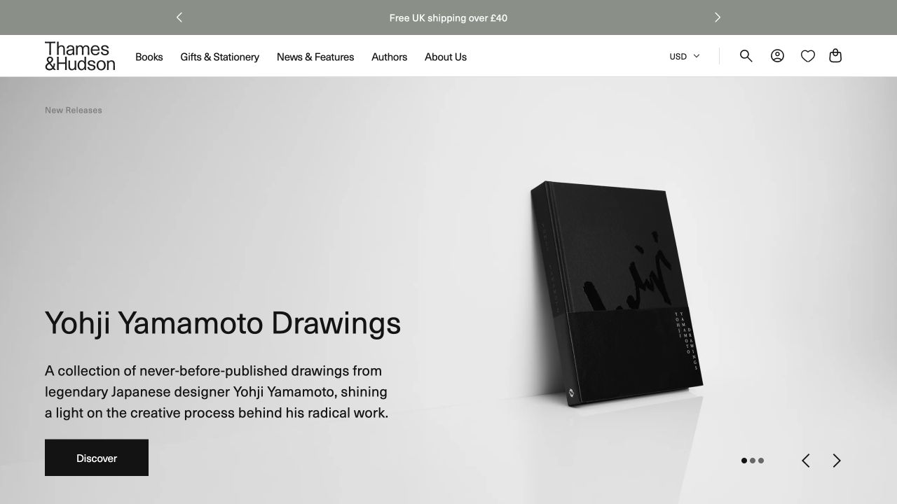
Thames and Hudson places a distinctive cover against a restrained pale background, supported by a direct shopping action and subject-led browsing. Series and special editions provide additional catalog structure. The visual approach leaves substantial attention on the featured object while retaining the publisher’s wider art and design context. It is a useful example of how a single striking book can introduce a catalog without requiring every other title to adopt its visual identity.
What you can learn
Keep the featured title’s art direction separate from the reusable interface. Model subject, series and edition as different relationships so the same book can be found in several appropriate places. A signed or collector version should state its difference clearly, and every large cover image should lead to practical information about the physical publication.
Pros
The neutral surrounding design accommodates highly varied cover artwork.
Subjects and series supply different, complementary discovery routes.
Cons & considerations
A large cover feature does not explain the interior or physical scale.
Special versions need explicit distinctions rather than a badge alone.
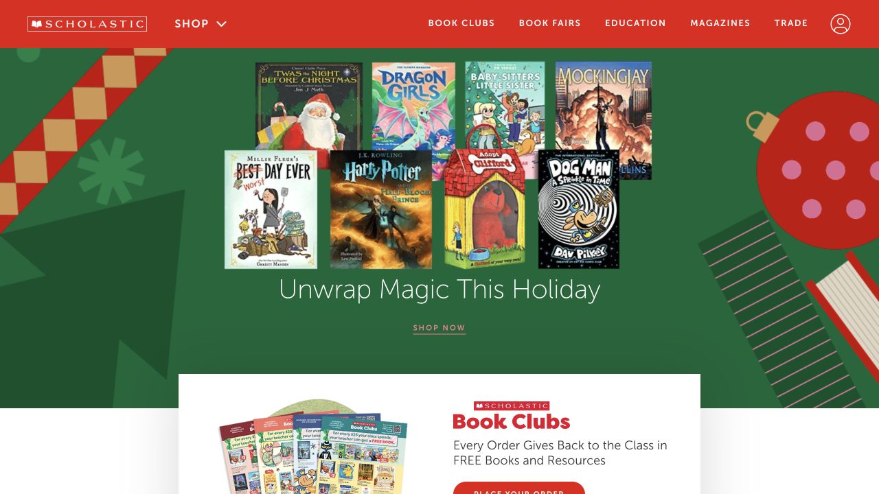
Scholastic’s red identity connects several distinct destinations: shopping, book clubs, fairs, education, magazines and trade publishing. A colorful seasonal book-set feature gives the opening an immediate retail focus, but the navigation reveals a much wider educational ecosystem. The useful reference is its audience segmentation. A parent choosing a gift, an educator finding classroom material and a school organizing a fair do not need identical forms, account assumptions or explanations.
What you can learn
Write separate task journeys for families, educators and institutional buyers before choosing homepage components. Explain which program a visitor is entering and what information it requires. Keep age or grade labels, formats and purchasing eligibility consistent, and avoid treating an organizational program as though it were just another individual book category.
Pros
The navigation acknowledges several genuinely different educational audiences.
Program-specific destinations can carry information that ordinary product cards cannot.
Cons & considerations
The number of programs may be overwhelming to a first-time visitor.
Account and purchasing requirements need explanation before a visitor commits to a route.
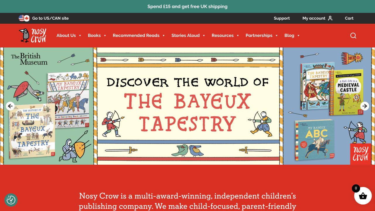
Nosy Crow pairs bright illustration and a celebratory campaign with routes for books, recommendations, read-aloud material, resources and publishing news. Product information distinguishes age groups, formats and creative contributors rather than relying entirely on the cover. The observed UK view is useful for seeing how a children’s catalog can offer support around the book itself. The resource layer has a separate purpose from shopping and needs to remain understandable for both families and professional readers.
What you can learn
Use explicit age-range and format fields while avoiding promises about individual reading ability. Credit authors and illustrators consistently, and state how associated audio or classroom resources may be used. Preserve regional context for currency, editions and availability; do not assume that a language choice alone identifies the correct market.
Pros
Reading resources have recognizable routes beyond the retail catalog.
Age, format and contributor information help distinguish visually similar titles.
Cons & considerations
Bright campaign illustration can push practical catalog information down the page.
Regional editions and resource permissions require maintained supporting text.
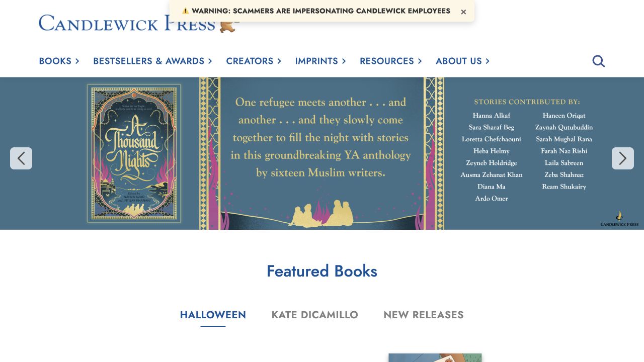
Candlewick Press uses illustrated imagery and a featured cover within a clear blue and white publishing identity. Books, awards, creators, imprints and resources appear as distinct navigation choices, while subsequent features connect titles with familiar characters and contributors. This is a useful reference when families remember an illustration or series character more readily than an exact title. It also makes clear that creator information is an important catalog destination, not merely a line of promotional attribution.
What you can learn
Build creator pages that distinguish authorship and illustration and connect each contributor to the correct titles. Model a character or series as a collection with an understandable order where relevant. Give awards a date and source, and keep resource permissions and intended audiences clear instead of assuming every visitor is an educator.
Pros
Creator and character routes support discovery without an exact title.
Resources and awards add structured context around the book catalog.
Cons & considerations
Familiar-character merchandising may underrepresent less-established books.
Series ordering and contributor relationships require careful metadata maintenance.
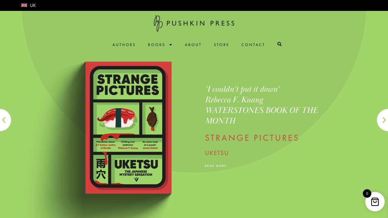
Pushkin Press gives a featured title a lime-green campaign area with its cover, author and supporting quotation. Books, authors, company information and shopping remain straightforward header destinations. Collections such as translated literature, crime and special editions give readers additional ways into the wider list. The useful design pattern is that a strong launch identity sits above an editorial catalog structure, rather than replacing it with a succession of unrelated promotional landing pages.
What you can learn
Keep collections descriptive and connect them to maintained book records. Credit translators where relevant and distinguish a new edition from a newly written work. When a review quotation helps introduce a title, identify its source and provide an original description as well, so the visitor can understand the book without relying on someone else’s endorsement.
Pros
The launch feature includes an identifiable cover and author.
Editorial collections provide more character than a single generic genre menu.
Cons & considerations
Bright campaign styling can dominate quieter backlist discovery.
Quoted praise and special-edition labels need source and edition context.
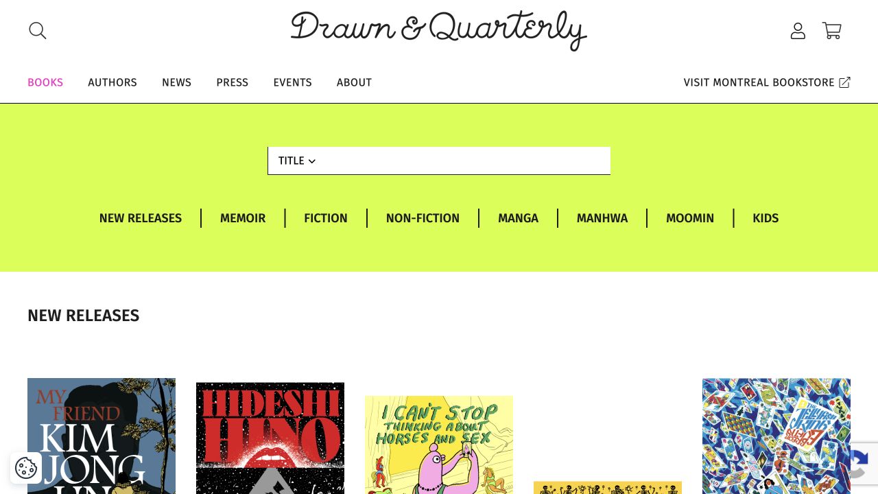
Drawn and Quarterly’s captured books page combines a handwritten-style masthead with a bright category band and an orderly cover grid. New releases sit beside memoir, fiction, nonfiction, manga, manhwa and children’s routes. Author navigation and a separately labeled Montreal bookstore destination distinguish the publishing catalog from the physical shop. This is a publisher’s catalog view rather than a replacement homepage screenshot, and its usefulness lies in how visual works remain supported by understandable textual categories.
What you can learn
For illustrated publishing, plan interior samples as well as cover images and preserve creator credits outside the artwork. Let genre and format overlap without forcing every title into one exclusive bucket. Separate publishing inquiries, online orders and physical-bookstore visits, and make the book detail record the stable source of price, edition and availability information.
Pros
The category band offers several recognizable routes into a visual catalog.
The physical bookstore is labeled separately from the publisher’s online assortment.
Cons & considerations
Cover thumbnails alone cannot communicate the style of interior pages.
Overlapping format and subject categories need consistent filtering rules.
Plan the catalog as a set of connected publishing records
Choose authoritative sources for the metadata
Decide where each public field comes from, who can correct it, and how the website receives updates. Use representative examples with several formats, multiple contributors, a changed publication date, and an older edition. Avoid maintaining a separate unreviewed title spreadsheet inside promotional page copy.
Write a brief for each important audience
List the tasks a reader, bookseller, librarian, reviewer, or rights contact should be able to complete. Decide which belong on public pages and which require another system or a responsible person. Keep manuscript and rights inquiries within the publisher’s approved process rather than improvising an upload feature.
Rehearse catalog changes and old-link behavior
Test a new edition, a renamed contributor, an unavailable format, and a change to an external seller link. Preserve useful paths to older titles. Review permissions for jacket images, excerpts, contributor photography, and downloadable materials before they enter the public release.
The editing job behind the design
Connect the publishing catalog to the right public presentation
Choose the content and commerce setup around the publisher’s authoritative metadata and editing process. Identify whether the site sells directly, sends readers to sellers, or supports both. Keep an editorial campaign flexible without letting it contradict format, availability, or contributor information in the catalog.
Search, distribution feeds, commerce, email, events, and rights systems have different owners and failure modes. Document the handoffs and correction process. A CMS or storefront signal on the public website does not establish the publisher’s distribution, inventory, or internal publishing systems.
Our WordPress website examples offer a separate look at publishing approaches. A visible platform label is evidence for that named page, not a guarantee that the same system will suit your requirements.
Before the public launch
Book publisher website launch checklist
Check titles with multiple editions, formats, contributors, and identifiers.
Reconcile public metadata with its approved authoritative source.
Test title, author, imprint, subject, series, and backlist discovery.
Attach purchase and download destinations to the correct title or edition.
Distinguish reader, trade, media, submissions, and rights-contact routes.
Verify permissions and credits for jackets, excerpts, photographs, and downloadable files.
Test old title URLs, unavailable formats, and corrected publication information.
Assign owners for catalog feeds, link checks, campaign expiry, and corrections.
These checks are a project checklist, not a performance, legal, security, or accessibility certification. Test real journeys with the people responsible for the website before making claims about the result.
Sources & editorial method
How this collection was selected and reviewed
We selected official book-publishing properties to compare catalog discovery, title presentation, and audience routes. These are actual dated browser captures, not vendor gallery reconstructions. We did not submit manuscripts, contact rights teams, complete purchases, or assess editorial quality or sales performance.
Each example links to its actual source page. Screenshots are direct browser captures with their own capture dates; moving imagery, announcements and live designs can change. The notes describe observable design choices and conditional tradeoffs, not measured traffic, conversion results, service quality, or accessibility conformance.
Technology labels use public page metadata, asset evidence, or explicitly cited platform documentation. Platform documentation is not a complete current deployment audit. A component reference may be legacy or unused; it is not a complete backend inventory. Unknown stacks are omitted. These sites are editorial examples, not our client portfolio.
Written, Edited and Curated are separate editorial records, not timestamps advanced by a rebuild. Website designs and imagery belong to their owners. See our editorial standards or suggest a correction.
Questions worth asking
Book Publisher website design questions
Does every publisher need an online shop?
No. The public website may support direct sales, external sellers, or both. Make the chosen destination and edition clear, and align the public explanation with the publisher’s actual operations.
Should every imprint have its own website?
Only when audience, identity, content, and maintenance responsibilities justify it. A shared catalog with well-defined imprint pages can be more manageable than several sites that duplicate metadata inconsistently.
How should multiple book formats be presented?
Make the relationship and selected format understandable, with accurate edition-specific information and destinations. Test the model with actual complicated titles rather than designing solely around a single hardcover example.
Can we use the jackets and excerpts shown in this guide?
The examples are references, not an asset library. Use material the publisher is authorized to publish, and confirm the scope and credit requirements for jackets, excerpts, photography, and downloads.