A nonprofit website has to connect a public mission with concrete actions while respecting the different needs of supporters and people seeking help.
A donor, volunteer, researcher and person seeking a service may all arrive at the same homepage. Their next steps should be distinct. A compelling appeal can create interest, but clear program information, dated evidence and an honest explanation of the organization’s role help sustain trust.
These examples include humanitarian, conservation, education, health-information and advocacy organizations. Compare the design patterns rather than treating the collection as a charity ranking. The reviews address website presentation and navigation, not financial effectiveness, program outcomes or the merits of a particular campaign.
Before the examples
What makes good nonprofit website design in 2026?
Explain the work before relying on the appeal
Name the people or places served, the organization’s role and the kinds of work it performs. Show how a broad mission becomes a specific program. Photographs and stories should preserve dignity, consent and attribution, with enough context to avoid making one image stand in for a complex situation.
Give each audience an honest next step
Separate donating, volunteering, joining a campaign and seeking services. A visitor should understand what happens after choosing an action and what information will be requested. Where local partners deliver the service, make that relationship and handoff clear.
Make evidence understandable and current
Give impact figures a reporting period, unit and source. Distinguish audited reporting from provisional operational data. Link to governance, financial and program information in a predictable place, and explain the scope of donation-impact comparisons or matching offers.
The collection · 24 examples
24 nonprofit websites worth studying
Compare donation panels, public-service routes, editorial reporting and mission explanations. A small local nonprofit can borrow the clarity of a large organization’s navigation without copying its fundraising volume or publishing schedule.
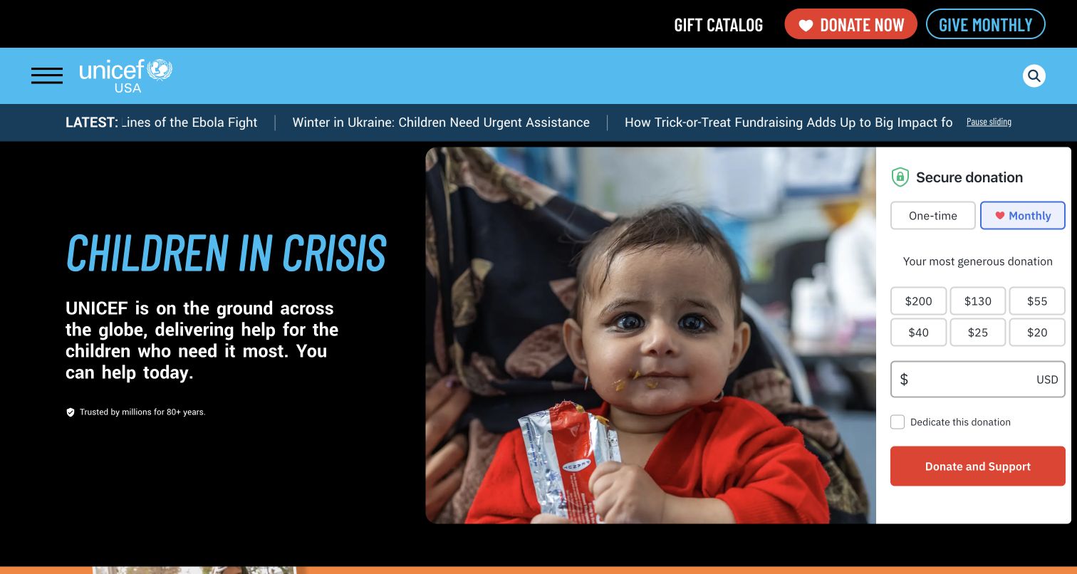
UNICEF USA opens with a children-in-crisis appeal, a large photograph and a prominent giving panel. A latest-stories strip and a featured-story section connect the appeal to specific locations and current work. The blue identity and straightforward navigation keep the institution recognizable despite the intensity of the image. This is a useful fundraising reference because the page gives a supporter both an immediate action and a route to learn more about the work behind it. The example is UNICEF USA’s website, not a separate national-government service.
What you can learn
Place an immediate appeal beside a credible explanation of the organization and links to current work. Keep recurring and one-time giving choices unmistakable. An urgent image should preserve the subject’s dignity and have appropriate attribution; it should not carry the entire explanation of how a gift will be used.
Pros
Featured stories give context beyond the opening appeal and donation control.
The visible pause action acknowledges that the latest-story strip moves.
Cons & considerations
Several urgent messages compete for attention before the reader reaches the detailed work.
Donation prominence can leave non-donor tasks less obvious without a carefully organized menu.
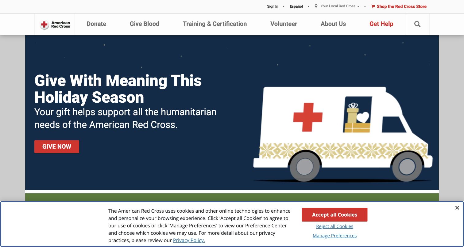
The American Red Cross makes its breadth visible in the main navigation: donate, give blood, training, volunteer and get help are separate actions. The captured holiday appeal leads into a blood-appointment search, volunteer driving and training options. This is a useful example of a nonprofit that cannot organize its entire homepage around fundraising alone. The page acknowledges that a visitor might be giving money, contributing time, seeking a class or needing assistance, and those intentions deserve distinct destinations.
What you can learn
Start the information architecture with the actions people can actually take. Give blood donation, course booking and emergency assistance their own recognizable labels and explain any location input before asking for it. Seasonal fundraising can lead the page, but essential public services should remain accessible through stable navigation.
Pros
The main menu names concrete actions rather than internal program departments.
Local search controls support services whose availability depends on place.
Cons & considerations
Several campaigns and incentives create a dense page that requires disciplined prioritization.
Time-limited promotions need clearly visible conditions and prompt removal when their period ends.
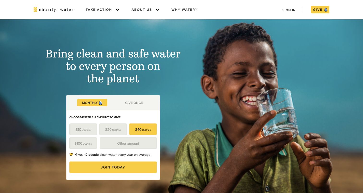
charity: water places a giving panel directly over a large field photograph, with monthly and one-time options and explicit amount controls. The page then explains why water matters through health, education, women and economic-growth sections. Project evidence, photographs and a dated impact summary extend the story below. The visual hierarchy is tightly focused on one cause, making it useful for studying how a donor action can connect to a longer explanation rather than appearing as an isolated payment request.
What you can learn
Make donation frequency and amount clear before the next step, then explain the assumptions behind any impact comparison. If the organization promises project-level reporting, build that reporting process into the content model. A memorable giving proposition needs evidence, dates and operational follow-through beyond its visual presentation.
Pros
The giving panel distinguishes a monthly contribution from a one-time gift.
The page connects its cause to several understandable dimensions of everyday life.
Cons & considerations
Amount-to-impact statements need careful qualification so an average is not mistaken for a guaranteed individual result.
A donation-first opening offers little immediate space for visitors seeking organizational records or partnership information.
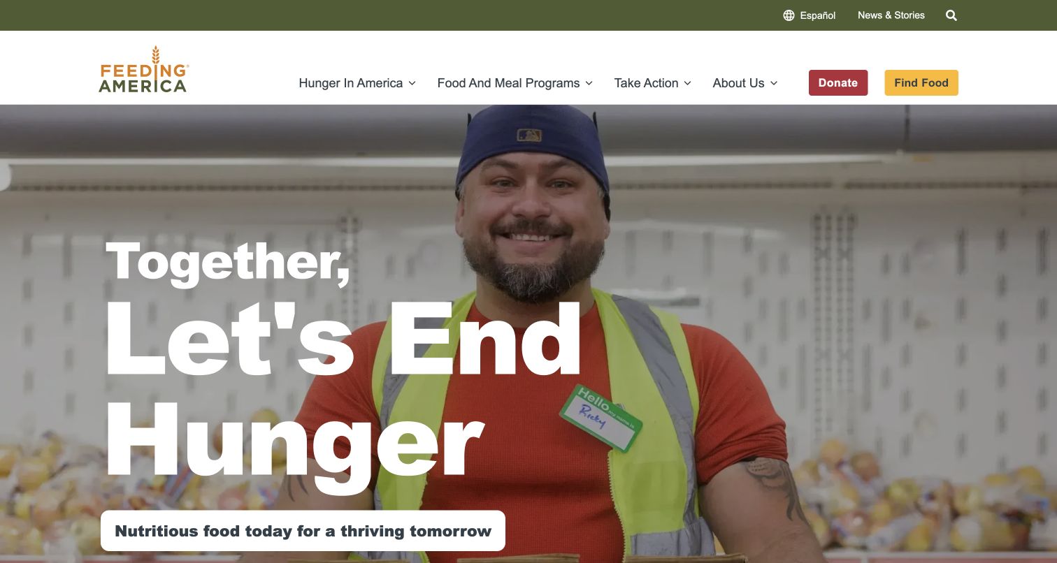
Feeding America uses a large community photograph and a concise hunger-focused message, but its navigation gives Find Food a prominent place alongside Donate. The next major section identifies food-bank search, SNAP assistance and other meal resources before moving into giving, advocacy and fundraising. That order matters: someone who needs help is not treated simply as the subject of a donor campaign. The design is a useful reference for separating access to services from opportunities to support them.
What you can learn
Give service access the same clarity as supporter actions. Use direct descriptions of what a resource finder can do and explain when the destination is a local partner. Donation promotions should not obscure the route for a person who is already trying to find food or other assistance.
Pros
Find Food remains visible in the main navigation beside the donation action.
The resource section distinguishes several forms of assistance rather than offering one generic help link.
Cons & considerations
The captured matching promotion and countdown add visual pressure above essential service content.
Meal-equivalence statements need context and should not be read as a promise about an individual gift.
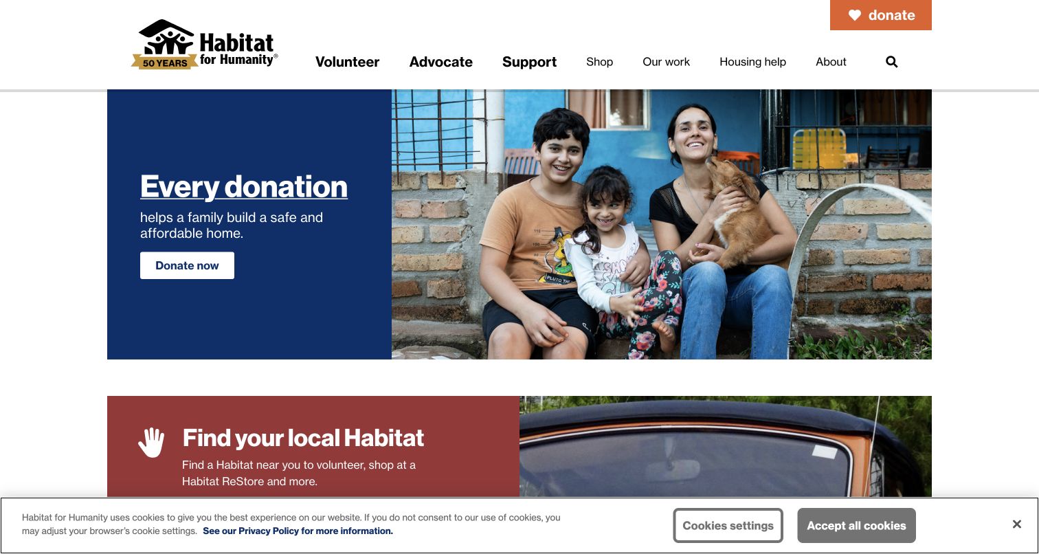
Habitat for Humanity pairs a family-focused opening with support actions and a broad navigation system for volunteering, advocacy, shopping, housing help and organizational work. Local-Habitat routes appear within participation areas, acknowledging that many activities happen through local organizations. The extensive menu exposes different ways to give, including money, materials and other contributions. This is useful for studying a national nonprofit whose central website must explain a mission while directing visitors toward distinct local and program-specific processes.
What you can learn
Map the relationship between the national organization and its local affiliates before designing the navigation. Explain where a visitor’s next action will happen and who handles the request. Keep housing-help routes distinguishable from volunteer and donor journeys so someone seeking services does not enter the wrong process.
Pros
Housing help has an explicit navigation category alongside supporter opportunities.
The local-affiliate route reflects the practical organization of many volunteer and service activities.
Cons & considerations
The very large menu can overwhelm visitors unless categories and keyboard behavior are carefully maintained.
Many giving methods require concise explanations so similar-sounding routes do not become difficult to compare.
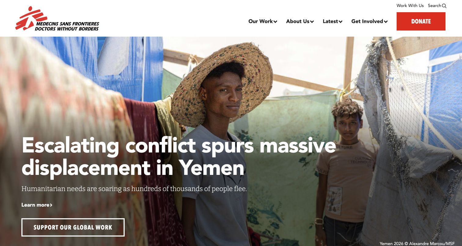
Doctors Without Borders presents a current field report over a large photograph, with a visible location, year and photographer credit. Below it, the page explains the organization’s medical humanitarian work, links to its methods and fund use, and presents figures tied to its activity report. The opening asks the visitor to understand a specific situation before moving into organizational scale. This makes the site useful for studying how frontline reporting, mission explanation and fundraising can sit within a coherent hierarchy.
What you can learn
Credit field imagery where it is used and give current reporting a clear route to its full context. Connect institutional numbers to a named reporting source. Separate descriptions of humanitarian work from claims about what one donation will achieve, and provide readers a way to understand how funds are used.
Pros
The opening photograph carries a specific credit and location context.
The activity figures explicitly refer to a reporting source rather than appearing as unexplained counters.
Cons & considerations
Urgent conflict reporting can be emotionally demanding and needs thoughtful image selection.
Visitors seeking a narrow practical task may need to navigate beyond the editorial opening.
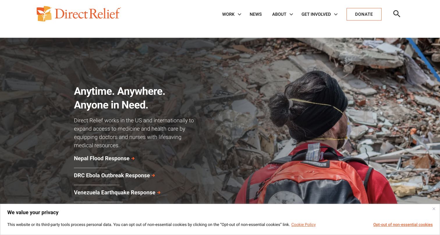
Direct Relief combines a short mission statement with a large response photograph and links to current emergencies. A prominent aid tracker follows, listing deliveries and medical-resource measures with an update timestamp and an explicit unaudited label. Recognition and rating blocks sit above the tracker. The most useful pattern is the pairing of a plain explanation of the work with operational data whose status is visible. The design shows how a nonprofit can give numbers context rather than displaying them solely as decorative proof.
What you can learn
State what a tracker measures, the period it covers and when it was refreshed. Distinguish provisional operational figures from audited reporting. Awards and ratings should link to their own context, while the main narrative explains the organization’s role in a way that does not depend on badges alone.
Pros
The aid tracker gives a date range, refresh time and qualification for its figures.
Current-response links make the broad mission more concrete and explorable.
Cons & considerations
Several recognition blocks compete for space before readers reach the operational explanation.
The captured privacy notice adds another layer around an already information-dense first view.
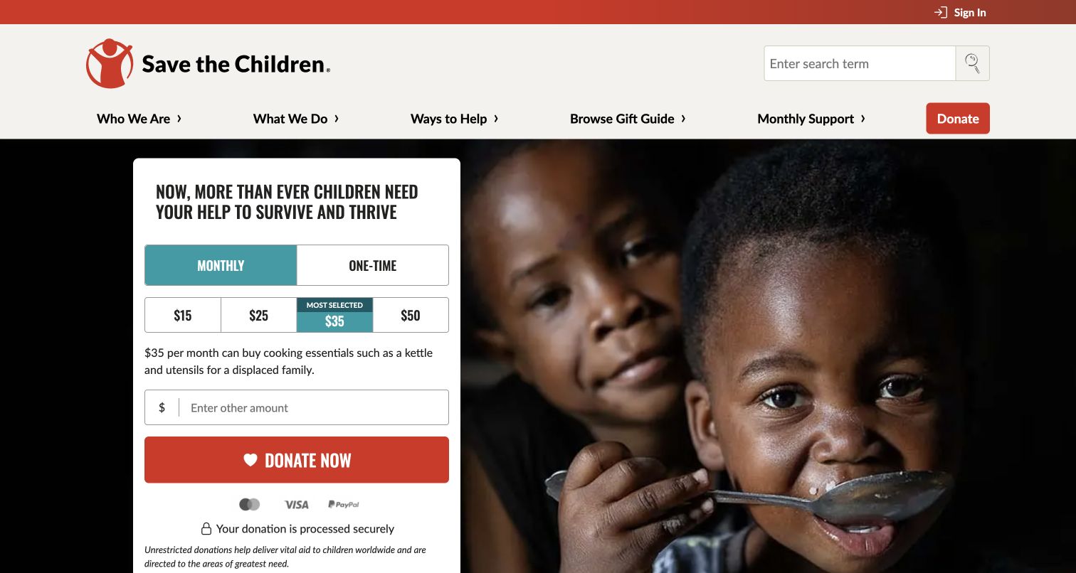
Save the Children places a strong appeal beside a child photograph and prominent giving controls. The following explanation names several categories of work, including nutrition, emergency assistance and learning. Monthly support, a gift guide and other ways to help remain visible in the navigation. The page demonstrates how one fundraising surface can cover both urgent response and continuing programs, but it also shows the need for careful prioritization when several supporter actions and sign-up requests occupy the same page.
What you can learn
Explain the areas a donation supports before asking readers to interpret an emotional image alone. Keep gift frequency and purpose clear, and separate newsletter or mobile-message consent from donating. People should understand whether they are giving, subscribing, learning or entering another kind of supporter relationship.
Pros
The work explanation translates the broad appeal into recognizable program categories.
Monthly support is identifiable as a distinct giving route in the header.
Cons & considerations
The opening appeal and subsequent subscription fields create several competing requests.
Images of children and personal stories require strong consent, dignity and editorial review practices.
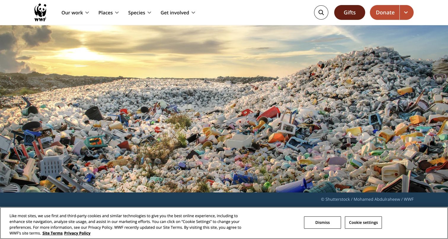
WWF opens with a photographic feature about plastic waste, then introduces its broader conservation mission and a series of reports, stories and news. The navigation gives places and species their own routes beside organizational work and involvement. Image credits are visible near the photography. This structure is useful for a nonprofit that serves curious readers as well as donors: someone can enter through an animal, a place, a current issue or a support action without first learning the internal program structure.
What you can learn
Build topic routes around how the public explores the cause. Preserve image attribution and distinguish a research report from a short news story. Seasonal gift promotions can support fundraising, but keep their relationship to the conservation mission clear and retain a direct route to substantive program information.
Pros
Places and species provide understandable browsing routes beyond the organization’s own program labels.
Content-type labels help distinguish reports, stories and news in the editorial stream.
Cons & considerations
Large photography and seasonal giving material can push detailed program explanation below the opening.
Headline statistics from reports need their scope and methodology preserved when summarized.
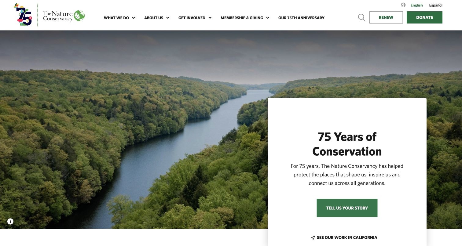
The Nature Conservancy uses a landscape photograph and centered anniversary card to establish place and continuity. Below the celebration, the page breaks its explanation into who the organization is, what it does, how to help and where it works. Membership, giving and a renewal route remain clear in the header. This is a useful example of balancing a major institutional milestone with an ordinary explanatory structure, so the homepage can support a first-time reader as well as an established supporter.
What you can learn
Use anniversaries as an invitation into the work, not as a substitute for explaining it. Keep a short mission overview with separate participation and geographic routes. Renewal deserves a recognizable path when existing members form a substantial audience, and local content should identify its geographic scope clearly.
Pros
The four-part overview answers basic organizational questions in plain language.
Renewal is distinguishable from a new donation in the utility navigation.
Cons & considerations
An anniversary-led hero requires a plan for updating the page when the campaign ends.
Personalized or regional links need clear labels so visitors understand which geography they are viewing.
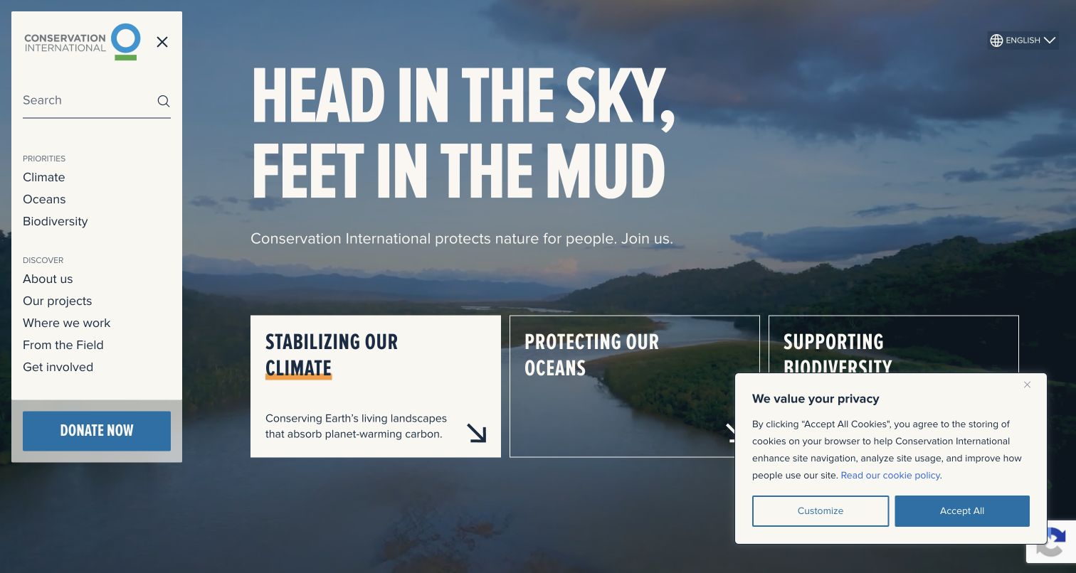
Conservation International places a bold mission headline over a landscape, then presents climate, oceans and biodiversity as three adjacent priority cards. A left-side navigation panel gives access to projects, locations, field stories and involvement. The main message is followed by a short explanation of community leadership, partnerships, science and financing. This is useful for showing how a complex environmental mission can be translated into a few understandable entry points without reducing every program to the same generic donation prompt.
What you can learn
Choose a small set of priorities that genuinely organize the work, and explain each with a sentence describing its purpose. Keep project and location routes available for readers who need more concrete evidence. An unconventional side navigation needs clear controls, visible focus and a sensible compact-screen equivalent.
Pros
The three priority cards pair their headings with short explanatory descriptions.
Projects and geographic work receive explicit destinations beyond the mission statement.
Cons & considerations
The visible side panel reduces the width available to the main content in this capture.
The privacy notice overlaps part of the lower opening and competes with the priority cards.
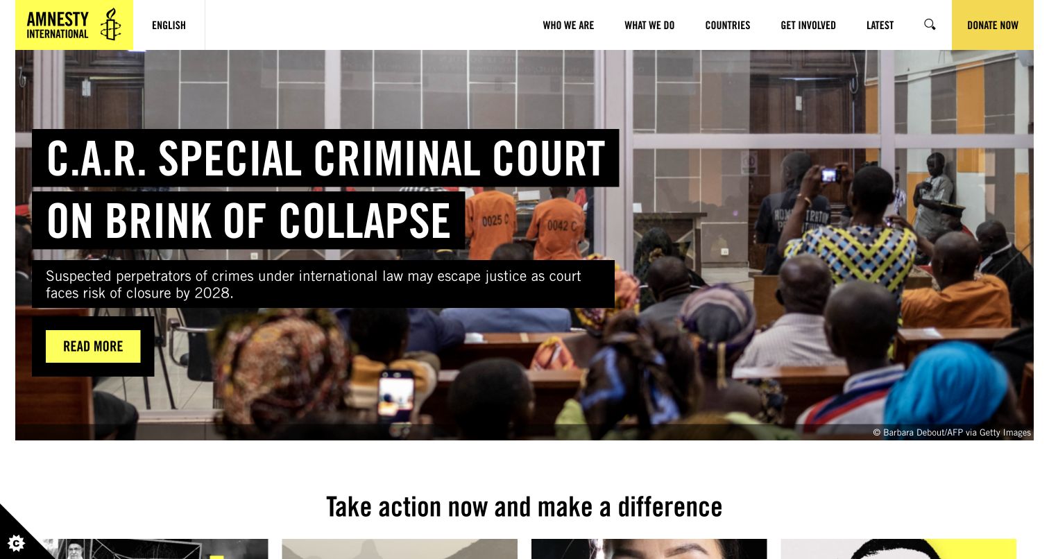
Amnesty International opens with a current human-rights report and a short summary over documentary photography. The next section presents individual campaign actions, each labeled by issue and paired with a direct action link. Countries, latest reporting and organizational information remain distinct navigation routes. This is a useful reference for connecting a broad rights mission to specific public participation while keeping reporting visible. The design makes the intended next step clear, but the underlying action page must still explain what participation means.
What you can learn
Separate reading an investigation from joining a campaign. Name the issue and the requested action before a visitor shares information, and preserve the source context behind allegations or urgent claims. Country and topic navigation should help readers investigate further without requiring them to enter a campaign form.
Pros
Campaign cards identify the relevant issue before presenting an action.
Country browsing provides an additional route into an extensive international information library.
Cons & considerations
Several urgent actions at once can make it difficult to understand which campaign is currently most relevant.
Strong documentary imagery and allegations require careful sourcing and continuing editorial review.
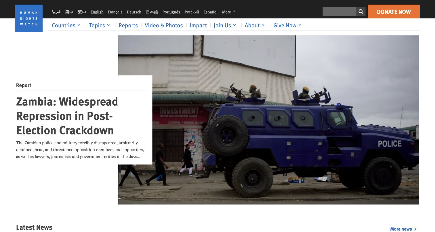
Human Rights Watch gives its main report a large headline and summary, with latest-news items nearby and a clear navigation route for reports. Countries, topics, video and impact are distinct destinations. A broad language selector appears in the utility area. The page is useful for studying a nonprofit that functions as a public research publisher as well as a fundraising organization: the central experience is discovering and reading material, with support actions surrounding that editorial structure.
What you can learn
Design reports as primary content with clear titles, dates, summaries and stable destinations. Give readers both topic and geographic paths, and preserve a meaningful distinction between a full report and a news update. Multilingual navigation should set honest expectations about which material has been translated.
Pros
Reports have a dedicated navigation destination and strong editorial prominence.
Country, topic and language routes support several ways of finding relevant material.
Cons & considerations
The long headline and dense news selection create a substantial reading load in the opening.
Multiple donation prompts can compete with the report hierarchy if their visual weight is not controlled.
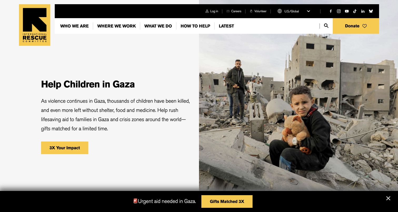
The International Rescue Committee opens with a specific crisis appeal in a yellow-and-black brand system. The following section broadens the explanation to survival, recovery and rebuilding, then lists several service measures explicitly tied to a year. Navigation separates who, where, what and how to help, giving the organization a simple explanatory framework. This is useful for studying the transition from an urgent request to a longer account of programs, particularly when one organization works across several countries and kinds of support.
What you can learn
Follow urgent fundraising with a dated explanation of what the organization actually does. Give each statistic a clear unit and reporting period, and make country or program detail easy to reach. If an appeal includes a matching offer, preserve its conditions and expiry rather than letting the multiplier carry the entire message.
Pros
The main navigation uses a compact set of plain explanatory questions.
Service figures identify their reporting year and distinguish different program activities.
Cons & considerations
An urgent matching appeal requires visible, current terms to prevent misunderstanding.
A crisis-specific opening may initially conceal the breadth of the organization’s continuing work.
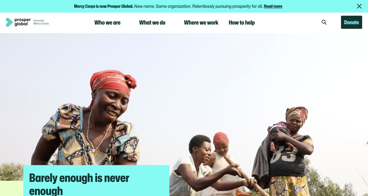
The former Mercy Corps address redirects to Prosper Global, where a prominent banner explains the new name and continuity of the organization. The opening pairs a large people-focused photograph with a short statement about moving beyond survival. Navigation retains clear routes for organizational work, geography, resources and support. This is a useful reference for a nonprofit rebrand because the page acknowledges the transition directly rather than expecting returning supporters to infer why their familiar address now displays a different identity.
What you can learn
Explain a name change at the entry point and retain a route to the full announcement. Preserve old links through intentional redirects, and review donation receipts, email identity and partner references for consistency. Do not copy animated impact counters unless their accessible and unloaded states also communicate meaningful information.
Pros
The transition banner explicitly connects the former and current organization names.
The program and geographic navigation remain concrete beneath the broader brand message.
Cons & considerations
The observed text extraction exposed zero values before animated counters resolved, so fallback handling deserves attention.
Returning supporters may need more reassurance about continuity than a brief homepage banner can provide.
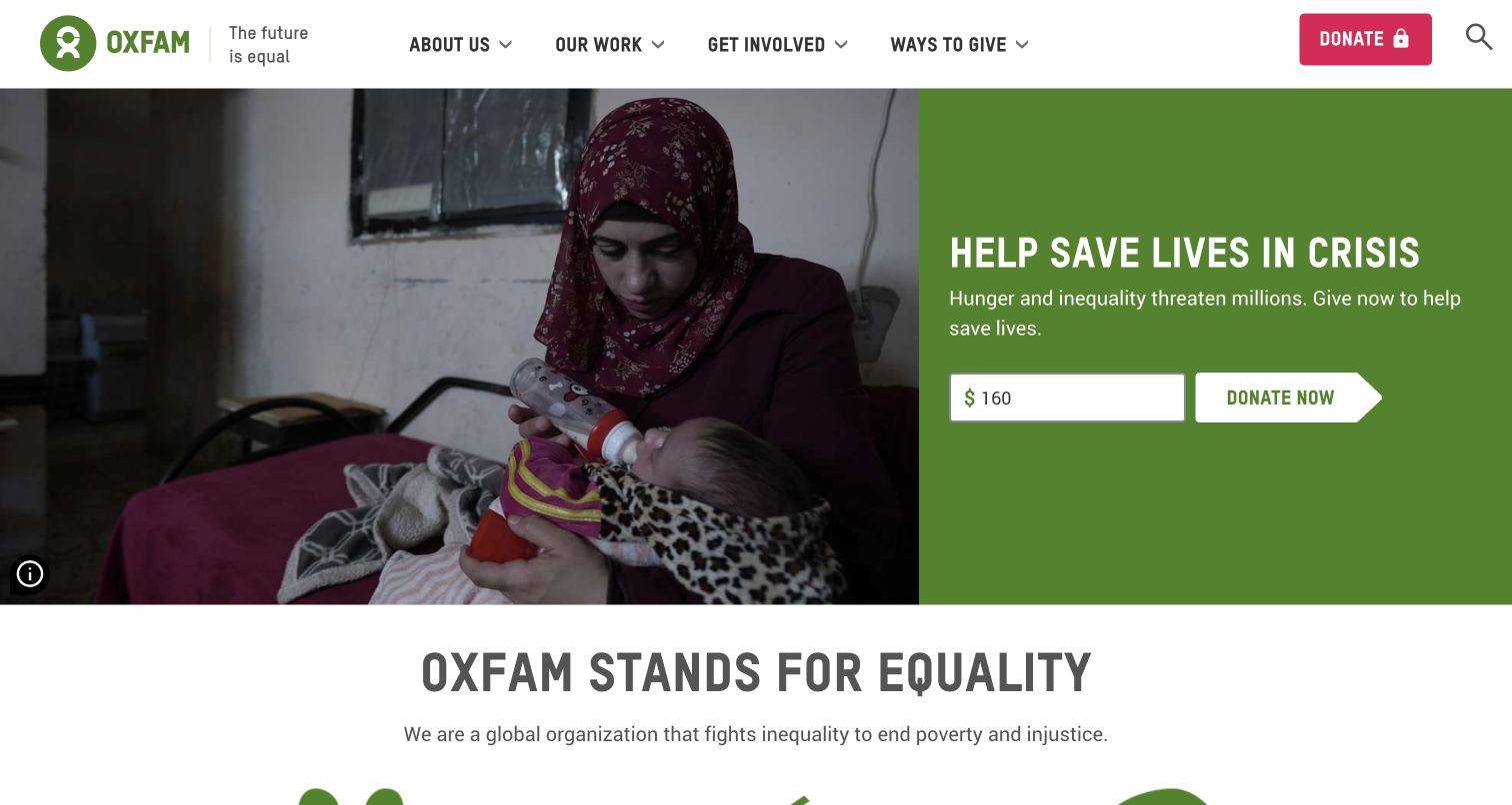
Oxfam America pairs a large photograph with a green donation panel, then explains its work through the themes of equality, poverty and injustice. Separate actions invite visitors to learn about beliefs, take action, donate or receive updates. Dated stories extend the page into research and commentary. This structure is useful for an organization whose mission includes both immediate assistance and longer-term advocacy, because the homepage has to make those related but different activities understandable to a new reader.
What you can learn
Distinguish an emergency appeal from the organization’s wider program and advocacy work. Give each participation route a clear label so a reader knows whether it leads to a donation, campaign or subscription. Keep opinion, analysis and field reporting identifiable in the editorial section rather than presenting them as interchangeable updates.
Pros
The page separates learning, action and giving into recognizable next steps.
Dated stories provide a path into the organization’s analysis beyond the donation panel.
Cons & considerations
Several supporter requests appear in succession and can make the page feel repetitive.
A very broad equality message needs concrete program examples to explain the organization’s particular role.
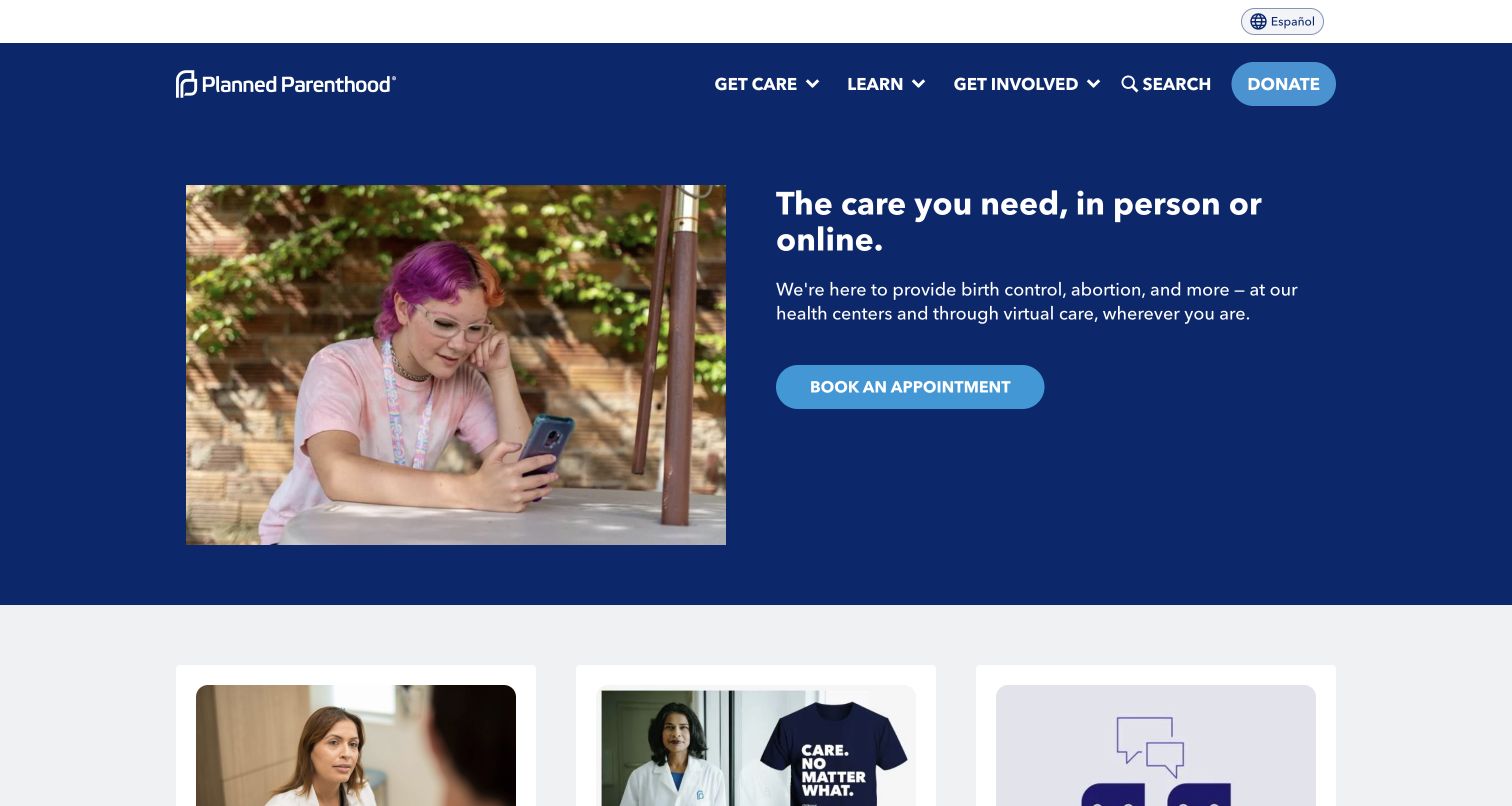
Planned Parenthood makes care access the first task, with a concise introduction and a prominent appointment action. The main navigation separates getting care, learning and getting involved, while donation remains a distinct utility. Subsequent sections distinguish online care, information and organizational support. As a design reference, the page demonstrates why a service nonprofit’s primary action should reflect the visitor’s immediate need. The homepage is not simply a fundraising surface, and the review concerns its navigation rather than the suitability of any individual service.
What you can learn
Separate service discovery, educational material and supporter actions in the information architecture. Label when a route leads to an appointment system, a virtual service or informational content. Keep availability and location context current, and avoid requesting personal health information before the visitor understands the destination and its purpose.
Pros
Getting care and learning have clear, separate places in the primary navigation.
The main appointment action is visible before fundraising or newsletter requests.
Cons & considerations
Several care channels require careful explanation of their different availability and next steps.
A chat invitation needs clear expectations about privacy, limitations and the type of assistance offered.
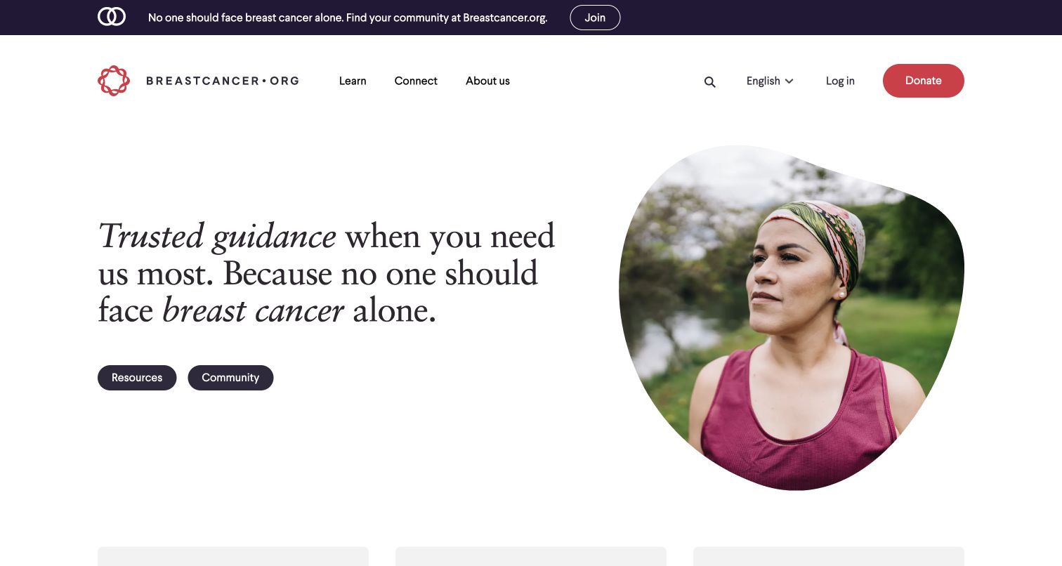
Breastcancer.org pairs a calm introduction and portrait with two central routes: resources and community. Its navigation groups educational material by topic, treatment and content type, while community discussion, support groups and other resources receive their own structure. The distinction is useful because reading reviewed information and joining a peer conversation are different experiences. The design gives both an intentional place without requiring the visitor to understand the organization’s internal teams or publishing workflow.
What you can learn
Make the difference between editorial information and community contribution explicit. Use plain category names, preserve authorship and review dates on health content, and explain the expectations of a discussion space before someone participates. A supportive visual tone should accompany clear navigation and meaningful content governance rather than substitute for them.
Pros
Resources and community are presented as distinct, understandable starting points.
The educational navigation offers several browsing methods beyond a single search field.
Cons & considerations
The extensive topic and treatment menus can feel overwhelming without careful grouping.
Medical information and peer discussion need visibly different provenance and moderation cues throughout the site.
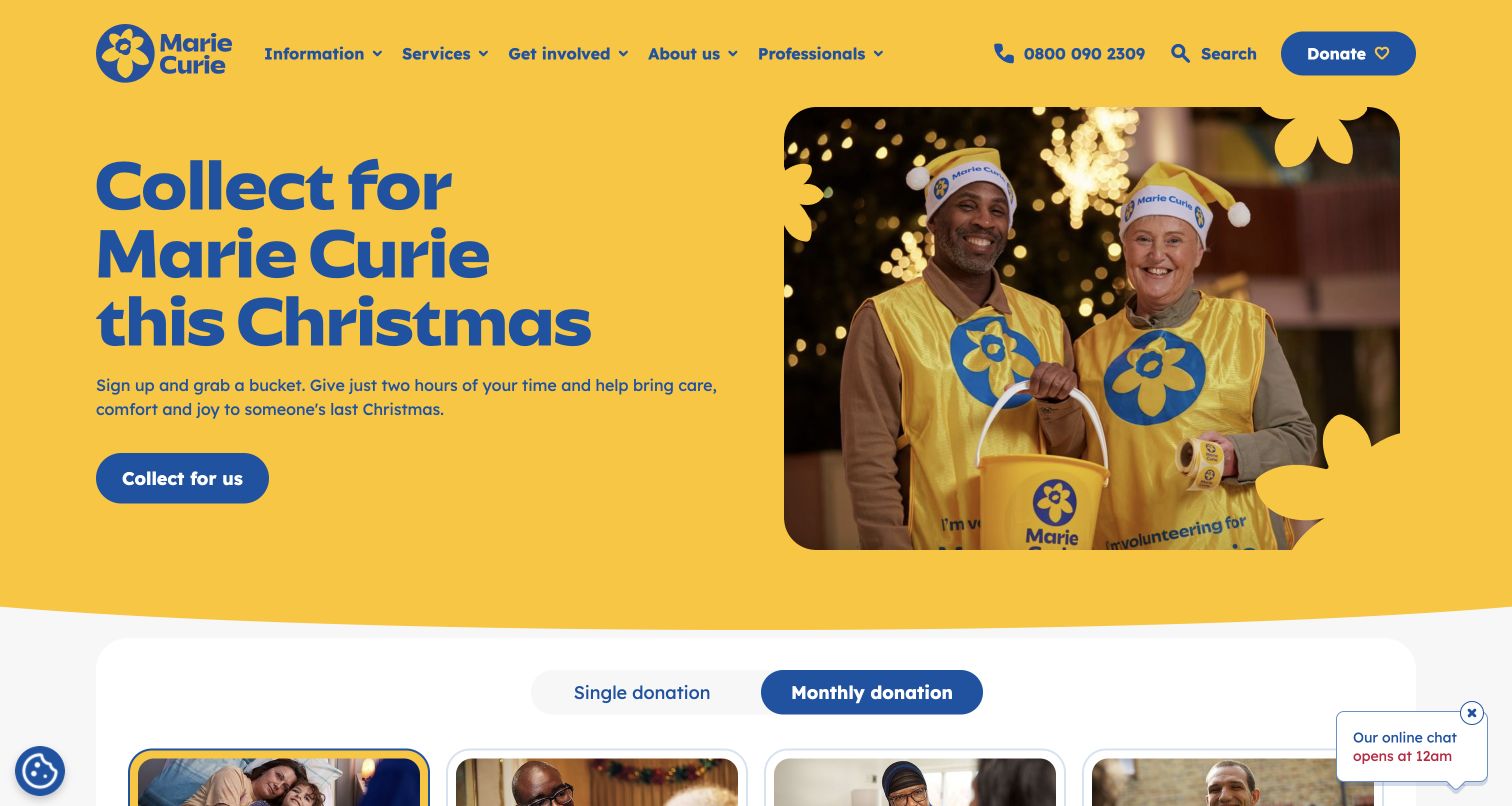
Marie Curie opens with a seasonal volunteering invitation in its yellow-and-blue identity, followed by a donation selector that distinguishes single and monthly gifts. A later audience section offers routes for people living with terminal illness, carers, health professionals and supporters. The helpline is visible in the header. This is useful for studying a charity that must welcome fundraising participation while still making sensitive service information accessible to people who may arrive with an immediate personal concern.
What you can learn
Give people seeking information an explicit route that does not require interpreting a fundraising campaign. Keep a staffed contact option visible and state its operating details on the destination. Donation examples should use carefully qualified wording, and recurring gifts must be clearly distinguished before the visitor reaches a payment step.
Pros
The audience routes recognize patients, carers and professionals as distinct groups.
The header provides a direct phone contact alongside ordinary navigation.
Cons & considerations
The seasonal campaign and donation selector precede the main care-information routes in the page body.
Suggested-gift impact examples need current costs and careful wording to avoid implying a guaranteed allocation.
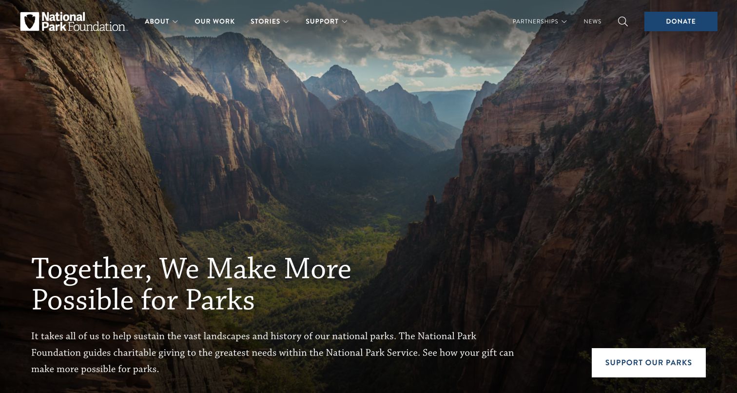
The National Park Foundation uses an expansive park landscape and a concise support message, then explains its role in directing charitable giving toward National Park Service needs. Work, stories, partnerships and support are visible in the main navigation. Impact figures and project-oriented sections follow the opening. The useful distinction is organizational: the website explains a foundation’s fundraising and partnership role, rather than presenting itself as the source for every park operation, reservation or visitor-service question.
What you can learn
State the relationship between a supporting foundation and the institution it helps. Use landscape imagery to establish the shared interest, then show specific projects and dated reporting. Keep park-visit logistics directed to the appropriate official destination rather than allowing donor storytelling to imply responsibility for services the foundation does not operate.
Pros
The opening explanation identifies the foundation’s relationship to the National Park Service.
Partnerships and project work have visible routes alongside donations.
Cons & considerations
The large scenic hero conveys place more strongly than the details of how support is allocated.
Impact figures from different periods need clear dates so readers do not assume they describe the same reporting year.
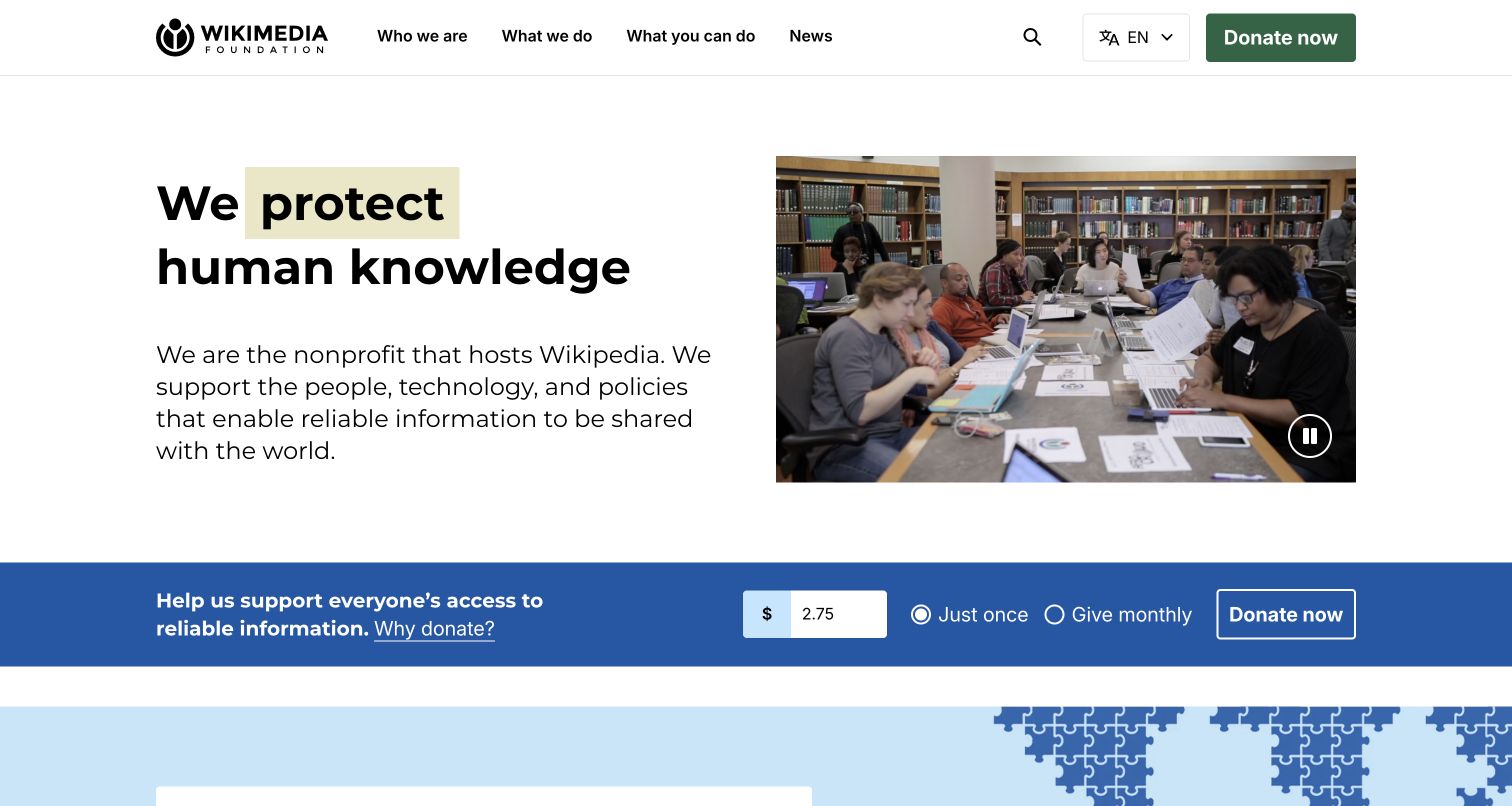
The Wikimedia Foundation begins by explaining that it is the nonprofit hosting Wikipedia and supporting the people, technology and policies behind shared knowledge. A large typographic statement and community photograph lead into a donation bar and explanatory content. The distinction between the foundation and the encyclopedia is valuable: many visitors may recognize the public product without understanding the organization that supports it. The homepage uses familiar language to bridge that gap before moving into scale and program information.
What you can learn
Explain the relationship between the nonprofit and its public-facing product in the first paragraph. Show the human and operational work behind a service that can otherwise feel automatic. Give readers a clear why-donate route and preserve sources and dates for the large usage figures used to describe scale.
Pros
The introduction clearly identifies the foundation’s relationship to Wikipedia.
One-time and monthly giving are labeled within the donation controls.
Cons & considerations
Animated headline words need a coherent static and reduced-motion presentation.
Large usage statistics can dominate the explanation unless the supporting work remains equally concrete.
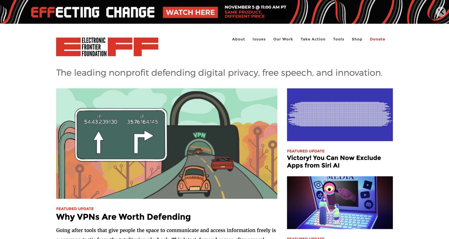
The Electronic Frontier Foundation uses a publication-style layout with a featured update, supporting stories and visible issue categories. Its navigation separates organizational information, issues, work, action and tools. Practical resources such as Surveillance Self-Defense appear alongside current reporting. This is useful for a nonprofit whose audience may arrive to solve a particular information problem rather than donate immediately. The page makes ongoing expertise visible, while membership and support requests remain a recognizable part of the surrounding structure.
What you can learn
Treat practical resources as durable content with their own navigation, separate from the news stream. Distinguish a guide, an issue overview and an advocacy action so readers understand what each destination offers. Keep older technical guidance reviewed and dated, because a strong editorial brand does not make instructions permanently current.
Pros
Tools and resources receive explicit navigation rather than being buried in dated posts.
Featured updates and issue hubs support both current reading and deeper research.
Cons & considerations
Several donation and campaign banners compete with an already dense editorial grid.
Technical and policy material requires active maintenance as products and public rules change.
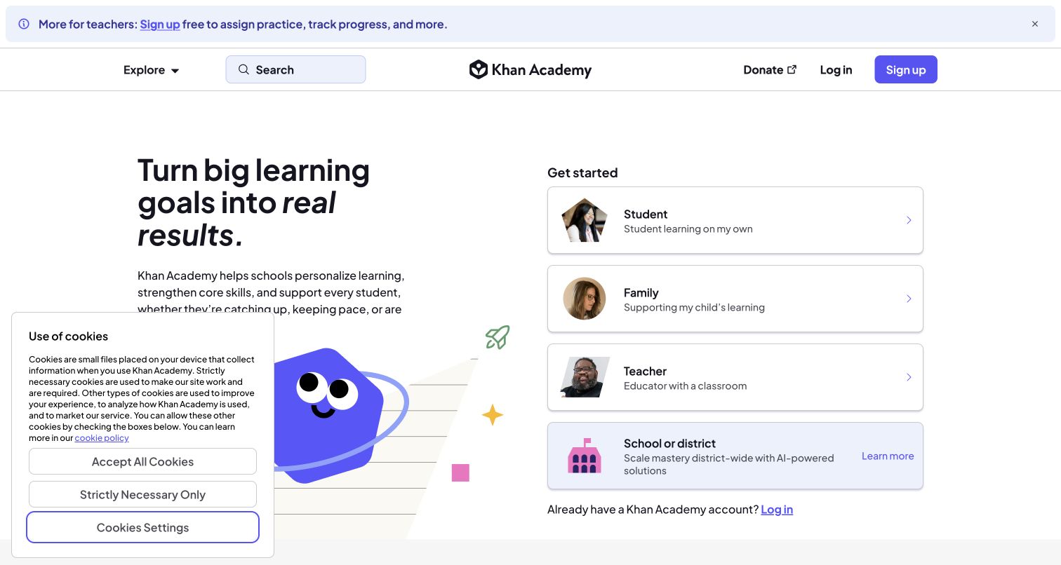
Khan Academy makes the first choice about the visitor’s role: student, family, teacher, or school and district. A short introduction explains the learning purpose, and a login route acknowledges returning users. Course categories and explanations of the learning approach follow. The page is useful for studying a nonprofit that also operates a substantial digital service. Its primary conversion is finding the appropriate learning experience, with donation available in the navigation rather than occupying the center of every visit.
What you can learn
Route people by the tasks and permissions that differ between roles. Explain each audience choice in ordinary language, and keep returning-user access close to the start. A public course catalog should remain discoverable before account creation so visitors can understand the available material and whether it fits their needs.
Pros
Role cards pair audience names with short explanations of their intended use.
Course categories provide a useful browsing route beyond the onboarding choices.
Cons & considerations
A visitor who occupies several roles may need a clear way to switch later.
Large scale and impact figures need definitions and dates to avoid implying more than the measures establish.
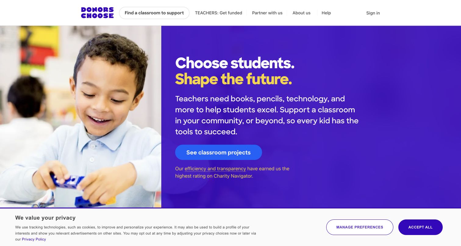
DonorsChoose introduces the needs of classrooms, then directs visitors toward project browsing and a location search. Teachers have a separate Get Funded route in the header, while donors can explore nearby projects, common supply requests and a school map. The page is useful for studying a marketplace-like nonprofit experience: the next action is choosing a concrete request, not only making an unrestricted gift. The introduction explains the teacher-request model before the page expands into organizational history and recurring support.
What you can learn
Make the two sides of the service distinct: people requesting support and people providing it. Let location search assist discovery without implying that the visitor must share precise location. Project cards should explain the request, recipient context and funding status consistently, with clear expectations about what happens after a gift.
Pros
Teacher funding and donor discovery have separate, recognizable navigation routes.
Nearby projects and school search offer concrete ways to explore the mission locally.
Cons & considerations
Location-based defaults need clear labels and an easy way to change the area.
Specific-project fundraising requires careful status updates so completed or changed requests are not misleading.
Plan the nonprofit site around mission and follow-through
Identify the visitor jobs that matter most
List the actual journeys the organization supports: finding help, giving, volunteering, researching a program or contacting a team. Decide which routes must remain available during a campaign. Use language tested with people outside the organization rather than only internal program names.
Create a record for each claim and story
Keep the source, period, review owner and approved wording for statistics and program claims. Record image and story permissions, including any limits on reuse. A reliable evidence process makes later website updates easier and reduces dependence on memory.
Define what happens after an action
Assign ownership for volunteer inquiries, service requests and supporter messages. Explain confirmations and expected next steps without promising an unstaffed response time. Keep donation frequency, purpose and consent choices clear before the visitor enters a payment or subscription flow.
The editing job behind the design
Choose tools the nonprofit can maintain and explain
Start with the organization’s publishing capacity and existing donor or service systems. A manageable CMS with structured programs, stories, reports and events may be more useful than a highly customized interface that staff cannot update. Assign permissions and review workflows for sensitive stories, statistics and active appeals.
Donation platforms, mailing tools and volunteer systems should have clear boundaries and accessible alternatives. Test handoffs with approved test modes and avoid collecting information that is not needed for the task. Keep service access and essential public information usable even if a marketing or fundraising widget fails.
Our WordPress website examples offer a separate look at publishing approaches. A visible platform label is evidence for that named page, not a guarantee that the same system will suit your requirements.
Before the public launch
Nonprofit website launch checklist
Confirm the mission, program descriptions and geographic scope with responsible teams.
Verify the source, period and qualification of every prominent impact claim.
Review story consent, photography rights, credits and the dignity of presentation.
Check giving frequency, appeal purpose, matching conditions and confirmation wording.
Test service access, volunteer routes, keyboard navigation and mobile readability.
Assign owners and expiry dates for campaigns, reports, contact routes and partner links.
These checks are a project checklist, not a performance, legal, security, or accessibility certification. Test real journeys with the people responsible for the website before making claims about the result.
Sources & editorial method
How this collection was selected and reviewed
We reviewed twenty-four distinct official nonprofit websites and captured their public homepages directly. The collection intentionally includes service, education, advocacy and fundraising models. Mercy Corps redirected to Prosper Global during research, and the review preserves that current identity and transition. No donation, appointment, campaign or subscription form was submitted.
Each example links to its actual source page. Screenshots are direct browser captures with their own capture dates; moving imagery, announcements and live designs can change. The notes describe observable design choices and conditional tradeoffs, not measured traffic, conversion results, service quality, or accessibility conformance.
Technology labels use public page metadata, asset evidence, or explicitly cited platform documentation. Platform documentation is not a complete current deployment audit. A component reference may be legacy or unused; it is not a complete backend inventory. Unknown stacks are omitted. These sites are editorial examples, not our client portfolio.
Written, Edited and Curated are separate editorial records, not timestamps advanced by a rebuild. Website designs and imagery belong to their owners. See our editorial standards or suggest a correction.
Questions worth asking
Nonprofit website design questions
Should Donate always be the primary action?
It depends on the organization and the visitor’s needs. A nonprofit delivering public services may need help-seeking or service access to be equally prominent. Keep giving easy to find while making other essential journeys explicit.
What makes an impact statistic useful?
A useful statistic states what was measured, over what period and from which source. Explain limitations and avoid mixing several reporting periods as if they describe one current total.
How much should a donation form ask for?
Ask only for information needed for the gift and its administration, with optional choices clearly labeled. Explain recurring frequency and keep newsletter, phone or campaign consent separate from the act of donating.
Can a nonprofit use urgent campaigns responsibly?
Yes. Use current, sourced context, explain the purpose of the appeal and give matching offers clear conditions. Preserve service routes and remove or update time-limited messages when they no longer apply.
Borrow the patterns that make the organization’s work and next steps clearer. Trust comes from understandable information, respectful storytelling and a process the team can reliably carry through.