Best Clerk Websites of 2026 (20 Real-World Examples)
Twenty public product websites with documented Clerk account authentication, real screenshots and practical lessons for connecting discovery to a customer account.
Clerk supplies authentication and user-management capabilities. These examples show the public entrances to products that document a Clerk account relationship, with the precise scope stated for each property.
An account-based product has at least two important experiences: the public website that explains its value and the application people enter after signing in. A good connection between them starts with honest labels, understandable expectations and a clear route for returning users. The examples here span AI platforms, developer infrastructure and specialist business software.
Their visual design is worth studying independently of the authentication choice. A provider register, engineering article or cookie notice can establish a particular Clerk relationship without identifying the marketing site's frontend, CMS or complete architecture. Read the qualification beside each example before borrowing an implementation assumption from its appearance.
Before the examples
What makes good Clerk website development in 2026?
Explain the account's purpose before asking for one
Show what someone will gain access to and whether they are exploring individually, joining a team or requesting a managed demonstration. Pricing, documentation and representative public examples can answer useful questions before signup. Keep an existing customer's sign-in route easy to find even when a campaign changes the main hero.
Separate identity from permission
Knowing who signed in does not decide which records they may read or change. Define the application's roles and resource rules alongside the authentication journey. Clerk documents role-based access approaches, but the product still needs authorization checks appropriate to its own actions and data boundaries.
Clerk Organizations group users with roles and permissions and provide an active organization context. This is useful for shared workspaces, but an individual-only product may not need that structure. Map the product's real ownership model before making organization creation an unavoidable step in every signup.
OpenRouter, Browserbase, Braintrust, Higgsfield and Cartesia lead the collection as recognizable AI and developer-platform references with primary authentication evidence. Smaller specialist products follow. The captures show public homepages; the accompanying sources explain the separate account relationship. Graphlit is explicitly included as a wind-down example with closed new signups, not an available onboarding recommendation.
We start with five recognizable brands or organizations: OpenRouter, Browserbase, Braintrust, Higgsfield, Cartesia. Each attribution applies to the named website property, not every product or website belonging to its organization. This is a curated reading sequence, not a measured ranking.
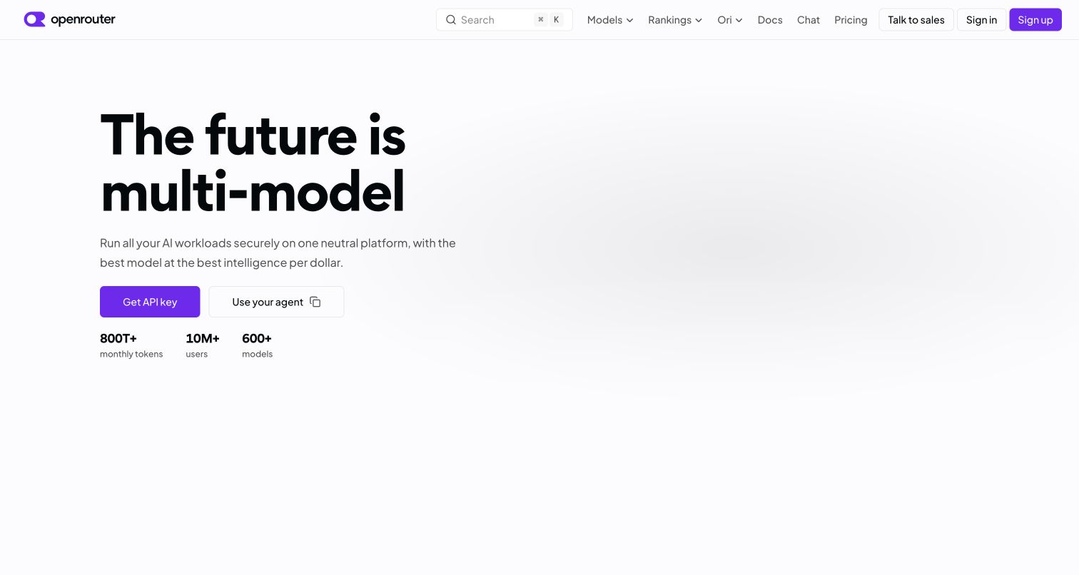
OpenRouter gives a technically broad product a remarkably spare entrance. The large headline and purple action sit well apart from the navigation, while model discovery, rankings, documentation and pricing remain visible across the top. That separation lets someone understand the gateway before confronting individual providers. Further down, model categories and usage information give the initial promise something concrete to point toward. Its public trust center names Clerk for authentication, and its member documentation identifies Clerk user IDs. That supports the account relationship, rather than identifying the technology behind the marketing layout.
What you can learn
Give exploration and account creation different jobs. A visitor should be able to understand the catalog and compare the service before deciding whether the account entrance is relevant to their task.
Pros
The spacious opening makes the main developer action easy to locate.
Persistent documentation and model links support visitors arriving with specific questions.
Cons & considerations
The broad gateway promise still requires deeper reading about individual model differences.
Public presentation alone cannot demonstrate authenticated account behavior or service performance.
Visible tech stack
Earlier / documented evidence
Clerk
Platform source: Official product authentication evidence. Public trust center names Clerk for authentication; current SDK member schema explicitly describes Clerk user IDs. Scope is OpenRouter member accounts, not a CMS claim. Official documentary association with customer account authentication. The public homepage capture does not establish Clerk as a frontend framework, CMS, page builder or complete application architecture. Platform evidence is separate from the direct website screenshot and is not a complete current infrastructure audit.
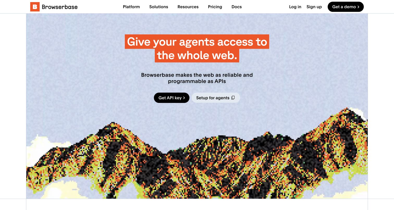
Browserbase combines a pixelated mountain scene with an orange highlighted headline, giving browser infrastructure a visual identity without hiding the next step. Documentation, pricing, login and signup occupy a compact header; the main action focuses on obtaining access to the product. The larger page separates search, fetching and browser services into more digestible choices, then introduces customer stories. That structure matters because the umbrella browser proposition could otherwise obscure distinct use cases. Browserbase's public subprocessor entry describes Clerk handling application signup, signin, profiles and sessions; it does not attribute this illustrated homepage to Clerk.
What you can learn
Use a strong visual scene to establish recognition, then let task labels carry the explanation. Product families should become clearer as the visitor scrolls, with documentation remaining easy to find throughout the journey.
Pros
The orange emphasis directs attention without requiring a dense opening paragraph.
Separate product categories turn an infrastructure umbrella into recognizable developer tasks.
Cons & considerations
The playful imagery supplies little technical information without the accompanying copy.
Customer stories and interface polish do not independently verify reliability or account security.
Platform source: Official product authentication evidence. Primary subprocessor record says Clerk provides sign-up, sign-in, profiles and session management integrated into Browserbase applications. Official documentary association with customer account authentication. The public homepage capture does not establish Clerk as a frontend framework, CMS, page builder or complete application architecture. Platform evidence is separate from the direct website screenshot and is not a complete current infrastructure audit.
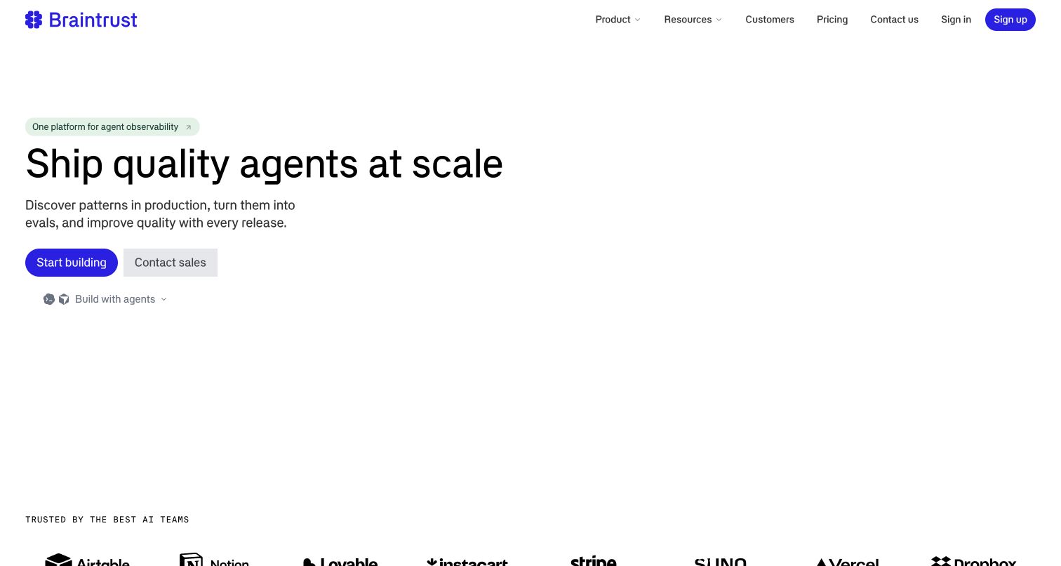
Braintrust opens with a blue wordmark, a compact announcement and a large statement about agent quality. The substantial white space gives the primary build action room, while a sales route and an agent selector acknowledge different visitor intentions. The lower page expands into observing, evaluating and improving systems, rather than placing every capability in the opening viewport. This is useful sequencing for a product with an unfamiliar category. Braintrust's architecture article explicitly places Clerk authentication in its control plane alongside the web interface and lightweight metadata, separate from the customer data plane.
What you can learn
Let the opening establish the product's central job, then explain the workflow in named stages. When technical trust depends on architectural boundaries, provide a separate readable source instead of expecting a marketing graphic to carry the whole argument.
Pros
A restrained hero makes the primary action and product proposition easy to distinguish.
Workflow sections give several capabilities a coherent order rather than an undifferentiated list.
Cons & considerations
The generous opening space postpones concrete product detail until further scrolling.
The architecture article documents a relationship, not an independent test of agent quality.
Platform source: Official product authentication evidence. Braintrust explicitly describes its control plane as web UI, authentication via Clerk and lightweight metadata, distinct from the customer data plane. Official documentary association with customer account authentication. The public homepage capture does not establish Clerk as a frontend framework, CMS, page builder or complete application architecture. Platform evidence is separate from the direct website screenshot and is not a complete current infrastructure audit.
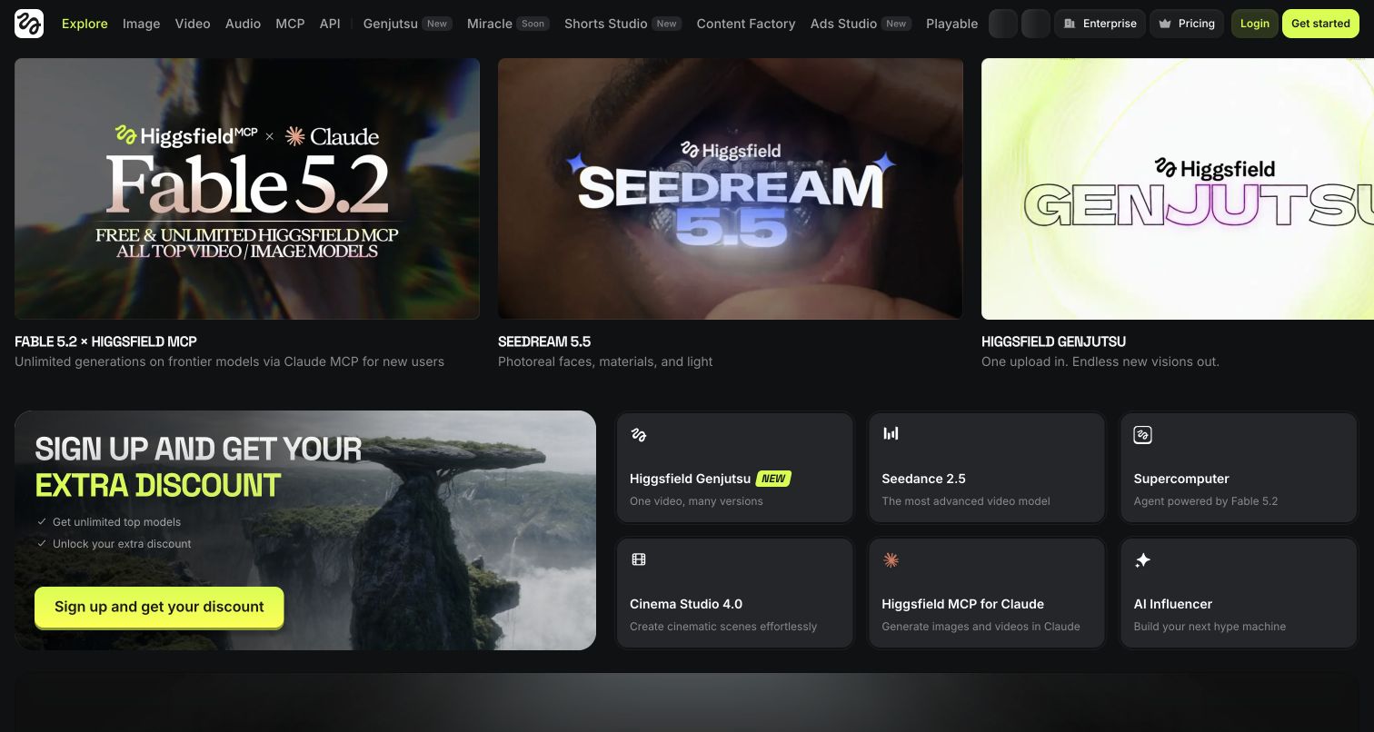
Higgsfield uses a dark canvas and bright yellow highlights to frame a busy creative catalog. Large promotional panels immediately show several visual directions, while the long navigation exposes image, video, audio and other creation routes. The account action stays conspicuous even when the page is crowded with launches. This approach makes discovery feel close to the product, although a first visitor must distinguish core tools from current promotions. The site's cookie notice names Clerk authentication and session configuration cookies on its own domain. That is scoped account evidence, not proof that Clerk creates the showcased media or controls the complete interface.
What you can learn
For a large creative suite, make the persistent task navigation recognizably different from rotating campaigns. Keep the account entrance stable while allowing the editorial surface to change with new tools and examples.
Pros
Large visual panels communicate the platform's creative range before detailed reading.
A consistent accent color helps account and navigation actions stand out.
Cons & considerations
Numerous product names and promotions compete for a newcomer's attention.
Promotional demonstrations do not establish output quality for an individual user's project.
Visible tech stack
Earlier / documented evidence
Clerk
Platform source: Official product authentication evidence. Current cookie notice names Clerk Inc for authentication/session configuration cookies on higgsfield.ai; named cookie purpose is account/session context. Official documentary association with customer account authentication. The public homepage capture does not establish Clerk as a frontend framework, CMS, page builder or complete application architecture. Platform evidence is separate from the direct website screenshot and is not a complete current infrastructure audit.
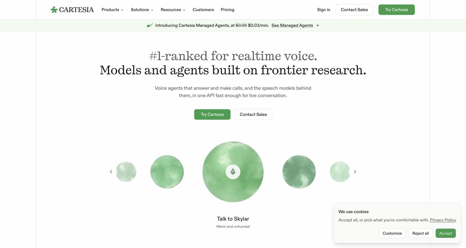
Cartesia's opening uses a large serif headline, muted green actions and a row of voice-oriented visual elements. It feels measured rather than overloaded, with an announcement strip introducing news without replacing the main proposition. Trial and sales paths sit beside one another, allowing individual developers and larger buyers to recognize different next steps. The public page also offers product explanations and customer stories below the opening. Cartesia's public trust center identifies Clerk as an authentication, identity and profile provider for its software application. This supports the customer account layer; it does not establish how the marketing page or voice models are implemented.
What you can learn
A technical service can use expressive typography while keeping decisions practical. Separate exploratory access from a sales conversation, then make the evidence supporting each audience easy to reach beyond the visual introduction.
Pros
A restrained palette gives the headline and paired actions a clear hierarchy.
The voice-focused presentation connects the visual identity to the product's purpose.
Cons & considerations
A static screenshot cannot communicate the quality of an audio demonstration.
The visible cookie panel competes with some opening content in the captured state.
Platform source: Official product authentication evidence. Primary trust center says Clerk provides user authentication, identity management and user-profile services for Cartesia's software application. Official documentary association with customer account authentication. The public homepage capture does not establish Clerk as a frontend framework, CMS, page builder or complete application architecture. Platform evidence is separate from the direct website screenshot and is not a complete current infrastructure audit.
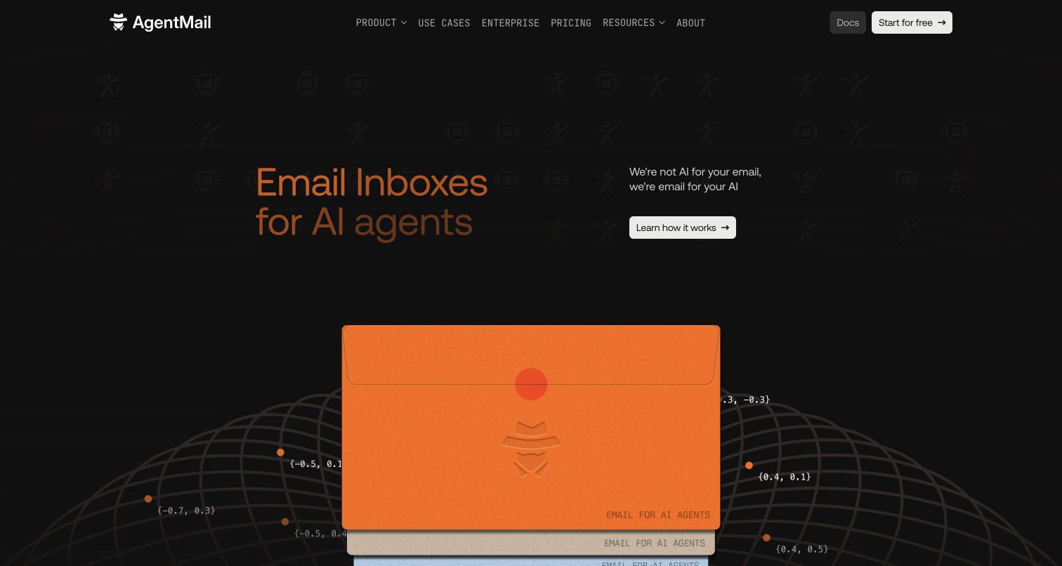
AgentMail makes email infrastructure tangible with an oversized orange envelope against a dark background. The split layout pairs that illustration with a short explanation of inboxes for agents, then offers documentation and a clear starting action. Lower sections organize capabilities around programmatic inboxes, events and control, with code-oriented presentation helping bridge the metaphor and implementation. The result is memorable without needing a decorative scene unrelated to the service. AgentMail's service subprocessor page names Clerk for authentication, and its public site links the developer console. The evidenced relationship is customer access to that service, not email delivery itself.
What you can learn
Choose a visual metaphor that already belongs to the product, then move quickly from recognition to concrete capabilities. Developers should find documentation without having to interpret the illustration or read every marketing section first.
Pros
The envelope creates a direct connection between brand imagery and the service category.
Documentation and capability tabs provide practical routes beyond the opening claim.
Cons & considerations
The agent terminology assumes some familiarity with automated application workflows.
The public page cannot establish delivery behavior, inbox permissions or authenticated console usability.
Platform source: Official product authentication evidence. Current service subprocessor table names Clerk for authentication; the same public site links the AgentMail developer console. Official documentary association with customer account authentication. The public homepage capture does not establish Clerk as a frontend framework, CMS, page builder or complete application architecture. Platform evidence is separate from the direct website screenshot and is not a complete current infrastructure audit.
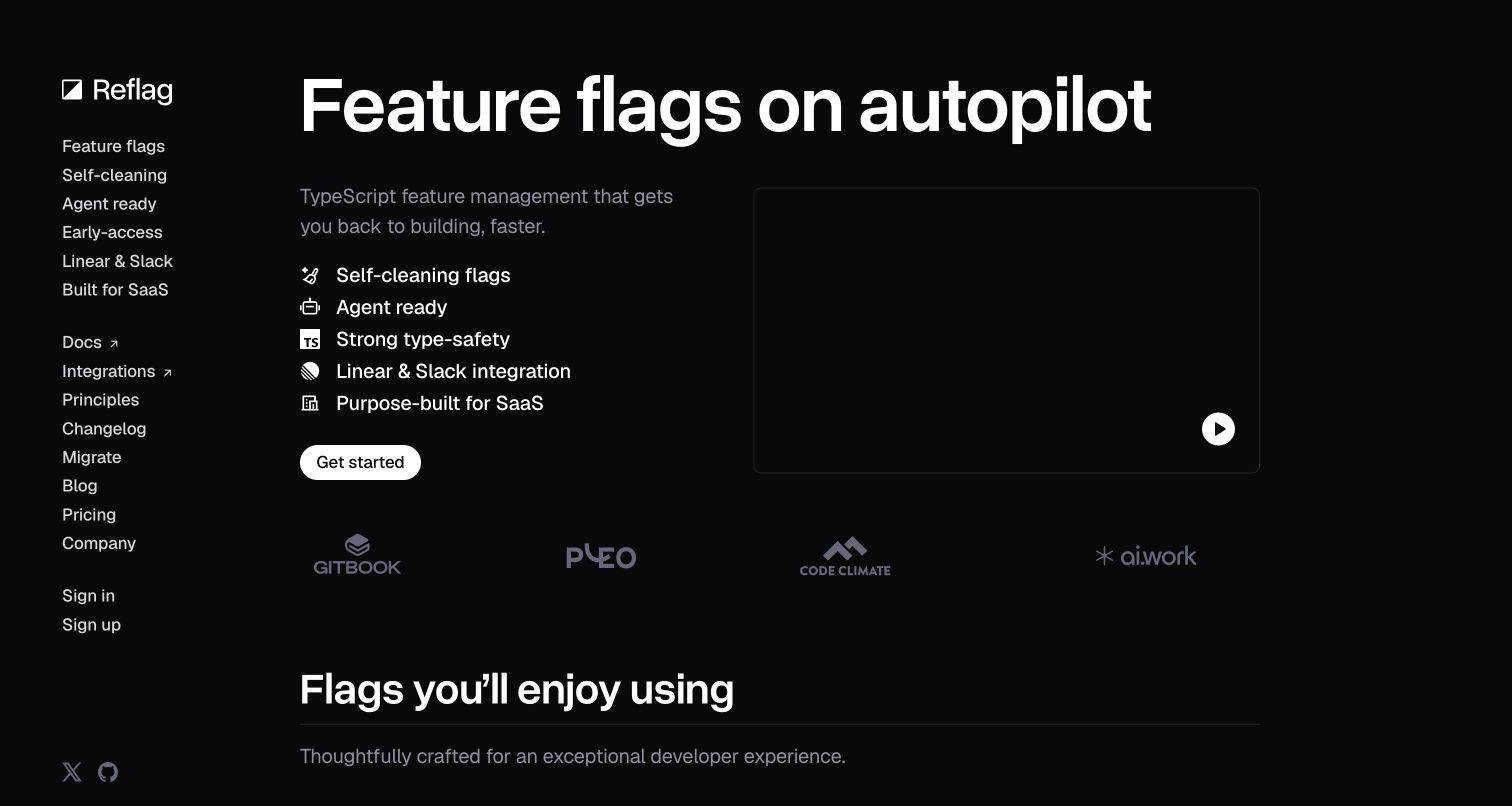
Reflag combines a dark background, large white headline and a persistent navigation rail. The page emphasizes automatic cleanup and operational simplicity before presenting a framed product video. Several specific capabilities remain visible in the rail, while documentation, pricing and login retain conventional labels. This gives the site a strong personality without forcing every journey through the hero. Reflag's own engineering article explains its choice of Clerk for platform authentication. The article dates to February 2025 and retains some former Bucket terminology, so it is a documented implementation account rather than a fresh test of the current login system.
What you can learn
An unusual navigation treatment works best when its words remain ordinary and useful. Let the distinctive layout support a small number of product decisions, and keep historical engineering material clearly dated when it informs present comparisons.
Pros
Persistent capability links let returning visitors bypass the introductory pitch.
High contrast and a limited palette keep the main promise visually concentrated.
Cons & considerations
The navigation rail introduces a reading pattern that some visitors must learn.
A historical integration article cannot confirm every detail of today's authenticated application.
Platform source: Official product authentication evidence. Own engineering article explains the team's selection and integration of Clerk into its B2B platform's authentication; article currently identifies Reflag though legacy Bucket terminology remains. The article was published on 2025-02-14; its historical implementation account is retained as documentary evidence, not independently retested authentication. Official documentary association with customer account authentication. The public homepage capture does not establish Clerk as a frontend framework, CMS, page builder or complete application architecture. Platform evidence is separate from the direct website screenshot and is not a complete current infrastructure audit.
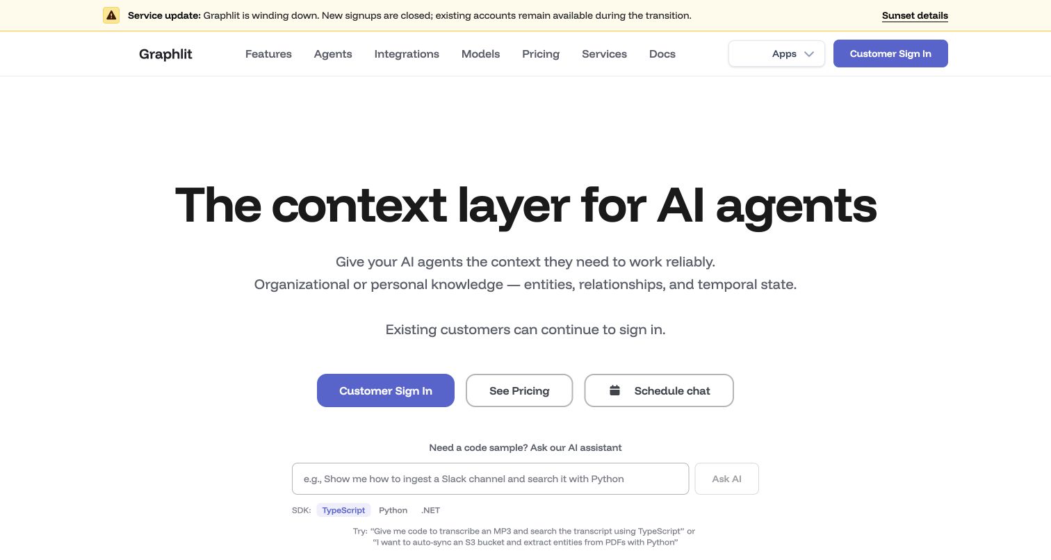
Graphlit's most important element is the notice above its product presentation. On November 11, 2026, the homepage said the service was winding down, new signups were closed and existing accounts remained available during transition. That message changes how the rest of the page should be read. The purple accented context-platform hero, developer language and SDK routes remain useful design references, but they are not an open onboarding invitation. Its privacy page identifies Clerk for user authentication and account management. Here that documentary association is limited to the existing-account service context described by the current public notice.
What you can learn
Operational status belongs ahead of conversion copy when it changes what visitors can do. A clear transition notice should explain availability and point readers toward details without requiring them to discover the limitation after attempting signup.
Pros
The prominent notice establishes the service's current availability before product exploration.
Developer-oriented language and SDK routes still explain the product's original purpose.
Cons & considerations
Remaining promotional material requires careful reading in light of the wind-down notice.
This transitional example should not be used as a recommendation for new account adoption.
Platform source: Official product authentication evidence. Own platform policy identifies Clerk for user authentication and account management. The reviewed homepage announces a wind-down: new signups are closed and existing accounts remain available during transition. This is a documented existing-account relationship, not an invitation to start a new account. Official documentary association with customer account authentication. The public homepage capture does not establish Clerk as a frontend framework, CMS, page builder or complete application architecture. Platform evidence is separate from the direct website screenshot and is not a complete current infrastructure audit.
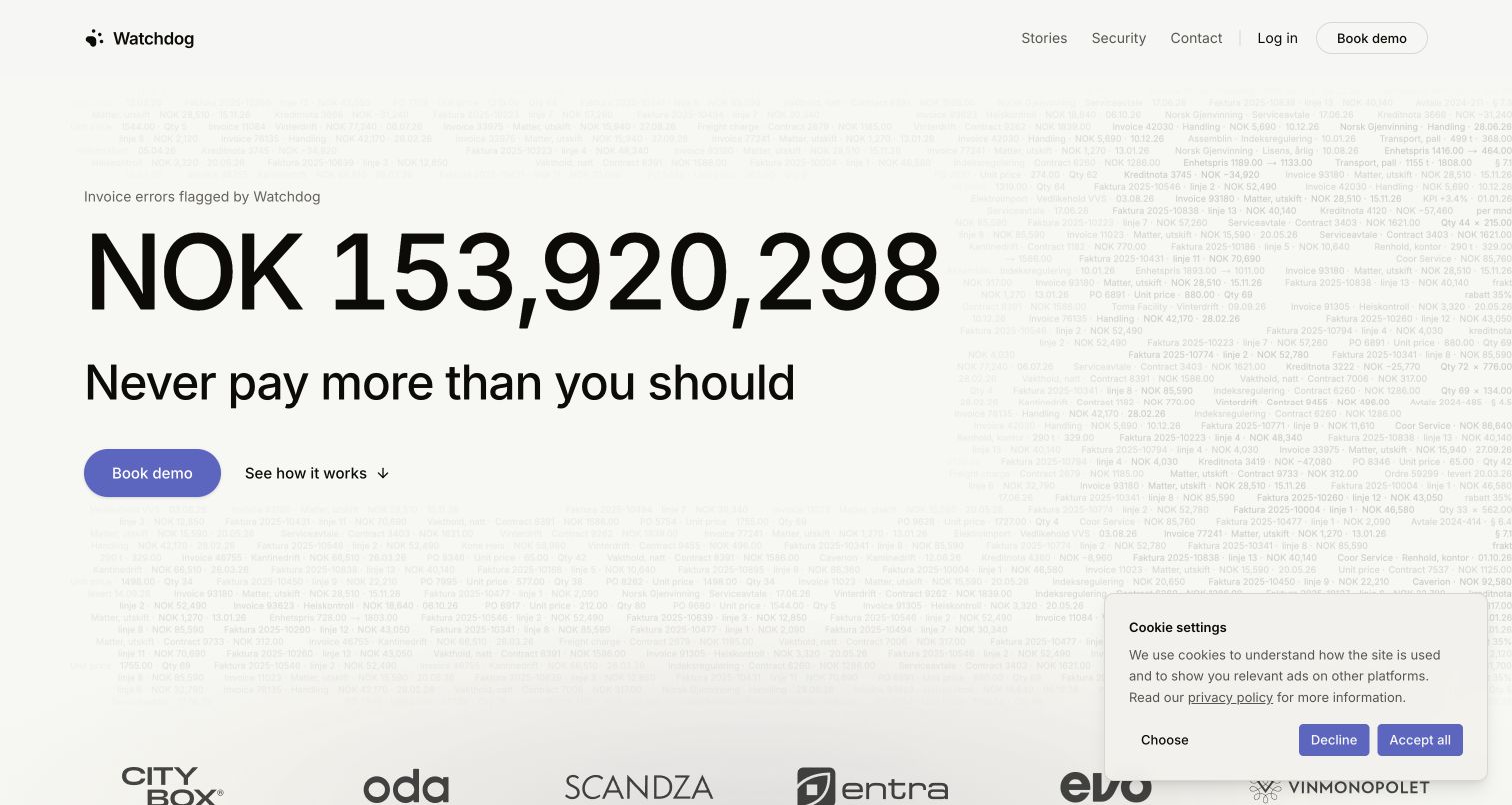
Watchdog centers its opening on a large monetary counter and a concise message about avoiding overpayment. A pale field of invoice-like text gives the otherwise spacious composition a connection to the work being discussed. The purple demo action has a clear secondary explanation route, and the page later breaks the workflow into agreements, invoices, alerts and claims. That sequence turns an abstract savings proposition into a process a buyer can examine. Its own provider register names Clerk for authentication, sessions and organization membership. The association concerns the software account layer, not independent verification of the counter or financial outcomes.
What you can learn
Use a striking problem statement to establish relevance, then immediately explain the steps behind it. When numbers carry the visual argument, distinguish the company's own claims from demonstrated product workflows and independently verified results.
Pros
The limited palette makes the demo action easy to find within a spacious composition.
The staged process gives buyers concrete questions to ask during evaluation.
Cons & considerations
The animated counter can dominate before a visitor understands its basis.
A visible cookie panel occupies part of the opening view and adds competing text.
Platform source: Official product authentication evidence. Own service table names Clerk for authentication, MFA and SSO, with organization membership and sessions. Official documentary association with customer account authentication. The public homepage capture does not establish Clerk as a frontend framework, CMS, page builder or complete application architecture. Platform evidence is separate from the direct website screenshot and is not a complete current infrastructure audit.
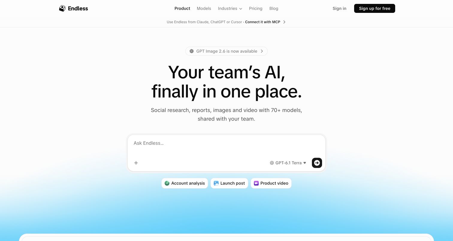
Endless introduces its AI workspace through a centered headline and a prominent composer with model selection and suggestion chips. The white and blue treatment makes the interaction area feel approachable, while login and signup remain clearly identified in the header. Further down, team roles and shared working context broaden the story beyond a single prompt. The public composer is a useful visual explanation, but its presence does not establish the behavior of a paid or authenticated workspace. Endless's subprocessor policy specifically identifies Clerk for authentication, sessions and workspace membership, making the account relationship more precise than a generic vendor logo.
What you can learn
Show the smallest recognizable product action first, then explain how the experience changes for a team. Keep the transition into an account explicit so a demonstration surface does not silently imply access to every collaboration feature.
Pros
The composer makes the product's basic interaction understandable at a glance.
Later team explanations connect individual exploration to the broader business proposition.
Cons & considerations
A familiar prompt box can make differentiated collaboration features easy to overlook.
The captured public state does not demonstrate permissions or actual shared-workspace behavior.
Platform source: Official product authentication evidence. Own service policy identifies Clerk authentication, sessions and workspace membership as essential service functionality. Official documentary association with customer account authentication. The public homepage capture does not establish Clerk as a frontend framework, CMS, page builder or complete application architecture. Platform evidence is separate from the direct website screenshot and is not a complete current infrastructure audit.
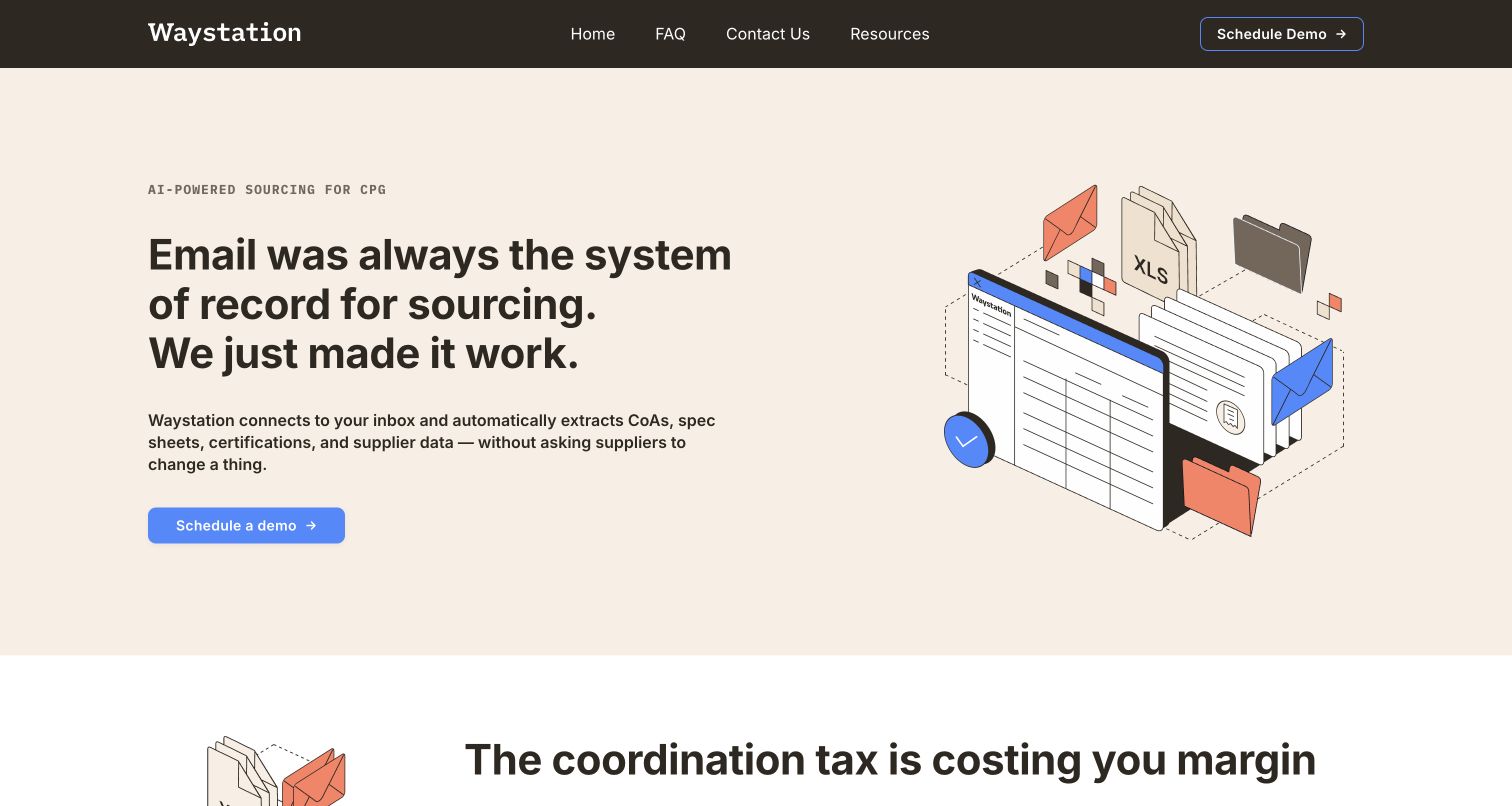
Waystation names its audience and problem directly: sourcing work for consumer packaged goods teams. A warm cream background, dark headline and isometric documents-and-spreadsheets illustration make the opening feel closer to office coordination than abstract AI branding. The main action is a demo request, with the page subsequently explaining process stages and departmental perspectives. That progression is useful for a product whose buyer may need several colleagues to understand the change. The company's platform-infrastructure list names Clerk for authentication, user management and sessions. This supports customer account use, not a claim that Clerk performs the sourcing work or builds the public page.
What you can learn
Specific audience language can do more explanatory work than a long feature list. Show the familiar artifacts people already handle, then map the proposed service onto the responsibilities of the teams involved.
Pros
The sourcing and CPG terminology quickly establishes who the product is for.
The document illustration gives an otherwise abstract automation promise a recognizable setting.
Cons & considerations
A demo-led entrance offers less immediate product exploration for independent evaluators.
Public descriptions do not independently substantiate time savings or procurement outcomes.
Platform source: Official product authentication evidence. Platform infrastructure section names Clerk for authentication, user management and session handling. Official documentary association with customer account authentication. The public homepage capture does not establish Clerk as a frontend framework, CMS, page builder or complete application architecture. Platform evidence is separate from the direct website screenshot and is not a complete current infrastructure audit.
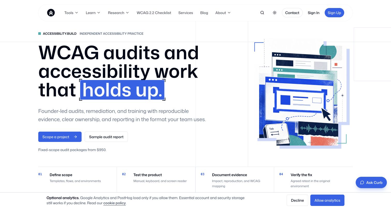
Accessibility.build pairs a blue highlighted headline with a collage of interface details, giving its accessibility services a concrete visual setting. A project-scope action and a sample audit report offer different levels of commitment, while process steps help explain what an engagement includes. The header also exposes resources and account routes, which are distinct from commissioning a review. Its subprocessor register is unusually useful for this collection because it explicitly limits Clerk to account features such as authentication and session security. That does not mean every consulting interaction uses Clerk, or that the homepage itself proves any accessibility conformance claim.
What you can learn
When a website combines professional services and account-based tools, label those journeys separately. Let visitors inspect a representative deliverable before committing, and explain which product features require an account instead of treating authentication as the whole customer relationship.
Pros
The sample-report route offers a concrete way to understand the service output.
Visible process steps make an expert-led engagement easier to evaluate.
Cons & considerations
Service, resource and account paths introduce several competing visitor goals.
The site's claims and visual polish are not independent evidence of standards conformance.
Platform source: Official product authentication evidence. Provider register explicitly limits Clerk to account features: authentication, account management and session security. Official documentary association with customer account authentication. The public homepage capture does not establish Clerk as a frontend framework, CMS, page builder or complete application architecture. Platform evidence is separate from the direct website screenshot and is not a complete current infrastructure audit.
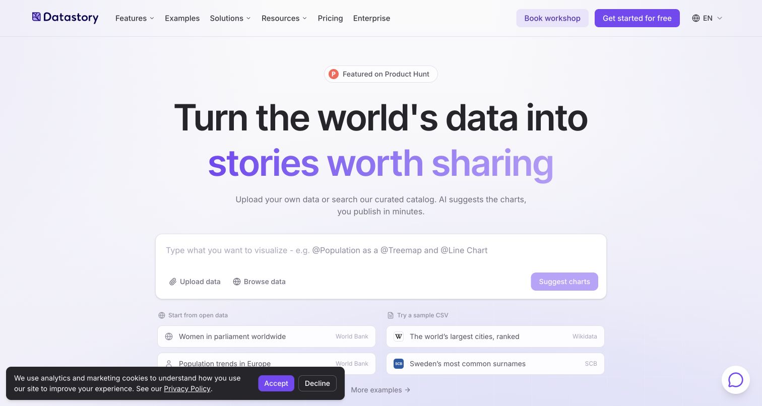
Datastory introduces data storytelling with a large lavender-accented headline and an input-oriented area for uploading or browsing data. Public examples referencing recognizable data sources make the idea more tangible than a generic chart illustration alone. Pricing, enterprise and workshop routes remain visible alongside the account entrance, acknowledging both independent exploration and organizational buying. The page's own provider list identifies Clerk for user authentication, signin and account management, separately from internal business tools. That supports the product-account association. It does not demonstrate what any uploaded dataset would produce, and the review concerns the public presentation rather than a generated analysis.
What you can learn
If a product depends on a user's material, offer understandable public examples before asking for that material. Explain the input, the intended output and the account boundary as distinct steps in the journey.
Pros
Named sample data sources give visitors a concrete starting point for exploration.
Enterprise and workshop routes recognize different levels of support and adoption.
Cons & considerations
An upload-led opening can leave cautious visitors seeking more detail about data handling.
The cookie panel competes with the lower part of the captured opening view.
Platform source: Official product authentication evidence. Own service subprocessor list names Clerk for user authentication, sign-in and account management, distinct from internal CRM vendors. Official documentary association with customer account authentication. The public homepage capture does not establish Clerk as a frontend framework, CMS, page builder or complete application architecture. Platform evidence is separate from the direct website screenshot and is not a complete current infrastructure audit.
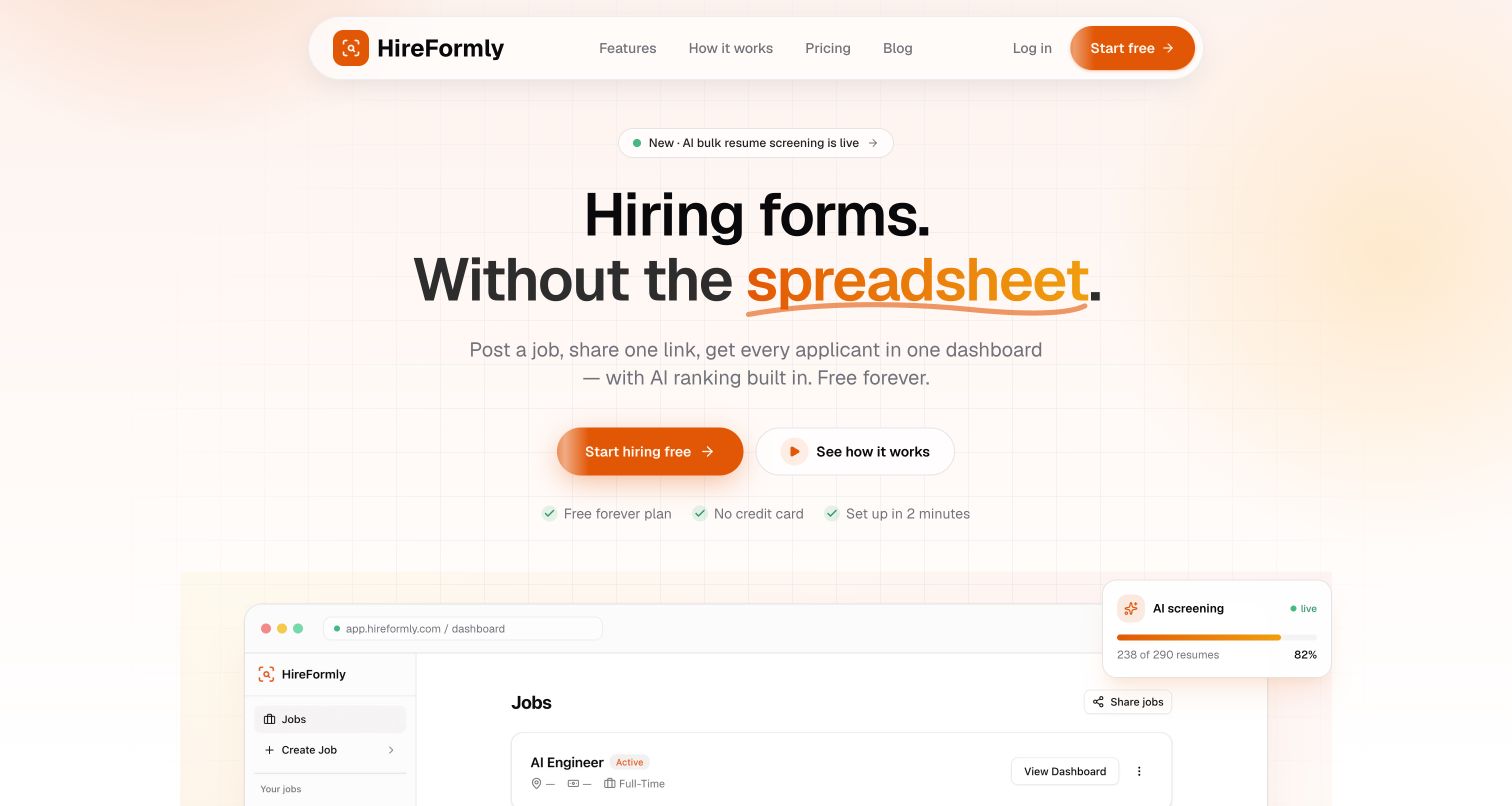
HireFormly uses warm orange accents and a centered message about hiring forms without spreadsheet administration. A prominent starting action, a lower-commitment explanation link and brief trial conditions establish the immediate choices. The large dashboard illustration then introduces how applications may be organized inside the product. This is a practical way to connect a familiar operational frustration to a more structured workflow. Its privacy policy identifies Clerk for signup, signin and account management. The relevant scope is the hiring-service account owner; the source does not establish that applicants submitting a form must authenticate through Clerk.
What you can learn
Describe the workflow being replaced before promoting advanced features. Public product illustrations should clarify what a hiring team will see, while claims about automated assessment need separate scrutiny and should not become implied endorsements through attractive presentation.
Pros
The spreadsheet problem provides an understandable entry point for a busy hiring team.
Trial conditions near the primary action reduce uncertainty about the first step.
Cons & considerations
AI ranking imagery can suggest decision quality that a screenshot cannot establish.
Employer account access and applicant submission are different journeys that require clear labeling.
Platform source: Official product authentication evidence. Policy identifies Clerk signup/signin/account management for hiring-service account owners; no claim that applicant form submissions authenticate with Clerk. Official documentary association with customer account authentication. The public homepage capture does not establish Clerk as a frontend framework, CMS, page builder or complete application architecture. Platform evidence is separate from the direct website screenshot and is not a complete current infrastructure audit.
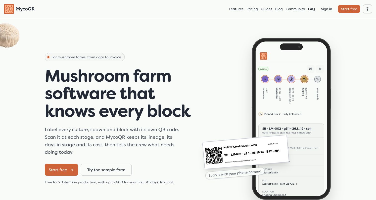
MycoQR immediately identifies itself as mushroom-farm software rather than a generic inventory tool. The opening copy uses concrete terms such as cultures, spawn, blocks and lineage, while a phone-shaped public sample shows how a labeled batch might be represented. Pale green and orange accents support the cultivation theme without replacing the functional explanation. Sample and account actions provide different levels of exploration. Its privacy policy explicitly names Clerk for authentication and account management. That evidence concerns access to the software; the pictured sample is public demonstration material, not a private grower's record or proof of production results.
What you can learn
Specialist software can gain clarity by using the audience's actual objects and terminology. Pair those words with a representative sample, and give readers a way to understand the model before asking them to create their own operational data.
Pros
Cultivation-specific nouns make the intended audience and workflow unusually clear.
The public sample connects QR labeling to a recognizable record structure.
Cons & considerations
Domain-specific language may require explanation for new growers or broader business stakeholders.
The embedded sample takes additional time to settle into the complete opening presentation.
Platform source: Official product authentication evidence. Mushroom-cultivation tracking platform policy explicitly identifies Clerk as its authentication and account-management service. Official documentary association with customer account authentication. The public homepage capture does not establish Clerk as a frontend framework, CMS, page builder or complete application architecture. Platform evidence is separate from the direct website screenshot and is not a complete current infrastructure audit.
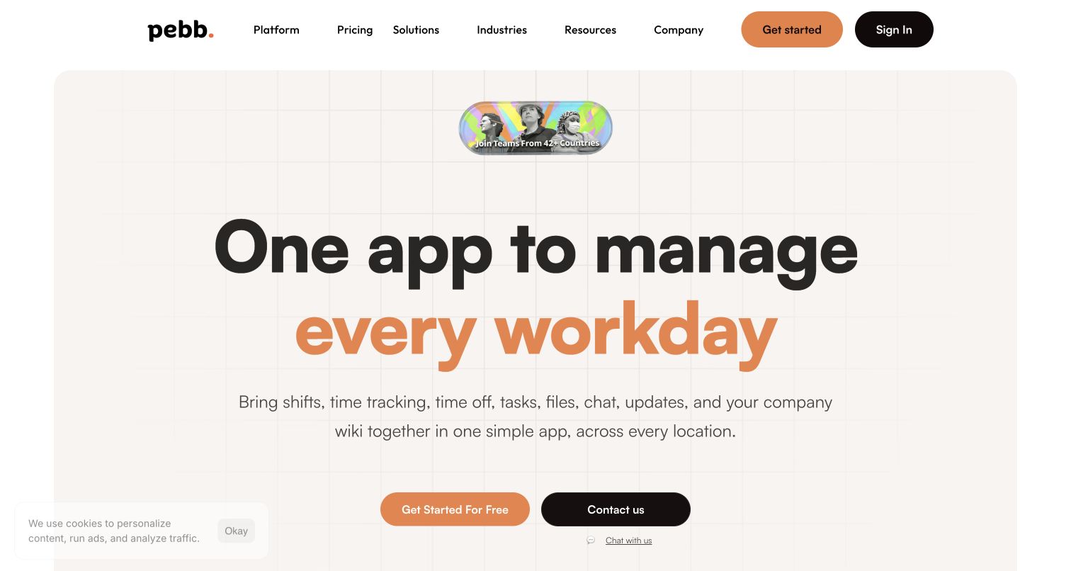
Pebb opens with oversized black and orange typography above a rounded, cream-colored panel. The nearby feature language names everyday work such as shifts, time off, tasks, files and chat, giving the broad employee-management promise practical anchors. Free access and contact routes recognize both small-team exploration and a more involved buying process. Lower sections group communication, operations and collaboration instead of relying entirely on one long capability list. Its subprocessor list places Clerk under customer-platform authentication and identity management, while separating internal developer tools. That distinction supports a product-account relationship without attributing every public feature to the authentication vendor.
What you can learn
A broad platform needs a short organizing idea and concrete examples close together. Group the deeper explanation by recurring work, and make clear when someone can explore independently versus when a conversation may be useful.
Pros
Large typography creates a clear focal point within an otherwise gentle palette.
Everyday work labels help visitors map a broad product onto familiar needs.
Cons & considerations
The many capabilities can still make product boundaries difficult to assess quickly.
The cookie panel covers part of the opening presentation in the captured state.
Platform source: Official product authentication evidence. Customer-platform subprocessor list names Clerk authentication and identity management, while separately identifying internal developer tools. Official documentary association with customer account authentication. The public homepage capture does not establish Clerk as a frontend framework, CMS, page builder or complete application architecture. Platform evidence is separate from the direct website screenshot and is not a complete current infrastructure audit.
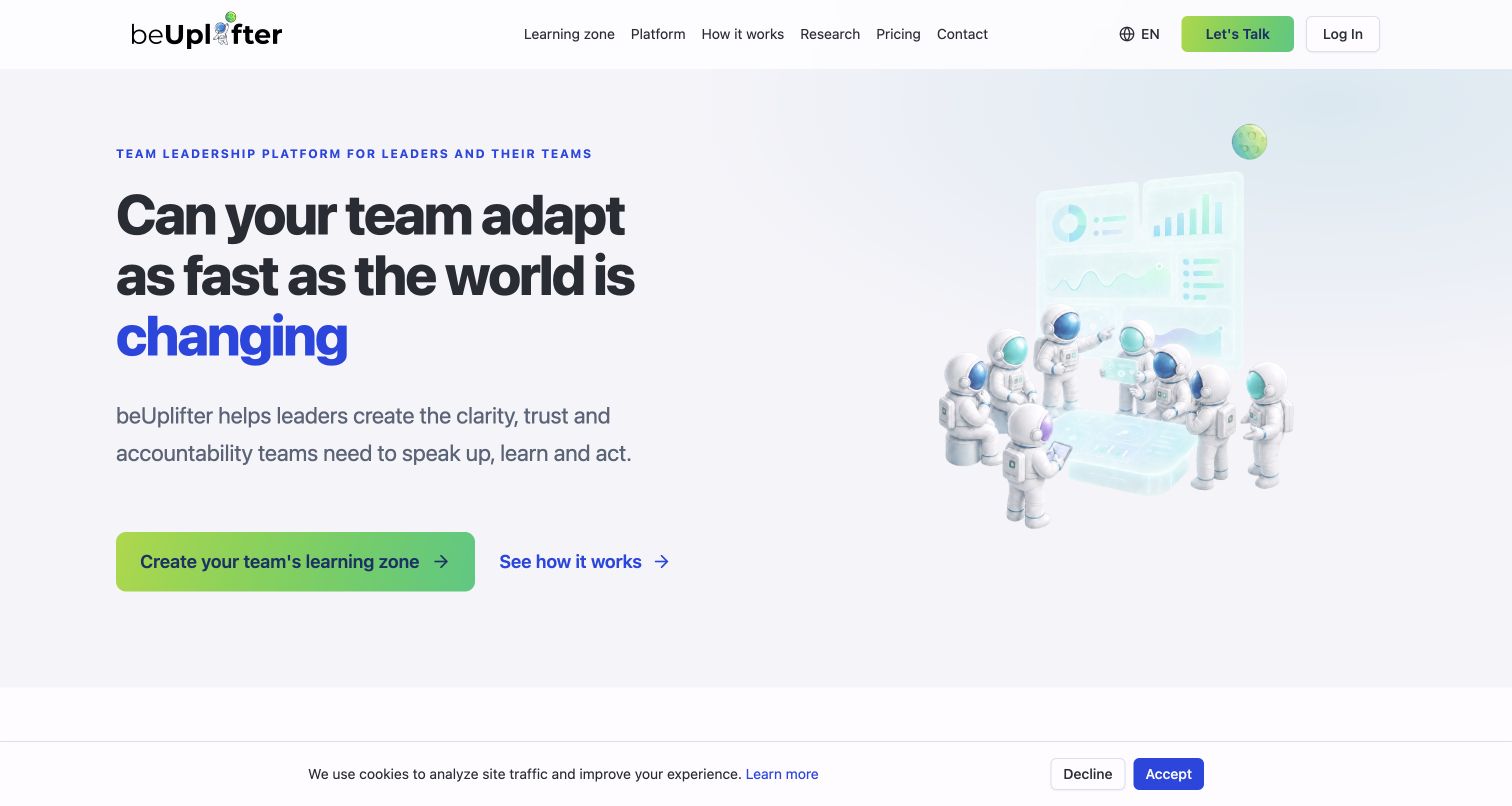
beUplifter asks a large question about team challenges rather than opening with a dashboard specification. A soft blue and green palette, illustrated figures and a nearby product panel make the presentation approachable. The main action introduces the learning-zone concept, while a secondary explanation path and login remain distinct. Lower question cards and role-oriented material help translate the initial idea into organizational situations. The company's provider list names Clerk for authentication and user management involving identity and login data. This supports account access for the service; it does not establish that its leadership methods or team-performance claims have been independently evaluated.
What you can learn
An unfamiliar concept becomes easier to explore when the page begins with a recognizable question and then explains its vocabulary. Keep the route for existing users obvious without letting account controls crowd out the educational introduction.
Pros
The question-led headline encourages readers to connect the product to a real team concern.
Soft illustration and clear secondary routes make the concept feel less technical.
Cons & considerations
Learning-zone terminology needs additional explanation before visitors can judge practical fit.
The public page cannot demonstrate changes in team behavior or organizational outcomes.
Platform source: Official product authentication evidence. Own service subprocessor list names Clerk for authentication and user management with identity/login data. Official documentary association with customer account authentication. The public homepage capture does not establish Clerk as a frontend framework, CMS, page builder or complete application architecture. Platform evidence is separate from the direct website screenshot and is not a complete current infrastructure audit.
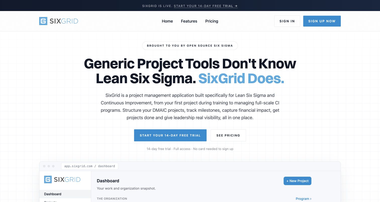
SixGrid makes its distinction explicit in the headline: the product is organized around Lean Six Sigma rather than generic project tracking. A faint grid, blue accents and a broad dashboard preview reinforce the structured character of that promise. Trial and pricing actions sit beneath copy naming DMAIC projects, milestones and financial impact. The lower page expands into practitioner, leadership and training audiences, making the same product relevant from several perspectives. Its privacy policy covers the public site and app.sixgrid.com and identifies Clerk for authentication and session management. That documents the account layer, not the accuracy of any illustrated savings or project results.
What you can learn
If a professional method is the differentiator, show its vocabulary and artifacts early. Let audience sections explain how the same structure serves different responsibilities instead of diluting the proposition into generic productivity language.
Pros
The method-specific headline quickly distinguishes the product from broad project-management tools.
Trial conditions and pricing access make the first commercial decision reasonably clear.
Cons & considerations
Specialist terminology may leave newcomers needing introductory context before evaluating the product.
Dashboard illustrations explain structure but do not substantiate financial improvement claims.
Platform source: Official product authentication evidence. Policy explicitly covers app.sixgrid.com and sixgrid.com and identifies Clerk for user authentication and session management. Official documentary association with customer account authentication. The public homepage capture does not establish Clerk as a frontend framework, CMS, page builder or complete application architecture. Platform evidence is separate from the direct website screenshot and is not a complete current infrastructure audit.
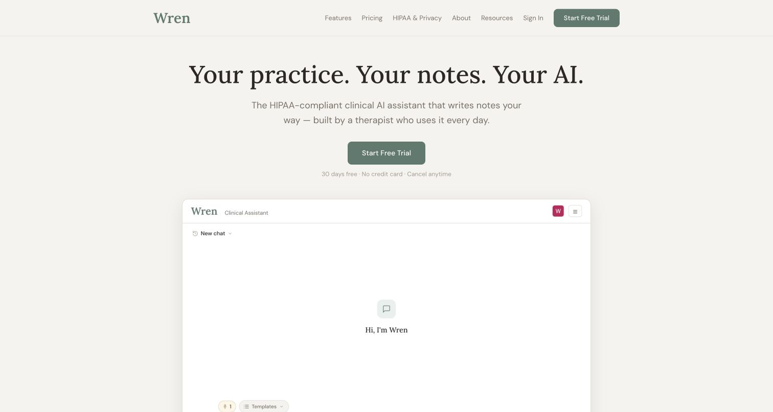
Wren Clinical uses a warm neutral background, serif headline and muted green actions to introduce its note-writing product. The large interface preview avoids a crowded feature collage, while trial conditions sit close to the main action. Further down, the page explains input methods, review steps and the founder's professional context. Privacy information has a visible navigation route rather than being confined to the footer. Its provider register names Clerk for therapist identities, sessions and organization membership, specifically separating that scope from patient information. The review therefore concerns practitioner account access and public presentation, not independent verification of clinical quality or regulatory compliance.
What you can learn
For sensitive professional work, give visitors an understandable workflow and a prominent route to the relevant data-handling information. Keep account identity, clinical content and the user's review responsibility clearly differentiated in both product explanation and technical evidence.
Pros
The quiet layout makes the main proposition and trial conditions easy to read.
Visible privacy navigation and a staged workflow support more informed evaluation.
Cons & considerations
The simple opening reveals limited detail about the full working interface.
Homepage statements about compliance and clinical usefulness require their own independent assessment.
Platform source: Official product authentication evidence. Own web-app vendor list identifies Clerk login, session tokens and tenant organizations for therapist identities only; does not assert access to patient data or clinical records. Official documentary association with customer account authentication. The public homepage capture does not establish Clerk as a frontend framework, CMS, page builder or complete application architecture. Platform evidence is separate from the direct website screenshot and is not a complete current infrastructure audit.
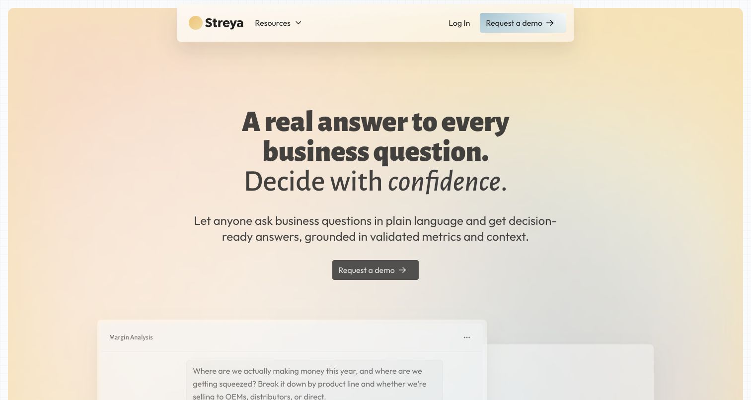
Streya places a direct business-question headline over a soft peach-to-blue background. A compact floating header and one demo action keep the opening focused, while the first product illustration begins just below the main copy. Further down, a public sample conversation shows questions, tables and explanatory answers, followed by a dashboard example and a staged onboarding process. These samples make the proposed interaction easier to understand without exposing a customer workspace. Its privacy policy explicitly describes the web application and names Clerk for account authentication. That supports the sign-in relationship, not the accuracy of sample analyses or a claim about access to customer warehouses.
What you can learn
Show a representative question and the shape of an answer when a product's interface is conversational. Pair that demonstration with an explanation of setup and data context, so a smooth sample does not imply effortless results in every organization.
Pros
The restrained opening gives the business purpose more emphasis than a list of integrations.
Conversation and dashboard samples make two related product modes concrete.
Cons & considerations
A demo-only action limits immediate exploration beyond the public examples.
Illustrative answers do not independently validate analytical accuracy or customer data protections.
Platform source: Official product authentication evidence. Own policy explicitly says the product is a web application and names Clerk for authenticating service accounts. Official documentary association with customer account authentication. The public homepage capture does not establish Clerk as a frontend framework, CMS, page builder or complete application architecture. Platform evidence is separate from the direct website screenshot and is not a complete current infrastructure audit.
Kegan has 15+ years of experience working with small businesses, Fortune 500 companies, and everything in between. No development job is too big or too small: he brings the same hands-on attention to a focused improvement, a complete website, or a custom application.
For Clerk projects, he can help with responsive interfaces, reusable components, custom functionality, API connections, and performance-minded implementation. He works directly with clients on scope, design, implementation, testing, and handover, with an emphasis on clear communication and a system that remains practical to maintain after launch.
Show 3 other Clerk developersHide other Clerk developers
Choose the account journey that matches the product
An individual account after public exploration
Let visitors understand a useful example, relevant documentation or the basic service before asking them to commit. Make the account action specific enough that its destination is predictable. Explain trial conditions near the decision, and give returning users a direct sign-in route that remains stable as the marketing page evolves.
A team workspace with explicit membership
A collaborative product needs clear distinctions between creating a workspace, accepting an invitation and switching an existing context. Explain the responsibility of the person setting it up. The page should not use an ambiguous start button to conceal whether someone is creating a new organization or joining an established one.
A guided demonstration before account access
Specialist operational tools may need a discussion about fit, setup or data requirements before an account is useful. A demo-led site should still show concrete workflows and representative outputs. Give the visitor enough information to decide whether a conversation is appropriate, without suggesting that a public screenshot proves a completed implementation.
From references to requirements
Plan the boundaries between the website and the application
Map every entrance and return path
List the public homepage, documentation, pricing, signup, signin and invitation entrances. Write down where each should lead after a successful or interrupted step. Use consistent product names and action labels across those surfaces so people can recognize where they are and why an account is being requested.
Define the identity and resource model
Decide which records belong to a person and which belong to a team. Document the roles that can view, edit or administer them. Include account departure, membership removal and recovery in the design discussion rather than treating the first successful signup as the entire lifecycle.
Keep asynchronous events out of critical assumptions
Clerk's webhook documentation explains that events arrive asynchronously and are unsuitable as an assumed immediate dependency in onboarding. Decide which application steps require a direct response and which can follow later. Where events update local records, account for duplicate or out-of-order delivery and validate the event source.
Changes to availability, trials or service retirement should appear before an obsolete conversion promise. Explain the account provider's role in the appropriate privacy or subprocessor material, keeping identity data distinct from the product's other information. Revisit these explanations when the service changes rather than relying indefinitely on its launch copy.
A useful handover demonstration
Ask the actual team to carry out its routine job: publish a realistic update, correct a mistake, preview a narrow screen, and identify who owns an integration failure. For a library or frontend framework, also ask who maintains the content source and deployment. A polished screenshot does not answer those operational questions.
Beyond the screenshot
A practical Clerk product-entrance checklist
Name the product or workspace that the account action will open.
Keep signup, signin, invitations and demo requests clearly distinguished.
Offer useful public examples or documentation before unnecessary account commitment.
Show relevant trial conditions close to the decision they affect.
Document individual ownership, team membership and authorization responsibilities.
Plan recovery, interrupted journeys and returning-user navigation.
Separate synchronous onboarding requirements from later event-driven updates.
Review keyboard navigation, labels, error messages and small-screen reading.
Keep provider disclosures specific to the data and functions actually involved.
Update prominent availability notices when a product closes signup or changes service status.
Test with real content, a keyboard, a small screen, slow or failed requests, and the people who will maintain the system. These are planning checks, not an accessibility, security, performance, or search-ranking certification.
Sources & editorial method
How this Clerk collection was reviewed
The twenty public homepages were reviewed and directly captured on November 11, 2026. Each property has a primary policy, trust-center row or engineering source identifying its customer authentication relationship with Clerk. The three dynamic trust-center entries were read in their public rendered tables. Documentary sources establish the stated account scope, not a complete current stack or proof that Clerk renders the homepage. Reflag's February 2025 engineering account retains its historical context. Graphlit's current wind-down and closed-signup notice is reflected explicitly. A separate bounded public-source technology audit was attempted for every exact captured page; unavailable or partial results remain qualified. Reviews assess the visible public design and information structure, without treating a screenshot as a test of authenticated behavior, business outcomes or compliance.
Every image is an unmodified capture from the actual website, with its source and capture date. Some captures are reused from our shared catalog; their dates remain the original capture dates. None comes from a vendor gallery or a generated reconstruction. Moving imagery and live content can change.
Technology attribution uses public page assets or metadata, official platform documentation, or a cited first-party project case study. Documentary and framework-relationship evidence is identified where used; it is not a complete current backend inventory. A CMS image CDN alone does not establish a full CMS deployment. A library’s presence does not prove which individual controls use it, and a platform label does not establish AI authorship.
The composition notes, lessons, pros and tradeoffs are original editorial observations. We have not measured conversion, traffic, security, performance or accessibility conformance. Website owners retain their brands and imagery; these examples are not our client portfolio. Written, Edited and Curated are independent records, not dates advanced by a build. See our editorial standards or suggest a correction.
Questions worth asking
Clerk website development FAQs
Are these websites built with Clerk?
The sources establish a more specific relationship: Clerk supplies documented account authentication or related identity services for the named product. That does not identify the marketing website's CMS, frontend framework or complete architecture. Each example states the supported scope.
Why show a homepage instead of a signed-in account?
The homepage is the public entrance people use to understand a product and choose a next step. It can be reviewed without exposing a customer's workspace. The separate primary source supports the account-technology claim; the screenshot supports the design observations.
Does every product need an organization or team step?
No. Shared workspaces can benefit from organization membership and role context, while a product used only for personal resources may not need that structure. Choose the model from the product's ownership and collaboration requirements rather than adding team setup by default.
Does successful signin prove a user can access a record?
No. Authentication identifies the user; the application must also enforce the relevant authorization rules. A public account-provider statement does not prove that a particular product's resource permissions have been independently tested.
Why is a product that is winding down included?
Graphlit provides a concrete example of communicating a service transition before the product pitch. Its November 11, 2026 notice says new signups are closed and existing accounts remain available during transition. It is included with that limitation, not recommended as a new onboarding destination.
How current is a documentary authentication claim?
The review date records when the cited public source was inspected. An older engineering article remains an older implementation account, and a current provider register still describes only its stated scope. Neither should be treated as an independent test of every feature in the live application.
Borrow a clearer account label, a useful public example or a better explanation of team context. Then make the authentication journey fit your own product's promises, permissions and lifecycle.