Best Stationery Store Websites of 2026 (27 Real-World Examples)
Stationery store website examples that make paper, pens, formats and thoughtful gifts easier to discover and compare.
A stationery store website should make a small object feel tangible while explaining exactly which version a customer is buying.
A visitor replacing a favourite pen refill has a different task from someone choosing a first planner or a gift. Good stationery websites accommodate both: precise search and product information for the familiar purchase, plus clear categories, useful photography and practical guidance for discovery.
This collection includes local paper shops, writing specialists and broader stationery retailers. Compare how they present paper formats, ink and pen compatibility, maker identity, physical stores and seasonal gifts. The reviews concern website design and editorial presentation, not product quality, fulfilment reliability or a ranking of the businesses.
Before the examples
What makes good stationery store website design in 2026?
Make small differences easy to compare
Show notebook size, ruling, page count, binding and planner year consistently. Pens need their writing type, tip or nib options and refill compatibility explained. Keep the manufacturer’s exact model names searchable while giving unfamiliar terms short, useful explanations. A beautiful cover does not tell a shopper whether the inside suits their purpose.
Photograph use as well as packaging
Show an open page, a pen beside a hand or familiar object, and an ink mark where appropriate. Identify the variant shown and distinguish a styled scene from the items included in a purchase. Keep colour and paper claims qualified; a screen image is not a guarantee of physical colour or writing performance.
Connect online discovery with practical service
State where orders can be delivered, how collection works and whether physical-store stock matches the website. Give workshops, personalisation and store visits their own clear routes. Keep opening hours, event dates and seasonal campaigns current without changing evergreen product information unnecessarily.
The collection · 27 examples
27 stationery store websites worth studying
Compare these real stores for their treatment of product detail, paper texture, specialist guidance and the pleasure of finding something useful for a desk or journal.
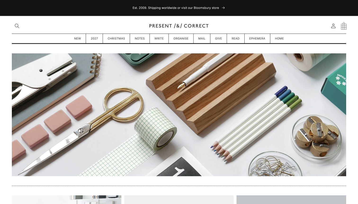
Present & Correct makes ordinary desk objects feel worth examining. Its opening photograph arranges a wooden pen tray, scissors, clips and writing tools with enough space to read their shapes. Thin rules and a compact row of categories echo the order of that photograph. Labels such as Notes, Write, Organise and Mail describe familiar activities, while Ephemera gives the unusual stock a clear home. The Bloomsbury shop announcement connects the online collection to a real place. This is a restrained presentation with a recognisable point of view, although the image does more explanatory work than the opening copy.
What you can learn
Borrow the relationship between product styling and navigation: an orderly photograph works best when the categories are equally deliberate. Add a short explanation or clear destination where an unfamiliar visitor might otherwise admire the composition without knowing what to explore next.
Pros
The photographed objects establish a coherent desk-focused assortment.
Simple activity labels keep a specialised catalogue approachable.
Cons & considerations
The opening image has little explicit guidance for a first-time visitor.
Terse categories may need supporting descriptions for unusual vintage items.
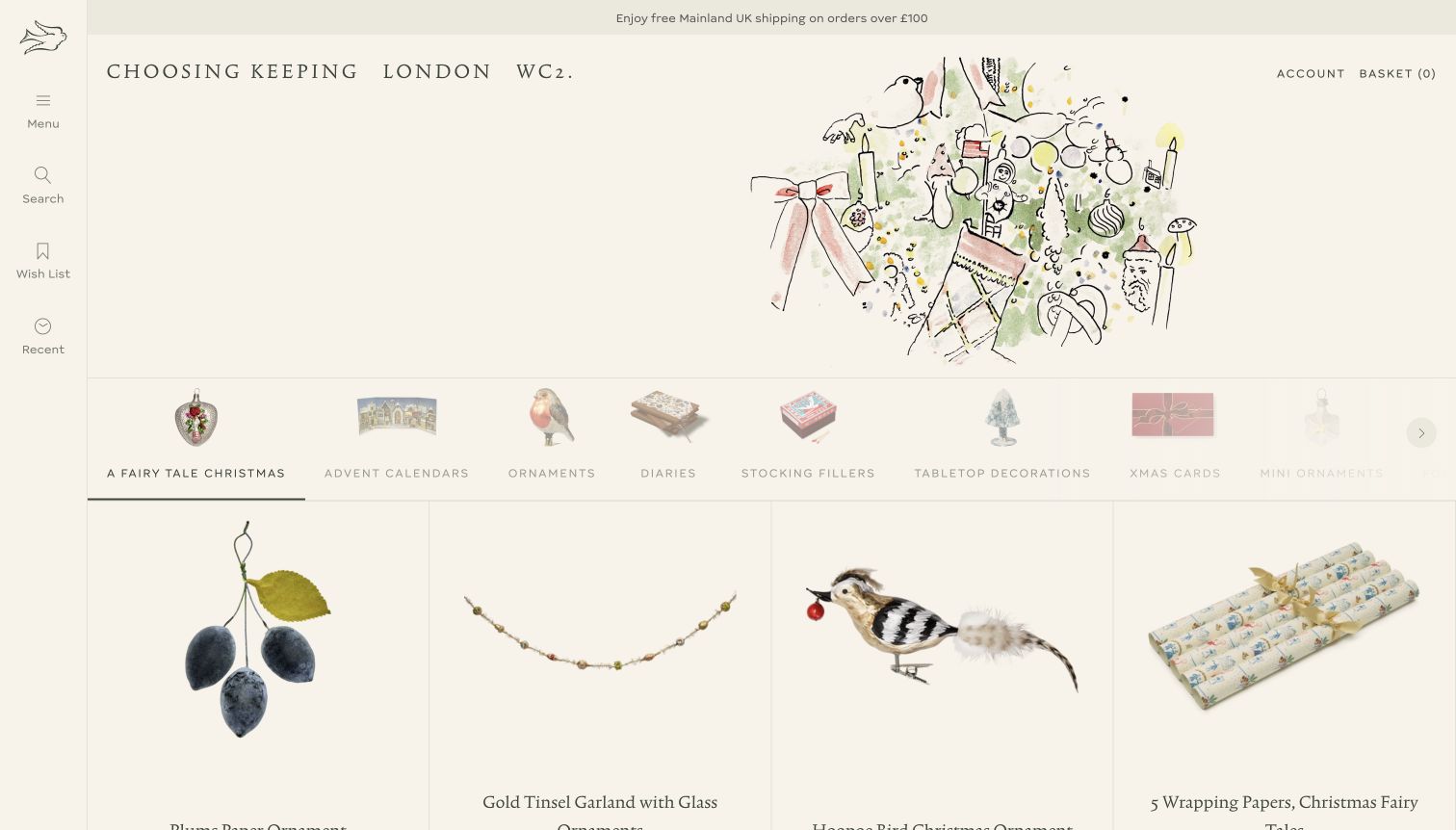
Choosing Keeping uses a pale paper background, widely spaced lettering and drawn imagery to create a shop-window mood. The visible seasonal illustration sits above a line of small category images and larger individual objects, so browsing feels closer to inspecting a display than reading a conventional promotional banner. A narrow vertical tool strip keeps menu, search, wishlist and recent items at the edge. Elsewhere, named people’s desk collections and maker stories offer editorial routes through the range. The presentation rewards curiosity, but the unusual navigation and seasonal decorations can delay a straightforward search for everyday paper or pens.
What you can learn
A distinctive visual world can support a small shop without filling the screen with slogans. Pair that world with recognisable product categories and readily discoverable search, so both curious gift shoppers and people replacing a specific notebook have a useful route.
Pros
Illustration and generous spacing make individual objects stand out.
Desk collections provide a human editorial angle on the assortment.
Cons & considerations
The vertical utility navigation takes a moment to interpret.
Seasonal ornaments can overshadow the core stationery range.
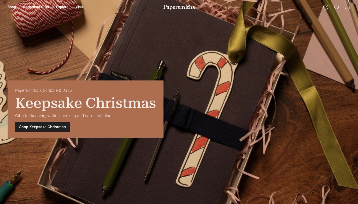
Papersmiths opens with a richly styled notebook gift scene: ribbon, paper and pencils are arranged as a coordinated set. A rust-coloured panel introduces the seasonal collaboration and gives it a specific shopping destination. The slim Shop, Christmas Gifts, Explore and Visit navigation leaves the photography room to breathe. Below the campaign, new-arrival cards name notebook colours and show complementary accessories, making the visual theme continue into actual products. This is useful inspiration for a retailer with a recognisable own-brand range. The tradeoff is that a very short top menu and a large seasonal story require more discovery from a visitor looking for a particular paper format.
What you can learn
Use a campaign to demonstrate how products belong together, then repeat the same names and visual cues in the shopping cards. Keep an obvious path to the full stationery range alongside the gift story rather than making the promotion the only way in.
Pros
The gift scene shows relationships between notebooks, packaging and accessories.
A dedicated campaign panel provides a clear next step.
Cons & considerations
Broad top-level labels conceal the detailed category structure.
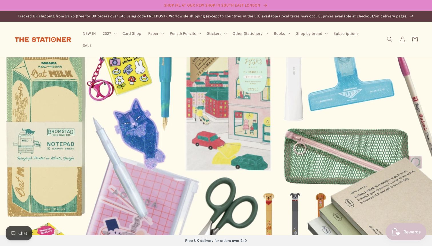
The Stationer combines an orange wordmark, a cream background and a bright collage of notebooks, pens, scissors and small desk tools. Its category row is more literal than the playful branding: Paper, Pens & Pencils, Stickers and Other Stationery sit alongside brands, subscriptions and sale items. A shop announcement gives the online store a local connection. Below the opening image, the welcome copy describes a functional desk, while new products and recognisable stationery ranges bring the idea back to shopping. The homepage has warmth without abandoning product names, though announcement strips and floating loyalty or chat controls can compete with the merchandise.
What you can learn
Let colour and illustration express personality while the menu does straightforward work. Group products by how customers actually ask for them, and be selective about announcement bars so a local-store message, shipping offer and rewards prompt do not all demand equal attention.
Pros
Clear product departments support the colourful visual treatment.
The range is shown as real desk objects rather than abstract decoration.
Cons & considerations
Several promotional and utility elements share the opening space.
Long navigation needs careful prioritisation as the assortment grows.
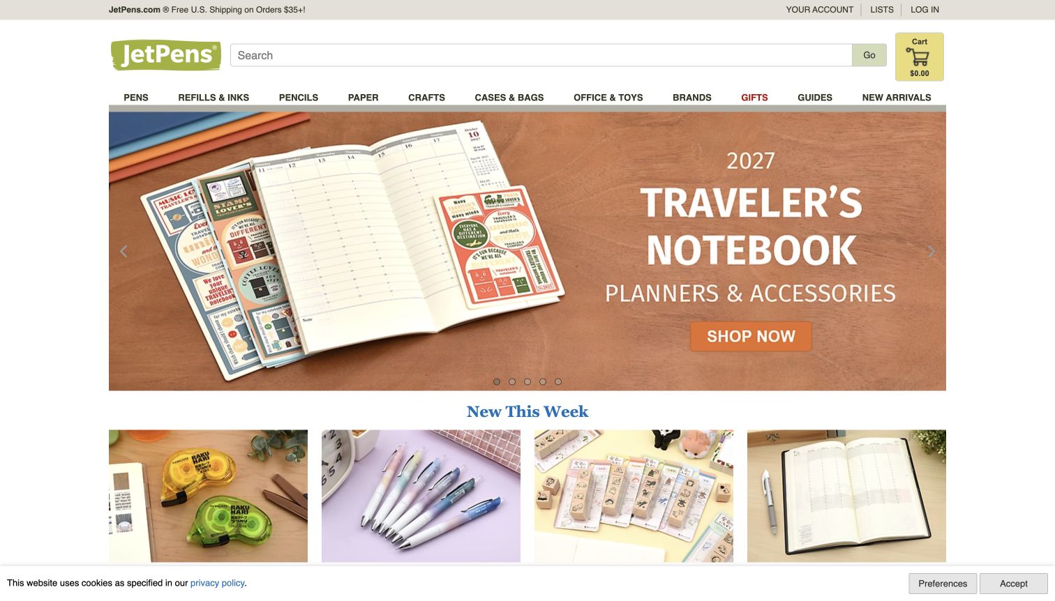
JetPens gives search a prominent position and divides the catalogue into pens, refills and inks, pencils, paper, cases and other practical departments. The captured hero shows an open planner with accessories, linking a specific planning system to the objects used with it. New-this-week tiles provide a quick route to recent additions without replacing the stable category structure. Guides also have a visible place in the navigation, which is especially useful when products differ by refill, tip or paper compatibility. The page is information-rich rather than sparse; that density is valuable for a repeat buyer but gives a newcomer many simultaneous choices.
What you can learn
Organise technical details around the questions a customer brings: a compatible refill, a paper format or a writing purpose. Keep educational guides near the product routes, and use a few concrete demonstrations to make a large specialist catalogue less intimidating.
Pros
Search and refill categories acknowledge precise repeat purchases.
Planner photography demonstrates related products in context.
Cons & considerations
The compact header contains many competing destinations.
A broad assortment requires strong category explanations beyond the homepage.
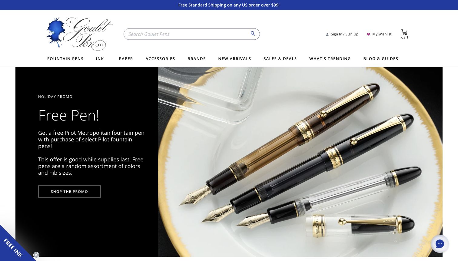
The Goulet Pen Company pairs a calligraphic identity with a large search field and explicit Fountain Pens, Ink, Paper and Accessories departments. Blog & Guides is part of the same navigation, giving learning a place beside shopping. The captured promotion combines a clear offer panel with a large pen photograph and visible conditions. Further down, featured-product tabs distinguish new arrivals, coming-soon items, sales and best sellers; product names retain useful colour and nib detail. This makes the catalogue feel specialist rather than generic, although a strong promotional hero can dominate the first impression for someone seeking basic pen advice.
What you can learn
Give educational material the same navigational credibility as product categories. Keep promotional conditions close to the offer, and preserve exact model and variant names in product cards so attractive photography does not leave a customer guessing which pen is being shown.
Pros
Learning routes are integrated into the main shopping navigation.
Product cards retain specific variant information and comparison cues.
Cons & considerations
The opening offer takes priority over beginner orientation.
Several featured tabs require deliberate exploration to see the wider range.
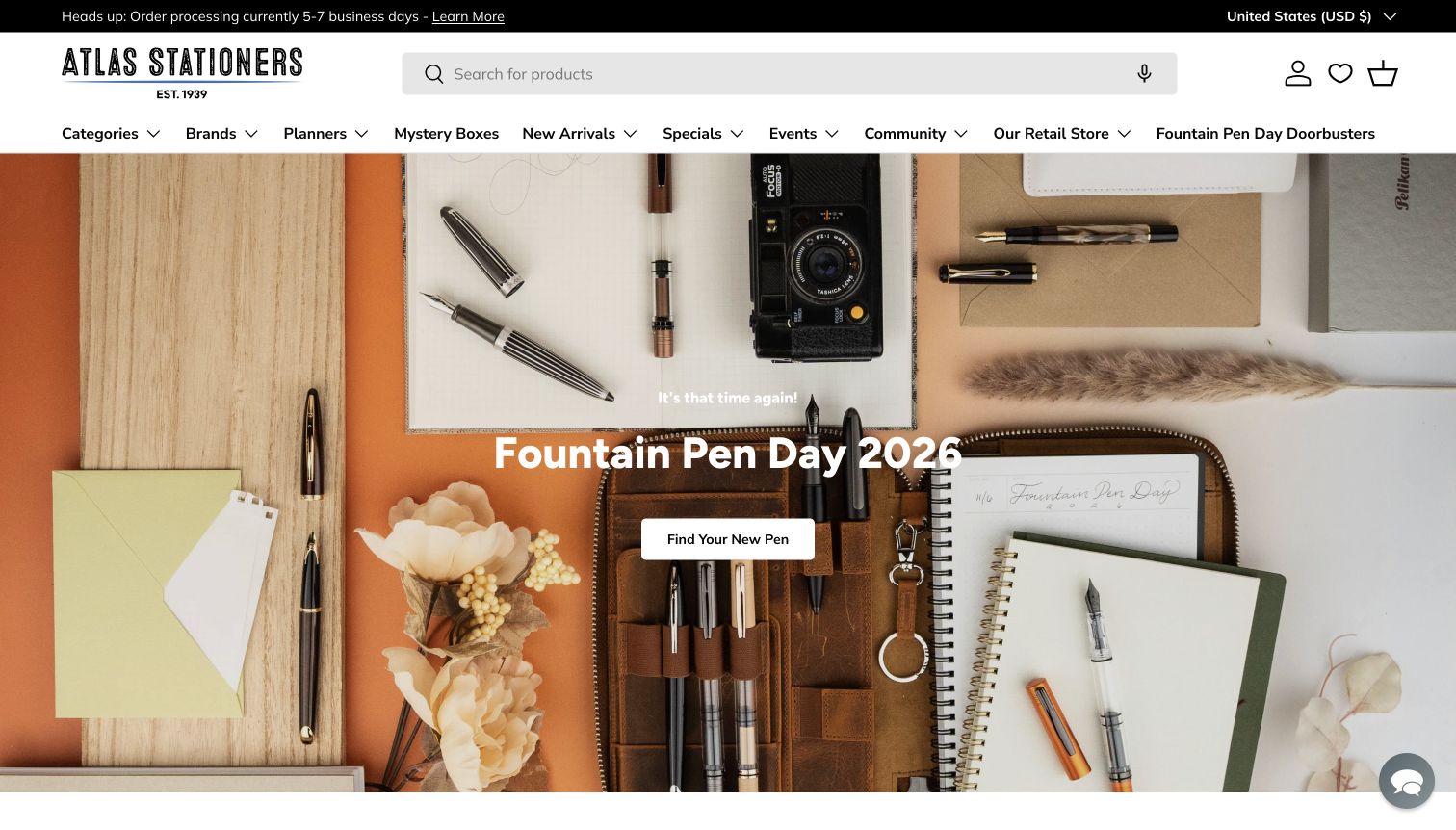
Atlas Stationers opens with an unusually useful operational notice: the current processing-time message has its own information link. Beneath a large wordmark and search field, the navigation includes products, planners, events, community and the retail store. The main desk photograph connects pens and notebooks to a familiar working environment, while the seasonal campaign provides a direct shopping action. Product cards retain variant names and option-selection prompts instead of implying every item has one interchangeable version. The combination acknowledges both local visitors and online buyers, but the long menu and prominent promotion make the opening screen fairly busy.
What you can learn
Use the header to communicate practical conditions that affect an order, not only incentives. A physical stationery store can also make events and local visits easy to discover while keeping product search prominent enough for customers who already know what they want.
Pros
A current processing notice is visible before shopping begins.
Events and the physical store have explicit navigation routes.
Cons & considerations
The extensive top menu spreads attention across many priorities.
Seasonal promotion can eclipse the shop’s everyday service information.
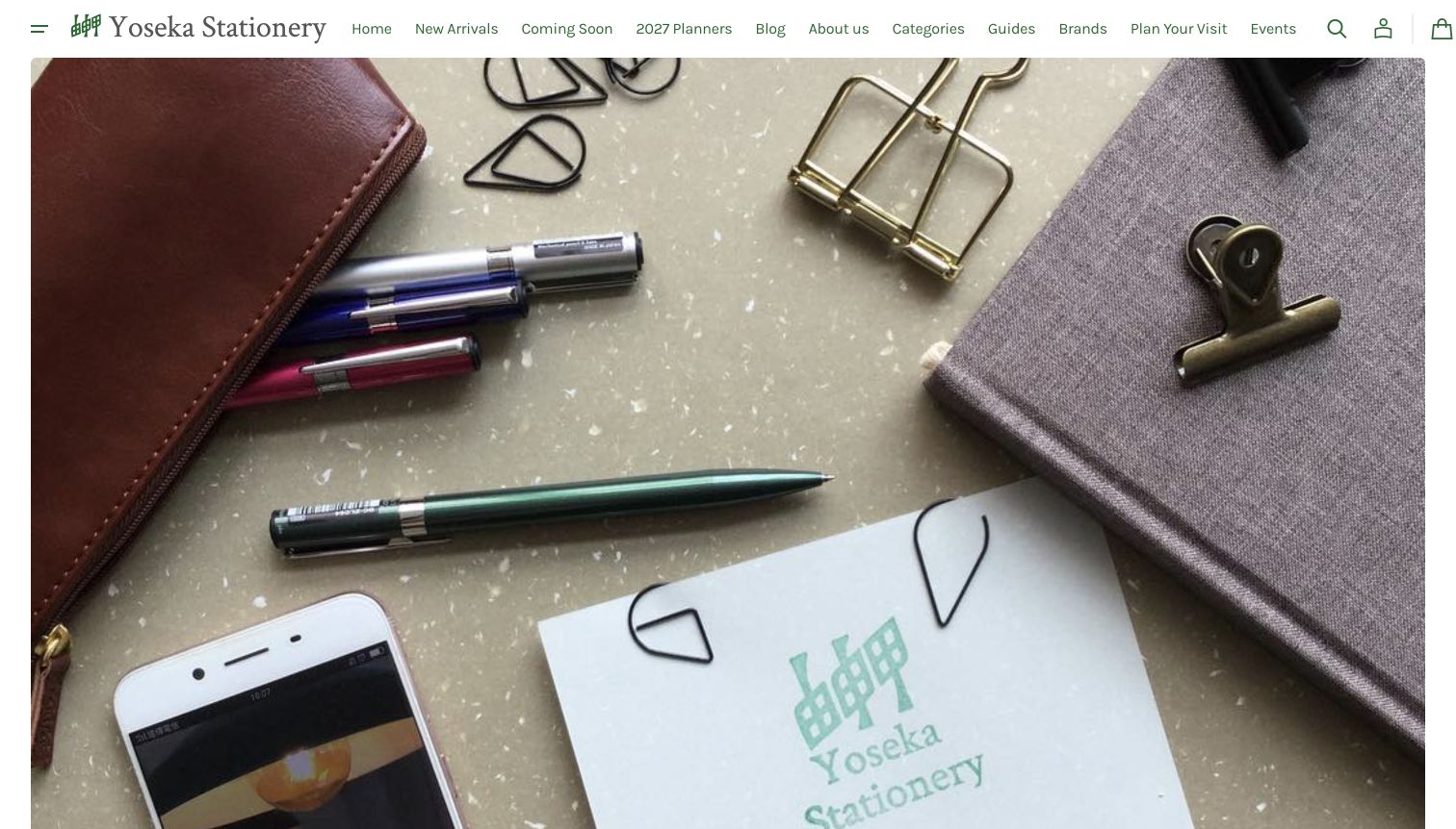
Yoseka’s opening photograph brings the visitor close to a pouch, writing tools and a notebook rather than presenting a conventional sale panel. A small green identity and fine navigation keep that image central. The surrounding catalogue is more detailed than the quiet first screen suggests: planner years, formats, languages and preorder or sold-out states appear in product names and labels. Guides explain systems such as Hobonichi, Traveler’s and PLOTTER, while visiting and event links connect the collection to a physical stationery community. The visual restraint is appealing, but the opening image offers little explicit direction and the number of specialist routes can overwhelm a newcomer.
What you can learn
Use close product photography to convey texture and scale, then supply the terminology needed to choose the right format. Clear guides and availability labels are particularly important when notebooks, covers and inserts look similar but are not interchangeable.
Pros
Detailed format and language labels help distinguish planner products.
Guides, events and visit information support the specialist range.
Cons & considerations
The opening photograph has limited explanatory copy or direction.
Many specialist navigation choices assume some familiarity with the products.
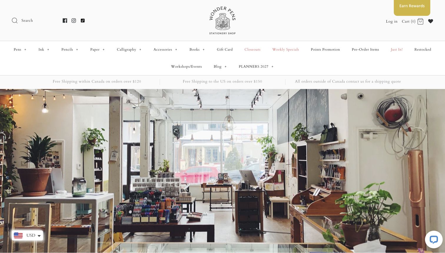
Wonder Pens begins with the interior of its Toronto shop: shelves, plants and a working desk communicate the setting before any promotional message. A small illustrated ink-bottle identity and airy typography reinforce that quieter tone. The page then explains the family-run shop and its interest in handwriting, supported by address, hours and contact details. Product navigation is extensive, covering pens, ink, paper, calligraphy and workshops alongside new, restocked and preorder items. The result feels rooted in a real place. Its main weakness is the amount of small navigation text, which can make a simple product-finding task feel more complicated than the welcoming photograph suggests.
What you can learn
A genuine interior photograph can establish local identity more convincingly than a generic lifestyle image. Support it with current visit details and a concise category structure, keeping beginner guidance and workshop information easy to distinguish from shopping filters.
Pros
The real shop image gives the online store a specific sense of place.
Visit details and introductory guidance support people new to the range.
Cons & considerations
The two-row menu contains many similar merchandising destinations.
The hero does not provide a strong immediate shopping action.
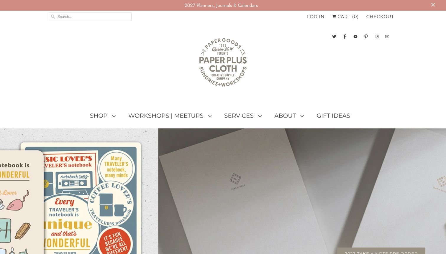
Paper Plus Cloth gives workshops and meetups a place in its main menu alongside shopping, services and gift ideas. The large circular identity and generous white header make the store feel like a creative destination rather than a discount catalogue. The captured campaign places planner products side by side, using close material photography and recognisable covers. The page’s broader content connects imported stationery with its Toronto shop and community activities. This is a useful model for a retailer whose offering extends beyond products, although the tall header pushes the actual campaign and its labels lower on the first screen.
What you can learn
Separate workshops, services and products into clear routes, then show how they belong to the same creative practice. Keep branding compact enough that visitors can see both the featured material and its next step without having to scroll past a large identity block.
Pros
Workshops and meetups are easy to find from the main navigation.
Planner photography gives concrete evidence of the shop’s specialist range.
Cons & considerations
The generous logo area consumes substantial opening-screen space.
Several rotating campaigns require scrolling or interaction to discover fully.
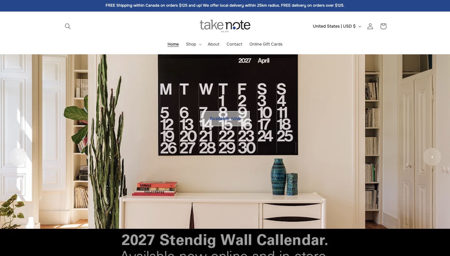
Take Note keeps the main navigation short: Shop, About, Contact and Online Gift Cards sit beneath a centred wordmark. The captured hero shows a large calendar in a furnished room, making its scale easier to understand than an isolated product thumbnail would. Further down, the range is divided into direct categories such as Paper, Pen, Pencils and Ink, followed by handpicked products and brand spotlights. Delivery information is prominent at the top. This structure offers an approachable starting point, although the generic Available now action on the hero is less informative than naming the calendar, and a rotating banner can hide other featured products.
What you can learn
Use environmental photography when scale matters, then repeat the exact product name in the call to action. A small shop can start with a short navigation bar, provided the next layer reveals practical product categories and clearly separates local delivery from general shipping.
Pros
The calendar photograph demonstrates size in a recognisable room.
Simple product categories appear beneath the focused opening menu.
Cons & considerations
The hero action does not identify the featured product by name.
Large rotating imagery postpones access to the full product range.
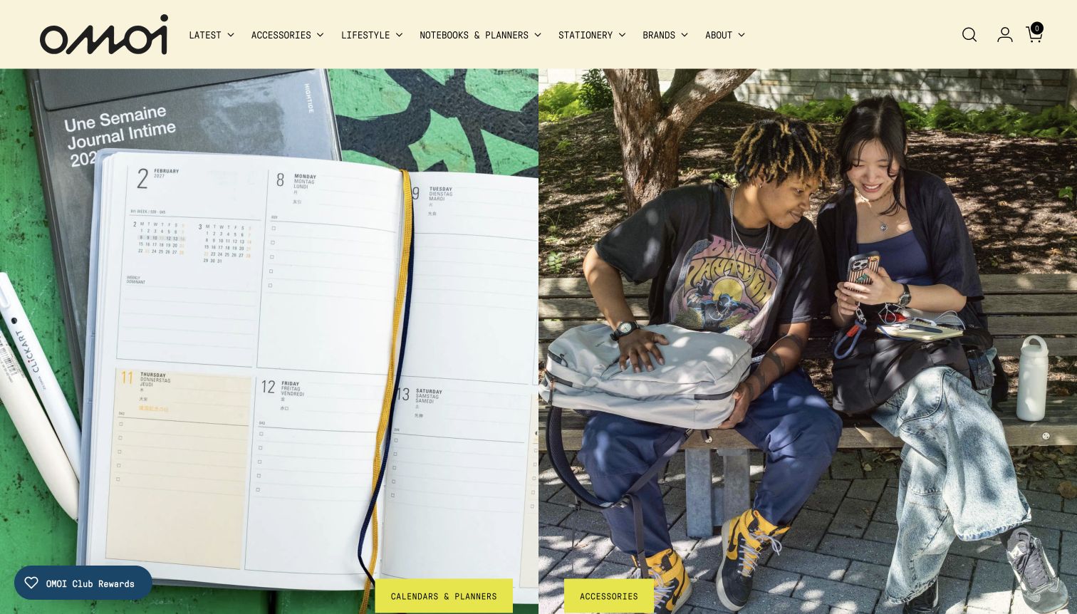
OMOI pairs two full-height images: an open weekly planner on one side and people using everyday accessories on the other. Bright category tabs at the bottom make each image a distinct route. The cream header uses compact labels for notebooks and planners, stationery, brands and broader lifestyle products. New-arrival cards retain descriptive names, prices and alternate views, including the inside of calendars rather than only their covers. This gives paper products a practical context within a wider assortment. The balance is less ideal for a visitor interested solely in stationery, because accessories occupy half the first screen and product details sit below the large images.
What you can learn
When a shop spans stationery and lifestyle goods, give each major intent an explicit visual route. Show planners open as well as closed, so the appeal of a cover is supported by evidence of the actual page layout and writing space.
Pros
The split hero distinguishes two shopping directions without a carousel.
Open-page imagery helps explain the paper products’ use.
Cons & considerations
Broader lifestyle goods compete with stationery for the opening space.
Large images push prices and individual products below the initial view.
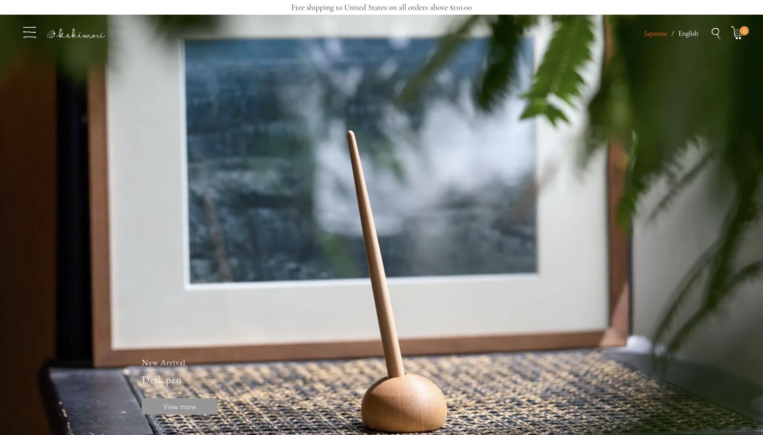
Kakimori’s homepage treats a desk pen almost as a small piece of furniture: the object is photographed beside a window, with a restrained title and View more action. The minimal header leaves most of the screen to the material and setting. Below it, the page connects pens, ink, notebooks and letters with stories about writing, beginner guidance and personalised notebook or ink services. Japanese and English options are visible, while the captured page retains its Japanese interface. The mood is coherent and distinctive, but hidden primary navigation and understated text make exploration less immediate than on a conventional catalogue homepage.
What you can learn
A focused product image can communicate material character without a large amount of copy. Keep the path to categories, custom services and language options clear, and supplement the atmospheric opening with practical information about how the writing tools are selected or used.
Pros
The opening photograph gives the featured object space and context.
Writing stories and personalised services extend beyond a product grid.
Cons & considerations
The concealed main menu adds a discovery step for routine shopping.
Small overlaid text depends on the image remaining visually calm.
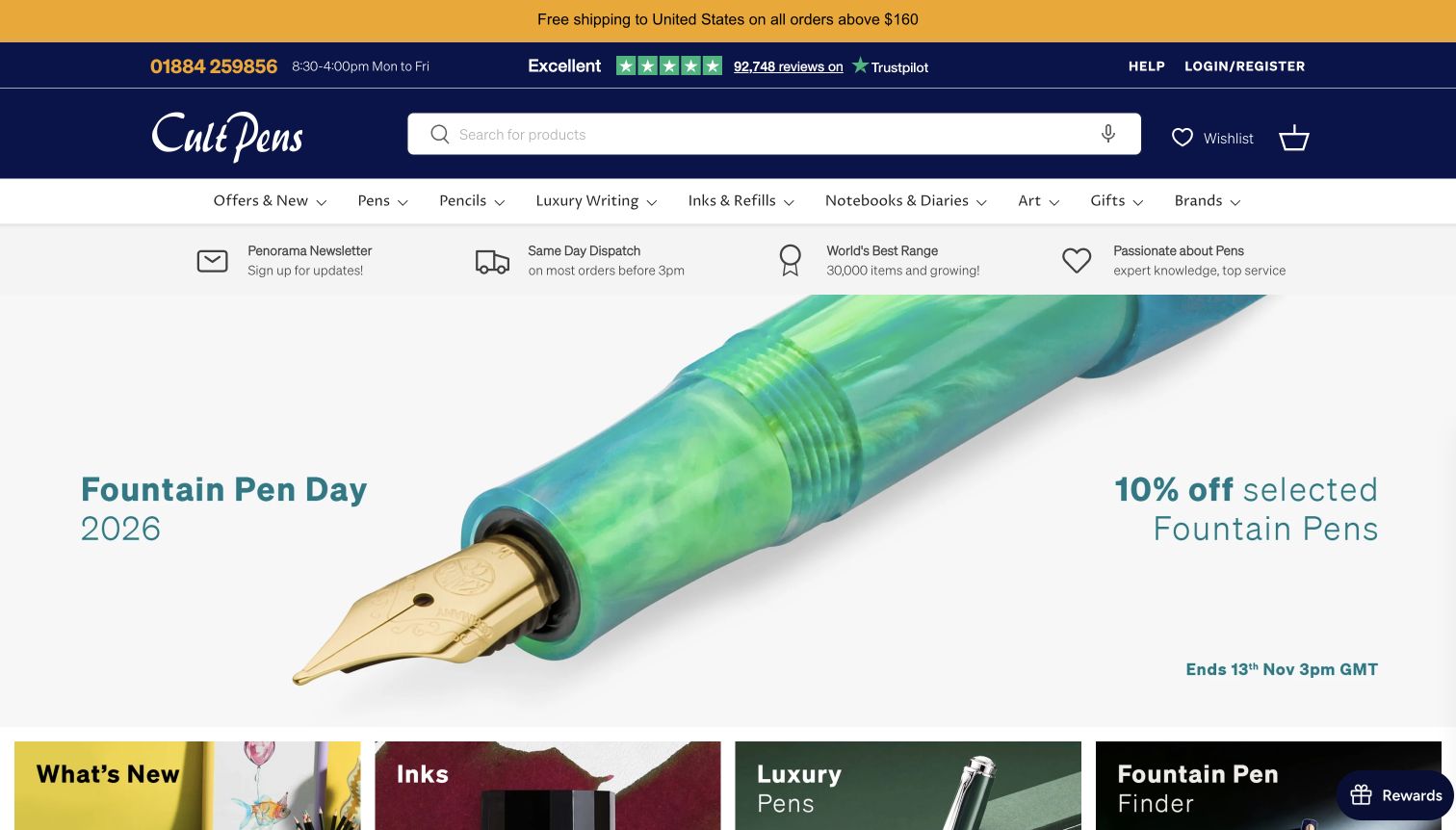
Cult Pens makes product search the dominant element in a dark blue header. Categories distinguish pens, pencils, luxury writing, inks and refills, notebooks and gifts, while a service strip links to delivery and learning information. The captured campaign uses a close-up pen and a clear offer end time, with category tiles immediately below. This structure recognises that a specialist buyer may arrive with a precise model or refill in mind. Its tradeoff is the number of competing messages: shipping, ratings, service claims, seasonal offers and prompts can all appear before a visitor reaches individual products.
What you can learn
Make exact-product search and replacement-part categories obvious before adding seasonal merchandising. If a campaign occupies the hero, place stable category routes directly beneath it and keep delivery conditions available through a clear information link rather than relying on an abbreviated headline.
Pros
The search field is large and immediately recognisable.
Inks and refills have a dedicated place in the product structure.
Cons & considerations
Numerous header and service messages compete for attention.
Consent and newsletter prompts can interrupt the first visit.
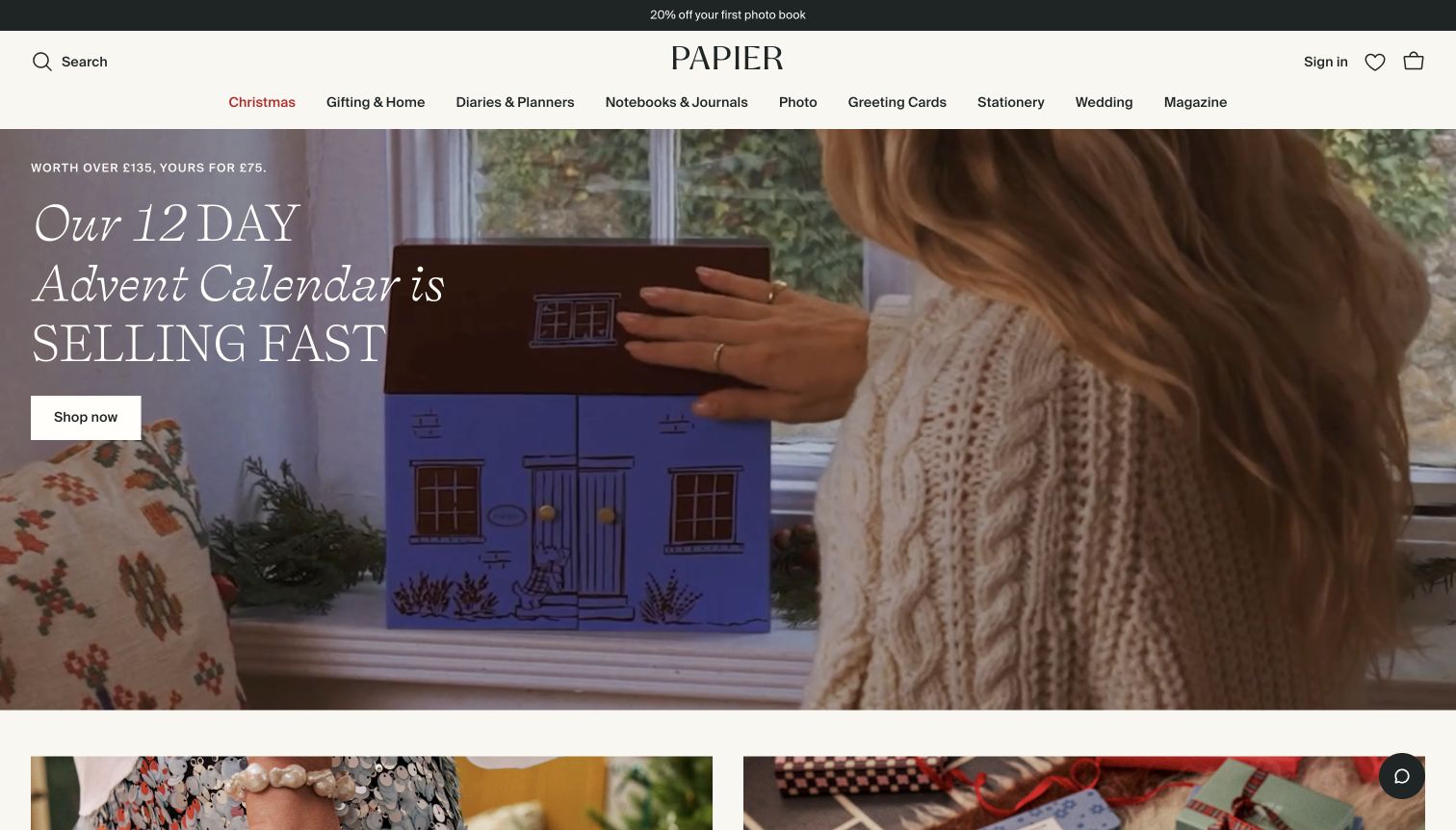
Papier uses expressive serif type over a moving seasonal product scene, turning an advent calendar into the opening story. The navigation remains practical, separating diaries and planners, notebooks and journals, photo products, greeting cards and correspondence stationery. Beneath the hero, product groups are organised by purpose, such as productivity planners and photo books, and retain format names and prices. Editorial articles offer another way into the range. The presentation is polished and gift-oriented, though the first visit includes consent and shipping-destination prompts, and the large campaign temporarily outweighs the quieter everyday writing products.
What you can learn
Connect a brand story to recognisable uses for paper, then show the actual format and price when the visitor reaches products. Keep seasonal urgency proportionate, and make destination choices and privacy controls straightforward so they do not become the main opening experience.
Pros
Purpose-based departments distinguish different kinds of paper products.
Product cards combine distinctive cover designs with format labels.
Cons & considerations
Initial consent and destination prompts interrupt the visual opening.
The seasonal campaign gives less space to routine notebook shopping.
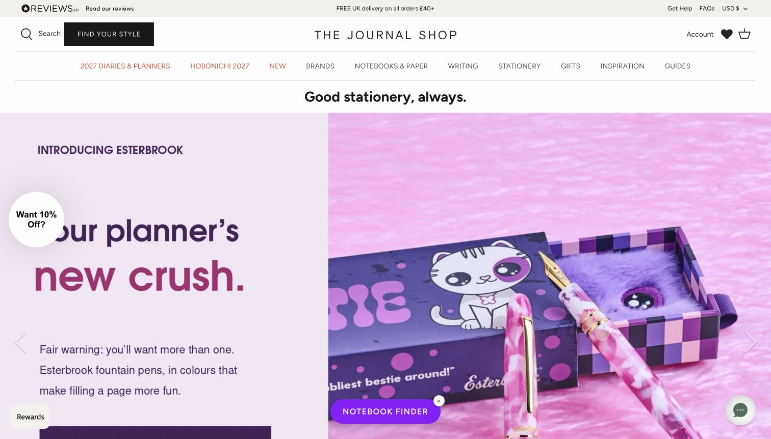
The Journal Shop pairs a restrained white header with colourful product campaigns. Its main navigation gives current-year diaries and Hobonichi their own routes, then separates notebooks, writing, stationery, inspiration and guides. A Find Your Style control sits beside search, while new-arrival cards name formats such as A5 monthly planners and pocket dotted notebooks. Colour choices are visible in the product listings. This is useful for a catalogue where subtle format differences matter. The screen also illustrates the cost of too many assistance layers: a discount prompt, notebook finder, rewards and chat can compete with the campaign and ordinary navigation.
What you can learn
Offer discovery tools for shoppers who do not know a product name, but keep them secondary to clear categories and exact format labels. A finder should reduce the choices a visitor has to interpret, not become one more floating element beside several other prompts.
Pros
Planner systems and paper formats receive explicit navigation and labels.
Guides and a discovery tool support exploratory shopping.
Cons & considerations
Multiple floating prompts can crowd the opening view.
Rotating campaigns spread key messages across several slides.
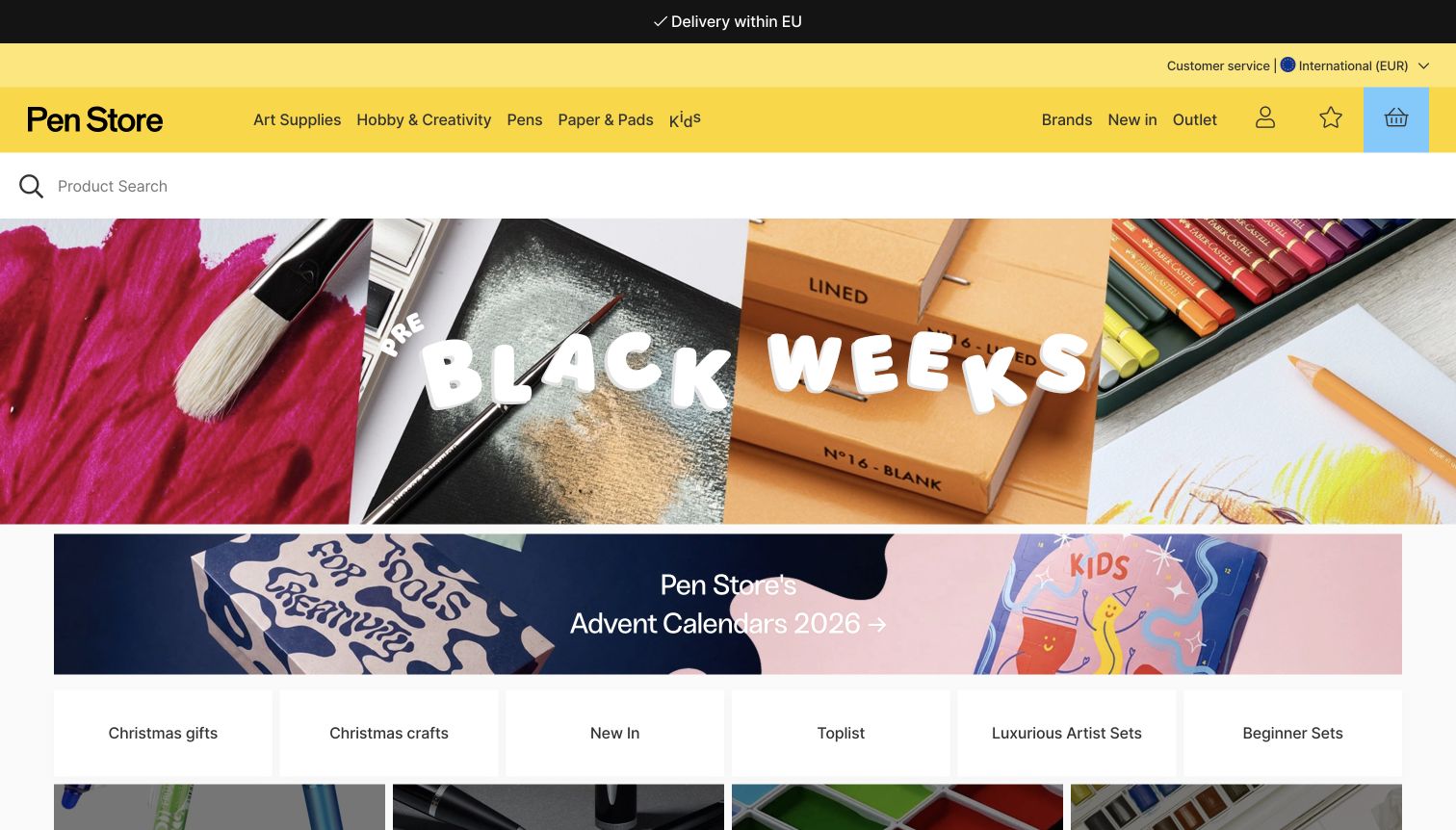
Pen Store uses a vivid yellow navigation bar to separate product departments from the white search area beneath it. Pens and Paper & Pads sit alongside art supplies, creative hobbies and children’s products, making the breadth of the range visible. The captured homepage combines a seasonal material collage with concise shortcuts for gifts, beginner sets and new products. The international view states its delivery geography near the top, which is more useful than assuming every visitor can order. The assortment is broad enough that stationery is one part of the story, and the stacked campaigns can make the homepage feel more promotional than instructional.
What you can learn
State the market and delivery scope early, then let product departments carry the navigation. For a mixed creative store, use purpose-based shortcuts such as beginner sets without losing precise categories for people who need a particular pen or paper type.
Pros
The product departments are visually distinct and easy to scan.
Delivery geography is visible in the international storefront.
Cons & considerations
Stationery shares attention with a wide creative-supply assortment.
Several seasonal blocks appear before detailed product comparisons.
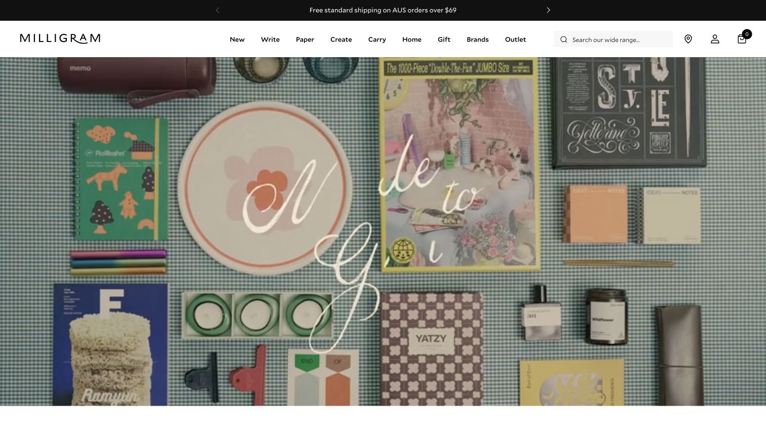
Milligram’s opening flat lay combines notebooks, writing tools and other gift objects on a patterned surface. The compact white header keeps Write and Paper visible alongside Create, Carry, Home and Gift, so the broader assortment still has a clear stationery entry point. The page then offers gift selections by budget and editorial routes back to writing supplies and cards. This is a useful approach for a store selling coordinated presents rather than isolated items. The photographed collection is attractive, but the campaign’s decorative lettering and mixed product types make its immediate shopping purpose less explicit than the navigation above it.
What you can learn
A mixed gift assortment needs stable category names to keep it understandable. Use lifestyle photography to show relationships between objects, then provide budget or purpose routes with descriptive labels; check that every campaign tile has a meaningful title rather than a placeholder.
Pros
Write and Paper remain explicit within the broader lifestyle range.
Budget-based gift routes help visitors narrow a mixed assortment.
Cons & considerations
The large mixed-object campaign can obscure the core stationery offer.
One observed gift tile retained a generic Collection title label.
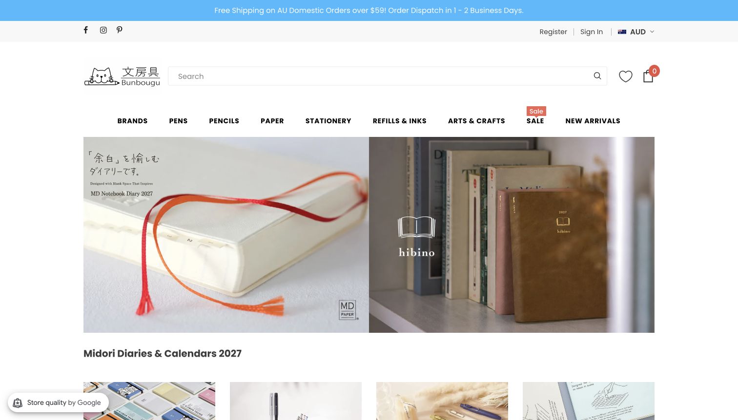
Bunbougu combines a small illustrated identity with a long search field and direct departments for pens, pencils, paper, refills and stationery. The captured opening shows two planner views with visible paper edges, covers and ribbon markers; a separate heading identifies the planner range and year. New-arrival names retain useful details such as tip width, case size and ink colour, while limited-edition or new labels are kept separate from the name. The site feels catalogue-led rather than purely decorative. Its relatively tall header and information-dense product titles are the main compromises, especially for a visitor scanning quickly.
What you can learn
Keep technical distinctions in the product record and visible name where they prevent a wrong purchase. Pair those details with calm photographs and a clear range heading, rather than expecting the customer to infer size, year or tip width from a product image alone.
Pros
Planner imagery shows physical format and material details.
Product names retain precise size, colour and tip information.
Cons & considerations
The header takes substantial space before the featured range begins.
Long specialist product names require careful line-length control.
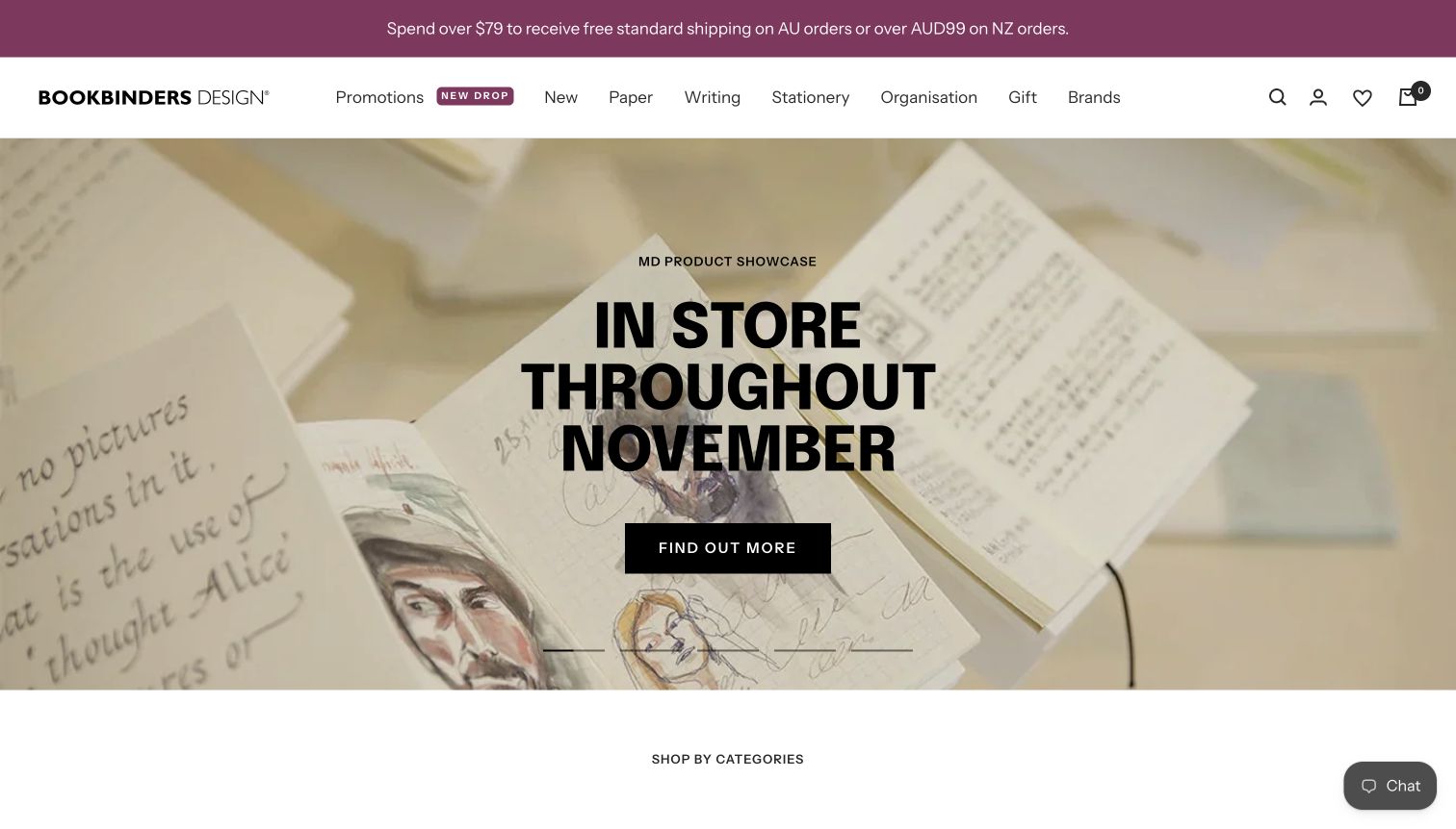
Bookbinders Design uses an in-store paper showcase as its opening message, with handwriting and sketches visible across the background. The campaign includes a clear information action and a specific month, rather than presenting an unexplained decorative image. Immediately below, shopping categories include notebooks, fountain pens, calligraphy, diaries and photo albums. The page also offers personalisation and a guide to Traveler’s Notebook sizes and refills. These routes connect products to the decisions and activities around them. The large rotating hero still delays direct browsing, and the observed limited-edition copy includes a small spelling error that shows why campaign proofreading matters.
What you can learn
Use store events to demonstrate knowledge of materials, then connect that interest to well-labelled categories and practical guides. Keep dates and promotional copy maintained as carefully as product information, particularly when an event remains visible across several homepage slides.
Pros
The showcase connects paper products with actual writing and drawing.
Format guidance and personalisation have visible supporting routes.
Cons & considerations
A multi-slide hero places some featured information out of immediate view.
A spelling error in a campaign heading weakens otherwise orderly copy.
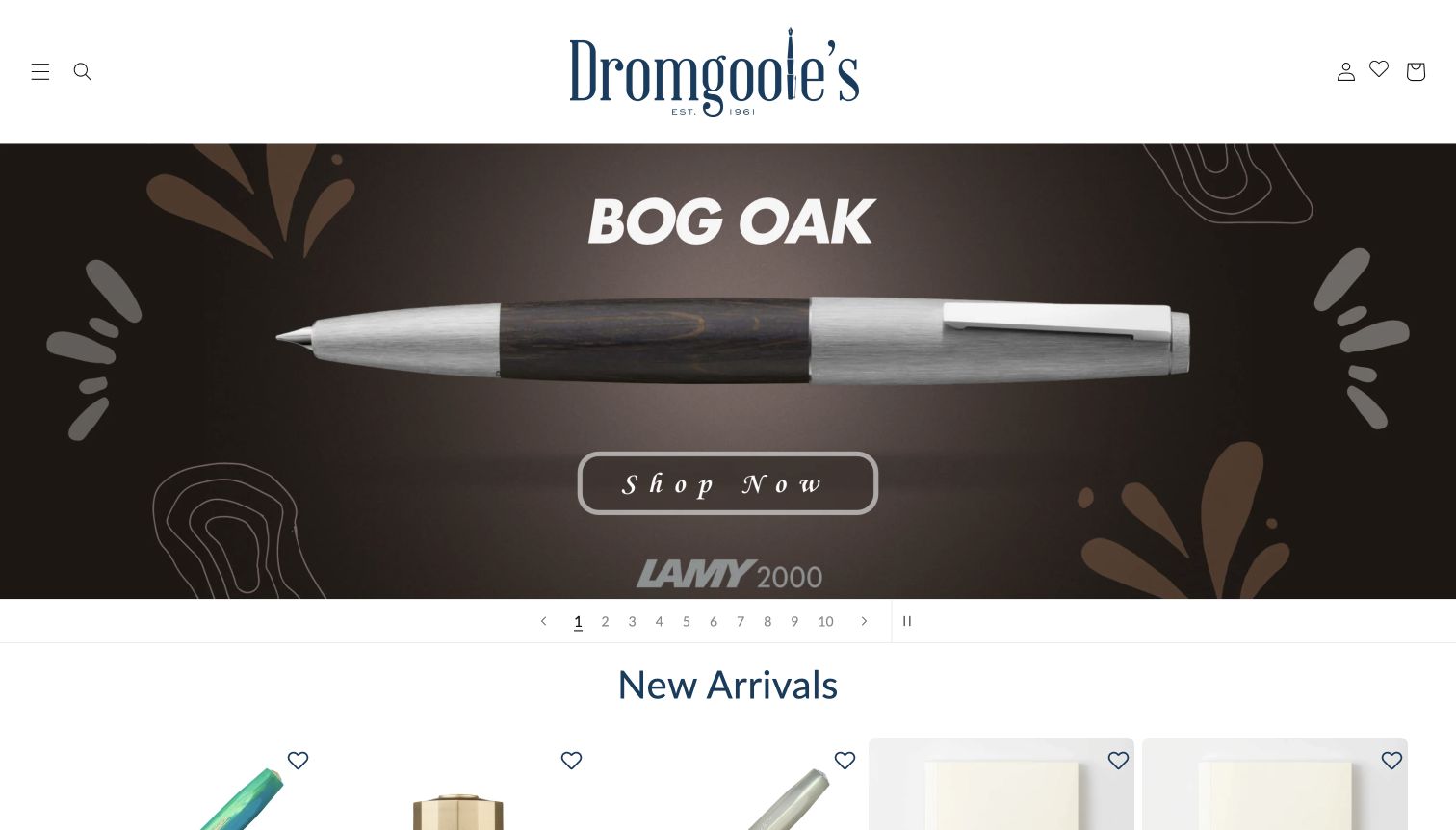
Dromgoole’s gives a featured pen almost the full width of its opening image, making the material and silhouette easy to inspect. The centred identity is large, while search and the main menu are reduced to compact controls. A numbered row beneath the campaign shows that there are ten slides and includes a pause control. Lower sections separate pens and ink from stationery and paper, with specific new-arrival names and prices. The approach makes a strong product impression, but the hidden primary categories and long carousel require more exploration than a visible department menu would.
What you can learn
Show the object clearly, but do not make a visitor wait through a campaign sequence to understand the range. If a carousel is used, expose its controls and keep stable product categories nearby; give stationery and paper a clear place even when pens dominate new releases.
Pros
The close product view makes material and form easy to examine.
Numbered slideshow controls and pause are visibly available.
Cons & considerations
Primary category navigation is concealed behind a menu control.
Ten campaign slides distribute attention across many separate messages.
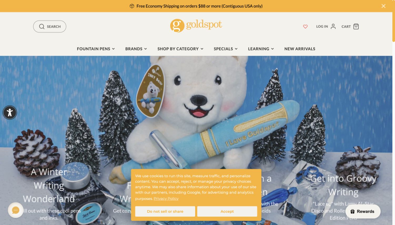
Goldspot uses seasonal photography and a warm yellow identity to frame a specialist pen catalogue. Its shopping structure separates fountain-pen types, nib characteristics, filling mechanisms and price ranges rather than treating every pen as equivalent. Further down, named team members describe their preferences and link to their favourite products, giving the recommendations a visible human source. Learning content includes tutorials and articles about practical pen questions. The captured first screen is less focused: multiple campaign captions, floating controls and a cookie notice compete with the product scene. The strongest lesson is the editorial structure beneath that busy opening.
What you can learn
Make recommendations attributable and specific: a person’s preference for a material or writing style is more useful than an unexplained best-seller claim. Keep the homepage hierarchy disciplined so those human recommendations and technical shopping routes are not buried beneath overlapping promotional elements.
Pros
Specialist categories acknowledge meaningful differences between pens.
Named staff favourites give product curation an identifiable voice.
Cons & considerations
Several campaign captions share the opening image area.
Floating notices and controls reduce the unobstructed space for products.
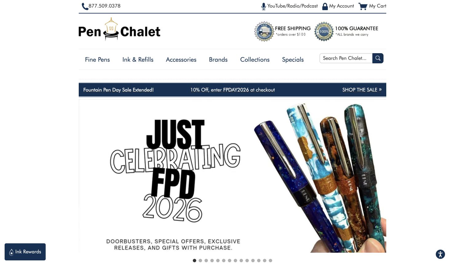
Pen Chalet keeps its storefront within a centred column, with phone, account and cart links above a simple row of product departments. Fine Pens, Ink & Refills, Accessories and Brands are visible beside search. The opening campaign is large, but the surrounding frame stays comparatively restrained and includes links explaining shipping and the retailer’s guarantee. Product slides use close pen images and recognisable model names. This is a useful example of straightforward specialist retail structure, although the number of carousel indicators and the prominence of a seasonal sale can distract from less promotional routes into notebooks or everyday writing supplies.
What you can learn
A compact content width can keep a specialist catalogue readable if the main departments and search are clear. Link service claims to their actual conditions, and avoid letting a large number of campaign slides become the primary way customers discover the assortment.
Pros
The main product departments are visible without opening a menu.
Service information has dedicated explanatory links.
Cons & considerations
Many carousel indicators make the opening campaign sequence feel lengthy.
Sale messaging receives more emphasis than routine product guidance.
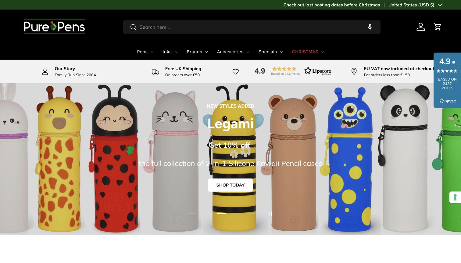
Pure Pens uses a dark header and a broad search field, followed by a short menu for pens, inks, brands and accessories. A service strip links to its shop story and delivery details, including a specific explanation for European orders. The captured campaign shows colourful pencil cases with a direct shopping action, while other homepage sections feature pen brands, notebooks and the shop’s ink range. The combination supports both gift browsing and specialist purchases. Ratings panels and seasonal promotions add visual noise, and the changing hero can make the range feel different depending on the moment a visitor arrives.
What you can learn
Put delivery qualifications and the shop’s identity close to the buying routes, but keep them concise. Use stable categories to support a changing campaign, and give any own-brand ink or paper range a clear destination rather than relying entirely on temporary hero placement.
Pros
The service strip connects practical delivery information to full details.
Search and a short specialist menu remain prominent.
Cons & considerations
Ratings widgets compete with campaign content near the screen edge.
The rotating hero makes the opening product emphasis variable.
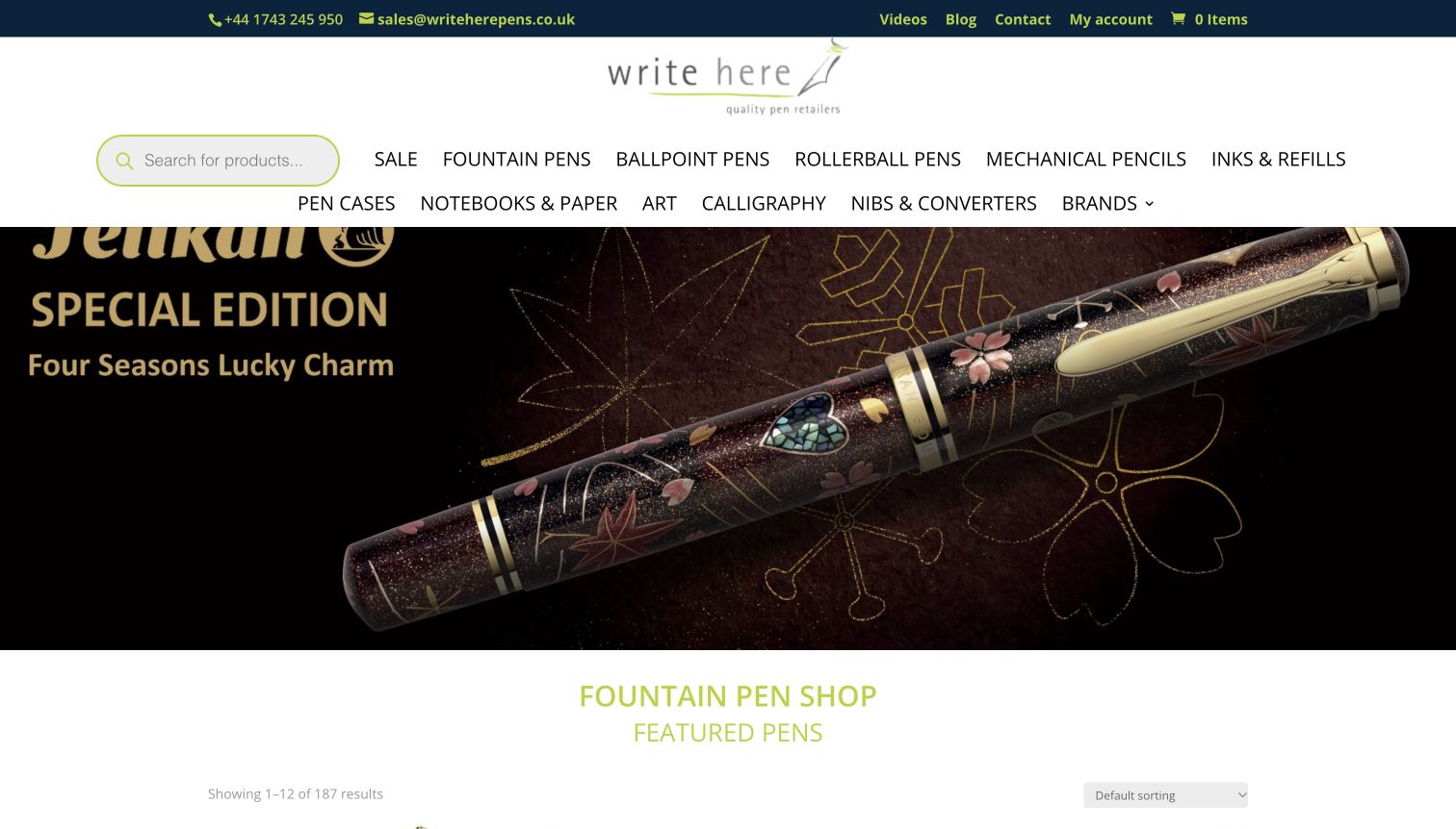
Write Here uses a large close-up of an ornamented pen to establish its fine-writing focus. Above it, the navigation distinguishes fountain pens, ballpoints, rollerballs, mechanical pencils, inks, nibs and converters, with notebooks and paper also explicitly listed. Phone and email contact are visible in the top strip. Below the hero, featured products include prices and a sorting control, moving quickly from the campaign to a catalogue view. The directness is useful, though the two-row uppercase navigation is dense and the large pen image provides more atmosphere than explanation for visitors unfamiliar with the product.
What you can learn
Precise product-type labels can save an enthusiast time, especially for replacement nibs and converters. Pair that depth with short category explanations for less experienced shoppers, and keep featured-product imagery labelled clearly enough that the object’s name and purpose are understandable at first glance.
Pros
Replacement parts and paper have explicit category destinations.
Featured products lead into a conventional price-and-sort catalogue.
Cons & considerations
The long uppercase menu creates a dense header.
The hero assumes some familiarity with fine-writing products.
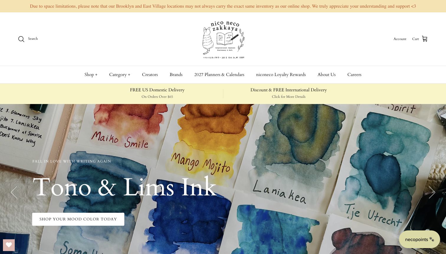
niconeco zakkaya opens with painted ink swatches, allowing colour variation and handwritten labels to become the campaign image. The illustrated identity and fine typography suit the paper-and-writing focus, while Creators and Brands have separate navigation routes. New arrivals include illustrated planners, cards and stickers with specific maker names. A prominent notice explains that the physical shops may not carry the same inventory as the online store, an unusually clear distinction for a multi-location retailer. The atmosphere is cohesive, but the tall header and understated Shop and Category labels require some exploration before a newcomer understands the full range.
What you can learn
Show creative materials through their use: an ink mark or open page can explain more than packaging alone. Give makers credit in product names, and state differences between online and physical stock plainly so a strong shop identity does not create false availability assumptions.
Pros
The ink-swatch photograph demonstrates colour and texture in use.
The store clearly distinguishes online inventory from physical-shop stock.
Cons & considerations
The large identity area delays the featured products.
Broad menu labels need supporting category detail for new visitors.
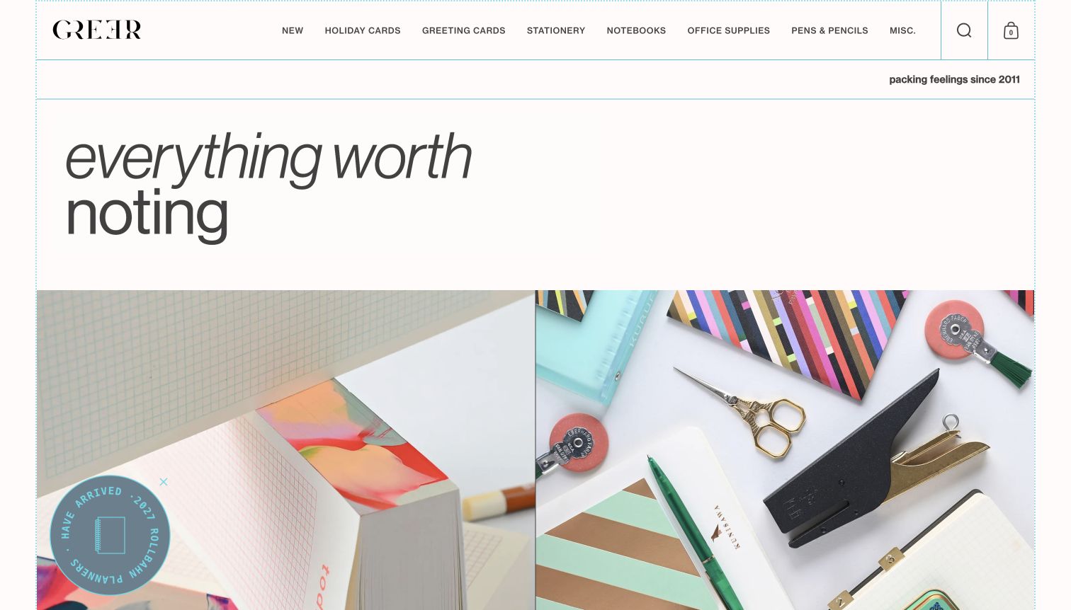
Greer combines an oversized typographic statement with a pair of close stationery arrangements. Fine blue rules divide the page into an orderly grid, while the products supply the colour: patterned cards, notebooks, scissors and a stapler become the visual vocabulary. The main menu stays concrete, separating greeting cards, stationery, notebooks, office supplies and writing tools. Further down, short editorial captions connect categories to familiar purposes such as keeping in touch. The design makes a modest assortment feel deliberate. Its main tradeoff is the amount of space given to the opening statement before a shopper sees individual names or prices.
What you can learn
A strong graphic system can give unrelated small objects a coherent setting. Keep the categories literal and let editorial language add meaning beside them, so the visitor can enjoy the presentation without having to decode poetic labels to find cards, notebooks or pens.
Pros
A consistent ruled grid gives varied products a shared visual structure.
Concrete category names balance the expressive typography.
Cons & considerations
The large opening statement postpones individual product detail.
Editorial images need clear destinations to support purposeful shopping.
Kegan is a freelance web designer and developer with 15+ years of experience helping businesses turn complicated website requirements into clear, maintainable digital experiences. He works directly with clients from planning and design through development, launch, and ongoing support.
For stationery store website design, his development approach focuses on stationery store websites that connect paper, writing tools and gifts with product specifications, personalization options and clear ordering information. The scope can be a targeted improvement or a complete custom build, with responsive layouts, thoughtful content structure, and integrations chosen around the people using and maintaining the site.
Show 3 other stationery store website designersHide other stationery store website designers
Plan the site around actual stationery shopping tasks
Model a representative product range first
Start with a notebook in several sizes, a refillable pen, bottled ink and a dated planner. Record which attributes are essential, which belong to a variant and which need explanatory content. Check that a customer can distinguish a cover, an insert and a complete notebook before extending the structure to the full catalogue.
Separate exact purchases from exploration
Give returning shoppers dependable search, brand routes and replacement-part information. Offer gift, beginner and creative-use routes for people who need help choosing. These routes should lead to the same maintained product records, rather than separate pages with conflicting prices, availability or specifications.
Keep campaigns maintainable
Assign responsibility for planner years, preorder dates, stock status, dispatch notices and seasonal offers. Build reusable campaign sections with clear destinations and expiry rules. A small store benefits more from a few accurate features than a large carousel whose older slides remain visible after the offer or event ends.
The editing job behind the design
Choose tools that can describe the real product
Choose catalogue and search tools that support the actual product distinctions: page format, ruling, nib size, refill family, colour, language and dated versus undated planning. Test the most confusing product combination before selecting an elaborate theme. Keep inventory, shipping and personalisation requirements separate from purely decorative preferences.
Use an editing system that makes guides, maker profiles and local-store information easy to maintain alongside products. Public technology references on these examples are limited observations of the reviewed pages; they do not reveal every checkout, stock or back-office integration, and they are not a prescription for another store.
Our WordPress website examples offer a separate look at publishing approaches. A visible platform label is evidence for that named page, not a guarantee that the same system will suit your requirements.
Before the public launch
Stationery store website launch checklist
Check notebook dimensions, ruling, page count and binding labels on representative products.
Distinguish planner year, language, start month and dated or undated formats.
Explain pen, nib, cartridge, converter and refill compatibility without guessing.
Show useful interior-page and scale photographs, identifying the photographed variant.
Make exact model names, common product terms and brands searchable.
State online versus store stock differences and collection conditions clearly.
Test keyboard navigation, visible focus, zoom and mobile product-option controls.
Ensure campaign tiles have descriptive labels, working destinations and an expiry plan.
Keep customer, order and private contact information outside public content exports.
These checks are a project checklist, not a performance, legal, security, or accessibility certification. Test real journeys with the people responsible for the website before making claims about the result.
Sources & editorial method
How this collection was selected and reviewed
We reviewed the official public store pages on November 11, 2026, comparing product organisation, photography, writing guidance, store information and promotional hierarchy. Present & Correct is the Editors Choice for its focused desktop photography, orderly category structure and distinctive stationery-shop identity. The selection concerns website design, not service quality or customer votes. Technology audits document bounded public-source evidence; an unavailable scan does not establish a hidden platform or integration.
Each example links to its actual source page. Screenshots are direct browser captures with their own capture dates; moving imagery, announcements and live designs can change. The notes describe observable design choices and conditional tradeoffs, not measured traffic, conversion results, service quality, or accessibility conformance.
Technology labels use public page metadata, asset evidence, or explicitly cited platform documentation. Platform documentation is not a complete current deployment audit. A component reference may be legacy or unused; it is not a complete backend inventory. Unknown stacks are omitted. These sites are editorial examples, not our client portfolio.
Written, Edited and Curated are separate editorial records, not timestamps advanced by a rebuild. Website designs and imagery belong to their owners. See our editorial standards or suggest a correction.
Questions worth asking
Stationery Store website design questions
Should a stationery shop organise products by brand or by use?
Both can help. A repeat buyer may know a brand and model, while a new customer starts with a task such as planning, letter writing or finding a gift. Maintain one accurate product record and provide consistent category and brand routes to it.
What details should a notebook product page show?
Include dimensions, page count, ruling, binding and any documented paper specification that matters to the product. Show the inside as well as the cover. For planners, clearly state the year, start month, language and layout rather than relying on the photograph.
How should a shop explain pen refill compatibility?
Use verified manufacturer information and exact model names. Distinguish cartridges, converters, rollerball refills and ballpoint refills, and explain any limits. Do not assume similar-looking parts are interchangeable or infer compatibility from a brand name alone.
Does every stationery homepage need a large carousel?
No. A clear search field, useful categories and a few well-labelled products can be more effective for routine shopping. If a carousel serves a real editorial purpose, provide accessible controls and keep important categories and service information available outside its slides.
How can an online stationery shop support a physical store?
Provide current addresses, hours, collection arrangements and event information. Explain whether online stock matches each location. A real interior photograph can convey the shop’s character, but practical visit information should remain easy to find without interpreting the image.
Can public technology labels identify the whole commerce system?
No. A public page can reveal a platform, library or delivery service without exposing inventory, payment or fulfilment integrations. Treat the evidence as scoped to the reviewed page and choose tools around your own product data and operating needs.
Borrow the useful categories, honest product photographs and clear explanations. Give the store’s personality room to show while making the next practical shopping decision easy.