Best Perfume Brand Websites of 2026 (16 Real-World Examples)
Perfume websites that translate an invisible product into useful stories, scent categories, sampling routes and clearly described formats.
A perfume website cannot deliver a scent through the screen. Its job is to help someone form a meaningful shortlist and find an appropriate way to experience it.
Fragrance shopping asks more of language and imagery than many other product categories. A bottle photograph establishes identity, but not what the perfume will smell like to a particular person. The strongest sites acknowledge that gap. They connect an evocative world with practical product records, understandable scent descriptions and a route to samples, stores or assistance where those services genuinely exist.
These examples are website design references, not perfume reviews or recommendations about ingredient safety, longevity or personal suitability. Read them for the relationship between art direction, product organization and the next step. A memorable visual identity can make a brand distinctive without turning every descriptive claim into an independently verified fact.
Before the examples
What makes good perfume brand website design in 2026?
Pair imaginative language with a useful anchor
A story can communicate mood, place or character, while a concise scent description gives the visitor something to compare. Keep the two layers connected. A poetic name alone is a difficult basis for distinguishing several unfamiliar perfumes.
Explain formats and sizes clearly
Separate a full bottle, travel format, sample set, refill and home-fragrance product where applicable. Show the actual quantity and what a set contains. Similar packaging should not make customers guess whether they are looking at the same product in a different size or a different formulation.
Make discovery a real customer journey
If samples, discovery sets, consultations or store visits are available, explain their role and conditions. Do not imply that every sample purchase creates a full-bottle credit or that a quiz can guarantee personal preference. Keep the practical route visible beside the brand storytelling.
Keep ingredient and product claims specific
Give approved product information a dependable home and retain its scope. Do not use natural, clean or another broad label as a substitute for an accurate ingredient record or as a universal safety promise. Website design observations cannot independently validate such claims.
The collection · 16 examples
16 perfume brand websites worth studying
Compare seasonal perfumery, character-led niche houses and established fragrance collections. Notice how each brand helps someone move from a mood or a name toward a specific fragrance, format or discovery route.
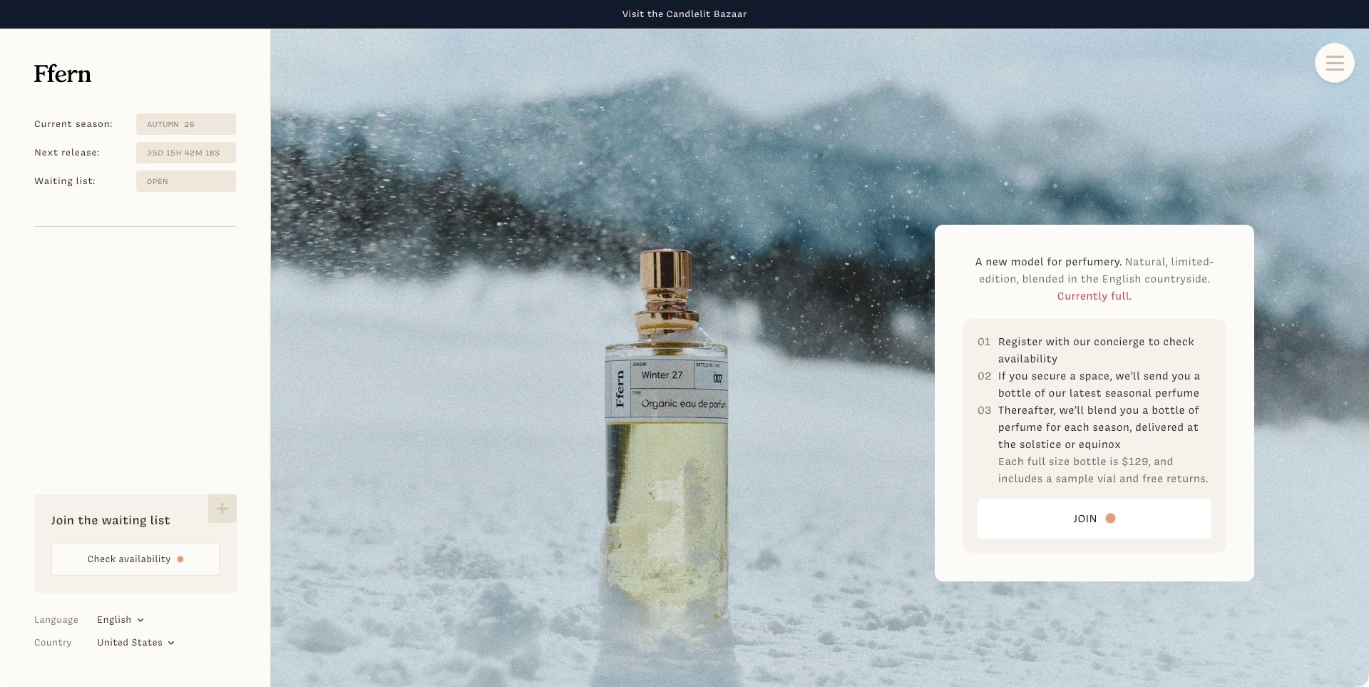
Ffern pairs a perfume bottle in a snowy landscape with a cream sidebar and an explanatory card. The sidebar separates the current season, a next-release countdown and waiting-list status; the card outlines registration, the first bottle and subsequent seasonal releases. A Currently full message qualifies the invitation instead of presenting an ordinary Add to Cart button. Language and country choices remain visible at the lower left. The page makes its own unusual model understandable within the opening view, without independently proving the displayed availability, ingredient descriptions or delivery terms.
What you can learn
If buying a fragrance involves a waiting list or recurring release, explain that relationship before asking someone to join. Separate status information from the action, and give the visitor enough context to understand the next step. Atmospheric imagery should support the explanation rather than conceal commitments behind a romantic product story.
Pros
The numbered explanation makes an unfamiliar release model easier to follow.
Season and waiting-list information sit alongside the product instead of being buried in checkout.
Cons & considerations
Several status indicators need consistent maintenance to avoid contradictory seasonal messages.
Small pale labels and countdown text need readable contrast and responsive sizing.
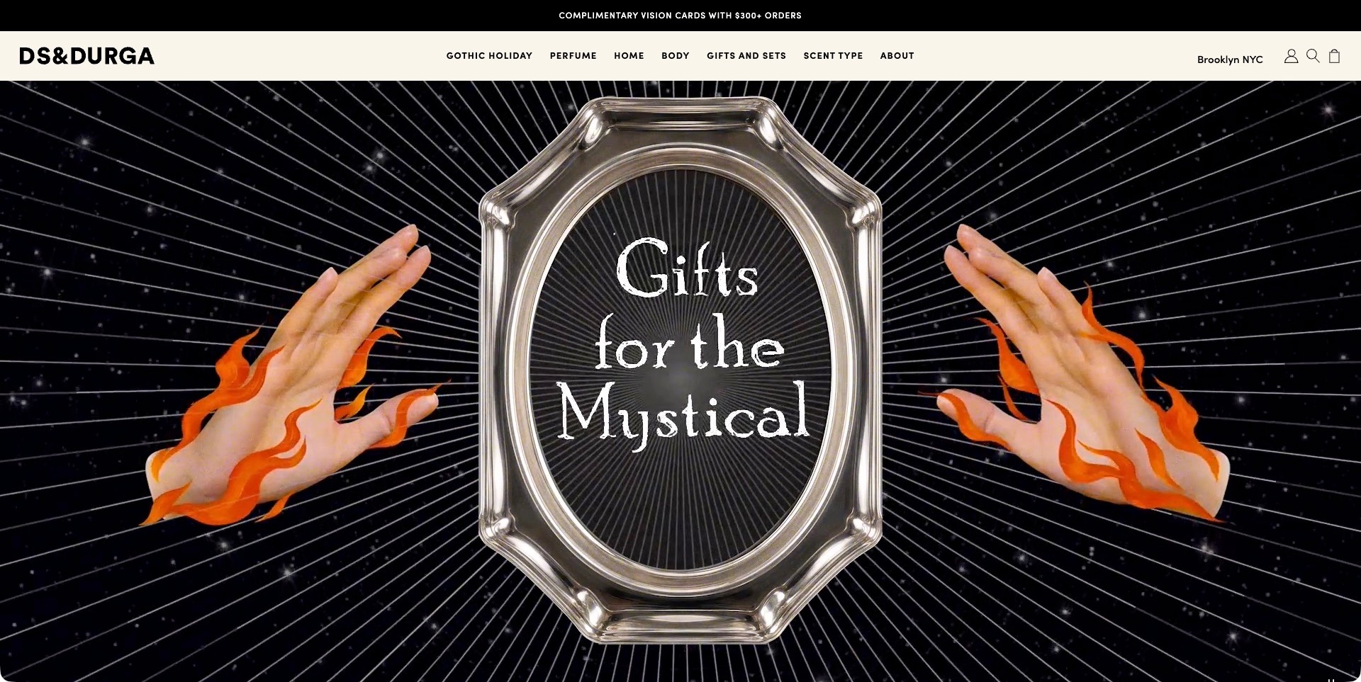
D.S. & Durga’s saved homepage frame centers an ornate silver mirror containing the words Gifts for the Mystical, flanked by photographed hands with illustrated orange flames. Radiating lines cross a black background, while the cream header remains straightforward: Perfume, Home, Body, Gifts and Sets, Scent Type and About. No perfume bottle is visible in this exact campaign frame. The page separately identifies the brand’s own perfume products, so the industry fit does not depend on pretending the theatrical illustration is a product photograph.
What you can learn
A fragrance campaign can express an imaginative world while plain category labels provide orientation. Offer both product-type and scent-oriented routes, because a gift shopper and a returning customer may start with different questions. Follow the visual concept with useful product, size and discovery information rather than expecting atmosphere to explain the offer.
Pros
The colorful central composition gives the seasonal campaign a clearly recognizable identity.
Scent Type supplies a browsing route distinct from conventional product categories.
Cons & considerations
A campaign without a visible bottle can delay basic product context for first-time visitors.
Dense radiating imagery needs careful treatment around text and motion alternatives.
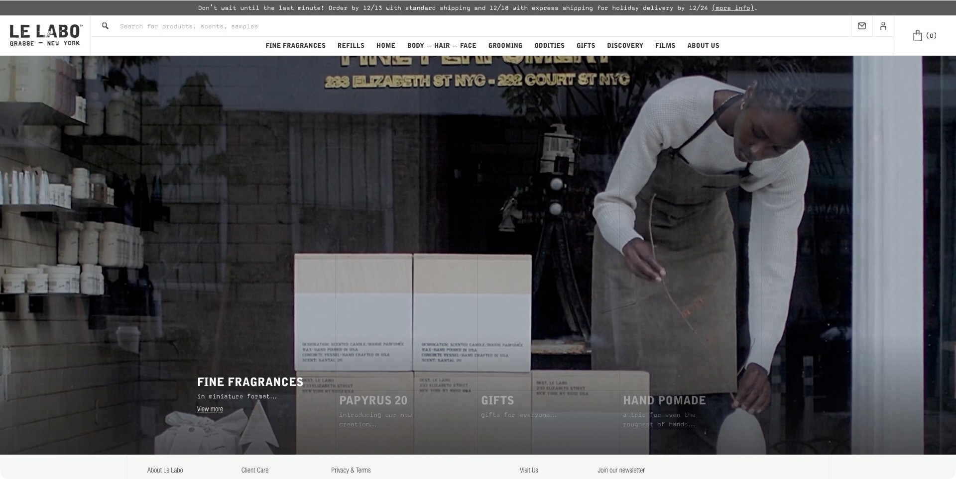
Le Labo fills the main view with a shop-window scene containing an apron-wearing person, shelves and boxed products. Its utilitarian wordmark and condensed category labels sit in a white header above a long search field. The lower image area separates Fine Fragrances, a named new scent, Gifts and Hand Pomade, with the active fragrance item brighter than its neighbors. A compact footer remains visible within the same screen. The scene evokes a retail setting without proving how any pictured product was made or which services are available at a particular store.
What you can learn
Translate a physical brand atmosphere into the image treatment while keeping search, refills, discovery and product categories practical. A returning fragrance customer may know the scent name already. They should not have to wait through a film or decode a seasonal concept before locating it.
Pros
A substantial search field provides a direct alternative to the campaign navigation.
Refills and Discovery appear as distinct tasks rather than being buried under a general shop label.
Cons & considerations
Dim secondary campaign labels can become difficult to read over a changing background.
Several dense navigation rows need a clear hierarchy and careful mobile reflow.
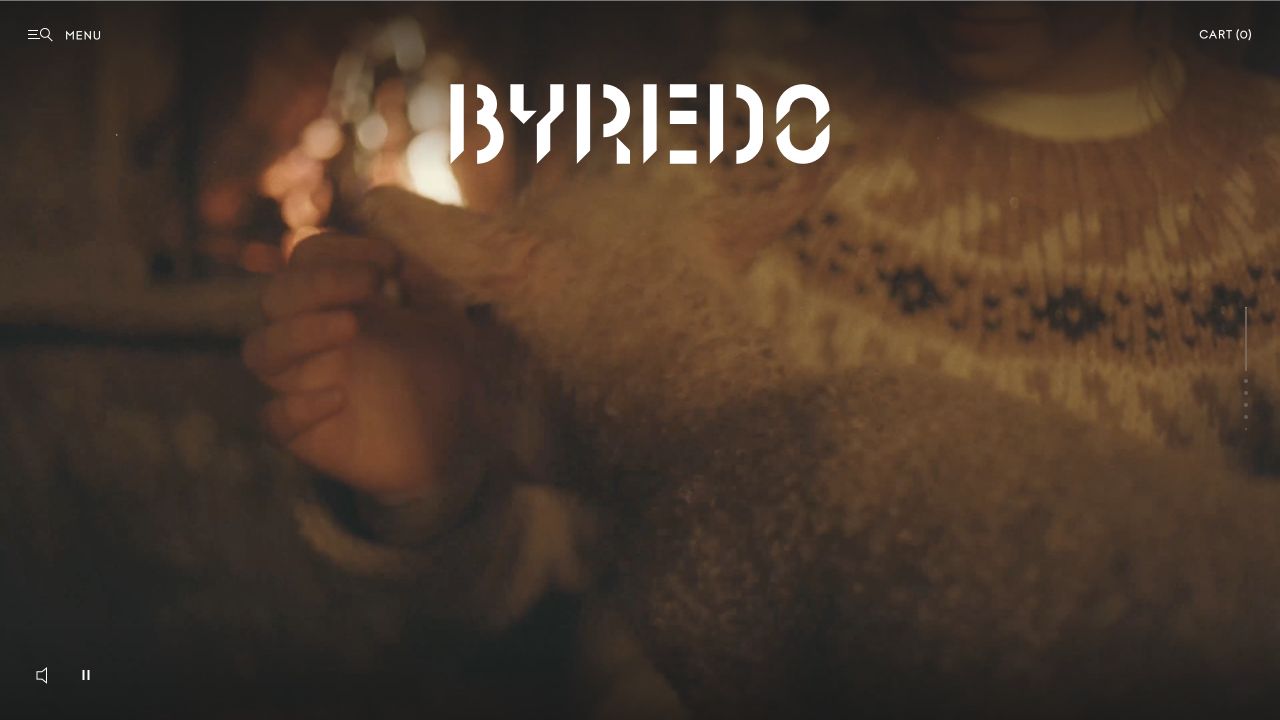
Byredo’s retained opening is deliberately spare: a warm, dimly lit film frame fills the screen, with a large angular white wordmark placed high in the composition. Small menu and cart controls sit at opposite upper corners, while playback-related controls appear near the bottom. The image presents a person and a richly textured interior rather than a bottle or a scent list. This is an identity-led introduction, and its usefulness as a design reference lies in that clear commitment rather than in detailed product information visible in the frame.
What you can learn
A fragrance brand can establish character through an evocative scene, provided the route into the products remains understandable. Give customers who already know a fragrance a way past the atmosphere, and provide a useful fallback for optional film.
Pros
The high-contrast wordmark stays identifiable against the detailed and relatively dark image.
Minimal controls preserve a focused opening rather than competing with the film.
Cons & considerations
If a visitor wants immediate scent comparison, this opening provides little product-level information.
If video cannot load or is reduced, the navigation and introductory identity still need to work.
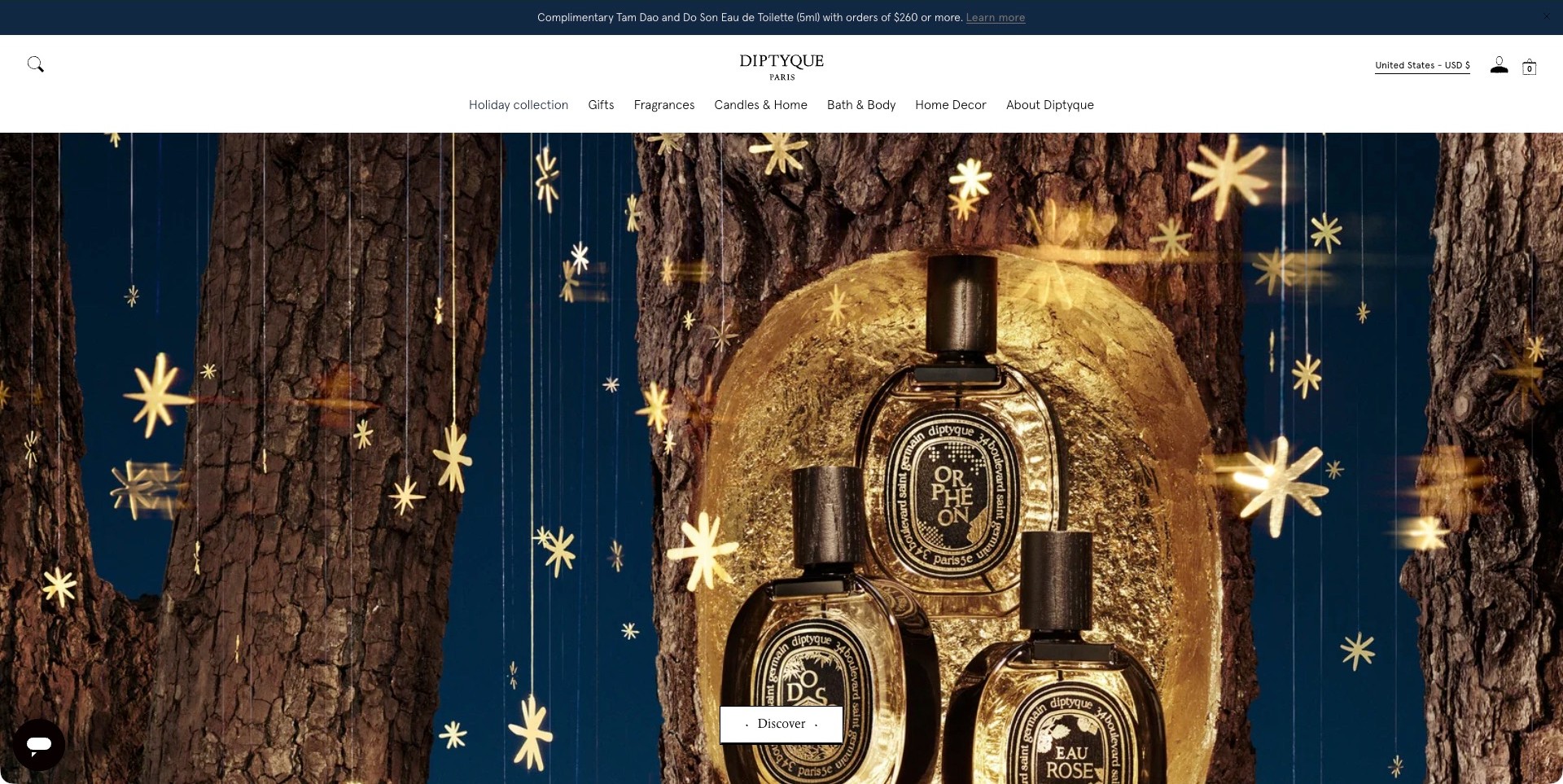
Diptyque’s US page places recognizable fragrance bottles in a gold-colored hollow between tree trunks, surrounded by small star shapes against deep blue. The bottle labels remain visible within the decorative scene, and a simple white Discover button sits below the central product. Above, the white header separates Fragrances from Candles and Home, Bath and Body, and other categories. United States and USD are explicitly displayed. This is the actual regional storefront, not the former international URL, and the image is not independent evidence of packaging materials or fragrance characteristics.
What you can learn
Keep the product identifiable when a holiday concept becomes visually elaborate. Use seasonal scenery to frame the offer, not replace it, and preserve plain category routes around the campaign. Destination pages should explain which sizes and editions are included rather than relying on a decorative bottle label alone.
Pros
The product labels provide recognizable anchors inside the elaborate seasonal composition.
Separate fragrance and home categories reduce ambiguity in a mixed catalog.
Cons & considerations
A tall product scene can delay access to comparison information on shorter screens.
A generic Discover label needs a clearly explained destination to set useful expectations.
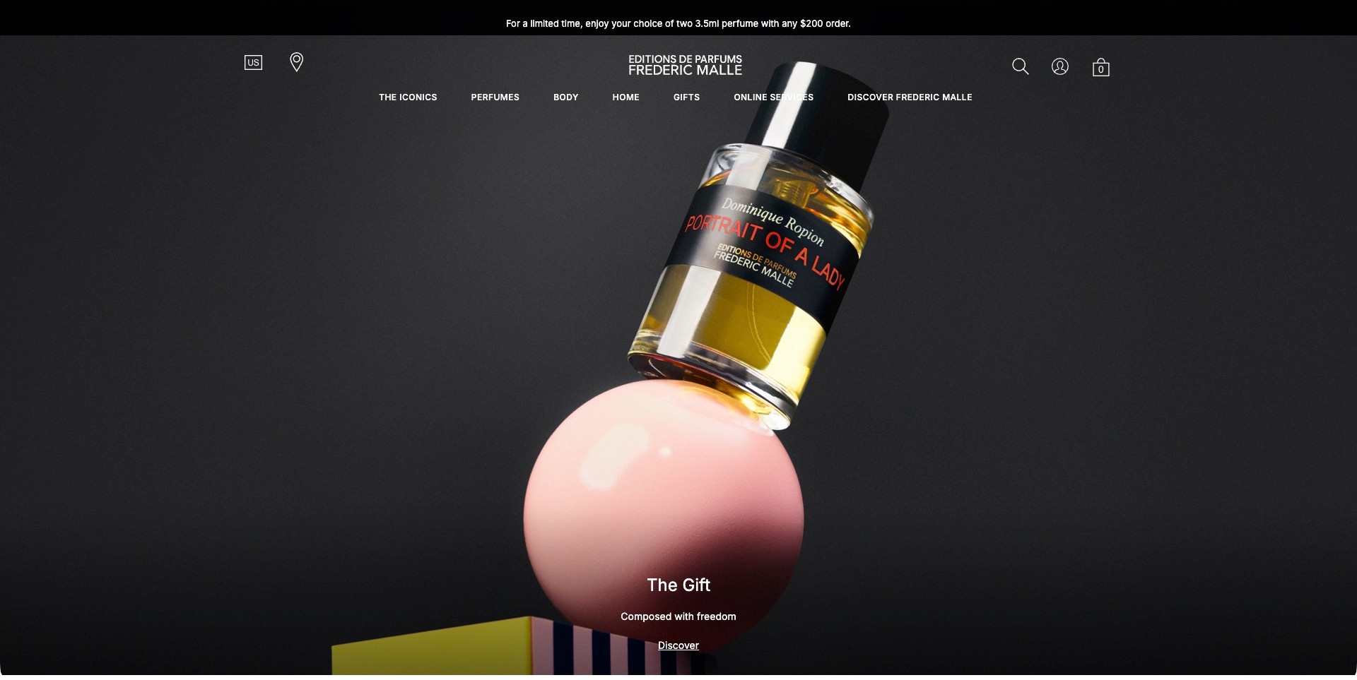
Frédéric Malle sets a diagonally positioned Portrait of a Lady bottle above a glossy pink sphere against a charcoal background. Its black label, red fragrance name and visible perfumer credit remain part of the image rather than being replaced by a generic seasonal illustration. A short Gift heading, supporting line and Discover link sit below. The header keeps Perfumes, Body, Home, Gifts and Online Services separate. The composition communicates an editorial product focus; it does not independently establish the scent, the perfumer’s current involvement or the promotion’s conditions.
What you can learn
Let an identifiable product carry a conceptual campaign, then supply a concise next step and ordinary catalog routes. A perfume house can credit creative authorship while still helping visitors compare sizes, discovery options and related products. Artistic presentation should lead toward those practical details instead of assuming familiarity.
Pros
The bottle label keeps the featured fragrance recognizable within an abstract scene.
A restrained palette makes the single product the clear visual focal point.
Cons & considerations
A generic Discover action may need stronger destination context for unfamiliar visitors.
If product photography carries most of the explanation, accessible text must identify the relevant edition clearly.
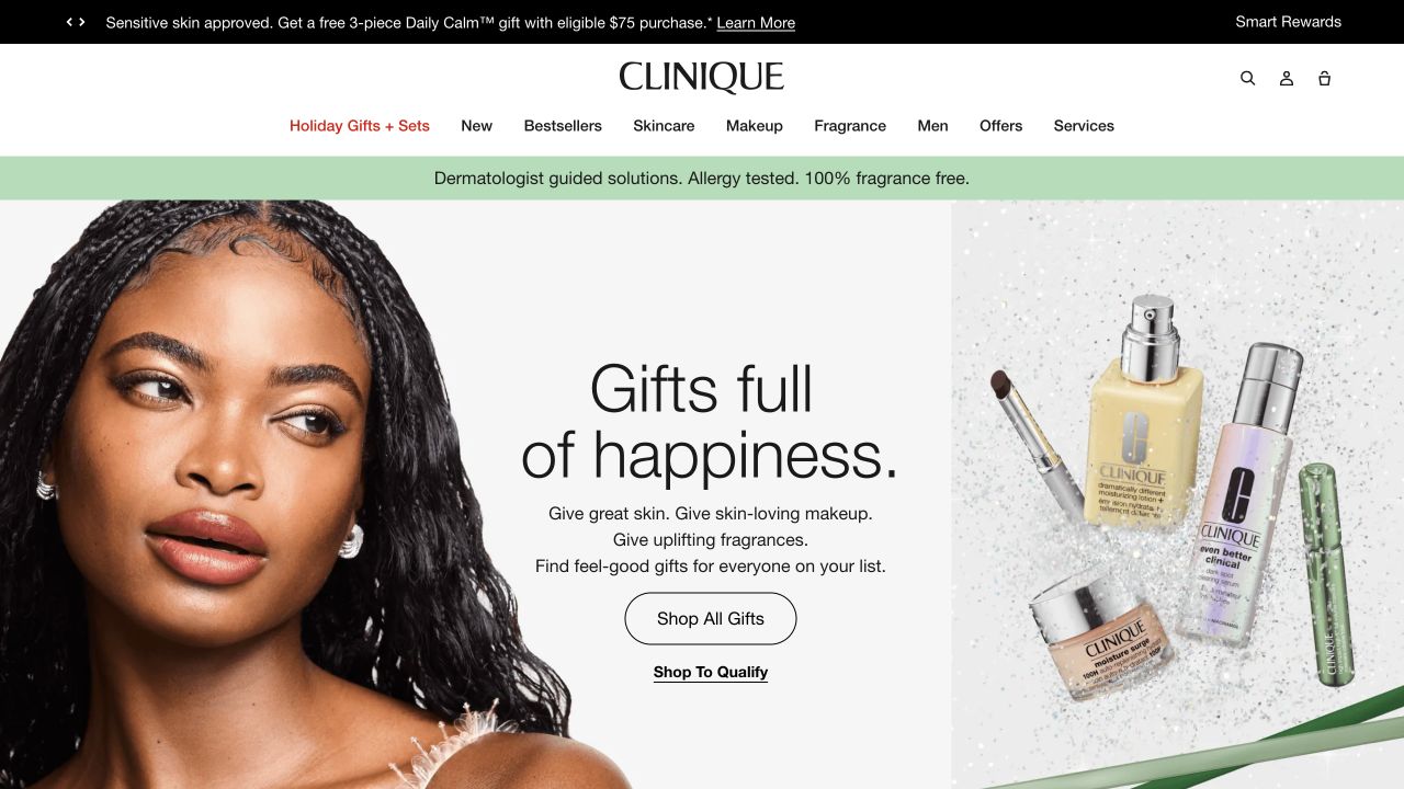
Clinique’s retained opening separates its gift campaign into three parts: a model at the left, a readable central message and a group of products at the right. The arrangement includes a perfume bottle among makeup and skincare rather than isolating fragrance as a separate brand. Above, Fragrance has its own navigation label next to Makeup and Skincare. A black offer strip and green brand-claim strip add other messages around the white header. The current official site confirms its own fragrance range and fragrance gift sets.
What you can learn
When perfume shares a storefront with other beauty products, make its category easy to locate and identify what a gift set actually contains. The shared campaign can suggest an occasion, but customers still need scent, size and format information before choosing a fragrance.
Pros
A separate Fragrance label prevents the mixed gift campaign from becoming the only discovery route.
The central text panel keeps the buying prompt readable between two detailed images.
Cons & considerations
If several product types appear together, the destination must explain which are included in each set.
If brand-claim strips are reused, their wording must not imply that every product shares identical properties.
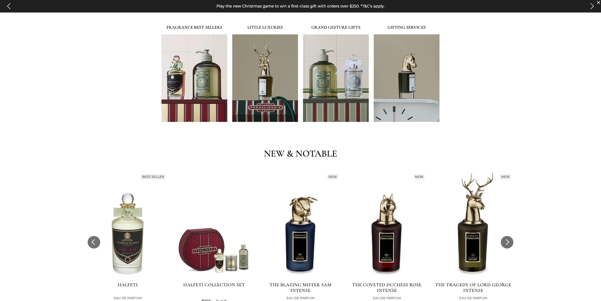
Penhaligon’s saved scrolled homepage shows four image-led routes for fragrance best sellers, little luxuries, grand gesture gifts and gifting services. Below, a spacious New and Notable row displays individual bottles and a collection set against white, with readable product names and small New or Best Seller labels. The animal-headed caps provide visual differences without replacing those names. This example is the actual product-discovery section, not the illustrated train hero elsewhere on the page. The retailer’s badges are presentation labels rather than an independently measured popularity ranking.
What you can learn
Separate gift-selection tasks from individual product comparison. Image-led categories can narrow the intention, while consistent product cards provide the next decision. Keep model names, formats and set contents explicit so distinctive packaging does not force shoppers to guess which product or service a card represents.
Pros
The two levels distinguish broader gifting intentions from named fragrance choices.
A quiet white product row makes packaging and labels easier to compare.
Cons & considerations
A sparse product row still needs scent, size and pricing context at the destination.
If New or Best Seller badges are used, their meaning and upkeep should remain consistent.
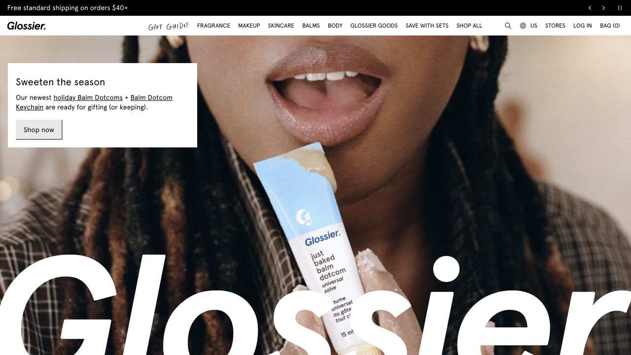
Glossier’s retained campaign is a close-up lip-balm scene, not a perfume photograph. The product appears near a model’s face, a small white panel explains the seasonal balm feature, and an oversized wordmark crosses the lower image. A compact header gives Fragrance an explicit position beside Makeup and Skincare. Current official navigation separately identifies the brand’s own Glossier You and related fragrance collections. The example is useful for studying how a shared beauty storefront keeps perfume discoverable even when the main campaign is focused on a different category.
What you can learn
Keep the fragrance route recognizable within a mixed beauty catalog rather than expecting customers to infer it from a broad brand identity. The perfume destination should supply scent language, format and size distinctions; a persuasive cosmetics campaign cannot provide those details on its behalf.
Pros
The clearly named Fragrance category offers an alternative to the balm-led campaign.
The white caption panel keeps the featured product message readable against the close-up image.
Cons & considerations
If visitors arrive specifically to compare scents, this opening adds little fragrance-level guidance.
If oversized identity lettering crosses imagery, responsive crops must preserve the actual shopping controls.
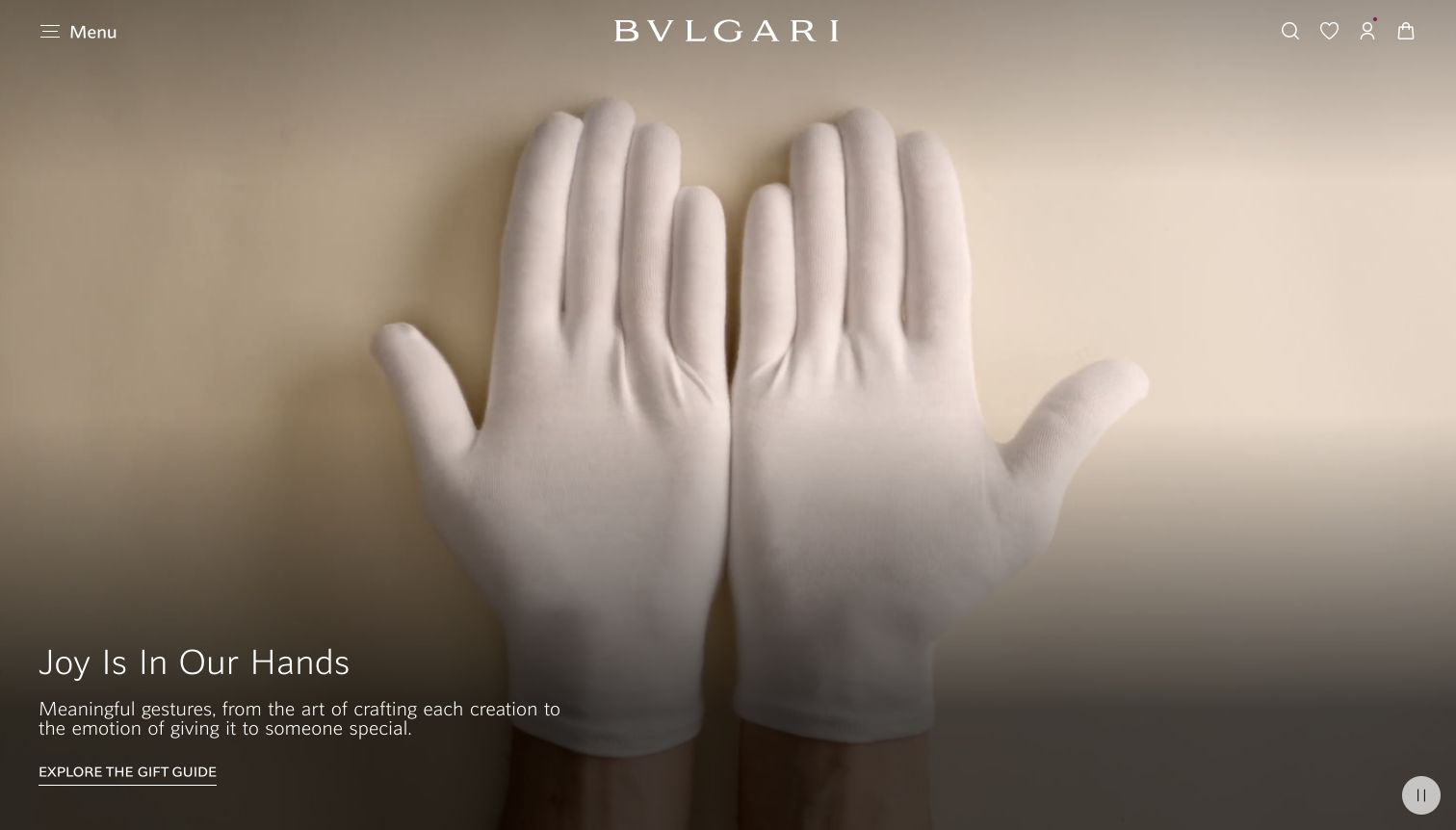
Bvlgari’s retained campaign shows white-gloved hands on a warm neutral field, accompanied by a short gift-guide message and a single underlined link. The widely spaced white wordmark provides the dominant identity, while a small menu and commerce icons frame the upper edge. No perfume bottle or scent description appears in this viewport. The current official homepage explicitly includes fragrances within the brand’s creations, so the example illustrates how an umbrella luxury identity introduces the shopping occasion before visitors choose a particular product family.
What you can learn
Use a broad gifting story to establish context, then let a fragrance-specific destination do the explanatory work. A customer choosing perfume still needs clear scent language, concentration and size distinctions, and a realistic path to sampling or assistance rather than atmosphere alone.
Pros
The restrained composition gives the gifting message a clear relationship to the brand.
One main campaign action avoids competing perfume, jewelry and accessory promotions in the same frame.
Cons & considerations
If fragrance is the visitor’s immediate interest, a concealed category menu adds a navigation step.
If a gift guide mixes product families, its filters must make fragrance options easy to isolate.
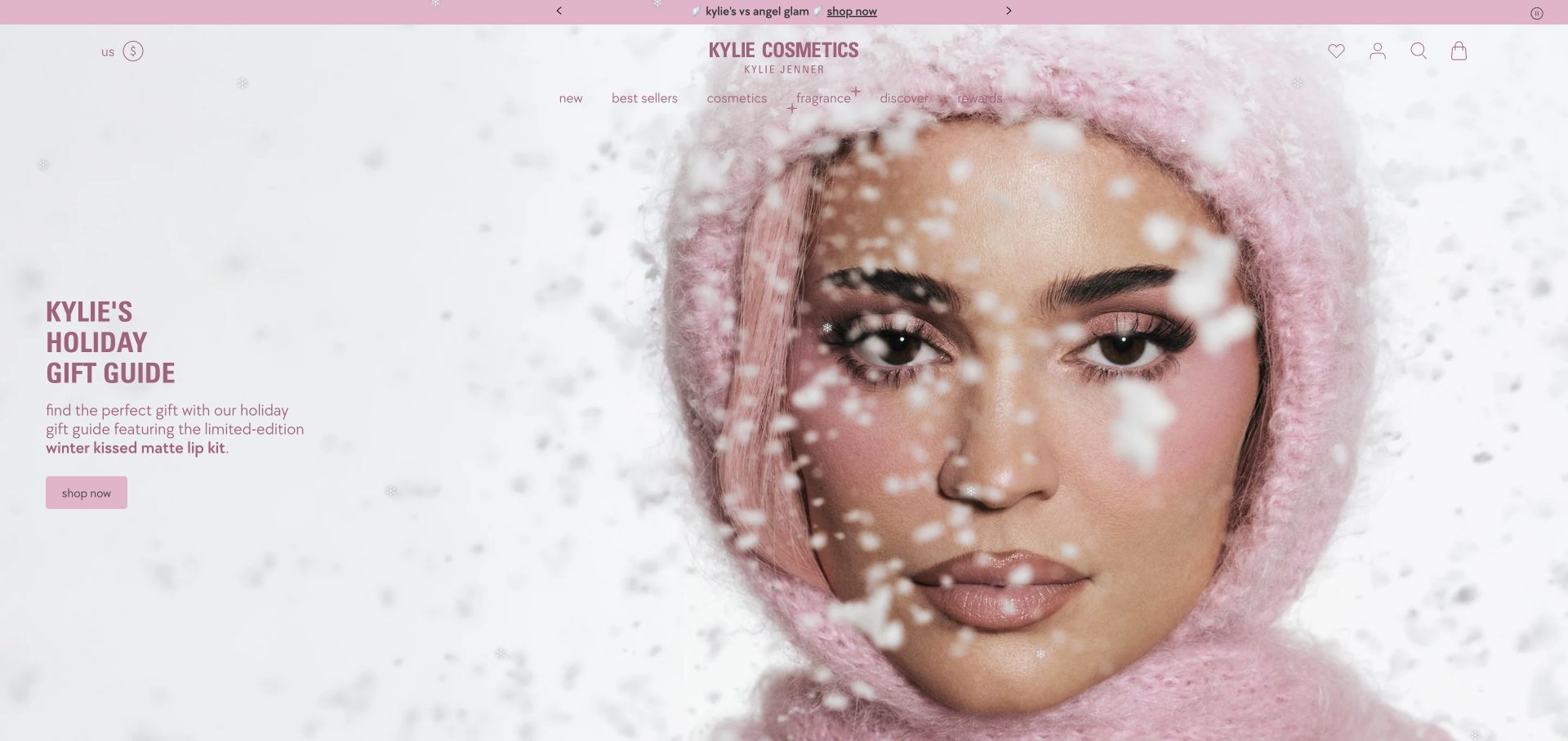
Kylie Cosmetics’ retained homepage uses a soft pink holiday palette and an unusually close model portrait. The campaign copy at the left promotes a lip-kit gift feature, with a modest pink shopping button underneath. A centered wordmark and compact navigation include separate cosmetics and fragrance labels, so the perfume range has an identifiable route even when another category leads the campaign. The current official page confirms makeup and fragrance gift sets. This is a shared beauty storefront reference, not a screenshot of perfume packaging or a scent-selection interface.
What you can learn
A fragrance line can borrow the parent beauty brand’s visual identity without disappearing into its makeup campaign. Keep the category route explicit, then use the fragrance destination to explain the scent family, bottle sizes and sampling options rather than assuming familiarity with the wider brand.
Pros
The fragrance label remains available despite the lip-product emphasis of the hero.
The restrained pink palette connects navigation, campaign copy and the primary action.
Cons & considerations
If scent discovery is the priority, the pictured opening offers little olfactory guidance.
If seasonal effects remain active, their readability and motion behavior need testing across devices.
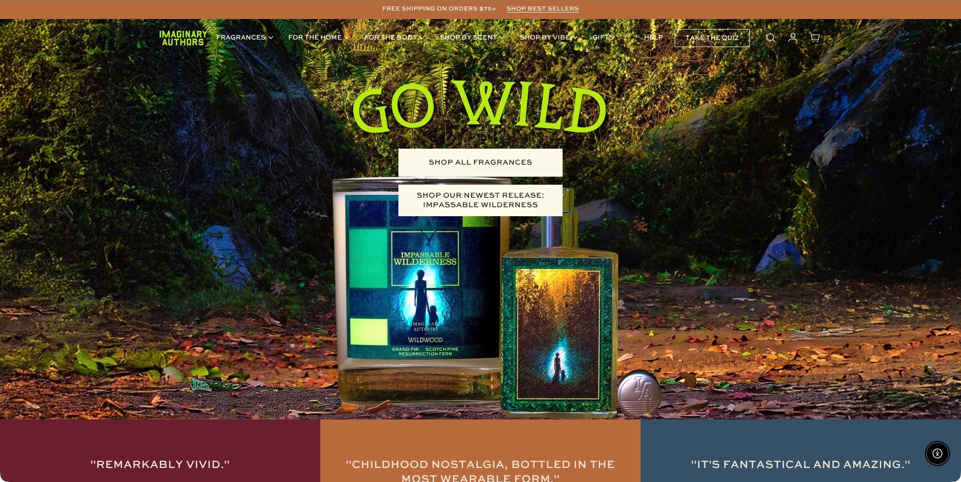
Imaginary Authors places a named Impassable Wilderness fragrance presentation inside a forest scene beneath a bright green Go Wild headline. Two cream actions distinguish the full fragrance collection from the newest release. The header also separates shopping by scent from shopping by vibe, alongside home, body, gifts and a quiz route. The coordinated imagery makes the release’s fictional world visible without replacing all navigation with storytelling. Product appearance and descriptive mood remain editorial presentation, not independently verified notes, ingredients, environmental claims or an assurance of how it will smell.
What you can learn
Give an imaginative perfume range more than one entry point. A visitor may remember a scent note, respond to a mood or simply want a sample set. Keep those routes understandable and connect stories to concrete product names, sizes and discovery options rather than relying on decorative prose alone.
Pros
Separate collection and release actions make the campaign destinations easier to distinguish.
Scent and mood labels acknowledge different ways customers describe an unfamiliar fragrance.
Cons & considerations
A richly detailed forest background can compete with small header text.
Mood-based browsing needs useful product explanations so evocative labels do not become dead ends.
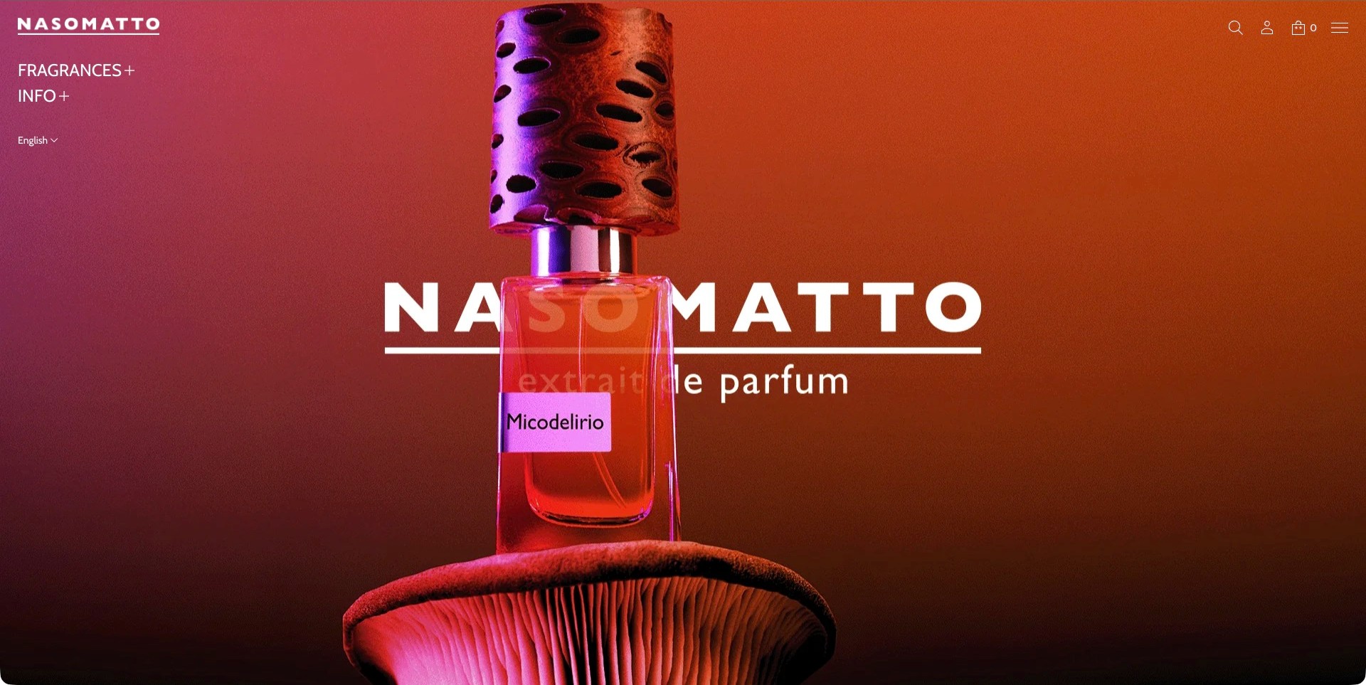
Nasomatto introduces Micodelirio with an oversized bottle, a textured perforated cap and a broad organic form beneath it, all lit in orange and magenta. A large white wordmark crosses behind the bottle, while a smaller brand mark, Fragrances and Info stay at the upper left. Search, account, bag and menu icons occupy the opposite corner. The product label remains readable within this unusually saturated scene. The useful example is the relationship between packaging, light and interface restraint, not evidence about the cap material, formula or fragrance character.
What you can learn
A distinctive bottle can anchor an expressive fragrance website without requiring several competing campaign messages. Keep a direct collection route and enough ordinary product text to identify the offer. Supply neutral product views and practical details elsewhere so dramatic lighting is not the only basis for comparison.
Pros
The product name remains identifiable despite the highly stylized lighting.
A small set of navigation choices keeps the visual emphasis on the bottle.
Cons & considerations
Saturated lighting can make actual packaging colors difficult to judge.
Icon-led utilities need clear accessible labels and usable focus states.
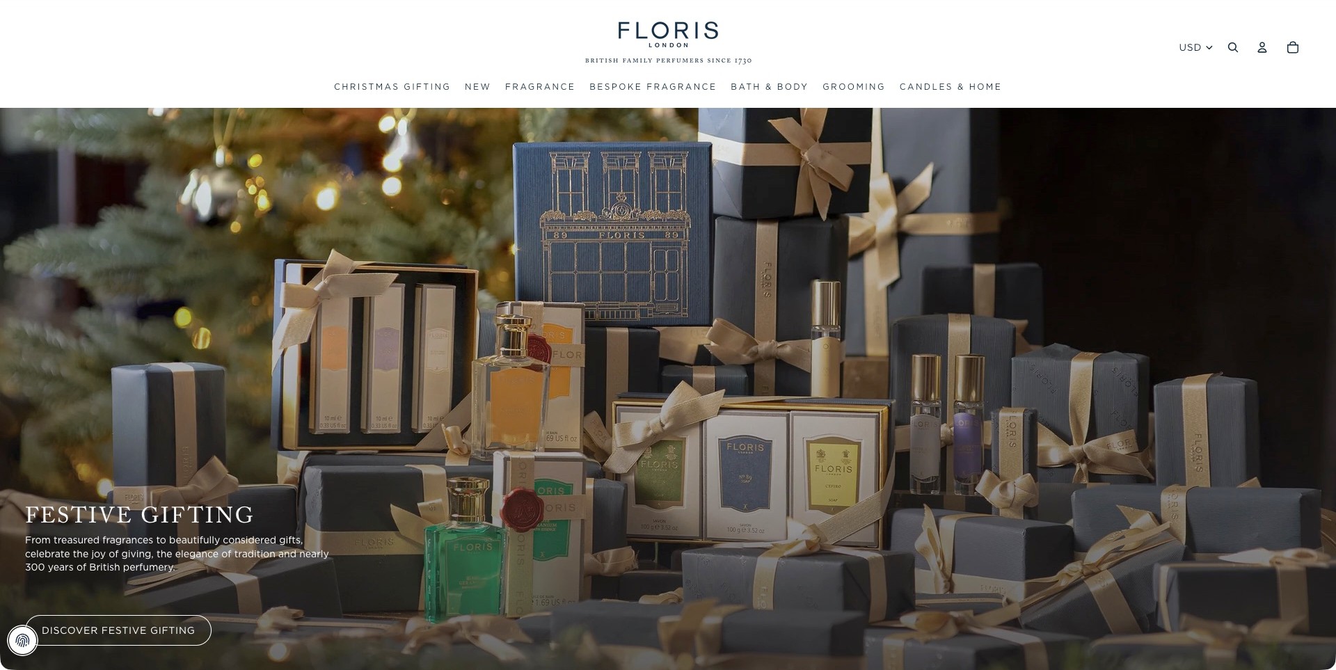
Floris London’s US storefront arranges branded fragrance bottles, small sprays, boxed sets and soap packaging among blue-gray parcels and gold-colored ribbons. A Christmas tree remains softly visible behind the products. The white header uses a centered wordmark and separates Fragrance, Bespoke Fragrance, Bath and Body, Grooming, and Candles and Home. Festive Gifting text and an outlined action sit at the lower left. USD is displayed in the utility area. The presentation demonstrates coordinated merchandising, without independently adopting the site’s heritage, material or product-quality claims.
What you can learn
Show the relationships between gift formats while keeping the path to ordinary fragrance shopping and bespoke enquiries distinct. A seasonal arrangement should lead to product pages explaining what each set contains, its sizes and any relevant conditions. Matching wrapping alone cannot communicate those differences.
Pros
Consistent packaging colors make a large gift arrangement feel visually connected.
Separate bespoke and retail fragrance routes acknowledge different visitor intentions.
Cons & considerations
A dense gift scene can make individual product names and contents harder to compare.
Text over a detailed photograph needs contrast checks across responsive image crops.
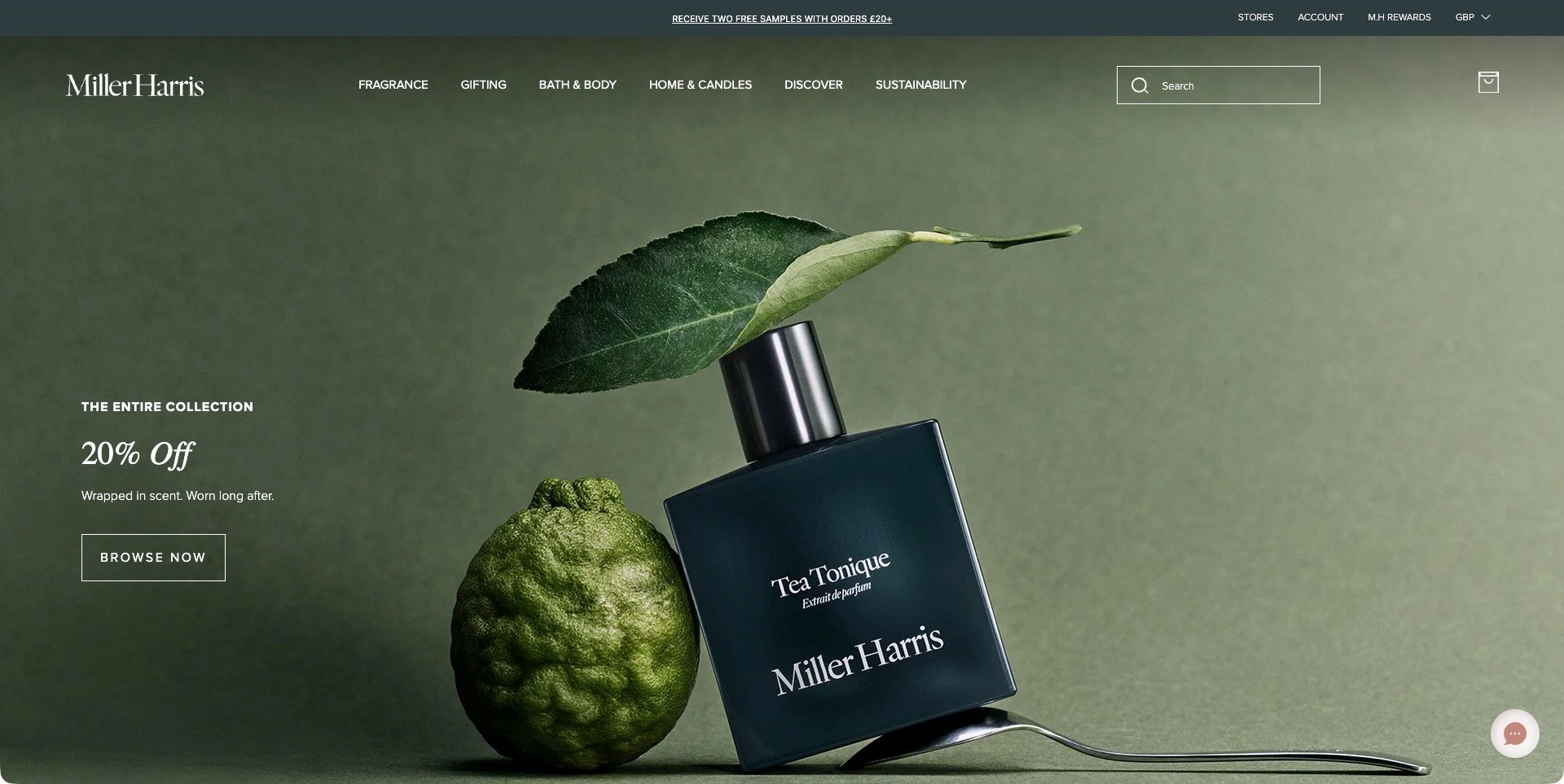
Miller Harris places a Tea Tonique bottle beside a textured citrus fruit and a leaf, using a muted green background that continues behind the white navigation. A spoon extends along the lower edge of the still life. Collection-wide promotional text and a bordered Browse Now button occupy the left, while a substantial search field remains at the upper right. The captured global storefront displays GBP rather than a silently substituted US price context. The arrangement suggests an editorial mood, not independently established ingredients, scent notes, discount eligibility or product performance.
What you can learn
Keep a recognizable fragrance product visible when a price promotion leads the page. Pair broad browsing actions with search and stable category labels so a returning shopper can bypass the offer. Botanical props may support a story, but product descriptions should explain the actual scent and composition claims clearly.
Pros
The named bottle remains the primary product anchor within the still life.
A visible search field provides a direct route beyond the collection-wide offer.
Cons & considerations
White navigation over photographic backgrounds needs contrast checks across every crop.
If a promotion covers a collection, exclusions and expiry require consistently maintained destination information.
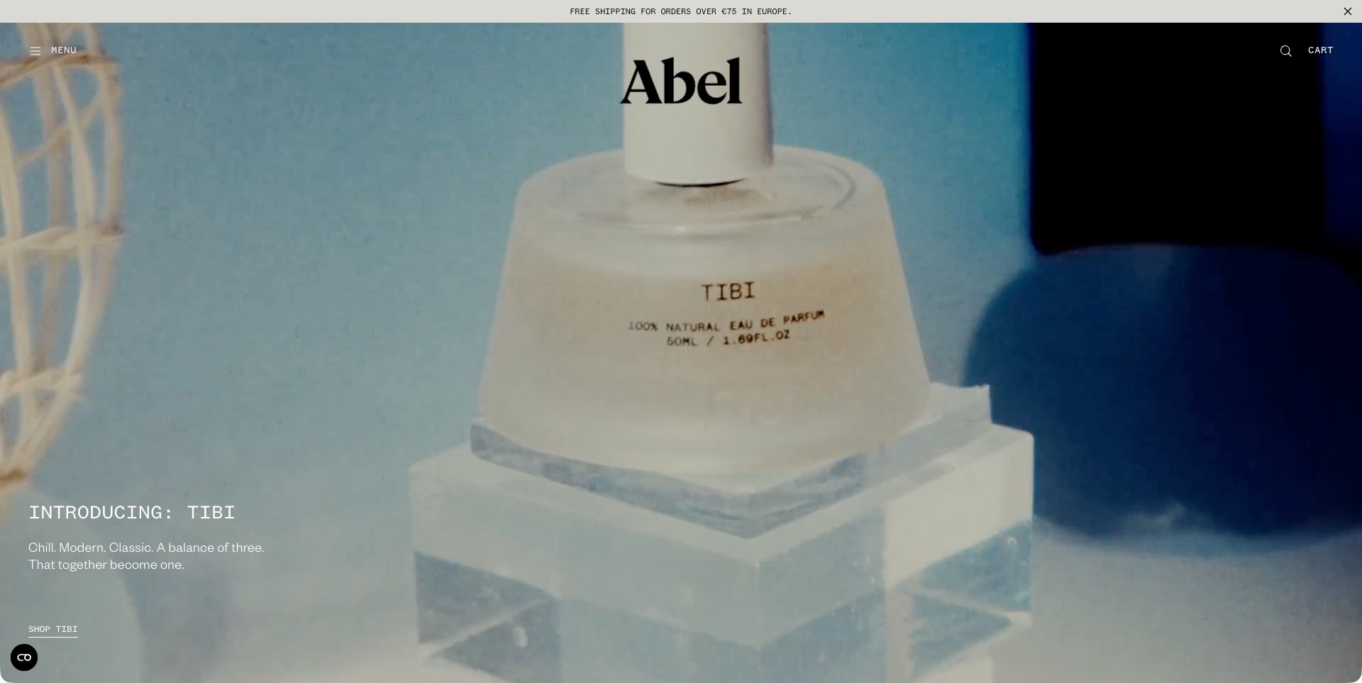
Abel’s international homepage introduces TIBI with a large pale perfume bottle on translucent display blocks against blue and black areas. The oversized serif brand mark sits near the top, while Menu, search and Cart remain restrained at the edges. Lower-left copy names the release and supplies a small Shop TIBI link. A separate utility strip refers to European shipping in euros, preserving the actual international context. This is one saved campaign-film frame; the bottle’s natural-language label is not independent ingredient, safety or environmental verification.
What you can learn
Name a fragrance plainly even when its image treatment is atmospheric. Keep the release action distinct from general navigation and regional service information. Product pages should add sizes, discovery options and understandable scent descriptions rather than making customers infer them from packaging or the tone of the campaign.
Pros
The release name and specific shopping link identify the featured product clearly.
Minimal utilities leave the main composition visually uncluttered.
Cons & considerations
A small lower-corner shopping action can be easy to miss within a tall film.
Very pale text and packaging need readable contrast across changing frames and responsive crops.
Kegan is a freelance web designer and developer with 15+ years of experience helping businesses turn complicated website requirements into clear, maintainable digital experiences. He works directly with clients from planning and design through development, launch, and ongoing support.
For perfume brand website design, his development approach focuses on understandable fragrance and format discovery, useful scent descriptions and sampling choices, clear delivery and returns information, and considered product presentation without unsupported sensory promises. The scope can be a targeted improvement or a complete custom build, with responsive layouts, thoughtful content structure, and integrations chosen around the people using and maintaining the site.
Show 3 other perfume brand website designersHide other perfume brand website designers
Plan a perfume website around description, discovery and product clarity
Create a scent vocabulary people can actually use
Start with the distinctions the brand wants customers to understand. A broad family such as floral, woody or citrus may provide a useful entry point, while a more detailed description explains the character of an individual fragrance. Agree the vocabulary with the people responsible for the products. Keep labels consistent across navigation, product cards and product pages rather than changing them to suit each campaign.
Leave room for evocative storytelling without requiring it to do every job. A place, memory or imagined scene can make a fragrance memorable, but visitors still need an anchor for comparison. A short plain-language description can sit beside the longer narrative. Avoid presenting a note list as a complete recipe or promising that every wearer will perceive the same sequence, intensity or emotional effect.
D.S. & Durga exposes scent-type routes as well as product formats in its public navigation. Le Labo separates named fragrances from format-based discovery. Those are useful structural references: one customer begins with a sensory preference, another already knows a fragrance name. Design a route for both without copying another brand’s proprietary names or making unsupported comparisons to a familiar perfume.
Treat the bottle, fragrance and format as related but different records
Define the product model before building the storefront. A single fragrance may appear in several bottle sizes, a discovery set, a travel product and a body or home format. Those items should be related without being silently treated as identical. Record the exact product name, quantity, format and approved description so a customer understands what the selected price buys.
Make photography show the relevant contents. A gift-set image should not require the customer to infer quantities from the number of bottles in a stylized scene. Include a readable description of what is included and identify decorative props. Show packaging when it matters to gifting, but avoid implying that an optional box or accessory is part of every order. Variant changes should update the important product information as well as the picture.
Keep reusable product records distinct from campaign pages. A seasonal feature can introduce a fragrance world and lead to the maintained product record. When a format becomes unavailable, update that record and the places that point to it. This is more dependable than leaving several old landing pages with different prices, sizes or stock messages scattered through the site.
Build an honest sampling and discovery path
Decide how a new customer can experience the range before committing to a larger purchase. The available route might be a sample set, a discovery kit, a store, an event or a conversation with the team. Explain what is actually offered, the contents and any conditions. Do not describe a small spray, a printed scent card and a full discovery experience as interchangeable simply because all can appear under a sample category.
If there is a later purchase credit, state the approved terms where the customer makes the discovery purchase. If there is no credit, do not borrow the language from another brand’s program. Keep expiry, regional restrictions and product eligibility clear when those conditions apply. A short explanation of the process can be more useful than a prominent promotional badge that leaves the important details hidden.
Give quizzes and recommendations an appropriately modest role. They can narrow a range by stated preferences, but cannot establish how a fragrance will smell on someone’s skin or guarantee that they will enjoy it. Let customers reach the catalog without completing a quiz, signing up for a newsletter or submitting personal details. Optional discovery tools should support exploration rather than become a compulsory data-collection gate.
Use art direction to express character without hiding the product
Choose a visual system that distinguishes the house while keeping essential information legible. Photography can evoke materials, a landscape or a studio process, but the perfume name, format and action should remain understandable. A homepage that consists only of atmospheric video may be a deliberate brand opening; it still needs a dependable route into the range and a useful experience when that video does not load.
Plan for smaller screens and reduced motion from the start. Keep copy away from unpredictable highlights in video, provide adequate contrast and avoid requiring hover interactions to reveal the product name. A long editorial page can work when its structure gives readers places to pause and return to the product. It becomes difficult when every scroll changes the navigation or makes the page feel like an unskippable introduction.
Ffern’s public site connects seasonal releases with a wider world of stories and creative work. That suggests a useful principle for smaller fragrance houses: build an editorial system around a genuine point of view, not an endless stream of unrelated lifestyle posts. Record credits and permissions for the imagery, music and collaborators used to express that world. The brand story should remain maintainable after the launch campaign changes.
Keep product information, gifting and regional availability connected
Place approved ingredient and product-use information where it can be maintained consistently. If formulas, packaging or market requirements change, the content process should make clear which record applies to which product. Avoid turning an informal scent description into a claim about treatment, safety or physiological effects. Questions about an individual’s suitability may need an appropriate professional or product-support route rather than a marketing quiz.
Design gifting around practical choices. Explain the contents of a set, available message or packaging options and the relevant delivery information. A gift finder can organize products by format or occasion without inventing a universal scent for a demographic. Keep the final basket clear about the selected items and any paid additions. Do not make someone discover essential shipping restrictions only after completing a long personalization process.
Keep regional storefronts coherent. Currency, shipping destinations, stock and product names may differ, so a region change should explain what has changed and preserve the customer’s context where possible. Link stores and stockists accurately, distinguishing owned locations from independent retailers. A beautiful global campaign should not conceal the fact that a particular product or service is only available in selected markets.
The editing job behind the design
Choose tools for connected fragrance records and useful discovery
Model fragrances, formats, sizes, sets and editorial stories as related content. Avoid using a collection tag as the only record of what a set contains. A clear data model makes comparison, regional updates and future campaign changes easier to maintain accurately.
Treat discovery sets, appointments and optional quizzes as distinct workflows. Keep their confirmations honest and their information requests proportionate to the task. A newsletter subscription is not a product reservation, consultation or promise of availability.
Prioritize responsive imagery, readable descriptions, reliable variant selection and accessible controls. The public technologies visible on an example do not establish its formulation systems, private inventory tools or customer-preference database. Describe only observed references and properly qualified documentary associations.
Our WordPress website examples offer a separate look at publishing approaches. A visible platform label is evidence for that named page, not a guarantee that the same system will suit your requirements.
Before the public launch
Perfume brand website planning checklist
Agree a consistent scent vocabulary with the product team.
Pair evocative stories with plain comparison anchors.
Separate fragrance identity from format and size.
Describe the exact contents of sets and discovery products.
Identify props and optional packaging in product images.
Explain the available sampling or store route.
Keep any discovery-credit conditions visible and approved.
Make quizzes optional and avoid preference guarantees.
Maintain ingredient and product information in one dependable record.
Avoid universal safety or therapeutic claims from broad marketing labels.
Explain regional availability and delivery restrictions early.
Keep gifting options and paid additions clear.
Provide readable fallbacks for video and reduced motion.
Record image, music and collaborator permissions.
These checks are a project checklist, not a performance, legal, security, or accessibility certification. Test real journeys with the people responsible for the website before making claims about the result.
Sources & editorial method
How this collection was selected and reviewed
This collection contains exactly 16 distinct public perfume brand website examples, matching the original target saved before research. Each accepted image was independently inspected at full resolution. The 5 retained original direct captures keep their genuine earlier dates and bytes; 11 new browser captures retain actual UTC timestamps and remove only the observed native browser toolbar. Dated current first-party observations establish relevant own-brand product fit without turning older screenshots into fresh captures. Ffern is the explicit researched Editors Choice for the stated website-design reasons, not a measured or vote-derived ranking. Reviews evaluate visible communication and presentation only. Ingredients, efficacy, safety, materials, environmental descriptions, heritage, availability and commercial outcomes remain unverified unless separately established; no product-quality or service endorsement is implied. Unknown technologies remain unlisted pending scoped public evidence. External designs, images and trademarks belong to their respective owners.
Each example links to its actual source page. Screenshots are direct browser captures with their own capture dates; moving imagery, announcements and live designs can change. The notes describe observable design choices and conditional tradeoffs, not measured traffic, conversion results, service quality, or accessibility conformance.
Technology labels use public page metadata, asset evidence, or explicitly cited platform documentation. Platform documentation is not a complete current deployment audit. A component reference may be legacy or unused; it is not a complete backend inventory. Unknown stacks are omitted. These sites are editorial examples, not our client portfolio.
Written, Edited and Curated are separate editorial records, not timestamps advanced by a rebuild. Website designs and imagery belong to their owners. See our editorial standards or suggest a correction.
Questions worth asking
Perfume Brand website design questions
How can a website communicate a scent?
It can offer useful descriptions, scent families, imagery and a route to discovery, but cannot reproduce smell through a screen. Combine an evocative story with a practical comparison anchor and explain how customers can experience samples or visit a location where those options exist.
Should every perfume brand offer a quiz?
No. A well-organized catalog and a clear discovery route may be more useful. If a quiz is offered, keep it optional and explain that it suggests a shortlist rather than guaranteeing preference or personal suitability.
Can the same description cover every format of a fragrance?
Not automatically. A perfume, body product and home-fragrance format may require different product information. Relate them through the fragrance identity while maintaining the correct quantity, instructions and approved descriptions for each actual item.
What should a discovery-set page explain?
Show the fragrances or items included, their quantities, the price and any applicable conditions. If a later-purchase credit exists, link its approved terms near the decision. Do not imply a credit or consultation that the business does not offer.
Does premium art direction need a complex technical stack?
Not necessarily. A maintainable content system, coherent product records and strong original assets can support a distinctive experience. Choose additional motion or recommendation tools only when they serve a useful task and have a dependable fallback.
Borrow the evocative worlds, precise format descriptions and thoughtful discovery routes. Help visitors build a meaningful shortlist while remaining honest about what a screen can and cannot tell them.