A beautiful room can start a furniture decision. The website also has to help someone work out what fits, what is included, and how it gets to their space.
Furniture is a consequential physical purchase. A visitor may be comparing dimensions, choosing a finish, furnishing a workplace, or checking whether a sofa can reach an apartment. The homepage should provide useful routes into those decisions without asking a styled room photograph to answer every practical question.
This collection spans broad home stores, design-led brands, modular systems, outdoor furniture, office furniture, and a specialist cabinetry-component business. It also includes gateways that route visitors to regional or professional properties. Reviews distinguish those models and focus on visible presentation; they do not establish comfort, material performance, product safety, stock, delivery reliability, or checkout quality.
Before the examples
What makes good furniture store website design in 2026?
Make fit information a first-class product requirement
Prepare accurate dimensions, relevant clearances, configuration differences, and included components before designing the product template. Identify what the business can say about delivery access and assembly, and provide a route for uncertain cases. An attractive scale reference in a room is useful, but is not a measured plan or a promise that a piece will fit.
Connect the room to individually identifiable products
Name the pieces shown, distinguish sold-separately accessories, and keep the route useful when a featured item becomes unavailable. Complement complete-room imagery with isolated product views and material details. Do not imply that a room is a discounted set or that every finish pictured is available unless the actual catalog and offer support it.
Explain buying and assistance models clearly
A consumer order, a configurable system, a trade specification, a showroom visit, and a made-to-order quotation need different information. Label the paths accurately and explain what happens next. Publish the business’s actual regional delivery, returns, assembly, and support arrangements through maintained content rather than burying them in promotional artwork.
The collection · 18 examples
18 furniture store websites worth studying
Study how the stores balance room inspiration with search, material close-ups with whole-product views, and immediate shopping with professional or local assistance. The strongest reference depends on the decisions your furniture requires.
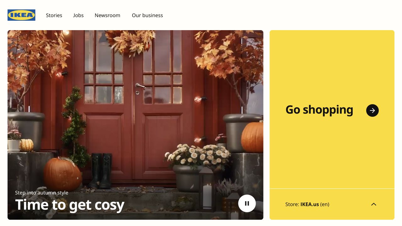
IKEA’s global property places a seasonal doorway photograph beside a large yellow shopping panel. The panel gives the regional store destination more visual weight than a small country selector normally receives, while editorial navigation remains along the top. This is a global gateway, not the complete local furniture storefront. It is useful for studying a business that needs to distinguish inspiration, company information, and actual regional purchasing. The saved photograph supplies atmosphere, but says relatively little about an individual furniture item or its dimensions.
What you can learn
Make a regional shopping handoff an explicit task. Label the destination, language, and market clearly, and preserve a way to correct the choice. Do not imply that a global editorial page contains current local stock, delivery terms, prices, or product availability unless that information really comes from the relevant store.
Pros
The shopping destination has its own unmistakable visual panel.
Editorial and transactional routes are separated rather than mixed into one list.
Cons & considerations
The seasonal scene provides little direct product-comparison information.
Visitors still need the correct local store to evaluate availability and fulfillment.
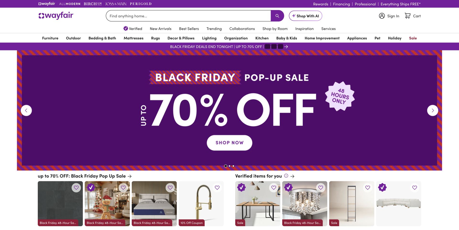
Wayfair places a wide product-search field within a header containing account utilities and multiple shopping routes. A dominant purple promotional panel occupies the center of the saved view, and product cards begin immediately underneath. The arrangement treats discovery as both a search problem and a merchandising problem. For a furniture catalog, those permanent search and category routes matter when a visitor has a specific room, measurement, or item in mind rather than an interest in the current promotion. The opening does not establish product quality, delivery performance, or the usefulness of search results.
What you can learn
Keep the permanent product taxonomy independent of seasonal offers. Prepare consistent fields for measurements, materials, configurations, and delivery information so category browsing and search can support meaningful comparison. Test the actual result and empty-result states, rather than assuming that a large search box guarantees useful discovery.
Pros
Search remains prominent despite the extensive merchandising navigation.
Product cards offer a concrete continuation beneath the campaign panel.
Cons & considerations
Several navigation layers make the first screen visually dense.
Large discount language can overpower ordinary room and product exploration.
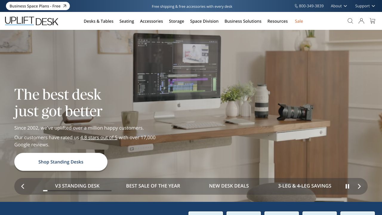
UPLIFT Desk shows a standing desk in a furnished working room, with recognizable equipment and storage around it. The header distinguishes desks, seating, accessories, storage, and business-oriented routes, while named campaign tabs appear below the hero. For a furniture reference, the room is useful because it establishes a plausible setting and the desk’s relationship to other objects. It does not supply a measured plan or explain which components are included. Configuration behavior and the suitability of any ergonomic claim were outside this homepage review.
What you can learn
Use the scene to introduce the use case, then let the product record carry accurate dimensions, frame and surface choices, compatibility, and included components. Show when a pictured accessory is a separate purchase. Rehearse invalid or unavailable configurations with the business before treating the promotional homepage as a complete buying journey.
Pros
The desk is placed in a recognizable working environment.
Business and accessory routes acknowledge buying needs beyond a single standard item.
Cons & considerations
Room imagery can make separately sold components appear included.
Named campaigns and utility routes add choices before detailed product comparison.
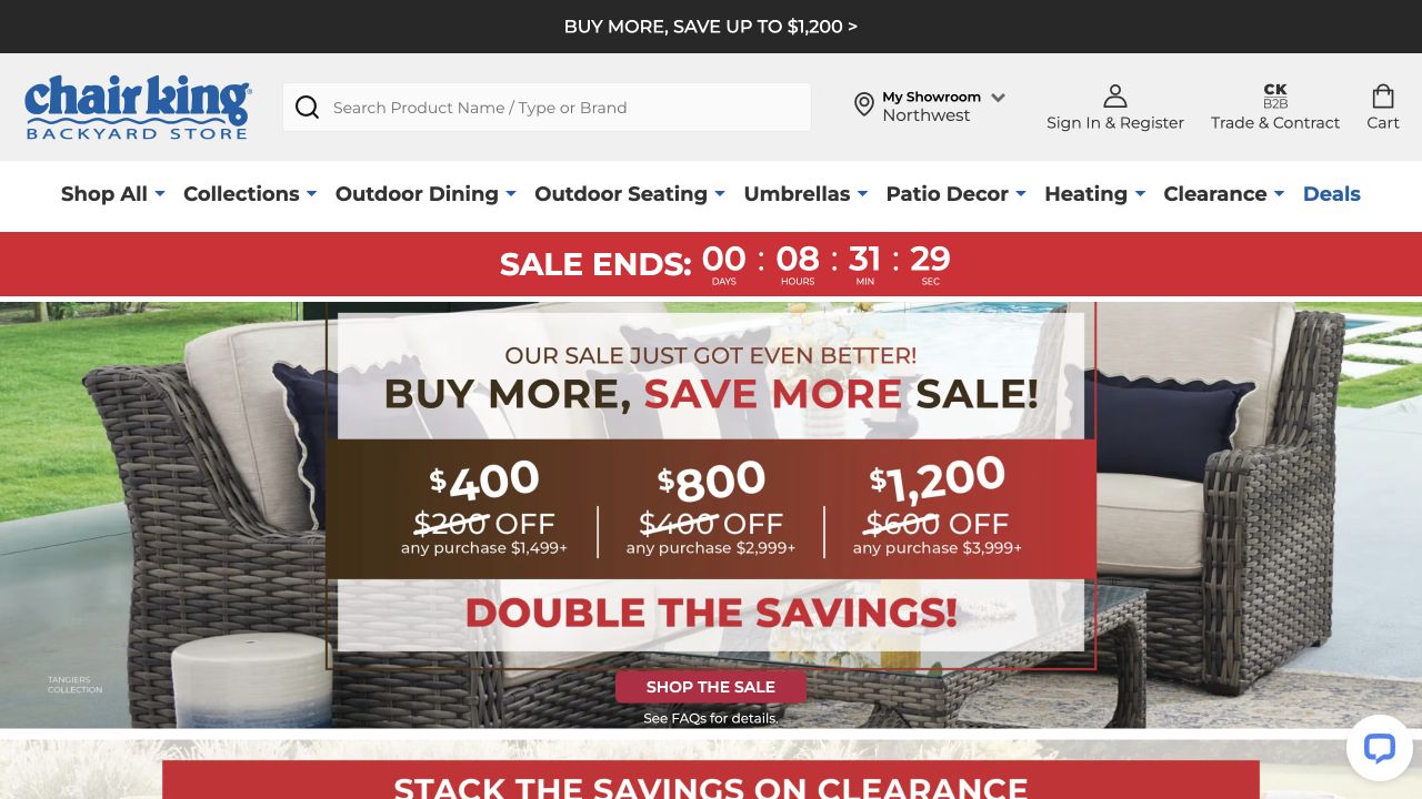
Chair King Backyard Store combines a wide product-search field with showroom, account, trade, and cart routes. Its captured campaign places tiered sale amounts and a countdown over a patio-furniture scene, while explicit outdoor categories remain above it. The showroom destination is an important clue about the business model: some visitors may want to inspect materials, comfort, or scale in person before ordering. The promotional frame does not establish local stock, delivery coverage, or the exact terms of an advertised offer.
What you can learn
Connect the online catalog to practical showroom information without making either route feel secondary. Explain local availability, store contact, large-item delivery, and which products can be viewed in person. Keep tiered promotion terms in maintained text as well as campaign artwork, with a clear owner responsible for removing expired messages.
Pros
Search and showroom access support practical furniture-shopping tasks.
Trade users receive a distinct route alongside consumer shopping.
Cons & considerations
Countdown and stacked sale messages compete strongly with the furniture itself.
Large-item delivery and local availability need detail beyond the first screen.
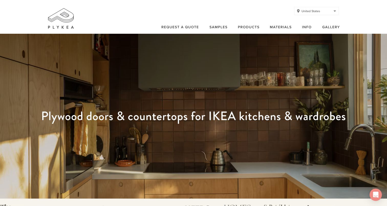
Plykea introduces plywood doors and countertops for compatible kitchens and wardrobes over a warm completed-kitchen photograph. The light header gives samples, products, materials, information, gallery, and a quotation route clear positions. Its inclusion broadens this furniture guide into cabinetry components: this is not a conventional freestanding sofa shop. The plain product description is particularly useful because compatibility is central to the offer. An attractive installation can show the intended result, but cannot establish that a particular customer’s cabinets or measurements are suitable.
What you can learn
Put compatibility and the path from sample to quotation into maintained product content. Explain required measurements, market-specific terminology, material options, and what information staff need before preparing a quote. Distinguish an inexpensive sample decision from committing to a complete project, and caption installation images with useful product context.
Pros
The opening explains the component category without assuming brand familiarity.
Samples and materials are visible beside the more involved quotation route.
Cons & considerations
A wide finished interior can conceal important construction and material detail.
Compatibility and regional fulfillment require more precise information than the photograph provides.
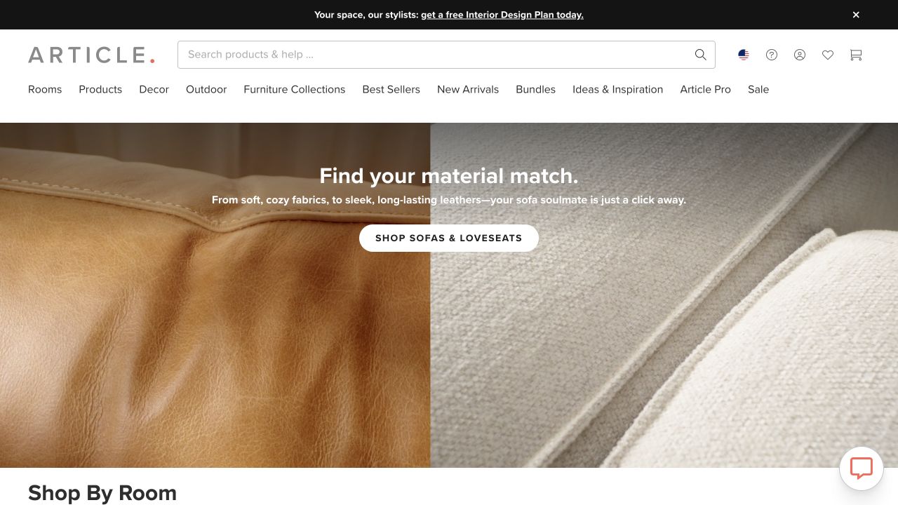
Article’s saved opening uses a close view of contrasting upholstery textures rather than a full room. A concise material-led message and a sofa-shopping action sit over the surface detail. The header supplies room categories, furniture categories, outdoor products, search, and account utilities, and a shop-by-room section begins below. The composition suggests that material choice is an important part of comparison, but an online photograph cannot communicate actual hand feel, durability, or the precise color a visitor will see in their own lighting.
What you can learn
Use close-ups to introduce material differences, then connect them to named finishes, care information, samples where available, and accurate product records. Include complete furniture and room views as complementary evidence. Keep a route to the product category for visitors who already know the material they want.
Pros
The detailed texture photograph makes a specific buying consideration visible.
Room and product routes remain available around the material-focused campaign.
Cons & considerations
A fabric close-up alone gives little indication of furniture scale or silhouette.
Material and color judgments need more evidence than one photographed surface.
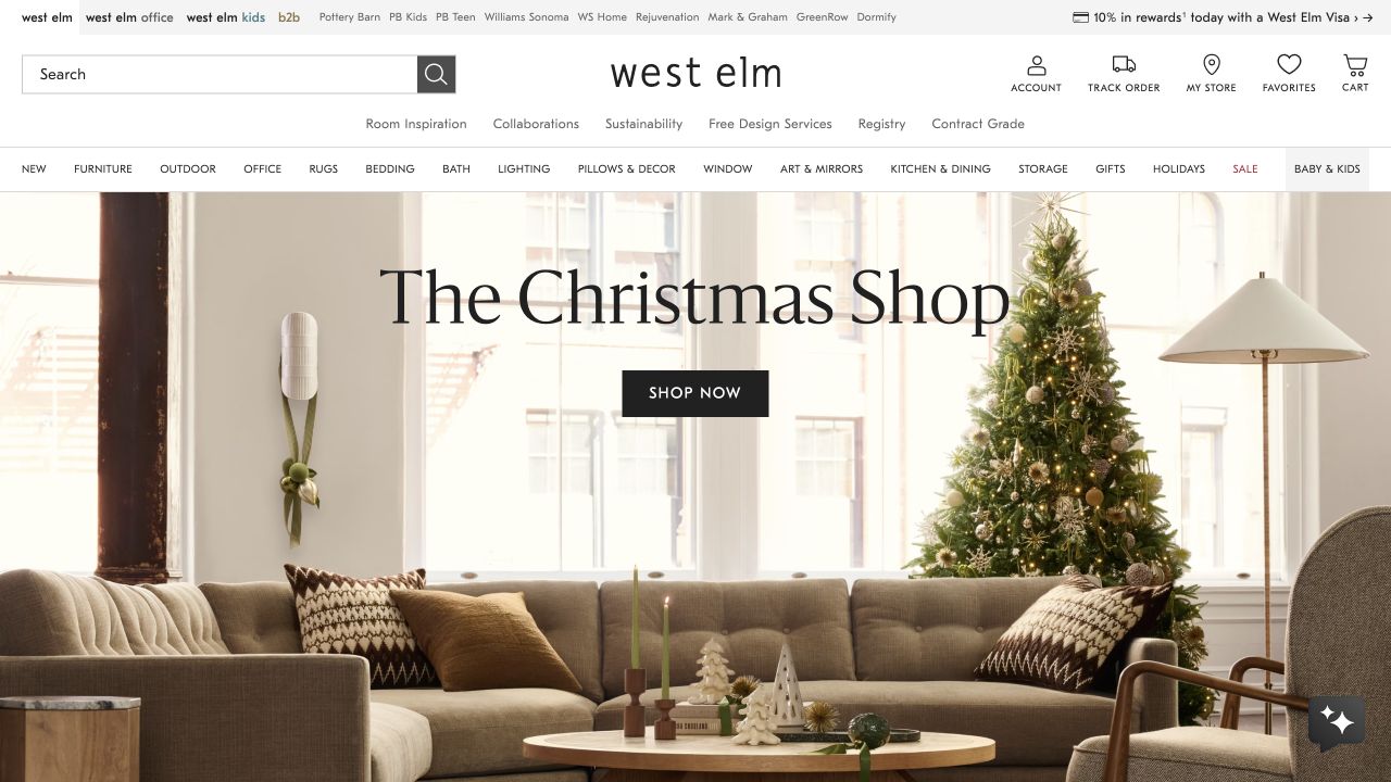
West Elm’s captured opening presents a sunlit living room with a sofa, lounge chair, lighting, and a decorated tree. A seasonal shopping message and a dark button sit above the furnishings. Search, account, store, favorites, and cart utilities occupy a substantial white header, followed by furniture and home-product categories. The scene helps establish a coordinated room rather than one isolated product, while the permanent navigation lets visitors bypass the seasonal collection. The review does not establish which pictured pieces are included in that collection or currently available locally.
What you can learn
Identify the individual products in styled rooms and provide a useful path to them. Keep furniture discovery stable while holiday and decor campaigns change. Separate local-store information, delivery options, and promotional qualifications from the imagery so practical shopping questions do not depend on interpreting a seasonal photograph.
Pros
The room scene shows several product types in a coherent setting.
Search and store utilities remain outside the seasonal artwork.
Cons & considerations
Several header and category layers consume substantial first-screen space.
The broad seasonal message does not identify every piece visible in the room.
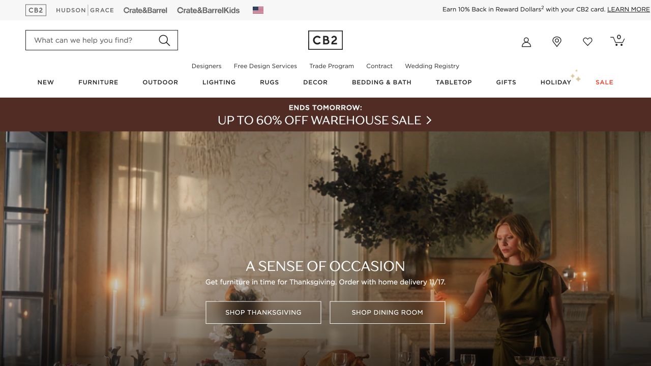
CB2 uses a dark, carefully styled dining room as its campaign stage. Two adjacent actions separate the seasonal occasion from the broader dining-room category, while a compact but extensive shopping header stays above the image. The photograph includes a person, furnishings, lighting, and decorative objects, giving the range a recognizable social setting. This is a useful example of pairing editorial atmosphere with more than one discovery path. The staged scene does not independently establish comfort, scale, delivery conditions, or the properties of a material.
What you can learn
Give an occasion campaign a durable room-category alternative. Name the furniture and accessories shown, and make it clear which action opens a curated seasonal selection rather than the complete range. Preview text and controls against each approved image, especially when dark finishes and low lighting are central to the brand style.
Pros
Separate occasion and room actions clarify two reasons to continue browsing.
The dining scene gives several related products a shared context.
Cons & considerations
Dark atmospheric photography reveals less material detail than a neutral product view.
The opening needs additional product identification to distinguish the featured pieces.
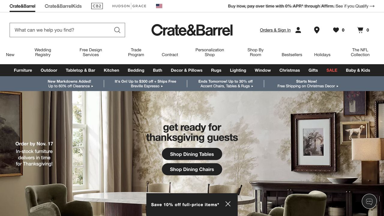
Crate & Barrel places a dining-room photograph beneath a multi-layer retail header. A seasonal hosting message is followed by separate buttons for dining tables and dining chairs, rather than a single vague shopping action. The room includes framed art, lighting, seating, and a table, so this division gives the viewer a concrete way to begin recreating part of the scene. It does not imply that the items form one bundled set or confirm their current stock and delivery dates.
What you can learn
Make the relationship between coordinated items explicit. A room photograph can introduce a pairing, while product content should explain dimensions, quantities, finishes, and whether pieces are purchased separately. Keep campaign routes useful when one featured chair or table becomes unavailable, and maintain a normal category destination beyond the seasonal presentation.
Pros
Separate table and chair actions translate the room into practical product routes.
The styled interior helps explain how complementary categories can work together.
Cons & considerations
A broad home-retail header creates many competing navigation choices.
The complete scene can suggest a bundle unless individual purchase details are clear.
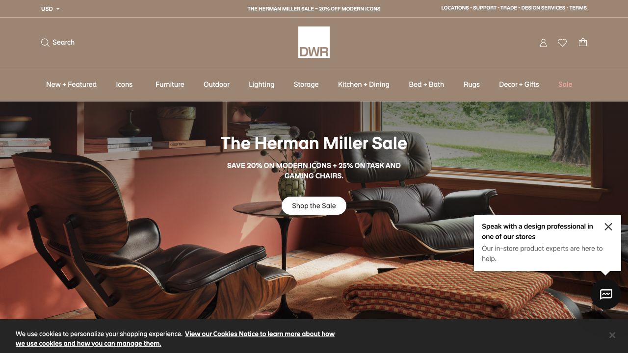
Design Within Reach gives a lounge-chair room scene most of the opening, with a centered brand-specific promotion and shopping button. Its warm neutral header names icons, furniture, outdoor, lighting, and other categories, while locations, trade, and design-service routes sit above. This gives different audiences a way into the same catalog: a visitor seeking a familiar designer piece can approach it differently from someone furnishing a room. The sale artwork and iconic furniture are presentation evidence, not verification of promotional eligibility or an individual product’s delivery terms.
What you can learn
Support both known-item and room-based discovery. Keep designer or collection attribution accurate, explain available variations, and provide relevant dimensions and finish information on maintained product pages. Trade and design assistance should describe their actual scope instead of acting as unexplained header labels.
Pros
Icon and room-oriented categories support different furniture-shopping intentions.
Locations and assistance routes acknowledge decisions that may need human advice.
Cons & considerations
Brand-specific sale messaging can dominate broader catalog discovery.
Privacy and chat surfaces in the captured session occupy part of the lower image.
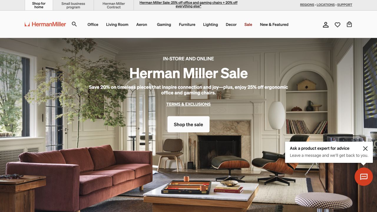
The Herman Miller Store places a complete living room behind its central campaign statement. Seating, tables, lighting, records, and plants establish a residential use case rather than an office-only impression. The upper strip separates home shopping, a small-business program, and contract information, while the main categories include office, living room, named chair families, gaming, and more. A visible terms-and-exclusions link accompanies the offer. This is an audience-routing reference; the capture does not establish product suitability or verify the commercial conditions.
What you can learn
Separate consumer browsing from business procurement where their requirements differ. Explain which catalog, assistance, pricing arrangements, and delivery information apply to each route. On the consumer product pages, keep dimensions, finishes, included elements, care, and product-specific documentation available without expecting a room photograph to answer those questions.
Pros
The room demonstrates a wider residential range than a single office chair.
Home, small-business, and contract audiences receive visibly different routes.
Cons & considerations
Multiple audience and product layers create a busy header.
A complete styled room still needs clear identification of separately sold items.
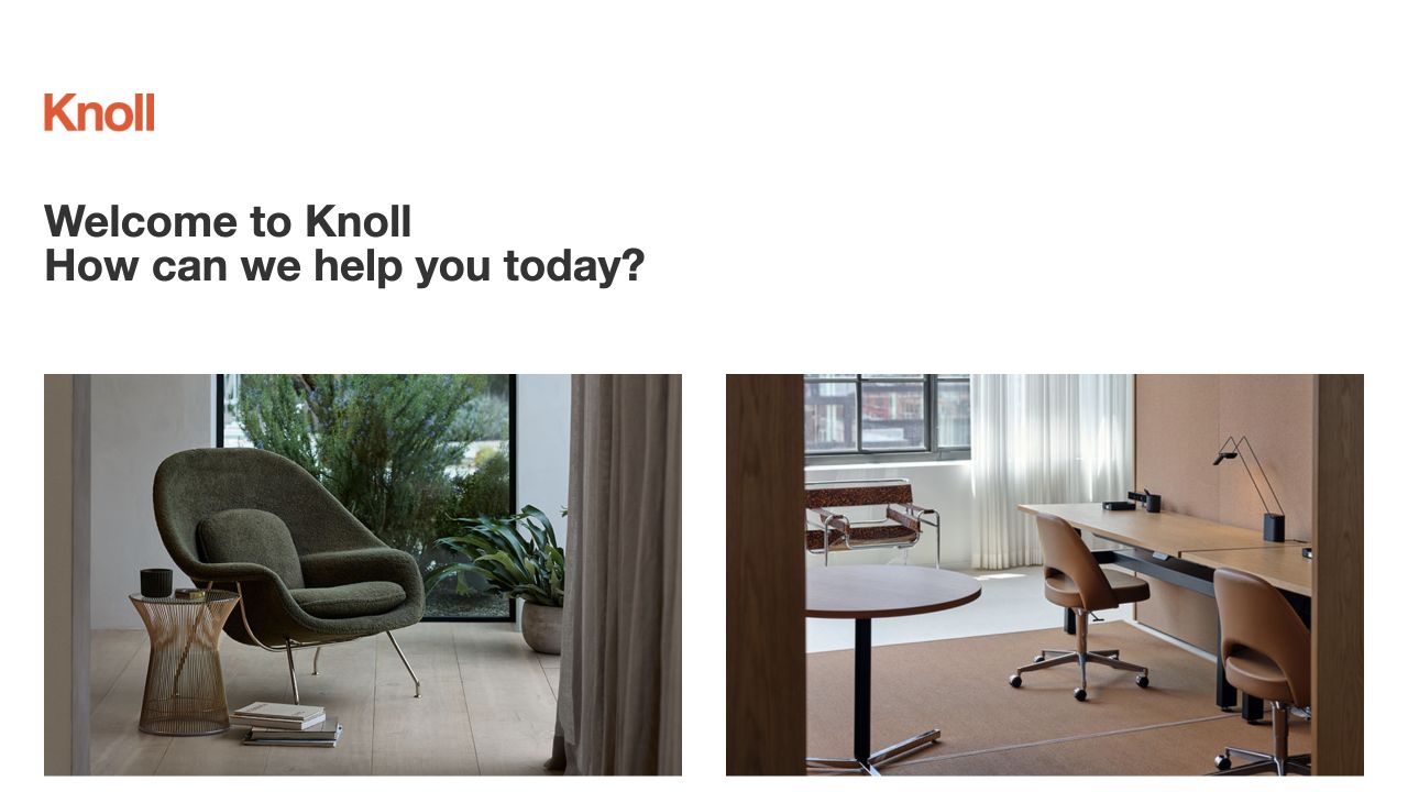
Knoll’s gateway uses a plain welcome question followed by two large photographic choices. One shows a lounge chair in a domestic setting; the other shows a long workplace table and seating. The routes distinguish shopping for home from planning for the workplace, making the business-model difference visible before displaying a large catalog. This is a gateway page, not evidence of a complete product-selection or specification workflow. Its simplicity is useful when the right destination depends more on the buyer’s task than on a featured seasonal product.
What you can learn
Use audience routing only when the destinations offer meaningfully different information and support. Name the action expected on each side, preserve a way back, and explain regional differences where needed. Keep the residential shop and professional planning resources connected through accurate product identities rather than leaving buyers in unrelated content systems.
Pros
Two large images make the home-versus-work distinction easy to identify.
The introductory question gives the gateway a clear purpose.
Cons & considerations
A known-product shopper must make another choice before reaching the catalog.
The gateway itself supplies little detail about products, specifications, or availability.
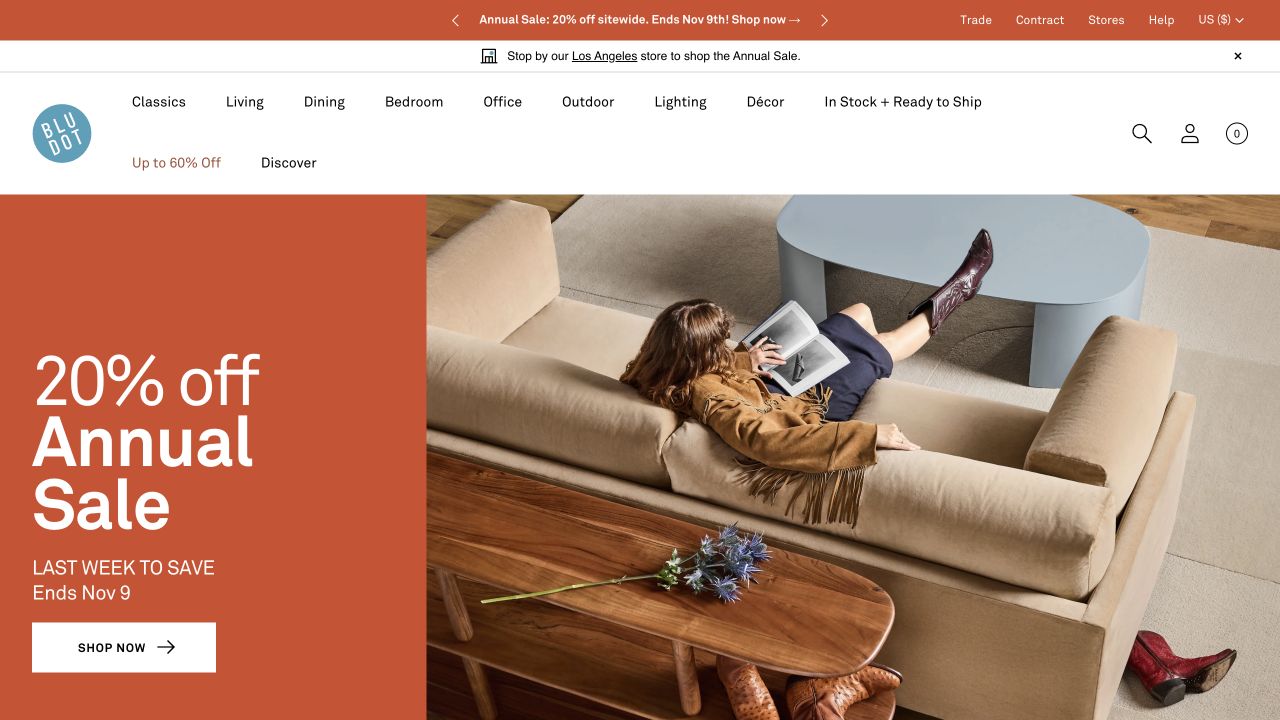
Blu Dot divides its opening between an orange promotional panel and an overhead photograph of a person relaxing on a sofa. The crop makes the furniture’s relationship to a coffee table, rug, and surrounding space visible, while a white navigation layer lists living, dining, bedroom, office, and outdoor categories. Trade, contract, stores, and help routes recognize several ways to buy or specify the range. The photograph provides context, not a measured floor plan or evidence about comfort.
What you can learn
Pair expressive color with stable product labels and informative furniture photography. Use the overhead view as one perspective among several, then provide dimensions, clearances, materials, and accurate variation information on the product page. Give ready-to-ship and professional routes explicit meanings so their labels do not imply availability or services the business cannot support.
Pros
The overhead composition reveals furniture relationships within a furnished space.
Room categories provide a steady framework around the promotion.
Cons & considerations
The large discount panel can overshadow product characteristics.
An attractive room crop does not supply the dimensions needed for a fit decision.
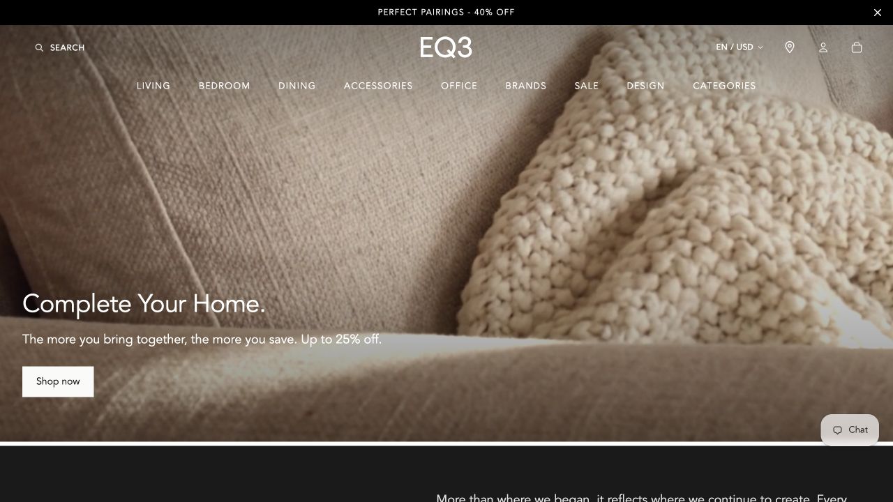
EQ3’s captured opening is a close view of pale textured upholstery. A short complete-home proposition and shopping action sit near the lower left, with restrained room and product navigation over the image. This is a material-led introduction rather than a conventional room photograph or product grid. Its tactile emphasis can establish a visual identity, but the image does not explain an item’s silhouette, dimensions, fiber composition, or performance. Store and regional controls provide practical context around the atmospheric opening.
What you can learn
Connect texture imagery to named material choices and real product records. Complement the close-up with complete product views, room context, care information, and samples where the business actually offers them. Keep local-store and regional details accurate, and avoid making a photographed surface stand in for a substantiated durability or sourcing claim.
Pros
The close view gives material character a clear editorial role.
Restrained navigation preserves a direct route beyond the atmospheric image.
Cons & considerations
The opening does not immediately reveal a complete furniture item.
Overlaid text needs checking against changes in a pale, detailed surface.
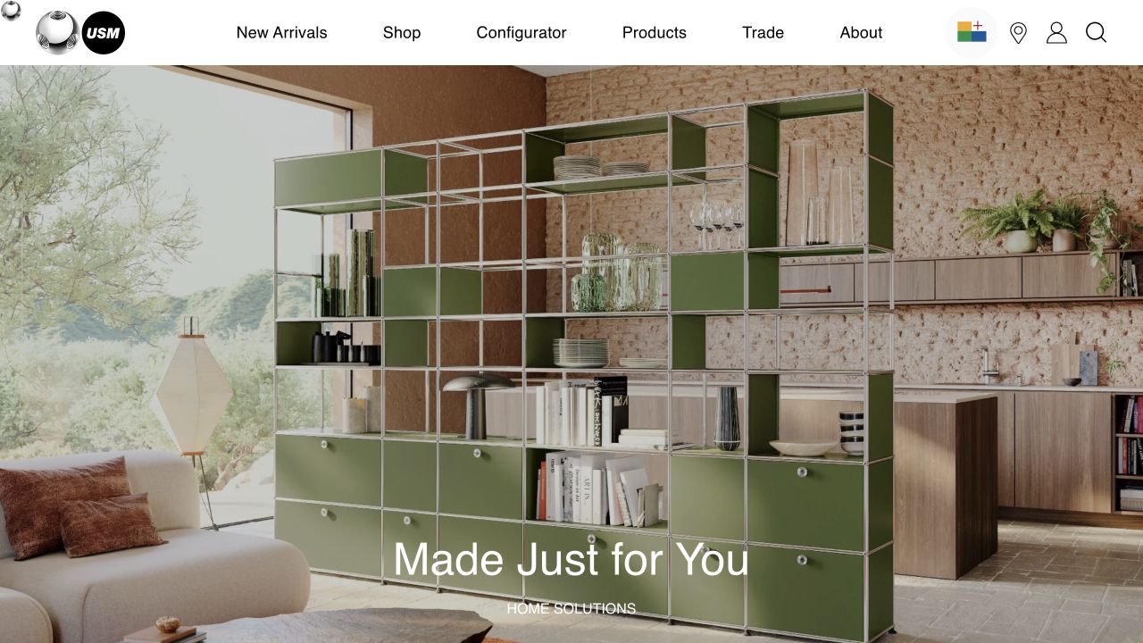
USM shows a large green storage installation in a furnished room, making the system’s repeating structure and range of compartments visible. The header separately names shopping, a configurator, products, trade, and company information, while the main message introduces the possibility of a personal configuration. This is useful for a modular purchase that may not fit a simple one-item product card. The room image demonstrates one arrangement; it does not establish which combinations, load limits, lead times, or installation requirements apply to a proposed order.
What you can learn
Introduce modularity visually, then explain the rules through accurate product and configuration content. Make selected dimensions, components, dependencies, and the path to advice understandable. Preserve the configuration through an enquiry or quotation handoff where appropriate, without implying that an attractive example is automatically valid for every room or use.
Pros
The installation makes the modular structure visible in a recognizable setting.
The configurator has a distinct label rather than being hidden inside general shopping.
Cons & considerations
One photographed arrangement cannot explain all configuration constraints.
Visitors still need practical size, assembly, and delivery information beyond the campaign.
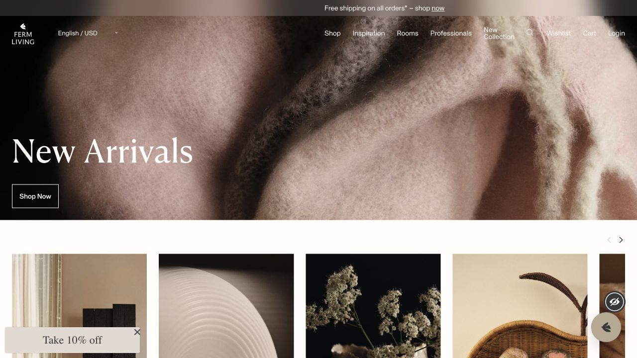
ferm LIVING places a close material detail behind its new-arrivals message, followed by a row of product and editorial images. Navigation distinguishes shopping, inspiration, rooms, professional information, and the current collection. The property mixes furniture with lighting and smaller homewares, making it a useful reference for a store that wants to present a coordinated interior vocabulary rather than only large objects. The close-up introduces texture, but does not identify the dimensions or construction of a complete furniture piece.
What you can learn
Keep room inspiration connected to precise product categories and individual item information. Distinguish the furniture, accessories, and editorial material within a styled scene, and provide a practical route for professionals who need specification details. Do not let a coherent aesthetic imply that products share the same material, delivery, or care requirements.
Pros
Room and inspiration routes support browsing across a coordinated collection.
The product row begins to translate abstract material imagery into actual objects.
Cons & considerations
The opening material crop provides limited information about furniture scale.
A mixed homeware catalog needs clear distinctions between editorial images and shoppable items.
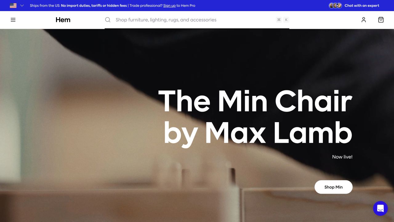
Hem introduces a named chair and its designer over close footage of material being worked. A direct product action sits within the hero, while the header gives search unusual prominence and provides a separate route for trade professionals. This approach connects an individual furniture launch with a making process instead of beginning with a generic room. The captured frame may not show the complete chair, so the next product page needs to supply the shape, dimensions, materials, and options that the introduction leaves open.
What you can learn
Use designer and making stories to add context to an accurately documented product. Credit the designer, identify the relevant piece, and provide complete views alongside detail footage. Keep professional information and consumer purchase information distinct, and have the business verify any material, manufacturing, stock, or delivery statements.
Pros
The launch is tied to a named product and designer rather than an anonymous collection.
Prominent search offers a direct alternative to the featured launch.
Cons & considerations
Close process footage does not communicate the entire furniture silhouette.
Trade and regional arrangements require explanation beyond a compact utility strip.
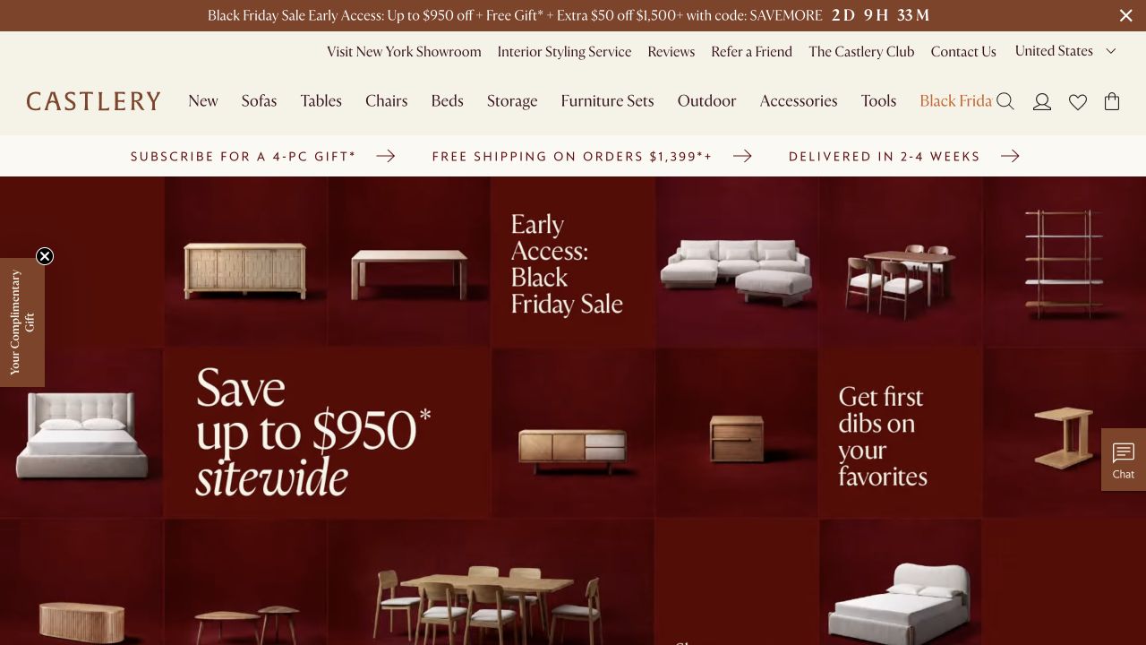
Castlery’s saved campaign arranges sofas, storage, tables, chairs, and shelving across a deep red tiled composition. The main category navigation remains above it, while showroom, styling, reviews, contact, and country information occupy a separate utility row. The campaign makes a range of furniture silhouettes visible without placing them all inside one room. Its promotional amounts, delivery wording, and gifts remain the retailer’s time-specific offer; this review does not verify their eligibility or applicability to a particular order.
What you can learn
Maintain clear product and room routes around a broad sale event. Connect each promoted category to a useful collection, explain applicable terms in maintained content, and remove expired messages deliberately. Give styling and showroom services their own scope so a visitor understands when they are browsing products and when they are requesting assistance.
Pros
The tiled composition exposes several product categories within one campaign.
Showroom and styling routes recognize decisions that may need more than online browsing.
Cons & considerations
Multiple promotion and utility rows create a crowded opening.
A category montage provides less room-scale context than a fully furnished interior.
Plan the furniture decision, not only the room photograph
Build the product record around awkward real examples
Choose a sectional with several configurations, a chair with multiple finishes, a large assembled item, a ready-to-ship piece, and a made-to-order product. Define accurate fields and explain meaningful differences. Ask the people who handle customer questions which missing details most often cause uncertainty, then make those details part of the content model.
Map inspiration into comparison and assistance
Walk from a room image to the individual pieces, their dimensions, material choices, and a realistic enquiry or order path. Include someone who knows an exact item and someone who wants advice. Explain what a showroom, styling service, trade account, sample request, and quotation can actually provide instead of treating them as interchangeable contact buttons.
Rehearse regional and fulfillment questions with staff
Have the business approve delivery coverage, access requirements, assembly language, lead-time explanations, returns, and made-to-order terms. Verify which system owns stock and which team handles exceptions. Use an appropriate test workflow for notifications and order states, and never infer that a completed homepage design means the physical fulfillment process is ready.
The editing job behind the design
Choose the catalog and configuration model before the visual layer
Start with the product and operating requirements: variations, modular dependencies, quotations, regional catalogs, samples, professional information, stock, and fulfillment. A standard commerce platform may fit a straightforward range. A custom configurator or separate frontend needs a specific reason, reliable previews, and named people responsible for its rules, releases, and support.
Keep room stories, product records, material information, promotional terms, and delivery explanations connected but separately maintainable. Record what each integration actually owns. A public site may expose a frontend, search service, or media host without revealing inventory, warehouse, configuration, or order-management systems. The technology lists do not claim to reconstruct that entire operation.
Our WordPress website examples offer a separate look at publishing approaches. A visible platform label is evidence for that named page, not a guarantee that the same system will suit your requirements.
Before the public launch
Furniture store website launch checklist
Verify dimensions, clearances, finishes, configuration names, and included components.
Identify products and separately sold accessories in each styled-room image.
Provide useful whole-product, room-context, and material-detail views.
Explain delivery coverage, access, assembly, lead times, and exceptions with approved wording.
Distinguish ordinary shopping, quotation, samples, showroom, styling, and trade routes.
Test unavailable configurations, incomplete measurements, and staff enquiry handoffs.
Review small-screen product controls, image crops, form labels, and keyboard focus.
Assign owners for catalog corrections, expired promotions, regional information, and broken links.
These checks are a project checklist, not a performance, legal, security, or accessibility certification. Test real journeys with the people responsible for the website before making claims about the result.
Sources & editorial method
How this collection was selected and reviewed
We selected official furniture and home-retail properties with different buying models, combining preserved dated library captures with thirteen direct new browser screenshots. The guide identifies global and audience gateways and explains the cabinetry-component specialist’s scope. We reviewed visible content and navigation, without placing orders, testing comfort or materials, creating accounts, or independently verifying delivery and promotional claims.
Each example links to its actual source page. Screenshots are direct browser captures with their own capture dates; moving imagery, announcements and live designs can change. The notes describe observable design choices and conditional tradeoffs, not measured traffic, conversion results, service quality, or accessibility conformance.
Technology labels use public page metadata, asset evidence, or explicitly cited platform documentation. Platform documentation is not a complete current deployment audit. A component reference may be legacy or unused; it is not a complete backend inventory. Unknown stacks are omitted. These sites are editorial examples, not our client portfolio.
Written, Edited and Curated are separate editorial records, not timestamps advanced by a rebuild. Website designs and imagery belong to their owners. See our editorial standards or suggest a correction.
Questions worth asking
Furniture Store website design questions
Should a furniture homepage start with a room or a product?
Use the image that answers the first useful question. A room explains context and relationships; an isolated item explains silhouette; a close-up introduces material. Most furniture decisions need more than one of those views. Keep a direct category or search route for visitors who already know what they need.
What information matters most on furniture product pages?
The answer depends on the piece, but usually includes accurate dimensions, meaningful configuration and finish differences, materials, care, included components, and the business’s actual delivery and assembly information. Identify any measurements or access questions that require human advice. Do not use a generic template to invent product-specific facts.
Does modular furniture need a custom configurator?
Only if the product rules and buying process justify it. A small set of valid combinations may be explained through well-structured product options or a supported quotation process. More complex arrangements need visible selections, dimensions, dependencies, and recovery from invalid choices, with an owner responsible for keeping those rules accurate.
Should trade and consumer visitors share the same journey?
They can share product information, but their tasks may differ. Professionals may need specification resources, project advice, samples, and a procurement process. Consumers may need a straightforward purchase and local delivery explanation. Separate the routes where there is a real operational difference, and make that difference clear before asking someone to register.
Borrow a stronger connection between the room and the buying decision. Then make the product facts and practical handoffs dependable enough to support the purchase beyond the photograph.