A bank homepage has to welcome a prospective customer and remain familiar to someone who visits every week. These examples show how login panels, product categories, campaign imagery, and service notices share that space.
The most useful bank website references are often the ones that make competing tasks visible. A returning customer may need account access, a branch, or help with a digital-service change. A new visitor may be comparing checking accounts or trying to understand the bank’s wider offering. The same first screen has to establish a clear starting point for both.
This collection examines public website design and navigation. It looks at how information is arranged, how actions are labeled, and how marketing sits beside customer service. Account terms, financial suitability, security performance, and the quality of banking services are outside this design review. Captures record a particular public page state, so campaigns and notices may change.
Before the examples
What makes good bank website design in 2026?
Make access predictable
Choose a stable location and label for login. Where personal, business, and other portals differ, explain the distinction before sending visitors away. Keep recovery and help close to account access without letting the login panel absorb every service link.
Give products a clear vocabulary
Use familiar category names or test whether your action-led labels are understandable. A campaign is temporary; the product taxonomy should support visitors who ignore it. Keep comparison routes available beneath or beside the hero.
Treat notices as a designed layer
Branch changes, migration instructions, and institutional updates need explicit audience labels and destinations. Give urgent information a recognizable surface, but review stacked notices together so they do not obscure the rest of the homepage.
The collection · 28 examples
28 bank websites worth studying
Compare the relationship between the hero and the service navigation in each example. Notice which banks expose a full login form, which use a header link, and which provide a second product directory underneath the campaign.
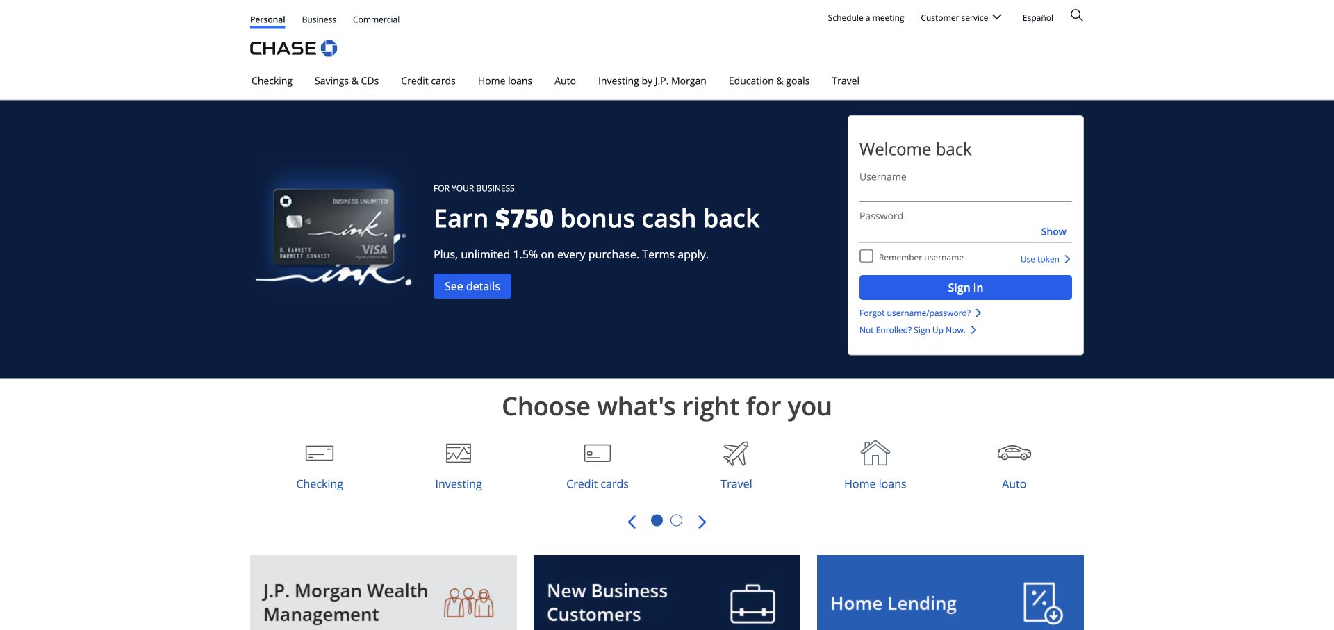
Chase gives the public homepage two obvious jobs. A dark promotional area addresses people exploring an account, while the white sign-in card gives existing customers a stable destination. Product icons below the hero make the breadth of the bank legible without forcing every category into the campaign. Audience tabs and the second navigation row provide further orientation. The result is a practical reference for a bank with frequent customer visits and several product families competing for space.
What you can learn
Borrow the separation of persistent account access from changeable marketing. Treat the login card as a service landmark, then let the adjacent campaign change without moving the customer’s familiar entry point.
Pros
The white access panel remains visually distinct against the navy campaign background.
The product icon row creates a useful second route for visitors ignoring the current promotion.
Cons & considerations
Multiple navigation layers demand careful prioritization when space becomes limited.
The large campaign can delay broader comparison information for visitors still deciding which product category fits.
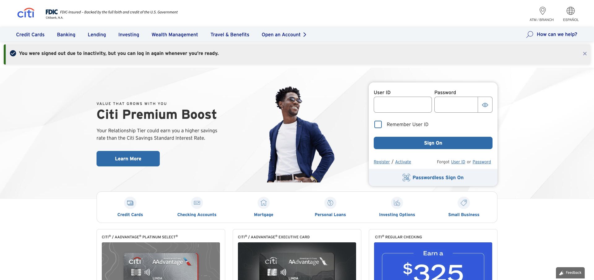
Citi combines a pale blue lifestyle campaign with an account-access panel on the right. The product shortcut strip gives visitors a quick view of cards, banking, and other categories before they read the promotional details. The inspected public state also displayed an inactivity message above the empty sign-on form, a reminder that service states can become part of the marketing page. White cards and blue headings provide a consistent visual language across these otherwise different tasks.
What you can learn
Design account messages as part of the homepage composition. An expired-session explanation should be understandable without overpowering product discovery or making a new visitor think they have done something wrong.
Pros
Product shortcuts are recognizable as a separate navigation layer beneath the main header.
The sign-on area has its own boundaries rather than being embedded inside campaign copy.
Cons & considerations
The inactivity state adds an extra message to an already busy first screen.
A promotional hero offers less immediate comparison detail than a dedicated product table would provide.
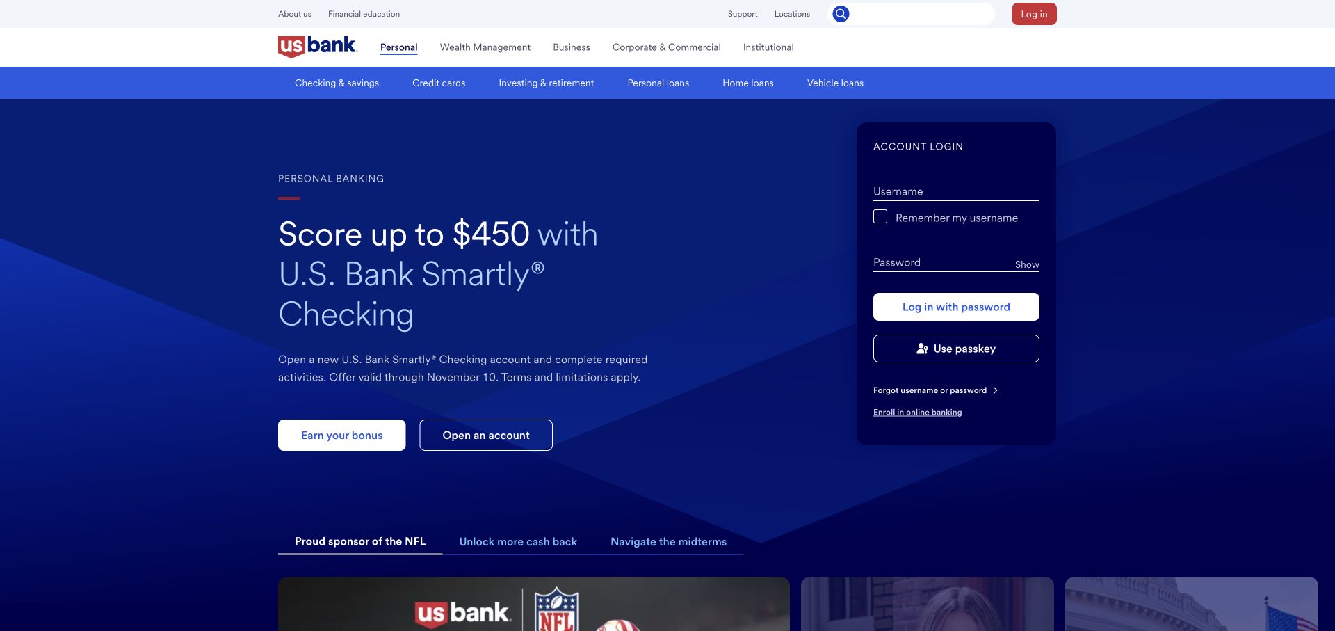
U.S. Bank places its campaign in a deep blue field and sets a white account-access card alongside it. The hero uses paired actions, letting a visitor move toward account opening or read more before committing. Below the campaign, a strip of topic tabs signals that the homepage carries several offers. The header separates audiences from product categories. The inspected layout shows how a broad bank can keep customer access visible while giving one acquisition message substantial visual weight.
What you can learn
Give different levels of intent different buttons. A visitor ready to act needs a direct route, while someone comparing an account needs a nearby explanation rather than an identical second sales action.
Pros
The white access card is easy to distinguish from the dark campaign area.
Audience navigation and product navigation answer different orientation questions in separate rows.
Cons & considerations
The campaign tab strip introduces another choice before the visitor reaches deeper information.
Several prominent buttons can compete unless their labels make the next step unmistakable.
Visible tech stack
Referenced on the public page
Apache HTTP ServerReported response header
Public source checked November 3, 2026. References may be embedded or legacy—not a complete backend inventory.
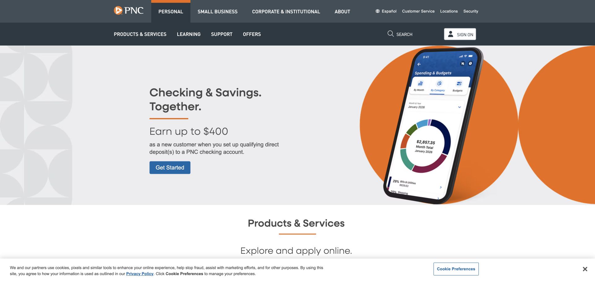
PNC uses a restrained white page with charcoal navigation and orange accents. The opening campaign pairs account copy with a large phone mockup, making the digital experience part of the product story. A single highlighted action gives the hero a clear destination, while the product section beginning underneath broadens the page beyond that offer. Personal, business, and other audience choices occupy their own header layer. This is a useful example of showing an interface without turning the whole homepage into a software advertisement.
What you can learn
Use a phone image to explain a specific banking task, then support it with plain product language. The illustration should connect account benefits to an actual screen concept rather than stand in for the explanation.
Pros
Orange actions contrast clearly with the largely neutral page composition.
The phone and copy occupy distinct areas, giving the eye a straightforward reading order.
Cons & considerations
A large device image consumes room that could otherwise show account comparisons.
Two navigation rows require visitors to distinguish audience selection from product exploration.
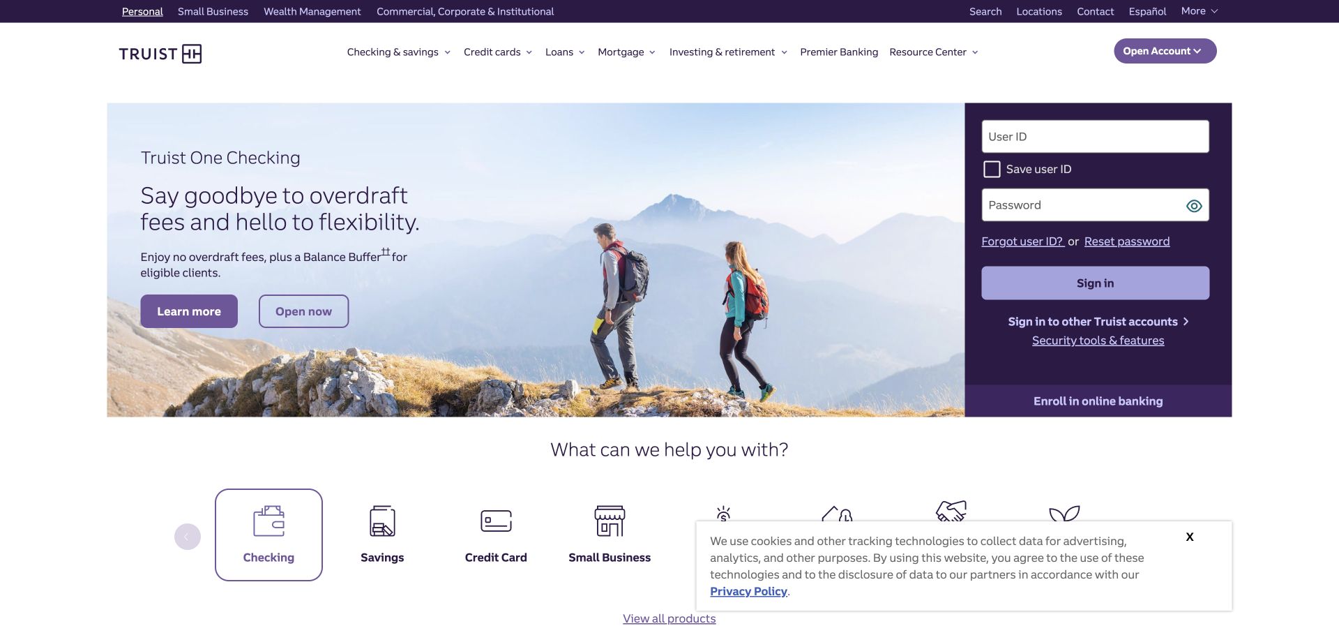
Truist uses purple as both a brand cue and a structural tool. The account-access card on the right is strongly separated from the outdoor lifestyle photograph, while the campaign text occupies the remaining hero area. The page offers a learning route and an opening route, then follows with a row of product icons. The photograph adds a personal tone, but the persistent login area keeps the page recognizably useful for returning customers rather than functioning only as an advertisement.
What you can learn
When using an emotional photograph, give practical banking tasks their own solid-color surfaces. That prevents an image change from affecting the visibility of login, recovery, or product navigation.
Pros
The purple account panel is a stable visual anchor beside a busy photograph.
The product icon row makes additional account categories available beyond the current campaign.
Cons & considerations
The outdoor scene communicates a feeling more readily than specific account differences.
The combination of campaign actions and product icons can feel crowded near the first fold.
Visible tech stack
Referenced on the public page
Google Fonts
OneTrust
Amazon CloudFrontDelivery / hosting signal
Apache HTTP ServerReported response header
Public source checked November 3, 2026. References may be embedded or legacy—not a complete backend inventory.
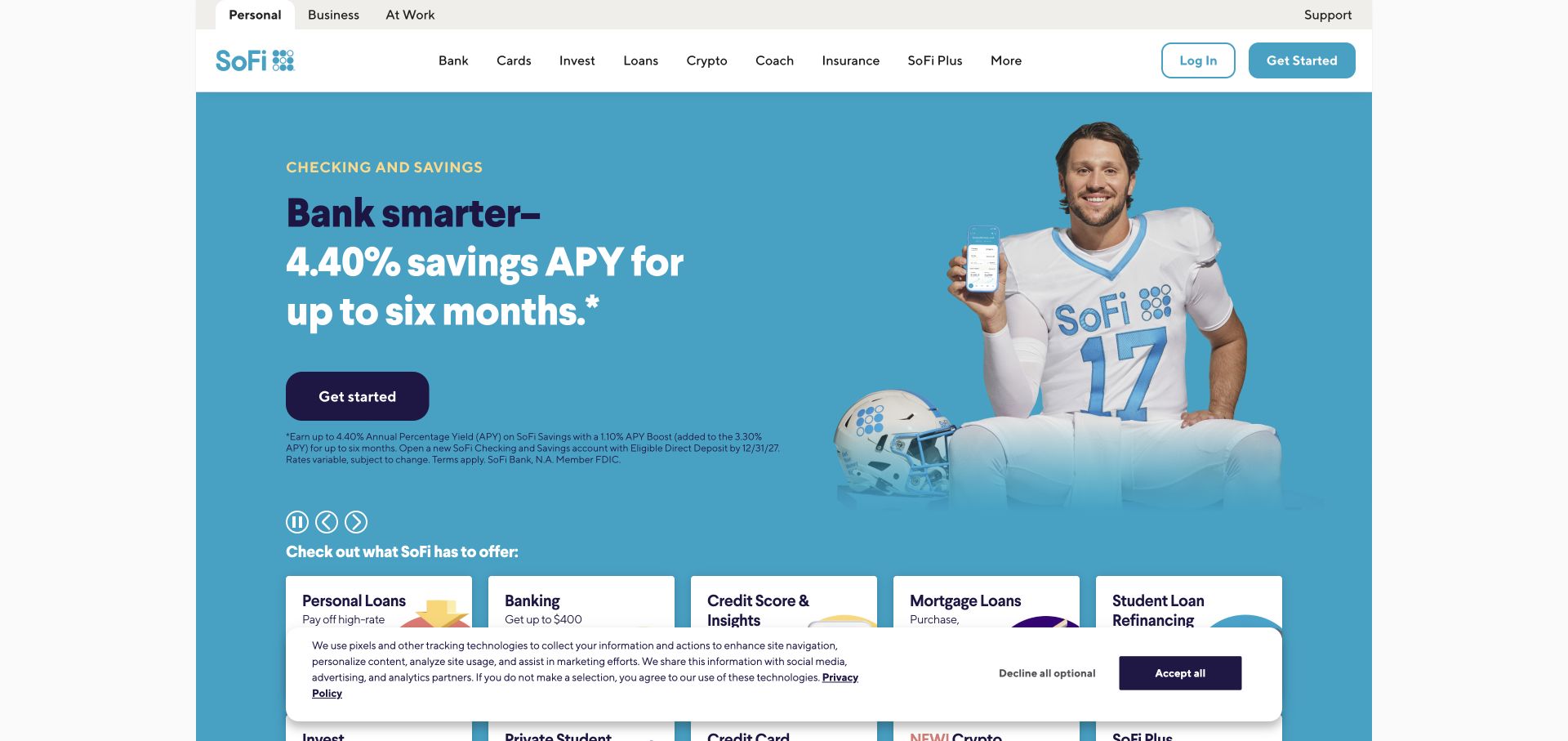
SoFi presents a bright turquoise campaign with an athlete and phone imagery, then introduces a broad set of product cards. The navigation lists familiar product nouns such as bank, cards, invest, and loans, alongside newer service categories. A dark action button stands out against the saturated hero. The page feels closer to a consumer technology brand than a conventional branch-led bank. Its useful design lesson is the visible connection between a memorable campaign and a structured product marketplace underneath.
What you can learn
A distinctive campaign still needs a dependable product taxonomy. Keep the everyday category names easy to scan so visitors can bypass the celebrity or promotional story when they already know their task.
Pros
The turquoise background and dark button create a strong visual hierarchy.
Product cards provide a more systematic browsing route after the personality-led opening.
Cons & considerations
The growing number of service categories makes the header dense.
Promotional personality can overshadow the practical differences between accounts until the visitor scrolls.
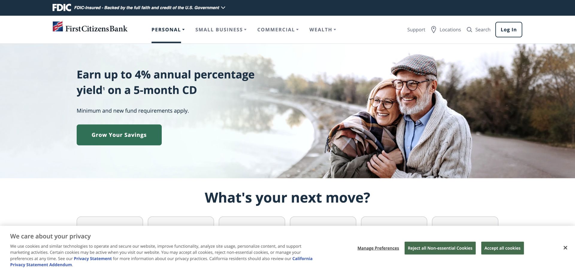
First Citizens Bank uses a familiar white and navy header to frame a warmer product campaign. A photograph of an older couple sits beside the account message, while a green button identifies the next action. Personal, business, commercial, and wealth audiences are separated near the top, helping a broad institution organize its services before the page moves into individual products. The next section shifts toward the visitor’s next financial move, giving the campaign a bridge into wider discovery.
What you can learn
Let audience categories do the heavy organizational work before adding lifestyle language. A visitor should be able to identify the relevant part of the institution even when the current campaign does not match their circumstances.
Pros
The green action is easy to isolate within the navy and white system.
Audience labels clarify the breadth of the bank without mixing every product together.
Cons & considerations
The hero focuses on one life stage and may feel less relevant to other visitors.
The broader goal-based section requires scrolling before it can help with exploration.
Visible tech stack
Referenced on the public page
OneTrust
Public source checked November 3, 2026. References may be embedded or legacy—not a complete backend inventory.
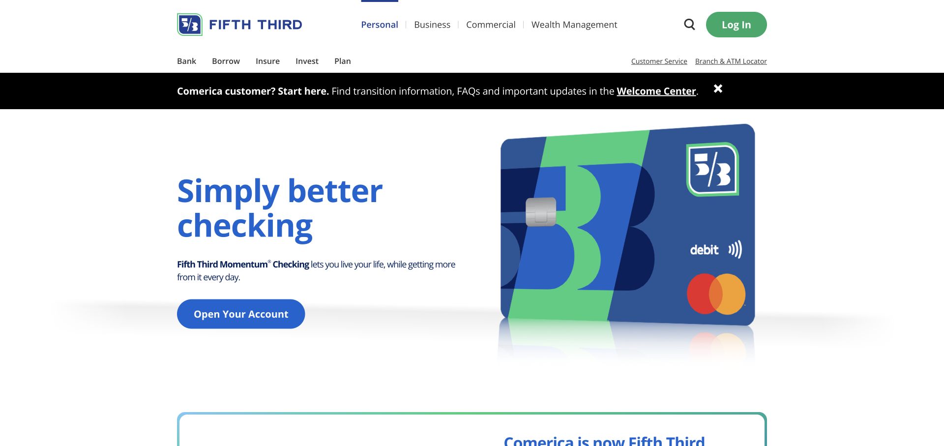
Fifth Third uses verb-led navigation—bank, borrow, insure, invest, and plan—to organize a wide service range. The inspected homepage also gives a prominent black notice to a Comerica transition, with a Welcome Center route distinct from the main promotional area. A debit card rendering and blue-green accents carry the product campaign. This creates a useful contrast between ordinary marketing and time-sensitive operational information: the transition message receives attention without requiring the visitor to infer it from a rotating banner.
What you can learn
Give major service transitions a named destination and a recognizable notice treatment. Customers arriving for migration information should not have to decode an unrelated product campaign to find their next step.
Pros
Verb-led categories offer a compact way to group a broad range of services.
The transition notice has a dedicated Welcome Center action instead of only explanatory text.
Cons & considerations
Abstract verbs still require interpretation when a visitor is looking for a particular product name.
The strong transition band adds visual competition above the standard campaign.
Visible tech stack
Referenced on the public page
Google Fonts
Public source checked November 3, 2026. References may be embedded or legacy—not a complete backend inventory.
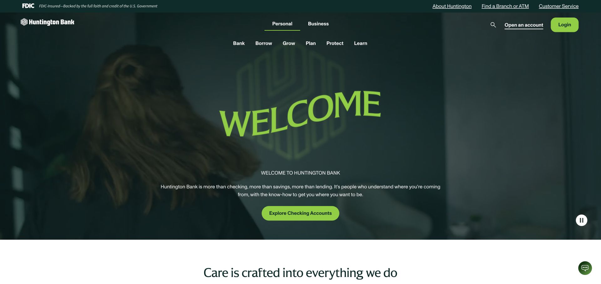
Huntington’s homepage pairs a dark green moving hero with oversized lime lettering. The greeting is deliberately simple, and a checking-account action gives the visual statement a practical next step. Above it, navigation uses bank, borrow, grow, plan, protect, and learn as the organizing vocabulary. A visible pause control acknowledges the moving media. The combination is memorable because the palette and typography carry much of the identity, leaving the primary message short rather than filling the screen with multiple promotional paragraphs.
What you can learn
If the visual identity is doing the expressive work, keep the action and product description direct. A prominent pause control also belongs in the design from the outset when motion fills the hero.
Pros
The green and lime palette makes the brand recognizable across the opening screen.
The checking action supplies a concrete destination beneath the broad welcome message.
Cons & considerations
A greeting alone offers little help to visitors comparing several account types.
The verb categories can be less explicit than product names for someone with a narrow task.
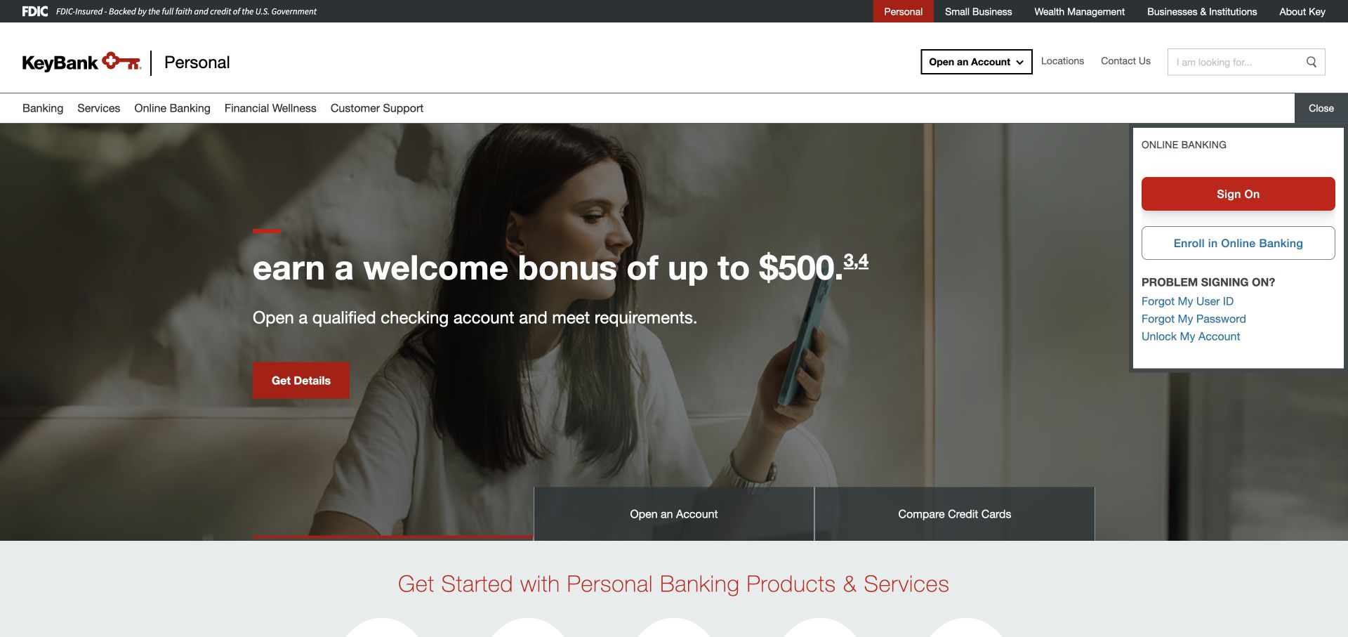
KeyBank uses a red, black, and white identity around a lifestyle campaign, with a substantial online-banking panel on the right. That panel includes account entry and recovery routes, making it a service area rather than merely a login button. The top navigation groups banking, services, online banking, financial wellness, and support. The result is more task-dense than a minimal promotional landing page, but it shows how returning customers can retain a predictable path while the center of the page changes.
What you can learn
Treat recovery and support as part of access design. A login area becomes more useful when the alternatives for someone who cannot sign in are visible alongside the normal path.
Pros
The separate online-banking panel supports a clear distinction between browsing and account access.
Financial wellness and support are visible categories rather than being confined to the footer.
Cons & considerations
The tall access panel reduces space available to the campaign and product explanation.
Several similarly broad navigation categories may require exploration before their boundaries become clear.
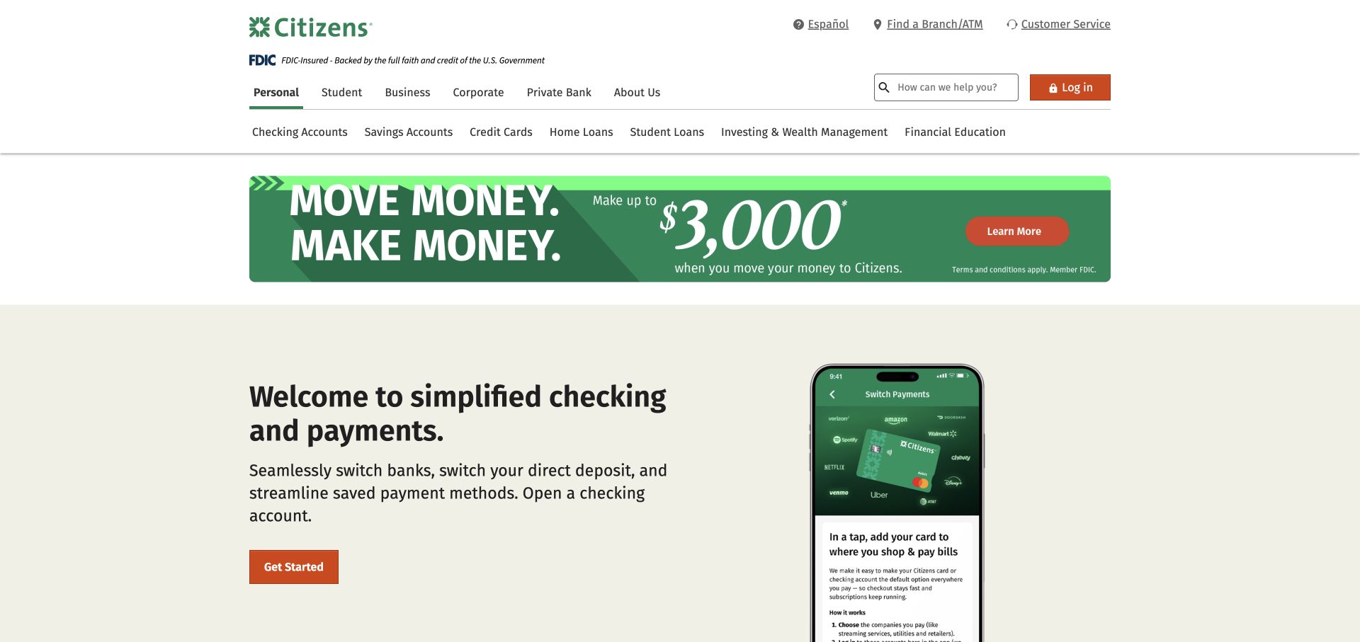
Citizens uses green, cream, and orange to give a familiar banking layout a softer tone. The hero presents switching-related tasks through phone imagery, including direct-deposit and saved-payment concepts, rather than relying entirely on a generic lifestyle photograph. A separate sign-in route remains in the header, with branch and support utilities nearby. Audience navigation includes students alongside broader banking groups. The page is a useful reference for explaining a process that otherwise might feel hidden behind an account-opening button.
What you can learn
Make the difficult middle step visible. If a visitor is considering switching banks, show how the transition is described and where to learn more, while keeping account access separate for existing customers.
Pros
The phone imagery gives the switching message a concrete interface context.
Branch and support utilities remain available alongside the acquisition-focused campaign.
Cons & considerations
Interface illustrations still need supporting detail before a visitor can judge the full process.
A wide audience menu can add complexity to the header on smaller layouts.
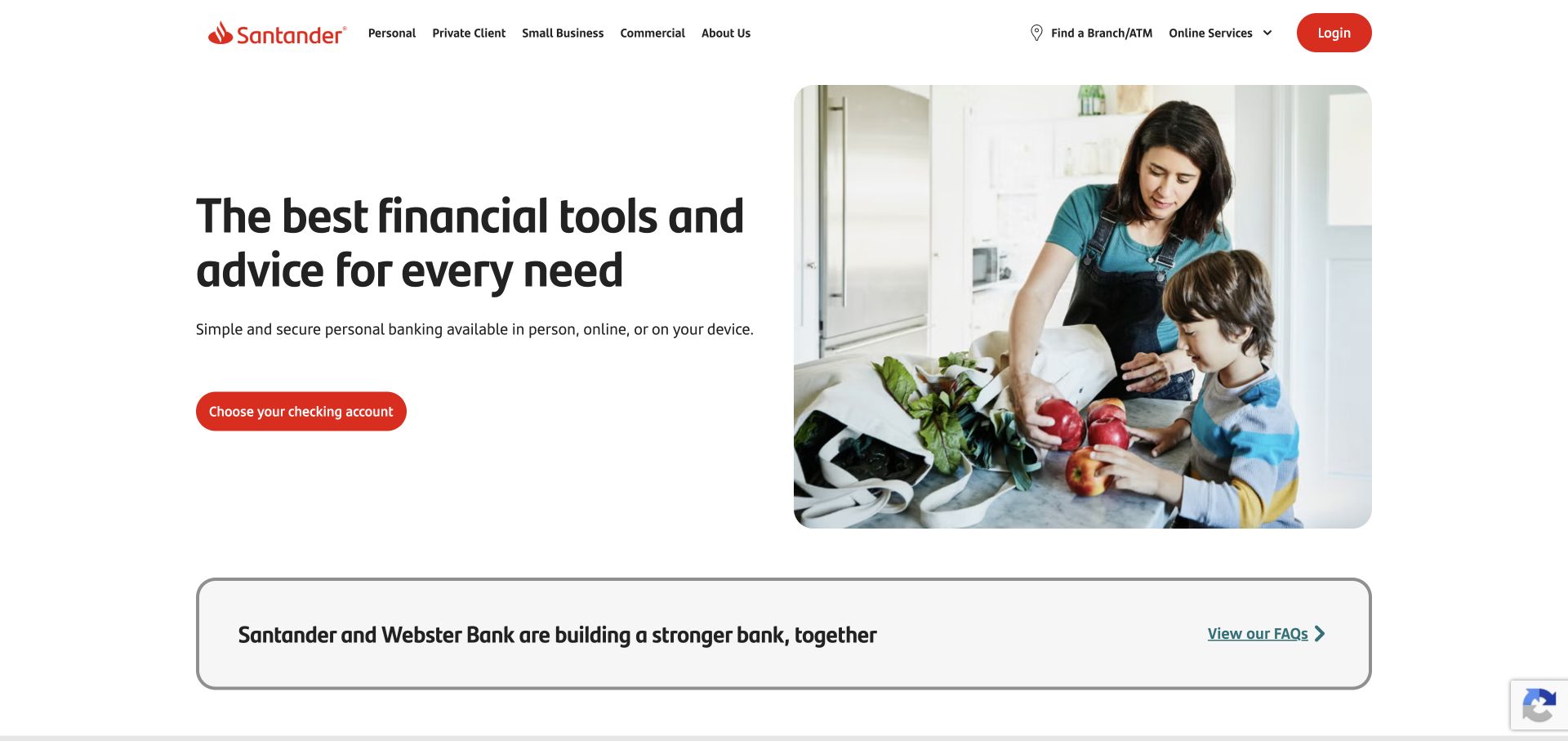
Santander uses a sparse white header, red brand accents, and a large black headline paired with a family photograph. The checking-account action is easy to identify because the hero contains relatively few competing elements. Branch and login utilities sit in the header rather than occupying a separate form card. A Santander and Webster update band provides a route to transition information below the main campaign. This is a useful example of maintaining a simple first impression while still acknowledging operational changes.
What you can learn
Separate the campaign’s primary task from institutional updates, but keep both named and reachable. A clearly labeled update band can serve affected customers without turning every hero message into a merger explanation.
Pros
The restrained header gives the main account action room to stand out.
The update band offers a recognizable destination for visitors seeking transition details.
Cons & considerations
The family photograph communicates tone more than specific product distinctions.
Customers wanting immediate sign-in fields must follow the header route to another view.
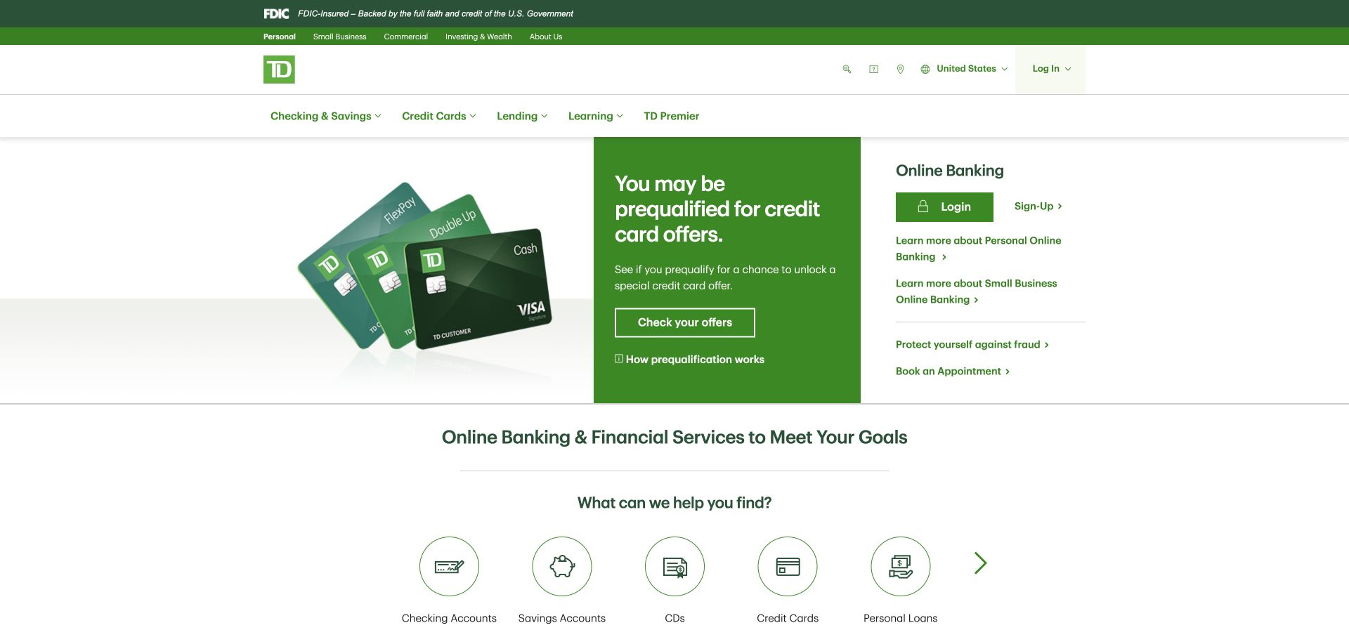
TD Bank divides its opening area into a product image, a solid green promotional panel, and a white online-banking section. This three-part arrangement gives different tasks visible boundaries without making them feel like separate pages. The access section includes service links, and a product icon row appears underneath. White, green, and gray establish a familiar brand system. The page is particularly useful as a reference for fitting daily access and product exploration into one broad desktop composition.
What you can learn
Use background blocks to show the relationship between tasks. A promotional message, an illustrative object, and an access panel can coexist when each has a clear role and the action labels explain what happens next.
Pros
The white service area is visually distinct from the green promotional panel.
Product icons provide a compact route to categories beyond the featured account.
Cons & considerations
Three adjacent zones create a relatively information-heavy opening screen.
The account campaign’s prominence can push comparison details below the first visible area.
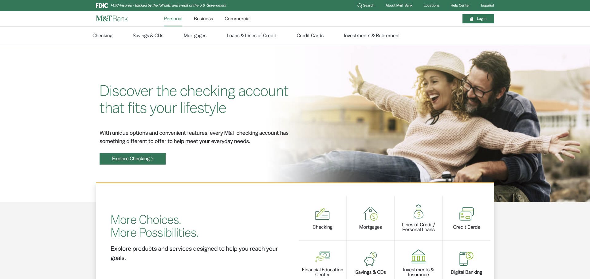
M&T Bank uses green typography against a lifestyle photograph, then overlaps the lower edge of the hero with a white product-navigation card. The card’s icons create a clear transition from the campaign to practical banking choices. Utility links include help and a Spanish-language route, while the header keeps account access available. The composition offers a useful way to avoid a hard visual break between a promotional image and the more functional content that visitors often need next.
What you can learn
Use overlap to connect adjacent sections, not merely as decoration. The product card should read as the natural next step after the campaign, with enough contrast and spacing to remain distinct from the photograph.
Pros
The overlapping white card makes product discovery visible before a full scroll.
Help and language utilities are separated from the main promotional message.
Cons & considerations
Thin hero lettering needs careful contrast when the background photograph changes.
The layered card and photograph can complicate spacing when the layout narrows.
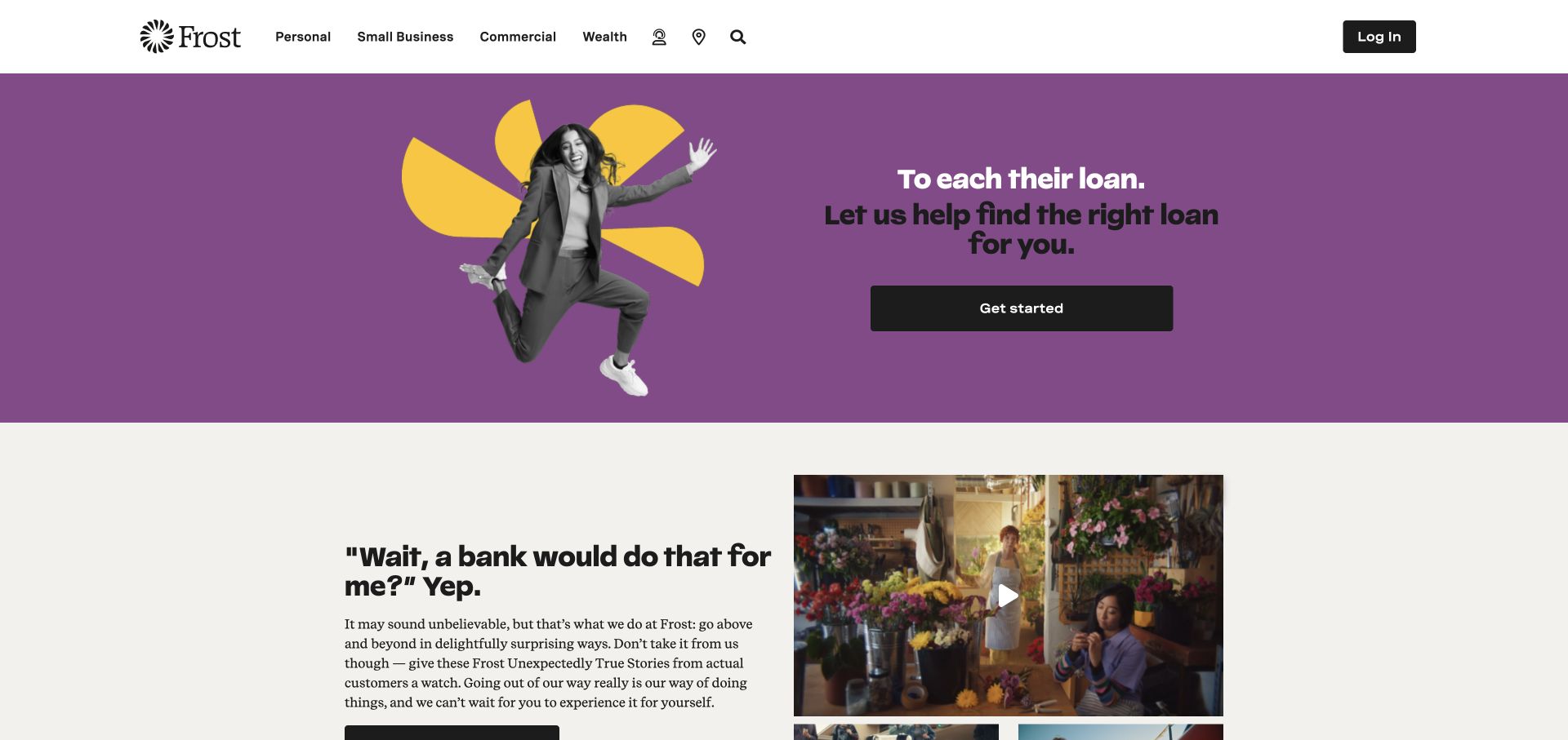
Frost keeps a compact white header with audience links and a dark login button, then shifts into a purple and yellow campaign. A cutout figure and a large black action make the loan promotion feel editorial and energetic. Customer-story content begins below the hero, connecting the product message to a more narrative section. The contrast between the conventional header and expressive campaign is the most useful aspect: the public identity becomes distinctive while service navigation remains easy to recognize.
What you can learn
Keep the operational frame predictable when experimenting with campaign art direction. A bold palette and unconventional imagery can work when login, audience selection, and the primary action retain clear labels and stable placement.
Pros
The dark button stands apart from the saturated purple and yellow campaign.
The compact header leaves substantial room for the campaign without hiding account access.
Cons & considerations
The expressive visual treatment may need more explanation for visitors comparing loan options.
Customer-story content arrives after the campaign rather than supplying immediate product detail.
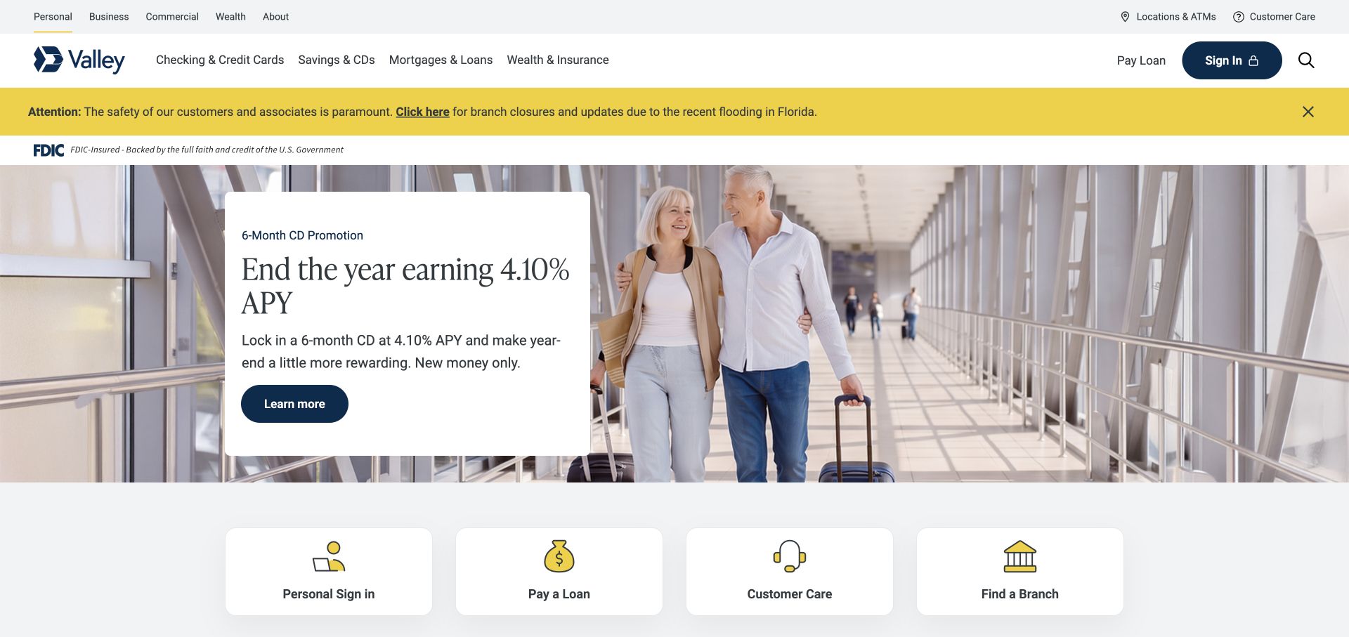
Valley combines navy and yellow branding with a conspicuous branch-closure notice at the top. The hero places a white promotional box over a travel photograph, and four service shortcuts below lead toward login, payments, customer support, and branch discovery. This structure acknowledges that many visitors arrive with a service need rather than an interest in the current campaign. The notice and shortcut row are especially useful references for a regional bank with location-dependent information and a range of repeat tasks.
What you can learn
Give operational notices a distinct location and connect the homepage to everyday services through concise shortcuts. Those routes should remain useful even when the hero promotion is irrelevant to the visitor.
Pros
The yellow notice is visually separate from the product campaign.
Four clearly framed shortcuts offer practical alternatives to reading the hero.
Cons & considerations
The notice, navigation, and campaign create several stacked areas before deeper content.
A text box over photography requires deliberate placement to preserve both image and message.
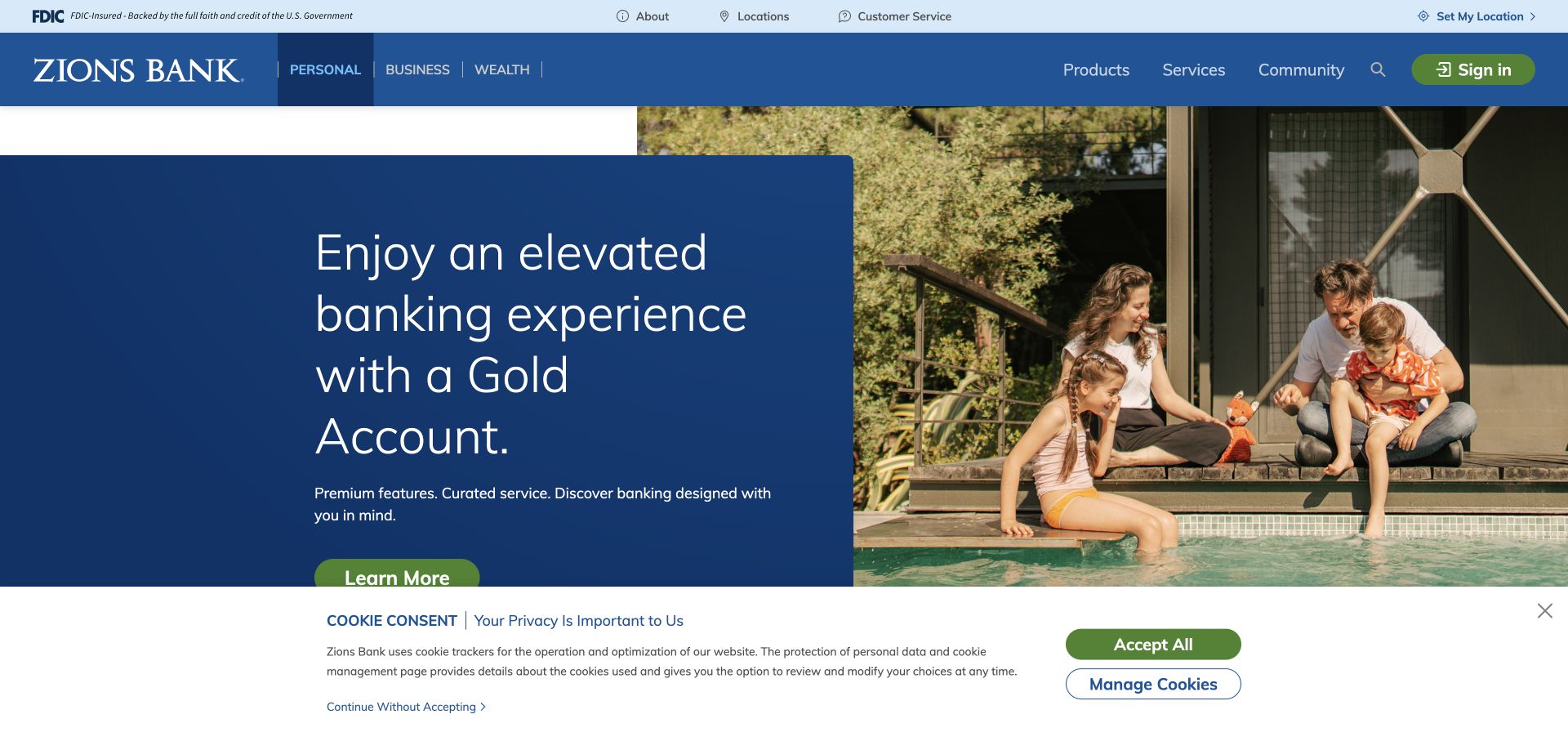
Zions Bank places a navy text panel over a family-and-pool photograph, using overlap to create depth while keeping campaign copy on a solid background. The header separates audience choices from products, services, and community information. A green sign-in action adds a second accent to the blue system. A substantial cookie strip was visible in the captured state, showing how consent can affect the lower edge of a hero even when the main layout itself is carefully composed.
What you can learn
Put essential text on a reliable surface when using a busy lifestyle scene. Also reserve room for consent controls, since a banner can cover a carefully positioned call to action on a visitor’s first arrival.
Pros
The solid navy panel keeps campaign text independent of photographic contrast.
Community receives an explicit navigation label alongside products and services.
Cons & considerations
The overlapping composition uses considerable vertical space before supporting information appears.
The visible consent strip competes with content near the bottom of the first screen.
Visible tech stack
Referenced on the public page
Google Maps
Public source checked November 3, 2026. References may be embedded or legacy—not a complete backend inventory.
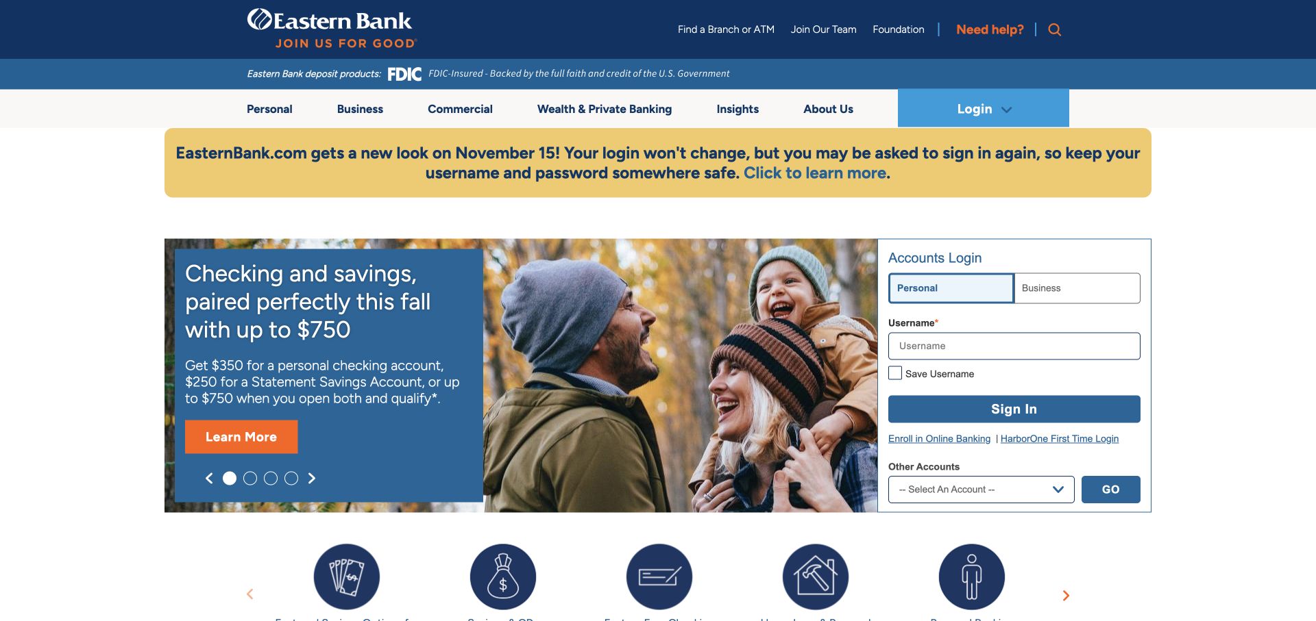
Eastern Bank’s captured homepage includes a prominent notice about an upcoming site redesign. Beneath it, a seasonal campaign sits beside a tall login card with personal and business tabs plus an additional account selector. Blue and orange establish the hierarchy, while branch and help utilities remain close to the header. The layout is a practical reference for institutions with several account systems: it makes the access choice explicit rather than assuming every visitor needs the same login destination.
What you can learn
Explain website change before users mistake a new layout for a problem. Where several account portals exist, use clear audience labels and an additional-account route instead of sending everyone through one ambiguous login button.
Pros
The login card acknowledges personal, business, and other account destinations.
The redesign notice gives existing customers context for an approaching interface change.
Cons & considerations
A tall access card and large campaign leave limited room for immediate product comparison.
The extra account selector introduces a choice that needs clear supporting labels.
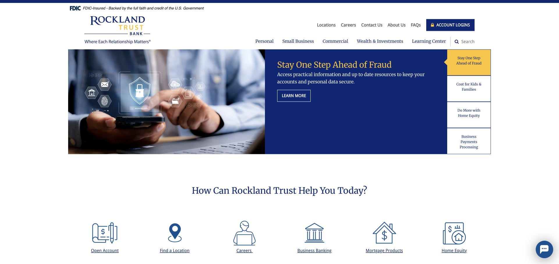
Rockland Trust uses serif typography, navy, and gold to create an editorial tone. The main hero presents security information, while a vertical list of labeled campaign topics appears on the right. This is more informative than a row of anonymous carousel dots because visitors can see what other topics exist. A large action-icon row underneath broadens the page toward locations, careers, business, and other tasks. Account login stays in the header, preserving the central space for information and discovery.
What you can learn
If several homepage stories must share a hero, expose their subjects as labels. Named alternatives help visitors choose relevant information without waiting for an automatic rotation or guessing what a dot represents.
Pros
The vertical topic list makes the hero’s alternative stories visible.
The lower action row includes practical organizational destinations beyond account products.
Cons & considerations
The security story occupies the opening space even for visitors seeking a specific account.
A mixture of service and organizational shortcuts requires careful ordering by visitor need.
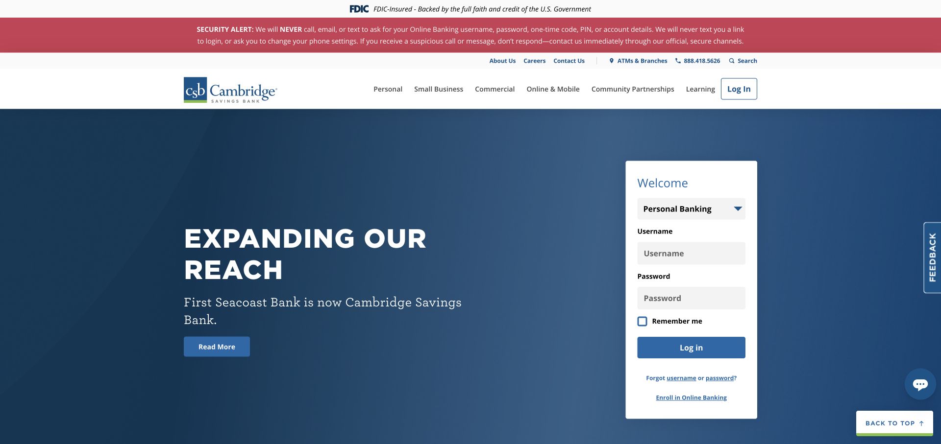
Cambridge Savings Bank uses a red security alert above a conventional white navigation header. The opening content is a text-led merger announcement on a deep blue field, paired with a tall white login card. This gives current customers access while providing a prominent institutional message. Learning and community categories also appear in the navigation. The design is useful for studying a homepage in a period of change, when service continuity and explanation take precedence over a lifestyle-led acquisition campaign.
What you can learn
During an institutional transition, give the announcement enough plain language and a defined destination, while preserving the familiar login area. Customers should not have to choose between understanding the change and reaching their account.
Pros
The solid blue announcement area supports a clear text-first presentation.
A separate white login card maintains a recognizable service route beside the update.
Cons & considerations
The alert and announcement add two urgent-looking messages to the same opening screen.
The transition focus leaves less immediate room for ordinary product discovery.
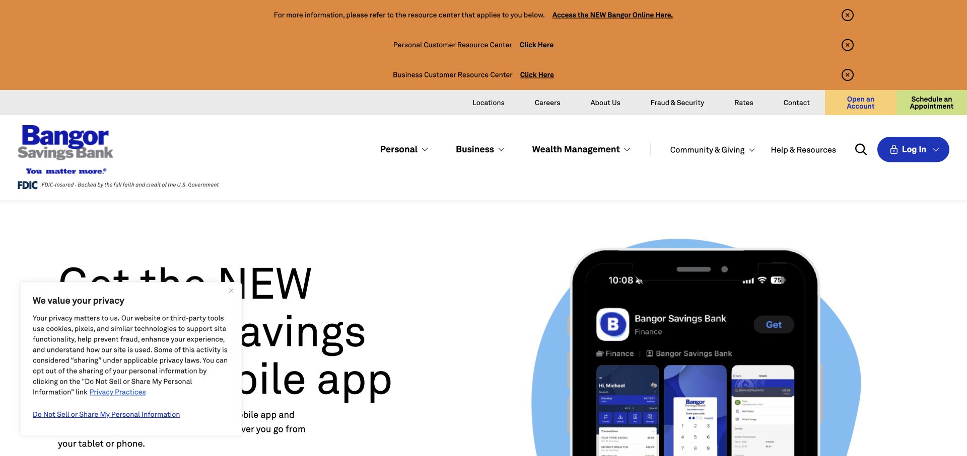
Bangor Savings Bank places several orange assistance notices above the main navigation, with separate references for personal and business customers. The main campaign then introduces the app through phone imagery. Help and community remain visible categories in the white header. This is a particularly useful example of the tension between an ongoing marketing page and temporary service communications: migration guidance receives high visibility, but the stack of notices takes a substantial share of the first screen.
What you can learn
Plan temporary migration messages as a small information system. Label the affected audience and destination explicitly, then review whether several notices can be grouped so the ordinary homepage remains easy to scan.
Pros
Audience-specific notices help distinguish personal and business migration information.
The phone illustration connects the digital-service message to a recognizable interface object.
Cons & considerations
Several orange strips create a dense opening before the visitor reaches the main content.
The visible consent panel further reduces the unobstructed area available to the hero.
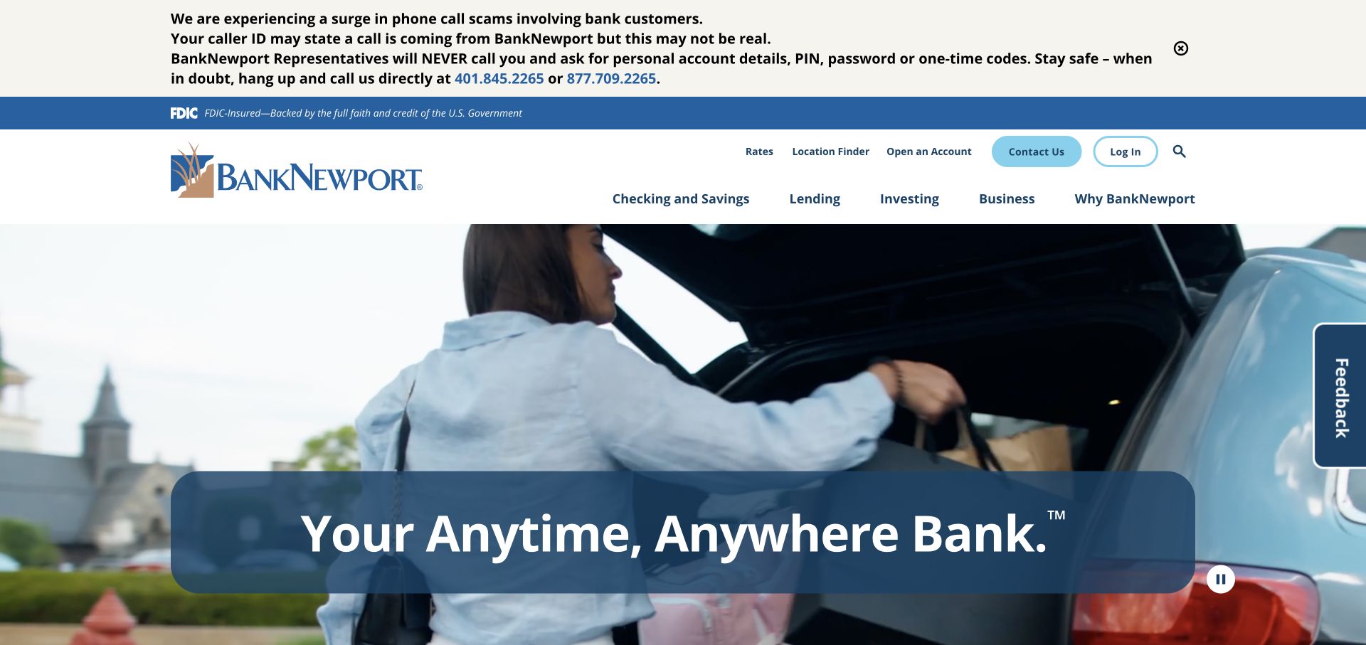
BankNewport places a detailed security warning above a light blue and navy header. Product navigation is supported by utilities for rates, locations, contact, and login. The hero uses a lifestyle film with oversized translucent blue lettering and a visible pause control. That treatment creates atmosphere, while the header carries the practical tasks. The inspected first screen is useful as a study in division of labor: the moving image expresses the brand, but the navigational structure must do most of the work for a task-focused visitor.
What you can learn
When a hero is primarily a brand film, make the utility routes unusually clear. Visitors who need a branch or account access should be able to act without interpreting the film’s slogan.
Pros
Rates, locations, contact, and login are exposed as recognizable utility destinations.
The pause control makes the moving hero’s basic playback control visible.
Cons & considerations
Large translucent lettering can be harder to read over changing imagery.
The hero offers less obvious task direction than the practical navigation above it.
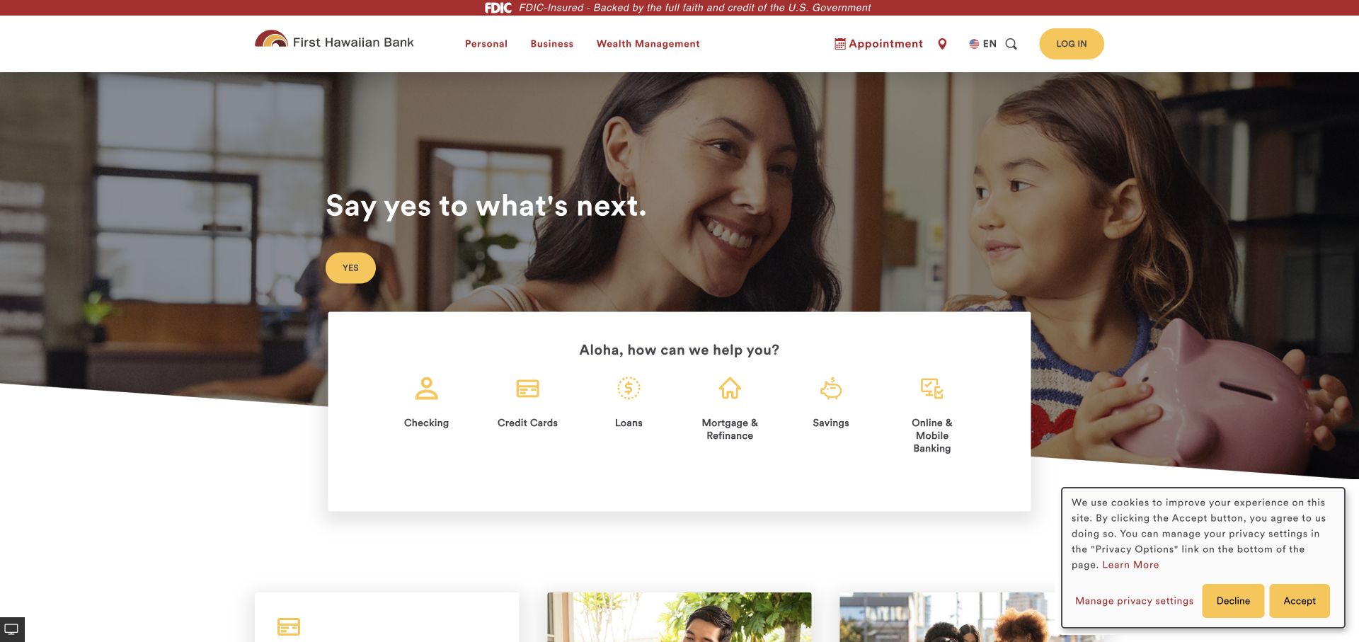
First Hawaiian Bank uses burgundy and yellow around a broad family photograph. Appointment, language, and login utilities appear above the main campaign, while a white product-icon panel overlaps the bottom of the image. The bright hero action is visually prominent, though its short affirmative label communicates less about the destination than a product-specific phrase would. The page is useful for understanding how a regional identity can coexist with familiar banking categories and a functional layer of customer utilities.
What you can learn
Pair expressive campaign wording with descriptive action labels. A distinctive voice can remain in the headline while the button explains the exact information or task waiting on the next page.
Pros
The white product panel creates a clear bridge from the photograph to account categories.
Appointment and language utilities acknowledge needs beyond routine sign-in.
Cons & considerations
The brief affirmative hero button gives limited information about its destination.
The overlapping card, photograph, and consent panel compete near the first fold.
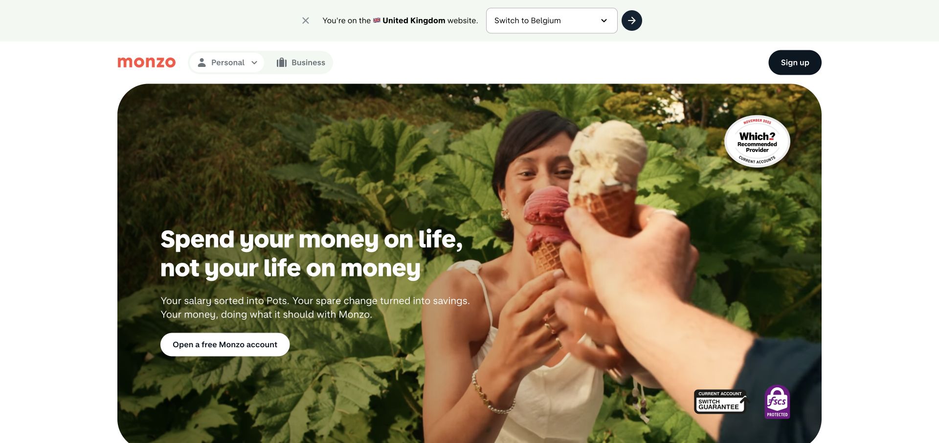
Monzo uses a compact header and a large rounded lifestyle video to introduce its account experience. The captured campaign connects informal language to features such as pots and savings, with a prominent account-opening action and a small cluster of badges. A region prompt appears above the header, reflecting the importance of market context. The page relies on tone, imagery, and the opening action rather than presenting a long product menu immediately. It is a useful reference for a focused digital banking proposition.
What you can learn
A compact navigation works best when the first screen explains the product’s everyday purpose. Keep market selection and important account information discoverable so the friendly campaign does not become the only source of orientation.
Pros
Rounded media and informal typography create a coherent consumer brand presentation.
The account-opening action is easy to locate within the broad hero.
Cons & considerations
The compact header exposes fewer product categories for visitors wanting to browse first.
The region prompt adds another decision before the main account story begins.
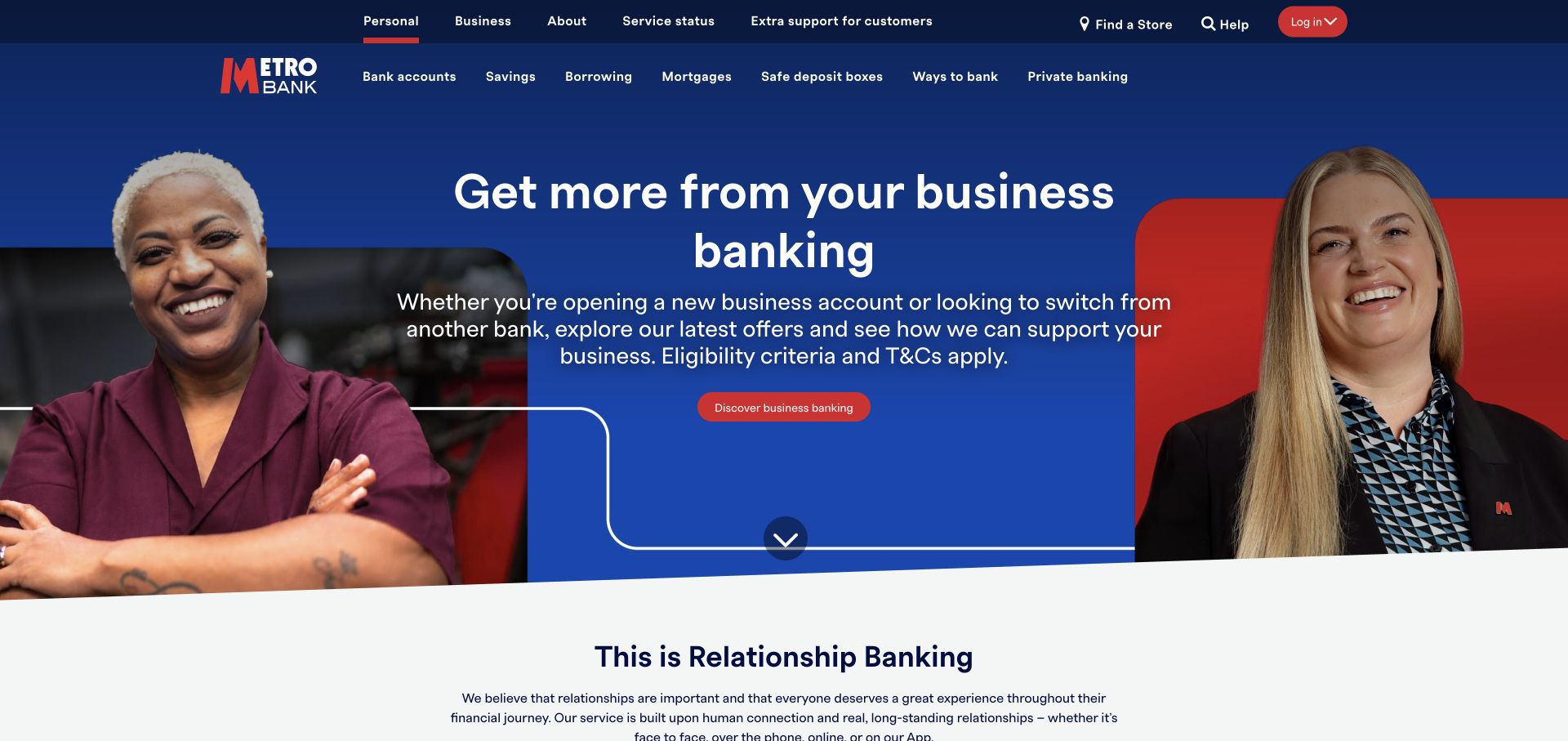
Metro Bank uses navy and red in a broad, conventional navigation system. Service status and extra-support utilities are visible above the product categories. The captured campaign focuses on business banking, using portraits at the sides and a centered message with a red action button. A curved lower border softens the transition into the following section. This is a useful reference for keeping service-oriented links visible while giving a campaign enough room to address a particular audience directly.
What you can learn
Do not make support information compete inside a campaign headline. A separate utility layer can keep service status and additional help consistently reachable while the main area addresses the current product or audience.
Pros
Service status and extra-support links have explicit positions in the upper navigation.
The centered red action has a clear visual relationship to the business campaign.
Cons & considerations
Multiple header rows consume space before the visitor reaches the product message.
The business-focused opening may require personal customers to redirect through navigation.
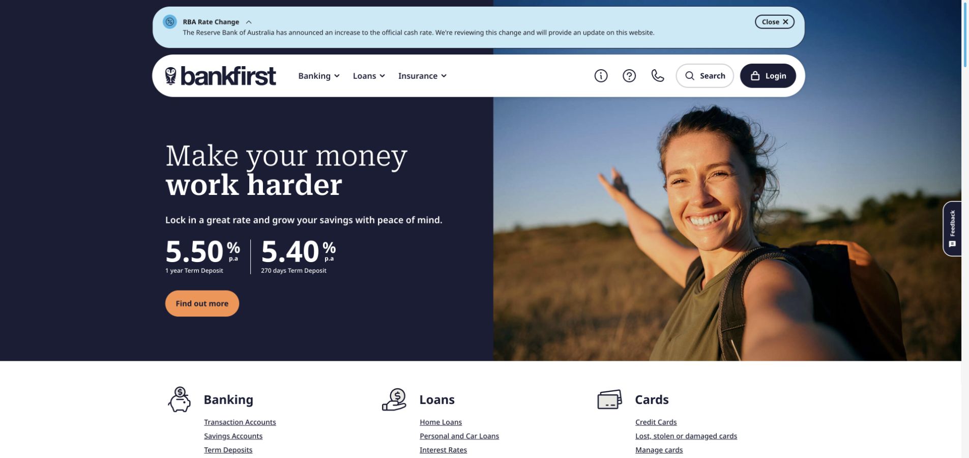
Bank First in Australia combines a rounded floating navigation bar with navy and salmon accents. An interest-rate update sits above a split hero pairing a term-deposit message with an outdoor photograph. Underneath, quick links are arranged in banking, loans, and cards columns, providing a more explicit directory after the visual opening. The layout is useful because it gives the page two reading modes: a single campaign for immediate attention and a structured list for visitors who already know the product family they need.
What you can learn
Follow a spacious campaign with a plain product directory. The change in presentation can help task-focused visitors recover quickly without forcing every link into the hero or floating header.
Pros
The three product columns make the broader service range easy to compare at a glance.
The floating navigation maintains a distinct boundary above the campaign image.
Cons & considerations
The update band and floating header introduce several horizontal layers.
The outdoor photograph supplies atmosphere but little information about the account itself.
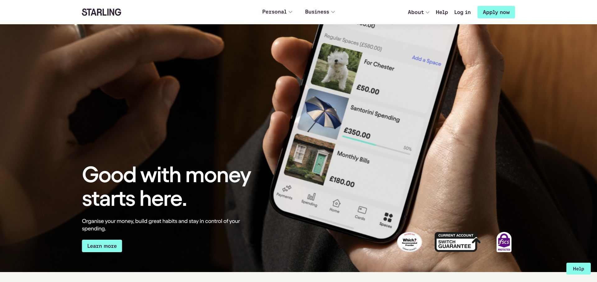
Starling Bank uses a compact white header with personal, business, about, and help categories, plus login and application routes. A full-width app-focused film dominates the hero, with white copy and a turquoise action over the image. The result ties the bank’s identity closely to a visible digital experience. The restrained header avoids competing with the media, while the separate personal and business paths establish the main audience split before visitors reach more detailed features further down the page.
What you can learn
Show an app in the context of a specific account story, but keep service navigation independent of the film. Login and help should remain recognizable even when the media frame or campaign wording changes.
Pros
Personal and business routes are explicit in the compact header.
The turquoise action stands apart from the dark moving imagery behind it.
Cons & considerations
A large app film offers less immediate detail than static feature explanations.
Text placed over moving media needs consistent contrast across every frame.
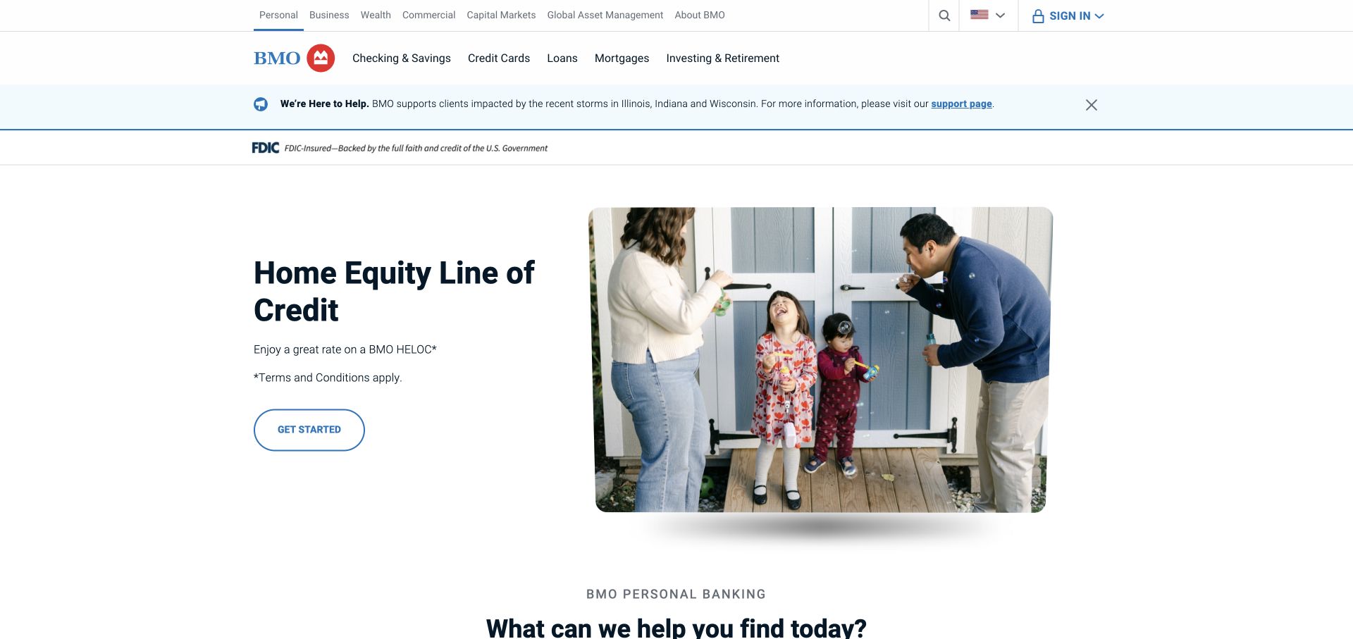
BMO’s U.S. personal-banking homepage uses a multirow blue-and-white header above a spacious campaign. The captured hero pairs home-equity copy on the left with a family photograph on the right, shaped with a rounded corner. A pale notice band separates the navigation from the campaign. Considerable white space gives the product message room, while the audience and product rows retain access to the bank’s wider offering. It is a useful example of making one campaign readable inside an institution with many services.
What you can learn
Use spacing to simplify the campaign after a dense header. The hero can concentrate on one product if the navigation above it clearly preserves the routes to other accounts and customer services.
Pros
The split composition gives copy and photography separate, readable zones.
Audience and product navigation preserve the breadth of the institution above the focused campaign.
Cons & considerations
Several stacked header rows postpone the main message on shorter screens.
The single-product opening requires unrelated visitors to use navigation for their own task.
List the public tasks the page needs to support: sign in, recover access, find a branch, contact support, browse a product, and understand a service change. Decide which must be visible immediately and which can sit within a clearly named category.
Separate stable structure from campaigns
Define the header, access area, product shortcuts, and notice locations before creating campaign artwork. Give authors constraints for headline length, image contrast, and action labels so a new promotion fits the existing service structure.
Review real first-visit states
Inspect the page with consent banners, region selectors, and public session messages present. Check that buttons remain visible and that the message hierarchy still makes sense. Include narrow screens and keyboard navigation in implementation QA, rather than assuming a desktop capture proves them.
The editing job behind the design
Choose tools around editorial and service boundaries
The public marketing site, account portal, branch directory, and support systems may have different responsibilities. Document those boundaries before choosing a CMS or front-end framework. Keep public links and labels consistent even when a task leads to a separate service.
Use a content model for products, campaigns, notices, and locations so editors can update each without rebuilding the others. This collection does not infer a bank’s technology stack from visual appearance; empty technology labels mean the stack was not verified for this review.
Our WordPress website examples offer a separate look at publishing approaches. A visible platform label is evidence for that named page, not a guarantee that the same system will suit your requirements.
Before the public launch
Bank homepage design checklist
Make login recognizable and keep its position stable across campaign changes.
Label personal, business, and specialist account destinations clearly.
Provide a practical route to account-access help and recovery.
Keep product categories discoverable outside the current promotion.
Give notices an audience, a date where relevant, and a clear destination.
Review consent and region prompts together with the first-screen layout.
Use descriptive action labels for product and service destinations.
Validate text contrast across moving hero frames and expose playback controls.
Keep branch and contact information reachable from the public navigation.
These checks are a project checklist, not a performance, legal, security, or accessibility certification. Test real journeys with the people responsible for the website before making claims about the result.
Sources & editorial method
How this collection was selected and reviewed
Reviewed public pages directly in Chrome on November 3, 2026, and saved a distinct browser capture and page snapshot for each selected example. The 28-example target was fixed before selection. Incomplete or malformed captures were excluded. Analysis concerns visible design and navigation; it does not verify banking products, rates, operational security, or customer outcomes.
Each example links to its actual source page. Screenshots are direct browser captures with their own capture dates; moving imagery, announcements and live designs can change. The notes describe observable design choices and conditional tradeoffs, not measured traffic, conversion results, service quality, or accessibility conformance.
Technology labels use public page metadata, asset evidence, or explicitly cited platform documentation. Platform documentation is not a complete current deployment audit. A component reference may be legacy or unused; it is not a complete backend inventory. Unknown stacks are omitted. These sites are editorial examples, not our client portfolio.
Written, Edited and Curated are separate editorial records, not timestamps advanced by a rebuild. Website designs and imagery belong to their owners. See our editorial standards or suggest a correction.
Questions worth asking
Bank website design questions
Should a bank put a login form on its homepage?
A visible form can serve frequent visitors, but it takes substantial space and may require several account-system choices. A header link can keep the page simpler. Choose based on actual customer journeys, then preserve a clear recovery route and consistent access label.
How should a bank balance promotions and service information?
Give each a defined area. A campaign can own the main visual field while account access, branch information, and support remain stable. Temporary operational notices should identify the affected audience and lead to a dedicated explanation.
Are lifestyle photographs useful on a bank website?
They can express the brand and provide a human setting, but they do not explain account differences by themselves. Pair them with concise product language and descriptive actions, and keep essential text on a surface with reliable contrast.
Do these examples recommend particular banks or accounts?
No. The collection studies public website design. The reviews describe information structure, visual hierarchy, and navigation tradeoffs, without ranking financial products or assessing whether an account is suitable for a reader.
Can the screenshots identify the technology behind each bank?
Appearance is not reliable evidence of a CMS, framework, hosting service, or account platform. Technology labels are left empty unless separate evidence verifies the relevant claim. The visible layout can still provide useful design lessons.
Start with the visitor’s next task, then decide how much campaign space the page can support. The strongest reference for your project is the one whose service structure matches your audience and product complexity.