Best Dancewear Store Websites of 2026 (15 Real-World Examples)
Fifteen real dancewear-store websites show how product categories, studio requirements, local fitting services and seasonal collections can work together.
Help dancers and families find the right shopping route before asking them to navigate a large assortment.
A dancewear-store website serves several different intentions. A parent may need an exact studio uniform, an experienced dancer may be replacing a known shoe, and a first-time visitor may need an appointment rather than an online purchase. Attractive imagery matters, but the website becomes useful when it makes these differences understandable.
These fifteen examples include independent local shops, specialist dancewear brands and broad online catalogs. The reviews examine visible website design and information structure. They do not assess the quality of garments, the suitability of a particular shoe, the outcome of a fitting or the reliability of an unplaced order.
Before the examples
What makes good dancewear store website design in 2026?
Support both product knowledge and uncertainty
Keep search available for visitors who know a brand or product code. Offer clear categories for those who know only the dance discipline, age range or class requirement. A school-uniform route should lead to maintained requirements and actual products, with enough context to distinguish similar styles.
Separate fitting appointments from ordinary shopping
Explain where fittings happen, whether appointments are needed and what a visitor should bring. Make preparation guidance easy to reach from footwear categories. The website should help customers contact the appropriate team without turning an online product listing into a claim of individual suitability.
Make local details and buying conditions easy to find
Publish current store hours, location and contact routes alongside clear delivery, exchange and size-guide information. Keep seasonal promotions from hiding these essentials. Show genuine store and product photographs with useful context, and maintain product availability rather than leaving outdated offers prominent.
The collection · 15 examples
15 dancewear store websites worth studying
Compare the fifteen source views for category clarity, fitting routes, store identity and the relationship between campaigns and everyday shopping. The Editors Choice recognizes website design and communication, not a product or fitting recommendation.
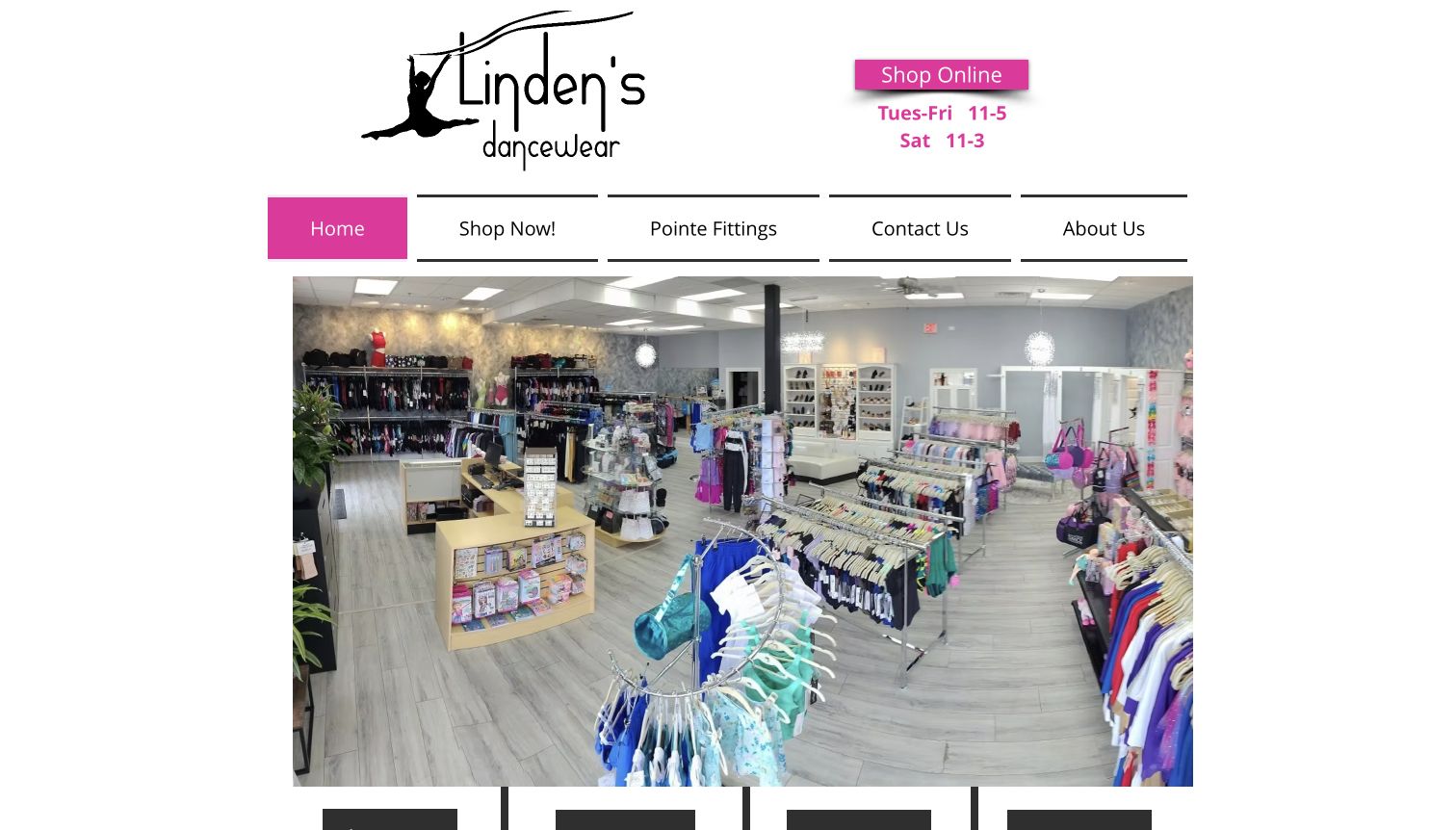
Linden’s opens with a panoramic photograph of the actual shop, giving visitors a useful sense of its racks, footwear and welcoming interior. Magenta navigation and a small set of practical links keep the introduction straightforward. Opening hours sit beside the logo, while shopping and pointe fittings have separate routes. The fitting page extends that clarity with appointment expectations, preparation notes and different time allowances for first and returning visits. Product categories on the homepage connect the physical shop with its separate online catalog. The result is a specific local identity supported by information someone can use before visiting.
What you can learn
Treat the store visit as a distinct customer journey. Show the real setting, publish practical preparation guidance and make the difference between browsing products and arranging a fitting clear.
Pros
Visible opening hours and a direct fitting route answer practical first-visit questions.
The store photograph establishes place without relying on a generic performance image.
Cons & considerations
Shopping moves to a separate subdomain, so consistent navigation and policy context matter.
The large interior image postpones detailed product information until visitors scroll or choose a category.
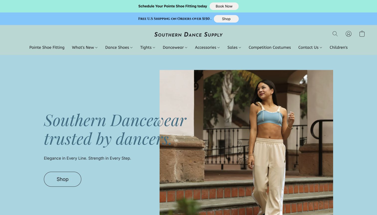
Southern Dance Supply pairs a pale blue hero with a muted green header and a large photograph of a dancer. The restrained colors give the merchandise a gentle introduction, while an outlined shopping button provides a recognizable next step. A separate announcement promotes fitting appointments before visitors reach the product navigation. Categories for shoes, leotards and accessories make the retail purpose immediately clear. Lower sections expose specific products, prices and availability rather than relying entirely on lifestyle imagery. This is a useful reference for combining a boutique tone with ordinary catalog requirements, especially when the physical fitting service remains central to the business.
What you can learn
Use the opening screen to distinguish two intentions: finding a product and preparing for an appointment. Give each a clear label, then maintain the underlying category links as carefully as seasonal imagery.
Pros
The appointment announcement makes an important local service visible above the catalog.
A limited color palette lets the main photograph carry the visual character.
Cons & considerations
Several navigation destinations appeared as placeholder error routes in the reviewed page structure.
Prominent unavailable products can interrupt browsing when alternatives are not immediately apparent.
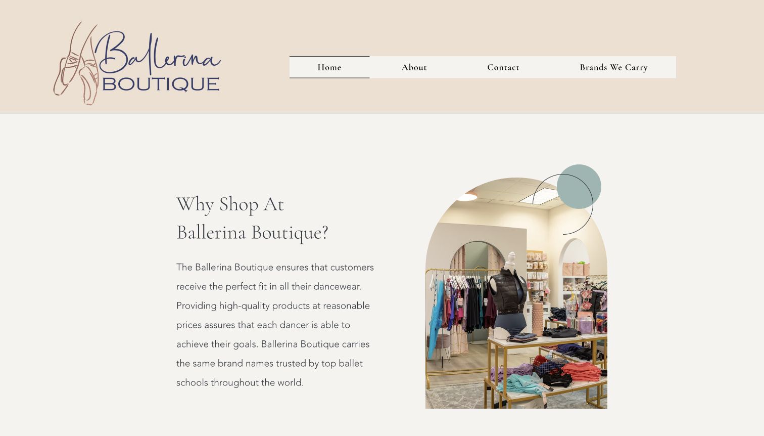
Ballerina Boutique begins with a substantial illustrated shoe logo and a short navigation containing home, background, contact and brand information. Below, an arched photograph of the shop sits beside a concise explanation of why customers might visit. Cream backgrounds and mint accents make the page feel closer to a local boutique than a large marketplace. The public content introduces staff and fitting support, then points visitors toward the brands and ordering routes. This presentation gives the business a recognizable personality without requiring a dense product grid on the first screen. Its usefulness depends on the practical contact journey remaining just as easy to find.
What you can learn
A small retailer can lead with place and people when those are meaningful reasons to visit. Pair the welcoming introduction with explicit service and ordering routes so the atmosphere supports a concrete task.
Pros
A short primary navigation avoids presenting a small shop as an unnecessarily complex catalog.
The interior photograph gives the introductory copy a specific visual setting.
Cons & considerations
The oversized header consumes space that could introduce hours or appointment details sooner.
External ordering forms require visitors to understand when they are leaving the main website.
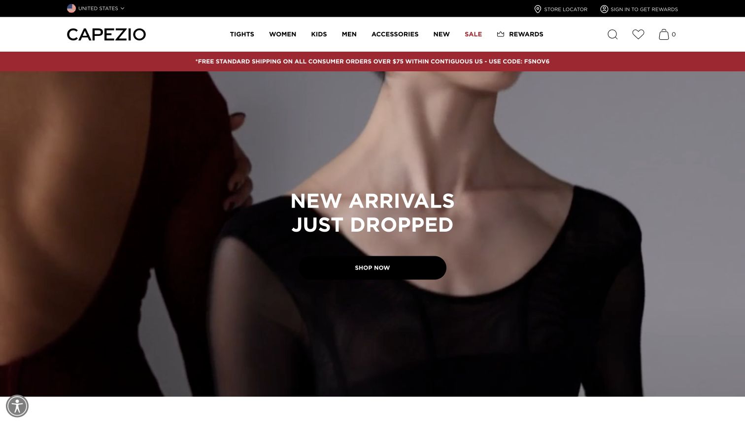
Capezio uses a high-contrast header and a large moving product presentation to announce its newest collection. A centered shopping prompt sits over the imagery, while the surrounding navigation keeps footwear, apparel and other familiar departments available. The page follows the campaign with individual products, colors and further seasonal collections, so the launch is connected to a functioning catalog. Utility links for store finding, regions and customer programs occupy their own layer above the main navigation. The design is useful for studying how a recognizable brand can create a campaign moment while retaining routes for customers who already know the type of item they need.
What you can learn
Keep permanent categories available around a changing campaign. Returning shoppers should be able to bypass the promotional story, while new visitors receive a clear visual introduction and a specific collection destination.
Pros
Persistent department navigation supports product-focused visits alongside seasonal browsing.
The campaign is followed by named products instead of ending at a purely atmospheric image.
Cons & considerations
Moving imagery can change the clarity of text and garment details from one moment to another.
Several stacked promotional and utility bands compete for space before the main collection appears.
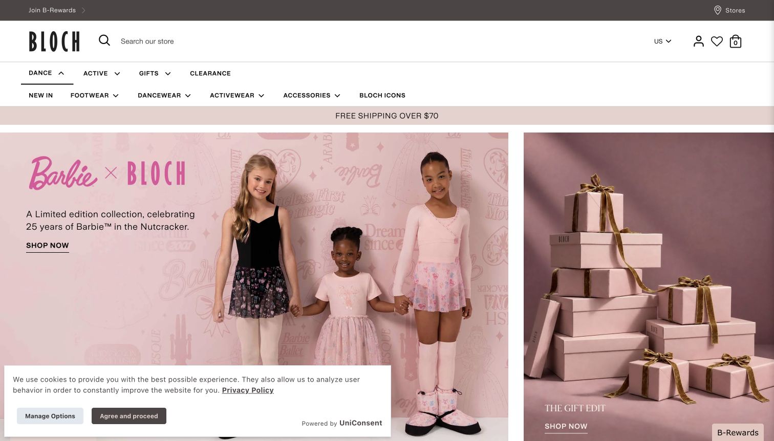
BLOCH’s United States storefront places a wide brand header above a two-level shopping structure. The reviewed opening campaign combines a bright collaboration photograph with neighboring gift imagery, giving visitors more than one seasonal entry point. Dance, activewear and gifts remain distinct, with footwear and product categories available underneath. The scale of the photography makes the campaign memorable, but the surrounding search and department labels perform much of the practical work. A newsletter interruption was dismissed before the selected capture; a cookie notice remains visible. Those real first-visit elements are part of the experience and illustrate how promotional layers can affect an otherwise direct retail composition.
What you can learn
When a campaign spans several audiences, keep the category hierarchy readable around it. Review the combined space used by promotions and privacy controls, because each additional layer reduces the room available for products.
Pros
Distinct department labels help separate dance shopping from activewear and gifting.
Search and region context remain available near the main brand identity.
Cons & considerations
Large campaign panels emphasize a particular collaboration before routine dance essentials.
The remaining cookie panel overlaps part of the lower opening view and adds visual competition.
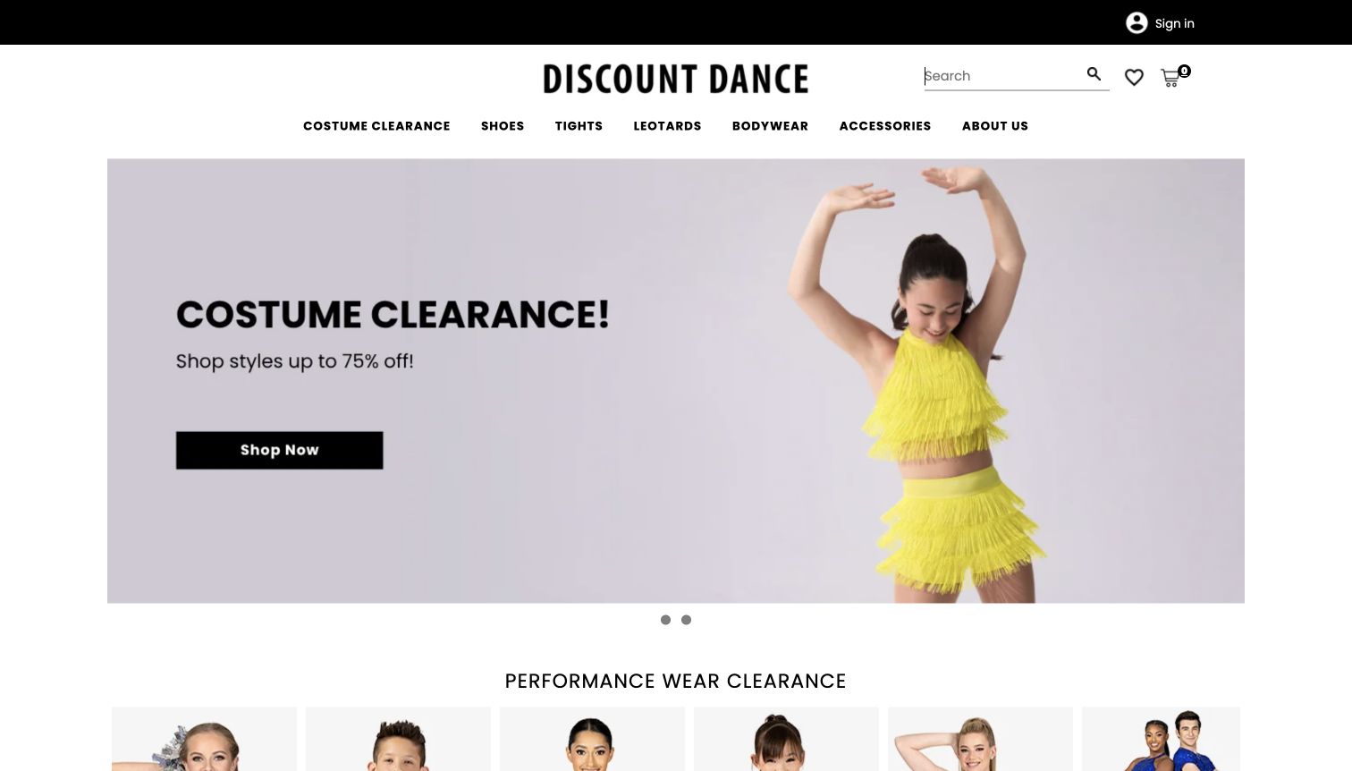
Discount Dance presents its name in a white header above product navigation. In the selected view, a pale lavender campaign pairs a dancer photograph with a costume-clearance message and a direct shopping button. The restrained background makes that offer easy to identify despite the breadth of the catalog. Search and category navigation provide alternative routes for visitors with a specific requirement, while carousel indicators signal that the opening offer is only one part of a changing promotion sequence. A newsletter panel and an expanded navigation overlay were cleared during capture preparation. The clean result is useful, but those interruptions deserve attention when adapting a similar layout.
What you can learn
Give a wide catalog a simple opening message without making the campaign the only way forward. Search and stable product categories should remain visible for shoppers arriving with a class requirement or replacement item.
Pros
A single prominent offer makes the opening campaign easy to understand.
Search and department routes accommodate customers who do not want to browse the seasonal promotion.
Cons & considerations
Rotating offers can conceal information until a visitor waits or changes slides.
Promotional and navigation overlays can obstruct the hero when they appear together.
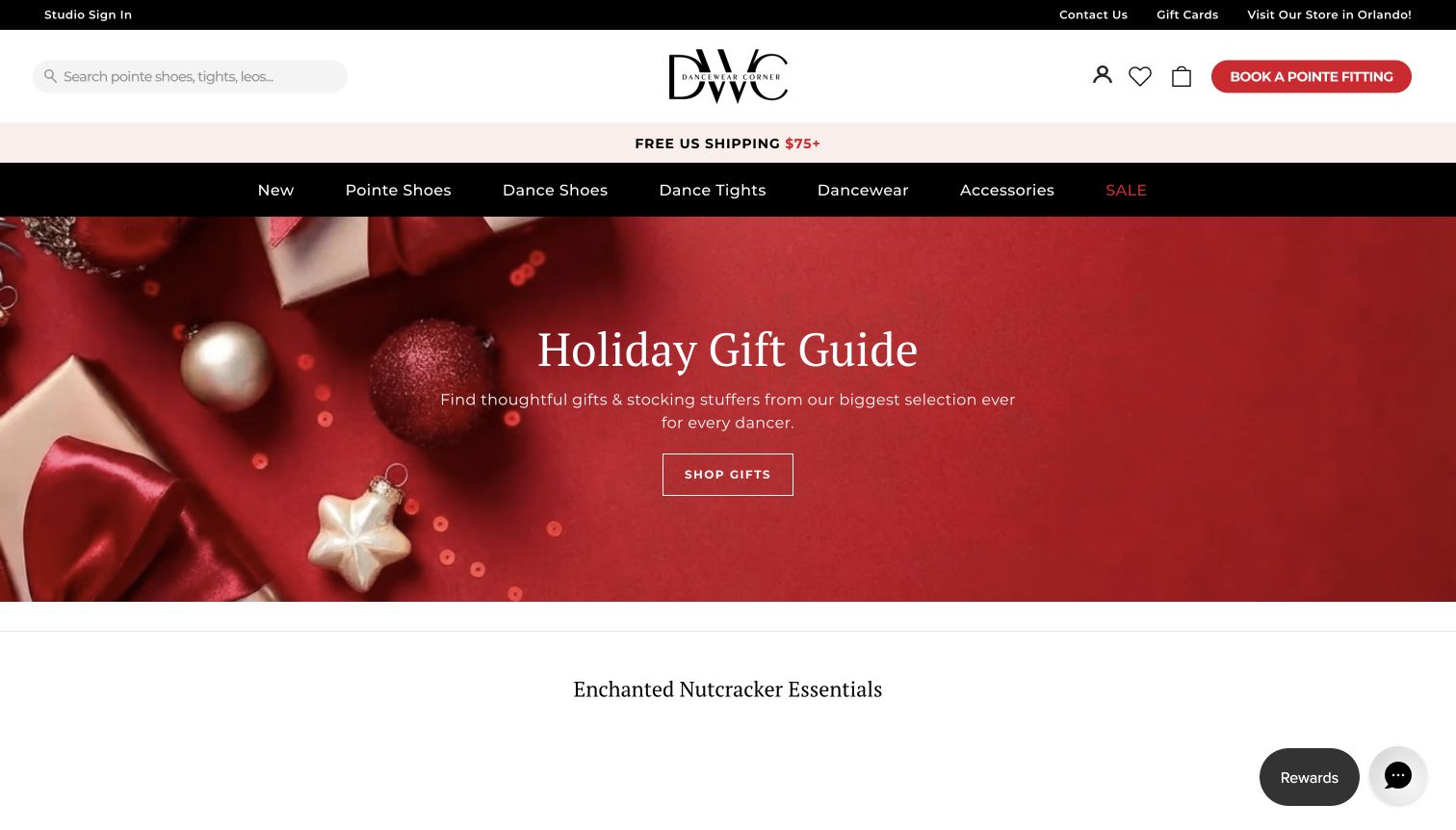
Dancewear Corner places its centered logo between search and a conspicuous pointe-fitting appointment button. A dark category bar then separates routine navigation from a vivid holiday gift campaign. The reviewed hero uses ornaments, clear gift wording and one shopping destination, followed by new merchandise and additional catalog sections. This arrangement lets a seasonal promotion occupy the main visual area without removing the fitting service from the opening screen. Rewards and assistance controls remain around the edges, adding useful routes but also more competing elements. The example is especially relevant to stores whose online audience includes both distant product buyers and nearby dancers planning a visit.
What you can learn
Keep a distinctive local service in the persistent header instead of burying it beneath campaigns. A seasonal homepage can change frequently while appointments, search and core categories remain stable.
Pros
The fitting button remains conspicuous beside the logo rather than relying on a lower-page section.
A clear category bar separates navigation from the colorful seasonal artwork.
Cons & considerations
Rewards, chat and promotional controls add competition around the main content.
A gift-led hero gives less immediate context for everyday classwear and replacement shoes.
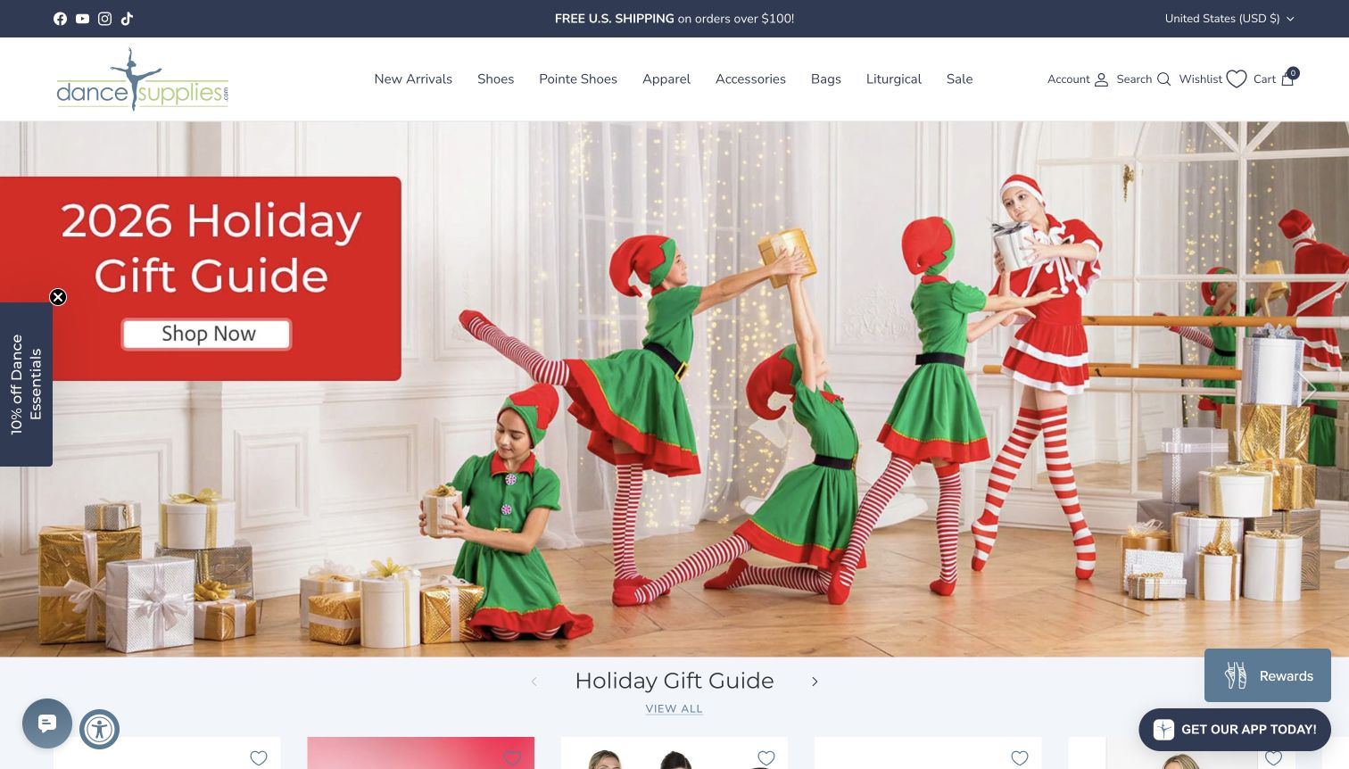
DanceSupplies.com uses an expansive holiday photograph to turn familiar dance merchandise into a seasonal shopping story. The staged rehearsal-room scene is paired with a large gift-guide label and a clear shopping control. Above it, a compact header groups arrivals, shoes, pointe shoes, apparel and accessories without losing the brand identity. Product sections below the hero return the page to individual merchandise and prices. The design is worth studying for the contrast between a highly expressive campaign image and a straightforward department structure. Multiple assistance, rewards and app prompts remain visible around the screen edges, demonstrating how useful supporting services can accumulate into a busy first impression.
What you can learn
Let campaign photography provide personality while keeping category labels literal. Before adding another floating tool, consider the combined footprint of chat, rewards, accessibility and app prompts on the same screen.
Pros
Distinct pointe and general footwear categories acknowledge different shopping needs.
The campaign leads into an actual product selection rather than an isolated image gallery.
Cons & considerations
Several floating controls compete with the merchandise and reduce visual breathing room.
The dominant seasonal scene may delay context for visitors seeking ordinary class essentials.
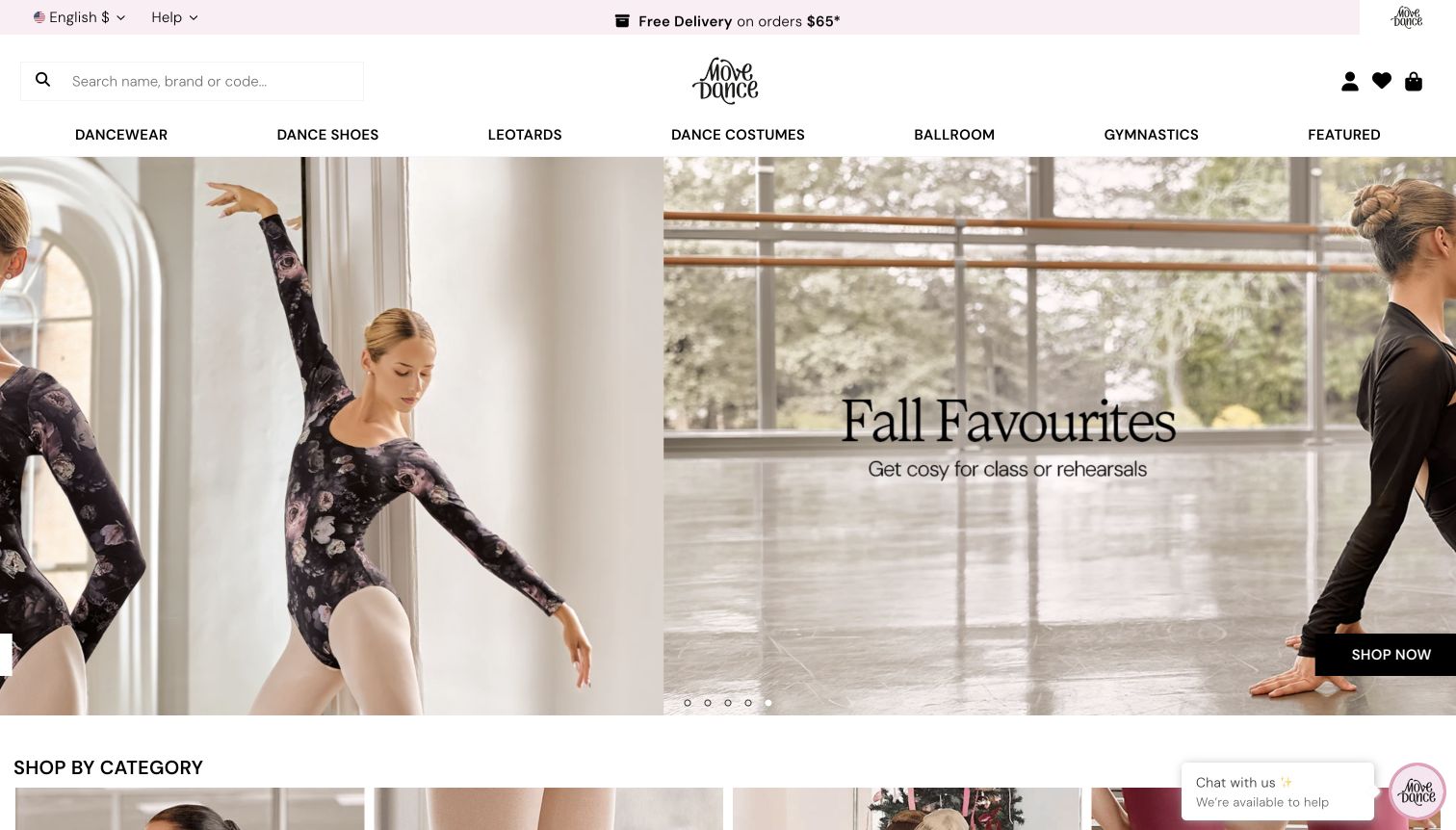
Move Dance’s United States site surrounds its large collection carousel with search and straightforward department labels. The reviewed hero features rehearsal clothing in a studio setting; the capture records a genuine slide transition rather than a fixed composite. Below, visitors can browse by product category and dance type, then continue into arrivals, costumes and named merchandise. Delivery context is presented in the top strip, separate from the principal navigation. This combination is useful for understanding how a broad catalog can support several ways of thinking about an outfit. The moving campaign provides atmosphere, while the stable category and discipline routes make the range easier to approach.
What you can learn
Organize a broad assortment around more than one legitimate customer vocabulary. Product type, dance discipline and brand can coexist when they lead to consistent merchandise records rather than disconnected duplicate catalogs.
Pros
The visible search field supports shoppers using a product name, brand or code.
Dance-type links offer an alternative to conventional garment and footwear categories.
Cons & considerations
The rotating hero can show transitional compositions that weaken the campaign’s immediate clarity.
A large newsletter interruption appeared during the initial visit before the corrected source view.
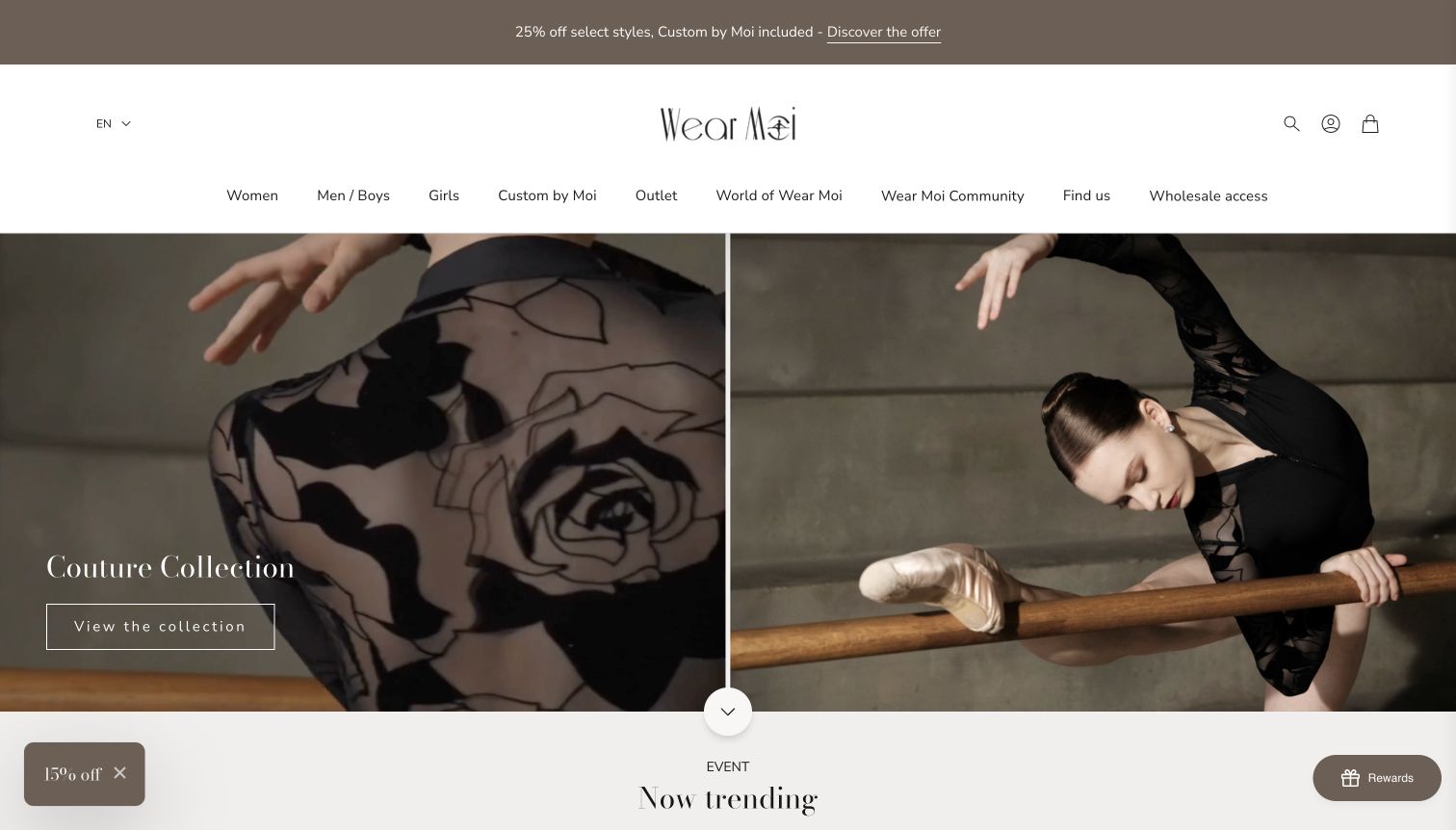
Wear Moi opens with paired photographs that show both a garment detail and the same visual language in movement. White navigation, a muted promotional strip and a fine outlined collection button leave the dark fabric and studio setting prominent. Women, men and boys, girls, custom options and outlet shopping are separated in the main navigation. Lower sections introduce named collections, individual products and color choices, extending the campaign into concrete browsing. The page demonstrates how a dancewear brand can borrow the visual pacing of a fashion editorial while remaining a store. Some interface labels mix English and French, which makes consistent localization an important consideration in an otherwise polished presentation.
What you can learn
Use close details and wider movement photographs together to explain a collection visually. Then make product names, color options and customer-help labels consistently understandable in the selected regional language.
Pros
Paired imagery communicates fabric character and the overall silhouette in the same opening view.
Custom, outlet and main collection routes are distinguished within the navigation.
Cons & considerations
Mixed-language labels create avoidable uncertainty in parts of the English-language shopping experience.
The tall opening presentation delays direct product comparison until visitors scroll.
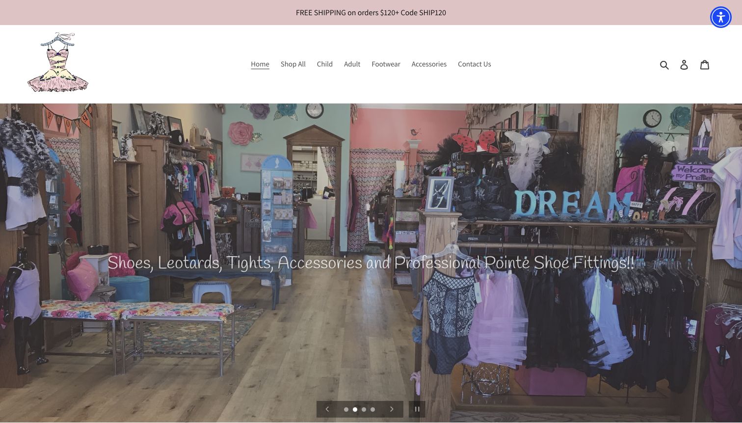
Dancer’s Wearhouse uses a full-width interior photograph to introduce the store before individual products. A small illustrated costume logo and pale pink announcement strip soften the otherwise simple white header. Navigation separates child, adult, footwear and accessories, while the hero names the store’s product and fitting offering. Customer quotations and selected merchandise follow, and the footer supplies the Agoura Hills address and contact details. The photograph gives visitors a tangible sense of the space and its assortment, making this a useful local-retail reference. Its main limitation is that a long line of text sits over a visually detailed interior, so the image and message compete in places.
What you can learn
A genuine shop photograph can communicate more local character than a generic dancer image. Keep the text overlay short, and place appointment instructions or location details where visitors can act on that interest.
Pros
The opening photograph establishes the store as a real place with a visible assortment.
Simple audience and product categories provide a manageable starting structure.
Cons & considerations
The long hero sentence competes with a detailed photographic background.
Practical location information appears farther down than the initial service introduction.
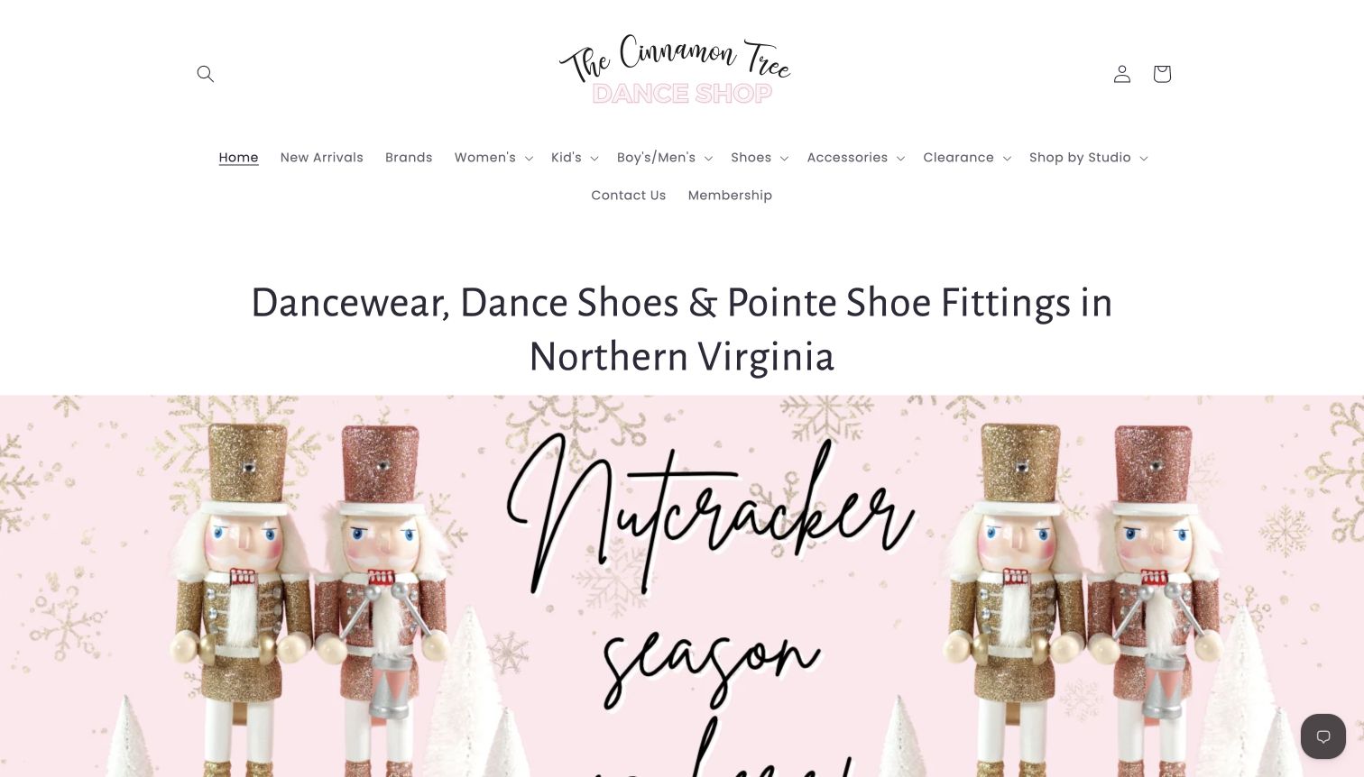
The Cinnamon Tree Dance Shop states its Northern Virginia focus in a heading before seasonal artwork. A handwritten-style logo and pale pink accents establish the shop’s visual identity, while the navigation includes ordinary product categories, brands and shopping by studio. The homepage then highlights pointe accessories and a large range of skirt colors, giving visitors several practical entry points beyond the holiday image. This is useful for stores that serve both individual preferences and prescribed school requirements. The generous header and long opening heading consume substantial space, however, so the first screen communicates the business and campaign more strongly than the products themselves.
What you can learn
Make school or studio requirements a first-class shopping route when they matter to the audience. Maintain those lists alongside ordinary product categories so families can move from an institutional requirement to the correct item.
Pros
The regional heading explains the shop’s local relevance before visitors reach the footer.
A studio-shopping route acknowledges requirements that are not captured by garment categories alone.
Cons & considerations
The tall header pushes the seasonal image and merchandise farther down the opening view.
A large color-based product sequence can become repetitive without strong filtering or grouping.
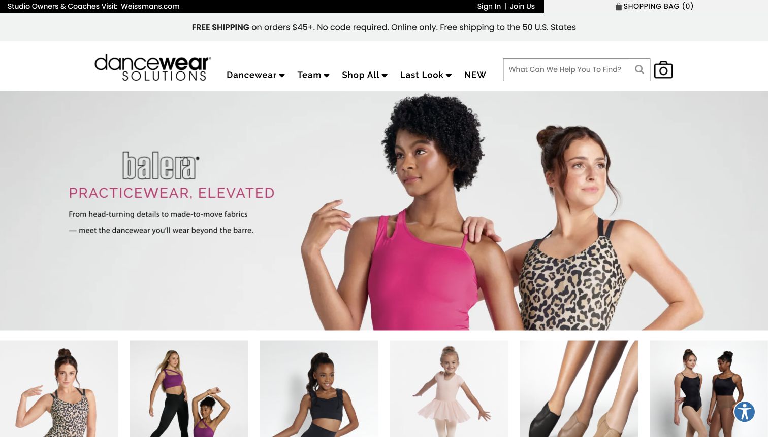
Dancewear Solutions combines a compact brand header with a broad practicewear campaign. The selected view pairs a short product message with two garment photographs, followed immediately by visual category tiles. Leotards, tops, bottoms, children’s styles, shoes and tights receive recognizable destinations, while brands and team shopping provide alternative routes elsewhere on the page. A separate top-level cue directs studio owners and coaches toward the related professional site, keeping that audience distinct. The example is useful for the way it connects a lifestyle introduction to concrete merchandise groups. An initial email-and-text offer obscured the homepage; the corrected capture shows the underlying structure after that interruption was no longer present.
What you can learn
Follow a broad campaign with clear category choices before asking visitors to interpret a long product assortment. Separate professional and individual shopping routes when their requirements differ, and explain any change of destination.
Pros
Image-led categories translate the broad practicewear message into specific shopping tasks.
The professional-audience cue distinguishes studio purchasing from the main consumer journey.
Cons & considerations
An early subscription offer can delay access to the otherwise direct category structure.
Important sizing and service information still requires navigation beyond the campaign-led homepage.
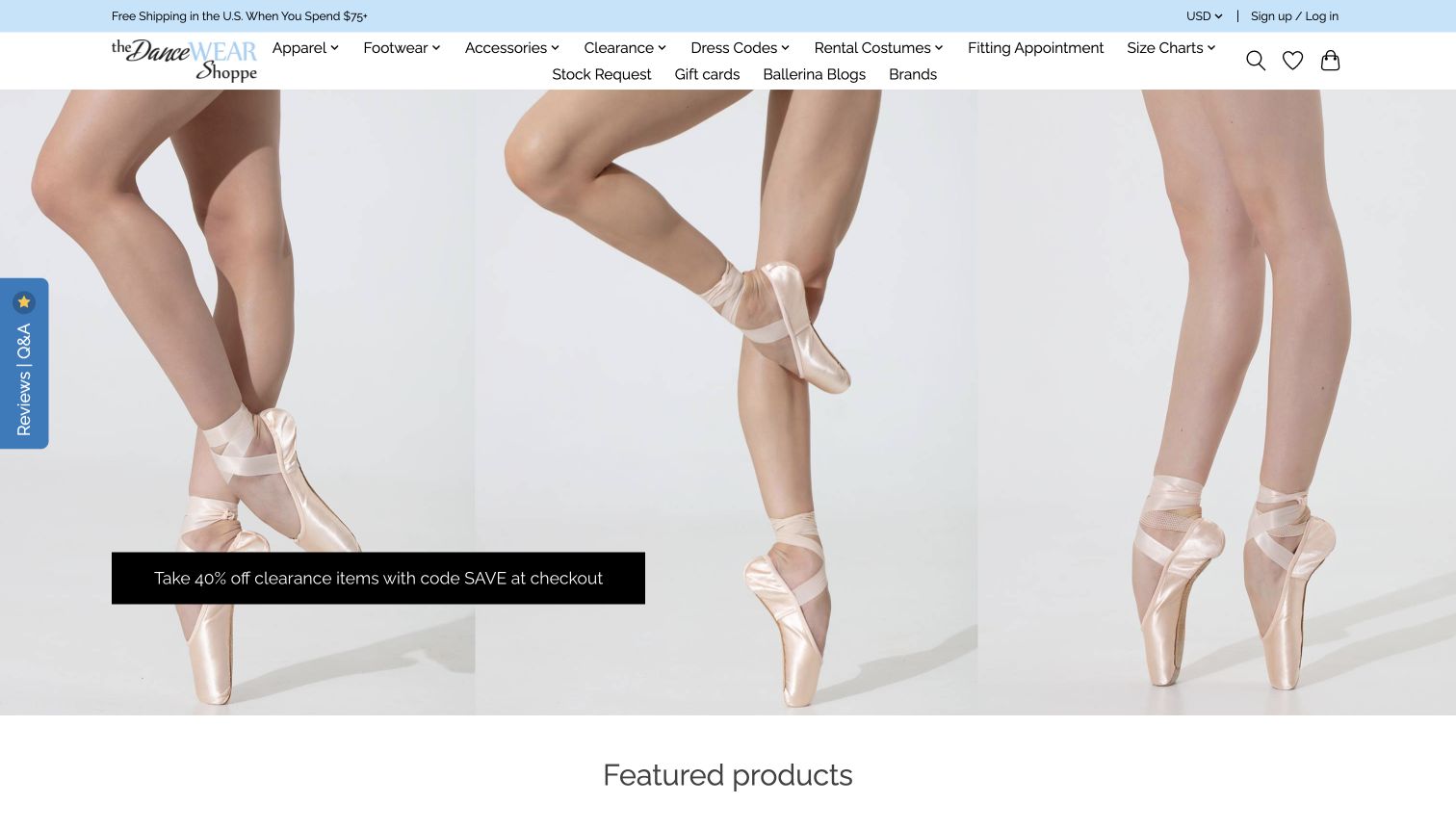
The DanceWEAR Shoppe gives several practical tasks unusual prominence in its navigation: fitting appointments, dress codes, size charts and stock requests sit beside apparel and footwear. A large pointe-shoe photograph introduces a clearance offer, followed by featured merchandise. Lower sections link to fitting information and explanatory articles, connecting the catalog with questions a dancer or parent may have before visiting. The compact pale-blue and white header leaves most of the opening screen to the photograph, though the number of links creates a dense two-line menu. This is a useful example of a service-aware store whose information architecture reaches beyond products and seasonal promotions.
What you can learn
Include the practical tasks that surround a purchase, especially required uniforms and fitting preparation. Group those routes deliberately so useful service links do not become an undifferentiated wall of navigation.
Pros
Dress codes, fitting appointments and stock requests are available directly from the main header.
Explanatory articles extend the catalog with preparation-oriented information.
Cons & considerations
The dense navigation gives many destinations similar visual weight.
A dominant clearance campaign leaves the broader fitting service to surrounding links and later sections.
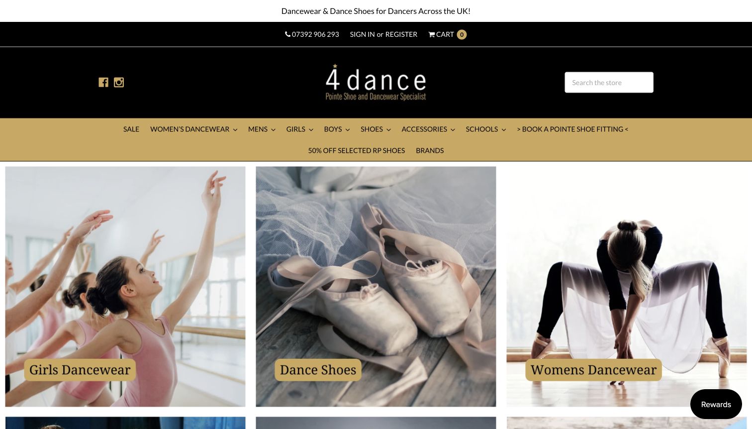
4Dance uses a black-and-gold header above large photographic category tiles. Instead of opening with one abstract campaign, the first row identifies girls’ dancewear, shoes and women’s dancewear, with further categories continuing below. Navigation also includes schools, brands and a fitting appointment route. The public introduction explains the Byfleet location and the range of dance disciplines served, while product listings expose actual names, prices and availability. This is useful for a store whose customers may arrive with either a broad need or a specific uniform requirement. The selected capture follows dismissal of a marketing overlay and optional cookie notice, preserving a clear view of the underlying category structure.
What you can learn
Use a small number of obvious visual categories to introduce a large assortment. Keep local services and school requirements close to those routes, and maintain consistent labels between the menu, photographs and product listings.
Pros
Large labeled category photographs give new visitors an immediate starting point.
School and fitting links account for needs beyond browsing individual garments.
Cons & considerations
The deep header and two-line navigation consume significant space before the category grid.
Marketing and cookie overlays initially obscured several of the otherwise useful category choices.
Kegan is a freelance web designer and developer with 15+ years of experience helping businesses turn complicated website requirements into clear, maintainable digital experiences. He works directly with clients from planning and design through development, launch, and ongoing support.
For dancewear store website design, his development approach focuses on product navigation, studio requirements, local-store information and fitting-appointment guidance. The scope can be a targeted improvement or a complete custom build, with responsive layouts, thoughtful content structure, and integrations chosen around the people using and maintaining the site.
Show 3 other dancewear store website designersHide other dancewear store website designers
Plan around the dancer, the requirement and the next visit
Map the main shopping tasks before choosing the homepage layout
Begin with the questions the store actually receives. Some visitors can name a manufacturer and style code; others know only the class, school or performance they are preparing for. Record these tasks before designing categories. An independent fitting shop and a brand selling its own collection need different first screens, even when both sell leotards and shoes.
Give each important task an understandable route. Product search can serve repeat purchases, while categories by garment, footwear or discipline support broader exploration. If the store supplies school uniforms, maintain a dedicated list for each participating school with the relevant class or level. Avoid presenting a vague school name as enough information to choose among several similar items. Assign responsibility for confirming changes with the school.
Decide how local services fit beside online shopping. A fitting appointment, stock question and ordinary purchase should have different labels and expectations. Show the location and opening hours before the visitor commits to a trip. Keep these stable routes available when seasonal artwork changes. Test the wording with staff who answer customer questions, and remove labels that require an insider to explain them. A clear menu should help a new customer identify an appropriate destination without additional assistance.
Build product information that helps visitors compare accurately
Plan the product record before the campaign photography. Useful fields may include the manufacturer, style name or code, available colors, size range, material information and the specific sizing guidance supplied for that item. Keep variants connected to the correct photographs. Do not let a generic image imply that every color, cut or fastening is available.
Show garments and footwear clearly, then use wider lifestyle photography to establish context. Detail views can explain fabric, construction or closures, while a straightforward product image helps comparison. If images include dancers, obtain appropriate permission and avoid treating the photograph as evidence that a product will fit or perform identically for everyone. Describe the visible item without making unsupported health, safety or performance claims.
Place exchange conditions, availability and delivery information near the point where they affect a choice. Different rules may apply to special orders, clearance items or particular product types; state the actual policy clearly. Keep stock and product information maintained through one responsible system. When an item is unavailable, offer a clear way to ask about alternatives without implying that a replacement is automatically suitable. A large assortment is useful only when its differences remain understandable.
Make fitting preparation and follow-through part of the website
Treat an appointment as its own journey. Explain which store or team handles the service, how to request a time and what the request does or does not confirm. If the business provides preparation instructions, publish those beside the appointment route and keep them consistent with staff practice. Explain any differences between a first visit and a repeat visit without promising an outcome.
Use the website to reduce logistical uncertainty. Visitors may need to know what to bring, how much time to allow, whether a parent or instructor should be involved, or whom to contact with a question. Present only the requirements that the business can actually support. Individual readiness, fit and suitability belong with the relevant qualified people; a marketing page should not substitute for that assessment.
Plan the follow-through as carefully as the introduction. Confirm what happens after an inquiry, how changes or cancellations are handled and where customers can find the store’s current policies. Collect only necessary information, keep appointment records private and explain their use. Make error messages and unavailable times understandable. Staff should be able to maintain practical guidance quickly, so a polished homepage does not continue promising a service or schedule that has changed.
The editing job behind the design
Choose tools that keep products and local services current
Use a maintained product system for variants, availability and policy context. If the main information site and online catalog use separate systems, keep branding, navigation and contact details consistent across the transition.
Appointment tools should explain whether the visitor is requesting a time or receiving a confirmed booking. Keep customer details and fitting notes private, and avoid duplicating sensitive information in public content or analytics.
The example stacks come from bounded public-source audits. They describe observed references, delivery signals and qualified evidence, not a complete inventory of checkout, stock, appointment or customer-management systems.
Our WordPress website examples offer a separate look at publishing approaches. A visible platform label is evidence for that named page, not a guarantee that the same system will suit your requirements.
Before the public launch
Dancewear-store website brief checklist
Identify the store’s actual locations, delivery territory and customer groups.
Keep search available for known brands, names and style codes.
Provide clear product, discipline and age-range categories where useful.
Maintain school or studio uniform lists with the relevant class context.
Distinguish online shopping, fitting appointments and stock inquiries.
Publish current hours, location and practical visit information.
Connect each variant with accurate images and sizing guidance.
State availability and delivery conditions without unsupported arrival promises.
Explain applicable return, exchange, special-order and clearance conditions.
Keep seasonal promotions from hiding important service and policy links.
Review the combined footprint of newsletters, rewards and assistance controls.
Keep inquiry and appointment records private and assign a content owner.
These checks are a project checklist, not a performance, legal, security, or accessibility certification. Test real journeys with the people responsible for the website before making claims about the result.
Sources & editorial method
How this collection was selected and reviewed
This collection contains fifteen distinct public website properties, matching the original saved random target of fifteen for the November 9 evening batch. All selected screenshots were captured directly on November 10, 2026 and individually inspected. The source views retain their actual capture timestamps; some show genuine privacy notices, floating tools or a moving-image transition. Every source received a bounded broad technology-audit attempt. Access restrictions and unavailable evidence remain qualified, with no hidden backend inferred. Dance Direct was excluded after its homepage remained behind a security-verification screen. Linden’s Dancewear was selected explicitly after comparison of the complete collection and direct review of its homepage, fitting guidance and company story. No purchase, fitting request, account action or marketing subscription was submitted.
Each example links to its actual source page. Screenshots are direct browser captures with their own capture dates; moving imagery, announcements and live designs can change. The notes describe observable design choices and conditional tradeoffs, not measured traffic, conversion results, service quality, or accessibility conformance.
Technology labels use public page metadata, asset evidence, or explicitly cited platform documentation. Platform documentation is not a complete current deployment audit. A component reference may be legacy or unused; it is not a complete backend inventory. Unknown stacks are omitted. These sites are editorial examples, not our client portfolio.
Written, Edited and Curated are separate editorial records, not timestamps advanced by a rebuild. Website designs and imagery belong to their owners. See our editorial standards or suggest a correction.
Questions worth asking
Dancewear Store website design questions
Should a dancewear homepage lead with products or fitting appointments?
Use the store’s main customer tasks. A local specialist may need to make fitting preparation and visit details prominent, while a broad online catalog may prioritize search and product categories. Keep both routes clear when the business supports both.
How should school uniform requirements appear?
Give each participating school or studio a maintained route with the relevant class or level, clear item names and links to the correct products. Assign someone to confirm changes. Do not assume that a school name alone resolves every uniform choice.
Can a website tell someone which pointe shoe is suitable?
A website can explain the products, the store’s fitting process and how to prepare for an appointment. Individual suitability and readiness require the appropriate personal guidance; a product photograph, size chart or marketing statement is not that assessment.
What matters when the online shop uses a different domain?
Keep the transition clear and maintain consistent branding, navigation, contact details and policy context. Visitors should understand that they are moving from information or appointments into a catalog, and should be able to return to the practical store details.
Does the Editors Choice endorse a retailer’s products or fitting service?
No. It recognizes the public website’s design and communication. The review did not involve buying products, testing fulfillment, verifying customer testimonials or receiving a fitting.