Best Record Store Websites of 2026 (17 Real-World Examples)
17 real record store websites, reviewed for music discovery, precise catalog browsing, release information and the connection between online shopping and a physical shop.
Help a collector find an exact pressing while giving an unfamiliar listener a useful reason to explore.
Record store websites serve different kinds of curiosity. A collector may arrive with an artist, catalog number and preferred format. Another listener may want staff recommendations, an upcoming event or the address of a shop they have never visited. A useful homepage gives those visitors clear starting points without making them interpret the entire inventory at once.
These 17 examples include dense specialist catalogs, expressive independent shops and local sites built around visiting information. Compare how they present editions, preorders, recommendations and physical identity. Their strongest ideas come from connecting a store's actual work to the next decision a customer needs to make.
Before the examples
What makes good record store website design in 2026?
Combine exact search with useful discovery
Make artist, title and format easy to identify, then provide a small number of understandable browsing routes. Staff recommendations should explain something useful about the record rather than merely repeat its title.
Explain editions, timing and availability
Separate new arrivals from newly released and forthcoming music. Identify pressing differences and stock limitations in text as well as images, especially when the online selection differs from the physical shop.
Make the real store easy to understand
Give address, hours, events and record-selling information identifiable homes. Use actual shop photography and specific programs to establish character, while keeping the main shopping or visiting task visible.
The collection · 17 examples
17 record store websites worth studying
The collection begins with an explicitly researched Editors Choice. Every review explains a useful design pattern and a visible tradeoff; the sequence is an editorial study of websites, not a measured ranking of the stores' service or record quality.
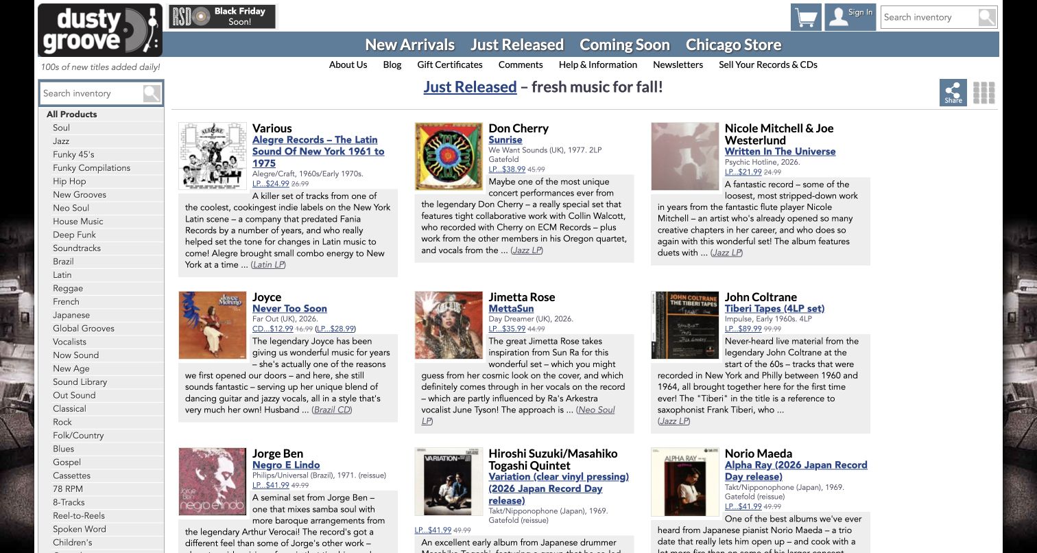
Dusty Groove makes its knowledge part of the shopping interface. The homepage places substantial record descriptions beside compact cover images, so discovery does not depend entirely on recognizing an artist or sleeve. A persistent left column separates musical styles, unusual formats, used stock and special offers, while the top navigation distinguishes new arrivals from newly released and forthcoming music. Those are meaningful differences for a collector. The restrained gray and blue presentation leaves the writing and artwork in charge. A direct Chicago Store link also keeps the physical business accessible within a catalog that could otherwise feel entirely online.
What you can learn
Write recommendations where a browsing decision happens. Pair a short explanation of a record with precise format and availability information, then give specialist categories stable homes. Keep a clear local-store route outside the product taxonomy.
Pros
Rich descriptions offer a reason to investigate unfamiliar music beyond the cover image.
Separate used-format and genre routes support several different ways of exploring the stock.
Cons & considerations
The long sidebar asks newcomers to process many specialist labels at the same time.
Dense text and small product images create a relatively compact reading experience on desktop.
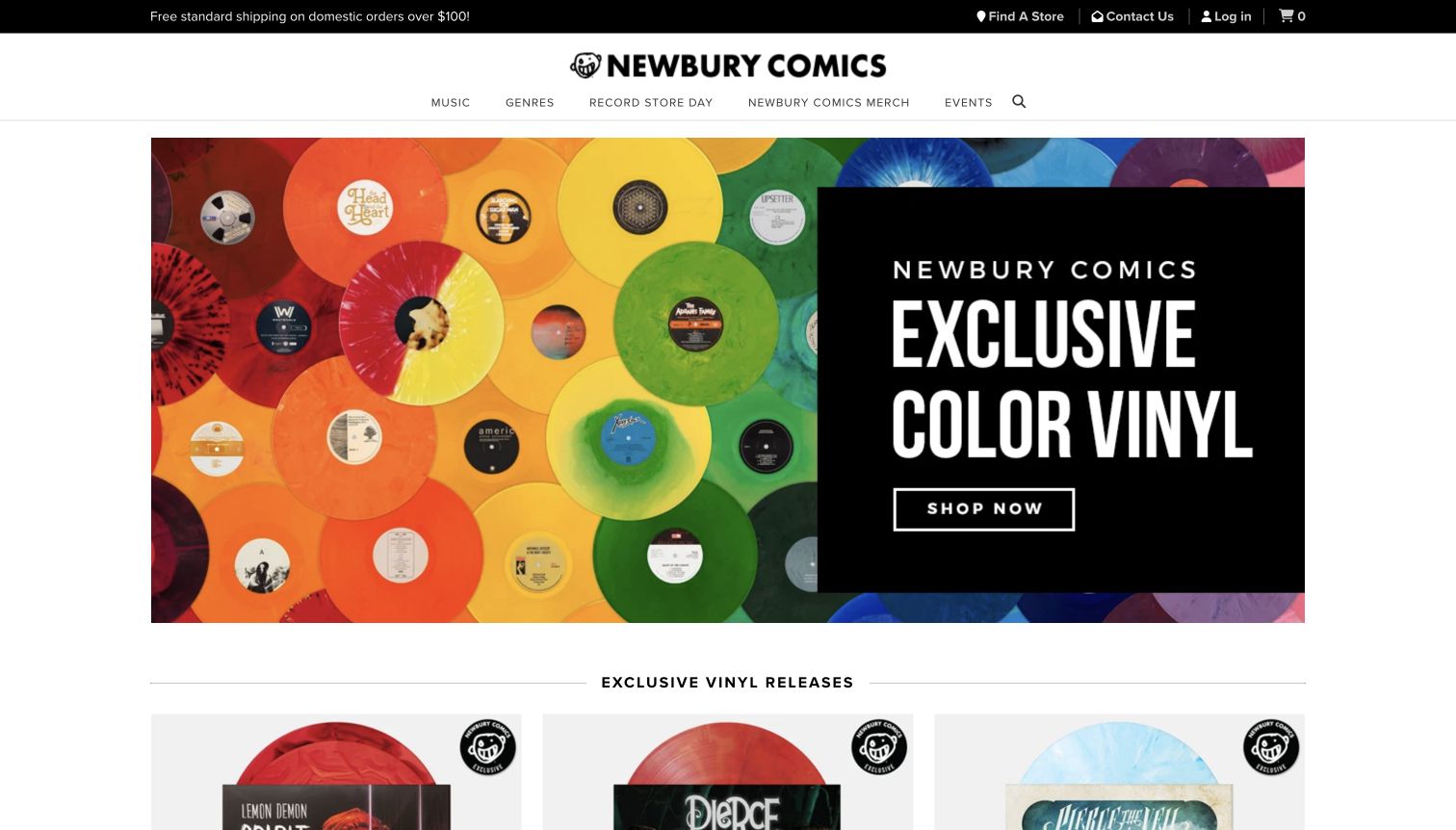
Newbury Comics opens with a vivid arrangement of colored records and a single, legible invitation to shop exclusive vinyl. The photograph shows the characteristic being promoted, which is more useful than a generic lifestyle image. A restrained white header separates music, genres, Record Store Day, merchandise and events; practical links for store finding and customer contact sit in a darker utility strip. Below the hero, exclusive releases continue the same story through product photography. The site therefore establishes a specific music-retail proposition despite a brand name that might otherwise suggest a different primary catalog to a first-time visitor.
What you can learn
Make the visual promise concrete. If unusual pressings are a genuine specialty, show the record as well as its sleeve and carry that distinction into product labels. Keep events and physical locations accessible without competing with the main campaign.
Pros
The hero image immediately explains the appeal of the featured colored-vinyl collection.
A short main menu and separate utility strip create an understandable initial hierarchy.
Cons & considerations
The large campaign occupies most of the opening view before individual products appear.
Other formats and less promotional shopping journeys depend on navigating beyond the featured collection.
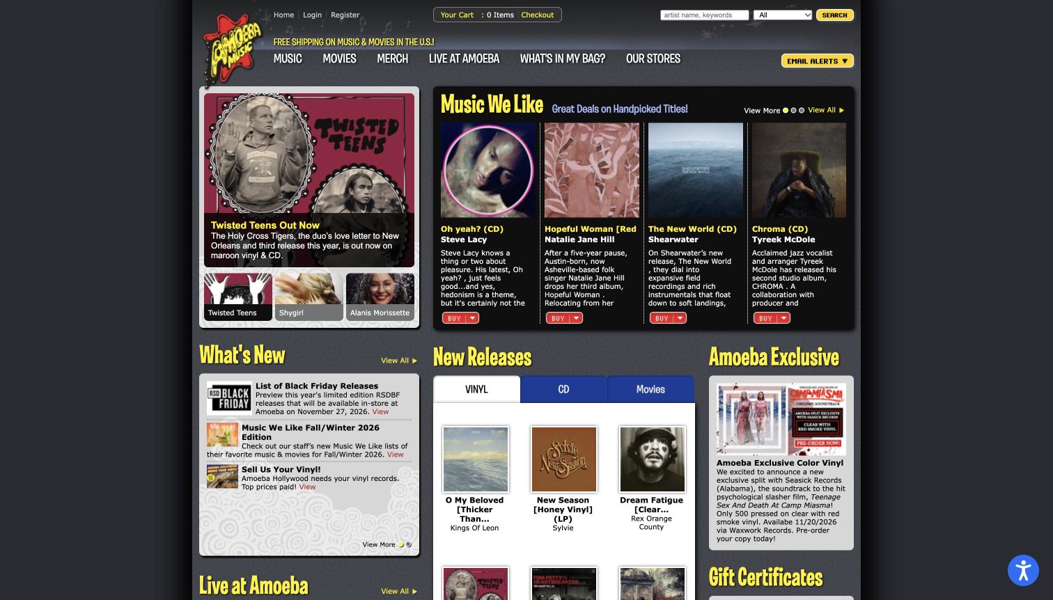
Amoeba Music treats the homepage as a lively shop noticeboard. Its dark background and bright yellow headings divide handpicked recommendations, new releases, news and live appearances into recognizable panels. The Music We Like area gives albums descriptive writing rather than only cover images and prices. Nearby routes to store information, the video series and live events show that the business has an editorial life beyond checkout. This density suits a visitor who enjoys browsing many subjects in one place, although several equally emphatic blocks compete for attention. Small text fills narrow desktop columns.
What you can learn
Give staff taste a visible, repeatable format. Place a few useful recommendations beside the catalog, then distinguish events and editorial features with consistent headings. Establish which panel should lead rather than making every promotion equally loud.
Pros
Album commentary provides context for listeners who do not recognize the featured releases.
Shopping, store visits and live programming all have explicit routes in the main interface.
Cons & considerations
Multiple high-contrast panels make it harder to identify a single primary next step.
Compact columns and small descriptive type require more sustained reading than a simpler product grid.
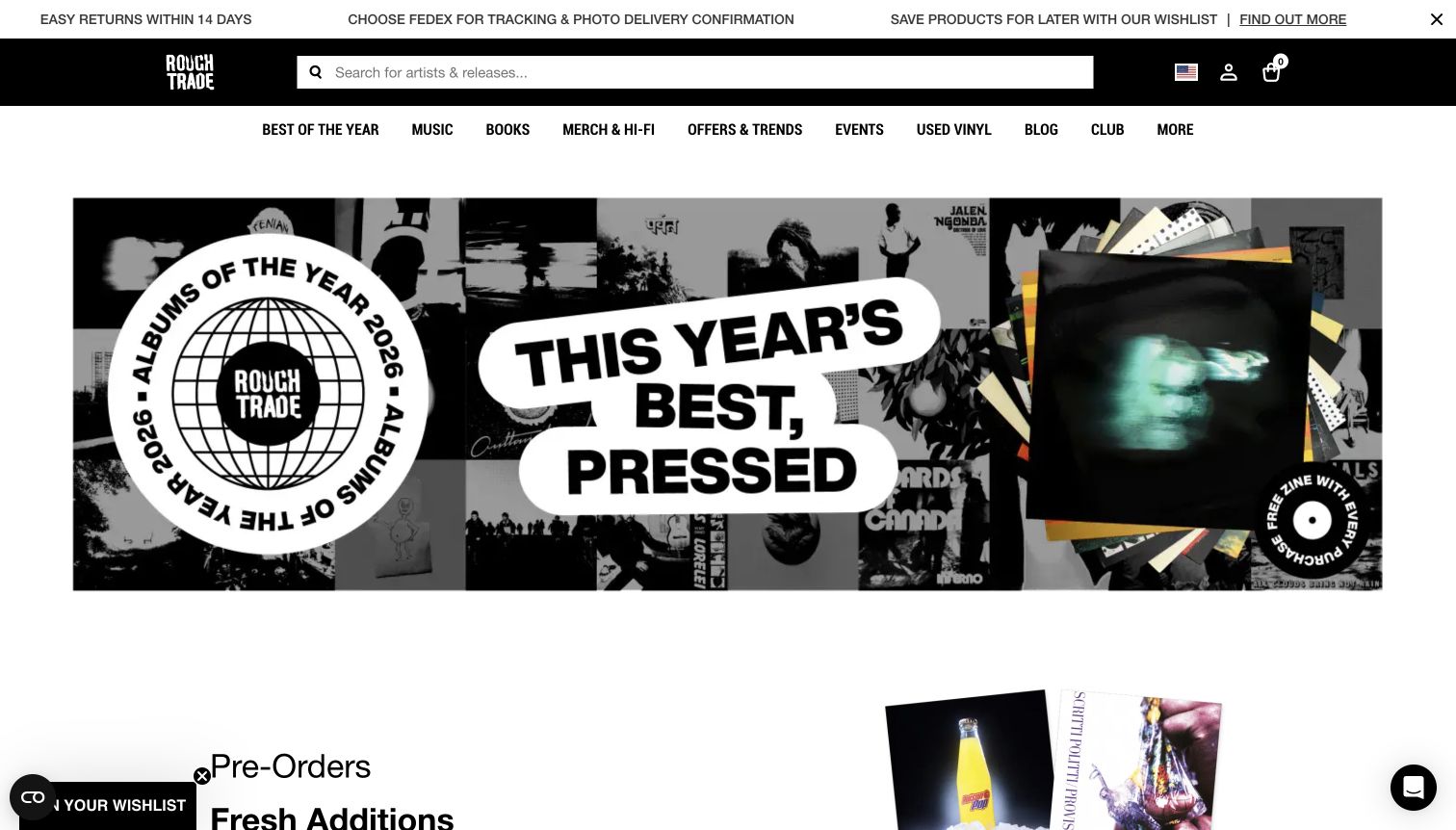
Rough Trade pairs a large artist-and-album campaign with a conspicuous search field in the black header. The page can therefore address a visitor exploring the year's selections while still giving an exact-title shopper a direct starting point. A broad menu includes music, books, events, used vinyl, editorial material and the club. Further down, staff picks and exclusive releases connect the promotional presentation to particular records. The opening campaign is visually confident, using collage, large lettering and generous white space, but it also delays ordinary product comparison. Small floating utilities remain visible around the edges of the accepted capture.
What you can learn
Keep exact search available even when a seasonal campaign dominates the page. Build a path from the campaign to a clearly named collection, and distinguish ongoing editorial programs from temporary offers so returning visitors retain their bearings.
Pros
The wide search field offers a direct alternative to browsing the featured campaign.
Editorial, event and used-record routes make the store's broader music activity discoverable.
Cons & considerations
The oversized promotional banner pushes individual titles below the first desktop screen.
Many top-level destinations and floating controls add competing choices around the main shopping path.
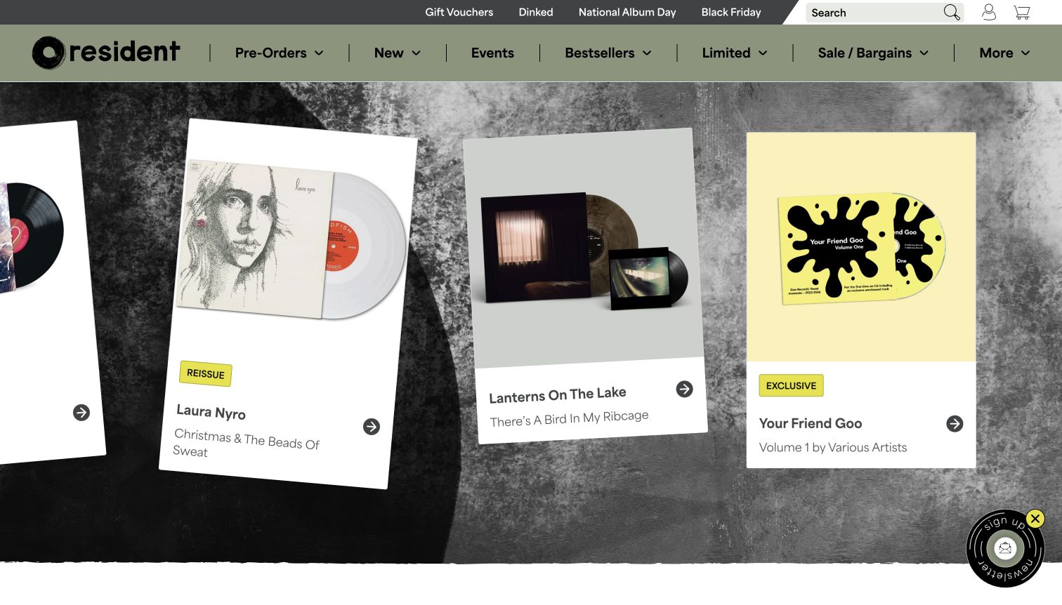
Resident Music uses a textured backdrop and tilted, oversized product cards to evoke records laid out for inspection. Sleeve and vinyl images receive room to breathe, while small labels identify distinctions such as reissues and exclusives. The muted green navigation contrasts with bright yellow accents and offers clear routes to preorders, new stock, events, bestsellers and limited editions. Below this display, Available Now and Coming Soon establish useful timing categories, with substantial album commentary further down. The result has a strong independent-shop character. Its tradeoff is that the theatrical opening consumes considerable space and places several browsing directions on the same visual level.
What you can learn
Use tactile styling to support real product differences. Show the physical edition clearly and pair expressive presentation with plain timing labels. Keep a straightforward list or category route available for customers who already know what they need.
Pros
Large record-and-sleeve images make the featured physical editions easier to understand.
Separate current and forthcoming sections reduce ambiguity about which releases are already available.
Cons & considerations
The spacious angled display shows fewer products than a conventional compact grid.
A dense menu and floating newsletter control compete with the deliberately expressive hero area.
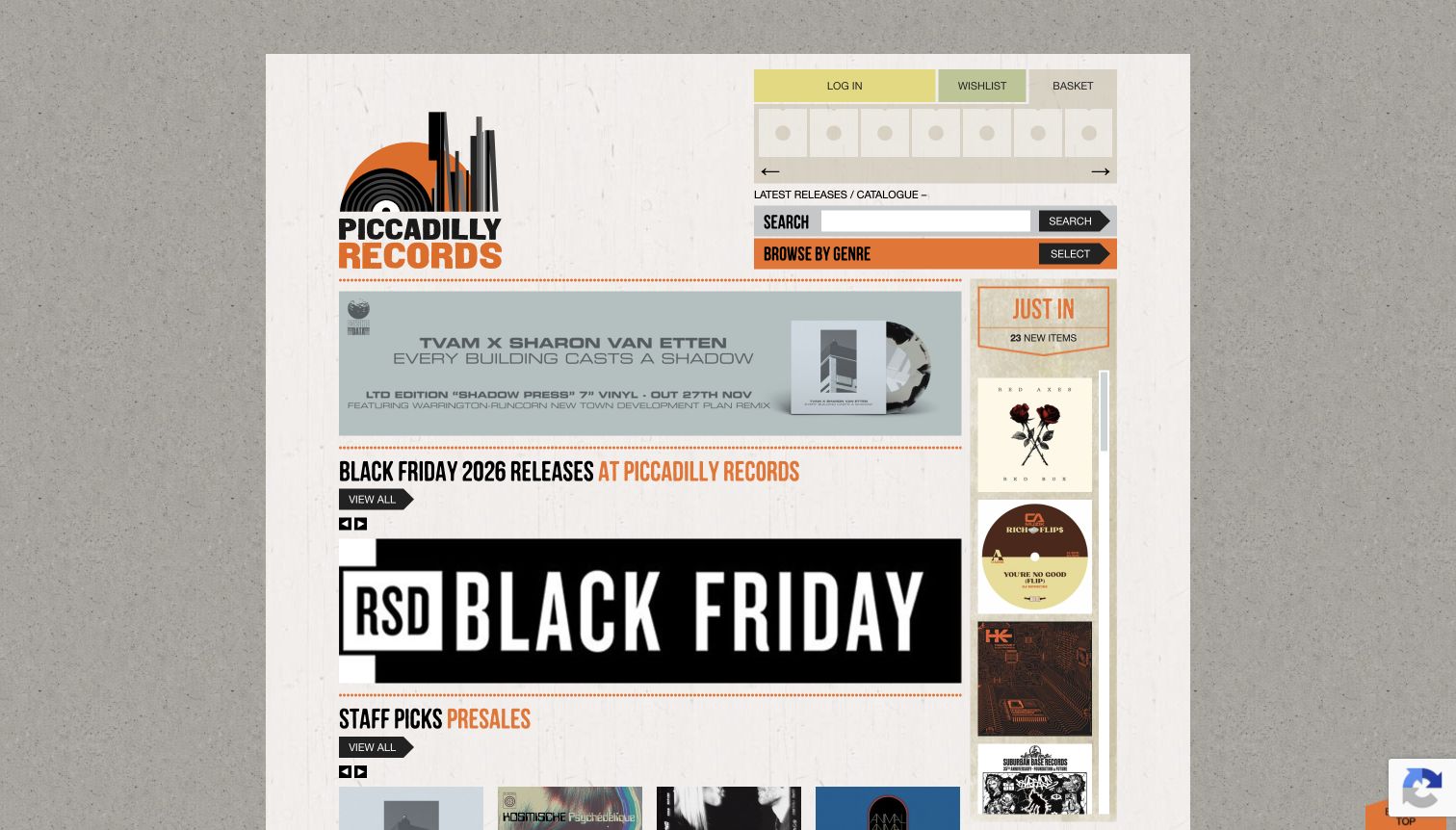
Piccadilly Records combines a textured, poster-like frame with very practical catalog controls. Search and genre browsing sit together near the top, while a narrow Just In column creates a separate stream of recent additions. The main page breaks staff selections into presales, latest LPs, collections and reissues, and singles. That structure communicates the shop’s perspective rather than presenting an undifferentiated feed. Orange accents and condensed headings connect the sections visually. On the captured desktop, the central site remains comparatively narrow and contains many small elements, so the distinctive visual character comes with a denser reading and scanning experience.
What you can learn
Give staff recommendations a useful structure. Separate selections by timing or format, keep exact search close to genre browsing, and make the relationship between the main recommendations and secondary arrival feed obvious to a new visitor.
Pros
Several clearly named staff-pick sections offer more guidance than a generic featured-products row.
Search and genre controls are grouped together instead of scattered across the page.
Cons & considerations
The narrow desktop content area makes banners, product details and side content feel crowded.
Many similarly styled sections require scrolling to understand the full range of available routes.
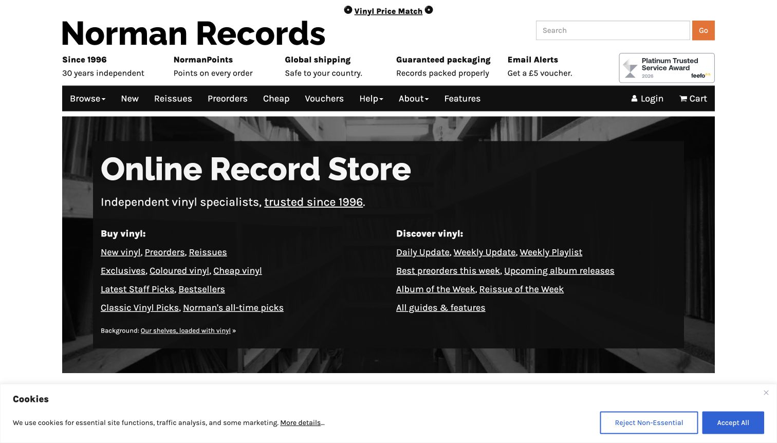
Norman Records introduces itself directly as an online record store, then splits the hero's links into buying and discovery. New vinyl, preorders and reissues sit beside routes to updates, playlists, upcoming albums and editorial features. This makes the opening screen unusually explicit about what a visitor can do. A service strip discusses shipping and packaging; staff picks below supply concrete examples. Bold black type and underlined links favor clarity over decorative complexity. The number of links remains substantial, and the cookie notice retained in the capture occupies a noticeable band across the bottom.
What you can learn
Separate known-item shopping from exploratory listening. Explain those paths in familiar language before asking people to interpret a large taxonomy. Keep service claims linked to their actual conditions and use a restrained set of priorities in the hero.
Pros
The buying-versus-discovery split gives both focused shoppers and curious listeners an understandable starting point.
Direct textual links expose useful destinations without requiring every visitor to open a menu.
Cons & considerations
The hero contains many links before showing a specific record or staff recommendation.
The visible cookie banner reduces the amount of catalog content available in the initial screen.
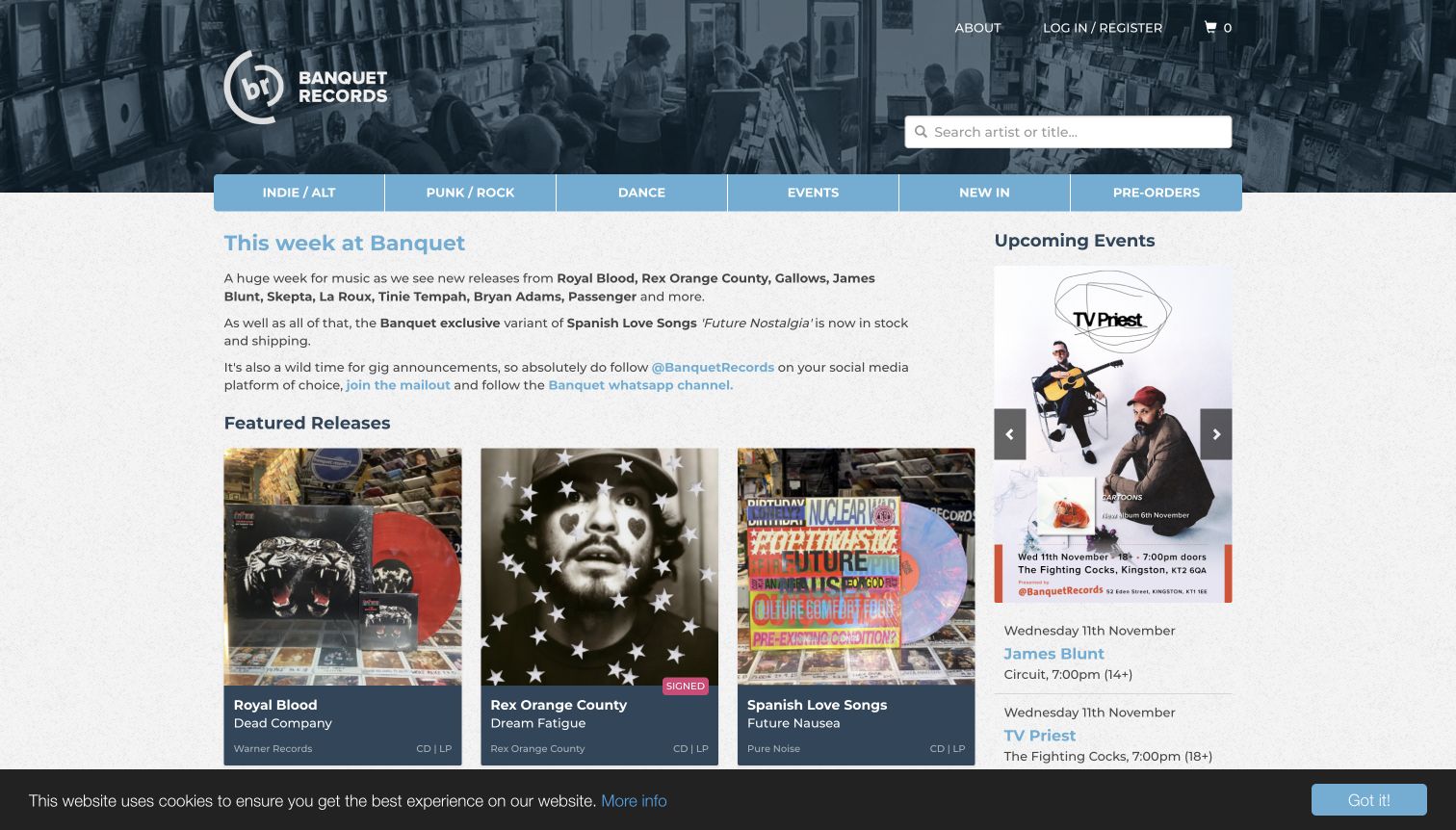
Banquet Records brings the physical shop into its header through a wide photograph of people browsing record bins. Beneath a compact genre-and-task menu, a weekly note explains current releases and announcements in the store's own voice. Featured albums occupy the main column while upcoming events receive a distinct side column with dates, venues and attendance details. Records and live activity feel connected. Blue accents connect the varied sections. It is also a busy opening: editorial copy, products and event promotion compete, and the retained cookie bar reduces the visible lower portion.
What you can learn
Treat the weekly update as orientation, then connect it to structured products and events. Give each event a real date and location rather than relying on its poster alone. Keep the introduction short enough that useful listings remain easy to reach.
Pros
Actual shop photography gives the catalog a tangible local setting and recognizable personality.
The event column combines promotional images with practical scheduling information beside current releases.
Cons & considerations
Several active content areas ask for attention before the visitor chooses a primary task.
The first-view cookie notice covers part of the product area and adds another visual interruption.
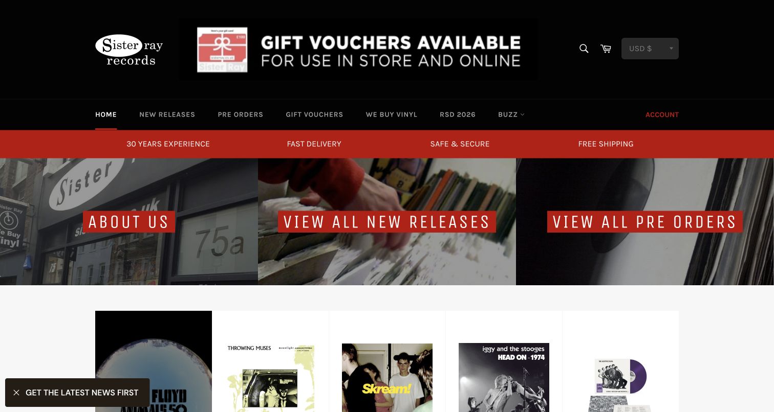
Sister Ray uses black, white and red to connect a gift-voucher promotion, service strip and three broad photographic gateways. Those gateways distinguish the shop's story, new releases and preorders before the page moves into rows of records. The catalog cards also display availability wording, which helps separate future releases from current stock. History and news appear below, giving the commerce layout a connection to Soho rather than leaving it anonymous. The initial saved visit was dominated by a signup overlay; the accepted second capture preserves a compact newsletter prompt instead. Optional marketing substantially changes that first impression.
What you can learn
Make the main catalog choices visible before introducing optional signup requests. Pair photographic entry points with plain labels and keep availability on product cards. A visitor should understand the store even if they never subscribe to updates.
Pros
Three large entry panels explain the major routes without relying on a complex menu.
Product availability labels help distinguish preorders from records that are already in stock.
Cons & considerations
The observed signup overlay initially obscured much of the homepage and interrupted browsing.
Several service claims share a bright strip without their conditions being visible alongside them.
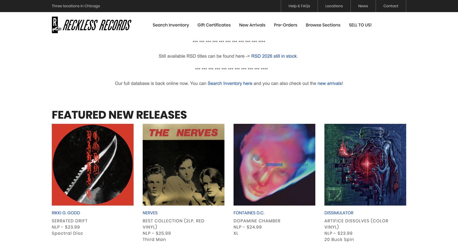
Reckless Records gives the desktop homepage a straightforward inventory character. A restrained black wordmark, location information and task-based links lead into a notice about the relationship between the website and available stock. Product entries then use album covers alongside artist, title, format, label and price information. The page spends little effort on a large aspirational hero, leaving room for records and operational explanation. This is useful for someone arriving with a specific collecting goal. It is less immediately evocative for an unfamiliar visitor: the prominent notice and dense catalog presentation require reading before the shop's personality becomes apparent.
What you can learn
Explain stock boundaries before customers make assumptions. Use a consistent order for artist, title, format and edition details, then offer search and browsing routes that match those fields. Keep operational notices concise and visually distinct from promotional content.
Pros
Practical product details support comparison without depending entirely on recognizable cover artwork.
Location and stock information acknowledge the relationship between the online catalog and physical shops.
Cons & considerations
The large explanatory notice delays the first substantial view of the record selection.
A dense functional presentation provides less immediate guidance for newcomers who want recommendations.
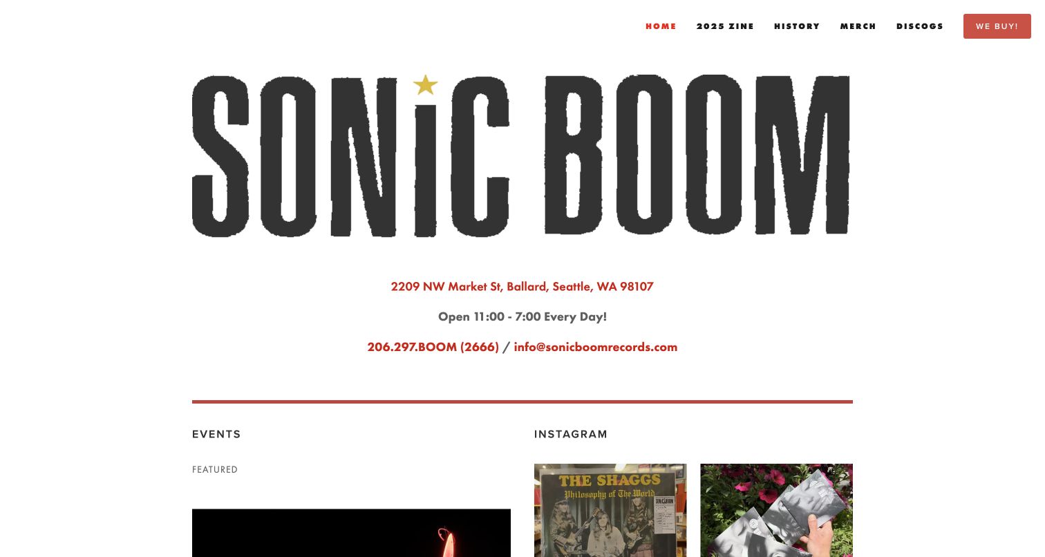
Sonic Boom Records leads with an oversized wordmark, then puts its street address, opening hours, telephone and email in the middle of the page. That hierarchy makes the physical visit the most obvious task. Short navigation connects store history, merchandise, selling records and an external marketplace. Events and social material continue below the opening information. The page has a strong graphic identity without pretending to be a conventional full-catalog storefront. Its main tradeoff follows the same choice: a customer looking for one particular album does not receive a prominent on-site inventory search in this first view.
What you can learn
Choose the homepage around the service the site actually provides. If most useful visits begin with finding the shop, show essential location details prominently and label any external catalog clearly. Do not hide practical information behind brand storytelling.
Pros
Address and opening information are highly visible rather than buried in a generic footer.
A short menu connects local history, events and record-selling information without excessive hierarchy.
Cons & considerations
The very large wordmark uses space that could expose more event or service context.
Exact-item shoppers need another destination because a prominent native catalog search is absent here.
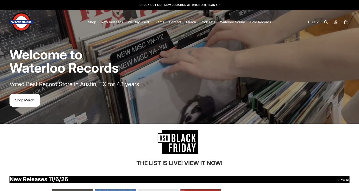
Waterloo Records uses footage of hands browsing record bins as the homepage's main visual introduction. A welcoming overlay and merchandise button sit above that scene, while a conspicuous notice communicates the store's location information. The navigation offers shopping, new releases, used-record buying, events and contact alongside other business programs. Promotional releases below introduce particular records. The opening effectively communicates the physical activity of record shopping, but the strongest immediate button promotes merchandise rather than the music catalog. Several programs share the navigation, increasing the choices for first-time visitors.
What you can learn
Use store atmosphere to support a clear next step. Pair authentic browsing imagery with the action most visitors need, and keep important location changes separate from ordinary promotions. Organize secondary programs so they do not obscure core music and visiting routes.
Pros
Real record-bin imagery makes the physical shopping experience understandable without lengthy explanatory copy.
Location messaging and dedicated service links connect the visual introduction to practical store tasks.
Cons & considerations
The hero's merchandise emphasis may divert visitors whose immediate goal is finding music.
A broad navigation mixes core retail tasks with several additional branded programs and offerings.
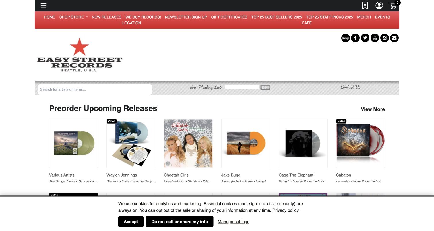
Easy Street Records uses a broad logo area and red navigation to establish a recognizable identity above its catalog. Search and mailing-list access occupy a separate horizontal band, followed by a dense row of upcoming records with cover art, artist names and edition descriptions. Links for the shop, events and cafe acknowledge that the business includes several reasons to visit. Music commerce meets a broader physical destination. In the captured view, the logo and navigation consume considerable vertical space, while the first products are partly limited by a cookie notice. Practical catalog information follows several stacked layers.
What you can learn
Keep distinct services visible without making the header a sequence of competing banners. Put search close to the catalog and make preorder status explicit. Keep cafe and event routes distinct from the main retail task.
Pros
Product rows expose artist and edition information alongside the cover rather than using imagery alone.
Navigation acknowledges the cafe and events as separate reasons to engage with the store.
Cons & considerations
The large identity area and multiple horizontal bars delay the main product selection.
The retained cookie notice occupies part of the first view and reduces visible catalog space.
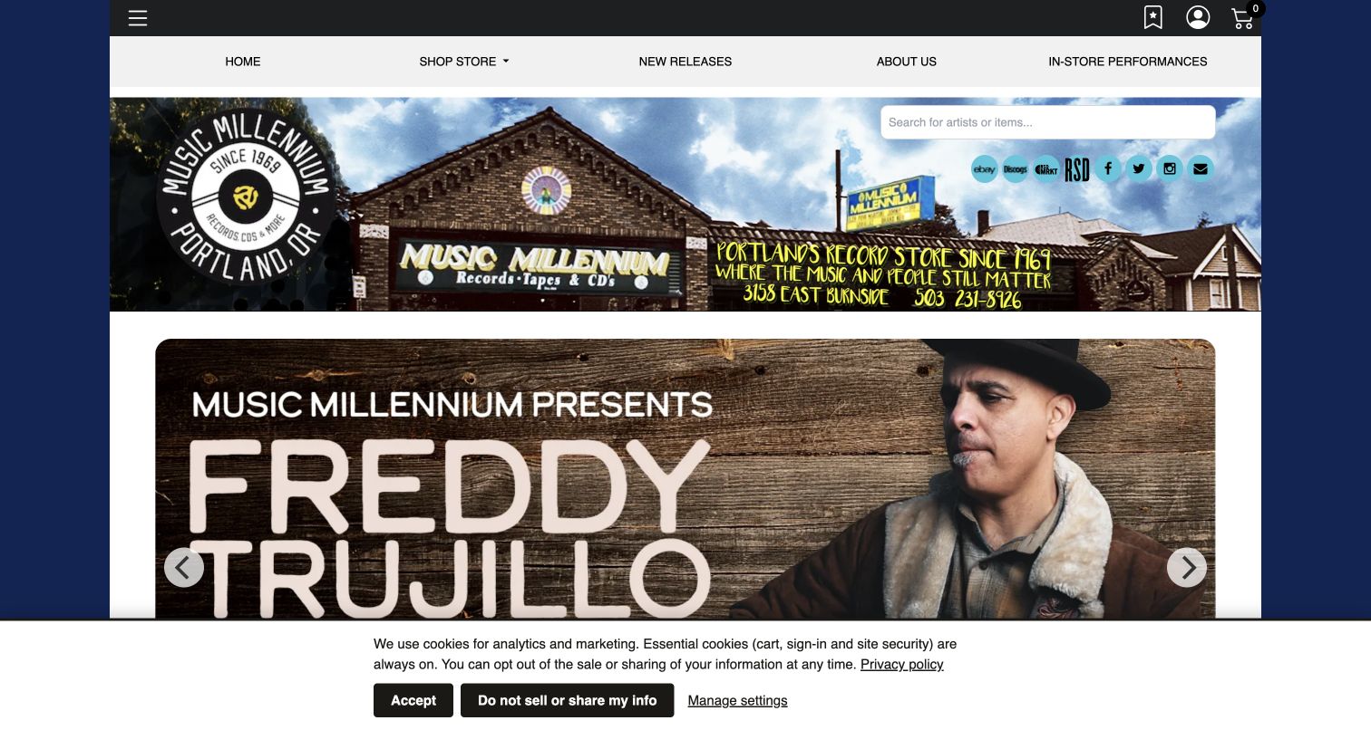
Music Millennium uses a wide photograph of its storefront to make the business feel located rather than abstract. Its branding and address sit within that identity area, with search and a short navigation connecting visitors to shopping, new releases, background and in-store performances. A large event promotion then takes priority before the product sections. Live music leads without displacing online shopping entirely. External marketplace links introduce additional destinations to evaluate. The captured cookie notice remains visible, and the promotional area means a visitor must move farther down to compare individual records.
What you can learn
Use real exterior photography to help visitors recognize the place, then give events structured information and a clear path back to shopping. Explain external marketplace transitions so people understand whether they are browsing the same inventory or a separate selection.
Pros
The storefront image supplies concrete local identity instead of a generic music-themed background.
Dedicated performance and new-release links distinguish live programming from ordinary catalog browsing.
Cons & considerations
A large event promotion pushes specific record listings beyond the initial desktop view.
Multiple marketplace links and the visible cookie notice add competing elements around the shopping route.
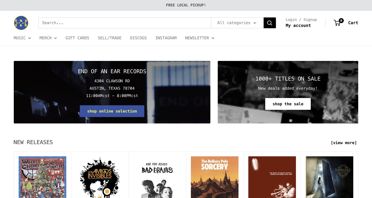
End of an Ear places a substantial search field and category selector at the top of a spare, typographic page. Two panels separate visiting information and online selection from a sale collection. Record covers begin immediately below, so the homepage moves quickly from orientation to merchandise. Monospaced lettering and a restrained layout give it a distinctive personality without relying on a large decorative photograph. The main menu provides routes to music, merchandise, gift cards and selling or trading records. Discogs provides another catalog route. Genre choices and marketplace routes still require interpretation by unfamiliar shoppers.
What you can learn
Put local information and catalog access beside each other when both matter. Use typography to establish character without displacing utility, and define the purpose of each inventory destination. Use understandable search categories rather than unexplained specialist terminology.
Pros
Prominent search and a category selector support people arriving with a specific record in mind.
Visiting details and the online selection receive similarly visible positions near the top.
Cons & considerations
Specialist category options can require interpretation from customers unfamiliar with the shop's taxonomy.
The relationship between the on-site selection and external marketplace is not explained in the opening panels.
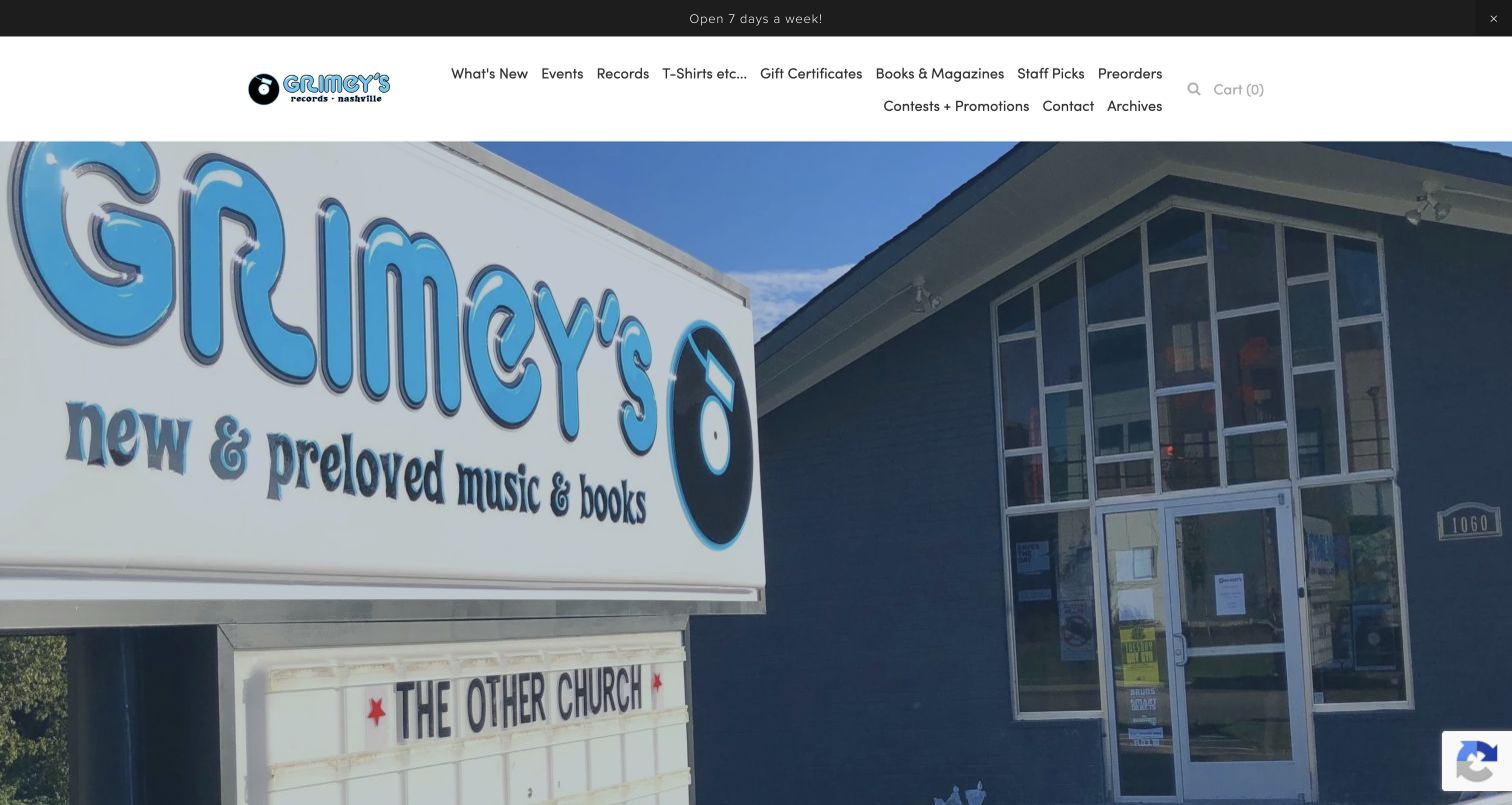
Grimey's opens with an expansive photograph of its sign and building, making the physical destination the dominant first impression. A white navigation area contrasts with the blue exterior and gives direct routes to new stock, events, records, staff picks, preorders and other store categories. Below the opening image, the page connects those routes to news, shopping and practical visiting information. The photograph gives the page distinctive local character. Its scale leaves little product or event detail in the first screen. Broad two-line navigation also requires considerable scanning.
What you can learn
Use recognizable storefront imagery when local identity matters, but decide how much of the opening screen it should occupy. Pair the photograph with a concise set of primary tasks and let lower-priority categories live within related sections rather than crowding navigation.
Pros
The actual exterior and sign help visitors connect the website to a recognizable physical location.
Staff picks, preorders and events are named explicitly rather than hidden under vague navigation labels.
Cons & considerations
The very large storefront photograph postpones concrete record and event information beyond the first screen.
Numerous menu destinations spread over two lines make the header comparatively busy to scan.
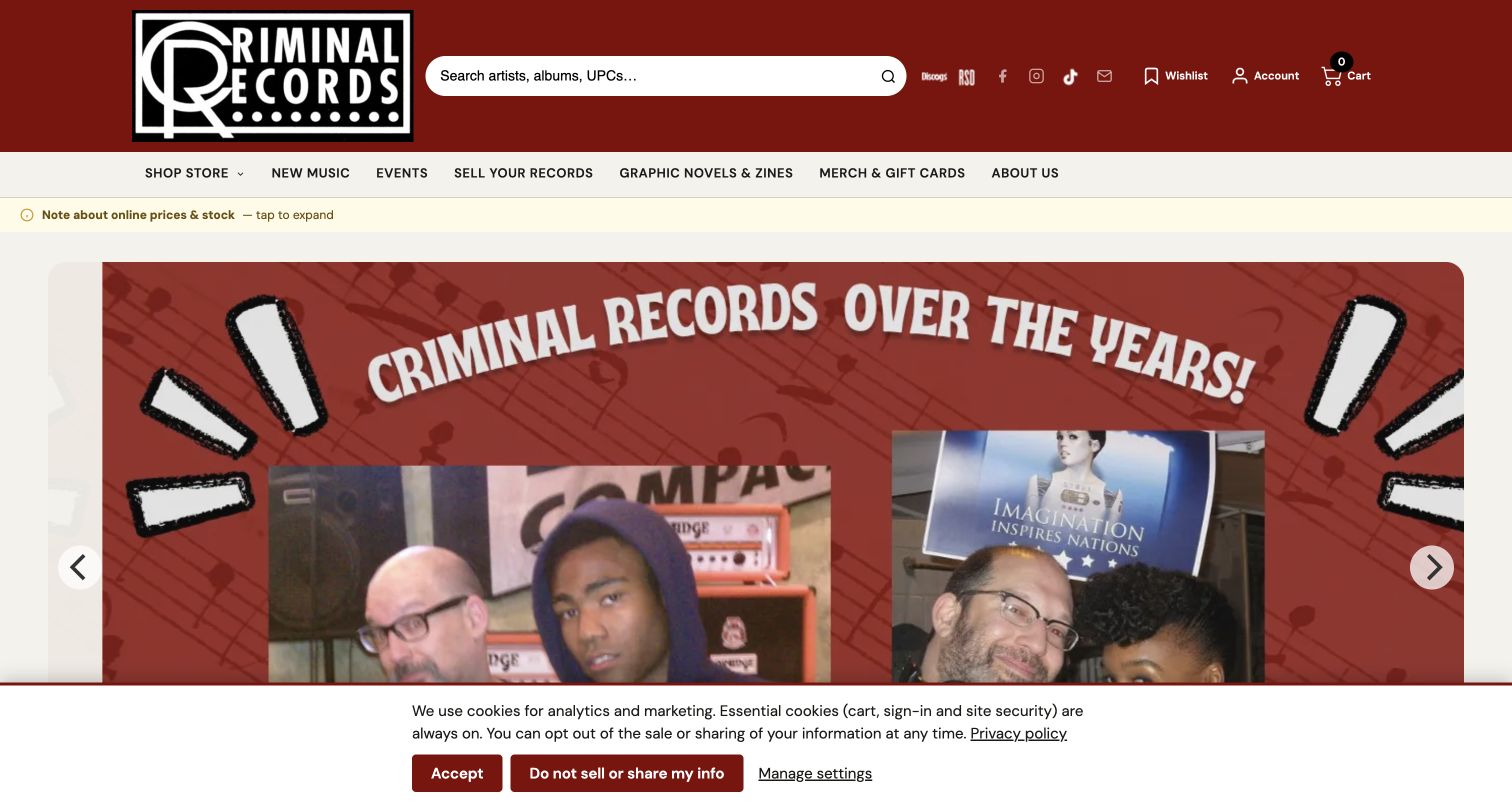
Criminal Records combines a dark red header, a prominent artist-and-album search field and a clear set of retail and community links. A slim notice highlights online price and stock information before the main promotional carousel. Below it, the preorder section exposes release dates, formats, prices and individual detail links, while events receive dates and venue context farther down. Personality accompanies structured commerce. The opening slide presents store-history photographs before individual records. A cookie notice leaves less room for the detailed catalog below.
What you can learn
Give preorder timing and stock qualifications visible homes before checkout. Keep practical product metadata consistent while using imagery to explain the shop's community. Make the most important catalog path available outside the carousel so it remains clear as promotions change.
Pros
The large search field offers a direct route for visitors who know an artist or title.
Preorder cards provide explicit release timing and format information instead of relying on promotional artwork.
Cons & considerations
A tall promotional carousel delays the more detailed product and event information below it.
The visible privacy notice reduces the opening view and competes with the store-history imagery.
Kegan is a freelance web designer and developer with 15+ years of experience helping businesses turn complicated website requirements into clear, maintainable digital experiences. He works directly with clients from planning and design through development, launch, and ongoing support.
For record store website design, his development approach focuses on record store websites that connect music discovery, formats and availability with clear ordering and visiting information. The scope can be a targeted improvement or a complete custom build, with responsive layouts, thoughtful content structure, and integrations chosen around the people using and maintaining the site.
Show 3 other record store website designersHide other record store website designers
Plan a record store website around listening, collecting and visiting
Build a catalog that supports both precision and curiosity
Start with the ways people identify music. An exact search may involve an artist, album title, label, catalog number or format. A less certain visitor may know only a genre or the kind of listening experience they want. Design a clear search route for the first group and a manageable set of editorial shelves for the second. Both should lead to consistent product information rather than entirely separate catalog structures.
Decide which differences belong directly on a product card. Artist, title, format and availability are usually more useful than a long promotional sentence. When colored vinyl, a reissue or another edition is relevant, identify it in words as well as showing the package. Do not assume that a sleeve image explains a pressing difference. Keep the naming order predictable so someone comparing several similar entries does not need to reread each card from scratch.
Give recommendations a sustainable role. A few current staff selections with specific commentary can support discovery more effectively than an enormous unmaintained editorial section. Explain why a listener might investigate a record, and link that explanation to the appropriate edition. Review the taxonomy periodically so new genres, formats and campaigns do not simply accumulate in the main menu.
Make stock boundaries and release dates part of the interface
Document how the online catalog relates to the physical shop before deciding how products should look. Some businesses expose live stock; others offer a selected online range or a distributor catalog. Used records, one-off finds and preorders can each follow different rules. Explain those boundaries where customers encounter the relevant products, rather than leaving a general notice to carry every qualification across the whole website.
Separate availability from release timing. A record can be newly released without being newly added to your inventory, and a preorder date can change. Use consistent wording for these states and show relevant dates next to the item. If an edition is sold out, keep that status unmistakable. Avoid making a promotional carousel the only place where a customer can discover an important ordering condition or a temporary service change.
Map the questions that generate avoidable confusion: local pickup, shipping, combining preorders, selling a collection and transitions to external marketplaces. Give each a concise explanation and a stable destination for complete terms. Assign someone to update those pages when operations change. The visual design should make truthful information easy to find; it cannot compensate for inconsistent stock records or promises the shop cannot reliably fulfill.
Connect music discovery to a maintainable local presence
Use the website to explain the place as well as its products. Real storefront and interior photographs help a new visitor recognize the entrance and understand the atmosphere. Pair that imagery with a stable address, current opening information and an identifiable contact route. If there are several locations, connect each event or service to the correct branch instead of making people infer it from the business name.
Treat events as structured information rather than only attractive posters. Publish the date, time, venue and any attendance requirements as readable text. Separate upcoming activity from the archive, and keep a useful event route available even when a homepage campaign changes. Social links can add personality, but essential visiting details should remain understandable without requiring a social account or an embedded feed to load.
Choose a publishing routine the team can maintain alongside running the shop. This might be a brief weekly note, a small staff-pick shelf or a concise release update. Give those elements clear owners and remove expired promotions promptly. Keep optional newsletter requests from covering the first useful content. Distinctive typography and imagery should reinforce a real store identity while leaving the practical tasks of finding, browsing and visiting straightforward.
The editing job behind the design
Choose technology around catalog accuracy and store operations
Begin with inventory, edition data, preorder handling, local pickup and event publishing. Establish which system owns each piece of information and how changes reach the website. A flexible visual theme is useful only when the underlying stock and service information stays consistent.
The example stacks document bounded public-source observations. A library, hosted asset or delivery service does not establish the entire commerce backend. Access-limited and partial observations retain their qualifications; the absence of a detected product is not proof that the store does not use it.
Keep cover images efficient, search labels understandable and essential visiting information available as ordinary page content. Validate transactions separately with authorized test data. This editorial research did not place orders, create accounts, subscribe to updates, submit forms or vote.
Our WordPress website examples offer a separate look at publishing approaches. A visible platform label is evidence for that named page, not a guarantee that the same system will suit your requirements.
Before the public launch
Record store website checklist
Provide an obvious artist-and-title search route.
Offer a short, understandable set of genre and format entry points.
Use a consistent order for artist, title, edition and format details.
Show pressing or package differences in text as well as photographs.
Distinguish new arrivals, new releases and preorders.
Keep availability and release dates close to the relevant product.
Explain differences between online selection and physical store inventory.
Give staff recommendations a specific reason to explore the music.
Publish clear address, opening and location-specific service information.
Give events readable dates, venues and attendance requirements.
Label external marketplaces and explain record-selling or trading routes.
Prevent optional signup prompts from obscuring essential first-view content.
These checks are a project checklist, not a performance, legal, security, or accessibility certification. Test real journeys with the people responsible for the website before making claims about the result.
Sources & editorial method
How this collection was selected and reviewed
This collection uses the original random target of 17, saved before research. Every example represents a distinct public record-store property with an actual direct browser capture, original review and bounded broad public technology-audit attempt. Research took place on November 10, 2026; retained captures preserve their actual timestamps, source URLs, dimensions and attribution. Dusty Groove was explicitly selected after comparative inspection for its descriptive catalog, specialist browsing structure and clear connection to its Chicago shop. This is a website-design selection, not a service-quality endorsement, sales-performance claim or vote result. Access restrictions and incomplete stack observations remain qualified. No purchases, accounts, subscriptions, forms, votes or outreach were performed.
Each example links to its actual source page. Screenshots are direct browser captures with their own capture dates; moving imagery, announcements and live designs can change. The notes describe observable design choices and conditional tradeoffs, not measured traffic, conversion results, service quality, or accessibility conformance.
Technology labels use public page metadata, asset evidence, or explicitly cited platform documentation. Platform documentation is not a complete current deployment audit. A component reference may be legacy or unused; it is not a complete backend inventory. Unknown stacks are omitted. These sites are editorial examples, not our client portfolio.
Written, Edited and Curated are separate editorial records, not timestamps advanced by a rebuild. Website designs and imagery belong to their owners. See our editorial standards or suggest a correction.
Questions worth asking
Record Store website design questions
What should a record store homepage prioritize?
Start with the store's real service model. A catalog-led business needs search and clear product routes, while a local shop may prioritize visiting details and events. Both benefit from a concise introduction, visible availability information and practical navigation.
How should a store present different editions of one album?
Use consistent artist and title labels, then identify format, pressing and relevant package differences in text. An image alone may not distinguish similar editions. Keep availability and release information near each option so customers can compare them without guessing.
Are staff recommendations useful on a record store website?
They can give unfamiliar listeners a reason to explore beyond recognizable artwork. Keep the selection current, explain what makes each record worth investigating and connect the recommendation to the correct edition. A small maintained shelf is more useful than an abandoned archive.
Does every record store need a complete online catalog?
No. A site can effectively support visits, events and collection-selling inquiries without offering a full checkout. Be explicit about the services available, the limits of the online selection and any transition to an external marketplace.
Why do some examples have limited technology information?
Public-source inspection cannot reveal every system behind a website. Every example received a bounded audit attempt, but blocked scans, partial asset samples and unavailable responses retain their limitations. Missing public evidence does not establish that a technology is absent.
Borrow the approach that fits your store's actual work. Precise catalog information, thoughtful recommendations and clear visiting routes give a distinctive music identity practical value.