A university homepage serves people at very different stages of their relationship with the institution. Its most useful design choice is making those journeys understandable.
An applicant comparing courses needs different information from a current student looking for support, a researcher seeking a collaborator or a visitor checking campus access. A broad institutional story can introduce the university, but it cannot carry every task. Clear navigation, dependable search and maintained course information do much of the practical work.
These examples compare research-led homepages, course-finding tools, audience shortcuts and campus storytelling. They are references for information architecture and presentation, not a ranking of universities or an assessment of academic quality. The screenshots record a particular homepage state; recruitment campaigns, news and deadlines change.
Before the examples
What makes good university website design in 2026?
Make study discovery concrete
Offer both course search and browsing by subject or study level. Explain the difference between taught, research and professional programs where those routes exist. A course record should connect requirements, fees, duration, location and application steps instead of leaving applicants to assemble them from unrelated offices.
Separate stable tasks from changing stories
Give current students, staff, alumni and visitors predictable destinations. Keep urgent support, campus status and essential service information outside rotating campaigns. Research features can demonstrate the university’s work, but everyday tasks should remain discoverable when the feature changes.
Treat the university as a connected publishing system
Decide how central, faculty, department and program pages share navigation and ownership. Show when a destination moves to another school or service. Maintain accessible headings, search labels and useful error pages across the journey, not only on the central homepage.
The collection · 19 examples
19 university websites worth studying
Compare where each site places course discovery, how it names its audiences and how much space it gives research or campus stories. Large institutions offer useful patterns, but their publishing volume is not a requirement for a smaller university.
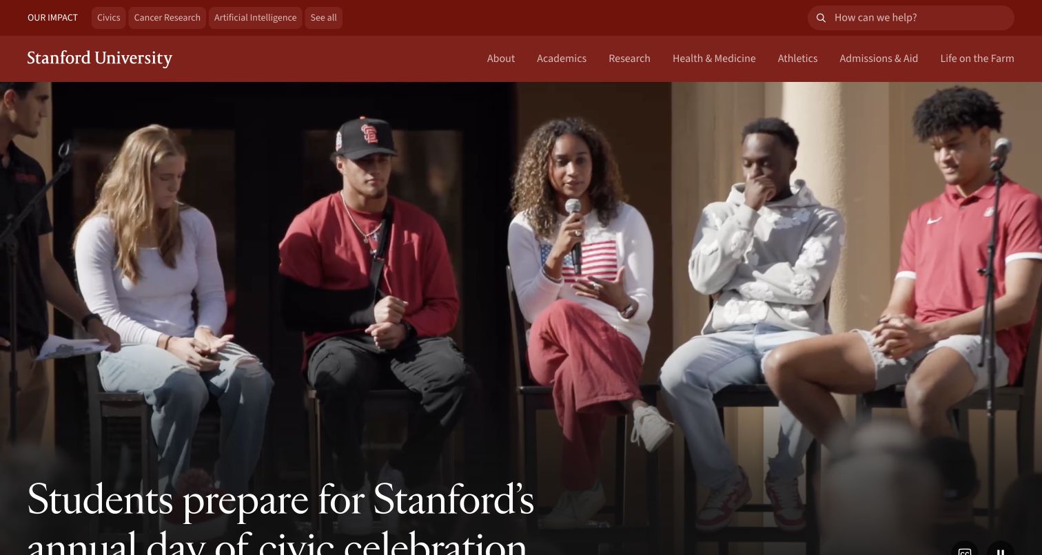
Stanford opens with a large campus-life video beneath a red institutional header. Academic, research, health, athletics and admissions destinations remain visible above the image, while an impact strip introduces timely subject areas. The page then moves from a short statement of purpose into dated news and research stories. The result gives the institution a human opening without reducing the homepage to a recruitment campaign. It is a useful reference for placing current community activity within a stable information structure.
What you can learn
Keep permanent university destinations independent of the changing hero. A campus event can make the institution feel active, but applicants and current students still need predictable labels. Give video a visible pause control and an informative still so the opening remains useful when motion is unavailable.
Pros
The primary navigation names recognizable academic and campus functions.
Dated stories make the transition from institutional identity to current work tangible.
Cons & considerations
A large moving image places extra responsibility on legibility, loading and motion controls.
The broad institutional narrative requires several sections before a visitor reaches detailed application information.
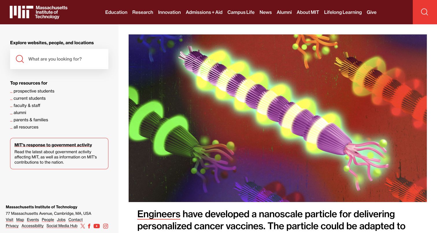
MIT uses an unusually compact left-hand resource area beside a large illustrated research spotlight. Search and audience links appear in that utility area, while the current feature receives most of the visual field. The captured story explains a nanoscale vaccine-delivery particle in a short plain-language caption, with a date and a full-story link. A following research-and-education section expands the editorial selection. The design demonstrates how a university can make its daily intellectual output the homepage’s main visual material.
What you can learn
Treat a research feature as an editorial package: image, understandable explanation, date and source destination. Pair that changing package with a stable resource index. Scientific imagery can be compelling, but the caption should explain what a reader is looking at without overstating the research result.
Pros
Audience shortcuts distinguish prospective students, current students, staff and other recurring visitors.
The spotlight has a clear date and an explicit route to the complete story.
Cons & considerations
The asymmetric layout relies on careful resizing so utility navigation remains comfortable on phones.
A research-first opening gives less immediate space to admissions deadlines or program comparison.
Visible tech stack
Referenced on the public page
Apache HTTP ServerReported response header
Public source checked November 3, 2026. References may be embedded or legacy—not a complete backend inventory.
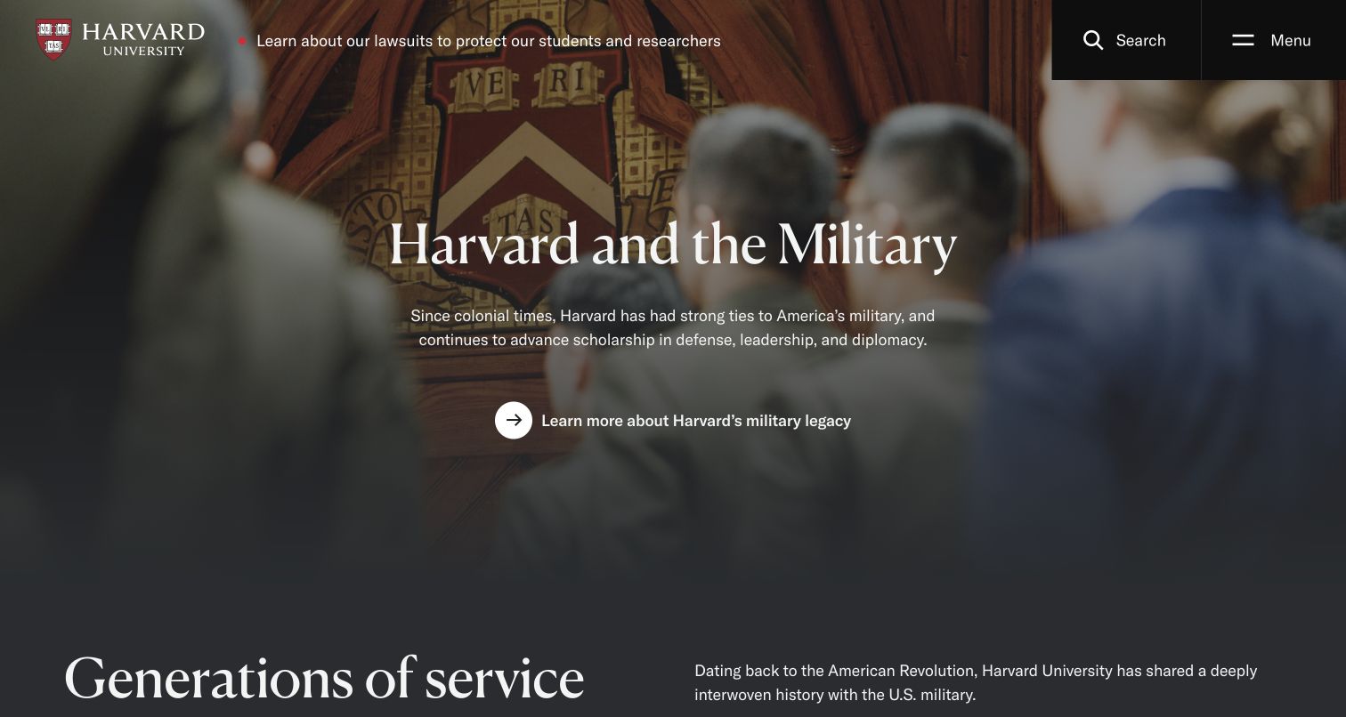
Harvard gives its opening screen to a themed feature about the university and military service. A large photograph, restrained heading and short introduction lead into a timeline and related profiles. Search and menu controls keep the chrome sparse while the story occupies the page. The captured composition feels closer to an institutional magazine than a directory. That is valuable when a university wants to explain a particular strand of its history, but it depends on a separate navigation system carrying routine tasks.
What you can learn
Use a thematic homepage only when the editorial team can maintain a coherent sequence and provide easy exits. A timeline can connect people, places and dates, but distinguish historical material from current services. Keep essential study and support destinations available without requiring completion of the story.
Pros
The feature has a clear theme and develops it through more than a single promotional image.
Spacious typography makes the introduction and subsequent historical milestones easy to distinguish.
Cons & considerations
Most functional destinations require opening the menu rather than appearing in the first view.
Long narrative pages need strong heading structure and shortcuts for visitors with a narrow task.
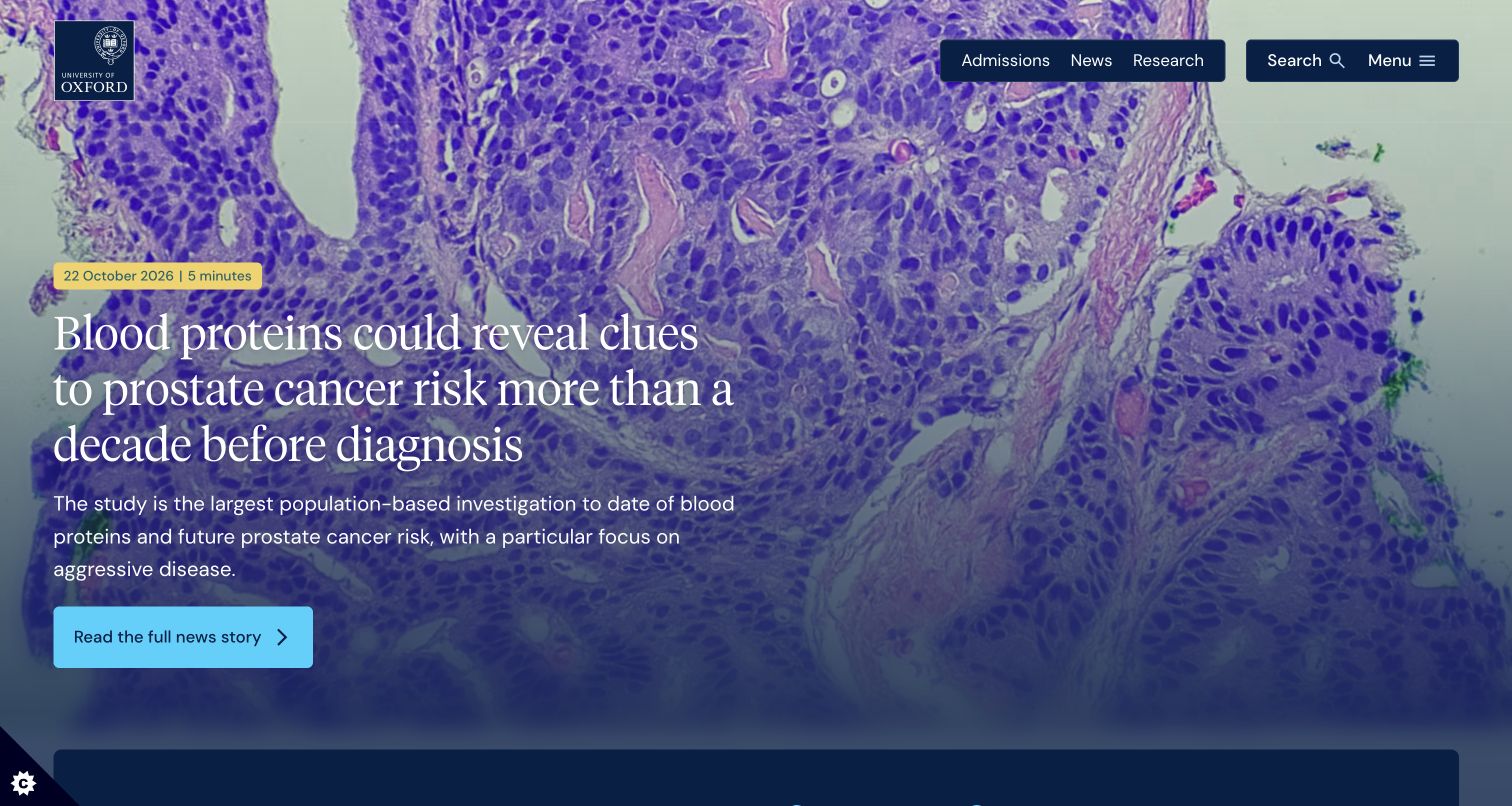
Oxford places a research feature at the top, with an update date, reading time and a concise explanation beside the image. The next section invites visitors to search courses and distinguishes undergraduate from graduate study. Latest news continues below with subject labels and dates. This sequence gives the university’s research a public platform while keeping a concrete applicant task close to the opening. The image is prominent, but the course finder supplies the first strong functional transition.
What you can learn
Put a practical discovery tool directly after the institutional feature when applicants are a major audience. Ask for the study level before returning course results, and keep that choice visible. Research cards should identify their topic and publication context so a visitor can judge whether to read further.
Pros
The course finder offers an explicit undergraduate or graduate distinction.
Dates, reading times and subject labels provide useful context for editorial content.
Cons & considerations
A detailed research headline may dominate the first view for someone arriving only to compare courses.
Multiple metadata labels can crowd story cards unless spacing and hierarchy are maintained on mobile.
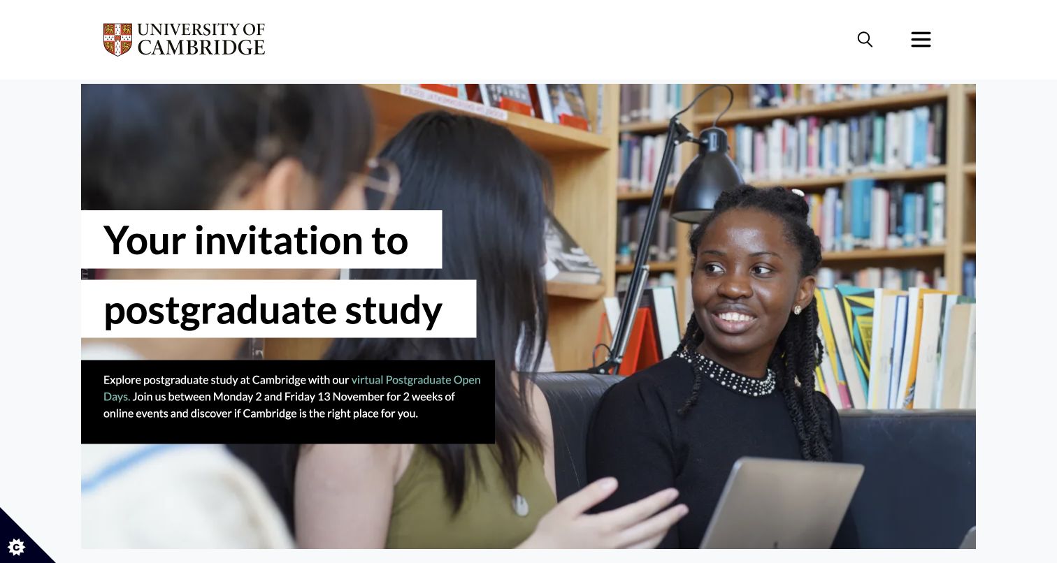
Cambridge uses the opening photograph and text treatment to invite visitors to postgraduate open days. The event description explains the online format and dates, then the page presents undergraduate and postgraduate study routes with separate course-finding actions. Libraries, museums, research and other university destinations follow as a compact set of links. News and events provide a broader institutional view farther down. The hierarchy shows how a seasonal campaign can sit above enduring study navigation without replacing it.
What you can learn
Give recruitment campaigns an expiry date and preserve the permanent route underneath. An open-day invitation should explain who it is for, when it happens and what the visitor can expect. Distinguish general study information from a course search rather than assigning both links the same vague action.
Pros
The opening event supplies concrete timing and a clear prospective-student audience.
Separate study and course-finder links accommodate both exploration and a specific program search.
Cons & considerations
A season-specific hero needs active ownership to avoid remaining live after the event.
The many institutional links beneath recruitment content can become visually secondary despite their importance to other audiences.
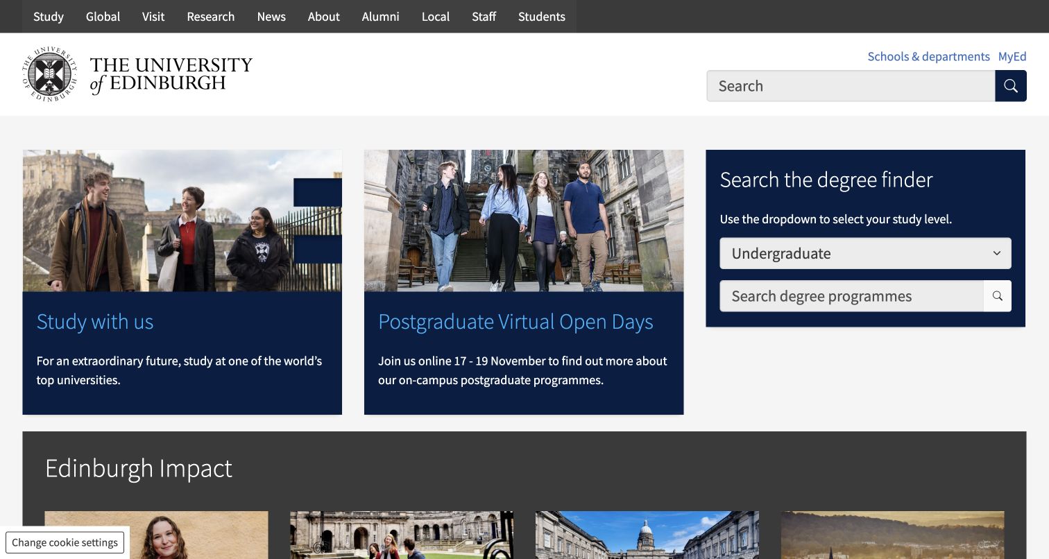
Edinburgh opens with three compact study components: a broad invitation, a postgraduate virtual-open-day panel and a degree finder. The finder explicitly asks for undergraduate, postgraduate taught or postgraduate research study before a search term. News and impact stories appear beneath this functional opening. The restrained blue panels and ordinary labels are useful references for a homepage that needs to serve a large information estate without depending on a full-screen campaign video or a hidden navigation concept.
What you can learn
Separate the applicant’s immediate jobs into visible units: understand the offer, attend an event and find a degree. Name postgraduate taught and research routes explicitly where they lead to different catalogs. Let news demonstrate the institution’s activity after the core discovery tools are already available.
Pros
The degree finder makes the study-level distinction visible before search.
Open-day information sits near the study tools rather than being buried in a general event feed.
Cons & considerations
Several compact panels compete for attention and need careful prioritization on narrow screens.
The utilitarian opening offers less visual sense of campus life than a photography-led introduction.
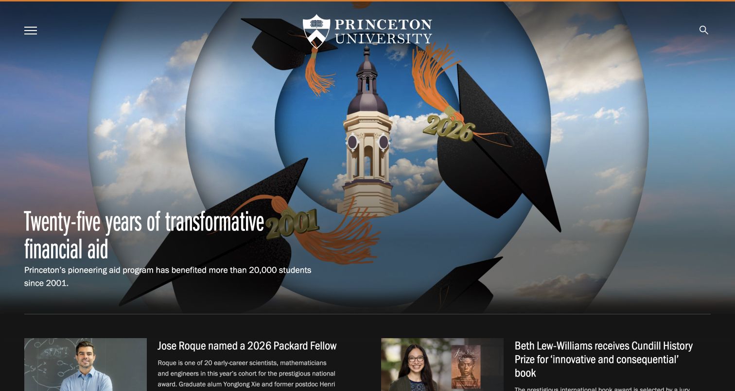
Princeton’s captured homepage highlights twenty-five years of its financial-aid program with a large editorial photograph and a short explanatory headline. A compact menu and search keep the feature dominant, while news stories and university updates broaden the page below. The homepage presents the policy through people and a dated institutional milestone rather than treating it as a standalone number. It offers a useful model for explaining a university commitment, provided that the underlying eligibility and current details remain available in dedicated pages.
What you can learn
Connect a prominent institutional claim to a substantive explanation and the people affected by it. Give prospective students a direct route from an aid story to current aid information. A historical milestone should support, rather than substitute for, the practical details needed for an application decision.
Pros
The main feature focuses attention on one recognizable institutional theme.
News beneath the hero gives the page a broader view of academic and campus activity.
Cons & considerations
Menu-led navigation adds a step for visitors seeking an immediate admissions task.
A financial-aid celebration cannot by itself explain eligibility, application requirements or individual costs.
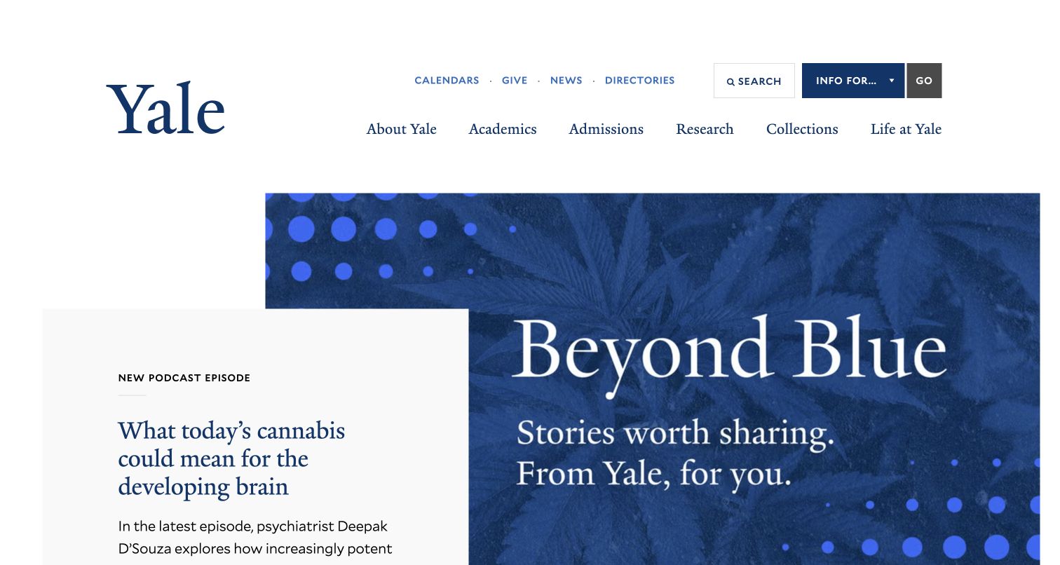
Yale combines a traditional white-and-blue header with a featured podcast story. Main navigation exposes academics, admissions, research, collections and campus life, while a separate audience control offers routes for students, faculty, staff, alumni and the local community. The featured media panel leads into categorized news. This pairing is useful because the editorial surface can change format without requiring a new architecture: a podcast episode still sits within an institution-wide framework of familiar destinations.
What you can learn
Let editorial formats vary while keeping navigation consistent. Label a podcast action as listening or following, and make the full story accessible beyond an image. Audience navigation should supplement subject navigation, especially when the same resource serves more than one university community.
Pros
The header distinguishes major subject areas from audience-specific routes.
News categories provide more context than an undifferentiated stream of headlines.
Cons & considerations
Several navigation layers and utility links increase the amount of material in the header.
A media-led feature needs a clear text alternative and should not assume that visitors can listen immediately.
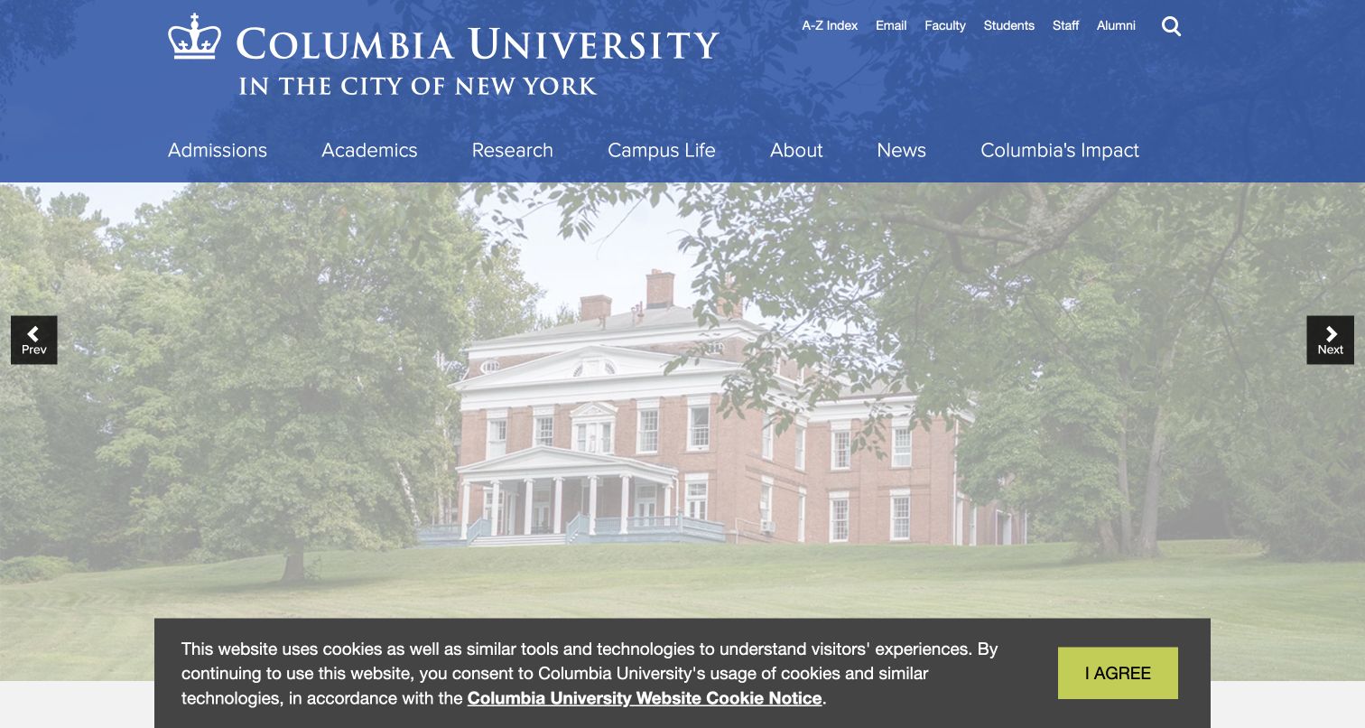
Columbia places a broad campus photograph and short editorial headline beneath a blue header. Admissions, academics, research and campus life remain in the main navigation, with staff, student and alumni utilities above. A compact Explore row includes athletics, arts, campus access, giving, libraries and the medical center. The following news grid uses labels such as magazine, event recap and campus community. The structure is valuable for distinguishing enduring destinations from the large volume of current institutional publishing.
What you can learn
Use the first screen to show the university’s character, then provide a short index of high-demand destinations before the news feed grows long. Editorial labels should describe the kind of story or source. Campus-access information deserves a stable location when visitors may need it before arriving.
Pros
The Explore row exposes practical destinations outside the main academic navigation.
Story labels help distinguish institutional updates, magazine features and other content types.
Cons & considerations
The captured privacy notice reduces contrast across the opening feature until addressed.
The volume of news can push less prominent visitor tasks well below the first screen.
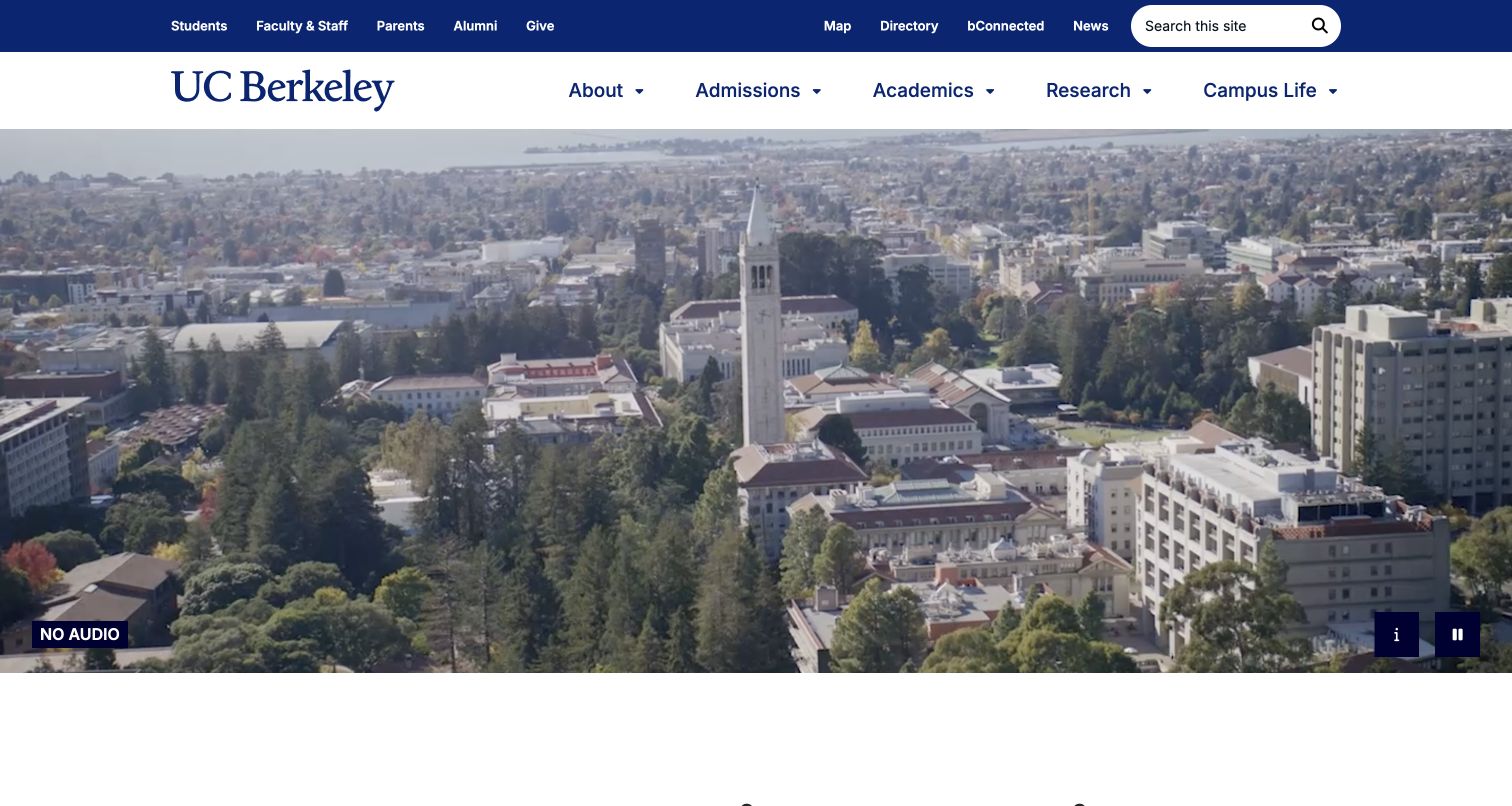
Berkeley opens with campus video beneath a blue-and-gold navigation system. The controls identify that the video has no audio and offer a description and pause action. Below, a research-impact introduction leads into programs, institutional figures and news. Student, staff, parent and alumni utilities are separated from the main academic navigation. The page is a useful example of presenting a large university as a place and an active research community while retaining recognizable routes for recurring visitors.
What you can learn
Make the behavior of decorative video explicit, then move quickly into useful content. Provide a description or alternative when imagery carries meaning. If rankings or institutional statistics support the narrative, link them to dated context and avoid allowing numbers to replace explanations of what students or researchers can actually do.
Pros
Visible pause and description controls acknowledge different ways of experiencing the opening media.
Audience utilities and core academic sections occupy distinct navigation rows.
Cons & considerations
The broad research narrative takes precedence over immediate course or application tools.
Prominent rankings and impact figures require ongoing sourcing and review as their context changes.
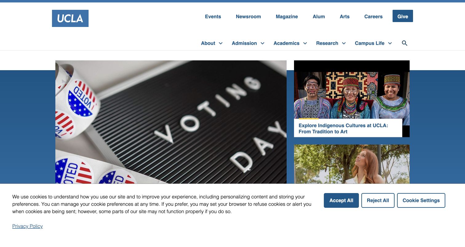
UCLA uses its recognizable blue wordmark and a compact navigation bar above a group of top stories. The opening mixes civic information, culture and a student profile rather than assigning the whole screen to one campaign. The news-and-features section below includes dates and source labels. This magazine approach is useful for showing a campus as a varied community, while the persistent admissions, academics, research and campus-life links carry the more stable university journeys.
What you can learn
Select a small set of genuinely different stories for the opening grid and label their sources. A university homepage can act as an editor across several publications, but it should preserve dates and descriptive headlines. Give operational tasks stable navigation so they are not dependent on which stories happen to be featured.
Pros
Multiple opening stories communicate a range of campus activity without a rotating hero.
Source labels and dates help readers understand where editorial material originates.
Cons & considerations
A story-led opening offers no immediate course finder for applicants with a specific subject in mind.
Several equally vivid images can weaken the first focal point unless the grid has a clear hierarchy.
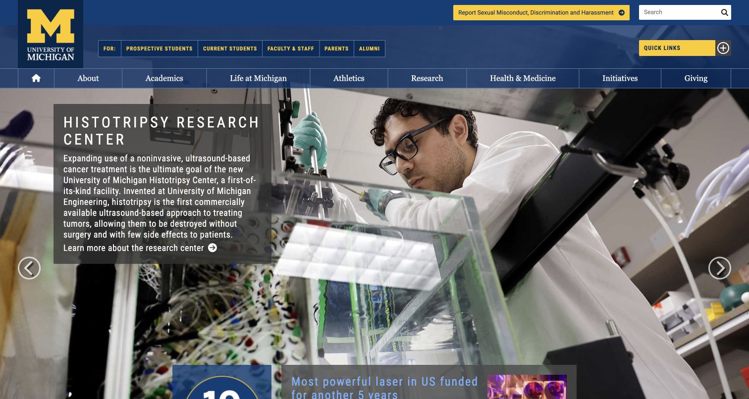
Michigan pairs a blue-and-maize institutional header with a large featured-story area. The captured selection highlights a research center, while adjacent story choices cover music, art and language. Above it, quick links distinguish prospective and current students, faculty and staff, parents and alumni. The main navigation includes academic life, athletics, health and giving. This is a useful reference for managing breadth: the stories can show variety, while audience and subject routes preserve a more predictable way into the university.
What you can learn
Do not make a carousel the only way to discover important content. Expose the available stories with meaningful labels and keep essential student services outside that component. When research stories involve health, the homepage caption should describe the institution’s work without turning a promotional summary into personal medical advice.
Pros
Audience shortcuts recognize several common reasons for returning to the university website.
The feature selection spans different disciplines rather than repeating one type of institutional story.
Cons & considerations
A large rotating feature can hide material unless controls and labels remain easy to operate.
The extensive subject navigation needs careful handling to avoid crowding on smaller screens.
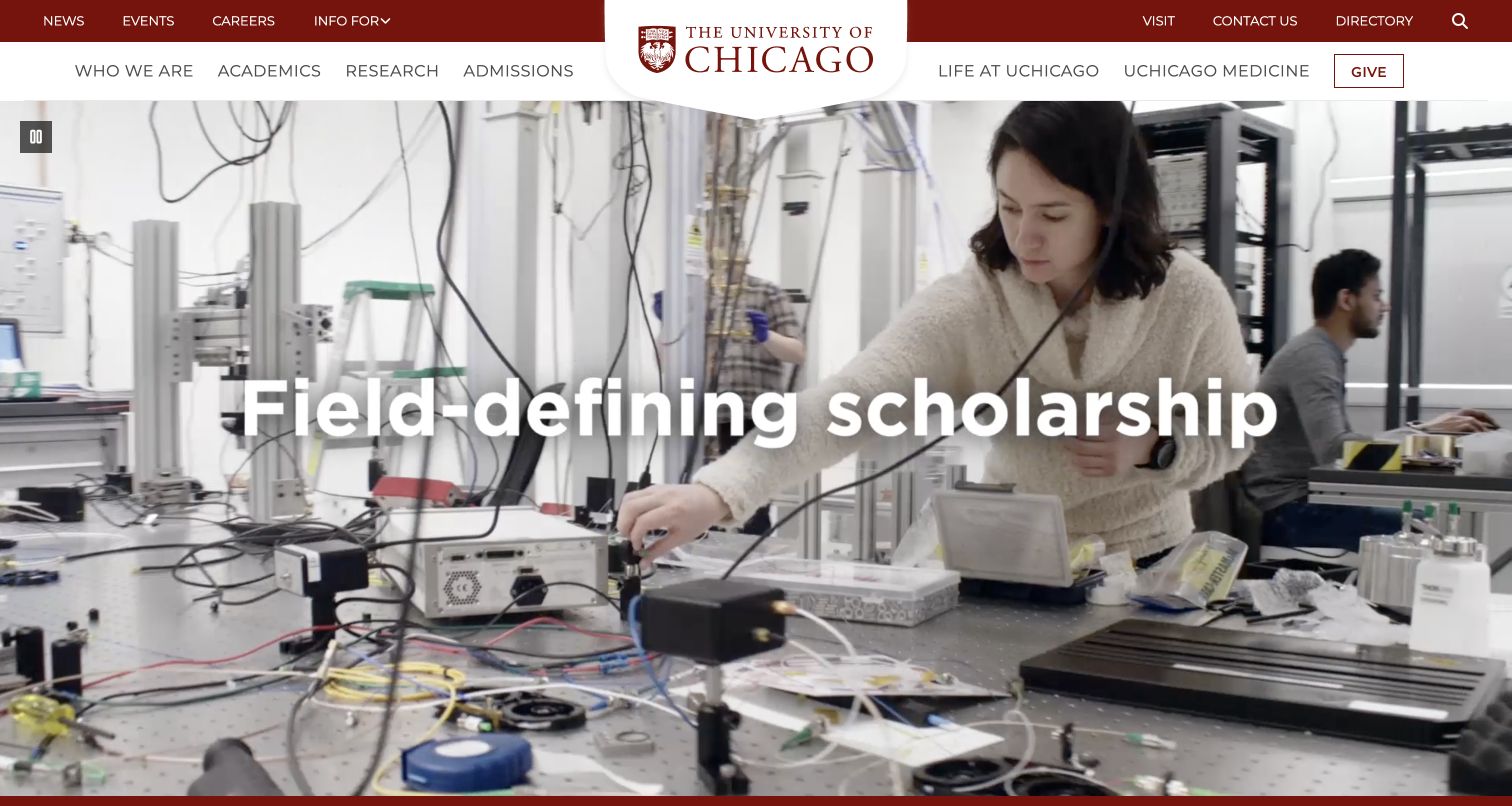
The University of Chicago begins with a campus-and-research video carrying short statements about scholarship, education and ideas. A maroon header organizes the institution into identity, academics, research, admissions and university life. Immediately after the opening, links offer how to apply, contact and campus visits. News then extends the narrative. The useful pattern is the transition from an aspirational image sequence to three ordinary actions, rather than asking visitors to infer their next step from the brand language alone.
What you can learn
Follow abstract institutional messaging with specific verbs. Apply, contact and visit are comprehensible actions that can support different stages of interest. Keep video captions and still fallbacks meaningful, and explain when a navigation destination leaves the central university site for a separate school or application service.
Pros
The action row translates the broad opening into practical applicant and visitor routes.
The navigation distinguishes admissions from general academic information and campus life.
Cons & considerations
Large menus expose many destinations and require disciplined grouping and keyboard behavior.
A cinematic opening adds weight and can delay useful content if the media is not carefully optimized.
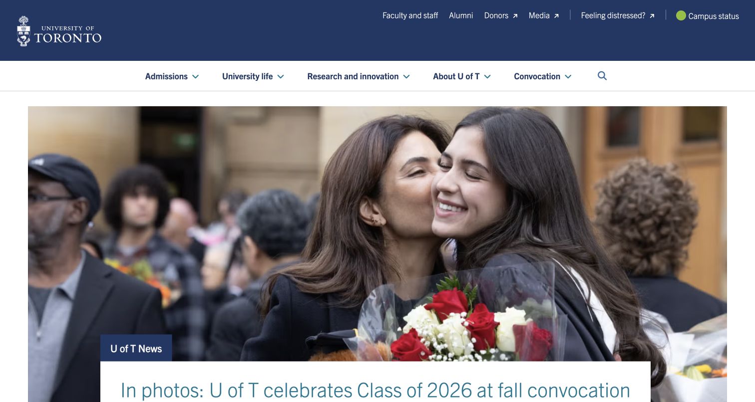
Toronto’s captured opening celebrates fall convocation through a large photograph and news link. Beneath it, the UTogether section gathers campus maps, academic and wellness supports, student information and other everyday resources. The header keeps admissions, university life and research prominent, while campus status and a distress-support route sit in the utility area. This composition gives community celebration room without overlooking the operational information a large, multi-campus university needs to make findable.
What you can learn
Pair campus storytelling with an organized resource destination that has a clear purpose. Explain what visitors will find in that hub rather than promoting its name alone. Operational status and urgent support should remain stable utilities, with language and routing maintained by the teams responsible for those services.
Pros
The resource-hub introduction names concrete items such as maps and student supports.
Campus status and support access are visible alongside the usual audience utilities.
Cons & considerations
A central hub can become another navigation layer if its own categories are not maintained carefully.
Convocation is timely content, so the opening needs an editorial plan for the next period.
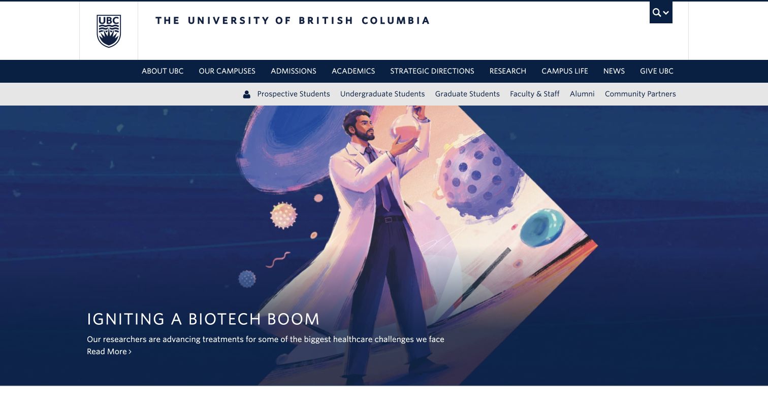
UBC opens with a bold illustrated biotechnology feature beneath a navy institutional header. A row of audience links distinguishes prospective, undergraduate and graduate students from faculty, alumni and community partners. The main navigation separately covers campuses, admissions, academics, research and campus life. Spotlight items and an Explore section continue the research and community story. The design is a useful reference for a university whose audience distinctions do not map neatly to the subjects in its main navigation.
What you can learn
Use audience shortcuts for recurring tasks while preserving a subject structure for exploratory visitors. Keep undergraduate and graduate distinctions only where the destinations materially differ. A strong research illustration should lead to an accessible explanation, with the homepage making clear that it is a feature rather than a complete account of the institution.
Pros
Audience labels include community partners as well as the core academic population.
The primary navigation gives campus selection an explicit place in the information structure.
Cons & considerations
Two extensive navigation rows can feel dense and require careful mobile consolidation.
The dominant research feature leaves limited first-screen space for deadlines or application requirements.
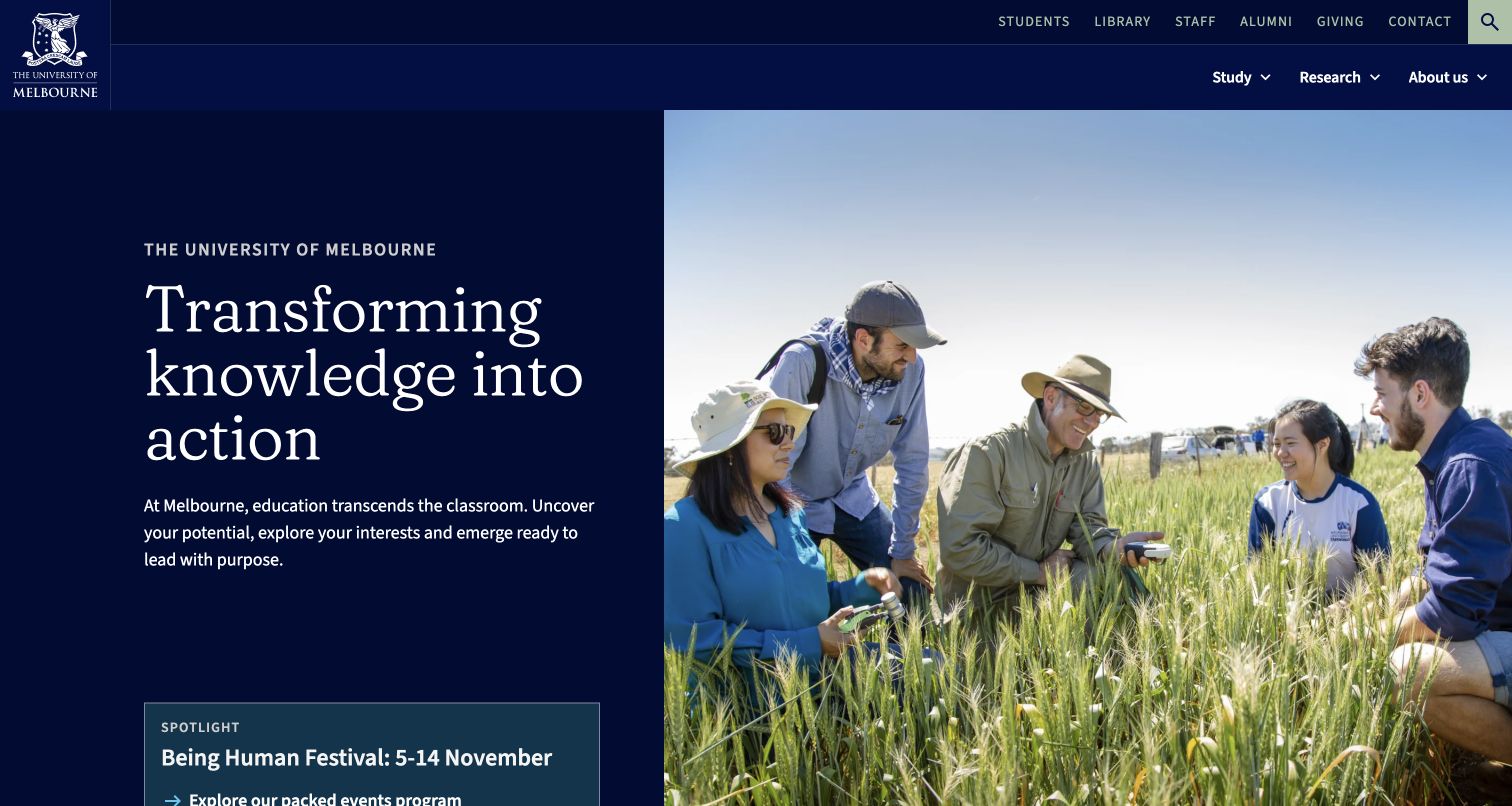
Melbourne pairs a navy text panel with a photograph of students and researchers in a field. The short institutional message is followed by a course search and separate cards for undergraduate, graduate, graduate research and professional development study. A compact spotlight within the hero introduces a current event. News, campuses and research follow farther down. This sequence is useful because it gives the institution a distinct opening while providing a more explicit study taxonomy as soon as the visitor moves beyond it.
What you can learn
Make the study gateway explain the differences between its routes. Graduate coursework, research and professional development often answer different needs, so give each a short description. Keep temporary spotlights visually subordinate to permanent course discovery and record an owner for event dates and changing promotional content.
Pros
Study-level cards include short descriptions rather than relying entirely on labels.
The split layout gives the main text a stable background independent of the photograph.
Cons & considerations
The full homepage is long and needs clear section hierarchy for visitors seeking a particular resource.
Rankings and changing event promotions elsewhere on the page require frequent contextual review.
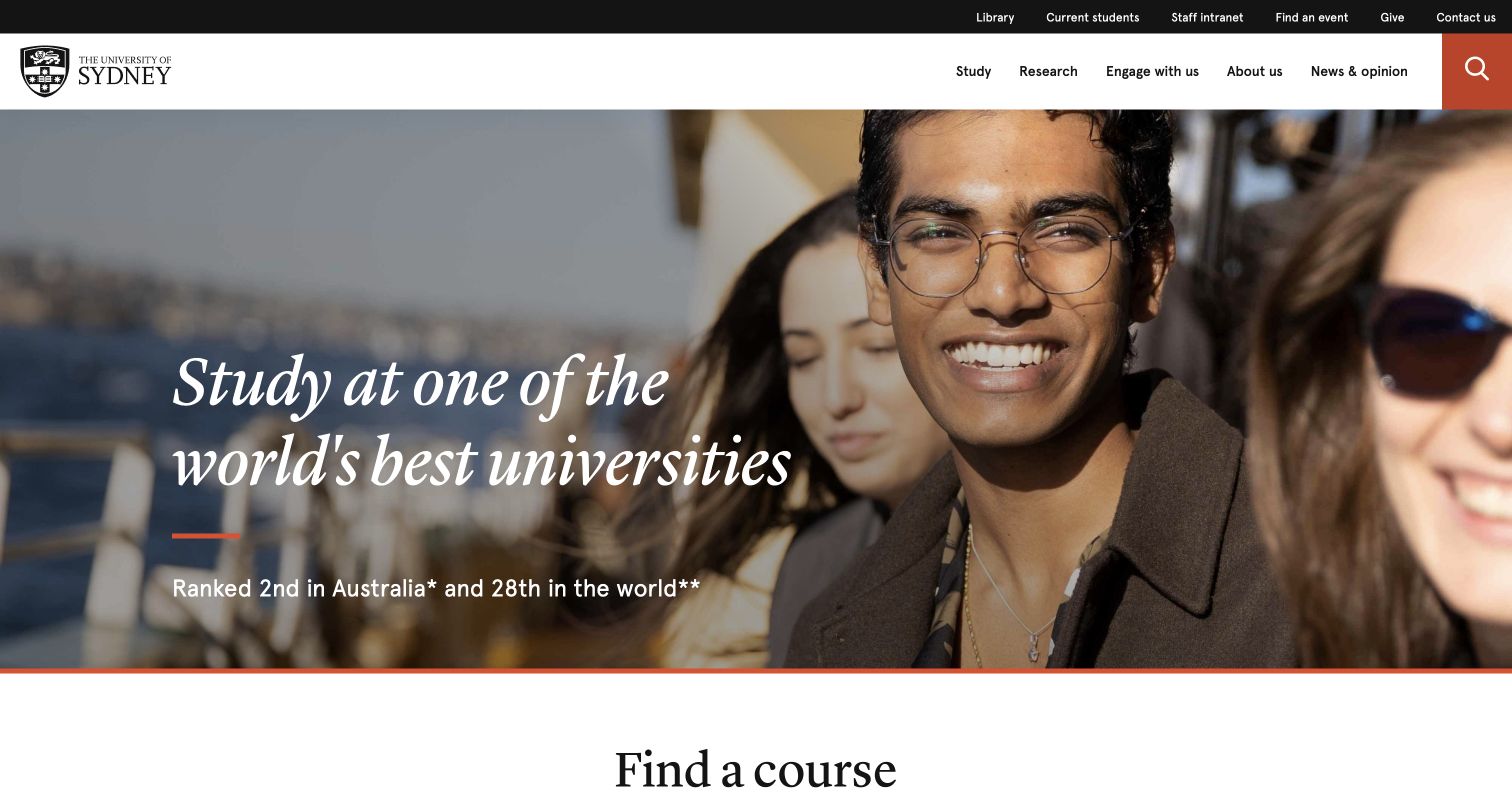
Sydney places a study invitation over student photography and follows it with a course finder and a visible list of study areas. International-student information, application guidance, fees and scholarships form another clear group. The header still offers research, engagement and institutional information, but the page’s strongest emphasis is helping someone explore study options. It is a useful model for connecting a broad recruitment statement to subject categories and the practical questions that usually follow initial interest.
What you can learn
Put course discovery and the surrounding decision information together. A prospective student should be able to move from a subject to application steps, costs and support without guessing which university department owns the answer. Keep ranking claims dated and attributed wherever they form part of the opening message.
Pros
The study-area list provides a browsing alternative to typing a search query.
International applicants receive a recognizable group of practical next-step links.
Cons & considerations
The recruitment emphasis gives current-student and research tasks less prominence within the page body.
Several ranking statements can overshadow more useful explanations of individual programs and study requirements.
Visible tech stack
Referenced on the public page
Swiper
Amazon CloudFrontDelivery / hosting signal
Apache HTTP ServerReported response header
Public source checked November 3, 2026. References may be embedded or legacy—not a complete backend inventory.
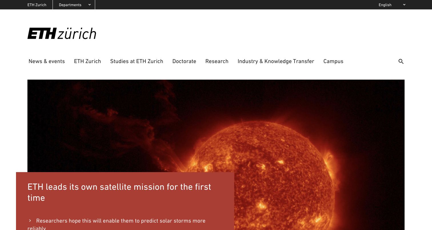
ETH Zurich uses a restrained white-and-blue layout with a major research story followed by dated news. The header separates studies, doctorate, research, industry relationships and campus information, while a department selector provides a direct route into the academic organization. Language choices are explicit. The captured feature concerns a satellite mission, supported by a concise explanatory line. This is useful for studying a university homepage that makes its research visible without hiding its departments behind a broad brand narrative.
What you can learn
Expose the academic directory in a predictable place, but translate internal abbreviations into full names. Keep news categories and dates consistent so the research stream remains scannable. Language selection should make clear which content is available in each language and preserve the visitor’s place whenever possible.
Pros
Department names accompany their abbreviations, reducing dependence on institutional familiarity.
Study, doctorate and industry routes acknowledge materially different visitor needs.
Cons & considerations
The full department list is substantial and needs careful navigation treatment on a phone.
A news-dominant introduction can leave applicants needing another step before they find program-specific requirements.
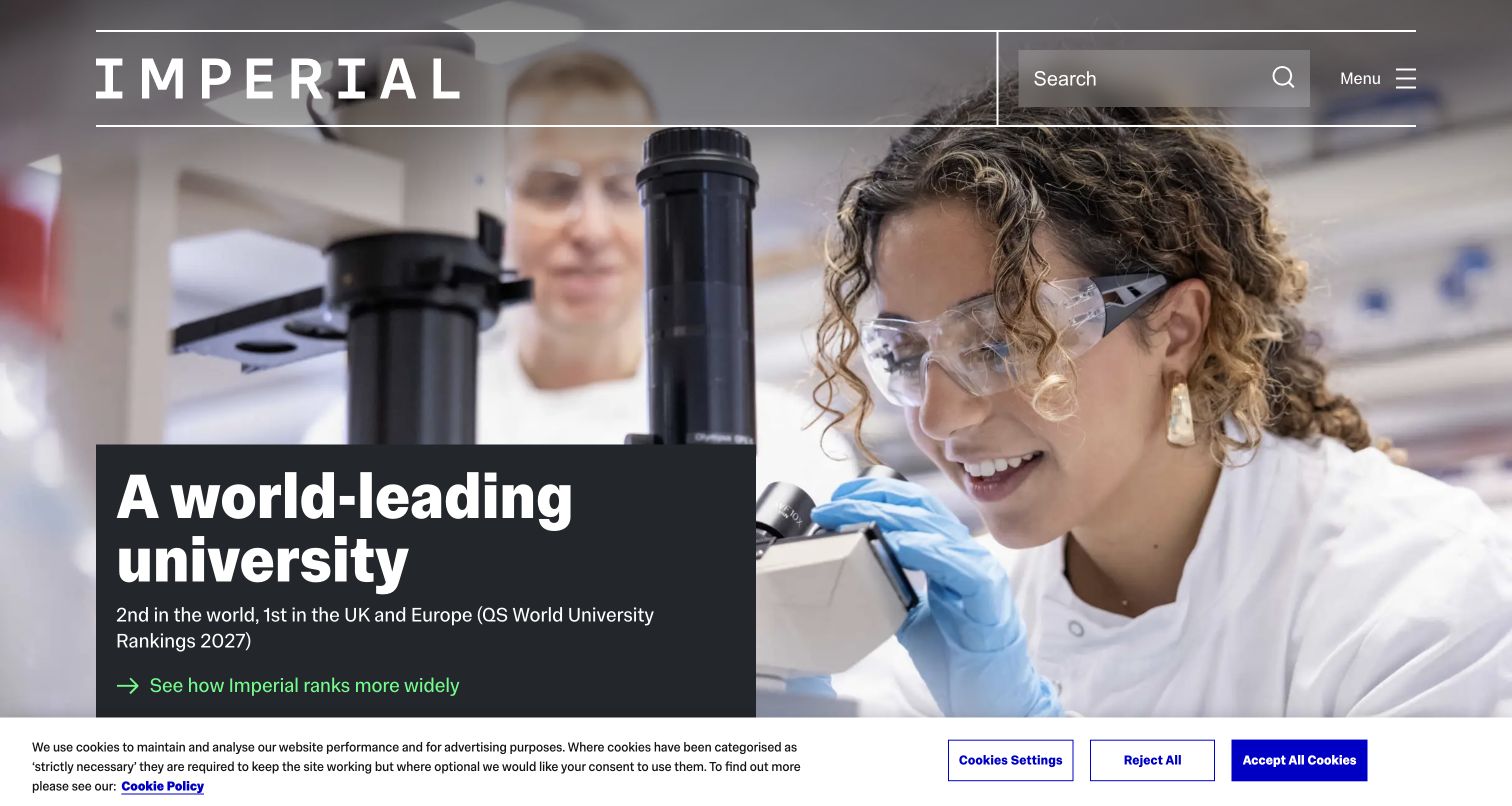
Imperial places its large wordmark and research imagery above a course finder that asks for study level and subject. Undergraduate, taught postgraduate, doctoral and lifelong-learning options are all explicit. The current feature and following news stories show the institution’s research and campus work, while rankings and awards appear with named sources later in the page. The useful pattern is the proximity of a functional course search to a strong institutional identity, rather than treating discovery as a separate destination hidden in the menu.
What you can learn
Make study level a meaningful first filter and retain a clear subject input. When a homepage uses rankings to support its message, state the source and edition beside each claim. Keep the course tool visually stable as the research feature changes so returning applicants can recognize it quickly.
Pros
The course finder distinguishes doctoral study and lifelong learning from taught programs.
The captured ranking references name their source and edition instead of presenting an unexplained number.
Cons & considerations
Prominent reputation claims can compete with the actual content of courses and applicant guidance.
Merchandise and multiple promotional sections increase the length of an already broad institutional homepage.
Plan the university site around decisions and responsibilities
Map the questions behind each audience route
Interview the teams handling admissions, student support, research inquiries and visits. List the questions they answer repeatedly and test whether a first-time visitor can find those answers using ordinary language. Do not assume that a faculty name or internal abbreviation is a useful navigation label.
Define one authoritative course record
Assign ownership for program facts, intake dates and application requirements. Decide which fields are reused in search, department pages and campaign landing pages. A change should update every relevant surface without requiring staff to find and edit multiple copied paragraphs.
Create an editorial calendar with expiry rules
Give open days, application campaigns, rankings and campus notices an owner and review date. Plan what replaces each temporary feature. Preserve useful archived news while removing obsolete calls to action from navigation and prominent promotional areas.
The editing job behind the design
Choose a platform that supports distributed university publishing
A university CMS should support structured courses, people, departments, events and news with clear permissions and review workflows. Evaluate multilingual publishing, accessible templates, redirects and search before adding decorative features. The right system depends on the institution’s staff and existing services; the appearance of a reference site does not establish its technology.
Keep the boundary between public information and student or staff systems explicit. Application platforms, identity services, libraries and learning systems may have different owners. Test the handoffs, use recognizable destination labels and provide a useful contact route when a visitor cannot complete the next step.
Our WordPress website examples offer a separate look at publishing approaches. A visible platform label is evidence for that named page, not a guarantee that the same system will suit your requirements.
Before the public launch
University website launch checklist
Verify course names, study levels, intake dates, fees and application destinations with their owners.
Test course discovery using subject browsing as well as search.
Check student support, campus status, visitor information and staff routes on a phone.
Review keyboard navigation, headings, zoom, captions and video pause controls.
Confirm ownership and expiry dates for campaigns, events and ranking claims.
Test redirects and navigation across central, school and service domains.
These checks are a project checklist, not a performance, legal, security, or accessibility certification. Test real journeys with the people responsible for the website before making claims about the result.
Sources & editorial method
How this collection was selected and reviewed
We reviewed nineteen distinct official university homepages through direct browser visits and saved current screenshots. The selection spans research-led, recruitment-led and community-oriented approaches. Reviews describe visible design and navigation; they do not independently verify institutional outcome claims or infer an unproven software stack.
Each example links to its actual source page. Screenshots are direct browser captures with their own capture dates; moving imagery, announcements and live designs can change. The notes describe observable design choices and conditional tradeoffs, not measured traffic, conversion results, service quality, or accessibility conformance.
Technology labels use public page metadata, asset evidence, or explicitly cited platform documentation. Platform documentation is not a complete current deployment audit. A component reference may be legacy or unused; it is not a complete backend inventory. Unknown stacks are omitted. These sites are editorial examples, not our client portfolio.
Written, Edited and Curated are separate editorial records, not timestamps advanced by a rebuild. Website designs and imagery belong to their owners. See our editorial standards or suggest a correction.
Questions worth asking
University website design questions
Should a university homepage focus on applicants?
The priority should reflect actual visitor needs and institutional goals. Applicants often need prominent course discovery, while current students and staff need stable service routes. A clear hierarchy can support both without making every item equally large.
Is audience navigation enough?
Usually it works best alongside subject navigation and search. A library, event or research resource may serve several audiences, so forcing every visitor to choose one identity can create unnecessary friction.
Does a university need a homepage video?
No. Strong photography and useful content can establish a sense of place. If video is used, provide readable text, a useful still fallback, appropriate captions and a visible way to pause motion.
How should separate department sites fit together?
Agree on shared navigation cues, content ownership and destination labels. Departments can retain useful subject detail while following common standards for accessibility, course facts, search and contact information.
Borrow the navigation and storytelling patterns that fit the institution’s real audiences. A useful university website makes the next decision clearer and gives each important fact an accountable owner.