Best Big Cartel Websites of 2026 (20 Real-World Examples)
Twenty real artist, maker and independent-brand stores, with direct screenshots, scoped Big Cartel evidence and practical lessons for a clear small-shop experience.
A small shop becomes distinctive through the work it sells and the way it explains that work. These Big Cartel examples show how recognizable illustration, photography, product categories and useful buying information can support a creative business without turning every visit into a complicated interface.
Start with the decisions a visitor must make. Someone buying a familiar artist's new print needs edition and availability information; a first-time gift buyer may need help choosing a format; an event visitor needs location and timing. A useful storefront gives those different intentions a clear starting point while keeping the maker's identity visible.
The opening selections are Worry Lines, Mab Graves, Heather Benjamin, Lil Tuffy and Ryan Russell: established independent art and photography brands with publisher, gallery or direct-interview documentation separate from the platform evidence. The musician pictured on a print is not the store owner or a separate technology example. All twenty captures come from the specific live shops reviewed on November 10, 2026, including custom domains and individual Big Cartel subdomains.
Before the examples
What makes good Big Cartel website development in 2026?
Make the product understandable before decorating the frame
An expressive logo or illustrated background can make a shop memorable, but the product still needs a clear name, format and next step. Use visual personality to reinforce the catalog rather than replacing its organization. Someone arriving from a shared product image should be able to identify the seller, understand the item and find the practical information needed to choose it.
Treat availability as part of the design
Big Cartel's product guidance distinguishes active, coming-soon, sold-out and hidden listings. Decide what each state means for your own catalog and how it should appear to visitors. A sold-out archive may be useful for collectors, but it should not conceal the work that is available now or suggest that every item can still be ordered.
Keep the store’s identity separate from its subjects
A photographer may sell images of famous performers, and a printmaker may create concert posters. Credit that work accurately without treating every depicted musician as the merchant. This distinction matters in the design as well as the research: a visitor should know whose shop they are using and where to find that seller's product, shipping and contact information.
The collection · 20 examples
20 Big Cartel website examples worth studying
The collection compares twenty distinct live storefronts rather than vendor template demos. Big Cartel identification comes from observed store attribution and specific official showcase or interview links. Every source received a bounded broad technology-audit attempt; those automated requests encountered access checks, so they add no supporting-stack conclusions. The direct screenshots and cited platform evidence are retained separately and honestly scoped.
We start with five recognizable brands or organizations: Worry Lines, Mab Graves, Heather Benjamin, Lil Tuffy, Ryan Russell. Each attribution applies to the named website property, not every product or website belonging to its organization. This is a curated reading sequence, not a measured ranking.
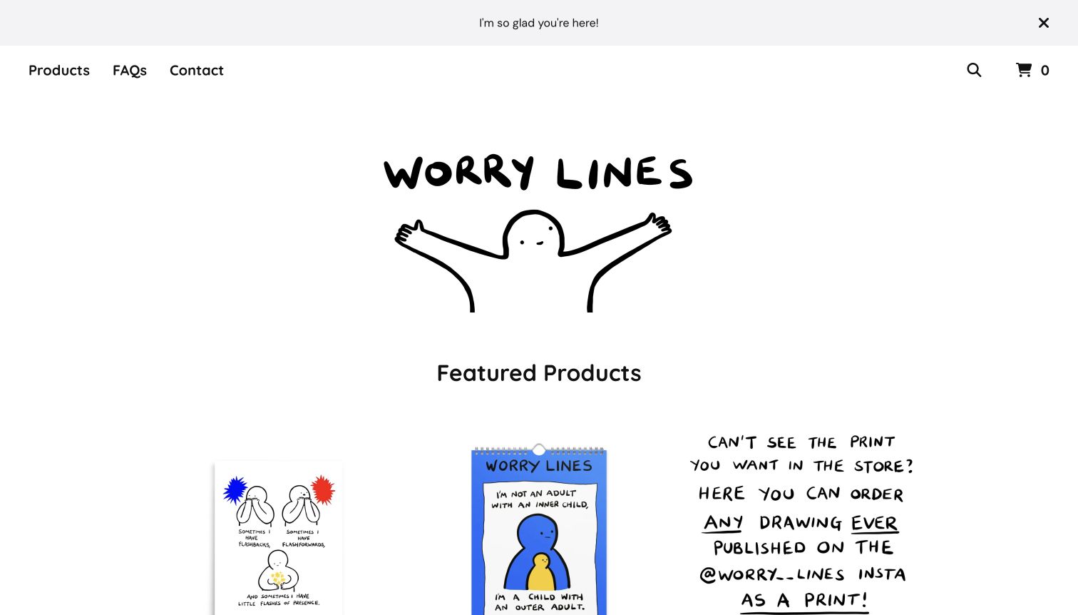
Worry Lines brings its loose black drawing style into the store identity, pairing an illustrated greeting with rounded navigation and plenty of white space. The first merchandise row connects that familiar voice to prints, a calendar and a way to order earlier drawings. Books and mugs sit within the same wider catalog, so the shop feels like an extension of a body of work. The current storefront explicitly identifies Big Cartel. Its large introductory mark creates a warm arrival, although visitors must travel farther down the page to compare individual product names and prices.
What you can learn
Carry a recognizable creative language into navigation, product photography and service explanations without making visitors decode the buying process. For an artist with a large archive, a clear route to request a known drawing can complement curated products, provided formats and fulfillment details remain understandable.
Pros
The illustrated identity makes the store feel closely connected to the work being sold.
Distinct product types give returning followers several useful ways to support the artist.
Cons & considerations
The tall introductory area pushes detailed merchandise information below the initial screen.
A broad archive-ordering offer needs careful product-level explanation of formats and eligibility.
Visible tech stack
Earlier / documented evidence
Big Cartel
Platform source: Explicit attribution on the directly reviewed storefront. The directly reviewed public storefront displays an explicit Powered by Big Cartel attribution and identifies this named store. This evidence applies to the pictured storefront only; no claim is made about every company website or the complete supporting stack. The separate bounded broad audit encountered an access check and made no additional stack conclusion. Platform evidence is separate from the direct website screenshot and is not a complete current infrastructure audit.
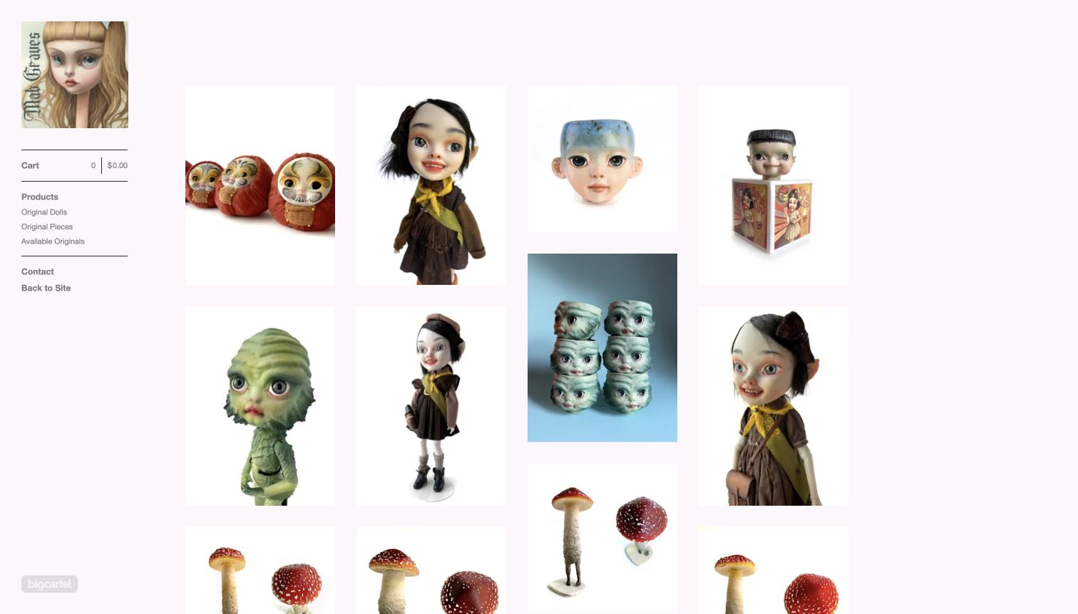
Mab Graves places a narrow portrait-led sidebar beside a grid of dolls, sculptural cups and other original pieces. The pale background and restrained controls give the objects room to establish their unusual character. Different image proportions preserve the silhouette of each work instead of forcing every item into an identical crop. Navigation separates original dolls, original pieces and available originals, acknowledging the difference between browsing an archive and finding something purchasable. The live store names Big Cartel and links back to the artist's main site. Product labels are less prominent than the images in the captured opening.
What you can learn
A collectible-art shop can borrow a gallery's visual restraint while still answering practical purchase questions. Keep available work easy to isolate, preserve useful views of three-dimensional objects, and make materials, scale, price and shipping conditions discoverable without requiring prior familiarity with the artist.
Pros
The quiet layout lets varied sculptural forms retain their individual visual impact.
An available-originals category distinguishes current stock from the broader body of work.
Cons & considerations
Image-first presentation can slow comparison when prices and titles are not immediately visible.
Different photograph proportions need care to avoid an uneven or confusing reading order.
Visible tech stack
Earlier / documented evidence
Big Cartel
Platform source: Explicit attribution on the directly reviewed storefront. The directly reviewed public storefront displays an explicit Powered by Big Cartel attribution and identifies this named store. This evidence applies to the pictured storefront only; no claim is made about every company website or the complete supporting stack. The separate bounded broad audit encountered an access check and made no additional stack conclusion. Platform evidence is separate from the direct website screenshot and is not a complete current infrastructure audit.
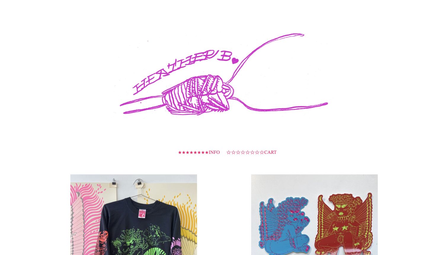
Heather Benjamin uses a large magenta drawing as the store masthead, with minimal decorative navigation separating that identity from a two-column product display. Apparel, stickers, prints and zines share a consistent setting, letting the same artistic world move across different formats. The opening feels personal rather than like a general merchandise marketplace. A current Big Cartel footer and direct gallery publication links support the specific store relationship. The oversized masthead and symbolic navigation are memorable, but they also make the practical shop controls quieter than the artwork and postpone the first product details.
What you can learn
Let original artwork establish the tone, then give practical shopping tasks equally clear language. A small artist catalog benefits from consistent product photography and straightforward labels for information, shipping and the cart; decorative symbols should reinforce those labels rather than carry their meaning alone.
Pros
The custom drawing makes the storefront recognizably connected to the artist’s wider practice.
A limited number of broad product formats keeps the merchandise selection understandable.
Cons & considerations
Symbol-heavy navigation is less immediately descriptive than conventional text labels for new visitors.
The generous masthead area leaves relatively little initial space for product details.
Visible tech stack
Earlier / documented evidence
Big Cartel
Platform source: Explicit attribution on the directly reviewed storefront. The directly reviewed public storefront displays an explicit Powered by Big Cartel attribution and identifies this named store. This evidence applies to the pictured storefront only; no claim is made about every company website or the complete supporting stack. The separate bounded broad audit encountered an access check and made no additional stack conclusion. Platform evidence is separate from the direct website screenshot and is not a complete current infrastructure audit.
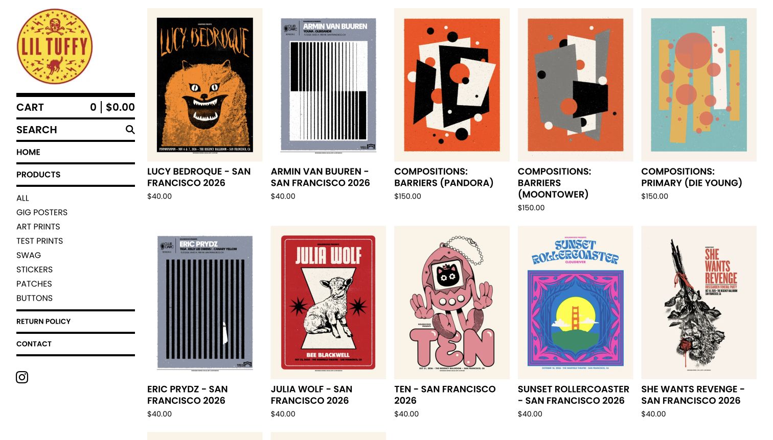
Lil Tuffy organizes the shop like a closely hung poster wall, keeping a bold ruled sidebar beside a dense but orderly grid. Concert posters and abstract art prints appear together, with titles and prices immediately beneath the images. The sidebar separates gig posters, art prints, test prints and smaller merchandise, helping visitors approach the catalog by format rather than scrolling without a plan. Big Cartel's official showcase identifies this specific artist store. The musicians named in products are subjects of the work, not separate examples or evidence that their own websites use the platform.
What you can learn
Large print catalogs need both visual browsing and reliable text. Keep artwork generous enough to judge at a glance, but retain searchable titles, dates and categories so collectors can find a particular edition. Distinguish the artist's shop identity from the performers represented in the merchandise.
Pros
Visible titles and prices support comparison without opening every individual poster page.
Persistent format categories provide useful entrances into a substantial and varied archive.
Cons & considerations
Several dense columns can make small poster lettering difficult to read immediately.
A concert name alone does not explain edition, paper or fulfillment details.
Visible tech stack
Earlier / documented evidence
Big Cartel
Platform source: Explicit attribution on the directly reviewed storefront. The directly reviewed public storefront displays an explicit Powered by Big Cartel attribution and identifies this named store. This evidence applies to the pictured storefront only; no claim is made about every company website or the complete supporting stack. The separate bounded broad audit encountered an access check and made no additional stack conclusion. Platform evidence is separate from the direct website screenshot and is not a complete current infrastructure audit.
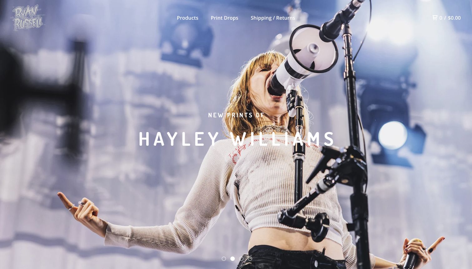
Ryan Russell opens the print store with a full-width performance photograph and a short announcement for new Hayley Williams images. The photographer's own mark remains in the corner, while products, print-drop information and shipping sit in a compact header. Below the photographic introduction, titles distinguish preorders, numbered editions and other print options. The result connects the emotional appeal of a concert image with a practical catalog. Big Cartel identifies this exact print property in its showcase; the platform association belongs to Russell's store and does not extend to the musicians photographed.
What you can learn
Use a strong photograph to introduce a release, then make edition and availability information unusually clear. Collectors need to distinguish a preorder from stock and one edition from another. Keep the photographer's identity visible so the subject of an image is not mistaken for the seller.
Pros
The full-width photograph gives the featured release an immediate and coherent visual focus.
Print-drop and shipping links address useful returning-customer tasks beside the product route.
Cons & considerations
The initial image delays direct comparison of the prints and their prices.
White navigation over changing photographs requires consistent attention to text contrast.
Visible tech stack
Earlier / documented evidence
Big Cartel
Platform source: Explicit attribution on the directly reviewed storefront. The directly reviewed public storefront displays an explicit Powered by Big Cartel attribution and identifies this named store. This evidence applies to the pictured storefront only; no claim is made about every company website or the complete supporting stack. The separate bounded broad audit encountered an access check and made no additional stack conclusion. Platform evidence is separate from the direct website screenshot and is not a complete current infrastructure audit.
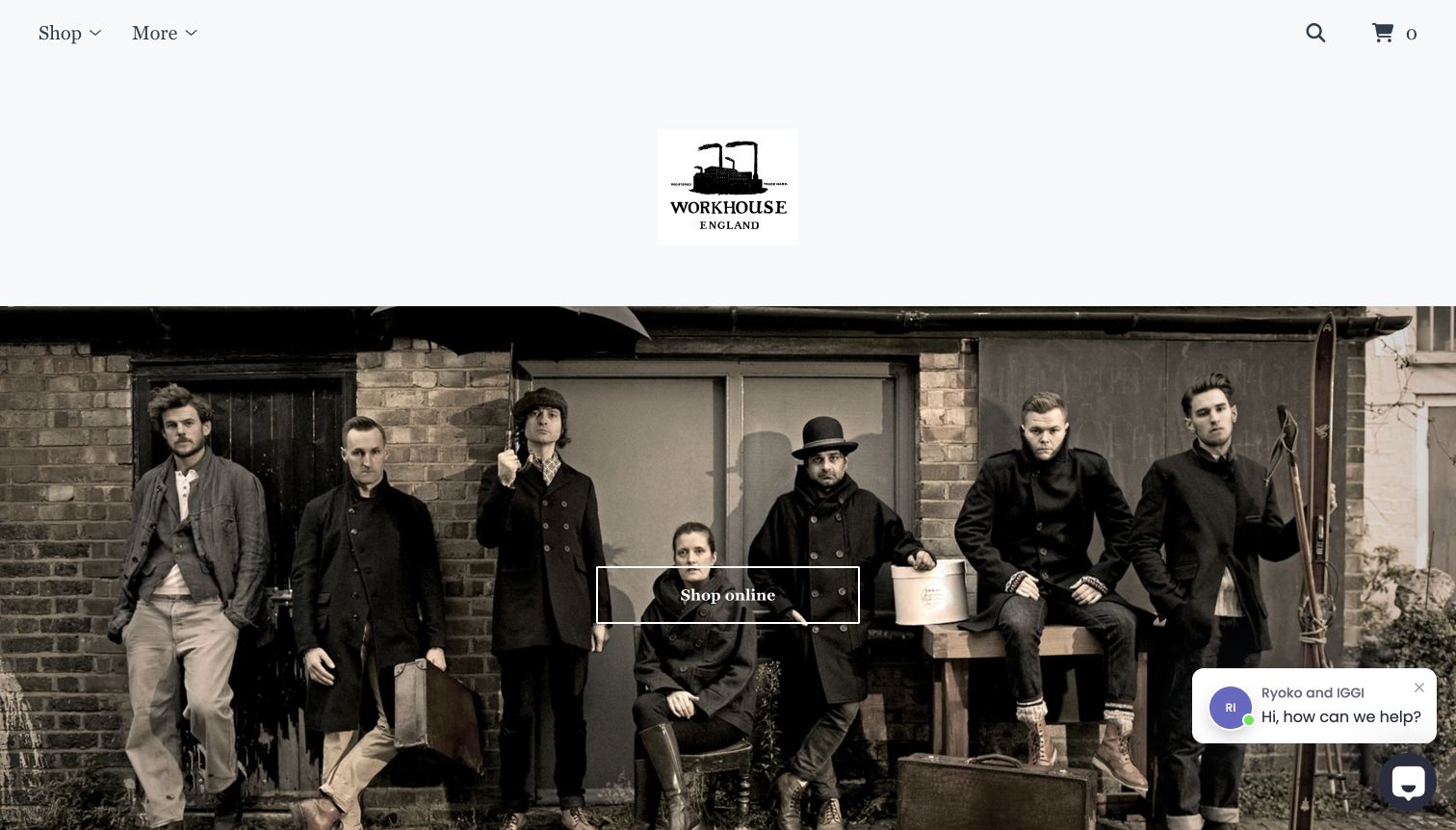
Workhouse England introduces its clothes through a wide group photograph beneath a small factory-style logo. The muted image, serif navigation and pale background create a coherent editorial mood before the product catalog begins. A centered shopping action provides the transition from that scene toward named garments, which include material and color distinctions in their titles. The specific store is listed in Big Cartel's official examples. A chat prompt is also present in the captured opening, adding a route to assistance but competing with the lower portion of the main photograph.
What you can learn
An apparel hero should make the collection feel coherent without becoming the only way to find products. Keep a direct catalog route available, use descriptive garment titles and support the editorial photographs with fit, fabric and care information once visitors reach the individual product pages.
Pros
The group photograph communicates a consistent styling direction across several different garments.
Material and color distinctions in product names help shoppers understand similar pieces.
Cons & considerations
A large atmospheric photograph offers limited immediate information about individual item availability.
The visible chat prompt occupies part of the image and introduces another competing element.
Visible tech stack
Earlier / documented evidence
Big Cartel
Platform source: Explicit attribution on the directly reviewed storefront. The directly reviewed public storefront displays an explicit Powered by Big Cartel attribution and identifies this named store. This evidence applies to the pictured storefront only; no claim is made about every company website or the complete supporting stack. The separate bounded broad audit encountered an access check and made no additional stack conclusion. Platform evidence is separate from the direct website screenshot and is not a complete current infrastructure audit.
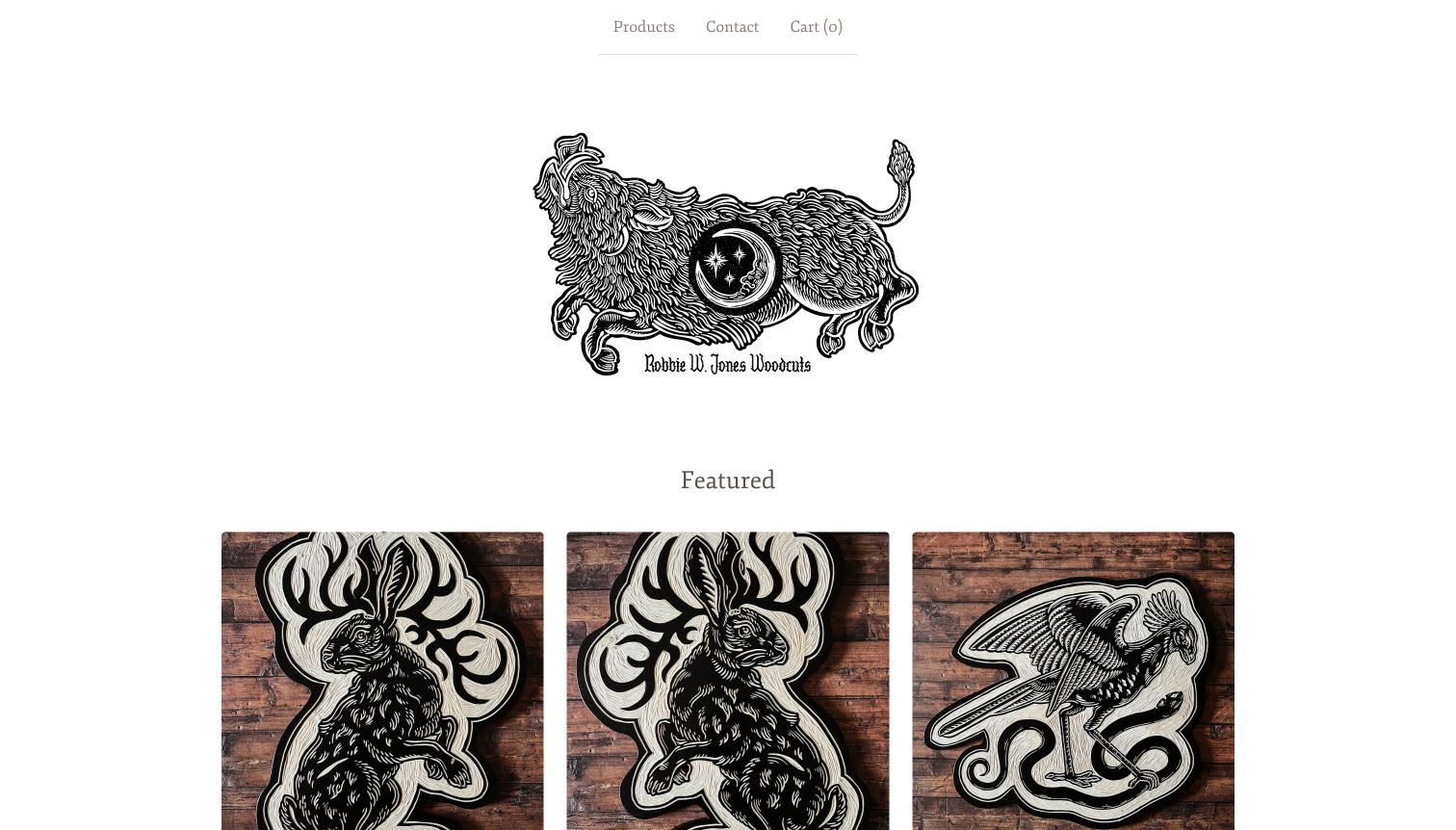
Robbie W. Jones Woodcuts pairs an elaborate black-and-white animal mark with similarly graphic products photographed against warm wooden surfaces. That repetition connects the shop identity to the actual objects rather than relying on a separate lifestyle campaign. The opening is sparse: products, contact and cart sit above the logo, followed by a three-column featured selection. The official Big Cartel showcase links directly to this store. Animal and fantasy subjects make the assortment visually distinctive, while the restrained page furniture leaves most of the attention on the carved shapes and contrasting ink.
What you can learn
When process and material are selling points, let photographs show them consistently. A simple storefront can work well if each listing explains whether the buyer receives a print, carved object or garment, and supplies enough scale and production information to complement the striking first image.
Pros
Consistent wood-backed photography reinforces the physical character of the work on display.
The small navigation avoids competing with the intricate illustration and product shapes.
Cons & considerations
The large logo postpones the first row of merchandise within the opening screen.
Subject-based titles alone may not explain the material or format of every listing.
Visible tech stack
Earlier / documented evidence
Big Cartel
Platform source: Explicit attribution on the directly reviewed storefront. The directly reviewed public storefront displays an explicit Powered by Big Cartel attribution and identifies this named store. This evidence applies to the pictured storefront only; no claim is made about every company website or the complete supporting stack. The separate bounded broad audit encountered an access check and made no additional stack conclusion. Platform evidence is separate from the direct website screenshot and is not a complete current infrastructure audit.
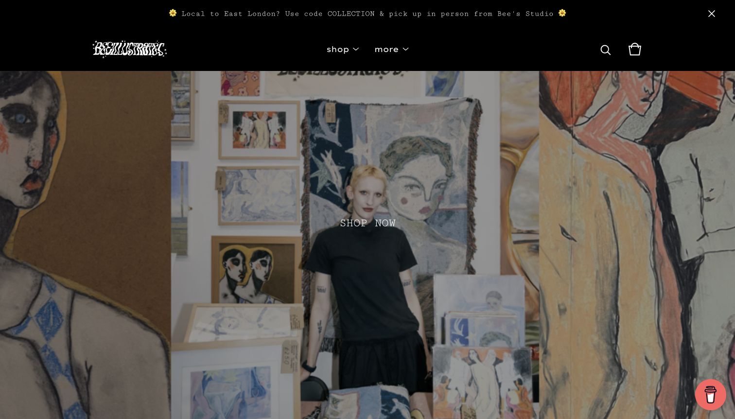
Bee Illustrates uses a dark header and a broad studio portrait to introduce a store organized around prints, wearable art, zines and original work. The setting shows the artist surrounded by images, giving the merchandise a visible creative context. A concise shopping action sits over the scene, while the page later offers clear category entrances. The announcement bar makes local collection an explicit option. Big Cartel's showcase identifies the pictured custom-domain shop. The dark overlay helps the central text separate from the artwork, although the first screen contains little information about individual products.
What you can learn
A studio portrait can establish authorship, but the next step should be unambiguous. Connect that introduction to clear product formats and practical shipping or collection information. Keep portfolio and wholesale routes available without forcing ordinary buyers to understand the whole professional practice before browsing.
Pros
The studio setting ties the products to a recognizable maker and working environment.
Category names distinguish original work, publications and merchandise in familiar terms.
Cons & considerations
The large introductory photograph delays product prices and availability until further browsing.
Several promotional or support elements can compete with the main shopping action.
Visible tech stack
Earlier / documented evidence
Big Cartel
Platform source: Official Big Cartel showcase naming this exact store. Big Cartel’s current official showcase links this exact public storefront by name and URL. This evidence applies to the pictured storefront only; no claim is made about every company website or the complete supporting stack. The separate bounded broad audit encountered an access check and made no additional stack conclusion. Platform evidence is separate from the direct website screenshot and is not a complete current infrastructure audit.
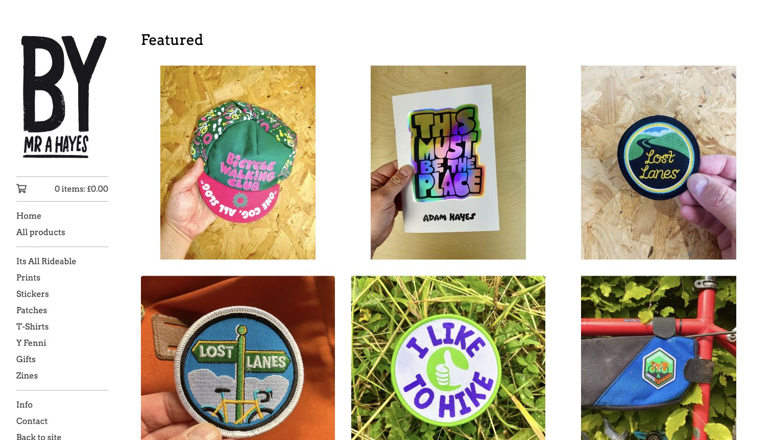
Mr A Hayes places a large monogram above a straightforward sidebar, then lets product photographs establish the shop's outdoor and cycling interests. Patches appear held in a hand or attached to equipment, giving small objects context that a flat scan would miss. The white background, even spacing and repeated image sizes make varied formats feel like one catalog. Big Cartel's official examples link to this specific shop. Its product-type categories sit alongside named collections, offering both practical and thematic entrances, although the long sidebar asks visitors to scan several different kinds of label.
What you can learn
Small merchandise benefits from photographs that communicate scale and use. Pair those contextual images with clear format categories and keep thematic collections distinct enough to understand. A visitor should be able to find a patch or a print without already knowing the name of the collection.
Pros
Hands and equipment provide useful scale and context for small physical products.
Consistent spacing holds patches, apparel and publications together as a coherent assortment.
Cons & considerations
The long mix of collection names and product types increases navigation scanning effort.
Image-first cards make price and availability less prominent in the captured opening.
Visible tech stack
Earlier / documented evidence
Big Cartel
Platform source: Explicit attribution on the directly reviewed storefront. The directly reviewed public storefront displays an explicit Powered by Big Cartel attribution and identifies this named store. This evidence applies to the pictured storefront only; no claim is made about every company website or the complete supporting stack. The separate bounded broad audit encountered an access check and made no additional stack conclusion. Platform evidence is separate from the direct website screenshot and is not a complete current infrastructure audit.
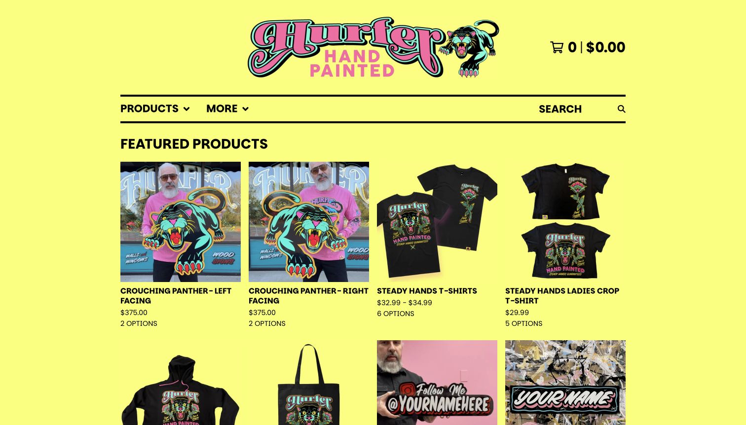
Hurfer Hand Painted surrounds its product catalog with a bright yellow background and a multicolored illustrated wordmark. Photographs of the maker holding large signs sit beside clean apparel views, connecting the original craft to smaller branded products. Heavy rules and bold headings provide structure within the energetic palette. Product cards show prices and option counts, and the menu separates signs, glass paintings and merchandise into more specific formats. Big Cartel's official showcase links this custom-domain store. The combination is expressive, but the many category choices create a substantial navigation system for a small-looking storefront.
What you can learn
A strong maker identity can support both original pieces and merchandise when the distinction remains clear. Use photographs to explain scale, show option counts before the product page and organize custom work separately from ready-made stock so visitors know what kind of purchase they are considering.
Pros
Photographs of held signs explain their physical scale while reinforcing the maker’s identity.
Prices and option counts give buyers practical information directly in the grid.
Cons & considerations
The intense background and detailed logo can compete with subtle product imagery.
A very long category menu needs careful grouping to remain easy to navigate.
Visible tech stack
Earlier / documented evidence
Big Cartel
Platform source: Official Big Cartel showcase naming this exact store. Big Cartel’s current official showcase links this exact public storefront by name and URL. This evidence applies to the pictured storefront only; no claim is made about every company website or the complete supporting stack. The separate bounded broad audit encountered an access check and made no additional stack conclusion. Platform evidence is separate from the direct website screenshot and is not a complete current infrastructure audit.
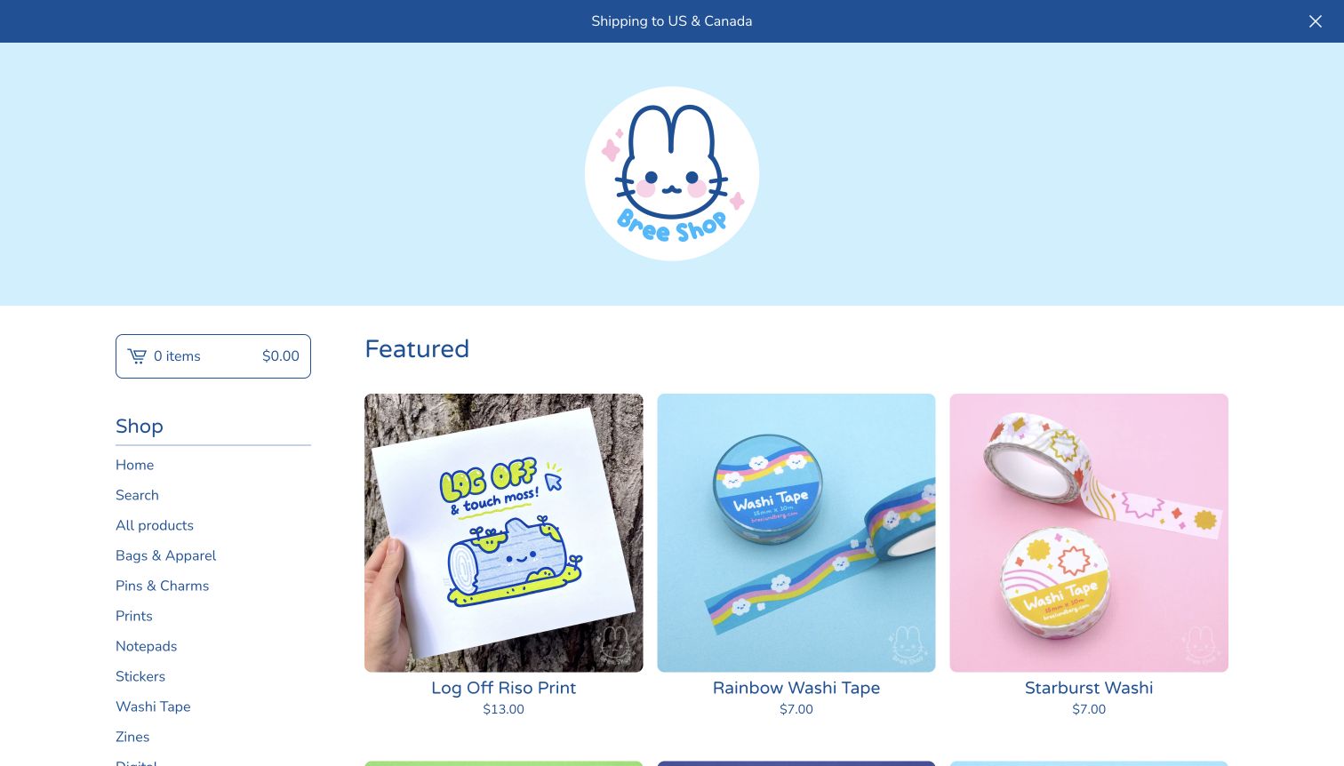
Bree Shop uses a soft blue header, a rabbit character and rounded type to establish a friendly stationery identity. The first products include a print and several kinds of decorative tape, photographed against coordinated but varied backgrounds. A sidebar separates bags, pins, prints, notepads, stickers and other formats, while a shipping announcement states the supported regions immediately. The official Big Cartel showcase identifies the store. Prices are visible under the first product row, giving the playful presentation a practical retail structure instead of requiring every visitor to open a listing before comparing options.
What you can learn
For a catalog of small gifts, consistency can make variety easier to browse. Keep format categories clear, use product photographs that reveal scale and material, and surface shipping boundaries early. The visual character should make navigation welcoming without hiding the ordinary details needed to choose an item.
Pros
The character, typography and coordinated colors create a clear and memorable shop identity.
Visible prices and a shipping-region announcement provide practical context alongside the imagery.
Cons & considerations
A long format menu can become cumbersome as more small product categories accumulate.
Product-level dimensions and quantities still need explanation beyond the cheerful opening photographs.
Visible tech stack
Earlier / documented evidence
Big Cartel
Platform source: Official Big Cartel showcase naming this exact store. Big Cartel’s current official showcase links this exact public storefront by name and URL. This evidence applies to the pictured storefront only; no claim is made about every company website or the complete supporting stack. The separate bounded broad audit encountered an access check and made no additional stack conclusion. Platform evidence is separate from the direct website screenshot and is not a complete current infrastructure audit.
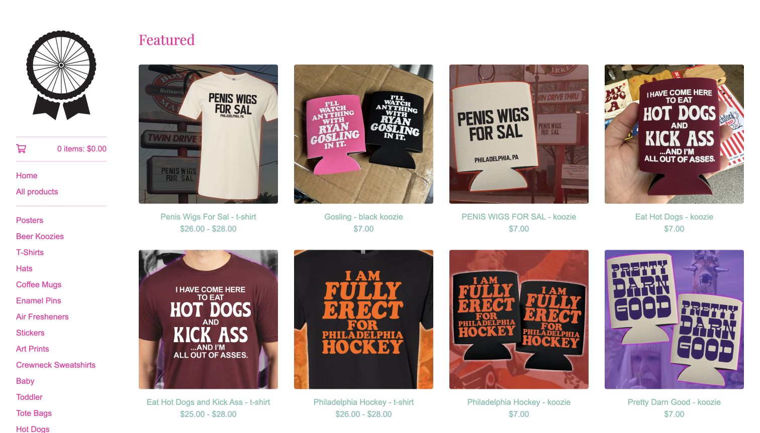
Pink Bike Ralph uses a simple sidebar and a grid to display shirts, drink sleeves and other graphic merchandise. The restrained white frame keeps the attention on bold lettering and humorous slogans, while pink navigation supplies a recognizable accent. Product names and prices sit directly beneath the images, and categories divide the assortment into practical formats such as hats, mugs, pins and prints. Big Cartel's official showcase links to this custom-domain store. The assortment's deliberately irreverent language is part of its identity, but that tone will not suit every audience or brand context.
What you can learn
A merchandise store needs to make the format and design easy to compare. Consistent card structure can support a strong editorial voice, provided the typography stays readable and categories do not become an unstructured list. Choose imagery and language deliberately for the audience the shop actually serves.
Pros
Repeated image and label treatment makes several merchandise formats straightforward to compare.
Specific format categories help returning buyers locate an item type without lengthy browsing.
Cons & considerations
The long category list requires more scanning than a smaller grouped navigation system.
The intentionally provocative product language limits how broadly this particular presentation transfers.
Visible tech stack
Earlier / documented evidence
Big Cartel
Platform source: Explicit attribution on the directly reviewed storefront. The directly reviewed public storefront displays an explicit Powered by Big Cartel attribution and identifies this named store. This evidence applies to the pictured storefront only; no claim is made about every company website or the complete supporting stack. The separate bounded broad audit encountered an access check and made no additional stack conclusion. Platform evidence is separate from the direct website screenshot and is not a complete current infrastructure audit.
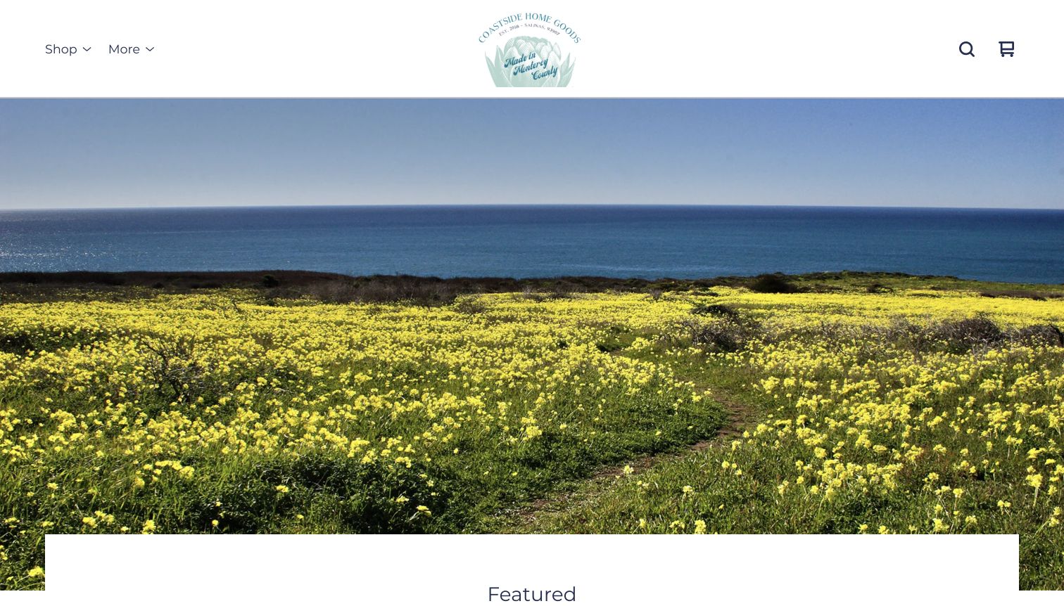
Coastside Home Goods leads with a coastal landscape beneath a restrained logo and compact shop controls. The ocean, flowers and soft colors establish a sense of place before the featured products begin. That opening is followed by a short assortment and customer quotations, giving the page a different rhythm from the denser artist catalogs in this collection. Big Cartel's official showcase identifies the specific store. The scenic introduction is visually coherent, but a first-time visitor must continue down the page to learn that the offer includes candles, soaps and other home goods.
What you can learn
A place-based identity should connect quickly to the things a visitor can buy. Use landscape imagery to establish atmosphere, then introduce product types and practical details promptly. Keep customer statements clearly attributed and avoid treating the emotional appeal of a setting as evidence of product quality.
Pros
The landscape and restrained header create a coherent regional identity for the shop.
A small featured selection offers a manageable transition from atmosphere to actual products.
Cons & considerations
The opening photograph does not immediately explain the assortment or individual product benefits.
Customer quotations provide context but do not replace specifications, ingredients or shipping information.
Visible tech stack
Earlier / documented evidence
Big Cartel
Platform source: Explicit attribution on the directly reviewed storefront. The directly reviewed public storefront displays an explicit Powered by Big Cartel attribution and identifies this named store. This evidence applies to the pictured storefront only; no claim is made about every company website or the complete supporting stack. The separate bounded broad audit encountered an access check and made no additional stack conclusion. Platform evidence is separate from the direct website screenshot and is not a complete current infrastructure audit.
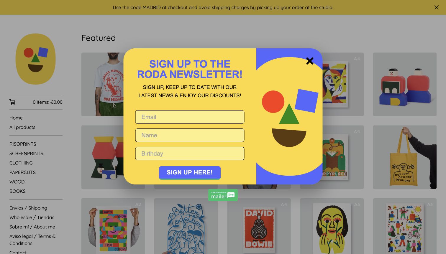
RODA combines a yellow face logo, geometric artwork and a simple sidebar to organize prints, clothing, papercuts, wood objects and books. The same primary-color language appears across the merchandise and the newsletter invitation visible in the direct capture. A local collection announcement provides a practical regional detail above the catalog. Big Cartel's official showcase identifies this exact artist shop. The newsletter overlay is retained as an observed page condition: its close control is visible, but it temporarily covers much of the product selection and competes with the visitor's initial browsing task.
What you can learn
A consistent visual language can tie very different product formats together. Keep the shopping hierarchy intact when adding a newsletter prompt, and make dismissal obvious. Local pickup information is most useful when it remains accessible without requiring visitors to subscribe or provide personal details first.
Pros
Repeated shapes and colors connect the brand mark to prints, apparel and objects.
Material-based categories offer useful routes through an assortment that spans several formats.
Cons & considerations
The observed newsletter overlay obscures products before the visitor has explored the catalog.
Several similarly vivid elements compete for attention when the overlay is present.
Visible tech stack
Earlier / documented evidence
Big Cartel
Platform source: Explicit attribution on the directly reviewed storefront. The directly reviewed public storefront displays an explicit Powered by Big Cartel attribution and identifies this named store. This evidence applies to the pictured storefront only; no claim is made about every company website or the complete supporting stack. The separate bounded broad audit encountered an access check and made no additional stack conclusion. Platform evidence is separate from the direct website screenshot and is not a complete current infrastructure audit.
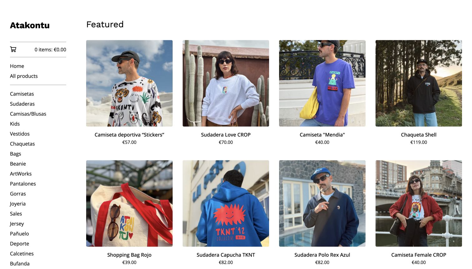
Atakontu uses an understated wordmark and sidebar beside a four-column grid of people wearing the offered clothes. Outdoor and street settings give the garments an everyday context while consistent square images keep the catalog orderly. Product names and euro prices remain close to the photographs, making the opening more immediately shoppable than a full-screen fashion campaign. The official Big Cartel showcase links this store. Categories cover many garment and accessory types, with delivery and return information available separately. The mixture of Spanish and English labels reflects the shop's presentation but requires care for unfamiliar visitors.
What you can learn
For small apparel catalogs, worn photographs can communicate styling and silhouette efficiently. Pair them with consistent product names and practical size information, and keep category language predictable. A visitor should be able to separate garment type, collection name and color without studying every listing individually.
Pros
Worn photographs show how the garments sit within recognizable everyday situations.
Titles and prices remain visible beneath each image for straightforward product comparison.
Cons & considerations
The extensive sidebar creates a long list of choices before narrower product browsing.
Mixed-language category labels may require clarification for visitors outside the primary audience.
Visible tech stack
Earlier / documented evidence
Big Cartel
Platform source: Explicit attribution on the directly reviewed storefront. The directly reviewed public storefront displays an explicit Powered by Big Cartel attribution and identifies this named store. This evidence applies to the pictured storefront only; no claim is made about every company website or the complete supporting stack. The separate bounded broad audit encountered an access check and made no additional stack conclusion. Platform evidence is separate from the direct website screenshot and is not a complete current infrastructure audit.
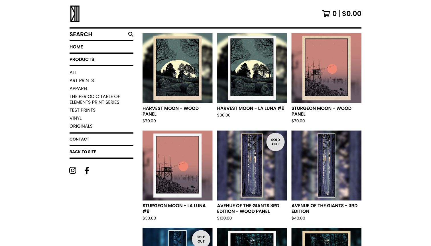
Dan McCarthy places a compact monogram above a strongly ruled catalog frame, then shows related print editions side by side. The opening pairs wood-panel versions with paper editions, using similar images so visitors can see the relationship between them. Names, prices and conspicuous sold-out labels supply practical distinctions within the grid. The current storefront identifies Big Cartel directly. A persistent search field and format categories support browsing a sizable archive, while the recurring moon series gives the catalog a recognizable editorial thread rather than an assortment of unrelated images.
What you can learn
When one design exists in multiple editions or materials, make the relationship explicit and the differences easy to compare. Consistent photographs help, but labels should explain the medium, edition and availability clearly. A collector should not need to infer those details from a similar-looking thumbnail alone.
Pros
Related paper and panel versions appear close together for useful visual comparison.
Prominent sold-out markers distinguish unavailable editions before a visitor opens their pages.
Cons & considerations
Repeated artwork thumbnails can make genuinely different editions appear interchangeable at first glance.
Long uppercase titles and a dense sidebar add visual weight to the opening.
Visible tech stack
Earlier / documented evidence
Big Cartel
Platform source: Explicit attribution on the directly reviewed storefront. The directly reviewed public storefront displays an explicit Powered by Big Cartel attribution and identifies this named store. This evidence applies to the pictured storefront only; no claim is made about every company website or the complete supporting stack. The separate bounded broad audit encountered an access check and made no additional stack conclusion. Platform evidence is separate from the direct website screenshot and is not a complete current infrastructure audit.
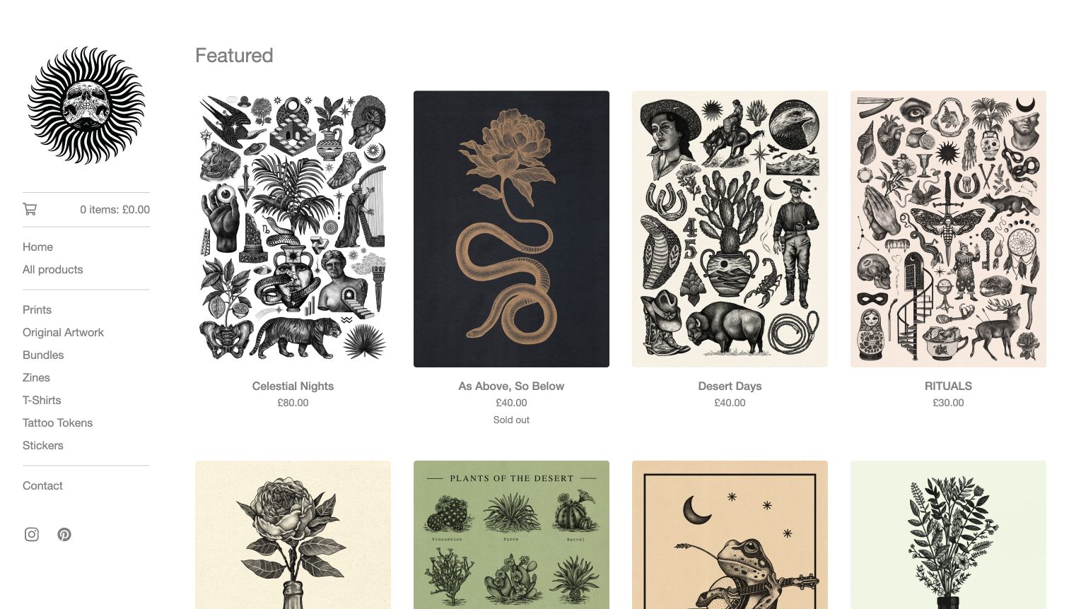
Lloyd Stratton presents intricate black-and-white imagery within a nearly monochrome storefront, using a small illustrated mark and light sidebar labels. The product grid includes detailed compositions, botanical imagery and other prints, with prices and availability under each image. Categories separate prints, originals, bundles, publications and smaller merchandise, preserving a practical structure around the decorative work. Big Cartel's artist article links to this specific store, and the current page retains its identity. The restrained interface suits the artwork, although pale typography and dense image detail make comfortable scanning an important consideration.
What you can learn
Detailed artwork benefits from a quiet interface, but quiet should not mean difficult to read. Preserve enough thumbnail scale to distinguish compositions and use clear labels for original work versus reproductions. Product pages can then explain paper, size and edition information without overloading the opening grid.
Pros
The restrained surrounding palette keeps intricate illustrations visually prominent in the catalog.
Separate original-art and print categories clarify two materially different kinds of purchase.
Cons & considerations
Light gray labels may be harder to scan against the pale page background.
Dense compositions need larger product views before a buyer can judge their finer details.
Visible tech stack
Earlier / documented evidence
Big Cartel
Platform source: Explicit attribution on the directly reviewed storefront. The directly reviewed public storefront displays an explicit Powered by Big Cartel attribution and identifies this named store. This evidence applies to the pictured storefront only; no claim is made about every company website or the complete supporting stack. The separate bounded broad audit encountered an access check and made no additional stack conclusion. Platform evidence is separate from the direct website screenshot and is not a complete current infrastructure audit.
WhatMegKnits keeps a pale sidebar visible beside a large editorial photograph of people wearing colorful knitwear. The pink wordmark and warm background complement the clothes, while categories distinguish cardigans, scarves, sleeveless pieces and home-related knits. Commission and gift-card routes sit separately from the product formats. The official Big Cartel interview names this store and describes its collection-based workflow; the current property is directly captured here. The oversized slideshow makes the opening feel like a fashion editorial, but its many slides and tall framing offer less immediate product comparison than a compact grid.
What you can learn
Editorial imagery can establish a knitwear collection's character, provided useful shopping routes remain visible. Organize by the terms customers use for garments and explain made-to-order or commission arrangements separately. Avoid relying on a long slideshow to communicate information that belongs in clear product descriptions and photographs.
Pros
Persistent garment categories remain available beside the large editorial photography.
The warm palette and colorful clothing create a coherent and distinctive presentation.
Cons & considerations
A very large slideshow delays direct comparison of individual products and prices.
The unusually long slide sequence can contain more material than visitors reasonably explore.
Visible tech stack
Earlier / documented evidence
Big Cartel
Platform source: Explicit attribution on the directly reviewed storefront. The directly reviewed public storefront displays an explicit Powered by Big Cartel attribution and identifies this named store. This evidence applies to the pictured storefront only; no claim is made about every company website or the complete supporting stack. The separate bounded broad audit encountered an access check and made no additional stack conclusion. Platform evidence is separate from the direct website screenshot and is not a complete current infrastructure audit.
Fellow Humans opens with a photograph of people together, a short invitation to make friends and a clear event-browsing action. The design uses a bright blue announcement strip and simple white navigation to distinguish the practical controls from the social scene. Below, event cards combine activity, timing and location, while city categories provide another way into the offer. Big Cartel's homepage links this exact event store. Its stated reach is the organization's own claim; the review concerns the visible booking catalog and does not verify attendance, participant experiences or completed transactions.
What you can learn
An event store should connect the emotional reason to attend with concrete planning information. Make location, date, duration and availability easy to compare, then provide clear expectations for first-time participants. Keep the sense of welcome without asking the introductory photograph to explain the entire experience.
Pros
The main invitation and event action give new visitors an understandable first step.
City categories recognize that location is a practical prerequisite for choosing an event.
Cons & considerations
The large opening photograph postpones the dates and details needed to assess a visit.
Activity titles can become long when timing, location and availability share one label.
Visible tech stack
Earlier / documented evidence
Big Cartel
Platform source: Official Big Cartel showcase naming this exact store. Big Cartel’s current official showcase links this exact public storefront by name and URL. This evidence applies to the pictured storefront only; no claim is made about every company website or the complete supporting stack. The separate bounded broad audit encountered an access check and made no additional stack conclusion. Platform evidence is separate from the direct website screenshot and is not a complete current infrastructure audit.
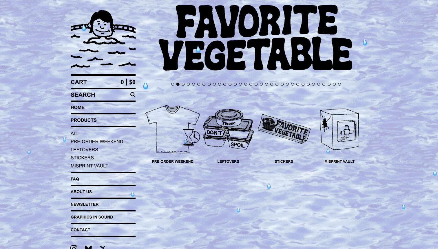
Favorite Vegetable turns the storefront itself into an illustrated scene, combining a watery background, an oversized wordmark and a small swimming character. Heavy rules give the sidebar structure, while custom category drawings introduce preorders, remaining stock, stickers and misprints. Those labels reflect how the shop releases merchandise rather than simply grouping by garment. Big Cartel's homepage identifies the custom-domain store. The presentation is memorable and internally consistent, but the animated-looking background and long slideshow indicators can compete with the relatively small controls used to find actual items.
What you can learn
A distinctive themed storefront still needs an understandable release model. Explain what separates a preorder, leftover item and misprint before checkout, and keep those routes consistently labeled. Decorative movement and illustrations should support that structure while preserving readable text and a direct path to available merchandise.
Pros
Custom category illustrations extend the brand personality into useful catalog navigation.
Release-based groupings distinguish preorders and imperfect stock from ordinary available merchandise.
Cons & considerations
The busy background competes with text and small interface details in the opening.
A long sequence of slideshow indicators adds visual density without clarifying product availability.
Visible tech stack
Earlier / documented evidence
Big Cartel
Platform source: Official Big Cartel showcase naming this exact store. Big Cartel’s current official showcase links this exact public storefront by name and URL. This evidence applies to the pictured storefront only; no claim is made about every company website or the complete supporting stack. The separate bounded broad audit encountered an access check and made no additional stack conclusion. Platform evidence is separate from the direct website screenshot and is not a complete current infrastructure audit.
Kegan has 15+ years of experience working with small businesses, Fortune 500 companies, and everything in between. No development job is too big or too small: he brings the same hands-on attention to a focused improvement, a complete website, or a custom application.
For Big Cartel projects, he can help with responsive interfaces, reusable components, custom functionality, API connections, and performance-minded implementation. He works directly with clients on scope, design, implementation, testing, and handover, with an emphasis on clear communication and a system that remains practical to maintain after launch.
Show 3 other Big Cartel developersHide other Big Cartel developers
Choose a storefront structure that suits the assortment
Use a catalog grid for comparison
A repeated grid works well when shoppers need to compare prints, garments or small accessories. Keep the photograph, name, price and availability in predictable positions. Consistent framing helps related products feel connected, while contextual photographs can still explain scale, texture or use. Leave room for long titles and unavailable items rather than designing only around a perfect first row.
Use an editorial introduction with a direct shop route
A studio portrait, landscape or fashion photograph can establish the maker's world before the catalog begins. Give it a clear purpose and a visible path to products. Large imagery should not become the only source of product information, and a long slideshow should not carry details that visitors need in order to understand the offer.
Organize releases and events explicitly
Preorders, limited editions, misprints and event tickets involve different expectations from ordinary stocked goods. Use categories and product descriptions to make those distinctions understandable. Big Cartel's guidance asks sellers to explain preorder status and expected shipping in the description. For an event, make the activity, location and timing clear before introducing secondary promotional content.
Plan the catalog, fulfillment and routine editing together
Write a product model before polishing the homepage
Begin with a short inventory of what the shop actually sells. A paper print, framed edition, original sculpture, digital file and event place do not need identical information, even when they share one visual system. List the details required to distinguish each format: dimensions, material, edition, selected option, availability and any relevant delivery expectation. Use that inventory to decide which information belongs on the catalog card and which belongs on the product page.
Build several realistic sample listings before finalizing the layout. Include a long title, a sold-out item, a product with multiple choices and an image with an unusual aspect ratio. These cases reveal whether the design can survive ordinary catalog work. Make sure the person maintaining the shop understands how a change to an option or status affects the public listing.
Big Cartel documents product categories, options and listing states, but those controls do not choose a clear naming system for the seller. Agree on one vocabulary for materials, sizes and editions. Keep that vocabulary consistent across photographs, descriptions and customer communication. A concise internal checklist can help a solo maker publish a new release reliably without depending on memory or repeatedly asking the original designer to repair avoidable inconsistencies. It also makes later collaboration easier when someone else helps prepare listings.
Explain fulfillment before asking for a commitment
A beautiful photograph cannot answer when an item will arrive or whether it can be sent to a particular destination. Decide how the shop will communicate the difference between ready-made stock, a preorder, a commission and a recurring offering. Put the relevant expectation close to the product description, then provide a consistent route to the fuller shipping or service policy. Avoid making visitors discover an important limitation only after they have invested time in choosing an item.
For physical goods, use realistic combinations when planning shipping information. A small sticker and a framed print may need different packaging; a bundle can create a different expectation from several independent items. Big Cartel provides shipping-profile guidance, but the seller still needs accurate product information and a clear explanation of the regions served. Local collection also deserves an explicit process rather than a promotional line with no practical follow-through.
For events and services, translate the same principle into timing, location and participation details. Explain what the buyer receives and where to find help if something changes. Keep public guidance understandable, and assign responsibility for maintaining it when the assortment or operating arrangements change. The goal is a coherent set of expectations across the storefront, product description and ordinary customer communication, not a longer page of vague assurances.
The most distinctive stores in this collection often use a small number of repeated choices: a drawn mark, a limited palette, consistent photographs or a recognizable arrangement of categories. Document those choices so the shop can grow without becoming visually inconsistent. Specify which images need a neutral background, which can show the work in use and how much space should surround an object. Keep useful source files for the maker's own artwork and explain where each exported asset belongs.
Review the ordinary editing tasks with the actual person who will perform them. They should be able to replace a campaign image, update a product, remove an obsolete announcement and locate the relevant policy without guessing. Big Cartel's theme documentation describes customization controls; decide which settings are safe for routine editing and which require more careful support. Avoid adding code or integrations merely to imitate an effect seen in another store.
Plan how the shop behaves when imagery changes or promotional content is absent. Text over a photograph needs a reliable contrast treatment, a newsletter prompt needs an obvious dismissal route, and a long category list needs understandable organization. Record who owns each third-party connection and how it can be removed if no longer useful. A manageable storefront is one the business can keep accurate after its first collection has sold through.
Ask the actual team to carry out its routine job: publish a realistic update, correct a mistake, preview a narrow screen, and identify who owns an integration failure. For a library or frontend framework, also ask who maintains the content source and deployment. A polished screenshot does not answer those operational questions.
Beyond the screenshot
Check the shop with realistic products and tasks
Use real product names, prices, photographs and availability states throughout the catalog.
Distinguish original works, reproductions, different editions and digital products clearly.
Keep the seller's identity separate from people, brands or characters depicted in the work.
Make important size, material, quantity and format information easy to find.
Explain preorders, commissions and expected fulfillment timing in the relevant listing.
Check that product choices and sold-out states remain understandable on narrow screens.
Keep shipping regions, collection arrangements and policy links consistent across the shop.
Review category names for overlap, unexplained abbreviations and unnecessary duplication.
Ensure newsletter prompts can be dismissed and do not prevent ordinary browsing.
Check keyboard navigation, image alternatives and text contrast with realistic content.
Document routine editing responsibilities and the purpose of each third-party integration.
Use an appropriate test workflow to check purchasing behavior without submitting unintended live orders.
Test with real content, a keyboard, a small screen, slow or failed requests, and the people who will maintain the system. These are planning checks, not an accessibility, security, performance, or search-ranking certification.
Sources & editorial method
How this Big Cartel collection was reviewed
These twenty public stores were reviewed and directly captured on November 10, 2026. The opening five have separate publisher, gallery or direct-interview identity sources. Specific official Big Cartel showcase/interview links and visible store attribution establish the scoped platform relationship. All twenty broad automated source scans stopped at access or bot checks; no bypass was attempted, and no new CMS, plugin, analytics, font or delivery conclusions were inferred from those unsuccessful scans. The visible Big Cartel relationship is supported independently by the cited store and vendor evidence. RODA's newsletter overlay and other observed interface conditions remain in the original screenshots. No purchases, forms, subscriptions or account actions were performed.
Every image is an unmodified capture from the actual website, with its source and capture date. Some captures are reused from our shared catalog; their dates remain the original capture dates. None comes from a vendor gallery or a generated reconstruction. Moving imagery and live content can change.
Technology attribution uses public page assets or metadata, official platform documentation, or a cited first-party project case study. Documentary and framework-relationship evidence is identified where used; it is not a complete current backend inventory. A CMS image CDN alone does not establish a full CMS deployment. A library’s presence does not prove which individual controls use it, and a platform label does not establish AI authorship.
The composition notes, lessons, pros and tradeoffs are original editorial observations. We have not measured conversion, traffic, security, performance or accessibility conformance. Website owners retain their brands and imagery; these examples are not our client portfolio. Written, Edited and Curated are independent records, not dates advanced by a build. See our editorial standards or suggest a correction.
Questions worth asking
Big Cartel website development FAQs
Are all twenty examples separate Big Cartel stores?
Yes. Each review names a distinct public storefront, with its own direct capture and scoped platform evidence. Different artists on Big Cartel subdomains count as separate properties; several products or categories within one shop do not.
Why does the opening group focus on artists rather than large retailers?
The opening group comprises established independent art and photography brands. Their recognition is supported by publisher, gallery and direct-interview sources, separately from the Big Cartel evidence. A famous musician appearing in a print is not treated as the owner of that store.
Does a Big Cartel label reveal the complete technology stack?
No. It identifies the scoped storefront relationship supported by the cited evidence. The broad automated scans encountered access checks, so they did not establish additional plugins, analytics, fonts, delivery services or hidden systems.
Can a small shop use a custom domain and its own visual identity?
The collection includes custom-domain shops and Big Cartel subdomain shops with distinct artwork, photography and navigation. Consult the current official product and theme documentation for the options available to your plan and the responsibilities involved in maintaining a customization.
Should sold-out products stay visible?
That depends on the role of the catalog. An archive can help collectors understand previous work, while a new buyer may need a clear route to available stock. Make availability explicit and avoid presenting an unavailable item as an ordinary active purchase.
Were checkout, sales or performance tested?
No. These are original design reviews of public pages with real source captures and qualified technology evidence. They do not measure sales, traffic, checkout reliability, service quality, accessibility conformance or the complete security of a store.
Borrow the clarity of the product organization, the consistency of the imagery and the care given to practical details. Build a visual identity from your own work, then make sure people can understand what is available and what happens after they choose it.