A bakery website should make the food appealing and the next step unambiguous. The right design depends on whether customers are visiting a counter, collecting a cake or sending a gift.
A neighborhood bakery, a celebration cake business and a national cookie brand share a need for convincing food photography, but their customers have different decisions to make. Someone nearby needs hours and a menu. Someone planning a birthday needs lead times, size choices and collection arrangements. A gift buyer needs confidence about delivery dates, packaging and what the recipient will receive.
These 22 distinct official bakery websites show approaches to those decisions, from minimal local information to large seasonal stores and bakery schools. The reviews consider visible design, navigation and content. They do not assess the food, independently verify advertised awards or claim that a layout produces more orders. Screenshots record the public pages as observed, including the actual capture date.
Before the examples
What makes good bakery website design in 2026?
Separate the ways customers receive food
Label local pickup, local delivery, national shipping and catering according to the services actually offered. A shipped bake-at-home product may have different preparation and storage needs from an item collected at the counter. Ask customers to choose a location or delivery area before they spend time selecting products that are unavailable there.
Make timing part of the product information
Display preorder cutoffs, collection windows and preparation lead times close to the relevant products. Holiday campaigns should state their dates in text, with an owner responsible for retiring the promotion. Do not imply that a picture of the daily counter is a live inventory feed unless the system genuinely supports that promise.
Pair appetite with dependable visit details
Use photographs that accurately represent the bakery and its products. Keep hours, addresses, menus and accessibility information easy to reach. Branch pages should explain meaningful differences such as seating, brunch availability or collection arrangements. Food descriptions and ingredient information need a practical maintenance process, especially when menus change frequently.
The collection · 22 examples
22 bakery websites worth studying
Compare how these bakeries connect visual identity with an actual customer task. Notice where ordering modes are separated, how seasonal content changes the first screen and whether local visit information remains easy to find.
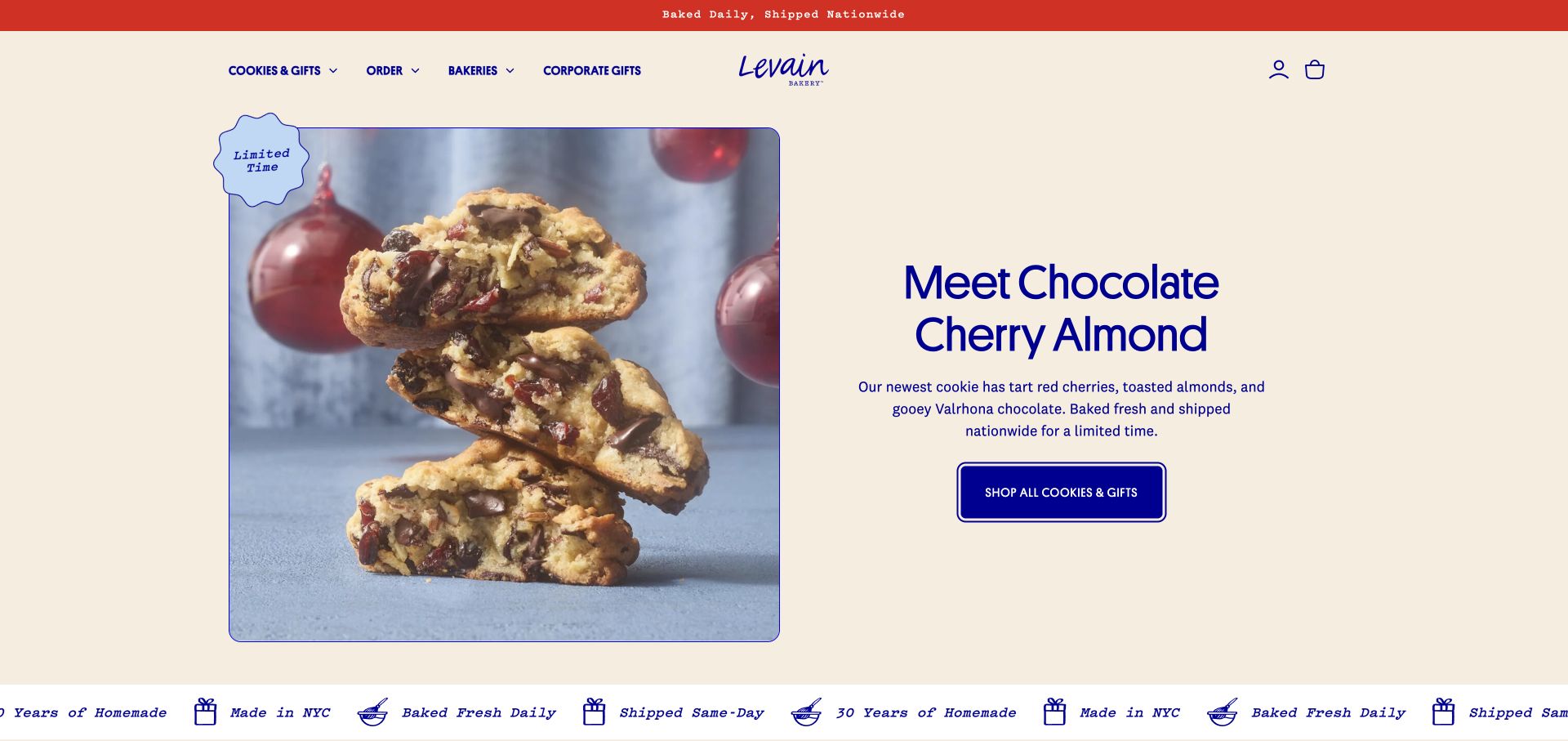
Levain gives its seasonal cookie a large close-up beside an uncluttered description and a single shopping button. Cream backgrounds and blue lettering carry the packaging identity into the interface, while the main navigation distinguishes cookies, ordering, bakeries and corporate gifts. Further down, separate sections address same-day pickup, events and catering. That structure makes the business model legible: the same signature product can satisfy a personal treat, a local visit or a larger gift order.
What you can learn
Organize a focused product range around the customer’s occasion and fulfillment needs. Keep the product photograph consistent across those routes, then explain the different timing and quantities on each destination.
Pros
The seasonal hero has a clear relationship between product photograph, flavor description and shopping action.
Corporate gifting and bakery discovery receive explicit navigation labels instead of being hidden in a general contact page.
Cons & considerations
An initial signup popup interrupted the product view during review and needed dismissal.
The shipping emphasis requires equally clear local availability details once a customer selects pickup.
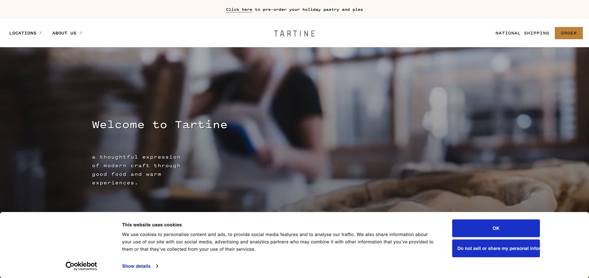
Tartine opens with an immersive bakery scene under a restrained header, pairing a centered wordmark with compact location and ordering links. The visual treatment communicates a working bakery before introducing individual products. The page then separates regional locations, shipping, seasonal orders and special cakes. This is useful for a business whose name covers several distinct places: the visitor needs to select a relevant bakery before assuming a menu, collection time or service applies everywhere.
What you can learn
Let atmosphere establish the bakery’s character, but make geography a first-class decision. Give each branch its own menu, hours and ordering destination so a shared brand does not obscure operational differences.
Pros
The spare header leaves room for photography while retaining direct routes to locations and ordering.
Regional grouping helps visitors understand that the bakery network includes different local experiences.
Cons & considerations
A cinematic opening offers less immediate product detail than a visible menu or compact product grid.
Seasonal preorders and special cake lead times need regular editorial maintenance across the linked destinations.
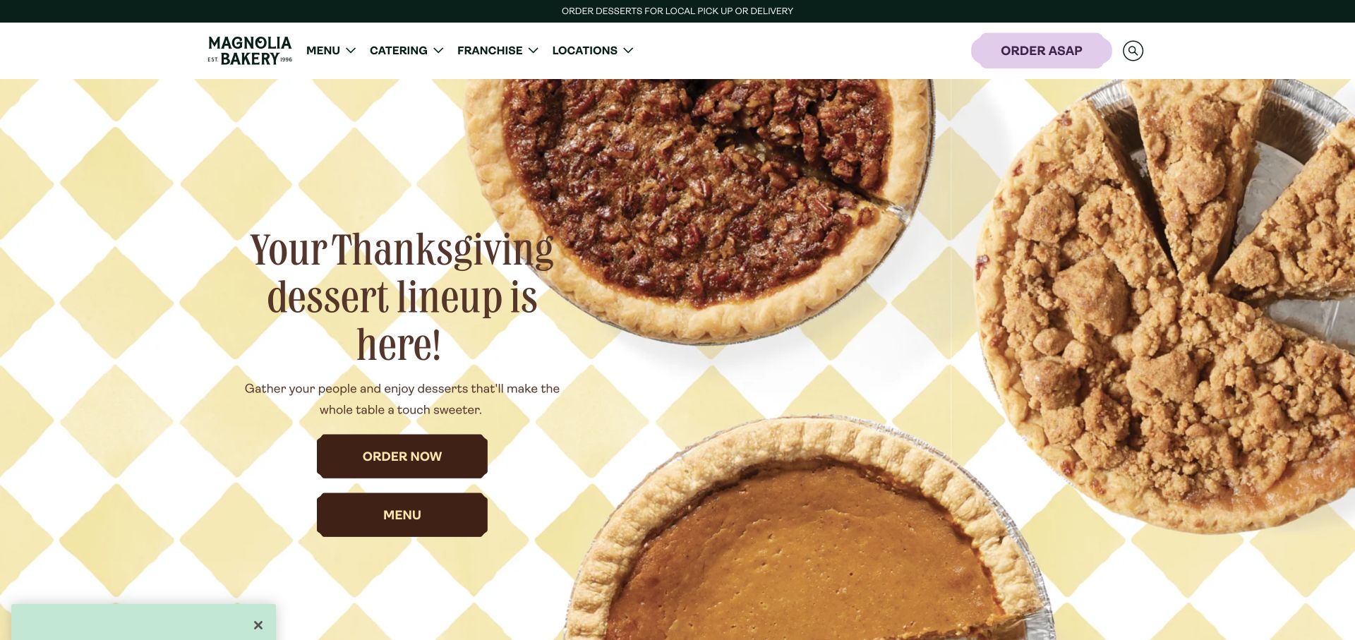
Magnolia uses a bright pie photograph, checked tablecloth and large seasonal message to place a specific celebration at the center of the homepage. Its cream and green header remains recognizable above the promotional imagery, and prominent menu and ordering controls give visitors practical next steps. The site also distinguishes immediate ordering from planned purchases and directs visitors toward locations and catering. The result is an occasion-oriented storefront that can introduce a campaign without making every shopper begin with a full catalog.
What you can learn
Build seasonal landing sections around a real ordering deadline and fulfillment route. Keep the evergreen menu and location navigation available so customers with another occasion can move past the campaign easily.
Pros
The hero connects an event, a visible dessert assortment and an ordering action in one composition.
Catering and location links sit alongside the retail navigation, acknowledging several reasons to visit.
Cons & considerations
A holiday campaign can dominate the opening even when a visitor wants an everyday cupcake or celebration cake.
Customers still need clear distinctions between local ordering and products eligible for national shipping.
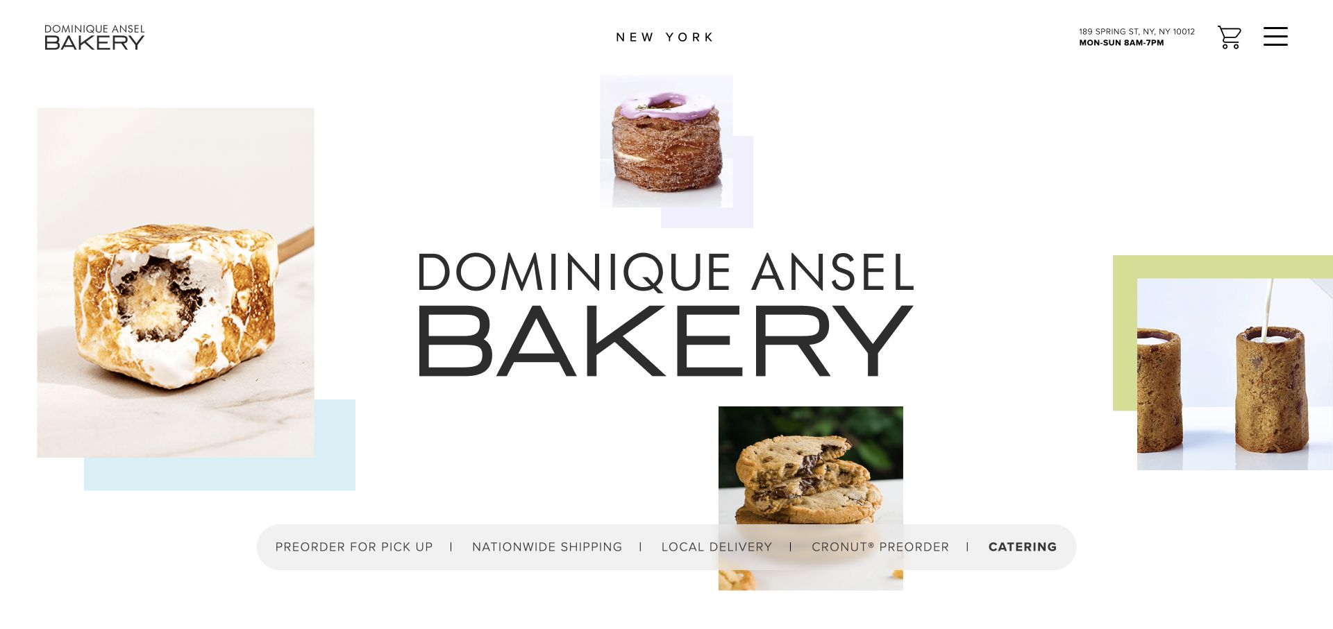
Dominique Ansel’s New York site frames an oversized wordmark with isolated pastry photographs and small pastel blocks. The asymmetrical composition feels like a display of individual creations rather than a conventional restaurant hero. Practical information is unusually close at hand: the header shows a street address and opening hours, while a horizontal strip offers pickup, national shipping, local delivery, Cronut preorders and catering. Product cards and a visit section continue beneath the opening, connecting the visual identity with concrete ordering choices.
What you can learn
Treat signature items as distinct journeys when their availability or preorder process differs. Pair the creative presentation with persistent visit information so a destination bakery remains useful to someone already nearby.
Pros
Address and hours appear in the header rather than requiring a search through the footer.
The fulfillment strip explicitly names several order types and the signature pastry preorder route.
Cons & considerations
The collage uses considerable screen space before the first detailed product information appears.
Multiple parallel preorder and shipping links need consistent explanations to prevent customers choosing an unsuitable route.
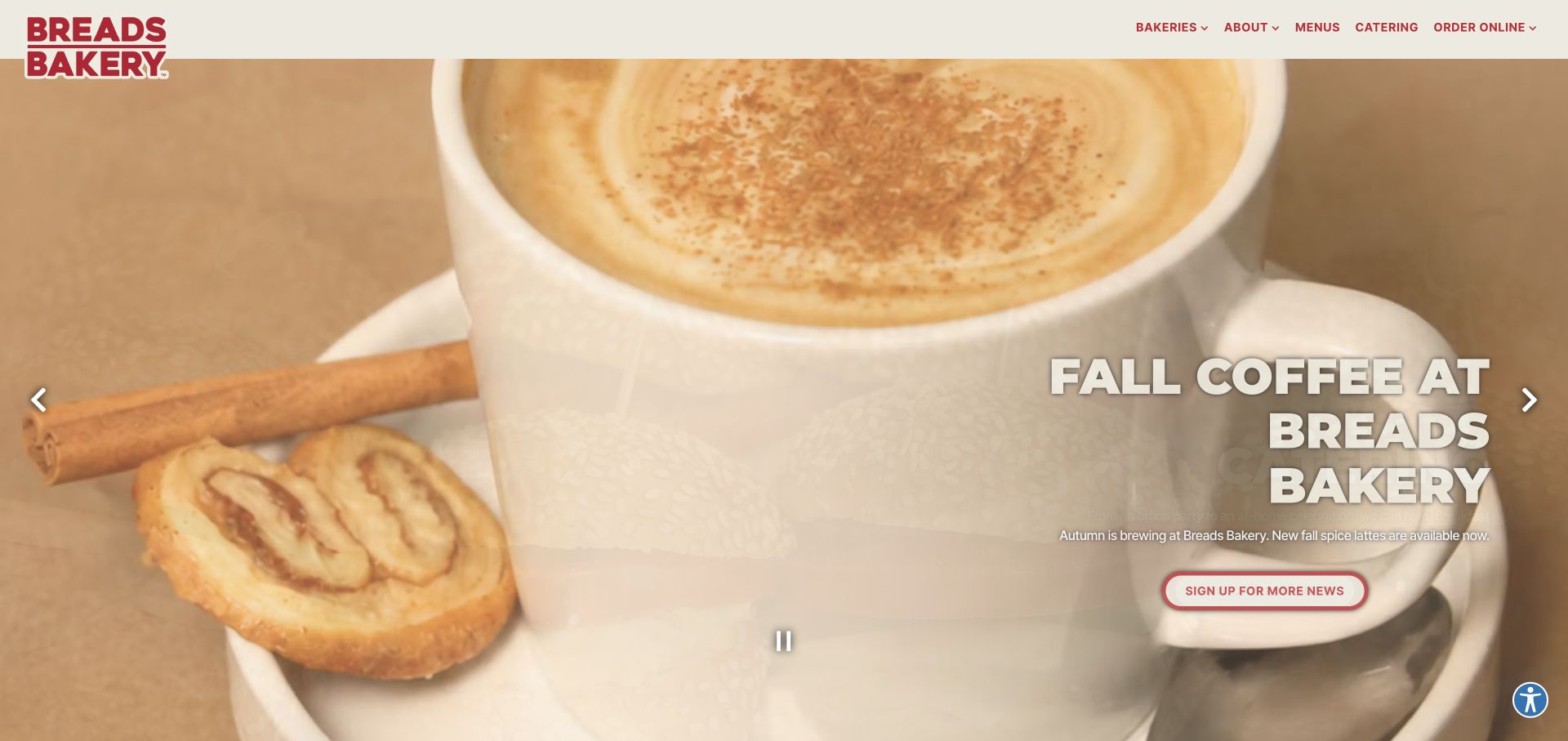
Breads Bakery combines a strong red wordmark with warm product photography and a rotating seasonal presentation. The reviewed page promoted coffee cake, pumpkin pastries, catering and drinks, while the top navigation retained bakeries, menus and online ordering. Below the carousel, product families and distinct local delivery and nationwide shipping sections broaden the entry points. This gives regular customers reasons to return without replacing the core structure needed by a first-time visitor deciding what the bakery sells and where to obtain it.
What you can learn
Use a seasonal carousel only as an additional entry point. Repeat important menu and order routes in stable page sections, and provide visible controls so the visitor can pause or move between promotions.
Pros
The compact navigation keeps bakery locations and menus available alongside changing promotional content.
Separate local and national fulfillment sections acknowledge that different products may require different order systems.
Cons & considerations
A rotating slide can move away from a message before a reader finishes its description.
Promotional text placed over a detailed food photograph needs careful contrast at every responsive size.
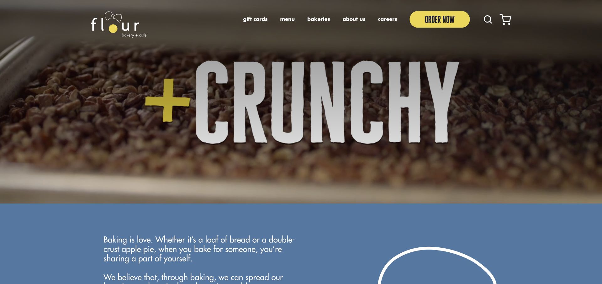
Flour’s homepage pairs a food preparation video with bold condensed lettering and a bright yellow order button. Beneath the opening, a blue section introduces the bakery’s personal voice, followed by distinct cards for catering, celebration cakes, seasonal ordering and its rewards app. A location section lists individual bakeries using expandable entries. The page presents Flour as an everyday neighborhood habit while still giving occasional customers a route to larger events and planned purchases, which are different tasks from buying lunch today.
What you can learn
Map the homepage to real service differences before choosing promotional artwork. A daily menu, a cake inquiry and a catered event should each explain their own lead times and collection arrangements.
Pros
The yellow ordering control remains visually distinct against the photographic opening and darker navigation.
Location entries and service cards make the breadth of the cafe group’s offerings understandable.
Cons & considerations
The video-led opening depends on a useful still image when motion does not load or is disabled.
App promotion and seasonal campaigns can compete with simpler information such as the nearest bakery’s hours.
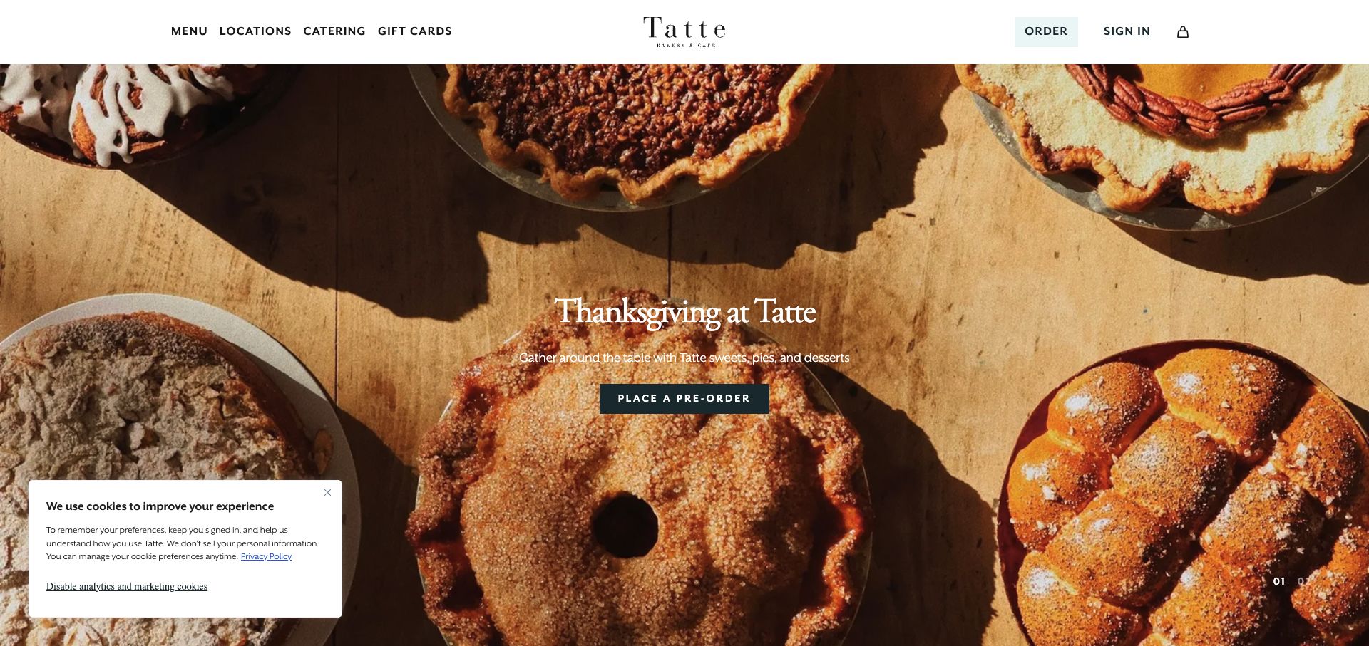
Tatte presents its seasonal desserts across a full-width tabletop photograph with a short central message and preorder button. A slim white header separates menu, locations, catering and gift cards from ordering and account access. The rest of the page moves between everyday meals, coffee, holiday pickup, cafe design and the brand story. This mixture makes the site useful as both a transactional destination and a picture of the cafe experience, provided the immediate ordering task remains clear beside the more leisurely editorial content.
What you can learn
Give a seasonal preorder a direct route, then explain its pickup window in ordinary text near the campaign. Keep daily ordering and menu discovery recognizable for visitors who are not planning ahead.
Pros
The overhead food photography shows several products in one coherent setting rather than disconnected thumbnails.
Evergreen navigation labels provide straightforward alternatives to the seasonal promotion in the hero.
Cons & considerations
White text over detailed photography can lose emphasis in brighter areas or smaller crops.
A carousel that mixes a meal campaign with holiday desserts needs clear labels for the different purchase timelines.
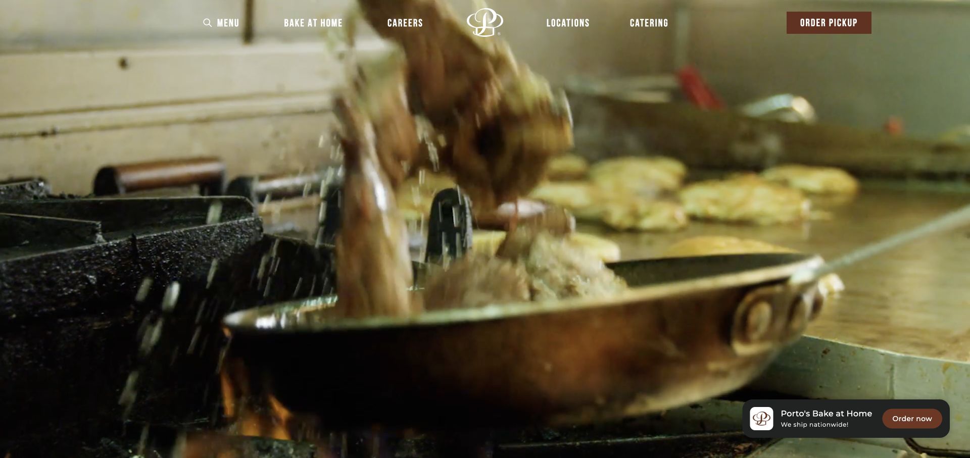
Porto’s introduces the bakery through moving kitchen and storefront imagery while its navigation gives order pickup a distinct button. An initial routing panel separates local pickup, bake-at-home shipping and catering, making fulfillment the first meaningful choice. After dismissal, the homepage continues with product features, shipping information and practical FAQs. This is a useful example of a bakery whose ordering complexity comes from how food is prepared and delivered, rather than simply from the number of products in the menu.
What you can learn
Name fulfillment routes in customer language before asking for products. A pickup order and a frozen bake-at-home shipment should not appear interchangeable, and location selection should happen before customers invest in a cart.
Pros
Pickup, bake-at-home shipping and catering are presented as visibly different services with specific labels.
The homepage connects product promotion with FAQs and bakery locations rather than relying on imagery alone.
Cons & considerations
The initial routing panel can interrupt someone who only wants to browse a menu or find hours.
Moving hero footage supplies atmosphere but needs a stable fallback and readable navigation over changing frames.
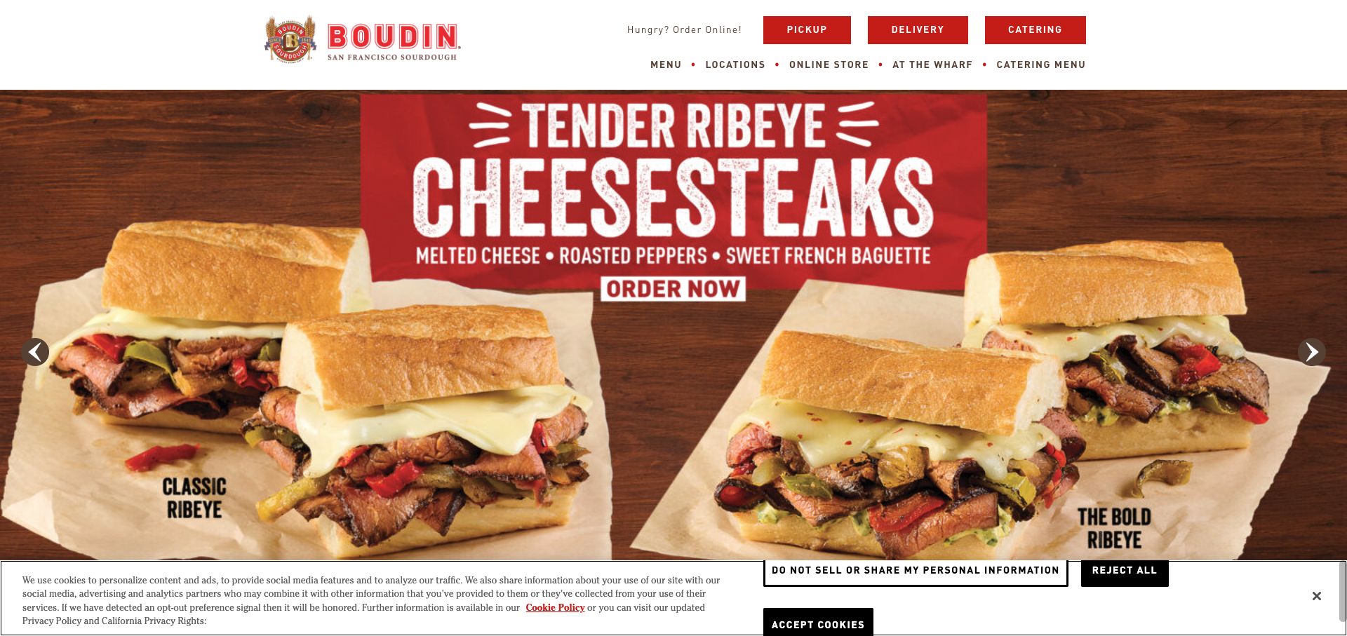
Boudin uses its red identity and crest above a large food campaign, with pickup, delivery and catering buttons grouped prominently in the header. A second navigation row handles menus, locations, the online store and the flagship wharf experience. Further down, the page describes sourdough heritage, cafe dining and bread gifts. The structure recognizes that a visitor may want a nearby meal, a shipped loaf or an introduction to the historic destination, and gives each task a named route.
What you can learn
Separate the meal-ordering service from shipped bakery goods when their catalogs and delivery rules differ. Use heritage storytelling to support those journeys, while preserving simple labels for customers arriving with an immediate task.
Pros
Three ordering modes are visible before the visitor reaches the body of the page.
The flagship experience is distinguished from everyday cafe locations and the separate online gift store.
Cons & considerations
A sandwich promotion can temporarily obscure the bread heritage that differentiates the broader brand.
The two navigation rows require careful prioritization on small screens to avoid an overcrowded header.
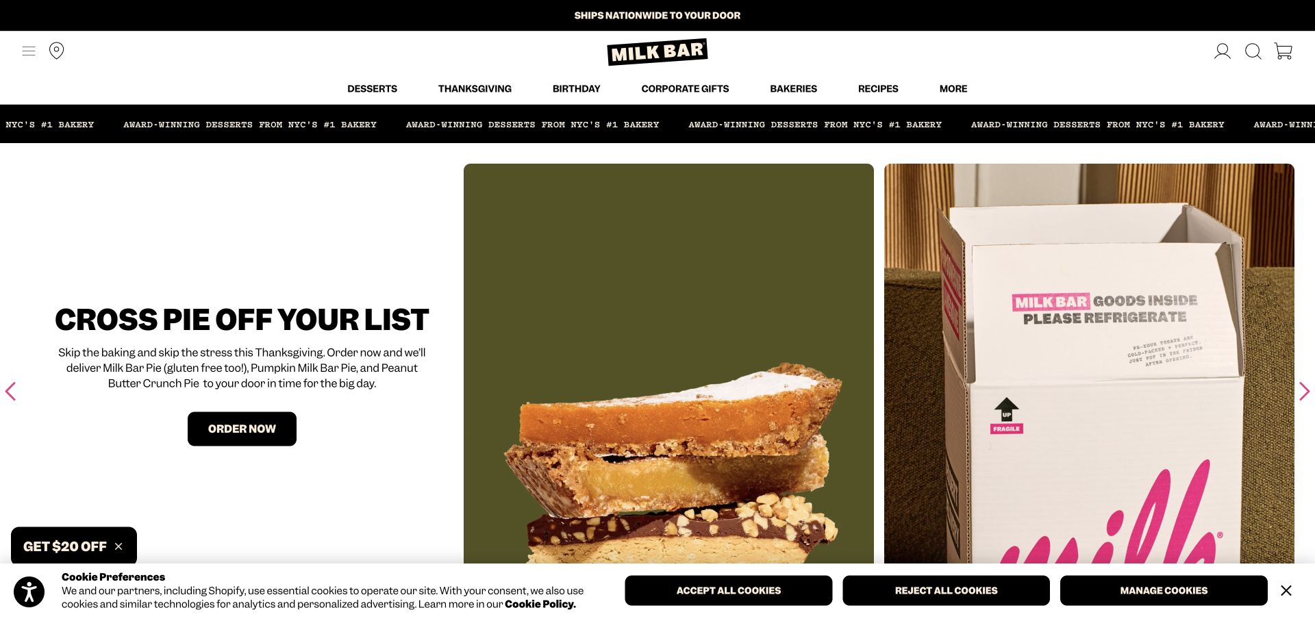
Milk Bar uses a blunt black-and-white identity, vivid product imagery and short promotional copy to make shipped desserts feel like a celebration purchase. The reviewed hero placed pie slices beside a branded delivery box, linking the product to its arrival experience. Navigation is organized around desserts, holidays, birthdays, corporate gifts and bakeries, with recipes offering a separate editorial route. The page is especially instructive for brands selling beyond their physical stores because packaging and fulfillment belong in the shopping story, not only in a policy page.
What you can learn
Show how a fragile or perishable product reaches the recipient, then connect the promise to clear shipping information. Occasion categories help gift buyers who know the event but have not chosen a dessert.
Pros
Product and shipping-box imagery make the online gift proposition immediately understandable in the hero.
Birthday and corporate gift categories describe customer intentions rather than only bakery production categories.
Cons & considerations
The initial discount popup occupied the full screen during the review and interrupted browsing.
Seasonal campaigns and multiple promotional strips can reduce the space available for practical delivery details.
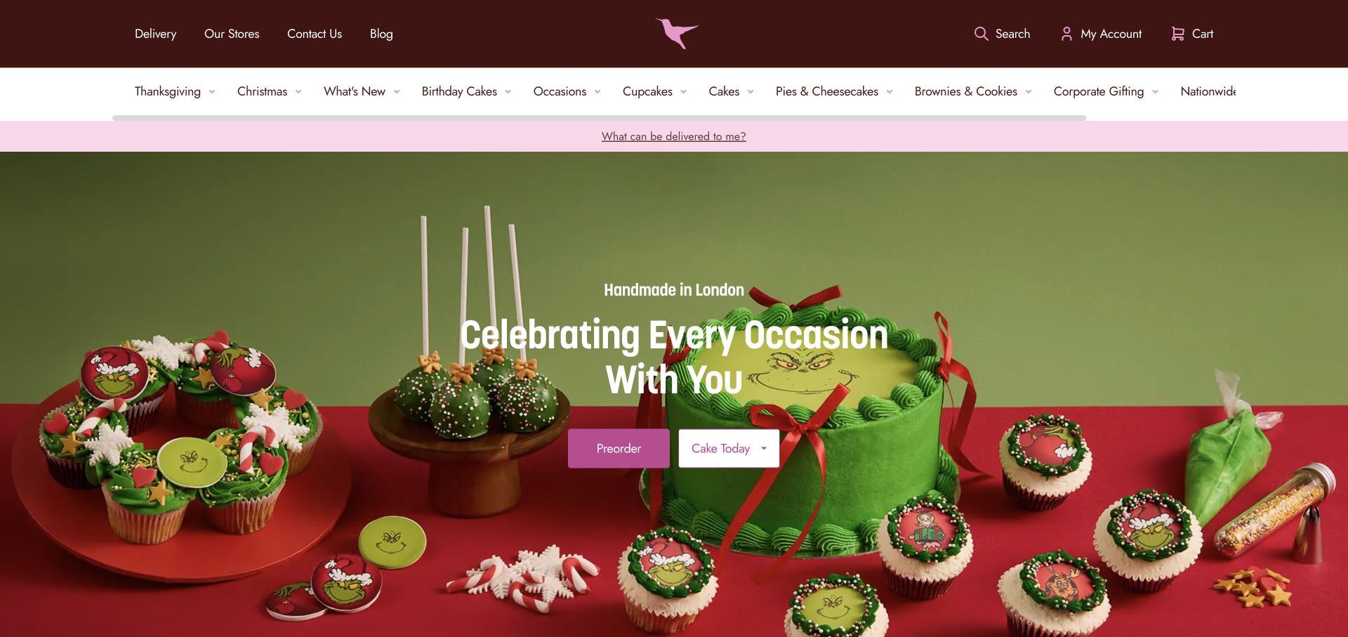
The Hummingbird Bakery uses a dark brown and pink identity above an extensive category navigation. The opening places decorated seasonal cakes in a staged scene and offers a choice between preordering and obtaining a cake today. A separate delivery eligibility prompt sits close to the navigation, while category tiles and best sellers follow beneath. This is a useful organization for customers whose main uncertainty is not whether they like a cake, but whether a suitable design can arrive at the right place and time.
What you can learn
Resolve delivery eligibility and timing early in a celebration purchase. A customer should understand the distinction between planned orders and same-day availability before comparing designs or investing effort in customization.
Pros
Preorder and same-day cake choices make two common purchase timelines visible from the opening screen.
The delivery eligibility link gives geographic constraints a clear place in the shopping journey.
Cons & considerations
The long horizontal category list can require scrolling and makes relative priorities harder to recognize.
Seasonal character cakes dominate the hero, so everyday occasions need strong alternative entry points below it.
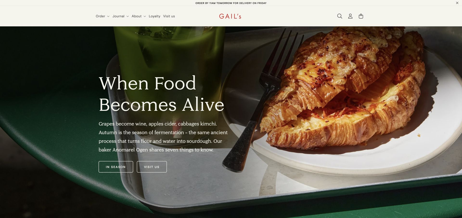
GAIL’s uses a restrained cream header, red wordmark and close food photography to introduce an editorial story about fermentation. The hero links to seasonal content and bakery visits, while the navigation separately offers ordering, journal, loyalty and locations. Subsequent sections connect a particular pastry with its ingredient makers and then return to products. This is a coherent example of explaining why a menu item exists, allowing the bakery’s craft and supplier relationships to give context to an otherwise familiar food photograph.
What you can learn
Tie editorial stories to a specific product and a useful next action. An ingredient article becomes practical when readers can locate the pastry, see the current menu or find a bakery serving it.
Pros
The opening connects a visible pastry with a focused editorial theme instead of a generic brand slogan.
Journal and ordering routes coexist without requiring all visitors to read the story before shopping.
Cons & considerations
An editorial headline may leave a first-time visitor looking for prices or the main product range.
Seasonal stories need maintenance when the featured item changes or disappears from local bakery menus.
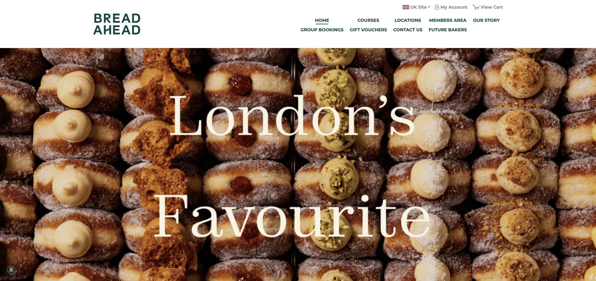
Bread Ahead leads with an oversized doughnut photograph and a simple green wordmark, but its navigation reveals a broader business: courses, group bookings, gift vouchers, locations and a member area. The homepage highlights the bakery school, workshop cards with starting prices and seasonal classes. This makes the site a useful reference for a bakery selling knowledge as well as food. A visitor can understand that a class is a separate bookable experience rather than an informal event hidden in the bakery’s news feed.
What you can learn
If classes are a meaningful service, give them a structured catalog with dates, locations, skill expectations and booking terms. Keep bakery visits clearly separate so prospective students and hungry customers can identify their routes.
Pros
Workshop cards expose starting prices and named skills before visitors enter a detailed course page.
Group bookings and gift vouchers are visible navigation destinations for different kinds of class buyers.
Cons & considerations
The large photographic opening communicates bakery appeal before explaining the emphasis on education.
Multiple regional sites and workshop formats need careful location labeling to avoid booking the wrong venue.
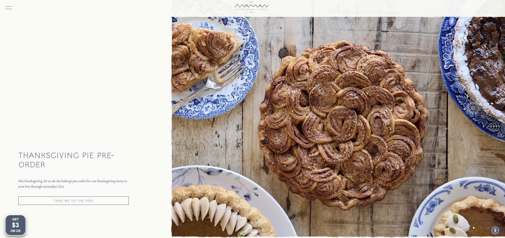
Maman pairs pale backgrounds and delicate lettering with richly styled food photography and recognizable blue tableware. The reviewed seasonal slide placed a short pie preorder message in a narrow text column beside a large dessert composition. A compact menu contains daily ordering, locations, cookie gifts, events and catering, while additional sections introduce the cafe network and brand story. The design emphasizes the atmosphere of a table and gathering, which is relevant to event customers as well as people choosing an individual pastry.
What you can learn
Use a consistent visual setting to connect products with the experience customers are buying. Support the lifestyle presentation with plainly labeled ordering routes and explicit campaign deadlines, especially when events and shipping use separate processes.
Pros
A distinct tableware and photography style gives different seasonal products a recognizable shared identity.
The menu acknowledges events, catering and cookie gifts as separate reasons to engage with the bakery.
Cons & considerations
The small menu icon makes the breadth of practical navigation less visible at first glance.
Fine lettering and generous empty space require careful checking for readability on smaller screens.
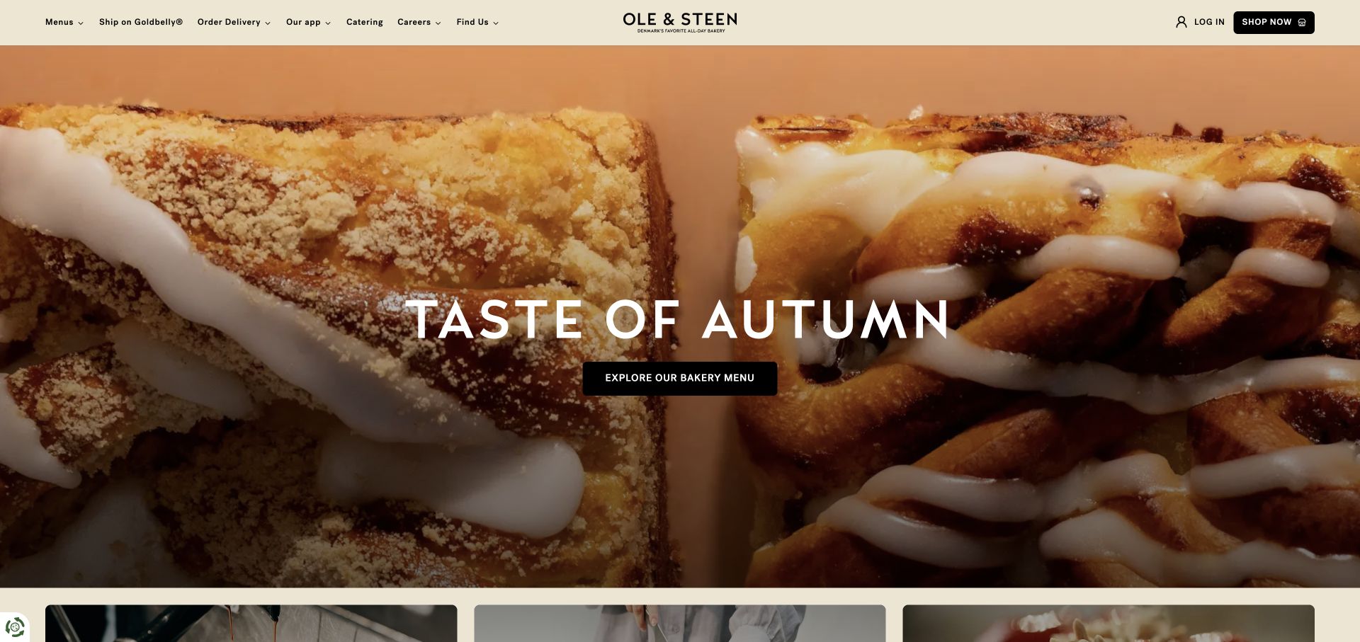
Ole & Steen uses a warm cream header and a close pastry photograph to introduce its seasonal menu. The central headline and dark menu button keep the first decision simple, while the navigation distinguishes local delivery, shipping, catering, the app and bakery discovery. Below, broad product and location sections offer another way into the site. The composition shows how a bakery can maintain a calm visual hierarchy even when it operates several services, by giving one primary message to the hero and keeping secondary choices in stable navigation.
What you can learn
Choose one primary homepage action and keep the supporting services predictable. A short seasonal campaign can work well when visitors can still reach locations, everyday menus and the correct fulfillment provider without searching.
Pros
The hero has a single obvious menu action with strong contrast against the food photograph.
Shipping and local delivery have different labels, helping customers recognize that the services are distinct.
Cons & considerations
The opening photograph and seasonal headline provide little detail about individual products or prices.
App, catering and delivery links need consistent destination descriptions to prevent fragmented experiences across providers.
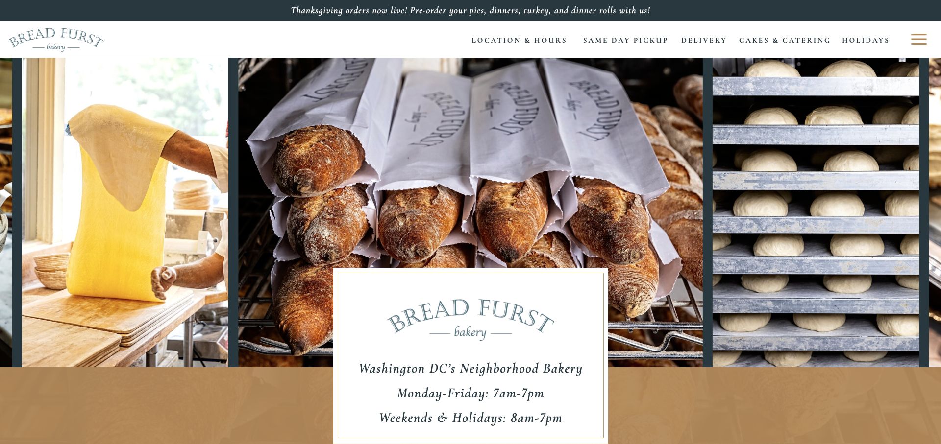
Bread Furst places bakery hours prominently in a framed panel over a collage of dough, bread bags and proving trays. The header gives location information, same-day pickup, delivery, cakes, catering and holidays their own labels. Rather than implying the website contains the full daily assortment, the body explains that visitors will find additional seasonal and experimental products in the bakery. This manages the relationship between a changing physical counter and a more selective online menu, an issue many small bakeries face.
What you can learn
Be explicit about what the online menu represents. If the counter changes throughout the day, explain that limitation and provide dependable hours and contact information rather than presenting a static page as live inventory.
Pros
Opening hours are part of the first-screen composition, directly supporting the decision to visit.
Same-day ordering and holiday or catering purchases are separated with descriptive navigation labels.
Cons & considerations
A broad collage can delay the appearance of individual products and their available ordering formats.
Visitors relying on a static menu still need a clear way to confirm a particular item before traveling.
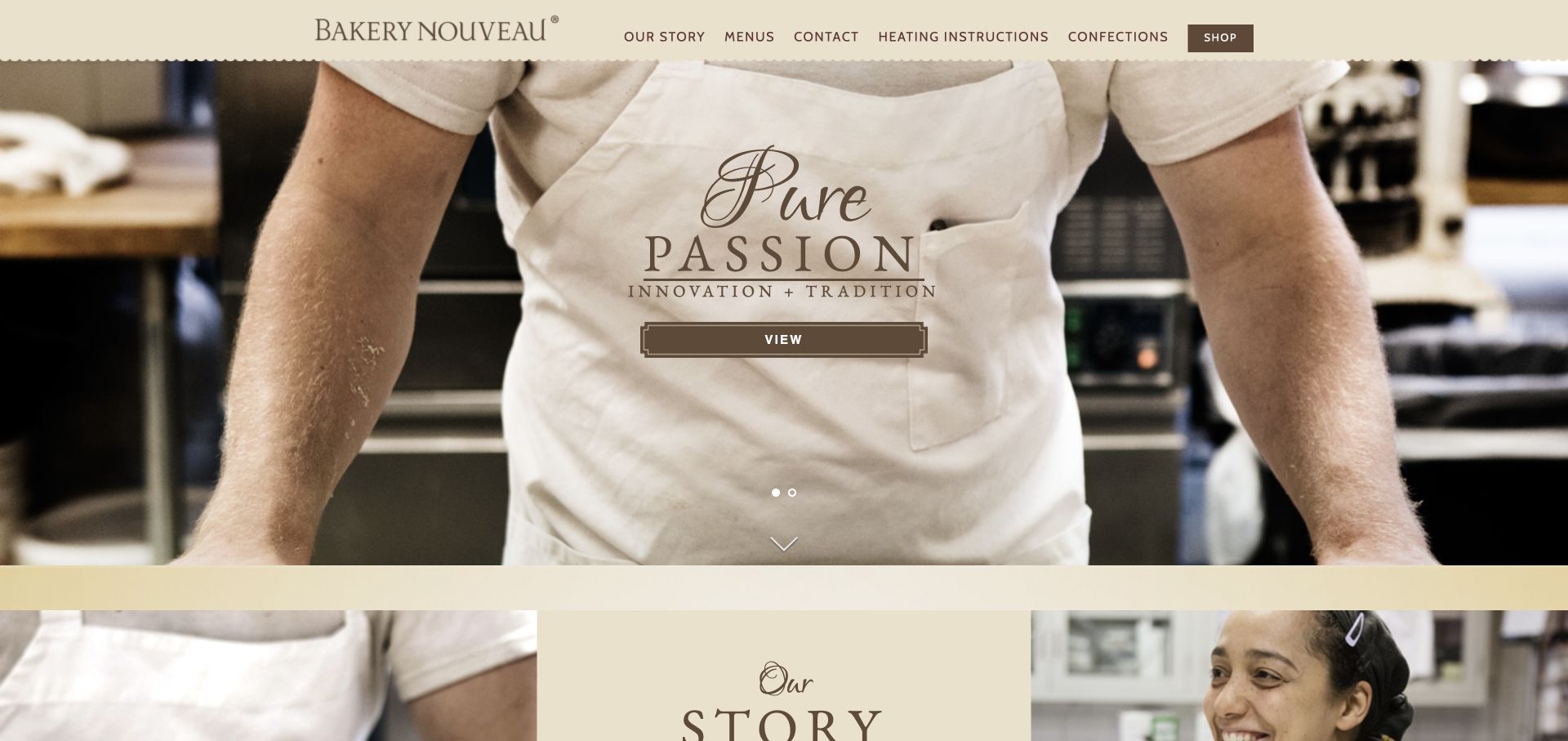
Bakery Nouveau uses a close baker portrait, traditional typography and a scalloped header edge to establish a handcrafted identity. Its navigation stays concise, combining story, menus, contact, heating instructions, confections and shopping. Beneath the opening, a narrative introduction and creation imagery lead to hours and named locations. Heating instructions are a particularly useful addition: they recognize that the customer experience continues after purchase and that pastry care can be a practical reason to return to the website.
What you can learn
Include useful after-purchase information where customers can find it again. Storage and reheating guidance should be attached to the relevant product type, while location pages continue to answer the basic questions needed for a visit.
Pros
The maker-focused photography communicates the production setting rather than relying only on finished product images.
Heating instructions receive a main navigation link, giving practical support unusual prominence.
Cons & considerations
The hero’s generic viewing action explains less than a specific menu or bakery-location label would.
Opening hours and address information appear lower on the page than the initial story-led presentation.
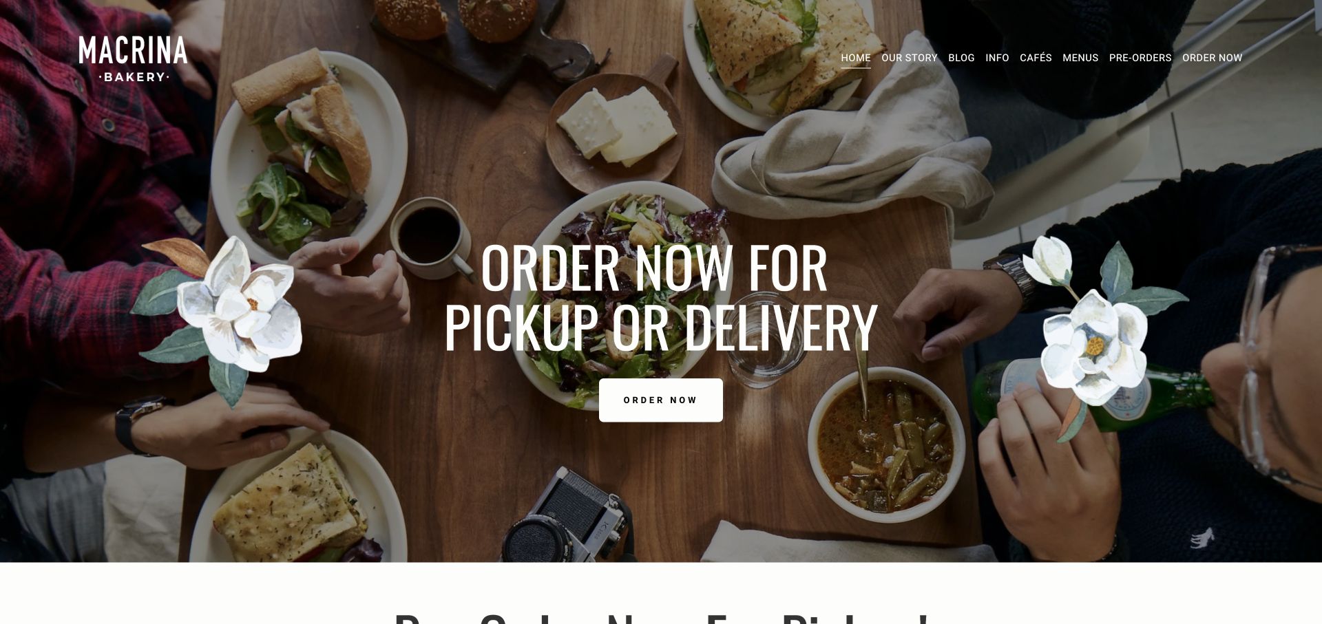
Macrina opens with an overhead table photograph, floral accents and an unusually explicit pickup-or-delivery message. The header separates menus, cafes, preorders and ordering, while the page below explains a deadline for special orders and reminds customers to check cafe hours. Other sections introduce loyalty, subscriptions and editorial recipes. The most useful lesson is the distinction between buying from today’s availability and scheduling something made in advance; that difference is operationally important even when the two paths share the same bakery identity.
What you can learn
Treat scheduled collection as its own service, with a visible cutoff and location rules. Keep routine ordering easy to recognize, and repeat the advance-order requirements near the relevant selection controls.
Pros
The first-screen message clearly names pickup and delivery instead of using a vague shopping invitation.
Special-order timing appears in ordinary page text, giving customers practical planning information before checkout.
Cons & considerations
Preorders and order-now links can still feel similar unless the destination pages reinforce their different timelines.
Loyalty, subscriptions and recipe content add competing secondary goals to an already broad homepage.
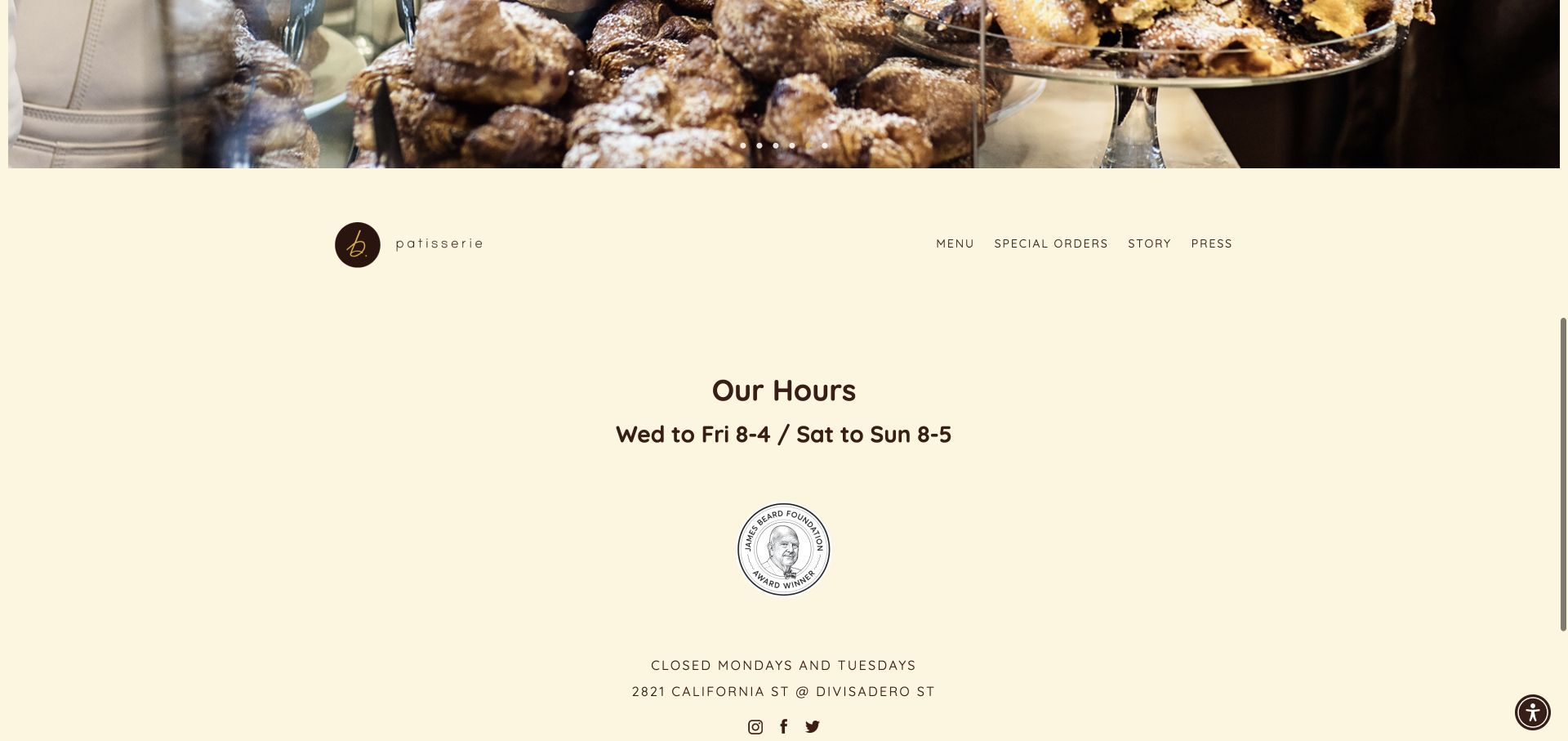
b. patisserie places an expansive pastry gallery before a minimal cream section containing its wordmark, a short navigation row and opening hours. The lower homepage makes closure days and the street intersection easy to read, with contact details nearby. This is a deliberately small information model: menu, special orders, story and press cover most of the public site. It demonstrates how a bakery can avoid a large promotional catalog when its main purpose is to help people recognize the food and plan a visit.
What you can learn
A small bakery site can be concise, but its essential visit information should not depend on a long scroll. Pair the image-led introduction with accessible shortcuts to hours, address, menu and special-order requirements.
Pros
The hours section uses ample spacing and direct wording, including the days the bakery is closed.
A short navigation list gives the limited content structure a clear and manageable scope.
Cons & considerations
The initial full-screen gallery delays practical information and may leave first-time visitors without context.
A sparse homepage needs detailed special-order and menu destinations to answer questions about products and availability.
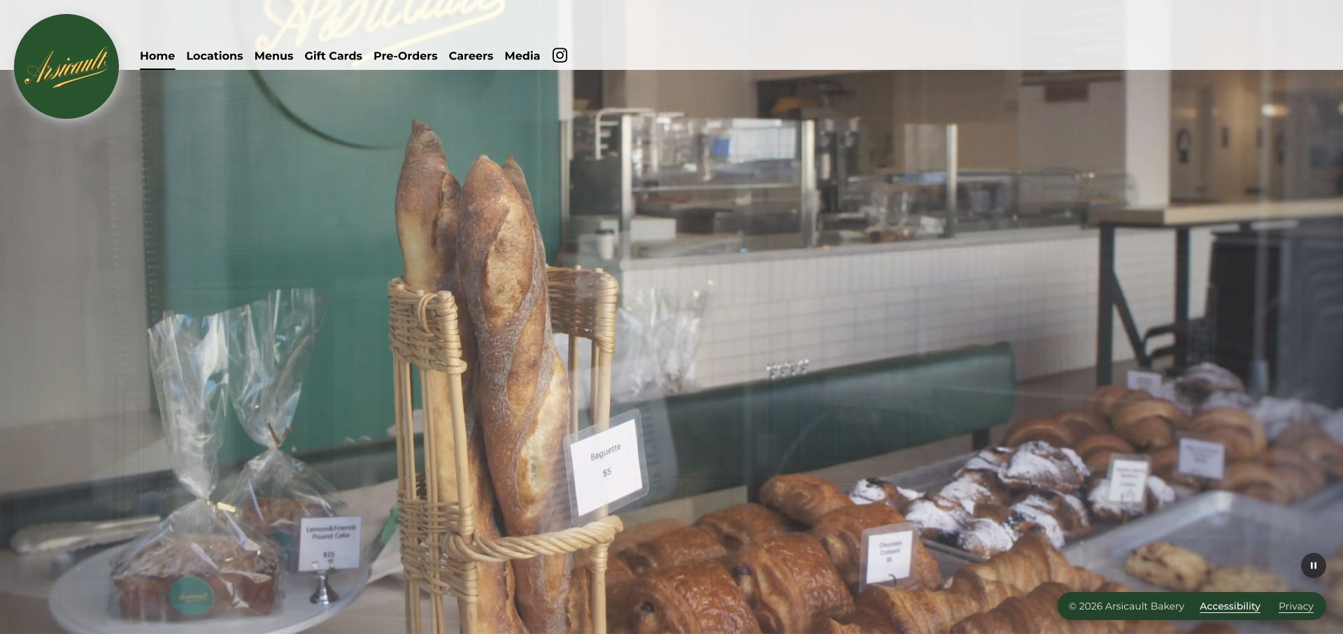
Arsicault’s homepage uses footage of the bakery counter as its main surface, with a green circular mark and a direct horizontal navigation across the top. Locations, menus, gift cards and preorders are named plainly, while the rest of the page remains exceptionally sparse. The counter view shows breads and pastries in their real retail setting rather than a studio arrangement. This suits a bakery where customers are likely to want a location or menu quickly, as long as those linked pages carry the information the homepage intentionally omits.
What you can learn
A minimal homepage works only when its next destinations are precise. Keep menu, location and preorder labels explicit, and ensure each destination answers availability and collection questions without requiring another round of navigation.
Pros
The navigation uses familiar task labels that can be understood without reading a brand story.
Retail counter imagery gives prospective visitors a concrete sense of the bakery environment.
Cons & considerations
The opening offers little text explaining the bakery or its specialties beyond the visual scene.
A video-dominant layout needs readable controls, a pause option and a useful static fallback.
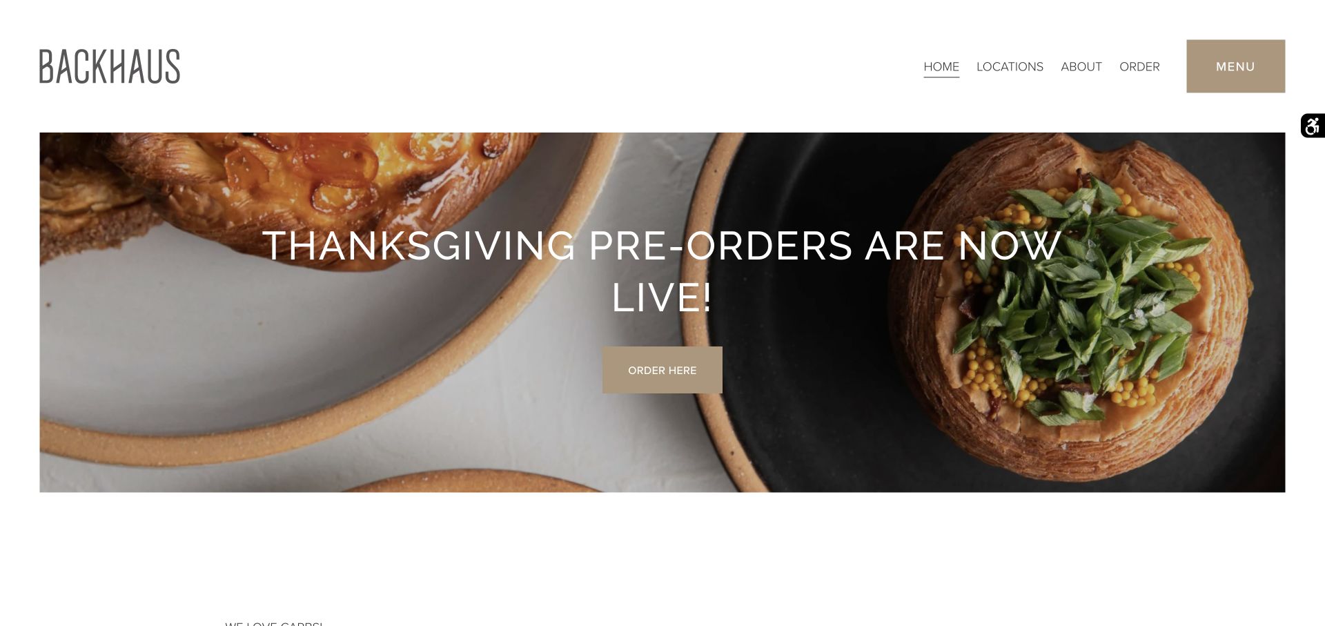
Backhaus combines a spacious white header, narrow wordmark and seasonal pastry photograph with an explicit preorder announcement. The body then provides named locations, hours, contact details and a note explaining how seating works at one outpost. Product descriptions give context to individual pastries without pretending the site is a complete live inventory. The result balances a timely sales message with the information a neighborhood customer needs before visiting, including differences between branches that could easily be lost in a generic locations grid.
What you can learn
Use location content to describe the actual visit, not merely an address. Hours, seating arrangements, brunch windows and preorder collection rules are useful distinctions that should be attached to the relevant branch.
Pros
The homepage combines a timely seasonal action with direct access to menus and location information.
Branch descriptions include practical differences in service instead of repeating identical generic descriptions.
Cons & considerations
A hiring popup appeared over the seasonal campaign and interrupted the first view during review.
The large seasonal hero should be retired or updated promptly when the ordering window ends.
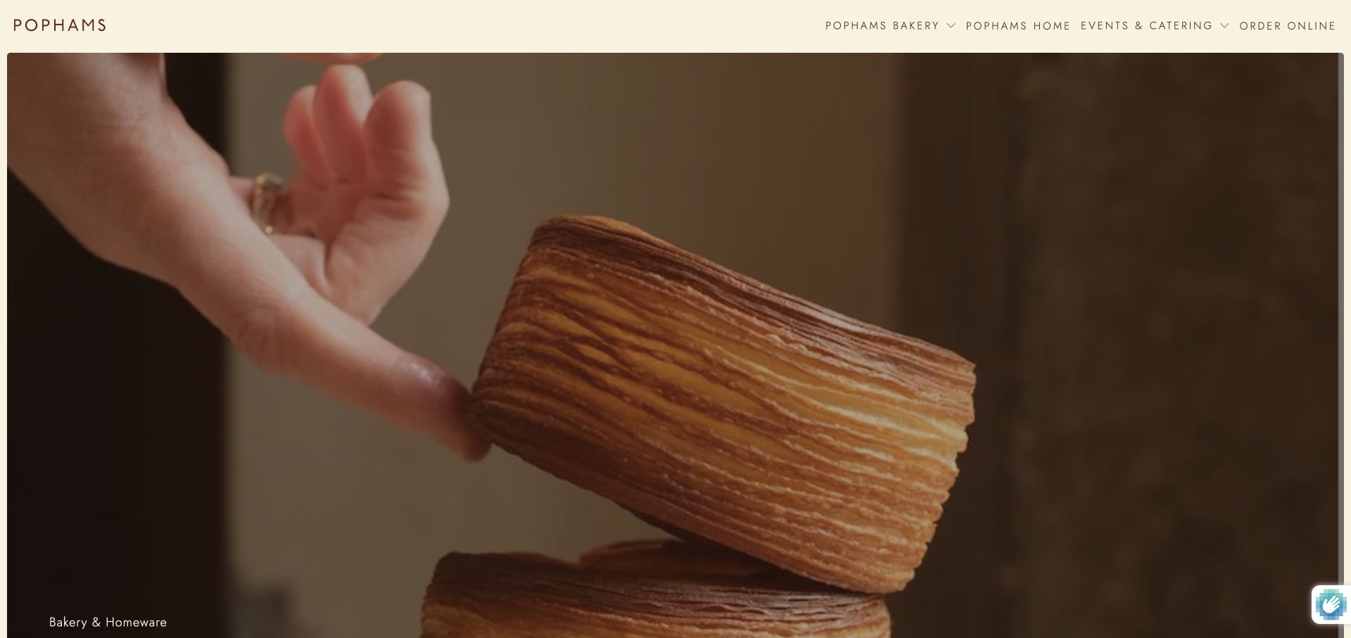
Pophams uses a close pastry preparation video beneath a slim cream header with restrained brown lettering. Its main navigation separates the bakery, homeware, events and catering, and online ordering. The body explains the relationship between pastries, coffee and the ceramics or textiles used in its spaces, giving the expanded product range a coherent context. This is a useful reference for a bakery that sells adjacent objects: the site can explain why those products belong together instead of presenting an unrelated shop beside a food menu.
What you can learn
Connect adjacent retail categories through the real customer experience, but preserve clear task boundaries. Someone buying a pastry should be able to find food availability without navigating through homeware or event services.
Pros
The main navigation distinguishes bakery visits, homeware shopping and catered events with explicit category names.
Close preparation imagery supports the site’s emphasis on craft and the physical details of its spaces.
Cons & considerations
The opening video contains little practical information, placing more responsibility on the navigation and lower content.
A lifestyle expansion can dilute the bakery’s core ordering route if secondary categories receive equal prominence everywhere.
Collect the recurring questions asked by phone and at the counter: opening times, special orders, cake portions, delivery areas, sold-out items and holiday collection. Turn those questions into a small set of useful pages and clear navigation labels. Avoid creating a separate page for every product variation when a well-structured menu would be easier to maintain.
Document each order handoff
Identify which system receives daily orders, which person handles custom cakes and how catering requests are confirmed. Describe the next step accurately: a request form may begin a conversation rather than reserve an order. If a third-party ordering service is used, tell customers which location and fulfillment mode they are entering before the handoff.
Prepare a practical photography and update plan
Photograph signature products, the bakery environment and the real team with permission. Record which images are seasonal and which are suitable for year-round use. Assign responsibility for hours, menu changes, holiday deadlines and unavailable products. A small current site is more useful than a large gallery whose attractive products can no longer be ordered.
The editing job behind the design
Choose systems that reflect the bakery operation
A modest CMS can handle menus, location records, stories and special-order information. Store shared details such as addresses and opening hours once, while allowing each branch to publish genuine differences. If a PDF menu is offered, also provide readable web content so customers can understand the range without downloading a file.
Choose commerce, pickup scheduling and catering integrations around the existing production process. Confirm that capacity limits, collection slots and lead times can be expressed clearly. Preserve a useful contact route if an embedded tool fails. This collection assigns no unverified platform labels; the visible appearance of an inspiration site is not evidence of its underlying stack.
Our WordPress website examples offer a separate look at publishing approaches. A visible platform label is evidence for that named page, not a guarantee that the same system will suit your requirements.
Before the public launch
Bakery website launch checklist
Confirm every branch address, opening time, closure day and contact route with the bakery team.
Distinguish same-day ordering, advance collection, local delivery, shipped products and catering.
Publish relevant lead times, collection windows and seasonal cutoffs beside the ordering route.
Review product descriptions, ingredient information and photography against the current menu.
Check mobile menus, contrast over food images, keyboard access and paused-video or static fallbacks.
Test each external ordering handoff and confirmation in an approved test workflow.
Assign an owner to remove expired campaigns and update availability or branch information.
These checks are a project checklist, not a performance, legal, security, or accessibility certification. Test real journeys with the people responsible for the website before making claims about the result.
Sources & editorial method
How this collection was selected and reviewed
We reviewed 22 distinct official bakery websites through direct browser observation and saved genuine, unmodified browser screenshots of the public views shown. The examples include neighborhood bakeries, cafe groups, shipped-dessert brands and a bakery school. Reviews describe observable presentation and customer journeys, with tradeoffs framed as design considerations. Source companies retain their visible brand marks and website designs. Capture dates are recorded per example; no unsupported technology attribution is assigned.
Each example links to its actual source page. Screenshots are direct browser captures with their own capture dates; moving imagery, announcements and live designs can change. The notes describe observable design choices and conditional tradeoffs, not measured traffic, conversion results, service quality, or accessibility conformance.
Technology labels use public page metadata, asset evidence, or explicitly cited platform documentation. Platform documentation is not a complete current deployment audit. A component reference may be legacy or unused; it is not a complete backend inventory. Unknown stacks are omitted. These sites are editorial examples, not our client portfolio.
Written, Edited and Curated are separate editorial records, not timestamps advanced by a rebuild. Website designs and imagery belong to their owners. See our editorial standards or suggest a correction.
Questions worth asking
Bakery website design questions
Does a bakery need a full online store?
Only when the business can reliably support the ordering process. A local bakery may be better served by accurate menus, hours and a clear special-order route. Add checkout when inventory, production capacity, collection timing and customer support can be maintained consistently.
How should a bakery show items that change daily?
Explain whether the online menu is representative or reflects current availability. Use a maintained daily selection when feasible, and provide a direct way to check a particular item. Avoid an unqualified availability promise attached to a photograph that may remain on the site for months.
Should holiday preorders take over the homepage?
They can receive a prominent campaign section when the deadline matters, while everyday menus and branch information remain accessible. State the order cutoff and pickup window in readable text. Plan the replacement content before the campaign ends so the site does not advertise an expired collection.
What belongs on a custom cake page?
Explain the available styles, portion guidance, lead time, collection or delivery arrangements and how the inquiry is handled. Show representative work with appropriate permission. Clearly distinguish an inquiry from a confirmed order, and place practical limitations near the request form rather than only in a separate FAQ.
Borrow the presentation ideas that fit the bakery, then build around its real menu, capacity and customer routines. A useful site connects an appealing photograph with a clear and dependable way to visit, order or plan ahead.