A good coffee website helps people choose a coffee they can enjoy with the equipment and routine they already have. Attractive packaging and origin stories work best when the practical details are equally clear.
Coffee customers arrive with different levels of knowledge. One person wants to reorder a familiar espresso blend, another wants a forgiving first bag for a home brewer, and another is comparing unusual processing methods. A useful roaster website gives each of them a starting point. It can tell a compelling story about a producer while still stating the bag weight, grind options, roast direction and shipping expectations in plain language.
These 22 distinct official coffee roaster websites demonstrate approaches to that balance. Some lead with agricultural imagery or detailed release stories; others emphasize subscriptions, everyday blends, cafés or new beverage formats. The reviews examine visible design and content, with genuine browser captures of the public views shown. They do not assess the coffee itself, verify promotional awards or infer sales performance from appearance.
Before the examples
What makes good coffee roaster website design in 2026?
Help customers compare the cup they want
Give each coffee a consistent set of useful attributes: flavor notes, roast direction, origin, process, caffeine category and recommended preparation where appropriate. Explain unfamiliar terms without making the page feel like an exam. Pair specialist details with a short description of the drinking experience, and make decaf and familiar everyday options easy to find.
Show the purchase unit and preparation choices
Place bag weight, price and whole-bean or ground options together. If several weights are offered, explain which price is shown in the catalog. Cans, pods, instant servings and gift sets need equally clear quantity labels. Distinguish a one-time order from a recurring subscription before the customer reaches the final purchase step.
Connect freshness claims with operational information
Explain the roasting and dispatch rhythm the business can actually maintain. Distinguish a roast date, dispatch estimate and delivery estimate instead of treating them as interchangeable. Limited lots and preorder releases should state their timing and availability accurately. Keep café hours and location pages maintained for people whose next step is a visit rather than a shipped order.
The collection · 22 examples
22 coffee roaster websites worth studying
Compare how these roasters help customers move from interest to selection. Notice the balance between campaign photography, flavor guidance, subscriptions, café information and the practical unit being sold.
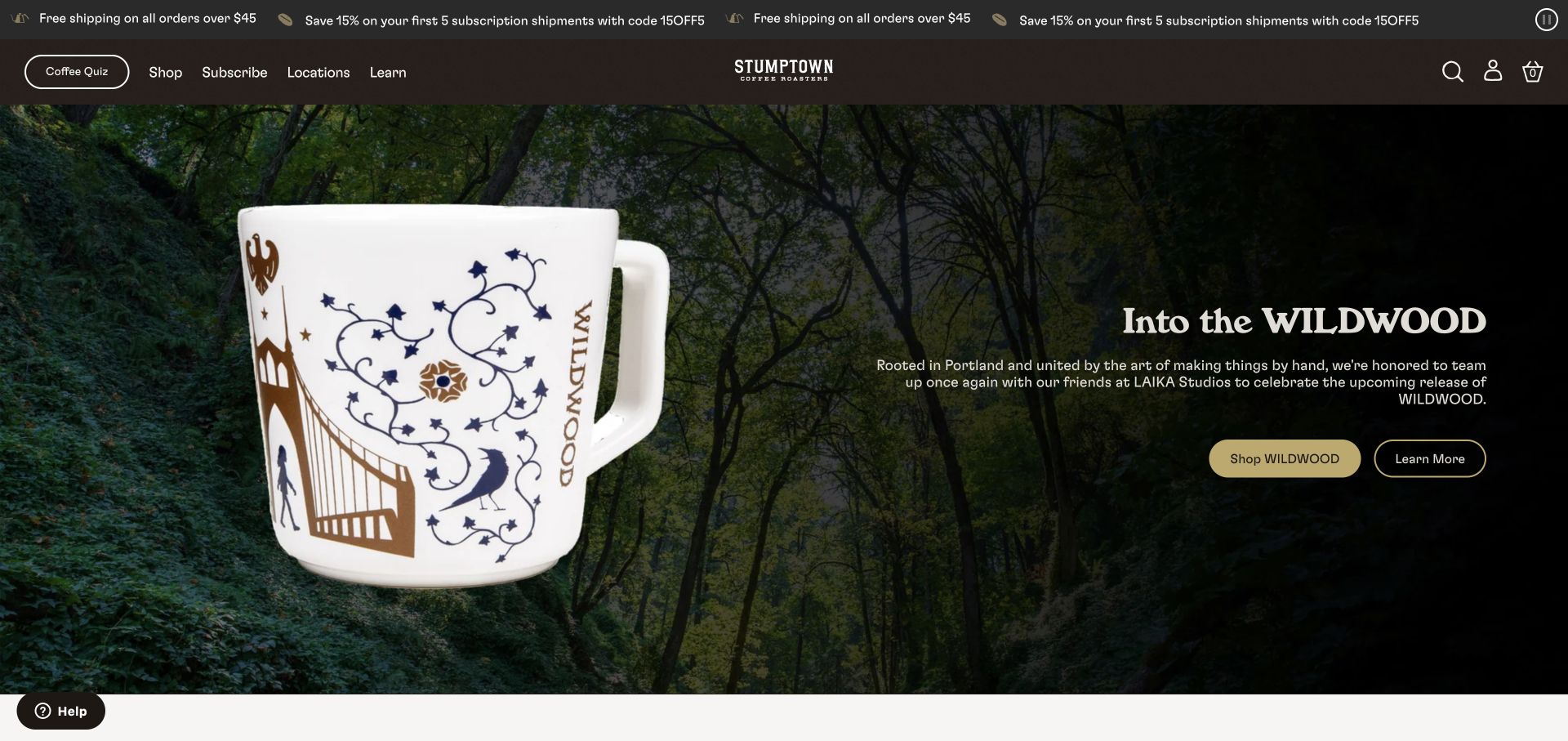
Stumptown gives its Wildwood collaboration the scale of an editorial cover. A large illustrated mug sits against a forest scene, while the neighboring copy and shopping links explain the campaign. The dark header keeps familiar routes to coffee, subscriptions, locations and learning available above the spectacle. Farther down, product collections and a coffee quiz offer more practical starting points. The result connects coffee with a recognizable creative world while retaining a conventional retail structure for visitors who already know what they want.
What you can learn
Give a collaboration one focused visual story, then preserve an obvious route to the everyday coffee range. A campaign can express personality without requiring every visitor to understand the cultural reference before shopping.
Pros
The illustrated product and landscape create a memorable campaign composition with clear visual ownership.
Persistent coffee, subscription and location links support several different reasons for visiting the same storefront.
Cons & considerations
A visitor arriving primarily for beans may need to move past merchandise and collaboration storytelling.
Prominent campaign imagery needs concise supporting copy so the offer remains understandable without prior brand knowledge.
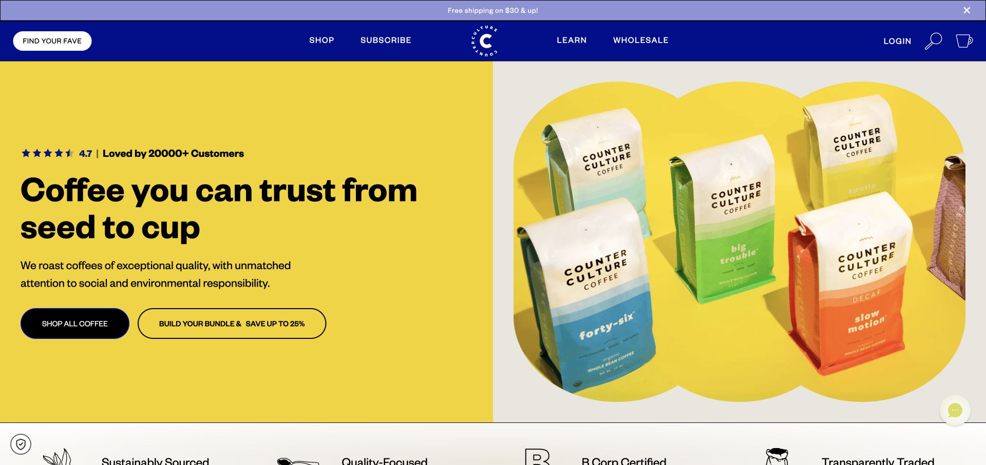
Counter Culture uses a strong blue header and yellow campaign area to frame its white coffee bags and colorful labels. The main navigation makes finding a favorite, shopping, subscribing and learning separate actions. Below the hero, coffee cards expose useful details such as roast level, tasting notes and decaf or half-caffeine distinctions. Those details help translate the brand presentation into a comparison task. The site also presents sourcing and certification messages, which operate as brand claims in this review rather than independently verified conclusions.
What you can learn
Pair distinctive packaging with consistent product attributes. Visitors should be able to compare likely flavor, caffeine category and roast direction before opening several separate product pages or committing to a recommendation flow.
Pros
Strong color blocks make the product photography easy to identify without overwhelming the navigation labels.
Product descriptions provide several concrete ways to distinguish coffees beyond the name printed on each bag.
Cons & considerations
Multiple routes into the catalog can feel similar unless each explains the kind of help it provides.
Certification and sourcing language needs accessible supporting information for readers who want to evaluate those statements.
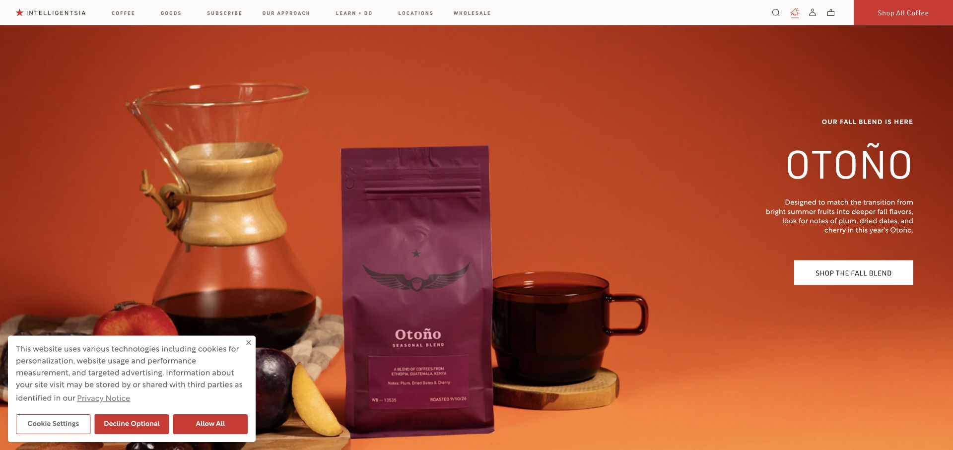
Intelligentsia places its seasonal Otoño blend in a vivid orange scene with coffee equipment, fruit and a contrasting bag. The composition gives flavor and season a visual role while a thin white header keeps the broader store organized. Coffee, goods, subscriptions, locations and learning are all named directly. Lower sections lead into espresso, single origins and the full range, alongside a subscription explanation that discusses amount, frequency and management. The page offers a strong campaign image while still describing the ongoing service behind a repeat order.
What you can learn
Use seasonal imagery to make a particular release recognizable, but explain subscription choices in ordinary operational terms. Quantity, timing and the ability to change an order are more useful than an abstract promise of convenience.
Pros
The orange setting and purple packaging distinguish the seasonal feature immediately from the neutral site chrome.
The subscription explanation surfaces practical choices that customers need before starting recurring deliveries.
Cons & considerations
A large seasonal feature can delay comparisons between everyday coffees for visitors entering through the homepage.
Small navigation typography and text over photographs deserve careful testing at narrower sizes and different contrasts.
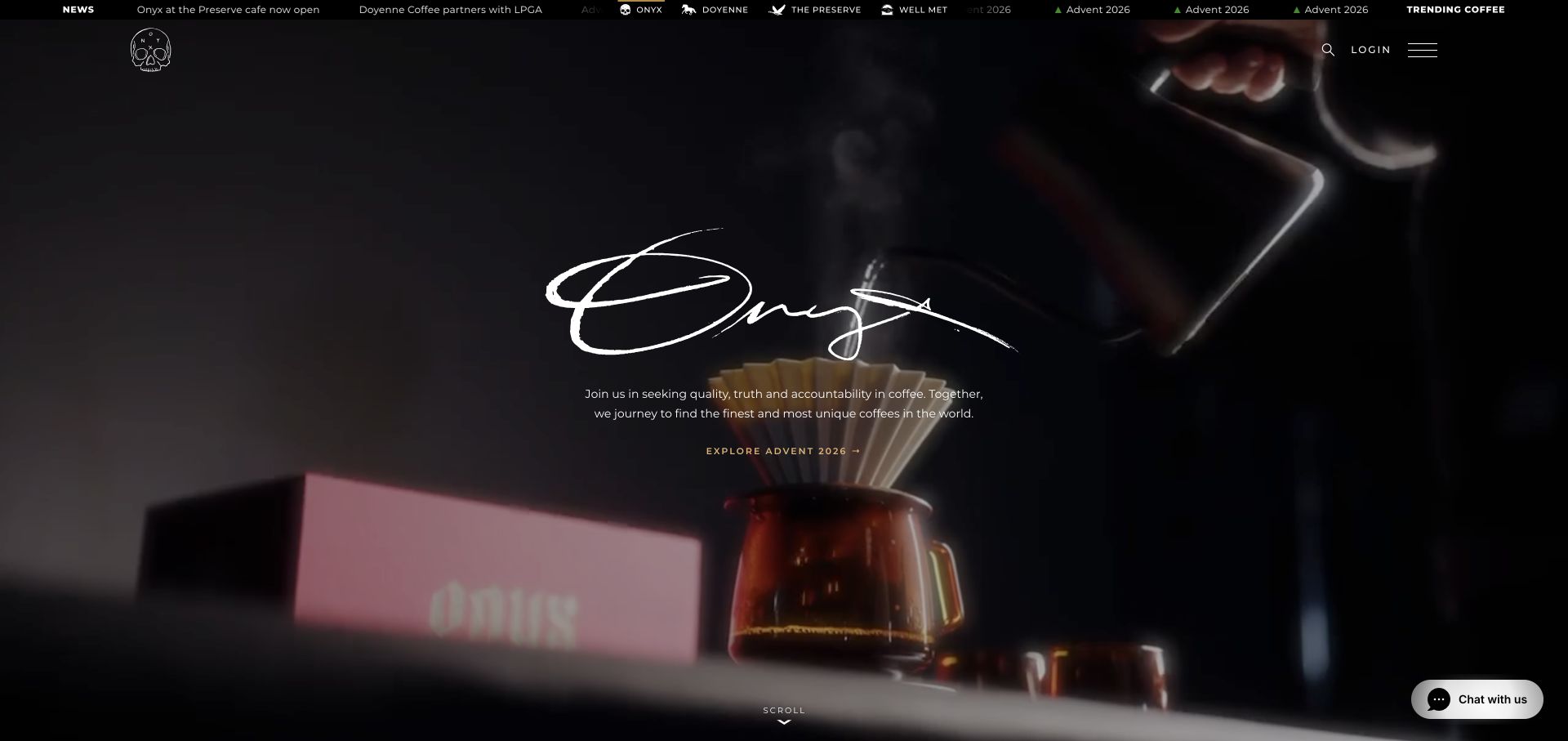
Onyx opens with a dark, cinematic brewing scene, a large signature wordmark and a compact statement of purpose. An Advent release receives a direct action within that atmosphere. The header relies on a small menu control rather than displaying the entire catalog at once. The page then expands into coffee, tea, chocolate, goods and related projects, including product and location stories. This is an example of a roaster using the homepage as a brand experience before asking the visitor to navigate a substantial retail and editorial offering.
What you can learn
A cinematic entrance needs a clear next action and an equally clear route to the complete range. Make the essential message and buying paths work when video is paused, unavailable or intentionally reduced.
Pros
The dark palette, brewing imagery and distinctive lettering create a consistent and immediately recognizable mood.
The wider product and project stories show how a roaster can organize a broader creative business.
Cons & considerations
A compact menu hides category choices until the visitor deliberately opens the navigation.
Motion and a large atmospheric hero require static alternatives and careful attention to the legibility of overlaid text.
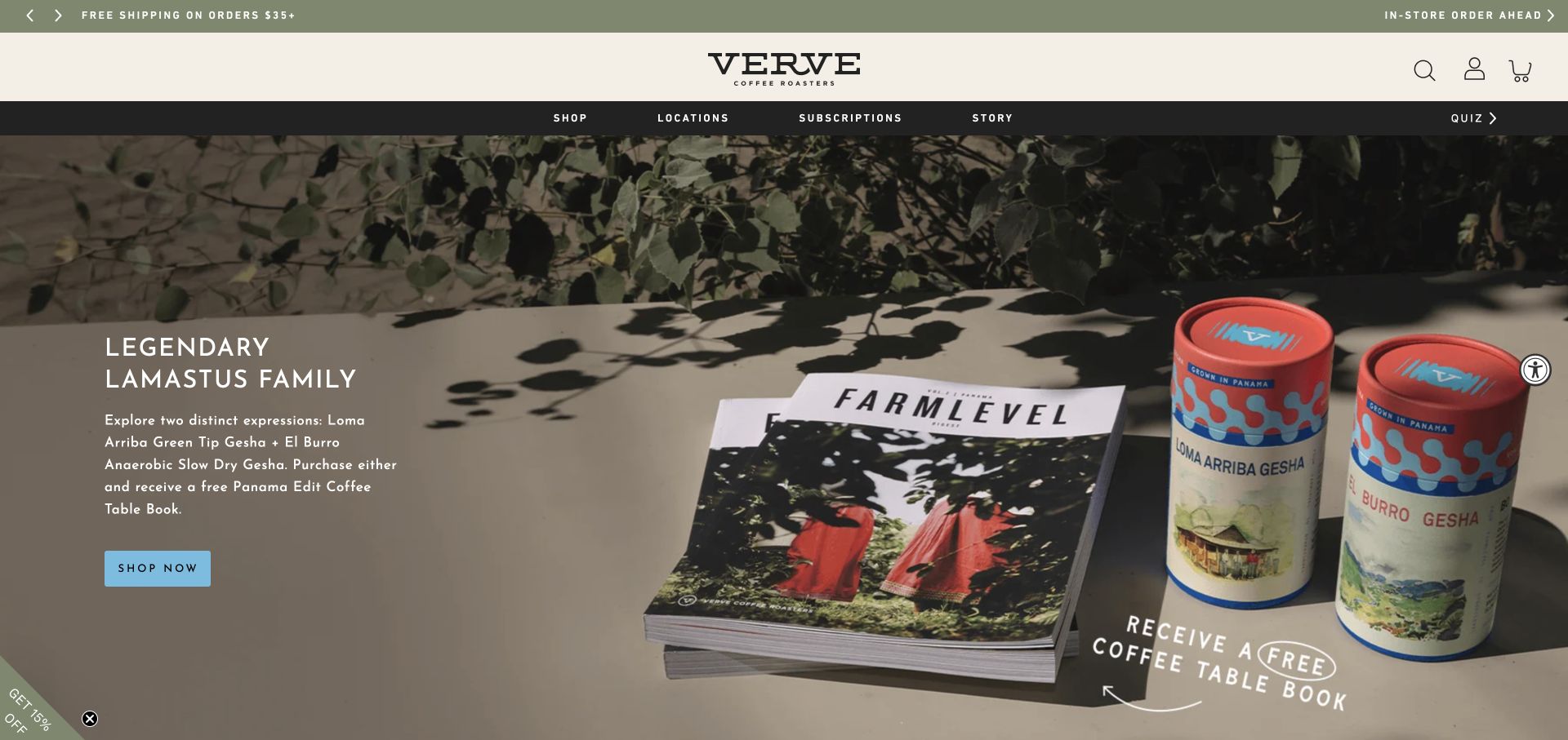
Verve presents a special Lamastus family release through a composed photograph of packaging and a coffee table book. A cream masthead and muted green announcement area create a quiet frame, while a blue action stands apart from the product scene. The navigation keeps shopping, locations, subscriptions and a quiz readily available. New-arrival cards lower on the page include details such as bag size, grind selection, tasting notes and price. This connects the carefully styled limited release with the concrete information needed to choose and prepare a coffee.
What you can learn
Rare releases benefit from context, but the basic purchase unit must remain explicit. Keep bag weight, preparation choices and price close together so premium storytelling does not make the actual offer harder to understand.
Pros
The campaign photograph gives packaging and accompanying objects room to communicate a considered product experience.
Visible product attributes provide practical context beyond a producer name or an evocative release title.
Cons & considerations
Specialty names and unfamiliar processing terms can still require additional explanation for someone buying their first bag.
A prominent rare release may make the everyday range less obvious unless catalog and quiz links remain easy to find.
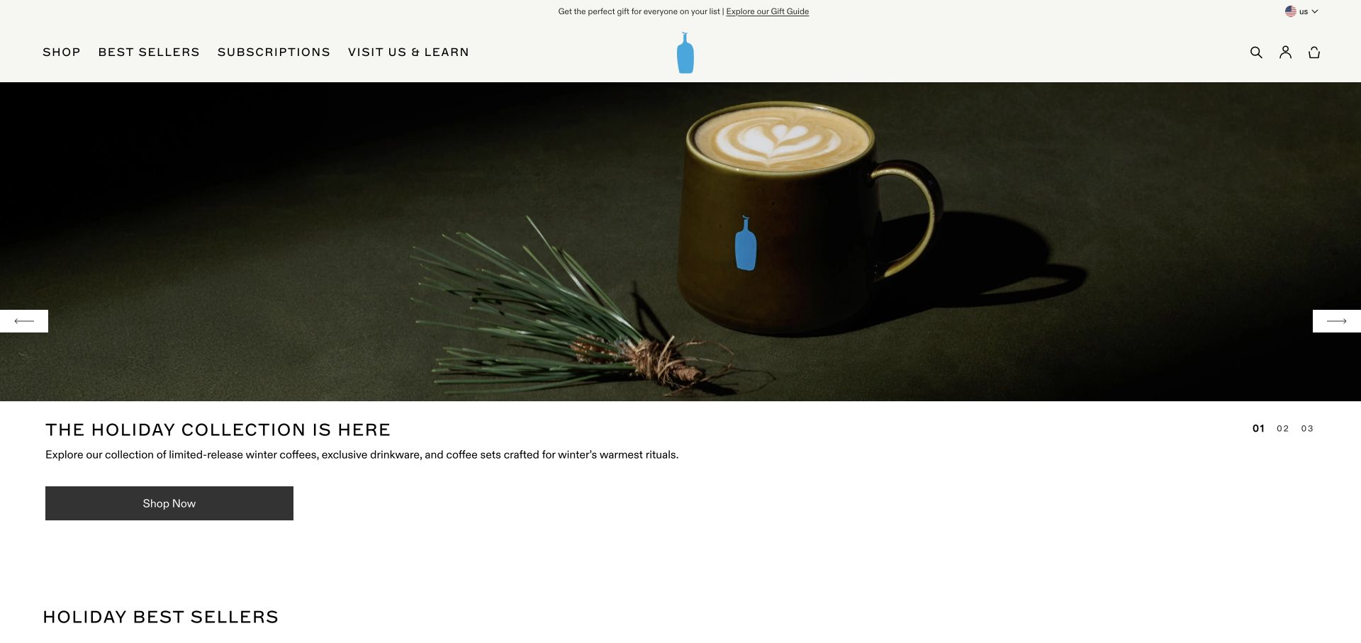
Blue Bottle uses a restrained cream header and its small blue bottle mark to frame a large seasonal photograph. A green mug and gift-oriented styling establish the campaign, while the headline and shopping action sit in a separate light area beneath the image. This separation keeps the message from competing directly with the photograph. The visible site offers best sellers, subscriptions and visiting information alongside holiday sets and instant latte products. The homepage therefore acts as a calm introduction to several product formats and a physical café network.
What you can learn
Separate campaign copy from complex photography when readability matters more than a full-bleed effect. Keep the distinction between beans, prepared formats and café visits visible as the seasonal collection grows.
Pros
A limited color palette and generous image space create a composed presentation without dense promotional decoration.
The separate copy area gives the campaign a clear reading position outside the main product photograph.
Cons & considerations
Seasonal gifts and instant formats can postpone the first comparison between regular bags of coffee.
A quiet visual system needs sufficiently clear labels so subtle styling does not make important navigation easy to overlook.
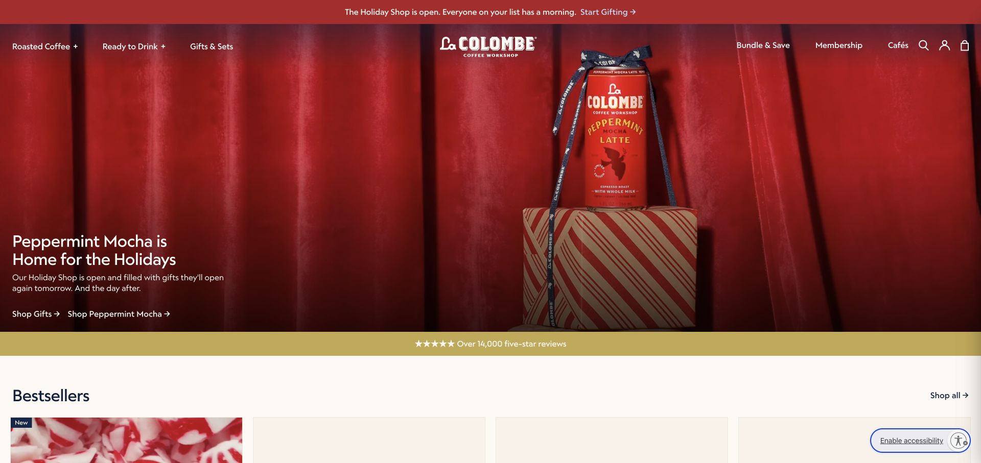
La Colombe makes product format part of the main navigation, with roasted coffee and ready-to-drink ranges named separately. Its red seasonal hero promotes a peppermint mocha can through prominent packaging and a short campaign message. Gift sets, bundles, membership and cafés provide additional routes around that feature. The product sections combine beans and canned drinks with prices and short descriptors, making the page useful for a business whose customers may buy very different versions of the same brand. The design problem here is maintaining clarity as those formats share one storefront.
What you can learn
Organize a mixed coffee business around what the customer receives. Beans, cans and sets need distinct quantity and format labels, even when a common campaign style ties the collection together.
Pros
The main navigation explicitly separates roasted coffee from prepared drinks before customers enter the catalog.
Large packaging photography makes the seasonal product format understandable without relying only on its promotional name.
Cons & considerations
Mixed product grids need consistent units so a bag price is not mistaken for the cost of a multi-can set.
Bundles, membership and ordinary shopping create several offers that require clear explanations of their differences.
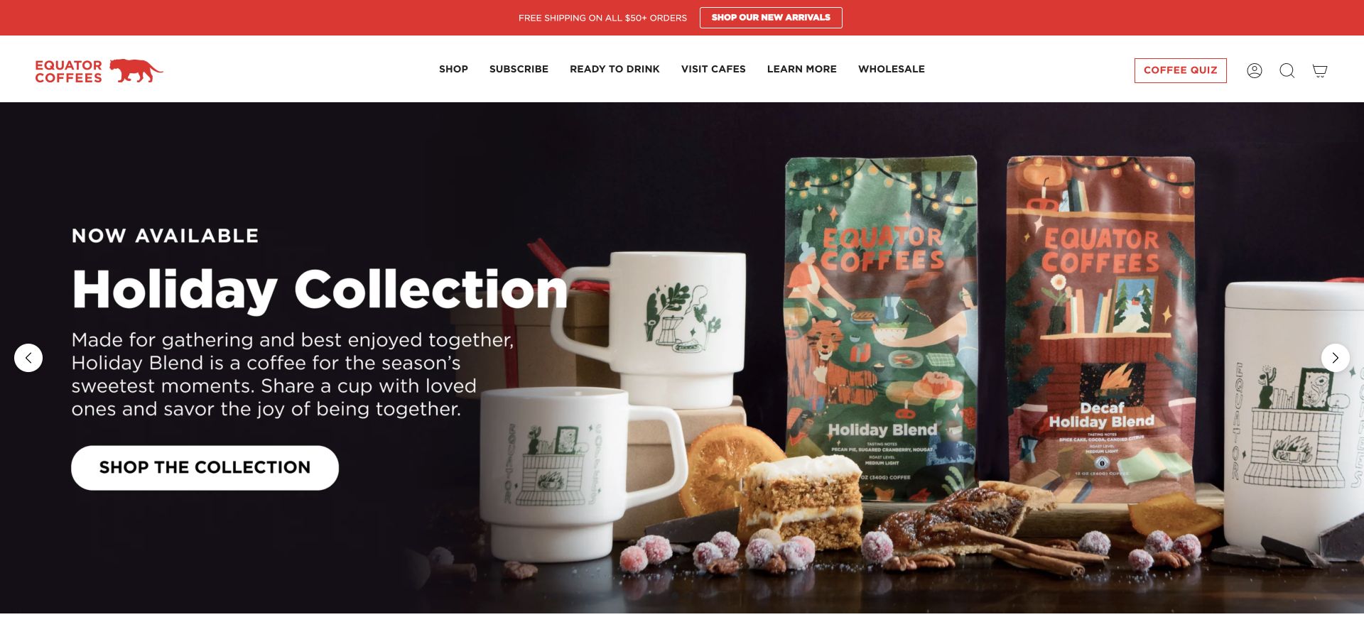
Equator pairs its red tiger identity with a broad, clearly labeled navigation covering shopping, subscriptions, ready-to-drink products, cafés and learning. The seasonal hero uses a dark backdrop and illustrated bags, allowing the package design to carry much of the visual character. Below it, collections such as best sellers, new arrivals and single origins give the catalog several entrances. Featured collaborations and a coffee quiz add further ways to explore. The page illustrates how a recognizable package system can anchor a fairly expansive retail and hospitality offering.
What you can learn
Let packaging establish identity, then add discovery tools that answer different customer questions. A quiz should help an uncertain buyer, while collections and a direct shop route should remain efficient for experienced customers.
Pros
The tiger mark, red accents and illustrated bags give the seasonal section a coherent visual identity.
Named collections and a visible quiz provide alternatives to browsing the complete catalog without assistance.
Cons & considerations
Numerous catalog entrances can overlap unless their labels explain the intended difference between each route.
A packaging-led hero still needs accessible roast, format and flavor information for customers choosing by practical preferences.
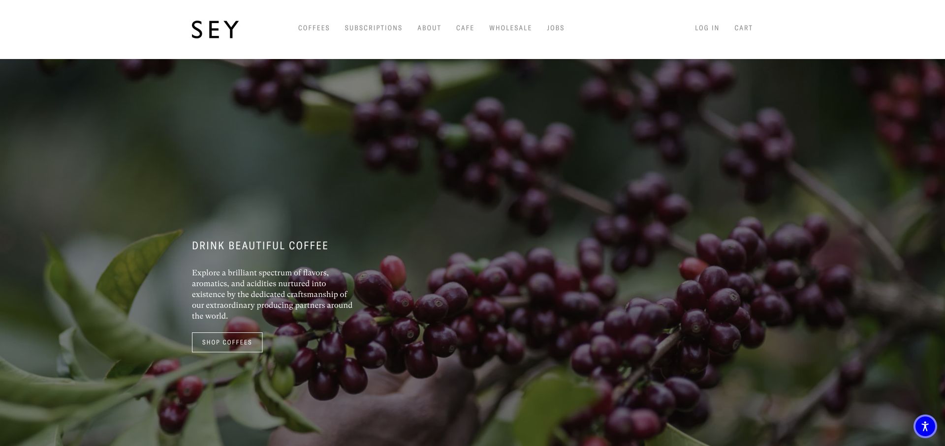
Sey places coffee fruit and branches across nearly the entire first screen, with a compact introduction and shopping action over the lower-left portion of the image. A spare white header presents coffee, subscriptions, the café and wholesale without promotional clutter. The page continues with its approach, subscription information and a producer spotlight. This gives the growing and sourcing side of coffee a prominent visual position before the customer encounters a large product grid. The overall presentation is restrained, with relatively little decorative interface competing with the subject matter.
What you can learn
A minimal origin story works best when its next step is explicit. Keep the language welcoming enough that visitors can understand what distinguishes the coffee without already knowing specialist terminology.
Pros
The close view of coffee fruit links the brand introduction to the agricultural source of the product.
A short navigation makes the main customer and business routes easy to distinguish at a glance.
Cons & considerations
Small text over a detailed photograph requires careful contrast and responsive type sizing to remain comfortable to read.
A concise specialty voice may leave new buyers looking for more direct flavor or brewing guidance before ordering.
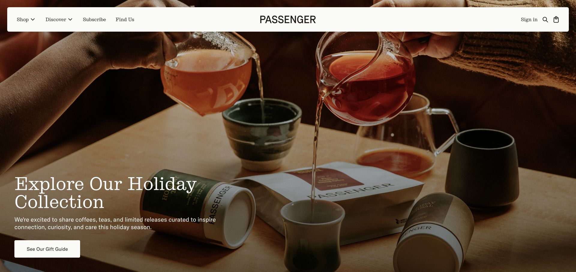
Passenger frames a warm tabletop scene with a rounded floating navigation bar and a seasonal gift-guide message. The photograph shows coffee and tea as part of a shared occasion rather than presenting isolated bags alone. Below the campaign, the site connects its product range with farmer relationships and presents origin names, tasting notes and prices. A tasting set provides a specific example of turning different processing approaches into something a customer can compare. The homepage combines an inviting lifestyle introduction with a more detailed specialty catalog underneath.
What you can learn
Use approachable imagery to welcome customers, then make exploration concrete through comparable products or tasting sets. Explain what the comparison teaches rather than assuming every visitor understands the distinction between processing methods.
Pros
The shared tabletop photograph connects packaged products with a recognizable serving and gifting occasion.
Origin details, tasting notes and a comparative set give curious visitors substantive ways to explore the range.
Cons & considerations
A seasonal gift guide can distract from an everyday reorder if the direct coffee route is not retained prominently.
Coffee, tea and gear need clear product-type labels when they appear within the same discovery journey.
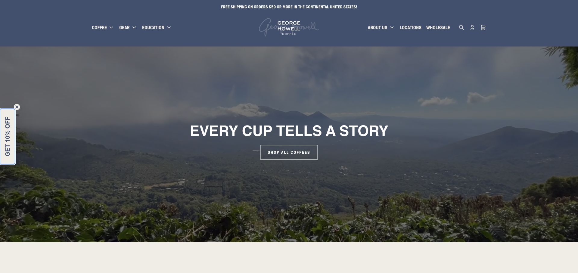
George Howell uses an origin landscape behind a centered headline and shop action, beneath a muted blue header. The navigation brings education and locations into the same visible tier as coffee and gear. Lower sections connect flavor exploration, cafés, classes and brewing equipment. A limited-roast section explains a particular sale and roasting rhythm, giving the customer more operational context than a generic limited-edition badge. Regional browsing also appears in the catalog. The page is useful as a reference for connecting retail discovery with education and a recurring release schedule.
What you can learn
When a coffee follows a release calendar, explain the dates and sequence near the offer. Educational content becomes more useful when it connects directly to selecting a coffee, preparing it or attending a relevant class.
Pros
Education and café information are first-class navigation choices rather than being buried in a generic company section.
The limited-roast explanation gives customers a concrete framework for understanding when a particular coffee is offered.
Cons & considerations
Regional browsing alone may not help someone who knows a preferred taste but does not recognize coffee origins.
Release schedules require ongoing maintenance so an attractive campaign does not leave stale purchase expectations online.
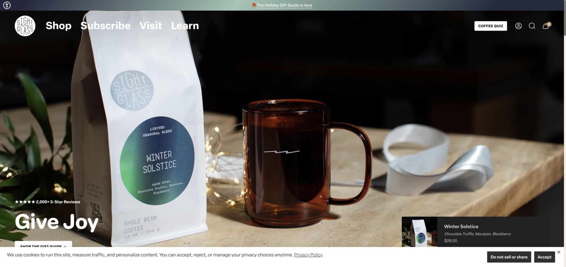
Sightglass uses a large seasonal scene featuring a coffee bag and mug, paired with a short gifting headline. A compact product annotation on the right identifies the featured coffee and presents descriptive information alongside its price. That small retail layer makes the campaign more specific than a photograph with only a broad shop button. The white header offers shopping, subscriptions, visits and learning. Lower on the page, coffee collections include favorites, new releases, espresso, blends and single origins, with flavor notes helping customers read the range beyond the packaging.
What you can learn
Give a campaign photograph a concise product explanation. A visitor should be able to identify the featured coffee and understand its basic appeal before moving from the seasonal story into the full catalog.
Pros
The product annotation links the emotional campaign image with a specific coffee and a visible price.
Flavor-oriented card information creates another comparison point alongside familiar coffee category labels.
Cons & considerations
A very large hero can still postpone seeing several coffees together, particularly on shorter screens.
Overlay cards and large photography require responsive testing so product details retain adequate space at smaller widths.
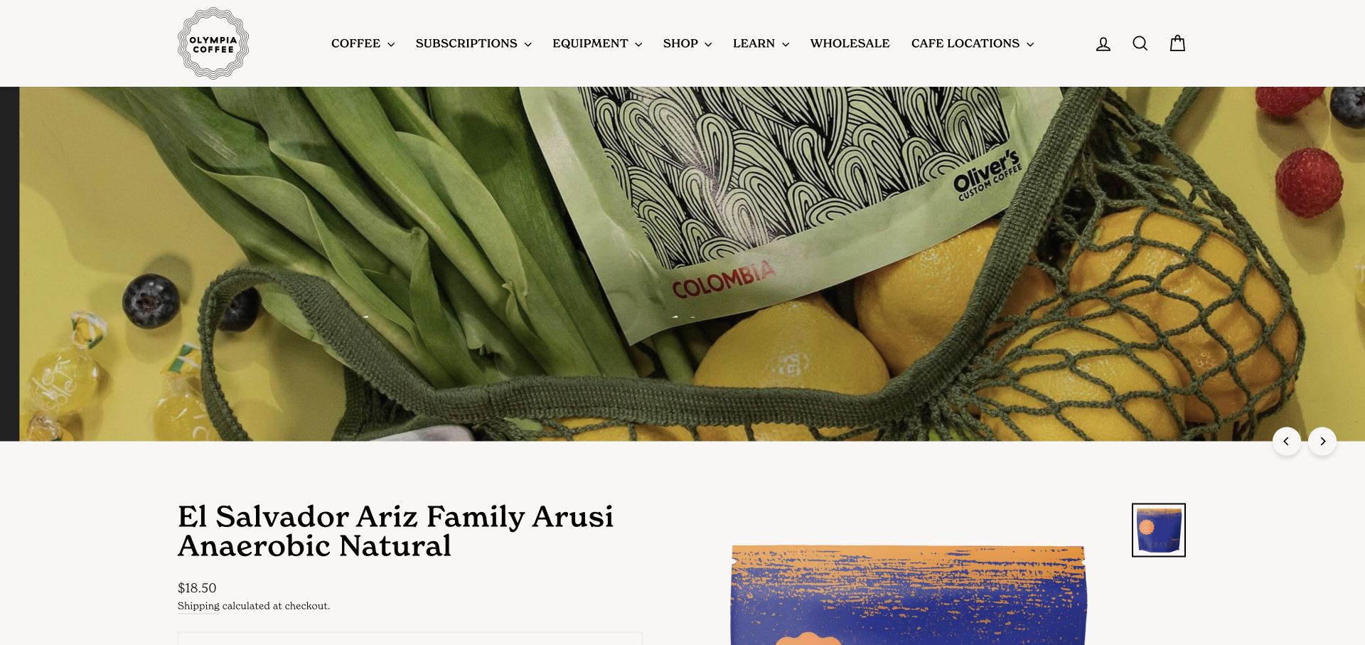
Olympia places coffee, subscriptions, equipment, learning and café locations in a persistent, plainly labeled header. The captured homepage section shows a reserve-coffee campaign with bright fruit imagery and distinctive patterned packaging, followed by a named El Salvador release and its price. Elsewhere on the same page, featured coffees, a reserve-line explanation and café information connect specialist releases with the broader business. The example demonstrates a homepage that behaves partly like a product detail page, bringing individual offerings and practical purchase information into the main browsing flow.
What you can learn
When highlighting a reserve line, explain how it differs from the regular range and keep each product unit clear. A homepage can introduce a special lot without forcing customers to infer its size or purpose from packaging alone.
Pros
The persistent header preserves access to everyday shopping and café information while visitors explore special releases.
Patterned packaging and fruit imagery distinguish the reserve campaign from the surrounding neutral product presentation.
Cons & considerations
Several large individual product sections make the homepage longer than a simple collection overview.
The initial media area did not resolve during this visit; essential navigation and product content should remain useful when media fails.
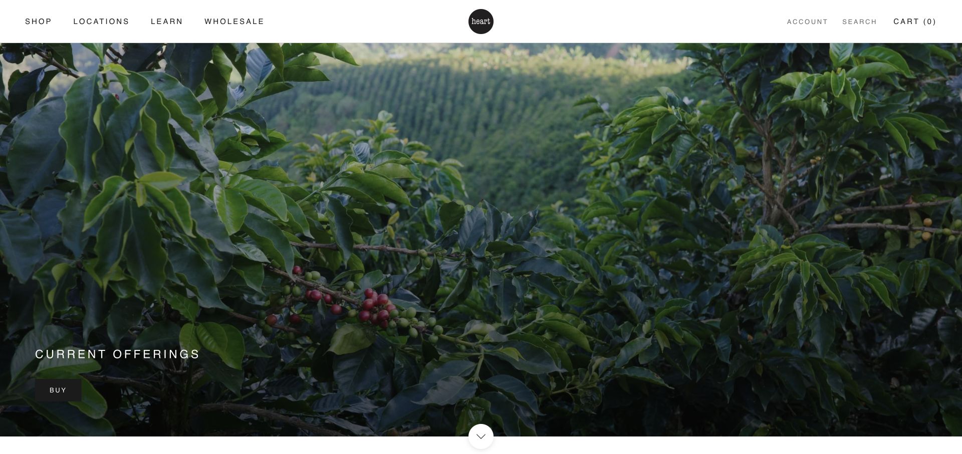
Heart opens with a wide photograph of coffee plants and a short current-offerings label above a small buying action. The white header uses spacious typography and a compact central mark, with shopping, locations, learning and wholesale named directly. The page then presents coffees and merchandise under new and best-seller groupings, followed by café hours and location information. This creates a restrained connection between agricultural imagery, a manageable retail range and the practical details of visiting a local café. The design relies on editing and hierarchy rather than many competing promotional modules.
What you can learn
A short homepage can serve both online buyers and nearby visitors when the retail route and café details are unmistakable. Keep the catalog focused while giving each coffee enough information to support a meaningful choice.
Pros
The single origin photograph and concise action create a calm opening with little competition for attention.
Café hours and addresses appear as practical content within the same experience as the online store.
Cons & considerations
The broad current-offerings message supplies little immediate flavor guidance for a visitor unfamiliar with the coffees.
Merchandise and coffee share the product area, so item type and availability need to remain clear as the collection changes.
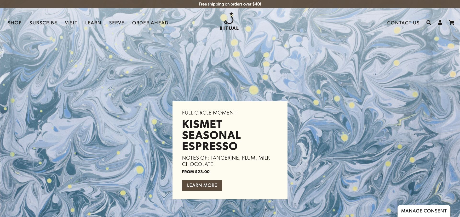
Ritual pairs a full-screen marbled campaign background with a cream information card for a seasonal espresso. The card includes tasting notes, a starting price and a direct link, bringing useful buying context into a highly expressive visual treatment. The navigation names shopping, subscriptions, visits, learning and ordering ahead. Lower product sections continue the combination of origin information, flavor notes and prices. A separate subscription section explains that the business offers several tailored options. The page connects the look of a particular release with distinct routes for home brewing and café customers.
What you can learn
A bold campaign background becomes easier to use when practical information sits on a stable, readable card. Keep flavor notes, price and the next step together rather than scattering them across separate promotional elements.
Pros
The cream product card remains readable against detailed artwork and contains more than a purely decorative headline.
Ordering ahead and visiting have explicit labels alongside the routes for shipped coffee and subscriptions.
Cons & considerations
Rotating campaign content means an important message may not be the first one every visitor sees.
Several subscription choices need comparison details so their differences remain understandable beyond a general promise of variety.
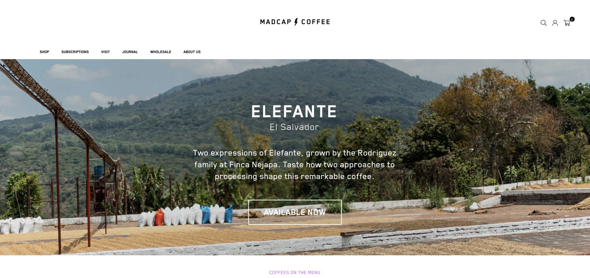
Madcap presents a coffee-growing landscape with a centered introduction to an El Salvador release. The visible copy names the producer family and explains that two processing approaches are part of the story, followed by a clear availability action. A generously spaced white masthead separates the campaign from navigation for shopping, subscriptions, visits, the journal and wholesale. Below the image, the coffee menu uses product names and price ranges, with a separate subscription invitation farther down. The presentation gives a specific coffee story room to establish interest before the catalog takes over.
What you can learn
Make a producer feature concrete by explaining the comparison or distinctive characteristic being offered. Keep the next retail step clear, and translate broad price ranges into understandable bag sizes or options when the customer proceeds.
Pros
The campaign connects a named release with a landscape and a specific explanation of processing differences.
The journal, visit and wholesale routes remain visible without competing heavily with the main coffee story.
Cons & considerations
Wide price ranges in the coffee menu can require additional exploration before a visitor understands the relevant purchase size.
Long overlay copy needs careful line length and contrast when the landscape changes or the screen becomes narrow.
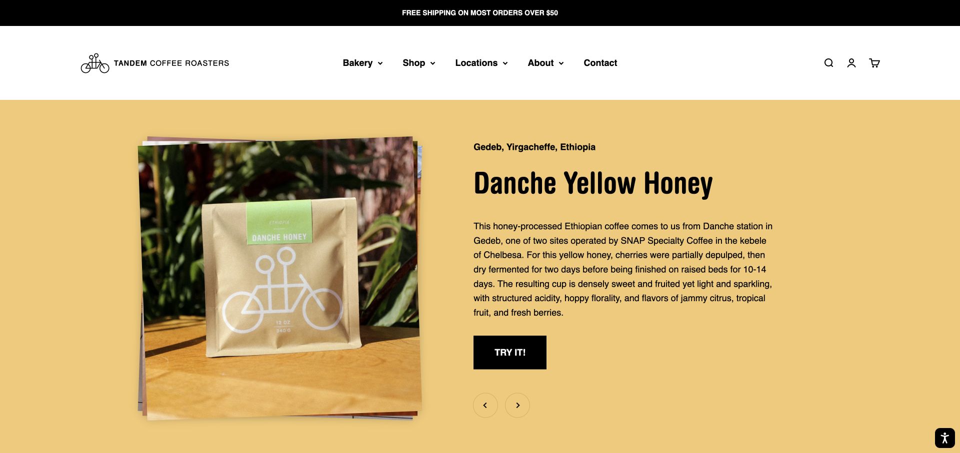
Tandem places a layered product photograph beside a substantial description of the featured coffee on a warm yellow background. The captured slide explains a honey-processed Ethiopian release, connecting place, processing and flavor before presenting a direct action. The large heading and contrasting button keep that longer passage organized. Navigation also makes the bakery and locations visible, acknowledging the business beyond mail-order beans. A product carousel below presents current coffees and a sampler. This is a useful example of giving specialty information real space while retaining a friendly neighborhood identity.
What you can learn
Detailed coffee writing can live on the homepage when the layout gives it a clear heading, readable measure and obvious next step. Pair technical descriptions with plain flavor language so the information supports selection.
Pros
The side-by-side composition gives both the bag photograph and the descriptive passage adequate visual space.
Bakery and location links recognize local visitors instead of treating every arrival as an online coffee order.
Cons & considerations
A long processing description demands more attention than a short flavor summary from someone making a quick purchase.
Rotating release features require careful controls and timing so readers can finish the copy before the content changes.
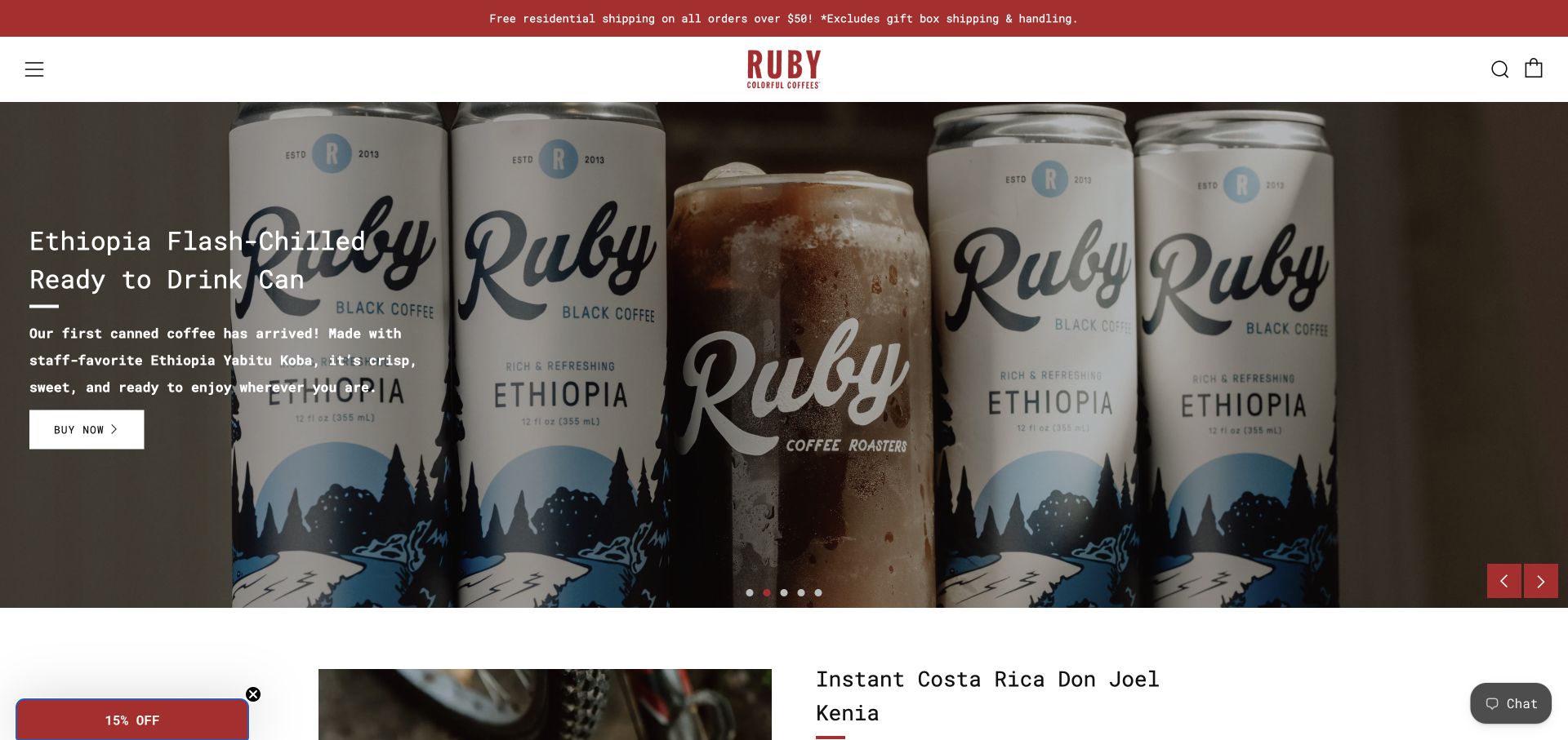
Ruby uses a red announcement bar, a centered wordmark and a compact menu to frame a large campaign carousel. The captured slide promotes a canned Ethiopian coffee through a close product photograph and a short explanation, while other visible campaign labels cover a holiday blend, instant coffee and the café. The page continues into an instant-coffee feature with a fuller description and purchase details. A typewriter-like text treatment gives these retail sections a consistent voice. The example shows how a small roaster can introduce new formats while keeping its package identity recognizable.
What you can learn
When adding ready-to-drink or instant products, explain the format in the campaign itself. Customers should not need to open a product page merely to discover whether they are looking at beans, a can or individual servings.
Pros
Large packaging photographs make the promoted beverage format apparent before the customer reaches the detailed product section.
Consistent typography and red accents connect several different products and campaigns within one storefront.
Cons & considerations
A collapsed desktop menu keeps the header quiet but adds a step before the full range can be inspected.
Several carousel messages compete for the first screen, so important format information should also appear in stable content below.
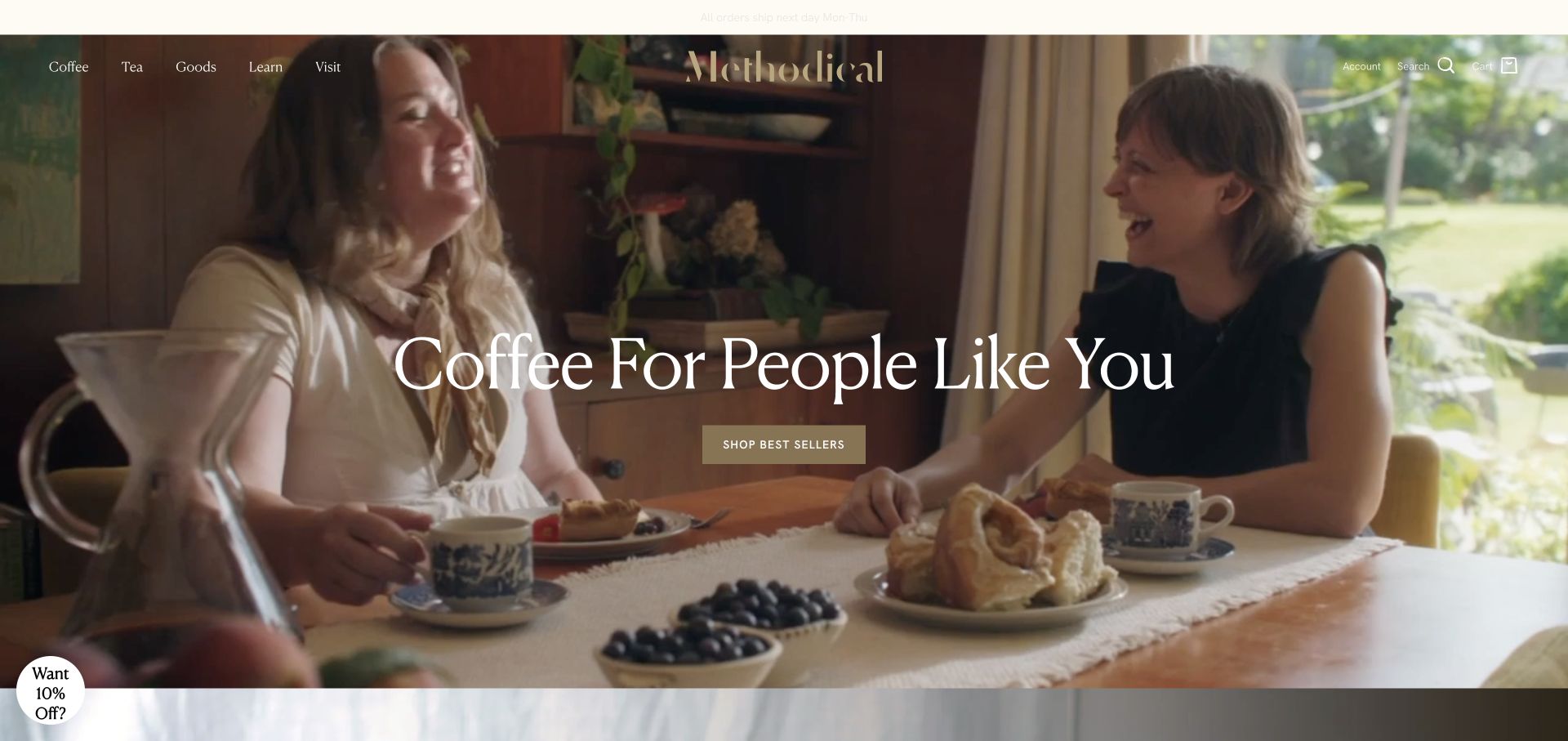
Methodical opens with a warm social scene and a large serif headline positioning coffee as part of everyday life. A simple best-sellers action sits beneath the message, while the header names coffee, tea, goods, learning and visits. The more instructive pattern appears lower down: classic, contemporary and avant-garde collections each receive a short explanation of body and flavor. This gives the brand language a practical role in choosing coffee. Brewing education and a separate tea section extend the homepage beyond the opening lifestyle image into useful discovery routes.
What you can learn
Translate an inclusive brand promise into a usable selection system. Collection names become more helpful when each is accompanied by plain descriptions of flavor, body and the kind of experience a customer can expect.
Pros
The social photograph gives the brand a welcoming context without requiring specialist coffee knowledge to understand the scene.
Short descriptions under collection names help connect distinctive terminology with recognizable taste preferences.
Cons & considerations
Labels such as avant-garde still need their supporting descriptions to avoid becoming another layer of unexplained jargon.
Light navigation text over moving imagery requires careful contrast and a useful static presentation when motion is reduced.
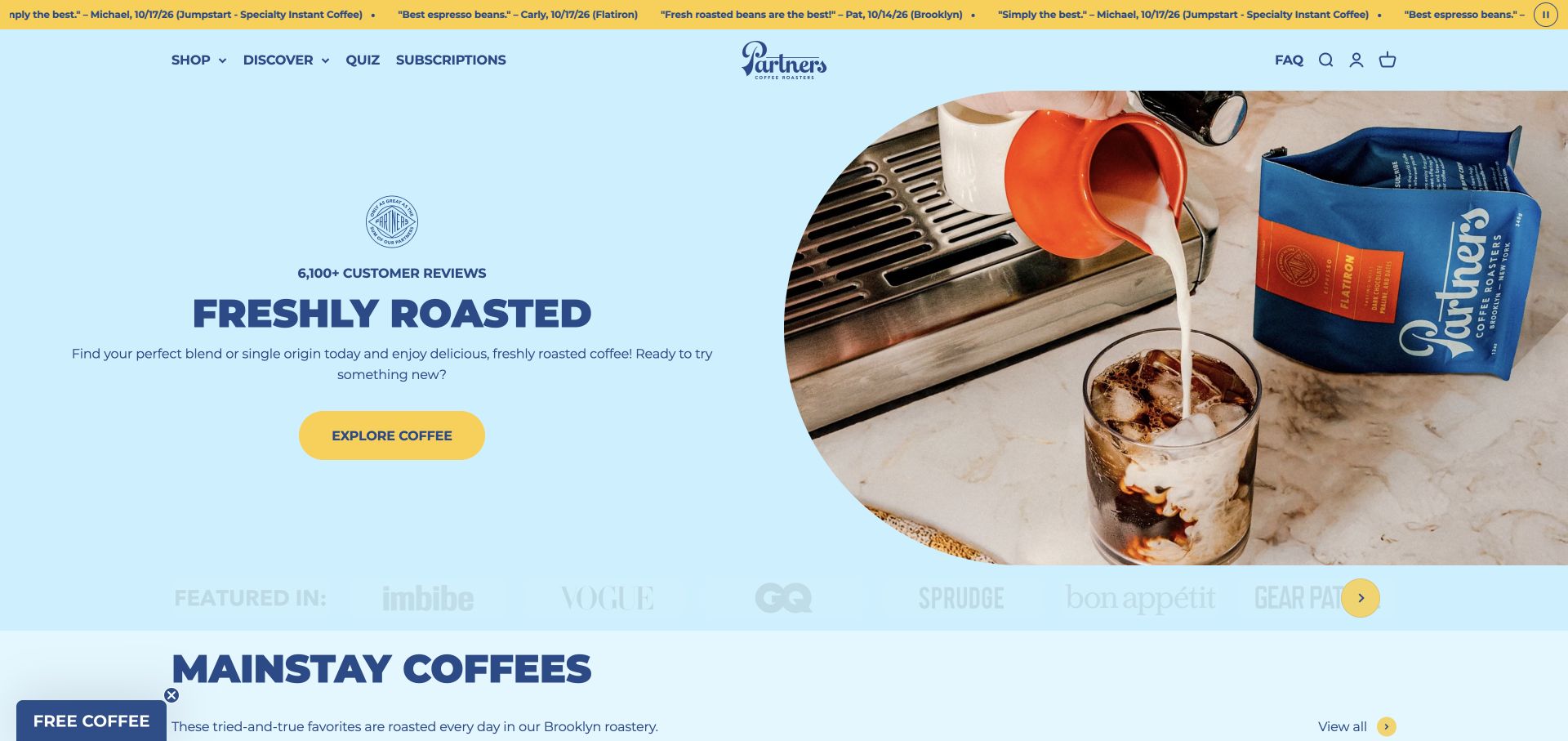
Partners uses a pale blue field, dark blue typography and yellow actions to create a friendly retail introduction. A rounded photograph of an iced drink beside a coffee bag connects the product with a recognizable serving occasion. The hero leads into mainstay coffees, where product descriptions and displayed review information help distinguish familiar options. A quiz and subscriptions are named directly in the header, with an FAQ nearby. The page uses customer-review statements as part of its presentation; this review assesses that design choice without independently validating the ratings or testimonials.
What you can learn
Give first-time customers an understandable everyday starting point before asking them to explore every origin. A quiz, clear product descriptions and a visible FAQ can support different levels of confidence within the same catalog.
Pros
The blue and yellow palette creates clear separation between the main message and the primary shopping action.
Mainstay positioning and short use-oriented descriptions make the initial range easier to approach than names alone.
Cons & considerations
A moving testimonial strip adds visual activity above the navigation and can compete with the main product message.
Review counts and ratings need context and a transparent route to the underlying feedback rather than functioning as unexplained decoration.
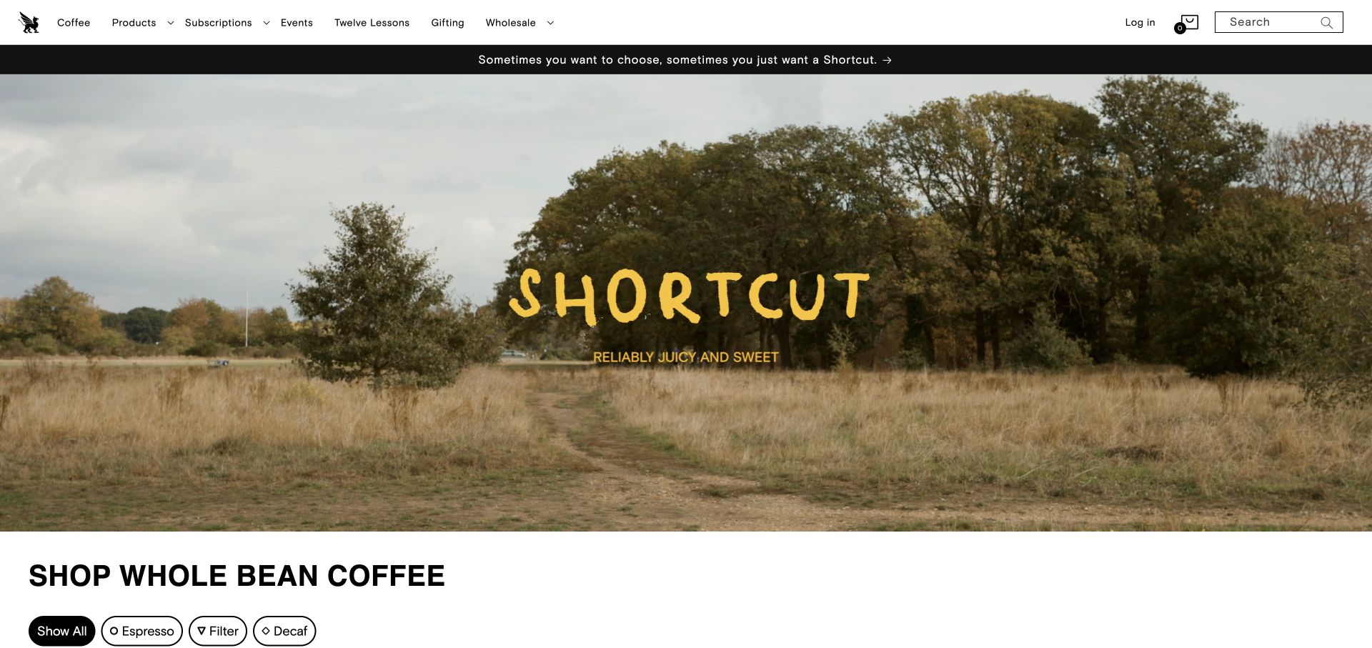
Square Mile places a landscape campaign for Shortcut above a clearly labeled whole-bean coffee section. The catalog offers espresso, filter and decaf filters, then presents each coffee with concise tasting notes, origin or process details, price and a specified bag size in the action. That structure gives customers several useful comparison points without requiring a separate page for every initial question. The header also makes subscriptions, events, gifting and educational material visible. The design combines a spacious brand introduction with a comparatively information-rich shopping area directly beneath it.
What you can learn
Put the purchase unit beside the price and connect filters to the ways customers actually brew. A compact catalog can carry substantial information when its attributes appear in a consistent order for every coffee.
Pros
Bag sizes are stated in the product actions, making the price more interpretable during catalog comparison.
Brew categories, tasting notes and origin details provide complementary ways to narrow the coffee range.
Cons & considerations
Dense specialty information may still need brief explanations for visitors unfamiliar with processing or brewing terminology.
The campaign occupies a large area above the catalog, so direct category links remain valuable for returning customers.
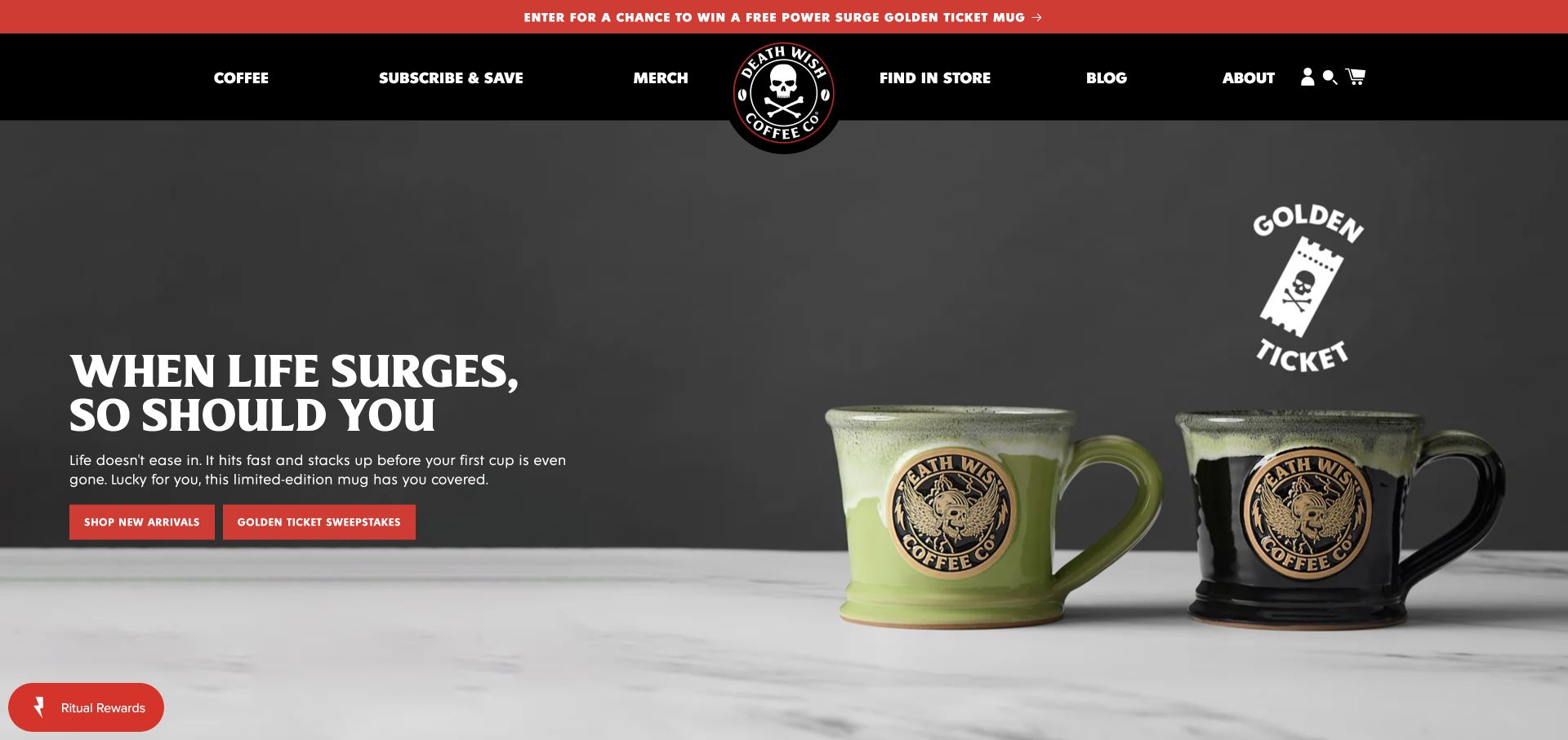
Death Wish uses a black masthead, red accents and a prominent skull mark to maintain a forceful visual identity across coffee and merchandise. The captured campaign features illustrated mugs with a short headline and two clear actions, while other visible slides promote seasonal coffee releases. Navigation distinguishes coffee, subscriptions, merchandise and store finding. New-arrival cards combine beans, pods and branded goods with prices and product-specific labels. The page shows how a roaster can build a cohesive retail world around its identity while still needing to keep different product formats understandable.
What you can learn
A strong brand voice can extend beyond coffee, but product format should remain explicit wherever the range mixes. Preserve a direct coffee route even when the current campaign focuses on a mug or another collectible item.
Pros
The black, white and red system gives coffee packaging, merchandise and navigation a consistent visual character.
The store-finding route recognizes customers who may prefer buying the brand through a physical retailer.
Cons & considerations
A merchandise-led first screen can obscure the coffee range for visitors arriving with a simple reorder task.
Promotions and rotating seasonal messages need clear hierarchy so their competing actions do not overwhelm the main shopping journey.
Plan the coffee catalog around real buying decisions
Define the everyday starting points
Choose a small set of useful entrances such as everyday blends, espresso, filter, decaf and gifts. Test those labels against the questions customers ask in the café or by email. A quiz can support discovery, but the main catalog should remain usable without answering questions. Returning customers also need a quick way to find a known coffee or manage an existing subscription.
Build a repeatable coffee information model
Create fields for producer or cooperative, region, process, variety where known, tasting description, bag size, preparation options and availability. Separate sourced facts from the roaster’s interpretation of flavor. Use the same sequence across product cards and detail pages so customers can compare coffees efficiently. Record who updates the information when a seasonal lot is replaced or a blend changes.
Map retail, subscriptions and wholesale separately
Document how a one-time order is fulfilled, how subscribers change deliveries and how wholesale enquiries reach the right team. Explain what happens after each action, especially when an external service handles part of the journey. A wholesale enquiry should set useful expectations about the partnership process without requiring a café owner to navigate a consumer checkout first.
The editing job behind the design
Choose commerce tools that support changing coffee ranges
Select a catalog system that can represent bag sizes, grind variants, stock limits and recurring orders without confusing the customer. Plan how discontinued lots will behave: an archived story can remain useful if the page clearly indicates that the coffee is no longer available and offers a relevant current route. Keep tasting notes and producer records structured so they can be reused consistently across collections.
Evaluate subscription management, fulfilment and location information as operational needs. Customers should be able to understand delivery frequency, recurring cost and available management options before signing up. Test third-party handoffs and provide an accessible contact route when a tool fails. No unverified platform labels are assigned to these examples; a visual style is not reliable evidence of the underlying technology.
Our WordPress website examples offer a separate look at publishing approaches. A visible platform label is evidence for that named page, not a guarantee that the same system will suit your requirements.
Before the public launch
Coffee roaster website launch checklist
Confirm product names, current availability, bag weights, preparation options and the price displayed for each variant.
Distinguish tasting descriptions from ingredient or added-flavor information where the difference could be misunderstood.
Make decaf, everyday blends and unfamiliar specialty releases understandable through clear labels and concise guidance.
Explain roast schedules, dispatch expectations and limited-release dates using the operation’s actual commitments.
Show the difference between one-time purchases and subscriptions, including frequency and management information.
Check café addresses, hours, ordering links and wholesale contact routes with their responsible teams.
Review image contrast, keyboard navigation, carousel controls and static alternatives for large video features.
Test catalog filtering and purchase handoffs in an approved test workflow, then assign owners for ongoing product updates.
These checks are a project checklist, not a performance, legal, security, or accessibility certification. Test real journeys with the people responsible for the website before making claims about the result.
Sources & editorial method
How this collection was selected and reviewed
We reviewed 22 distinct official coffee roaster websites through direct browser observation and saved genuine, unmodified browser screenshots. Most captures show the homepage opening; Olympia Coffee is represented by its reserve and product section on the same homepage because the initial media area did not resolve during the visit. Reviews describe observed layouts, navigation and content, with limitations framed as design considerations. Ratings, sourcing statements and awards displayed by the brands are not independently endorsed. Each example records its source, capture date, dimensions and attribution; unsupported technology labels remain empty.
Each example links to its actual source page. Screenshots are direct browser captures with their own capture dates; moving imagery, announcements and live designs can change. The notes describe observable design choices and conditional tradeoffs, not measured traffic, conversion results, service quality, or accessibility conformance.
Technology labels use public page metadata, asset evidence, or explicitly cited platform documentation. Platform documentation is not a complete current deployment audit. A component reference may be legacy or unused; it is not a complete backend inventory. Unknown stacks are omitted. These sites are editorial examples, not our client portfolio.
Written, Edited and Curated are separate editorial records, not timestamps advanced by a rebuild. Website designs and imagery belong to their owners. See our editorial standards or suggest a correction.
Questions worth asking
Coffee Roaster website design questions
Should customers choose coffee by roast level or flavor?
Offer complementary routes when the catalog supports them. Roast level can be familiar, while flavor and body descriptions often explain the expected cup more directly. Use consistent language across products and avoid implying that one label predicts every brewing result. A short everyday recommendation can help customers who do not want to compare technical details.
Does a roaster need a coffee quiz?
A quiz can help uncertain shoppers if the questions lead to clear, relevant recommendations. It should supplement a usable catalog rather than become a required gate. Explain why a recommendation fits the answers, and allow customers to browse blends, decaf or other categories directly when they already know what they want.
What should a coffee subscription page explain?
State the amount of coffee, delivery frequency, recurring price, available selection options and how customers manage their orders. Explain whether the coffee remains the same or changes between deliveries. Make any first-order promotion distinct from the ongoing cost, and ensure the described management options match the actual subscription service.
How much producer information belongs on a product page?
Include reliable details that help explain the coffee and acknowledge the people behind it, while preserving a clear purchase summary. A short introduction can lead into deeper information about the producer, region or processing approach. Attribute sourced facts accurately and avoid filling gaps with invented stories or unsupported claims about impact.
Borrow the visual approaches that suit the roaster’s character, then make every product easy to understand. Clear flavor guidance, explicit purchase units and dependable operational information give a strong coffee story a useful destination.