A good DatoCMS project starts with the information a team needs to maintain. The website can be a publication, a catalogue or a corporate platform, but the content model should explain how its pieces relate before a design turns them into pages.
These twenty examples pair public website reviews with named DatoCMS customer cases or implementation-partner showcases published by DatoCMS. The first five introduce recognizable automotive, software, education, restaurant and product brands. Evidence is scoped to the specific publishing property: Arduino Education is an education website, while commerce and operational applications remain separate unless the source explicitly describes their role.
The collection includes restrained corporate layouts, experimental portfolios, multilingual information sites and product campaigns. Their visual differences are a useful reminder that a CMS is one part of an implementation. Screenshots show the public design recorded on November 3, 2026; they cannot establish editorial usability, business results or every component of a current backend.
Before the examples
What makes good DatoCMS website development in 2026?
Model useful entities before drawing flexible pages
DatoCMS organizes content through models and fields. Start with recognizable editorial entities such as products, offices, authors, publications and projects. Define their relationships, required information and ownership before adding a general-purpose page builder. A clear schema should make a routine update easier to understand, not expose every design decision as an unexplained field.
Keep editorial content distinct from operational truth
Decide which system owns prices, inventory, account access and transactions. The CMS can explain an offering while another service performs its operational work. Document identifiers and integration boundaries so editors do not accidentally maintain a second, contradictory copy of information that belongs elsewhere.
Design for imperfect content
Use long titles, missing optional images, translated labels and older records during design review. Every reusable block needs a clear purpose, sensible content limits and a readable empty state. A flexible system is useful only when ordinary combinations still produce coherent pages.
The collection · 20 examples
20 DatoCMS website examples worth studying
Study the relationship between each opening view and its practical navigation. The examples are attributed publishing implementations with separately reviewed public screenshots; they are not rankings of backend quality or verified claims about commercial performance.
We start with five recognizable brands or organizations: Polestar, HashiCorp, Arduino Education, Le Pain Quotidien, Chilly’s. Each attribution applies to the named website property, not every product or website belonging to its organization. This is a curated reading sequence, not a measured ranking.
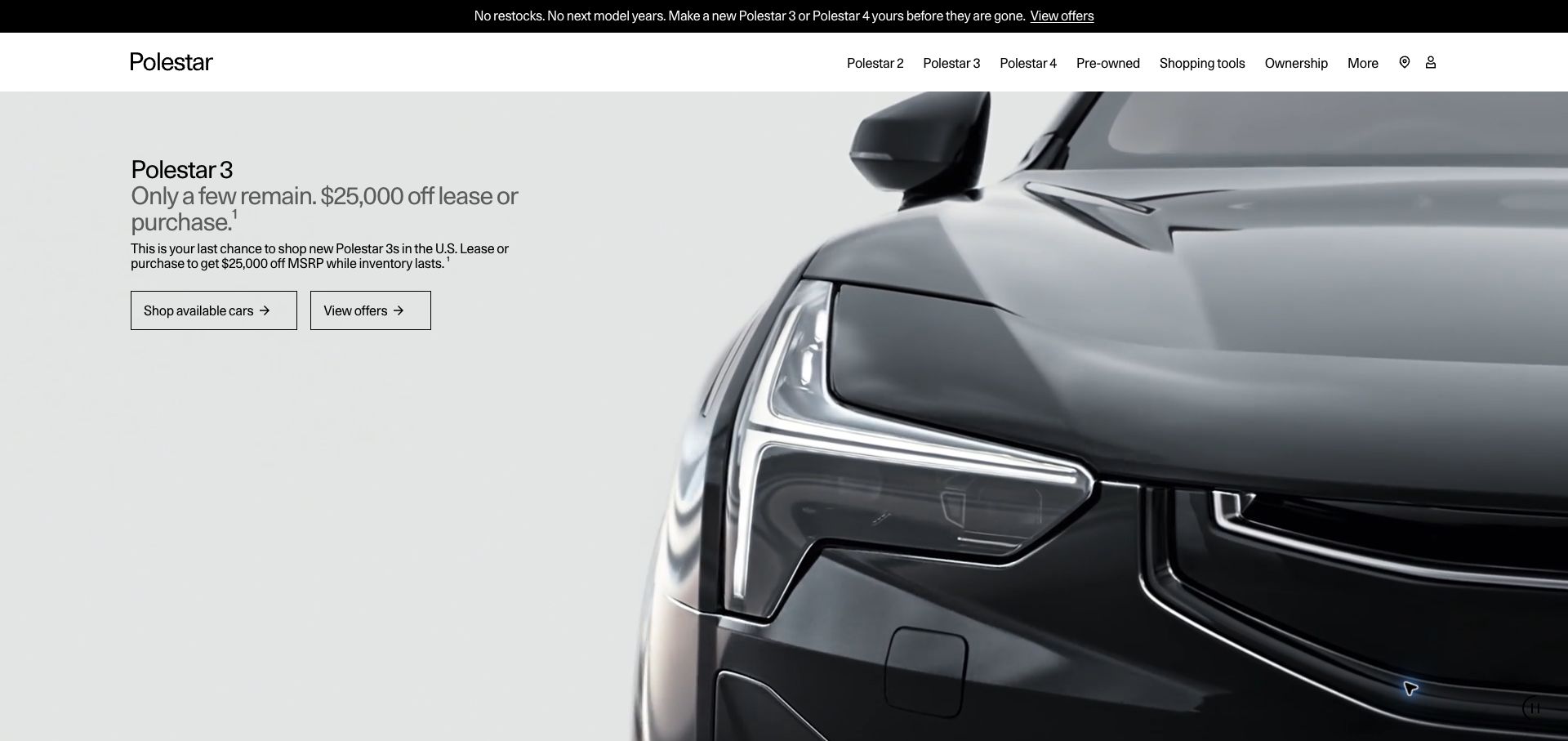
Polestar’s United States opening puts an enormous vehicle close-up beside a compact sales message. The white header lists individual models and ownership routes, while outlined buttons distinguish available inventory from offer details. A separate black announcement strip explains the current market situation. That combination makes the campaign unusually direct: the photograph supplies desirability, but the text identifies the action and its context. DatoCMS’s customer case documents the international website’s content operation. The screenshot records the regional page reached from its project link, not the backend of a vehicle configurator, finance application or purchase process.
What you can learn
Keep regional campaign copy, qualification text and destinations together in the publishing model. A striking product image can change frequently, but the offer and market context must remain understandable without relying on animation. Preview the real local version before approving a shared global component.
Pros
Model names and ownership information remain reachable above the campaign.
Two outlined actions make inventory browsing and offer research visibly distinct.
Cons & considerations
The very large moving vehicle image postpones specification comparison.
Dense promotional qualification text needs careful attention at smaller screen sizes.
Public source checked November 3, 2026. References may be embedded or legacy—not a complete backend inventory.
Platform source: DatoCMS customer case or implementation-partner project showcase. Named DatoCMS customer case or implementation-partner project showcase hosted by DatoCMS explicitly documents this public website and links to its domain. Evidence establishes an attributed content-management implementation, not an independent audit of every current operational, commerce, account or product system. The public visual design was reviewed separately. Platform evidence is separate from the direct website screenshot and is not a complete current infrastructure audit.
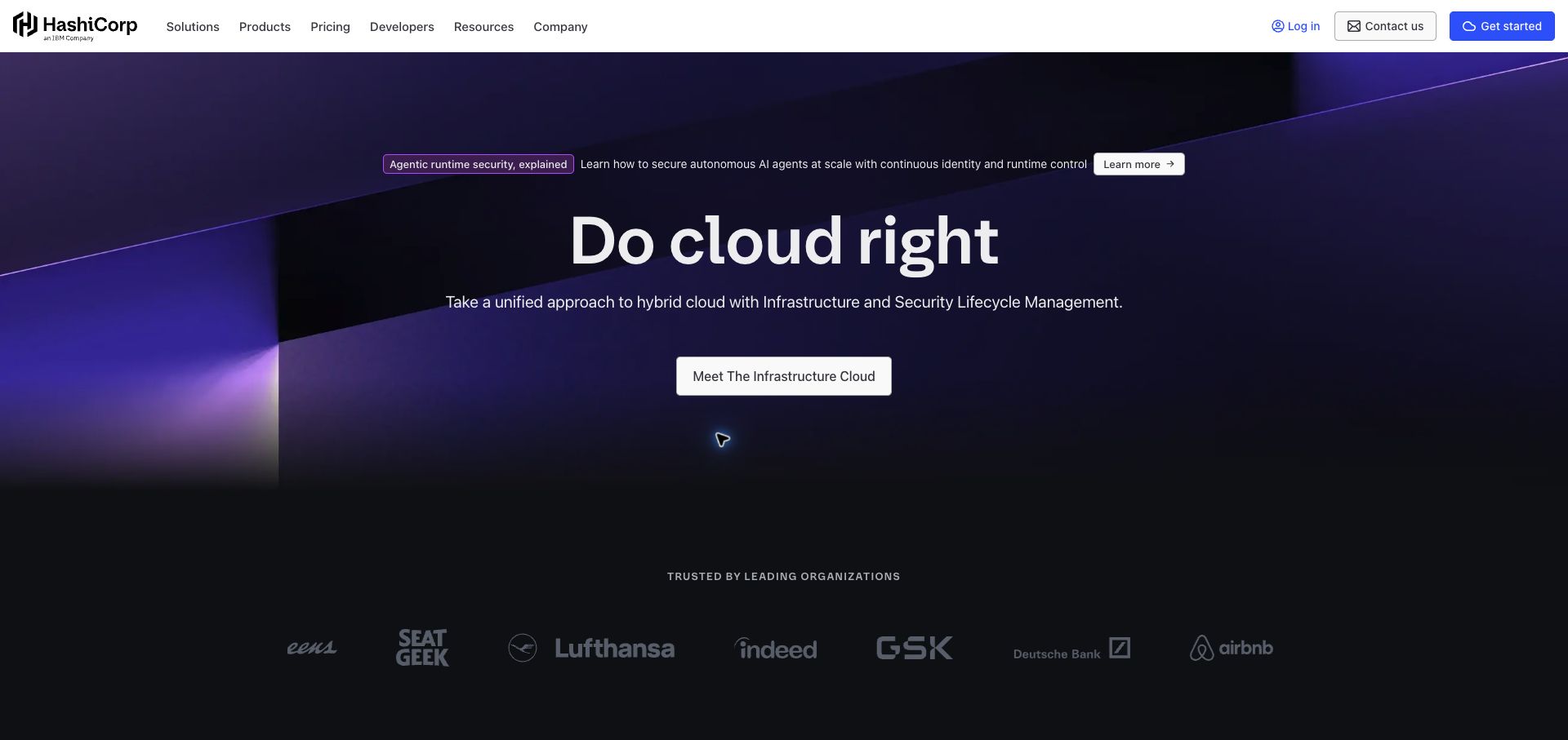
HashiCorp places a concise cloud-management proposition in the center of a dark purple composition. The surrounding architectural shapes create depth without resembling an application screenshot. A single large introduction button anchors the hero, and a row of customer marks begins immediately beneath it. Above, a white navigation bar separates products, pricing, developers and resources while retaining contact and getting-started actions. DatoCMS’s official case describes the marketing content system and its multiple web properties. That evidence concerns publishing; the infrastructure products themselves should not be described as applications built with this CMS.
What you can learn
Use the shared content system to connect a broad company promise with explicit product and audience routes. Keep campaign announcements subordinate to the main explanation, and give customer evidence a maintained record with appropriate context rather than treating a logo strip as a complete case study.
Pros
The white masthead provides clear contrast against the atmospheric hero.
Pricing and developer routes are visible before visitors commit to the main introduction.
Cons & considerations
The central promise requires supporting detail to distinguish individual products.
Muted customer logos can be difficult to read against the dark background.
Earlier cited evidence retained; no current scan result. References may be embedded or legacy—not a complete backend inventory.
Platform source: DatoCMS customer case or implementation-partner project showcase. Named DatoCMS customer case or implementation-partner project showcase hosted by DatoCMS explicitly documents this public website and links to its domain. Evidence establishes an attributed content-management implementation, not an independent audit of every current operational, commerce, account or product system. The public visual design was reviewed separately. Platform evidence is separate from the direct website screenshot and is not a complete current infrastructure audit.
Arduino Education combines a monospaced headline with photographs of a small device and a teacher working with children. Colored rectangular blocks echo the modular nature of the subject without turning the page into a technical diagram. The pale background leaves room for explanatory copy, and the next section introduces learning solutions rather than hiding below an enormous campaign. The header keeps certifications, resources, distribution partners, shopping and cloud access separate. DatoCMS’s Arduino case specifically documents the education branch, matching this captured path. It is not evidence for every Arduino community, store, cloud or software property.
What you can learn
Give a specialist audience its own content structure while preserving clear links to the wider organization. Model educational level, resource type and program information explicitly so editors can organize material without folding all learning content into general product marketing.
Pros
Photographs connect the hardware with an understandable classroom activity.
The visible next section helps visitors continue from mission to learning options.
Cons & considerations
The opening message is broad and does not immediately select a learner level.
Numerous external destinations require clear labeling and coherent return journeys.
ReactAssociated with Next.js; not independently observed
Public source checked November 3, 2026. References may be embedded or legacy—not a complete backend inventory.
Platform source: DatoCMS customer case or implementation-partner project showcase. Official DatoCMS Arduino case explicitly scopes its implementation to Arduino Education and links to arduino.cc/education. This does not establish the stack of Arduino Cloud, the store, community or other Arduino properties. Platform evidence is separate from the direct website screenshot and is not a complete current infrastructure audit.
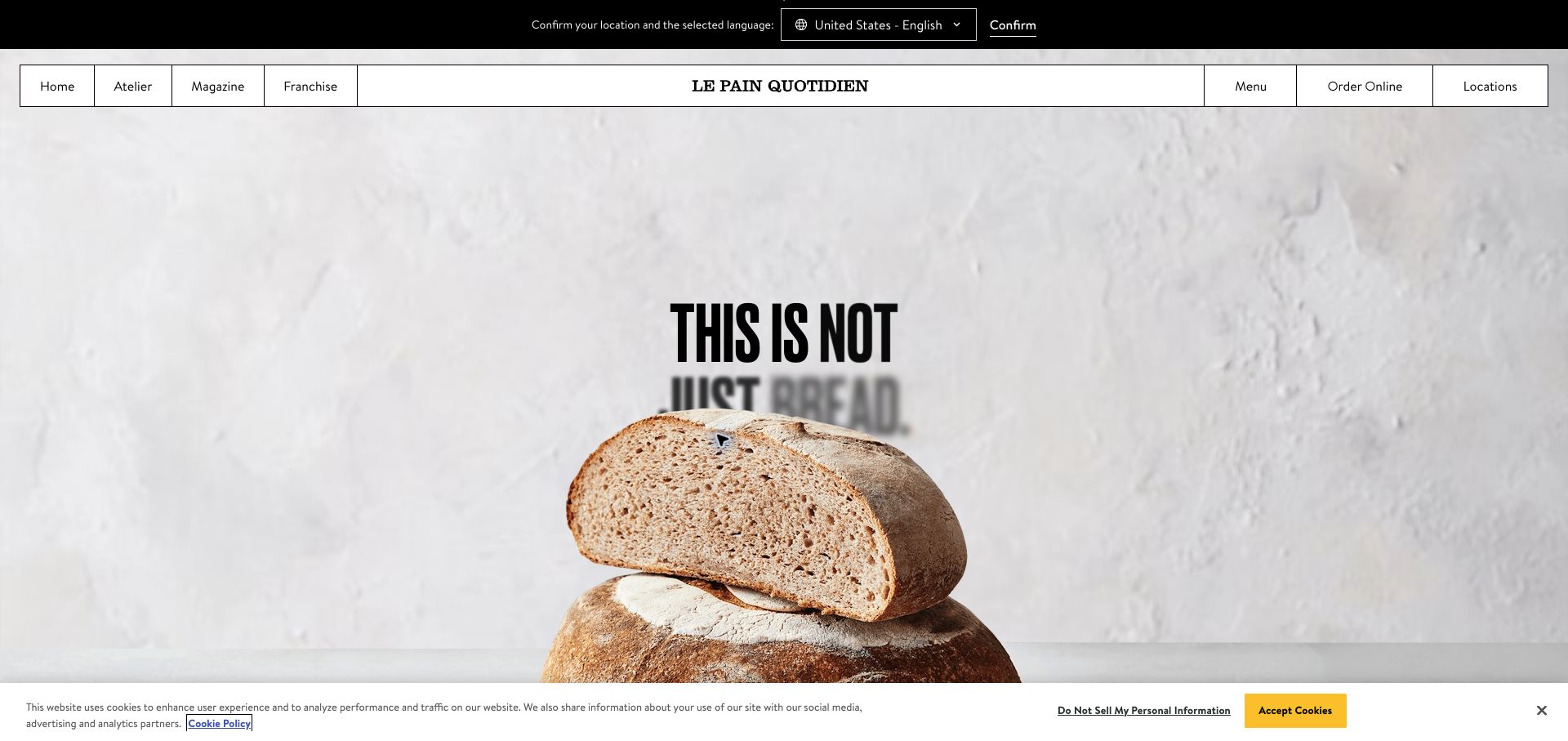
Le Pain Quotidien turns a loaf of bread into the central visual object. The quiet plaster background and oversized close-up communicate texture, while the narrow bordered navigation has a deliberate menu-like quality. Practical links for menus, ordering and locations sit opposite editorial routes such as the magazine and atelier. A location-and-language strip remains visible at the top, making the regional context explicit before a visitor chooses a destination. DatoCMS’s case describes the group’s international restaurant website. That supports the content relationship, without establishing which separate service processes an order or reservation.
What you can learn
Model restaurant location, language, menu and destination links as operational content, not decorative footer details. Keep the broad brand story consistent while allowing each market to publish accurate information. A regional selector should explain the consequence of changing location before the user follows an ordering link.
Pros
Food photography communicates the brand’s material character immediately.
Menus and locations are easy to distinguish from editorial discovery routes.
Cons & considerations
The large bread image delays detailed menu information until another action.
The location strip and bottom privacy notice add competing layers around the hero.
Public source checked November 3, 2026. References may be embedded or legacy—not a complete backend inventory.
Platform source: DatoCMS customer case or implementation-partner project showcase. Named DatoCMS customer case or implementation-partner project showcase hosted by DatoCMS explicitly documents this public website and links to its domain. Evidence establishes an attributed content-management implementation, not an independent audit of every current operational, commerce, account or product system. The public visual design was reviewed separately. Platform evidence is separate from the direct website screenshot and is not a complete current infrastructure audit.
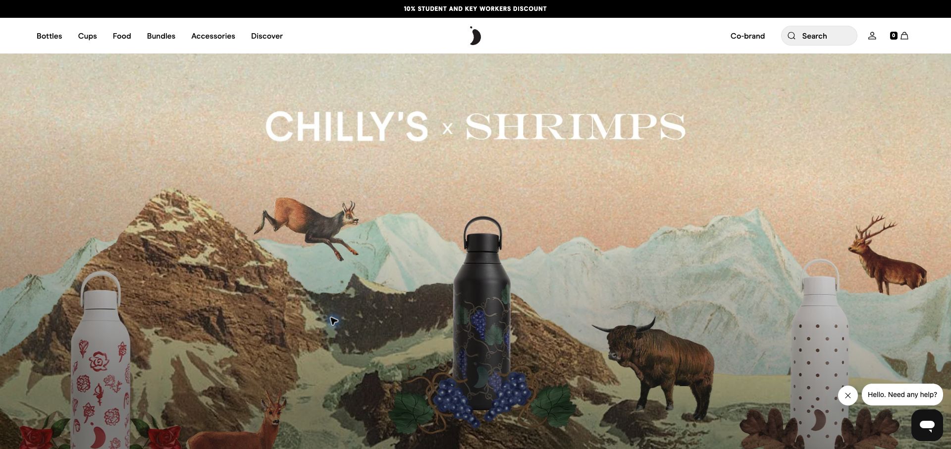
Chilly’s presents its current collaboration through an illustrated mountain landscape populated by animals and patterned bottles. The large collaboration title reads like a poster, while the physical products remain recognizable in the foreground. A simple white header retains bottles, cups, food, bundles and accessories as practical category routes. The global link redirected to an English regional storefront during this review. DatoCMS’s customer case describes the brand’s headless content implementation and links the current company domain. It supports the editorial association, not an inference that the CMS owns checkout, payments or stock availability.
What you can learn
Treat a collaboration as a connected set of campaign artwork, products, explanatory copy and collection destinations. Keep stable product categories outside the campaign so a visitor who wants a familiar item can still navigate directly. Check illustrated crops against the actual bottle placement on narrow screens.
Pros
The campaign artwork gives the collaboration a distinctive visual world.
Persistent category navigation supports shoppers who already know what they want.
Cons & considerations
The opening postpones practical comparisons of capacity, price and materials.
White collaboration lettering needs contrast checks across changing artwork and crops.
Public source checked November 3, 2026. References may be embedded or legacy—not a complete backend inventory.
Platform source: DatoCMS customer case or implementation-partner project showcase. Named DatoCMS customer case or implementation-partner project showcase hosted by DatoCMS explicitly documents this public website and links to its domain. Evidence establishes an attributed content-management implementation, not an independent audit of every current operational, commerce, account or product system. The public visual design was reviewed separately. Platform evidence is separate from the direct website screenshot and is not a complete current infrastructure audit.
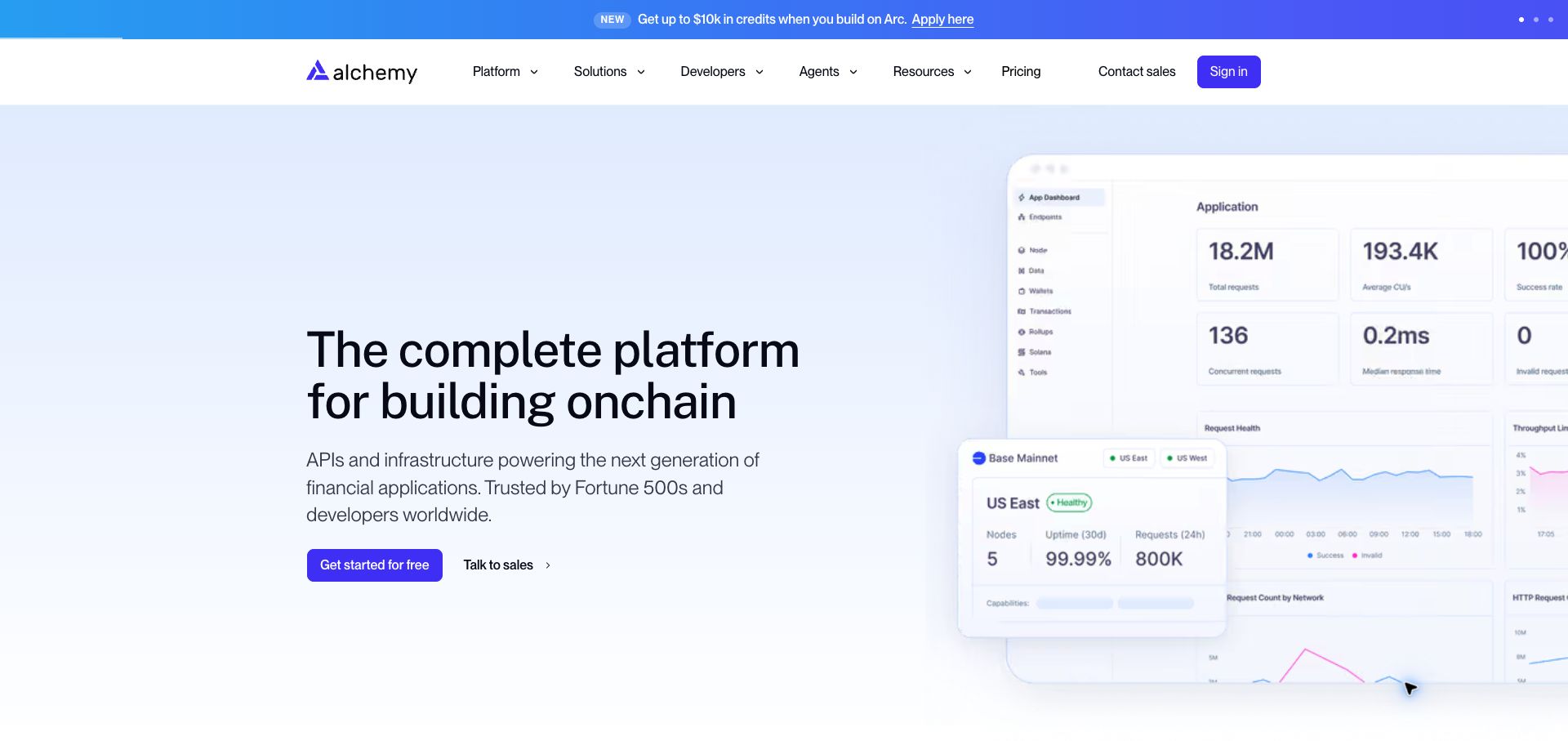
Alchemy pairs a plain-language platform headline with a large image of dashboards and request-health panels. The pale blue background and purple calls to action distinguish the explanatory area from the white navigation. Visitors can choose a free starting route or a sales conversation, while developers and pricing remain visible above. The interface imagery gives otherwise abstract infrastructure a concrete shape, although the tiny chart details are primarily illustrative at this scale. Monogram’s project account on DatoCMS documents the marketing website. It does not establish that the underlying blockchain infrastructure or authenticated dashboard is powered by the content platform.
What you can learn
Use an interface illustration to support a specific product explanation, then provide readable detail elsewhere. Keep the public content model separate from operational product data. Editorial screenshots need version ownership so they do not describe a dashboard that has already changed.
Pros
Two distinct calls to action accommodate self-service and sales-led visitors.
The visible interface connects the platform description with recognizable management tasks.
Cons & considerations
Small chart labels cannot carry essential information at the displayed size.
The announcement strip introduces another message before the main proposition.
Visible tech stack
Earlier / documented evidence
DatoCMS
Earlier cited evidence retained; no current scan result. References may be embedded or legacy—not a complete backend inventory.
Platform source: DatoCMS customer case or implementation-partner project showcase. Named DatoCMS customer case or implementation-partner project showcase hosted by DatoCMS explicitly documents this public website and links to its domain. Evidence establishes an attributed content-management implementation, not an independent audit of every current operational, commerce, account or product system. The public visual design was reviewed separately. Platform evidence is separate from the direct website screenshot and is not a complete current infrastructure audit.
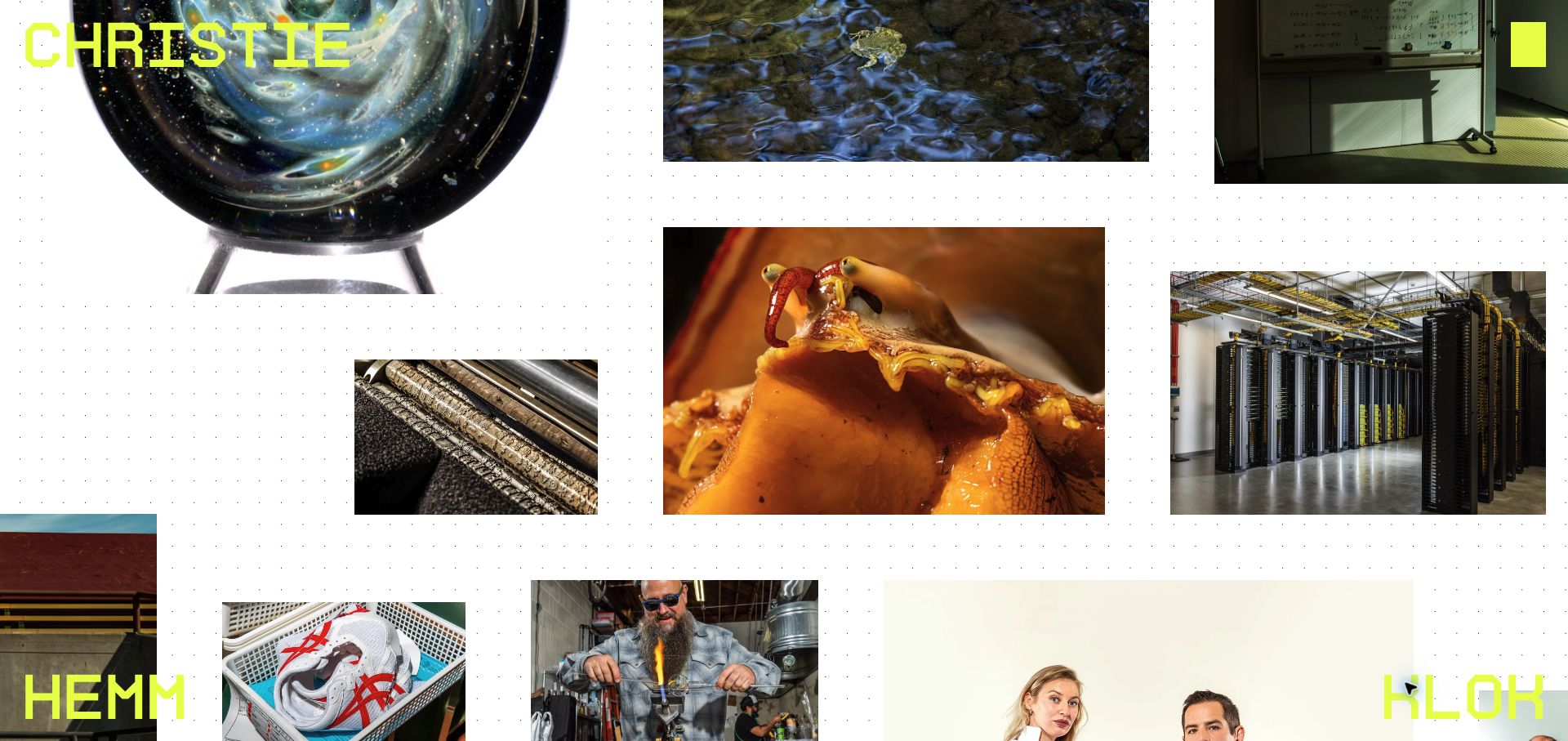
Christie Hemm Klok’s portfolio opens into a scattered field of photographs rather than a conventional row of project cards. Science imagery, portraits, objects and industrial scenes appear at different sizes against a lightly dotted white canvas. Fluorescent lettering in the corners makes the photographer’s name part of the composition. The result encourages browsing through visual relationships instead of reading a long introduction. Luke Tongue’s published DatoCMS project account identifies the portfolio implementation and its image-driven approach. The screenshot was taken after the introductory animation had cleared, so it records the actual photographic canvas rather than a loading frame.
What you can learn
An exploratory layout still needs dependable records for captions, image alternatives, project membership and contact information. Preserve an obvious route to a conventional overview for clients who need to find a particular assignment quickly. Test the portfolio with photographs of very different proportions.
Pros
Varied image sizes create a strong sense of range and visual curiosity.
The fluorescent name treatment establishes authorship without a separate introduction panel.
Cons & considerations
A scattered canvas offers less immediate project context than labeled cards.
The introductory animation delays the first view of the actual work.
Public source checked November 3, 2026. References may be embedded or legacy—not a complete backend inventory.
Platform source: DatoCMS customer case or implementation-partner project showcase. Named DatoCMS customer case or implementation-partner project showcase hosted by DatoCMS explicitly documents this public website and links to its domain. Evidence establishes an attributed content-management implementation, not an independent audit of every current operational, commerce, account or product system. The public visual design was reviewed separately. Platform evidence is separate from the direct website screenshot and is not a complete current infrastructure audit.
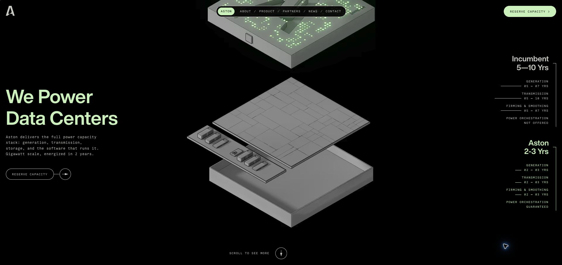
Aston Power uses a dark canvas and an exploded technical illustration to introduce its data-center power proposition. Pale green headline type and a compact floating navigation bar establish a restrained visual system. The diagram occupies the center while comparative time labels sit at the far right, encouraging the visitor to read the offering as a connected set of layers. A reserve-capacity route appears in the header. Luke Tongue’s DatoCMS project page documents this public marketing website. The design review concerns the visible presentation, not verification of the engineering, delivery-time statements or operational software described by the business.
What you can learn
Make complex diagrams understandable through stable labels and a readable fallback. If animation reveals explanatory material in stages, review the sequence as well as individual frames. Model the supporting claims with clear editorial ownership so a visual demonstration does not outlive the information it represents.
Pros
The layered illustration gives a physical structure to an abstract capacity offering.
A restrained green accent connects the headline, navigation and action route.
Cons & considerations
Small labels at the far right are demanding to read on a wide composition.
Animated reveals can hide supporting copy from visitors scanning quickly.
Public source checked November 3, 2026. References may be embedded or legacy—not a complete backend inventory.
Platform source: DatoCMS customer case or implementation-partner project showcase. Named DatoCMS customer case or implementation-partner project showcase hosted by DatoCMS explicitly documents this public website and links to its domain. Evidence establishes an attributed content-management implementation, not an independent audit of every current operational, commerce, account or product system. The public visual design was reviewed separately. Platform evidence is separate from the direct website screenshot and is not a complete current infrastructure audit.
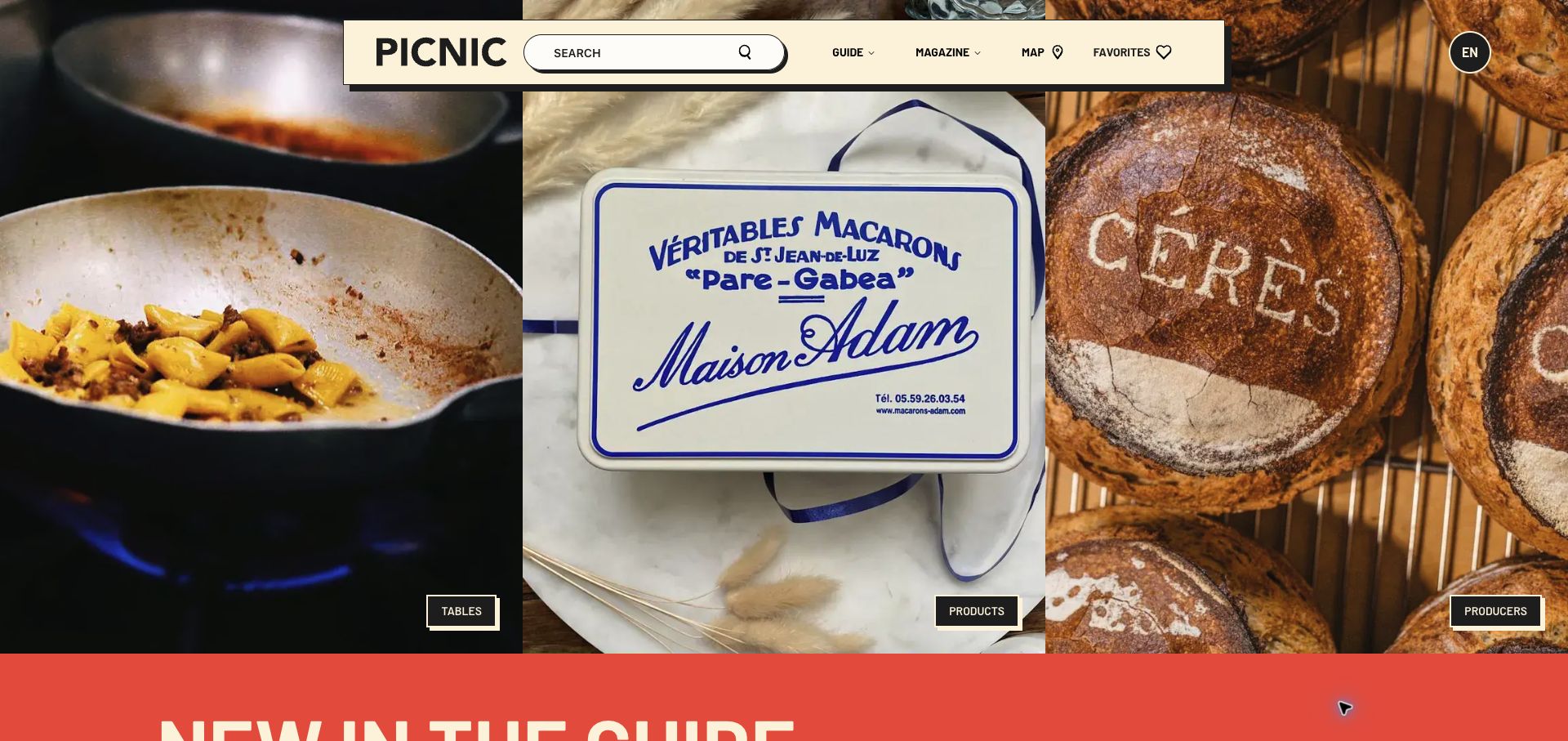
The Picnic Guide divides its opening into three adjacent photographs: food being cooked, a packaged specialty and a loaf of bread. Small labels identify the corresponding tables, products and producers routes. A cream navigation panel floats above the images, with an unusually prominent search field beside the publication name. Map and favorites controls reveal that this is a practical discovery tool as well as a magazine. Nomade’s project account on DatoCMS describes the publication’s connected editorial models. The screenshot shows the English public entry reached from that case, after the large images finished loading.
What you can learn
Give each editorial type a clear purpose and relationship to the others. A producer can connect to products and places without requiring duplicate descriptions. Make search and map destinations explain what they contain, and maintain enough structured metadata for visitors to narrow an appealing photograph into a useful recommendation.
Pros
Three large image panels communicate the publication’s main content categories.
Search is prominent without removing the more exploratory magazine and map routes.
Cons & considerations
Small category labels provide limited context beneath the dominant photographs.
A nearly full-screen hero postpones individual story titles and practical location detail.
Public source checked November 3, 2026. References may be embedded or legacy—not a complete backend inventory.
Platform source: DatoCMS customer case or implementation-partner project showcase. Named DatoCMS customer case or implementation-partner project showcase hosted by DatoCMS explicitly documents this public website and links to its domain. Evidence establishes an attributed content-management implementation, not an independent audit of every current operational, commerce, account or product system. The public visual design was reviewed separately. Platform evidence is separate from the direct website screenshot and is not a complete current infrastructure audit.
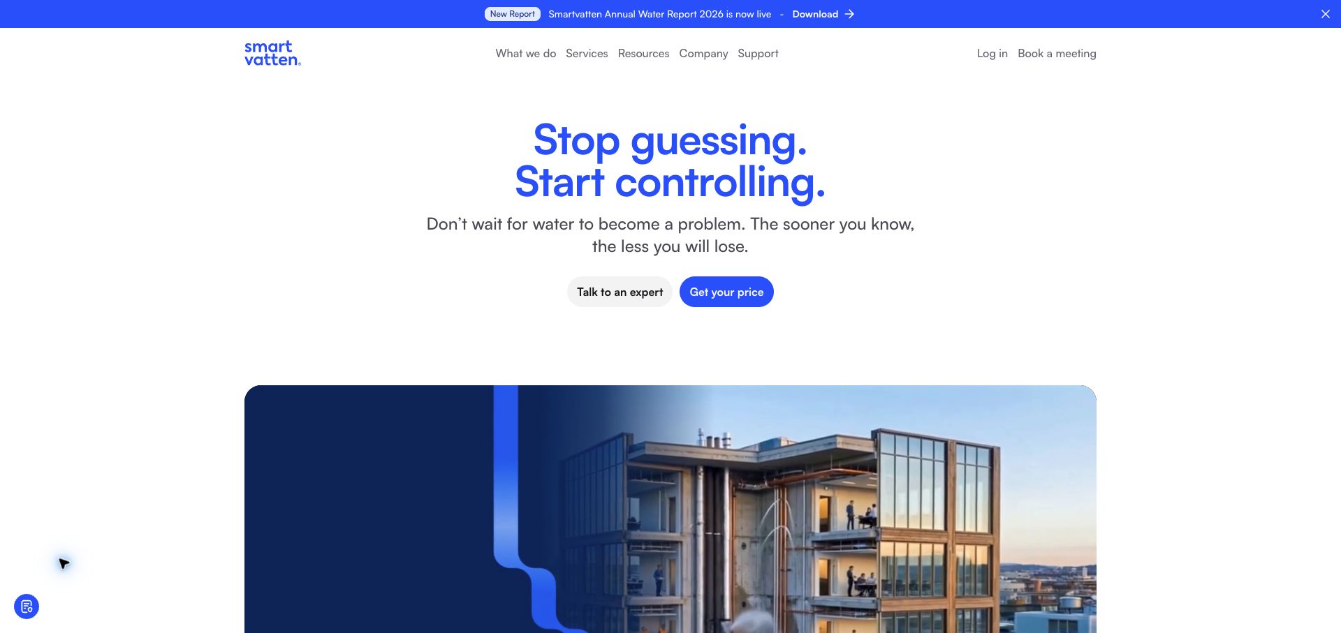
Smartvatten opens with a centered blue statement and a short explanation of the problem it addresses. Two pill-shaped actions offer an expert conversation or a pricing route. Below, a wide video panel introduces buildings and water-related imagery, giving the otherwise spare composition a more tangible setting. The header distinguishes service information from support and login, and a narrow announcement strip promotes a report. The implementation partner’s DatoCMS showcase documents the public website migration. Its evidence does not extend to the authenticated monitoring tools, measurements or performance outcomes advertised by the company.
What you can learn
Keep public service explanations and product applications distinct in the information architecture. Give the introductory video a meaningful poster and a text alternative so the proposition survives delayed playback. Model reports and customer references as maintained evidence rather than interchangeable promotional banners.
Pros
The headline and short supporting sentence establish a clear reading order.
Pricing and expert-contact routes acknowledge different stages of customer research.
Cons & considerations
The broad promise needs more detail before a visitor can compare specific services.
The large video panel occupies substantial space before deeper product information.
Public source checked November 3, 2026. References may be embedded or legacy—not a complete backend inventory.
Platform source: DatoCMS customer case or implementation-partner project showcase. Named DatoCMS customer case or implementation-partner project showcase hosted by DatoCMS explicitly documents this public website and links to its domain. Evidence establishes an attributed content-management implementation, not an independent audit of every current operational, commerce, account or product system. The public visual design was reviewed separately. Platform evidence is separate from the direct website screenshot and is not a complete current infrastructure audit.
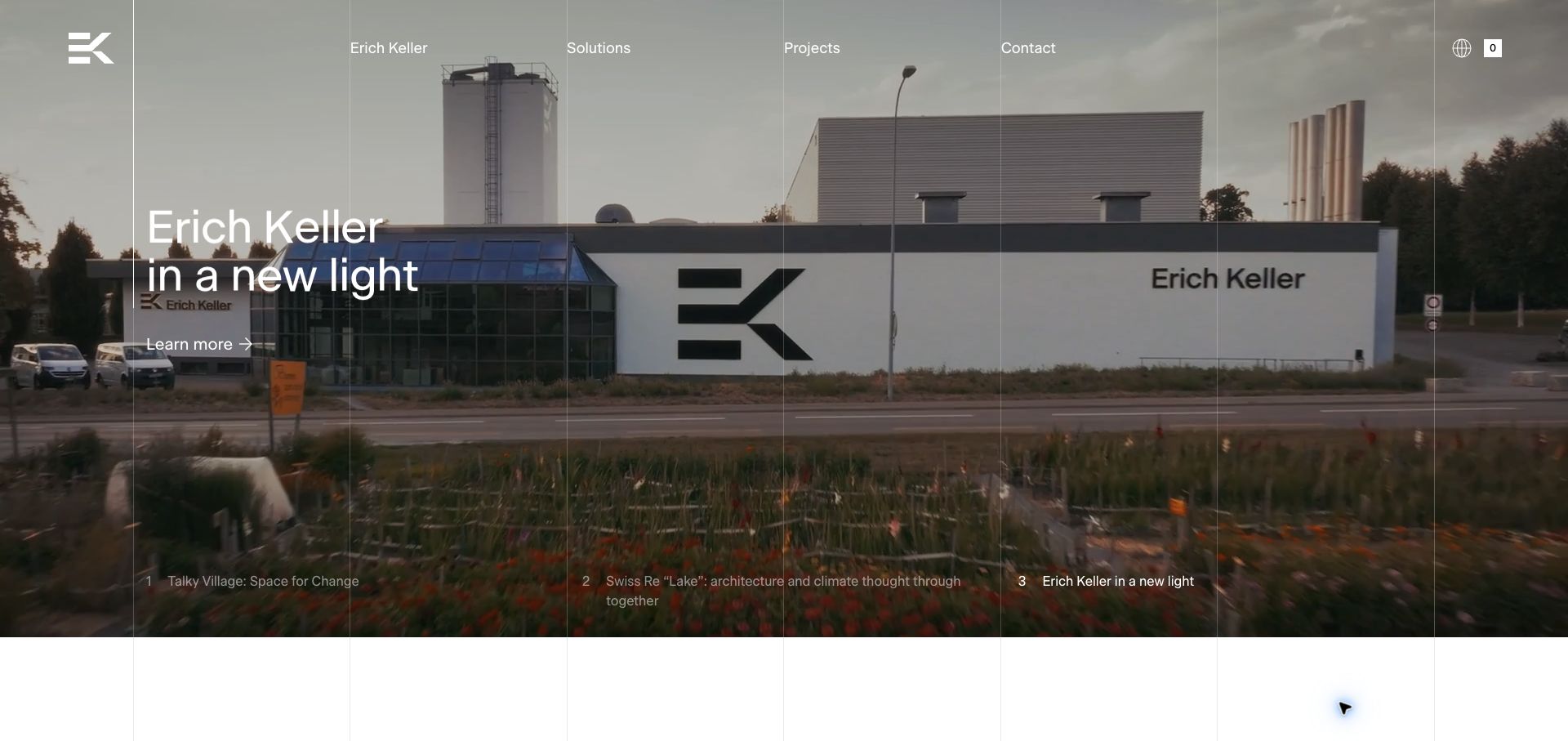
Erich Keller overlays fine vertical grid lines on a full-width photographic hero. The captured slide shows the company’s building with a short headline and a restrained learn-more link. Three numbered project labels run across the bottom, exposing the carousel’s other stories without covering the scene with bulky controls. The masthead uses the same grid to align the company, solutions, projects and contact routes. Heart’s DatoCMS showcase documents the manufacturer’s multilingual content platform and linked product information. That evidence concerns the public presentation; it does not identify every recruitment or business system reached through the website.
What you can learn
Use a project record that combines a meaningful title, carefully chosen image and explanatory destination. Keep carousel navigation readable on every photograph and preserve a stable project index outside the rotating hero. Grid discipline is most useful when editors can replace imagery without breaking that hierarchy.
Pros
The visible grid unifies navigation and project imagery into one visual language.
Numbered story labels make additional hero content discoverable immediately.
Cons & considerations
White text over varied photographs requires a dependable contrast treatment.
The rotating introduction delays a direct comparison of product specifications.
Public source checked November 3, 2026. References may be embedded or legacy—not a complete backend inventory.
Platform source: DatoCMS customer case or implementation-partner project showcase. Named DatoCMS customer case or implementation-partner project showcase hosted by DatoCMS explicitly documents this public website and links to its domain. Evidence establishes an attributed content-management implementation, not an independent audit of every current operational, commerce, account or product system. The public visual design was reviewed separately. Platform evidence is separate from the direct website screenshot and is not a complete current infrastructure audit.
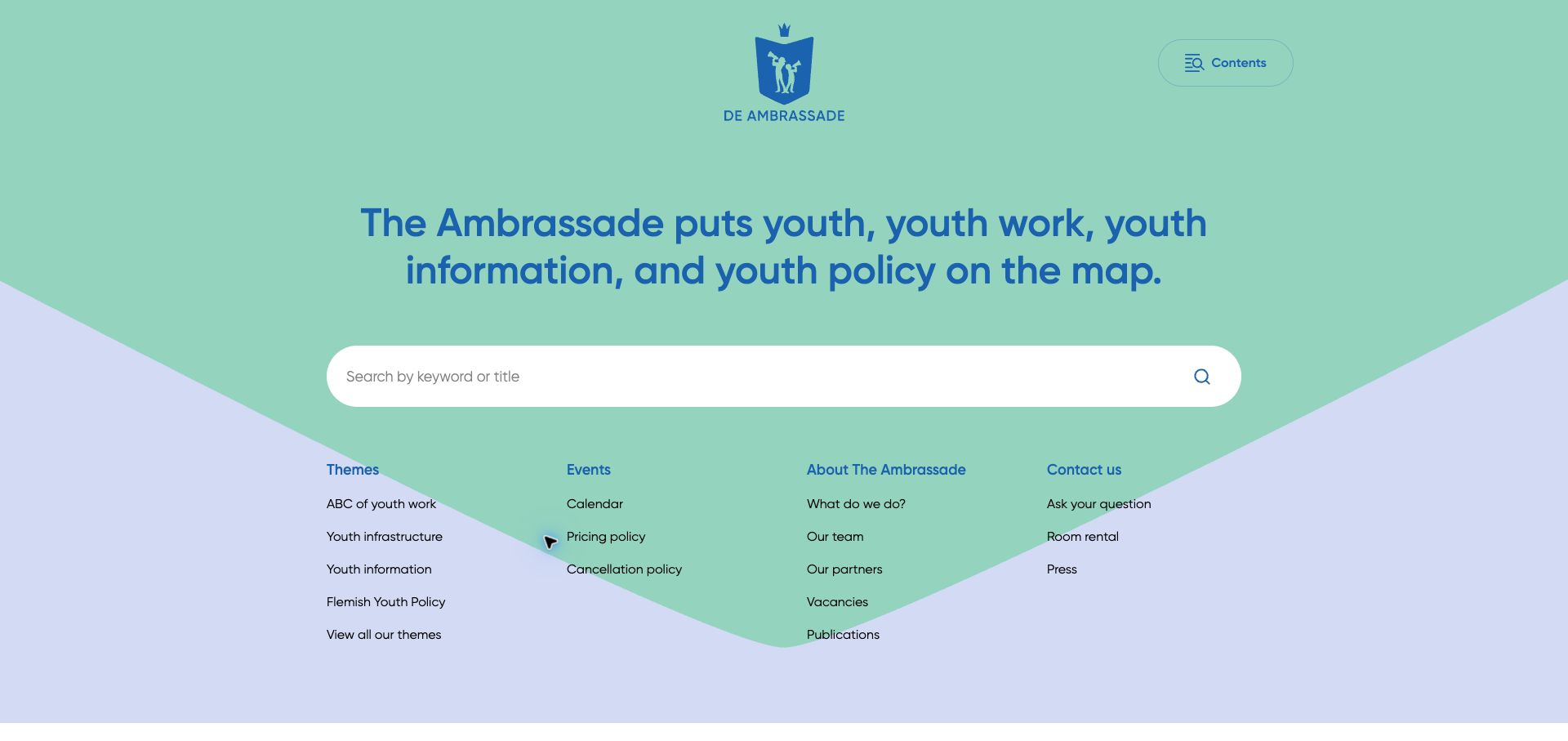
De Ambrassade gives the search field the largest interactive area on its opening screen. A centered mission statement sits above it, while four groups of links below expose themes, events, organizational information and contact routes. A mint-colored shield-like background and lavender lower area give the otherwise text-heavy page a friendly identity. The screenshot reflects the browser’s English translation of the Dutch property; this is not evidence of a native English edition. Wieni’s DatoCMS showcase identifies this youth-information website and its modular content implementation, matching the public domain reviewed here.
What you can learn
Start a knowledge site with the questions visitors need to answer. Use a stable taxonomy and descriptive page titles so search and thematic browsing support each other. Editorial models should distinguish events, publications and evergreen guidance instead of forcing every item into the same generic article template.
Pros
The prominent search field makes a specific information task easy to begin.
Grouped links expose useful destinations without opening a large navigation menu.
Cons & considerations
The opening contains little visual context for first-time visitors unfamiliar with the organization.
Translated labels in this capture should not be treated as the site’s original editorial copy.
ReactAssociated with Next.js; not independently observed
Public source checked November 3, 2026. References may be embedded or legacy—not a complete backend inventory.
Platform source: DatoCMS customer case or implementation-partner project showcase. Named DatoCMS customer case or implementation-partner project showcase hosted by DatoCMS explicitly documents this public website and links to its domain. Evidence establishes an attributed content-management implementation, not an independent audit of every current operational, commerce, account or product system. The public visual design was reviewed separately. Platform evidence is separate from the direct website screenshot and is not a complete current infrastructure audit.
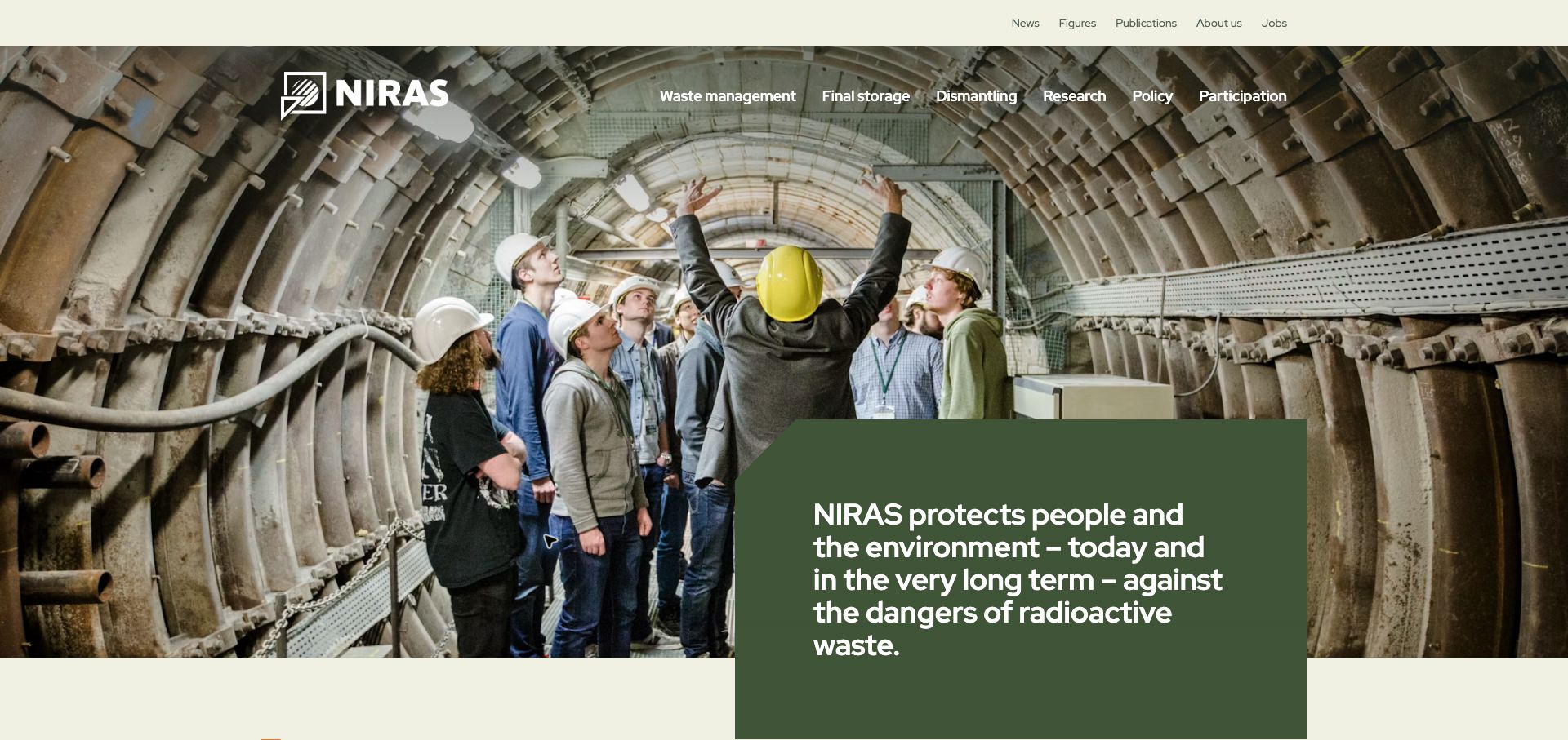
NIRAS opens with a photograph of visitors and a guide inside a large tunnel. A dark green text panel overlaps the image, providing a stable area for the organization’s public mission. Two navigation rows separate institutional information from subject areas such as research, policy and participation. The photograph makes the setting tangible while the panel avoids placing the entire explanation directly on a detailed background. Wieni’s DatoCMS project page documents this Belgian public-information website. The browser translated the Dutch page into English during capture; the review evaluates the visible composition, not the technical claims or safety practices described by the institution.
What you can learn
Pair specialist subject matter with a clear explanation of the organization’s role and routes for different levels of knowledge. Give frequently updated publications and long-lived explanatory pages distinct editorial responsibilities. Ensure translated versions retain readable navigation without treating automatic browser translation as authored content.
Pros
The solid mission panel preserves legibility over a complex photograph.
Participation and publication routes make the information architecture broader than an institutional brochure.
Cons & considerations
Two navigation tiers create a dense opening for a new visitor.
The large introductory image postpones individual documents and specific questions.
ReactAssociated with Next.js; not independently observed
Public source checked November 3, 2026. References may be embedded or legacy—not a complete backend inventory.
Platform source: DatoCMS customer case or implementation-partner project showcase. Named DatoCMS customer case or implementation-partner project showcase hosted by DatoCMS explicitly documents this public website and links to its domain. Evidence establishes an attributed content-management implementation, not an independent audit of every current operational, commerce, account or product system. The public visual design was reviewed separately. Platform evidence is separate from the direct website screenshot and is not a complete current infrastructure audit.
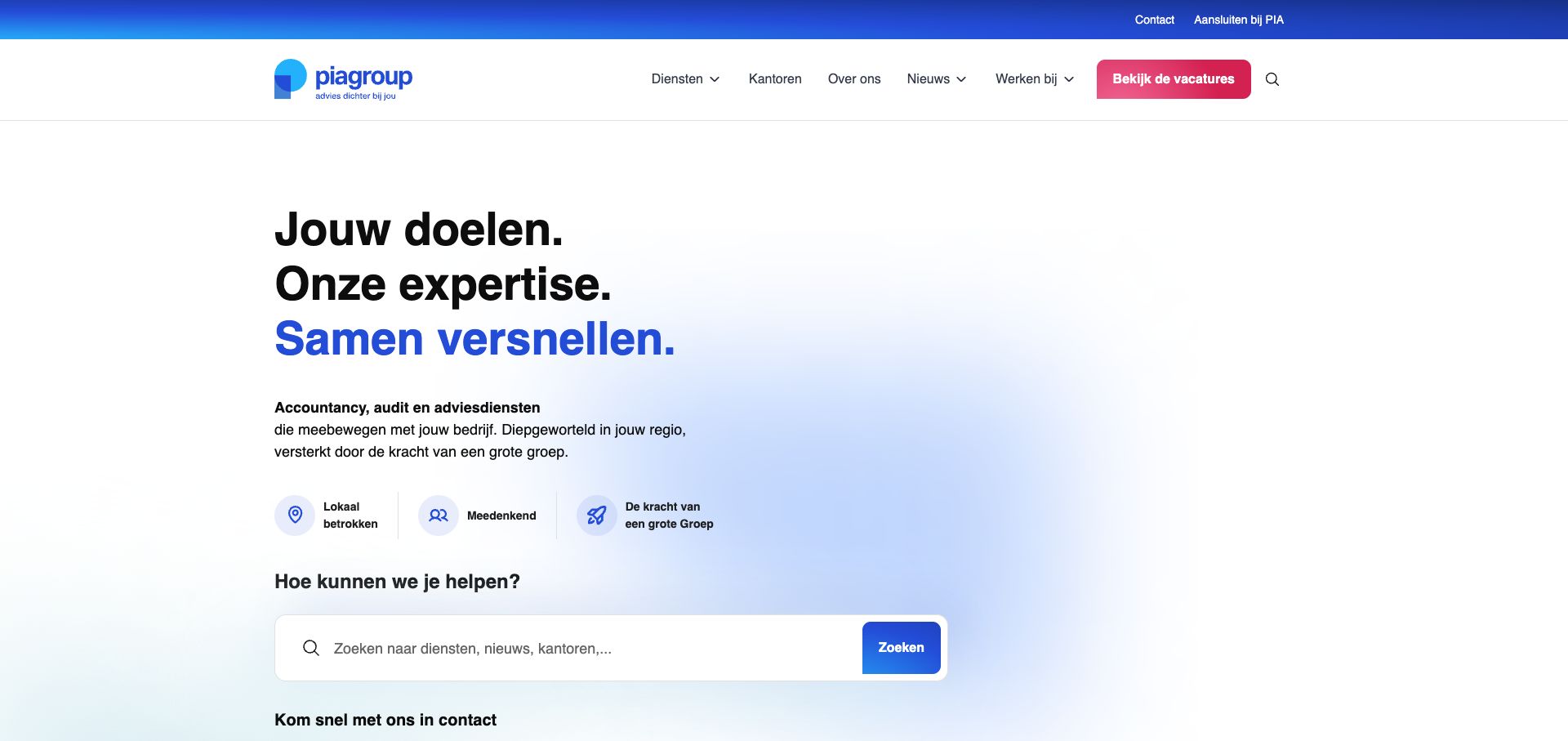
PIA Group combines a large three-line statement with a short service explanation and three compact value markers. Blue gradients connect the brand symbol, highlighted headline and search button, while generous white space keeps the introduction calm. The search field appears within the first screen and explicitly spans services, news and offices. In contrast, the brightest header button points toward vacancies, giving recruitment a noticeable place beside client-oriented navigation. Wieni’s DatoCMS showcase documents the Netherlands website and its network content. The capture shows the Dutch public property, not any private accounting application or client portal.
What you can learn
A network website needs a clear relationship between shared services and individual offices. Model those entities separately, then make search results explain both the service and location context. Decide deliberately how prominently recruitment should compete with the commercial tasks of visitors seeking advice.
Pros
The search prompt explains the kinds of information visitors can find.
A limited blue palette connects the brand identity with useful interface controls.
Cons & considerations
The prominent vacancy button may draw attention away from a prospective client’s task.
The broad opening statement offers little evidence of a particular specialist service.
ReactAssociated with Next.js; not independently observed
Public source checked November 3, 2026. References may be embedded or legacy—not a complete backend inventory.
Platform source: DatoCMS customer case or implementation-partner project showcase. Named DatoCMS customer case or implementation-partner project showcase hosted by DatoCMS explicitly documents this public website and links to its domain. Evidence establishes an attributed content-management implementation, not an independent audit of every current operational, commerce, account or product system. The public visual design was reviewed separately. Platform evidence is separate from the direct website screenshot and is not a complete current infrastructure audit.
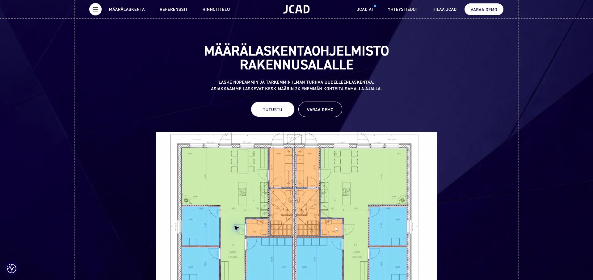
JCAD places a large floor-plan demonstration beneath a compact Finnish introduction. Colored areas in the drawing make the software’s subject visible without requiring a long explanation of quantity takeoff. The dark blue background and fine dotted borders give the page a technical character, while two contrasting buttons offer exploration and a demo. The navigation retains references and pricing alongside product information. Laniakea’s DatoCMS showcase documents this marketing website. It does not mean the quantity-calculation software itself runs on the CMS, and the visible productivity statements were not independently tested for this review.
What you can learn
Use a representative workflow image to explain a specialist tool, then supply readable labels and contextual detail outside the moving demonstration. Connect references, pricing and demo destinations to the same product records so an editor can maintain the public explanation without changing the application.
Pros
The floor-plan visual establishes a concrete professional use case immediately.
References and pricing remain available beside the more prominent demo route.
Cons & considerations
All-capital introductory copy makes longer lines relatively demanding to scan.
The oversized demonstration pushes detailed feature comparisons farther down the page.
Public source checked November 3, 2026. References may be embedded or legacy—not a complete backend inventory.
Platform source: DatoCMS customer case or implementation-partner project showcase. Named DatoCMS customer case or implementation-partner project showcase hosted by DatoCMS explicitly documents this public website and links to its domain. Evidence establishes an attributed content-management implementation, not an independent audit of every current operational, commerce, account or product system. The public visual design was reviewed separately. Platform evidence is separate from the direct website screenshot and is not a complete current infrastructure audit.
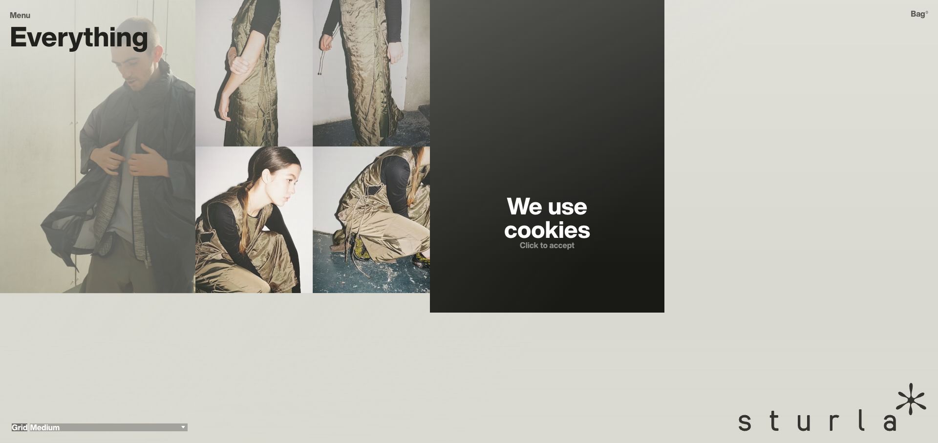
Sturla London presents an unconventional catalogue with fashion images and extensive neutral space. The opening heading identifies the current view as everything, with a minimal menu at the upper left and the shopping bag at the opposite corner. A grid-size control sits along the bottom, while an oversized wordmark anchors the lower right. The cookie notice appears as its own dark tile within the composition rather than a separate modal. The developer’s DatoCMS showcase explains that editorial content works alongside Shopify commerce services. This is evidence for that split implementation, not a claim that DatoCMS processes the checkout.
What you can learn
When a catalogue offers multiple visual densities, test the same product information in each layout. Keep names, prices and navigation understandable even when photography dominates. Distinguish editorial lookbook records from sellable variants so the content system and commerce system remain clear about their respective responsibilities.
Pros
Large photography gives materials and styling more room than a conventional compact grid.
The grid control makes the chosen viewing density an explicit interface option.
Cons & considerations
Sparse product labeling makes practical comparison slower in the initial view.
The cookie tile consumes a prominent position among the fashion images.
Public source checked November 3, 2026. References may be embedded or legacy—not a complete backend inventory.
Platform source: DatoCMS customer case or implementation-partner project showcase. The developer’s DatoCMS project showcase describes DatoCMS supplying editorial content alongside Shopify commerce through the Storefront API. The CMS association does not extend to checkout processing. Platform evidence is separate from the direct website screenshot and is not a complete current infrastructure audit.
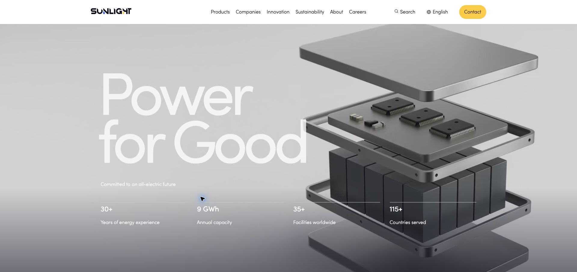
Sunlight Group uses an exploded battery illustration behind an oversized brand statement. A restrained white header separates products, companies, innovation, sustainability and careers, while a yellow contact button provides a clear visual endpoint. Four short metrics form a horizontal row beneath the main message. Their placement makes business scale part of the first impression, although the figures remain company claims rather than independently checked results. Incentro’s DatoCMS showcase documents the multilingual public website. It supports the publishing relationship without establishing the software inside energy-storage products or other operational systems.
What you can learn
Keep corporate claims in fields with named owners and review dates, rather than baking them into artwork. Pair an evocative technical visual with readable product categories and specific explanatory pages. A multilingual content workflow should check the fit of both metric labels and large headlines in every published version.
Pros
The battery illustration connects the brand statement with a recognizable physical product.
The contact accent remains distinct from the otherwise restrained navigation.
Cons & considerations
White headline text has limited contrast against some pale areas of the image.
Headline metrics need deeper context before a buyer can assess the offering.
Public source checked November 3, 2026. References may be embedded or legacy—not a complete backend inventory.
Platform source: DatoCMS customer case or implementation-partner project showcase. Named DatoCMS customer case or implementation-partner project showcase hosted by DatoCMS explicitly documents this public website and links to its domain. Evidence establishes an attributed content-management implementation, not an independent audit of every current operational, commerce, account or product system. The public visual design was reviewed separately. Platform evidence is separate from the direct website screenshot and is not a complete current infrastructure audit.
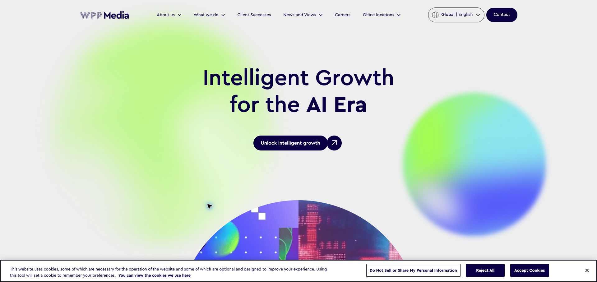
WPP Media centers a large proposition above a compact rounded action. Soft green, blue and purple forms surround the typography, while a circular image begins below it to signal further content. The navigation exposes client successes and office locations as concrete routes beside more general company and service sections. A visible global-language selector reinforces the network context. Code Computerlove’s DatoCMS showcase documents the corporate platform associated with this public website. The screenshot records its present opening; the case does not establish the technologies of every agency, campaign or media-buying system within the wider organization.
What you can learn
A broad corporate promise needs specific routes to evidence and expertise. Model office, service and client-story records so they can connect across regional pages without becoming duplicated biographies or case studies. Keep a compact campaign vocabulary that can adapt to new stories while preserving recognizable navigation.
Pros
Client successes and office locations provide concrete alternatives to broad corporate language.
The limited color family ties the decorative forms to the brand identity.
Cons & considerations
The abstract opening does not immediately explain the practical scope of services.
The bottom cookie strip competes with the start of the next visual section.
ReactAssociated with Next.js; not independently observed
Public source checked November 3, 2026. References may be embedded or legacy—not a complete backend inventory.
Platform source: DatoCMS customer case or implementation-partner project showcase. Named DatoCMS customer case or implementation-partner project showcase hosted by DatoCMS explicitly documents this public website and links to its domain. Evidence establishes an attributed content-management implementation, not an independent audit of every current operational, commerce, account or product system. The public visual design was reviewed separately. Platform evidence is separate from the direct website screenshot and is not a complete current infrastructure audit.
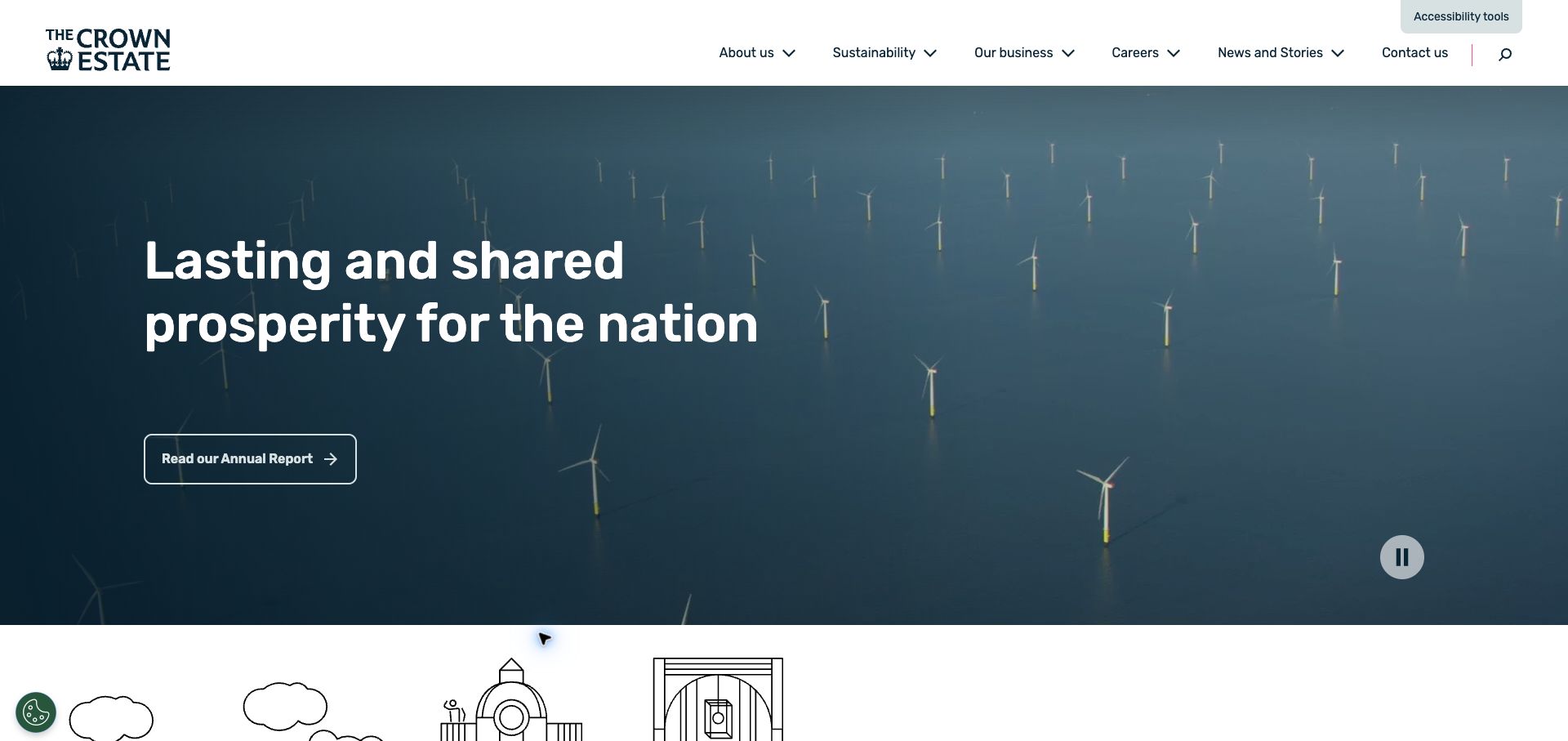
The Crown Estate introduces its public purpose over a moving view of offshore wind turbines. A dark tonal treatment gives the large white headline and annual-report link a stable visual foundation. The white masthead exposes sustainability, business, careers, news and contact, with an accessibility-tools control separately visible at the top. A pause control acknowledges the motion in the hero. Code Computerlove’s DatoCMS showcase documents this corporate website and its content platform. This review concerns the public design and publishing association, without making claims about the underlying portfolio, financial outcomes or private administrative systems.
What you can learn
Give institutional purpose a clear route to supporting reports and current information. Treat annual publications as maintained records with publication dates, accessible document alternatives and durable URLs. A video introduction should remain understandable through a static poster and a reliable pause control.
Pros
The annual-report action connects the broad mission with a substantive reading destination.
The visible pause control gives visitors a way to stop the moving introduction.
Cons & considerations
The large hero delays access to individual news and portfolio stories.
Several corporate navigation categories require clear landing pages to avoid ambiguous browsing.
ReactAssociated with Next.js; not independently observed
Public source checked November 3, 2026. References may be embedded or legacy—not a complete backend inventory.
Platform source: DatoCMS customer case or implementation-partner project showcase. Named DatoCMS customer case or implementation-partner project showcase hosted by DatoCMS explicitly documents this public website and links to its domain. Evidence establishes an attributed content-management implementation, not an independent audit of every current operational, commerce, account or product system. The public visual design was reviewed separately. Platform evidence is separate from the direct website screenshot and is not a complete current infrastructure audit.
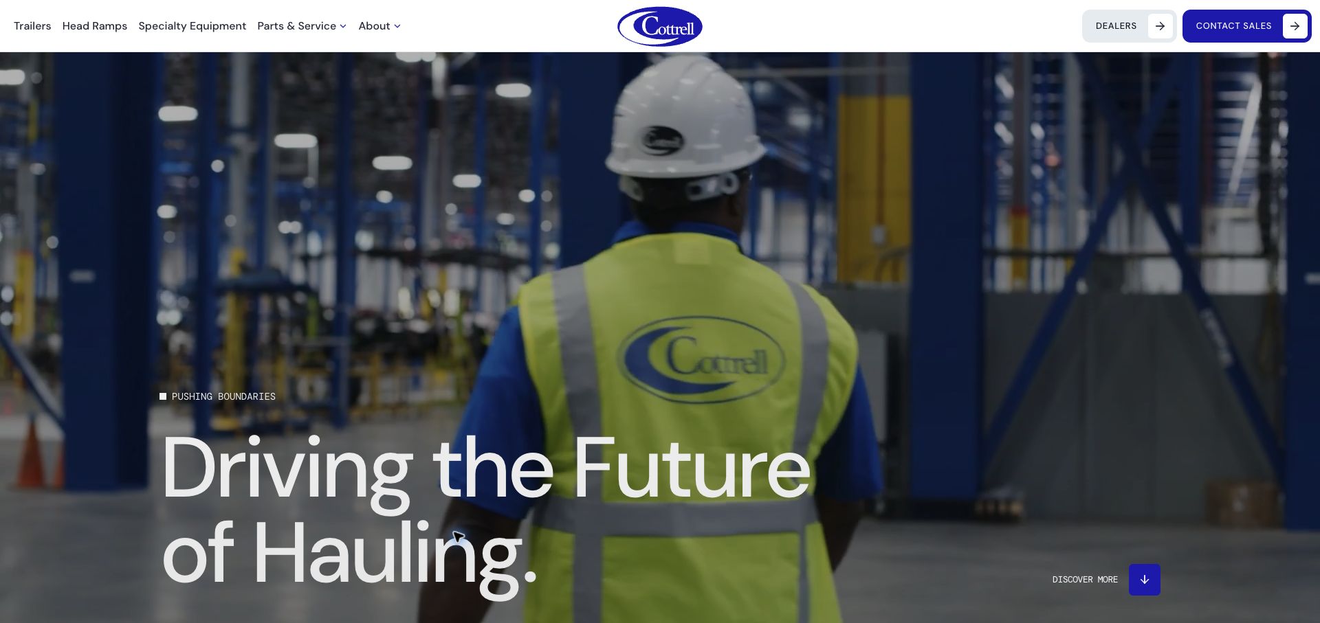
Cottrell places a factory scene behind a very large statement about hauling. The captured video frame shows a worker and manufacturing equipment, giving the company identity a physical setting. A centered oval logo anchors the white masthead, with trailers, head ramps, specialty equipment and parts-and-service routes to the left. Dealers and contact-sales buttons occupy the right, making the practical next steps visible before the visitor explores the story. Monogram’s DatoCMS project account explicitly documents the marketing-site rebuild. It supports a publishing role, not an inference about manufacturing systems, dealer software or operational inventory.
What you can learn
A manufacturer’s content model should connect product families, specifications, dealer information and service resources. Keep practical tasks reachable even when a large film carries the initial brand story. Review campaign headlines against real video frames so important wording remains readable throughout playback.
Pros
Product and service categories support different buyer and owner tasks from the header.
The factory imagery gives the company’s work a concrete human setting.
Cons & considerations
The very large headline leaves little space for product detail in the opening view.
Moving backgrounds require consistent contrast and an effective static fallback.
Visible tech stack
Earlier / documented evidence
DatoCMS
Earlier cited evidence retained; no current scan result. References may be embedded or legacy—not a complete backend inventory.
Platform source: DatoCMS customer case or implementation-partner project showcase. Named DatoCMS customer case or implementation-partner project showcase hosted by DatoCMS explicitly documents this public website and links to its domain. Evidence establishes an attributed content-management implementation, not an independent audit of every current operational, commerce, account or product system. The public visual design was reviewed separately. Platform evidence is separate from the direct website screenshot and is not a complete current infrastructure audit.
Choose the smallest content architecture that serves the publishing work
Use structured records for repeatable information
A restaurant location, office, product family or editorial author should usually have a maintained record. Link those records to relevant pages rather than copying their details repeatedly. Establish how a change appears wherever that record is reused and which editor is responsible for keeping it accurate.
Use composed pages for bounded campaign needs
Campaigns may need a different sequence of images, text and evidence. Offer a deliberate set of components with clear names and preview behavior. Avoid a catalogue of nearly identical blocks that makes editors choose between invisible implementation details.
Assign frontend and delivery responsibilities explicitly
DatoCMS’s Content Delivery API uses GraphQL to supply content to websites and applications. The frontend still needs its own routing, rendering, error handling and release process. Specify how published changes become visible, how draft previews work and who investigates a missing or stale page.
Rehearse the changes your editors will actually make
Write an editorial inventory
List recurring records, page types, markets, languages and external systems. Trace the most common update from source information to published page. Include image permissions, captions, document versions and legacy URLs so the migration does not focus exclusively on the homepage.
Test a complete campaign or publication cycle
Ask an editor to replace a hero image, add a related item, update a destination and preview a long translated title. Review the resulting page at narrow widths. A successful screenshot of the initial design is not a substitute for a successful everyday publishing task.
Give exceptions and maintenance an owner
Plan what happens when an API request fails, a linked record is removed, a translation is missing or an external destination changes. Assign responsibility for redirects, schema changes and outdated claims. Keep a rollback procedure that the team can follow during a real publishing problem.
A useful handover demonstration
Ask the actual team to carry out its routine job: publish a realistic update, correct a mistake, preview a narrow screen, and identify who owns an integration failure. For a library or frontend framework, also ask who maintains the content source and deployment. A polished screenshot does not answer those operational questions.
Beyond the screenshot
DatoCMS project launch and maintenance checklist
Identify the owner and purpose of every major content model.
Choose required fields and meaningful validation messages with the editorial team.
Keep operational prices, stock, payments and account data assigned to their proper systems.
Test long text, missing optional assets and unusual component combinations.
Preview each supported language and market with realistic content.
Verify drafts, published changes, cache behavior and error handling in the chosen frontend.
Preserve legacy URLs through an explicit redirect plan.
Check image alternatives, keyboard navigation, focus and narrow-screen readability.
Record permissions and review dates for important images, documents and corporate claims.
Rehearse recovery from a mistaken publish or broken integration before launch.
Test with real content, a keyboard, a small screen, slow or failed requests, and the people who will maintain the system. These are planning checks, not an accessibility, security, performance, or search-ranking certification.
Sources & editorial method
How this DatoCMS collection was reviewed
We read named official customer cases and partner-authored project showcases hosted by DatoCMS, followed their project links, reviewed the corresponding public properties and captured actual rendered browser views. Documentary implementation evidence and visual observations were recorded separately. Cases establish an attributed publishing relationship rather than a complete current-stack audit. Some Dutch pages were translated by the browser during inspection; the text is not presented as a native language edition. Performance figures, institutional statements and product claims visible on reviewed websites were not independently tested.
Every image is an unmodified capture from the actual website, with its source and capture date. Some captures are reused from our shared catalog; their dates remain the original capture dates. None comes from a vendor gallery or a generated reconstruction. Moving imagery and live content can change.
Technology attribution uses public page assets or metadata, official platform documentation, or a cited first-party project case study. Documentary and framework-relationship evidence is identified where used; it is not a complete current backend inventory. A CMS image CDN alone does not establish a full CMS deployment. A library’s presence does not prove which individual controls use it, and a platform label does not establish AI authorship.
The composition notes, lessons, pros and tradeoffs are original editorial observations. We have not measured conversion, traffic, security, performance or accessibility conformance. Website owners retain their brands and imagery; these examples are not our client portfolio. Written, Edited and Curated are independent records, not dates advanced by a build. See our editorial standards or suggest a correction.
Questions worth asking
DatoCMS website development FAQs
Does DatoCMS determine how the website looks?
The content system and frontend implementation work together, but a CMS association does not prescribe a visual style. The examples range from a photographic canvas to a searchable information gateway. Choose the presentation around the audience and the content your team can maintain.
Should every page be completely flexible?
Only where that flexibility serves an editorial need. Repeatable information benefits from dependable records and templates. Campaign pages may need composed sections, but a bounded component vocabulary is easier to understand and review than unlimited visual controls.
Does a retail example mean DatoCMS handles checkout?
No. A documented CMS role can concern campaign and product storytelling while a commerce service manages transactions. The Sturla London source explicitly describes this division. Confirm the responsibilities of each system in your own project.
Can a screenshot prove a current CMS implementation?
No. The screenshot supports the visual review. The separately linked customer or project source supports an attributed implementation relationship. Neither should be expanded into an unsupported claim about every connected system or every later redesign.
What should a proof of concept demonstrate?
Use a realistic editorial task: create a record, relate it to another, preview a difficult content example and publish through the chosen frontend. Include a correction and a failed dependency so the team can assess maintainability as well as appearance.
Borrow a useful structure from these examples, then test it with your real records and publishing responsibilities. A coherent content model should make the next update easier to get right.