A museum website should make the institution’s work inviting while helping someone understand what they can see, how to visit and what to expect.
Some visitors are choosing an exhibition; others need opening hours, accessible-entry details or a ticket for a particular day. Teachers, researchers, members and remote audiences bring different goals. Strong art direction can establish the museum’s character, but practical information determines whether a visit is easy to plan.
This collection compares art, history, science and design institutions with different scales and visual identities. Look at the relationship between the image, exhibition information, ticket action and operational details. These are website design references, not judgments of curatorial quality or recommendations about a particular exhibition.
Before the examples
What makes good museum website design in 2026?
Make the visit plan easy to assemble
Keep current opening hours, location, admission information and access guidance close to the visit route. Explain closures, timed-entry requirements and which spaces a ticket includes. Do not make a visitor read a campaign story before learning whether the museum is open.
Give exhibitions and collections useful context
Pair an exhibition image with its title, dates, venue and a concise explanation. A collection object needs attribution and descriptive information, not simply a decorative crop. Distinguish current, upcoming and past material so beautiful archived pages do not create a misleading visit expectation.
Welcome audiences beyond the ticket buyer
Provide routes for schools, families, members, researchers and remote exploration where those services exist. Accessibility information should describe practical arrangements and contact options. A digital collection can be valuable even when someone will never enter the building.
The collection · 17 examples
17 museum websites worth studying
Study how these museums balance visual identity with visit details, exhibition discovery and collection access. Some lead with architecture, others with an artwork or a current show; each choice changes what the visitor learns first.
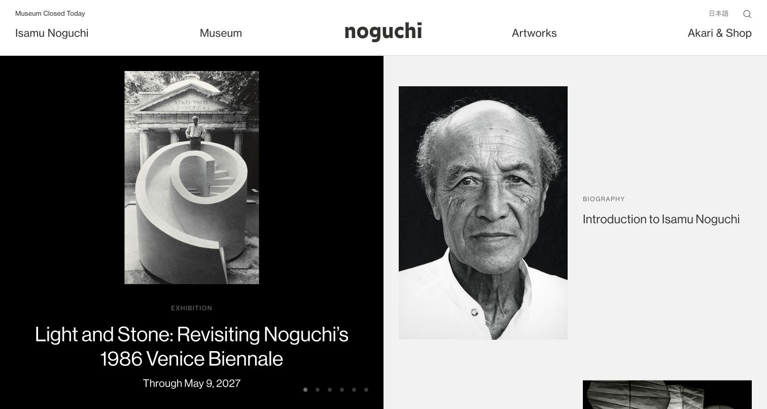
The Noguchi Museum places the artist, the museum, artworks and the shop in distinct navigation groups. The opening grid combines an exhibition image with a portrait and biographical entry, so the institution’s present program and its archival purpose appear together. Dated programs, digital features and public works extend that relationship farther down. The restrained black-and-white treatment lets sculpture and photography carry the visual interest without requiring every feature to share one rigid promotional format.
What you can learn
Give archival material and current programming distinct labels while allowing them to share a coherent visual system. An exhibition card should disclose its dates, while a biography or collection record needs a durable identity that remains useful after a seasonal campaign ends.
Pros
The navigation distinguishes the artist’s work from the practical museum and shop destinations.
The mixed grid offers both an immediate exhibition route and a slower research-oriented path.
Cons & considerations
Small category labels and dates require enough contrast and size to remain readable on phones.
A rotating feature can conceal some editorial choices unless the static page also exposes those destinations.
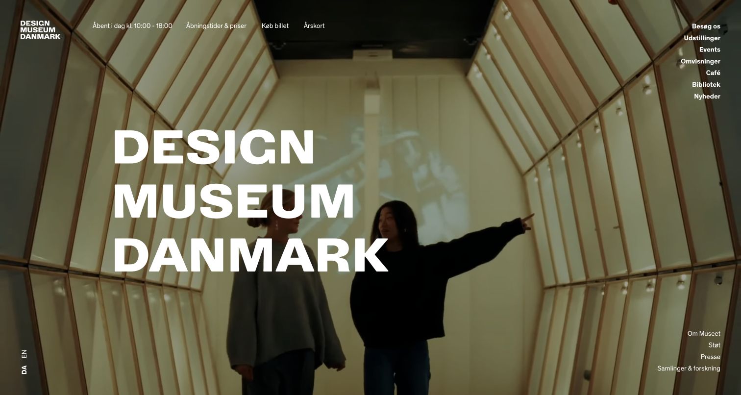
Designmuseum Danmark opens with an expansive interior photograph and large stacked typography. Practical information appears in the header, including today’s hours, prices, tickets and membership. The menu separates exhibitions, events, tours, the café, library and research resources. This is a useful example of a museum allowing a strong visual identity to lead while retaining the operational facts needed to plan a visit. The Danish page also makes an English-language route identifiable rather than assuming one audience language.
What you can learn
Let the museum’s environment establish atmosphere, then place hours, ticketing and accessibility information in stable positions. Treat translated navigation as an operational feature, and make exhibition dates and visitor details part of the content model rather than artwork embedded in an image.
Pros
Hours and ticket routes are available without requiring visitors to interpret the hero image.
The menu recognizes collection research, education and visitor services as different types of use.
Cons & considerations
Very large image-led openings need legible text treatment across changing photography and screen sizes.
A broad menu can become difficult to scan unless the main visitor tasks remain clearly prioritized.
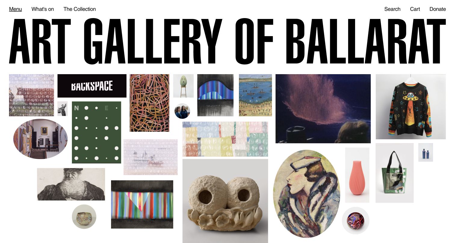
Art Gallery of Ballarat combines a large wordmark with a varied collage of artworks and objects. The page also states that the main building is closed for upgrades while other spaces remain open. Program cards name their location and distinguish exhibitions, workshops and free events. This is a particularly useful reference for an institution whose public program continues across several venues: the lively visual identity does not have to hide the logistical information that changes what a visitor can actually do.
What you can learn
Publish operational changes as first-class information and connect every event to its real venue. A collection-led homepage can still be welcoming during renovations if it explains which spaces are available, where to go and whether an activity requires a ticket.
Pros
Location and activity labels make the program more concrete than a gallery of unnamed artwork.
The closure notice acknowledges a material visitor constraint while directing attention to continuing activity.
Cons & considerations
The collage is visually busy and can compete with a small operational notice if hierarchy weakens.
Ticketing, shop and donation destinations need clear separation when the principal building is temporarily unavailable.
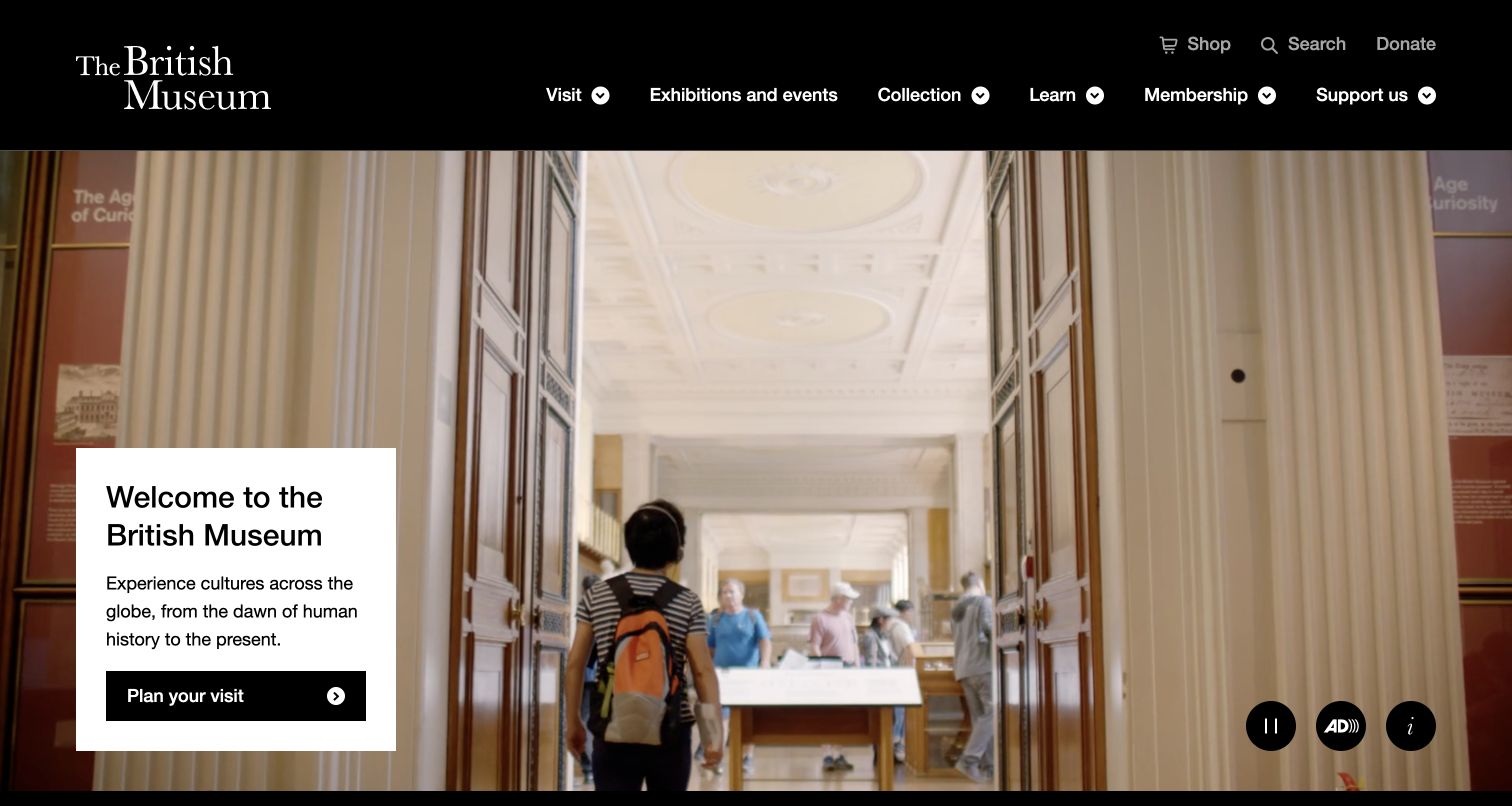
The British Museum places a compact white welcome card over a broad view of the museum interior. A direct visit-planning action is supported by opening information, free-entry guidance and exhibition dates below. Navigation separates visits, exhibitions, collections and learning, giving several audiences a recognizable route. The combination works because the image communicates the scale of the place while the card answers the immediate question of what a visitor should do next.
What you can learn
Use a visual introduction to orient people, then bring hours, admission conditions, access and travel information into a dependable visit-planning path. A beautiful interior image should support those decisions rather than be the only explanation of what the museum offers.
Pros
The contained text card preserves a readable action against a detailed photographic background.
Collection and learning routes remain distinct from the practical visit and exhibition journey.
Cons & considerations
A video opening can increase page weight and requires a useful still image and motion controls.
Free entry and ticketed exhibitions need careful explanation so their different booking requirements remain clear.
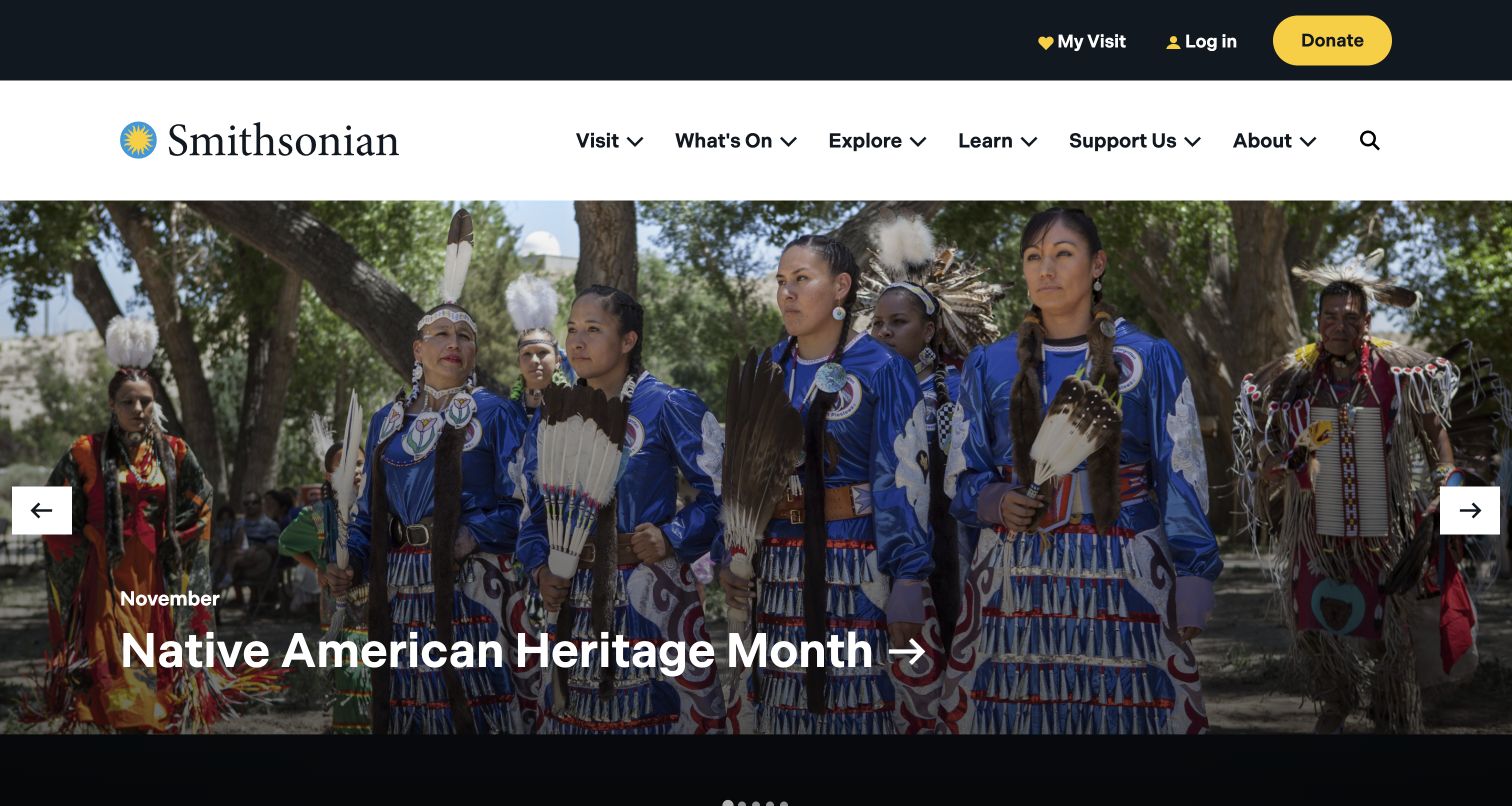
The Smithsonian homepage combines a large topical feature with a clear split between exploring online and planning an in-person visit. Its navigation spans visits, current programming, exploration, learning and support. Later categories group content by art, history, science and technology rather than by one building alone. This is a useful model for an institution whose website serves a distributed collection: the homepage can orient visitors without pretending that the organization is a single venue with one schedule.
What you can learn
Create a shared discovery layer when several museums or programs share a brand. Make venue selection explicit before presenting hours or tickets, and offer online collections as a complete visitor journey rather than a secondary substitute for attending in person.
Pros
The page makes remote exploration and physical visit planning visible as separate routes.
Subject categories help readers browse across a large institutional structure without knowing museum names first.
Cons & considerations
Rotating campaign features can distract from the location and schedule a practical visitor needs.
A large institution needs consistent venue-level information to make the broad homepage promises actionable.
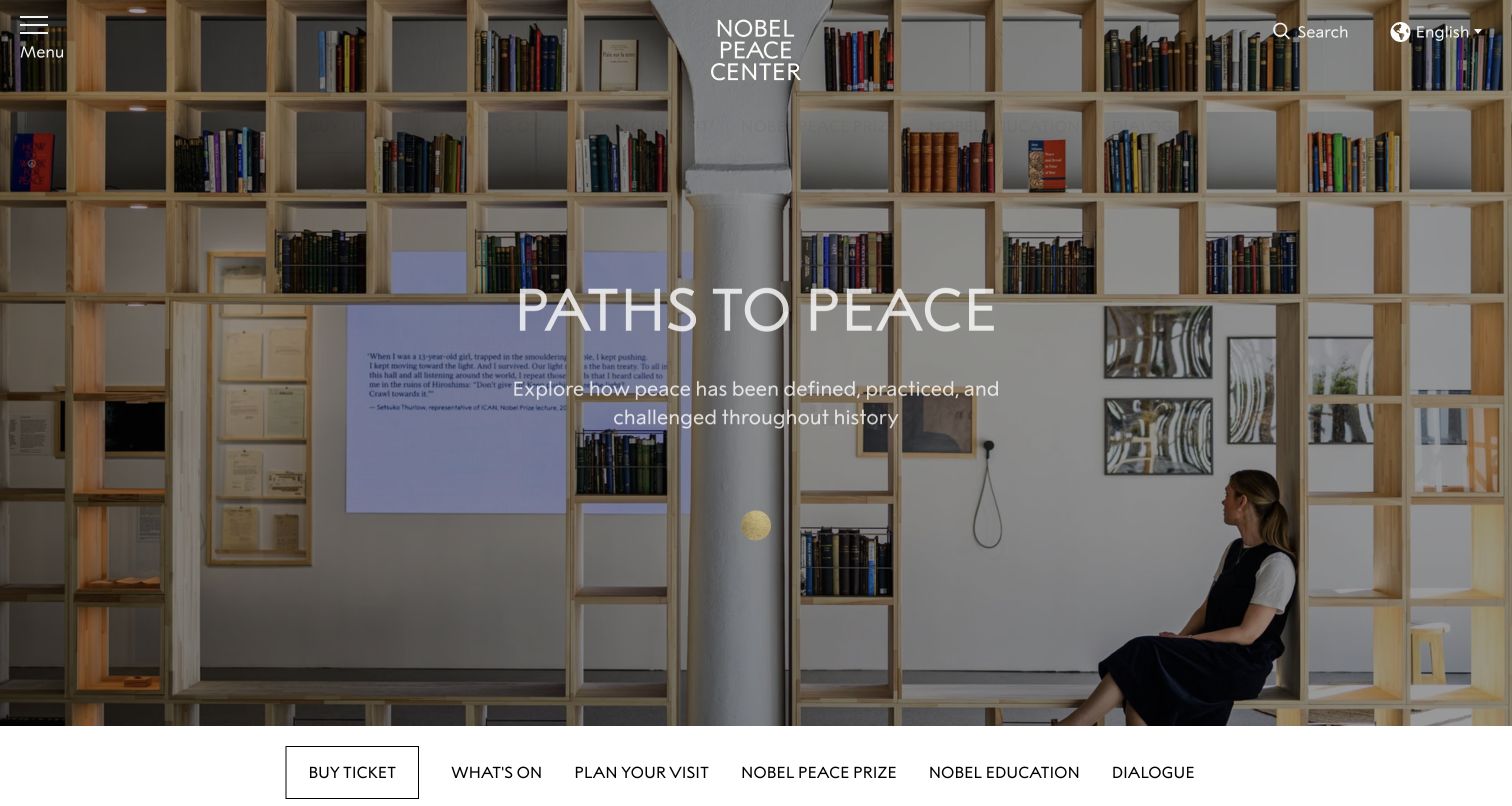
The Nobel Peace Center uses a full-width exhibition photograph with a restrained title and subtitle, followed by a narrow navigation bar and a dated program list. Exhibition, event and tour labels distinguish activities that could otherwise look similar in a card grid. Visit planning and ticketing remain explicit alongside education and dialogue. The design is useful for a museum whose mission extends beyond objects on display, because the content structure gives public programs a visible place without losing the visitor’s practical route.
What you can learn
Label the format and timing of each activity before adding promotional copy. A visitor should be able to distinguish a permanent exhibition, a temporary installation, a guided tour and a one-off event without opening every detail page.
Pros
Program-type labels and dates make the busy schedule more understandable at a glance.
Ticketing and visit planning are presented alongside the institution’s wider educational purpose.
Cons & considerations
Text over a detailed exhibition image needs careful contrast treatment and a dependable mobile crop.
An extensive mixed calendar benefits from clear filtering once the volume exceeds a small curated selection.
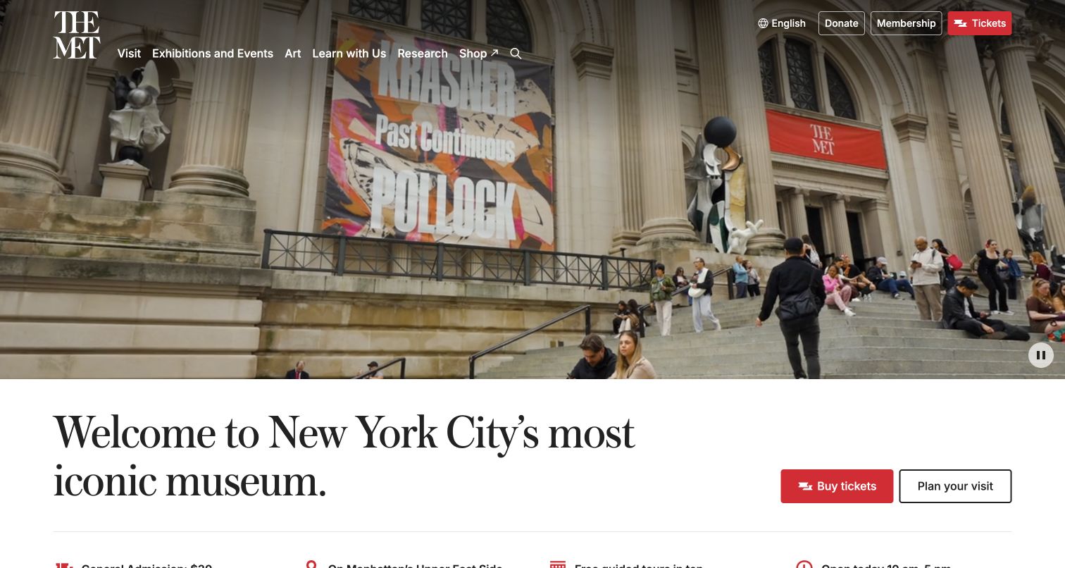
The Metropolitan Museum of Art pairs an exterior arrival image with a large welcome message and two direct actions: tickets and visit planning. The next information block names admission, location, transport, tours and opening hours. Exhibition cards then extend into the collection. This is a strong reference for keeping essential visit facts close to a visually ambitious opening, especially where admission policies differ by visitor category and cannot responsibly be reduced to one universal price label.
What you can learn
Place practical facts near the first ticket action and preserve their qualifications. Model admission categories, opening exceptions and transport information as maintained content, so a campaign redesign does not push those details into a distant FAQ or leave them embedded in outdated graphics.
Pros
The ticket and planning actions provide clear alternatives for decisive and still-researching visitors.
Admission and travel information are exposed early instead of relying solely on an inspirational hero.
Cons & considerations
A large exhibition catalog can overwhelm visitors unless dates and venue distinctions stay consistent.
Admission wording requires regular review because a short headline cannot represent every visitor’s eligibility.
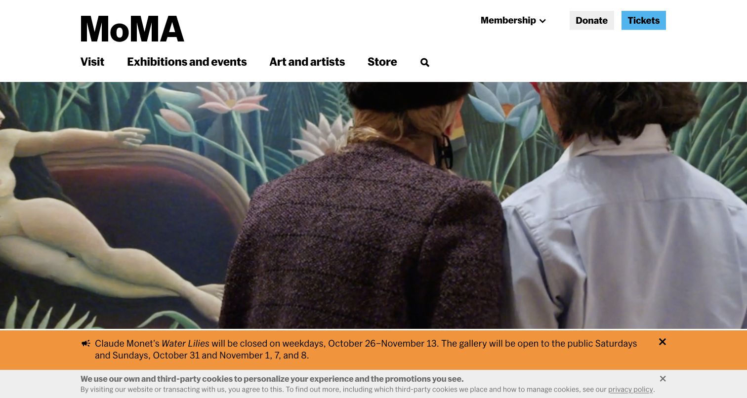
MoMA opens with a clean header, a broad photographic view and a short welcome. Tickets remain prominent, while an operational notice explains a temporary gallery closure. The body organizes exhibitions, events, collection exploration and the design store into distinct sections. The page demonstrates how a museum can maintain a recognizable visual voice while acknowledging practical exceptions. Its program is presented as current information with dates, rather than as timeless promotional imagery that a visitor must interpret without context.
What you can learn
Give temporary access changes a visible, maintained component separate from the exhibition marketing. Pair every featured show with its dates, and preserve a simple path to planning even when a strong visual campaign dominates the upper page.
Pros
The restrained navigation makes tickets, visits, art and exhibitions easy to recognize.
The closure notice provides actionable context before someone commits to a specific gallery visit.
Cons & considerations
Stacked notices can reduce the useful opening viewport, particularly on smaller screens.
A rich program grid needs clear priorities so the homepage does not become a list of equally weighted promotions.
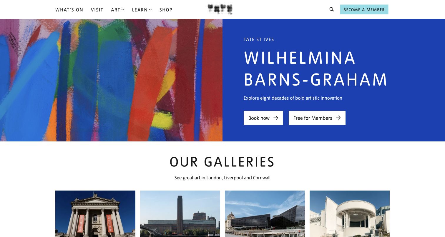
Tate’s homepage begins with a featured exhibition, then introduces its galleries as distinct destinations. The venue cards include names, locations and admission context, which matters because the organization spans several places and visitor experiences. Exhibition and membership routes continue below. The strong color and artwork make the page feel like a cultural publication, but the location layer turns that identity into practical navigation rather than leaving a visitor to discover the correct city after opening a ticket page.
What you can learn
Treat location as part of the first meaningful decision for a multi-venue institution. Keep the same venue name on exhibition cards, calendars and ticket handoffs, and distinguish general admission from special events wherever their conditions differ.
Pros
Gallery names and city information connect the shared brand to real places a visitor can reach.
Artwork-led features retain a clear route to booking and related program information.
Cons & considerations
A single featured exhibition can initially imply one location unless the venue label stays prominent.
Strong campaign colors need consistent contrast and focus styling as exhibitions change across the year.
Visible tech stack
Referenced on the public page
reCAPTCHA
Public source checked November 3, 2026. References may be embedded or legacy—not a complete backend inventory.
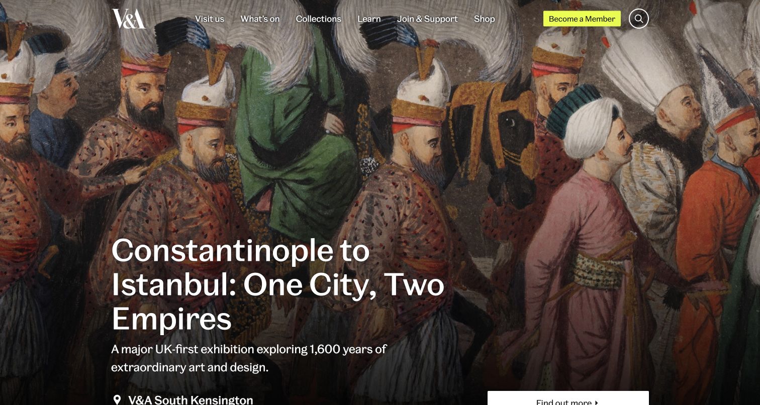
The V&A uses a large exhibition image to introduce the brand, followed by an explicit explanation that it is a family of museums. Current program cards identify the venue and display practical states such as sold out, free or a separate exhibition price. The broad navigation includes collections, learning and support alongside visits. This makes the page useful for studying a shared museum platform where a beautiful card is insufficient unless it also tells someone where an experience happens and whether entry is available.
What you can learn
Design program cards around real attendance decisions. Include venue, date and availability as structured fields, and ensure sold-out or free states remain readable without relying on color alone. Keep general admission separate from the conditions attached to particular exhibitions.
Pros
Venue labels help visitors distinguish programs across the different museums in the family.
Visible availability and price states prevent every exhibition from appearing equally bookable.
Cons & considerations
A richly illustrated opening can delay the practical distinction between the different locations.
Many ticket states increase editorial maintenance and require a reliable owner for timely updates.
Visible tech stack
Referenced on the public page
OneTrust
Amazon CloudFrontDelivery / hosting signal
nginxReported response header
Public source checked November 3, 2026. References may be embedded or legacy—not a complete backend inventory.
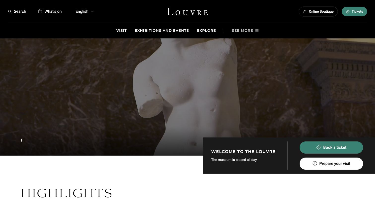
The Louvre presents an expansive visual welcome but keeps ticketing and visit preparation as explicit actions. The homepage reports whether the museum is open, then moves into exhibitions, concerts and other highlights. Language selection sits in the header, which supports an international audience. The page is a useful example of a landmark institution balancing a powerful image with operational information; it does not rely entirely on familiarity with the museum to explain what someone should do before arriving.
What you can learn
Keep opening status and visit preparation close to the principal booking action. For international audiences, maintain translated operational information with the same care as promotional copy, and make time-sensitive changes easy to publish without rebuilding the entire homepage.
Pros
The opening status supplies an immediate practical fact alongside the visual introduction.
Ticketing, visit preparation and language selection are recognizable destinations in the main structure.
Cons & considerations
A large moving image needs controls and a still fallback that preserve the same readable hierarchy.
A varied highlights carousel can obscure options unless they are also reachable through stable program navigation.
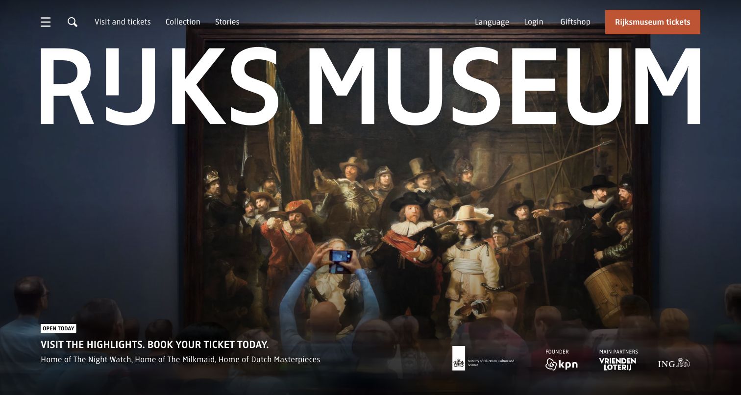
The Rijksmuseum gives its name dramatic scale over a collection-led image while keeping the main navigation compact: visits and tickets, collection, and stories. The following features identify current exhibitions and family visits, with daily hours and the address near the bottom. The visual restraint is useful for studying how a museum can avoid a crowded institutional menu. It also shows the tradeoff: a sparse upper page must make the route to detailed access and visitor information unmistakable.
What you can learn
Choose a small set of top-level tasks and make them consistently useful. A concise menu works when its destination pages answer practical questions thoroughly; reducing visible links should not remove access, travel, family or ticket-condition information from the visitor journey.
Pros
The small navigation gives visit planning and collection exploration a clear place in the hierarchy.
Large-scale artwork and typography create a recognizable identity without a complicated card layout.
Cons & considerations
Oversized branding can consume the opening view before more practical information becomes visible.
Sparse navigation puts greater responsibility on the visit page to expose secondary needs clearly.
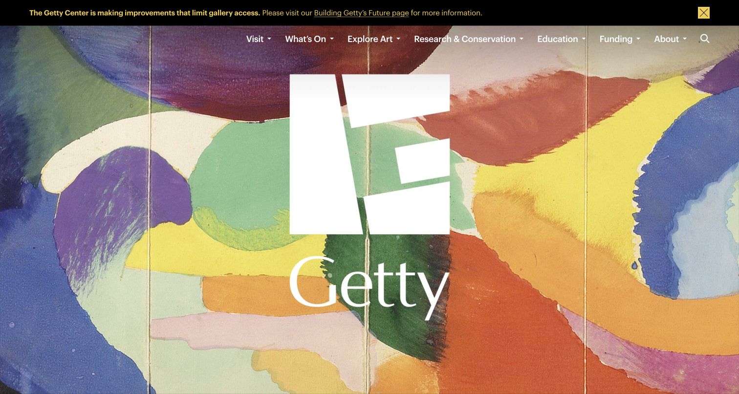
Getty’s homepage layers a large wordmark over colorful artwork, then separates locations, art and archives, research and conservation, and funding. A visible notice explains temporary gallery-access limitations. The navigation therefore reflects an organization with more responsibilities than a single exhibition program. This is a useful reference for institutions that need to serve scholars, grantees and the general public together: the site gives those activities names rather than forcing all of them beneath a generic visit or about section.
What you can learn
Map the institution’s actual public roles before designing the menu. Keep the visitor experience clear, but provide distinct destinations for research resources, conservation work and funding when those are genuine services with different audiences and requirements.
Pros
Research, conservation and funding are identified directly rather than hidden behind institutional jargon.
The access notice provides timely context while the homepage retains a strong visual identity.
Cons & considerations
The oversized brand treatment can delay the visitor’s first practical choice if the image occupies most of the screen.
A broad institutional menu needs consistent destination-page summaries to keep specialist routes understandable.
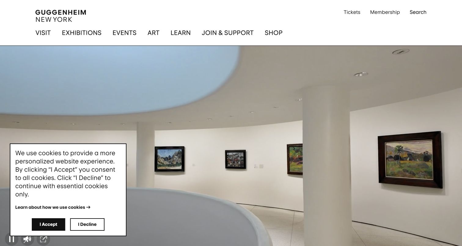
The Guggenheim opens with the interior of its distinctive building beneath a compact header. Tickets and membership sit above the exhibition and event navigation, while the program below names individual shows and their dates. The architecture establishes place immediately, but the content model still treats exhibitions as separate destinations. This is useful for a museum where the building itself draws interest: the visitor should be able to appreciate that identity and still find the specific art or program they came to see.
What you can learn
Use architectural imagery as orientation, then move into clear exhibition records. Preserve dates, ticket requirements and program titles independently of the hero image, so a change in campaign photography does not change how visitors navigate or compare what is currently available.
Pros
The opening communicates the physical experience without requiring a long introductory paragraph.
Ticketing, exhibitions and events retain direct labels despite the institution’s strong architectural identity.
Cons & considerations
The cookie panel covers part of the first view in the capture and competes with the architecture.
Repeated carousel content can make program scanning harder unless a stable view-all destination remains obvious.
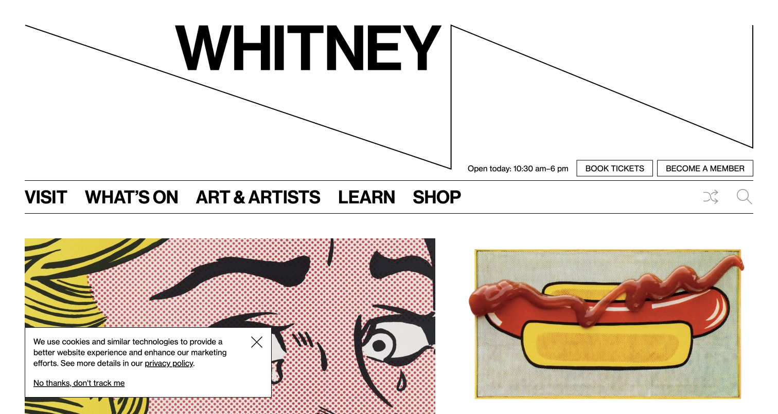
The Whitney pairs its expansive wordmark with a compact visitor navigation and large exhibition images. Opening hours, tickets and membership sit close to the top, while free-access programming receives its own explanation below. The graphic identity is strong without requiring every action to become an unusual interface. This makes the site useful for studying how a museum can express its character while preserving familiar visit tasks and giving admission initiatives an identifiable place in the page structure.
What you can learn
Let distinctive typography carry the brand while keeping essential actions conventional. Publish access initiatives with their exact schedule and conditions, and connect them to the same ticket and planning system used elsewhere so visitors do not have to reconcile conflicting information.
Pros
Hours and ticket actions remain visible alongside the museum’s expressive typographic identity.
The free-access section explains a practical visit route instead of treating it as a vague promotional badge.
Cons & considerations
The large wordmark uses substantial vertical space before the current exhibition content begins.
Multiple exhibition images and shop promotions can compete unless the primary visit path stays visually consistent.
Visible tech stack
Referenced on the public page
Vite
Fathom Analytics
Mailchimp
Public source checked November 3, 2026. References may be embedded or legacy—not a complete backend inventory.
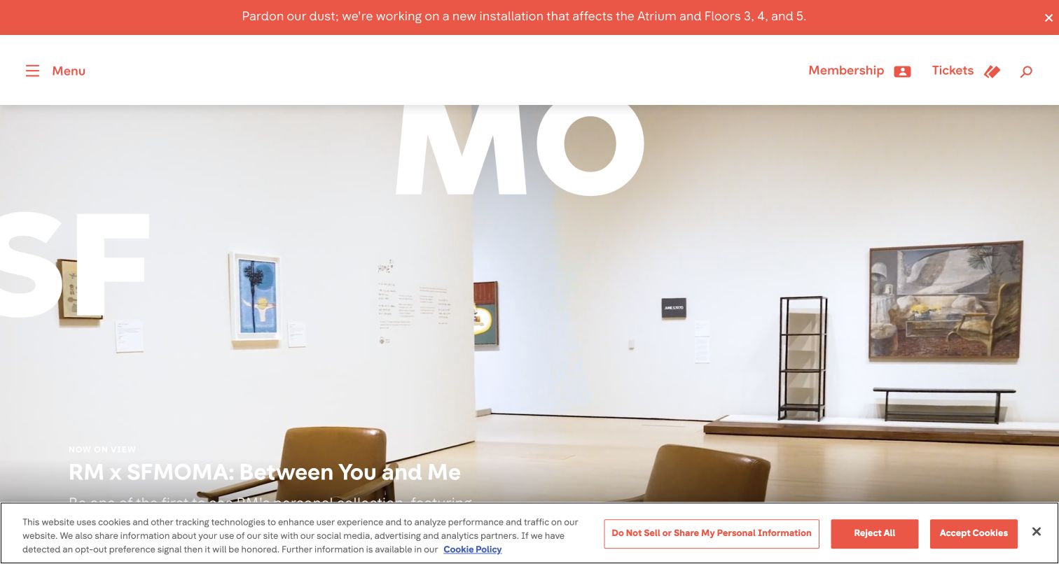
SFMOMA uses large photographs and brief editorial descriptions to introduce current exhibitions and installations. A notice at the top explains that work affects specific floors, while membership and tickets remain clear header actions. Family information, community participation and shop features follow the art-led sections. The page is useful for a museum with a changing physical environment: it presents the program energetically while acknowledging that an actual visitor may encounter temporary restrictions or different routes through the building.
What you can learn
Give installation changes an operational component that can be updated independently of marketing features. Keep the affected areas and practical next step clear, then let exhibition photography and short descriptions explain why the program is worth exploring.
Pros
The top notice makes a current building constraint visible before someone plans a visit.
Large artwork and installation photographs are paired with concise descriptions rather than left unexplained.
Cons & considerations
Text over bright gallery photography needs careful contrast treatment as the image changes.
Long sequences of full-width features can push routine information far down the page on smaller screens.
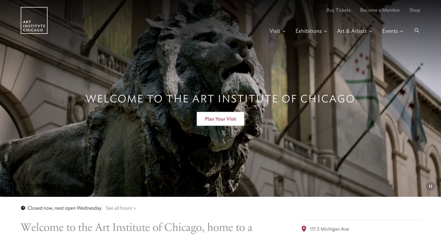
The Art Institute of Chicago uses its entrance and lion sculpture as an immediate sense of place, with a centered visit-planning action over the image. Opening status, the street address and ticket links follow close beneath. Exhibition sections provide dates and explain when a show has an additional ticket condition. The structure is useful because it connects the familiar landmark to practical attendance information, rather than assuming that recognition alone is enough to guide a first-time visitor.
What you can learn
Anchor the opening in a real arrival experience and follow it with the facts needed to act. Keep exhibition-specific admission conditions beside the program description, and make a visitor’s route from inspiration to hours, access and tickets consistent throughout the site.
Pros
The entrance photograph gives a clear sense of the destination while retaining a direct planning action.
Opening status and exhibition ticket conditions appear as explicit information rather than hidden assumptions.
Cons & considerations
A photographic header needs readable navigation against every crop and lighting condition.
Several audiences and program types can create a lengthy page, making concise section titles and indexes valuable.
Collect authoritative hours, addresses, admission categories, entry procedures and access information. Assign someone to maintain each field. Include exceptions such as closed galleries or building work, and decide where urgent operational notices appear across the site.
Model exhibitions as structured records
Give each show dates, location, images, credits, ticket relationship and audience information. Use those fields in calendars and landing pages rather than rewriting the same details. Decide what happens to booking actions when an exhibition ends.
Map the handoff to ticketing and membership
Explain when a visitor enters a separate booking platform and how to get help if it fails. Test date selection, basket summaries and confirmation wording with approved test data. Keep public visit information accessible before any account or payment step.
The editing job behind the design
Choose systems that keep collection and visit information consistent
A museum may need a CMS, collection-management system, ticketing service and membership database. Define which system owns each fact and how it reaches the public website. Structured exhibition and event records help reduce inconsistent dates, while an image-rights record protects essential attribution and reuse conditions.
Evaluate image delivery, search, multilingual content and accessible templates alongside editorial flexibility. Full-screen photography can be effective, but it needs responsive sizing and legible text. Treat a ticketing integration as a separate user journey that needs testing rather than assuming a good homepage guarantees a good booking experience.
Our WordPress website examples offer a separate look at publishing approaches. A visible platform label is evidence for that named page, not a guarantee that the same system will suit your requirements.
Before the public launch
Museum website launch checklist
Verify hours, admission categories, addresses and closure notices against current operations.
Check exhibition dates, venues, image credits and booking destinations.
Make access information and a contact route easy to find before ticket purchase.
Test visit planning, calendar use and navigation on a small screen with keyboard access.
Review image crops, alternative text, captions and moving-media controls.
Assign owners for urgent notices, expired exhibitions, ticket links and membership information.
These checks are a project checklist, not a performance, legal, security, or accessibility certification. Test real journeys with the people responsible for the website before making claims about the result.
Sources & editorial method
How this collection was selected and reviewed
We reviewed seventeen distinct official museum websites and captured their public homepages directly in the browser. The examples cover different collection types and visual approaches. Reviews focus on visible navigation, editorial hierarchy and visit planning; captured exhibitions and operational notices are time-specific.
Each example links to its actual source page. Screenshots are direct browser captures with their own capture dates; moving imagery, announcements and live designs can change. The notes describe observable design choices and conditional tradeoffs, not measured traffic, conversion results, service quality, or accessibility conformance.
Technology labels use public page metadata, asset evidence, or explicitly cited platform documentation. Platform documentation is not a complete current deployment audit. A component reference may be legacy or unused; it is not a complete backend inventory. Unknown stacks are omitted. These sites are editorial examples, not our client portfolio.
Written, Edited and Curated are separate editorial records, not timestamps advanced by a rebuild. Website designs and imagery belong to their owners. See our editorial standards or suggest a correction.
Questions worth asking
Museum website design questions
Should tickets be the main homepage action?
They often deserve prominence, but the label should reflect the actual visit model. Free admission, timed reservations, special exhibitions and membership entry can require different explanations. Keep basic visit information available before booking.
How should temporary closures be presented?
Use a clear notice near visit planning and on affected exhibition pages. State which spaces or services are affected and where to find current details. Avoid relying on a social post or a buried news article.
Can the website use large artwork images?
Yes, when rights, attribution, performance and accessibility are addressed. Preserve meaningful details in responsive crops and provide captions or object information where the image is part of the content.
Does every museum need an online collection?
A useful digital collection depends on catalog quality, rights and maintenance capacity. A smaller, well-described selection can be more valuable than a large set of images without provenance, context or workable search.
Use the collection and visual identity to invite interest, then make the practical visit straightforward. Clear dates, access information and maintained booking routes are part of the museum experience.