A veterinary website has to work for a calm first-time researcher, an existing client, and someone trying to reach urgent help.
Those visitors do not need the same opening screen. Routine appointments, emergency information, referrals, record access, and membership questions should have recognizable routes. The design should state where the practice is, which services it offers, and how a visitor confirms local availability.
This collection includes general practices, specialty and emergency hospitals, regional networks, and teaching hospitals. Their operating models differ, so the examples are design references rather than recommendations for care. Promotional claims, opening statements, and plan details must be checked with the individual provider before they are relied on.
Before the examples
What makes good veterinary clinic website design in 2026?
Separate routine, urgent, and emergency routes
Use the clinic's approved language to explain what each route is for. Keep the correct telephone and arrival information visible. A booking form should not imply that it is an emergency-response channel, and a network homepage should not imply that every location offers identical services.
Make the local practice the useful destination
Give each practice a consistent page with address, contact, opening information, services, team context, and an appropriate booking route. Let people change a suggested location. Avoid making them navigate the entire corporate organization before finding a clinic's practical details.
Explain the client experience plainly
Describe how appointments, follow-up, records, and plan information can be accessed. Separate memberships or packages from individual visits. Give referring professionals and returning clients their own shortcuts so the homepage can remain understandable to a new pet owner.
The collection · 25 examples
25 veterinary clinic websites worth studying
These 25 examples show different ways to handle appointment access, local discovery, referral audiences, and ongoing client tasks. Compare the patterns in light of the clinic's real service scope, staffing, and booking process.
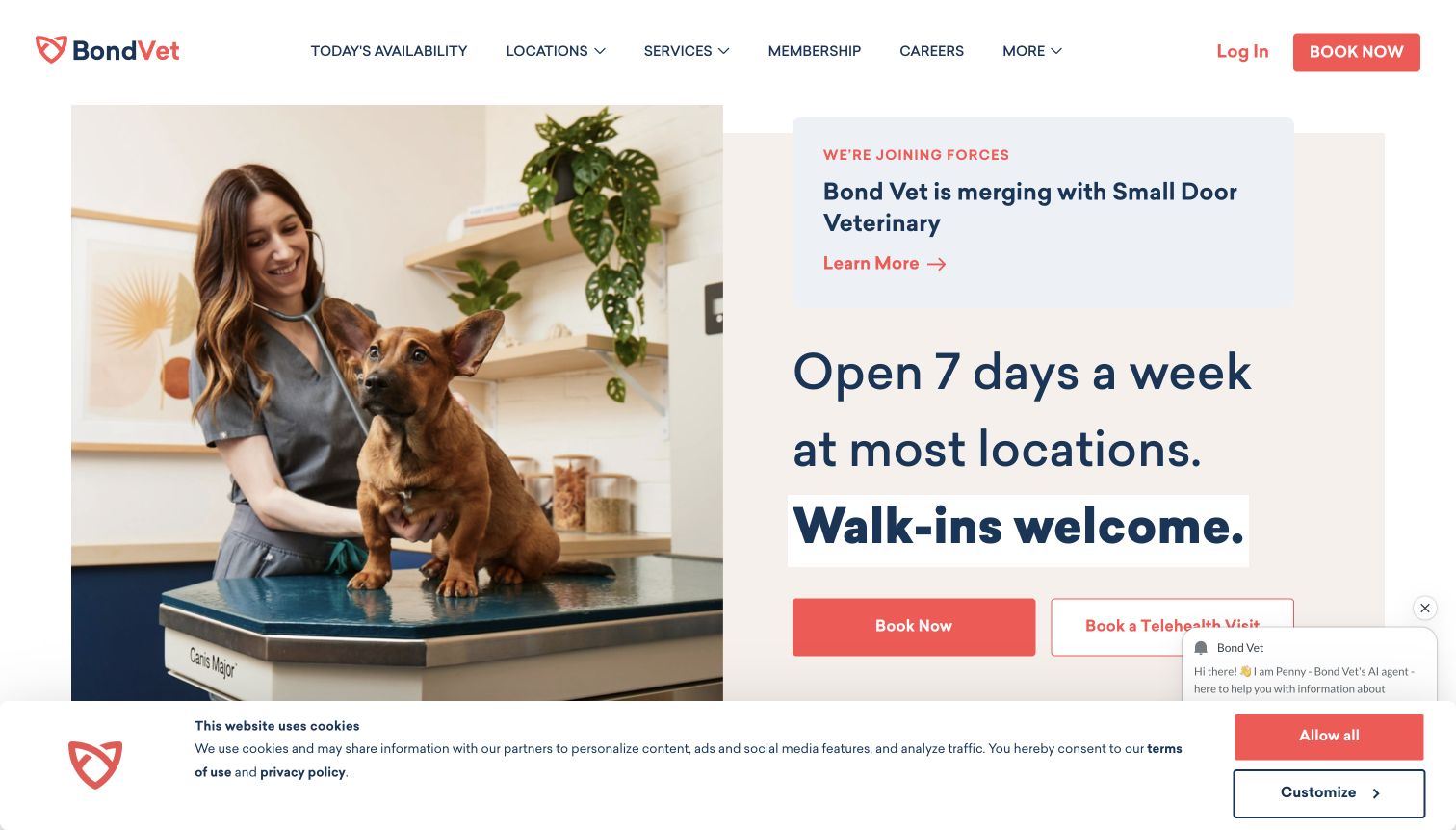
Bond Vet pairs a photograph of a veterinarian examining a dog with a large statement about opening days and walk-in availability. The page qualifies that message by location, while Today's Availability, Locations, and Book Now remain prominent in the header. A separate telehealth action recognizes that not every visitor is seeking an in-person visit. The captured page also carries a merger announcement, so an operational update shares the opening screen with the core booking task. The design makes access to care feel concrete, although chat, cookie information, and the announcement reduce the space available for the primary decision.
What you can learn
Lead with the access questions the practice can answer accurately: which locations, which types of appointment, and how to book. Put important organizational updates in a clearly labeled area and preserve a direct route to availability when notices or support widgets are present.
Pros
Location-qualified availability avoids presenting every clinic as identical.
In-person booking and telehealth have distinct labels.
Cons & considerations
The announcement adds another competing message above booking.
Chat and cookie controls can cover parts of the opening actions.
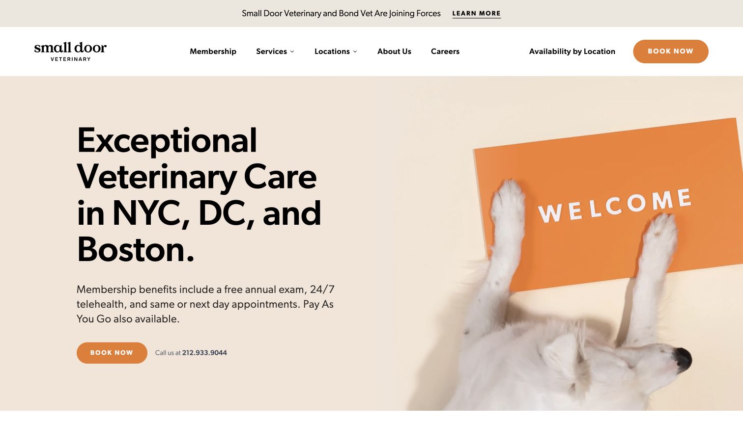
Small Door uses warm beige and orange, a playful dog photograph, and a headline naming its main cities. Membership benefits are introduced beside the booking action, with a short note that pay-as-you-go care is also available. This makes the business model visible early instead of leaving prospective clients to discover it during intake. Availability by location appears in the navigation, and service categories sit alongside membership rather than disappearing behind it. The opening screen is approachable, but the membership proposition carries a lot of information and still needs an easy path to detailed eligibility, prices, and inclusions.
What you can learn
Explain how clients can access the practice before presenting a membership as the default answer. Name the actual service area and connect benefits to a clear details page. Keep occasional-visit and membership routes understandable without requiring the reader to infer the difference from marketing language.
Pros
City names make geographic relevance immediate.
Membership and pay-as-you-go access are both acknowledged.
Cons & considerations
The large headline leaves limited room for detailed plan explanation.
A corporate announcement adds another decision above the main navigation.
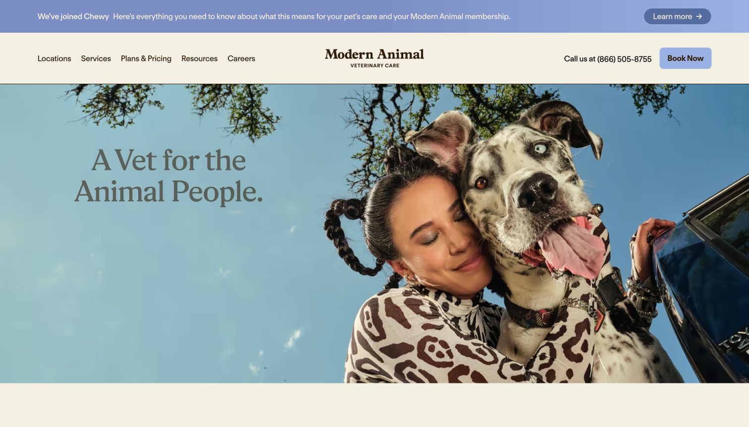
Modern Animal opens with a large photograph of a person and dog, a restrained serif headline, and a cream-and-blue interface. The image conveys the relationship the practice wants to support, while the header offers Locations, Services, and Plans & Pricing beside a phone number and booking button. Lower-page copy explains appointment access, costs, communication, and care after a visit. That combination gives the lifestyle image a practical foundation. The first screen itself offers relatively little service detail, and its muted text depends on the photograph maintaining enough contrast as the creative changes.
What you can learn
A distinctive brand voice works best when the navigation answers practical questions plainly. Keep services, location, pricing information, and booking visible even when the hero is mostly photographic. Follow an emotional introduction with specific explanations of the client experience that the team can consistently provide.
Pros
Plans and pricing receive a visible navigation position.
Phone and booking actions remain available beside the brand-led hero.
Cons & considerations
Service detail appears mainly after the large opening photograph.
Muted text over imagery needs careful contrast review.
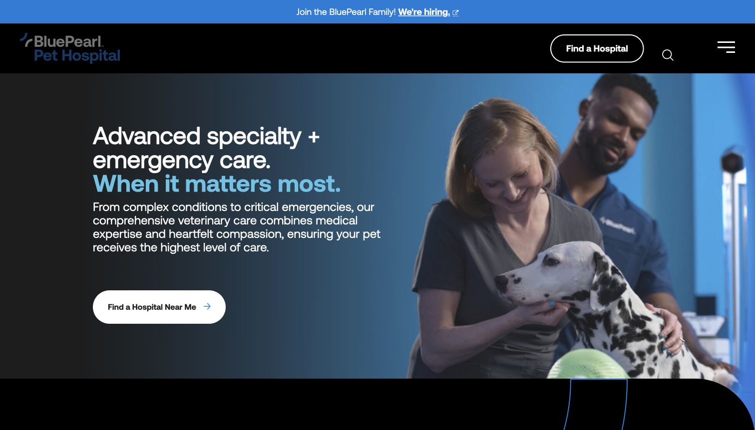
BluePearl uses a dark blue photographic hero to introduce specialty and emergency care together. The main action is a hospital finder, repeated in the compact header, while more detailed navigation sits behind a menu control. The photograph shows a clinical team with an animal, reinforcing the service context without turning the homepage into a list of diagnoses. Further sections introduce service categories and emergency-related information. This is an effective study in concentrating a large network around a local destination, although the collapsed menu means visitors seeking a specific specialty may need another step before seeing the full structure.
What you can learn
Choose a clear first task for a hospital network and carry it through the header and hero. Let local hospital pages explain availability and specialty services precisely. Keep urgent-help information easy to reach even when a restrained desktop menu hides the broader information architecture.
Pros
A repeated hospital-finder action creates a consistent next step.
Clinical photography supports the stated service category.
Cons & considerations
Collapsed navigation adds a step for specialty research.
Recruitment messaging occupies a prominent strip above the patient journey.
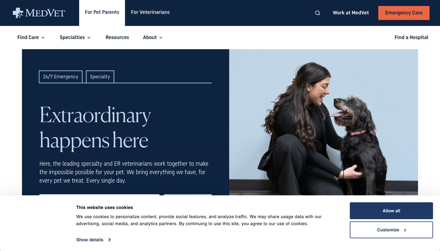
MedVet begins by separating pet parents from veterinarians in the top navigation. An orange emergency-care button stands apart from the navy header, while the main hero pairs a calm clinical photograph with emergency and specialty labels. A city-or-ZIP finder provides a practical path to a location, and service categories appear further down the page. The audience distinction is the strongest lesson here: a referral professional and a worried owner need different documents and explanations. The generous headline and tall two-level header, however, push some of the useful location content toward the bottom of the first screen.
What you can learn
Separate professional referral information from owner-facing guidance while preserving an obvious emergency route for both. Keep the location finder close to the opening explanation. A reassuring visual tone should support a short path to concrete care information, especially on smaller screens.
Pros
Audience tabs make owner and referral journeys explicit.
Emergency care uses a distinct, high-visibility action.
Cons & considerations
The tall header and hero leave less space for location search.
A broad aspirational headline needs the nearby service labels for context.
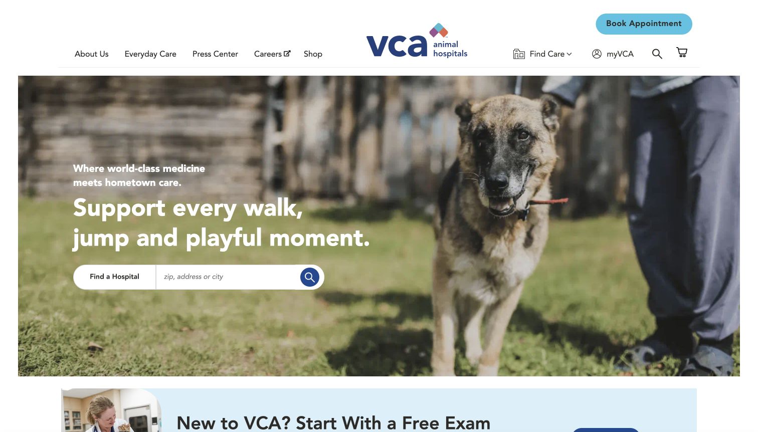
VCA places a city, address, or ZIP search directly over the opening pet photograph. The visitor does not have to start with a service menu to locate a hospital. Booking, Find Care, myVCA, and shopping utilities are also visible in the header, distinguishing care discovery from ongoing account tasks. The seasonal health message gives the page an editorial topic, while the search remains the most practical element of the hero. This is a strong locator pattern, but the number of header utilities illustrates how a broad network can make several secondary journeys appear equally important at first glance.
What you can learn
For a large practice network, let a visitor find the relevant hospital before asking them to understand the entire organization. Keep account and shopping functions clearly labeled as separate tasks. Maintain a stable locator position even as seasonal health content and promotional offers change.
Pros
The locator accepts several familiar types of geographic input.
Booking and returning-client account routes are visibly distinct.
Cons & considerations
Shopping and corporate utilities compete with care discovery.
Text over a changing photograph needs consistent contrast.
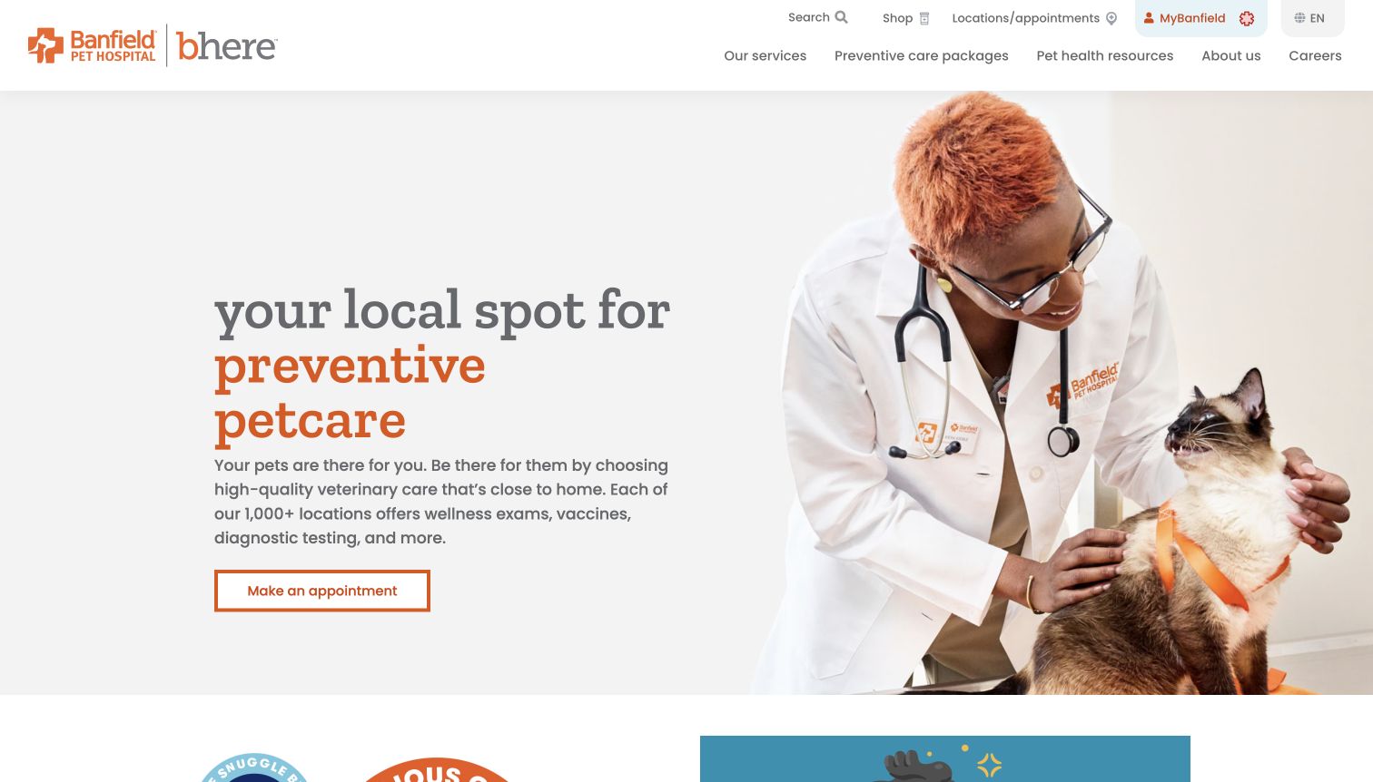
Banfield combines an orange-and-gray identity with a photograph of a clinician examining a cat. The main text names preventive care and follows it with recognizable service examples before presenting an appointment action. Navigation separates services, preventive-care packages, and pet-health resources, giving the business model and educational material their own places. The design offers a clear alternative to a vague 'we love pets' introduction: it describes the kind of care the visitor is researching. The extensive utility row and dual brand presentation make the header busier than the otherwise straightforward hero.
What you can learn
Describe the practice's real care focus in the opening copy and use concrete service examples to support it. Give package information its own route so readers can distinguish routine services from a plan. Keep emergency information separately visible without implying that every location offers every type of care.
Pros
The introductory copy names the preventive-care focus.
The appointment action follows a concise service explanation.
Cons & considerations
The multirow utility navigation adds visual density.
Package and individual-service distinctions still require further reading.
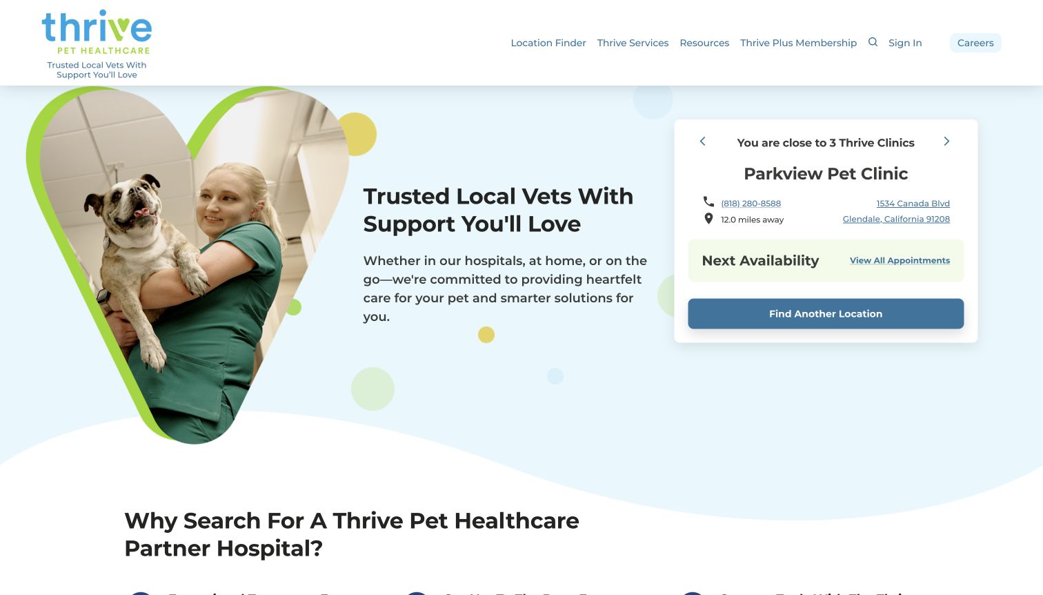
Thrive places a nearby-clinic card beside its main introduction, showing a clinic name, address, telephone route, and an availability area. The illustrated framing of the staff-and-dog photograph gives the page a friendly tone, but the local card is what makes the network feel actionable. A Find Another Location control also acknowledges that the initial suggestion may not be the right destination. The observed page later displayed a promotional signup overlay, which interrupted that useful first task. The design is a valuable reference for localizing a network homepage while preserving a way to correct the location.
What you can learn
Show useful clinic details early, and make changing the suggested location easy. Avoid requiring precise location permission when an ordinary search will work. Promotional overlays should not block the address, telephone number, or appointment route that made the localized experience useful in the first place.
Pros
A concrete clinic card makes the network immediately actionable.
A visible alternative-location control lets visitors correct the suggestion.
Cons & considerations
Automatic nearby suggestions may not match the pet's location.
A promotional overlay can interrupt the care-finding task.
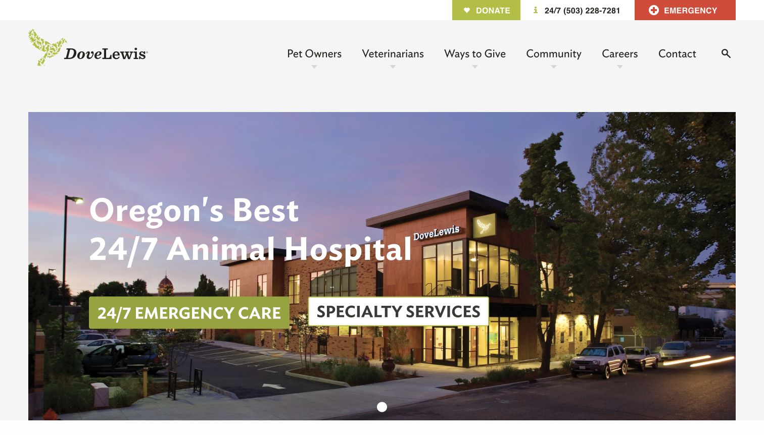
DoveLewis leads with a photograph of the hospital building and two large routes for emergency and specialty care. A telephone number and emergency action remain in the upper utility strip, while the main navigation distinguishes pet owners, veterinarians, giving, and community information. Showing the building provides a useful sense of place for someone who may soon need to find it. The homepage also gives the organization room to describe its nonprofit and educational work. Its large header and hero are visually spacious, though the operational address and arrival instructions still need a quick path from those prominent care buttons.
What you can learn
An exterior photograph can help visitors recognize a hospital, especially when paired with direct directions and arrival information. Separate urgent and planned specialty journeys. Keep donation and community routes available without allowing them to compete with a person trying to reach the clinical team.
Pros
Building photography provides a concrete sense of destination.
Emergency and specialty care have clear, separate entry points.
Cons & considerations
The large header takes space above essential care information.
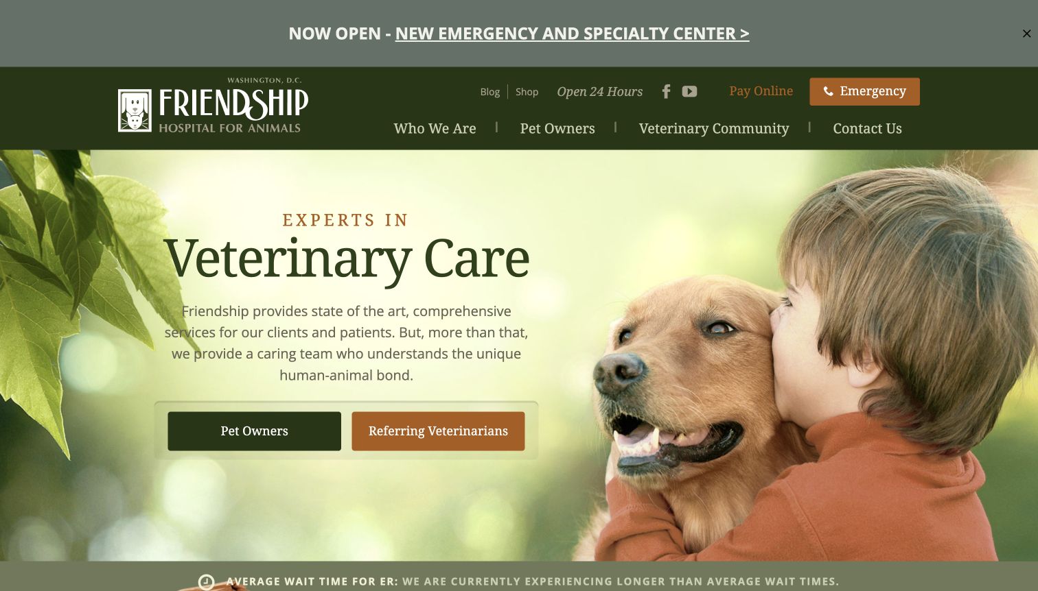
Friendship Hospital for Animals uses a warm green palette and a child-and-dog photograph to introduce its veterinary services. Two large hero actions separate pet owners from referring veterinarians. Emergency contact remains visible in the header, and the captured page includes an operational notice about emergency wait times along the bottom edge. This is a useful example of putting real service conditions beside a reassuring brand message. A prominent new-center announcement and several upper utilities create a busy first view, however, and the general hero text leaves the audience buttons to carry most of the navigational work.
What you can learn
Give different audiences a clear starting point and maintain operational notices where people can find them before traveling. Assign someone to update wait-time or service-status statements. Keep the emergency route independent of rotating announcements and broader institutional messages.
Pros
Owner and referring-veterinarian actions acknowledge distinct needs.
Operational wait information adds practical context to the emergency route.
Cons & considerations
Several announcements and utilities compete above the main content.
The general hero description provides limited detail about specific care paths.
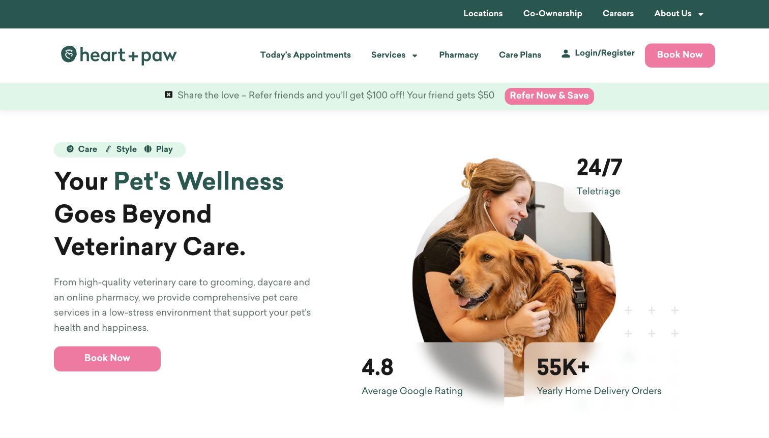
Heart + Paw introduces veterinary care alongside grooming, daycare, and pharmacy services. Pink booking actions stand out against a green-and-white palette, and the main navigation includes today's appointments, care plans, and a login route. The photograph and small service labels help explain that the business covers several parts of a pet owner's routine. A lower section describes record access and appointment management, extending the site beyond initial acquisition. The broad offering is understandable, but statistics, referral promotion, and multiple service types all compete for room in the opening view.
What you can learn
When the business offers several pet services, name them plainly and explain how visitors access each one. Keep client records and appointment management separate from marketing. Use supporting figures sparingly so the primary booking task and the actual service categories remain the clearest information.
Pros
The service range is explained in recognizable everyday categories.
Client login and today's appointments support practical repeat visits.
Cons & considerations
Referral promotion adds a competing message above the hero.
The range of services can obscure which care requires which booking path.
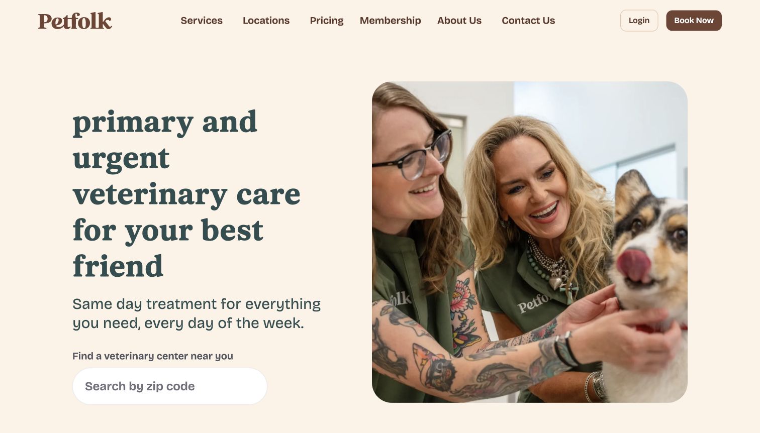
Petfolk pairs a large serif service statement with a rounded photograph of its team and a dog. A ZIP-code search sits immediately beneath the description, while Pricing and Membership appear directly in the main navigation. The warm cream-and-brown palette feels restrained compared with the bright offer-driven approach common elsewhere in the category. The useful design decision is the combination of service type, location, and cost-related navigation in one opening view. The tall headline uses significant space, and broad same-day messaging still needs to resolve to real local availability before a visitor makes plans.
What you can learn
Let visitors answer three early questions quickly: what care is offered, where it is available, and where to understand costs. Keep location-specific availability attached to the booking journey. A calm visual identity should make the information easier to scan rather than merely reducing the number of visible details.
Pros
Pricing and membership information are easy to discover.
The location finder follows a clear statement of service type.
Cons & considerations
The tall headline pushes the locator lower on smaller screens.
Broad availability messages require confirmation at the selected clinic.
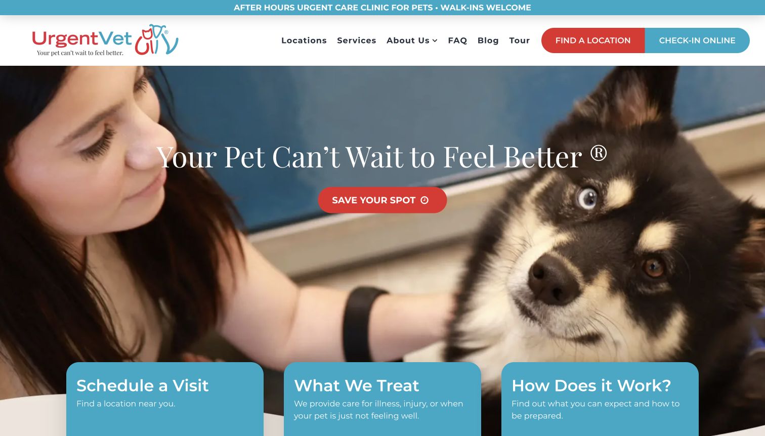
UrgentVet states its after-hours role in the top strip and repeats location and online check-in actions in the header. A large pet-care image carries the main invitation, with three cards below for scheduling, treatment scope, and how the visit works. That structure is particularly helpful for a service category visitors may not understand: the page provides an explanation alongside the action. The design still asks the reader to distinguish location finding, check-in, and saving a spot, which are closely related labels. The large photographic area also makes reliable text contrast important.
What you can learn
Explain the clinic's actual scope and the difference between a check-in request and a confirmed appointment. Put exclusions and emergency directions within easy reach of the action. A short process overview can reduce uncertainty without trying to diagnose a pet through the homepage.
Pros
The after-hours role is stated before the main content.
Treatment-scope and process cards support the booking action.
Cons & considerations
Several related booking labels can create uncertainty.
The image-led hero requires careful contrast for its central text.
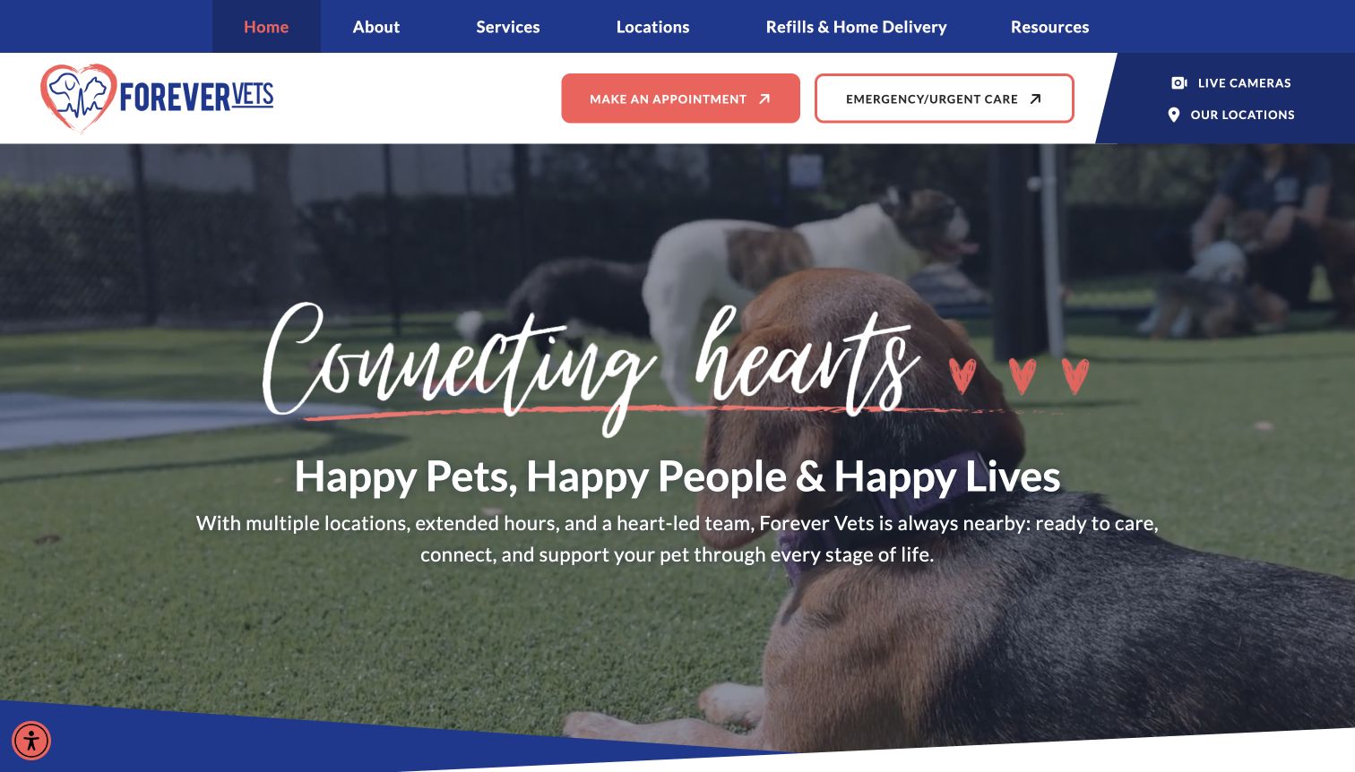
Forever Vets uses blue and coral accents across a header that gives routine appointments and emergency or urgent care separate actions. The hero combines a large service video with a warm relationship-focused headline, and the lower page explains its Florida locations and broader pet services. A location link stays visible beside the booking controls, which matters for a regional network with different facilities. The design accommodates both care and pet-resort visitors, but its layered headline, moving background, and two-level header create a lot of visual activity before the specific service information begins.
What you can learn
Keep routine appointments and urgent needs visibly separate, then route each to the appropriate facility. If using service video, supply a readable still fallback and avoid placing essential meaning only in motion. Use local pages to clarify which facilities offer which services.
Pros
Routine and urgent-care actions are labeled distinctly.
Location access remains visible in the upper interface.
Cons & considerations
Large motion and layered lettering compete for attention.
Care and resort services need careful location-level explanation.
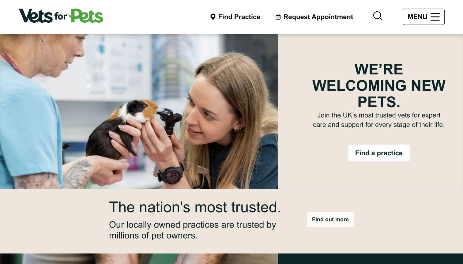
Vets for Pets gives its main header to only a few tasks: finding a practice, requesting an appointment, searching, and opening the menu. A split hero pairs a clinical photograph with a short new-pet welcome and another practice-finder action. The reduced navigation makes the first step unusually clear for a large network. Lower sections introduce care plans and educational material, so those topics do not overwhelm the initial location choice. The tradeoff is that service details remain behind the menu or further down the page, and the welcome language alone cannot establish the capabilities of an individual practice.
What you can learn
A network homepage can be simple when the practice page is the real destination. Make the locator dominant and give each local page consistent fields for services, opening hours, contact, and booking. Keep broad trust statements secondary to verifiable information about the selected practice.
Pros
The small set of header actions supports a quick first choice.
The hero repeats the practice-finding task clearly.
Cons & considerations
Service detail requires another navigation step.
Network-level messaging does not explain differences between individual practices.
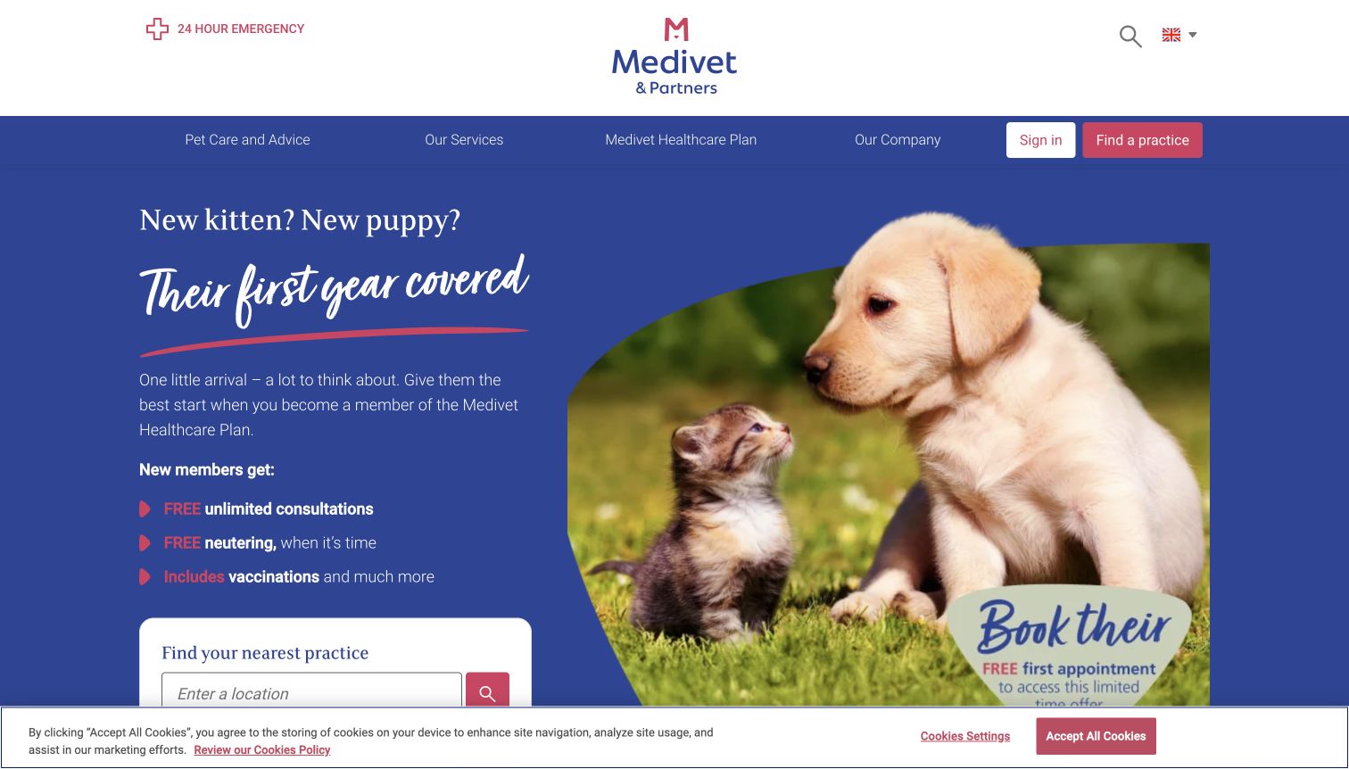
Medivet uses a puppy-and-kitten campaign to introduce its healthcare plan, placing a practice finder beneath the benefits. A separate emergency link sits above the main navigation, while sign-in and practice-finding actions remain visible in the colored menu bar. The composition makes a specific audience easy to recognize rather than presenting every service at once. It is a useful example of using life-stage content to organize a campaign. The same focus can leave owners of older animals feeling less directly addressed, and plan-related promotional details occupy most of the opening screen.
What you can learn
Use a life-stage campaign only within a permanent navigation that serves all clients. Keep emergency and practice-finding routes outside the campaign. Connect each advertised plan benefit to current details and make the difference between a healthcare plan and other payment arrangements easy to understand.
Pros
A focused life-stage message identifies a specific audience.
Emergency access remains outside the promotional hero.
Cons & considerations
The campaign is less immediately relevant to owners of older pets.
Detailed promotional benefits crowd the opening locator area.
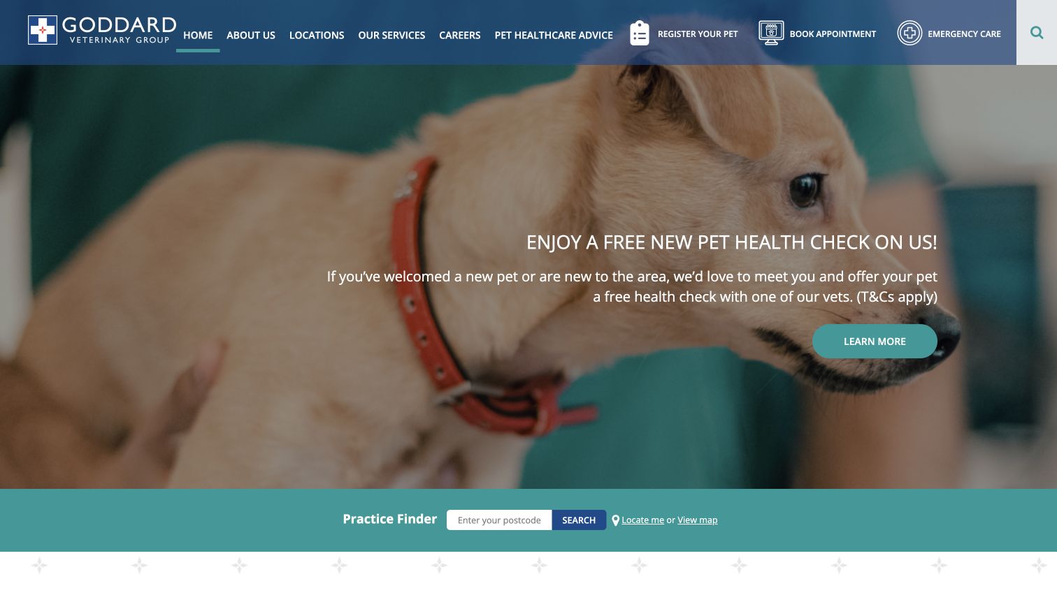
Goddard Veterinary Group combines a large pet photograph and introductory offer with a full-width practice finder. Register Your Pet, Book Appointment, and Emergency Care appear as separate header tasks with recognizable icons. The finder accepts a postcode and also offers a map route, making location selection an explicit part of the page. The design is useful for a regional practice group because it does not treat registration and appointment booking as the same task. Its dense navigation and large promotional hero make the first screen busy, and the offer needs context before it can help a visitor compare practices.
What you can learn
Separate registration, booking, and emergency help when they lead to different workflows. Give visitors a simple geographic search and an alternative way to browse. Keep introductory offers tied to clear eligibility information, and let the permanent practice finder remain useful after the promotion expires.
Pros
Three distinct client tasks are visible in the header.
Postcode and map routes support different ways to find a practice.
Cons & considerations
The header contains many competing navigation items.
The large offer area delays more detailed practice information.
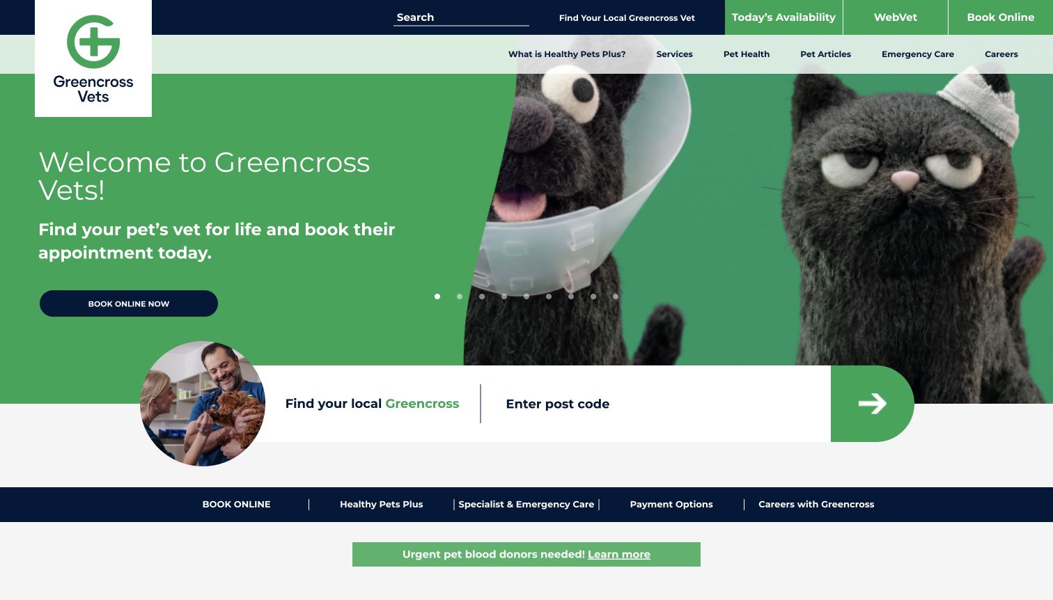
Greencross Vets places today's availability, remote-care access, and online booking in a prominent utility row. Its hero uses a bright green identity and playful animal characters, while a large postcode finder bridges the hero and the content below. The locator remains easy to recognize even among multiple campaigns. A secondary strip exposes emergency care, payment information, and other practical routes. This makes the site a useful study in organizing many client services, but the number of navigation rows and carousel messages can make it difficult to identify a single dominant path through the page.
What you can learn
Keep the clinic finder stable when the homepage carries several campaigns. Clearly distinguish remote consultation, availability, and booking actions. Review every utility row for necessity so a visitor does not have to compare several near-equivalent routes before reaching a local practice.
Pros
The postcode finder has a large and consistent visual position.
Different appointment and remote-care options are named explicitly.
Cons & considerations
Several navigation strips increase the amount to scan.
A long carousel can spread important messages across hidden slides.
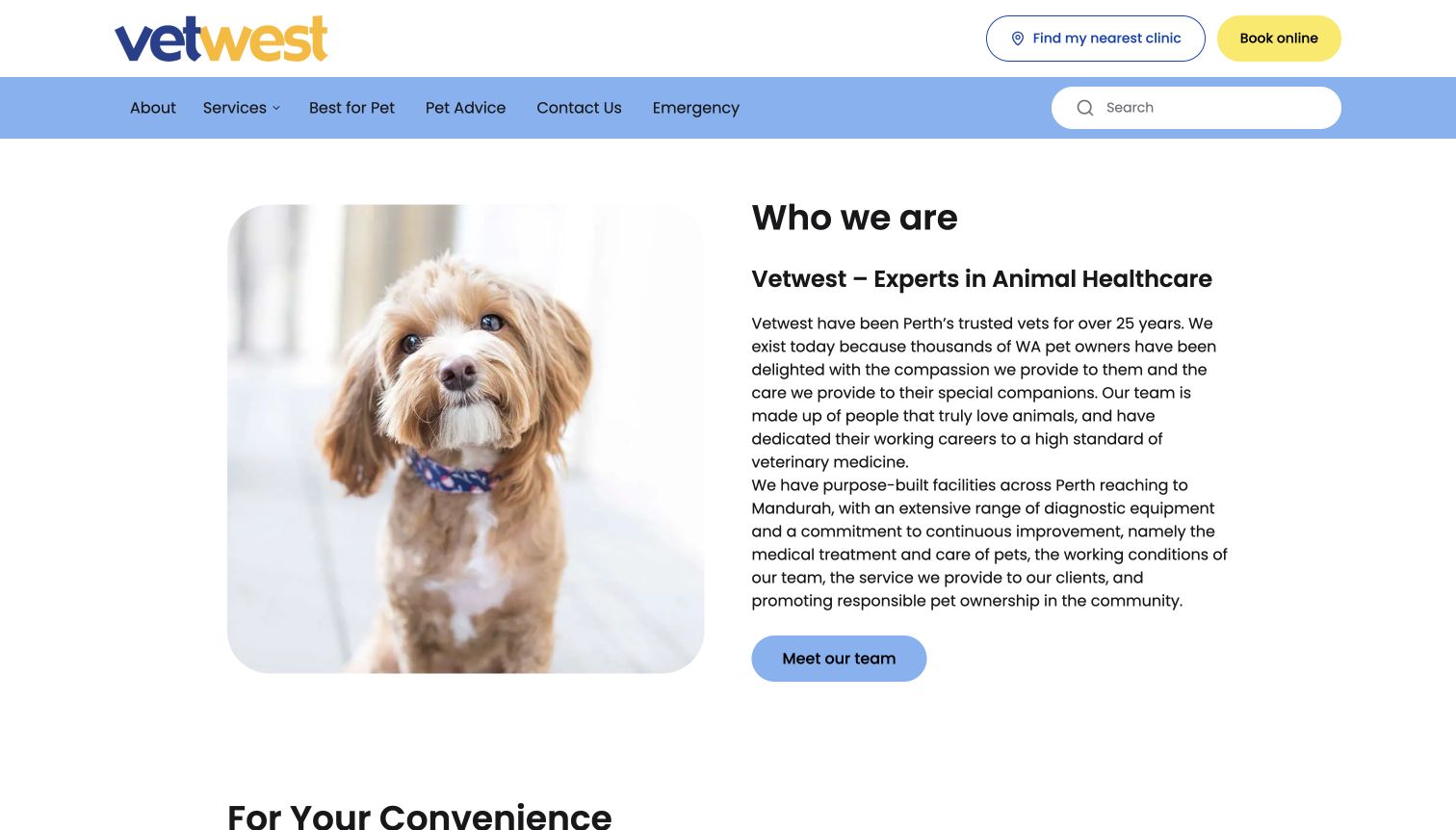
Vetwest opens with a simple two-column introduction: a pet photograph on one side and a description of the organization on the other. A clinic finder and yellow booking button remain in the header, with emergency information included in the main navigation. The page then lists local clinics and services, providing a conventional information path instead of a full-screen campaign. This makes the design accessible as a planning reference for a smaller team. The opening paragraph is comparatively long, however, and a visitor seeking a particular treatment or location must scan beyond the general organizational introduction.
What you can learn
Use a straightforward layout when it helps the team keep information current. Shorten the opening description to the facts a new client needs, then link to team and service detail. Keep booking and clinic selection visible so the about-the-practice story does not become an obstacle.
Pros
The header gives clinic finding and booking clear positions.
A conventional content structure is easy to maintain and scan.
Cons & considerations
The introductory text is dense for a first screen.
Specific service details appear after the general organization description.
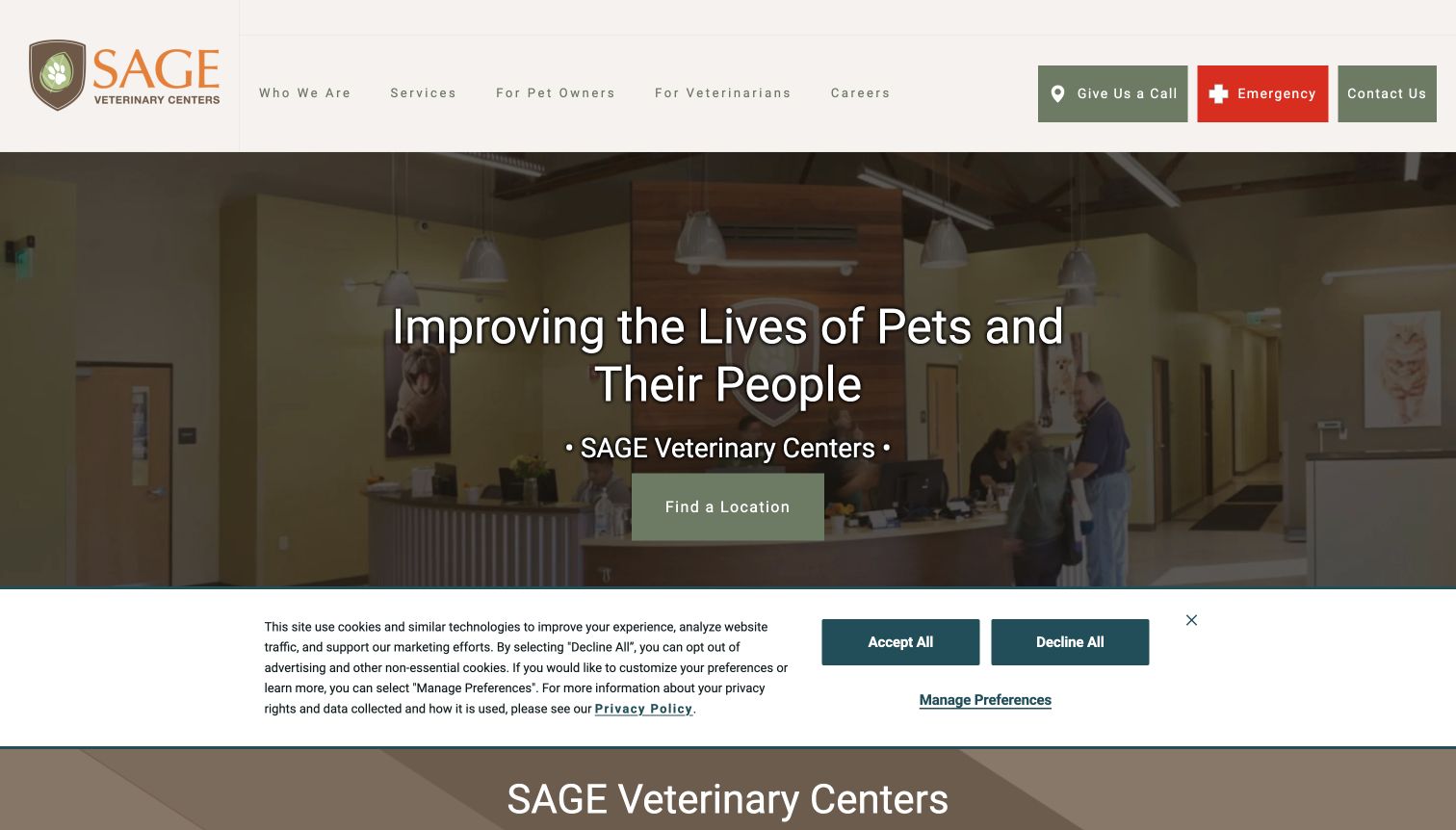
SAGE uses a restrained earth-tone identity and an interior hospital photograph behind its main message. The header provides separate routes for pet owners and veterinarians, alongside call, emergency, and contact controls. A location action anchors the hero, while emergency-service information appears below. The interior photograph offers a more concrete sense of the facility than a generic animal portrait. The design's challenge is the number of contact-related choices: someone arriving under stress must distinguish calling, contacting, locating, and emergency help. A cookie strip also occupies a sizable part of the captured opening view.
What you can learn
Design the header around distinct intentions and avoid giving several similar contact actions equal emphasis. Explain which route is for immediate help and which is for general questions. Use local hospital pages to connect the facility photograph with accurate arrival and specialty information.
Pros
Owner and veterinarian routes serve clearly different audiences.
The facility interior gives useful visual context.
Cons & considerations
Several contact-related actions compete in a small area.
The opening message is broad and relies on later sections for service detail.
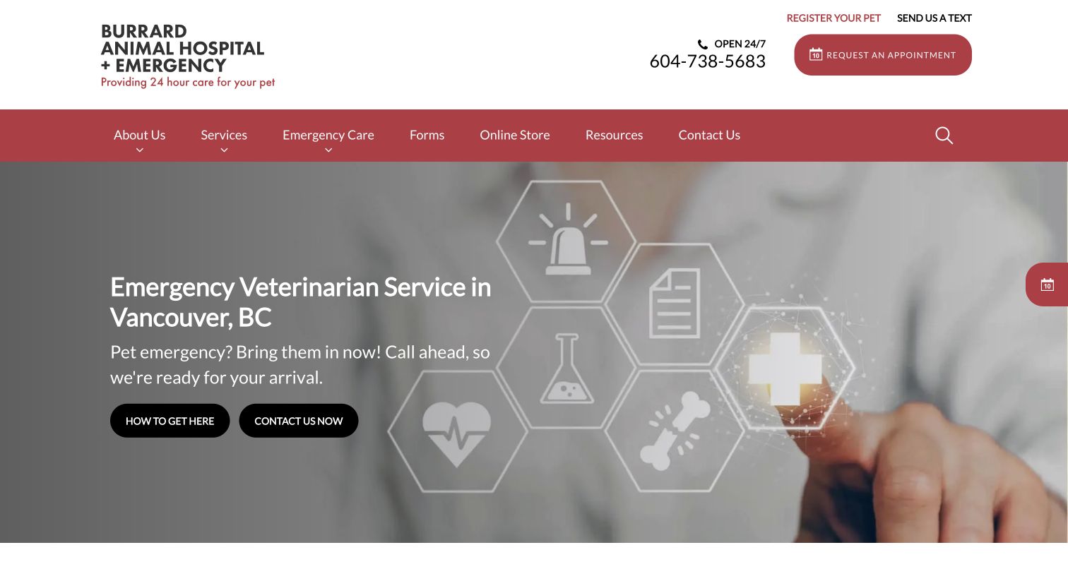
Burrard Animal Hospital + Emergency makes its Vancouver location and emergency role explicit in the main headline. The header repeats opening information and a telephone number, while the hero offers directions and contact actions. Registration, appointment requests, forms, and an online store remain separate tasks in the navigation. This is a useful reference for making a single hospital actionable: the visitor can understand the destination and find a route to the team. The abstract medical graphic is less informative than a real facility photograph, and several supporting links make the upper interface more complex than the core emergency task requires.
What you can learn
For a local emergency hospital, prioritize the destination, telephone route, and arrival instructions. Keep routine appointment and registration tasks separate. Use a recognizable exterior photograph or clear map when possible, and avoid decorative imagery that displaces information someone needs before traveling.
Pros
Location and emergency role are stated in the headline.
Directions and contact actions support the immediate arrival task.
Cons & considerations
Abstract medical imagery offers little sense of the actual facility.
Store, forms, and routine tasks add density around urgent information.
Visible tech stack
Referenced on the public page
OneTrust
ASP.NETReported response header
Public source checked November 3, 2026. References may be embedded or legacy—not a complete backend inventory.
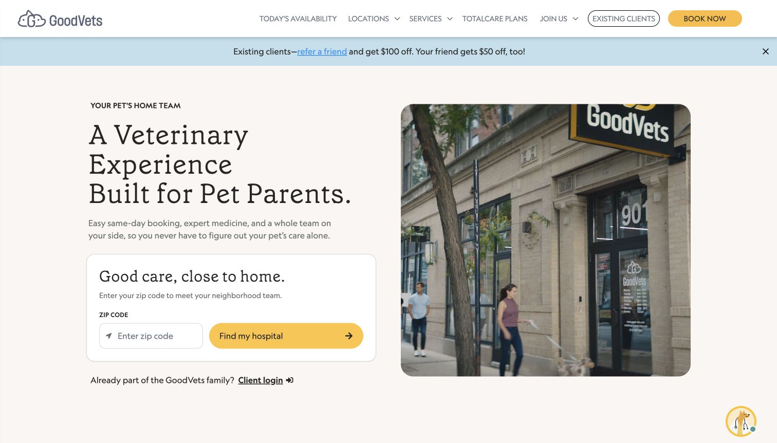
GoodVets places a ZIP-code finder inside a distinct white card beside a photograph of a street-level clinic. The opening message focuses on the pet parent's experience, while the navigation exposes today's availability, locations, services, and care plans. A separate existing-client control and a client-login link beneath the finder keep repeat visits from becoming new-customer inquiries. The storefront image makes the brand feel grounded in a neighborhood. The referral-promotion strip adds another message above the introduction, and the broad experience statement still needs the service navigation to explain the practice's actual scope.
What you can learn
Combine a local finder with a photograph that helps visitors imagine the real destination. Give returning clients an obvious shortcut to their existing workflow. Keep acquisition promotions separate from essential booking information so the practical value of the opening locator remains clear.
Pros
The location-search card is visually distinct and easy to identify.
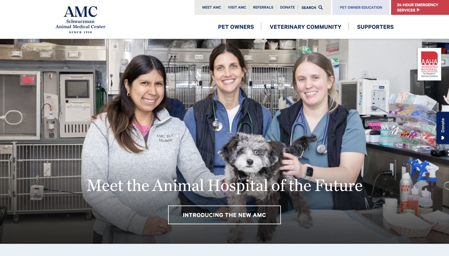
The Schwarzman Animal Medical Center uses a large clinical-team photograph to introduce the hospital, with audience routes for pet owners, the veterinary community, and supporters across the header. Emergency services receive a contrasting red block, while directions, referrals, and education are available as utilities. The page also presents institutional developments and educational resources beyond the initial care journey. It is a useful example of keeping a complex hospital's audiences visible, but the opening emphasis on the institution and its new facilities can require an extra step for someone who simply needs an appointment or arrival instructions.
What you can learn
Organize a complex hospital around audience needs while preserving a direct emergency route. Separate institutional news from the practical care tasks. A clinical-team photograph can communicate context, but it should be followed by precise navigation to appointments, referrals, directions, and preparation information.
Pros
Audience categories make a complex organization easier to navigate.
Emergency access remains visible as a contrasting utility.
Cons & considerations
Institutional announcements can precede immediate client tasks.
Several upper navigation layers demand careful scanning.
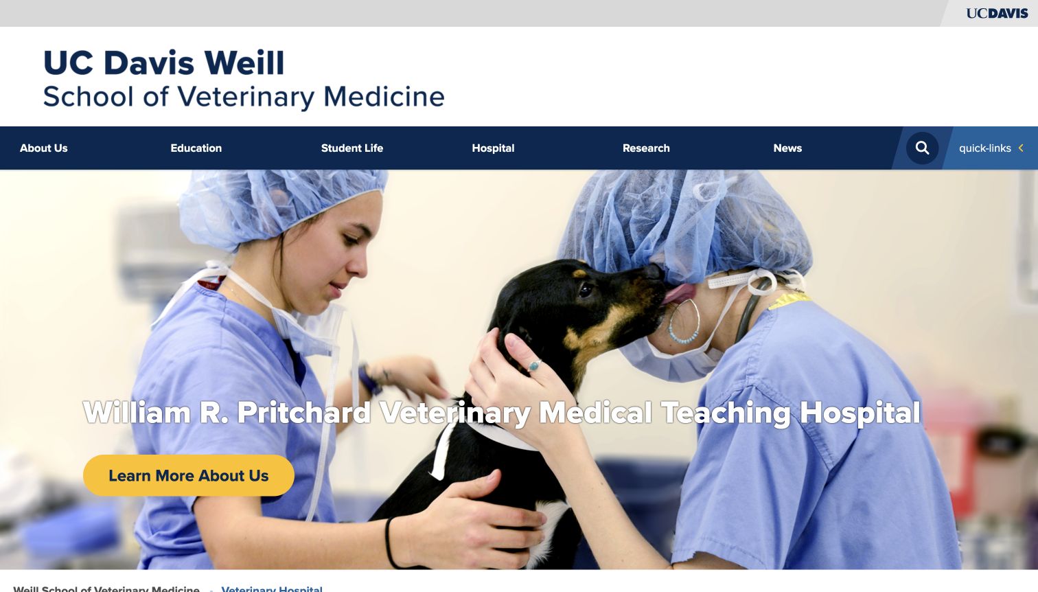
UC Davis presents its veterinary hospital within the larger school's navigation, using a clinical photograph and the hospital's full name to establish the section. The page contains dedicated appointment, referral, emergency, and directions routes, followed by client-service information and explanations of the teaching-hospital model. This is useful for studying how a care provider can coexist with education and research content without pretending the audiences are identical. The large university header and long institutional name occupy substantial space, however, and the general 'learn more' hero action is less direct than the care-specific links available elsewhere on the page.
What you can learn
When a hospital lives inside an institution's website, build a recognizable local navigation for care tasks. Put appointments, referrals, and directions ahead of broad organizational exploration. Explain what the teaching setting means for clients in plain language rather than relying on academic identity alone.
Pros
Care-specific links exist within the broader university structure.
Client-service information explains practical support tasks.
Cons & considerations
The institutional header consumes considerable screen space.
The hero action is less specific than the appointment and emergency routes.
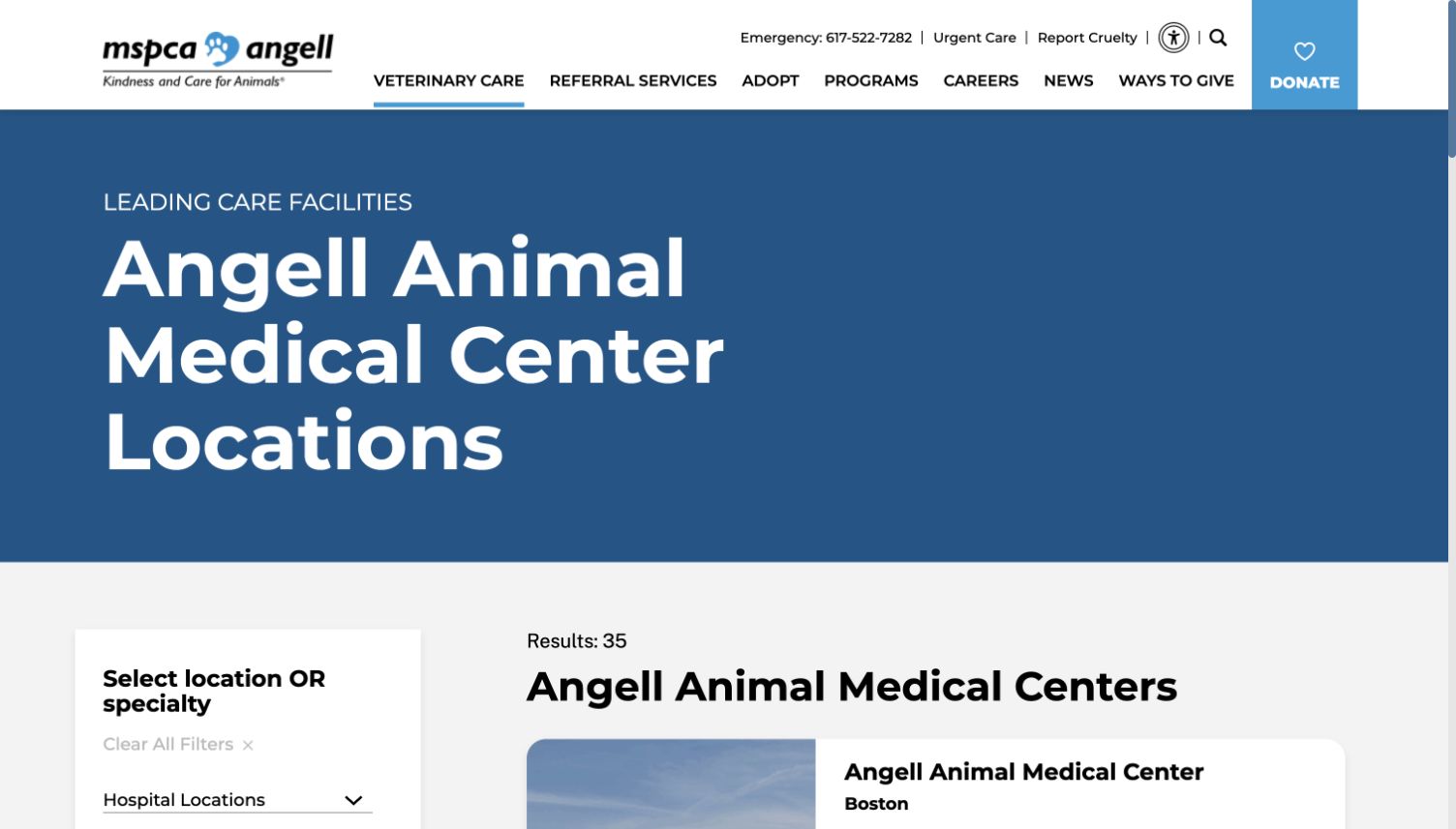
Angell's veterinary-care page is organized as a directory rather than a photographic campaign. A large heading introduces the location collection, and the results area pairs location and specialty filters with hospital cards. Quick links include client information, pharmacy, payment, financial assistance, and appointment requests. The wider MSPCA navigation remains available, but the page's core purpose is finding an appropriate care destination. This is a useful reference for a complex service catalog. The oversized title delays the filters and results, and the long specialty list needs thoughtful organization to remain approachable to a non-specialist reader.
What you can learn
Use a directory when the visitor's main challenge is matching a location to a service. Provide filters with familiar labels and keep practical client utilities close to the results. Do not let a decorative page title push the actual search task too far down the screen.
Pros
Location and specialty filters support a concrete matching task.
Client utilities cover practical needs beyond the first appointment.
Cons & considerations
The large title area delays the useful search controls.
A long specialty list can be difficult for unfamiliar visitors to interpret.
Review the questions reception receives about location, hours, appointment types, records, and preparing for a visit. Put the answers near the relevant action. Have the practice approve any clinical or emergency guidance rather than asking the design team to improvise it.
Define the source of each operational fact
Decide who owns opening hours, service availability, clinician profiles, referral instructions, and plan information. For a network, distinguish shared content from local exceptions. Assign an owner to temporary notices such as closures, service changes, or wait information.
Test the whole booking handoff
Follow the public path from choosing a location to understanding the next step, using approved test workflows. Check whether an action requests an appointment or confirms one. Provide a useful alternative if a booking vendor is unavailable, and keep clinical records out of ordinary public contact forms.
The editing job behind the design
Support accurate local information and dependable client workflows
Use structured practice and service records so addresses, telephone numbers, and availability statements are not copied into many unrelated pages. A CMS should make routine corrections possible without rebuilding every layout. The appropriate choice depends on the team's maintenance needs and existing systems, not on the visual style of another clinic.
Keep booking, client portals, referrals, and public education clearly distinguished. Explain transitions to external systems and preserve a contact alternative. The reviews do not infer clinical systems or website platforms from appearance; unknown technology entries are left empty.
Our WordPress website examples offer a separate look at publishing approaches. A visible platform label is evidence for that named page, not a guarantee that the same system will suit your requirements.
Before the public launch
Veterinary website launch checklist
Verify each location's address, telephone, opening information, and actual service scope.
Have the practice approve emergency wording and any clinical guidance.
Distinguish appointment requests, confirmed bookings, referrals, and client-portal access.
Check that membership or package information explains access and current terms clearly.
Test directions, tap-to-call, keyboard access, form labels, and mobile navigation.
Assign owners for local exceptions, temporary notices, team profiles, and content reviews.
These checks are a project checklist, not a performance, legal, security, or accessibility certification. Test real journeys with the people responsible for the website before making claims about the result.
Sources & editorial method
How this collection was selected and reviewed
We selected the reserved 25 distinct public veterinary properties and reviewed their official pages, including dedicated hospital and care-directory sections where those were the useful client destination. Direct desktop browser captures were made on November 3, 2026 UTC. Some examples belong to wider networks, and Bond Vet and Small Door displayed a merger announcement; they are separate website designs rather than claims of independent ownership. Reviews concern design and navigation, not clinical quality. No appointment or patient forms were submitted.
Each example links to its actual source page. Screenshots are direct browser captures with their own capture dates; moving imagery, announcements and live designs can change. The notes describe observable design choices and conditional tradeoffs, not measured traffic, conversion results, service quality, or accessibility conformance.
Technology labels use public page metadata, asset evidence, or explicitly cited platform documentation. Platform documentation is not a complete current deployment audit. A component reference may be legacy or unused; it is not a complete backend inventory. Unknown stacks are omitted. These sites are editorial examples, not our client portfolio.
Written, Edited and Curated are separate editorial records, not timestamps advanced by a rebuild. Website designs and imagery belong to their owners. See our editorial standards or suggest a correction.
Questions worth asking
Veterinary Clinic website design questions
Should emergency information be in the main navigation?
The correct emergency route should be easy to find and use the practice's approved instructions. The design must distinguish it from routine booking and avoid implying that a general contact form is monitored for urgent requests.
What belongs on a local clinic page?
Start with accurate contact, location, opening information, service scope, and booking instructions. Add team context and practical visit information. A local page should help someone act, not merely repeat the network's general introduction.
Should a practice promote its membership on the homepage?
It can, provided the site also explains other ways to access care where available. Give the plan a clear details page and distinguish its benefits and conditions from the clinic's general service offering.
Can a large pet photograph carry the homepage?
A strong photograph can establish tone, but location, contact, service type, and booking should remain easy to find. Keep text legible, provide a useful still alternative to video, and avoid overlays that block essential client tasks.
Start with the questions a client needs answered before a visit. Clear local information and reliable routes to the team are the foundation of a useful veterinary website.