Adobe Experience Manager can support a newsroom, product catalog, destination website, or global corporate presence. The useful design question is how editors keep those experiences coherent as campaigns, languages, assets, and business responsibilities change.
These public websites show different ways to organize a large publishing operation. Some lead with a product campaign, others with practical visitor information, news, or a catalog task. Their AEM associations are supported by Adobe customer stories and scoped public evidence, not by visual resemblance. A shared CMS does not imply a shared frontend, hosting model, commerce system, or account service.
Study the content decisions before the decorative treatment: which information is permanent, which is seasonal, who owns a qualification, and which parts of the page need to be reused across markets. The direct captures record a public view on a particular date. They do not certify accessibility, performance, conversion results, or private application behavior.
Before the examples
What makes good Adobe Experience Manager website development in 2026?
Define reusable information before reusable layouts
A product description, opening-hours notice, author biography, and event date have different owners and lifetimes. Model those differences explicitly. Adobe Content Fragments provide structured, page-independent content; use that capability where the same information needs to appear in multiple contexts, while keeping presentation decisions in the appropriate delivery layer.
An editor should be able to publish a useful variation without rebuilding the design system. Define permitted image ratios, heading lengths, action counts, metadata, and empty states for each recurring pattern. Demonstrate the actual publishing task with real content before approving a component library that only looks convincing in a polished homepage mockup.
Make regional ownership explicit
Shared content can reduce repeated work, but a local market still needs room for its own availability, language, notices, and destinations. Document what inherits from a common source and who may override it. Multi Site Manager maintains relationships between source content and Live Copies; translation and local review remain separate responsibilities.
Ford From the Road, Volvo Trucks North America, the Natural History Museum, Philips Hue, and Volkswagen open the collection. The remaining references span utilities, travel, rentals, news, food, corporate services, and consumer products. Each example represents one distinct public website property, with its own original review and capture.
We start with five recognizable brands or organizations: Ford From the Road, Volvo Trucks North America, Natural History Museum, Philips Hue, Volkswagen. Each attribution applies to the named website property, not every product or website belonging to its organization. This is a curated reading sequence, not a measured ranking.
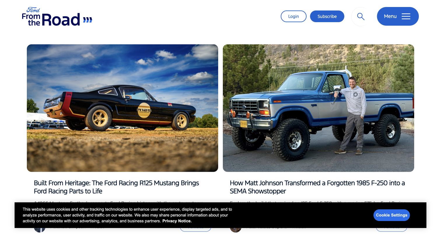
Ford From the Road feels like a publication before it feels like a vehicle configurator. Two broad story cards give photography room to establish their subjects, while the headlines, author details, and topic labels turn those images into identifiable editorial records. The restrained white header holds the Ford identity, subscription route, search, and menu without repeating the full vehicle shopping hierarchy. Adobe explicitly identifies this newsroom as an AEM Sites implementation; the association here is limited to that public editorial property.
What you can learn
Model a story as a durable record with a headline, image crop, author, date, topic, and destination. Then allow editors to choose its prominence without rebuilding its metadata each time. Preview a short announcement beside a longer feature, because equal image sizes do not guarantee equally balanced text blocks.
Pros
Large paired photographs make the featured stories easy to distinguish before reading the headlines.
Author and topic metadata give the card structure more editorial substance than a decorative image grid.
Cons & considerations
The opening view offers little explanation of the broader archive or its topic coverage.
The visible consent strip competes with the lower card details and deserves its own layout test.
Visible tech stack
Earlier / documented evidence
Adobe Experience Manager
Earlier cited evidence retained; no current scan result. References may be embedded or legacy—not a complete backend inventory.
Platform source: Adobe customer story with current public property review. Adobe explicitly identifies Ford From the Road as a newsroom built with AEM Sites. Current public page resources include Ford media-site AEM client libraries. This association covers the newsroom, not Ford vehicle or account services. Platform evidence is separate from the direct website screenshot and is not a complete current infrastructure audit.
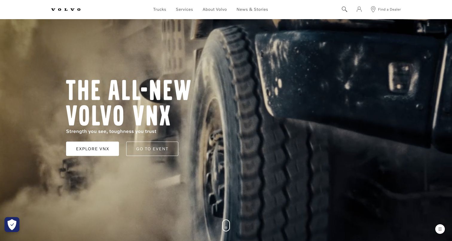
Volvo Trucks North America uses a cinematic truck scene and an oversized condensed headline to make the launch the unmistakable subject of the page. The header is comparatively quiet, keeping product, service, company, and news destinations above the campaign. Two nearby actions distinguish exploring the truck from visiting an event. Adobe names the North American website in its AEM Sites migration story, so this reference concerns that public marketing property rather than every Volvo service or regional business.
What you can learn
Give a campaign module a defined editorial contract: product name, supporting sentence, focal point, primary destination, and optional secondary destination. Editors should be able to replace the campaign without weakening the global navigation or hiding the product range. Include a still-image fallback and a usable pause control in the acceptance criteria.
Pros
The vehicle image and launch headline reinforce the same subject rather than splitting attention.
Two differently styled actions distinguish product exploration from the accompanying event destination.
Cons & considerations
A moving background can make headline contrast vary across frames and screen widths.
The launch dominates the first viewport, so returning visitors may need navigation to reach routine service information.
Visible tech stack
Earlier / documented evidence
Adobe Experience Manager
Public source checked November 3, 2026. References may be embedded or legacy—not a complete backend inventory.
Platform source: Adobe customer story with current public property review. Adobe names www.volvotrucks.us and describes its migration to AEM Sites. The current public homepage remains the North American truck-marketing property and serves Adobe AEM Cloud media; media delivery is corroboration, while the vendor case establishes the CMS relationship. Platform evidence is separate from the direct website screenshot and is not a complete current infrastructure audit.
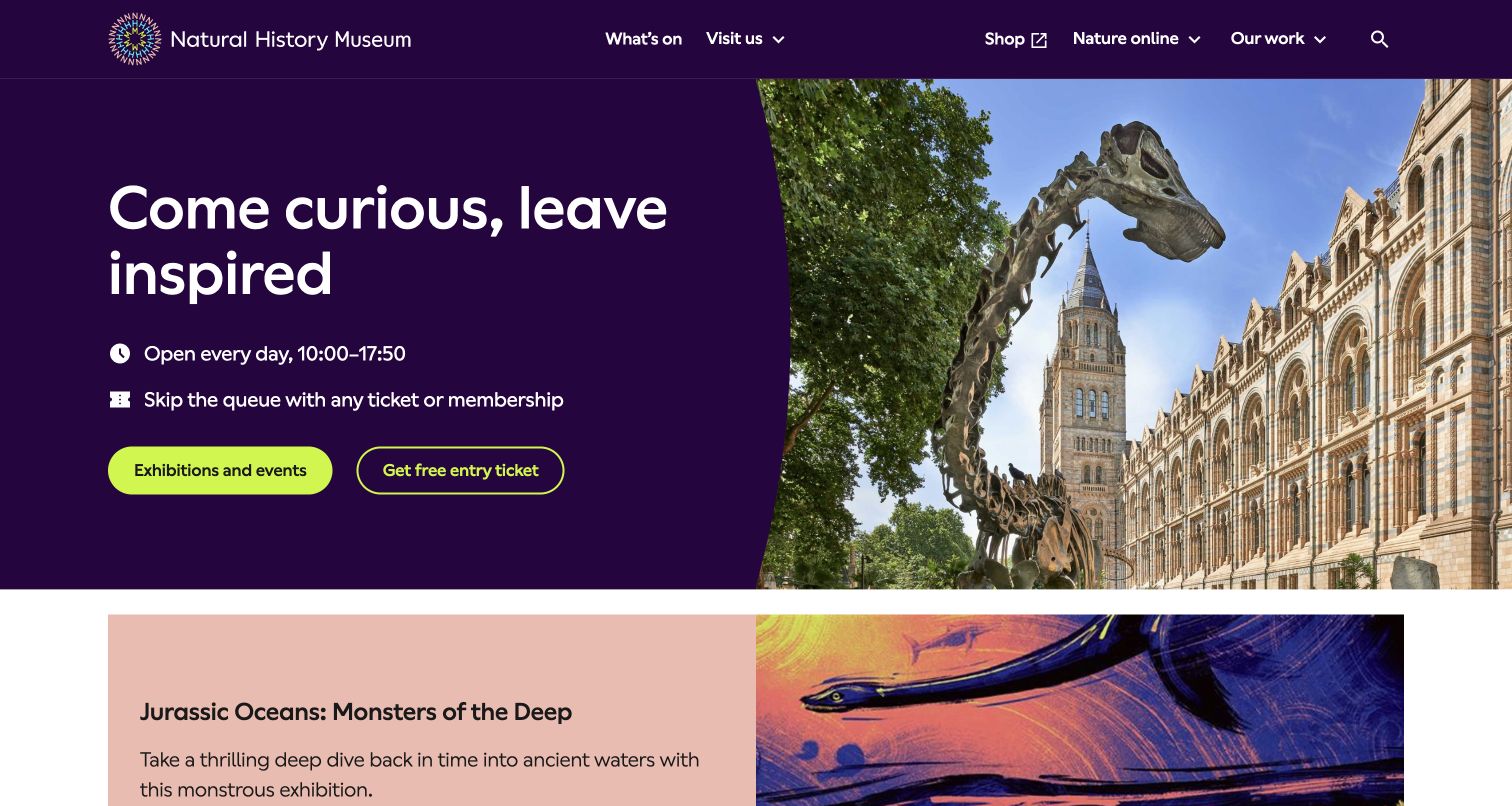
The Natural History Museum gives practical visitor information a strong place within an expressive opening composition. A deep purple text panel contains the welcome message, opening hours, queue guidance, and two ticket-related routes. The adjacent photograph connects the building and outdoor skeleton to the promised visit. Below, a contrasting exhibition panel starts the next story. Adobe describes a hybrid website using Next.js with AEM Sites as its CMS; that evidence does not make the separate ticketing transaction part of this review.
What you can learn
Treat hours, admission guidance, and booking links as maintained content with named owners. They should be available alongside the inspiring image, not buried beneath it. Test exceptions such as holiday opening hours and unavailable tickets before deciding that a reusable hero component covers the institution's real publishing needs.
Pros
Visitor essentials appear beside the welcome message instead of requiring an additional navigation step.
The vivid panel and building photograph create a recognizable identity while preserving readable text.
Cons & considerations
Two ticket-related actions need careful labels to explain which visitors should choose each one.
A prominent campaign can crowd practical information when opening notices or unusually long translations are added.
Visible tech stack
Earlier / documented evidence
Adobe Experience Manager
Earlier cited evidence retained; no current scan result. References may be embedded or legacy—not a complete backend inventory.
Platform source: Adobe customer story with current public property review. Adobe describes the London museum website as a hybrid Next.js implementation using AEM Sites as its CMS. The public homepage still uses museum AEM asset paths. This evidence concerns the content website; the separately described ticketing transaction layer is outside scope. Platform evidence is separate from the direct website screenshot and is not a complete current infrastructure audit.
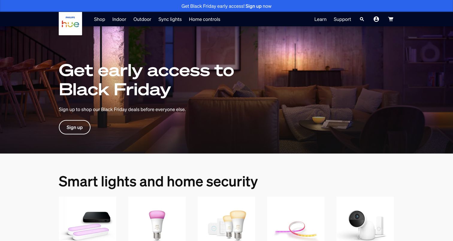
Philips Hue opens with a furnished interior rather than a grid of isolated bulbs. The photograph shows the desired atmosphere, while a compact campaign message and action sit over the scene. A dark navigation band separates shopping, indoor and outdoor lighting, synchronization, controls, and support. The next section begins to translate that lifestyle promise into product categories. Adobe's Signify story explicitly names the Hue website as a blueprint for reusable AEM Sites components; current client libraries corroborate the association.
What you can learn
Keep campaign storytelling and catalog orientation connected but separately maintainable. A seasonal message should not require rewriting the permanent category navigation, and a product category should still make sense after the campaign expires. Define safe text areas for room photography and preview the same module with both bright and dark interiors.
Pros
The room image explains the experience of the products before asking visitors to compare individual items.
Persistent category navigation offers a route around the seasonal campaign for shoppers with a known need.
Cons & considerations
Promotional announcements and the hero can compete for attention at the top of the page.
Text placed over atmospheric photography needs crop-specific contrast checks, especially on narrow screens.
Public source checked November 3, 2026. References may be embedded or legacy—not a complete backend inventory.
Platform source: Adobe customer story with current public property review. Adobe describes Signify’s AEM Sites component library and explicitly names the Philips Hue website as its blueprint. Current US Hue page resources include Signify brand AEM client libraries. The association covers this public marketing and catalog property. Platform evidence is separate from the direct website screenshot and is not a complete current infrastructure audit.
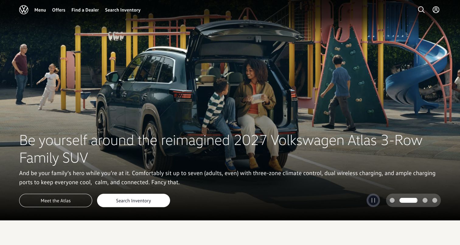
Volkswagen's United States homepage puts a vehicle into a familiar family setting and overlays a short model story with two shopping routes. The brand mark, menu, offers, dealer finder, and inventory entry remain available above the image. Carousel controls show that the opening campaign is one of several featured messages. Adobe documents Volkswagen Group's AEM Sites platform, and current page resources corroborate this US property.
What you can learn
Separate the stable shopping framework from the campaign content that rotates within it. Give each campaign an approved image crop, readable headline, primary action, optional secondary action, and retirement date. Test whether the first panel communicates enough without waiting for rotation, and ensure a visitor can pause movement or move deliberately between panels.
Pros
The vehicle is shown in a recognizable use context instead of relying only on a studio product shot.
Dealer and inventory routes remain visible for visitors who arrive with a practical shopping task.
Cons & considerations
Multiple campaigns can dilute the opening message if editors give every promotion equal weight.
Overlay copy must stay legible as the image crop and carousel panel change across devices.
Public source checked November 3, 2026. References may be embedded or legacy—not a complete backend inventory.
Platform source: Adobe customer story with current public property review. Adobe documents Volkswagen Group’s AEM Sites One CMS platform. The reviewed US Volkswagen property currently loads Volkswagen AEM client libraries under /etc.clientlibs/clientlibs/vwa-ngw18/. This supports one public property, not a stack inventory of every group brand or service. Platform evidence is separate from the direct website screenshot and is not a complete current infrastructure audit.
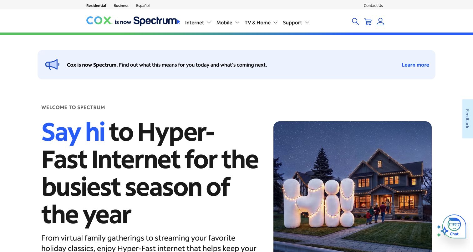
The cox.com residential homepage now explicitly presents Cox as Spectrum. A broad notice beneath the navigation explains the transition before a seasonal internet campaign begins, and the paired brand treatment makes that change visible in the header. The main message uses large type beside a household photograph, while product and support navigation remain conventional. Adobe's case study concerns Cox's website CMS, and the current public page still serves Cox AEM component libraries. This observation covers the public branding transition.
What you can learn
Treat a rebrand notice as maintained service information with a clear destination and review date. It should explain what changed before visitors have to interpret new colors or names. Preview the notice with the campaign, consent interface, and support tools together, because each can be individually reasonable while their combined height overwhelms the page.
Pros
The transition is stated directly in both the logo area and a dedicated announcement panel.
Product and support destinations remain easy to recognize while the brand presentation changes.
Cons & considerations
The notice and very large headline push supporting campaign details below the opening viewport.
Floating chat and feedback controls add competing interface layers that require coordinated placement.
Public source checked November 3, 2026. References may be embedded or legacy—not a complete backend inventory.
Platform source: Adobe customer story with current public property review. Adobe names cox.com in its AEM Sites website story. The current residential homepage visibly presents Cox as Spectrum and loads /etc.clientlibs/cox-cms-react/ components. The association is limited to this cox.com public content property during its branding transition. Platform evidence is separate from the direct website screenshot and is not a complete current infrastructure audit.
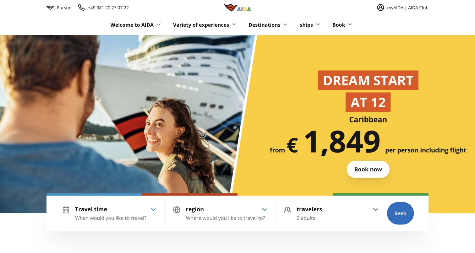
AIDA's public homepage pairs a cruise photograph with a bright promotional panel, then overlaps the lower edge with a compact trip-search strip. Travel time, region, and traveler count are grouped as one obvious next step. The colorful brand mark and straightforward destination, ship, and booking navigation make the broader travel catalog visible above the offer. Adobe explicitly names aida.de in its AEM Sites story. The capture is browser-translated into English from the German property.
What you can learn
Keep promotional content separate from the structured search controls. Editors should be able to change imagery, dates, and offer copy without changing the meaning or order of the trip fields. Include offer qualifications in the content model and test how the search strip stacks when destination labels or translated field instructions become longer.
Pros
The search strip turns a broad holiday campaign into a clearly structured discovery task.
A large color block gives the offer a dependable reading surface beside the photograph.
Cons & considerations
A price-led campaign needs nearby qualifications that remain readable when the composition becomes narrower.
The overlapping search panel can obscure the image or become crowded with longer field labels.
Visible tech stack
Earlier / documented evidence
Adobe Experience Manager
Earlier cited evidence retained; no current scan result. References may be embedded or legacy—not a complete backend inventory.
Platform source: Adobe customer story with current public property review. Adobe explicitly names aida.de and describes its AEM Sites publishing system. The current public homepage loads AEM core WCM and AIDA client libraries. Booking transactions and private trip accounts were not reviewed. Platform evidence is separate from the direct website screenshot and is not a complete current infrastructure audit.
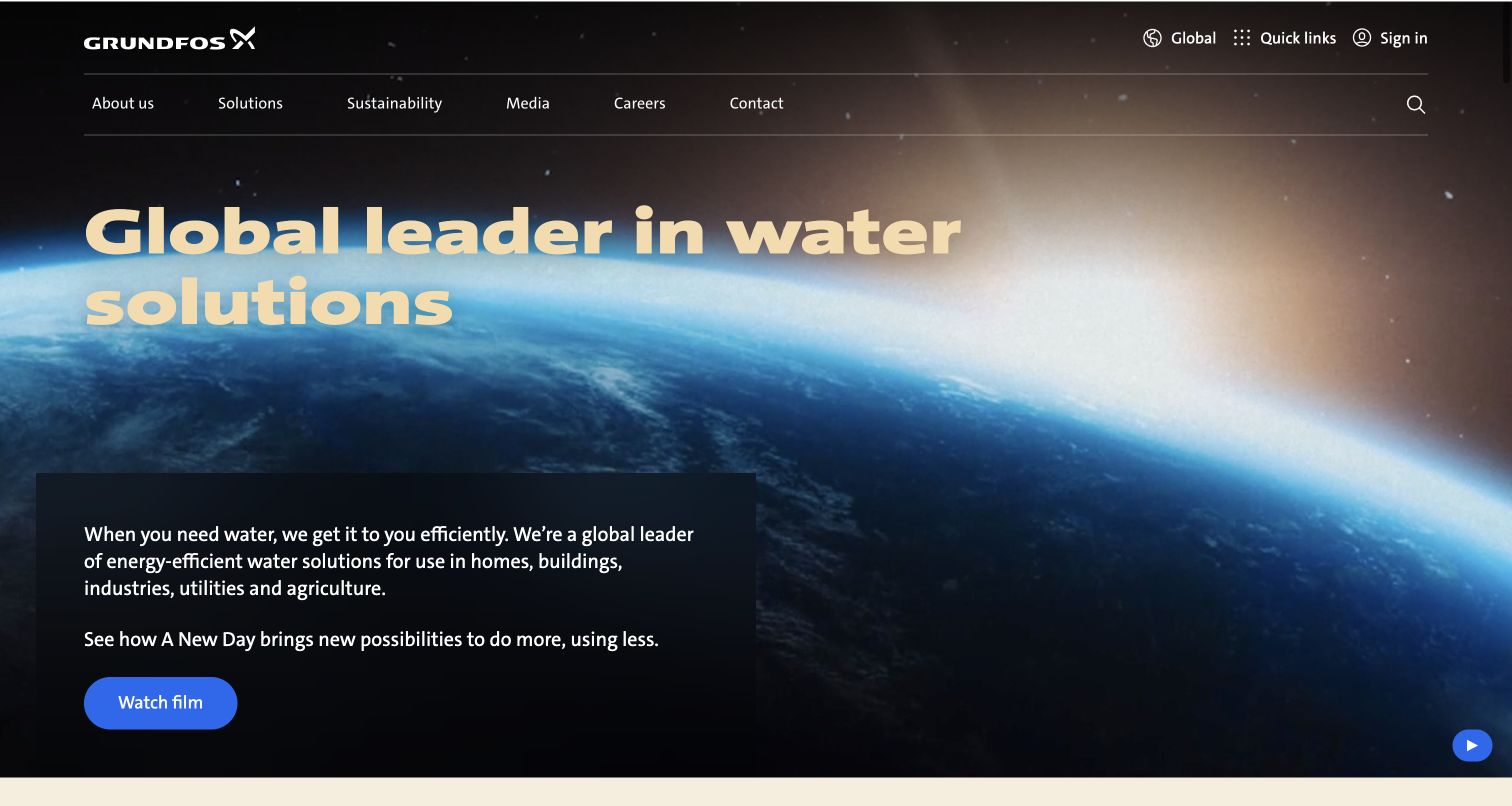
Grundfos introduces itself through water rather than through a dense pump catalog. A large purpose-led headline sits over a globe image, with a dark supporting text panel and a distinct film action below. The navigation separates company information, solutions, sustainability, media, careers, and contact. The captured frame has the background media paused, preserving a readable still view. Adobe identifies the global website as an AEM Sites implementation; current component libraries support that association.
What you can learn
Use a corporate opening to explain the common purpose behind a complicated product range, but retain a direct route to solutions. Give the hero a meaningful still frame, separate text content, and a clear media control. Editorial approval should include the paused and loading states, since a compelling film cannot be the only way to understand the organization.
Pros
The headline and supporting panel explain the company’s broad role without requiring technical product knowledge.
Corporate and solution destinations remain available above the large visual statement.
Cons & considerations
The cinematic opening postpones specific product selection until visitors use navigation or continue down the page.
Background media adds states that need deliberate fallbacks and contrast review rather than only a polished poster.
Public source checked November 3, 2026. References may be embedded or legacy—not a complete backend inventory.
Platform source: Adobe customer story with current public property review. Adobe states that Grundfos launched its global website on AEM Sites. Current public page resources include AEM client libraries and content assets. The association covers the global corporate homepage, not every product-selection or account application. Platform evidence is separate from the direct website screenshot and is not a complete current infrastructure audit.
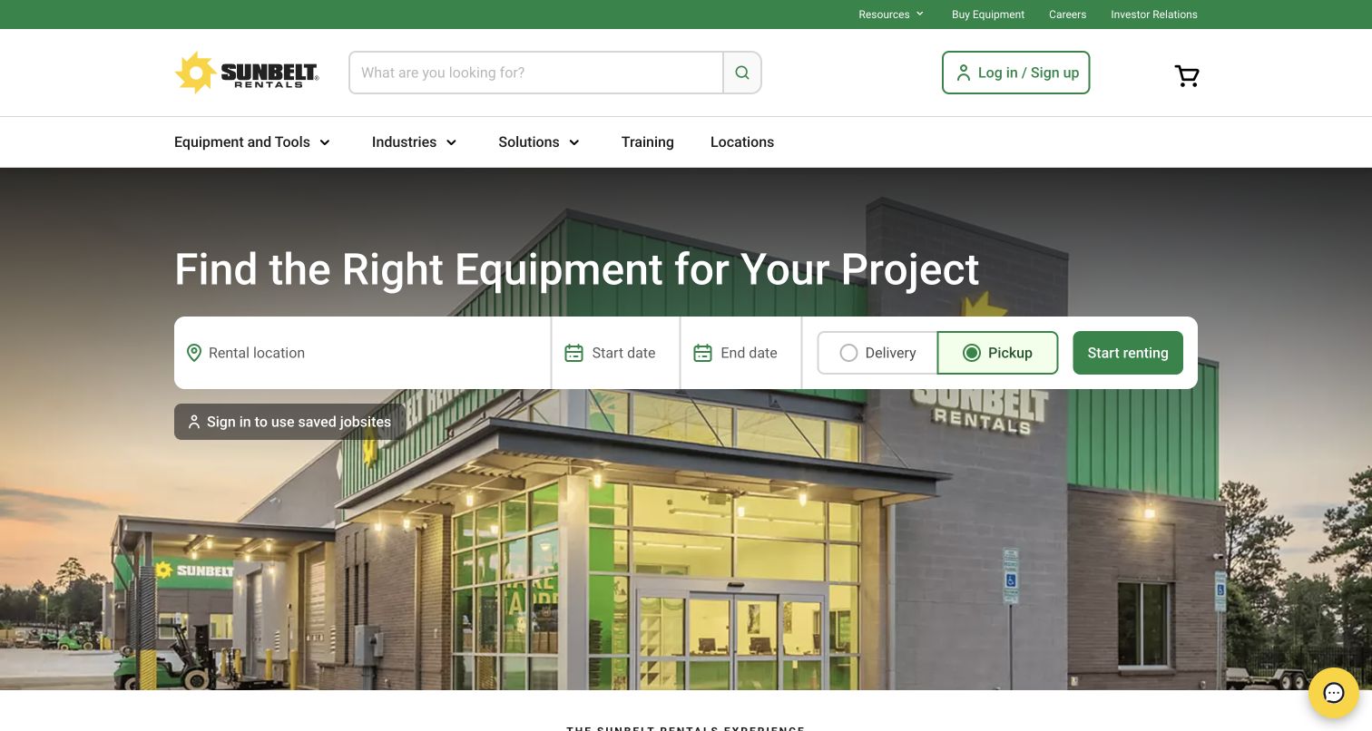
Sunbelt Rentals leads with the practical question of finding equipment for a project. A wide white control bar asks for rental location and dates, then distinguishes delivery from pickup before the main action. The company building provides a recognizable backdrop without replacing those task labels. Search, equipment categories, industries, solutions, and locations occupy the header. Adobe documents AEM Sites alongside Commerce for this public rental experience, and current component resources corroborate the content layer.
What you can learn
Model the editorial promise and the availability controls as connected but separate responsibilities. The homepage can explain a rental service, while the transaction system owns accurate availability and pricing. Define empty fields, unavailable locations, invalid dates, and delivery restrictions before evaluating the attractive default state. No rental or quote was submitted during this review.
Pros
Location and dates appear before the rental action, making the dependencies of the service visible.
The header supports both direct search and browsing by equipment or industry.
Cons & considerations
Several required controls share one horizontal strip and need careful stacking on a phone.
A familiar storefront image cannot explain availability, delivery charges, or rental terms without supporting content.
Visible tech stack
Earlier / documented evidence
Adobe Experience Manager
Earlier cited evidence retained; no current scan result. References may be embedded or legacy—not a complete backend inventory.
Platform source: Adobe customer story with current public property review. Adobe names sunbeltrentals.com and documents AEM Sites alongside Commerce for its public rental experience. Current Sunbelt AEM client libraries corroborate the content layer. Availability, checkout, and private account systems are not inferred from this evidence. Platform evidence is separate from the direct website screenshot and is not a complete current infrastructure audit.
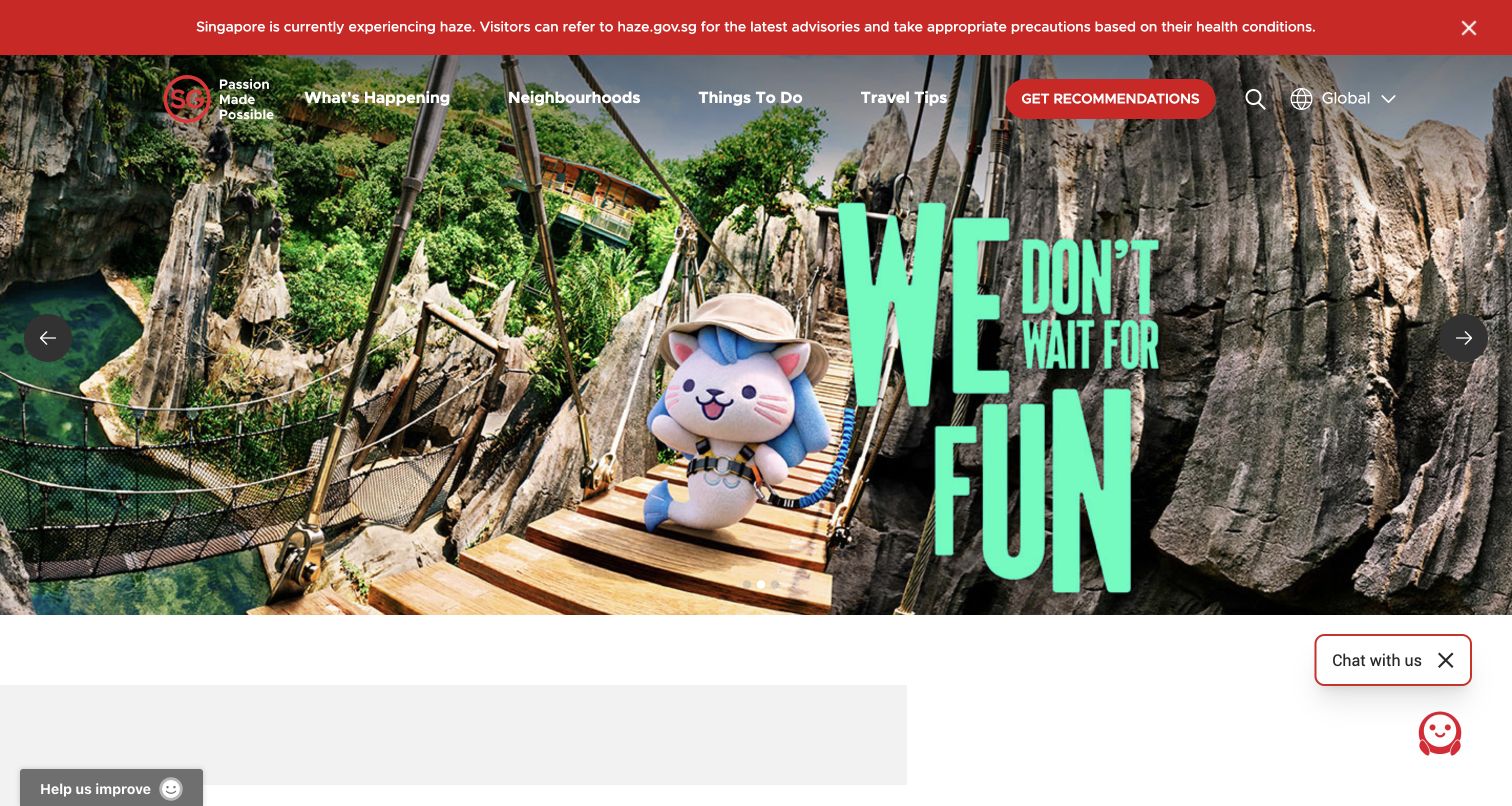
VisitSingapore combines a vivid attraction campaign with navigation for events, neighborhoods, activities, and travel tips. A prominent recommendation route offers another way into the destination content. Above the image, a red advisory strip carries timely visitor information rather than letting the campaign occupy every part of the opening view. Adobe's 2026 story explicitly names VisitSingapore.com as an AEM Sites cloud implementation, with matching live component libraries. The review concerns the public destination website.
What you can learn
Give travel advisories a separate publishing responsibility from campaign artwork. Both need owners and expiration checks, but they serve different levels of urgency. Build reusable destination and activity records that can support navigation, seasonal features, and recommendations without manually duplicating descriptions across every campaign. Test the page with an advisory and consent notice present together.
Pros
Practical advice has a distinct visual band that remains separate from the promotional photography.
Navigation offers several recognizable ways to explore a destination rather than one generic browse link.
Cons & considerations
Campaign artwork includes large embedded lettering, which may become difficult to read in tighter crops.
Chat, feedback, and announcement interfaces compete for space around an already busy opening composition.
Visible tech stack
Earlier / documented evidence
Adobe Experience Manager
Public source checked November 3, 2026. References may be embedded or legacy—not a complete backend inventory.
Platform source: Adobe customer story with current public property review. Adobe’s August 2026 story explicitly identifies VisitSingapore.com as using AEM Sites as a Cloud Service. Current page resources include VisitSingapore AEM client libraries. The evidence supports the public destination website, without a claim about private profiles or recommendation logic. Platform evidence is separate from the direct website screenshot and is not a complete current infrastructure audit.
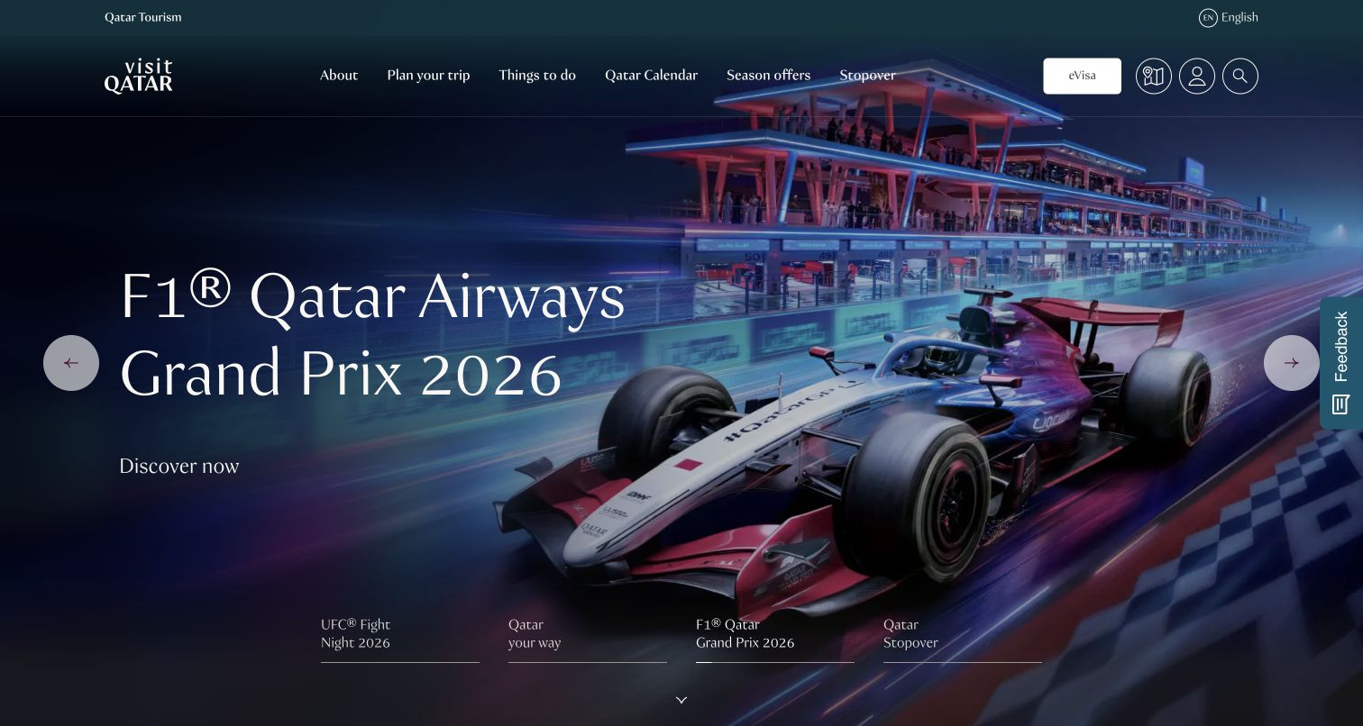
VisitQatar's opening combines large event imagery, a restrained serif headline, and a direct discovery route. Named campaign tabs along the lower edge make the featured subjects more understandable than anonymous dots alone. The header keeps trip planning, activities, a calendar, seasonal offers, stopovers, visa information, and a map within reach. Adobe explicitly describes the VisitQatar implementation of AEM as a Cloud Service; current component libraries corroborate the association. No transaction or private profile was opened.
What you can learn
Treat an event campaign as a dated content record with its own image, label, destination, and retirement rule. Keep permanent travel utilities outside that record so they remain useful after the event finishes. Review a full set of campaign titles together: a carousel needs understandable choices, readable text over every image, and a clear way to move without waiting.
Pros
Named campaign tabs communicate the available stories more clearly than position indicators alone.
Visa and map utilities stay visible alongside inspirational destination navigation.
Cons & considerations
Large background artwork can make headline contrast and image cropping inconsistent between campaigns.
An event-heavy opening needs a clear route for travelers whose dates or interests do not match the featured promotions.
Visible tech stack
Earlier / documented evidence
Adobe Experience Manager
Public source checked November 3, 2026. References may be embedded or legacy—not a complete backend inventory.
Platform source: Adobe customer story with current public property review. Adobe explicitly describes the VisitQatar website implementation of AEM as a Cloud Service. The public page currently loads VisitQatar AEM client libraries. The association excludes mobile apps, eCRM, visa transactions, and private visitor profiles. Platform evidence is separate from the direct website screenshot and is not a complete current infrastructure audit.
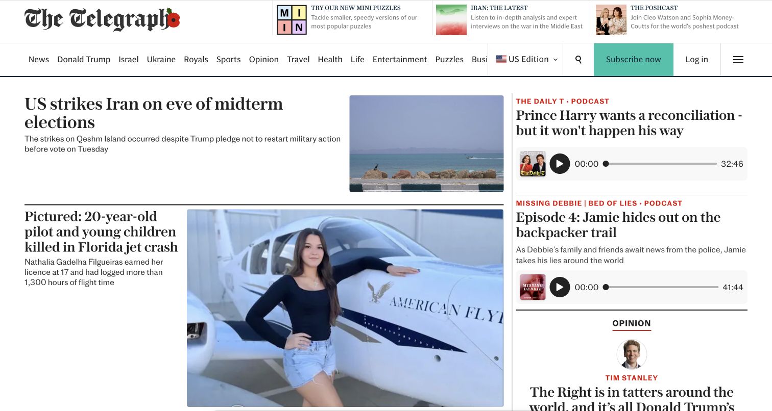
The Telegraph's public homepage uses its masthead, serif headlines, thin rules, and tightly organized columns to establish a newspaper-like hierarchy. A lead story occupies the broad left area, while podcast modules form a separate right-hand column with visible playback affordances. Topic navigation, edition selection, search, subscription, and login remain above the stories. Adobe explicitly names telegraph.co.uk in its AEM Sites story, with current Telegraph component libraries. The capture shows the public US edition; subscriber articles were not accessed.
What you can learn
Make editorial priority an explicit publishing decision rather than an accidental consequence of card size. Define which fields belong to a lead story, a secondary item, a podcast, and an opinion module. Then test replacement content with varied headlines and imagery so a routine desk update does not undermine the hierarchy or make unrelated modules appear equally important.
Pros
Typography and rules separate story roles without relying on many decorative surfaces.
Audio modules expose their format and duration within a recognizable secondary column.
Cons & considerations
A wide topic menu and several account actions create a crowded navigation band.
The dense opening requires careful responsive ordering so secondary formats do not interrupt the lead reading sequence.
Visible tech stack
Earlier / documented evidence
Adobe Experience Manager
Earlier cited evidence retained; no current scan result. References may be embedded or legacy—not a complete backend inventory.
Platform source: Adobe customer story with current public property review. Adobe explicitly names telegraph.co.uk and its AEM Sites implementation. The public US edition homepage currently loads Telegraph AEM client libraries. This review covers the accessible news homepage; subscriber articles and account areas were not accessed. Platform evidence is separate from the direct website screenshot and is not a complete current infrastructure audit.
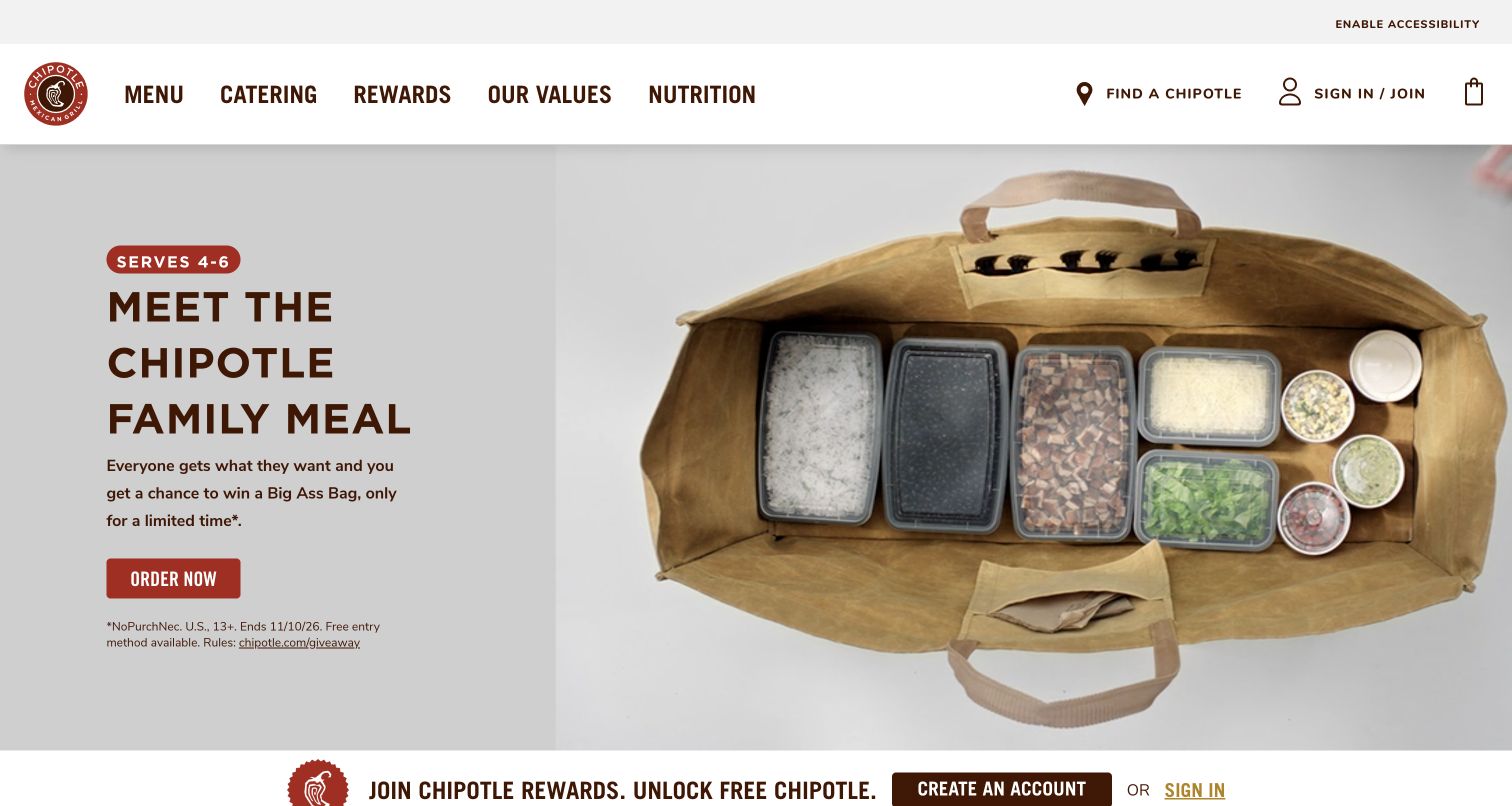
Chipotle's homepage centers a family-meal campaign on a large overhead food presentation and a compact text panel. A serving-size badge, short headline, supporting explanation, and order link establish a clear sequence. The header keeps menu, catering, rewards, values, nutrition, and restaurant discovery visible, while a rewards strip starts immediately below the campaign. Adobe identifies AEM Sites in Chipotle's web journeys, and current Chipotle AEM client libraries corroborate this public marketing page. Ordering and customer accounts remain outside the review.
What you can learn
Give a food campaign separate fields for serving guidance, product description, action, and time-sensitive qualifications. Keep that content distinct from the menu and ordering application so a promotion can expire without breaking the permanent route to food. Review the campaign with its terms visible and with motion paused, not only as an idealized product photograph.
Pros
The food presentation and concise serving badge make the promoted meal understandable at a glance.
Permanent menu and location routes remain visible above the temporary campaign.
Cons & considerations
Small promotional qualifications can be overlooked beneath the dominant image and order action.
The adjacent rewards strip introduces another conversion request before visitors have explored the food choices.
Visible tech stack
Earlier / documented evidence
Adobe Experience Manager
Public source checked November 3, 2026. References may be embedded or legacy—not a complete backend inventory.
Platform source: Adobe customer story with current public property review. Adobe identifies AEM Sites as the CMS in Chipotle’s web customer journeys. The current public homepage loads /etc.clientlibs/cmgaemacs/ and core WCM resources. This association concerns public marketing content, not the implementation of ordering or customer accounts. Platform evidence is separate from the direct website screenshot and is not a complete current infrastructure audit.
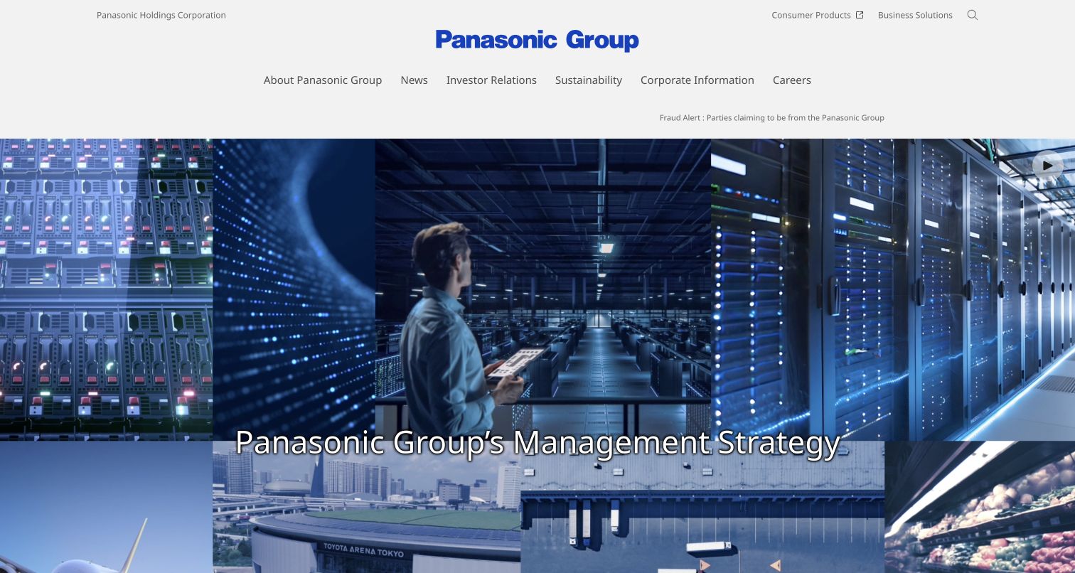
Panasonic Holdings' global homepage separates the corporate audience from consumer shopping. A centered Panasonic Group wordmark anchors a spacious header, with company information, news, investor relations, sustainability, and careers below it. The main visual assembles several business contexts around a management-strategy message, while consumer and business routes sit in a lighter utility area. Adobe describes Panasonic's global AEM Sites website program; the current Holdings property serves AEM component libraries. The association covers this corporate homepage after its official redirect.
What you can learn
Decide which audience the corporate homepage serves before borrowing product-marketing patterns. A group-level content model needs strategy, governance, news, and business navigation with clear ownership. Give the media module a useful still state and consistently readable text. Keep the consumer-shopping transition explicit so visitors can leave the corporate narrative without guessing.
Pros
The centered identity and orderly navigation make the group-level scope clear before the media begins.
Consumer and business destinations are distinguished from investor and corporate-information navigation.
Cons & considerations
A broad visual montage can communicate scale while saying little about an individual business offering.
Text over changing media needs contrast and motion controls that remain usable across the entire sequence.
Visible tech stack
Earlier / documented evidence
Adobe Experience Manager
Earlier cited evidence retained; no current scan result. References may be embedded or legacy—not a complete backend inventory.
Platform source: Adobe customer story with current public property review. Adobe’s 2025 Panasonic story describes a global website program using AEM Sites. The official global entry redirects to holdings.panasonic/global/, whose public homepage currently loads /etc.clientlibs/bsc/ and Granite resources. The association is scoped to this corporate property, not every Panasonic storefront. Platform evidence is separate from the direct website screenshot and is not a complete current infrastructure audit.
Kyndryl opens with a blue metallic loop filling almost the entire hero, while a thin white headline and short report description occupy a quieter left column. The outlined report button keeps the campaign action visibly separate from the bright green consultation button in the navigation. A rounded translucent header holds service, company, insight, news, and career routes without breaking the image into separate bands. The first row below introduces customer stories, operational advice, and analyst coverage, giving the report a broader editorial setting.
What you can learn
Use a stable navigation shell to support changing research campaigns, then give each campaign one clear reading action. Adobe documents shared AEM Sites templates across Kyndryl markets; the useful design principle is retaining navigation consistency while allowing local editorial priorities to change.
Pros
The report and consultation actions have distinct visual treatments and purposes.
Editorial cards immediately below the hero connect the campaign to other evidence.
Cons & considerations
Pale, lightweight copy depends on the dark area of the image for readability.
Small carousel dots provide little context about the other featured stories.
Visible tech stack
Earlier / documented evidence
Adobe Experience Manager
Earlier cited evidence retained; no current scan result. References may be embedded or legacy—not a complete backend inventory.
Platform source: Adobe customer story with current public page corroboration. Adobe documents Kyndryl’s public website launch with AEM Sites and shared templates using Multi Site Manager and Live Copy across markets. On November 3, 2026 UTC, the US page includes brand client libraries under /etc.clientlibs/kyndrylprogram/ and core WCM components. This association concerns the public marketing website, not Kyndryl’s customer systems. Platform evidence is separate from the direct website screenshot and is not a complete current infrastructure audit.
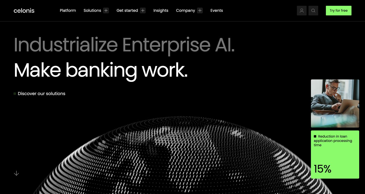
Celonis uses a nearly black canvas and oversized typography to pair an enterprise AI proposition with a specific industry application. In the captured state, a banking message sits above an abstract field of white particles. A narrow card on the right combines a human photograph with a vivid green outcome panel, making the business context easier to identify than the abstract visual alone. The same green marks the solution link and free trial button, while platform, solution, and company navigation stays restrained across the top.
What you can learn
Pair a broad platform promise with one concrete business context, then give that context its own visual proof area. Adobe identifies AEM Sites and Edge Delivery Services with document authoring for this website; that publishing model does not itself establish the effectiveness of the displayed claims.
Pros
The green accents create a consistent path from contextual proof to action.
The outcome card supplies a recognizable business setting beside abstract imagery.
Cons & considerations
The muted upper headline has lower contrast than the main industry message.
Large presentation elements postpone detailed product explanation below the initial view.
Visible tech stack
Earlier / documented evidence
Adobe Experience Manager
Public source checked November 3, 2026. References may be embedded or legacy—not a complete backend inventory.
Platform source: Adobe customer story with current public page corroboration. Adobe’s Celonis customer story explicitly describes rebuilding the main website with AEM Sites and Edge Delivery Services, using templates and document authoring. Current public HTML checked November 3, 2026 UTC also includes brand assets on an adobeaemcloud.com delivery domain. The documented case establishes the Sites relationship; asset delivery alone would not prove a CMS implementation. Platform evidence is separate from the direct website screenshot and is not a complete current infrastructure audit.
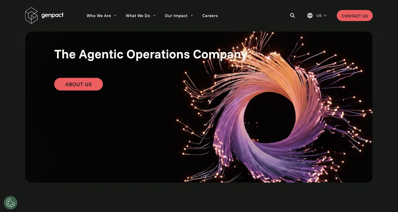
Genpact places its company statement inside a large rounded black panel, with a luminous loop of threadlike strands occupying the right side. The white headline and coral About Us button remain isolated on the left, so the opening view reads as a company introduction rather than a service catalog. The dark green outer background extends through the header, which groups company, capabilities, impact, and careers links. A matching coral contact button creates a second, persistent route for visitors who already understand what they need.
What you can learn
A short positioning statement can carry the opening screen when the surrounding navigation clearly provides the next level of detail. Adobe documents Genpact.com within an AEM Sites, Assets, and Workfront publishing environment; the design lesson is to keep the editorial message simpler than the system supporting it.
Pros
The coral buttons remain easy to find against both dark background treatments.
The asymmetrical composition leaves a clear text area beside the visual.
Cons & considerations
The abstract image explains little about the actual services without further reading.
An About Us action is less specific than a route to a relevant capability.
Visible tech stack
Referenced on the public page
OneTrust
Earlier / documented evidence
Adobe Experience Manager
Public source checked November 3, 2026. References may be embedded or legacy—not a complete backend inventory.
Platform source: Adobe customer story with current public page corroboration. Adobe explicitly identifies Genpact.com within its AEM Sites, AEM Assets, and Workfront publishing environment. The current public homepage checked November 3, 2026 UTC contains /etc.clientlibs/genpact/ libraries and core WCM components. The association is limited to the public website and does not inventory Genpact’s service delivery or private applications. Platform evidence is separate from the direct website screenshot and is not a complete current infrastructure audit.
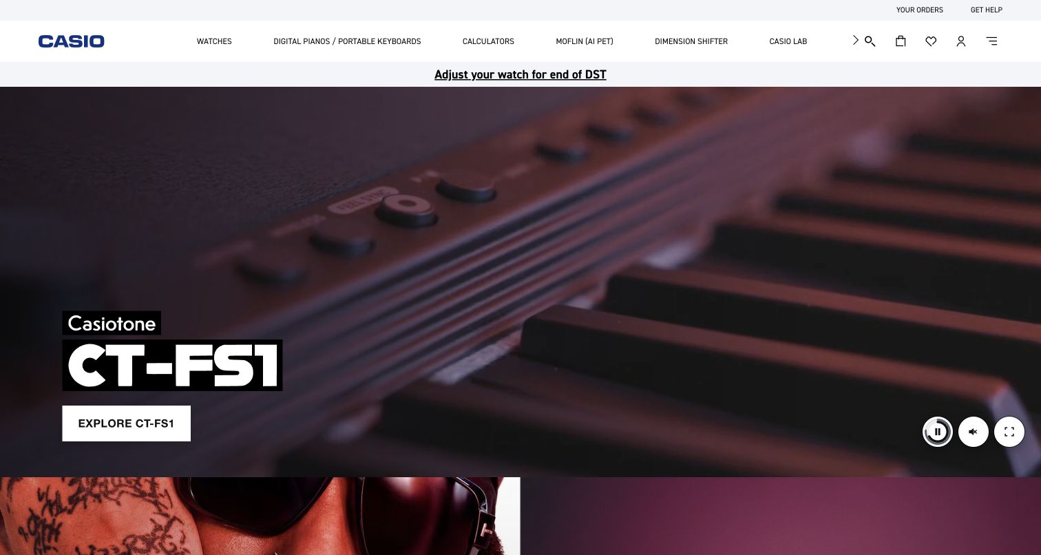
Casio's US homepage keeps a compact white category header above a large Casiotone keyboard campaign. The captured frame shows a close view of the instrument, with a bold model name and a white exploration button anchored at the lower left. Pause, audio, and fullscreen controls are grouped at the lower right, giving the media presentation visible controls. A separate announcement strip links to daylight saving guidance, while order support remains in the thin top bar. This arrangement combines a promotional opening with recognizable ownership and support tasks.
What you can learn
Keep practical tasks outside the campaign artwork so they remain findable when the featured product changes. Adobe's 2022 global redesign case names AEM Sites; current Casio client libraries corroborate the public US property, without establishing the technology behind every connected store or account service.
Pros
Product branding and the exploration action remain legible over the darker imagery.
Visible media controls give visitors a way to manage the presentation.
Cons & considerations
The dense category row requires careful scanning across several distinct product families.
The large campaign postpones comparison information and product specifications.
Visible tech stack
Earlier / documented evidence
Adobe Experience Manager
Earlier cited evidence retained; no current scan result. References may be embedded or legacy—not a complete backend inventory.
Platform source: Adobe customer story with current public page corroboration. Adobe’s 2022 Casio global website redesign case identifies AEM Sites for content management. Ordinary browser inspection of the public US homepage on November 3, 2026 UTC found /etc.clientlibs/casio/clientlibs/clientlib-site resources and core WCM components. This corroborates the selected regional property while preserving the older case’s date; it is not a claim about every Casio application or transaction system. Platform evidence is separate from the direct website screenshot and is not a complete current infrastructure audit.
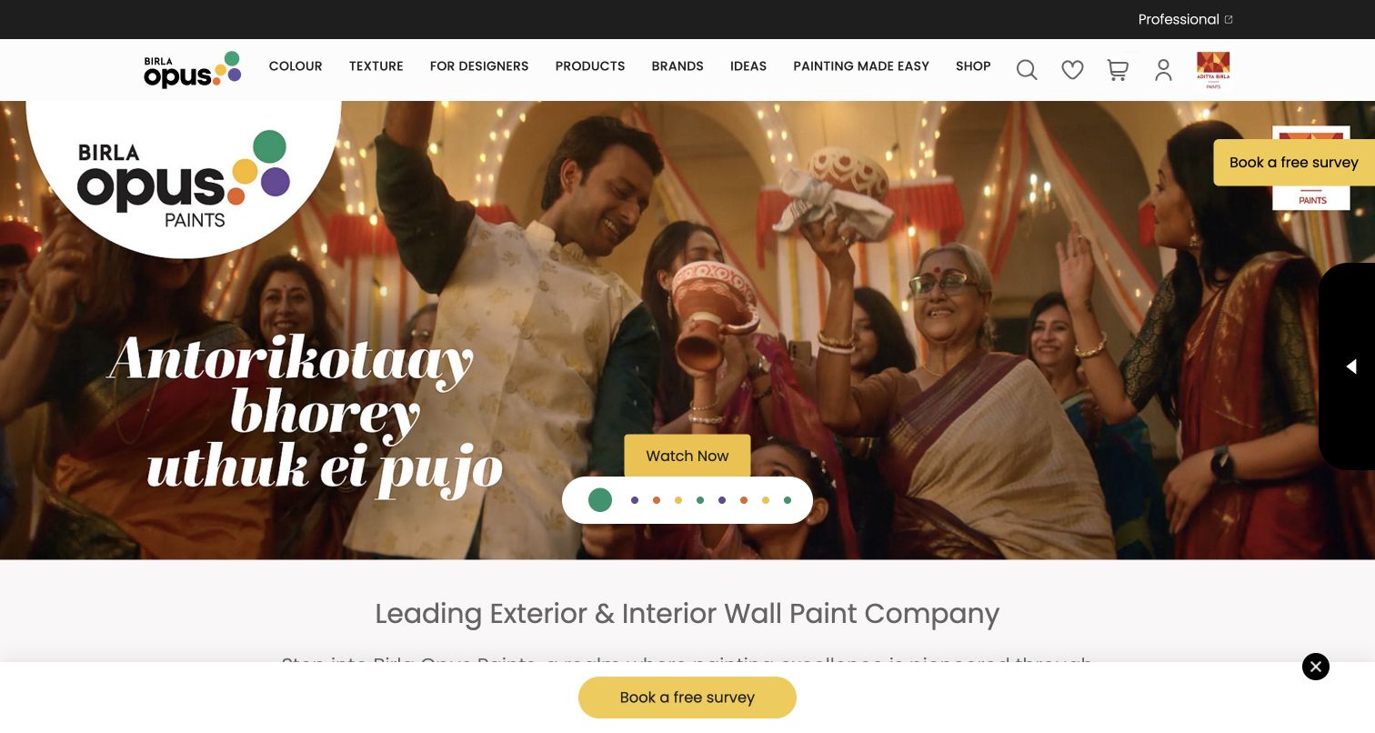
Birla Opus opens with a festive campaign photograph and large italic display lettering, framed by a white header that lists color, texture, products, ideas, and painting services. A prominent brand badge sits within the artwork, while a yellow video action and multicolored carousel indicators reinforce the palette. The captured page also repeats a free survey invitation along the right edge and bottom, making the service offer highly visible. The next section begins with a straightforward wall paint category heading, shifting from campaign storytelling toward the catalog.
What you can learn
Give inspiration and practical planning separate, plainly named routes, so a campaign does not become the only entrance. Adobe documents AEM Sites templates for this website and identifies Commerce separately for product data; the two roles should remain distinct when interpreting this example.
Pros
Task based navigation gives visitors alternatives to the seasonal campaign.
Consistent yellow actions remain recognizable against the varied photographic colors.
Cons & considerations
Repeated survey invitations compete with the campaign's video action.
The large brand badge and carousel controls consume substantial space within the photograph.
Visible tech stack
Earlier / documented evidence
Adobe Experience Manager
Public source checked November 3, 2026. References may be embedded or legacy—not a complete backend inventory.
Platform source: Adobe customer story with current public page corroboration. Adobe’s March 2026 Birla Opus story describes templates and content in AEM Sites for its website, with headless reuse into the MyOpus app. Adobe Commerce is identified separately for product data. The public website checked November 3, 2026 UTC includes brand /content/dam/grasimsbirlaopusconsumerwebsite/ assets. The explicit customer story establishes the CMS relationship beyond the asset paths. Platform evidence is separate from the direct website screenshot and is not a complete current infrastructure audit.
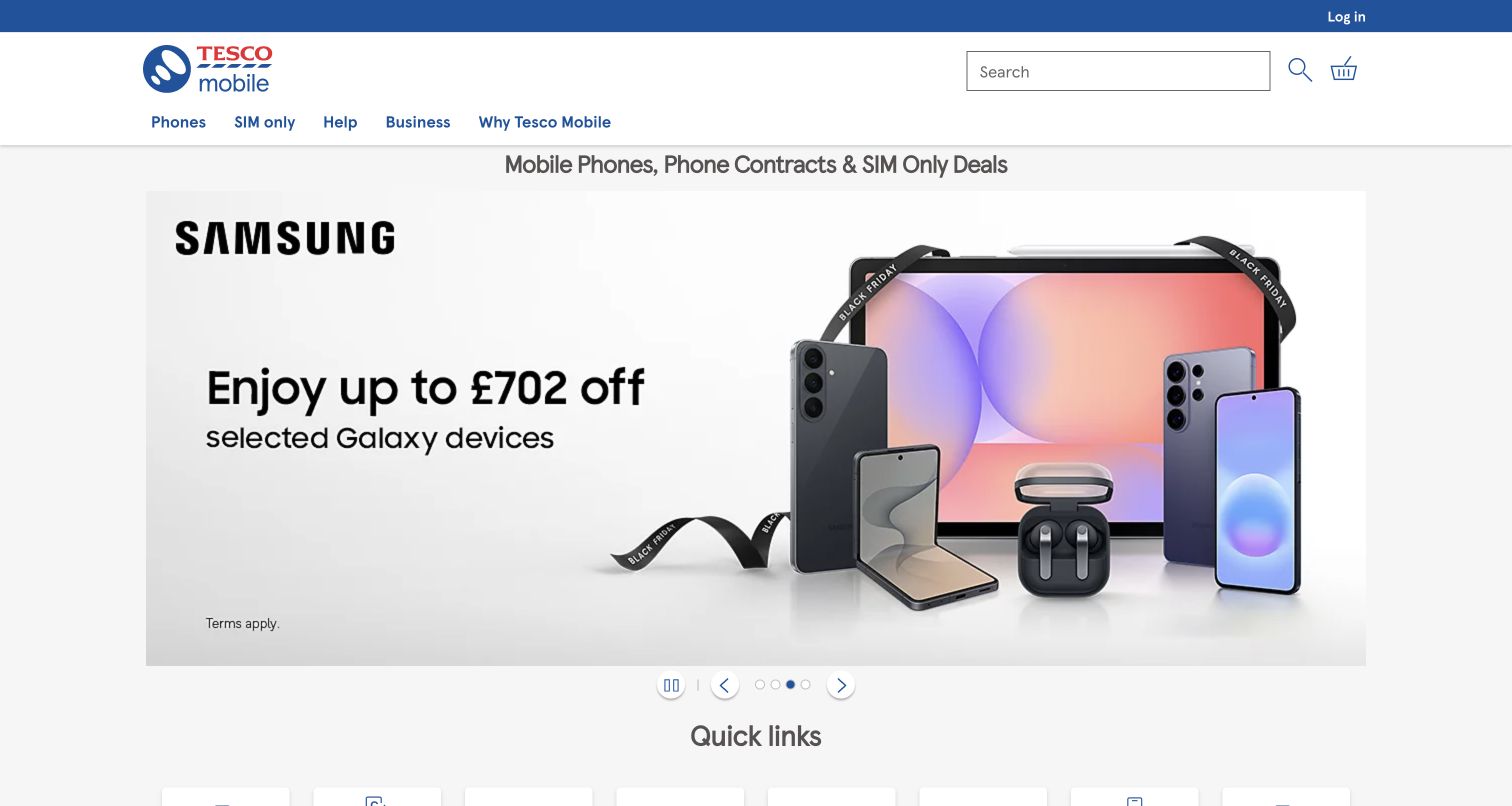
Tesco Mobile gives the opening offer a wide rectangular stage beneath a conventional retail header. The captured Samsung campaign pairs a large savings message on the left with a group of devices on the right, keeping the promotion understandable without entering a product detail page. Search occupies a substantial part of the header, and phone, SIM, help, business, and brand information routes sit in a single blue row. Carousel arrows, position dots, and a pause control are visible below the image, immediately before the quick links section.
What you can learn
Separate a frequently changing offer area from stable shopping and support navigation. Adobe documents AEM Sites alongside Commerce for Tesco Mobile, and the public page contains brand AEM client libraries; that evidence supports the content relationship without attributing checkout behavior solely to the CMS.
Pros
A clear text and product split makes the campaign easy to scan.
Search, help, and account access remain available around the promotion.
Cons & considerations
The offer occupies most of the initial view before detailed comparison begins.
Small conditions text requires closer reading than the dominant savings message.
Public source checked November 3, 2026. References may be embedded or legacy—not a complete backend inventory.
Platform source: Adobe customer story with current public page corroboration. Adobe’s Tesco Mobile customer story lists AEM Sites alongside Adobe Commerce and describes their integration in the public digital platform. The current homepage checked November 3, 2026 UTC contains /etc.clientlibs/tescomobile/ clientlib-base, clientlib-site, and clientlib-cif resources. This supports the public content association; it does not establish that AEM Sites alone implements checkout or customer accounts. Platform evidence is separate from the direct website screenshot and is not a complete current infrastructure audit.
Choose the authoring and delivery approach around the publishing work
Use governed page composition for recurring editorial layouts
When editors assemble campaigns, landing pages, and articles from a stable set of patterns, define a page-authoring workflow with clear component responsibilities. Separate shared navigation and notices from page-specific modules. Keep preview, approval, scheduling, and rollback requirements visible in the implementation brief rather than treating the editor as an afterthought.
Use structured content when several experiences need the same facts
A product, place, event, or story may appear on a website, an app, and several campaign pages. Structured content can give those experiences a common source while their presentation remains different. Define required fields, references, validation, and version expectations with the teams consuming the content; an API alone does not make an editorial model understandable.
Evaluate Edge Delivery Services as a distinct delivery option
Adobe supports Edge Delivery Services with in-context authoring through the Universal Editor or document-based authoring. Compare the editor experience, code ownership, integrations, preview process, and operational requirements against your actual content tasks. Do not assume that every existing AEM example uses this approach, or that changing delivery architecture removes the need for governance.
Plan the content operation alongside the public design
Inventory content and destinations before migration
List public routes, canonical URLs, redirects, important downloads, metadata, internal links, and the owners of recurring records. Identify duplicate or obsolete material before importing it into a new model. Preserve the useful relationships between stories, products, locations, and support information instead of treating migration as a copy of disconnected pages.
Create a component specimen with difficult content
Include long headlines, missing images, translated labels, multiple actions, unavailable products, legal qualifications, and urgent announcements. Show the initial page with consent, chat, and notification interfaces present. The combined state is what visitors encounter, even when different teams own each individual layer.
Separate content publishing from transactional responsibility
Document where the public marketing experience hands off to booking, ordering, payment, account access, or customer support. Identify which system owns availability, price, identity, and errors. A CMS case study should not be treated as evidence that one platform performs every operation visible from the homepage.
Assign asset and campaign lifecycles
Record image rights, focal points, alternative text, renditions, expiry dates, and replacement ownership. Give campaigns a planned end state so an expired event does not remain the default opening message. Review video posters, paused frames, reduced-motion behavior, and loading fallbacks as part of the same editorial asset decision.
Rehearse publishing with the people who will maintain the site
Ask an editor to replace a campaign, correct a shared fact, localize a page, and recover an accidental change. Measure where the process becomes unclear or requires unexpected developer help. Use those findings to refine permissions, approvals, documentation, and support ownership before scaling the pattern across markets.
A useful handover demonstration
Ask the actual team to carry out its routine job: publish a realistic update, correct a mistake, preview a narrow screen, and identify who owns an integration failure. For a library or frontend framework, also ask who maintains the content source and deployment. A polished screenshot does not answer those operational questions.
Beyond the screenshot
An AEM website launch checklist for content and delivery teams
Confirm the public scope of each website and its separate account or transaction systems.
Assign owners to shared facts, navigation, notices, campaigns, and translations.
Validate content models using real records with incomplete and unusually long fields.
Document inherited content, local overrides, review responsibilities, and rollout rules.
Test representative templates with consent, chat, alerts, and other overlays present.
Check image rights, alternative text, responsive crops, and media fallback states.
Review keyboard navigation, focus, contrast, zoom, and motion with the actual implementation.
Verify routes, canonical metadata, redirects, sitemap entries, and important downloads.
Exercise preview, approvals, scheduled publication, retirement, and recovery workflows.
Confirm integration failures have useful messages and do not hide essential public information.
Monitor the deployed experience and document who handles content and technical incidents.
Test with real content, a keyboard, a small screen, slow or failed requests, and the people who will maintain the system. These are planning checks, not an accessibility, security, performance, or search-ranking certification.
Sources & editorial method
How this Adobe Experience Manager collection was reviewed
Each entry pairs an original review with an actual browser capture of the named public property. Adobe customer stories establish the CMS relationship; current page resources provide additional corroboration where available. Asset delivery alone is not treated as proof of a CMS, and older vendor stories are checked against the present property. The collection excludes candidates whose current implementation could not be supported. Captures retain actual UTC dates, measured dimensions, and attribution; regional redirects and translated browser views are identified where relevant.
Every image is an unmodified capture from the actual website, with its source and capture date. Some captures are reused from our shared catalog; their dates remain the original capture dates. None comes from a vendor gallery or a generated reconstruction. Moving imagery and live content can change.
Technology attribution uses public page assets or metadata, official platform documentation, or a cited first-party project case study. Documentary and framework-relationship evidence is identified where used; it is not a complete current backend inventory. A CMS image CDN alone does not establish a full CMS deployment. A library’s presence does not prove which individual controls use it, and a platform label does not establish AI authorship.
The composition notes, lessons, pros and tradeoffs are original editorial observations. We have not measured conversion, traffic, security, performance or accessibility conformance. Website owners retain their brands and imagery; these examples are not our client portfolio. Written, Edited and Curated are independent records, not dates advanced by a build. See our editorial standards or suggest a correction.
Questions worth asking
Adobe Experience Manager website development FAQs
Does an AEM association mean the whole website runs on one Adobe product?
No. AEM Sites can be one part of a larger system. A public frontend, commerce platform, account service, asset library, and analytics tools may have different responsibilities. Use the evidence for the named property and layer rather than inferring the complete architecture.
Can an AEM site use a separate frontend?
Yes. Structured content can be delivered to independently built experiences, and implementations can combine different authoring and delivery approaches. Define the preview and publishing workflow as carefully as the API boundary so editors can understand the result of a change.
Should every regional website be an independent copy?
Start by identifying which information is genuinely shared and which needs local ownership. Live Copy relationships can synchronize selected content, but localization requires deliberate rules and review. An independent copy may be appropriate when its content and lifecycle differ substantially.
Are Content Fragments and Experience Fragments interchangeable?
They serve different reuse needs. Content Fragments organize structured information independently of a page, while Experience Fragments reuse composed content experiences. Choose from the information and presentation responsibilities you need to share, then test the authoring workflow.
Is AEM the right choice for a small brochure site?
A visual reference cannot decide that. Compare the publishing workload, number of teams and markets, integration needs, operational support, and total implementation effort. A small stable site may not need the governance and delivery structure of a large enterprise publishing program.
Do these examples prove a particular performance or accessibility result?
No. Screenshots and public platform evidence show design choices and a scoped technology relationship. Performance measurements, accessibility evaluation, and end-to-end transaction testing require separate work on the current implementation.
Borrow a content responsibility and a clear page hierarchy before borrowing a visual style. A successful enterprise website makes routine publishing dependable for editors and the resulting information understandable for visitors.