A strong salon website helps a visitor decide whether the service and stylist fit their needs, then makes the next step clear.
Hair photography can set the tone quickly, but a prospective client also needs practical answers. They may be comparing color services, looking for experience with their hair texture, deciding between stylists or checking whether a first visit requires a consultation. The site should support those decisions before sending them into a booking system.
These examples include independent neighborhood salons, personal-name studios, salon groups and brands that also sell products. Study how each balances expressive imagery with useful information. The collection evaluates visible website design; it does not assess hairdressing skill, service outcomes or the reliability of an appointment platform.
Before the examples
What makes good hair salon website design in 2026?
Explain the service before asking for a slot
Use service names clients can understand, then clarify what is included, how pricing is determined and whether a consultation comes first. Distinguish a maintenance appointment from a major change when the salon handles them differently. Keep the website’s descriptions aligned with the names people will see in the booking system.
Help visitors find a suitable person and place
Introduce the team with current roles, relevant specialisms and approved examples of their work. For multiple locations, connect each stylist and service to the correct branch. Put the address, contact details and useful access information on the location page so a beautiful image does not become the only clue about visiting.
Make appointment routes explicit
Separate new-client consultations, returning-client bookings and general questions when those routes genuinely differ. Explain any external booking handoff before it happens. Keep a plain contact alternative visible for people who cannot identify the correct service or use the online appointment interface.
The collection · 21 examples
21 hair salon websites worth studying
Compare location-led directories, stylist-led introductions, specialist service pages and combined salon-and-retail brands. Look at where each page places the information needed to move from an appealing photograph to a realistic appointment decision.
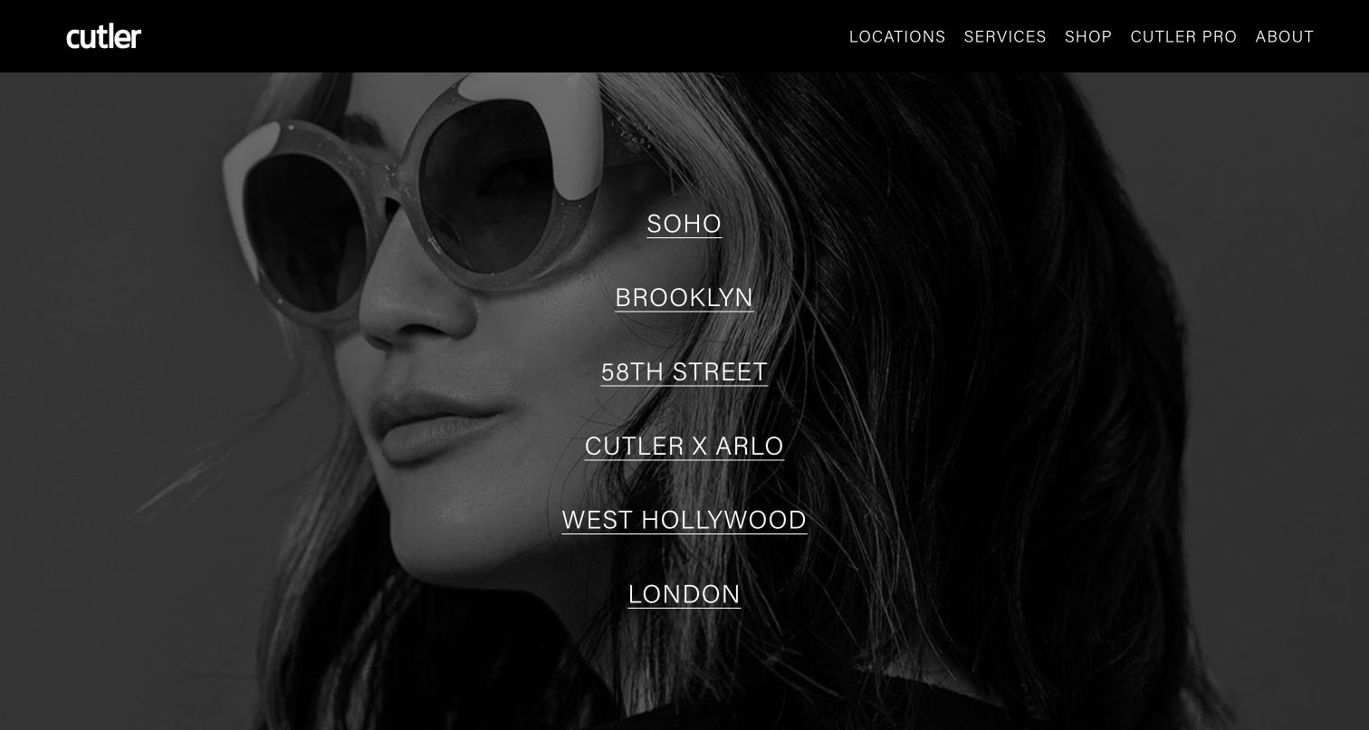
Cutler places its salon destinations at the center of the opening screen, using a grayscale portrait as the backdrop. A visitor can begin with a neighborhood or city instead of decoding a brand statement. The restrained black header separates broader services, shopping and professional information from that immediate location choice. This is a useful hierarchy for a business whose branches are the first practical distinction. The photograph supplies personality while the large vertical location list carries the actual decision.
What you can learn
Make the first choice match the way appointments are organized. A location selector should lead to the relevant team, services, contact details and booking destination, with enough contrast to remain readable when campaign photography changes.
Pros
Prominent location names give visitors a concrete starting point before broader exploration.
A limited monochrome palette lets the destination list remain visually distinct.
Cons & considerations
The opening composition does not explain service pricing or differences between branches.
Visitors seeking an immediate appointment must interpret a location link before seeing a booking-specific action.
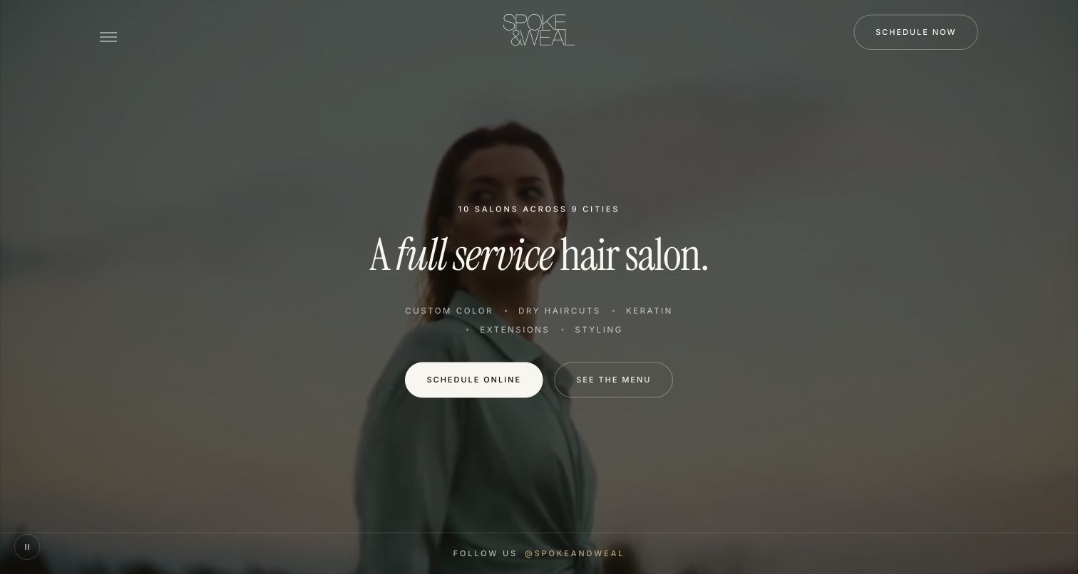
Spoke & Weal introduces the business with a short service proposition over darkened lifestyle media. Scheduling and the service menu sit beside each other, so the visitor can either act or understand the offer. A concise line of service categories gives the atmospheric presentation a practical anchor. The centered wordmark and small navigation controls keep the opening screen spare. The visible pause control is also worth studying when considering motion: the visual atmosphere has a distinct control instead of becoming an unavoidable background effect.
What you can learn
Pair a booking action with a route for people who still need service information. Keep the core explanation readable over every media frame, and retain a useful still composition when video cannot load or is paused.
Pros
Adjacent scheduling and menu buttons acknowledge different levels of visitor readiness.
The visible service vocabulary explains more than a purely aspirational headline would.
Cons & considerations
The minimal opening navigation gives locations less visual prominence than the main proposition.
Large background media requires careful fallback behavior and consistent text contrast.
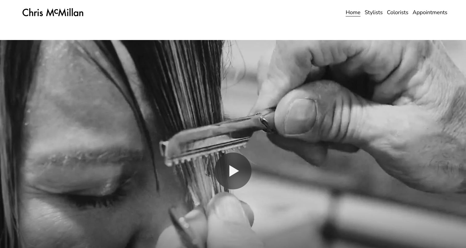
Chris McMillan The Salon leads with an expansive black-and-white view of hands working on hair. The image emphasizes the act of cutting rather than a polished room or retail product. Above it, straightforward navigation distinguishes stylists, colorists and appointments. That combination gives the page two layers: an editorial introduction to the salon’s craft and explicit routes toward the people who provide particular services. The opening video treatment is visually dominant, leaving most practical explanation to the navigation and subsequent pages.
What you can learn
Let process imagery establish character, then make staff specialisms easy to inspect. Team pages should help visitors understand who handles the service they want, while the booking route should preserve that choice rather than require it again.
Pros
The working close-up creates a concrete connection to the service being sold.
Separate stylist and colorist labels provide understandable starting points for staff research.
Cons & considerations
The large media area leaves little opening space for prices, location or appointment expectations.
A visitor unfamiliar with the team still needs another page to compare suitable people.
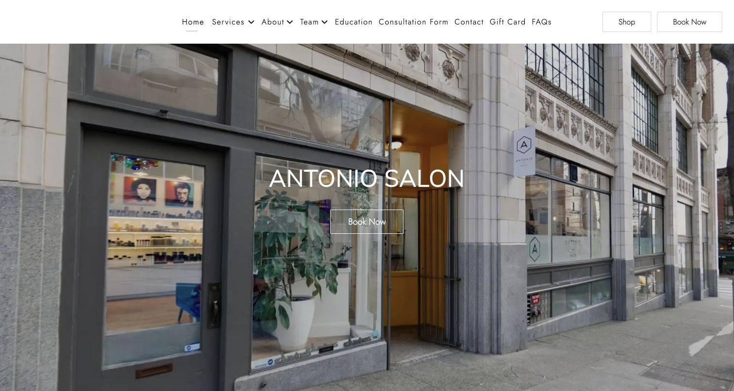
Antonio Salon uses a photograph of its real storefront as the main introduction. The salon name and booking action sit over that scene, linking the digital visit to a physical destination. The header exposes services, the team, consultation information and other practical routes, while shopping and booking remain visible on the right. Compared with a model-led campaign, the exterior photograph makes arrival and atmosphere part of the first impression. The tradeoff is a relatively busy header around an otherwise simple, place-focused hero.
What you can learn
A storefront can be useful brand material when visitors will need to recognize the entrance. Pair it with an accurate address, accessible arrival information and a clear action, then keep secondary navigation from crowding the appointment path.
Pros
The actual exterior gives prospective visitors a concrete sense of the destination.
Booking is represented both in the header and in the main introduction.
Cons & considerations
Many adjacent navigation choices compete for attention across the desktop header.
Service suitability and price context are not explained by the large exterior image itself.
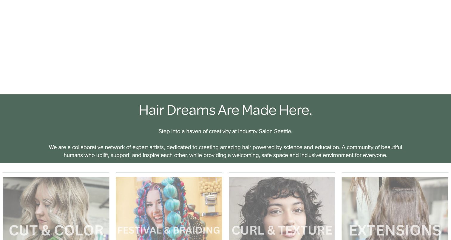
Industry Salon’s captured introduction section combines a muted green text panel with a row of photographic service cards. The cards distinguish cutting and color, braiding, curl and texture work, and extensions. This makes the service mix more tangible than a general statement about creativity alone. The screenshot is deliberately from below the opening media area, which remained blank during the observed visit. In this section, the broad welcome supplies tone while the labeled imagery begins the practical job of helping a visitor find relevant work.
What you can learn
Translate an inclusive brand promise into clear service routes and representative work. Essential introductions should remain available when a media embed does not render, and category labels need to stay legible over photographs with different backgrounds.
Pros
Distinct service cards let visitors recognize several possible paths through the salon offer.
The green introduction panel separates explanatory copy from the photographic category row.
Cons & considerations
The opening media area did not render during this visit, leaving substantial empty space above.
Large white labels over photographs need careful contrast across every category image.
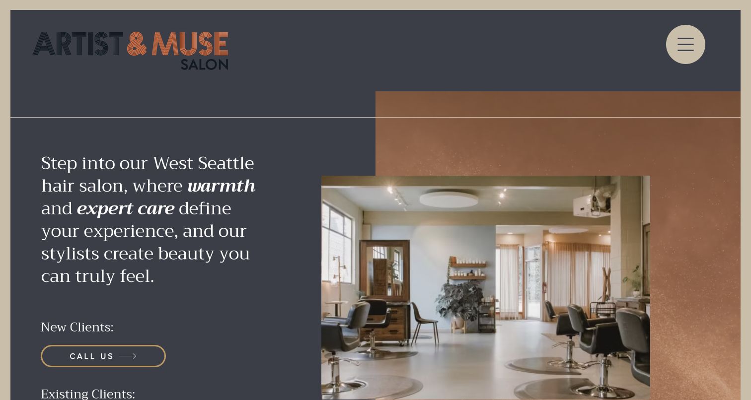
Artist & Muse uses a warm interior photograph, overlapping frames and a serif introduction to establish the feel of its West Seattle salon. The layout gives substantial space to the brand name while keeping the introduction in a readable text column. Its contact routes distinguish new clients from existing clients, a meaningful operational detail when the first appointment needs a conversation. The composed photography and neutral tones make the room part of the story, although the large decorative spacing means not every client route appears equally early.
What you can learn
Explain different booking paths in the words clients use. If a first visit starts with a call, state why and what the team will help decide, while keeping repeat booking convenient and visibly connected to the same salon.
Pros
The real interior photograph communicates the setting without requiring a promotional video.
Separate new-client and returning-client routes reflect a recognizable appointment workflow.
Cons & considerations
The oversized brand treatment uses space that could also introduce services or appointment details.
Some practical choices sit below the initial fold and require further exploration.
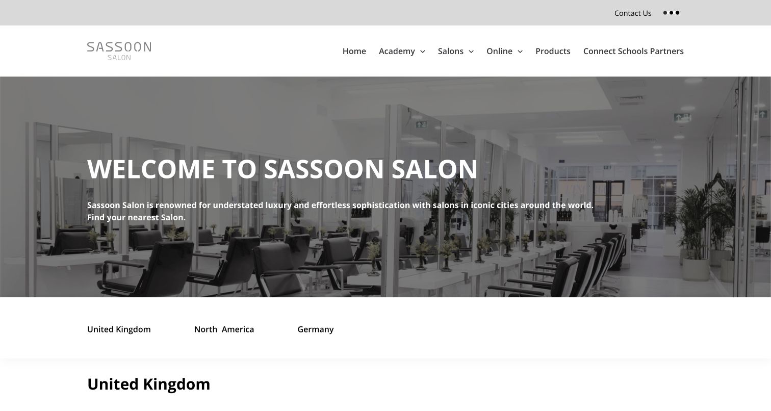
Sassoon Salon presents an interior photograph and a concise introduction before moving into country-based salon navigation. The page sits within a larger brand structure that also includes education, products and other audiences. For the salon visitor, geographic grouping is the most useful organizing device: it narrows a broad network into a plausible local destination. The restrained type and pale layout keep the directory readable, but the global navigation also asks visitors to distinguish a salon appointment from the brand’s professional and educational activities.
What you can learn
Use geography to reduce the size of a large salon network. Each destination should then provide its own practical information and appointment route, with clear boundaries between consumer services and professional training or product content.
Pros
Country navigation offers an understandable first filter for an international salon collection.
The interior photograph gives the directory an identifiable salon context.
Cons & considerations
Several global brand divisions share navigation space with the immediate salon task.
Visitors still need to open a location to understand its particular services and booking arrangements.
Visible tech stack
Referenced on the public page
Google Fonts
Public source checked November 3, 2026. References may be embedded or legacy—not a complete backend inventory.
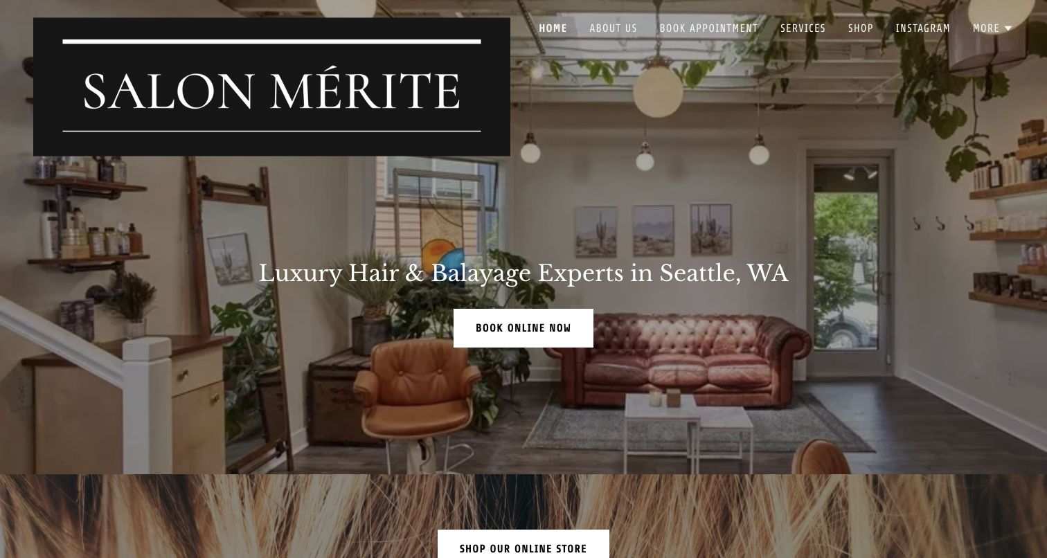
Salon Mérite combines an oversized dark logo block with a full-width view of the salon interior. The opening copy identifies the local setting and highlights a color-related specialism, while a clear booking button provides the next step. This gives the photograph a more useful role than atmosphere alone: it supports a specific salon proposition. A store section begins below the main introduction, introducing a second commercial route after the appointment message. The large logo and overlaid navigation make contrast and proportion central to the composition.
What you can learn
State the service focus and location close to the booking action, then use the room photograph as supporting context. If retail is part of the site, establish where appointment planning ends and product browsing begins.
Pros
The introduction connects a local salon identity with a specific service emphasis.
A prominent booking button is easy to distinguish from the surrounding photographic content.
Cons & considerations
The large logo panel occupies a substantial portion of the opening viewport.
Light navigation and copy over the interior photograph depend on careful image placement.
Visible tech stack
Referenced on the public page
Google Analytics
Public source checked November 3, 2026. References may be embedded or legacy—not a complete backend inventory.
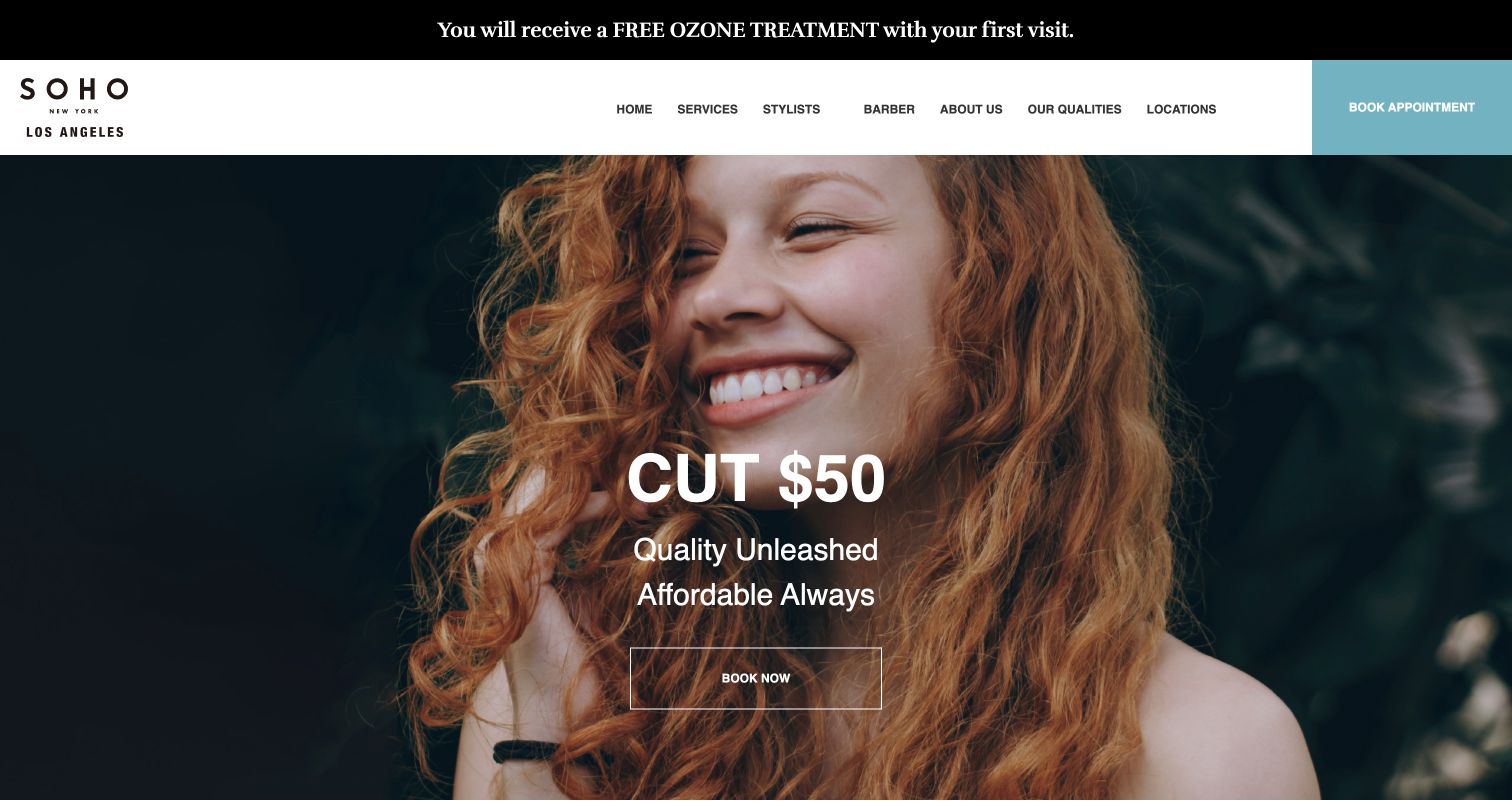
SOHO New York Los Angeles places a haircut price prominently over a colorful model photograph. A booking action appears alongside the offer, and another remains in the light header. The site therefore makes a concrete commercial proposition before asking visitors to explore a gallery or team story. An additional promotional strip introduces another message above the main navigation. The result is direct and easy to recognize as a salon offer, with the responsibility that any headline price must remain accurate and sufficiently explained on the service page.
What you can learn
Use a headline price only when visitors can understand its scope. Link it to current inclusions, relevant stylist or service distinctions and appointment conditions, and avoid letting a separate promotion obscure the primary offer.
Pros
A visible haircut price gives visitors practical information at the beginning of the journey.
Repeated booking access connects the main offer to an obvious next action.
Cons & considerations
The hero cannot by itself explain every condition or variation behind the advertised price.
The promotion strip and main campaign introduce competing messages in the same viewport.
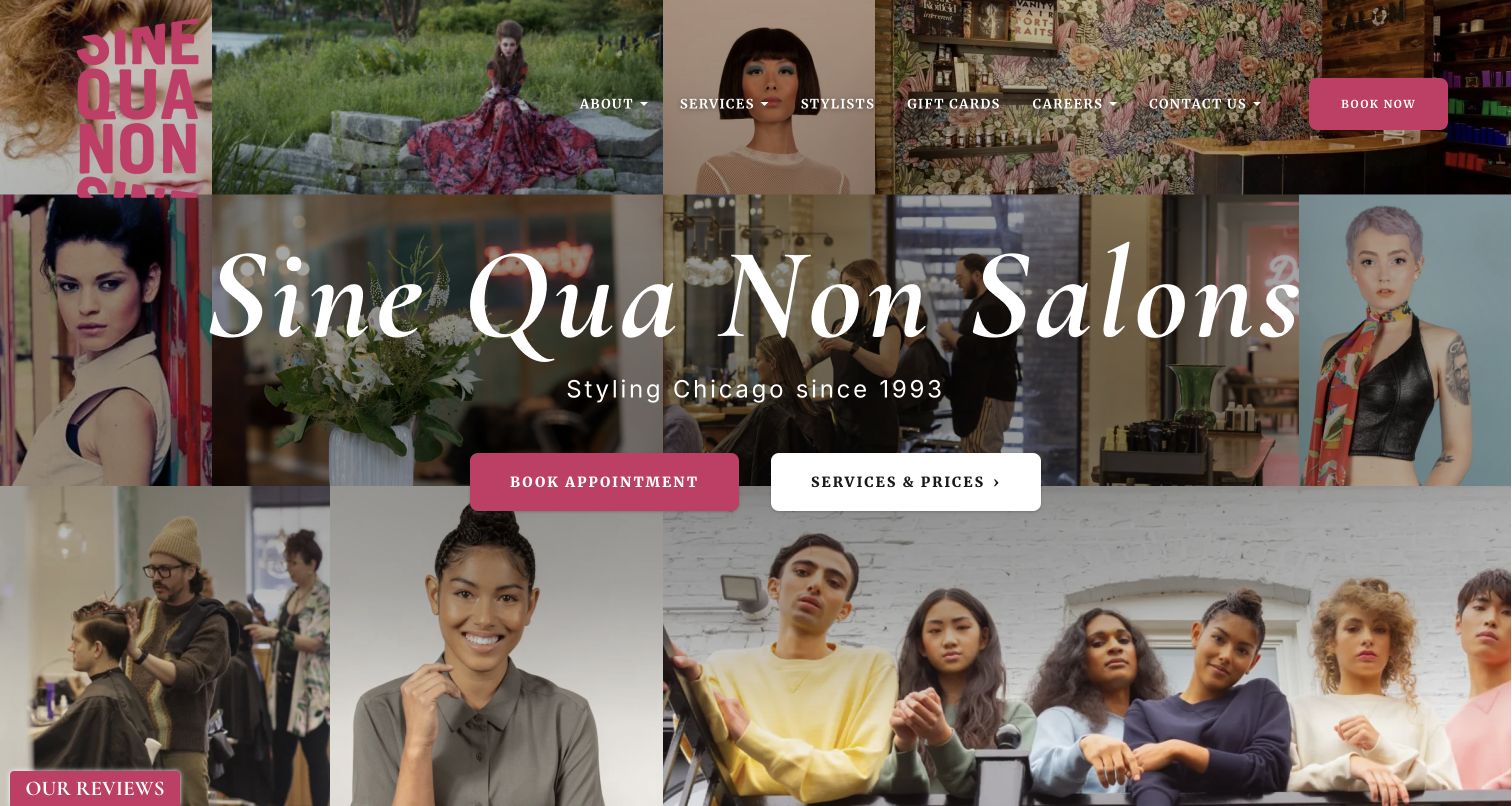
Sine Qua Non combines tiled hair portraits and interior imagery with a large typographic identity. Pink accents connect the wordmark, navigation and booking control across an otherwise varied photographic surface. The introduction identifies the city and gives visitors both a booking path and a service-and-price path. That pairing is valuable because the collage demonstrates visual range without explaining which appointment a visitor needs. The composition is intentionally dense, so its success depends on maintaining a clear hierarchy among photographs, large lettering, small navigation and additional interface elements.
What you can learn
A varied portfolio can introduce a salon’s character, but it should sit beside practical service information. Keep one or two actions visually dominant and check whether each image crop still supports readable navigation at smaller sizes.
Pros
The collage exposes several kinds of hair imagery rather than relying on one campaign model.
Services and prices receive a distinct route alongside the booking action.
Cons & considerations
Large type, multiple photographs and secondary interface elements create a busy opening screen.
Small navigation placed over varied imagery needs extra attention to contrast and spacing.
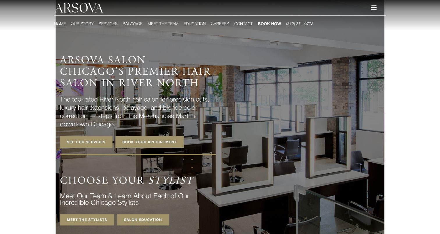
Arsova Salon uses its interior as a backdrop for a substantial opening explanation. The copy identifies the Chicago neighborhood and outlines services, while two highlighted buttons distinguish exploring the offer from making an appointment. A stylist-selection section begins within the same desktop view, connecting the room and service proposition to the people providing the work. The header includes many navigation routes and a phone number. This supplies practical detail early, but places a considerable amount of text and interface over a visually detailed photograph.
What you can learn
Connect place, services and staff as successive decisions. An interior image can support all three, provided explanatory text has a reliable contrast treatment and the main actions remain easier to scan than the surrounding navigation.
Pros
The introduction gives a specific neighborhood context rather than a generic salon slogan.
Service exploration, booking and stylist selection are represented as distinct decisions.
Cons & considerations
Longer white copy competes with the room photograph for visual attention.
The dense header creates several parallel choices before the visitor reaches the main proposition.
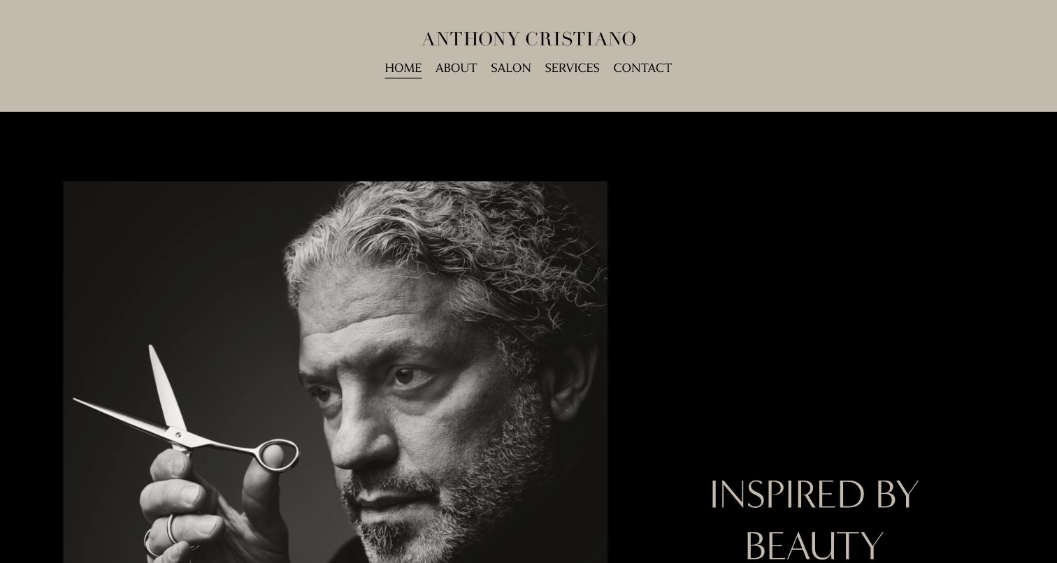
Anthony Cristiano Salon introduces the brand through a monochrome portrait with scissors, framed by a large dark composition. The pale header centers the name and limits navigation to a small set of recognizable topics. This makes the creative identity the clear first impression; the visitor is invited into a person’s visual world before receiving extensive service details. The photograph and sparse copy work together as an editorial statement. For someone ready to schedule, however, the opening screen offers less immediate practical direction than examples with a dedicated booking button.
What you can learn
A personal-name salon can lead with the artist, but the surrounding navigation should still support ordinary appointment decisions. Connect the portrait-led identity to team, services and contact information without making clients infer the next step from brand imagery.
Pros
The portrait and tools establish a direct relationship between the name and the craft.
A short navigation list keeps the opening identity from being crowded by secondary links.
Cons & considerations
The initial screen provides little service or pricing context for a first-time visitor.
An explicit appointment action is less prominent than the editorial portrait and brand statement.
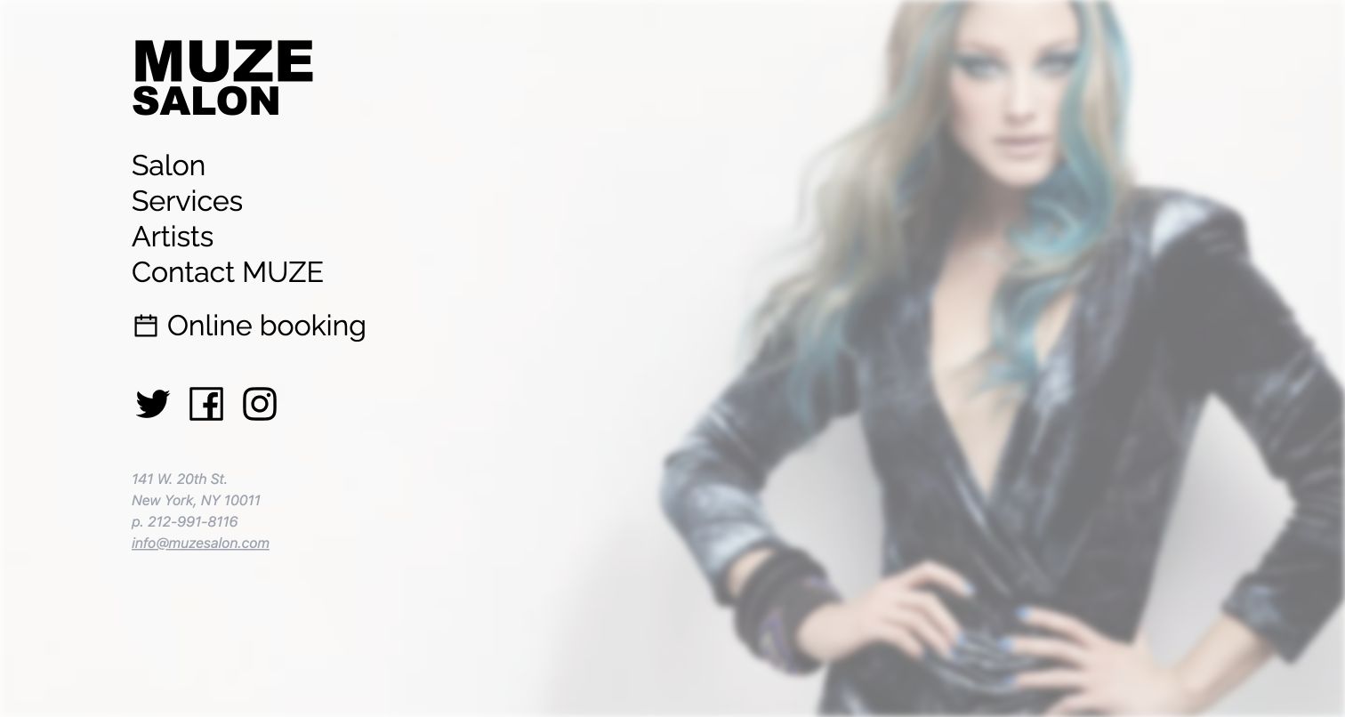
Muze Salon divides attention between a bold vertical navigation column and a large, softly focused hair image. Services, artists and contact information are easy to identify, with online booking given a calendar icon. Address and communication details sit close to the main navigation instead of being reserved for a distant footer. This produces a compact utility-led page with a strong photographic mood. The image is more atmospheric than diagnostic, while the visible links carry most of the information needed to begin evaluating or contacting the salon.
What you can learn
A small salon site can make its core tasks visible together. Preserve generous space around booking and contact links, but ensure that the imagery is supported by clear service descriptions and specific portfolio examples elsewhere on the site.
Pros
Services, staff, contact and online booking are grouped in a highly visible vertical structure.
Location and communication information remain close to the main action area.
Cons & considerations
The soft-focus hero provides atmosphere rather than a detailed view of finished hair work.
Visitors need additional pages to assess service scope or compare artists in depth.
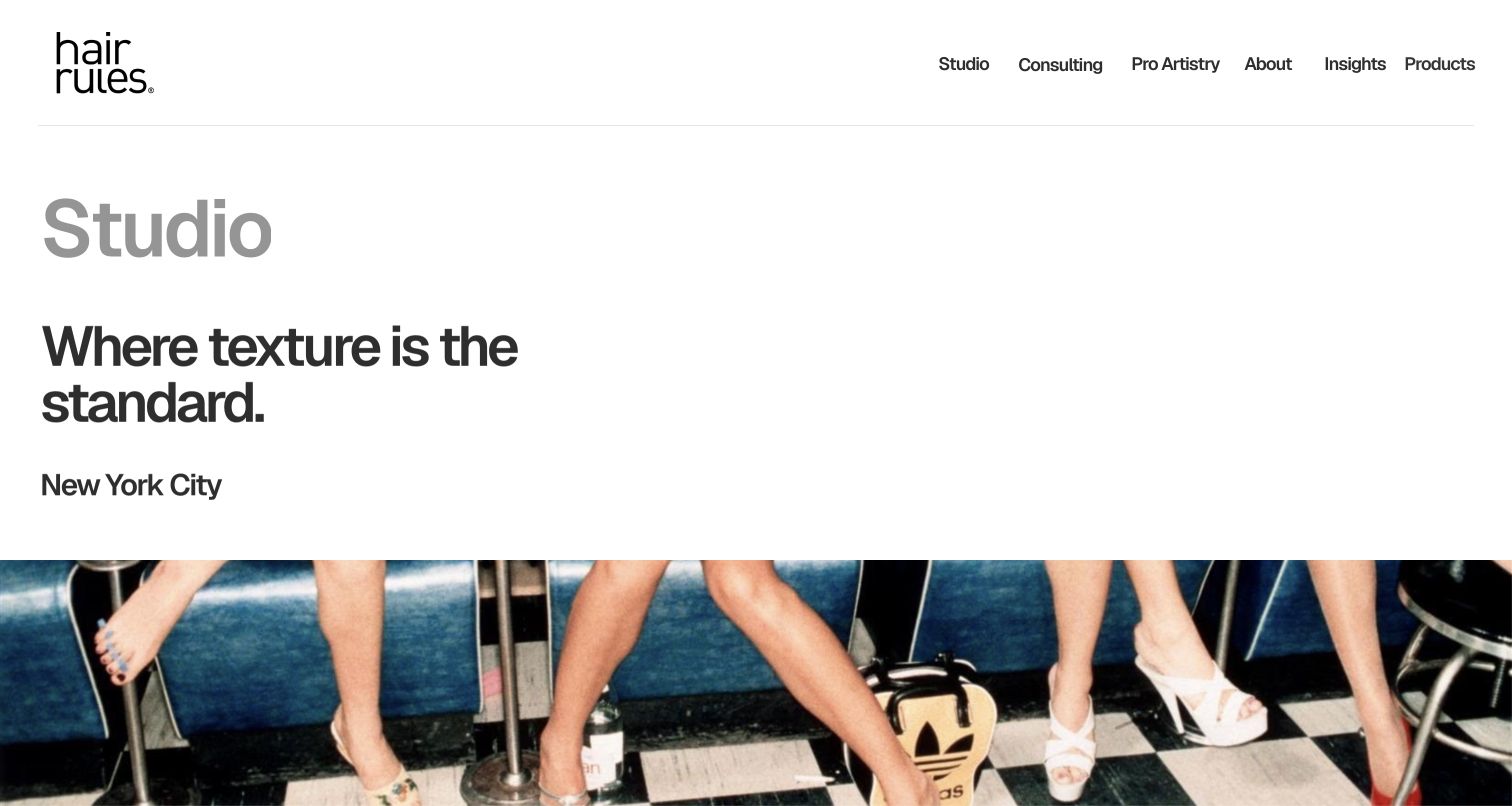
Hair Rules Studio uses oversized typography to establish the studio identity and its emphasis on hair texture. The city appears with the introduction, while a broad site navigation connects the studio with consulting, professional work and products. The first photograph begins lower in the viewport, giving the text proposition priority over a full-screen campaign. Further page content includes the physical location, hours and visit-related information. This is a useful example of a specialist service page within a wider brand, where the appointment-related content needs to remain easy to distinguish.
What you can learn
Name the relevant specialism clearly, then answer the practical questions that determine whether someone can visit. A studio page should bring together location, access information, service expectations and contact routes even when the parent brand serves several audiences.
Pros
The opening typography makes the studio’s texture-related positioning immediately visible.
The page contains practical visit information alongside the broader brand proposition.
Cons & considerations
The first viewport offers little detailed hair imagery to support the service positioning.
Multiple professional and retail destinations share navigation with the studio visit journey.
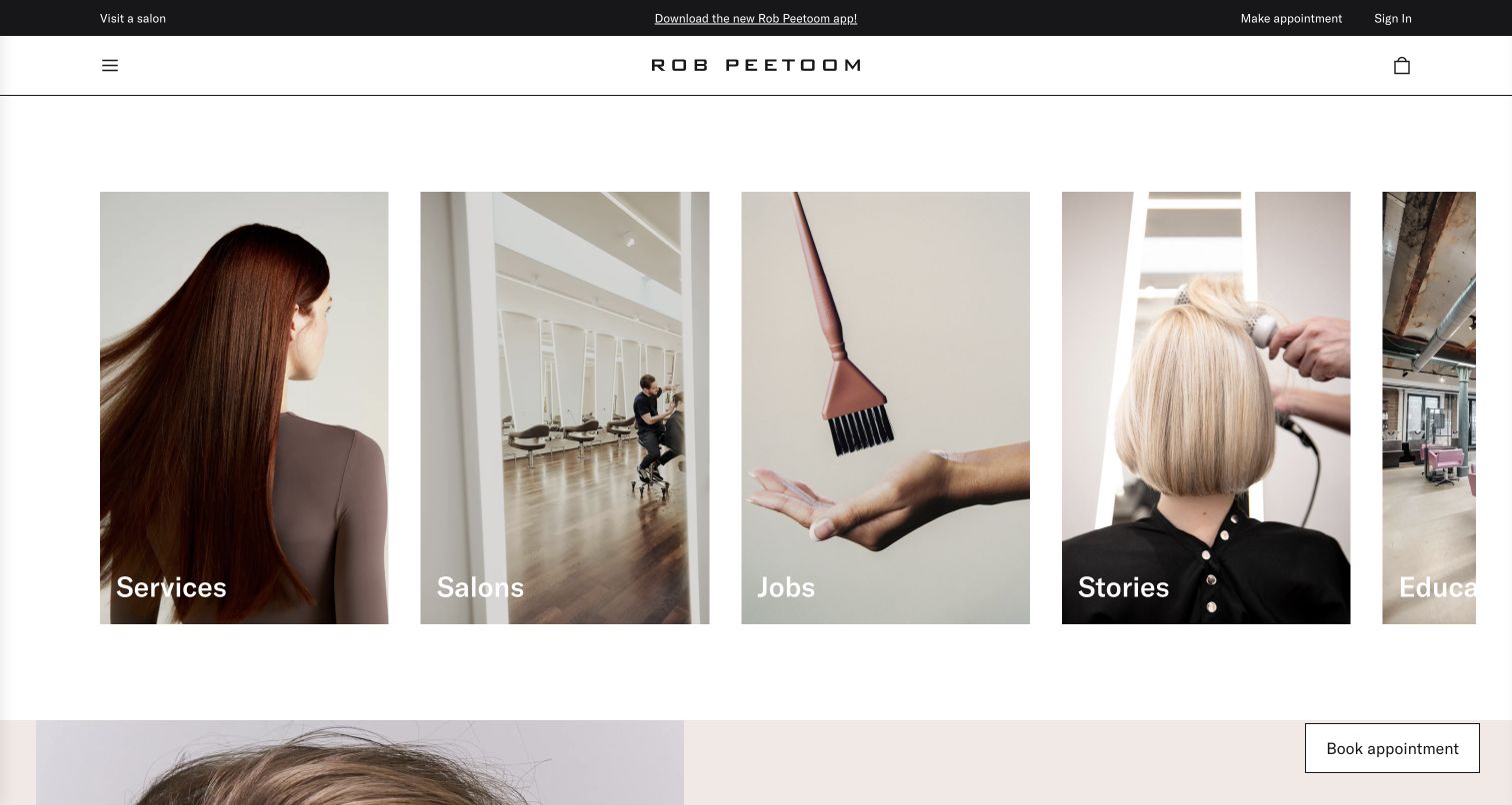
Rob Peetoom organizes the opening view around tall photographic cards for services, salons, jobs, stories and education. The cards act as a visual directory rather than a single campaign message. A separate utility strip contains appointment-related access, and an appointment control remains visible near the lower edge. The approach makes the breadth of the business legible, but gives client and professional destinations similar visual weight. On the observed desktop width, the horizontal sequence also extends beyond the fully visible set of cards, making discovery dependent on understanding that wider row.
What you can learn
A visual directory works best when audience priorities are explicit. Keep appointment access independent of exploratory cards, and make any horizontal continuation discoverable without requiring visitors to guess that more destinations are available off screen.
Pros
Photographic cards connect concise labels with distinct areas of the salon business.
Appointment access is available outside the large exploratory content cards.
Cons & considerations
Recruitment and education compete visually with services and salon finding for client attention.
The horizontal card sequence does not expose every destination fully in the captured viewport.
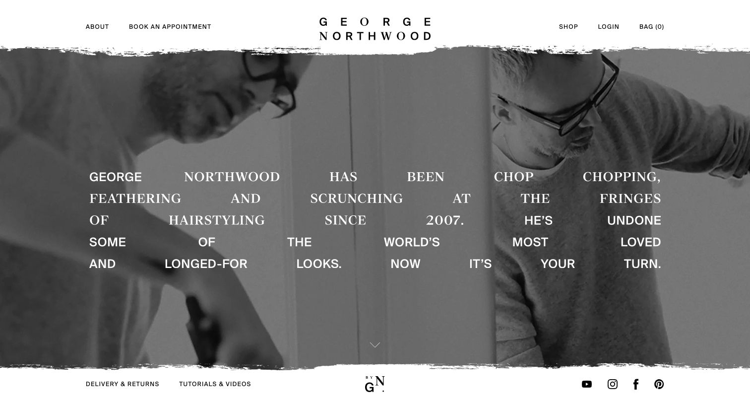
George Northwood pairs black-and-white working imagery with a large, widely spaced personal narrative. Rough-edged photographic framing and the expansive wordmark give the page a deliberate editorial character. Booking remains in the upper navigation, alongside routes into the brand’s products and account functions. This creates a connection between a named creative identity and an active salon environment. The expressive typography asks for more reading attention than a short service headline would, so practical information needs a clear supporting structure beyond the opening statement.
What you can learn
Use a founder’s voice to make the brand specific, while keeping appointment access and service information easy to scan. Decorative typography should remain readable and should not be the only place where essential details appear.
Pros
Working imagery connects the personal brand to an actual salon activity.
An appointment route is present in the header despite the strongly editorial hero.
Cons & considerations
The large, spaced narrative requires more visual effort than a compact practical introduction.
Salon appointments and retail utilities share the opening navigation without much explanatory separation.
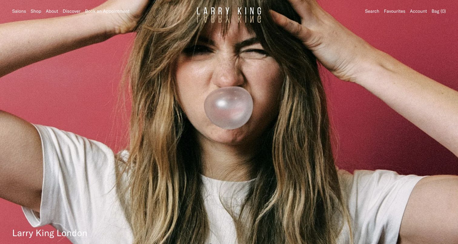
Larry King Hair opens with a vivid pink campaign photograph and restrained white navigation over the image. Salons and appointment booking appear alongside shopping and editorial destinations, making the site’s dual service-and-product role visible from the start. The image dominates the screen and communicates a strong visual identity, while the small navigation carries most of the practical information. This is a useful reference for a brand with substantial campaign material, though an independent salon borrowing the treatment would still need its own service detail and local context.
What you can learn
A memorable campaign should support the visitor’s task rather than replace it. Keep salon and product destinations explicitly labeled, and verify that booking controls remain readable over every image crop used across desktop and mobile layouts.
Pros
The distinctive color and model photography create an immediately recognizable visual direction.
Salon and appointment routes remain available within the opening navigation.
Cons & considerations
Small white controls overlap a photograph with changing tones and detailed shapes.
The first screen provides limited location or service explanation for someone arriving without brand familiarity.
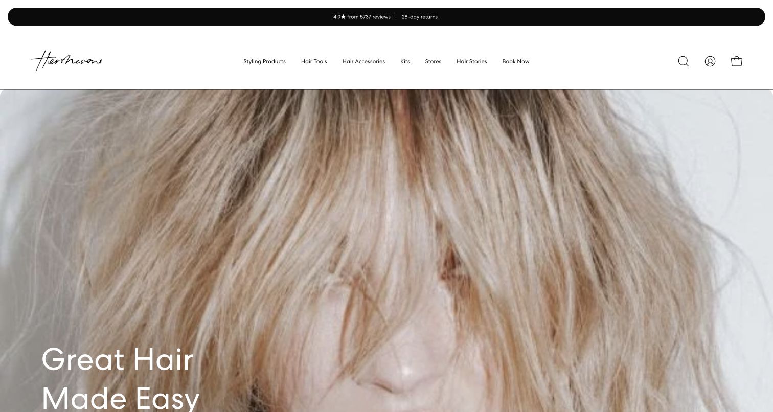
Hershesons places a large hair photograph beneath a light header and a narrow utility strip. The visible navigation gives substantial space to product-related categories while preserving a booking route and location-oriented content. The campaign image makes hair the obvious subject, but the structure behaves like a combined retail and salon brand rather than a small appointment-only site. Its restrained header typography and expansive image create a polished first impression. The main design question is whether a visitor seeking a salon appointment can distinguish that path as quickly as a product shopper can.
What you can learn
When products and appointments share a domain, give each a coherent route. Salon navigation should lead to local services, staff and booking information, and should remain identifiable even during retail promotions or campaign changes.
Pros
Large hair imagery keeps the brand’s subject clear despite the breadth of the navigation.
Booking remains represented within the same header as the product shopping routes.
Cons & considerations
The small booking label has limited visual emphasis among several retail-oriented choices.
The opening campaign requires further navigation to reveal practical salon-specific information.
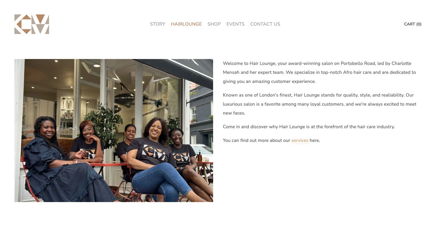
Hairlounge by Charlotte Mensah presents a photograph of the team outside the salon beside a readable introductory text block. The page establishes its hair-care specialism in prose instead of relying entirely on a fashion image. A service link follows the introduction, with practical salon information available farther down. The gold brand mark and simple white header keep the page connected to the broader product and editorial site. This gives the salon a human and physical context, although the first screen is oriented toward learning about the business more than immediately arranging a visit.
What you can learn
Photographing the people and place can make a specialist salon easier to understand. Pair that introduction with a clear explanation of relevant services, then make the step from reading to contacting or booking unmistakable.
Pros
The team outside the storefront connects the salon’s people with a recognizable physical place.
A substantial text introduction provides service context beyond the visual mood.
Cons & considerations
The first screen does not give appointment access the prominence of the team photograph.
Visitors must continue down the page to assemble more of the practical visit information.
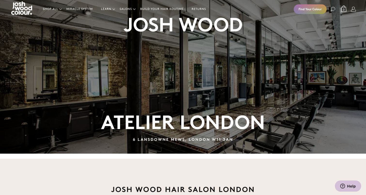
Josh Wood Atelier uses a full-width interior photograph to introduce its London salon page. The salon name and address connect the image to a real destination, while the global header retains the wider brand’s retail and advice routes. A light explanatory section begins beneath the photograph, marking a transition from atmosphere to information. The page is useful as a reference for giving a physical salon its own presence inside a product-focused website. The main tension is the difference between the global navigation’s shopping priorities and the local visitor’s appointment questions.
What you can learn
A salon landing page inside a larger commerce site needs its own practical hierarchy. Bring address, services, staff and appointment access together, while keeping global product tools from dominating the visitor’s attempt to plan a physical visit.
Pros
The interior photograph and address establish a specific place within the broader brand.
A dedicated salon page allows explanatory content to follow the visual introduction.
Cons & considerations
Retail and product-selection routes remain prominent in the global header above the salon content.
Booking is less immediately visible than the salon identity and room photograph.
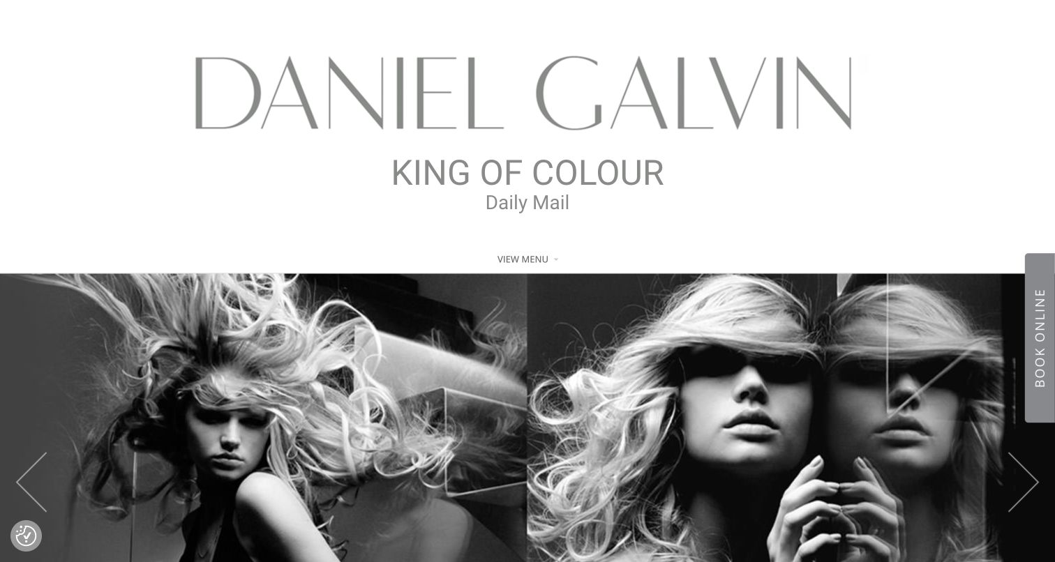
Daniel Galvin gives the salon name substantial space above a black-and-white hair montage. A compact menu control keeps the main navigation quiet, while a vertical booking tab sits at the right edge. This separates the identity-led introduction from the appointment action without putting several large buttons over the photography. The page emphasizes recognition and editorial style before detailed service explanation. Its oversized opening identity also means the first view contains less practical information than a more compact salon homepage, making the visibility of the menu and edge control especially important.
What you can learn
A strong name can anchor the design, but visitors still need obvious access to ordinary salon tasks. If booking lives at the screen edge, test its label, focus behavior and placement at smaller widths rather than relying on desktop familiarity.
Pros
The large wordmark and monochrome hair montage create a coherent editorial identity.
The booking tab provides a distinct action outside the central brand composition.
Cons & considerations
The substantial identity block postpones service and location detail until further exploration.
A compact menu and vertical edge label may be less immediately familiar than conventional navigation.
Plan around the questions clients ask before booking
Map the first visit and the repeat visit separately
Ask the reception team which appointments can be booked directly and which require a conversation. Document what information is needed at each step and where a confused visitor should go. Carry the selected location and stylist into the booking journey when the system supports it, and explain when a client must choose them again.
Create maintainable service and team records
Store a service description, price basis, relevant staff and appointment route together. Give each team profile an owner and a review date. Collect photographs with publication permission and enough context to explain the service shown; avoid presenting campaign imagery as the work of a particular stylist without support.
Give the team a practical update routine
Assign responsibility for staff changes, service names, price updates, opening hours and booking links. A small site with accurate information is easier to rely on than a large gallery with stale appointment details. Check the whole route after booking-provider changes, including confirmations and the salon’s own contact alternative.
The editing job behind the design
Choose tools that fit the salon’s appointment workflow
A manageable CMS can hold services, stylists, locations and approved work examples as reusable records. Decide who can update those records without editing a page layout. The systems behind these example sites have not been verified, so their visual appearance is not a platform recommendation.
Evaluate a booking provider using the salon’s real rules: consultations, service duration, stylist availability, multiple locations and returning clients. Review the transition from the public website on a phone and with a keyboard. Keep the product shop clearly distinct if the same brand also sells retail items, and request only information needed for the relevant task.
Our WordPress website examples offer a separate look at publishing approaches. A visible platform label is evidence for that named page, not a guarantee that the same system will suit your requirements.
Before the public launch
Hair salon website launch checklist
Confirm current services, price descriptions, staff roles and location assignments with the salon team.
Match service labels and location names between the public site and the booking destination.
Make new-client consultations and returning-client bookings distinguishable where the workflow differs.
Check every address, phone number, opening-hours statement and practical access detail.
Record permission for team photographs, client work examples and any published testimonials.
Keep essential text readable when hero media fails, pauses or changes crop on a narrow screen.
Test navigation, keyboard focus, text zoom and the booking handoff using a suitable test workflow.
Explain relevant appointment policies before a visitor commits, with a clear route for questions.
Give one person responsibility for monitoring broken links, staff changes and outdated offers.
These checks are a project checklist, not a performance, legal, security, or accessibility certification. Test real journeys with the people responsible for the website before making claims about the result.
Sources & editorial method
How this collection was selected and reviewed
The collection contains the 21 examples fixed by the saved selection plan before research began. We visited distinct official public salon websites or dedicated salon pages, read their visible content and individually inspected direct browser screenshots. Captures retain their actual source URLs and dates; one example uses the labeled introduction section below an opening media area that did not render. Reviews describe observed design choices and their limits. We did not complete appointments, audit private systems or infer technology from appearance.
Each example links to its actual source page. Screenshots are direct browser captures with their own capture dates; moving imagery, announcements and live designs can change. The notes describe observable design choices and conditional tradeoffs, not measured traffic, conversion results, service quality, or accessibility conformance.
Technology labels use public page metadata, asset evidence, or explicitly cited platform documentation. Platform documentation is not a complete current deployment audit. A component reference may be legacy or unused; it is not a complete backend inventory. Unknown stacks are omitted. These sites are editorial examples, not our client portfolio.
Written, Edited and Curated are separate editorial records, not timestamps advanced by a rebuild. Website designs and imagery belong to their owners. See our editorial standards or suggest a correction.
Questions worth asking
Hair Salon website design questions
What should a salon put on its homepage first?
Identify the salon, its location or location chooser, the relevant service offer and a clear appointment route. Add enough information for a new visitor to understand where to explore services or staff. A large photograph can support this introduction, but should not be the only explanation.
Should every stylist have a profile?
Use profiles when clients can choose a person or need to compare relevant experience. Keep roles, services, location and booking access current. A short, accurate profile with approved work examples is more useful than a long biography that does not help someone choose an appointment.
How should a salon present prices?
Explain the current basis of the price and what the service includes. If cost depends on a consultation, stylist level or another genuine factor, say so clearly. Avoid presenting a starting price as a guaranteed total, and keep public descriptions aligned with the booking system.
Does a salon need a separate website for product sales?
Not necessarily. A shared site can work when salon services and product shopping have clear labels and destinations. Give appointment visitors an obvious route to locations, staff and services instead of making them work through retail navigation.
Should the booking form be embedded on the page?
Choose the arrangement that works reliably with the salon’s existing process. An external booking page can be appropriate when the handoff is clear. An embed still needs readable controls, useful error states and a contact alternative. Test the actual journey before choosing based on appearance.
Borrow the information hierarchy that suits your salon, then fill it with your own services, people and approved photographs. The useful design is the one your team can keep accurate and your clients can use to plan the right visit.