A good Elementor website gives editors useful choices without making the underlying content arbitrary. Start with the visitor’s tasks, then define the small set of sections and relationships the team really needs.
The twenty examples below expose public Elementor resources. Their screenshots show varied uses across national service organizations, regional practices, retail, hospitality, and destination publishing. That evidence does not reveal the private template setup, licenses, permissions, form destinations, or exact controls supplied to their editors.
Use the references to plan structure rather than to accumulate widgets. A location finder, an estimate request, a restaurant menu, and a project archive each need a dependable content model and operating owner. Reproducing their visual shape without those decisions does not reproduce their usefulness.
Before the examples
What makes good Elementor website development in 2026?
Define global styles before page exceptions
Set a clear typography, color, spacing, button, and field system before assembling many pages. Elementor’s Site Settings documentation describes centrally managed global and theme-style controls. Test long content and an ordinary fallback state at the system level, then reserve local exceptions for real requirements rather than the convenience of one attractive mockup.
A service area, office phone number, staff profile, opening time, or product reference should have an intentional source. Decide which content belongs in a structured record and which is genuinely one-off campaign copy. Without that separation, several visually editable blocks can become several conflicting versions of the same practical fact.
Treat the working interaction as part of the design
A form needs routing, required states, errors, a truthful confirmation, and an owner for failed delivery. A finder needs empty results and coverage boundaries. A menu needs focus and small-screen behavior. These are implementation responsibilities, not styling choices that can be inferred from a builder component appearing on a public page.
The collection · 20 examples
20 Elementor website examples worth studying
Look for controlled flexibility: reusable service entrances, explicit local routing, restrained hospitality frames, structured retail navigation, and practical content that remains understandable around a changing campaign.
We start with five recognizable brands or organizations: JE Dunn Construction, Car-X Tire & Auto, Tecta America, Guidepost Montessori, F.H. Furr. Each attribution applies to the named website property, not every product or website belonging to its organization. This is a curated reading sequence, not a measured ranking.
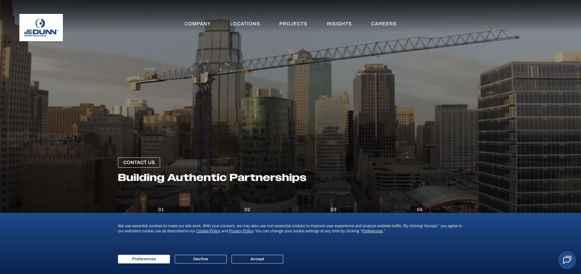
JE Dunn frames a large dusk construction photograph with a dark blue identity and a partnership-focused introduction. Its section sequence organizes the story around the company, its building approach, its work, and current insights. Markets and office routes support visitors who already know what they need. Public Elementor component references establish a scoped association with this website, not the exact editing controls or every internal corporate application.
What you can learn
Translate that progression into named reusable section types before opening a visual editor. A project feature, a market introduction, and a company statement need different content fields even when they share typography. Test an ordinary editor replacing the image and a long headline in an approved environment. Keep the underlying project record independent from its homepage placement so a later redesign does not turn the archive into disconnected page-builder fragments.
Pros
The sequence gives the corporate introduction an intentional reading order.
Office and market routes provide direct alternatives to the longer company narrative.
Cons & considerations
An extended brand sequence can delay specific comparable-project evidence.
A dark photographic field needs contrast checks for each replacement image and navigation state.
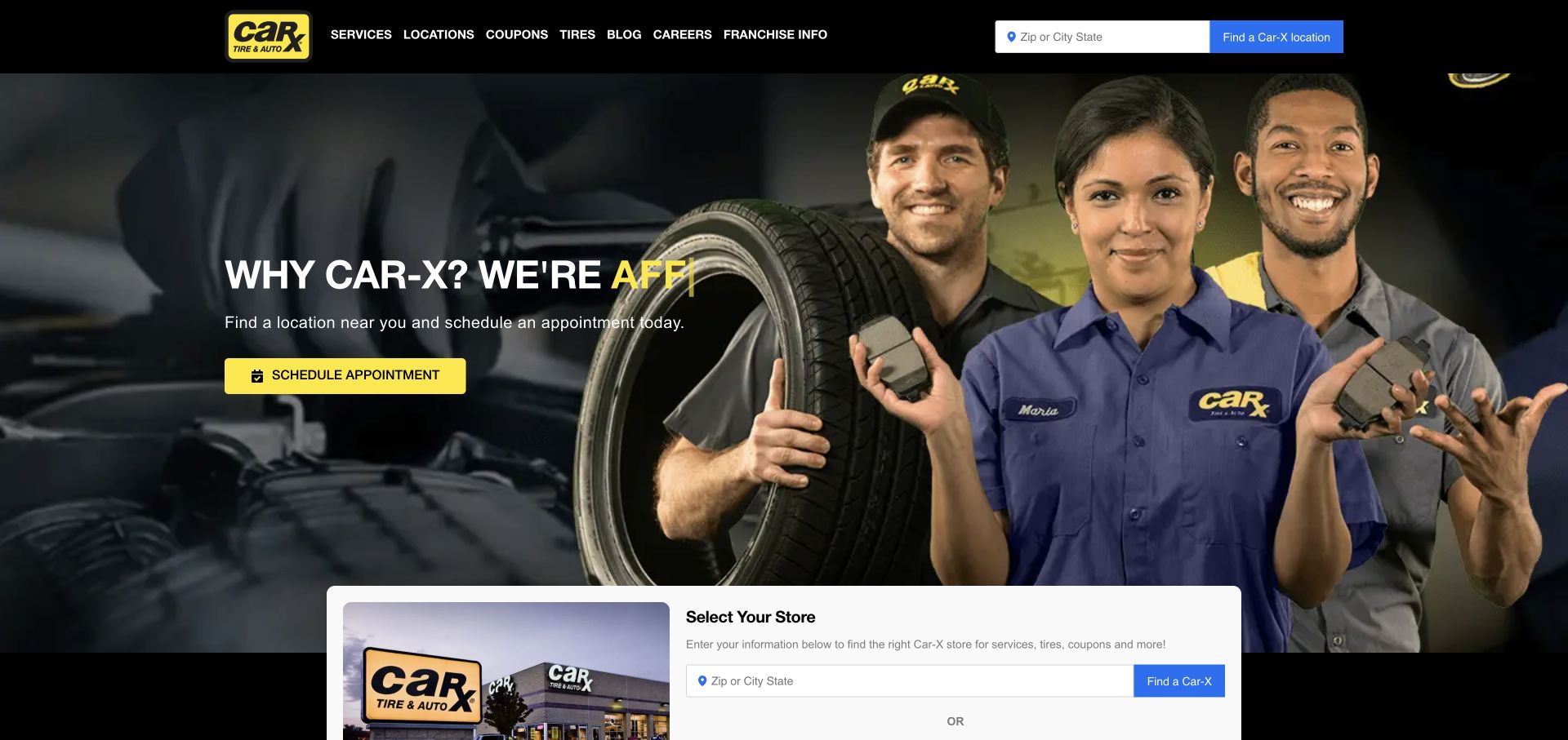
Car-X puts three uniformed staff members beside a yellow appointment action on a dark hero. A city-or-ZIP field in the header and a larger store-selection panel establish that the relevant shop matters. Services, locations, coupons, and tires have plainly named navigation. The public page referenced Elementor; the capture does not demonstrate actual store availability, appointment completion, or the editing workflow behind the layout.
What you can learn
Model a location record once and let appropriate templates refer to it. Avoid manually repeating phone numbers, hours, and service claims in every visually similar panel. Test both location controls together, including a place outside the coverage area and a changed selection. An editor should be able to update a promotion without altering the appointment destination or accidentally applying a local offer to every shop in the network.
Pros
The location requirement is visible before the visitor commits to an appointment journey.
The yellow action remains distinct against the dark team photograph.
Cons & considerations
Two store-selection controls require consistent state and clear priority.
Coupons and broad service navigation can compete with the immediate task of choosing a shop.
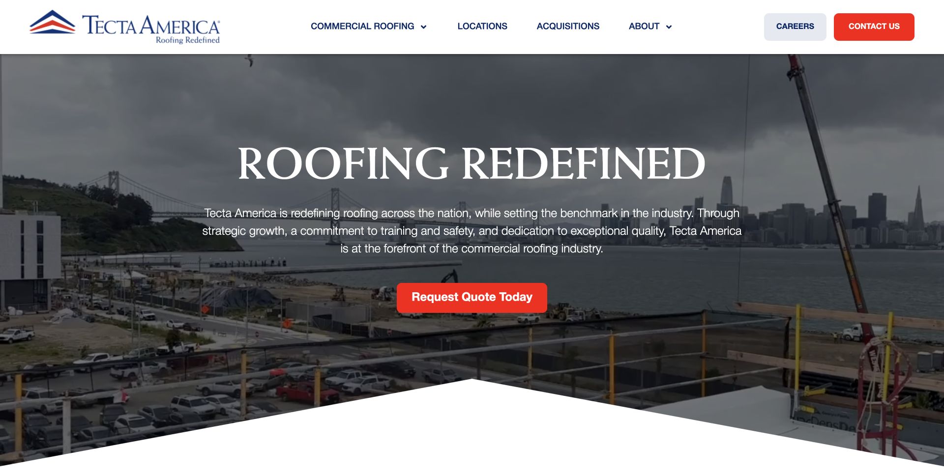
Tecta America uses a white navigation row, blue-and-red identity, and a large centered statement over a darkened construction scene. One red quote action provides the primary next step, and a sloped edge marks the transition below the feature. Public Elementor resources support the association for this site, but do not reveal which sections editors can change or how quote requests are processed internally.
What you can learn
Specify the hero's content and editing limits rather than leaving every visual property adjustable. Let an editor replace approved imagery, heading, and destination while preserving contrast and responsive spacing rules. Store service and location information as reusable records outside the individual promotional block. Test a long regional name and a missing image, and verify the real inquiry handoff separately from the visual form or button.
Pros
The single red action gives the expansive corporate scene a clear continuation.
Conventional service and location navigation remains readable above the image.
Cons & considerations
A broad roofing statement needs more concrete scope and project detail below it.
The decorative sloped edge must not consume useful content space on a short screen.
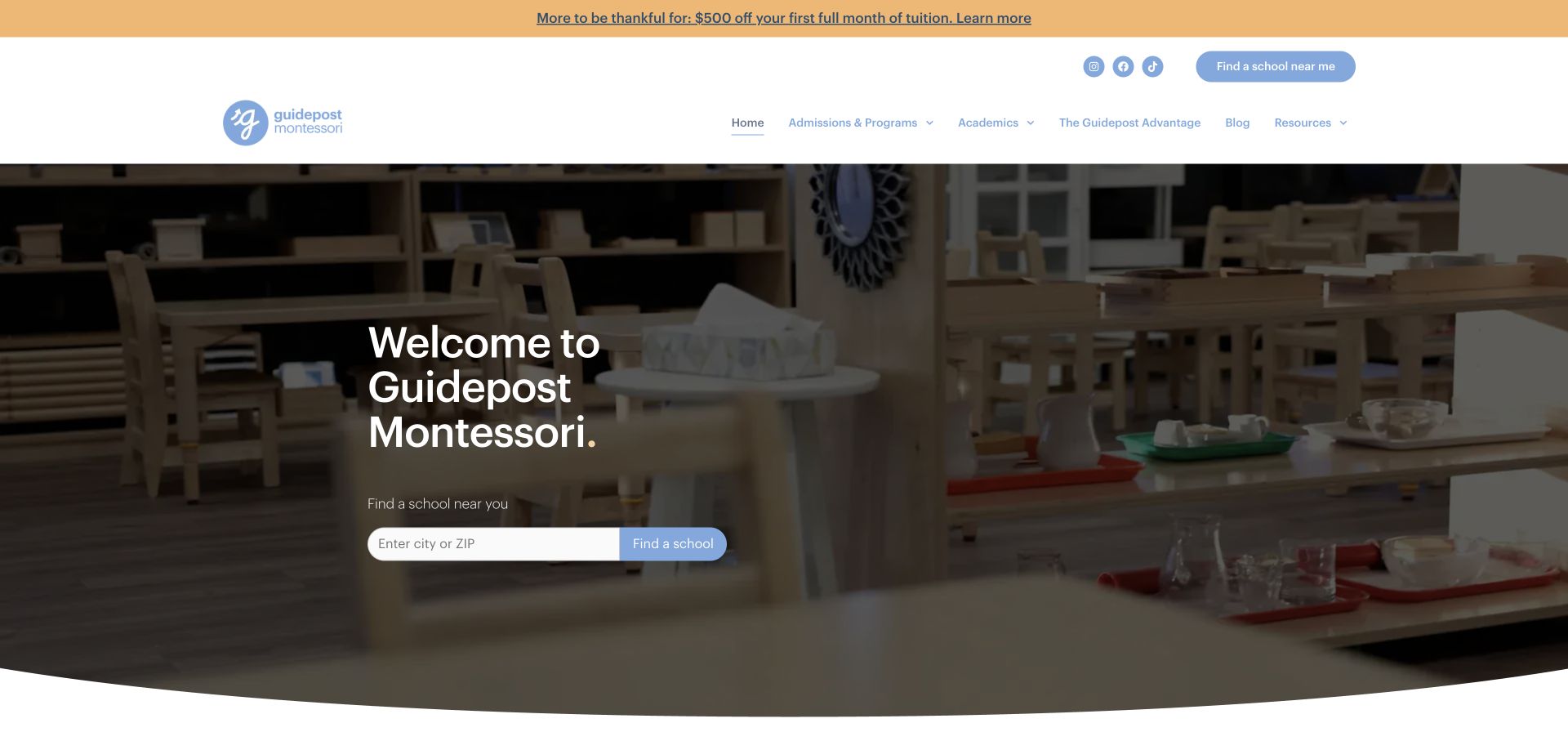
Guidepost Montessori places a concise welcome over a darkened classroom photograph and provides a city-or-ZIP finder beneath it. Admissions, programs, academics, and resources remain in the white header, with another school-finding action nearby. The public response referenced Elementor components. That does not validate educational claims, actual enrollment capacity, or how the network reviews updates to individual school records.
What you can learn
Separate network-wide program copy from school-specific addresses, ages, schedules, and contact details. Build the finder against that structured information rather than a set of manually copied landing pages. Test an out-of-area search and an unavailable school destination with fictional data. A visual editing workflow should preserve those relationships when the hero changes, while the appropriate organization reviewer remains responsible for care and curriculum statements.
Pros
The finder gives the welcoming photograph an immediate practical purpose.
Program information and local school discovery have recognizable places in the header.
Cons & considerations
Repeated finder entrances need consistent labels and selected-location behavior.
A promotional strip can distract from the more important local school selection task.
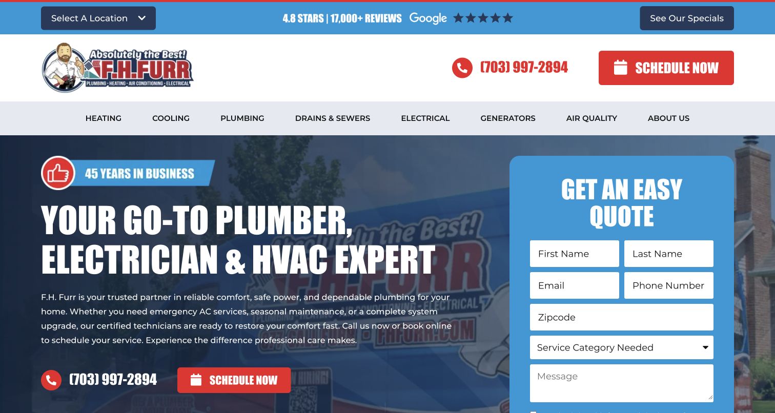
F.H. Furr puts a blue request panel directly over its branded service introduction. Plumbing, heating, cooling, and electrical categories sit in a broad navigation, while location and specials occupy a utility layer. The form makes the initial requested information visible instead of postponing it to a footer. Elementor references identify public components, not a verified CRM, dispatch process, or successful message delivery.
What you can learn
Define the minimum information the office needs before designing a large form block. Keep field labels, required states, service routing, and confirmation behavior under controlled review rather than editable as arbitrary decoration. Test on a narrow screen with long input, invalid values, and unavailable delivery. An editor should be able to change campaign copy without silently altering the request destination or the meaning of a service choice.
Pros
The request panel makes the next step explicit beside the service message.
Location and service choices can support a more relevant handoff.
Cons & considerations
The large form leaves less room to explain coverage and service scope.
Repeated phone, schedule, and request actions need a clear priority on mobile.
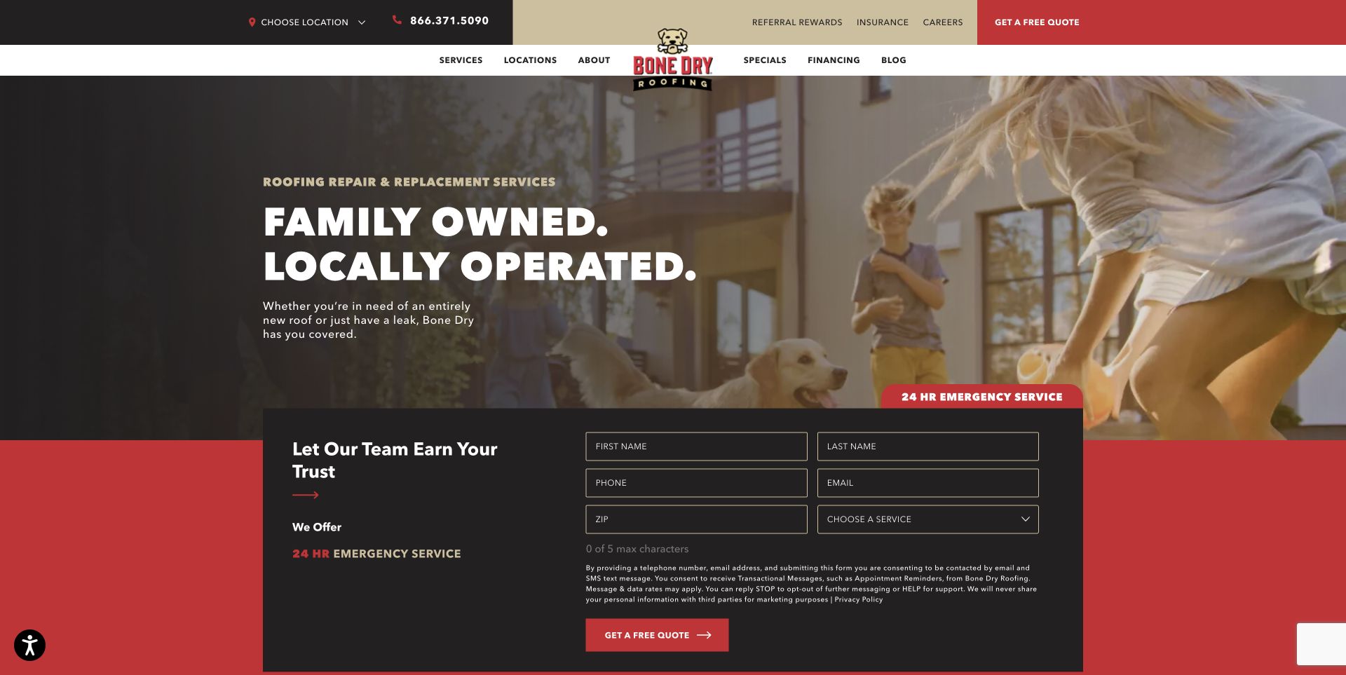
Bone Dry combines a warm family-and-home scene with a dark headline field and a broad contact form. Several header layers carry local contact details, secondary links, navigation, and quote access. An emergency label introduces the request area, with location and service choice among its fields. The public page referenced Elementor, but the capture did not test emergency response, form delivery, or office routing.
What you can learn
Make the difference between an ordinary estimate and urgent help explicit in both copy and form behavior. Store office and coverage information in a maintained source rather than repeating it in several visual containers. Test the form after an editor changes a headline, removes an image, or updates a phone number. Keep a plain contact alternative available when the richer request component cannot be completed.
Pros
The home setting makes the service context concrete rather than abstract.
The visible form explains what information the initial request asks for.
Cons & considerations
Several header layers and a large form create a crowded first screen.
An emergency label needs an accurate explanation of staffing and the correct immediate contact route.
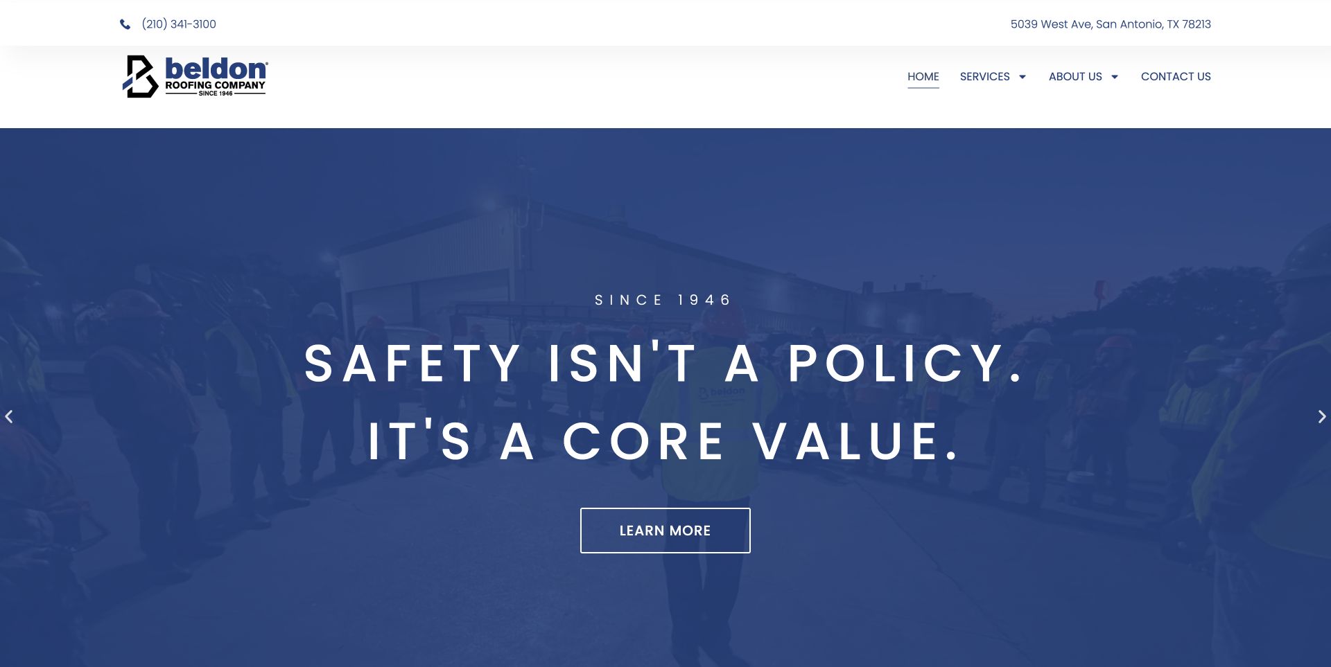
Beldon uses a white contact header and a compact navigation above a blue-tinted team scene. A centered values statement and a single outlined action keep the opening comparatively restrained. The carousel frame suggests more than one company story without turning every message into a separate form. Elementor resources were observed publicly; the reference does not verify safety statements or show the actual editorial review process.
What you can learn
Give each feature record a title, approved image, useful destination, and expiry decision. Keep the visual builder's global header separate from individual slides so an editor cannot accidentally change every contact route while updating a campaign. Test the longest statement, a missing slide image, and a non-rotating alternative. Assign an appropriate reviewer to values and safety language rather than treating a polished type composition as evidence of the underlying practice.
Pros
The restrained action count gives the company story a clear visual priority.
Phone and address information have a permanent place outside the carousel.
Cons & considerations
Widely spaced text can become difficult to scan at narrow widths.
A sequence of values messages should still lead quickly to concrete service and location information.
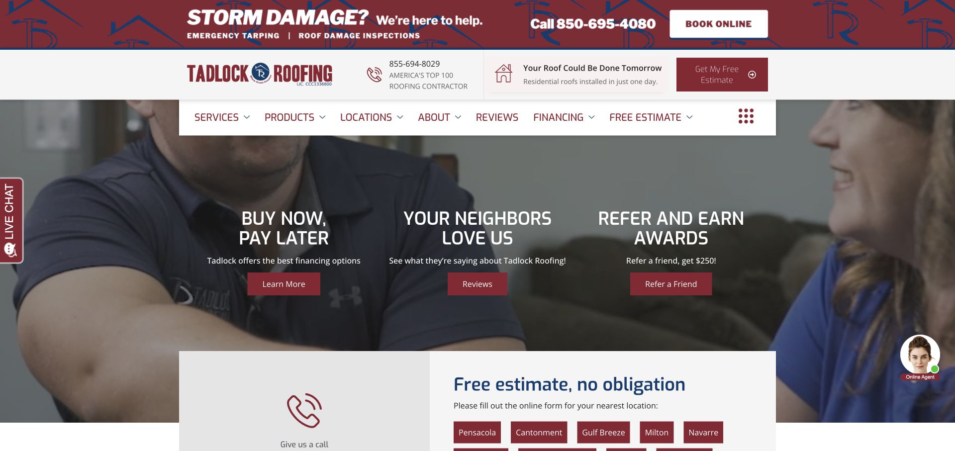
Tadlock layers storm help, contact information, a floating menu, and promotional columns over a residential scene. Financing, reviews, and referrals share the feature area, while an estimate section begins beneath it with location-specific routes. Burgundy ties the separate pieces together. The public page referenced Elementor components, not a tested financing service, a verified review program, or a complete estimate workflow.
What you can learn
Define a limited set of campaign modules with explicit content owners. Storm notices, finance information, referral offers, and ordinary service content should not depend on one editor remembering which copied block contains the current wording. Test the layout after removing an expired promotion and check the remaining action hierarchy. Keep location destinations tied to maintained records so a visually convenient duplication cannot direct a request to an outdated office.
Pros
The palette gives multiple promotional elements a recognizable common frame.
The estimate area recognizes that the relevant local location matters.
Cons & considerations
Three equal promotional choices can dilute the main estimate task.
Stacked banners and a floating header need careful space management on a small display.
Bestia places its textured white wordmark over a warm table-and-food photograph. Menu, contact, events, gifts, and reservations are plainly named in the surrounding navigation. The opening is highly atmospheric, with address and hours appearing in subsequent content. Public Elementor references support the website association, not the actual reservation provider, gift-card service, or permissions available in the site's administration.
What you can learn
Treat menu, hours, event information, and booking destinations as maintained content rather than typography embedded inside the hero image. Give editors sensible crop and text limits, then test a darker photograph and a longer event title. Keep the main restaurant information readable if moving media or a visual-builder enhancement fails. A change to seasonal imagery should not require re-entering the same practical details across several decorative page sections.
Pros
Recognizable navigation labels remain usable around the expressive identity.
The photograph gives the restaurant a specific material and social atmosphere.
Cons & considerations
Visitors unfamiliar with the restaurant may need practical location context earlier.
White navigation over imagery requires review for every replacement photograph and responsive crop.
BODYROK uses purple-toned group-class footage and a large condensed headline to establish an energetic atmosphere. A solid white header protects the logo and navigation from the moving scene. Booking and buying classes are both visible, with another booking action in the feature. Elementor references were observed on the public site, not as evidence of the class-booking platform or a particular membership configuration.
What you can learn
Keep the booking and package destinations explicitly different in the template. A first-time visitor may need an explanation of the class before purchasing, while an existing member may want the schedule immediately. Test those routes with motion reduced and video absent. Define editing limits for the oversized headline so a new campaign does not collide with controls or push essential introductory information beyond a phone's first usable view.
Pros
The solid header keeps key destinations readable above the visual energy.
The real class setting explains more than an isolated equipment photograph would.
Cons & considerations
Booking and buying labels must make their different consequences understandable.
Large condensed lettering and tinted footage can reduce space for first-visit context.
Modo Yoga places a red wordmark and a broad navigation on a generous white masthead. Studio finding and shopping have separate buttons. Teacher training, online classes, and retreats sit beside other program routes, while the photograph shows a resting participant rather than an extreme pose. Elementor components were referenced publicly; class operations, teaching standards, and the behavior of third-party booking were not evaluated.
What you can learn
Represent studios and program types as related records before multiplying visual landing pages. A teacher-training campaign should not overwrite everyday local class information. Test long studio names, an unavailable retreat, and an online-program handoff in the approved environment. Keep images and page-builder sections flexible within clear typography rules, while practical destinations remain conventional enough for visitors who simply want to find a nearby studio or understand how to begin.
Pros
Studio finding and retail shopping have visibly different roles.
The neutral space and resting scene offer a distinct alternative to high-intensity fitness campaigns.
Cons & considerations
A wide program navigation can become difficult to scan when stacked.
Retreats, training, and everyday classes need clear explanations of their different commitments.
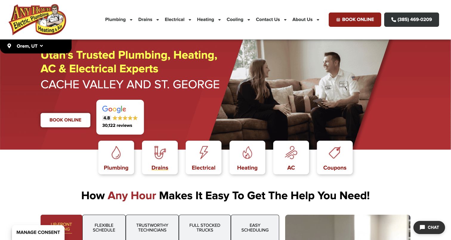
Any Hour places white service cards across the lower edge of a red hero. Plumbing, drains, electrical, heating, and cooling are separate choices, with a coupon tile occupying a similar position. A technician-and-customer scene supplies domestic context, and a location strip anchors the regional page. Public Elementor references support the component association, not a verified dispatch process or response-time commitment.
What you can learn
Build service cards from maintained category records rather than independent duplicated buttons. Test a change to one label and destination across the homepage and related pages, and verify the selected regional contact information. Promotional cards should have an expiry path that does not leave a hole in the grid. Keep an editor's campaign controls separate from urgent-service routing so a routine visual update cannot alter where an actual request goes.
Pros
Icon-and-text service entries give visitors a quick recognizable route to the right trade.
Regional information places the broad service message in a more specific context.
Cons & considerations
A coupon receives structural emphasis similar to an actual service category.
Multi-trade wording needs enough detail to help someone with one immediate problem.
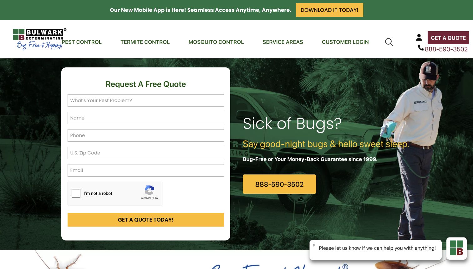
Bulwark places a quote form beside its headline and technician photograph. Name, phone, location, email, and pest information appear before a long service explanation, while a large telephone number offers another route. Green and yellow connect the form to the brand. The observed Elementor resources do not establish successful form delivery, actual treatment suitability, or the handling of information after submission.
What you can learn
Specify which fields are necessary for the first conversation and why. Keep required-state, error, and confirmation behavior under controlled implementation rather than allowing a visual edit to redefine the form. Test missing input, a location outside the service area, and an unavailable notification destination using fictional data. Include enough service and coverage context nearby that a visitor can make an informed inquiry rather than supplying details simply to find out whether the business is relevant.
Pros
The form makes the initial requested information concrete.
The large phone number provides an alternative to completing the online request.
Cons & considerations
Several personal fields are requested before much service evaluation is possible.
The form, phone action, promotional strip, and chat panel can compete on a short screen.
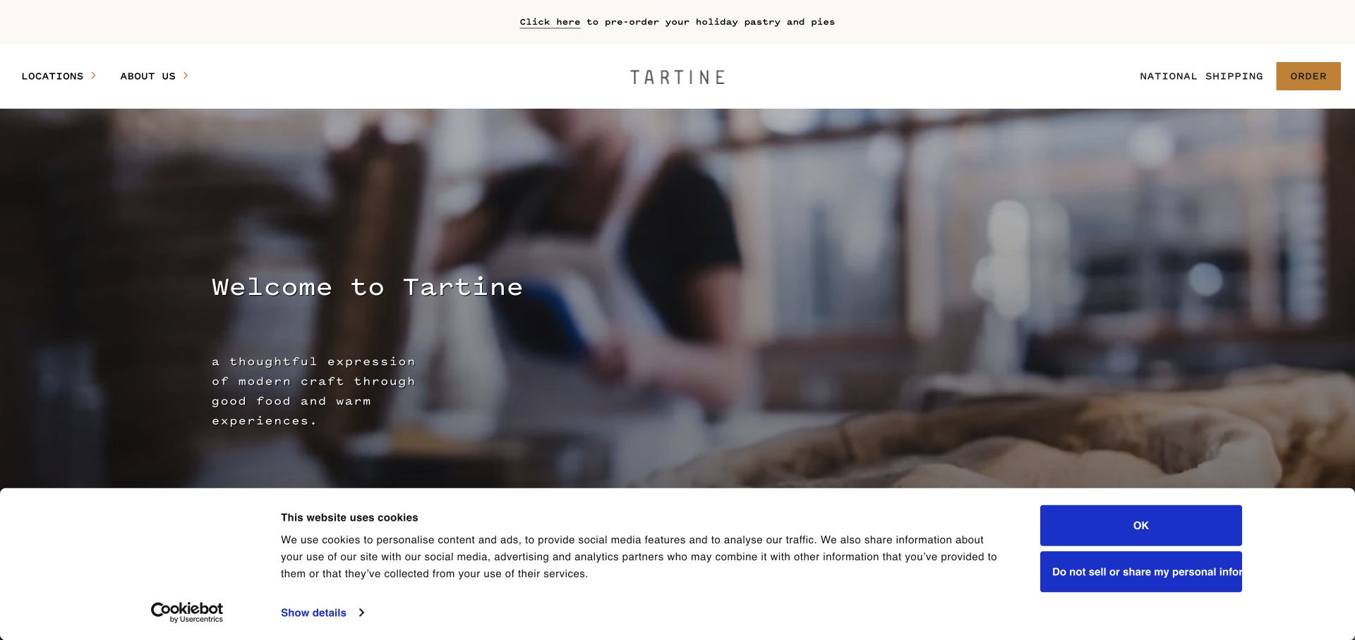
Tartine uses an immersive bakery scene beneath a restrained header and a small centered identity. Location and ordering links keep the visual introduction connected to practical tasks. Regional bakeries, shipping, seasonal orders, and special cakes continue as distinct subjects. Elementor was referenced in the public page; the capture does not establish that every bakery shares a menu, collection time, or transaction provider.
What you can learn
Create a reusable location model before designing each bakery as an independent page. Menus, hours, ordering links, and special-order conditions need local ownership even within a shared visual system. Test a different region, an unavailable seasonal item, and an old cake-request link. Give editors a controlled way to change atmosphere and campaign imagery without accidentally copying one bakery's practical promises into all the others.
Pros
The working environment communicates a real bakery context before individual products.
Location and ordering destinations remain available within the restrained opening.
Cons & considerations
An immersive scene can postpone the visitor's need to choose a specific bakery.
Consent and announcement panels need space that does not block the practical order or location links.
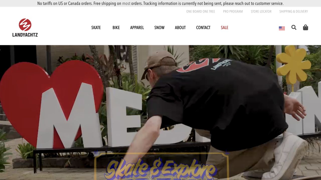
Landyachtz places a shipping notice and utilities above a white navigation for skate, bike, apparel, snow, and sale. The rider-led campaign establishes activity and community without replacing search or cart. The page referenced Elementor components alongside commerce evidence. This identifies public implementation signals, not the exact page templates, checkout configuration, or an independently tested retail journey.
What you can learn
Keep category, product, and campaign editing responsibilities distinct. A visual builder can help with editorial sections, but a promotion should reference maintained product records rather than duplicate price or availability text in unrelated widgets. Test changing a campaign image, removing a featured item, and navigating the catalog without the rich scene. Preserve the plain shopping controls so the page remains useful to someone who already knows which equipment they want.
Pros
The sporting categories stay conventional and recognizable around the lifestyle feature.
The rider photograph connects the products to a specific activity.
Cons & considerations
The large visual field may delay comparison details for task-focused shoppers.
Shipping notices and campaign copy need enough separation to remain readable on mobile.
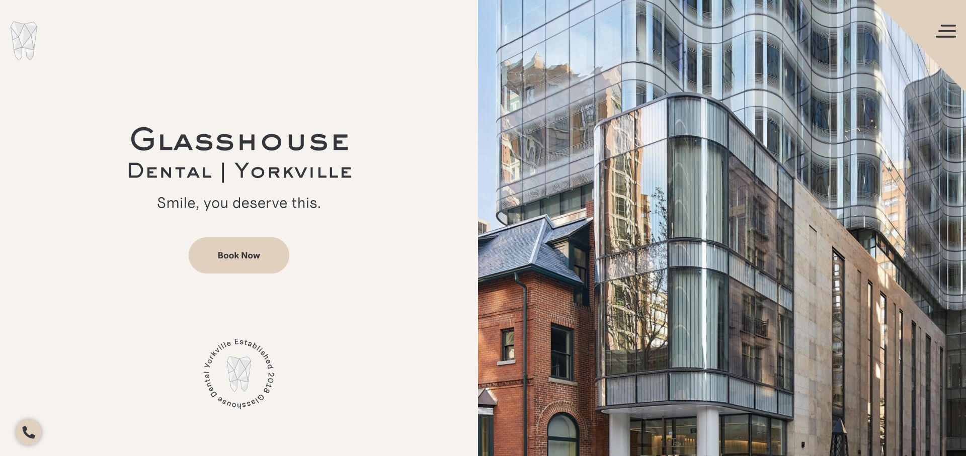
Glasshouse divides its opening between a cream text panel and an architectural photograph. The practice name and Yorkville location are prominent, with a short introduction and rounded booking action. A small geometric mark and establishment seal provide supporting identity details. Public Elementor references establish a component association, not clinical quality, appointment availability, or a verified accessibility result for the completed website.
What you can learn
A similarly compact practice site can use a small set of carefully controlled sections rather than many unrelated widgets. Keep location, hours, provider details, and booking links in maintained content, with appropriate practice review of clinical claims. Test the split layout with a longer address, no building image, and larger text. Preserve clear contrast and a conventional booking label when editors change the photograph or add another branch location.
Pros
The place photograph gives the practice name a concrete local context.
One main action preserves the calm hierarchy of the introduction.
Cons & considerations
A tucked-away menu may require extra exploration for treatment or first-visit details.
Decorative seals should not displace information a new patient needs to evaluate the practice.
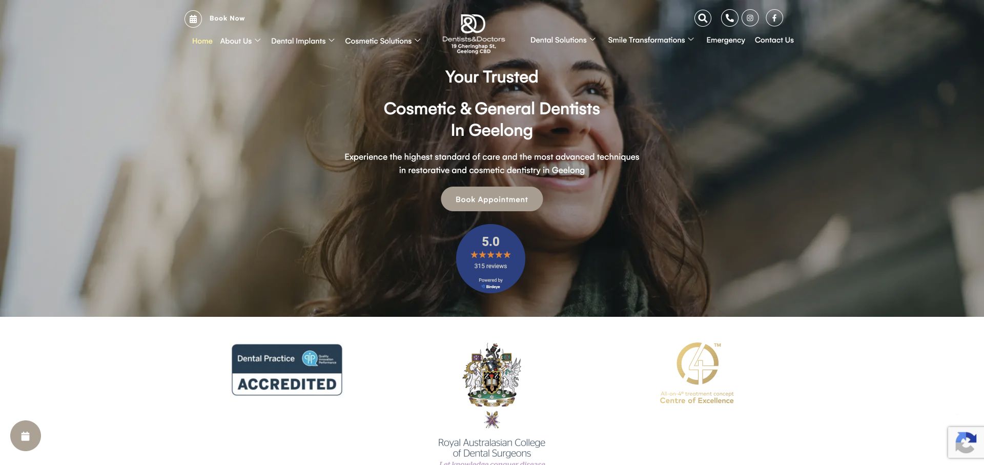
Dentists & Doctors puts its location and service focus at the center of a full-width photographic introduction. A balanced navigation surrounds the identity, with an appointment action and review material below the short message. Institutional marks follow on a white surface. The public page referenced Elementor, but the visual reference does not substantiate treatment claims, review authenticity, or a successful booking interaction.
What you can learn
Keep the practical introduction, approved review material, and institutional marks in separate maintained components. Record permission and review ownership rather than allowing copied testimonials to become anonymous decorative content. Test a long service title, a changed location, and a larger text setting against the photographic background. An editor should be able to update the campaign without changing clinical explanations or the actual appointment destination by accident.
Pros
Location and service context are stated before the supporting review and logo material.
The neutral palette lets the people photograph supply much of the warmth.
Cons & considerations
Centered text over photography needs reliable contrast for every replacement crop.
Several forms of supporting proof need clear labels rather than one undifferentiated trust strip.
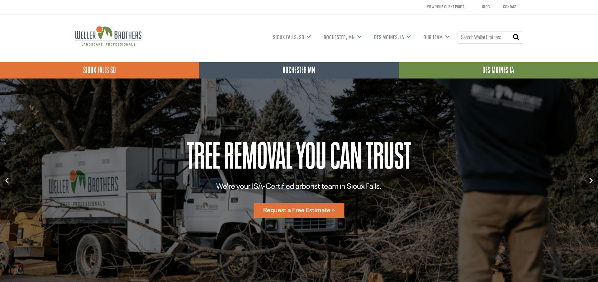
Weller Brothers gives three service cities a prominent colored band and repeats local navigation near team and search routes. The captured feature promotes tree work with crew-and-equipment imagery, a condensed heading, and an orange estimate action. A utility row includes client access and editorial links. Elementor resources were observed publicly, not as a test of coverage, estimate completion, or the client portal's implementation.
What you can learn
Build service and city relationships into the content model instead of cloning a complete landing page for every combination. Let local owners update accurate coverage and contact details while shared presentation rules remain consistent. Test a city without the featured service and an expired campaign, keeping the estimate destination explicit. Preserve client access as a separate handoff rather than making it another editable promotional button inside the feature.
Pros
The cities make local coverage a visible part of the visitor's choice.
The crew scene gives the promoted service concrete operational context.
Cons & considerations
Repeated location entrances need consistent selection and destination behavior.
A rotating service campaign must not imply that every promoted task is offered in every city.
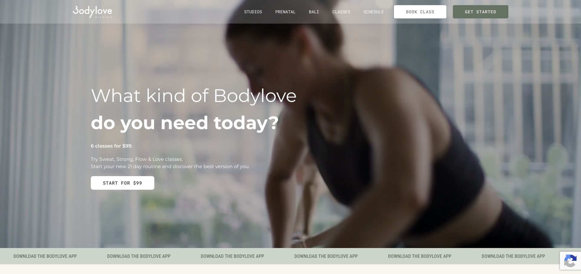
Bodylove uses softly toned movement imagery and a large question-style heading, followed by a short introduction to a starter package. The action includes the package price, while studio, class, and schedule routes remain together in a translucent header. An app strip appears below. Elementor components were publicly referenced; the capture does not establish actual class availability, eligibility, or any individual's exercise needs.
What you can learn
Keep introductory-package terms, price, and expiry in reviewed content rather than embedding them in image artwork. Define separate routes for new visitors and existing members before creating several similarly styled buttons. Test the campaign with longer conditions, a missing film, and a reduced-motion preference. A visual edit should not change the booking provider or obscure where the offer applies, particularly when the app and website lead into different parts of the member experience.
Pros
The action label connects the package to a concrete price rather than an unexplained start button.
The subdued visual system offers a distinct tone within the fitness category.
Cons & considerations
A translucent header needs contrast testing over changing movement imagery.
Introductory offers require clear eligibility and location context beside the attractive headline.
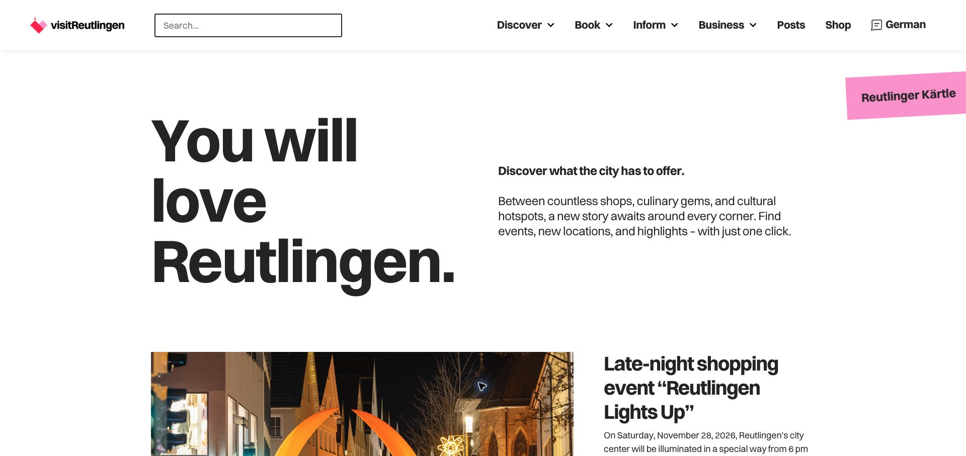
Visit Reutlingen opens with a large invitation, concise city context, and task-oriented navigation. Search remains in the header, while an event story begins directly below the introduction. A tilted pink promotion adds an accent without replacing the main structure. Public Elementor resources were observed on the current property. Some captured wording was browser-translated, so the review concerns hierarchy rather than claiming a verified English-localization implementation.
What you can learn
Separate attractions, events, local businesses, and practical visitor information into maintained records before styling their features. An event needs dates and an expiry destination, while a place needs useful ongoing details. Test long translated labels and a missing event image in the approved editing workflow. Keep search and conventional categories usable when a contributor changes a promotional block, instead of allowing the homepage's visual flexibility to redefine the underlying city directory.
Pros
The typographic introduction gives the city a clear editorial starting point.
Search and practical navigation remain visible around the current event feature.
Cons & considerations
Temporary event promotion needs an intentional expired-state and archive policy.
Browser-translated text cannot substitute for testing the site's actual supported language versions.
Choose a section library, a structured theme, or a more specialized implementation
Use a small section vocabulary for a focused site
A local service or compact practice may need only a few well-designed components. Define what each section explains and what content it accepts. Show the editor how to replace a photograph, correct copy, and remove a feature without breaking the remaining page. More section choices are not automatically more useful.
Combine visual campaigns with structured records
For locations, people, products, or projects, model the repeatable record and its relationships first. Use the visual layer to present and promote those records without manually recreating them on every page. Verify a change in the underlying fact across all places it appears, including links and related-content modules.
Use custom behavior where the task demands it
A complex finder, account boundary, or operational integration may need a focused custom implementation rather than another generic widget. Document its inputs, owner, and failure states. Keep that work separated from ordinary campaign editing so a routine layout change cannot silently redefine access rules or request destinations.
From references to requirements
Plan the content, editing rules, and handover with real examples
Build with awkward content early
Use a long company name, a portrait photograph, an empty testimonial slot, a complex service description, and a location with different hours. Test every component with those cases before filling an entire website with the easiest sample content. Keep text semantic and images appropriately described rather than relying on visual alignment alone.
Rehearse an editor’s ordinary work
Have the actual maintainer publish a campaign, update a local fact, correct a link, preview a phone, and remove an expired block in an approved environment. Identify which controls should remain fixed. Record the difference between changing presentation and changing the operating content that a visitor relies on.
Keep dependencies and recovery understandable
List the theme, builder, extensions, integrations, and their responsible owners. Check a supported update away from production, then verify the practical visitor tasks. Retain a recovery plan that accounts for content and configuration, not only template files. Remove unused overlap instead of adding another extension whenever a page needs a small variation.
A useful handover demonstration
Ask the actual team to carry out its routine job: publish a realistic update, correct a mistake, preview a narrow screen, and identify who owns an integration failure. For a library or frontend framework, also ask who maintains the content source and deployment. A polished screenshot does not answer those operational questions.
Beyond the screenshot
Elementor launch and editorial handover checklist
Establish global text, color, spacing, button, and form-field roles.
Give repeatable service, location, people, and product facts a maintained source.
Test long text, missing imagery, removed blocks, and larger user text.
Check navigation, focus, errors, and field labels on a narrow screen.
Verify actual form delivery and finder results with fictional test information.
Record extension, license, update, and integration ownership.
Rehearse a safe update and recovery procedure outside the public site.
Have an ordinary editor complete a realistic change before approving the handover.
Test with real content, a keyboard, a small screen, slow or failed requests, and the people who will maintain the system. These are planning checks, not an accessibility, security, performance, or search-ranking certification.
Sources & editorial method
How this Elementor collection was reviewed
We selected twenty distinct official websites with public Elementor component references. Five nationally or regionally established sector organizations lead the collection; they are not represented as equally famous global consumer brands. The screenshots and original capture dates show the actual public properties. We did not access private administration, copy templates, or establish specific editing controls and business results.
Every image is an unmodified capture from the actual website, with its source and capture date. Some captures are reused from our shared catalog; their dates remain the original capture dates. None comes from a vendor gallery or a generated reconstruction. Moving imagery and live content can change.
Technology attribution uses public page assets or metadata, official platform documentation, or a cited first-party project case study. Documentary and framework-relationship evidence is identified where used; it is not a complete current backend inventory. A CMS image CDN alone does not establish a full CMS deployment. A library’s presence does not prove which individual controls use it, and a platform label does not establish AI authorship.
The composition notes, lessons, pros and tradeoffs are original editorial observations. We have not measured conversion, traffic, security, performance or accessibility conformance. Website owners retain their brands and imagery; these examples are not our client portfolio. Written, Edited and Curated are independent records, not dates advanced by a build. See our editorial standards or suggest a correction.
Questions worth asking
Elementor website development FAQs
Does an Elementor reference mean the entire website is built with it?
Not necessarily. It establishes a public component association on the sampled property. A theme, commerce system, finder, external booking service, or custom application may have separate responsibilities. Document those boundaries rather than attributing every visible behavior to one builder.
Should editors be able to change everything?
Give the team control over the work it actually owns. Campaign text and approved imagery can be flexible while form routing, content relationships, accessibility behavior, and global styles remain controlled. An unlimited layout editor can create more maintenance work than a smaller useful system.
Can a visual builder replace content planning?
No. Repeated facts still need a source, owner, and relationship to other records. Decide how a location, service, person, and article connect before deciding how they look. Otherwise the page may be easy to rearrange but difficult to keep correct.
What should a handover demonstration include?
Ask the real editor to make and correct an ordinary update, check the small-screen result, and identify the person responsible for a failed integration. Include a removed block and awkward real content. A designer rearranging the original perfect example is not the same test.
Borrow a useful visitor pattern, then make it a small, controlled editing system. The goal is a website the team can keep coherent and correct after the original designer leaves.