An electrical contractor’s website should make the scope of the work clear. Residential service, commercial projects and facility support need different evidence and different next steps.
A homeowner seeking a service visit needs understandable task categories and local coverage. A general contractor or facilities team may need project scope, markets, locations and a relevant contact. Strong electrical websites recognize those differences instead of assuming one dramatic project image or one booking form can serve every audience.
The 28 examples here include residential service companies and larger electrical construction firms. We compare department visibility, geographic scope, project records, capability structures and contact paths. These are reviews of public website design and content. They do not verify professional credentials, technical competence, safety performance or the suitability of a contractor for a particular job.
Before the examples
What makes good electrical contractor website design in 2026?
State what kind of electrical work the business handles
Separate residential service, commercial construction and ongoing facility support when they are different offerings. Use explicit task and capability labels, and distinguish electrical work from adjacent systems. A broad energy or home-services slogan should be followed by concrete scope and actual coverage.
Make project evidence explain the contractor’s role
Pair project photographs with approved context such as market, location, scope and the electrical contribution. A photograph of a completed building alone does not show which work the company delivered. Use repeatable fields and permissions records so the portfolio remains accurate as it grows.
Route inquiries to the right team
Give household service requests, project inquiries and existing-customer support appropriate destinations. Explain what the first contact accomplishes. Do not ask homeowners to diagnose electrical faults in a form, and do not send a project buyer through an unrelated consumer booking sequence.
The collection · 28 examples
28 electrical contractor websites worth studying
Compare residential service patterns with project-led contractor sites. Borrow the structure that fits the buyer and the work, while keeping service boundaries and supporting evidence more prominent than broad claims.
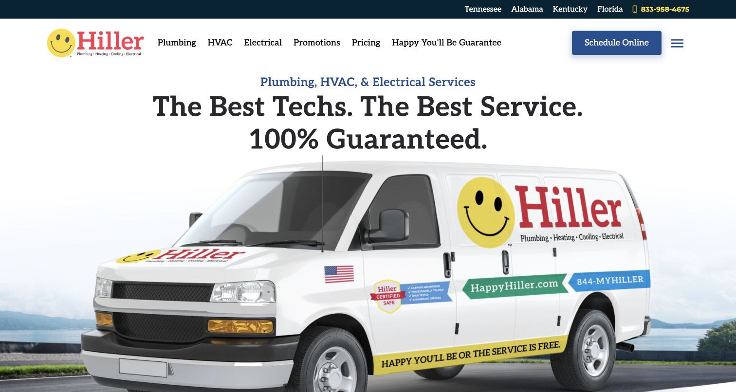
Hiller gives Electrical a direct place in the main navigation, beside Plumbing and HVAC, while its smiling mark and large van image communicate the parent brand. Pricing and the service guarantee are separately labeled, so electrical visitors have a route to process information without interpreting a technical catalog first. The state links also provide an early geographic framework. For an electrical contractor, the useful pattern is clear department visibility inside a broader identity. The homepage does not prove the scope of electrical work by itself, however. A dedicated destination needs to explain which household tasks the team handles and how a request is evaluated before any visit is arranged.
What you can learn
Keep Electrical explicit in shared navigation, then give it a service page with actual coverage and task categories. Connect pricing and guarantee language to the electrical context rather than assuming a company-wide promise explains every job.
Pros
Electrical is a first-level navigation choice.
Pricing and service-policy routes are separately labeled.
Cons & considerations
The shared hero provides little electrical-specific scope.
Broad guarantee language needs clear applicability to the requested work.
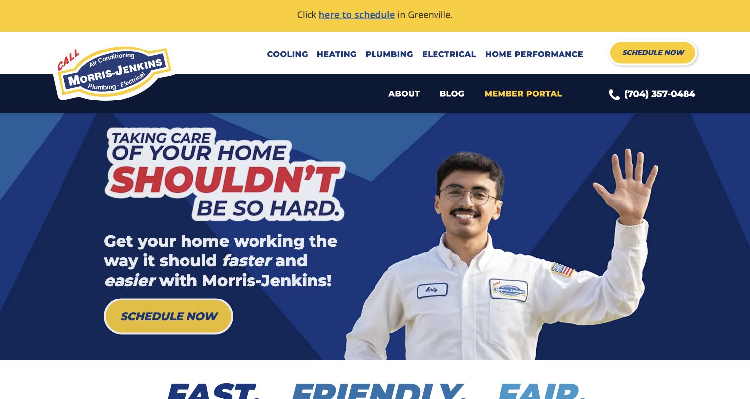
Morris-Jenkins pairs a friendly technician image with a simple home-care message, then places Electrical alongside the other major trades in the header. For electrical work, that conversational tone can lower the barrier for someone who knows there is a problem but lacks the vocabulary to describe it. The yellow schedule button is easy to distinguish from the blue page background. The opening is intentionally broad, which makes the next service page important: a visitor needs concrete scope and an appropriate contact process before treating the general household promise as evidence of a particular electrical capability. The design is most useful as a reference for tone and hierarchy.
What you can learn
Write electrical service descriptions in ordinary household language without asking the visitor to diagnose a fault. Keep the approachable brand voice, but make the work categories, service area and first conversation more specific than the homepage slogan.
Pros
The technician image and plain language make the introduction approachable.
The scheduling action has strong visual contrast.
Cons & considerations
Electrical scope is not explained in the opening message.
The regional announcement adds another competing header element.
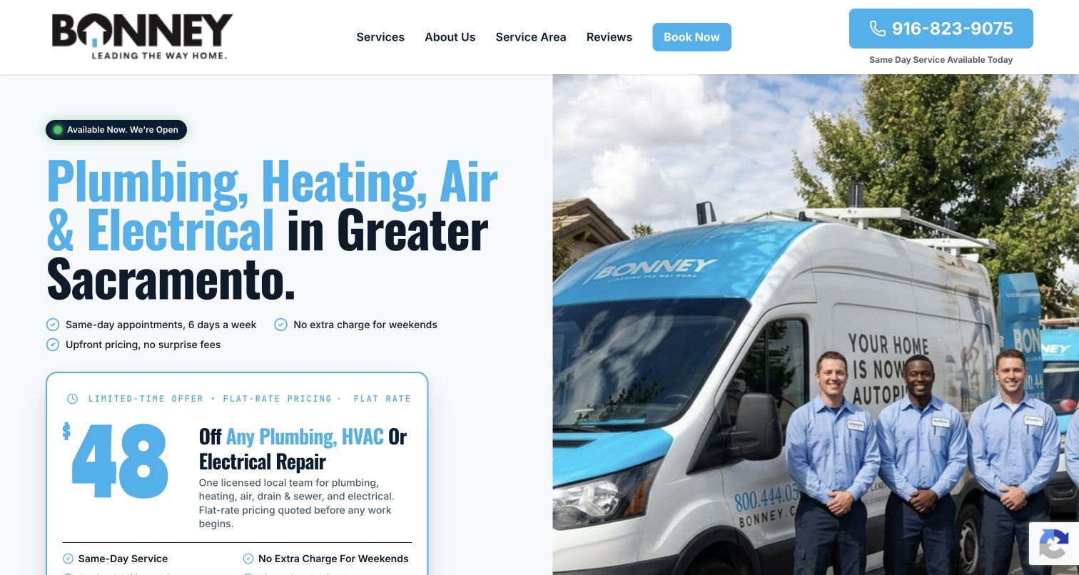
Bonney’s captured landing page names Greater Sacramento and includes electrical in its main service list. A team-and-van photograph occupies one side while copy, contact actions and an offer card occupy the other. For an electrician, the clear local context is useful because the visitor can establish relevance before starting a request. The short structure also avoids the heavy institutional feel of a large construction contractor’s site. Its limitation is specificity. The shared list covers four trades, and the featured offer may not concern the electrical task a visitor has in mind. A focused service route is needed to make the electrical department feel fully explained.
What you can learn
State territory and electrical scope before emphasizing a campaign offer. Use the team image to establish identity, then route visitors to task-specific information and explain whether the next action requests service or an estimate conversation.
Pros
Greater Sacramento is explicit in the introduction.
The team photograph provides a concrete local identity.
Cons & considerations
The opening gives several trades equal weight.
A featured offer can distract from unrelated electrical inquiries.
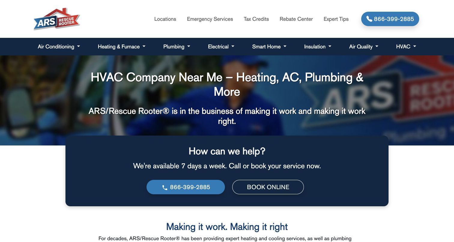
ARS centers a compact help card over a muted service-vehicle hero, with phone and booking actions grouped together. The service navigation provides the next layer of detail, including the company’s broader home-system catalog. For electrical design, this is useful when visitors first need a simple way to reach a local operation rather than an elaborate project portfolio. The network context also creates a responsibility: the site must resolve which local branch offers the requested electrical work. A broad national presence is not enough to establish that a particular task is available everywhere, so local service descriptions should carry the detail behind the brand-level introduction.
What you can learn
Pair a simple general contact block with explicit local electrical scope. Once a visitor chooses a location, show the actual services and response route rather than carrying national wording unchanged into every branch page.
Pros
Phone and booking choices are grouped clearly.
The navigation supports deeper service exploration.
Cons & considerations
Local electrical availability requires another step.
The shared hero has little electrical project or task evidence.
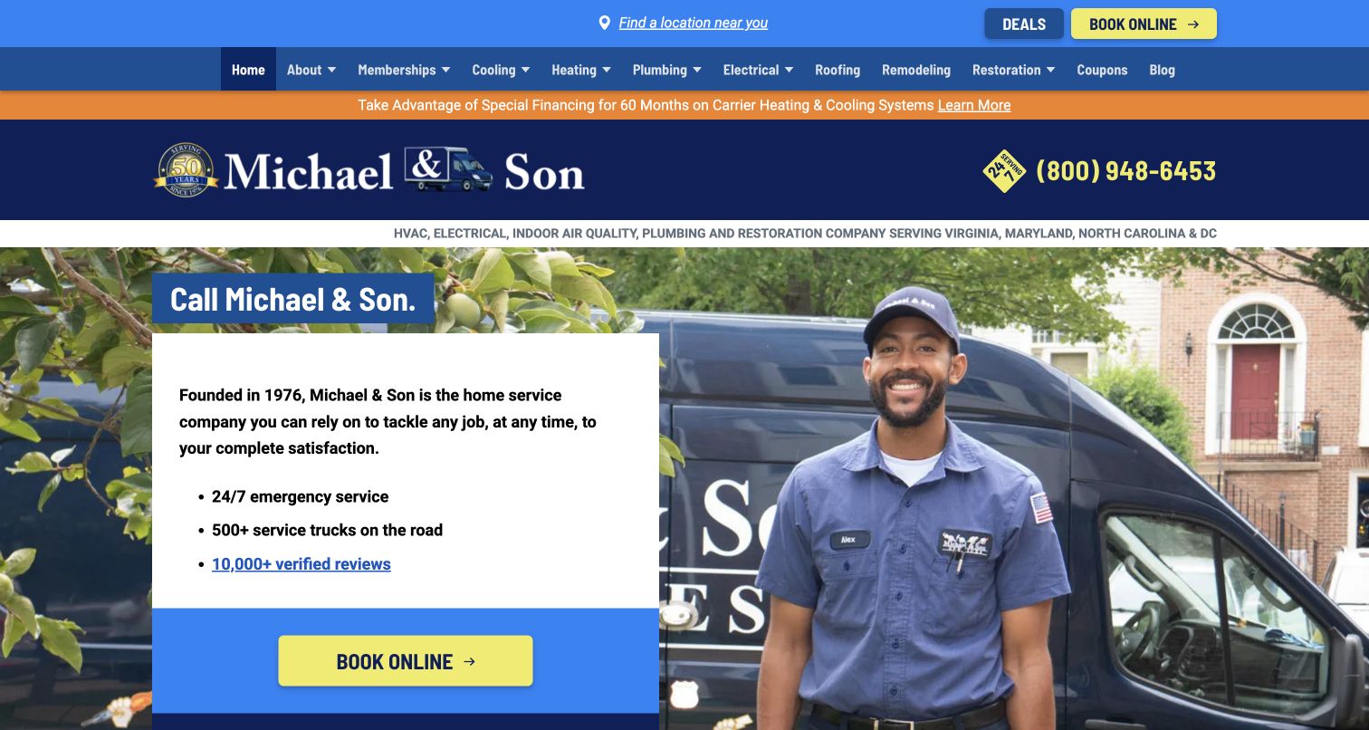
Michael & Son’s blue and orange header gives the service departments prominent placement above a technician-and-van hero. A white information card and yellow booking action turn the broad company introduction into a clear response route. For residential electrical work, this provides a useful reference for presenting a staffed, familiar organization without adopting the vocabulary of a major construction firm. The density of the header is the main tradeoff. Multiple strips, links and reassurance claims arrive before any specific electrical explanation. The dedicated department content therefore needs to be concise and concrete, helping visitors understand the work rather than simply repeating the parent company’s scale and friendliness.
What you can learn
Make the electrical department easy to find inside the shared brand, then use the next page to explain real tasks and coverage. Keep company-wide reassurance brief enough that practical service information remains easy to locate.
Pros
The service menu is prominent above the hero.
Booking has a distinct visual treatment.
Cons & considerations
Several header layers increase scanning effort.
The opening offers little specific evidence of electrical work.
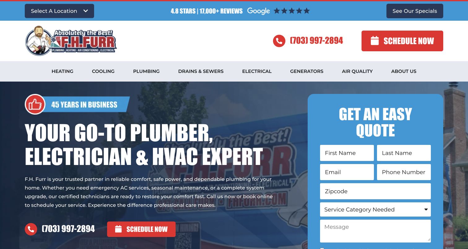
F.H. Furr combines a large blue quote panel with a darkened vehicle background and a direct Electrical entry in the service navigation. Generators also receive their own menu label, making one related service visible without requiring visitors to open a broad dropdown. The form asks for a service category, which is useful when several departments share the same inquiry channel. For electrical work, the form should begin a conversation rather than imply a diagnosis or final price. The page’s large form is effective at signaling action, but it leaves less first-screen space for describing the scope and the information the office needs to assess a request.
What you can learn
Use service categories to route electrical inquiries and keep specialized work clearly labeled when it is genuinely offered. Explain what happens after the form and avoid asking visitors to infer a complete estimate from a brief online description.
Pros
Electrical and generators are separately visible in navigation.
The form includes a department-routing choice.
Cons & considerations
The form dominates the available introductory space.
Quote language needs clear expectations about the next assessment step.
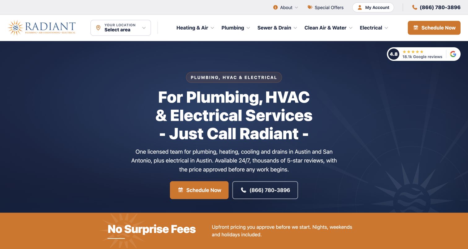
Radiant names Austin and San Antonio for its broader home services while explicitly limiting the electrical offering to Austin in the introductory content. That qualification is the most useful feature for this collection: a multi-city brand does not assume identical electrical coverage across every market. Navy and gold styling keeps the text and contact actions restrained, with a fee-reassurance strip underneath. The example shows that accurate scope can sit near the main sales message without making the page cumbersome. It still needs electrical-specific detail behind that boundary, since a city name alone does not explain which tasks are offered or how an inquiry is evaluated.
What you can learn
Publish service geography at the department level. If electrical coverage differs from plumbing or HVAC, say so near the first action and preserve that distinction through local pages, forms and appointment confirmations.
Pros
The electrical coverage exception is explicitly stated.
The restrained layout gives scope wording room to be read.
Cons & considerations
A city boundary does not explain the full electrical service catalog.
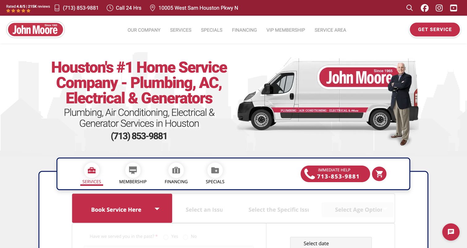
John Moore puts a stepped service-and-issue selector inside its red-and-white hero. The broader tabs distinguish booking, maintenance, financing and offers, while the service sequence lets the visitor narrow the request before describing it. For electrical work, this can help an office route inquiries without expecting a customer to know component names. The design is also a useful warning about form complexity. A homeowner should be able to say that the issue is uncertain, and the interface should not imply that selecting a symptom establishes the cause. The busy first screen needs a short explanation of the next human assessment to keep the interaction understandable.
What you can learn
Let issue selection describe what the customer observes, not a presumed electrical diagnosis. Keep an uncertain option and a plain contact alternative, then explain the follow-up process before the visitor submits a request.
Pros
The service sequence can produce a more useful initial request.
Different commercial journeys have separate tabs.
Cons & considerations
Several tabs and fields make the opening dense.
Overly technical issue labels could create false confidence or confusion.
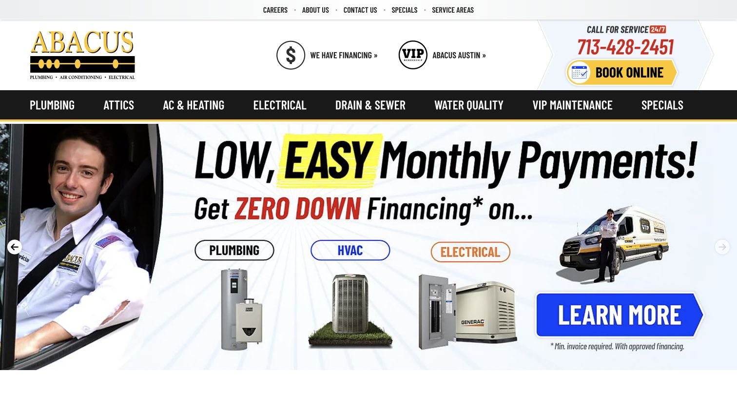
Abacus keeps Electrical in its black main navigation bar and expands the topic in supporting cards that mention inspections, GFCI and lighting. Standby and backup generators have a separate card, making the department’s breadth more concrete than a single generic service label. A large phone-and-booking block remains above the rotating offer artwork. For electrical website design, the useful pattern is the relationship between a broad department entry and specific task destinations. The campaign-heavy hero is less transferable to every contractor: financing and promotional graphics can dominate before the visitor understands the work. Important service scope should remain available as readable page text beneath those temporary campaigns.
What you can learn
Turn an electrical department into a small set of meaningful task pages, using the terms customers recognize. Keep specialized generator information distinct and let promotional artwork link into durable explanations rather than replace them.
Pros
The page exposes specific electrical service categories.
Generator work has a separate supporting destination.
Cons & considerations
Campaign artwork occupies much of the first screen.
Promotional language can overshadow the actual electrical scope.
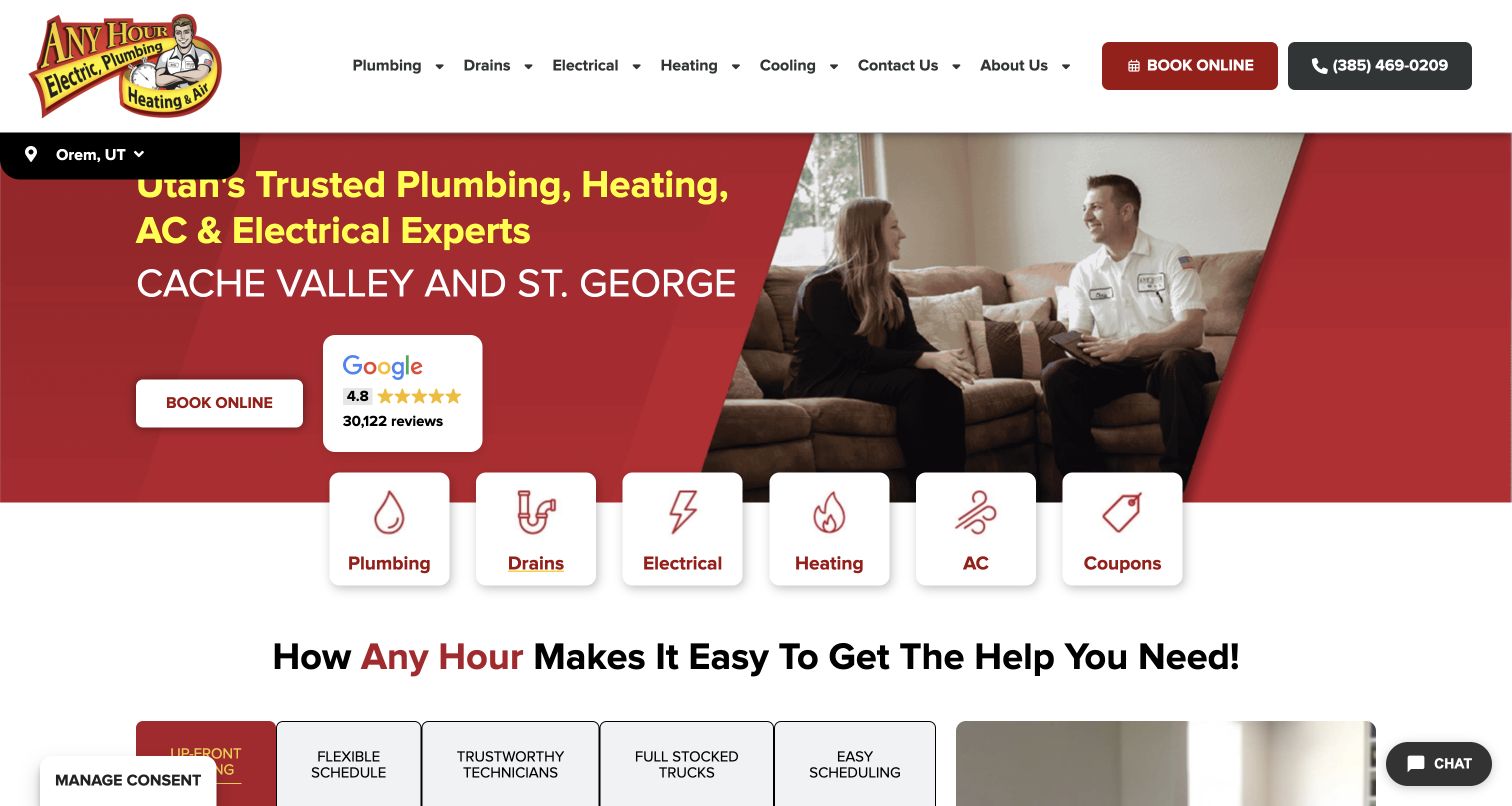
Any Hour places an Electrical icon card between the drain and heating choices in a row overlapping its hero. A technician speaking with customers establishes a household context, and the location strip gives the regional page a practical anchor. For electrical visitors, the key pattern is immediate recognition: the department is a visible choice rather than a buried item under a generic Services label. The site still needs the next page to explain the actual tasks and coverage. Equal-sized cards flatten the hierarchy between urgent services, routine work and coupons, so the designer must decide whether a promotion deserves the same prominence as an essential service route.
What you can learn
Give electrical service a literal, visible entry point in a multi-trade design. Use the next step to distinguish actual tasks and local scope, while keeping promotional choices from competing too strongly with essential help routes.
Pros
Electrical has a clear icon-and-label entry card.
The local strip helps orient the visitor.
Cons & considerations
Equal-sized cards give coupons similar weight to services.
The shared hero contains little electrical-specific detail.
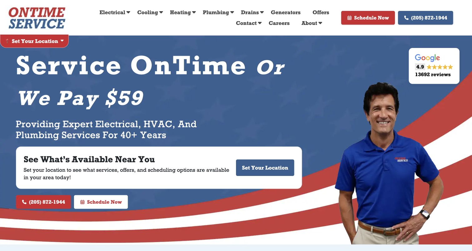
OnTime Service in Alabama uses a large timing-related promise, a technician photograph and a local-selection card to define its introduction. Electrical appears beside heating, cooling and plumbing in the service navigation. For electricians, this is a useful reminder that customers evaluate the appointment experience as well as the work category. The promise gives the page one strong idea, but it does not explain electrical capabilities or prove an outcome. The supporting content needs to state the applicable policy, the local service area and the kinds of work that can be requested. The design is most transferable when those operational details are as clear as the headline.
What you can learn
Connect a service-experience promise to explicit policy and electrical scope. Help the visitor choose the correct local office, then explain the next conversation rather than relying on the headline to communicate every appointment expectation.
Pros
The introductory message has a clear focal point.
Electrical remains visible within the shared navigation.
Cons & considerations
The timing promise needs accessible conditions.
Specific electrical capabilities are not explained in the hero.
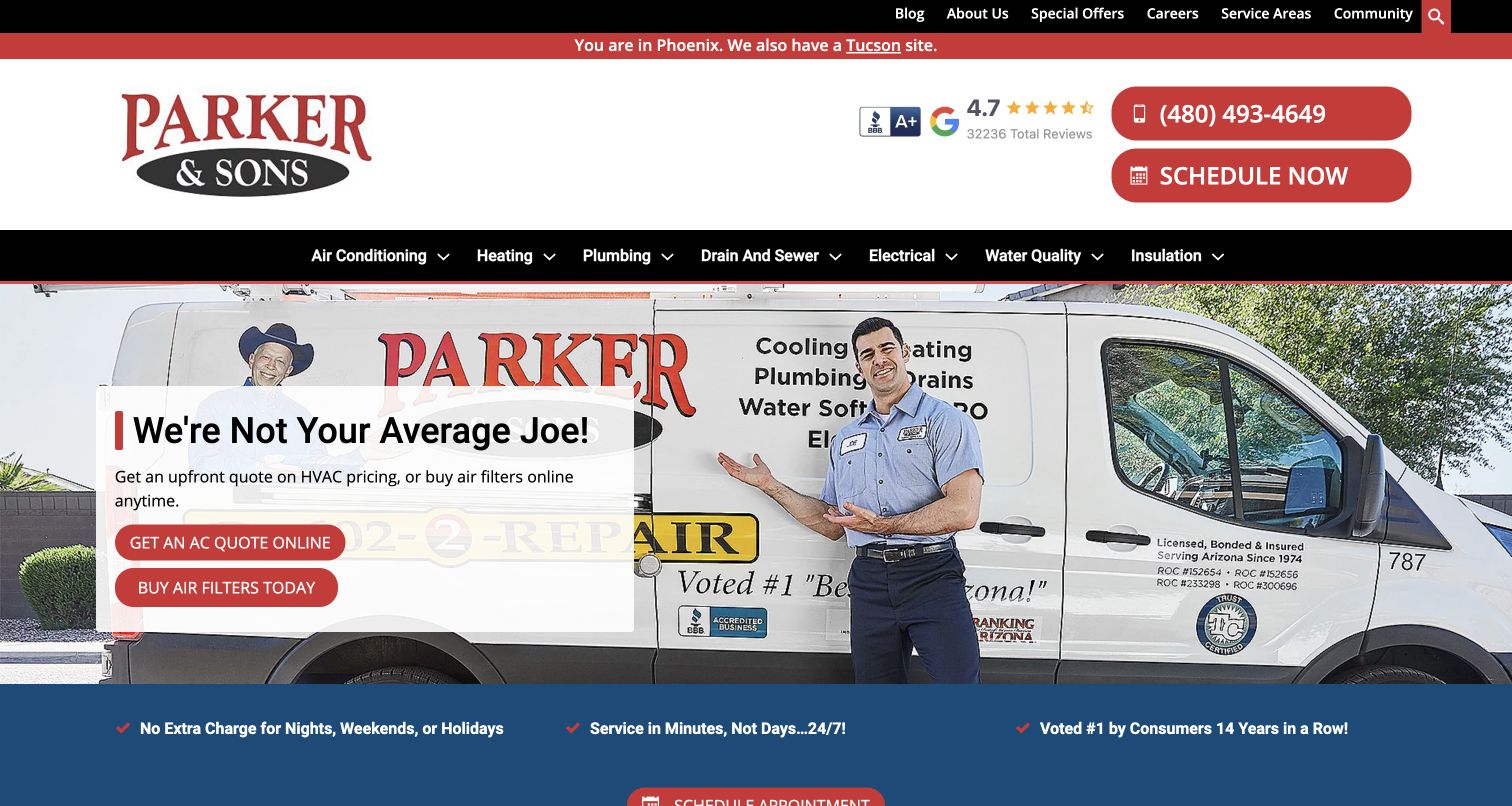
Parker & Sons identifies the Phoenix version of its site and links to Tucson in the top strip. Electrical remains visible in the main black navigation even though the captured hero emphasizes HVAC pricing and filter shopping. For electrical design, this is a useful example of stable departmental access beneath changing campaigns. A visitor can establish geography and still find the electrical route without waiting for a relevant slide. The limitation is relevance in the opening message: the technician-and-van photo supports the whole company, but the hero actions do little for someone seeking an electrician. Dedicated landing pages become especially valuable in this arrangement.
What you can learn
Preserve electrical navigation while seasonal campaigns change elsewhere on the site. Use a dedicated electrical destination to state tasks, territory and contact expectations, and carry the active regional context through that journey.
Pros
The current city and alternate market are clearly identified.
Electrical access remains stable during an HVAC-focused campaign.
Cons & considerations
The hero actions are largely irrelevant to an electrical inquiry.
The broad service menu requires careful mobile prioritization.
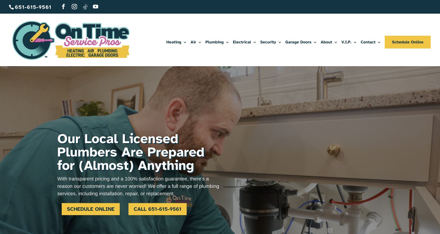
On Time Service Pros keeps Electrical in a compact main menu that also names heating, air, plumbing, security and garage doors. The yellow schedule action provides a consistent response route while rotating trade imagery carries the broader service message. For electrical visitors, the useful feature is the separation of electrical work from adjacent categories such as security. Those labels can prevent an expanded service catalog from collapsing into a vague smart-home promise. The wide menu also creates a challenge: the department page must quickly explain its own scope. A shared scheduling link is helpful only if the request is routed to the appropriate service team.
What you can learn
Keep electrical work distinct from adjacent household systems in the information structure. Use plain task descriptions and a service selector where needed, so one common scheduling route does not blur the department responsible for the request.
Pros
Electrical and security receive separate labels.
A consistent scheduling action anchors the header.
Cons & considerations
The many departments create a crowded menu.
Rotating trade content may not match the visitor’s electrical intent.
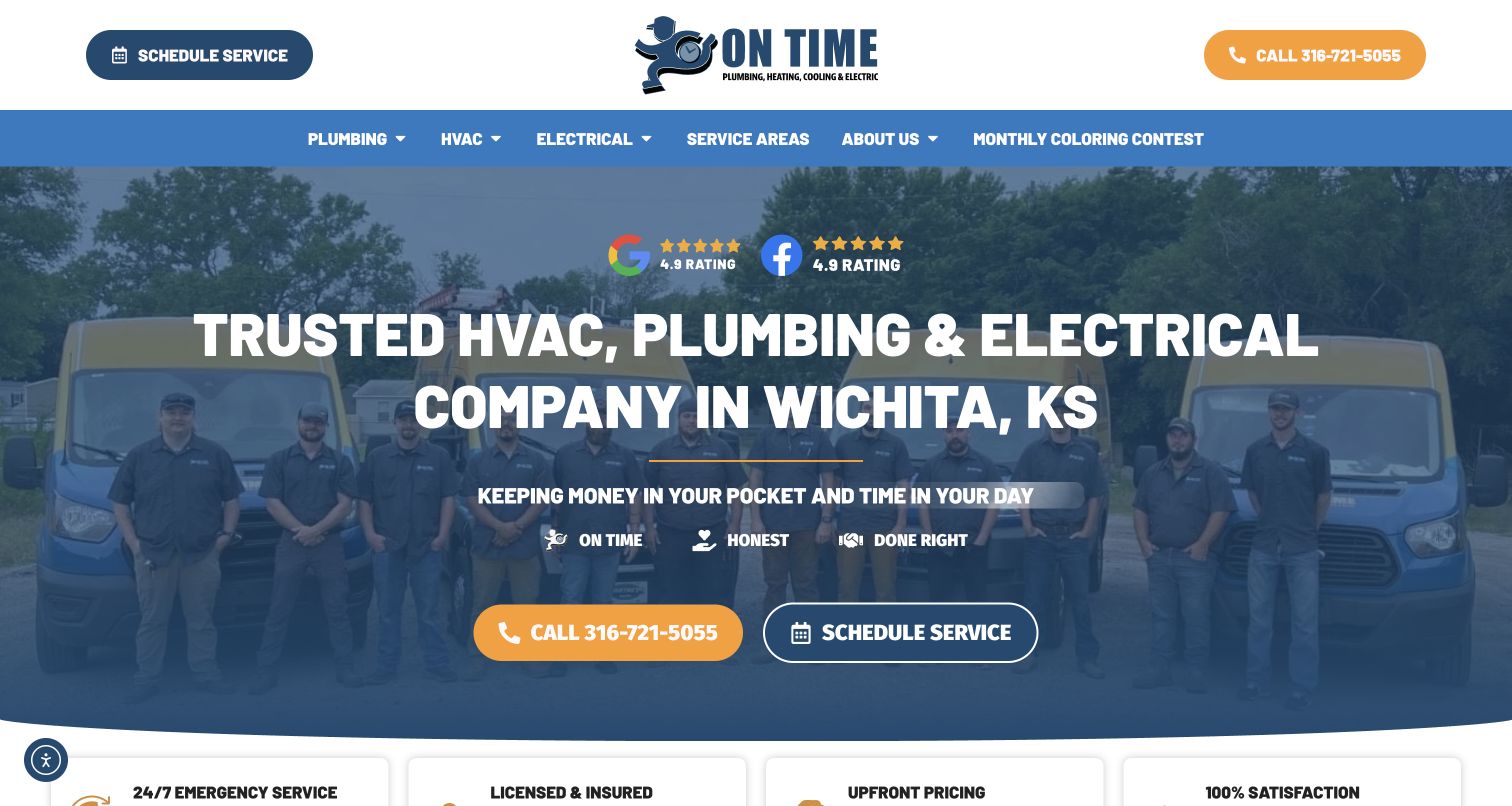
On Time’s Wichita site names the market and its four principal trades in the opening presentation. A technician and fleet photograph supports that local identity, while orange calling and outlined scheduling actions make the response options clear. For electrical visitors, the city cue is useful before any form is started. The review-platform badges and service values reinforce the presentation but do not explain the electrical tasks themselves. This is a practical local homepage reference, provided the department route supplies concrete scope and the first-contact process. The broad trade headline should not be expected to do the work of a dedicated electrical service page.
What you can learn
Make local relevance and the response channels clear on the first screen. Then use electrical-specific content to describe the work, coverage and follow-up process, keeping badges secondary to information a customer can actually act on.
Pros
Wichita is stated in the opening message.
Call and scheduling choices are visually distinct.
Cons & considerations
Several trades share one introductory headline.
Review badges take space without explaining electrical scope.
Lee Company leads with home services and facility solutions in a spacious two-column introduction. For electrical design, that audience distinction is especially useful: household work and ongoing facility support require different proof, vocabulary and contact routes. The restrained cranberry-and-white treatment gives the explanation room to establish that breadth before a large photograph appears. This offers a useful middle ground between a residential coupon homepage and a project-heavy construction portfolio. The broad positioning does mean a visitor seeking a specific electrical service must take another step. The audience paths need concrete scope so that neither homeowners nor facilities teams arrive at a generic catch-all form.
What you can learn
Separate residential electrical service from facility work by audience and information need. Give each route appropriate project or service evidence and its own inquiry context, while keeping one coherent company identity around both.
Pros
Home and facility audiences are acknowledged clearly.
The spacious layout supports an explanatory introduction.
Cons & considerations
Electrical services require deeper navigation.
Broad positioning can delay a visitor with a narrow immediate task.
Morrow Meadows overlays three concise values on actual jobsite imagery, with orange branding and a short navigation covering the company, work, projects and careers. The project records extend the presentation with fields such as location, owner, general contractor, market and contract value. For electrical contractors, that factual structure is more useful than a gallery of attractive buildings alone: it gives a prospective project partner context for evaluating comparable work. The hero remains deliberately broad, so the project library carries much of the evidence. Its value also depends on consistent permissions and careful editing, particularly when naming clients or publishing commercial project figures.
What you can learn
Build project records with repeatable factual fields that explain the contractor’s role and context. Let dramatic construction imagery introduce the business, then use approved project detail to support the capabilities a buyer is evaluating.
Pros
Project information includes concrete context beyond photographs.
The short navigation keeps work and project evidence easy to identify.
Cons & considerations
The values-led hero does not explain a specific capability.
Detailed project fields require ongoing accuracy and publication permissions.
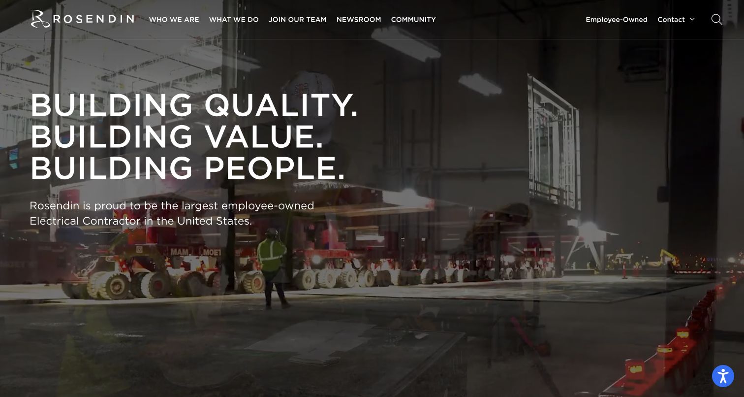
Rosendin uses a full-width active jobsite background with a large stacked statement about quality, value and people. Its navigation separates company information, capabilities, recruiting, newsroom and community material, while employee ownership receives a visible utility link. For electrical construction, the scale of the work is apparent without a lengthy introductory paragraph. The content structure also recognizes that prospective employees and clients share the site but need different routes. The visual strength comes with a readability tradeoff: text and navigation sit over moving or changing imagery. Project scope, safety information and relevant contact details still need clear destinations beyond the broad institutional message.
What you can learn
Use project imagery to establish the kind of electrical work, then separate client evidence from recruiting and culture content. Preserve readable text and direct routes to capabilities so a strong institutional hero does not become a navigation obstacle.
Pros
The jobsite imagery conveys the scale and context of the work.
Client, recruiting and community routes are distinctly labeled.
Cons & considerations
Text overlays need contrast across changing imagery.
The broad hero statement leaves specific capability evidence to later pages.
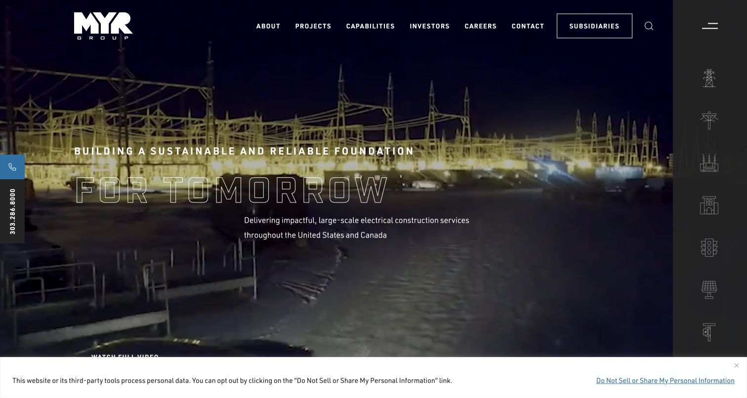
MYR Group combines infrastructure imagery with a concise statement about large-scale electrical construction. A vertical set of capability icons and a labeled service structure expose transmission, distribution, substations, commercial work, transportation, clean energy and restoration. For a diverse electrical contractor, that map is the useful design feature: the buyer can enter by the kind of infrastructure rather than first learning the corporate organization. The dark hero and outlined headline are distinctive, though their contrast varies with the background. Investors, careers and subsidiaries also occupy the main navigation, so the capability destinations must remain easy to find for prospective project clients.
What you can learn
Organize electrical capabilities around recognizable project types before presenting corporate structure. Pair icon shortcuts with readable labels and relevant project evidence, and keep the primary buyer’s route clear beside investor and recruitment content.
Pros
The capability taxonomy exposes several distinct infrastructure markets.
Project and subsidiary routes are clearly separated.
Cons & considerations
Outlined hero typography can lose contrast over imagery.
Cupertino Electric introduces its work with a short delivery promise over field imagery, then explains its electrical engineering and construction focus in a spacious text section. Core-market navigation, quick facts and a project portfolio give the visitor several ways to assess relevance. The reviewed homepage includes project summaries that name location, market and the kind of infrastructure involved. That is useful for electrical design because it connects broad positioning to concrete examples. The capture shows the homepage introduction below the initial header rather than a complete top-of-page view. Large claims and figures still need context and maintenance; their visual prominence should not replace a clear account of the contractor’s role.
What you can learn
Connect the main promise to market-specific projects with concise scope descriptions. Keep facts and credentials reviewable, and make the inquiry action visible without letting statistics substitute for the evidence of relevant electrical work.
Pros
Project summaries explain market, location and infrastructure context.
Core markets and project inquiry have explicit routes.
Cons & considerations
Large company claims need current supporting context.
The long homepage separates some proof from the first introduction.
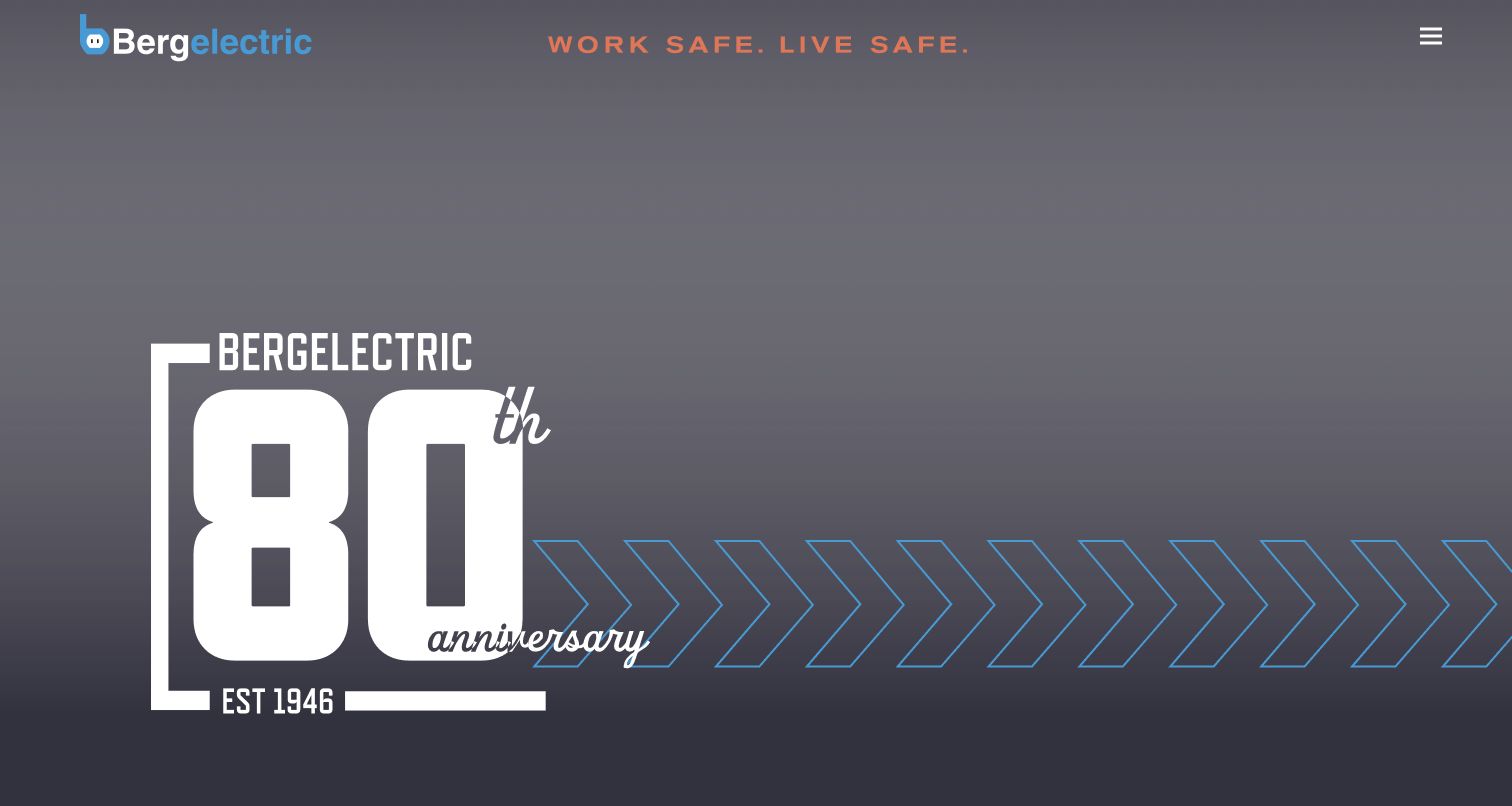
Bergelectric’s captured homepage uses a dark, restrained brand presentation with an anniversary graphic and a compact menu control. Below the hero, partner logos, recruiting content, a featured project story and regional office links provide the main information structure. The region list is particularly useful for a contractor whose local offices matter to prospective clients. This approach differs from a residential booking homepage: it emphasizes the organization and work context rather than an immediate appointment. The compact menu reduces visible navigation choices, however, so new visitors may need extra interaction to locate electrical capabilities. A client-focused project and contact route should remain easy to discover beside the workforce material.
What you can learn
Give regional electrical operations a clear place in the site structure and connect them to relevant work. Balance recruiting content with direct capability and project routes so clients can evaluate the contractor without decoding an image-led hero.
Pros
Regional offices have explicit contact-oriented destinations.
Project and workforce content provide more than a generic service list.
Cons & considerations
The compact menu hides primary choices on the first screen.
The hero offers little explanation of electrical capabilities.
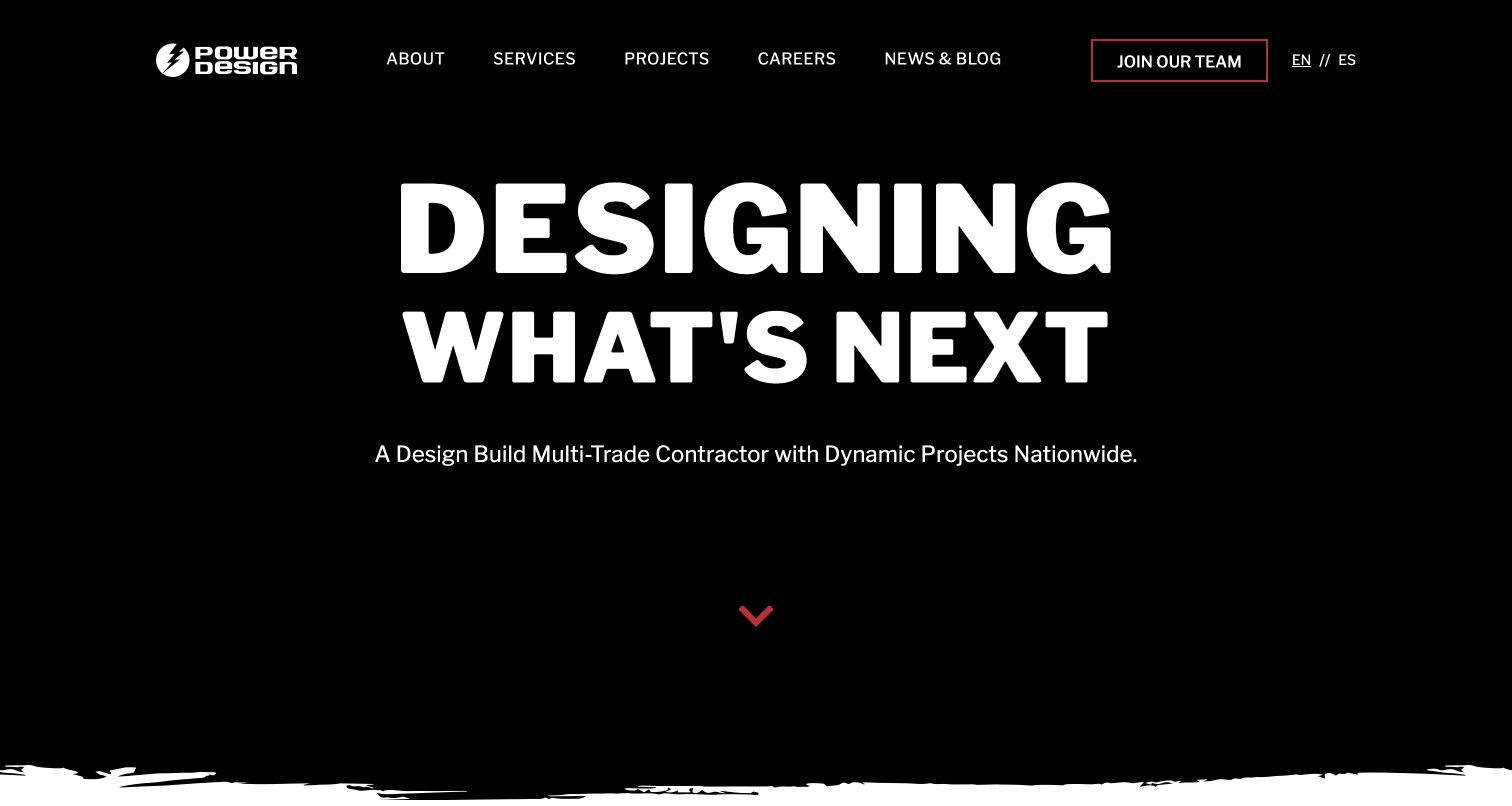
Power Design uses oversized white typography on a dark hero to introduce its design-build, multi-trade role. The service structure separates design and engineering, construction, systems technologies, distribution, manufacturing and other areas, with electrical named within the construction offering. For an electrical contractor, this is a useful way to explain coordination without presenting every discipline as an unrelated business. The visual identity is assertive and the service categories are broad. That breadth also creates a risk: visitors looking specifically for electrical work need a focused destination with relevant scope and projects, rather than relying on the impressive scale of the parent-company presentation.
What you can learn
Explain how electrical work relates to the other disciplines, then give it a distinct evidence path. Use broad integrated-service positioning to orient buyers, while keeping specific capabilities, project roles and contact routes easy to evaluate.
Pros
The service taxonomy explains several connected disciplines.
Electrical has an explicit place within construction services.
Cons & considerations
The hero remains broad rather than electrical-specific.
An extensive service catalog can require several steps to reach detailed scope.
Helix Electric uses a large architectural project image beneath a short header containing purpose, projects, contact and careers. The homepage then moves into featured projects and a recruiting section, keeping the portfolio central to the brand. For electrical contracting, the useful pattern is the direct route to work examples: prospective clients do not need to navigate a large corporate taxonomy before seeing the projects. The limitation is explanatory depth at the opening. A building photograph demonstrates context but not the contractor’s precise role, so each case study needs scope, constraints and contribution. The strong image-led presentation works best when those details are consistently available behind the project thumbnails.
What you can learn
Let completed projects lead when they are genuinely relevant to the buyer, but describe the electrical contribution clearly. Keep the project route short and support each image with context that distinguishes your work from the building as a whole.
Pros
Projects are a primary navigation choice.
The short menu makes contact and careers easy to distinguish.
Cons & considerations
Architectural photography does not establish electrical scope on its own.
The opening provides little detail about specific capabilities.
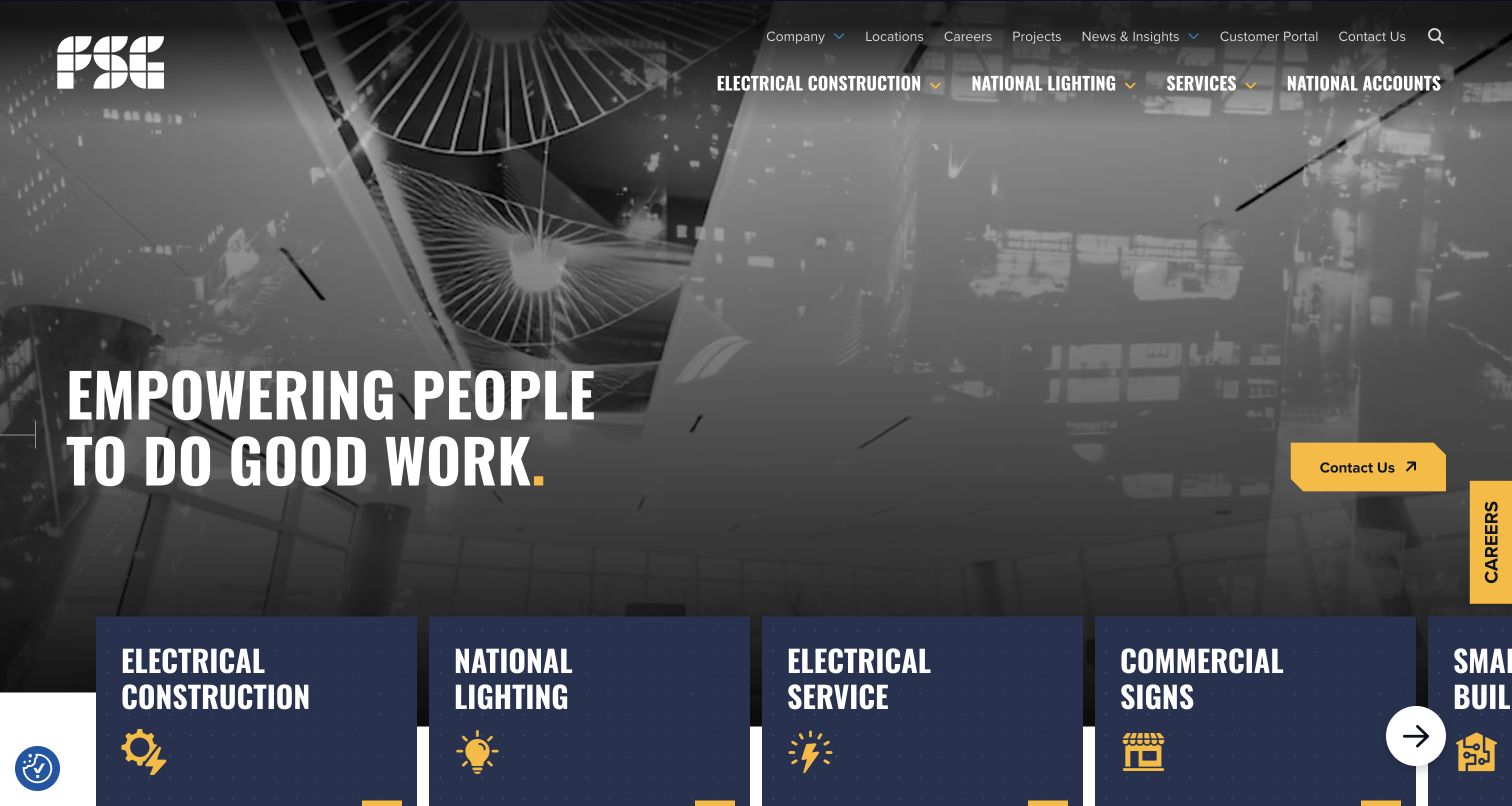
FSG places electrical construction, lighting, electrical service, signs, smart buildings and solar in a row of large labeled cards beneath a dark project-image hero. The header separately exposes national accounts, projects, locations and a customer portal. For electrical website design, this is a useful distinction between winning new construction work and supporting an existing portfolio of facilities. A facilities team can look for ongoing service without being forced into the construction story. The number of routes also makes prioritization important. The horizontal service presentation should remain understandable on small screens, and the broad empowerment headline needs concrete capability pages behind it.
What you can learn
Separate electrical construction from ongoing service and national-account support when those are different buying journeys. Use clear labels and relevant proof for each, and ensure existing customers can reach their service tools without competing with new-business content.
Pros
Construction and ongoing electrical service have separate cards.
Locations, national accounts and customer tools are explicitly labeled.
Cons & considerations
A horizontal service carousel can hide choices on smaller screens.
The broad headline does not explain a specific electrical capability.
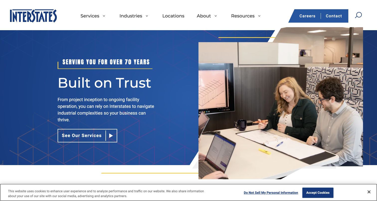
Interstates pairs a blue trust-led introduction with workplace imagery and a direct See Our Services action. Its main navigation separates services, industries, locations and resources, while careers and contact sit in a smaller utility area. The body explains work across the facility lifecycle and introduces specific industrial audiences. For electrical contractors, that is a useful architecture when the same technical capability serves several markets: buyers can enter by the work needed or by their industry. The broad trust message itself is less specific than the supporting structure. Industrial buyers still need relevant project context, operational constraints and a clear description of what the contractor actually delivered.
What you can learn
Offer both service and industry entry paths when the electrical business spans complex facilities. Connect them through relevant projects and clear scope, rather than duplicating generic copy across every market page.
Pros
Services and industries provide two useful ways into the content.
The facility-lifecycle explanation gives the broad brand claim practical context.
Cons & considerations
The hero’s trust message is not capability evidence by itself.
A large market structure needs careful cross-linking to avoid generic repetition.
Visible tech stack
Referenced on the public page
Google Fonts
OneTrust
Amazon CloudFrontDelivery / hosting signal
Apache HTTP ServerReported response header
Public source checked November 3, 2026. References may be embedded or legacy—not a complete backend inventory.
FTI uses close-up employee imagery beneath a restrained gray header, with projects, services, products and careers in the main navigation. Immediate Service appears in the utility row, giving operational needs a visible route separate from broad company exploration. The body connects the brand to services and a named project example, while recruiting remains prominent. For an electrical contractor, the useful pattern is the recognition that an existing facility problem and a new project evaluation are different journeys. The people-led hero supports culture, but it does not explain electrical scope on its own. Specific installation and project pages must carry that evidence beyond the broad energy positioning.
What you can learn
Give immediate electrical service a clear route separate from major project inquiries. Use people-focused imagery to support the brand while linking buyers to concrete installation capabilities, project roles and relevant operational information.
Pros
Immediate Service is distinct from general contact.
Projects and service capabilities have explicit navigation entries.
Cons & considerations
The broad energy positioning needs electrical-specific explanation.
Prominent recruiting elements compete with prospective-client content.
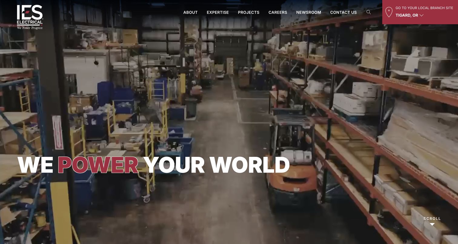
IES Electrical uses a dark infrastructure hero and a rotating power-themed headline, with a local-branch control in the header. The body explains the family-of-contractors model and links into featured projects, while footer navigation lists individual regional operations. For electrical website design, the branch connection is the most useful pattern: a national identity can establish the group’s context, but a buyer still needs to reach the people responsible for local delivery. The rotating headline is visually memorable yet broad, and the default branch should not be mistaken for a confirmed visitor location. Clear location choices and project scope are more useful than motion alone.
What you can learn
Connect the parent electrical brand to actual regional operations with an explicit branch selector. Make it easy to change the selection and evaluate relevant projects, rather than treating a default location or broad slogan as sufficient local context.
Pros
Local branch access is part of the header.
The regional contractor structure is visible in navigation.
Cons & considerations
A default branch may not match the visitor’s intended market.
The rotating slogan provides limited capability detail.
Walker Engineering leads with a field-work image and a compact corporate header, then exposes services including commercial electrical, structured cabling, security, tenant work and audiovisual systems. Projects and Texas office locations provide additional routes into the organization. For an electrical contractor, those explicit service labels are useful because related systems often involve different buyers and scopes. The project directory adds another layer by associating work with markets and business lines. The hero itself is mostly visual, so the content immediately below must explain the firm’s role. The design works best when each technical service retains a clear identity rather than becoming one undifferentiated capabilities page.
What you can learn
Separate electrical and adjacent technical disciplines using buyer-recognizable labels. Connect projects to those service lines and locations so visitors can evaluate relevant work without assuming that every photographed building demonstrates every capability.
Pros
The service catalog distinguishes electrical from adjacent systems.
Projects and regional offices provide useful supporting routes.
Cons & considerations
The image-led hero offers limited explanatory text.
Several related disciplines require careful organization and project tagging.
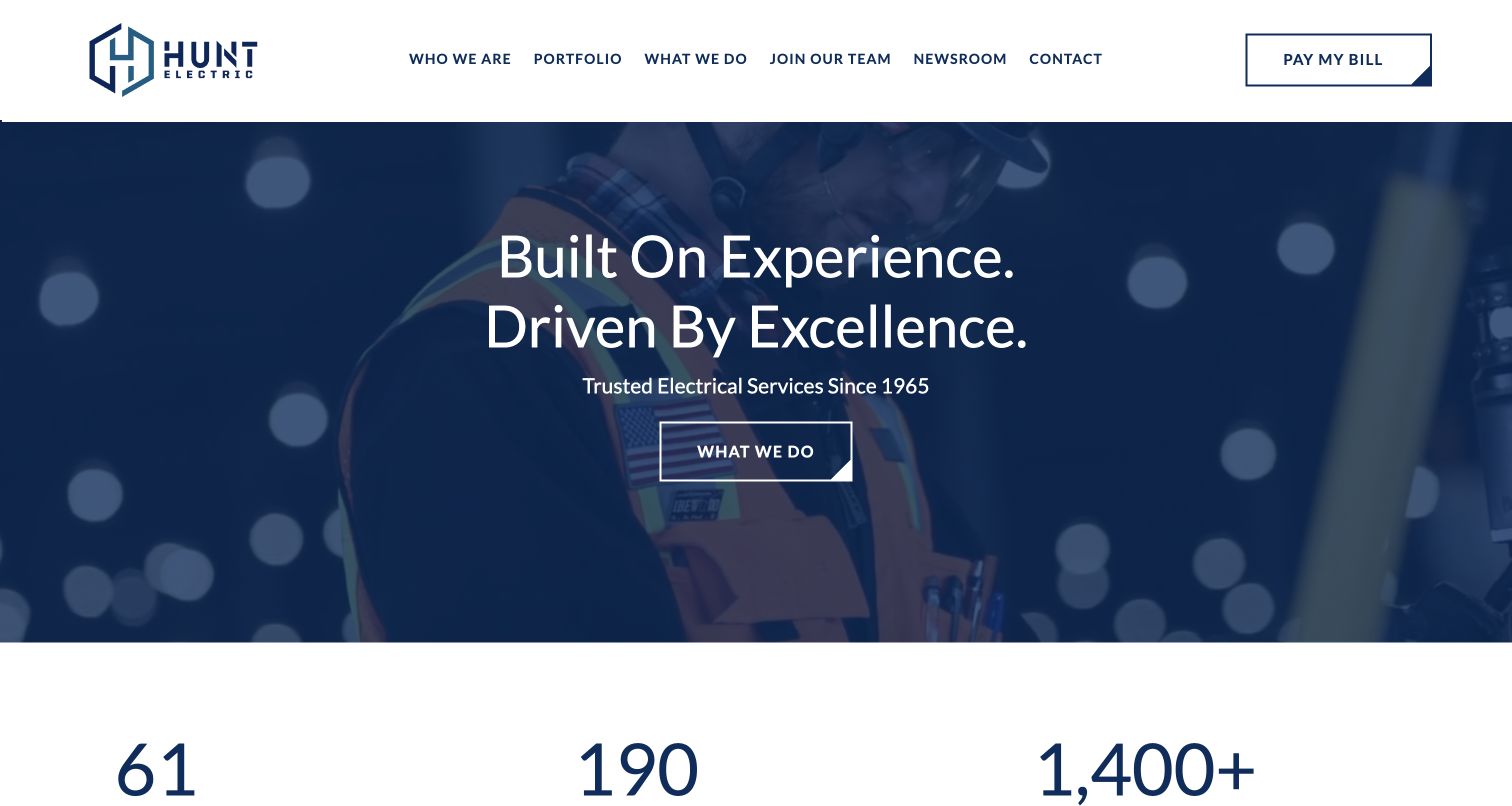
Hunt Electric combines a blue-toned work image with a short experience-led statement and a What We Do action. The header separates portfolio, services, company information, recruitment and contact, with a bill-payment route for existing customers. Below the hero, numerical company facts and recruiting content expand the organization story. For electrical design, the useful feature is the separation of evaluation and ongoing administration: a new client can browse the portfolio while an existing customer has a distinct utility task. The broad experience statement still needs relevant project scope behind it, and the prominent payment button should not displace a clear new-project contact path.
What you can learn
Keep portfolio evaluation, service explanation and existing-customer tasks distinct. Support experience claims with projects that describe the electrical role, and ensure a prospective buyer can reach the appropriate team without following administrative links.
Pros
Portfolio and service routes have clear, separate labels.
Existing customers receive a distinct payment route.
Cons & considerations
The hero’s experience claim needs concrete project context.
Recruiting and administrative actions compete with new-business content.
Plan around the electrical contractor’s actual buyers
Choose the primary audience and service boundaries
Identify whether the site mainly serves homeowners, general contractors, facilities teams or several distinct groups. Map actual work and geographic coverage to each audience. If electrical availability differs from other departments or branches, make that distinction explicit in the content model.
Create a useful project record
Define fields for project name, market, locality, scope, role and approved photography. Include constraints or delivery context only when the company can support them. Review permission before publishing client names, commercial values or site details, and avoid treating every building photograph as proof of every capability.
Keep business development and operational tasks separate
Plan routes for new projects, service calls, recruiting and existing-customer tasks. A portal or bill-payment link can be useful without becoming the main call to action for a prospective client. Assign a responsible team to each inquiry type and document the fallback when routing fails.
The editing job behind the design
Choose a content system that can connect services, projects and offices
A conventional CMS can model capabilities, markets, projects and office records without requiring a custom application. Link related records so a buyer can move from a market to relevant work and then to the appropriate contact. Keep shared office details and service boundaries consistent across the site.
Treat customer portals, payment tools and recruiting systems as distinct destinations with clear labels. For the marketing site, prioritize readable project detail, responsive photography and a dependable inquiry process. A platform choice does not supply credible project evidence or maintain permissions automatically.
Our WordPress website examples offer a separate look at publishing approaches. A visible platform label is evidence for that named page, not a guarantee that the same system will suit your requirements.
Before the public launch
Electrical contractor website launch checklist
Confirm electrical scope, service boundaries and office contact information with the business.
Separate residential service, project inquiries and existing-customer support where needed.
Review every project’s role description, factual fields and publication permissions.
Verify that credentials and company claims are current before presenting them as facts.
Test mobile navigation, project browsing, inquiry routing and readable media fallbacks.
Assign owners for office changes, portfolio updates, broken integrations and stale claims.
These checks are a project checklist, not a performance, legal, security, or accessibility certification. Test real journeys with the people responsible for the website before making claims about the result.
Sources & editorial method
How this collection was selected and reviewed
We reviewed 28 distinct official company websites with direct browser captures. The collection deliberately includes residential electrical departments and larger electrical construction firms to compare different buyer journeys. Multi-service companies receive electrical-specific analysis here. Captures preserve their actual dates, source brands remain attributable to their owners, and no unverified website technology is claimed.
Each example links to its actual source page. Screenshots are direct browser captures with their own capture dates; moving imagery, announcements and live designs can change. The notes describe observable design choices and conditional tradeoffs, not measured traffic, conversion results, service quality, or accessibility conformance.
Technology labels use public page metadata, asset evidence, or explicitly cited platform documentation. Platform documentation is not a complete current deployment audit. A component reference may be legacy or unused; it is not a complete backend inventory. Unknown stacks are omitted. These sites are editorial examples, not our client portfolio.
Written, Edited and Curated are separate editorial records, not timestamps advanced by a rebuild. Website designs and imagery belong to their owners. See our editorial standards or suggest a correction.
Questions worth asking
Electrical Contractor website design questions
Should an electrician use a booking form or a project inquiry form?
Use the route that matches the work. Residential service may start with a short appointment request, while a commercial project often needs a different conversation and team. Explain the purpose and keep a plain contact alternative rather than forcing every inquiry into one form.
What makes an electrical project page useful?
A clear account of the company’s actual role, the project context and approved images. Consistent fields for market, location and scope help buyers compare relevant work. Avoid relying on an attractive building photograph without explaining the electrical contribution.
Can one site serve residential and commercial electrical clients?
Yes, if the audience paths and service descriptions are distinct. Homeowners need understandable tasks and local response information. Project buyers need capabilities, comparable work and a suitable contact. Shared branding can connect those journeys without making the content identical.
How should a multi-trade site present its electrical department?
Give Electrical an explicit navigation entry and a dedicated scope explanation. State any coverage differences from plumbing or HVAC, and route inquiries to the right team. Do not assume a broad home-services headline communicates which electrical tasks are available.
Build the electrical website around real capabilities, relevant work and clear contact paths. The strongest design reference is the one that helps the right client understand the contractor’s actual role.