Best Paint Manufacturer Websites of 2026 (21 Real-World Examples)
Paint manufacturer websites that turn colour inspiration into a practical project
A paint website needs to help someone imagine a room, choose a finish and find the right way to buy. These twenty-one examples compare consumer storefronts, professional resources and corporate coating portfolios.
The first question on a paint website is rarely just which colour looks attractive. A homeowner may need a sample, a quantity estimate or an explanation of finish. A decorator may arrive with a product code and need a data sheet. A specifier may need an application system or a regional contact. Make those journeys visible in the information architecture before deciding how much space to give an inspirational campaign.
This collection includes decorative paint brands and wider coatings manufacturers. Some pages sell directly, some lead to stockists, and others route customers from a corporate group into regional or specialist sites. Compare each design against its purpose. A corporate gateway should not be judged as though it were a checkout, and a photographed room should not be treated as reliable evidence of how a colour will appear in someone else’s home.
Before the examples
What makes good paint manufacturer website design in 2026?
Connect colour with a next step
Link a photographed shade to its name, identifier and sample where those are available. Explain how visitors can continue toward an appropriate finish or product, rather than leaving an inspirational image disconnected from the range.
Give known-product visitors a direct route
Keep product search, technical information and stockist navigation independently accessible. Returning trade customers should be able to find the material they already know without following a seasonal colour story.
Explain the purchase model
Make direct shopping, retailer handoff and enquiry-based specification distinguishable. Show the relevant market or region and explain where availability information belongs before visitors invest time in a range that may not serve their project.
Treat advice as part of product selection
Room light, surface preparation, finish and quantity are connected decisions. Organize guidance around those practical questions and link it to relevant products and samples without presenting generic inspiration as technical advice.
The collection · 21 examples
21 paint manufacturer websites worth studying
The twenty-one websites below show several ways to balance atmosphere, product information and project services. Each review identifies the visible pattern, the audience it can serve and the tradeoff to examine before adapting it.
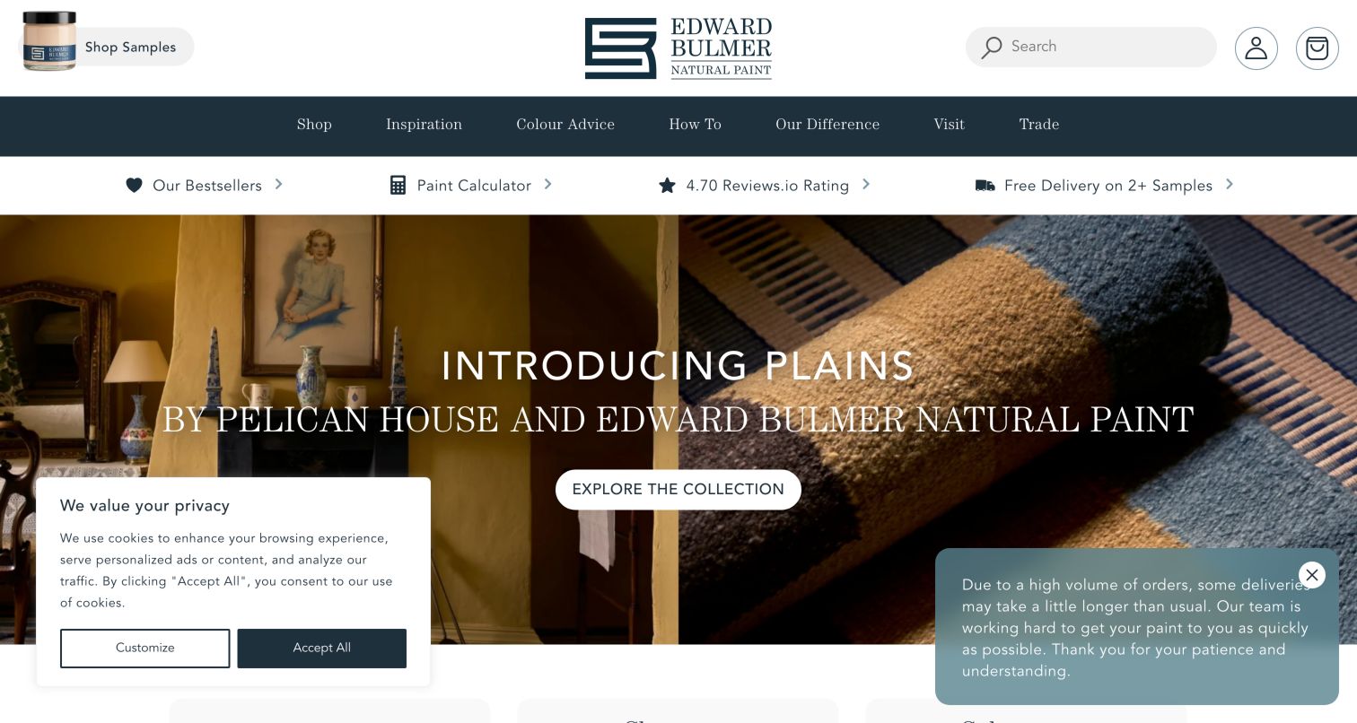
Edward Bulmer Natural Paint introduces a collection through paired interior and textile photography. A dark navigation bar groups shopping, inspiration, colour advice, instructions and the brand's difference, while a prominent sample entrance remains in the white header. Supporting shortcuts include a calculator and delivery information, connecting the editorial presentation to practical planning. The page also links to a dedicated green-claims policy, a useful place to substantiate the environmental language used elsewhere. In the captured view, a privacy box and delivery notice occupy opposite lower corners. Their combined footprint shows why several individually modest notices can interfere with a carefully composed collection story.
What you can learn
Give a specialist brand's philosophy a clear explanatory destination, and connect its collection imagery with samples, quantities and advice. Review the cumulative footprint of privacy, service and promotion notices so visitors can still see the main action and understand the photographed collection.
Pros
Samples and a calculator support practical decisions beside editorial imagery.
A dedicated claims-policy link offers context for the brand's positioning.
Cons & considerations
Two lower-corner notices compete with the collection presentation in the capture.
Distinctive philosophy language still needs clear product and finish explanations.
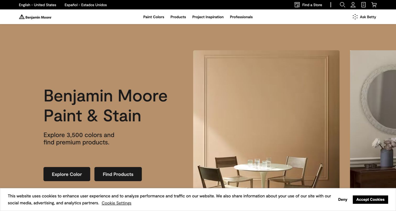
Benjamin Moore places a warmly coloured interior beside its paint and stain introduction, then offers separate entrances for exploring colour and finding products. That pairing recognizes two different kinds of visitor: someone imagining a room and someone already choosing a coating. Store finding, account access and regional controls occupy a separate utility strip. Farther down, sample and product categories provide more concrete options, while contractor, designer and architect routes acknowledge professional needs. The photographed room gives the palette a believable setting without making the visitor identify its finish before understanding the brand. A visible cookie notice reduces the amount of content available in the captured viewport.
What you can learn
Keep an inspirational opening tied to practical decisions. Provide a colour route, a surface or product route and a place-to-buy route with distinct labels, then preserve those entrances when seasonal photography changes.
Pros
Paired colour and product actions accommodate different stages of a decorating project.
Professional audience routes sit alongside consumer inspiration.
Cons & considerations
Consent messaging occupies useful space at the bottom of the initial view.
A room photograph cannot communicate finish, lighting and colour accuracy by itself.
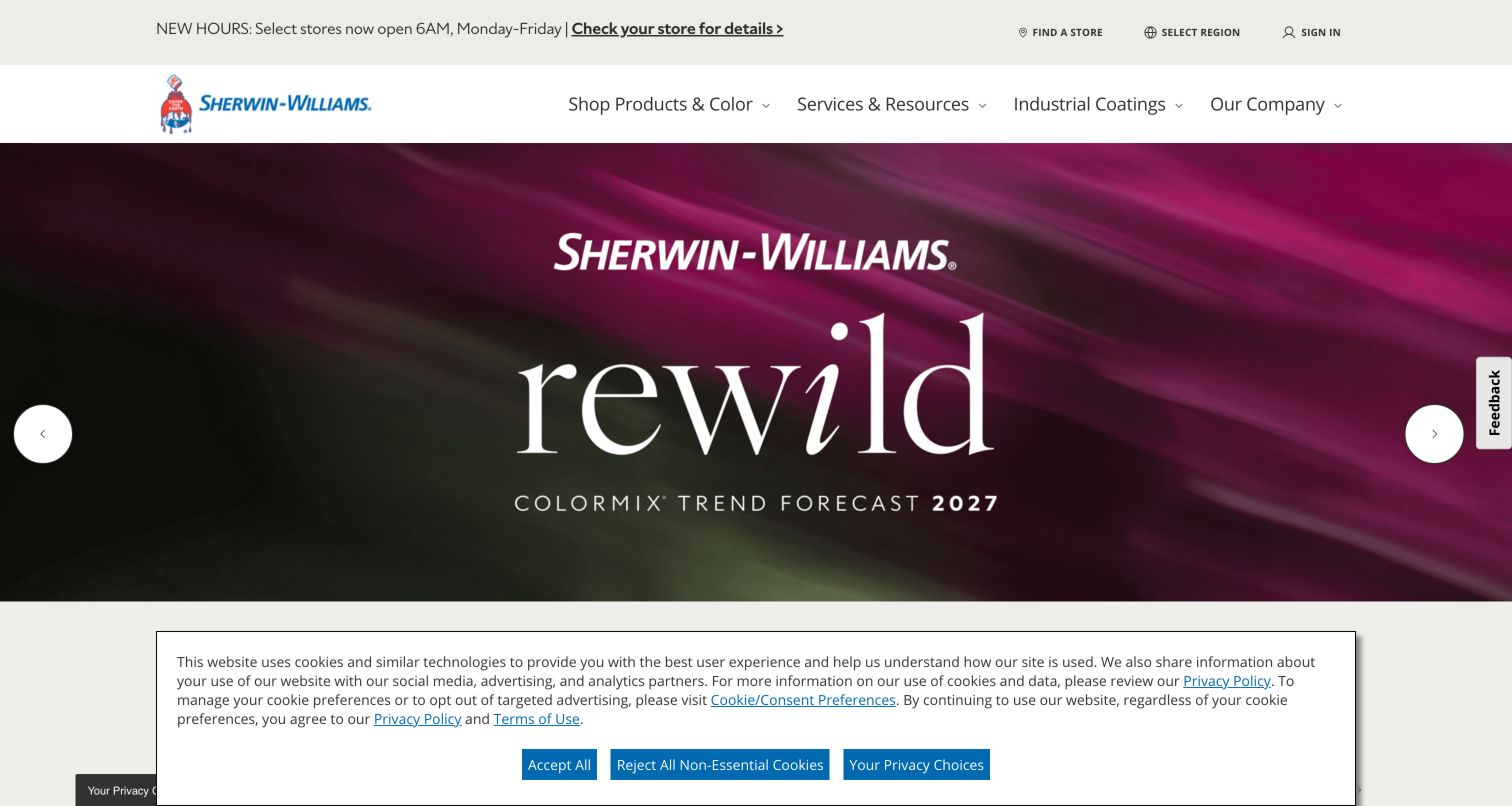
Sherwin-Williams uses a vivid magenta campaign image and a large colour-trend message to establish an expressive first impression. The surrounding interface is considerably more practical: the header identifies the brand, and store information and utility controls support a local purchase journey. Lower resource entrances include colour samples, applications and product data sheets, alongside routes for different professional audiences and industrial coatings. This creates a useful contrast between the changeable campaign and the enduring information system. The captured consent panel takes substantial lower-screen space, and the visually dominant campaign can delay visitors whose immediate task is finding an exact product or technical resource.
What you can learn
Treat a trend campaign as one layer of a manufacturer's website. Keep store lookup, product documentation and professional navigation independently reachable, and test the first screen with visitors who arrive with a known product name.
Pros
Strong colour direction makes the current campaign easy to recognize.
Technical and professional resources extend the site beyond an inspiration gallery.
Cons & considerations
The campaign asks practical visitors to scan past a large promotional area.
The captured consent panel reduces the visible space for supporting tools.
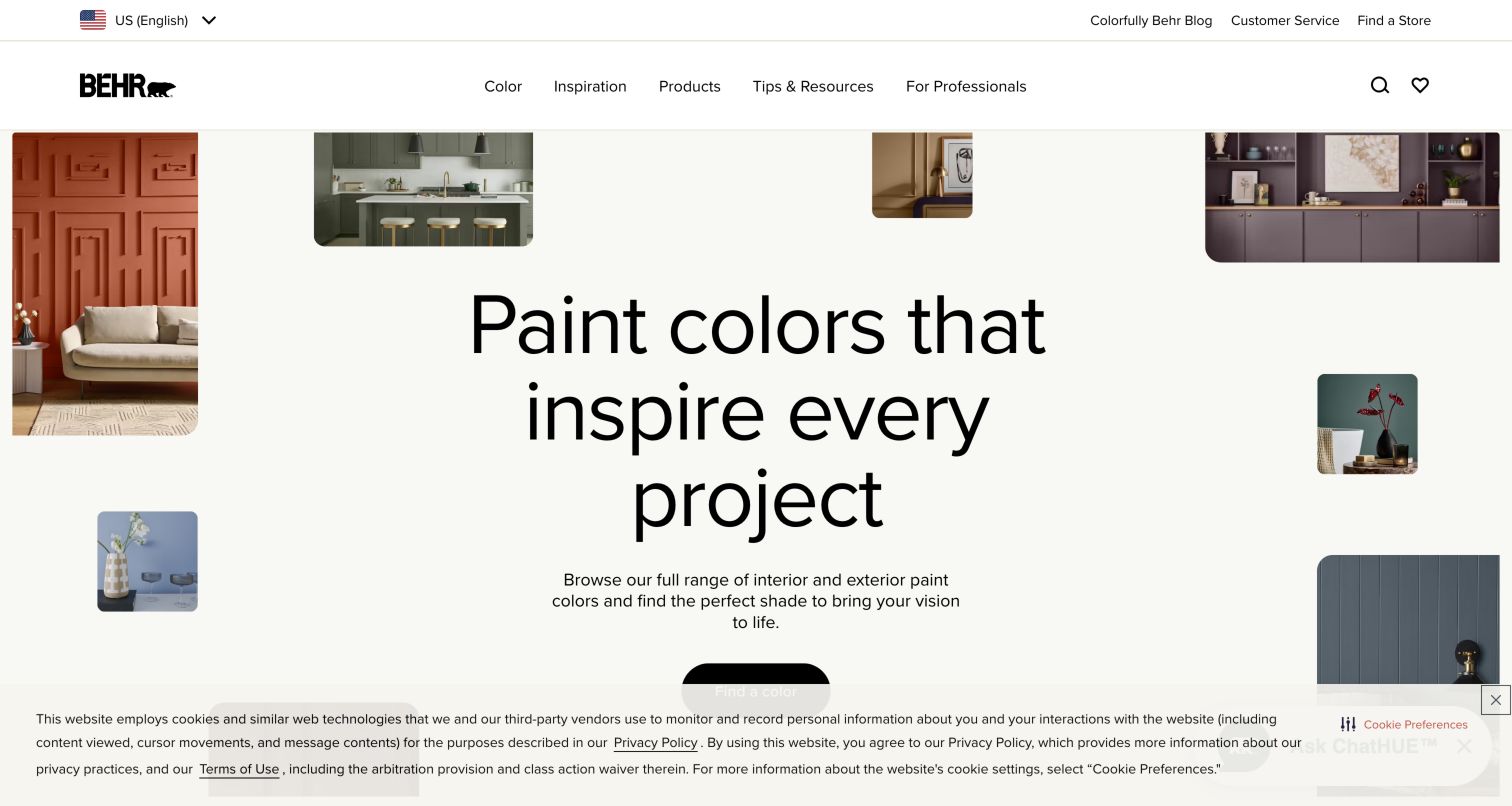
Behr surrounds oversized central typography with small rounded interior photographs rather than filling the entire screen with one room. The arrangement creates a clear focal point while showing several decorative contexts. Its primary navigation separates colours, inspiration, products and tips, with professional and store routes also available. A colour-finding entrance beneath the opening moves the visitor toward a more specific choice. The composition is worth studying as a hierarchy exercise: imagery supports the words instead of competing with them. In the captured view, consent messaging and a chat control compete near the lower action area, illustrating how service widgets can interfere with an otherwise restrained layout.
What you can learn
Design the page and its optional overlays as one composition. Reserve enough space around the main action for chat and privacy controls, and keep colour exploration connected to product and retailer information as the visitor progresses.
Pros
A central typographic message remains recognizable among several room images.
Navigation distinguishes inspiration, practical advice and product information.
Cons & considerations
The chat and consent elements crowd the lower action area in the capture.
Small inspirational photographs offer less room for inspecting individual surfaces.
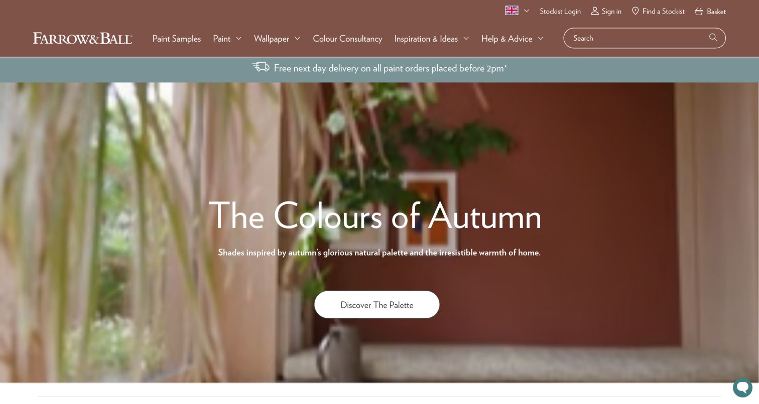
Farrow & Ball carries a warm russet tone from the header into an autumn interior presentation. White lettering and a palette action sit over the large imagery, while the navigation keeps paint, wallpaper and samples close to the brand introduction. Supporting content introduces finishes, colour consultancy and a colour card, connecting the editorial mood to tangible ways of narrowing a choice. The photographed setting feels consistent with the surrounding interface, which makes the campaign read as part of the brand rather than a detached advertisement. The size of that opening still means visitors looking for an exact finish or existing colour need a dependable navigation route.
What you can learn
Use the interface palette to reinforce the photographed collection, but give sampling and finish selection equally clear names. A premium presentation becomes more useful when a visitor can translate its atmosphere into a sample or a concrete consultation step.
Pros
Header and campaign imagery share a deliberate colour direction.
Samples, colour cards and consultancy offer practical follow-up routes.
Cons & considerations
A large atmospheric hero uses space that could explain finish differences.
Photographic colour remains dependent on the viewer’s screen and room conditions.
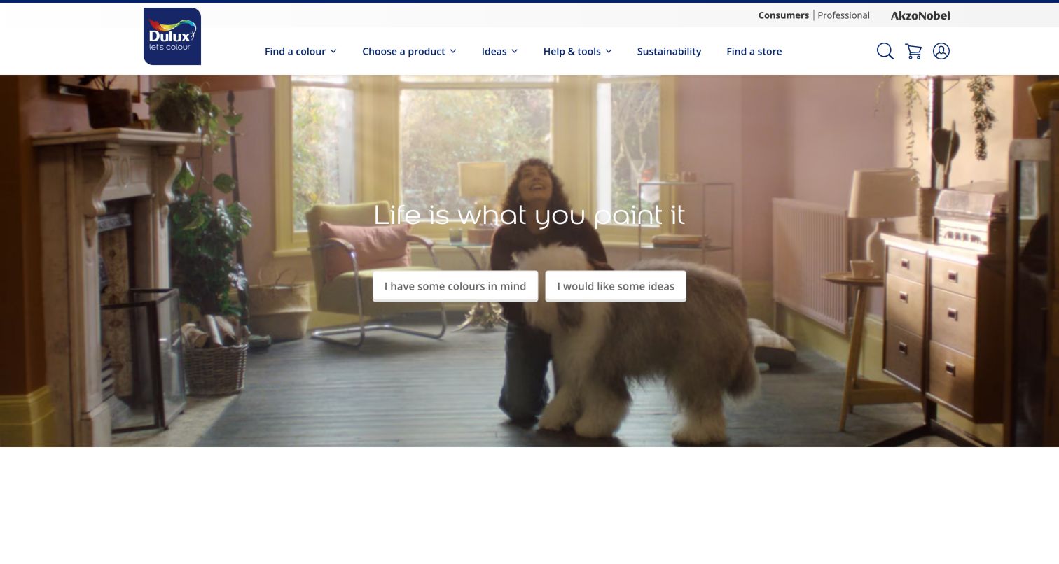
Dulux opens with a domestic video scene and two explicit colour intentions: visitors can indicate that they already have colours in mind or that they would like ideas. This is a useful way to organize the early journey without asking people to understand a product family. The white header and familiar blue mark provide a stable frame around the moving imagery. Subsequent room, surface and palette options give the broader decision more structure. The first screen explains a choice people can make immediately, although those two broad statements do not replace the technical questions about substrate, finish and application that follow a paint purchase.
What you can learn
Start with the uncertainty a homeowner can describe in ordinary language, then progressively introduce room, surface and finish choices. Keep controls over moving imagery readable across every frame and provide an equally understandable experience when motion is reduced.
Pros
Two plain-language intentions make the initial colour journey approachable.
Room and surface options provide a path toward more specific decisions.
Cons & considerations
Video imagery can change the contrast behind overlay content.
An inspiration-first opening needs a separate efficient route for repeat product buyers.
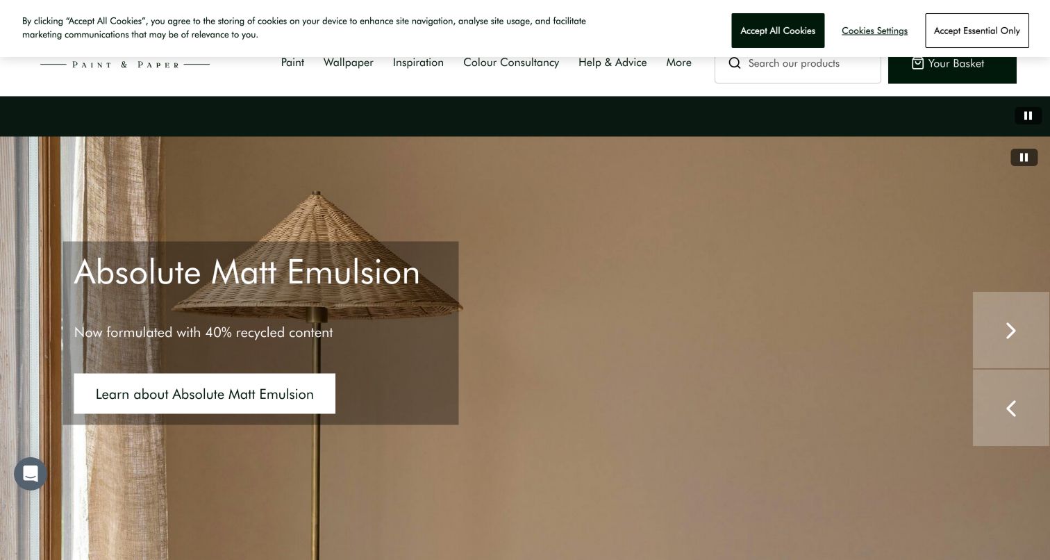
Little Greene presents its Absolute Matt Emulsion within a pale, furnished interior and uses generous spacing around the product message. Paint, wallpaper, inspiration and consultancy form the main navigation, reflecting a decorating project that may involve more than one finish. Supporting material includes sample choices and advice organized around room orientation, which gives colour browsing a useful real-world context. The site also displays an environmental material claim; this review considers how that claim is positioned, rather than independently verifying it. A cookie strip overlaps part of the upper brand area in the captured view, weakening an otherwise quiet and carefully controlled introduction.
What you can learn
Link an attractive finish presentation to the conditions in which people will use it. Direction of light, sample selection and coordinated wallpaper can make advice specific, while substantiation for material claims should remain available beside the relevant product content.
Pros
Room-orientation advice relates colour choice to a practical decorating constraint.
Paint, wallpaper and consultancy create several coherent project entrances.
Cons & considerations
The captured cookie strip intrudes on the upper brand area.
A subtle room image needs accompanying finish information to explain the product clearly.
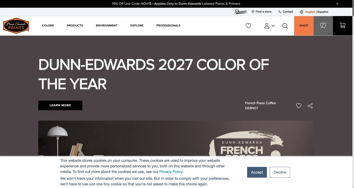
Dunn-Edwards makes a brown colour-of-the-year campaign the centre of its opening, using a named shade to give the photography a specific reference. The navigation separates colours, products, exploration and professional information, while an orange shopping action stands out from the neutral campaign palette. Lower sections organize discovery by product and room, giving visitors alternate ways to move from a colour story toward a purchase decision. Colour identifiers and related controls make individual shades easier to discuss. A persistent consent panel occupies the lower part of the saved screenshot, so the example also demonstrates how a campaign can lose supporting context when auxiliary messaging remains visible.
What you can learn
Give editorial colour names an accompanying stable identifier and a clear product destination. A campaign should help someone specify a sample or compare a room application, and the store or shopping route should remain visible when the campaign changes.
Pros
A named shade supplies a concrete reference for the colour story.
The contrasting shopping action is easy to distinguish from editorial navigation.
Cons & considerations
Consent messaging obscures some supporting content in the captured first screen.
A single featured shade provides a narrow introduction to a broader range.
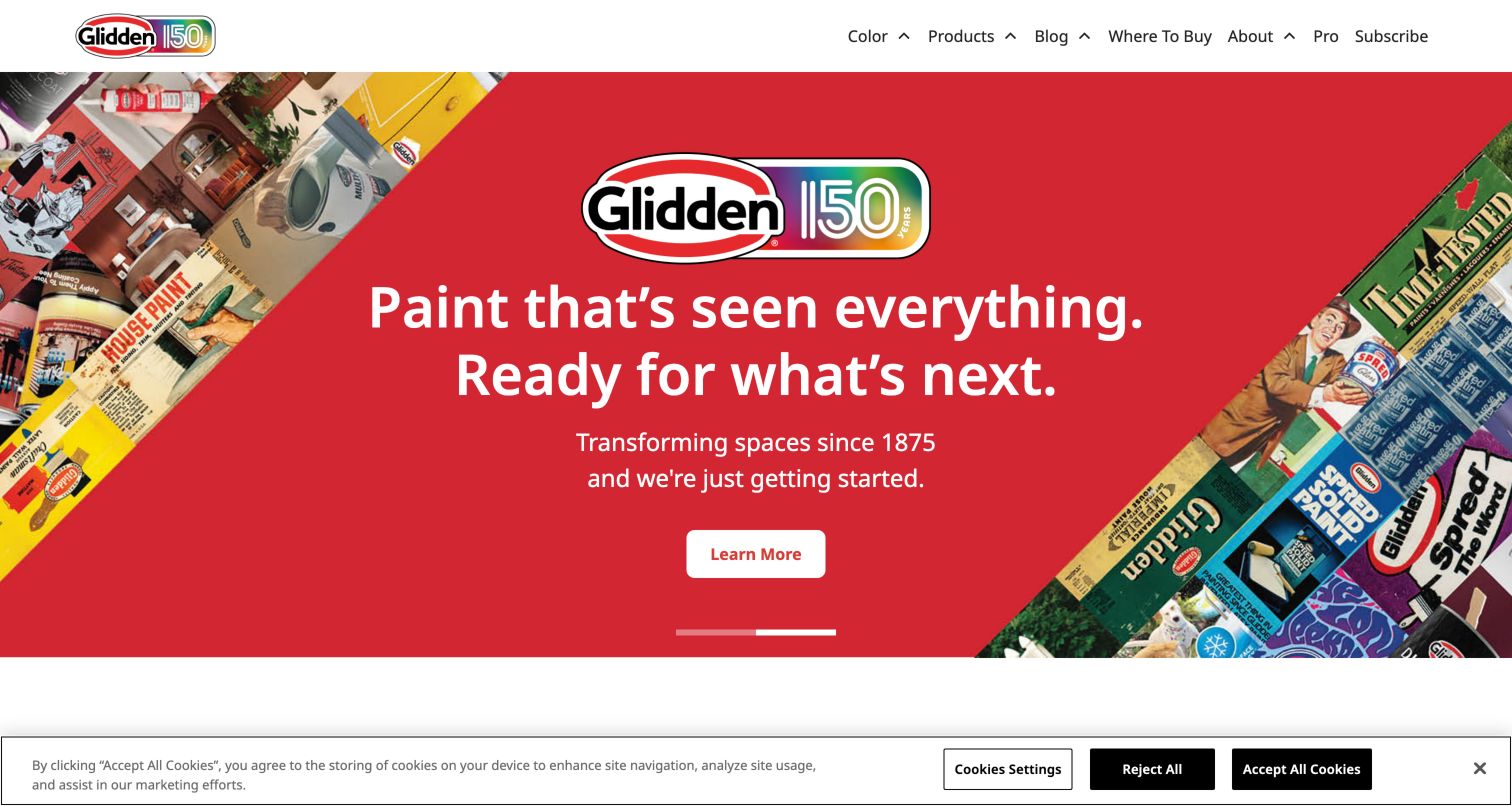
Glidden uses a bright red anniversary collage to introduce its heritage, framed by a straightforward white header. The primary choices are easy to understand: colour, products, advice and where to buy. That last route is important for a manufacturer whose website may inform a purchase completed through a retailer. Product, tool and swatch cards below the opening add more actionable material to the brand story. The campaign supplies a strong visual identity without requiring a complex navigation vocabulary. Its prominence also creates a tradeoff: a visitor seeking a specific coating must use the surrounding menu rather than expect the heritage image to answer a product question.
What you can learn
Keep an anniversary or heritage story connected to the tasks that bring people to a paint website. Preserve concise product and retailer labels and use supporting cards to turn brand familiarity into a useful next step without relying on promotional artwork alone.
Pros
The short primary menu makes key consumer tasks easy to identify.
Where-to-buy navigation connects online research with retail availability.
Cons & considerations
A heritage-led hero explains less about individual paint applications.
A visible cookie strip reduces the space available below the campaign.
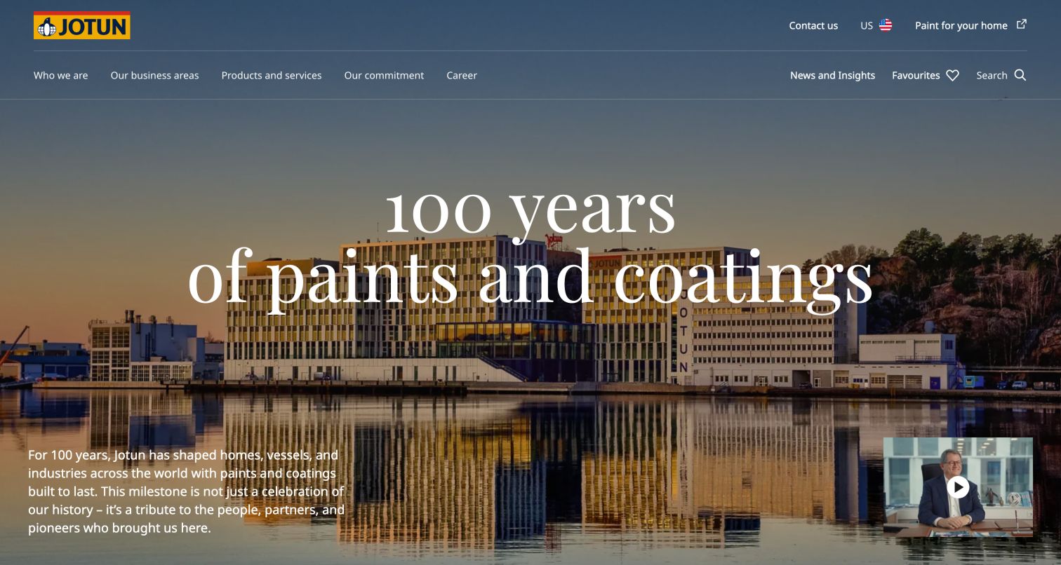
Jotun opens its corporate page with a waterfront headquarters photograph and a centenary message in large white lettering. The surrounding navigation emphasizes the company, business areas, products and services, commitments and careers. A separate paint-for-your-home link acknowledges that a homeowner may need a different experience from an industrial buyer. Further down, market entrances include marine, energy, architecture and decorative applications. This is a clear example of a corporate umbrella serving several different purchasing contexts. The first screen communicates identity and scale through a story and place, while the practical product journey depends on the navigation and business-area sections.
What you can learn
Decide whether a page is a corporate gateway or a consumer store, and make the transition explicit. Group a broad coatings portfolio by the markets visitors recognize, while giving homeowners a plainly labelled route into the decorative range.
Pros
Business-area organization recognizes the breadth of coating applications.
A separate home-paint link distinguishes consumer intent from corporate research.
Cons & considerations
The oversized anniversary message leaves little first-screen space for product detail.
Industrial visitors still need to identify the correct market before comparing solutions.
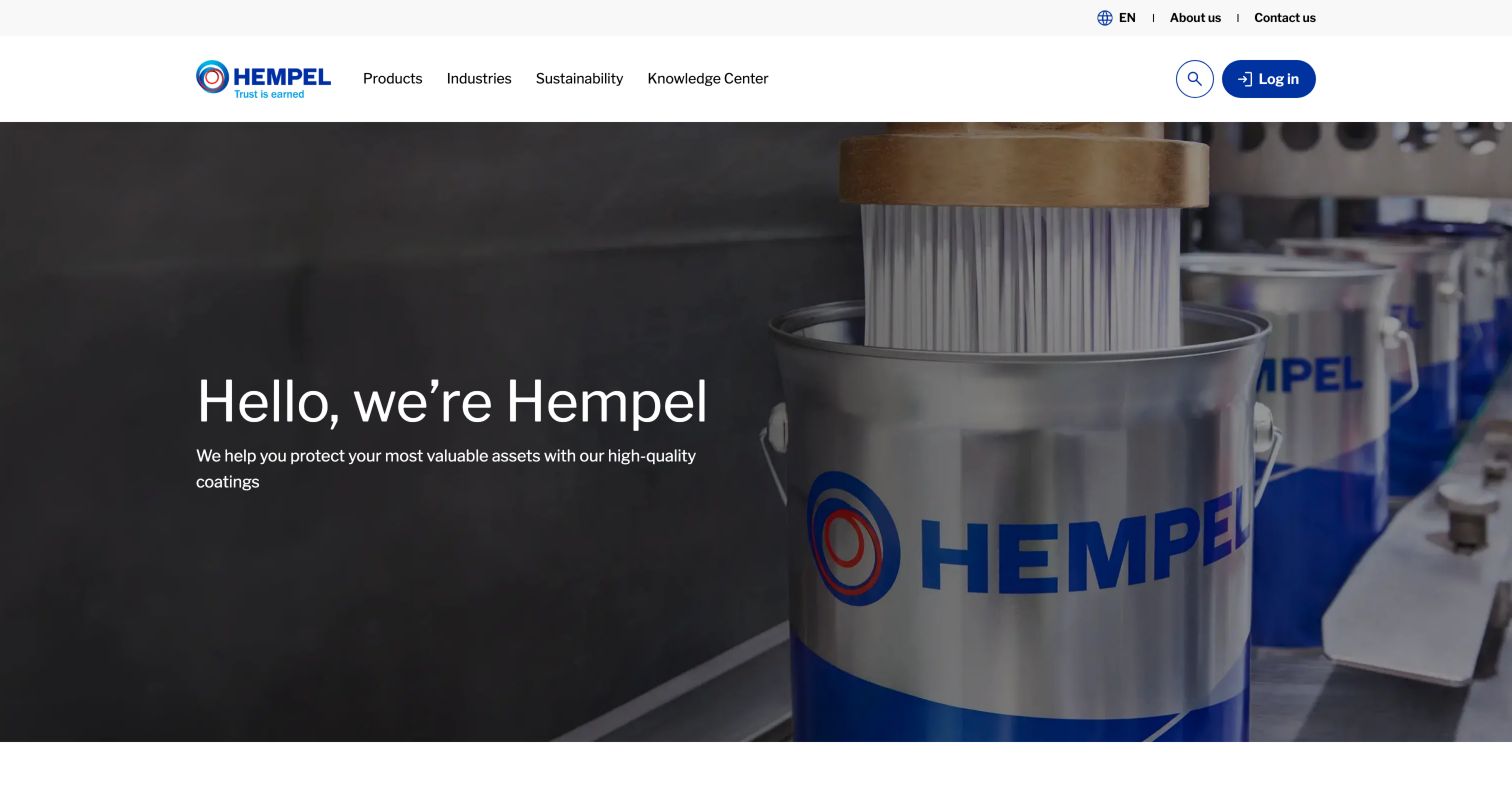
Hempel places a concise asset-protection introduction over a close view of coating production. Products, industries, sustainability and a knowledge centre give the header a task-oriented structure, with login access kept distinct. Below the hero, the page introduces MyHempel, a product finder and a coating-system selector, explaining different ways to progress from general interest to a more precise requirement. Industry cards then separate energy and infrastructure, marine, decorative and yacht applications. The combination makes a complex portfolio easier to enter. The opening itself remains broad, so the supporting selector and industry labels carry much of the responsibility for helping an unfamiliar visitor choose a direction.
What you can learn
Place product browsing, system selection and an existing-customer portal beside one another with explanations of their different purposes. Let technical visitors enter through an application or requirement without making a corporate introduction the only route forward.
Pros
Product and coating-system tools address different levels of technical certainty.
Industry cards provide understandable entrances into a broad portfolio.
Cons & considerations
The initial asset-protection statement gives little detail about an individual application.
Portal language needs a clear distinction between public browsing and account functions.
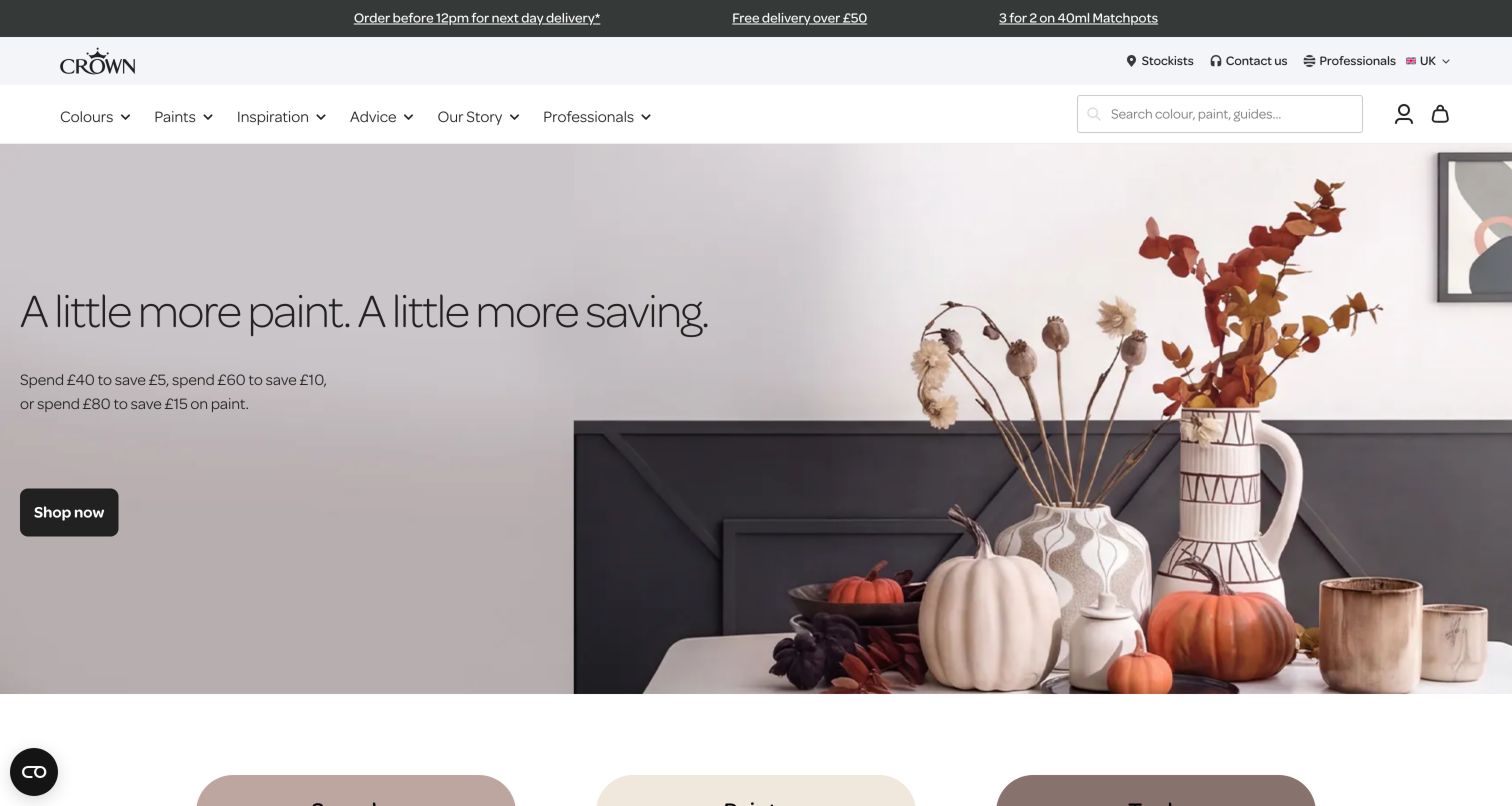
Crown Paints combines a seasonal dining-room setting with a prominent shopping promotion. The header separates colours, paints, inspiration and advice, while stockists and professional routes remain available above it. Sample pots, paint and tools receive early category entrances, followed by advice on preparing exteriors and choosing ceiling colours. Range summaries provide useful differentiators such as finish, available sizes and colour selection, although this review does not verify product performance statements. The page repeatedly connects inspiration with samples and a purchase route. Multiple offers in the top strip and hero can, however, demand attention before a visitor has decided what they need.
What you can learn
Keep promotion secondary to a clear product model. Present range, finish, size and sampling options consistently, and let stockist discovery and practical painting advice remain useful even when an offer expires or a seasonal room story is replaced.
Pros
Samples, paint and tools are presented as recognizable purchase categories.
Range descriptions and painting advice add context to the shopping journey.
Cons & considerations
Several simultaneous promotional messages compete in the opening view.
Repeated shopping actions need context to distinguish the destination they lead to.
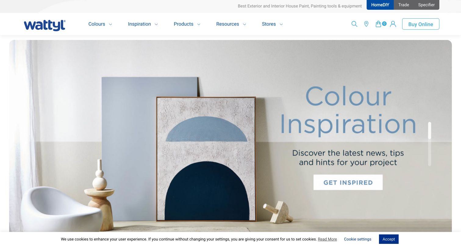
Wattyl distinguishes HomeDIY, Trade and Specifier audiences in a slim upper strip, then uses a shared navigation for colours, inspiration, products, resources and stores. The captured slide introduces an inspiration destination through room photography and a direct action. Below it, colour consultation, where-to-buy information and a local painter finder translate that inspiration into services. Named shades include colour codes, making them more useful than decorative swatches alone. Professional resources include technical data and a BIM library. The design therefore supports several project roles, though the carousel changes the first-screen message and some utility icons require visitors to infer their purpose.
What you can learn
Name audience routes according to recognizable project roles and retain clear product references beneath inspirational content. If technical data and specification resources belong elsewhere, explain the handoff so professionals can reach them without following a consumer campaign.
Pros
Explicit DIY, trade and specifier entrances acknowledge different information needs.
Colour codes and professional resources add practical depth to room inspiration.
Cons & considerations
A changing carousel makes the initial message less predictable.
Icon-only utility controls provide less immediate explanation than visible text labels.
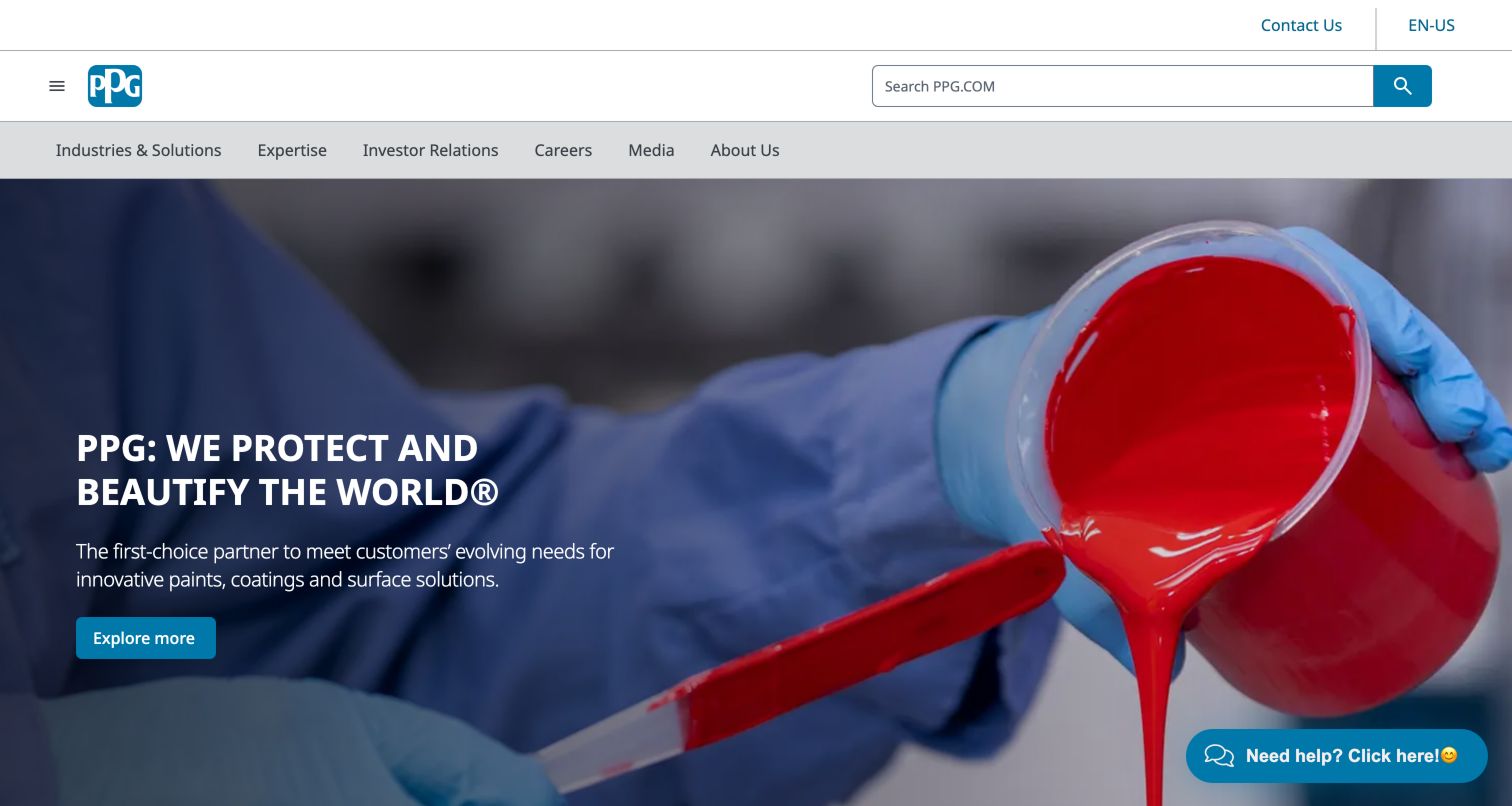
PPG pairs a paint-pouring image with a concise corporate statement and a prominent exploration button. A large search field occupies the header, while the navigation distinguishes industries and solutions from expertise, investors, careers and media. The following business grid names aerospace, architectural coatings, automotive, industrial, packaging and other application areas, each with an explanatory description. This is an effective way to make the breadth of a coatings group visible without expecting visitors to recognize every subsidiary or product name. The general exploration label is less informative than the business-specific links below, and corporate audience needs occupy considerable navigation space alongside customer tasks.
What you can learn
Use a consistent industry grid to explain a diversified manufacturer's portfolio. Give each market a short application description and a clear destination; make the main hero action equally specific so it does not become a vague detour before the useful taxonomy.
Pros
Business cards explain specialist applications in a consistent format.
A prominent search field supports visitors who already know their target.
Cons & considerations
The opening exploration button provides limited destination context.
Corporate navigation adds choices that some product-focused visitors will not need.
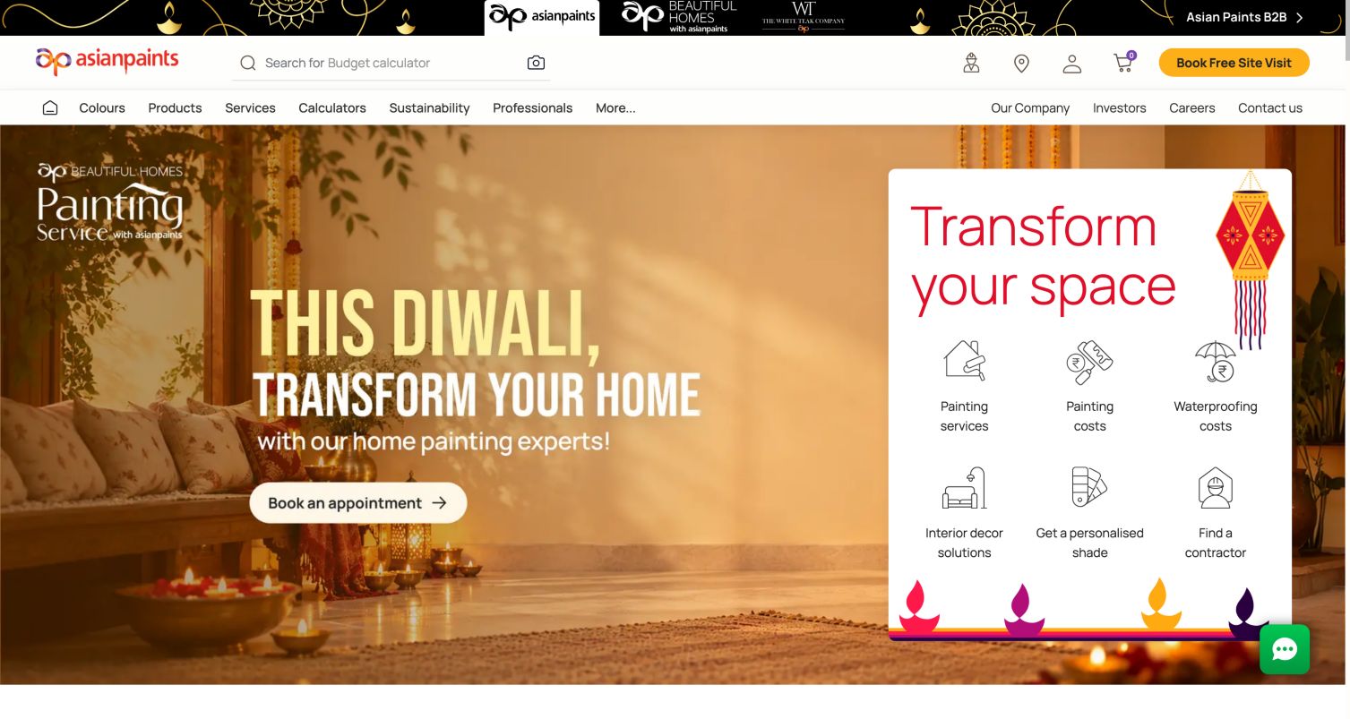
Asian Paints places a seasonal painting campaign beside a grid of six practical project choices. Painting services, costs, waterproofing costs, interior decoration, shade help and contractor finding are presented as separate intentions. The header also exposes calculators, products, colours and professional navigation, with an appointment action receiving emphasis. Below, colour catalogues, featured products and downloadable designer palettes provide several ways to continue researching without immediately entering personal details. The page shows how a manufacturer can frame itself around the whole decorating project. Its breadth creates a busy interface, and the initial welcome panel and privacy message required dismissal before the saved unobstructed capture.
What you can learn
Organize a broad service offering around decisions a homeowner understands. Separate estimation, colour advice and product exploration, and explain appointment requests as a distinct step so visitors can learn about options before deciding whether to provide contact information.
Pros
Six project intentions connect products with practical decorating tasks.
Calculators and palette downloads support research beyond the campaign.
Cons & considerations
Many header and service choices create a dense first impression.
Initial welcome and privacy overlays interrupted access before this capture.
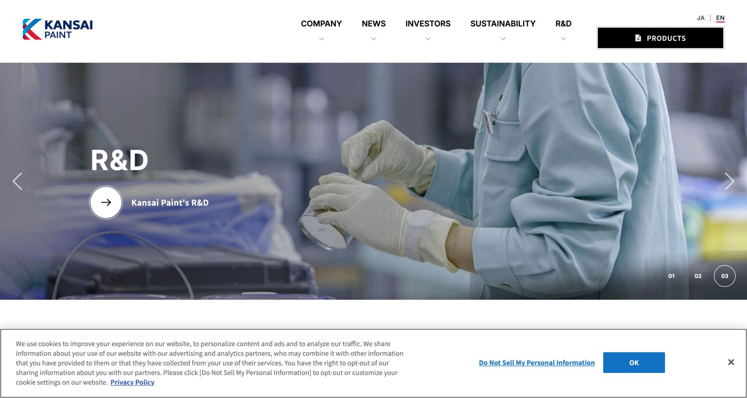
Kansai Paint uses a large photographic carousel to promote research, sustainability and investor information. The brand sits in a clean white header, with a strongly contrasted product entrance separating commercial discovery from the corporate links. Lower sections organize decorative, protective, automotive refinish, industrial and marine coatings into application groups, each accompanied by a concise description. A global trend-colour download provides a more tangible resource alongside the company story. The result makes corporate priorities visible while still offering a route into coatings. Its recurring general read-more labels and the distance between the hero and application grid leave room to make customer tasks more immediate.
What you can learn
Maintain a clear distinction between corporate information and coating applications. A strong product entrance helps, but application cards should use descriptive destinations and remain easy to find when rotating institutional campaigns take the most prominent position on the page.
Pros
A contrasted product entrance stands apart from institutional navigation.
Application categories describe the portfolio more clearly than brand names alone.
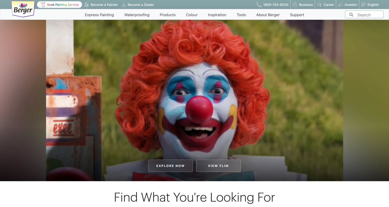
Berger Paints places painting services near the top of the interface and uses a large film-led campaign as its opening. A following task grid is more explicit: painting, waterproofing, product finding, the colour catalogue, blogs and a calculator each receive their own entrance. The Express Painting explanation then breaks the service into quotation, professional supervision, tools and protection of belongings. This helps visitors understand what a project service includes before approaching a contact route. The manufacturer also keeps dealer and painter participation separate in the utility navigation. The large film frame and several carousel controls can distract from the more useful project-planning choices below.
What you can learn
Explain a service through concrete stages and responsibilities, then provide tools for visitors who want to plan independently. Keep recruitment or dealer participation distinct from customer booking so each audience can identify the appropriate next step without interpreting a shared generic contact action.
Pros
A task grid names practical tools and product discovery routes.
Service components explain the project experience in concrete terms.
Cons & considerations
The cinematic opening consumes substantial space before the practical task grid.
Several horizontal components add navigation controls to an already busy page.
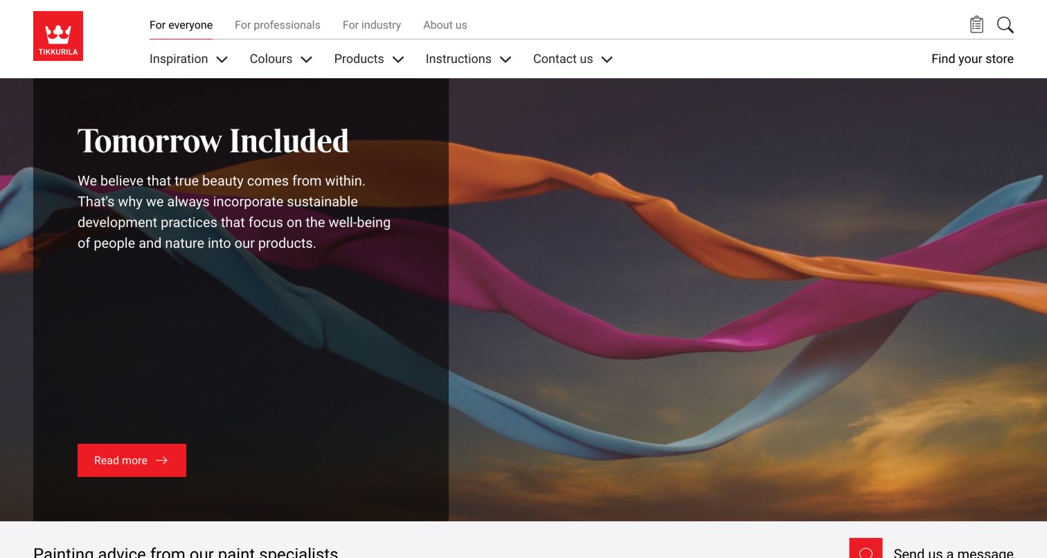
Tikkurila's consumer page retains a visible switcher for everyone, professionals, industry and company information. This makes audience changes possible after entry rather than treating a first choice as permanent. Inspiration, colours, products and instructions form the consumer navigation, with store finding available beside them. Below the campaign, room-specific ideas and a named colour collection connect visual exploration with manageable categories. Product highlights add short finish descriptions and direct links, while practical articles cover exterior work and furniture. The opening campaign emphasizes the brand's environmental positioning; visitors with a known coating requirement may find the product and instruction routes more immediately useful.
What you can learn
Keep audience switching available throughout a large manufacturer site and use room-based inspiration as an alternate path into the same product information. Make finish descriptions and instructions easy to compare, and provide sources for environmental statements within the relevant content.
Pros
A persistent switcher lets visitors move between consumer and specialist contexts.
Room ideas, product descriptions and instructions provide complementary research routes.
Cons & considerations
The broad brand campaign answers fewer immediate product questions than the navigation.
A long editorial page needs careful prioritization for visitors seeking one specific task.
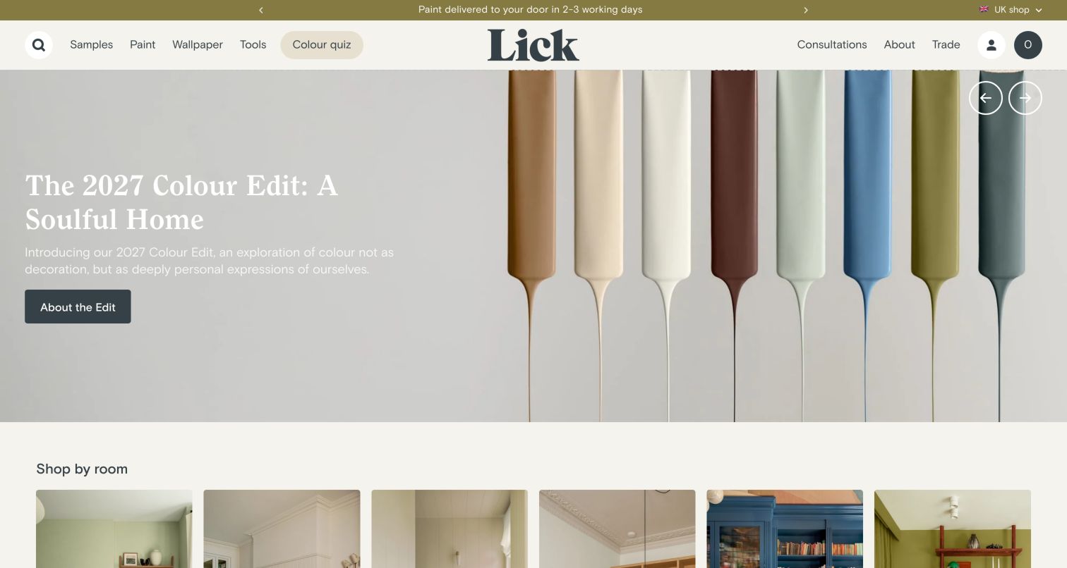
Lick centres its wordmark in a quiet header and gives samples, paint, wallpaper, tools and a colour quiz clear text labels. The captured colour-edit slide displays a row of paint-covered tools alongside a short editorial introduction. Below, room cards and popular colours move the page from an aspirational palette toward concrete browsing choices. Consultations and trade access remain separate from the main shopping categories. The composition is restrained and consistent, but white campaign text over a pale image is a point a project team should test for readability. A rotating editorial opening also needs a stable route for someone returning to buy a known shade.
What you can learn
Provide several understandable ways into the same range: sample, room, colour or guided advice. Keep those routes independent of the featured palette, and test overlay text against the lightest image areas rather than assuming a calm visual style guarantees readability.
Pros
Samples and a colour quiz support visitors before they commit to a full tin.
Room categories translate a broad palette into recognizable decorating contexts.
Cons & considerations
Light text on the pale captured campaign image needs careful contrast review.
Rotating editorial content may be less direct for repeat purchases.
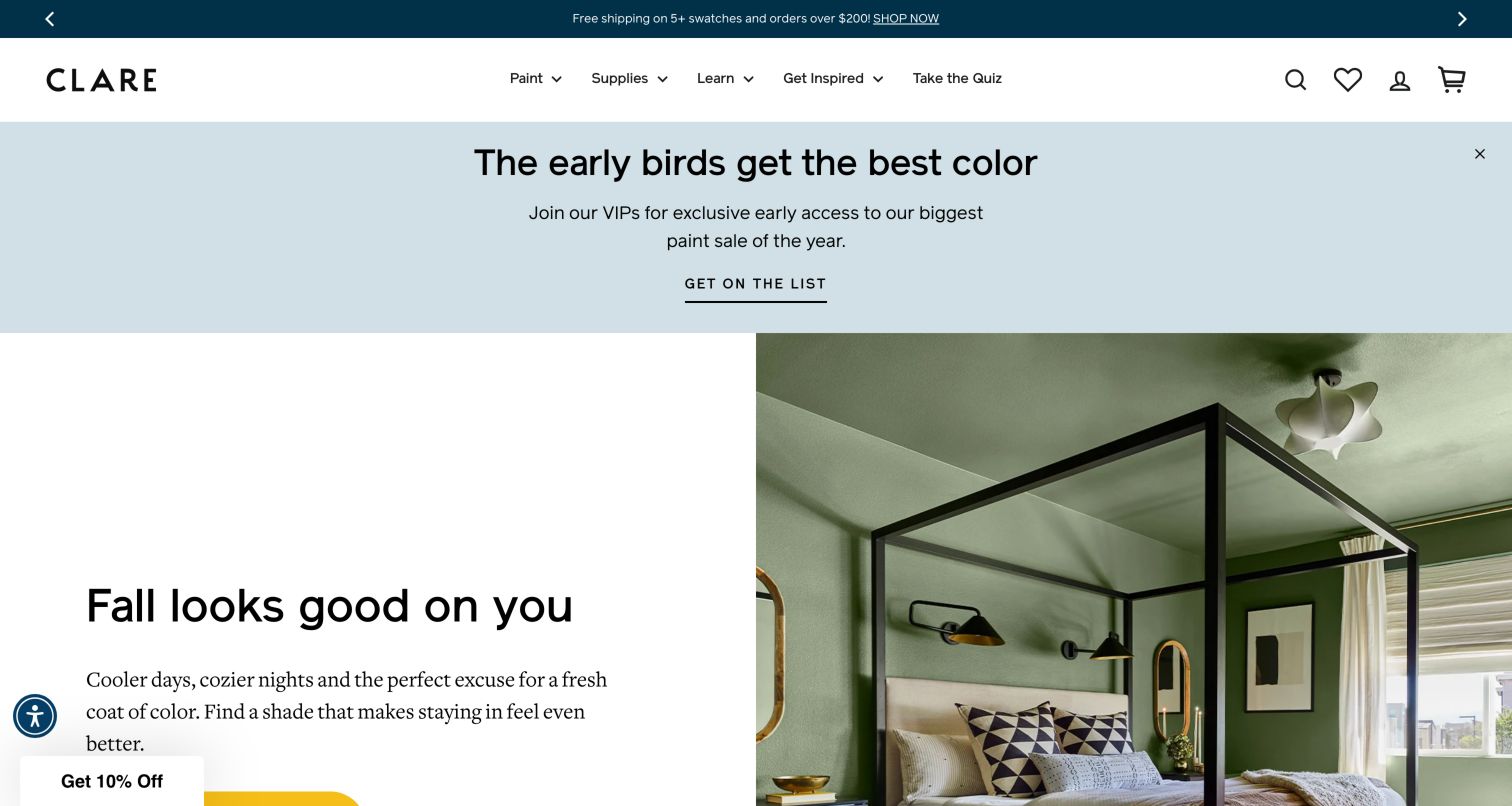
Clare pairs a seasonal green bedroom photograph with a concise message about refreshing a room. The header keeps paint, supplies, learning, inspiration and a quiz separate, while a wide early-access promotion occupies additional space above the room story. Lower down, curated colours, customer imagery and the Color Genius questionnaire create different ways to narrow the range. Product names appear alongside room photographs, helping visitors connect an attractive result to something they can investigate. The website also presents quality and certification claims; those statements are part of its marketing content and were not independently verified here. The layered promotions make the initial screen busier than the core navigation.
What you can learn
Attach identifiable colours to inspirational photographs and make guided recommendations an optional route. Explain what a quiz will ask before beginning it, and give direct browsing equal prominence so experienced customers can reach a known shade without answering project questions.
Pros
Named colours make inspiration photographs more actionable.
A quiz offers an alternative for visitors unsure where to begin.
Cons & considerations
Promotional layers push the main seasonal action lower in the viewport.
Customer testimonials and product claims need context beyond their visual prominence.
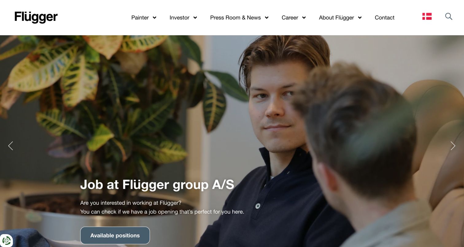
Flügger's group website uses a simple white header with painter, investor, press, career, company and contact routes. The captured carousel slide concerns employment, illustrating that this is a corporate gateway rather than a local paint shop. News and reports follow, while a dedicated paint section points people toward local sites and identifies several brands. Further company material includes locations and a map with factory, store and export-market tabs. That division gives different stakeholder groups a place to begin, but a homeowner arriving through search may need to pass corporate content before recognizing the route to relevant products. Video content is represented by an explicit consent-dependent placeholder.
What you can learn
Make the purpose of a group website clear and expose local product sites early for customers who arrive at the corporate domain. Keep reports, careers and manufacturing information organized for their own audiences, and explain unavailable media without making it the only carrier of essential information.
Pros
Distinct stakeholder routes make the corporate information structure understandable.
Local-site and brand entrances provide a handoff toward product research.
Cons & considerations
A recruitment-led opening is less useful to visitors looking for paint products.
Customers must distinguish group-level information from regional retail destinations.
Kegan is a freelance web designer and developer with 15+ years of experience helping businesses turn complicated website requirements into clear, maintainable digital experiences. He works directly with clients from planning and design through development, launch, and ongoing support.
For paint manufacturer website design, his development approach focuses on color discovery, product specifications, project resources, and retailer information. The scope can be a targeted improvement or a complete custom build, with responsive layouts, thoughtful content structure, and integrations chosen around the people using and maintaining the site.
Show 3 other paint manufacturer website designersHide other paint manufacturer website designers
List homeowner, decorator, designer, specifier and existing-customer needs. Identify which routes require regional information and which can share general advice. Use real task language in navigation instead of internal business-unit names.
Model colour and product separately
A colour may be offered in several products or finishes. Define how colour identifiers, samples, coating families, surfaces and availability connect. Keep product specifications maintained by the responsible team and avoid implying that one room photograph explains every application.
Design a useful sample journey
Explain the sample format and what a visitor can learn from it. Let people return from a sample to its shade and compatible product information. Preserve those associations when a collection name or seasonal promotion changes.
Clarify calculators and consultation
Tell visitors what a quantity tool needs and what its result represents. Keep optional advice or appointment booking distinct from general browsing. Only collect the information needed for the actual service and show a useful confirmation when implemented.
Support retail and specification handoffs
Define destinations for stockists, trade portals, documentation and local sites. Use descriptive link text and retain meaningful context when someone changes domain. Plan recovery when a product is renamed, moved or unavailable.
Review all layers of the first screen
Test the campaign together with privacy, delivery, chat and promotional notices. Several small overlays can hide a main action. Check keyboard access, text enlargement, reduced motion and small screens using the real components and content.
The editing job behind the design
Choose a platform around the product and content model
A direct paint store needs consistent associations between shades, sample formats, finishes and purchasable variants. A corporate coatings site may instead need market-specific product records, regional documentation and a searchable knowledge centre. Define those responsibilities and integrations before selecting a platform based on a homepage effect.
Public stack observations can identify exposed libraries, content systems and delivery services. They do not reveal a manufacturer’s complete ordering process, specification system or internal approvals. Retain the original evidence dates and scopes, and use those observations to frame implementation questions for your own project.
Our WordPress website examples offer a separate look at publishing approaches. A visible platform label is evidence for that named page, not a guarantee that the same system will suit your requirements.
Before the public launch
Paint manufacturer website planning checklist
Colour and product navigation are understandable as separate but connected routes.
Photographed shades have useful names or identifiers where available.
Samples link back to the relevant colour and product information.
Finish and surface guidance is maintained with the product range.
Known product names and codes can be found through search or browsing.
Stockist, direct-shopping and enquiry routes use distinct labels.
The selected region remains clear through a product journey.
Professional documentation is reachable outside promotional slides.
Calculators explain their assumptions and the meaning of the result.
Environmental and performance statements link to appropriate supporting information.
Campaign text remains readable over every image or video frame.
Privacy, delivery and chat notices do not collectively hide essential actions.
These checks are a project checklist, not a performance, legal, security, or accessibility certification. Test real journeys with the people responsible for the website before making claims about the result.
Sources & editorial method
How this collection was selected and reviewed
We inspected twenty-one distinct public paint-brand and coatings-manufacturer properties and saved direct browser screenshots with actual source URLs, capture dates and dimensions. The pre-research random target was twenty-one and was not rerolled. Two obstructed or incompletely rendered candidates were excluded. Reviews concern visible navigation, content and interface patterns; they do not verify coating performance, colour accuracy, environmental claims, certifications or sales results. We did not submit forms, place orders or enter customer accounts. Broad public stack audit attempts are recorded separately and unavailable observations do not justify guessed technologies.
Each example links to its actual source page. Screenshots are direct browser captures with their own capture dates; moving imagery, announcements and live designs can change. The notes describe observable design choices and conditional tradeoffs, not measured traffic, conversion results, service quality, or accessibility conformance.
Technology labels use public page metadata, asset evidence, or explicitly cited platform documentation. Platform documentation is not a complete current deployment audit. A component reference may be legacy or unused; it is not a complete backend inventory. Unknown stacks are omitted. These sites are editorial examples, not our client portfolio.
Written, Edited and Curated are separate editorial records, not timestamps advanced by a rebuild. Website designs and imagery belong to their owners. See our editorial standards or suggest a correction.
Questions worth asking
Paint Manufacturer website design questions
Should colour or product come first on a paint website?
Offer both as clear routes. Colour-first browsing helps an undecided decorator, while product and surface navigation serve someone choosing a coating for a known requirement. Visitor research should decide which receives the strongest initial emphasis.
How can room inspiration become more useful?
Identify relevant colours and link to samples, finishes or practical advice. Explain that photographs and screens cannot replace checking a sample in the actual space. Keep the path from an image to its product context understandable.
What belongs on a corporate coatings homepage?
A clear description of the group, recognizable market entrances and direct routes for customers, investors and other audiences. Customers arriving at the corporate domain should be able to find the appropriate local or specialist product site without reading the full company story.
How should a paint site handle professional visitors?
Give documentation, exact product lookup and relevant contacts stable routes. Separate specialist resources from inspiration while linking them where the task requires it. The actual content owners should determine which market qualifications and technical documents apply.
Do these examples prove a product or website performs well?
No. The collection documents visible design choices and their tradeoffs. It does not measure conversion, verify product claims or establish accessibility conformance. Use the examples to guide project research and testing.
Use these paint website examples to connect a visual idea with a practical decision. Clear sampling, product context and purchase routes make colour inspiration more useful throughout a real decorating project.