A cleaning website needs to explain the work as clearly as it presents the result. These examples show how companies organize recurring visits, deep cleans, move-related work, local service areas, and the first inquiry or booking step.
People comparing cleaners need to know what is included, whether their address is covered, and how the visit will be arranged. A polished room photograph can suggest the result, but checklists, service distinctions, and realistic next-step language make the offer understandable. The best structure for your business follows the way your team actually estimates and schedules work.
This collection ranges from national cleaning networks to regional operators and services that connect customers with professionals. Their different operating models deserve clear explanation. Compare the way each site handles local discovery, household details, price expectations, and customer support, while treating guarantees and review claims as marketing that requires its own evidence.
Before the examples
What makes good cleaning company website design in 2026?
Define the cleaning scope
Distinguish recurring, deep, move-in or move-out, and commercial work where the tasks differ. Provide a readable checklist, explain exclusions and optional extras, and describe what customers should prepare before a visit. A memorable service name should lead to a concrete explanation.
Confirm local availability early
Make service areas easy to inspect before a long contact form. If a national site routes work to a local operator, explain that relationship and preserve the location through the next step. Avoid implying that every service or promotion applies in every area.
Set accurate price and booking expectations
Explain whether a form provides a price, requests an estimate, or begins a booking. Show the factors that affect scope and cost without asking for unnecessary personal details. Distinguish preferred dates from confirmed appointments, and make support options visible.
The collection · 26 examples
26 cleaning company websites worth studying
Compare the service explanation with the first action. Some examples ask only for a ZIP code; others collect household size, frequency, or contact details immediately. The useful pattern is the one that asks a necessary question and explains what comes next.
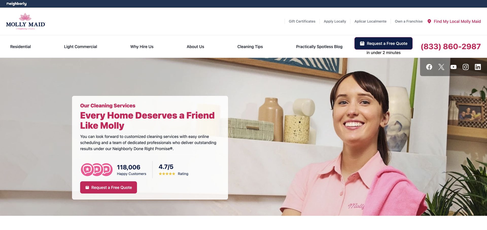
Molly Maid combines a large photograph of a uniformed cleaner with a white message card and pink quote action. Residential and light commercial work have separate navigation labels, while local discovery sits above them. The composition gives the brand a human subject and keeps the first task visible. Displayed ratings support the marketing message, but the more transferable design decision is the clear division between service categories and local inquiry.
What you can learn
Put the service distinction and location route near the first action. Explain what a quote request involves before presenting ratings as the main reason to proceed; customers also need scope, frequency, and local availability information.
Pros
The white card protects the introductory text from a busy photographic background and preserves a clear action.
Residential and light commercial labels acknowledge two audiences whose cleaning requirements may differ substantially.
Cons & considerations
Multiple header layers can become crowded when employment, gifts, editorial content, and service actions all compete.
Prominent rating figures require a current source and should remain secondary to accurate service explanations.
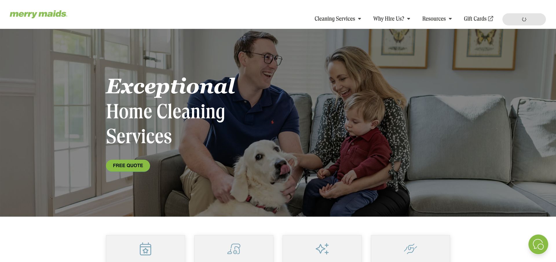
Merry Maids uses a family-and-dog photograph, a large serif headline, and a lime quote button. The upper navigation is relatively restrained, emphasizing services, reasons to hire, and resources. Below the hero, short benefit panels introduce experience, personalization, and the team. The page shows how a cleaning business can make a lifestyle benefit visible without placing a large multi-field form over the entire opening image.
What you can learn
Keep the first screen focused, then turn broad reassurance into practical information below it. Describe service inclusions and scheduling choices before asking the visitor to decide whether the company fits their home and routine.
Pros
A single contrasting quote action provides a clear next step within the quiet photographic composition.
The small set of primary navigation categories avoids exposing every cleaning option at once.
Cons & considerations
Lifestyle photography needs supporting service detail so the actual cleaning offer does not remain abstract.
Experience and trust statements should link to relevant explanations rather than carrying the whole persuasion task.
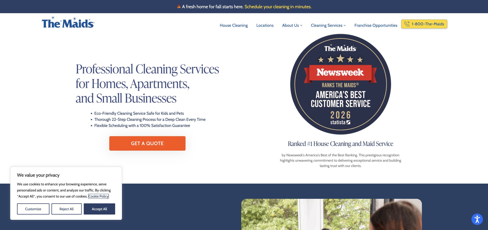
The Maids presents a compact service description and quote button beside a large award graphic. The header provides house cleaning, locations, company information, and service categories. Its page structure also exposes a cleaning-process route, giving readers a place to investigate what the company means by a thorough clean. The visual emphasis on an award demonstrates a credential-led opening, with the practical service statement doing the work of identifying the offer.
What you can learn
If an award is prominent, state its context and keep service scope equally easy to find. A documented cleaning process and room-level inclusions answer different questions from a credential and deserve their own readable destinations.
Pros
The opening service statement identifies homes, apartments, and small businesses before the quote action.
Process and location links provide practical ways to investigate the offer beyond the award presentation.
Cons & considerations
A large award graphic can dominate space that some visitors need for service inclusions or coverage information.
Awards and rankings need dates and context so a visual badge does not imply a broader endorsement.
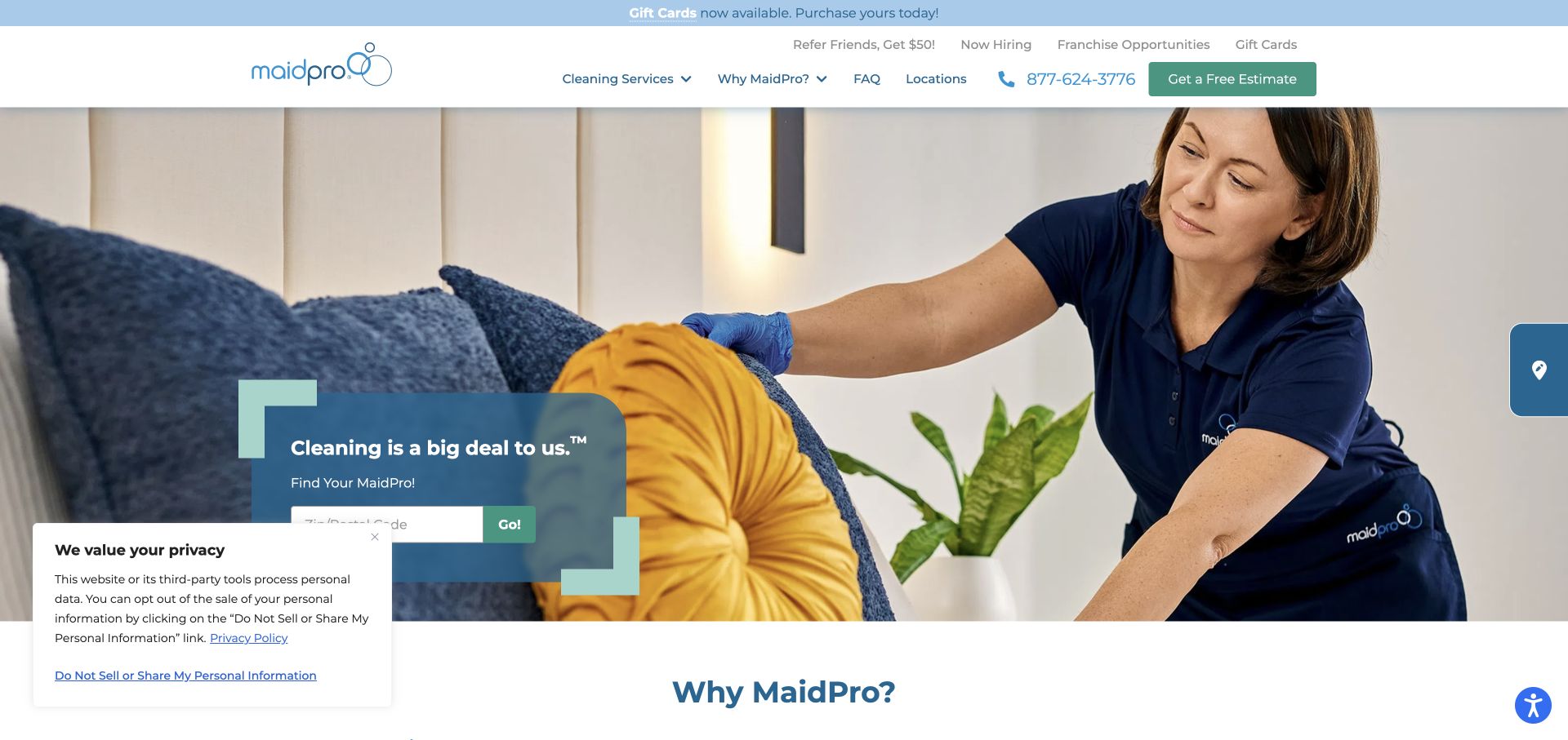
MaidPro shows a cleaner working in a lived-in room, with a small location-search panel over the photograph. The blue-green palette links the form and navigation, while an estimate action remains available in the header. Service pages distinguish property types, and the broader presentation refers to a cleaning checklist. The page makes local discovery a concrete first task, while the worker image conveys the service more directly than an empty-room photograph alone.
What you can learn
Use location entry to establish coverage, then carry that context into service and estimate pages. Explain checklist scope in readable content so visitors understand the work they are considering before they reach a booking or contact step.
Pros
The cleaner-in-action photograph gives the service a concrete human subject and recognizable household context.
Local discovery and an estimate action are visible together without requiring a long form in the hero.
Cons & considerations
A small panel over a photograph needs careful mobile placement so its field and button remain readable.
Checklist-based positioning needs details about exclusions and add-ons rather than only a memorable count of tasks.
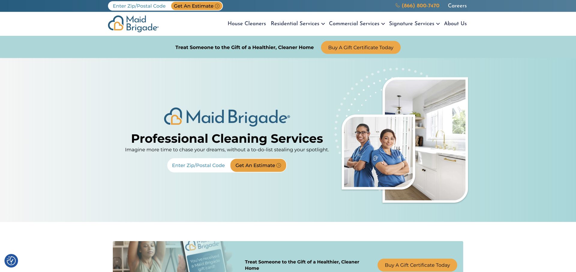
Maid Brigade uses a pale aqua field, rounded photographs of cleaning personnel and rooms, and a postal-code estimate control. Residential, commercial, and signature-service categories appear in the main navigation. A gift promotion occupies a separate strip above the hero. The result gives the central estimate task a consistent visual frame while making the company's different service groups visible. It is especially useful to compare how the locality question is repeated without requiring a full contact form immediately.
What you can learn
Ask for service area early when coverage determines the next step. Keep seasonal offers visually subordinate, and give each service group a plain description that clarifies what differs between household, commercial, and specialized cleaning work.
Pros
The postal-code control makes the local-availability question concrete before requesting more detailed customer information.
Distinct service categories prevent commercial and household cleaning from being presented as one identical offer.
Cons & considerations
Repeating estimate controls should preserve consistent labels so readers understand they begin the same process.
Promotional strips need an expiry review so gift or seasonal messages do not compete indefinitely with core services.
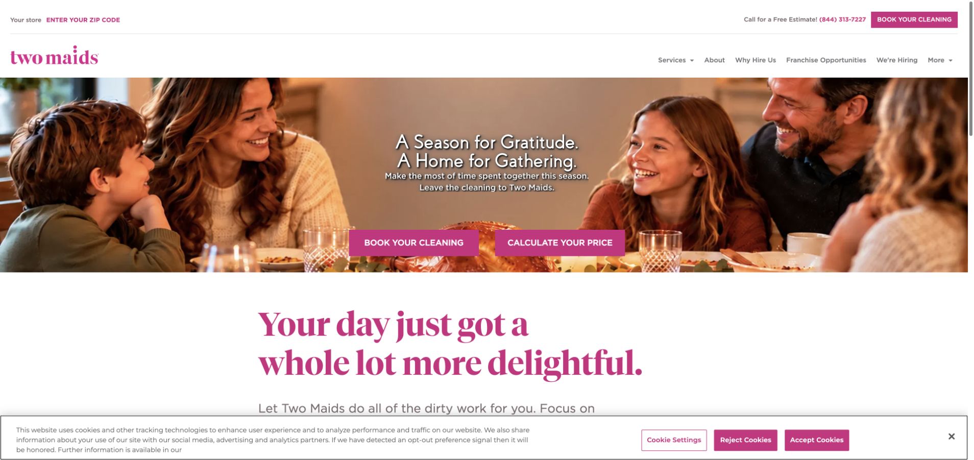
Two Maids uses a seasonal family-gathering photograph with separate booking and price-calculation actions. Its burgundy identity continues into a large statement below the hero, while ZIP-based store selection remains in the header. The layout separates the emotional reason for cleaning from two practical next steps: understanding cost and arranging service. The visible seasonal content also makes maintenance responsibility clear, because the opening depends on the campaign remaining relevant to the date and audience.
What you can learn
Offer pricing information and booking as distinct paths when they represent different user intentions. Keep campaign copy current, and ensure the local store selection follows visitors into the relevant service details instead of resetting their journey.
Pros
Two clearly named actions distinguish researching a price from beginning a cleaning booking process.
The family-gathering image gives a seasonal campaign a recognizable household context rather than an abstract offer.
Cons & considerations
Seasonal hero material needs planned replacement and should not become the permanent explanation of the business.
Local selection must clarify availability before a national campaign implies that every offer applies to every visitor.
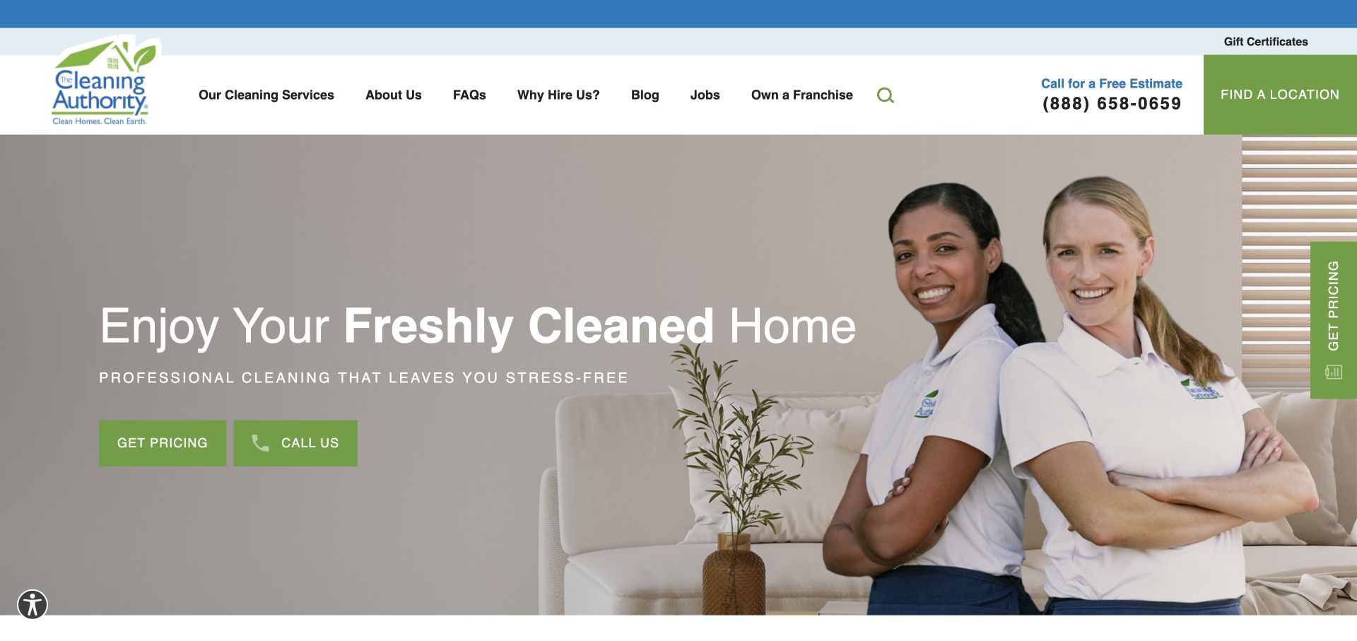
The Cleaning Authority places two uniformed cleaners on the right of the hero and a concise home-focused message on the left. Green buttons distinguish pricing and phone contact, while location discovery remains in the header. A vertical pricing tab adds another entry point. The page gives visitors several ways to continue, but keeps the principal choices close to the introduction. Its staff photograph helps the page describe a service relationship rather than merely showing the desired result.
What you can learn
Provide a small set of contact methods with clear purposes. If pricing actions appear in several places, route them consistently and explain whether visitors will see an estimate, choose a location, or receive a follow-up conversation.
Pros
The staff portrait makes the people delivering the service part of the initial brand presentation.
Pricing and call actions support visitors who prefer different ways to ask about cleaning work.
Cons & considerations
Repeated pricing entry points can feel intrusive if they cover content or lead to inconsistent destinations.
A reassuring home message still needs clear inclusions, scheduling options, and local coverage on subsequent pages.
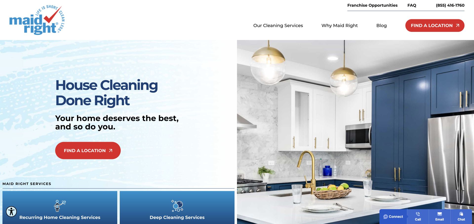
Maid Right uses a pale blue text area beside a bright kitchen photograph, with a red location action. Service tiles begin immediately below, distinguishing recurring, deep, move-related, and light commercial cleaning. The structure makes locality the first decision while exposing the main service range early. In the captured view, the large chat panel has been closed, leaving a compact support bar. That makes the underlying service hierarchy easier to assess without an overlay competing for the same space.
What you can learn
Establish local availability, then make the major cleaning types easy to compare. Support widgets should remain dismissible and should not cover the service choices that visitors need to determine whether the business is relevant to them.
Pros
The red location action stands out clearly against the pale blue and white introductory layout.
Early service tiles expose recurring, deep, move-related, and commercial options without a long explanatory paragraph.
Cons & considerations
A location-first route should preserve the selected service context rather than forcing visitors to begin again.
Automatically expanded chat panels can obscure important choices and deserve careful review on smaller screens.
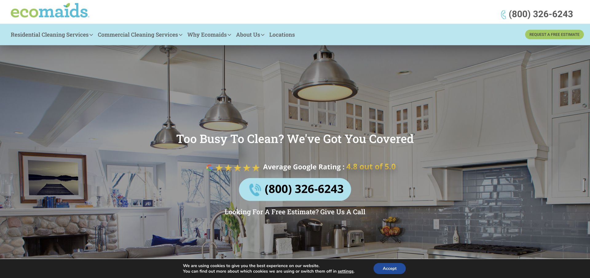
ecomaids places a centered message over a broad kitchen-and-living-room photograph. A large phone action and estimate invitation are more prominent than a detailed form, and the navigation distinguishes residential and commercial cleaning. Its green identity and company name establish an environmental theme, while the page's service content must explain the practical meaning of that theme. The layout is useful for studying a phone-led inquiry path that remains visually connected to the household setting.
What you can learn
Translate environmental positioning into specific, supportable descriptions of products and practices. Keep those details accessible from service pages, and let customers choose a telephone or estimate route without requiring them to accept broad health or safety implications.
Pros
The large phone action makes direct contact easy to identify within the centered hero composition.
Separate residential and commercial navigation gives the broad cleaning offer a useful initial structure.
Cons & considerations
Environmental branding needs precise supporting detail and should not imply unverified health or safety outcomes.
Text over a detailed room photograph needs sufficient contrast across different image crops and device widths.
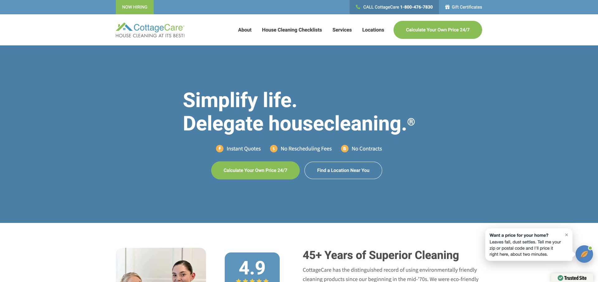
CottageCare uses a large blue opening area with a short delegation-focused headline and a prominent price-calculation action. A location option sits beside it, while the header links directly to cleaning checklists and services. The sparse opening gives the estimate task room to stand out. The website's stated policy benefits sit near the action, so the useful design question is how clearly those terms are explained once a visitor proceeds to a quote or service page.
What you can learn
If price calculation is the main promise, describe what inputs affect it and where conditions apply. Pair the calculator with a visible checklist so visitors can understand what the quoted service covers before comparing it with another cleaning offer.
Pros
The uncluttered opening gives the price-calculation action a clear visual priority without a large contact form.
A direct checklist link treats service scope as a primary research need rather than hidden supporting content.
Cons & considerations
A calculator label creates an expectation of useful pricing information that the destination must actually fulfill.
Short policy claims beside a quote action need accessible conditions, particularly when scheduling or contract terms vary.
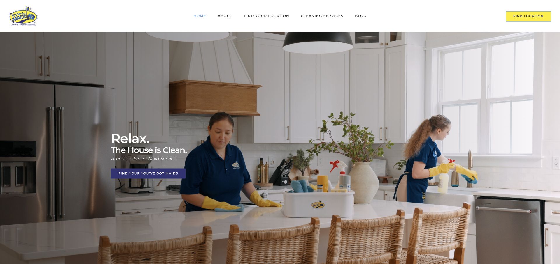
You've Got Maids shows two cleaners working in a bright kitchen, with a short relaxation-focused message placed to one side. The white header uses a small set of conventional links and a yellow location action. The hero keeps copy brief and allows the service activity to carry much of the introduction. This makes the page a useful example of a low-density opening, where locality and service details must be available through clear destinations rather than being packed into the image.
What you can learn
A quiet hero can work when the next pages answer practical questions promptly. Keep local discovery obvious, and connect the short emotional promise to cleaning scope, frequency, and the process for requesting an estimate in the visitor's area.
Pros
The photograph shows cleaning work in progress, giving the minimal message a concrete service context.
A simple header and contrasting location action maintain a readable hierarchy across the introductory screen.
Cons & considerations
Small overlaid copy may need larger sizing or a different position when the photograph is cropped for mobile.
A very short introduction leaves service coverage and inclusions dependent on the clarity of linked pages.
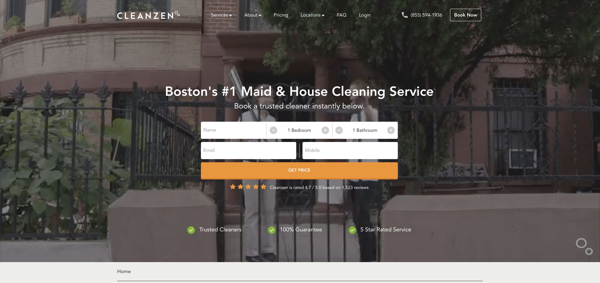
Cleanzen places a compact inquiry form over a Boston streetscape, using bedroom and bathroom choices alongside contact fields. The darkened photograph keeps the white form visible, while pricing and FAQ links remain in the header. The city reference helps establish local context before the visitor reaches the service details. This is a form-led design whose main tradeoff is visible immediately: it collects contact information early, even though some readers may still be comparing the cleaning scope.
What you can learn
Make the purpose of each initial field clear and distinguish a price calculation from a request for follow-up. Provide a nearby path to service inclusions and pricing conditions so cautious visitors can research before sharing contact details.
Pros
Bedroom and bathroom choices show which household characteristics influence the initial cleaning inquiry.
Pricing and FAQ navigation offer research paths alongside the prominent form and booking action.
Cons & considerations
Early contact fields can feel premature when visitors have not yet established coverage or cleaning scope.
A dark photographic background needs careful contrast for small labels, helper text, and validation messages.
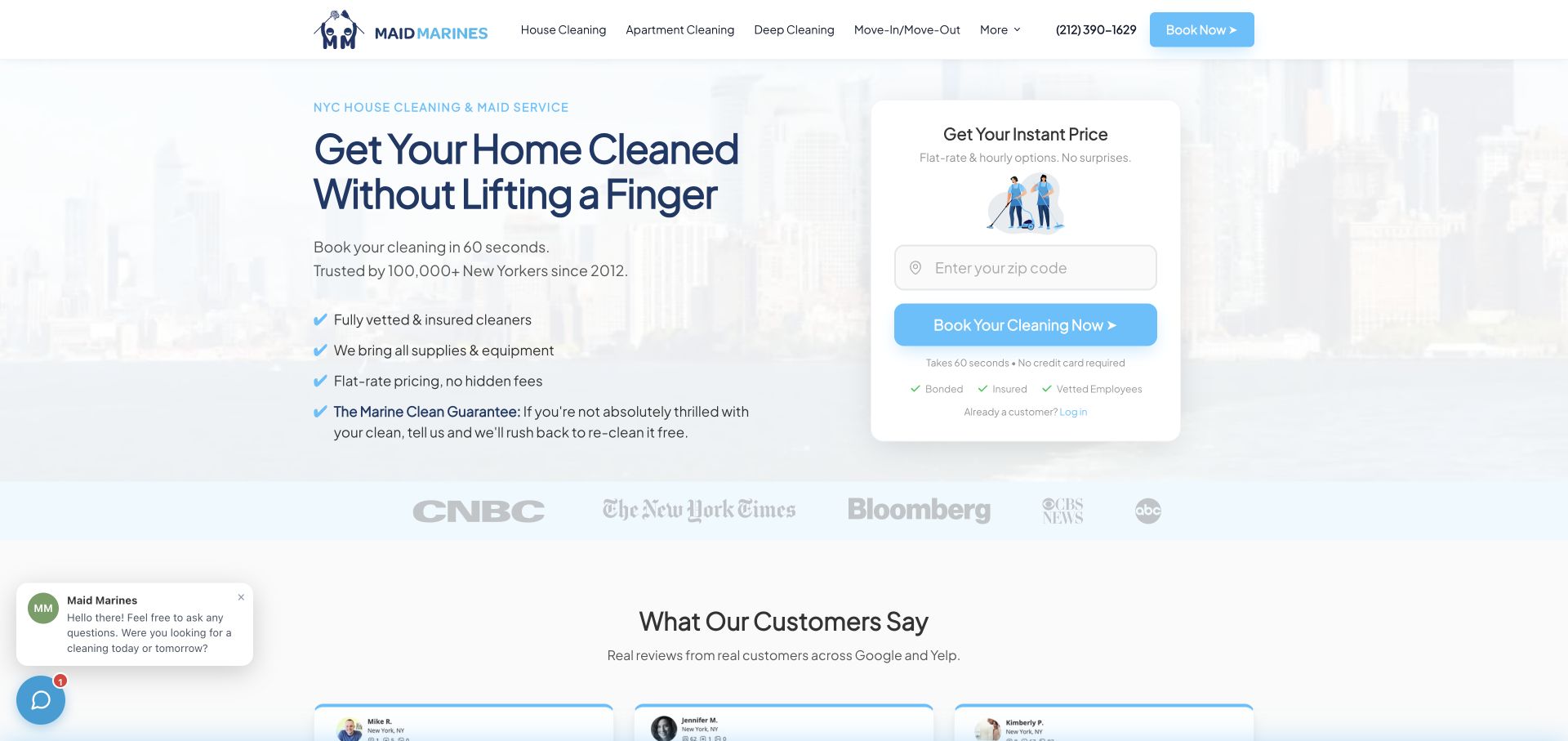
Maid Marines uses a pale city backdrop and a white price card with a ZIP field. The left side explains the cleaning offer in short lines, while navigation distinguishes house, apartment, deep, and move-related cleaning. A row of media marks and customer-review content follows below. The layout makes the first task small and easy to locate. Its usefulness comes from the service-category clarity and minimal initial location question, rather than the promotional numerical claims surrounding it.
What you can learn
Begin with the smallest question that determines availability, then explain the next step before collecting a full booking. Keep media and review references assessable, and ensure service pages define how apartment, deep, and move-related cleans differ.
Pros
The separate pricing card makes the ZIP question visible without a large block of contact fields.
Named cleaning categories give visitors direct routes to the type of work they are considering.
Cons & considerations
A quick-booking promise needs a clear explanation of the information and conditions involved after the first step.
Media logos and review counts require source context and should not substitute for scope or availability details.
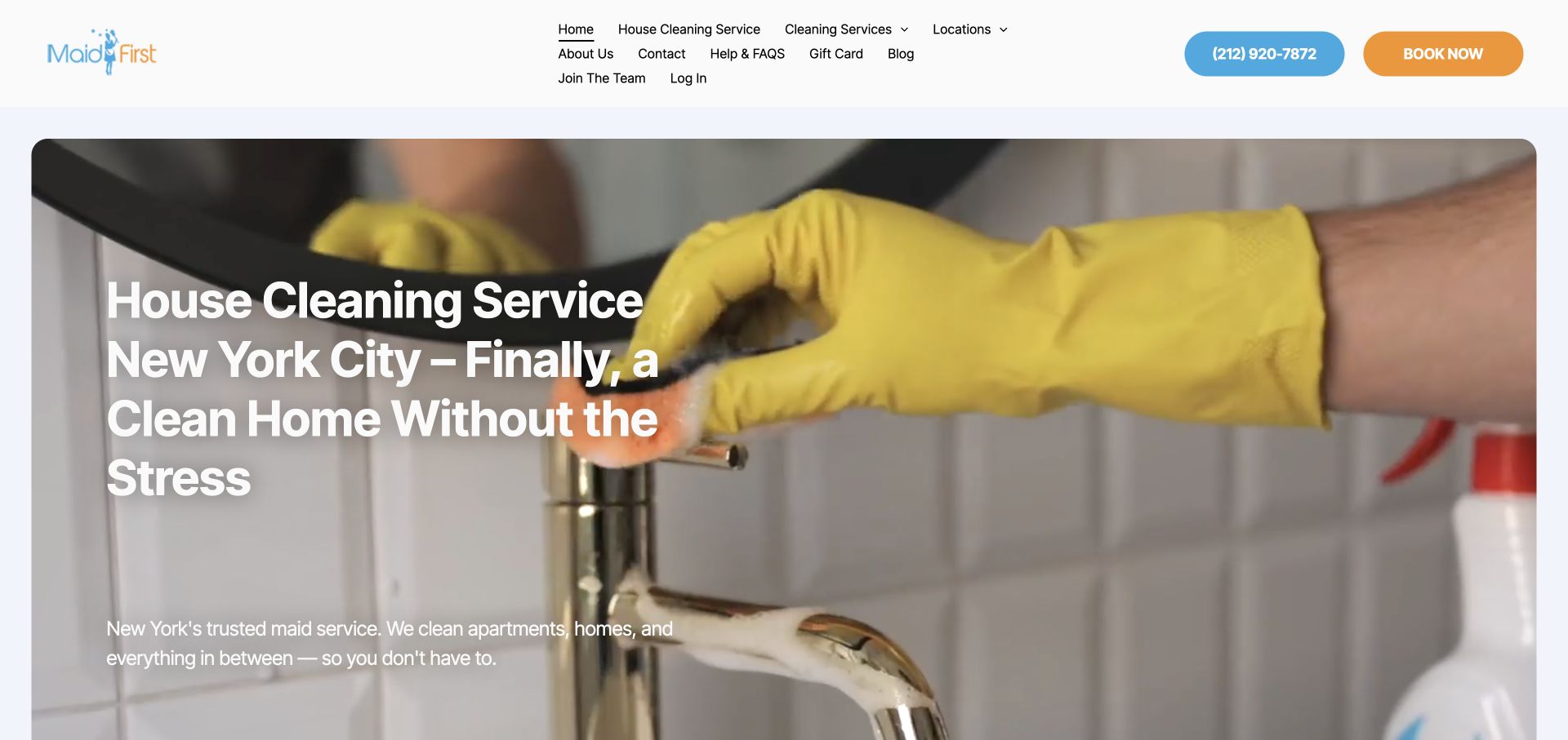
Maid First opens with a close photograph of gloved cleaning work and a large New York City service headline. Telephone and booking actions appear in the header, beside a dense set of navigation links. The image makes the cleaning task unmistakable, while the menu exposes household, office, and other service information. This example is useful for comparing a strong, concrete hero with a navigation system that carries many different destinations in a relatively small amount of space.
What you can learn
Use a specific service image to establish context, then group navigation around the questions visitors are likely to ask. Move lower-priority company and account links into a secondary area when the main service menu becomes difficult to scan.
Pros
The close view of cleaning equipment makes the service activity clear without relying on an empty-room image.
Phone and booking actions provide identifiable next steps in the header rather than only below the fold.
Cons & considerations
A tightly packed navigation area can make important service choices harder to identify at ordinary desktop widths.
A large overlaid headline needs responsive sizing so it does not conceal most of the useful image on mobile.
Visible tech stack
Referenced on the public page
Duda
nginxReported response header
Public source checked November 3, 2026. References may be embedded or legacy—not a complete backend inventory.
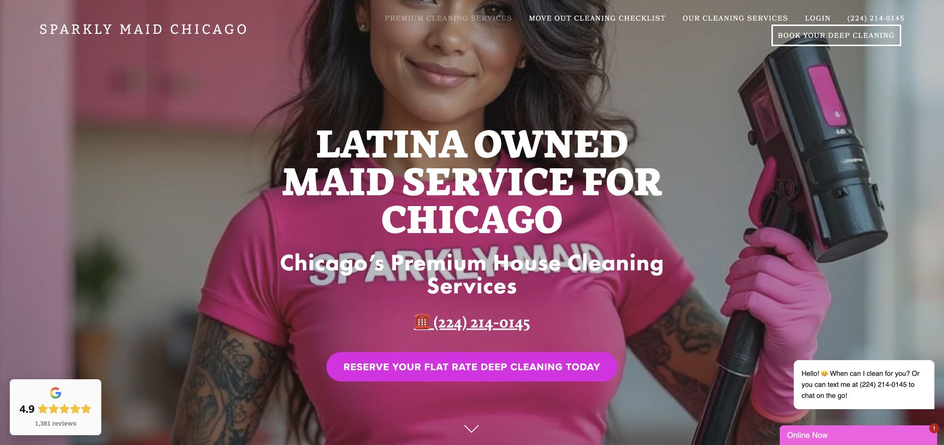
Sparkly Maid Chicago uses a vivid pink uniform, a cleaner holding equipment, and a large ownership-focused headline. The local identity is explicit, and the main action points to flat-rate deep cleaning. The header also exposes a move-out checklist and service page. This presentation gives the business a distinct personality within a category often dominated by neutral room photography. The review concerns how that identity is expressed, without inferring anything about the photographed person's identity beyond the website's own statement.
What you can learn
Connect a distinctive brand story to a specific service and a useful scope explanation. When a flat-rate or deep-cleaning offer leads the page, make the checklist and conditions easy to reach so the strong personality does not leave the work ambiguous.
Pros
The vivid cleaner portrait and local headline create a recognizable identity with a concrete service subject.
A move-out checklist link acknowledges a practical information need alongside the prominent deep-cleaning action.
Cons & considerations
Large uppercase typography can consume substantial space and needs careful line breaks on narrow displays.
Flat-rate language requires clear conditions and exclusions before visitors can interpret it as a complete price promise.
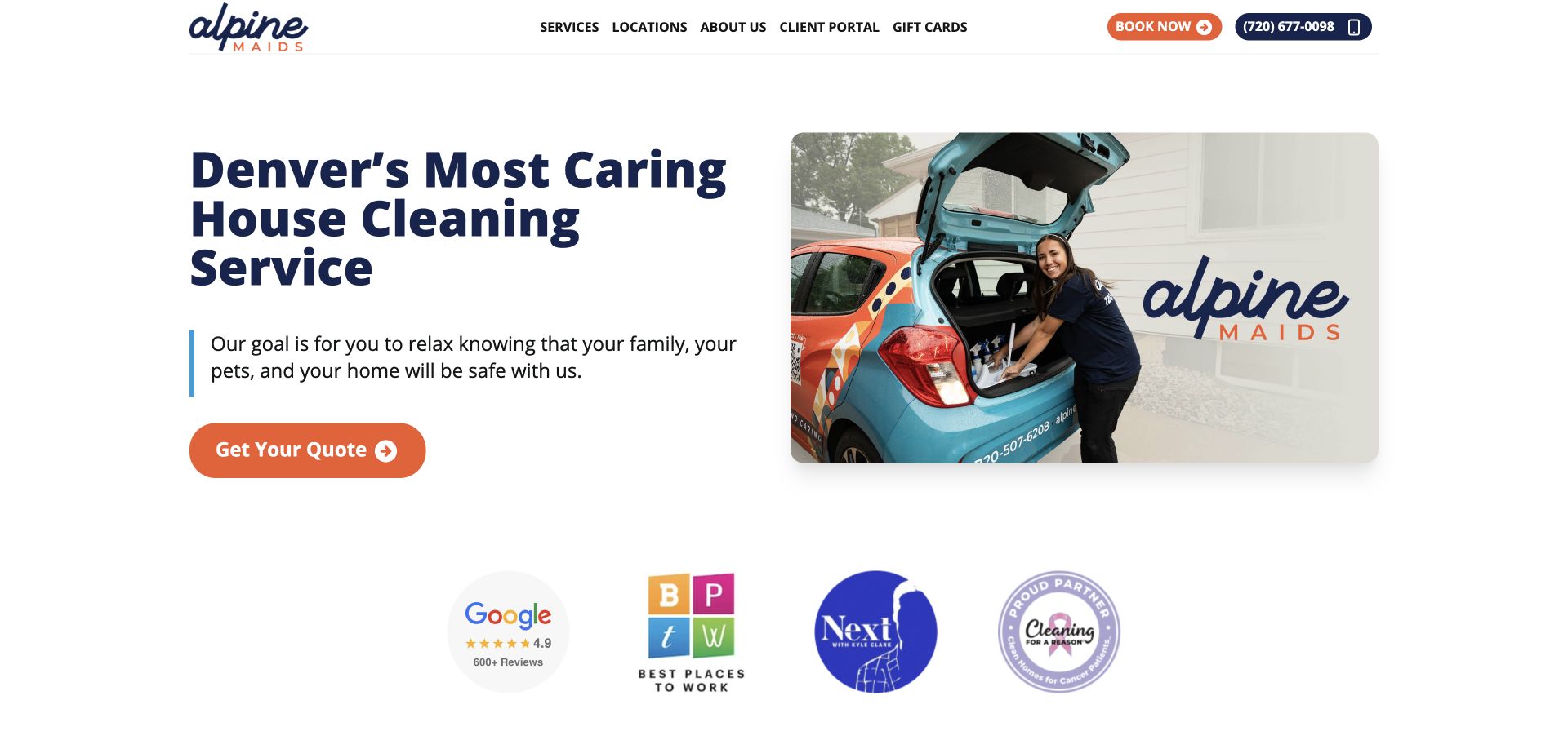
Alpine Maids places a Denver-focused headline beside a photograph of a staff member at a branded vehicle. The white layout, navy typography, and orange quote action create a clear hierarchy. A row of review and organization marks appears below, while services, locations, and a client portal stay in the header. The page's most useful feature is the specific operational image: it shows a person and equipment arriving to do the work rather than only presenting an idealized finished room.
What you can learn
Choose photographs that explain how the service appears in a customer's everyday context. Pair the local introduction with a clear quote route and service-area information, and give any trust marks enough context that visitors can investigate their meaning.
Pros
The staff-and-vehicle image gives the regional service a tangible operational identity and a human point of focus.
White space and a contrasting quote button keep the first action easy to distinguish from supporting marks.
Cons & considerations
A caring-service statement needs concrete details about communication, scope, and scheduling on linked pages.
A row of badges can become visual decoration unless labels or links explain the relevance of each mark.
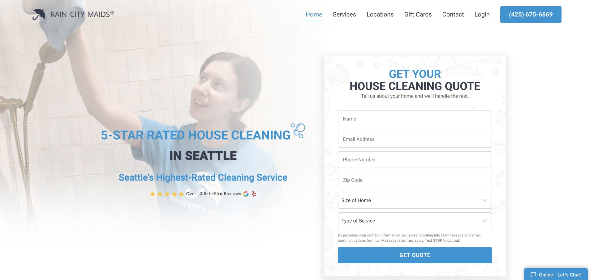
Rain City Maids pairs a Seattle-focused cleaning message with a tall quote card asking for contact information, ZIP code, home size, and service type. A cleaner photograph fades behind the introductory text, keeping the white form visually distinct. The header remains compact, with services, locations, contact, and login. The design exposes the information-gathering task immediately, making it a useful reference for businesses whose estimates depend on both household dimensions and the requested cleaning level.
What you can learn
Explain why the quote requires home size and service type, and make required fields unambiguous. Visitors should know whether the next result is a price, a callback, or another step, especially when contact information is collected before any estimate appears.
Pros
Home size and service type are visible estimate inputs rather than hidden questions introduced late in the journey.
The white quote card separates the task from the photographic introduction and simple navigation.
Cons & considerations
A tall form can dominate the first screen and may need a staged presentation on smaller devices.
Contact-heavy inquiries need a clear next-step explanation for visitors who expect an immediate price response.
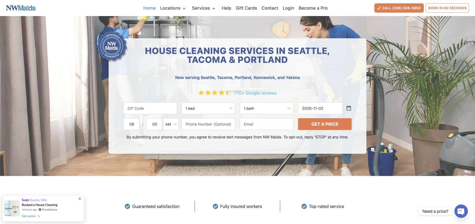
NW Maids places its Seattle, Tacoma, and Portland coverage inside a central panel over a cleaning photograph. The inquiry grid includes ZIP, room counts, date, and contact fields, with an orange price action. A short benefit strip follows below. This design shows several scheduling and household inputs at once, making the service task visible but also dense. The regional city list is a useful anchor for visitors who need to establish coverage before understanding the rest of the process.
What you can learn
Keep service-area language close to booking inputs and explain whether selected dates indicate a request or confirmed availability. Review a dense field grid carefully on phones, where a staged flow may be easier to understand than a compressed desktop arrangement.
Pros
The named cities give the regional offer an immediate geographic context before the visitor starts the form.
Visible date and room-count fields reveal the main information the initial cleaning request will require.
Cons & considerations
Several compact fields in one row can become difficult to label and validate clearly on small screens.
Date entry must distinguish a preferred appointment from confirmed capacity so the form does not create false expectations.
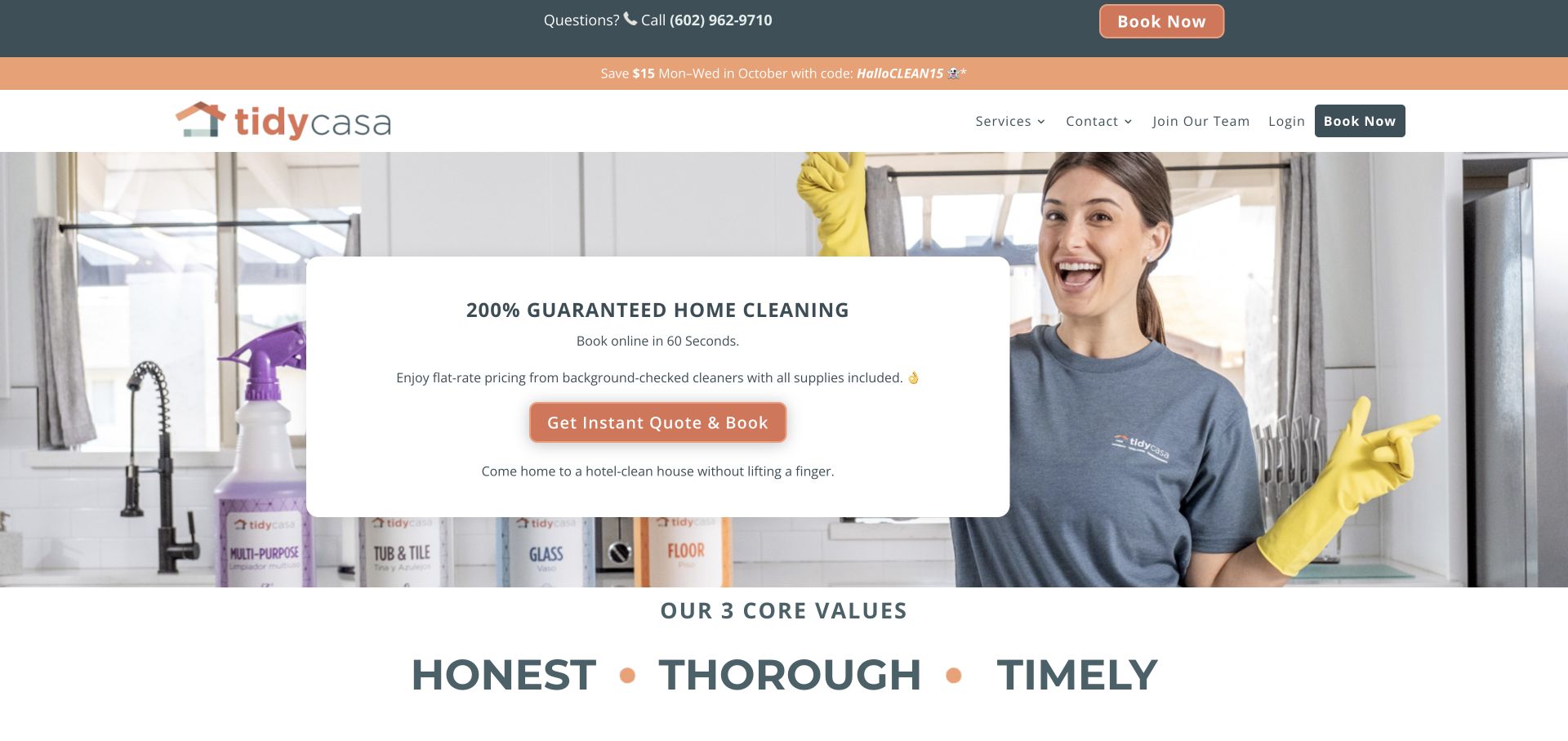
Tidy Casa places a white quote card over a cleaner photograph and uses warm orange accents for the main action. The card combines a booking promise, a brief scope statement, and an instant-quote route. Below it, three large value words introduce the company's character. A seasonal promotion appears in the upper strip. The composition gives the central inquiry a clear frame, while also showing the maintenance risk of a campaign message that can remain visible after its advertised period.
What you can learn
Keep the main offer durable and review promotional strips on a separate schedule. Translate brand values into observable process information, such as what is included, how timing is arranged, and how customers can ask for a correction or clarification.
Pros
The centered white card gives the inquiry action a defined, readable place within the service photograph.
The three-value section creates a simple bridge from the initial offer into the company's stated approach.
Cons & considerations
An out-of-date seasonal promotion can create uncertainty even when the main service message remains clear.
Large guarantee language needs accessible terms so visitors understand the remedy and the limits of the promise.
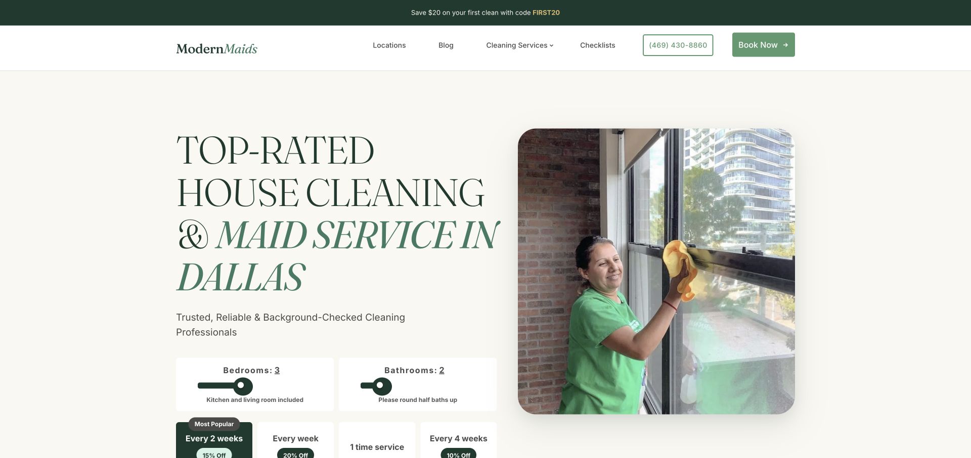
Modern Maids pairs a large serif Dallas headline with a working-cleaner photograph and green accents. Room-count controls and cleaning-frequency choices begin directly below the introduction. Further content includes neighborhood coverage, service descriptions, room checklists, and before-and-after images. This gives the page more depth than a single quote form. The useful pattern is the connection between household characteristics, visit frequency, and scope information, which helps readers understand the dimensions of the service they are comparing.
What you can learn
Explain how size, frequency, and cleaning level relate before asking visitors to choose a plan. Room checklists and examples can support that comparison, but pricing conditions and any claims about alternatives should remain precise, current, and appropriately qualified.
Pros
Frequency choices are visible alongside household-size controls, making recurring service an explicit decision.
Room-level checklists and neighborhood information provide practical research material beyond the opening booking interface.
Cons & considerations
A long page needs clear anchors and hierarchy so detailed scope information remains easy to find.
Comparisons with independent cleaners require careful substantiation and should avoid treating every alternative as identical.
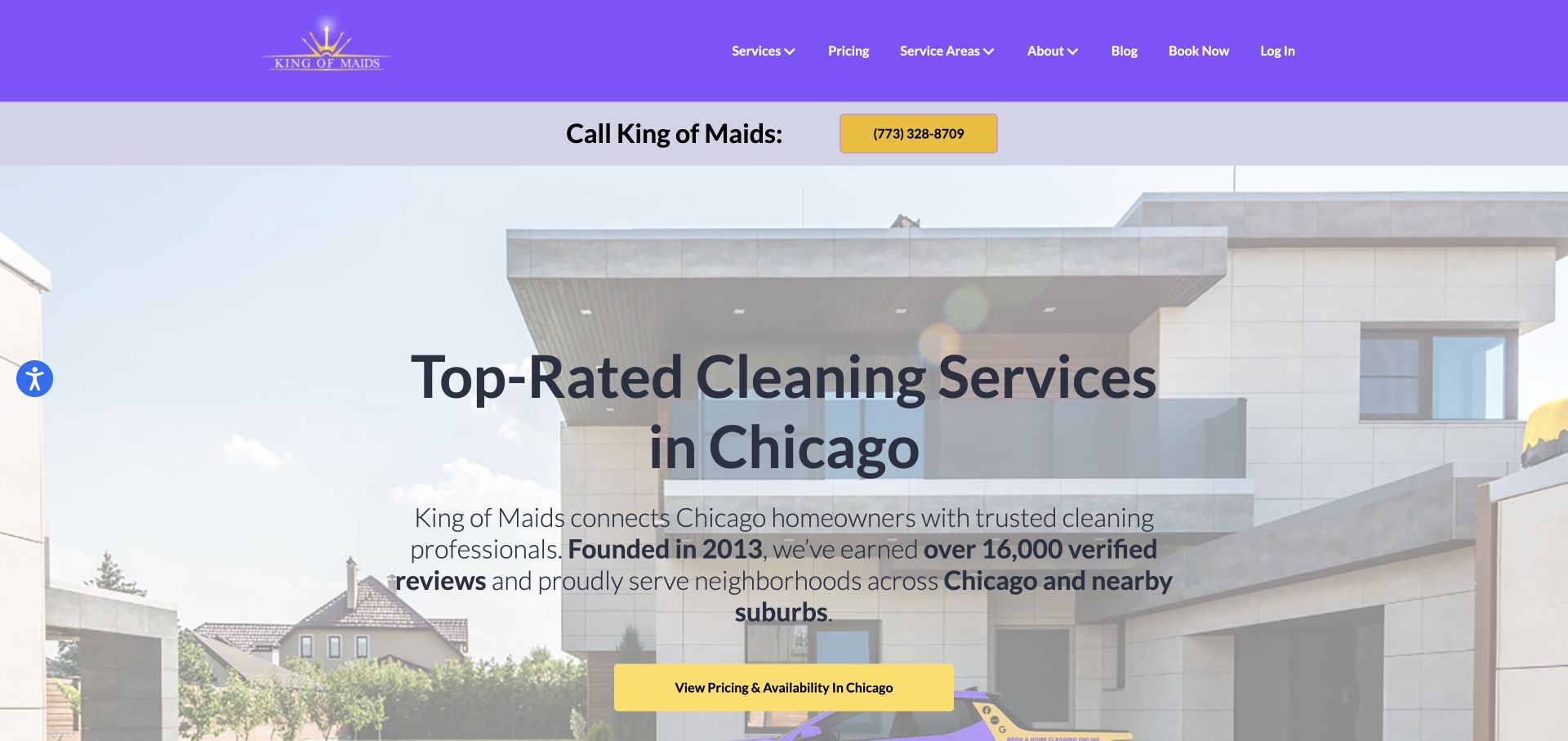
King of Maids uses a purple header, a residential exterior image, and a large Chicago-focused introduction. Its copy describes connecting homeowners with cleaning professionals, while a yellow action leads toward pricing and availability. Services, pricing, and service areas are visible in navigation. The distinction between providing work and connecting customers to professionals matters here: the website structure should make the operating model and responsibility clear, rather than letting visitors infer it from a familiar cleaning-company layout.
What you can learn
State who performs the cleaning and who handles customer questions or problems. Keep pricing and area discovery close to that explanation so visitors understand both service availability and the relationship they are entering before they proceed to booking.
Pros
Pricing and service-area links give visitors useful research routes alongside the prominent local introduction.
The opening copy identifies a connecting role instead of relying entirely on a generic cleaning-service slogan.
Cons & considerations
Large review totals need source context and should not blur reviews of different providers or service locations.
The relationship between the website, cleaners, and customer support needs explicit detail beyond the homepage wording.
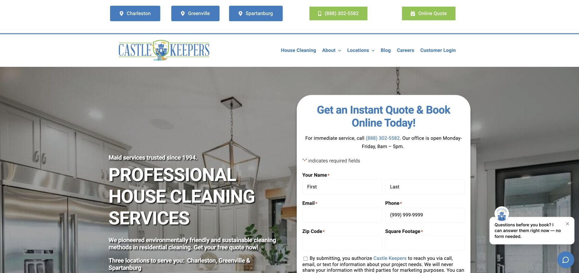
Castle Keepers places Charleston, Greenville, and Spartanburg links prominently above its main navigation. The hero pairs a house-cleaning message with a rounded quote card containing contact, ZIP, and square-footage fields. The local links make coverage concrete before the form begins. A kitchen photograph supplies context, while the estimate panel carries the main task. The design is useful for regional businesses that want to combine local relevance with a standardized inquiry process across more than one market.
What you can learn
Expose real service areas in plain language and preserve the selected location through the inquiry. If square footage affects estimates, explain how visitors should provide it and what happens when they do not know an exact figure.
Pros
Three named market links make the company's geographic coverage visible without requiring a location search first.
The quote card groups household and contact details in a distinct area beside the service introduction.
Cons & considerations
A large form can crowd the first screen and should be checked for readable spacing and labels on mobile.
Regional pages need substantive local information so location links do not simply repeat an identical generic introduction.
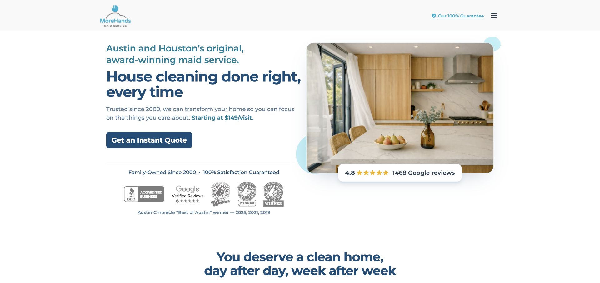
MoreHands combines a concise Austin-and-Houston introduction with a bright kitchen image and a dark quote button. A displayed starting price appears in the explanatory copy rather than as a giant promotional graphic. Review and award marks sit below the action, and the main menu is compact. This composition keeps the inquiry route prominent while giving readers an initial price reference. That reference is only useful when the destination explains the service scope and conditions that make the starting amount applicable.
What you can learn
Place any starting-price statement beside a clear explanation of what affects the final estimate. Keep the service-area and scope details easy to reach from a compact menu, and do not let a small price reference imply that all homes receive the same service.
Pros
The split layout balances a clear text introduction with a useful household image and one dominant action.
The starting-price reference is integrated into the service explanation rather than overwhelming the entire opening screen.
Cons & considerations
A compact menu may conceal service inclusions that price-conscious visitors need before requesting an estimate.
Starting prices and review marks require current context and should remain distinct from a confirmed quote for a particular home.
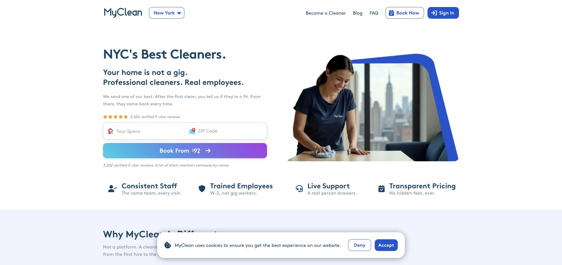
MyClean uses a spacious white layout with a New York selector, a short staffing-focused introduction, and a ZIP-based booking control. A cleaner photograph sits inside a blue geometric frame. Below the first action, icon labels introduce consistent staff, training, support, and pricing. The page gives the employment and continuity story a central role, rather than leading with an empty-room photograph or a discount. Those statements remain company claims, but their placement shows a clear choice about what the brand wants customers to evaluate.
What you can learn
If staffing continuity is a differentiator, explain the actual customer process and its limits. Connect the short value labels to details about scheduling, substitutions, and support so the story becomes useful operational information before someone makes a booking.
Pros
The ZIP control keeps the first booking question small within an otherwise uncluttered introductory layout.
Staffing and support themes form a coherent message across the headline, photograph, and supporting icon row.
Cons & considerations
Continuity claims need clear exceptions and process detail rather than implying the same cleaner is always guaranteed.
A displayed starting amount should explain its scope and conditions before customers compare it with another quote.
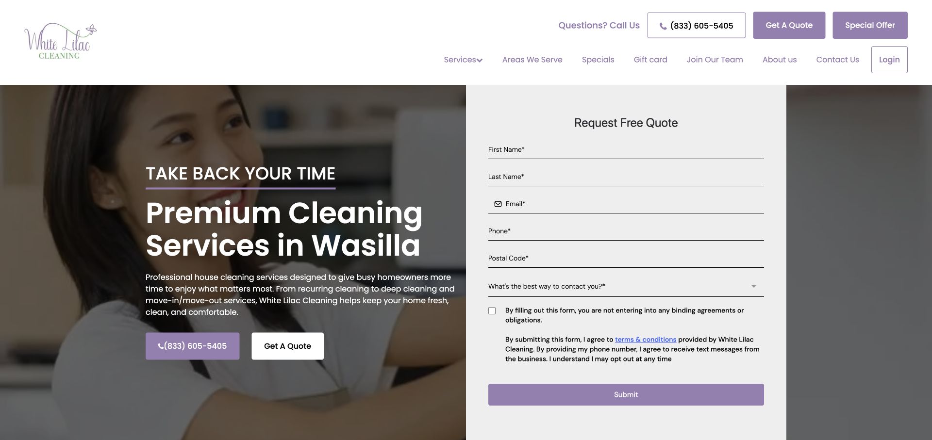
White Lilac Cleaning places a Wasilla-focused introduction beside a tall inquiry panel over a cleaner photograph. Purple actions connect phone contact, a quote request, and the form. The fields include contact details, postal code, and a preferred contact time, making the follow-up nature of the interaction more apparent. Navigation includes service areas and specialist services. The design gives a local business a concrete geographic identity while exposing the amount of information it asks visitors to provide.
What you can learn
Match the form to the real follow-up process and explain why each field is needed. A preferred contact time can be helpful when the business actually uses it; otherwise, reduce the request and keep the service-area and scope information easy to find.
Pros
The named local market establishes relevance before visitors reach the quote panel or service-area navigation.
A contact-time question acknowledges that an inquiry may lead to a conversation rather than an immediate booking.
Cons & considerations
A tall contact form can require substantial mobile scrolling before the visitor has inspected cleaning inclusions.
Service claims and contact promises should be consistent across the main page and any location-specific destinations.
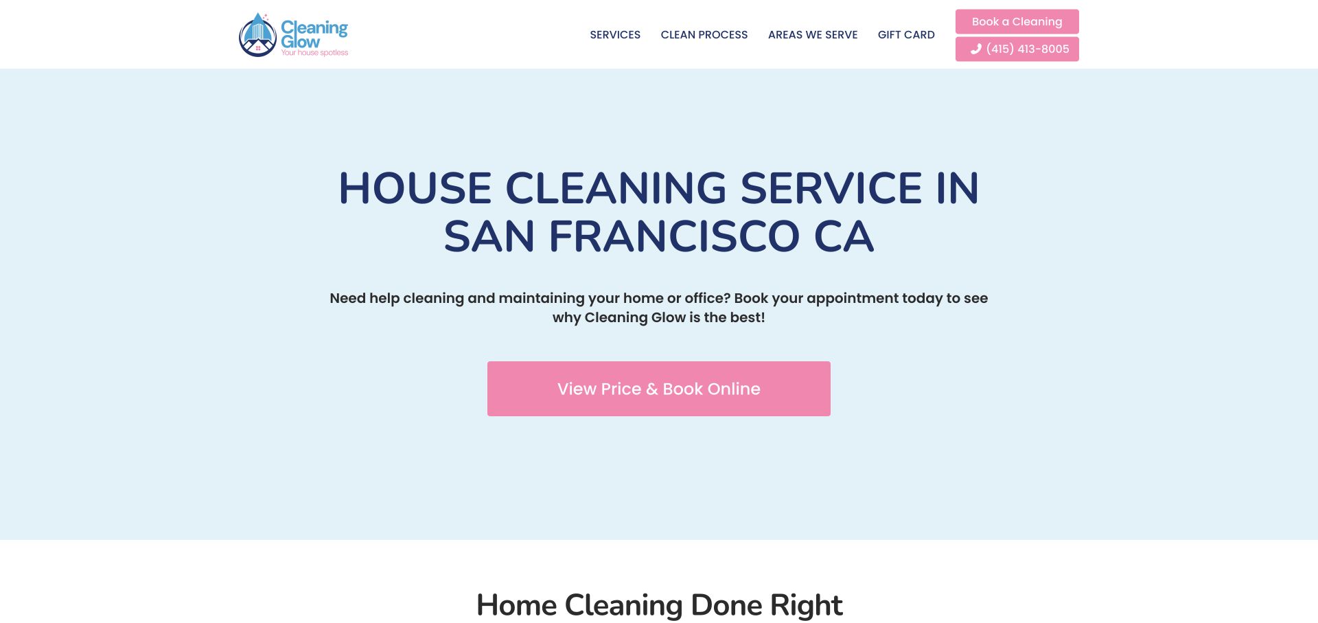
Cleaning Glow uses a pale blue field, a centered San Francisco service headline, and a pink price-and-book button. The header keeps services, process, service areas, and gift information visible without a large form. The next section begins with a cleaning-process introduction. The opening demonstrates a direct, low-density approach: it identifies the city and task, then sends interested readers toward pricing. Longer explanatory copy below should support that clarity and avoid making broad claims that the service cannot substantiate.
What you can learn
A simple hero can answer the essential location and service questions quickly. Use the rest of the page to explain scope and process in respectful, concrete language, and make the pricing destination match the promise of the button.
Pros
The centered city-and-service statement makes the basic offer easy to recognize without reading a long paragraph.
A single pink action has a clear purpose and remains visually distinct from the restrained navigation.
Cons & considerations
A minimal introduction needs useful service and process content nearby so visitors can investigate fit before booking.
Broad health or judgmental housekeeping statements in supporting copy can distract from a practical, customer-focused explanation.
Plan the service information before the booking screen
Write the scope matrix
List what each cleaning type includes, what it excludes, and which extras can be requested. Use those distinctions to build pages and estimate questions. Keep room-level details consistent so customers do not receive conflicting descriptions in a checklist, FAQ, and booking flow.
Map inquiry to scheduling
Document how a request reaches the team, who confirms coverage, and when a date becomes an appointment. Ask only for information that supports those decisions. Provide a clear alternative for unusual properties or work that needs a conversation before an estimate.
Maintain proof and local details
Assign owners for service areas, phone numbers, offer dates, reviews, and guarantee language. Explain the operating model accurately, including who performs the work and handles questions. Review seasonal promotions separately from the durable service content so expired messages do not linger.
The editing job behind the design
Choose tools around service scope and scheduling
The content system should make service types, checklists, areas, and FAQs easy to maintain together. Booking tools should represent the actual sequence of inquiry, estimate, and confirmation. Do not choose a platform only because another cleaning site has a similar appearance; these reviews leave unverified technology fields empty.
Test forms with realistic household details, missing information, and unsupported service areas before launch. Check labels, errors, date controls, and support widgets on narrow screens. Keep private entry instructions out of ordinary public forms, and explain any later secure channel used by the service team.
Our WordPress website examples offer a separate look at publishing approaches. A visible platform label is evidence for that named page, not a guarantee that the same system will suit your requirements.
Before the public launch
Cleaning website review checklist
Each cleaning type has clear inclusions, exclusions, and optional extras.
Coverage can be checked before a visitor completes a long inquiry.
The primary action accurately describes pricing, inquiry, or booking behavior.
Household-size and frequency questions explain why the information matters.
Preferred dates are distinguished from confirmed appointments.
The relationship between the brand, local operator, and cleaner is understandable.
Guarantees, ratings, and promotional dates are supported and maintained.
Chat panels and cookie notices can be dismissed without covering the core service choices.
These checks are a project checklist, not a performance, legal, security, or accessibility certification. Test real journeys with the people responsible for the website before making claims about the result.
Sources & editorial method
How this collection was selected and reviewed
We directly viewed and captured twenty-six distinct public cleaning websites on 3 November 2026. Each example includes a source URL, actual browser capture, and original review of visible layout, navigation, and initial inquiry content. We did not submit quote forms, book cleaning visits, or independently verify ratings, guarantees, product claims, or cleaning outcomes. Maid Sailors was excluded after unsuccessful browser navigation; no unavailable page was used to fill the collection.
Each example links to its actual source page. Screenshots are direct browser captures with their own capture dates; moving imagery, announcements and live designs can change. The notes describe observable design choices and conditional tradeoffs, not measured traffic, conversion results, service quality, or accessibility conformance.
Technology labels use public page metadata, asset evidence, or explicitly cited platform documentation. Platform documentation is not a complete current deployment audit. A component reference may be legacy or unused; it is not a complete backend inventory. Unknown stacks are omitted. These sites are editorial examples, not our client portfolio.
Written, Edited and Curated are separate editorial records, not timestamps advanced by a rebuild. Website designs and imagery belong to their owners. See our editorial standards or suggest a correction.
Questions worth asking
Cleaning Company website design questions
Should a cleaning website offer instant pricing?
Only when the business can support the result accurately. Explain which household details and service choices affect the amount, and distinguish a starting price from a confirmed estimate. Otherwise, describe the follow-up process clearly.
What is the most useful cleaning checklist content?
Show the tasks included in each service type, with exclusions and optional extras nearby. Organize by room or task in a way customers can scan, and keep the checklist consistent with the quote and booking descriptions.
How much should the first form ask?
Ask for the details needed to establish coverage and route the request. A ZIP code may be enough initially; a more complex estimate may require size and service type. Explain the next step before asking for contact information.
Do these reviews confirm a cleaner's quality or safety claims?
No. They describe public website design and information structure. They do not audit cleaning quality, staff screening, product safety, insurance, pricing accuracy, or service availability.
Build the cleaning website around an understandable service. Clear scope, local coverage, and honest booking expectations give the visual design something useful to support.