Moving websites work best when they help a visitor identify the right service before requesting detailed information. These examples show how brands organize local coverage, move types, packing and storage, and the first steps toward an estimate.
A person planning a move may know the destination but still be unsure about packing, access, storage, or timing. A useful website turns those uncertainties into a manageable sequence. The first screen should identify the service and coverage, then explain whether its main action starts a quote, a consultation, or a booking request.
This collection includes national van lines, local and regional movers, and companies with adjacent removal or labor services. Compare how they present location discovery, differentiate household and business work, and connect reassuring imagery with practical planning information. The reviews assess website presentation, not moving quality or the validity of promotional claims.
Before the examples
What makes good moving company website design in 2026?
Clarify move type and coverage
Separate local, long-distance, household, and business services where they differ. Make the service-area route visible and explain the relationship between a national brand and a local agent. Visitors should be able to determine basic fit before entering a detailed inventory.
Explain the estimate sequence
Label the first action according to what actually happens. State which details are needed now, what later steps may involve, and whether the result is an initial estimate or a request for contact. Avoid making a short address form look more definitive than it is.
Show what support includes
Give packing, storage, disassembly, and other options their own explanations. Use straightforward inclusions and exclusions, and provide a contact route for unusual items or access conditions. Reassuring language becomes more useful when it is tied to a clear process.
The collection · 14 examples
14 moving company websites worth studying
Look beyond the truck photograph. Compare the initial form questions, local-service routes, and explanations of moving support. The examples offer different approaches to helping visitors move from general reassurance to a specific planning task.
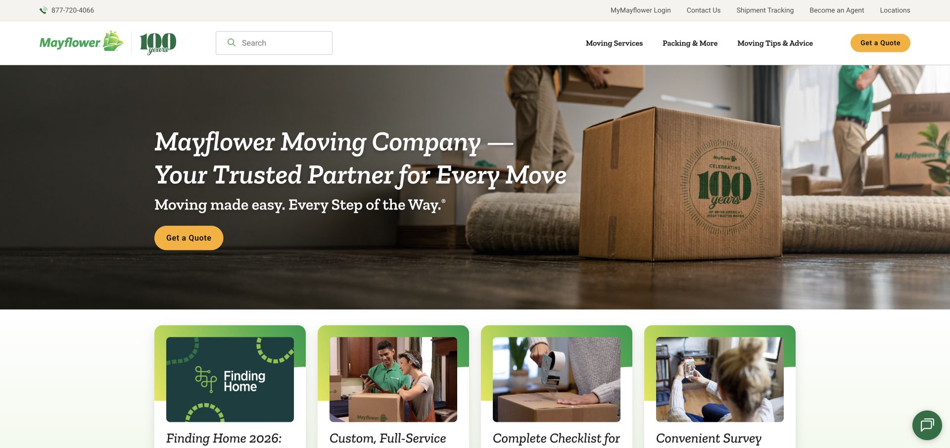
Mayflower pairs a household packing scene with a calm green identity and a conspicuous yellow action. The navigation separates moving services, packing support, and advice, while shipment tracking and account access occupy a utility role. This structure recognizes the difference between researching a move and managing one already underway. The opening emphasizes reassurance, with practical resources further down the page to help visitors understand the process. It is a useful reference for a broad moving company that needs to make its service range feel approachable.
What you can learn
Keep first-time planning separate from customer logistics. Give prospective movers clear service descriptions and an estimate route, while allowing existing customers to reach tracking or account tools without passing through the entire sales introduction again.
Pros
The green and yellow palette creates a clear visual distinction between background content and primary actions.
Moving, packing, advice, and tracking have recognizable roles within the overall navigation structure.
Cons & considerations
Reassurance-led copy needs clear service boundaries so readers can distinguish included support from optional extras.
A national brand introduction still needs local coverage and contact details before a visitor can assess fit.
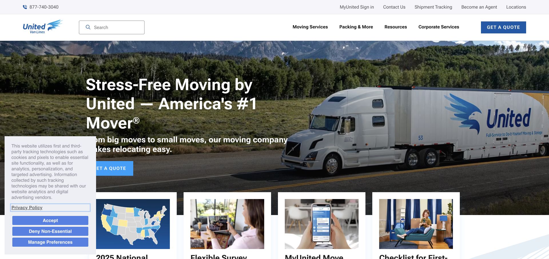
United Van Lines leads with a blue truck image and a direct moving-service introduction. The visual establishes the transport aspect of the offer, while navigation and resource cards provide routes into planning, service choices, and customer support. The page combines a recognizable fleet identity with practical material that can support visitors before they request an estimate. Its useful design lesson is the pairing of a broad brand promise with a resource structure, rather than requiring the first interaction to be a detailed inquiry form.
What you can learn
Show the service in a recognizable context, then supply information for visitors at different planning stages. Separate the estimate path from advice and existing-customer tools so an undecided reader can learn without confusing research with a booking commitment.
Pros
The branded truck gives the opening a concrete moving-service subject and a recognizable visual identity.
Planning resources create useful alternatives for readers who are gathering information before requesting an estimate.
Cons & considerations
A broad national message requires clear local and move-type details on subsequent pages to establish relevance.
Prominent trust language should be supported by specific process explanations rather than treated as evidence of service quality.
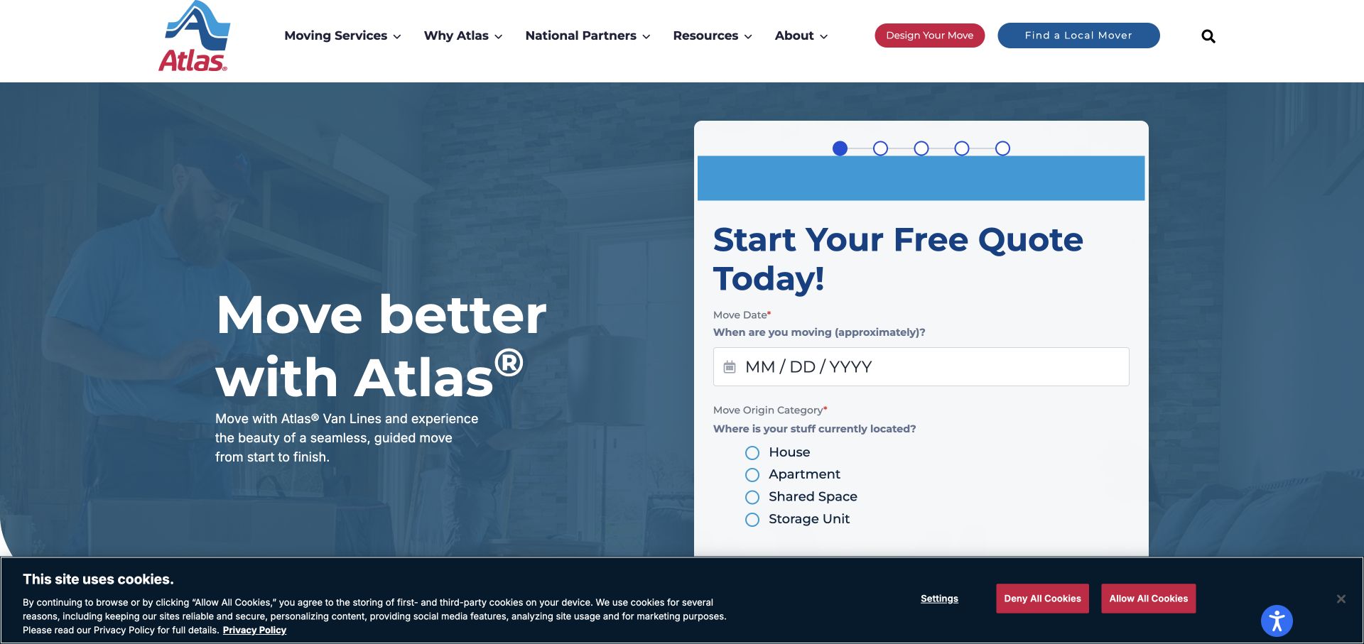
Atlas places its moving message beside a quote interface that begins with a move date and home type. Progress indicators make the interface read as a sequence rather than one long form. A local-mover route remains in the header, giving visitors another way to identify the right team. The blue visual system and direct wording keep the quote task prominent. This is a useful reference when a moving business needs a few concrete details to route an inquiry, but should explain what later stages will ask.
What you can learn
Start estimate forms with information that determines service eligibility or routing, and show the sequence clearly. Explain whether the result is a preliminary inquiry, an appointment request, or a binding quote before asking people to invest time in further steps.
Pros
A short initial step makes the information-gathering sequence visible without displaying every possible moving question at once.
The local-mover link offers a direct route for visitors who prefer to identify a provider before completing a form.
Cons & considerations
Progress dots need understandable labels or supporting text so the remaining effort is not left ambiguous.
A prominent quote interface should not obscure coverage, move types, or the limitations of any estimate it produces.
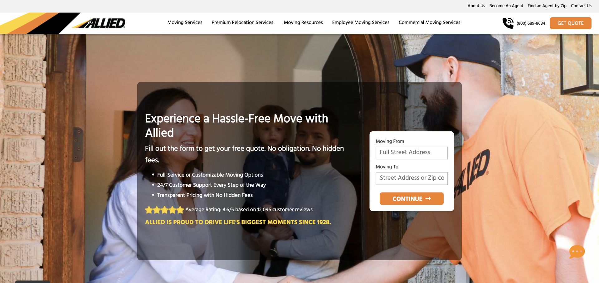
Allied combines warm orange branding, family photography, and a compact origin-and-destination form. A darker text panel gives the moving message a defined place within the image, while the quote card stays visually distinct. Agent and contact routes remain available in the surrounding navigation. The arrangement makes the first task easy to recognize: describe the basic move route. It also illustrates the importance of balancing an immediately actionable form with enough service information for visitors to understand what kind of moving support is being offered.
What you can learn
Put the minimum routing information beside a short explanation of the service, then disclose the next step. A first-screen form should help determine fit, while move-type pages explain packing, storage, and other options before customers assume they are included.
Pros
The separate form panel makes origin and destination fields easy to locate within a photographic opening.
Warm brand color and a household scene give the practical quote task a consistent visual context.
Cons & considerations
A route alone cannot describe access conditions, inventory, or timing, so later estimate stages need clear expectations.
Large promotional claims in a hero should link to relevant detail rather than substituting for a service explanation.
Visible tech stack
Referenced on the public page
Google Analytics
Google Fonts
Public source checked November 3, 2026. References may be embedded or legacy—not a complete backend inventory.
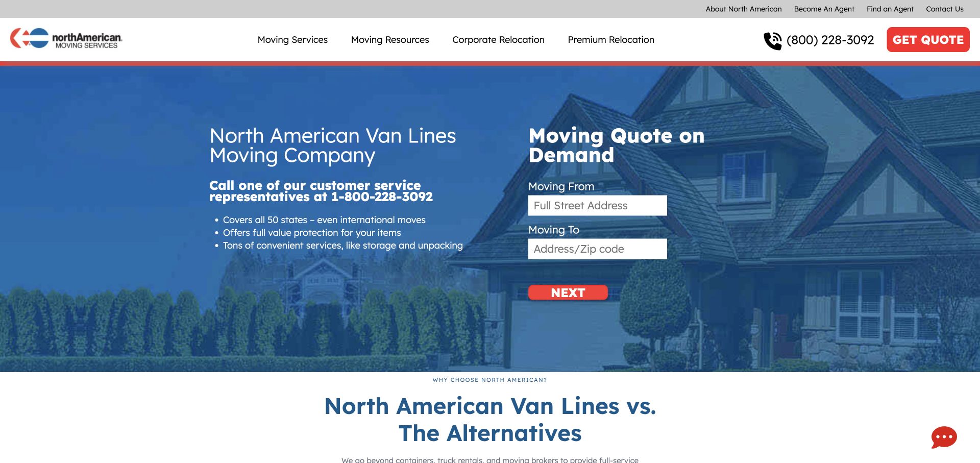
North American uses a residential photograph, a blue content area, and a white quote card with a contrasting red next-step button. The opening places short service points beside the form, so a visitor can read the offer while deciding whether to enter move details. Further comparison content gives the page a more argumentative sales structure. The design is a useful reference for form hierarchy and proximity, provided the business treats its own comparisons as marketing claims rather than independent evidence about competing providers.
What you can learn
Use nearby content to answer the questions a form creates: what service is available, what happens next, and what information affects the estimate. Keep comparison tables specific and substantiated, and distinguish promotional statements from the facts required to plan a move.
Pros
The white card and red action create a recognizable quote sequence against the blue and photographic background.
Service points remain adjacent to the form instead of requiring a separate navigation step before inquiry.
Cons & considerations
A strong next-step button needs clear language about whether the user is requesting contact or receiving an estimate.
Comparative marketing sections require careful sourcing and maintenance if they make claims about other moving services.
Visible tech stack
Referenced on the public page
jQuery UI
Google Analytics
Google Fonts
Google Maps
Public source checked November 3, 2026. References may be embedded or legacy—not a complete backend inventory.
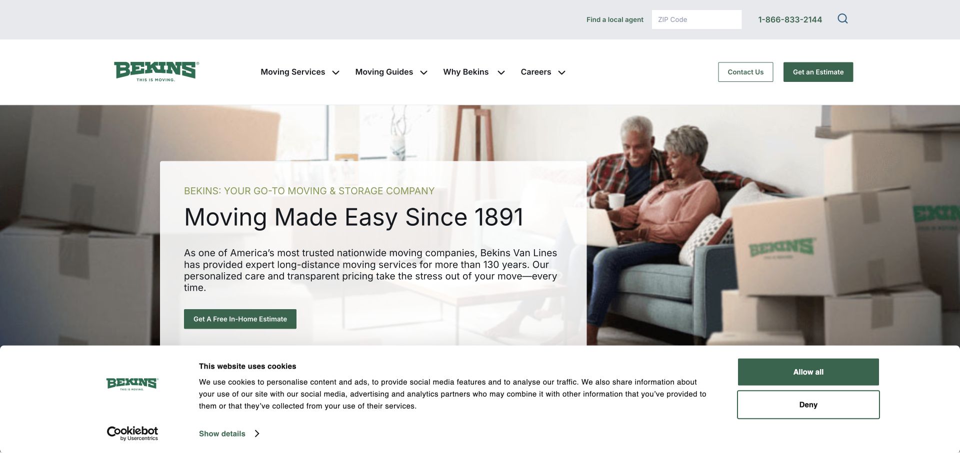
Bekins shows a couple packing in a domestic setting and places an estimate invitation in a pale panel over the image. The green identity and conventional navigation keep the presentation familiar. A ZIP-based agent finder and telephone route appear in the header, helping visitors connect the national brand with local service. The page also provides moving guides and consumer-oriented links. Its useful pattern is the invitation to a defined estimate process, rather than implying that a complex household move can be priced from a slogan alone.
What you can learn
Describe the kind of estimate being offered and how a local provider becomes involved. Keep agent discovery, telephone contact, and planning resources visible so visitors can choose a comfortable next step while learning what information the estimate will require.
Pros
The estimate action is tied to a recognizable household-moving scene and a clear visual panel.
The ZIP-based agent route connects a broad brand introduction with the need for local moving coverage.
Cons & considerations
An estimate invitation should explain any visit, inventory, or scheduling requirements before the customer proceeds.
A long resource collection needs useful labels and current links so essential preparation information does not become buried.
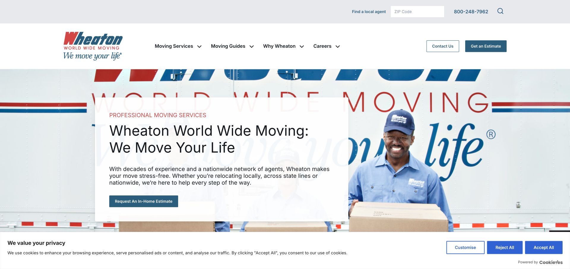
Wheaton's opening places a uniformed mover in front of a branded truck, with a separate panel introducing professional moving services and an estimate action. A local agent finder appears in the upper navigation. The page continues with move-type choices and planning material, giving the transport image a practical service framework. The composition is useful because it shows both the person and vehicle involved in the work, while keeping the first inquiry action readable rather than scattering multiple forms across the hero.
What you can learn
Connect the visible service team to a clear local contact or agent route. Support the estimate action with move-type explanations and preparation information so the visitor can understand whether the company handles the specific move before supplying detailed personal information.
Pros
The mover and truck make the service tangible while providing a strong, consistent branded image.
Agent discovery and estimate access offer two related routes for visitors at different stages of planning.
Cons & considerations
The first screen needs supporting detail to distinguish local, long-distance, and specialized moving requirements.
A national site should make the relationship between the central brand and the local service provider easy to understand.
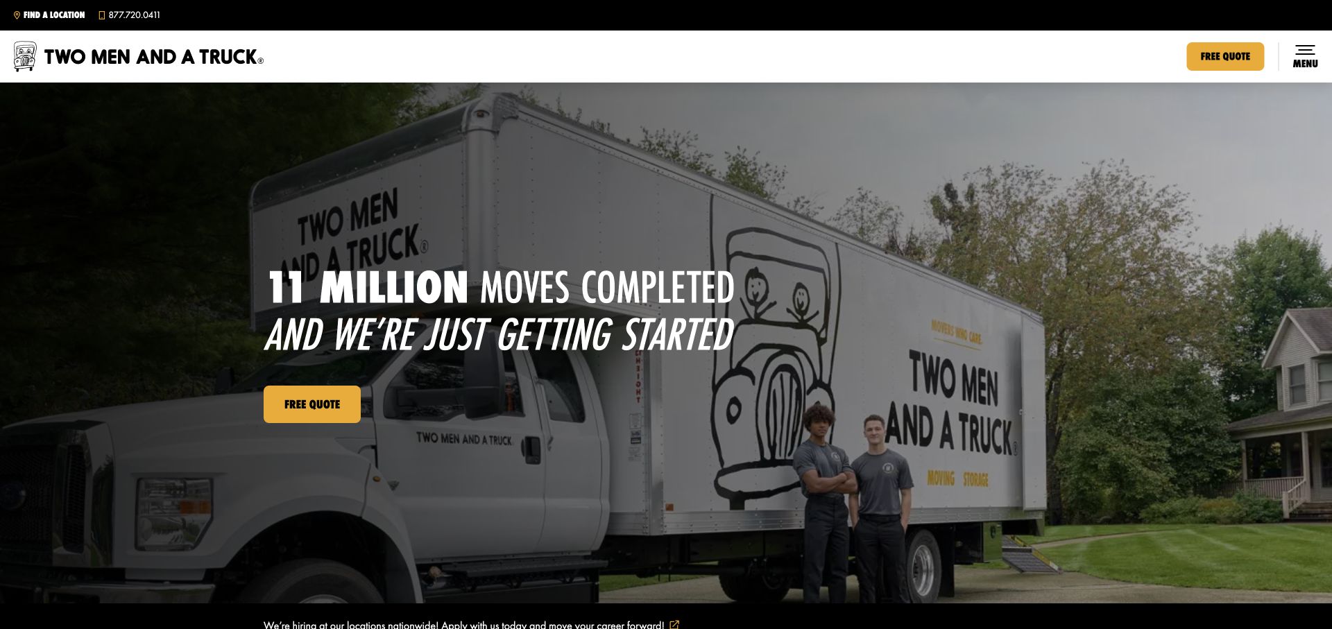
Two Men and a Truck uses a large truck-and-mover photograph with bold black and yellow styling. Location discovery, a free-quote action, and the menu are prominent in the header. Further service cards broaden the page beyond a single moving task, while recruiting content has its own place. The website is a useful reference for maintaining a distinctive identity across a wide service network. Its large self-reported headline claims function as marketing, so the design lesson is their hierarchy and placement rather than proof of operational performance.
What you can learn
Give the local service route and the quote route obvious positions in a recognizable header. When adding adjacent services or recruitment, label them clearly and preserve the primary moving journey so the brand's breadth does not make the next step uncertain.
Pros
Strong brand colors and fleet imagery make the moving service recognizable before a visitor reads detailed content.
The header keeps location and quote actions available without requiring the visitor to inspect a long services list.
Cons & considerations
Large numerical or superlative claims need supporting context if visitors are expected to use them as decision evidence.
A broad mix of services and recruitment messages needs careful ordering to keep a household move inquiry easy to follow.
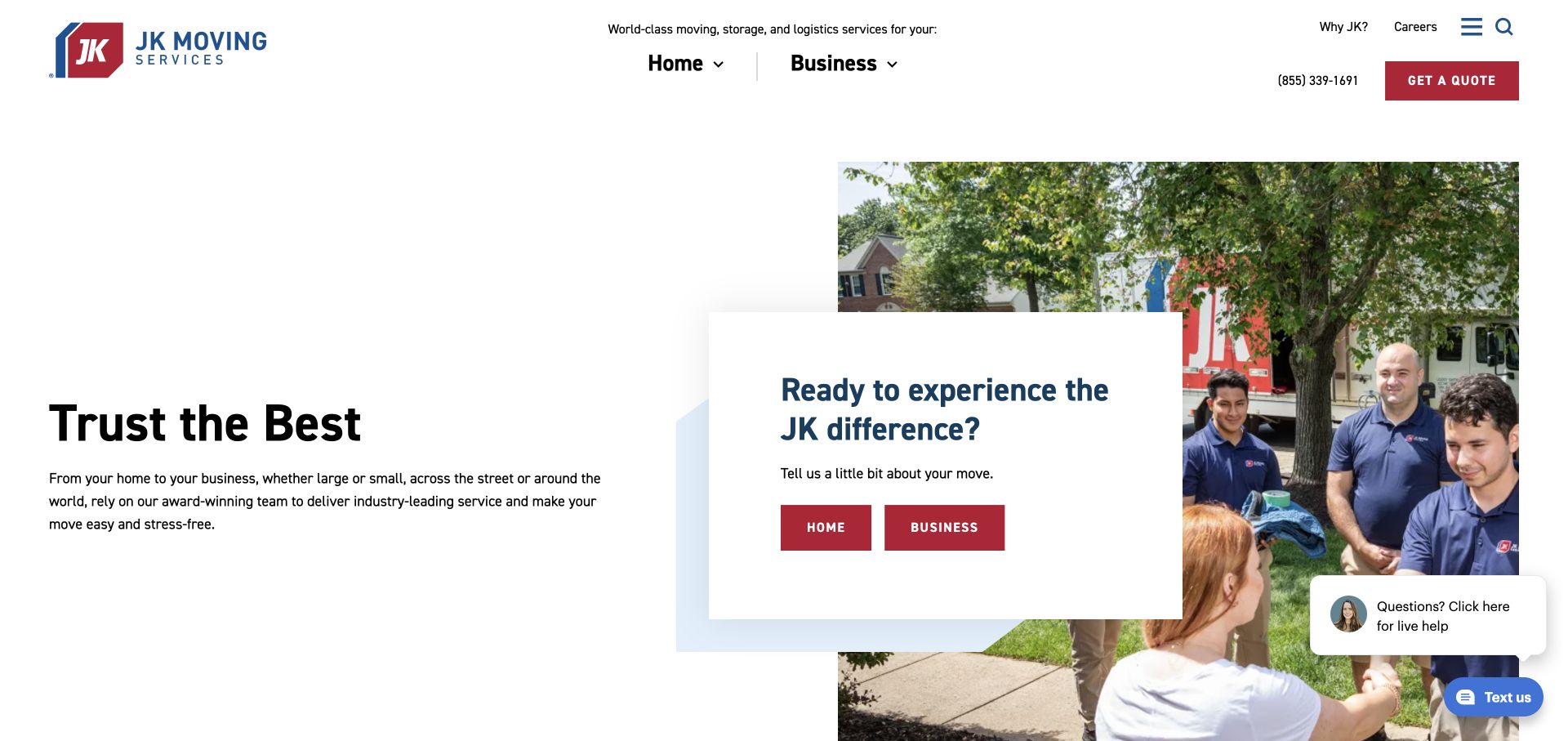
JK Moving uses a spacious split layout, placing its headline beside a photograph and an overlaid card that distinguishes home and business moves. A red quote action remains visible in the header. The audience choice is useful because household and commercial projects have different information needs, even when the same company handles both. Rather than using a single generic form as the only entry point, the page gives visitors a way to identify the relevant service context before moving into the details.
What you can learn
Separate household and commercial journeys early when their requirements differ. Each destination should explain the relevant process, scope, and information needed for an estimate, while preserving a consistent brand and an easy way back if the visitor chose the wrong path.
Pros
The home-versus-business card provides a clear decision that reflects two materially different types of moving work.
White space and a restrained palette make the red estimate action stand out without filling the hero with competing offers.
Cons & considerations
Audience selection adds a step, so the destination must provide more specific information than the opening page.
A small chat interface should remain secondary to the core service choices and should not cover them on mobile screens.
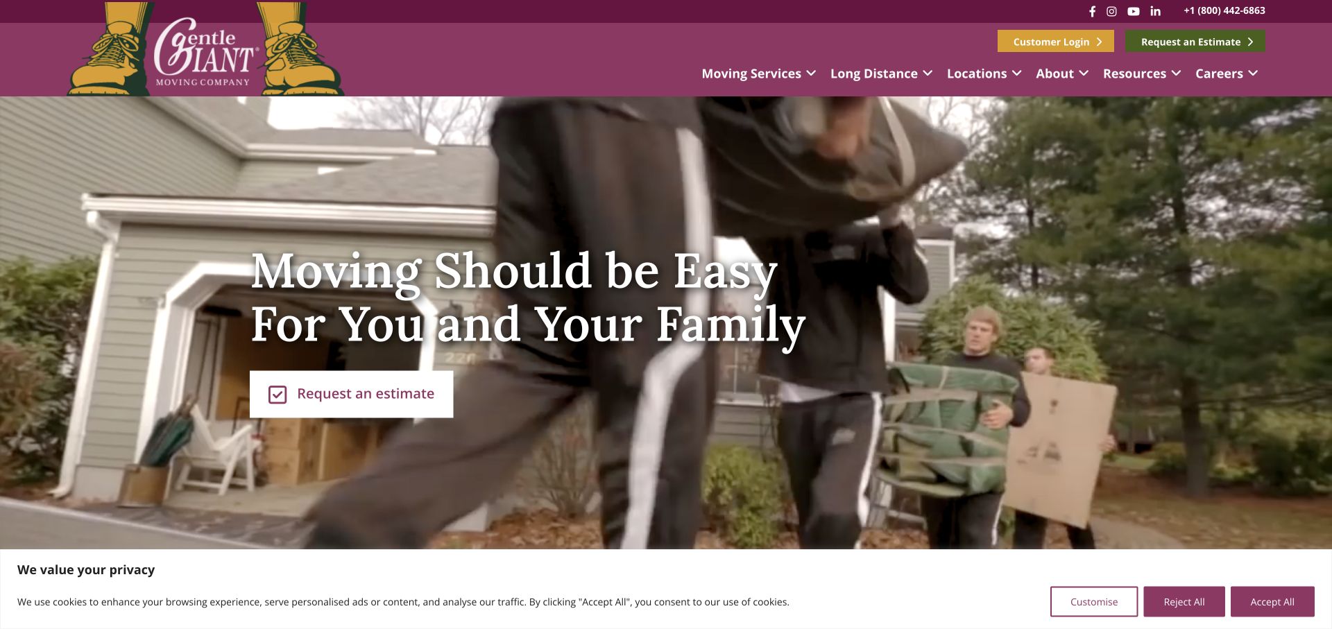
Gentle Giant pairs a burgundy header and distinctive illustrated logo with footage of a crew handling household belongings. The opening message addresses the family experience of moving, and a simple estimate action sits beneath it. The main navigation includes services, long-distance moves, locations, resources, and careers. The layout is useful for showing the physical work behind a moving promise, while the location network and service categories provide practical routes for visitors whose move requirements are already defined.
What you can learn
Use real service activity to give an emotional headline a concrete foundation. Keep the estimate action simple, then explain coverage and the move process through stable navigation so visitors can verify fit without waiting for a rotating image or story.
Pros
The crew-at-work imagery connects the brand message to recognizable moving tasks and household circumstances.
Long-distance and location routes are visible alongside service and resource information in the main navigation.
Cons & considerations
Motion behind text requires a stable, readable overlay and an appropriate static presentation when video is unavailable.
A family-centered introduction still needs explicit information for apartment, business, or specialized moving situations.
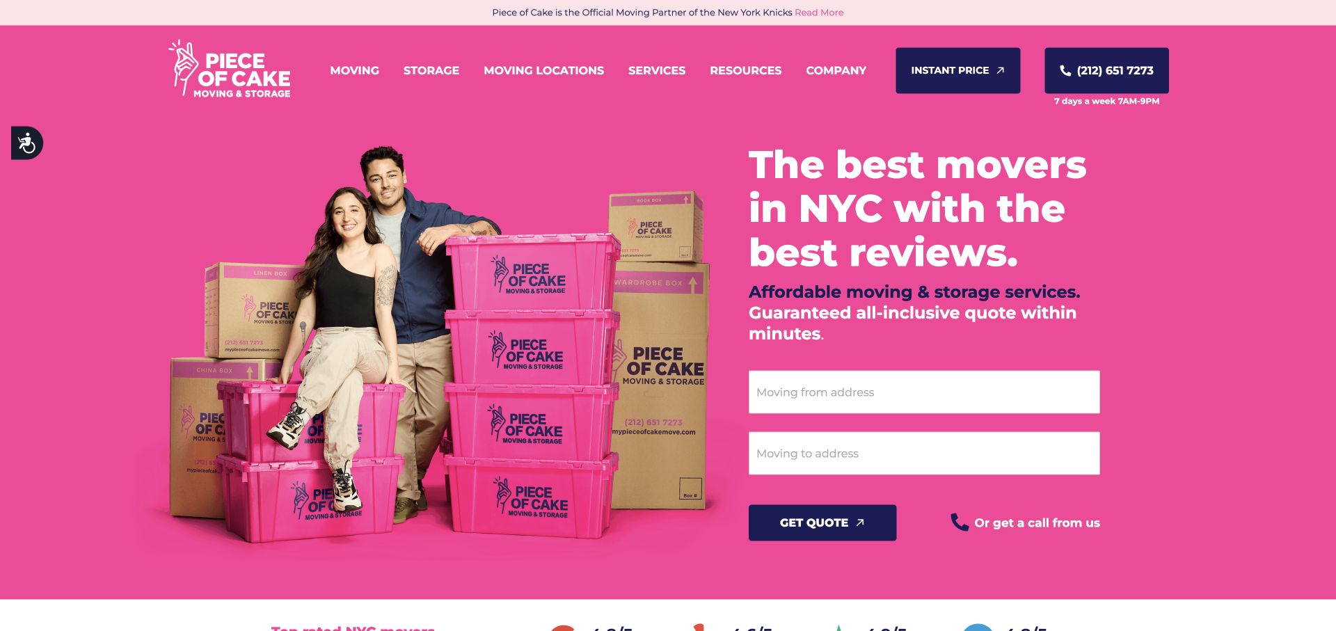
Piece of Cake uses a saturated pink field, branded moving boxes, and a household portrait to create a highly recognizable opening. A dark navigation bar and dark quote button contrast with that field, while origin and destination inputs sit directly beneath the New York City message. The page also exposes storage, locations, services, and company information. Its useful idea is the close connection between identity and the inquiry task: the boxes, background, and form all belong to one coherent visual composition.
What you can learn
A distinctive palette can work when the main action and form remain easy to distinguish. Keep the city focus and service coverage explicit, and explain the conditions behind pricing language before readers interpret a short quote interface as a complete moving agreement.
Pros
The pink boxes and background create a memorable identity that is visible throughout the opening composition.
The two-address form offers a direct first step while navigation still exposes storage and service locations.
Cons & considerations
Strong color needs careful contrast checks for form labels, helper text, and secondary navigation at smaller sizes.
Price and review claims should be supported by clear scope and source detail rather than dominating the service explanation.
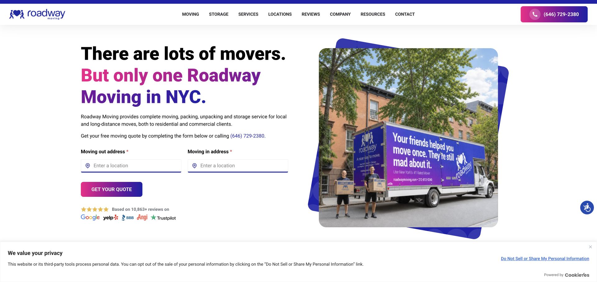
Roadway presents its New York message on the left and a branded truck photograph inside a layered geometric frame on the right. Purple and pink accents connect the headline, quote button, and phone action. The origin and destination fields are compact, and review-source logos sit beneath the inquiry area. The composition is useful for an urban mover because it combines a local service statement, a tangible fleet image, and a short first task without turning the whole screen into a form.
What you can learn
Place local context, the first estimate questions, and contact options together, then explain the rest of the move process below. Treat review logos as links to assessable evidence and avoid assuming that a familiar logo alone establishes service quality.
Pros
The truck image provides a concrete moving-service subject within a distinctive but readable visual frame.
The local headline and two-address form keep the primary inquiry task close to the explanation of the offer.
Cons & considerations
A compact quote form needs later clarification of inventory, access, packing, and scheduling before pricing is meaningful.
Multiple review marks and promotional claims should not replace clear descriptions of coverage and included services.
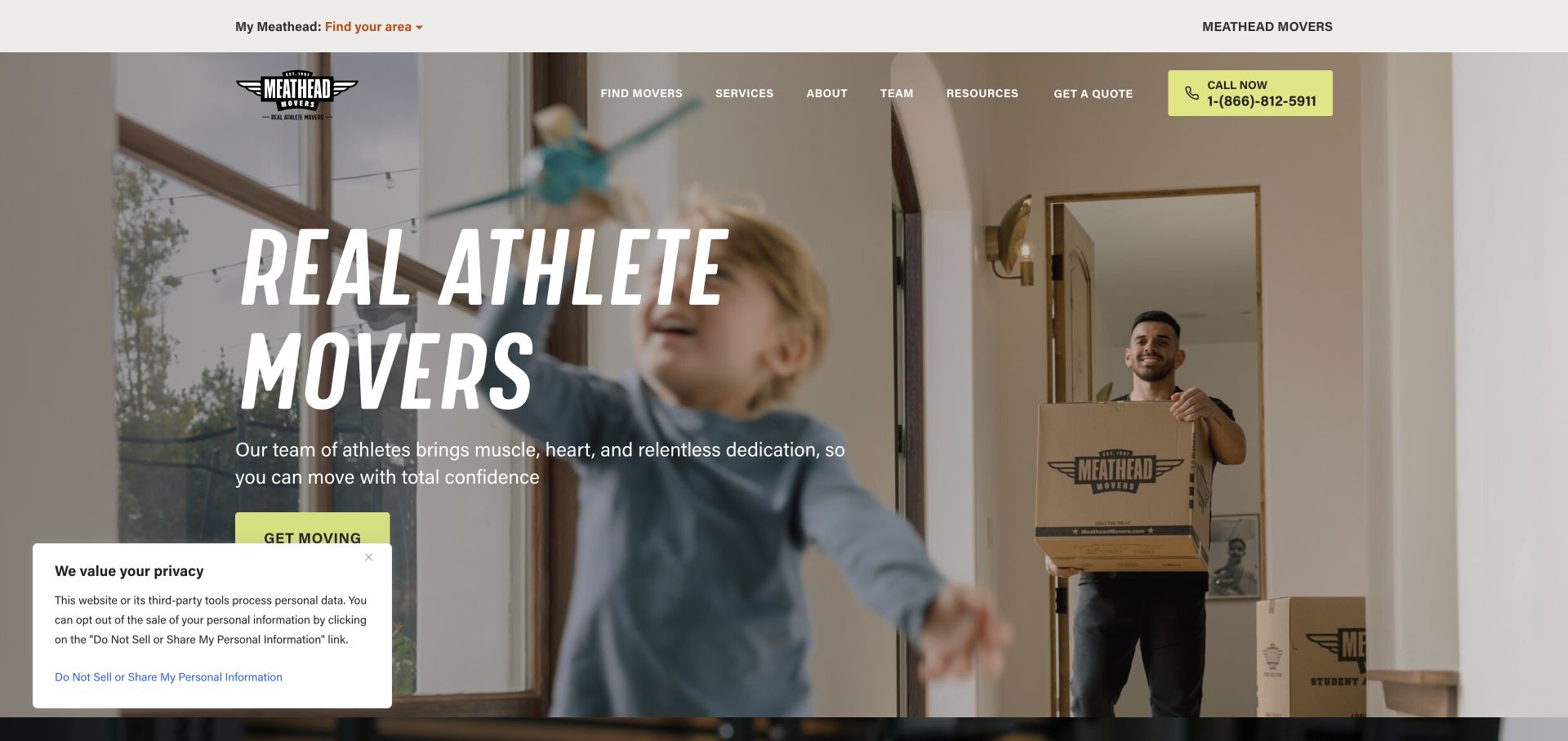
Meathead Movers builds its opening around an athlete-mover identity, with large italic typography over a household moving scene. A bright call action and a getting-started button provide visible next steps. The navigation includes services, team, resources, and locations, allowing the people-focused introduction to lead into practical information. This is a useful reference for a business whose staffing story is central to its brand, provided that the distinctive personality remains connected to ordinary questions about coverage, service scope, and the estimate process.
What you can learn
If a team's identity differentiates the business, show that identity in real service context and explain how the customer journey works. Give team stories and recruiting their own space while keeping location, service descriptions, and estimate access easy to find.
Pros
The athlete-focused presentation gives the brand a distinct point of view within a visually familiar moving category.
Phone and getting-started actions remain prominent while services and team information are available in navigation.
Cons & considerations
A strong staffing narrative needs practical service detail so visitors can evaluate fit beyond the brand personality.
Large italic text over moving footage requires deliberate contrast and crop choices on a narrow display.
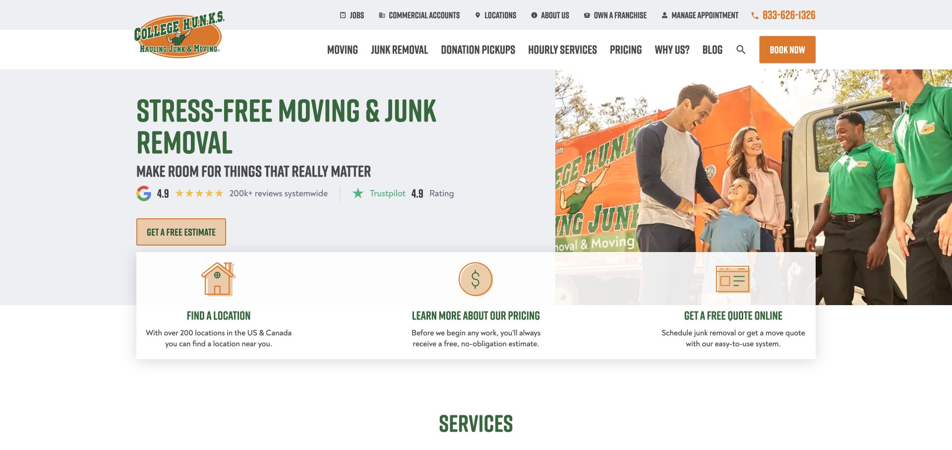
College HUNKS combines green and orange branding with a crew-and-customer photograph. Its main navigation distinguishes moving, junk removal, donation pickup, and hourly services. Beneath the hero, three cards lead toward finding a location, understanding pricing, and getting a quote. That structure is useful for a company whose related services could otherwise become confusing. The page acknowledges that a visitor may need to identify local availability or understand the pricing process before choosing the inquiry route.
What you can learn
Name adjacent services separately and explain where their processes differ. Offer shortcuts for location, pricing information, and estimates, but keep the destination language specific so a moving customer does not accidentally enter a junk-removal or donation pickup journey.
Pros
Distinct service labels help separate household moving from removal, donation, and hourly labor needs.
The three shortcut cards recognize that location and pricing questions may come before a quote request.
Cons & considerations
A broad combined-services headline requires clear destination pages to avoid implying that every service follows the same process.
Pricing and donation-related statements need accurate conditions and local applicability rather than a universal promotional promise.
List the move types you handle and the information that determines coverage. Give each major type a useful page with relevant preparation guidance. Do not create multiple pages that repeat the same broad promise while leaving actual service boundaries unclear.
Design the first inquiry step
Ask only for the information needed to route the initial request, then disclose the remaining process. Test labels for addresses, dates, property type, and optional services. Tell visitors how their inquiry will be handled and how to reach a person if their move does not fit the standard options.
Support the period before moving day
Build practical resources around preparation, packing responsibilities, scheduling, and customer communication. Keep existing-customer tools separate from the sales flow. Assign an owner to maintain location information and remove expired offers or outdated preparation material.
The editing job behind the design
Choose tools that match the estimate workflow
The website's forms should match how the moving team assesses and routes work. Choose a content and inquiry system that can represent service areas, move types, agents, and optional services without forcing visitors into unrelated fields. The example sites do not establish a preferred technology stack.
Keep address entry, progress indicators, validation messages, and telephone actions understandable on a small screen. Document the difference between a saved inquiry, a confirmed appointment, and a booked move. The public review did not submit forms or test quote accuracy, so those operational behaviors need separate verification before launch.
Our WordPress website examples offer a separate look at publishing approaches. A visible platform label is evidence for that named page, not a guarantee that the same system will suit your requirements.
Before the public launch
Moving website review checklist
Local and long-distance coverage can be found before a detailed form is completed.
Household and commercial moving paths use appropriate descriptions and questions.
The primary action explains whether it starts an estimate, contact request, or booking process.
Packing, storage, and other options have clear scope and conditions.
Form progress and required fields remain readable on mobile screens.
Existing customers can find tracking or support without restarting the sales journey.
Review and rating claims identify a source and are maintained when presented.
Contact details, local agent information, and seasonal offers have an assigned review date.
These checks are a project checklist, not a performance, legal, security, or accessibility certification. Test real journeys with the people responsible for the website before making claims about the result.
Sources & editorial method
How this collection was selected and reviewed
We directly viewed and captured fourteen distinct public moving-company websites on 3 November 2026. Each example includes its own source URL, capture record, and original design review. We examined visible layout, service navigation, and initial inquiry interfaces without submitting forms or booking services. Business claims, pricing promises, and customer ratings are treated as statements displayed by the websites, not independently verified service outcomes.
Each example links to its actual source page. Screenshots are direct browser captures with their own capture dates; moving imagery, announcements and live designs can change. The notes describe observable design choices and conditional tradeoffs, not measured traffic, conversion results, service quality, or accessibility conformance.
Technology labels use public page metadata, asset evidence, or explicitly cited platform documentation. Platform documentation is not a complete current deployment audit. A component reference may be legacy or unused; it is not a complete backend inventory. Unknown stacks are omitted. These sites are editorial examples, not our client portfolio.
Written, Edited and Curated are separate editorial records, not timestamps advanced by a rebuild. Website designs and imagery belong to their owners. See our editorial standards or suggest a correction.
Questions worth asking
Moving Company website design questions
What should the first moving quote form ask?
Ask for the minimum details that establish coverage and route the inquiry, such as move locations, timing, and move type. Explain any later inventory or consultation step. The right sequence depends on the business's real estimating process.
Should a mover show prices on the homepage?
Only show pricing in a way the business can accurately support. Explain the service scope, conditions, and whether the amount is a starting point or an estimate. A clear explanation of the pricing process can be more useful than an unexplained promotional number.
How should national and local moving information connect?
Let visitors discover local coverage early, then preserve context when they reach an agent or location page. Explain who handles the inquiry and which services are available there. Keep brand-wide resources separate from local availability claims.
Do these reviews rank the quality of moving companies?
No. They compare public website design, navigation, and content organization. They do not verify moving performance, quote accuracy, insurance arrangements, availability, or suitability for a particular move.
Borrow the information structure that makes the next step clear. A distinctive brand can attract attention, but accurate coverage, a transparent estimate process, and useful preparation content make the website easier to use.