Travel planning begins with different levels of certainty. A useful agency website gives the person who knows their destination a direct route, while helping the undecided traveller form an idea and understand the planning service.
Travel agency homepages often start with a beautiful destination, but the more useful design question is what happens around that image. Does the visitor search a place, browse by month, choose a travel style, find an adviser, or request a conversation? Each route implies a different service model and level of readiness.
These examples examine public page composition, navigation, search entrances, and inquiry framing. The collection includes broad travel marketplaces, custom-trip specialists, and adviser networks. It studies how those businesses explain their offering through the website; it does not evaluate trip quality, supplier reliability, pricing, or the experience of completing a booking.
Before the examples
What makes good travel agency website design in 2026?
Explain who plans the trip
A traveller should understand whether the site offers immediate search, adviser-led custom planning, or both. Name the service model near the first action, and make the role of the adviser visible before asking for a detailed inquiry.
Support uncertain starting points
Destination search works for someone who already knows where to go. Offer a small set of alternatives based on travel style, timing, interests, or companions. Explain where those paths lead so inspiration does not become an endless image gallery.
Keep practical contact visible
Place the contact route, service hours where relevant, and a clearly named planning action within the stable navigation. Existing booking help and new-trip inquiries deserve distinct labels when they lead to different teams or processes.
The collection · 21 examples
21 travel agency websites worth studying
Look beyond the destination photography. Compare how each site introduces its planning model, how many decisions the first search asks for, and whether a visitor can reach a person without losing the context of the trip idea.
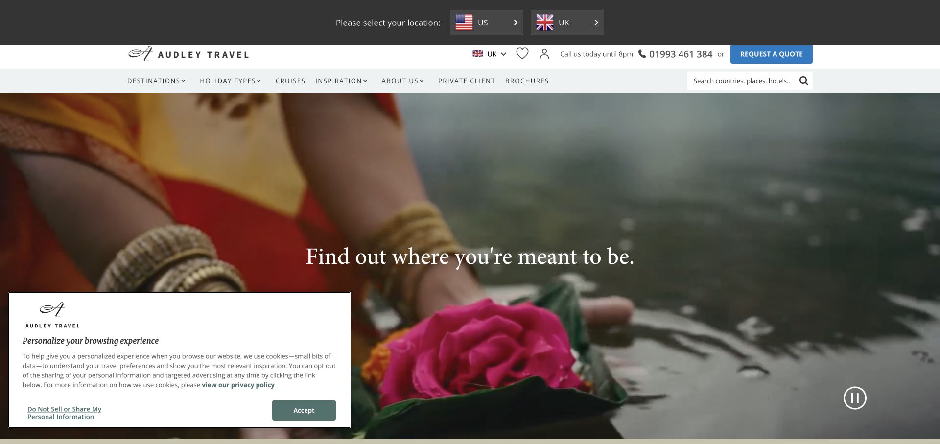
Audley Travel uses a large cinematic hero beneath a restrained header. Destinations, travel styles, cruises, and inspiration are exposed as distinct browsing routes, while a phone number, opening hours, and quote action make human contact part of the first impression. A market selector appears above the navigation. The design works as a reference for an agency whose website introduces possibilities before a specialist develops the itinerary. The photograph supplies atmosphere, while the header explains how to begin a practical conversation.
What you can learn
Keep the adviser route visible while visitors browse destinations. A phone number with availability information and a clearly named quote action can explain the service model more effectively than an atmospheric headline alone.
Pros
Destination and travel-style navigation support different ways of beginning a trip search.
Contact details remain prominent above the large visual campaign.
Cons & considerations
Several header layers reduce the space available to the destination story.
The captured consent panel covers part of the hero and competes with its first impression.
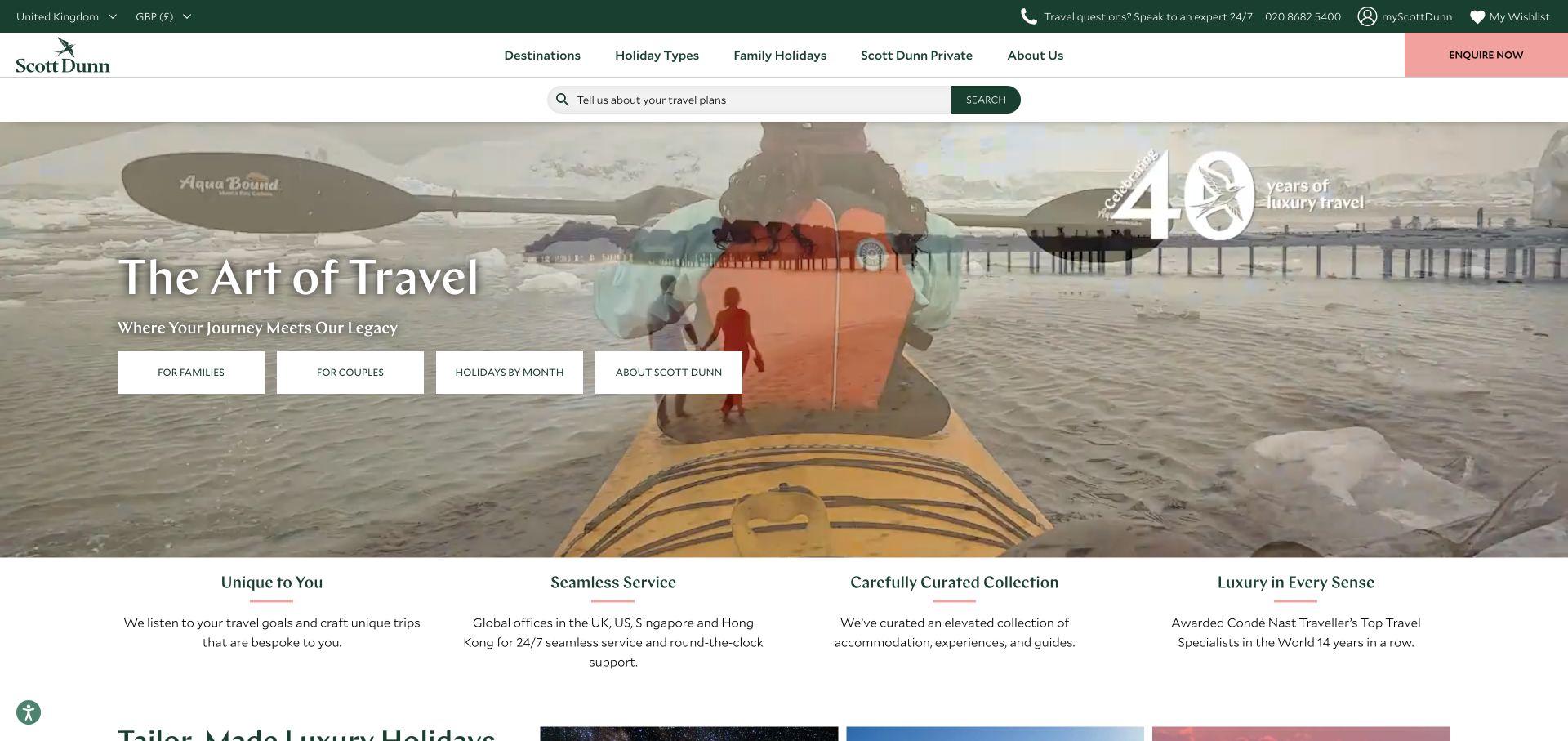
Scott Dunn combines a scenic video hero with a natural-language search field and shortcuts for family trips, couples, travel months, and the company itself. Sage, white, and pale pink give the interface a restrained palette. Contact availability, currency, and wishlist utilities sit around the main navigation, and a short benefits row begins immediately below the hero. The useful pattern is the variety of entry points: a visitor can arrive with a destination, a companion type, or only a time of year in mind.
What you can learn
Offer a small number of genuinely different planning entrances. Destination search, travel party, and travel month answer different questions; they should converge on a coherent itinerary or adviser journey rather than become disconnected content collections.
Pros
The search field and trip-category shortcuts accommodate different levels of planning certainty.
The benefits row brings explanatory content close to the inspirational opening.
Cons & considerations
Several utilities and shortcuts create a busy first screen despite the quiet palette.
Video transitions can make overlaid text and controls compete with changing scenery.
Visible tech stack
Referenced on the public page
OneTrust
reCAPTCHA
ASP.NETReported response header
Public source checked November 3, 2026. References may be embedded or legacy—not a complete backend inventory.
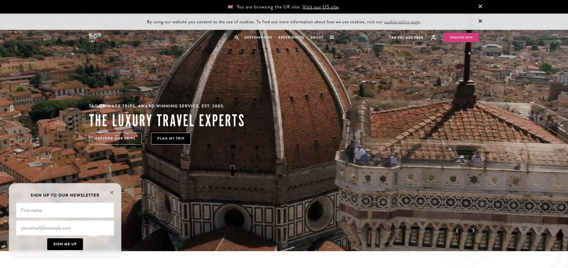
Black Tomato places condensed oversized typography over a full-bleed destination film, with a vivid pink inquiry action in the transparent header. The hero offers a route to explore the featured trip and another to plan a trip, separating inspiration from a more active request. The captured page also includes regional information and a newsletter panel. Its distinctive quality comes from the typography and image treatment, but the paired actions are the more transferable design decision for an agency balancing storytelling and inquiries.
What you can learn
Give an inspirational feature its own exploration route while preserving a direct planning action. Visitors should be able to enjoy the destination story without losing sight of how the agency turns that interest into a conversation.
Pros
The pink inquiry button is visually consistent with the brand’s bold art direction.
Paired hero actions distinguish learning about the feature from beginning a plan.
Cons & considerations
The newsletter panel competes with the destination film on first arrival.
Large display typography leaves less room for practical trip information above the fold.
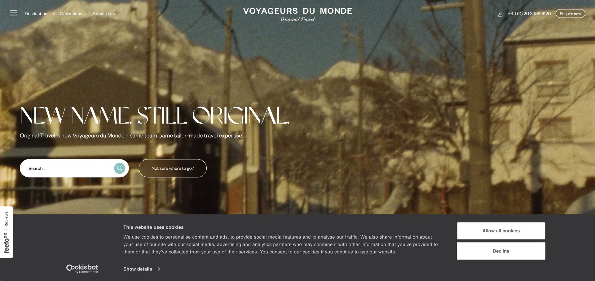
The Original Travel address now presents Voyageurs du Monde branding with an explicit announcement of the new identity. A large serif headline sits over destination video, while a centered logo and restrained destination, collection, and company navigation create an editorial tone. Phone and inquiry routes remain visible. The search area includes an alternative for visitors who do not yet know where to go. This makes the page useful as both a travel-design reference and a study in preserving orientation during a public brand change.
What you can learn
Explain the relationship between old and new names where returning visitors will see it. Keep familiar planning routes available so the identity announcement does not interrupt destination discovery or the start of an inquiry.
Pros
The brand-change message gives context to visitors arriving through the older domain.
The uncertain-destination alternative supports people who are still forming a trip idea.
Cons & considerations
The dual identity asks newcomers to understand an additional piece of company context.
The large video and serif headline delay more concrete itinerary detail until further exploration.
Visible tech stack
Referenced on the public page
Google Analytics
Vimeo
reCAPTCHA
ASP.NETReported response header
Public source checked November 3, 2026. References may be embedded or legacy—not a complete backend inventory.
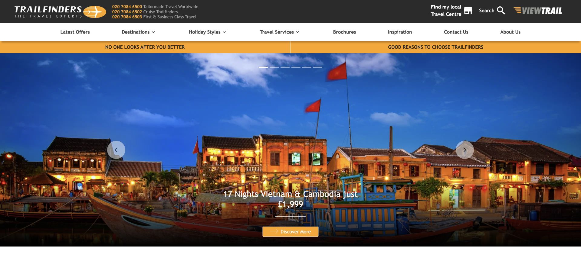
Trailfinders uses a dense black and yellow header with separate specialist phone numbers, store information, and a broad travel-services menu. The main campaign pairs a destination photograph with a named trip, duration, price presentation, and a clear action. Holiday-style content follows below. The layout is useful for agencies whose visitors may want flights, cruises, tours, or a more complex package from the same business. It favors immediate service breadth and practical entry points over a minimal editorial opening.
What you can learn
When the offering is broad, make the service taxonomy and contact routes explicit. A promotional trip can remain the focal point if visitors can quickly identify the specialist route relevant to their own itinerary.
Pros
Specialist phone routes make the agency’s human service model visible.
The featured trip includes concrete planning cues rather than only an evocative destination image.
Cons & considerations
The dense header asks visitors to scan many choices before reaching the hero.
Multiple phone numbers and service labels need especially careful grouping on smaller screens.
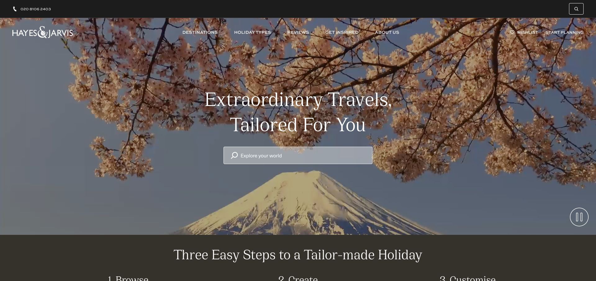
Hayes & Jarvis combines a Mount Fuji and cherry-blossom film with a centered serif promise and broad destination search. Dark transparent navigation carries wishlist and planning routes. Just below the hero, a three-step sequence explains browsing, creation, and customization, giving the visitor a framework for what the agency does after the initial inspiration. The page is a useful reference for custom travel because the design connects an emotional destination image to a practical description of the planning process.
What you can learn
Place a concise process explanation near the first search or inquiry action. Visitors considering a custom trip need to understand what they can explore independently and what happens when an adviser becomes involved.
Pros
The three-step sequence turns the abstract custom-travel promise into a recognizable workflow.
A broad search field gives the scenic hero an immediate practical use.
Cons & considerations
The large video takes priority over concrete sample itineraries in the first screen.
Transparent navigation depends on the underlying footage remaining visually calm enough for the labels.
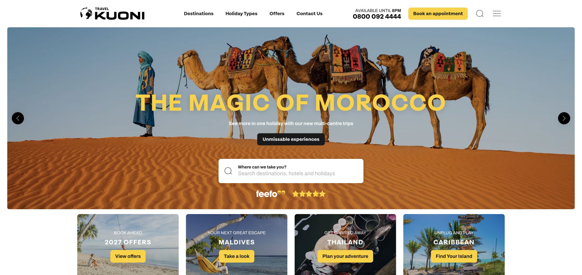
Kuoni uses a compact white header above a destination photograph with a bold yellow headline. The same yellow highlights an appointment action, while a central search field offers a more independent browsing route. Phone opening hours are visible, and a compact set of promotional tiles begins beneath the hero. The page creates a clear relationship between discovering possibilities and talking to someone about them. Its useful lesson is the parallel presence of search and appointment booking without making either path feel hidden.
What you can learn
Keep browsing and consultation as distinct, clearly named choices. A visitor who wants ideas should not have to request an appointment first, while someone ready for advice should not need to finish an elaborate search.
Pros
The yellow appointment action stands out within a restrained white header.
Search and the compact offer tiles provide multiple scales of destination discovery.
Cons & considerations
Promotional tiles introduce more competing messages immediately after the hero.
The prominent campaign headline gives less immediate detail about how consultation works.
Visible tech stack
Referenced on the public page
Google Maps
Cloudflare Turnstile
Public source checked November 3, 2026. References may be embedded or legacy—not a complete backend inventory.
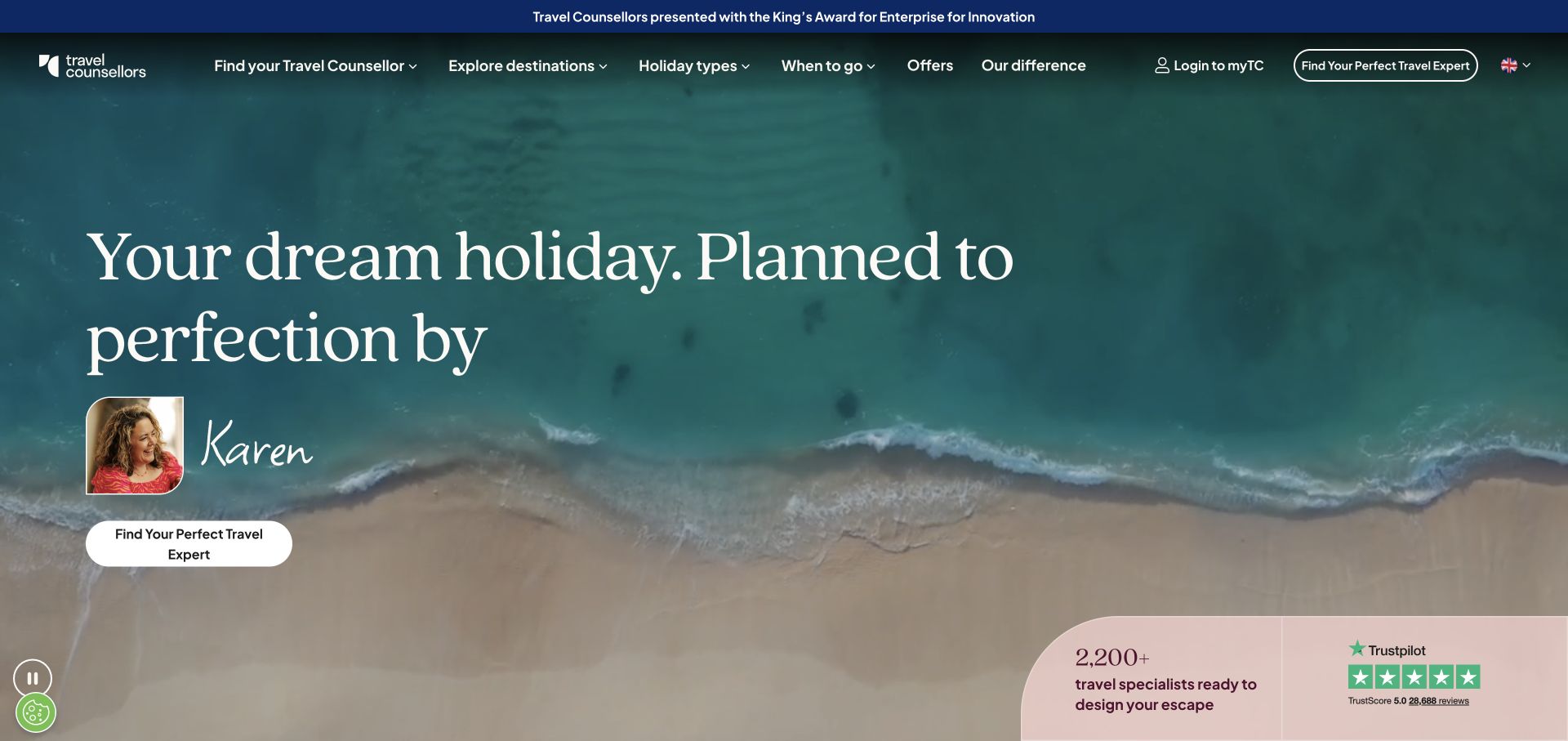
Travel Counsellors places an adviser’s portrait and name within an ocean-led hero, making the person behind the service part of the opening design. A large serif headline and find-an-expert action reinforce that model. The navigation supports destinations, trip types, timing, and offers, while a lower panel presents the company’s own scale and review signals. The most useful feature is the explicit human route: visitors can understand that they are choosing a relationship with an adviser, not merely browsing a stock of packages.
What you can learn
Show how a person enters the planning journey. A named adviser and a clear expert-finding action can make the service tangible, but the surrounding content should still help visitors explain the trip they have in mind.
Pros
The adviser portrait connects the brand promise to an identifiable service role.
Navigation includes timing as well as destination and trip type.
Cons & considerations
The large opening composition postpones detailed itinerary examples.
Displayed review and scale signals add persuasion but do not explain adviser matching by themselves.
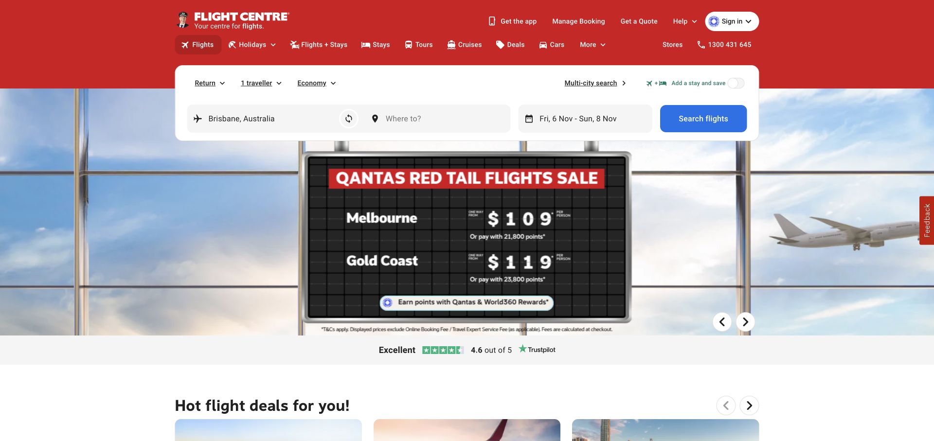
Flight Centre puts a substantial white flight-search form at the center of its first screen. Origin, destination, dates, travellers, and cabin class are grouped within the form, while product tabs let visitors move between travel categories. A red toolbar carries the brand, and quote, booking management, stores, and support routes remain available above the campaign background. This is a practical reference for an agency where visitors often arrive ready to define a trip rather than first read an editorial destination story.
What you can learn
Make the search structure match the decisions a traveller already expects to make. Keep booking management and human help outside the search card so existing customers and uncertain planners have clear alternative routes.
Pros
The search fields expose the main trip parameters in one recognizable area.
Store, support, and booking-management utilities acknowledge needs beyond a new purchase search.
Cons & considerations
The campaign behind the form adds visual information to an already dense screen.
A detailed flight form can feel premature for visitors still exploring where to travel.
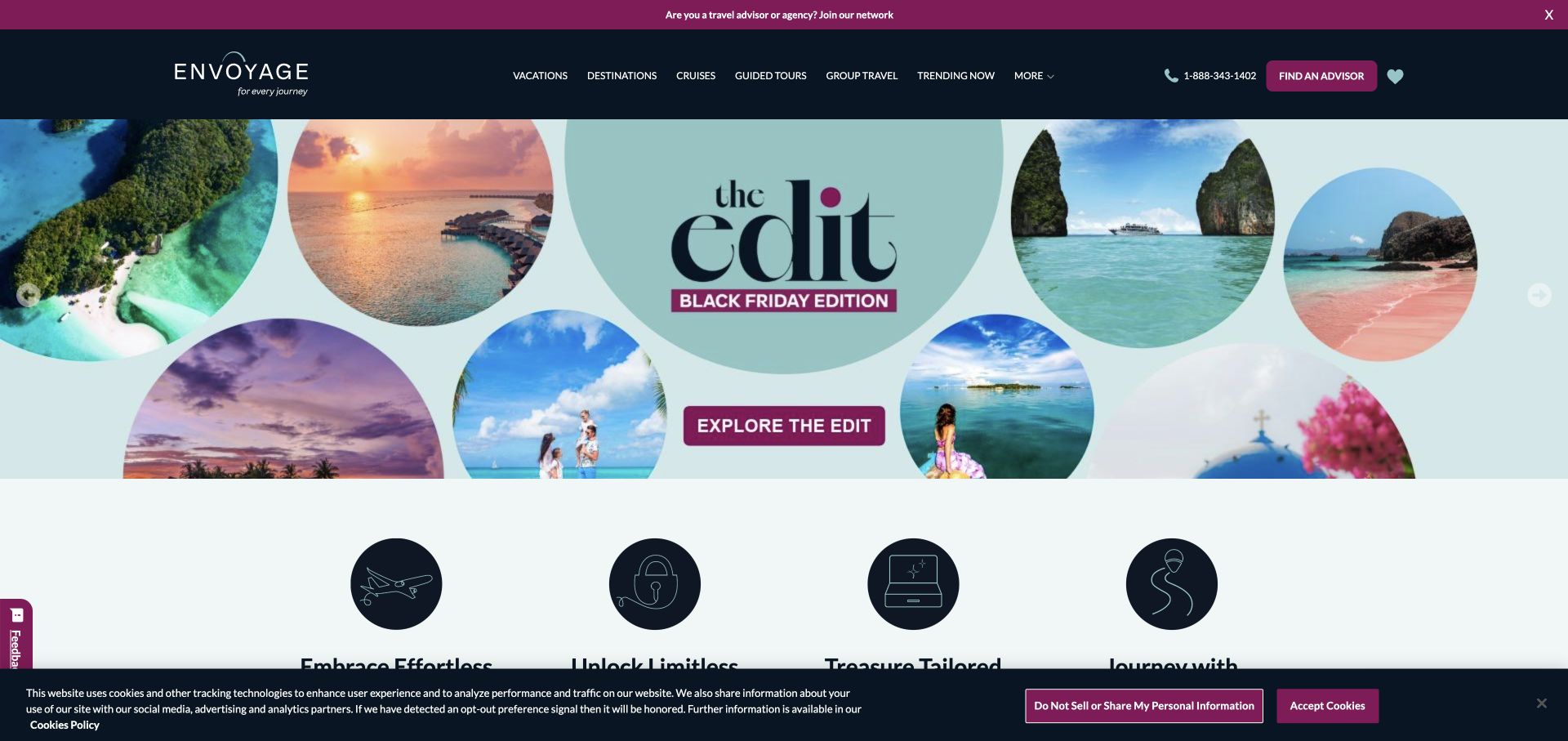
The former Liberty Travel address redirects to Envoyage, where a dark navy and plum identity frames a broad travel catalog. Navigation covers vacations, destinations, cruises, guided travel, and groups, with a prominent find-an-adviser route. A seasonal collage uses circular photographs rather than one uninterrupted scenic image. A recruitment strip also addresses prospective advisers. The page is useful for studying how a travel network serves both public trip discovery and its professional community while maintaining a recognizable consumer planning route.
What you can learn
Make audience boundaries visible when a travel network recruits advisers and serves travellers on the same site. The public planning action should remain unmistakable, even when professional opportunities are part of the upper-page content.
Pros
The find-an-adviser action gives the broad catalog a clear human next step.
Distinct travel categories help visitors narrow the network’s wide offering.
Cons & considerations
The recruitment strip introduces a second audience into the consumer homepage.
Several overlapping travel categories require clear destination pages to explain their differences.
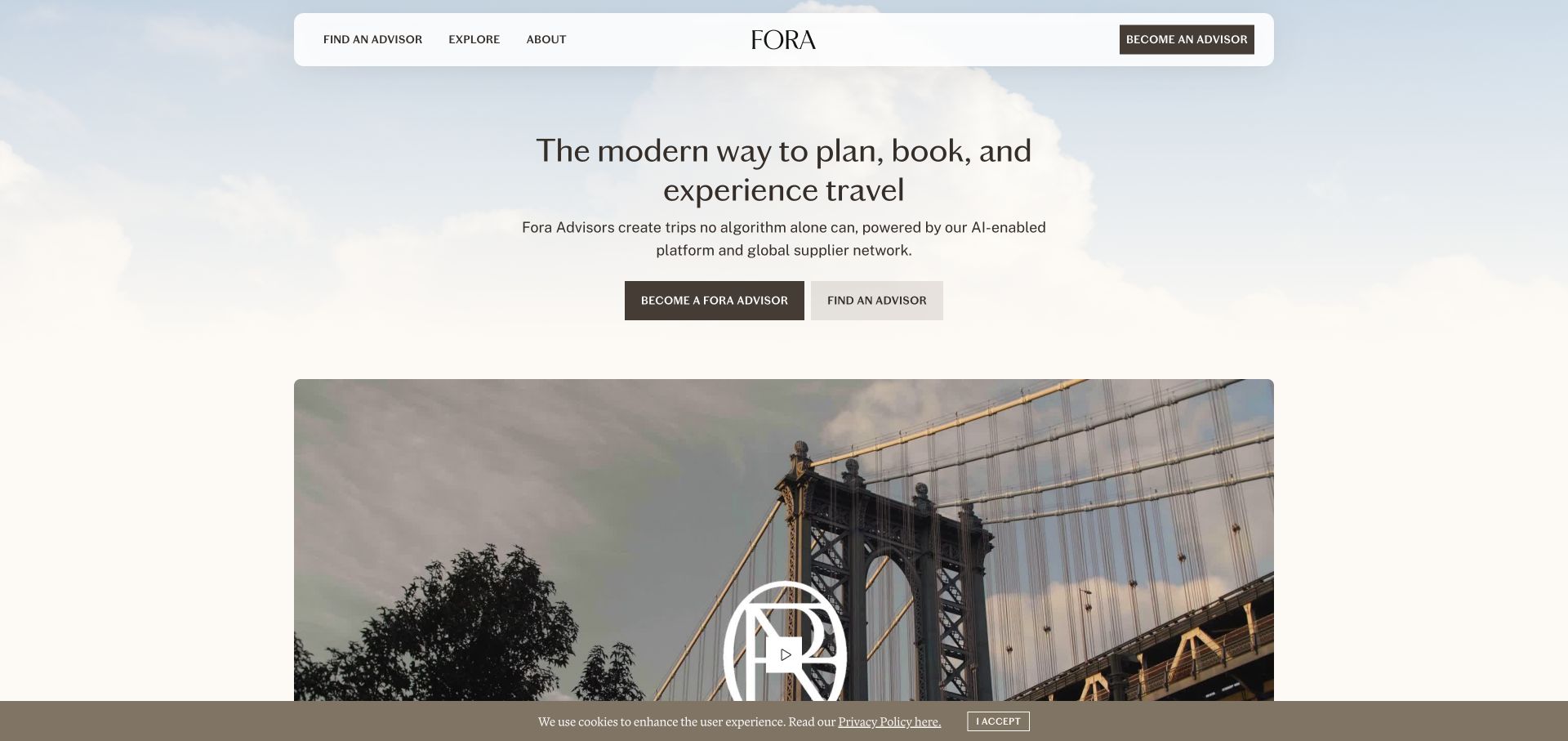
Fora uses a cream and sky-toned opening with a floating rounded white header. A concise central explanation is followed by equally prominent routes to become an adviser and find an adviser, with a large video frame beginning below. The navigation also recognizes supplier relationships. The page is a useful reference for a business whose public website must explain a marketplace rather than only sell trips. Its calm visual style gives space to the audience split, although the equal actions require visitors to identify their role immediately.
What you can learn
State the audience choice before asking visitors to act. When adviser recruitment and traveller inquiries are both important, use explicit labels and maintain distinct information paths after the initial split.
Pros
The two main actions clearly name the different roles the site supports.
A restrained palette and generous spacing make the central explanation easy to isolate.
Cons & considerations
Equal emphasis on recruitment and trip planning can distract a traveller with a single goal.
The opening provides limited immediate destination detail for visitors expecting a conventional travel catalog.
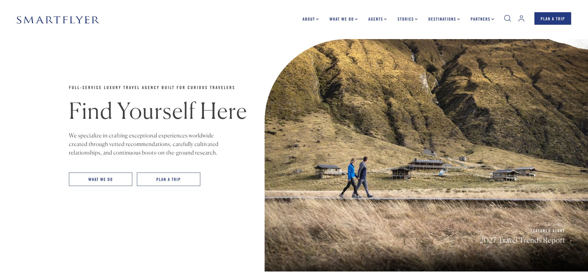
SmartFlyer uses an asymmetric split hero: editorial text and outlined actions occupy the left, while a large rounded-top travel image fills the right. A featured travel-report link sits within the image area. Navigation includes agents, stories, destinations, and partners, making the publishing and service sides of the business visible together. Navy, white, and serif typography create a magazine-like presentation. The design is useful for agencies that build interest through original editorial material while still needing a straightforward trip-planning route.
What you can learn
Let editorial content support the service model rather than conceal it. A report or story can be a strong entry point, but a visitor should also be able to identify who plans the trip and how to begin.
Pros
The split composition gives the planning actions a stable area separate from the image.
Agents and stories are both explicit navigation categories.
Cons & considerations
The featured report competes with the direct planning invitation for attention.
Outlined buttons can appear less prominent than the large image beside them.
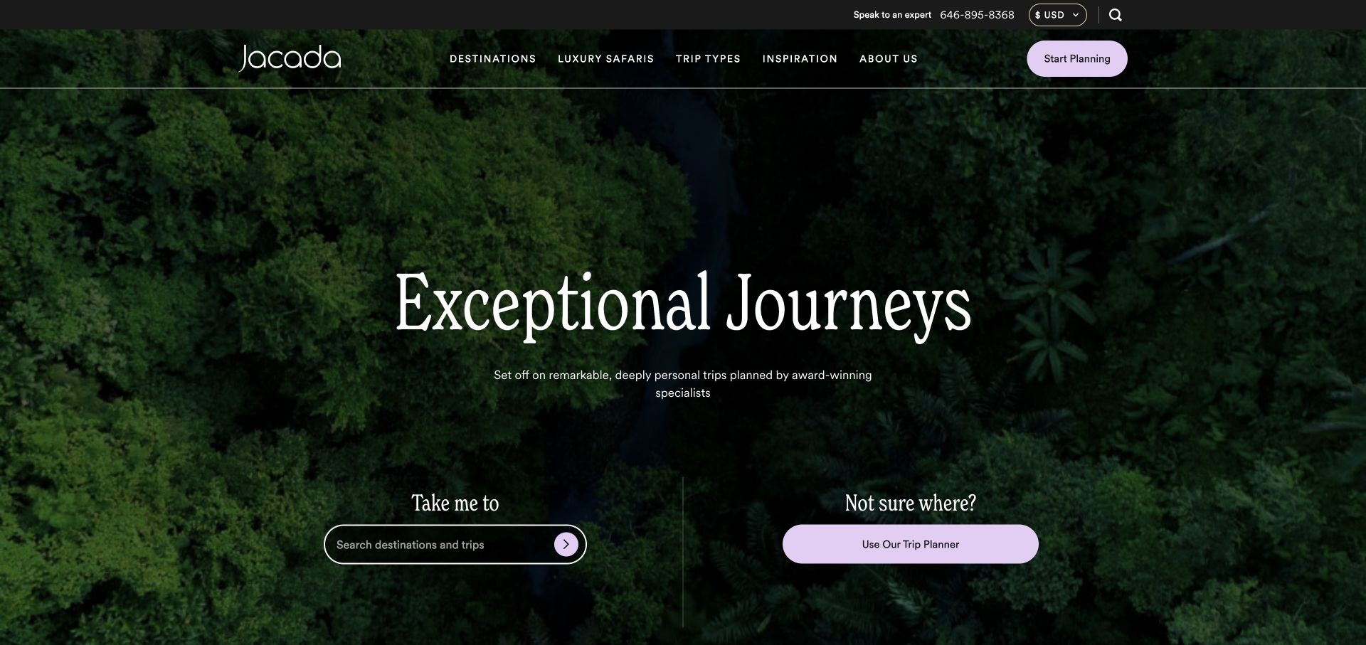
Jacada places a large serif heading over forest footage, with lavender accents in a predominantly dark and white interface. The hero separates two tasks: a destination search for people who know where they want to go, and a trip-planning route for those who are undecided. Phone and currency utilities sit above the main navigation, and a planning action is repeated in the header. This is a useful reference for custom travel because uncertainty is treated as a normal starting state rather than a failure to use search.
What you can learn
Offer a meaningful path for visitors who cannot name a destination yet. The alternative should help them express interests, timing, or travel style instead of forcing them to invent a search term.
Pros
The two hero routes distinguish known-destination searches from open-ended planning.
The repeated planning action stays accessible in the header.
Cons & considerations
Large moving scenery delays concrete itinerary examples until further down the page.
Phone, currency, search, and planning controls create several competing entry points.
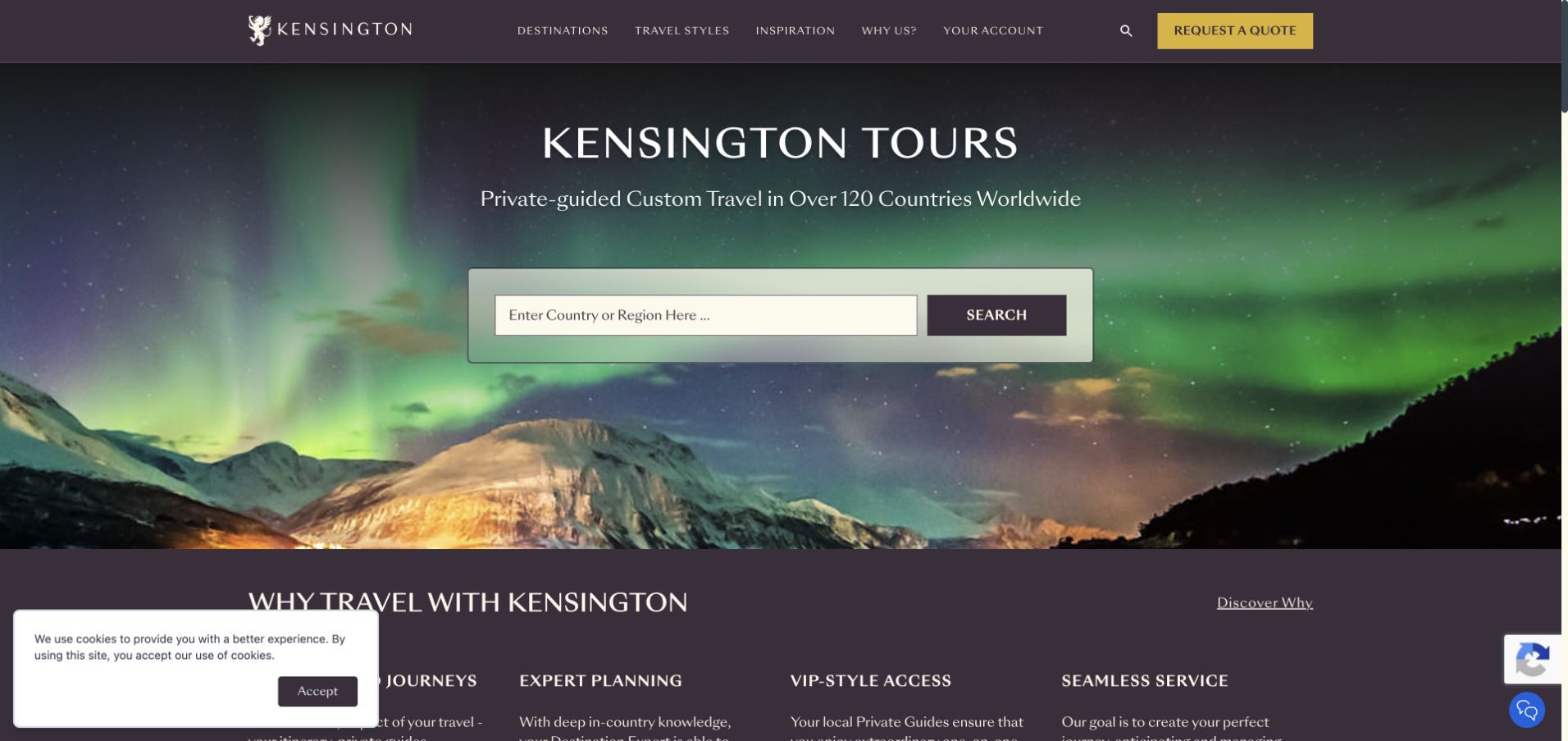
Kensington combines a plum and gold identity with an aurora photograph and a large white country-or-region search card. The opening copy explicitly describes custom private-guided travel, while a request-a-quote action remains in the header. A four-column explanation begins below the hero, providing a second layer of context after the search. The design is useful because it names the trip model early: visitors can understand the kind of planning offered before deciding whether to search a destination or start an inquiry.
What you can learn
Explain the service format before presenting a broad destination field. A phrase such as private-guided or custom travel establishes expectations that the destination name alone cannot convey.
Pros
The large search card has a clear boundary against the scenic background.
A short explanatory row follows the hero without requiring a separate about-page visit.
Cons & considerations
The scenic hero and search card leave little room for sample itinerary detail above the fold.
A quote action may feel premature to visitors who still need an overview of the process.
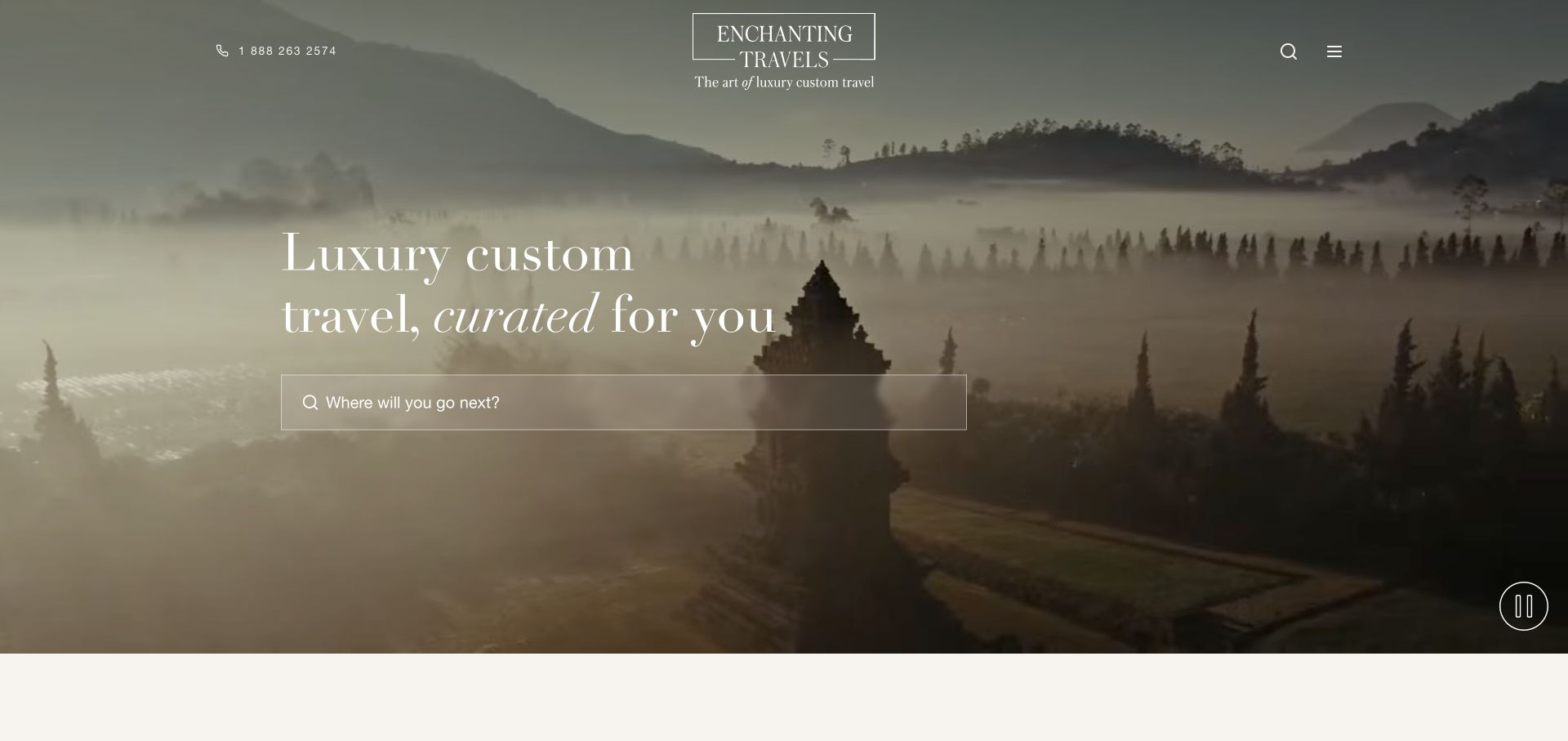
Enchanting Travels uses a misty destination film with a centered logo and a spacious serif headline. Phone contact is placed on one side of the header, with search and menu controls on the other. A broad destination field anchors the hero, and a benefits section with sample-itinerary content follows below. The interface is deliberately sparse compared with a traditional travel marketplace. It provides a useful reference for prioritizing a single discovery task, while illustrating the tradeoff of placing much of the category structure behind a menu.
What you can learn
Minimal navigation needs a strong first task and a discoverable fallback. A broad destination search can organize the opening, but visitors should still be able to find trip styles and planning information without guessing where they are hidden.
Pros
The centered composition makes the destination field the natural next step.
Phone contact remains visible despite the otherwise minimal header.
Cons & considerations
Trip categories are less immediately discoverable when most navigation is collapsed.
The atmospheric film supplies little practical itinerary information on its own.
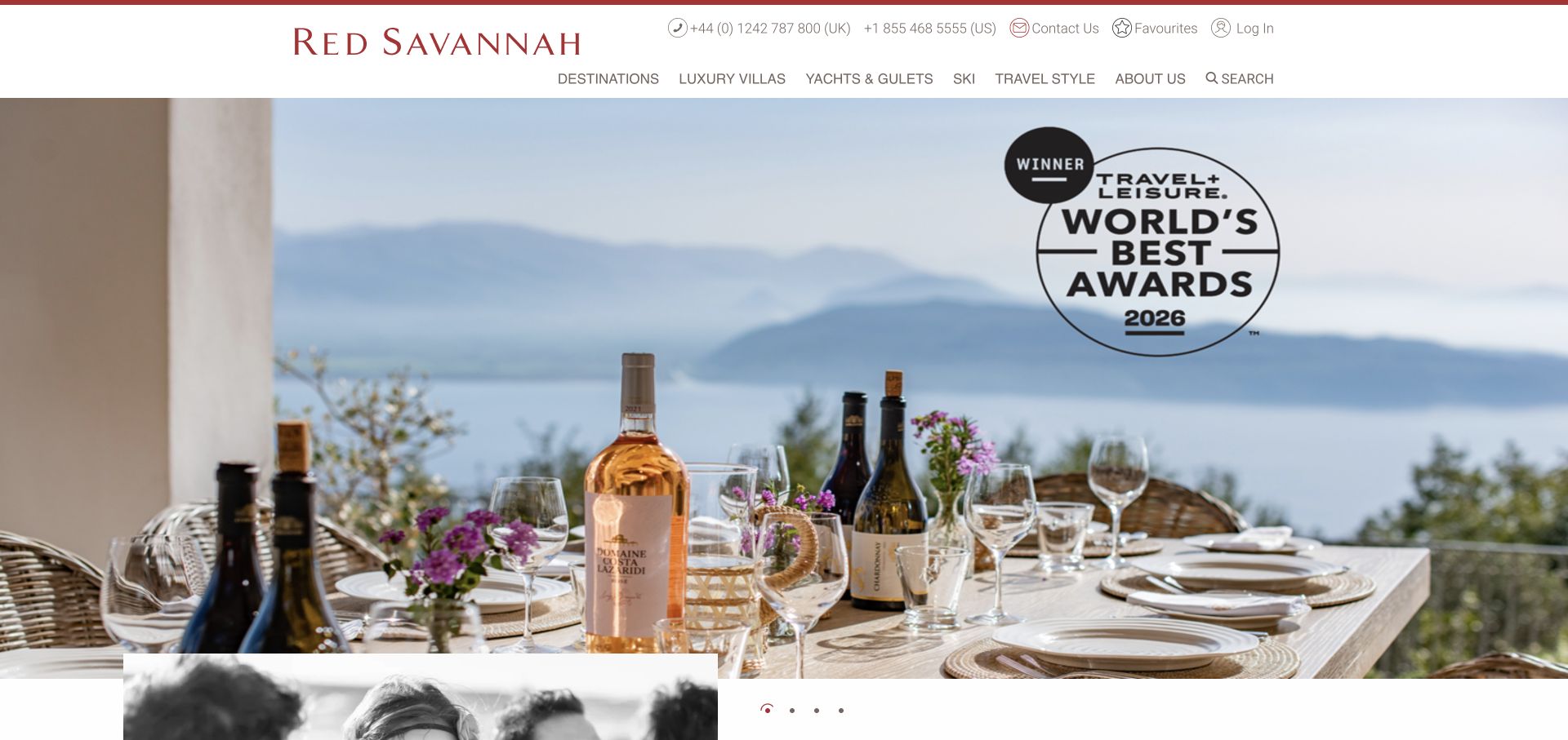
Red Savannah uses a white header, burgundy branding, and a wide terrace photograph with an award graphic in the hero. The navigation exposes specialist categories such as villas, yachts, ski, and travel styles, while separate regional phone numbers and favourites utilities sit above. Introductory text begins below the large image. The page is useful for studying a specialist travel catalog whose categories matter as much as destinations. Its opening emphasizes atmosphere and recognition, leaving the navigation to carry much of the practical planning direction.
What you can learn
When specialist services define the offer, name them clearly in navigation. If the hero is mainly a prestige image, add an obvious planning route so visitors are not left to infer the next step from the catalog alone.
Pros
Villas, yachts, and ski are exposed as distinct specialist browsing routes.
Regional phone numbers make the human-contact option visible before a visitor starts exploring.
Cons & considerations
The captured hero has less explicit planning direction than the navigation around it.
The award graphic and large photograph postpone a fuller explanation of the service.
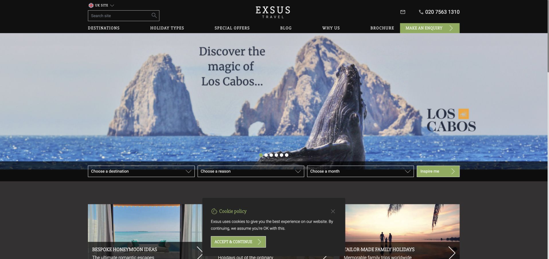
Exsus uses black and lime accents around a destination campaign, with conventional navigation, phone contact, brochure, and inquiry routes above. A dark filter bar combines destination, reason for travel, and month, ending in an inspiration action. That combination is more specific than a general search box because it recognizes the different constraints people bring to a trip. The captured hero also uses carousel dots, while themed content begins underneath. The filter structure is the most transferable part of the design.
What you can learn
Organize exploratory search around the visitor’s actual planning dimensions. Destination, occasion, and timing can work together, provided the resulting suggestions explain how they relate to the selections rather than merely showing a generic gallery.
Pros
The three filter dimensions accommodate visitors who have only part of a trip decided.
Brochure and inquiry routes remain available alongside self-directed browsing.
Cons & considerations
The filter bar introduces several decisions at once for an uncertain visitor.
Anonymous carousel dots reveal less about alternative campaign content than named tabs would.
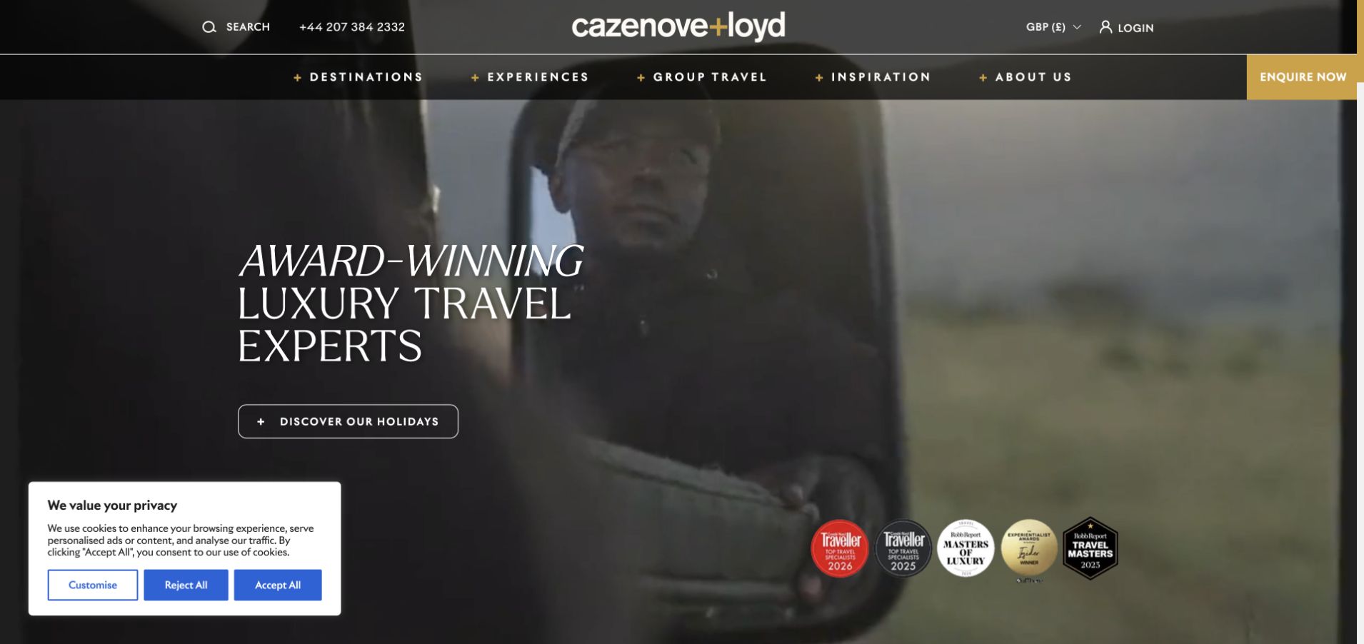
cazenove+loyd places a large italic serif headline over safari footage, using black and gold to establish a distinctive editorial identity. Phone and currency utilities sit above destination, experience, group, and inspiration navigation. A gold inquiry action remains visible in the header, while an outlined holiday-discovery action sits within the hero. An award strip and consent panel occupy opposite lower corners in the captured state. The page is useful for studying how a specialist agency can express a strong voice while retaining both browsing and direct-contact routes.
What you can learn
Keep a persistent inquiry action outside the destination film. The editorial story can change by campaign, but the visitor’s route into a conversation should not depend on watching or understanding that story first.
Pros
The gold inquiry action has a consistent place in the upper navigation.
Destination and experience categories support both geographic and interest-led browsing.
Cons & considerations
The lower award and consent panels compete with the full-bleed visual composition.
Large expressive type leaves limited room for practical trip details in the opening view.
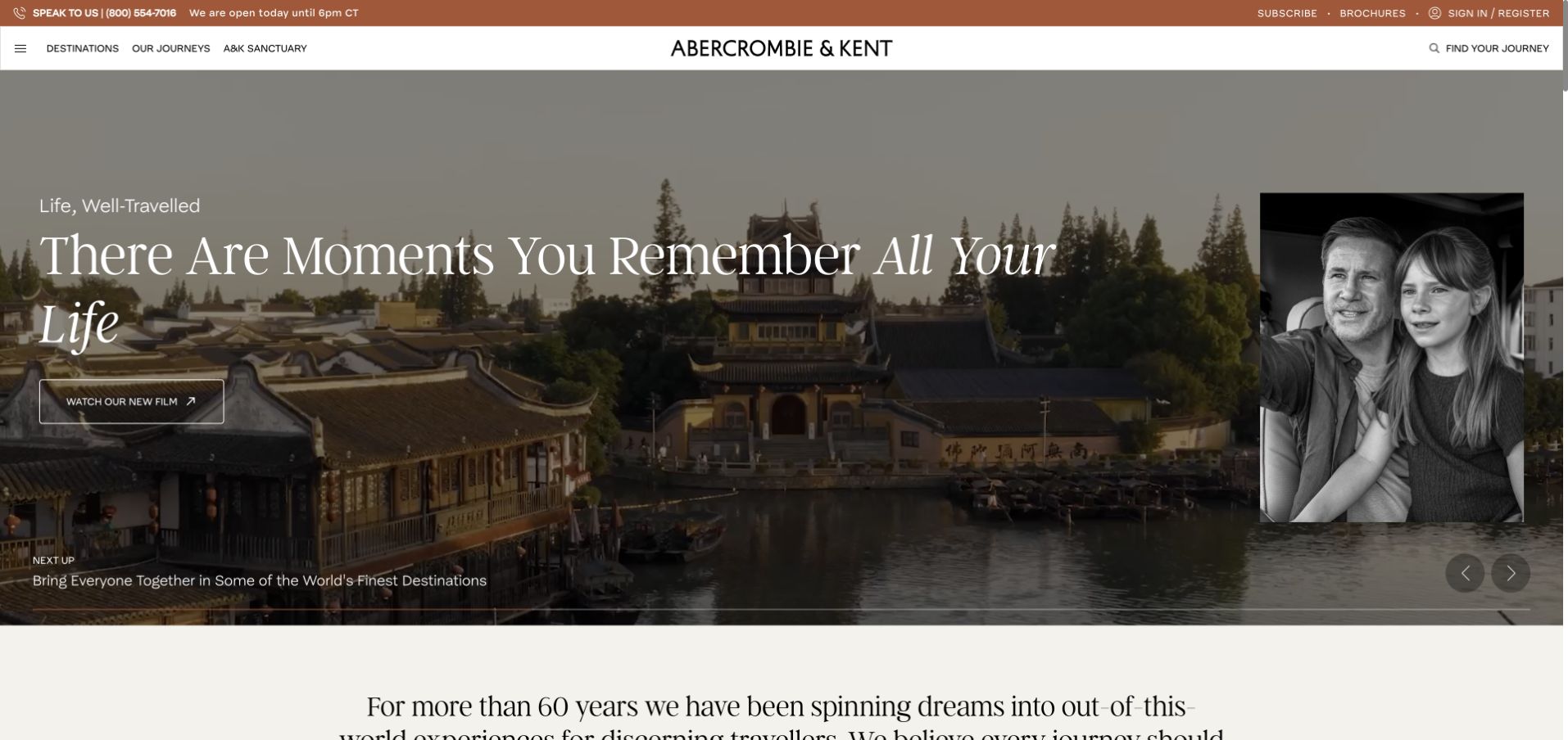
Abercrombie & Kent combines a terracotta utility bar with a compact white main navigation. Phone availability, brochure, and sign-in routes sit above a panoramic city scene with oversized serif text and a portrait inset. A film action and story pagination make the opening feel like a feature article rather than a search page. The design is useful for agencies whose heritage is part of the positioning, but it also illustrates the need for clear service navigation when the hero is devoted to storytelling.
What you can learn
Give a brand-history feature a defined role in the page. Visitors should be able to explore the story while retaining a straightforward route to actual journeys, contact, or account-related services in the surrounding navigation.
Pros
The utility bar separates practical contact information from the editorial hero.
The portrait inset and large headline create a recognizable feature-story composition.
Cons & considerations
A film-led opening asks more time from visitors who want immediate trip options.
Story pagination introduces another interaction before concrete itinerary discovery.
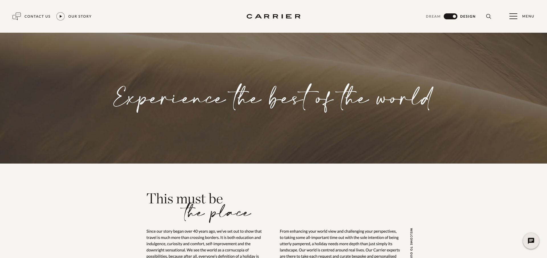
Carrier first presents a choice between dreaming and designing; the inspected capture is the linked Design page. A centered, widely spaced logo sits in a warm white header, with contact and company information on the left and a Dream/Design toggle, search, and menu on the right. A dune photograph and script headline lead into a two-column editorial introduction. The page is useful for studying how an agency can explicitly recognize different planning stages, though the minimal controls require visitors to explore further for detailed categories.
What you can learn
If inspiration and planning are separate modes, name the distinction clearly and keep the switch available. Each mode still needs an obvious next task so the visitor does not encounter only another atmospheric introduction.
Pros
The persistent Dream/Design switch makes the planning-stage distinction visible.
A restrained header gives the landscape and editorial typography substantial breathing room.
Cons & considerations
Sparse navigation exposes fewer destination and service categories at first glance.
The scenic introduction provides limited immediate detail about the actual design process.
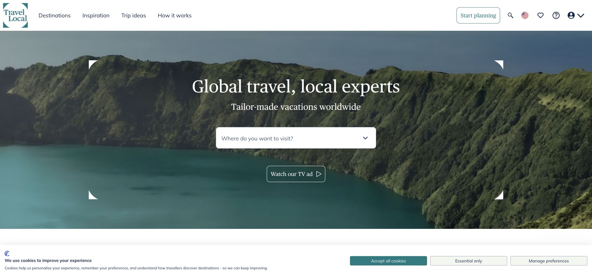
TravelLocal uses teal and white around a broad landscape hero with a large framed headline and prominent destination dropdown. The header exposes destinations, inspiration, trip ideas, and an explanation of how the service works. A planning action sits alongside help, saved-trip, and region utilities. A secondary television-ad route adds brand storytelling, while the main interface remains focused on choosing where to go. The page is a useful reference for connecting a custom-travel proposition to a simple first decision.
What you can learn
Place the service explanation near destination discovery. A visitor can choose a place quickly, but they also need a clear route to understanding who develops the itinerary and how the planning relationship works.
Pros
The destination dropdown creates a concrete next step within the scenic hero.
The how-it-works category makes process information visible in the main navigation.
Cons & considerations
Several utilities compete with the primary planning action in the header.
The captured consent strip reduces the unobstructed space beneath the hero content.
Identify the main arrival states: a known destination, fixed dates, a special occasion, a preferred travel style, or complete uncertainty. Design a manageable number of entry paths around those states and connect them to useful destination or itinerary content.
Connect inspiration to evidence
Follow evocative imagery with concrete explanations of trip format, itinerary possibilities, and the planning process. Distinguish sample itineraries from fixed packages. A visitor should understand what can be customized and what the next conversation will cover.
Design the handoff to an adviser
Make the inquiry action say what it starts. Preserve the selected destination or trip context where appropriate, request only useful initial information, and explain the expected next step. Test the confirmation and routing during implementation without treating a decorative form as a complete service.
The editing job behind the design
Build around destinations, itineraries, and adviser workflows
Model destinations, travel styles, sample itineraries, advisers, and editorial stories as related content. This lets an article lead naturally to a relevant trip or expert. A CMS choice should reflect who maintains those relationships and how frequently campaigns, seasonal details, and contact information change.
Search, inquiry routing, booking management, and editorial publishing may rely on separate systems. Document the handoffs and keep labels consistent across them. Visual appearance alone does not establish the technology behind these sites, so the examples leave unverified stack information empty.
Our WordPress website examples offer a separate look at publishing approaches. A visible platform label is evidence for that named page, not a guarantee that the same system will suit your requirements.
Before the public launch
Travel agency website planning checklist
State the agency’s trip-planning model near the first meaningful action.
Offer a direct route for visitors who already know their destination.
Provide an exploratory path for people who have not chosen where to travel.
Make adviser contact and existing-booking help distinguishable.
Label sample itineraries and explain what can be customized.
Keep market and currency choices understandable without dominating the page.
Use descriptive labels for inquiry, appointment, and quote actions.
Review hero text against every relevant frame of moving media.
Check consent panels and promotional overlays in the first-visit layout.
Keep brand-transition explanations visible when older domains remain in use.
These checks are a project checklist, not a performance, legal, security, or accessibility certification. Test real journeys with the people responsible for the website before making claims about the result.
Sources & editorial method
How this collection was selected and reviewed
Inspected 21 distinct public travel agency websites in Chrome on November 3, 2026, after the example target was fixed. Saved original direct browser captures and page snapshots, excluding an incomplete blank capture. Carrier is shown on its linked Design page; other examples show the inspected public homepage or its redirected equivalent. Reviews concern website design and navigation, not travel-service outcomes.
Each example links to its actual source page. Screenshots are direct browser captures with their own capture dates; moving imagery, announcements and live designs can change. The notes describe observable design choices and conditional tradeoffs, not measured traffic, conversion results, service quality, or accessibility conformance.
Technology labels use public page metadata, asset evidence, or explicitly cited platform documentation. Platform documentation is not a complete current deployment audit. A component reference may be legacy or unused; it is not a complete backend inventory. Unknown stacks are omitted. These sites are editorial examples, not our client portfolio.
Written, Edited and Curated are separate editorial records, not timestamps advanced by a rebuild. Website designs and imagery belong to their owners. See our editorial standards or suggest a correction.
Questions worth asking
Travel Agency website design questions
Should a travel agency lead with search or an inquiry button?
That depends on the service model and the visitor’s readiness. Search suits people who can define a destination or flight. An inquiry can suit custom planning, but it should explain the process and allow visitors to explore before they share trip details.
How can a travel website help someone who does not know where to go?
Offer a few meaningful alternatives such as month, travel style, occasion, or interests. Connect those choices to specific suggestions and explain why they fit. A broad inspiration link is less useful if it simply opens another unstructured set of photographs.
What should appear beside a large destination photograph?
A clear description of the service and a practical next step. Depending on the agency, that may be destination search, a sample itinerary, an adviser finder, or a planning conversation. The image establishes tone; the surrounding interface explains what the agency can do.
How should an agency show advisers on its website?
Introduce their role, relevant expertise, and how a visitor starts working with them. A portrait can make the service tangible, but the site also needs a clear matching or contact route. Recruitment content should be visibly separated from traveller inquiries.
Do these examples verify prices, availability, or trip quality?
No. The collection reviews visible website organization and design. Campaign prices, availability, awards, and testimonials can change and are not used here as independent proof of travel quality or value.
Choose a reference that matches the way your agency plans trips. The right homepage helps visitors understand their next decision and how the agency will help them make it.