A streaming website should help visitors understand what they can discover, how access works, and what happens next. Catalog browsing, plan selection, and library eligibility are related tasks with different information needs.
This collection uses streaming media broadly: on-demand film and television, live-channel services, music streaming, and library-supported access to audiovisual collections. The public entrances serve different audiences. A catalog page can lead with titles and discovery; a plan page must explain the access being offered; a library gateway must make the institutional relationship clear before asking someone to begin.
The twenty-six examples include broad entertainment catalogs, specialist film and creator services, live television packages, music platforms, and library gateways. Reviews examine the visible public interface and its next-step language. They do not test playback, account benefits, sound or picture quality, geographic availability, subscription value, or the completeness of a service’s catalog.
Before the examples
What makes good streaming media companies website design in 2026?
Explain the access model before the commitment
State whether the relevant offering involves a subscription, advertising-supported access, an individual purchase, or participation through an institution. Keep the meaning of browse, play, subscribe, sign in, and get started distinct. If an action first checks eligibility or opens a plan selector, make that handoff understandable rather than implying immediate playback.
Give discovery more than a poster grid
Pair artwork with useful text such as title, creator, format, genre, and a short description where relevant. Keep search and recognizable categories available alongside curated collections. Distinguish a film from a series, an album from a playlist, and a scheduled channel from an on-demand item so visitors can predict the destination before opening it.
Attach availability to the relevant context
Connect catalog and channel information to the applicable region, plan, date, or institution. Explain why a location or library selection is needed and retain it as the visitor browses. If an item cannot be accessed in the selected context, provide a clear explanation and useful alternatives without presenting the limitation as an unexplained playback error.
Make offers and ongoing access comparable
Show the ordinary billing period, price basis, relevant access differences, and what happens after an introductory offer where the service uses one. For institutional access, explain the participating-library or university route and the next eligibility step. Do not force these different models into a comparison table whose headings conceal their practical differences.
The collection · 26 examples
26 streaming media companies websites worth studying
Compare each page according to its job: a browsable catalog, a specialist editorial introduction, a live-channel offer, a music-service entrance, or a library-access gateway. Artwork and familiar titles can attract attention, while labels, availability context, and clear actions make the page usable.
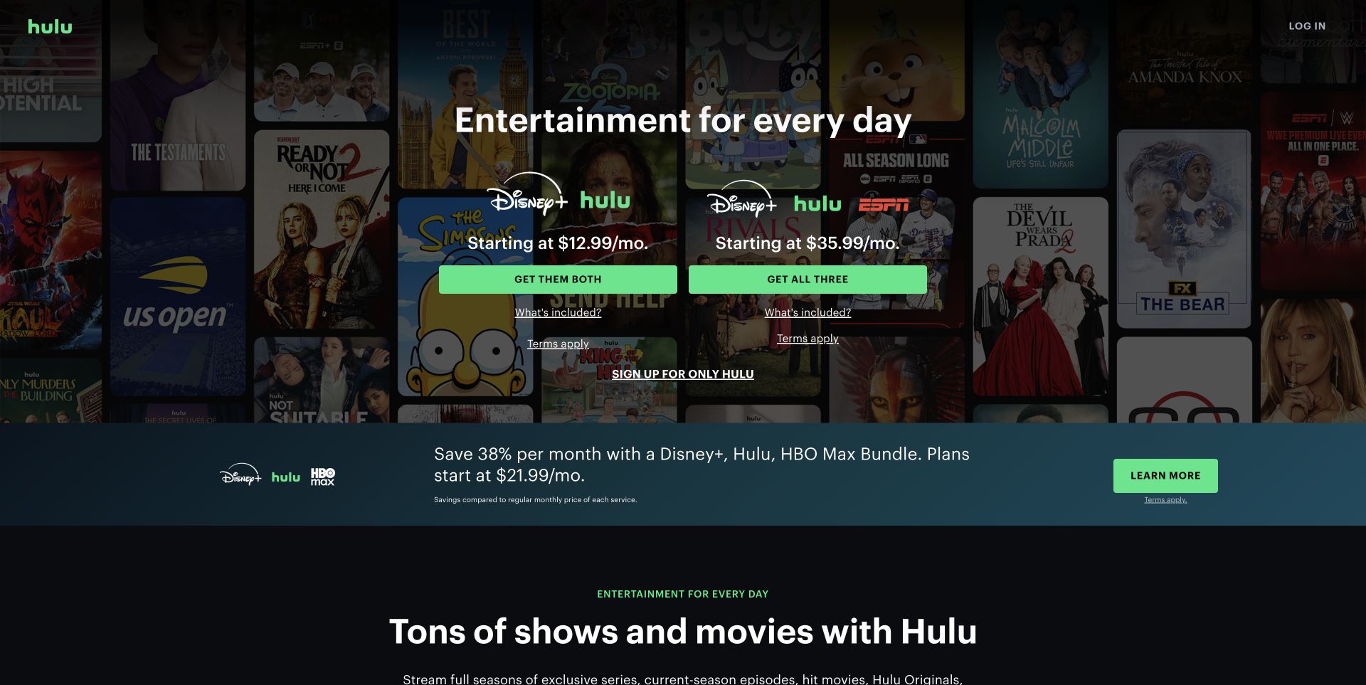
Hulu’s retained November 2 welcome-page capture places two subscription bundles side by side over a darkened mosaic of programs. Each option groups the relevant service logos, a starting price, a green action and a link explaining what is included. A separate text link keeps the standalone Hulu option available. Below, another horizontal promotion introduces a different bundle before the page begins its broader catalog explanation. The arrangement makes the immediate choice concrete, but several overlapping packages compete for attention in one viewport. This review describes the photographed offer hierarchy; it does not treat those displayed prices or titles as a continuing availability promise.
What you can learn
Give each bundle the same information structure so visitors can compare like with like. Keep a standalone option easy to find, and explain the difference between a promoted package and the wider catalog before requesting account details.
Pros
Service logos make the two main combinations easy to distinguish.
Inclusion and terms links sit beside the relevant subscription action.
Cons & considerations
A third bundle promotion increases comparison work immediately below the hero.
The standalone service entrance is visually weaker than the bundle buttons.
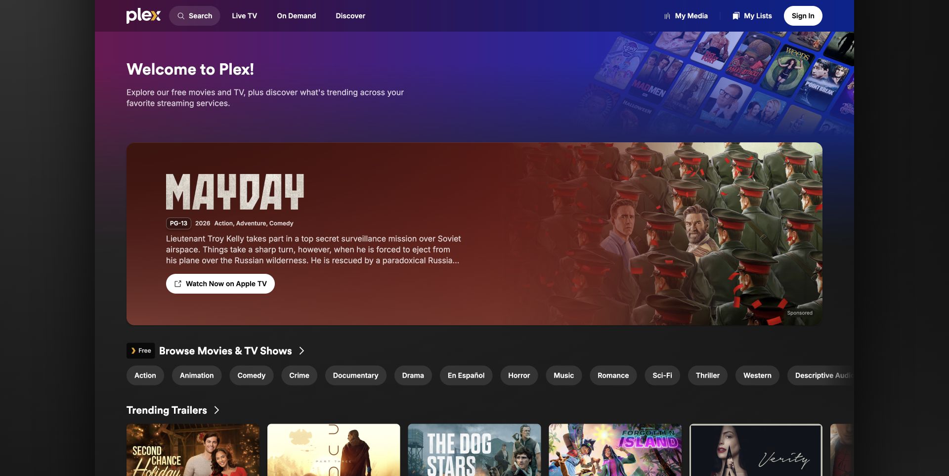
Plex’s retained November 2 public discovery capture opens with a compact explanation of free viewing and cross-service discovery. A large sponsored film feature then names Apple TV directly in its viewing button, with an external-link symbol reinforcing the handoff. The title card provides a rating, year, genres and synopsis before the action. Below, a free-catalog label and a row of genre pills create a second route that stays within Plex’s discovery structure. Search, Live TV, On Demand and Discover remain distinct in the header. This is a useful example of a service explaining more than one kind of availability, although the sponsored feature occupies most of the opening.
What you can learn
Name the viewing destination at the point of action. When an aggregator mixes included content and external offers, use consistent labels that let visitors distinguish discovery from access without reading every detail page.
Pros
The featured action explicitly identifies its external streaming destination.
Genre pills provide a quick alternative to the large promotional card.
Cons & considerations
The sponsored title can overshadow the service’s own free catalog.
Several discovery modes require clear explanations as visitors move deeper.
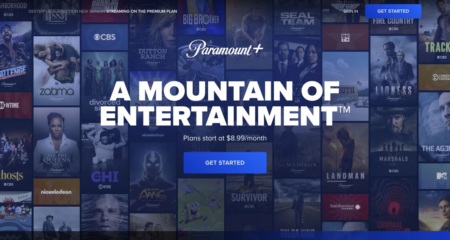
Paramount+ uses a dark blue wash over a dense wall of program artwork, placing its white brand mark, oversized entertainment statement and one blue Get Started button in the center. A starting-price line sits between the headline and action. The header repeats the acquisition route while preserving Sign In for returning viewers. A small strip across the top promotes a particular premium-plan series, so the broad promise and a specific content incentive share the opening. The capture makes the service recognizable without requiring familiarity with every poster. It does not, however, expose detailed browsing or plan differences within this first screen.
What you can learn
A large catalog can support one clear introductory action when the text has enough contrast and space. Follow that simple entrance with a comparison that explains plan differences before the visitor commits to a subscription.
Pros
The central logo, proposition and action form an obvious reading sequence.
A separate sign-in route accommodates existing subscribers.
Cons & considerations
The first screen offers little direct exploration of individual titles.
The premium-series strip adds a plan-specific message before the comparison.
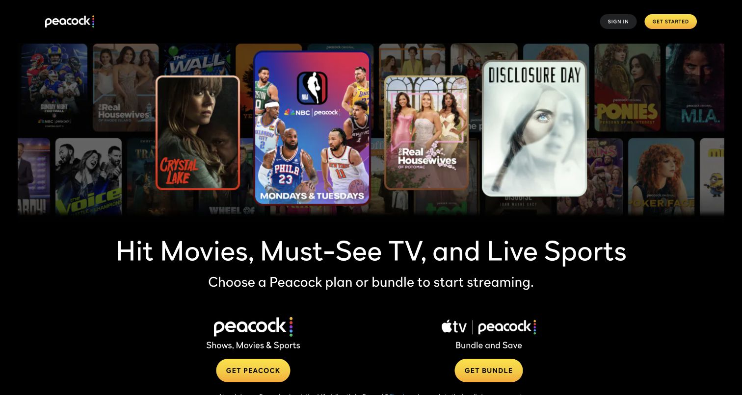
Peacock’s opening combines a wide montage of shows, film and sport with a large statement about its entertainment range. Beneath the headline, two balanced columns distinguish Peacock alone from a bundle with Apple TV. Each column uses service logos, a short explanation and a yellow button. The black background separates the composition from the colorful content artwork, while a slim header keeps Sign In and Get Started visible. Unlike a hero with one generic trial button, this page asks the visitor to choose the kind of offer first. Detailed plan inclusions still sit beyond the photographed opening, so the logos cannot carry the entire comparison.
What you can learn
When a bundle is a major offer, give it a parallel position beside the standalone service. Use the same visual structure for both and reserve a nearby comparison for the practical differences that brand logos cannot explain.
Pros
The two offer paths are balanced and clearly labeled.
Yellow actions stand out against the dark page without competing with poster colors.
Cons & considerations
The opening does not show the detailed cost or entitlement differences.
Large artwork pushes some practical account guidance toward the lower edge.
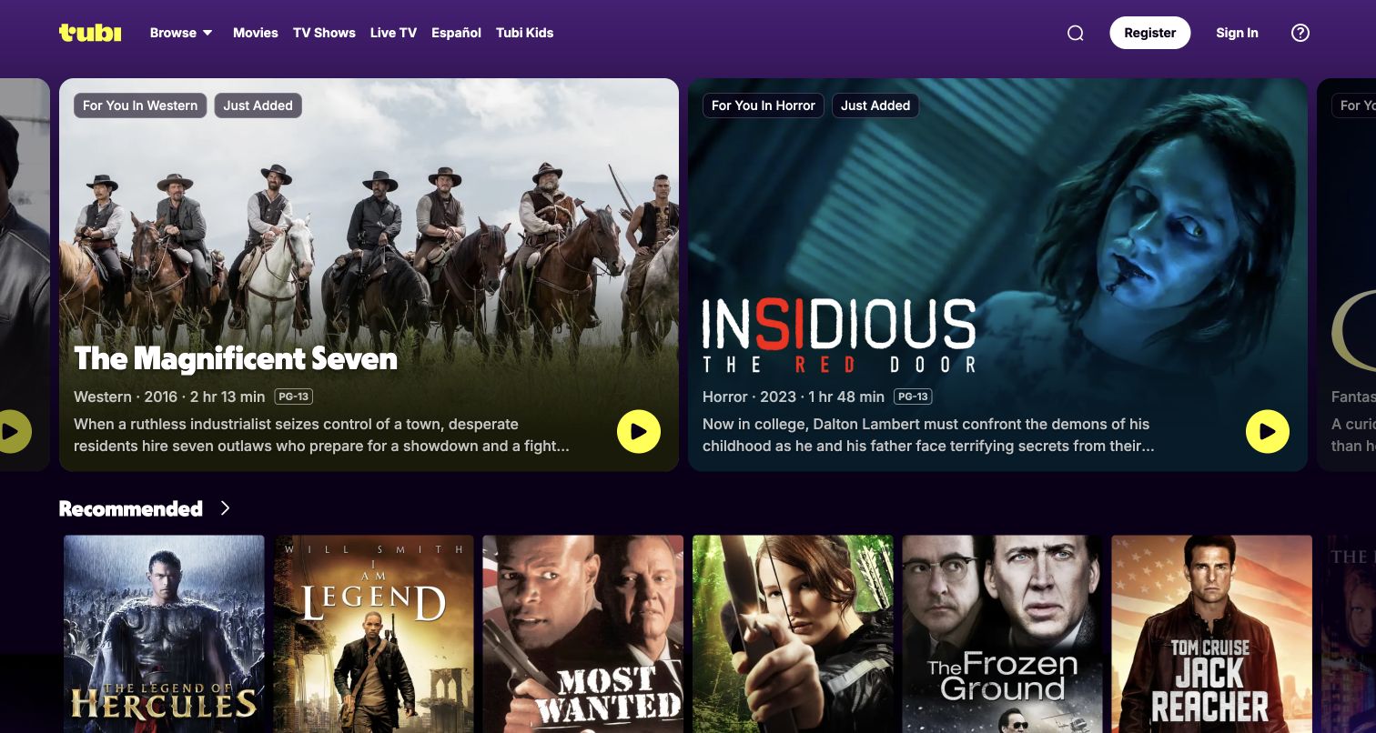
Tubi’s public opening behaves like a browsing interface rather than a subscription pitch. Large adjacent title cards show artwork, genre, release year, duration, rating and a brief synopsis, with bright yellow play controls. A purple header exposes movies, television, live channels, Spanish-language content and a children’s route. The screenshot shows a Western and a horror title sharing the carousel, followed by a row of recommended posters. Sign In and Register are both available, confirming a public entrance rather than an account view. The cards provide more decision support than artwork alone, although the recommendation labels do not explain how items were selected.
What you can learn
Let visitors evaluate a title before asking them to play it. Pair expressive artwork with stable metadata, and ensure browsing categories remain available when a rotating feature does not match the visitor’s interests.
Pros
Runtime, rating and genre appear directly on the featured cards.
The header distinguishes major viewing modes and audience routes.
Cons & considerations
Horizontal cards and truncated descriptions can hide part of a comparison.
Recommendation wording should not be mistaken for evidence of personal account data.
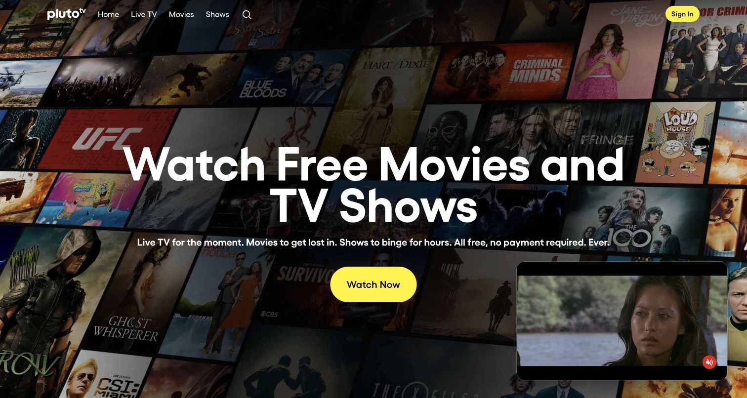
Pluto TV places a large free-viewing statement over an angled collage of entertainment artwork. Supporting copy names live television, films and shows, and a yellow Watch Now button supplies the dominant action. Home, Live TV, Movies, Shows and Search are available across the top, with Sign In separated on the right. The screenshot also contains a small moving-content preview in the lower-right corner, adding a second visual focus. This composition explains the basic access proposition quickly while leaving browsing modes visible. It does not establish what any particular title includes or whether a viewer will encounter regional limits beyond the entrance.
What you can learn
State the access model in plain language before introducing the catalog. Keep direct browsing routes visible alongside the main action, and check that a moving preview does not cover content or compete excessively with the message.
Pros
The access proposition is readable without interpreting the artwork.
Main navigation separates live programming from films and shows.
Cons & considerations
The floating preview adds motion and occupies part of the hero.
Catalog and regional conditions need clearer detail beyond the general promise.
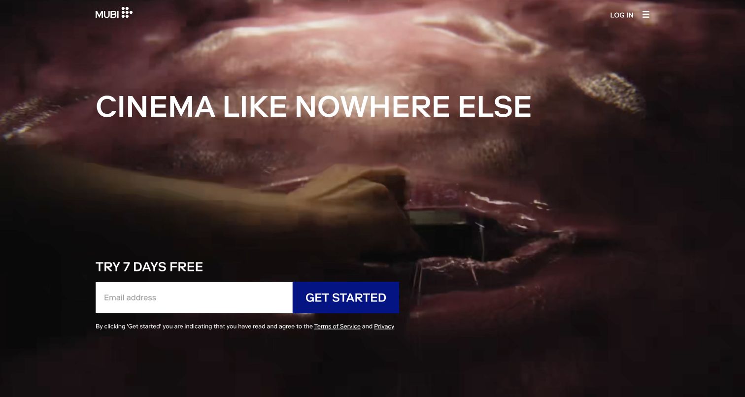
MUBI’s captured United States entrance uses an atmospheric full-screen film image behind a short cinema statement. A simple wordmark sits at the upper left, while Log In and a compact menu occupy the opposite corner. The lower-left area groups the trial invitation, email field, Get Started button and accompanying terms links. The still is intentionally less explanatory than a wall of recognizable posters, making the brand’s editorial position the main selling point. This creates a strong mood and a clear next action, but the first screen gives a prospective subscriber little direct evidence of the available catalog or the price after the trial.
What you can learn
A specialist service can lead with editorial character, provided the next steps remain clear. Pair the emotional introduction with accessible catalog, membership and device information so visitors can evaluate the offer before entering personal details.
Pros
A restrained header gives the cinematic image room to establish tone.
The email entrance and its explanatory links are grouped together.
Cons & considerations
The opening does not provide a useful sample of the current catalog.
Trial messaging requires nearby follow-on pricing and eligibility detail.
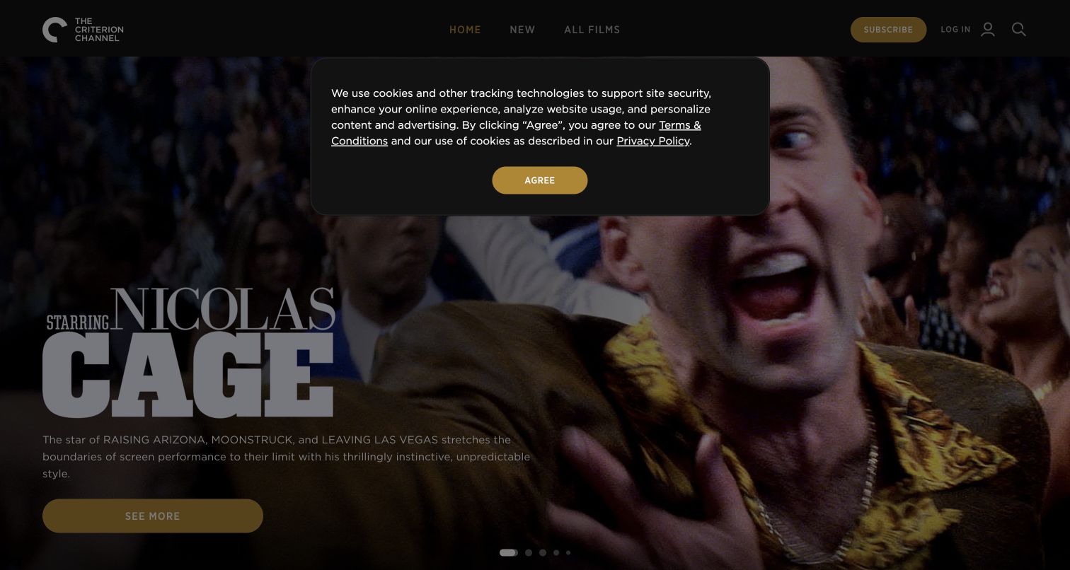
Criterion Channel’s captured homepage promotes a Nicolas Cage collection through a large film still, distinctive title treatment and a short editorial explanation. The main navigation offers Home, New and All Films, with Subscribe, Log In and Search separated to the right. A gold See More action belongs to the featured collection. In this observed first-visit state, a centered cookie notice dims the page and occupies much of the upper hero. Its Agree text refers to Terms and Conditions, so it was left untouched. The underlying composition remains readable enough to show a collection-led approach, while the overlay demonstrates how a notice can interrupt that editorial introduction.
What you can learn
Use a collection headline to explain why several films belong together. Review first-visit notices as part of the same composition, because their placement can determine whether visitors ever see the intended opening hierarchy.
Pros
The feature explains a curatorial idea rather than presenting an isolated poster.
All Films and Search offer alternatives to the current feature.
Cons & considerations
The retained notice obscures a substantial part of the opening image.
This capture does not show the unobstructed or signed-in catalog experience.
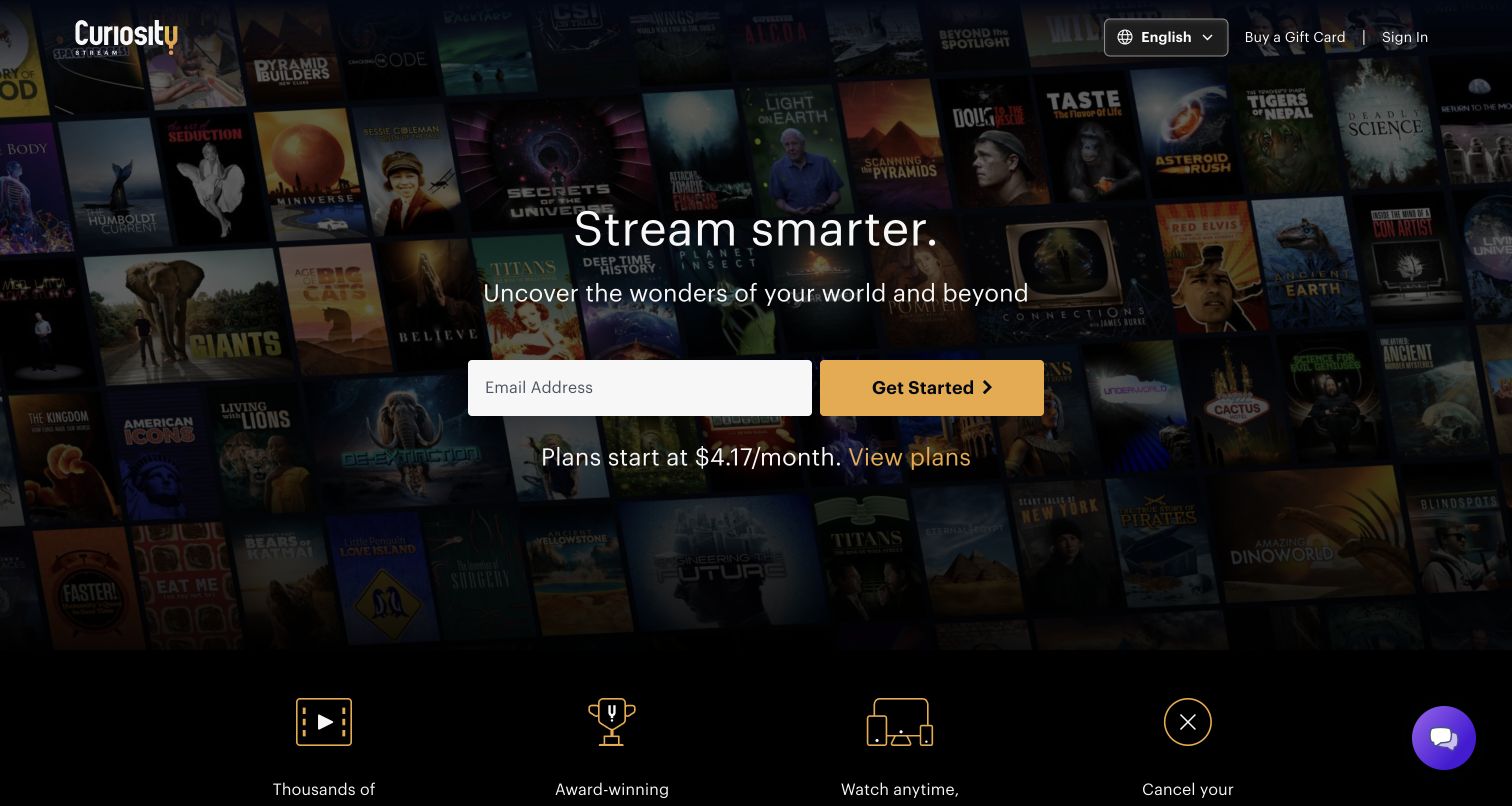
Curiosity Stream darkens a mosaic of documentary covers and centers a short invitation to explore the world. The email field and gold Get Started button sit together, followed by a starting-price line and a View Plans link. Along the lower edge, four simple icons introduce catalog breadth, original programming, device access and cancellation messaging. A language selector, gift-card route and Sign In occupy the header without becoming a second navigation system. The composition combines subject identity and an obvious acquisition step. The displayed monthly equivalent still needs its billing basis explained in the plan details, and the background covers are more atmospheric than searchable.
What you can learn
Keep a specialist content promise concrete and connect the first action to an accessible plan comparison. If a monthly-looking figure represents another billing period, make that relationship explicit before the visitor begins an account flow.
Pros
The plan link is placed directly beside the opening price message.
A short row of benefits gives the next section a predictable structure.
Cons & considerations
Background poster titles are difficult to inspect individually.
The hero’s price shorthand needs the fuller billing explanation below.
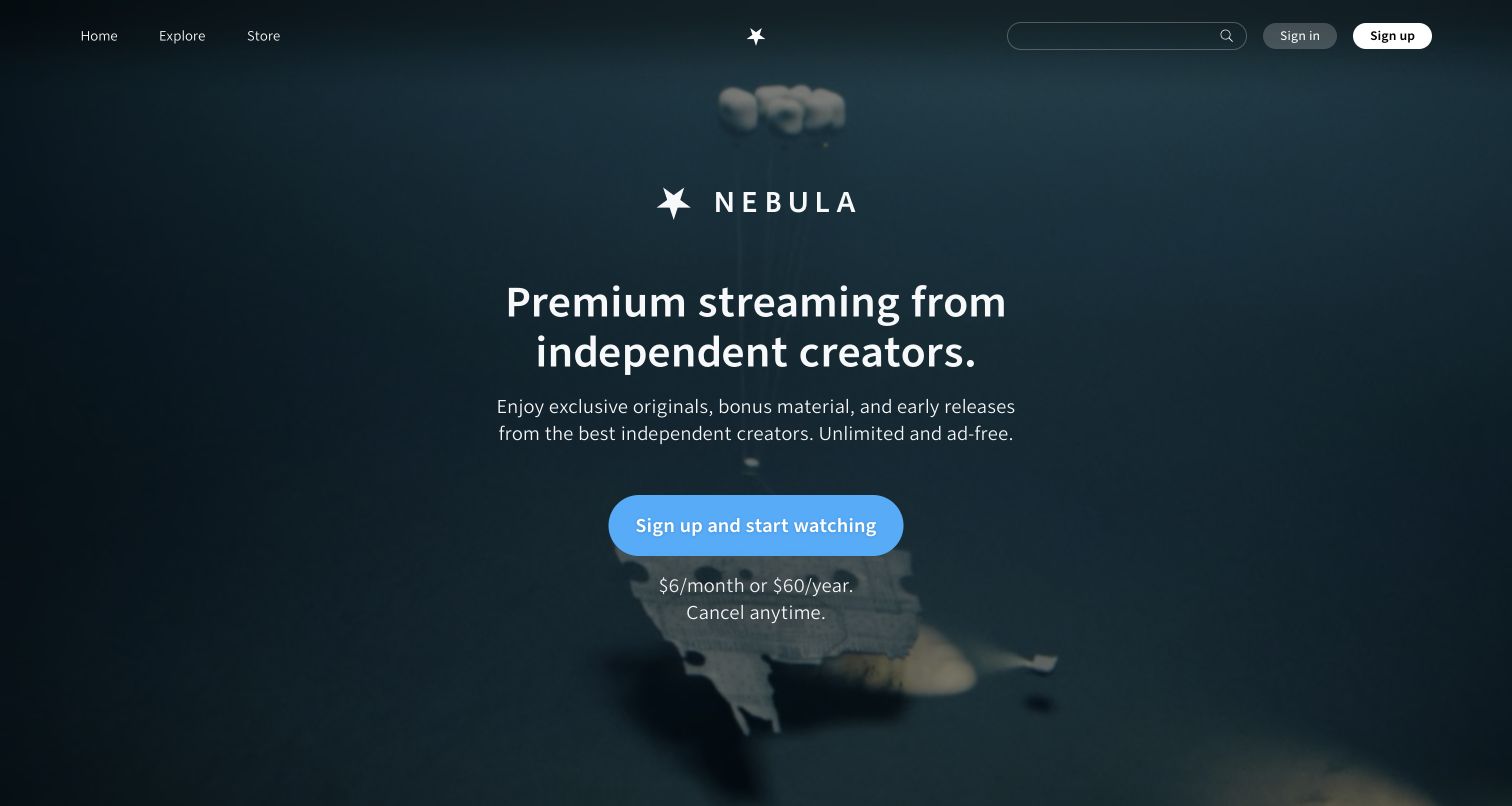
Nebula centers its star mark, name and independent-creator proposition over a subdued dark film background. A short supporting paragraph names originals, bonus material and early releases, while a blue sign-up button is followed by monthly and annual pricing text. The top navigation includes Home, Explore and Store, and a persistent search field remains visible even though acquisition is the central goal. This helps the page communicate an editorial identity without hiding all discovery behind registration. The opening relies on a general description of the creators rather than showing their names immediately, so unfamiliar visitors must continue to the featured originals for specific proof.
What you can learn
Explain who makes the content and why that changes the viewing experience. Keep exploration available beside subscription messaging, then use named creators and concrete examples to substantiate the broader promise.
Pros
Search and Explore remain available before registration.
Monthly and annual options appear close to the main action.
Cons & considerations
The dark background contributes little specific catalog information.
Visitors unfamiliar with the creators need examples beyond the opening.
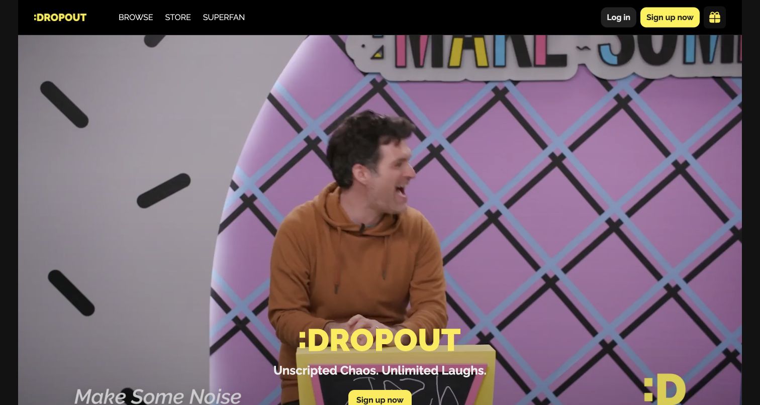
Dropout’s public entrance uses a large performance clip, captured here on a colorful Make Some Noise set. Its yellow wordmark, short comedy statement and sign-up button sit low over the image. A black header separates Browse, Store and Superfan from Log In, Sign Up and gifting. The visible show title in the footage connects the general brand promise to a recognizable program. An ordinary cookie banner was closed before this final capture. The result feels energetic and specific to the performers, but the main message sits near the lower edge and the footage must carry much of the explanation for a new visitor.
What you can learn
Use real program material to make an entertainment brand feel specific, then protect the visibility of the text and action across every frame. Offer a direct browsing route for visitors who need examples before subscribing.
Pros
The show footage gives the offer a distinctive human character.
Browse stays separate from merchandise and membership promotion.
Cons & considerations
The main action sits close to the bottom of this desktop viewport.
The first screen does not explain the full format range or membership terms.
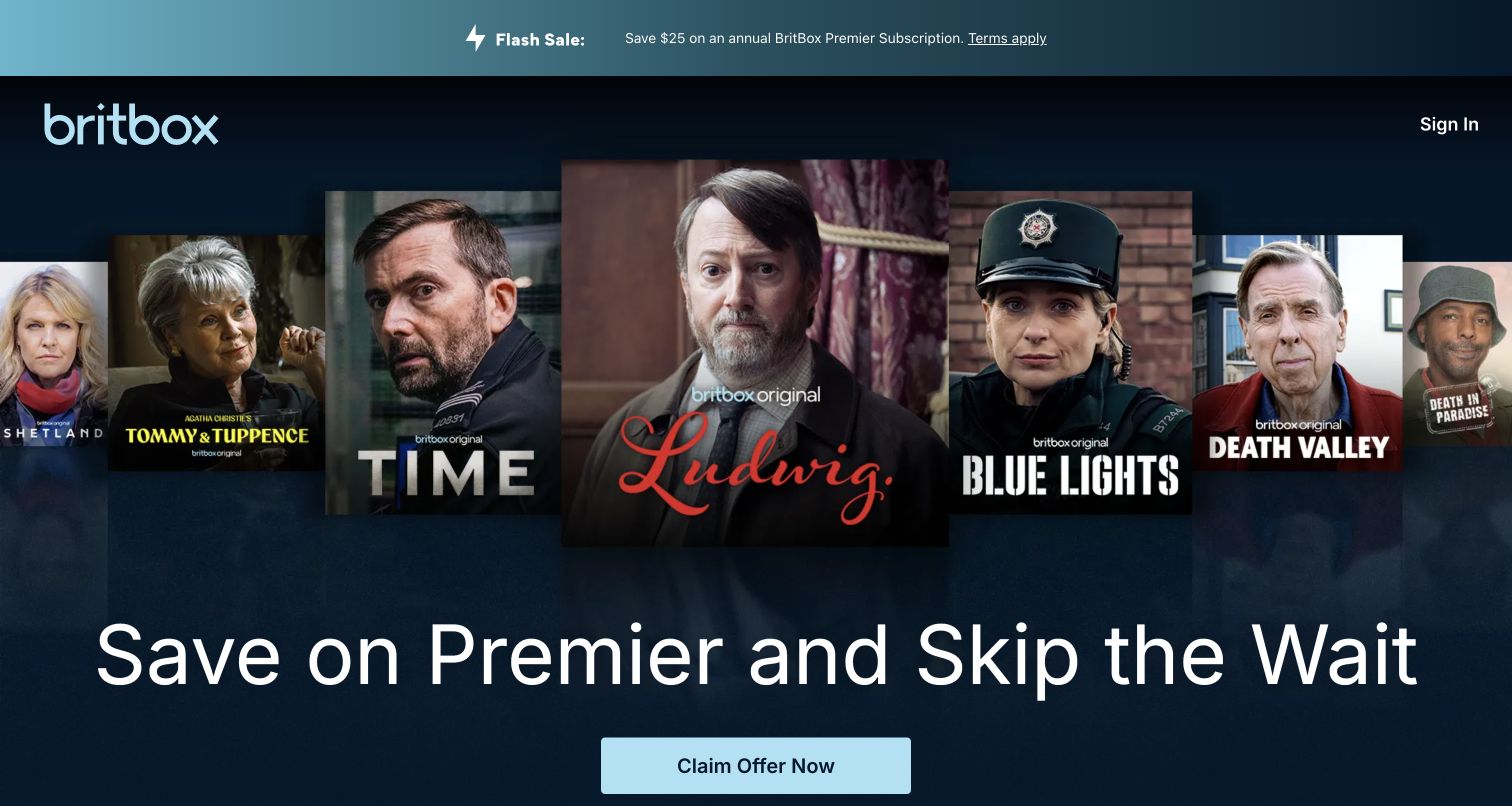
BritBox’s opening arranges a row of overlapping program portraits above a large promotional headline. The pale blue wordmark and action button sit against a dark blue field, with Sign In kept in the upper right. A narrow strip at the very top repeats the annual-plan incentive and links to its terms. The captured offer emphasizes the Premier tier and earlier access rather than beginning with an explanation of British programming. That can work for an audience already familiar with the catalog, while the recognizable titles provide reassurance. New visitors still need the comparison below to understand how Premier differs from the other membership options.
What you can learn
When promoting a higher tier, make the benefit understandable without assuming the visitor already knows the plan names. Keep offer conditions near the action and retain a straightforward route to the underlying subscription comparison.
Pros
Program portraits provide immediate evidence of the service’s editorial territory.
The top strip keeps a terms link alongside the promotion.
Cons & considerations
The plan name and access promise need additional explanation below.
Repeated offer messaging leaves less room for broader catalog discovery.
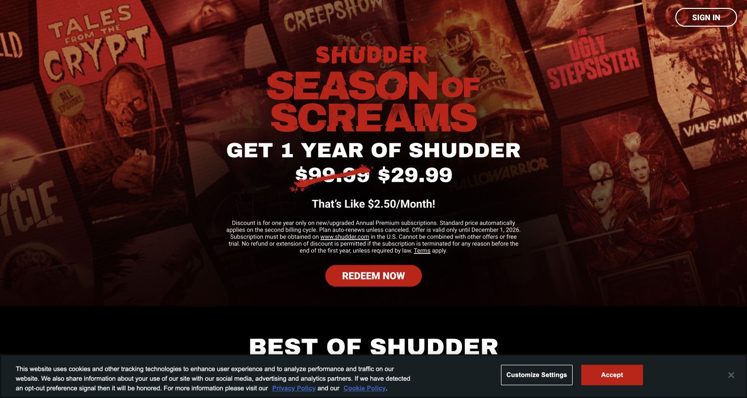
Shudder’s captured opening uses a red-tinted collage of horror artwork behind a large seasonal campaign. The service name, offer price and red redemption button form a centered column, with a compact block of renewal and eligibility conditions placed directly above the action. The next Best of Shudder heading begins below, connecting the promotion to recognizable catalog material. A bottom cookie notice remains visible in this first-visit capture. The visual treatment is unmistakably aligned with the horror genre, and the conditions are more prominent than a footer-only disclosure. Their small text and the competing bottom notice still make the first screen dense.
What you can learn
A seasonal offer can carry the tone of the catalog while keeping its practical limits nearby. Use readable conditions, a clear billing period and an obvious path to explore the content beyond the promotion.
Pros
The genre identity is consistent across artwork, color and typography.
Offer and renewal conditions appear before the main redemption action.
Cons & considerations
The small conditions block is demanding to read within the hero.
The bottom notice competes with the beginning of catalog discovery.
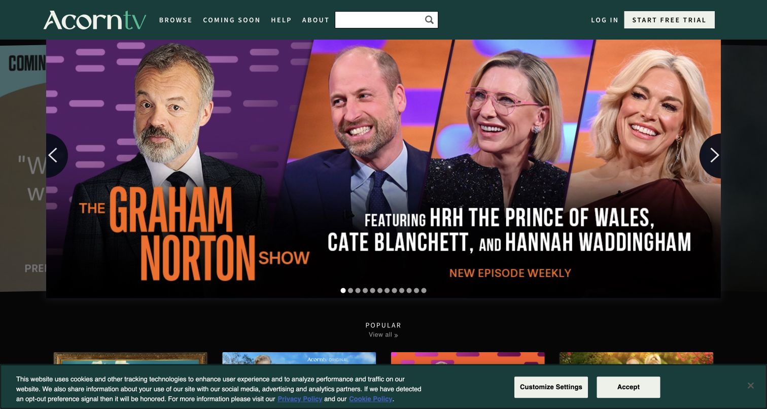
Acorn TV’s public homepage puts browsing ahead of a broad sales headline. A dark green header combines Browse, Coming Soon, Help and About with a substantial search field; Log In and Start Free Trial sit to the right. The captured carousel promotes a Graham Norton episode using a large guest montage, the program title and a short release-frequency message. Arrows and position dots indicate a wider set of features, while a Popular section begins below. A bottom cookie notice is retained. The arrangement makes particular shows easy to recognize, but the number of carousel positions and image-based promotional lettering require careful maintenance across screen sizes.
What you can learn
For a familiar catalog, keep title search and upcoming releases visible beside featured programming. Do not make a rotating hero the only way to find a show, and supply descriptive text that remains useful when promotional artwork changes.
Pros
Search and Coming Soon support concrete viewing questions.
Visible arrows and dots communicate that the feature can change.
Cons & considerations
Many carousel positions can make manual exploration laborious.
The retained cookie notice covers part of the next content row.
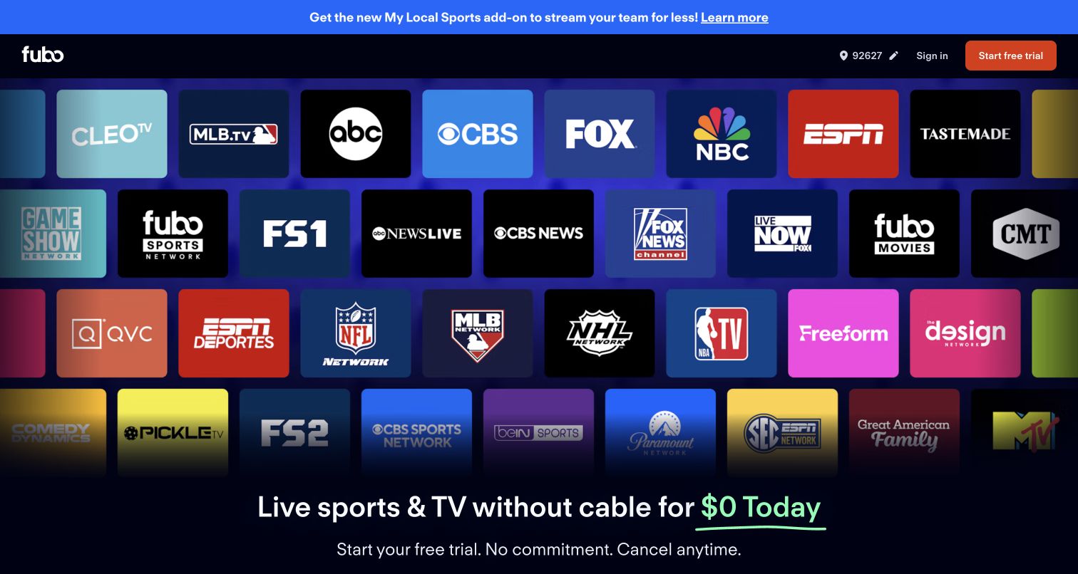
Fubo fills most of the opening with a grid of channel logos, then introduces its live-sports and television proposition near the lower edge. A bright strip across the top promotes a local-sports add-on, and the header includes a displayed service-area selector, Sign In and a trial action. The logos make the network range immediately recognizable without requiring visitors to read a long list. The screenshot also shows how much vertical space that proof consumes: the primary statement is low in the frame, with the fuller comparison beyond it. The displayed location and channel presentation describe this observed public page state, not a verified entitlement for another address.
What you can learn
Make location-dependent availability easy to check and explain the relationship between the main plan and add-ons. Use network logos as supporting proof, then give the practical comparison enough room to answer the visitor’s specific viewing question.
Pros
Recognizable network marks make the content categories tangible.
The service-area control remains visible in the header.
Cons & considerations
The large logo grid pushes the central proposition down the viewport.
An add-on promotion introduces another decision before detailed plan comparison.
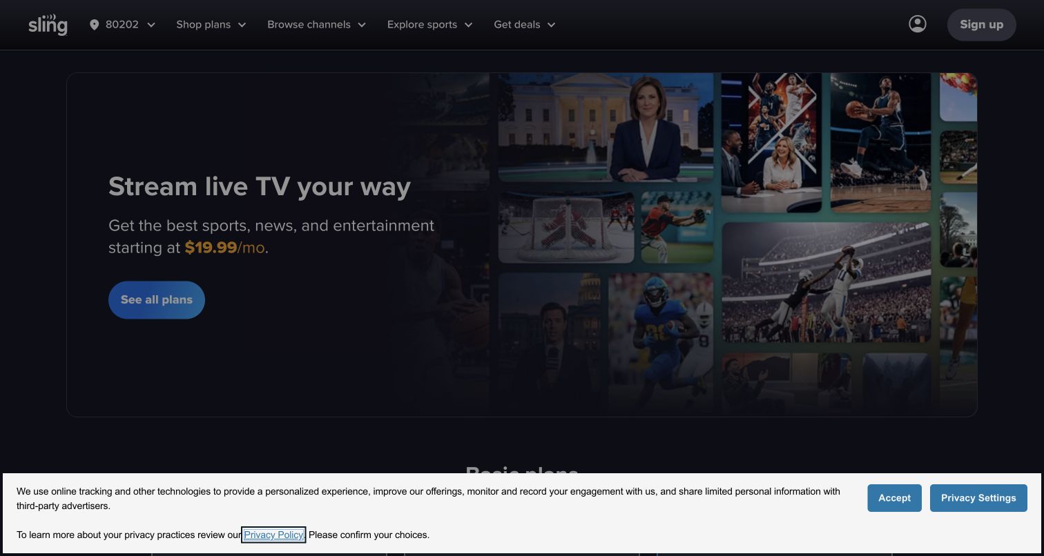
Sling’s opening places a short live-television statement, starting-price message and See All Plans action on the left of a rounded panel. A compact collage on the right represents news, sport and entertainment without taking over the entire screen. The header exposes Shop Plans, Browse Channels, Explore Sports and Get Deals, alongside a displayed area selector and sign-up access. This creates several task-based entrances for visitors with different levels of certainty. In the captured first-visit state, a cookie notice dims the page and covers the lower edge. The underlying composition is comparatively restrained, but the many package-related routes still need consistent labels deeper in the site.
What you can learn
Separate plan comparison from channel discovery so visitors can begin with the question they actually have. Keep local availability visible and inspect the whole first-visit layout with consent controls present, not just the clean promotional design.
Pros
The main button states a clear comparison task.
Header labels distinguish plans, channels, sports and offers.
Cons & considerations
The retained notice reduces contrast across the photographed opening.
Several plan families require careful explanation beyond the short starting price.
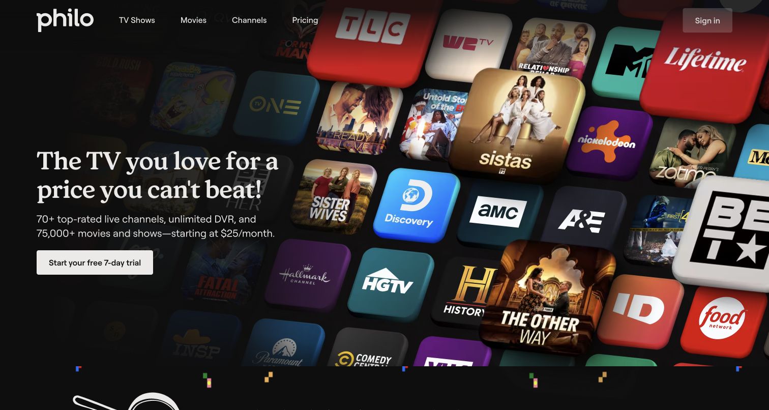
Philo’s public acquisition page sets a large serif headline and short value statement against a diagonal wall of network and program tiles. The left column groups the package description, starting price and a clearly labeled trial button. TV Shows, Movies, Channels and Pricing remain visible in the top navigation, with Sign In separated on the right. The use of dimensional tiles gives the background energy while leaving the text area dark and readable. Unlike a broad emotional slogan alone, the supporting line identifies the kind of service being offered. Its numerical catalog and channel claims are photographed marketing statements, not counts independently verified by this review.
What you can learn
Combine a concise proposition with the practical facts needed to evaluate it. Keep pricing and channel information directly reachable, and treat changing package claims as maintained content with an owner rather than permanent artwork.
Pros
The trial action includes a duration rather than a vague invitation.
Pricing and Channels are explicit primary-navigation destinations.
Cons & considerations
The introductory claim compresses several package details into one line.
Catalog and network artwork cannot establish individual viewing availability.
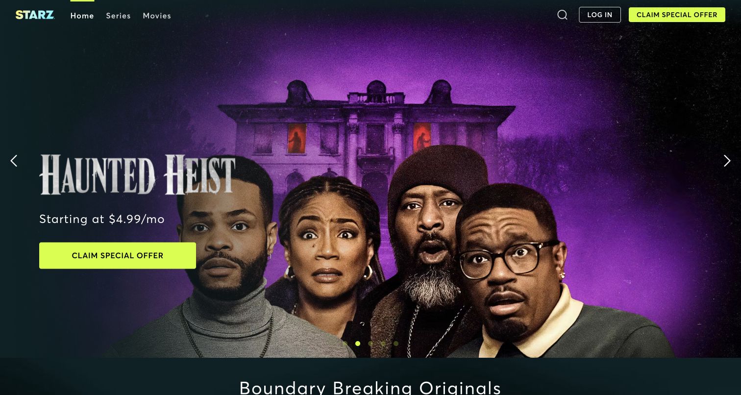
STARZ’s captured homepage features Haunted Heist with a large purple scene, character portraits and a prominently placed title. A starting-price line and fluorescent yellow offer button sit on the left, while a dark header preserves Home, Series, Movies, Search and Log In. Side arrows and small position dots indicate additional features. The next originals section begins at the bottom of the frame, linking the featured release to the broader catalog. This composition lets a particular program carry the emotional appeal while keeping the service’s main routes stable. It gives less immediate explanation of the featured story or the conditions behind the advertised offer.
What you can learn
Allow a strong release image to lead, but retain consistent navigation and a readable route to details. Keep offer conditions connected to the acquisition action so interest in a title does not become confusion about membership.
Pros
The bright acquisition button is easy to distinguish from the artwork.
Series and Movies remain available independently of the carousel.
Cons & considerations
The opening offers little synopsis or genre context for the featured title.
A starting-price message requires fuller terms before subscription decisions.
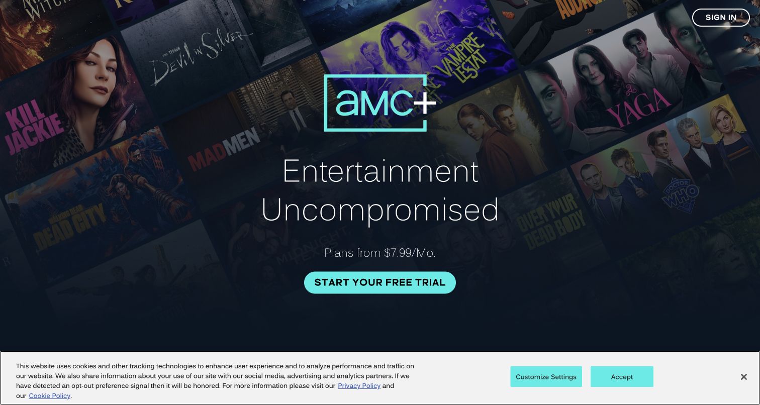
AMC+ centers its outlined logo and a two-line entertainment statement over a darkened mosaic of shows and films. A starting-price line and turquoise trial button follow in a narrow vertical sequence, while Sign In sits alone in the upper-right corner. The palette connects the logo outline and action without introducing many competing colors. A bottom cookie notice remains visible, but the central message and button are still readable. The opening favors a simple subscription entrance over direct title browsing. The collage supplies recognition for existing fans, yet a new visitor must continue below to understand the catalog’s categories and how the available plans differ.
What you can learn
A short acquisition page can work when the next sections quickly substantiate the promise. Keep the first action clear, then provide concrete content examples and plan distinctions for visitors who do not recognize the background titles.
Pros
Logo, proposition, price and action follow one clear vertical order.
A consistent accent color connects brand identity and the main button.
Cons & considerations
The first screen provides little direct catalog navigation.
The retained cookie notice consumes part of the lower viewport.
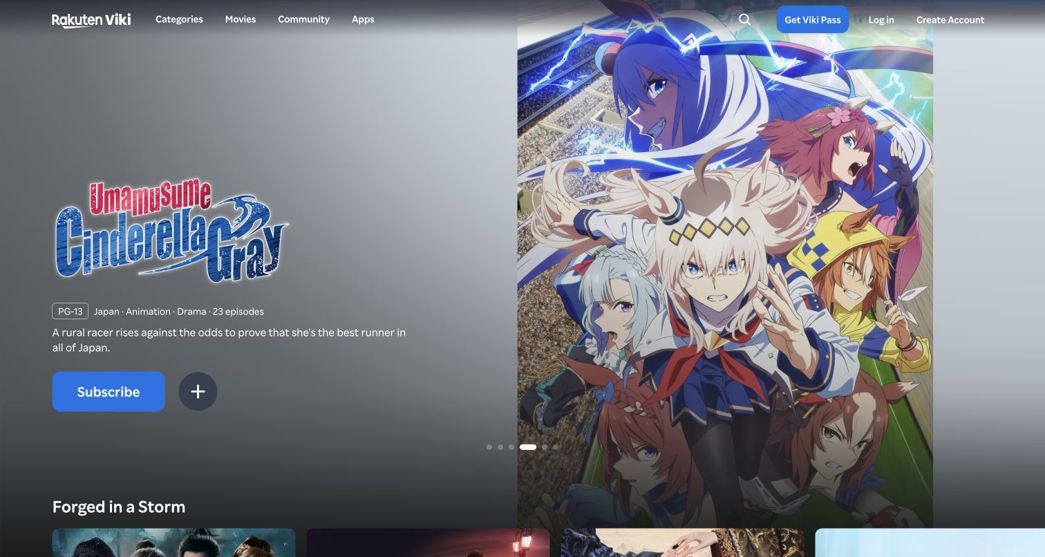
Rakuten Viki’s public homepage uses a large featured-title area with artwork on the right and a separate text-and-action area on the left. The captured anime feature includes a rating, country, genre and episode count before a short premise. A blue Subscribe button and a plus control sit beneath the description. The header exposes Categories, Movies, Community and Apps, along with search, Viki Pass, Log In and Create Account. The metadata gives visitors useful context before they enter a title, while the large image preserves the program’s visual identity. The small plus symbol still needs a clear accessible label and a predictable explanation of account requirements.
What you can learn
For international catalogs, treat origin, format and episode information as part of the main decision. Keep subscription, rental and saving actions distinct, and explain any access requirement when a visitor uses a public discovery page.
Pros
The featured title includes practical metadata and a concise premise.
The header separates catalog discovery from community and device information.
Cons & considerations
The plus control’s meaning is less explicit visually than the subscription button.
A changing feature can emphasize one format within a much wider catalog.
Visible tech stack
Referenced on the public page
SvelteKit
Public source checked November 4, 2026. References may be embedded or legacy—not a complete backend inventory.
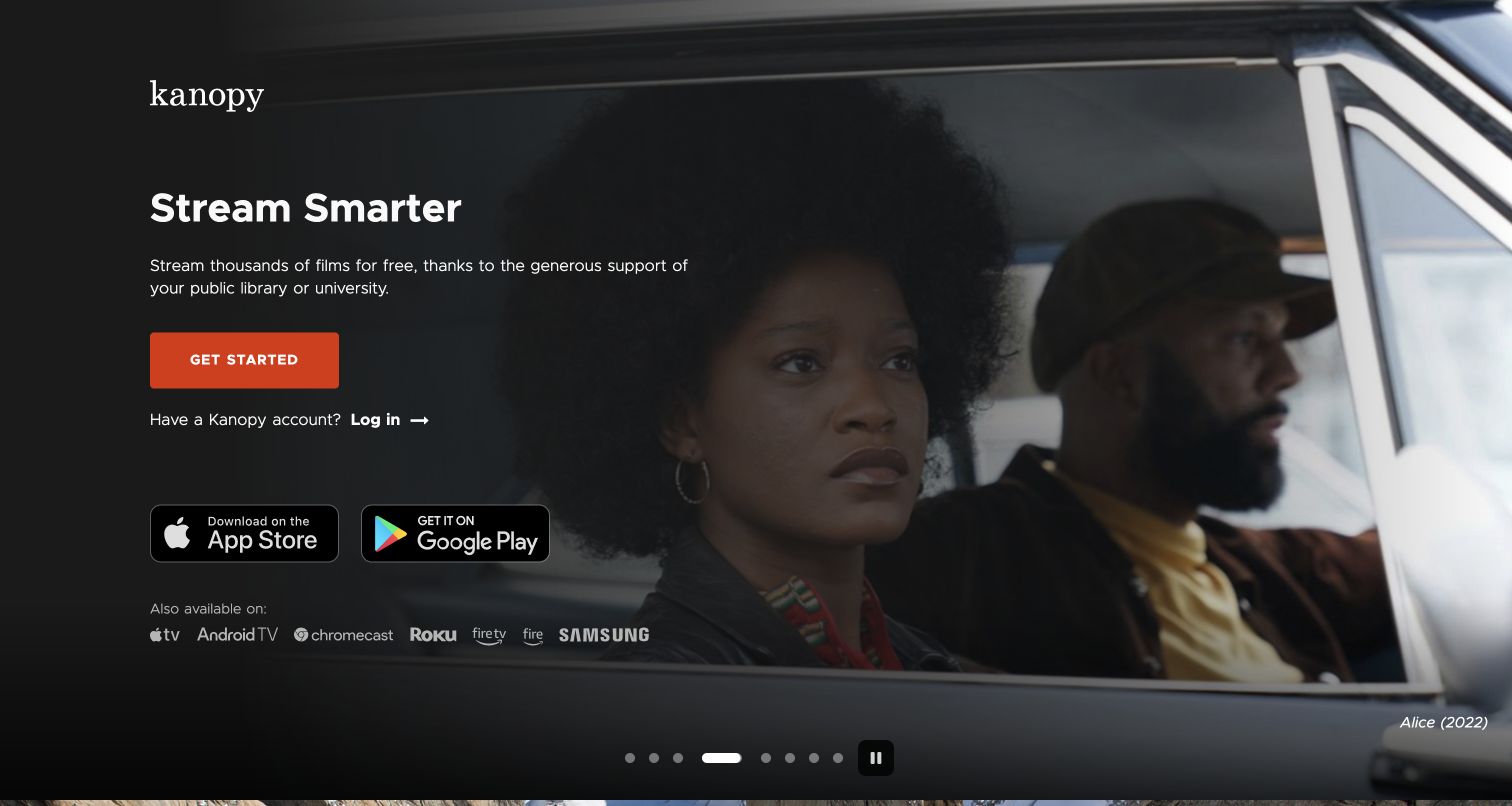
Kanopy’s public entrance places a concise access explanation over a large film still, with text and controls concentrated on the darkened left side. The copy explicitly connects viewing to a public library or university, followed by Get Started and a separate Log In link. App-store badges and device logos appear within the same screen. The featured film is credited in the lower-right corner, and carousel dots plus a pause control remain visible at the bottom. An ordinary cookie notice was closed before this capture. The composition balances the film’s emotional appeal with the eligibility information a visitor needs before attempting to register.
What you can learn
Explain the source of access before asking for an account. For an institution-supported service, a clear eligibility statement and device guidance can be more useful at the entrance than a conventional subscription-price promotion.
Pros
Library or university access is stated beside the primary action.
The visible pause control gives the moving feature an understandable affordance.
Cons & considerations
The opening does not identify whether a particular institution participates.
A visitor still needs a separate route to browse the full film catalog.
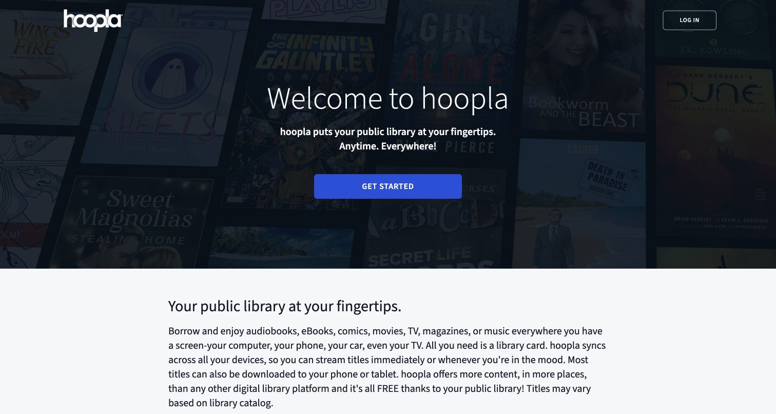
Hoopla opens with a darkened collage of books and entertainment artwork, a centered welcome statement and a blue Get Started button. The logo and Log In are the only prominent header elements. Immediately below, a white content section explains the range of formats, the library-card requirement and the fact that available titles depend on the library catalog. This second section is unusually important because the service includes reading, listening and viewing within one offer. Optional cookies were declined before the final capture. The opening makes the institutional connection clear, although its general action gives little indication of the steps needed to establish eligibility.
What you can learn
When several media formats share one service, explain both the range and the access conditions before registration. Keep institutional limits close to the promise of availability, and provide recognizable format labels when visitors begin browsing.
Pros
The access explanation begins within the same viewport as the hero.
The page distinguishes library-dependent availability in ordinary language.
Cons & considerations
The broad Get Started label does not describe the eligibility process.
The opening has few direct format-specific browsing entrances.
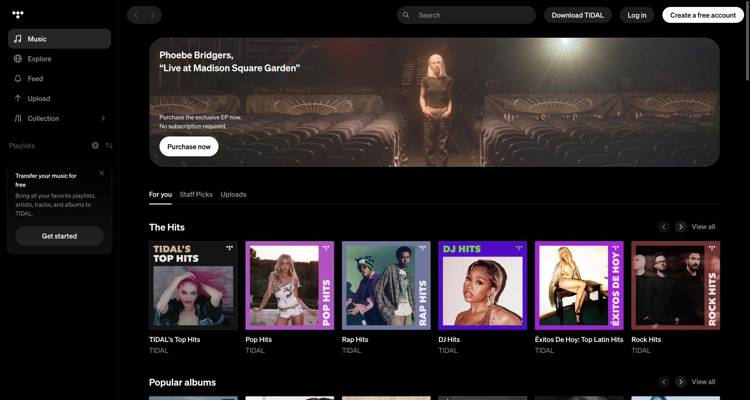
TIDAL’s signed-out public entrance presents an application layout: a persistent left navigation rail, top search, account actions and rows of music cards. A wide feature promotes a Phoebe Bridgers release with a purchase button and an explicit statement that a subscription is not required for that offer. Below, For You, Staff Picks and Uploads tabs sit above genre-oriented playlist cards. The screenshot was taken after declining optional cookies; no music was played. This interface gives prospective listeners a tangible view of discovery tools, while the separate purchase offer introduces a different transaction model from the streaming subscription. The generic For You label is not evidence of a signed-in profile.
What you can learn
Let visitors inspect the discovery interface while clearly labeling different access models. Distinguish a one-off purchase from subscription listening and explain which collection or saving controls require an account before they are used.
Pros
Search and genre-oriented playlists are visible before sign-in.
The featured purchase explicitly distinguishes itself from a subscription.
Cons & considerations
Application controls can imply functionality that requires later registration.
Purchase and streaming models share the opening and need careful labeling.
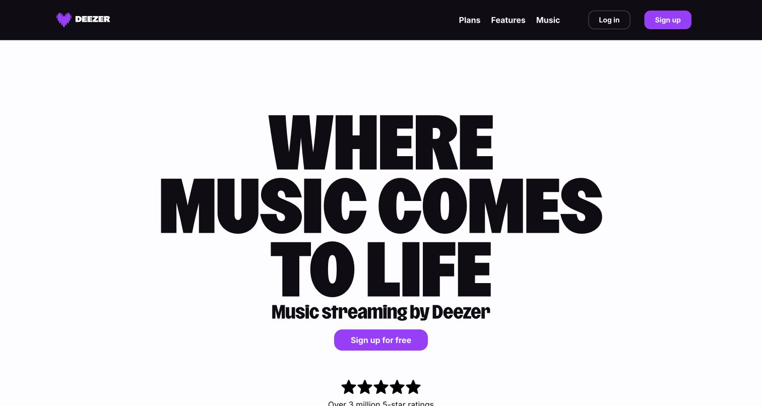
Deezer’s captured United States homepage uses a very large black typographic statement on a pale background, with a smaller music-streaming descriptor beneath it. A purple free-signup button supplies the central action. The dark header keeps Plans, Features, Music, Log In and Sign Up visible, repeating the same accent color. A rating graphic begins near the lower edge, but the first screen largely avoids artist or album artwork. Optional cookies were refused before this final capture. The result is unusually direct compared with poster-heavy streaming pages, although the typography spends considerable space expressing a general mood before showing what a listener can actually explore.
What you can learn
A bold typographic opening needs useful navigation to balance its abstraction. Keep plans, features and catalog discovery plainly labeled, and support broad brand statements with concrete listening examples in the following sections.
Pros
High-contrast type and a single accent make the main action easy to locate.
Music and plan information remain directly reachable from the header.
Cons & considerations
The opening provides no specific album, artist or playlist examples.
The oversized statement requires careful reflow on shorter or narrower screens.
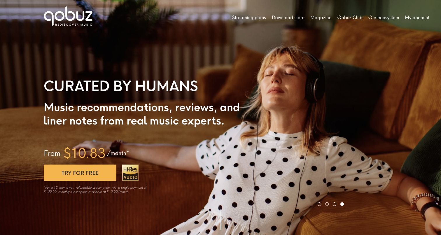
Qobuz’s captured United States discovery page features a relaxed listener photograph with a large statement about human curation on the left. Supporting text names recommendations, reviews and liner notes, connecting the subscription to an editorial experience. A starting-price line, gold trial button and audio-quality badge sit together, followed by small text explaining the annual billing basis and monthly alternative. The top navigation separates Streaming Plans, Download Store, Magazine, Qobuz Club and the device ecosystem. Optional consent was declined before capture. This makes the service’s different activities visible, but the white header text over a light photograph and the small billing explanation deserve careful contrast and readability review.
What you can learn
Connect a listening proposition to the practical service around it. Distinguish streaming from permanent downloads, and place billing-period explanations close to any monthly-looking price so the visual shorthand does not do all the work.
Pros
Streaming, downloads and editorial content have separate navigation labels.
The billing basis is stated near the trial action.
Cons & considerations
Light navigation text can become less distinct over bright image areas.
The small billing explanation is harder to scan than the prominent price.
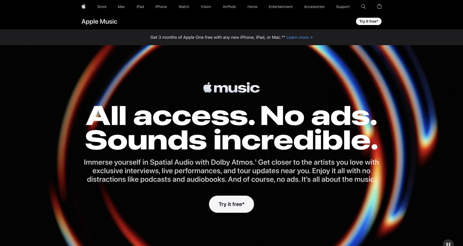
Apple Music’s public product page leads with its logo and an oversized statement about access, advertising and sound. A short paragraph connects that promise to listening features and artist material, followed by a white trial button. An abstract multicolor ring frames the text against black instead of relying on album covers. Above, a local Apple Music bar sits beneath the wider Apple navigation, and a separate strip promotes an Apple One device offer. This creates a polished, highly legible product introduction. It also places several related service and eligibility messages near one another, so a prospective listener needs to distinguish the Music trial from the broader bundle promotion.
What you can learn
Keep a service’s main promise readable within a larger corporate navigation system. Separate related-device and bundle offers from the primary subscription route, and make eligibility and plan differences available before the visitor enters an account flow.
Pros
The main text and action remain clear against a restrained abstract background.
A local service bar distinguishes Apple Music from the wider product navigation.
Cons & considerations
The adjacent Apple One promotion adds a second offer to interpret.
The opening does not provide direct artist or album browsing.
Plan the path from discovery to the correct access route
Create a content record for each media type
Define the fields needed for films, episodes, channels, albums, tracks, and other supported formats rather than forcing them into one minimal card. Record identifiers, titles, creators, artwork, descriptions, language information, and the relevant availability context. Keep promotional collections connected to those records so a campaign does not continue presenting an unavailable item as immediately accessible.
Map first-time and returning visitors separately
A new visitor may need to understand the catalog or compare access options; a returning visitor may simply need to sign in or find a saved item. Keep both routes clear. Document what happens when a person arrives at a shared title link without an account, with an ineligible plan, or through a participating institution.
Separate a preview, an access check, and an account change
Give each action a clear label and completion state. A title page, trailer entrance, subscription enrollment, and library sign-in should not appear interchangeable. Test the sequence with authorized accounts and test data in the product’s own environment, preserving the original title or channel context through any required handoff.
Design the public interface for careful browsing
Support readable title metadata, meaningful image alternatives, keyboard navigation, and usable focus states in horizontal rows. Give moving promotional areas appropriate controls and keep essential descriptions available as text. Review privacy notices, signup prompts, sticky navigation, and mobile menus together so overlays do not conceal the only route to a catalog or eligibility explanation.
Plan unavailable and interrupted states
Write specific messages for an expired link, changed availability, unsupported region, missing institutional access, or an unavailable service. Preserve the item the visitor was seeking and identify the next useful action. Keep account and billing outcomes authoritative: an animation or redirect alone should not be treated as proof that an enrollment or account change completed.
The editing job behind the design
Choose systems that keep the public catalog and access rules aligned
Separate editorial presentation from the records that determine catalog availability and customer access. The public website may need a content system for campaigns, a searchable media catalog, account services, and connections to delivery applications. Evaluate those relationships using real scenarios: an item changes region, a series gains an episode, a plan changes, or a library relationship is unavailable. Define the responsible source for each fact and what the public interface shows when an update is delayed.
Choose additional tools around a demonstrated visitor task. Recommendations should preserve item identity and availability; a channel guide should retain its schedule context; a library lookup should return an understandable eligibility result. Record who maintains each integration, the data it uses, and its failure behavior. A public script or media URL may identify a visible resource, but it does not reveal the full playback infrastructure, access enforcement, or account backend.
Our WordPress website examples offer a separate look at publishing approaches. A visible platform label is evidence for that named page, not a guarantee that the same system will suit your requirements.
Before the public launch
Streaming media website launch checklist
Define whether each entrance supports video, audio, live channels, or institutional access.
Connect title metadata, artwork, format, and creator information to an authoritative media record.
Show the relevant region, plan, date, channel schedule, or institution where it affects the next step.
Explain ordinary plan terms and subsequent billing alongside introductory offers where applicable.
Provide a clear institution-selection route and helpful unsupported-result state for library access.
Preserve the selected title, channel, album, or other item through sign-in and access checks.
Test search, category navigation, horizontal rows, image alternatives, and focus behavior on phones and with a keyboard.
Review motion controls, notices, signup prompts, and sticky elements as one complete screen.
Test unavailable items, changed access, expired links, and interrupted handoffs in an authorized environment.
Confirm account and billing changes through the authoritative system before showing completion or offering a retry.
Assign ownership for catalog updates, plan copy, availability rules, institutional relationships, and support messages.
These checks are a project checklist, not a performance, legal, security, or accessibility certification. Test real journeys with the people responsible for the website before making claims about the result.
Sources & editorial method
How this collection was selected and reviewed
The saved random target for this guide was twenty-six examples, selected before research. The collection reviews twenty-six distinct official public properties spanning video, music, and library-supported media access. Twenty-four captures were made on November 4, 2026; the Hulu welcome and Plex watch-page examples reuse genuine earlier captures with their original dates retained. Each example keeps its observed URL, capture date, dimensions, and attribution. Reviews assess the public page state, including any visible notices or enrollment entrances. No playback controls were used and no account, subscription, payment, or library-access actions were performed. Technical associations require separate public evidence and do not establish the complete streaming backend.
Each example links to its actual source page. Screenshots are direct browser captures with their own capture dates; moving imagery, announcements and live designs can change. The notes describe observable design choices and conditional tradeoffs, not measured traffic, conversion results, service quality, or accessibility conformance.
Technology labels use public page metadata, asset evidence, or explicitly cited platform documentation. Platform documentation is not a complete current deployment audit. A component reference may be legacy or unused; it is not a complete backend inventory. Unknown stacks are omitted. These sites are editorial examples, not our client portfolio.
Written, Edited and Curated are separate editorial records, not timestamps advanced by a rebuild. Website designs and imagery belong to their owners. See our editorial standards or suggest a correction.
Questions worth asking
Streaming Media Companies website design questions
Why does this collection include music and library services?
They share the problem of helping visitors discover media and understand access, while using different formats and business or institutional models. The guide makes those distinctions explicit. A music catalog, a live-channel offer, and a library gateway should be evaluated according to the task each public page performs.
Should a streaming site show its catalog before signup?
Provide enough representative, relevant information to support the decision the visitor is making. A public catalog can help someone find a title, while a specialist service may lead with editorial context. Make clear when displayed items are examples and when availability depends on a region, plan, or participating institution.
How should live channels differ from on-demand titles?
Give the visitor clear schedule and access context for a channel, while an on-demand item needs its own title, format, and availability information. Keep the action labels distinct so a person can tell whether the next step concerns a current broadcast, a catalog item, or a plan that includes access.
What should a library-supported service explain before sign-in?
Identify the role of the participating library or university, show how to find the relevant institution, and explain the next eligibility step. Provide a useful outcome when the institution is not supported. Avoid suggesting that a public catalog alone establishes a particular visitor’s borrowing or viewing access.
What should appear beside an introductory subscription offer?
Show the applicable access option, ordinary billing period and price basis, what follows the introduction, and the relevant conditions. Keep the plan comparison understandable on a phone. A promotional headline should lead to a clear decision rather than leave the customer to infer the continuing arrangement.
Does a public homepage reveal the quality of a streaming service?
It can show how the service explains itself and organizes discovery. It cannot establish playback reliability, audio or video quality, catalog completeness, or account behavior. Those questions need separate authorized evaluation using the relevant device, region, plan, and actual service context.
Borrow a clear discovery or access pattern, then connect it to the media records, availability context, and account behavior your own service can support.